Friday 4 February 2022

"The destruction of Breuer's Geller house feels like the Penn Station moment for modern homes"

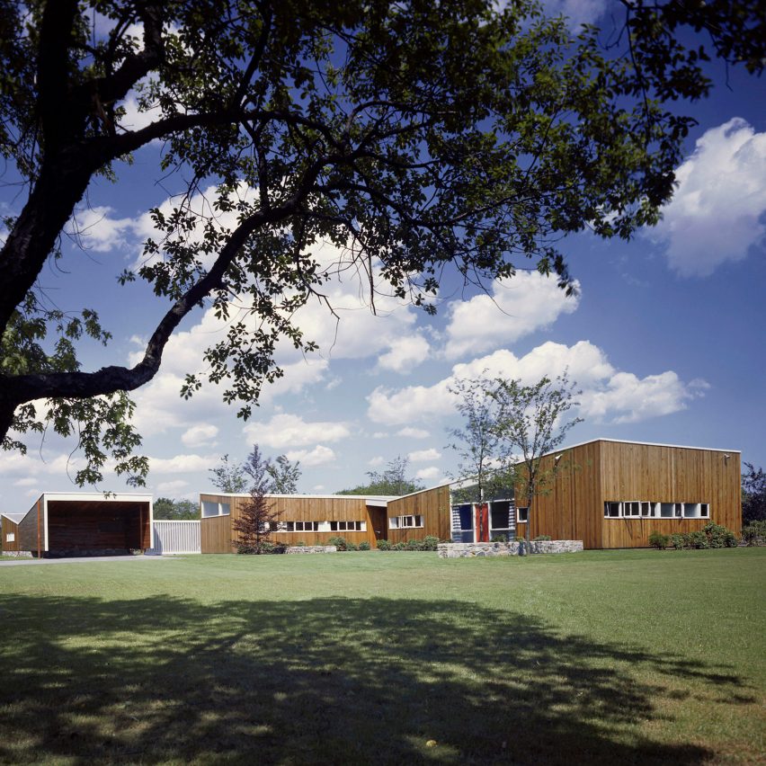
Geller I house by Marcel Breuer

The recent lost of Marcel Breuer's Geller I house should be a wake up call to protect significant modern homes in the US, just as the demolition of Penn Station kicked off the preservation movement in New York, says Liz Waytkus.

The demolition of Marcel Breuer's Geller I house last week is a tragedy that should never have been allowed to happen. Designed in 1945 by the former Bauhaus master it was one of the most important 20th-century homes in the United States.

But despite its international significance and eligibility to be listed on state and national registers, it is now gone. Demolished in the dead of night following pleas to the owners and local municipalities to give us time to find a preservation solution.

As late as last December the owners assured me on the phone that they considered the house to be a "masterpiece", and they had no plans to develop it for the next few years. While I took them at their word, it was clear the house was in danger.

Geller I captured the shifting taste for modernism

The house might not have impressed the neighbours but it put Breuer on the proverbial design map. The home showcased Breuer's talent in combining lush materials typical in New England residential design with new forms and new ideas of modern family life.

As his first realized binuclear house, separating living from sleeping spaces, Geller I captured the shifting taste for modernism. Isabelle Hyman writes in her monograph, Marcel Breuer, Architect: The Career and the Buildings, "A generation of American architects was educated about 'humanistic' modernism through the impact of Breuer's first postwar houses."

Geller I was not cold and rigid like earlier examples and it expressed his interest in warm materials, distinctive and expressive forms that likely became the inspiration for a generation of architects.

It also was a significant moment for the designer allowing him to pivot from working with his mentor and Bauhaus founder Walter Gropius to leading his own studio in New York. There he would go on to design more than fifty homes as well as some of the 20th century's some most important and influential buildings including the UNESCO Headquarters in Paris and New York's original Whitney Museum of American Art.

It is a far from perfect, patchy system of preservation

Geller I was not a recently discovered gem by an unknown architect. It's significance was identified more than forty years ago in 1981 when one of New York's oldest preservation groups, the Society for the Preservation of Long Island Antiquities (now Preservation Long Island), were provided federal funds through the State Historic Preservation Office to perform some of the original rounds of cultural resource surveys initiated by the National Historic Preservation Act of 1966.

These federal funds, no longer available today, were critical in the identification of the most important sites to be added to the newly created National Register of Historic Places.

Their work and the work of local and regional preservation organizations across the country continues to be critical to the process of identifying significant properties and engaging with local municipalities to support local or regional laws.

In the United States, local preservation ordinances typically have more robust measures of protection than the federal and state laws. It is a far from perfect, patchy system of preservation.

In the case of Geller I, the Incorporated Village of Lawrence, New York, had no local preservation ordinance. Which is why when our coalition of advocates learned of the potential demolition, we filed a landmarks application with the Town of Hempstead (of which Lawrence is part) which does have such an ordinance.

Unfortunately, Lawrence had no obligation to respond to the Hempstead's letter requesting a landmarking review and it remains unclear if the local officials were aware that the house was eligible for the National Register.

The destruction of Geller I feels like the Penn Station moment for historic modern homes

Sites on the National Register only trigger flags when state or federal funding or permitting is involved, or because of environmental reviews. The state government will not step in if projects are developed with private money and there is no state or federal reason for oversight. Without such a trigger, local officials in Lawrence went by what they knew, and no doubt believed they did their due diligence until they received my call.

I believe it is essential that we preserve the most significant parts of our architectural and cultural heritage. How are we to know and learn from our history if we do not have laws or mechanisms in place to help protect historic resources?

For major structures in large cities, the failed campaign to save New York's Penn Station is now engrained in our society and is the apt cautionary tale whenever a significant site is endangered. The unnecessary destruction of Breuer's Geller I house feels like the Penn Station moment for historic modern homes.

Penn Station and the brave individuals who championed that cause, helped our country develop initial tools to identify and place protections on such resources. And while state and federal designations are wonderful at providing tax credits to entities restoring and reusing our historic fabric, these laws do almost nothing to protect historic resources including internationally recognized architect-designed homes.

There are limited options for protecting significant modern homes

There are limited options for protecting significant modern homes. Adding a house to the local list of historic places is the first and often best option. Municipalities with a preservation ordinance have committees who meet regularly to approve such additions and are the body to act when an owner submits plans to alter a designated house.

Without a local ordinance, the only option may be to create a preservation easement for the individual house. As my colleagues at the Preservation League of New York State have laid out, easements are complicated and real estate lawyers are not cheap. But for those with the means and the motivation, an easement is the way to go. Adding houses to the National Register of Historic Places offers some protection and robust tax benefits for the owner, but nominations are also cost prohibitive and lengthy.

What the Geller I demolition has made clear is that we need better laws in general and new opportunities to help protect smaller projects and homes. The laws in place encourage and reward good stewards through tax credits but perhaps we need to be working with the National Trust for Historic Preservation and our State Historic Preservation Offices to develop an additional pot of money and a list of consultants to work on National Register nominations for endangered properties?

A small tax on construction could feed such pots of money locally and could be managed by the municipalities in which they serve.

My organization, Docomomo US, started the Advocacy Fund just last year where funds go directly to support critical advocacy efforts and endangered sites like the Breuer-designed home.

We need to do more if we are to avoid historic sites from being worth less than the land they sit on

Modern homes and indeed homes in general are bulldozed every day. The best protection for historic resources are local preservation ordinances. In New York State, only 19 per cent of all municipalities have such an ordinance. The New York State Historic Preservation Office has resources on the legal aspects of different types of local preservation laws and can direct local governments to National Park Service programs that offer communities grant making programs to promote preservation initiatives.

Let Breuer's Geller I live on by becoming its own cautionary tale so that the significance of its demolition was not in vein. Let it be to homes, what New York's Penn Station is to public architecture.

You can help avoid this from happening again by supporting and strengthening the work of your local or regional preservation organisation and by encouraging your local community to consider enacting a local preservation law.

We need to do more if we are to avoid historic sites from being worth less than the land they sit on. The aftermath of this demolition is the moment to act.

The photography is by Ezra Stoller /Esto.

Liz Waytkus is the executive director of Docomomo US and has worked in the non-profit cultural and educational fields for two decades.

The post "The destruction of Breuer's Geller house feels like the Penn Station moment for modern homes" appeared first on Dezeen.


from Dezeen https://ift.tt/3CVQHlh
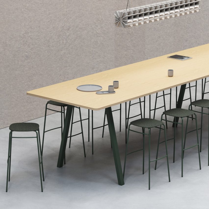
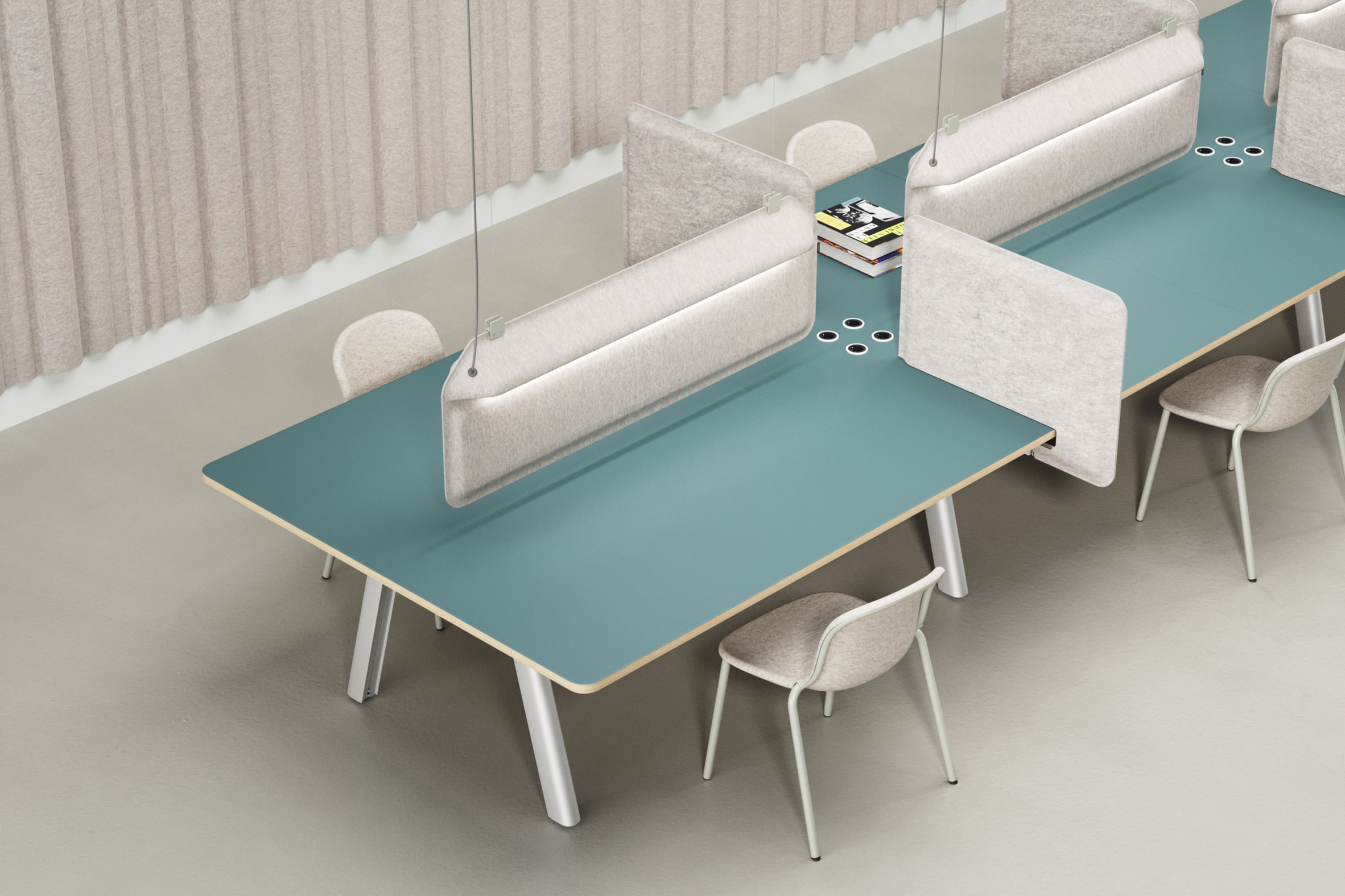
Big modular table system by De Vorm

Big modular table system by De Vorm

Dezeen Showroom: Dutch design brand De Vorm has updated its Big Modular Table System with a design that is more sustainable and boasts add-ons.

The Big Modular Table System enables the creation of custom tables up to ten metres long and two metres wide and is suitable for dining, working or meetings.

Big modular table system by De Vorm
De Vorm's new generation Big Modular Table System is made with recycled aluminium

With the new generation of the system, De Vorm switched to one of the most circular types of aluminium for its base material.

It contains up to 75 per cent recycled material while meeting the same quality standards as virgin material. It is also fully recyclable and produced locally using renewable energy sources.

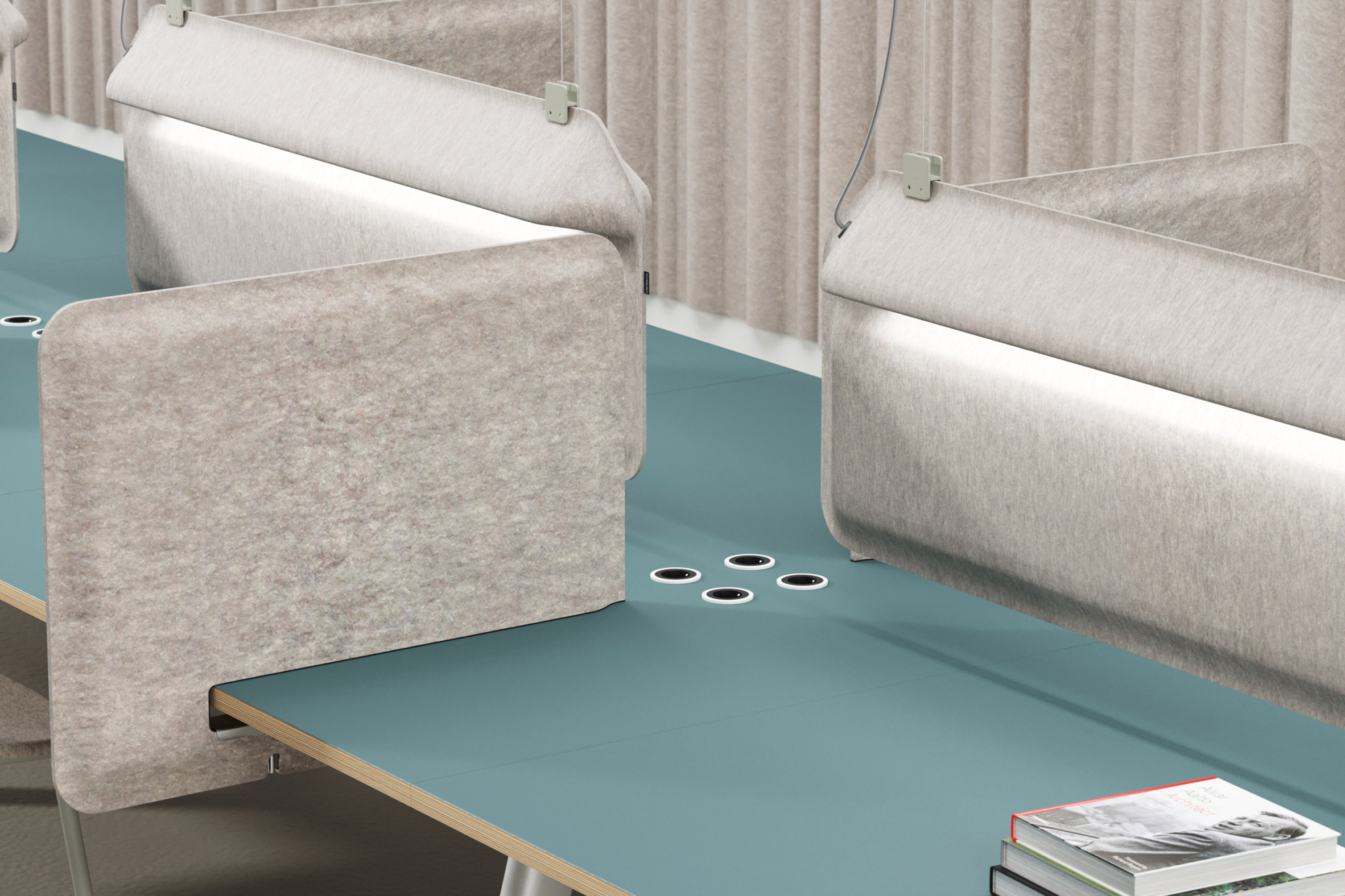
Big modular table system by De Vorm
There are also a range of new customisation options for elements such as cable compartments

The design's frame has also been optimised, and now 30 per cent less material is used, creating a product that is lighter than the previous iteration but just as strong and stable.

Completing the new generation Big Modular Table System are additional customisation options, including steel or wood for the frame and legs, and five cable compartments.

Product: Big
Brand: De Vorm
Contact: sales@devorm.nl

Dezeen Showroom

Dezeen Showroom offers an affordable space for brands to launch new products and showcase their designers and projects to Dezeen's huge global audience. For more details email showroom@dezeen.com.

Dezeen Showroom is an example of partnership content on Dezeen. Find out more about partnership content here.

The post Big modular table system by De Vorm appeared first on Dezeen.


from Dezeen https://ift.tt/zVLdO48

Triennale di Milano reconstructs room from Ettore Sottsass's Casa Lana

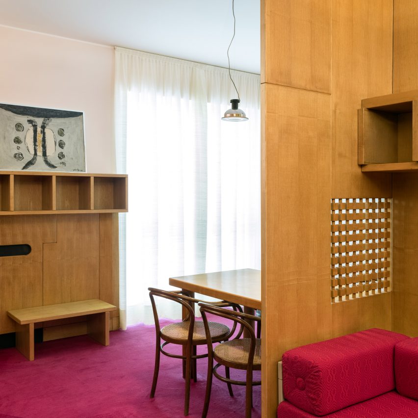
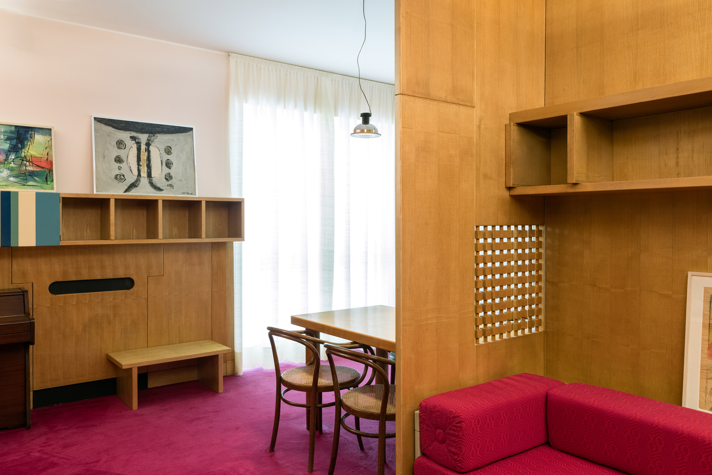
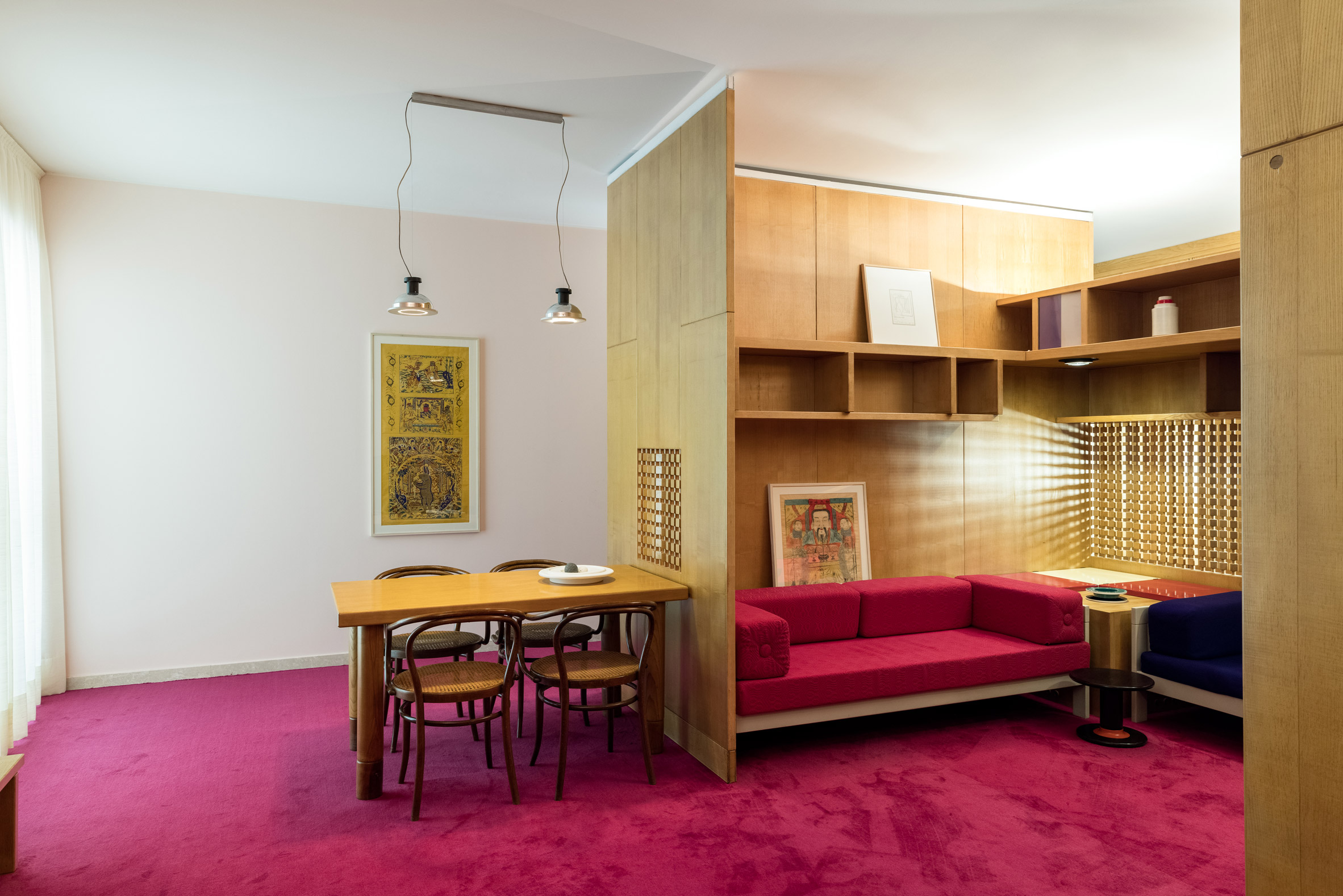
Dining area with wooden chairs surrounded by built-in wooden shelving and magenta carpet in living room of the Casa Lana installation at Triennale di Milano, Italy

This video, shared exclusively with Dezeen, shows the living area of a Milanese apartment by Memphis Group founder Ettore Sottsass being dismantled and rebuilt inside the city's Triennale di Milano museum.

The apartment, named Casa Lana, was originally designed by the Italian architect in 1965 for his close acquaintance Giovanni Lana, a lithographer and printer.

Dining area with wooden chairs surrounded by built-in wooden shelving and magenta carpet in living room of the Casa Lana installation at Triennale di Milano, Italy
The living room of Casa Lana has been reconstructed inside the Triennale di Milano

Now, with the help of donations from the architect's widow Barbara Radice Sottsass, Casa Lana's brightly-hued living room has been reconstructed within the Triennale di Milano as part of a permanent new installation.

Italian architect Stefano Boeri, who is the museum's president, said putting the Sottsass-designed room on display to the public is like "giving the world a wonderful surprise".

Dining table set-up next to wooden enclosure with built-in storage and seating designed by Ettore Sottsass
At the heart of the space is a wooden enclosure with built-in shelving and sofas

"Milan is now home to an authentic time machine, created by one of the international geniuses of the twentieth century," Boeri said.

Staff from the archive and restoration team at the Triennale di Milano visited Casa Lana and carefully documented the layout of the living room before taking it apart piece by piece.

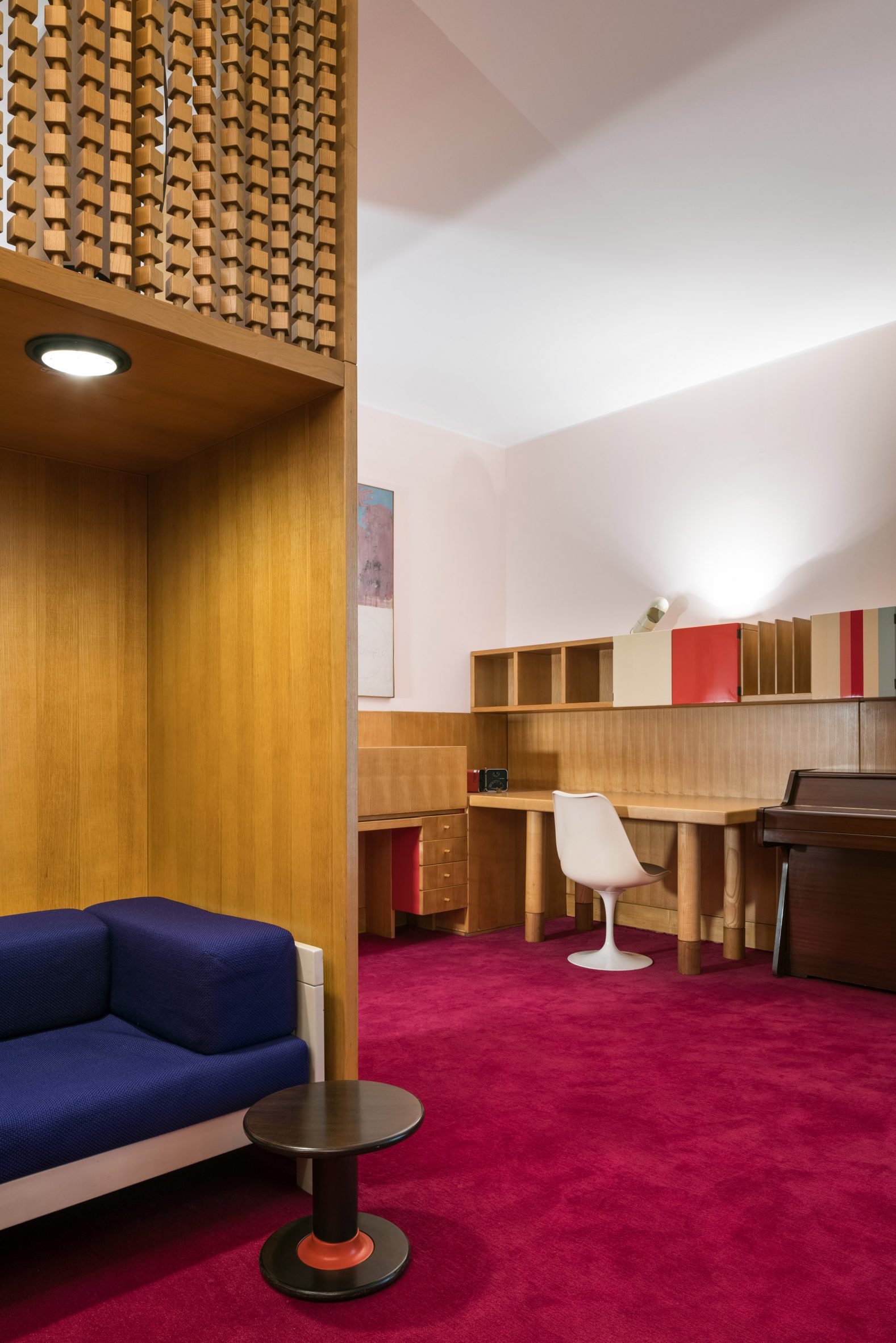
Wooden desk next to plastic white chair in Casa Lana installation
Other furniture elements such as the desk are pushed to the periphery of the room

The parts were then transported to the museum and painstakingly put back together to form a display on the first floor.

At the heart of the room is a three-sided wooden enclosure, where Lana would retreat to listen to music or conversate with guests. Inside, there's a trio of sofas – two upholstered in indigo-blue fabric and the third in a similar pink hue to the magenta carpet.

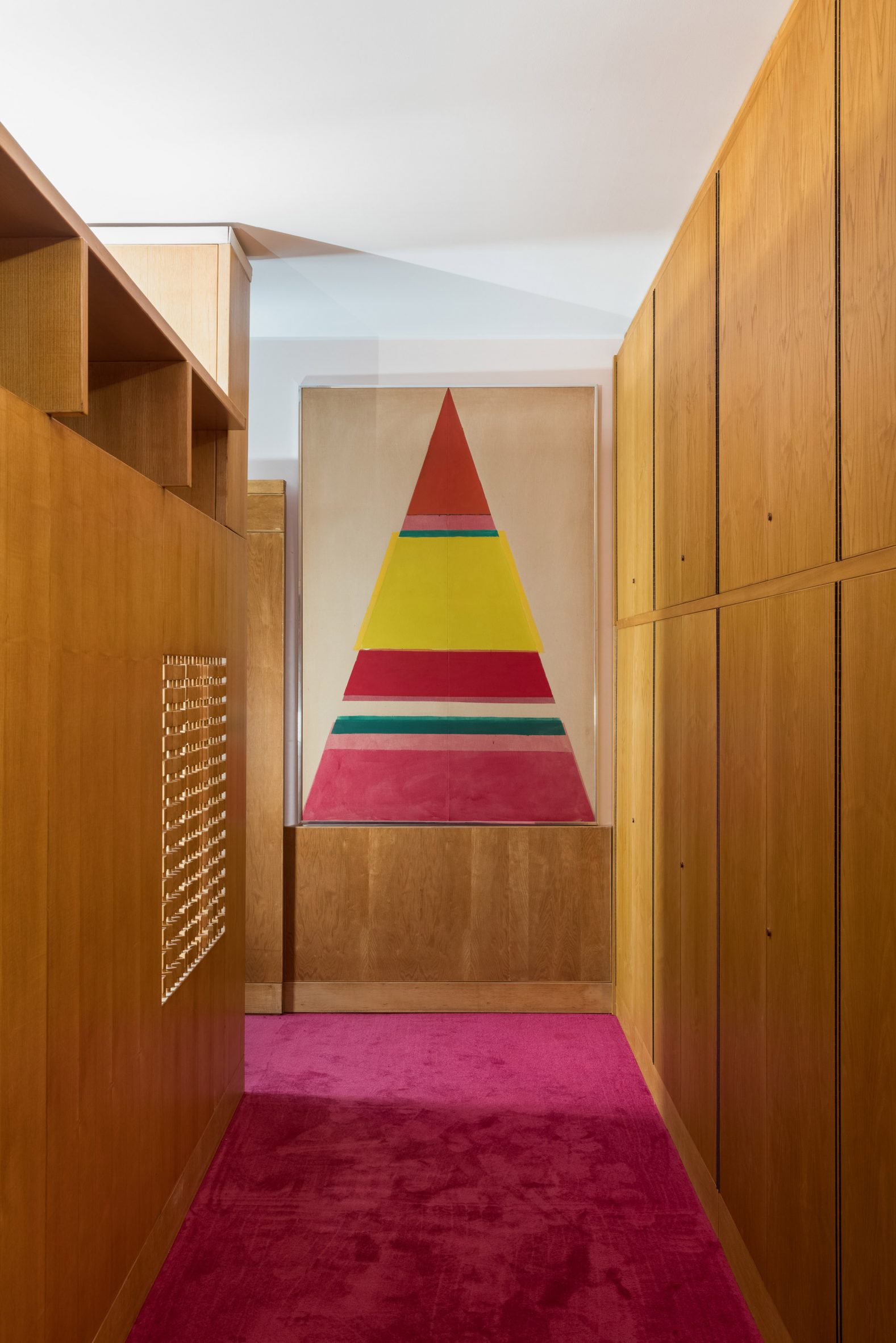
Wood-panelled corridor with magenta carpet and artwork in living room designed by Ettore Sottsass and reconstructed at Triennale di Milano, Italy
Bold magenta-pink carpet runs throughout the room

Winding around the top of the structure are a few built-in shelves where artworks and other ornaments can be displayed. There are also a couple of square openings inset with beaded wooden screens.

Beyond the enclosure, the rest of the room has been kept largely open plan as Sottsass wanted it to have a piazza-like layout that allowed inhabitants to roam and interact freely.

As a result, furniture items like storage cupboards and desks are pushed to the room's periphery.

Throughout 2022, a series of Sottsass-focused exhibitions will run alongside the Casa Lana display, put together by Triennale di Milano curator Marco Sammicheli and designed by Christoph Radl, who was a frequent collaborator of the Memphis Group founder.

The current show, Struttura e Colore, uses paintings, photographs and drawings to examine Sottsass's interest in daily rituals and domestic spaces.

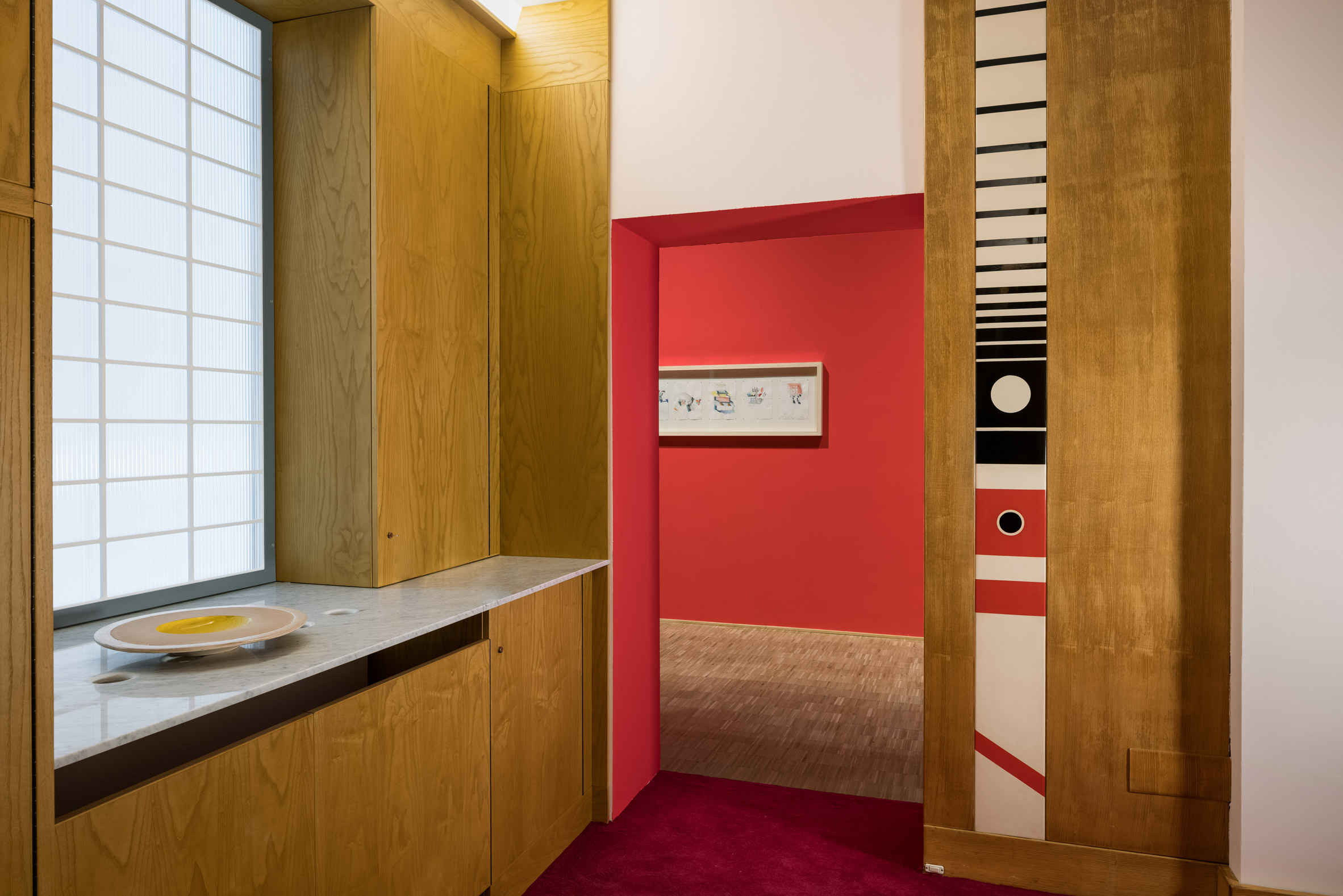
Entrance to Ettore Sottsass installation at Triennale di Milano with built-in wooden storage and marble counter
A marble-topped counter provides storage next to the entrance

Il Calcolo, which is set to run from May to November, will look at how the designer's work intersected with technology.

The third show, La Parola, will kick off in December 2022 and delve into the narrative and literary significance of Sottsass's designs.

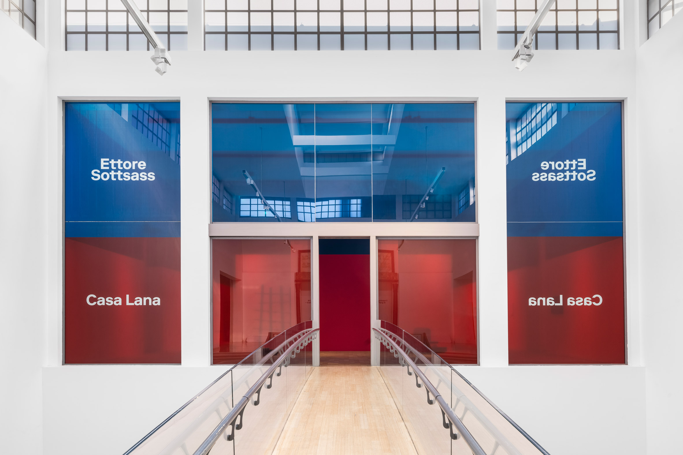
Entrance to Casa Lana: Ettore Sottsass exhibition at Triennale di Milano, Italy with blue and red resin panels
The installation is on Triennale di Milano's first floor

Other major shows taking place at the museum this year include the 23rd edition of the Triennale Milano International Exhibition.

Under the theme Unknown Unknowns: An Introduction to Mysteries, it will see scientists, artists and intellectuals from across the globe collaborate to answer complex questions about human existence.

The photography is by Gianluca Di Ioia.

The post Triennale di Milano reconstructs room from Ettore Sottsass's Casa Lana appeared first on Dezeen.


from Dezeen https://ift.tt/zBIvUXw

Powerhouse Company and IND design looping Corten-steel broadcasting tower

Broadcasting tower with walkable roof

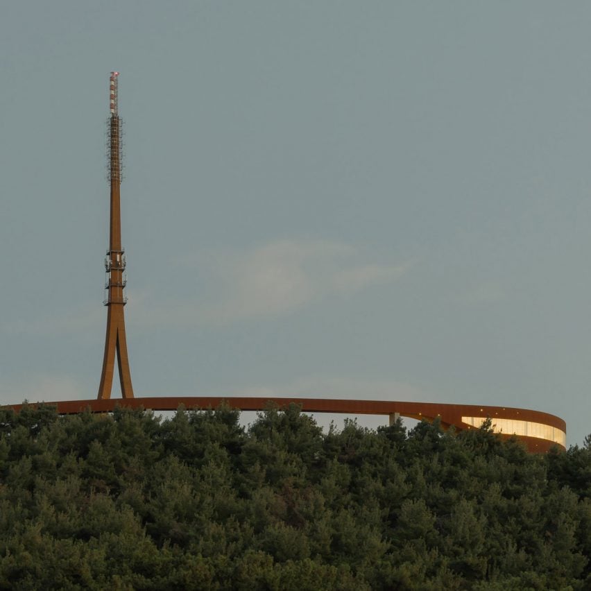
Dutch studios Powerhouse Company and IND have revealed the design for the Çanakkale Antenna Tower, a broadcasting and observation tower made from Corten steel to contrast a surrounding forest.

Powerhouse Company and IND designed the looping building, which will be located in Çanakkale, Turkey, to form a continuation of an existing forest path. As well as a multimedia and telecom broadcast antenna, it will also house exhibition spaces, recreational facilities and an observation deck.

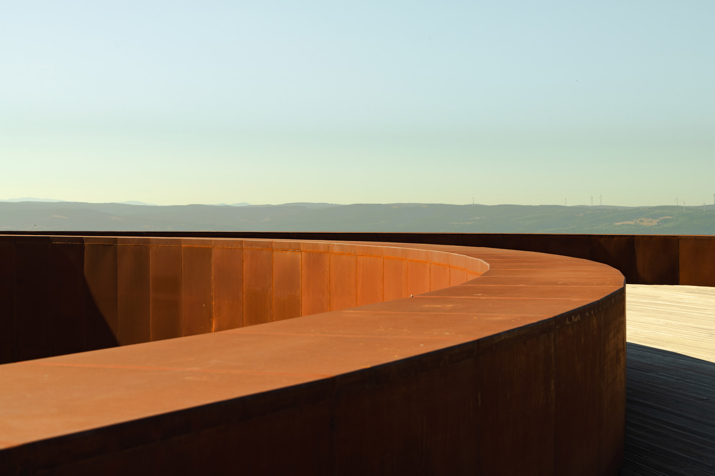
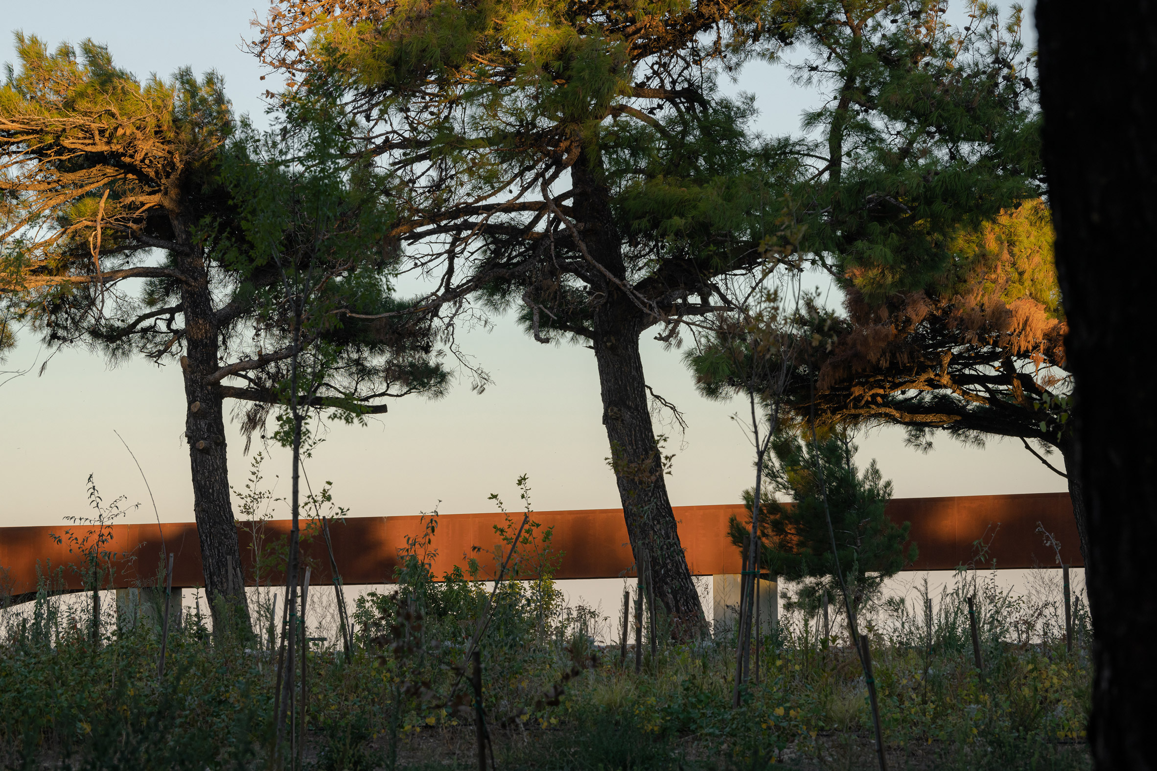
View of red Corten-steel antenna tower
The colour of the broadcasting tower contrasts against the forest

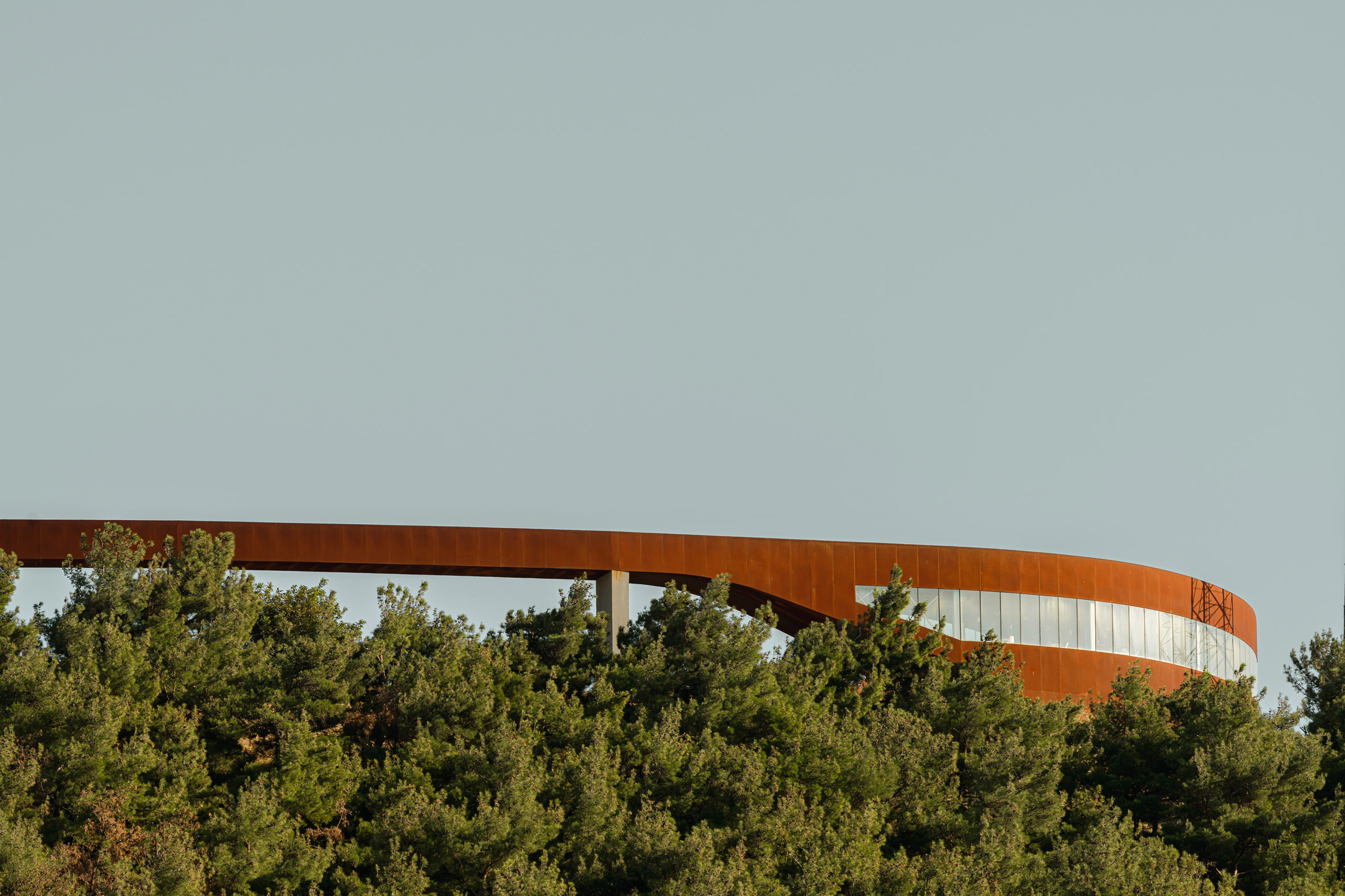
The 3,000-square-metre building, which is currently under construction, will be made from Corten steel. The studios chose the material for both its colour and ability to withstand the weather.

"The project's principal material is Corten steel for its suitability for outdoor sculpture and its natural rust color," Powerhouse Company associate architect Albert Takashi Richters told Dezeen.

Red antenna tower and observation deck in Turkey
The building has a walkable roof

"Corten or weathering steel is a type of steel alloy that develops a stable, rust-like appearance after exposure to the weather," Richters added.

"This finish forms a protective layer that prevents atmospheric corrosion. Its rustic and antique appearance offers a wonderful contrast with the green forest and reflects the long history of Çanakkale."

Broadcasting tower made from Corten steel
Corten steel was chosen for its colour and sturdiness

The tower's site was partly occupied by a decommissioned military complex, which meant it had strict plot boundaries that helped inform the curving path of the design.

Çanakkale Antenna Tower's public areas will be separated from the technical areas, which will be located in a concrete underground bunker. The looping tower will have a walkable roof, which continues the forest path and will be made from wood.

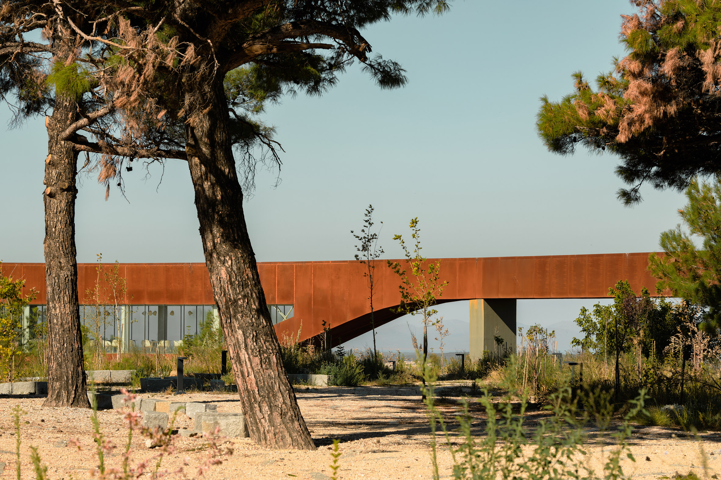
By elevating much of the structure, the studios aim to create a building that will allow the landscape to "flow uninterruptedly" and leave a minimal footprint.

"The beauty of the site, a hilltop forest facing the Dardanelles Strait, inspired the creation of a spatial experience that is intimately connected with the landscape – far removed from a conventional antenna tower design," Richters explained.

Walkable roof of Canakkale Antenna Tower
Çanakkale Antenna Tower is designed as a continuation of a forest path

Visitors to the building will walk along the forest path, which merges into the visitor centre as the building rises from the ground before "shooting" up towards the sky in the form of a tower.

"It was a challenge to combine a public program with a (potentially hazardous) radio tower, yet we solved the puzzle with a single gesture," said Powerhouse Company co-founder Nanne de Ru.

Trees surround Canakkale Antenna Tower by Powerhouse Company and IND
The tower will also function as a viewpoint

Powerhouse Company and IND won an international competition to design the tower, beating studios including Snøhetta with Özer/Ürger Architects and Battle Mccarthy, who took second prize, and AL_A, which came in third.

Other recent projects by Powerhouse Company include the first mass-timber university building in the Netherlands and a reception building topped with a red circular walking trail in Chengdu, China.

The images are by Sebastian van Damme.

The post Powerhouse Company and IND design looping Corten-steel broadcasting tower appeared first on Dezeen.


from Dezeen https://ift.tt/s6vg4yC

Agrotopia is a giant rooftop greenhouse built atop an existing building

Agrotopia greenhouse by Meta Architectuurbureau and Van Bergen Kolpa Architecten

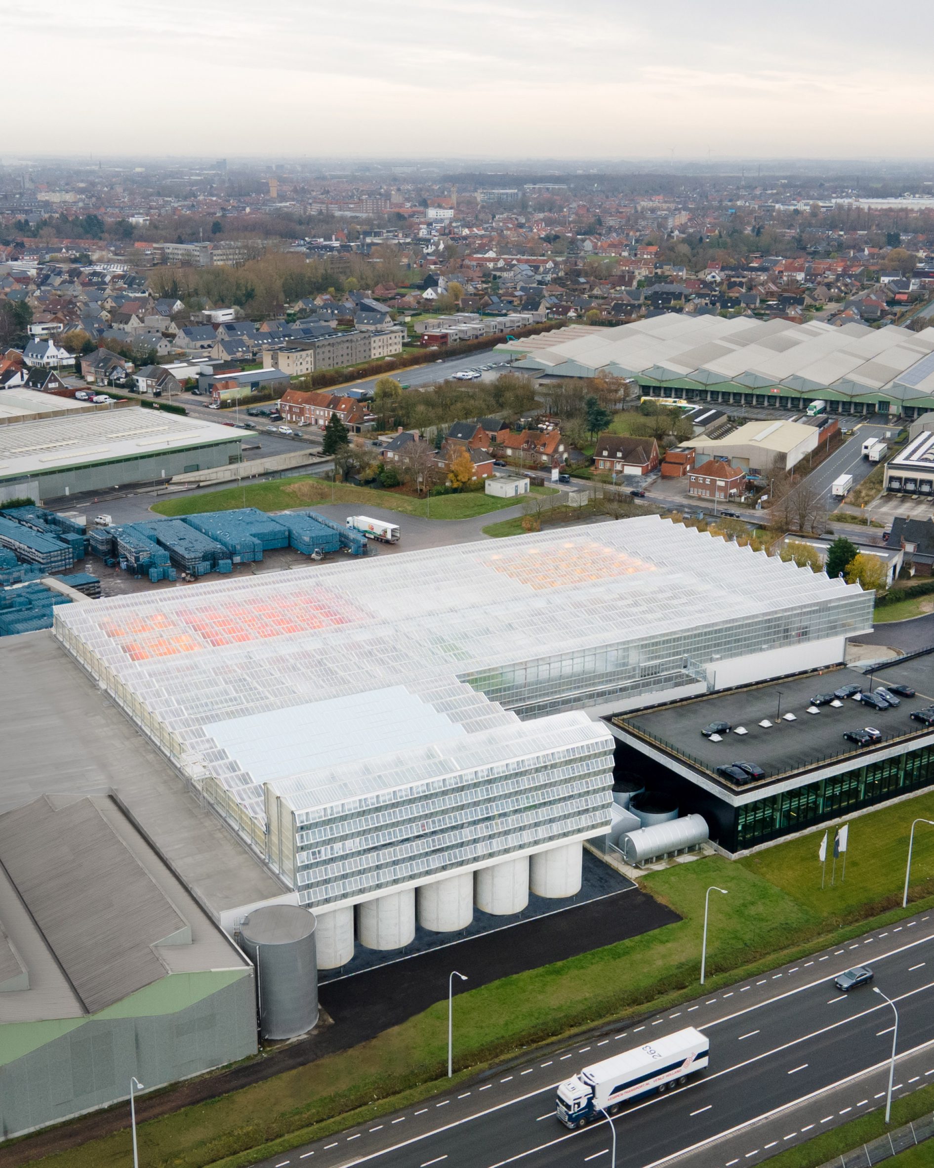
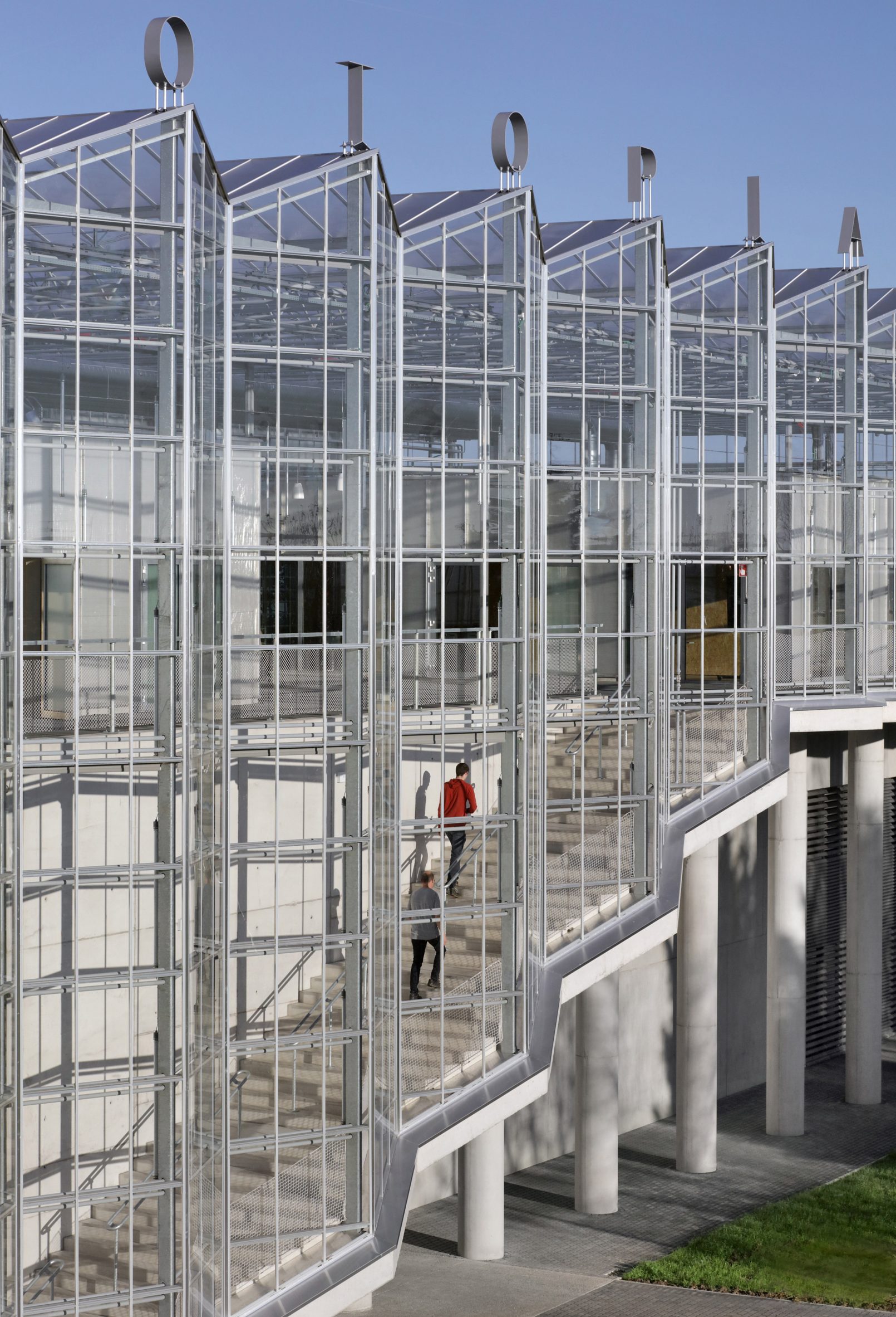
Meta Architectuurbureau and Van Bergen Kolpa Architecten have designed Agrotopia, a greenhouse in Belgium that was added to the roof of an agricultural market to create an urban food production centre.

Located in the city of Roeselare, Agrotopia is Europe's largest public building for urban food production and will be used to both farm food and educate the public about agriculture.

The 9,500-square-metre greenhouse was built on top of the REO Veiling agricultural auction market. It was commissioned by REO Veiling together with Flemish farming and horticulture research institute Inagro.

Aerial view of giant Agrotopia greenhouse on the roof of the REO Veiling building in Roeselare
Agrotopia spans 9,500 square metres of rooftop in the Belgian city of Roeselare

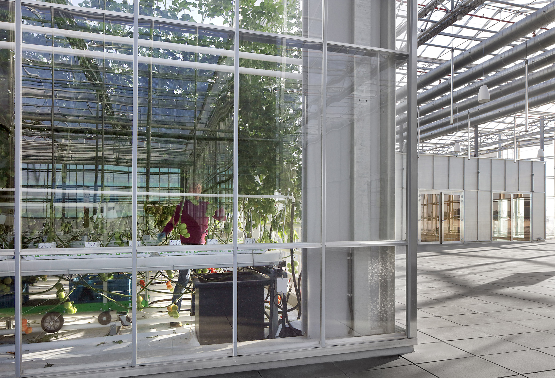
Inside, Agrotopia is divided into four climate zones to allow it to grow a number of different fruits and vegetables, and the building also has research facilities and an educational trail for the general public.

The architects created box-in-box spaces within the warm and humid greenhouse so that the areas dedicated to research and education would have a more suitable climate for the people working in the building.

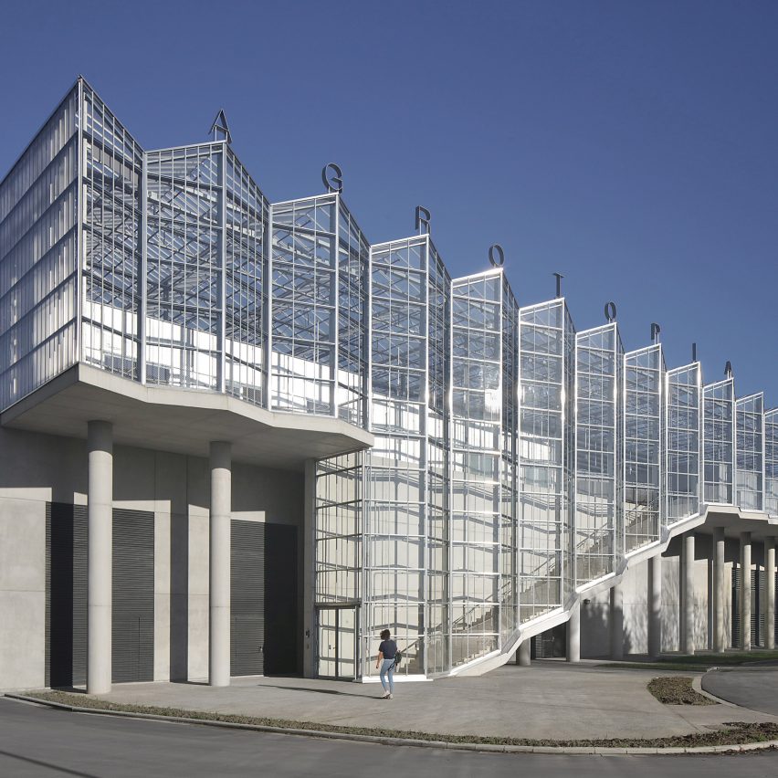
From the outside, Agrotopia appears as one cohesive greenhouse that Meta Architectuurbureau describes as "a proud, transparent sculpture of steel and glass".

Giant glass and steel structure with signage above it spelling out Agrotopia
A wide staircase leads visitors into Agrotopia

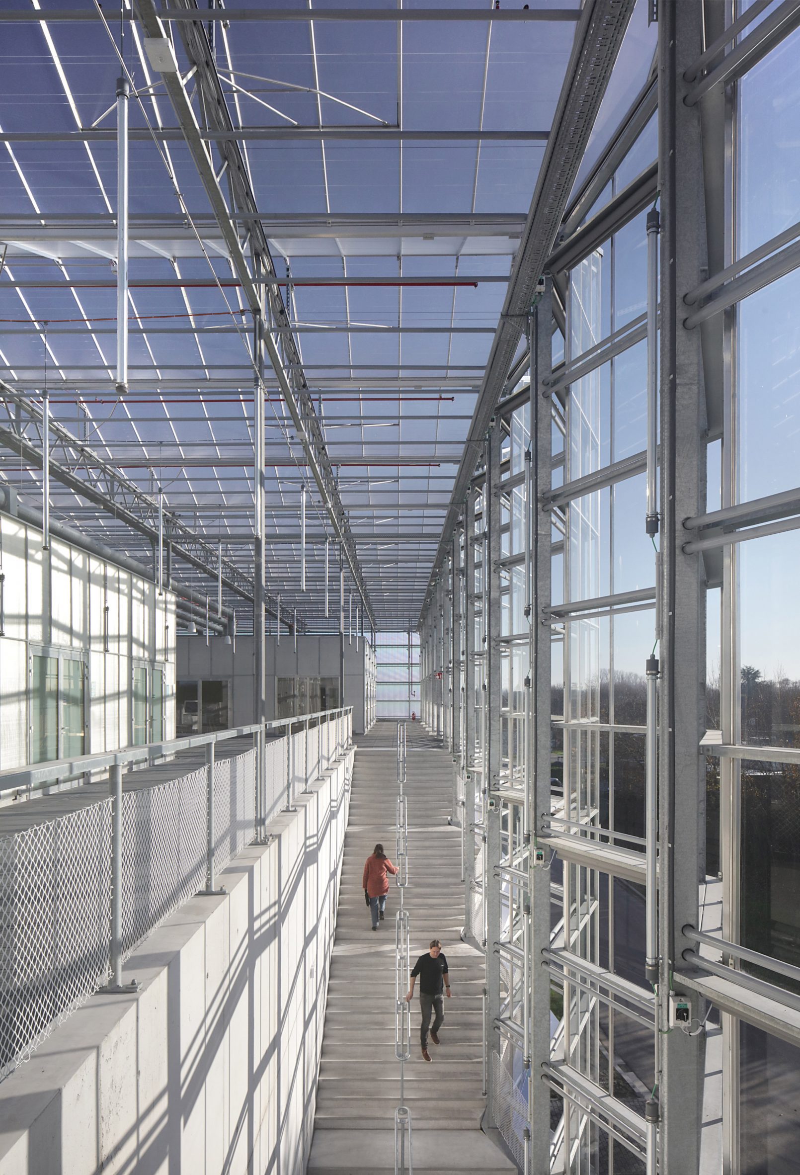
The entrance side of the building has a facade that is vertically faceted to form bay windows with a wide staircase running along the length of the building.

This leads up to the Urban Horticulture Square, which forms the starting point for visitors to the centre.

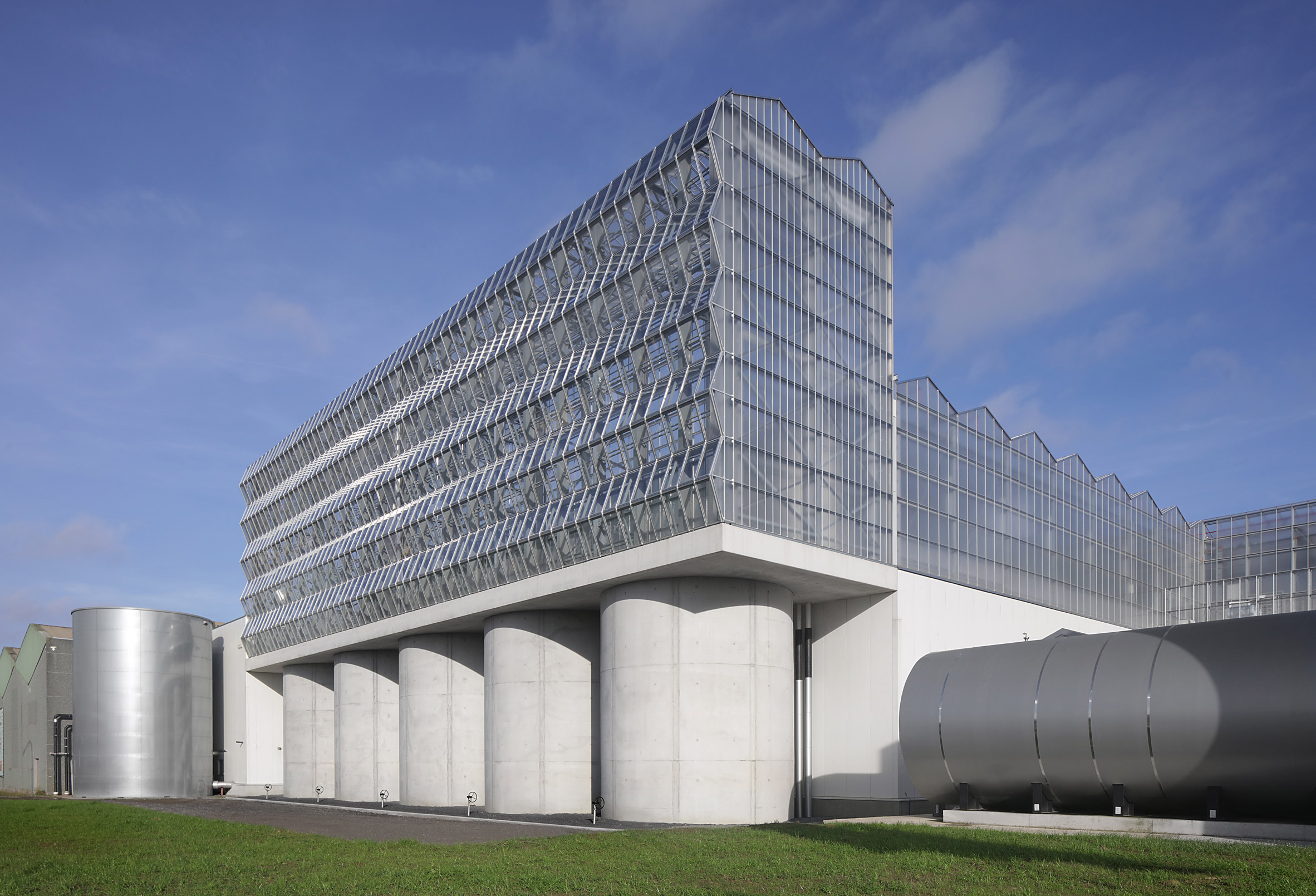
The greenhouse also features a double-height conservatory that was designed to support vertical cultivation. This section has a horizontal faceted construction that the studio says guarantees good sunlight for the crops while also creating a reflection-free view at ground level.

Faceted greenhouse structure sits on top of concrete silos
A double-height section of the greenhouse allows for vertical horticulture

At the foot of this conservatory are silos storing rainwater from the roof, which is used to irrigate the greenhouse.

Run-off from irrigation is also recycled and reused within the greenhouse, while heating comes from residual heat from a nearby waste incinerator, creating what the architects call a "circular symbiosis with the city".

"Together with the clients, Inagro and REO Veiling, we have realised an ambitious building with numerous innovations," said Van Bergen Kolpa Architects director Jago van Bergen.

"A single building featuring different climate zones, sustainable and economical use of space, research into leafy vegetables and fruit vegetables in the city, opening up the rooftop to a public function, circular use of space and energy, to name but a few."

Inside Agrotopia greenhouse showing visitors climbing the wide entrance staircase
The greenhouse contains both cultivation facilities and spaces for public education

Meta Architectuurbureau managing partner Niklaas Deboutte described Agrotopia as a test case for large urban agriculture projects.

"Building a greenhouse atop an existing building has never been done before on this scale and it presented many opportunities and challenges," said Deboutte.

"The integration of the steel greenhouse with the concrete substructure and complex installations has resulted in a true public building with exceptional architectural quality for the city of Roeselare."

Glass and steel boxes within the Agrotopia greenhouse separating growing from education and research functions
The architects designed Agrotopia as a "box-in-a-box" to separate out growing and visitor spaces

Agrotopia is part of the Flemish Government Architect's Pilot Projects for a Productive Landscape (PPPL), a programme that funds innovative building projects that meet social challenges.

Van Bergan Kolpa is a Dutch studio that specialises in architecture for food, while Meta Architectuurbureau is a Belgian studio whose past work has included the Bruges Meeting and Convention Centre, with Eduardo Souto de Moura.

The photography is by Filip Dujardin.

The post Agrotopia is a giant rooftop greenhouse built atop an existing building appeared first on Dezeen.


from Dezeen https://ift.tt/DQgS9C5