Sunday, 31 May 2020

Tracks Architectes creates colonnaded cinema in former French convent

Cinema de Riot by architecture studio Tracks

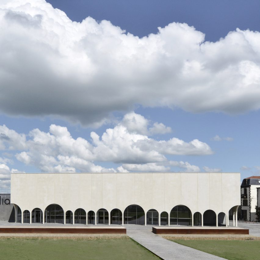
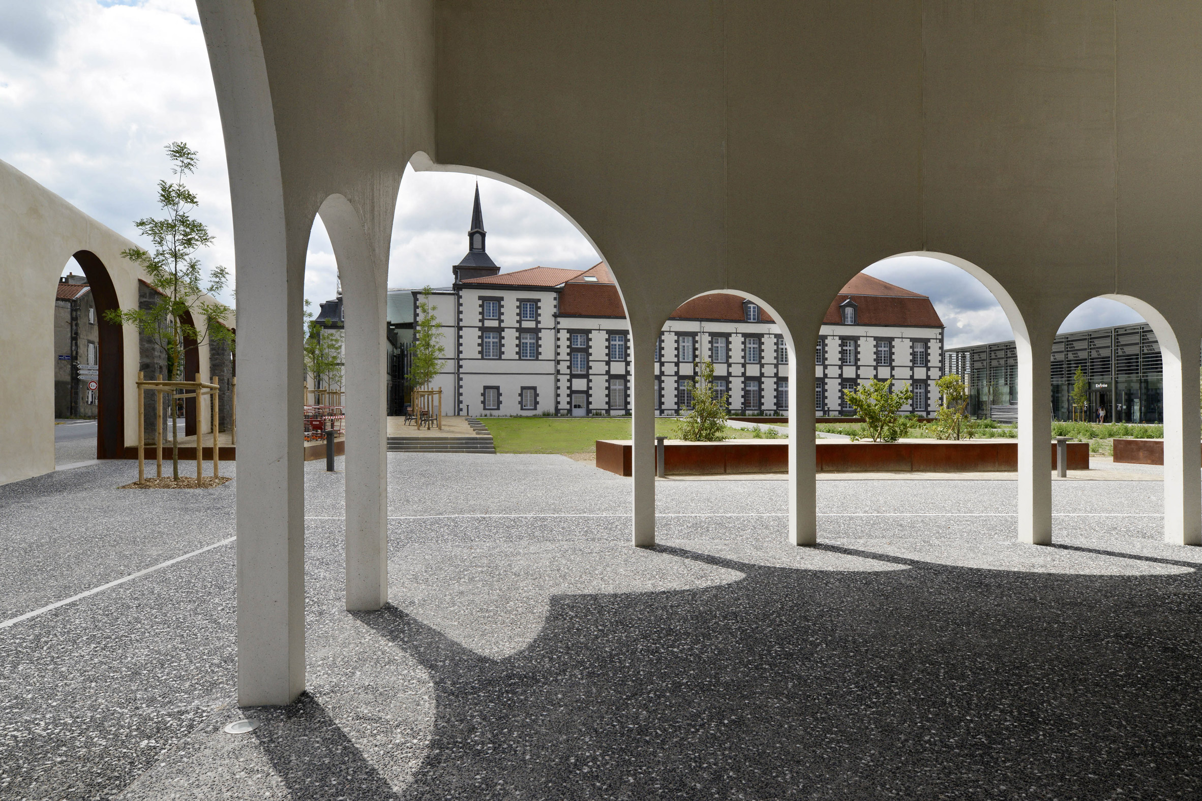
French studio Tracks Architectes has built a cinema fronted by an irregular arched colonnade in the grounds of a former convent in the town of Riom, central France.

Arcadia Cinema at Riom forms part of the conversion of the Redemptoristine convent into the Jardin de la Culture cultural centre near the historic centre of the town.

Tracks Architectes designed the multi-screen cinema as the first stage of the conversion, which will also include a multimedia library built alongside it and a music school built in the former convent building and an exhibition hall in the chapel.
Cinema de Riot by architecture studio Tracks

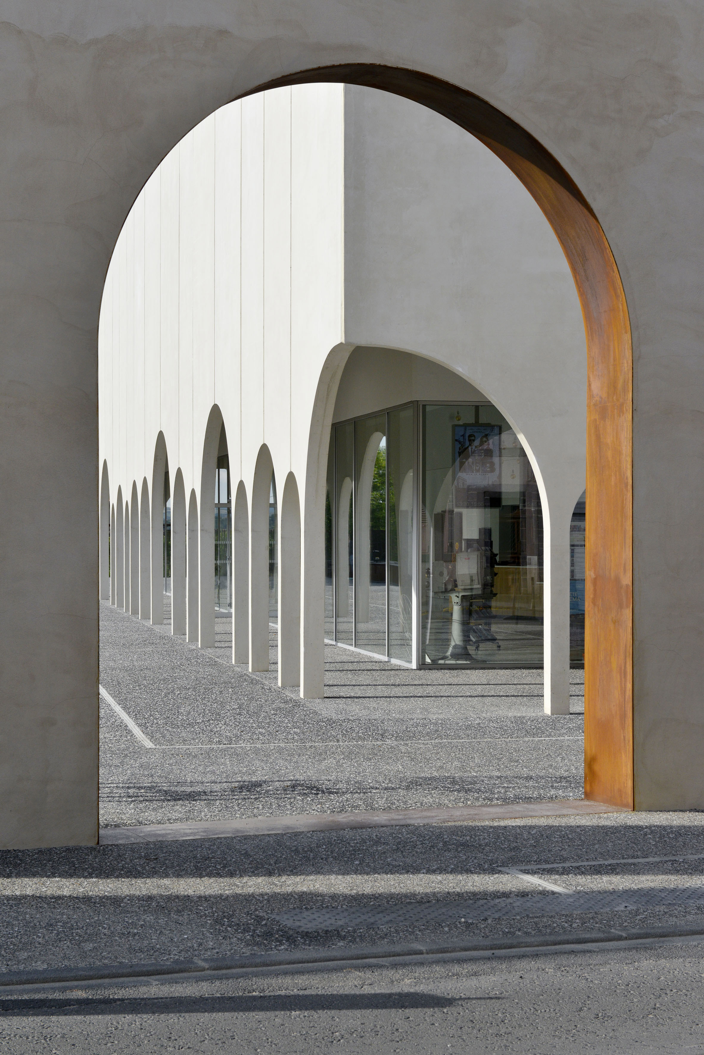
The cinema's distinctive facade was informed by a wall broken with seven arches that encloses the former convent and stands next to the cinema.

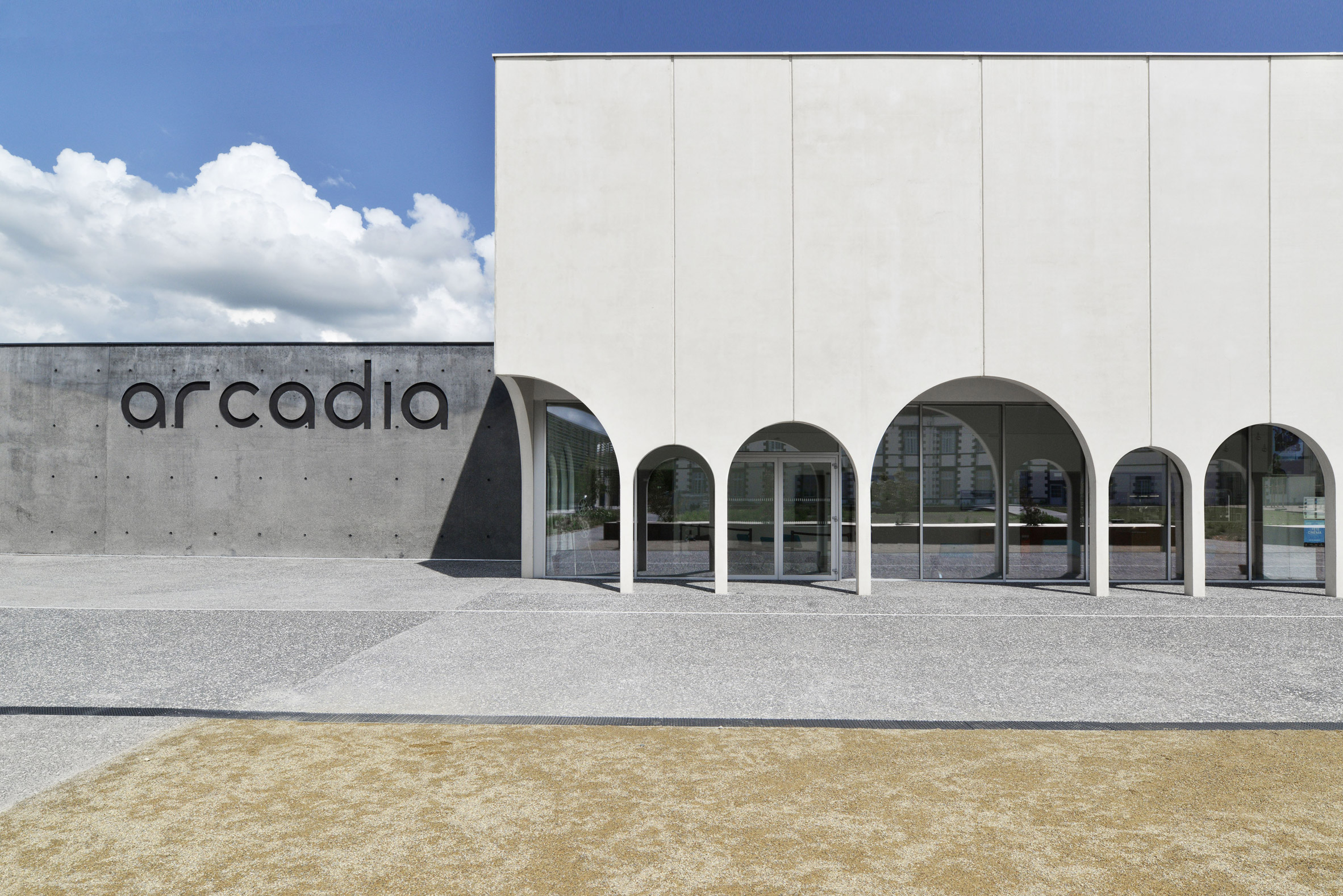
However, unlike the regular sized arches that break the wall, the arched openings that support the cinema's facade are three different sizes arranged in an irregular pattern. To add to the irregularity the arches turn the corner at the building's edges to create a larger opening.
Cinema de Riot by architecture studio Tracks

"The arches were inspired by the rich history of the site of the convent of the Redemptoristines," explained Moïse Boucherie, partner at Tracks.

"We borrowed this element of architectural vocabulary from existing structures and then gave it a contemporary interpretation," he told Dezeen.
Cinema de Riot by architecture studio Tracks

Tracks Architectes created the sheltered space in front of the building to open up the cinema to the public and the garden that forms part of the cultural centre.

"The design concept was to create a building that was open toward the green spaces of the garden of culture and the existing convent," continued Boucherie.

"Indeed a cinema programme imposes dark rooms and we tried to create a generously open and welcoming space functioning at night as 'light signal'."
Cinema de Riot by architecture studio Tracks

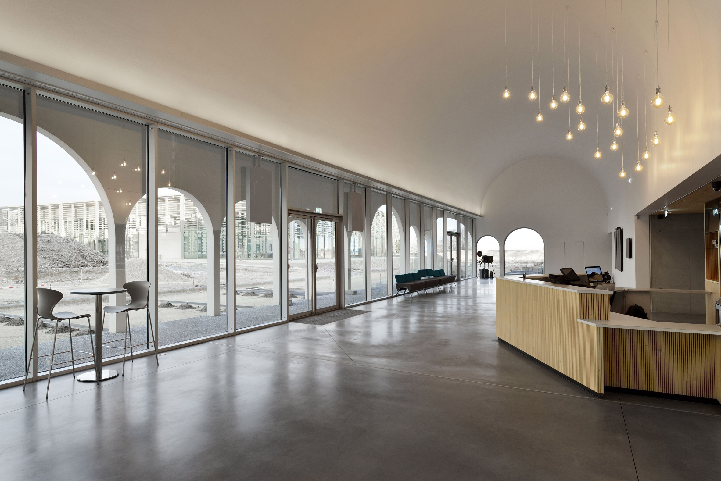
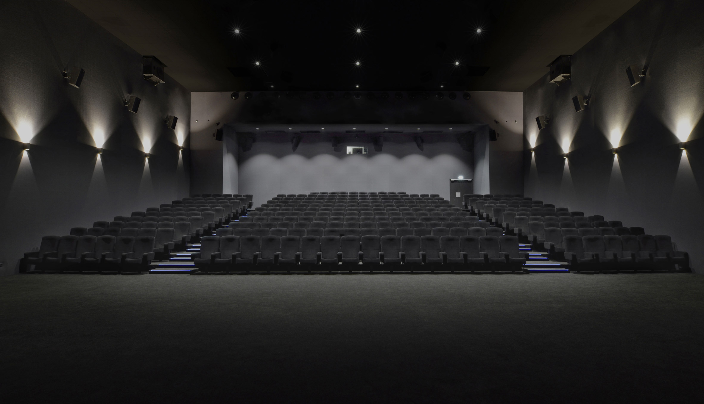
Beyond the colonnade is a large barrel-vault shaped reception hall that leads to three cinema screens and a conference room.

In total, the cinema's have 543 seats, while the conference facility seats 112.
Cinema de Riot by architecture studio Tracks

Paris-based Tracks Architectes is led by partners Boucherie and Jérémy Griffon. The studio previously designed a honey-coloured in the village of village of Perthes-en-Gatinais in France.

Photography is by Guillaume Amat.

The post Tracks Architectes creates colonnaded cinema in former French convent appeared first on Dezeen.


from Dezeen https://ift.tt/2BkWBZ3

Christo dies aged 84

Breaking news: Christo, the Bulgarian artist famous for wrapping buildings, has died of natural causes at the age of 84.

Christo Vladimirov Javacheff, known as Christo, died in his New York City apartment on 31 May.

The artist is known for the large-scale installations that he started creating with his late wife Jeanne-Claude in the 1960s.

They include wrapping the German Reichstag in Berlin with 100,000 square metres of silver fabric, which was tied to the building for two weeks using 15.6 kilometres of blue rope. They also covered a medieval tower and a fountain in Spoleto, Italy in 1968, a 250-metre section of the Aurelian Walls in Rome in 1974, and the entirety of the Pont Neuf bridge in Paris in 1985.

"Christo lived his life to the fullest, not only dreaming up what seemed impossible but realising it," said a statement from Christo's office.

"Christo and Jeanne-Claude's artwork brought people together in shared experiences across the globe, and their work lives on in our hearts and memories."

Christo continued to produce installations following his wife's death on 18 November 2009. In 2018, The London Mastaba was installed on the Serpentine Lake in London, which marked their first major UK sculpture.

Composed of a vast stack of brightly coloured barrels, the structure was also the culmination of over 60 years of working with stacked barrels.

His latest project, L'Arc de Triomphe, Wrapped, was to envelop Paris' Arc de Triomphe in 25,000 square metres of silvery recyclable fabric and 7,000 metres of red rope. Christo's office said it will continue to produce the work with the ambition to complete it next year.

"Christo and Jeanne-Claude have always made clear that their artworks in progress be continued after their deaths," it explained. "Per Christo's wishes, 'L'Arc de Triomphe, Wrapped' in Paris, France, is still on track for September 18 – October 3, 2021."

An exhibition about Christo and Jeanne-Claude's work will also open at the Centre Georges Pompidou in Paris on 1 July.

Christo was born on 13 June 1935, the same day as Jeanne-Claude, in Gabrovo, Bulgaria. He told his life story and discussed some of his best-known works in an exclusive two-part video filmed with Dezeen last year.
"I was born in Bulgaria and I escaped from the communist country to the west on 10 January 1957," he explained in one of the movies. "I met Jeanne-Claude in November 1958 and we together fell in love."

"We lived in Paris in between 58 and 64. I was so poor, I had no studio and I was living in one room. I started working with little cans, tin cans of industrial paint. From the cans of the smaller size, I moved to the smaller sized barrels. I rented a garage outside of Paris when I started working with real barrels."

Photo is by Dezeen.

The post Christo dies aged 84 appeared first on Dezeen.


from Dezeen https://ift.tt/2TWmXqG

Studio Dwell stacks black volume onto brick structure to form top-heavy Hermitage Residence

Hermitage Residence by Studio Dwell

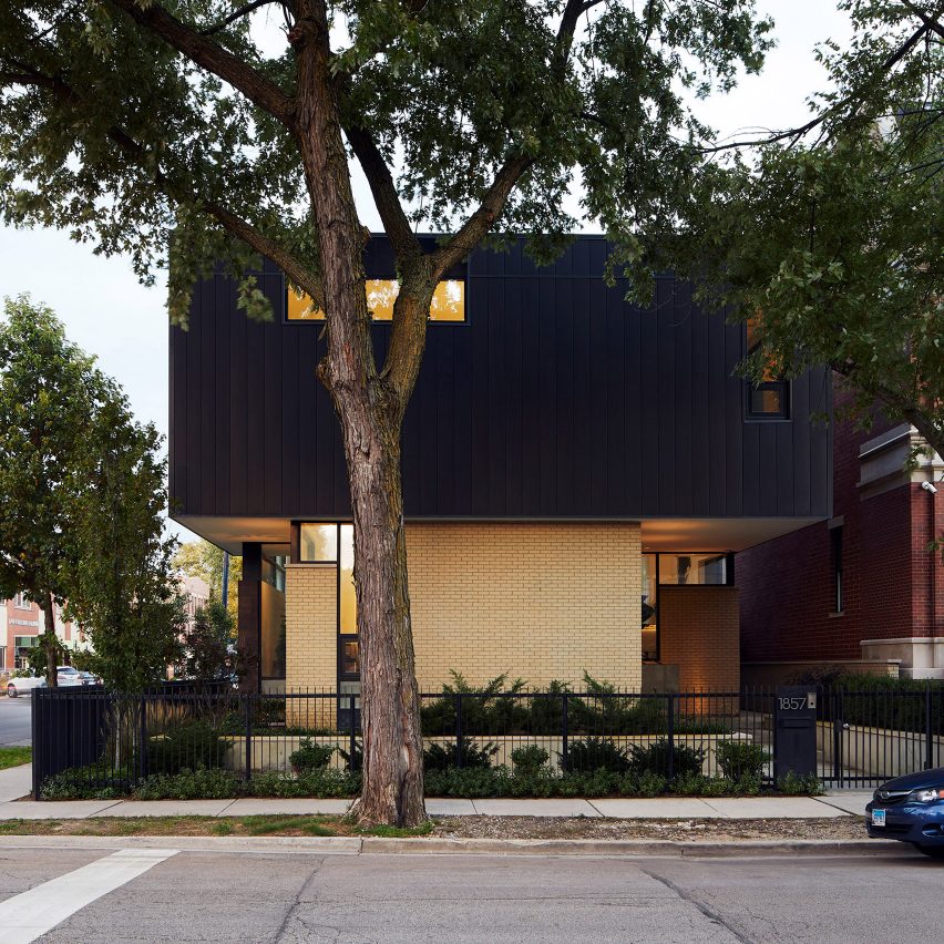
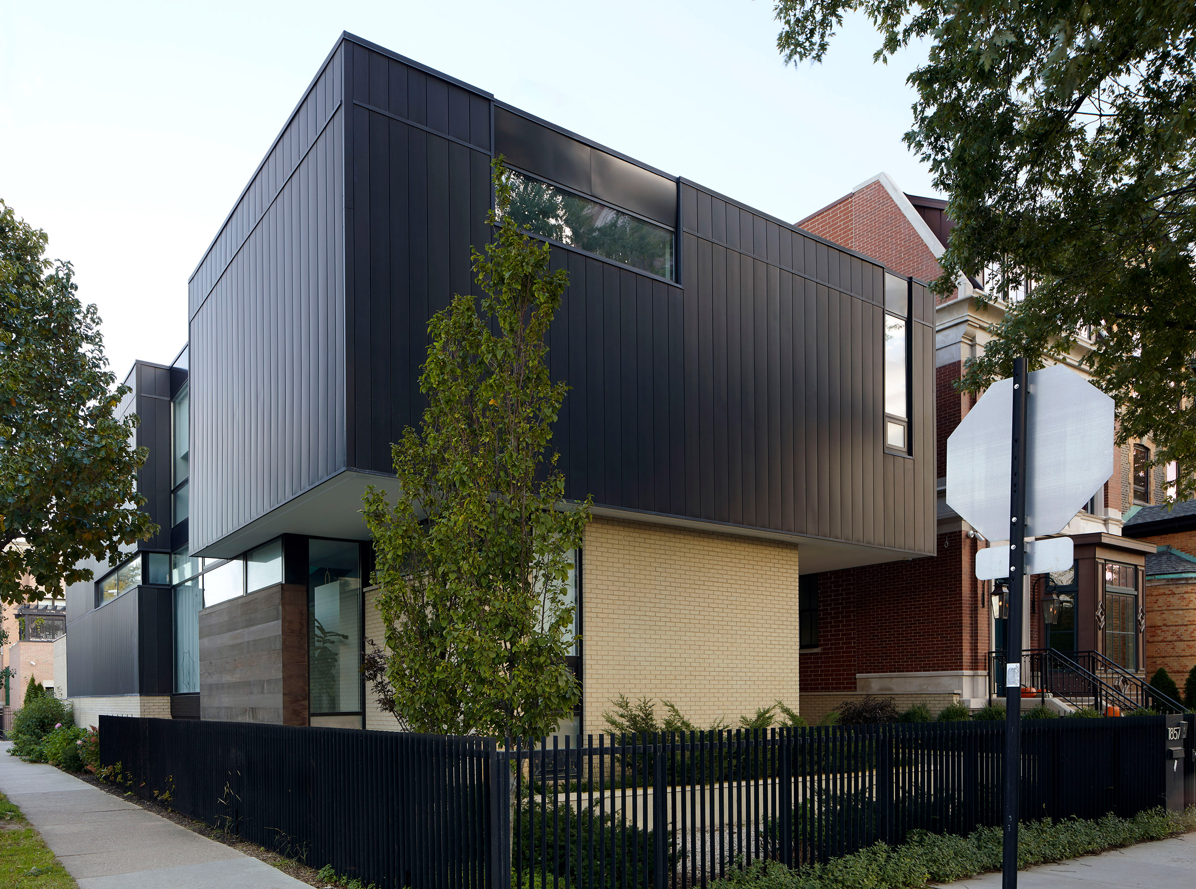
US architecture firm Studio Dwell has stacked a rectangular volume clad with black zinc on top of a pale brick structure to form this residence on a corner lot in Chicago.

Hermitage Residence by Studio Dwell

Hermitage Residence is located in the Bucktown neighbourhood of Chicago on a residential and commercial street. The clients, a professional couple, asked local firm Studio Dwell for a house with privacy and natural light.

In order to withdraw the 6,800-square-foot (603-square-metre) home from the busy road, the studio installed raised plant beds around its perimeter which reduced the area the brick volume could occupy.

Hermitage Residence by Studio Dwell

An overhanging structure clad with black zinc is stacked on top of the brick structure to form the second floor.

"In order to provide a buffer from the busy street corner to the home, a deep landscaped relief region was established by drastically carving back the first floor of the residence," the studio said.

Hermitage Residence by Studio Dwell

"This was further expressed by cladding the first floor in this area with a lighter brick, which produces the effect of a lighter volume supporting a heavier cantilevered volume above."

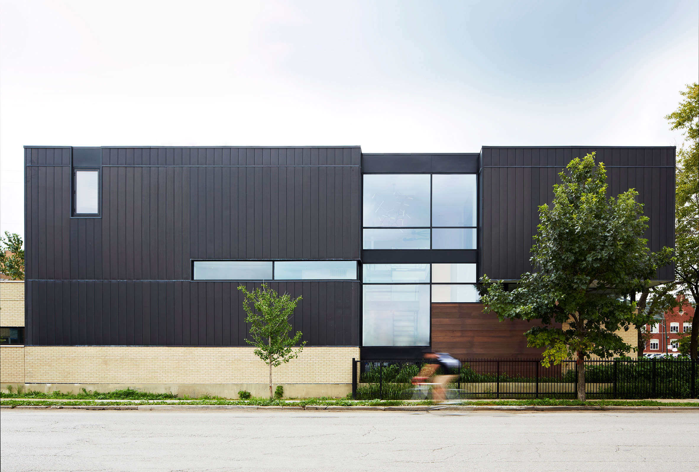
Rectangular windows of various sizes are cut into each of the structures and outlined with black frames that contrast against the pale bricks.

Hermitage Residence by Studio Dwell

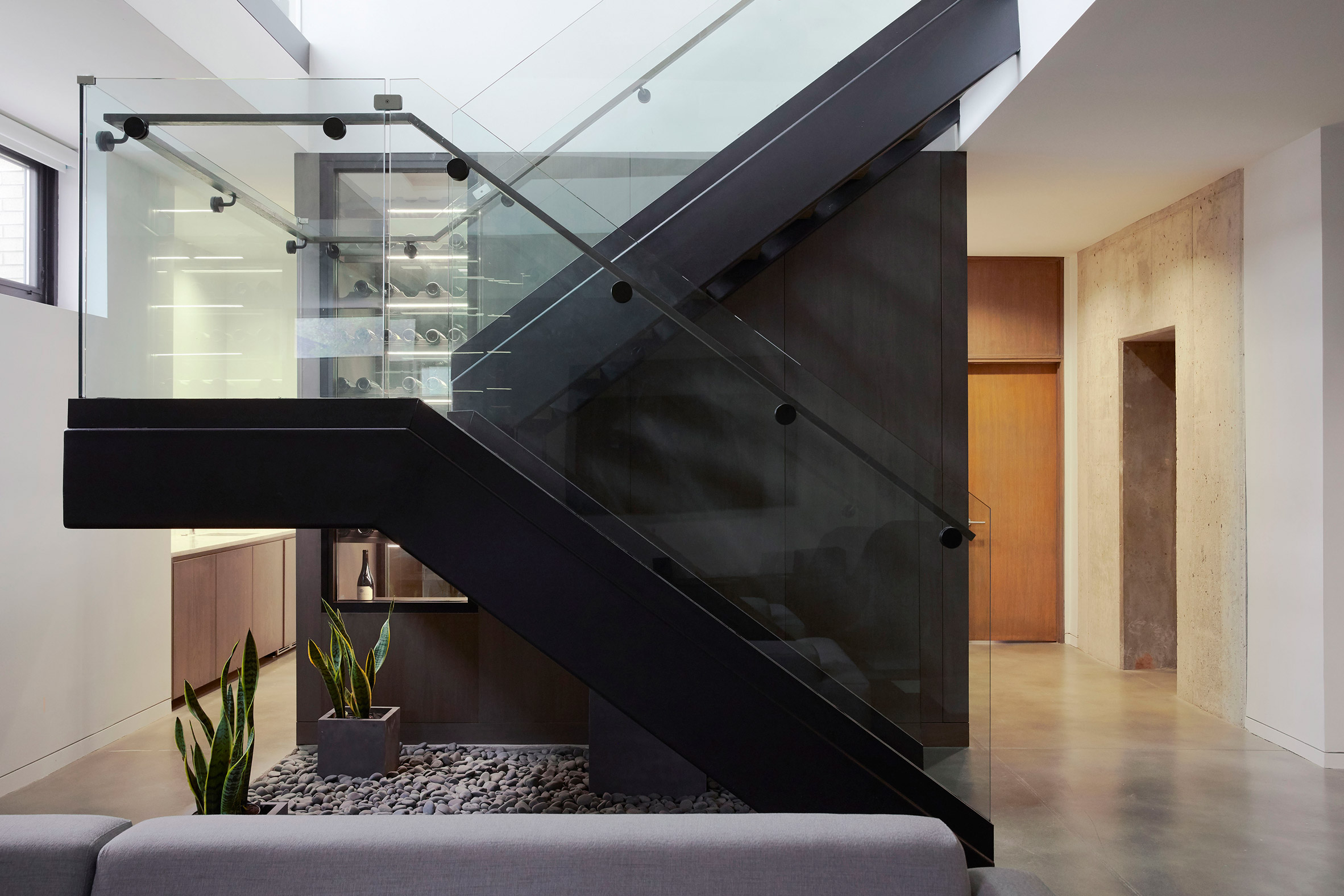
A grouping of windows on the south elevation flood natural light into the interiors and offer a glimpse of a glass and metal staircase situated in the centre of the house.

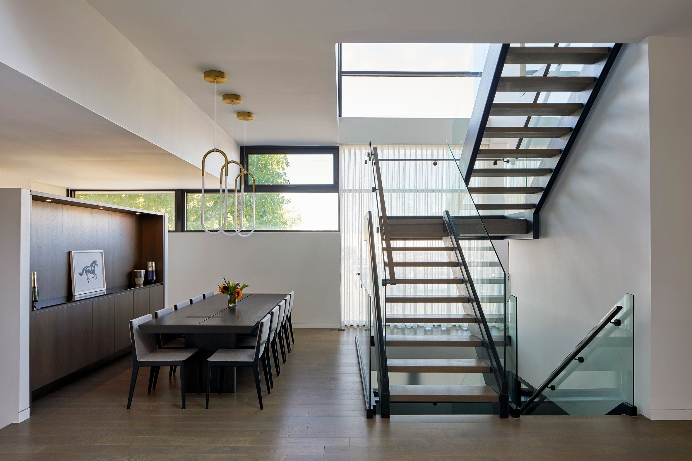
Studio Dwell designed the staircase to act as the "epicentre" of the house. It comprises a black steel stringer that is paired with a tempered glass enclosure, steel railing and wood steps. A bed of rocks and plants form a small garden underneath the geometric structure.

Hermitage Residence by Studio Dwell

"The epicentre of the house is the cantilevered glass and steel staircase that unites the floors," the studio added.

Main living areas, the kitchen and a guest room occupy the ground floor, while the basement houses recreational space. Four bedrooms with adjoining bathrooms are located on the top floor.

Hermitage Residence by Studio Dwell

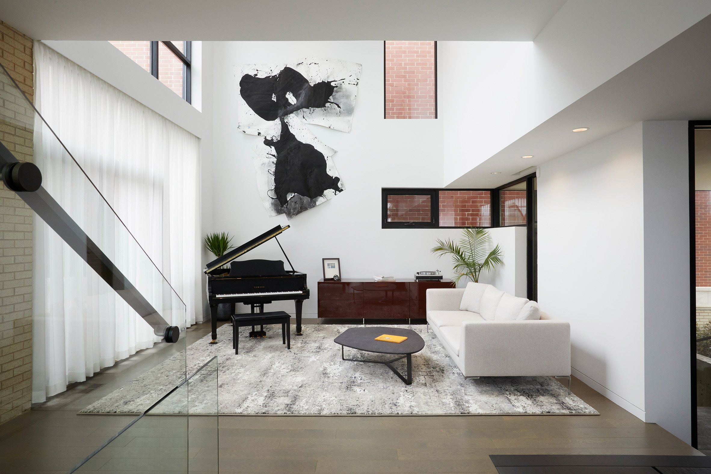
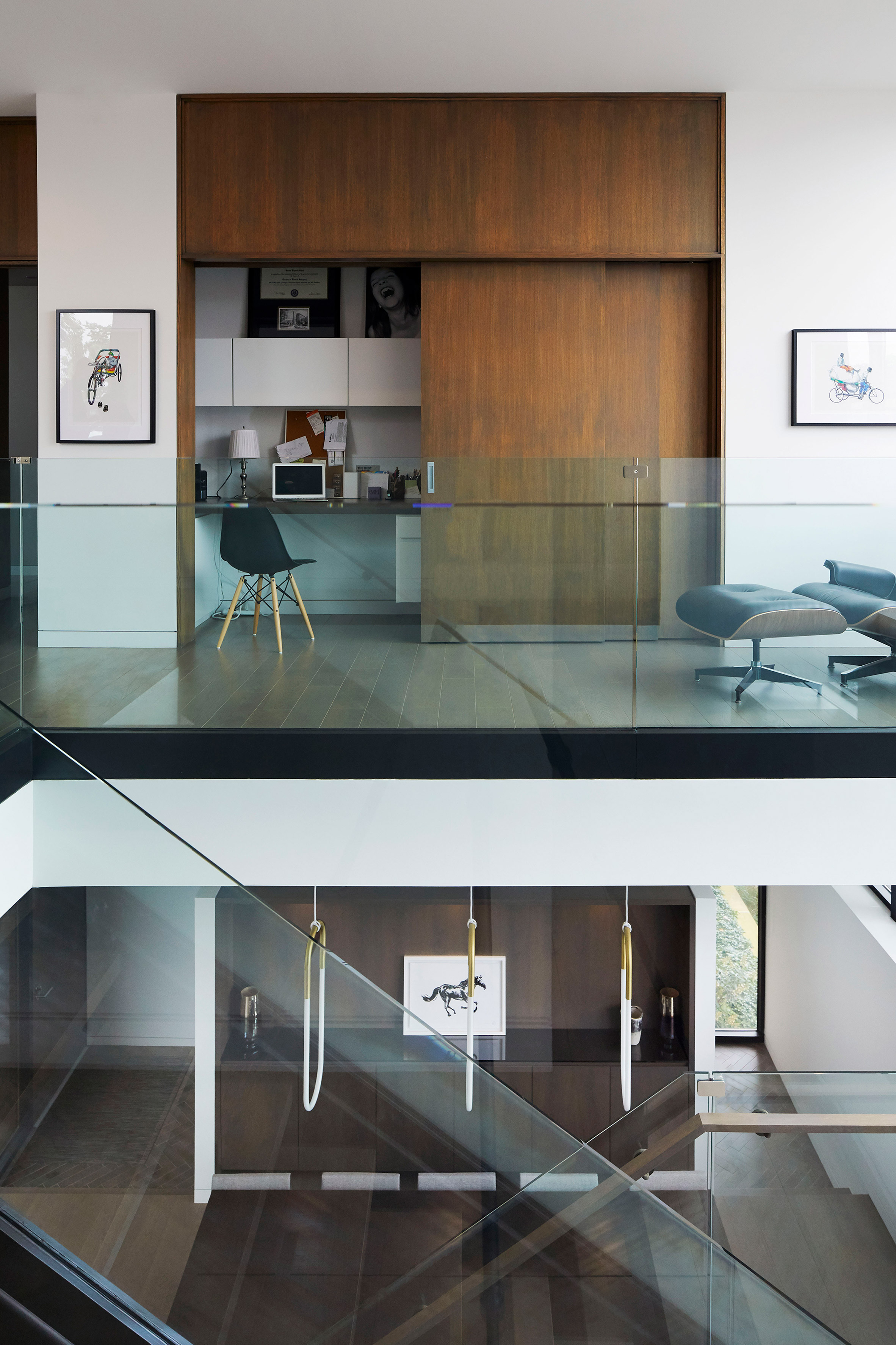
All of the walls are painted white and the floors are covered with hardwood. A number of wood accents throughout the houses contrast against the plain walls, including a custom-built teak bench in the master bathroom, a row of cabinets in the dining room and a built-in study unit.

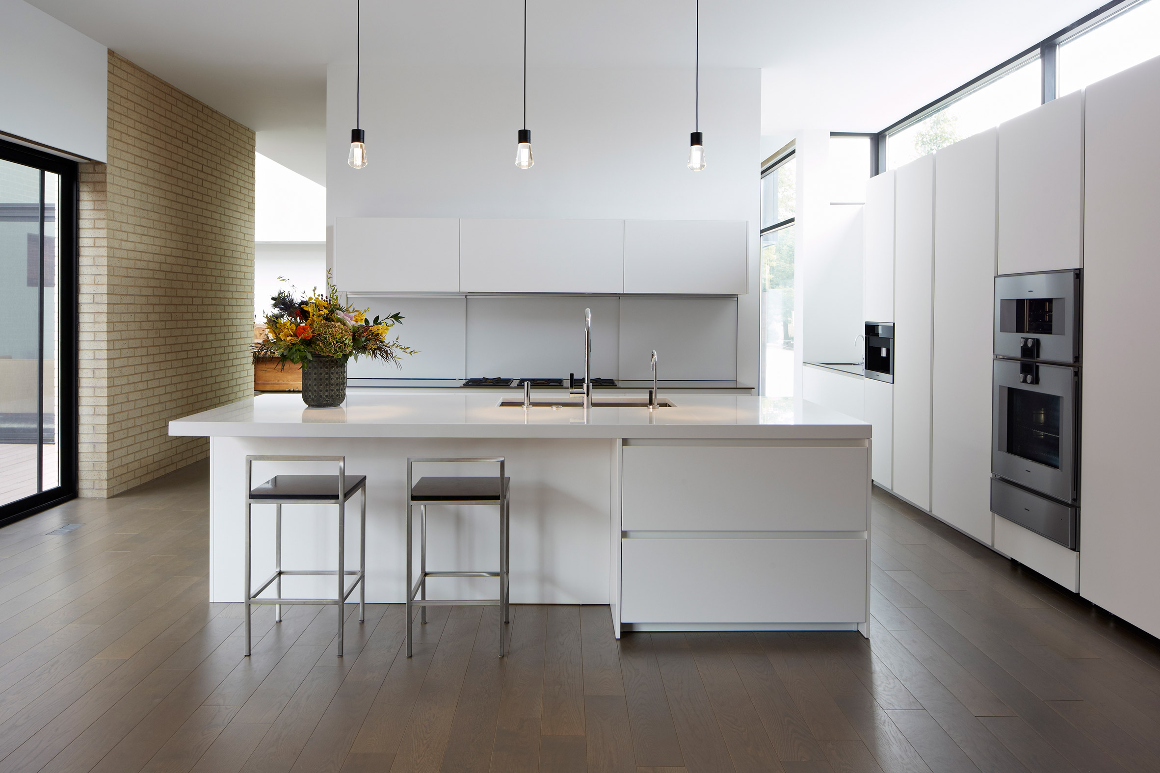
In the kitchen, the cabinetry is finished with white lacquer that matches the white quartz countertops. Three bulb-like pendant lights hang over the kitchen island.

Hermitage Residence by Studio Dwell

Other details of the house are the grey striped porcelain tiles that clad the walls and floor in the master bathroom and shower and the abstract splatter artwork hanging on the living room wall.

Studio Dwell is a Chicago architecture firm led by Mark Peters. It has worked on a number of projects in Illinois including a house hidden by brick screen and an aluminium clad structure with cantilevered terrace.

Photography is by Marty Peters.


Project credits:

Principal in charge: Mark Peters
Project manager: Jonathan Heckert
Engineer: Louis Shell Structures
General contractor: Allianz Construction Inc

The post Studio Dwell stacks black volume onto brick structure to form top-heavy Hermitage Residence appeared first on Dezeen.


from Dezeen https://ift.tt/3dlDyMn

Format Architecture Office imbues Manhattan office with "boutique sensibility" and cafe seating

Midtown Office by Format Architecture Office

Cafe-style seating and muted interiors outfit this New York office that local studio Format Architecture Office has designed with places to mingle, eat and work.

Called Midtown Office, the project spans an entire floor of a high-rise building in New York City's Midtown area. Close to Bryant Park, it was designed for a global tech company that occupies several floors of the building.

Midtown Office by Format Architecture Office

Brooklyn studio Format Architecture Office designed the renovation of one floor for the company's executive and sales teams.

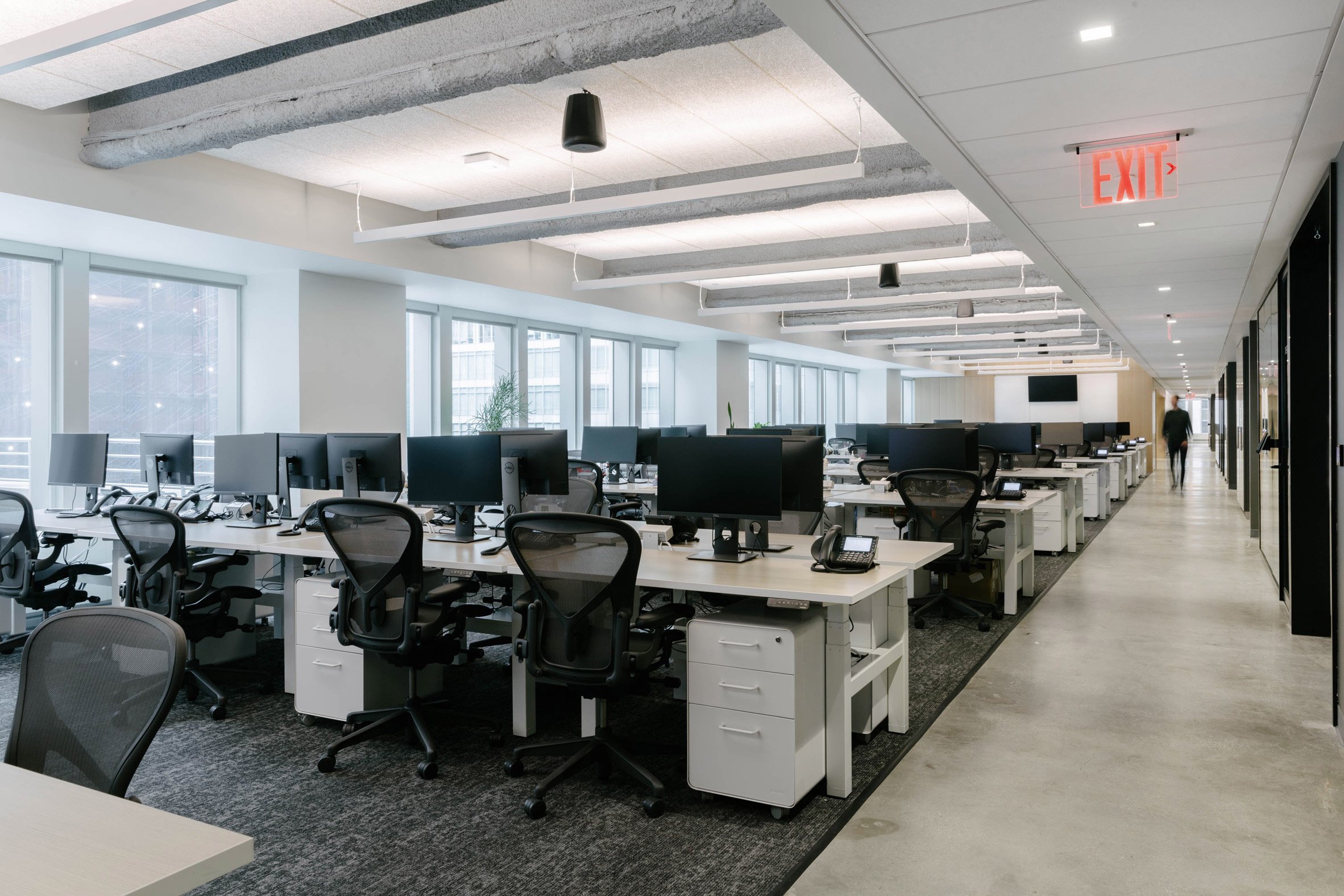
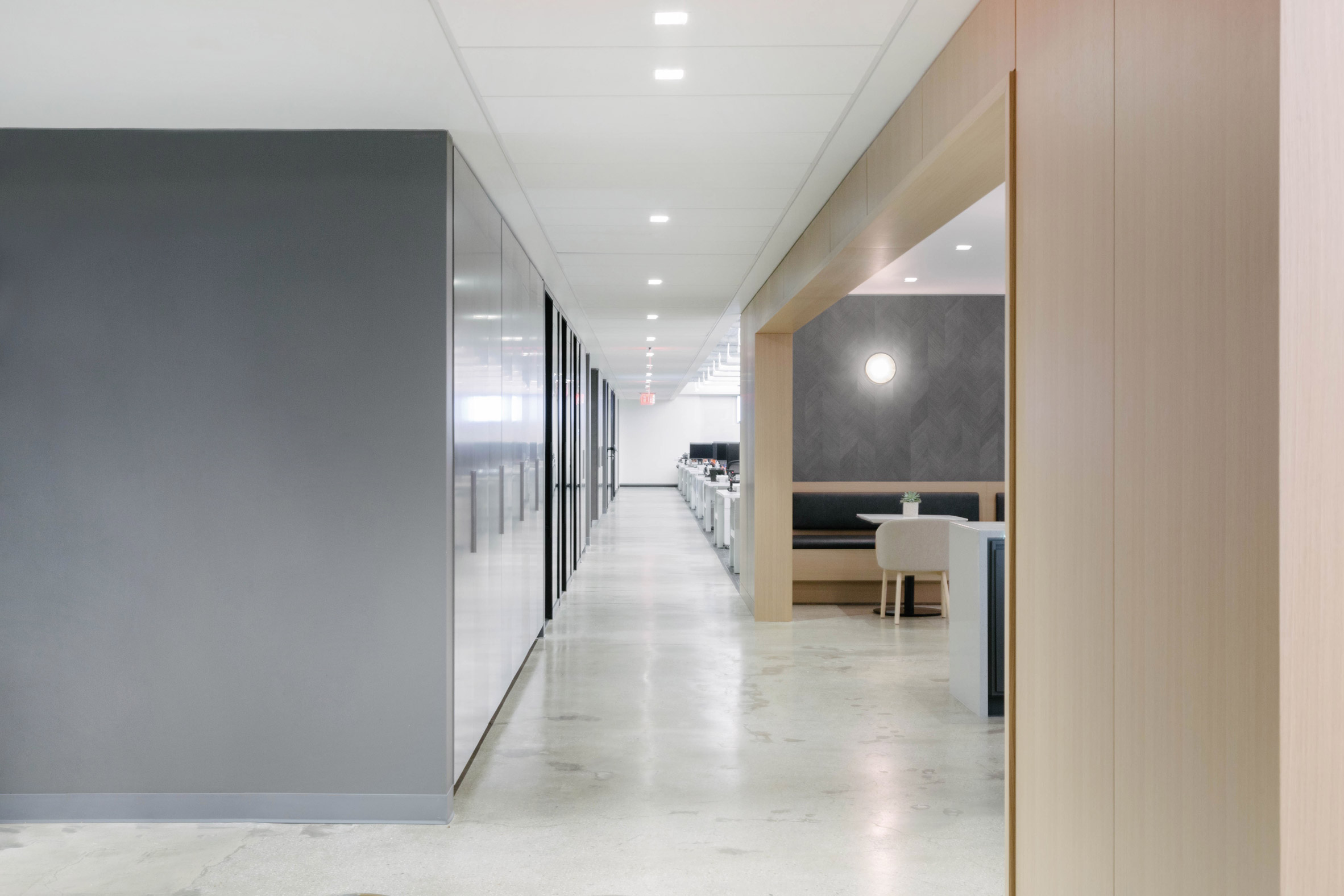
Interiors feature white walls and many different floor materials, ranging from pale wood in a herringbone pattern to polished concrete, white tiles and grey carpet. The flooring changes to signal different areas acting like a "code social and work zones," the studio explained.

Midtown Office by Format Architecture Office

"Polished concrete and bespoke wood flooring differentiate circulation and gathering space from more utilitarian work zones," said Format Architecture Office.

Other details like white panelled walls of ash wood veneer, nooks with cabinets in different colours, terrazzo and dark accents to offer further distinctions between the different spaces.

Midtown Office by Format Architecture Office

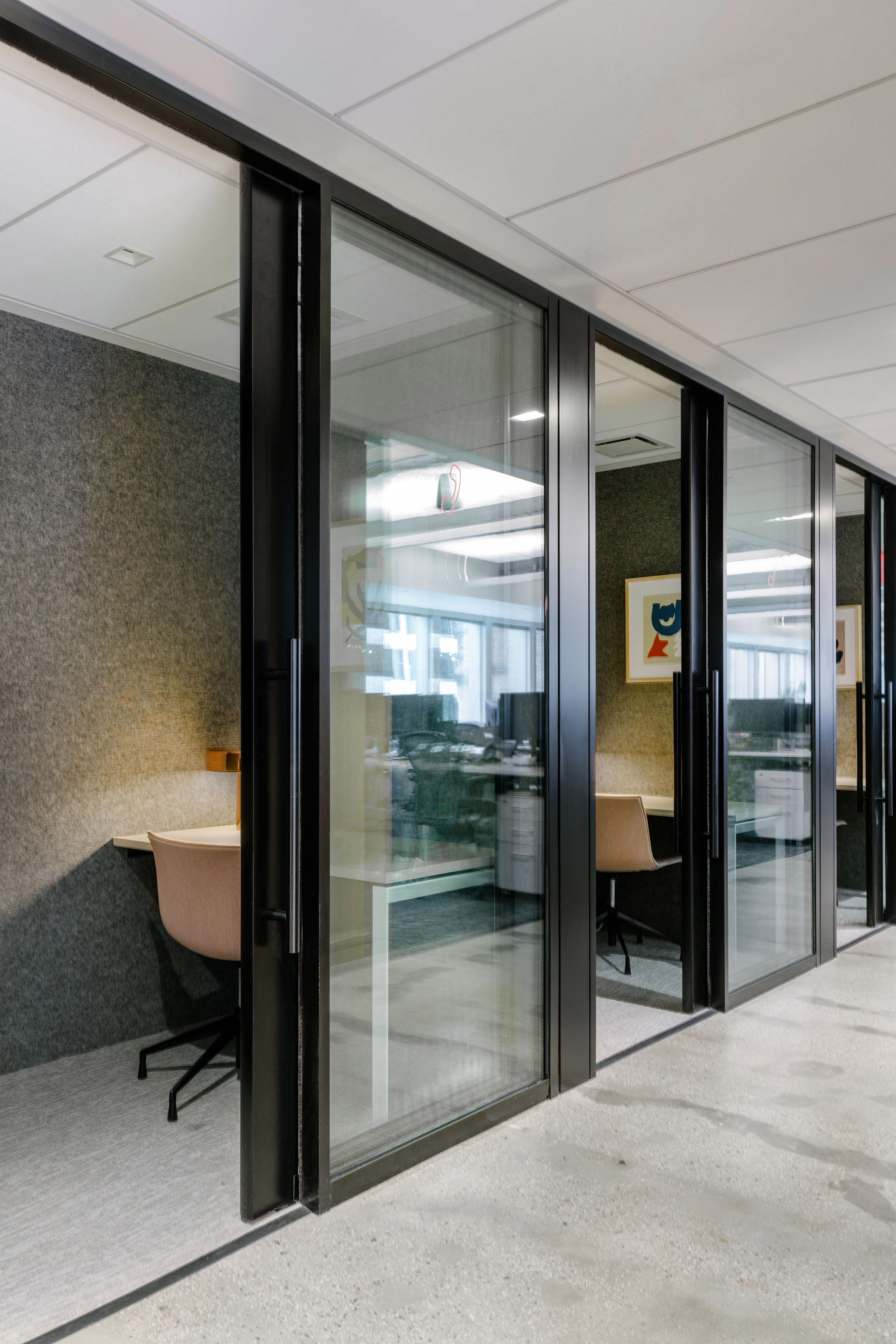
The middle of the floor is filled with volumes that house individual pods with glass doors, other meeting areas, private offices, stairwells and restrooms.

A walkway wraps around the centre structure to connect to the meeting rooms and open offices that are arranged around the perimeter of the floor plan, culminating in a long room with a kitchen and dining areas.

Midtown Office by Format Architecture Office

"The design approaches the layout of the space from two distinct angles – one, by creating a variety of collaborative and private work zones that maximise efficiency without sacrificing personal space; and two, by anchoring the plan with 'jewel-box' social zones that imbue the project with a boutique sensibility and help to break down the large scale of the floor," the studio said.

Midtown Office by Format Architecture Office

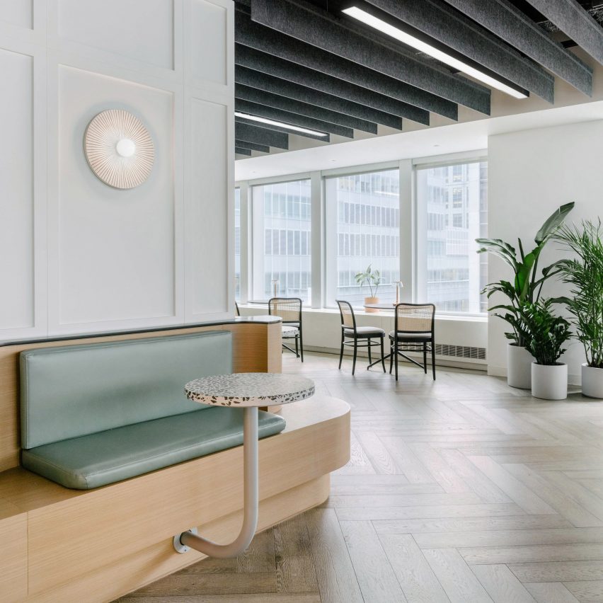
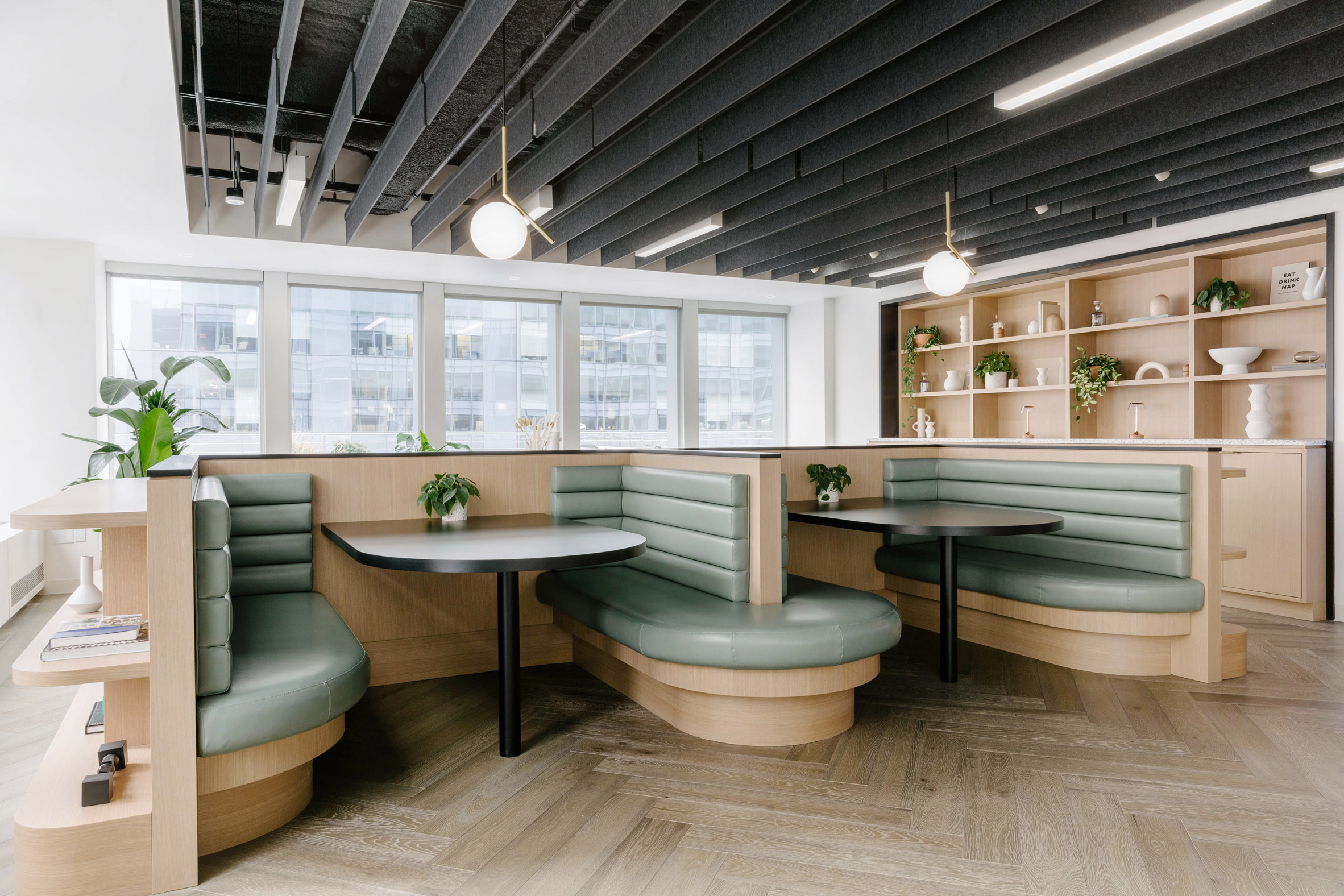
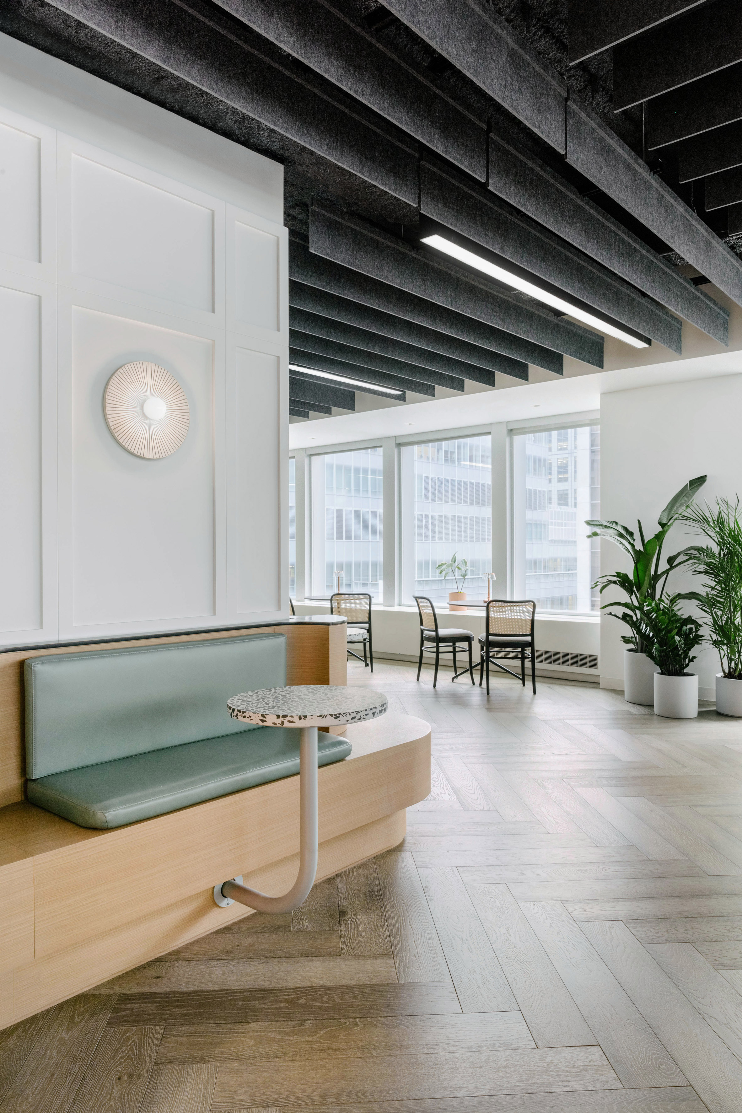
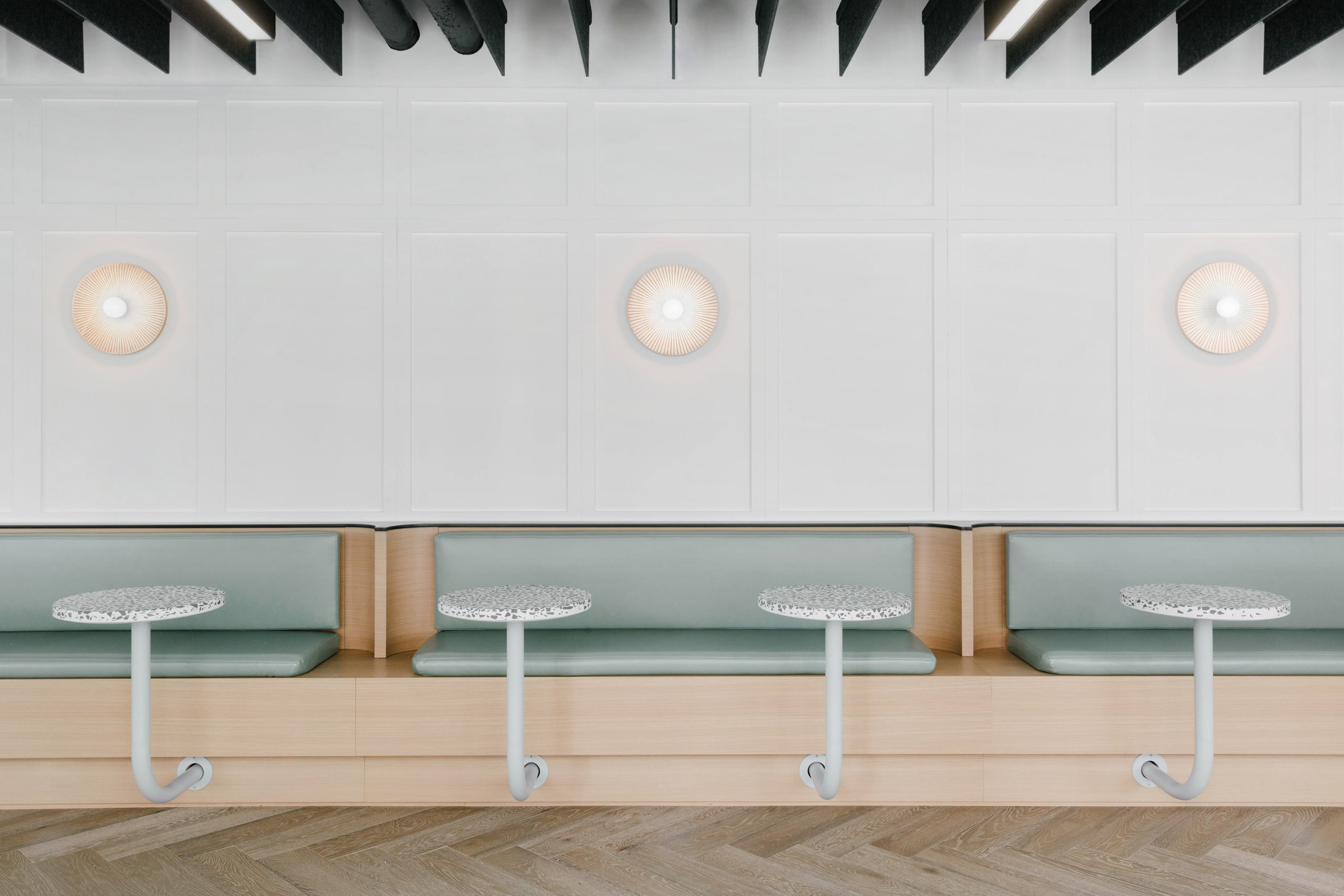
Furnishings that add to this "boutique sensibility" include a series of small, black cafe tables and rattan chairs, curved wood booths and a built-in bench that runs across a wall.

Round terrazzo tables attach to the built-in structure with rods in a hooked shape for support.

Midtown Office by Format Architecture Office

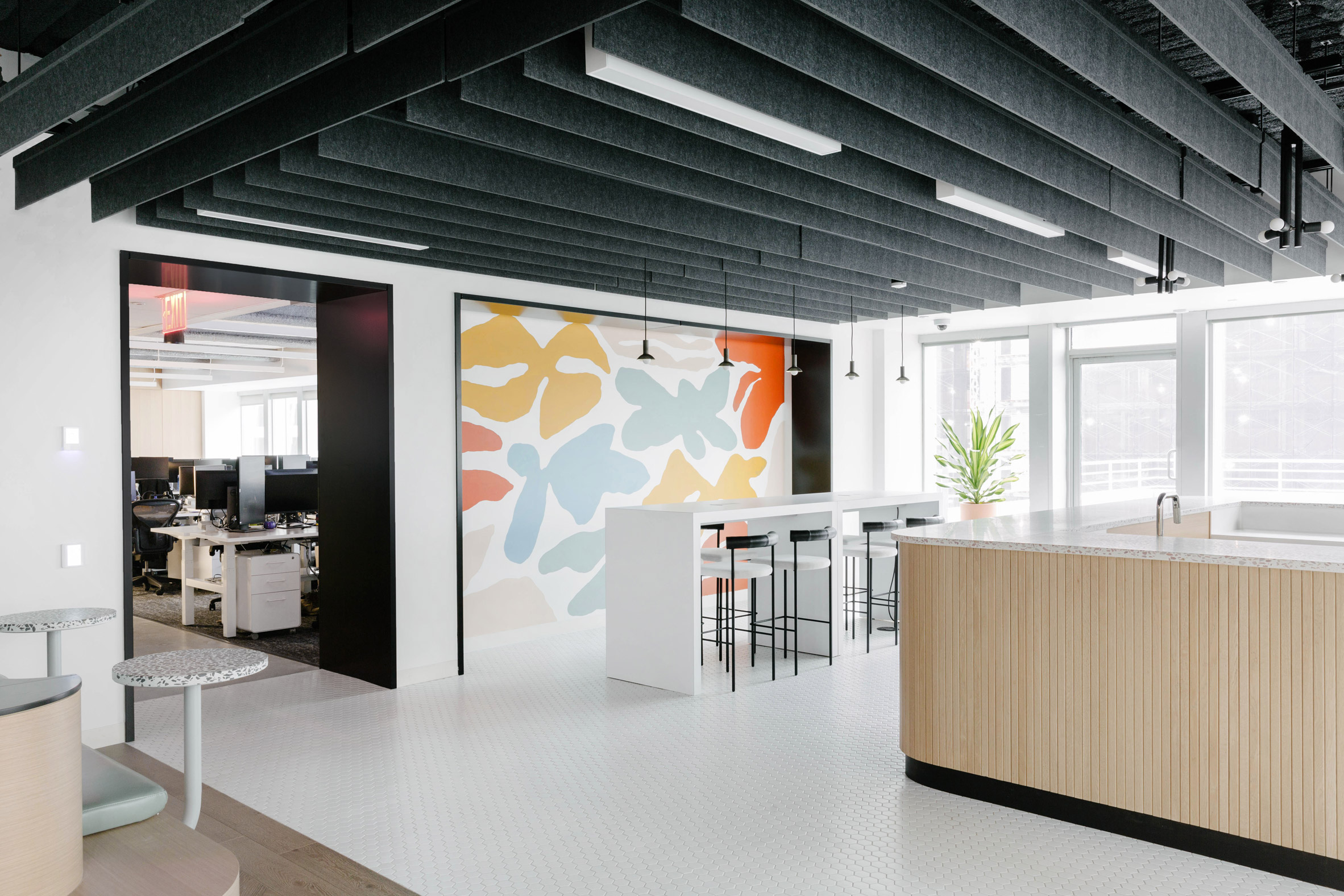
Pale green cushions add colour, and a geometric mural with soft blue, orange and mustard hues anchors another area with a white high-top table and black barstools. Nearby is a prep station constructed from a free-standing, pale wooden volume.

Rows of white desks, black office chairs and desktop computers can be seen through an archway.

Midtown Office by Format Architecture Office

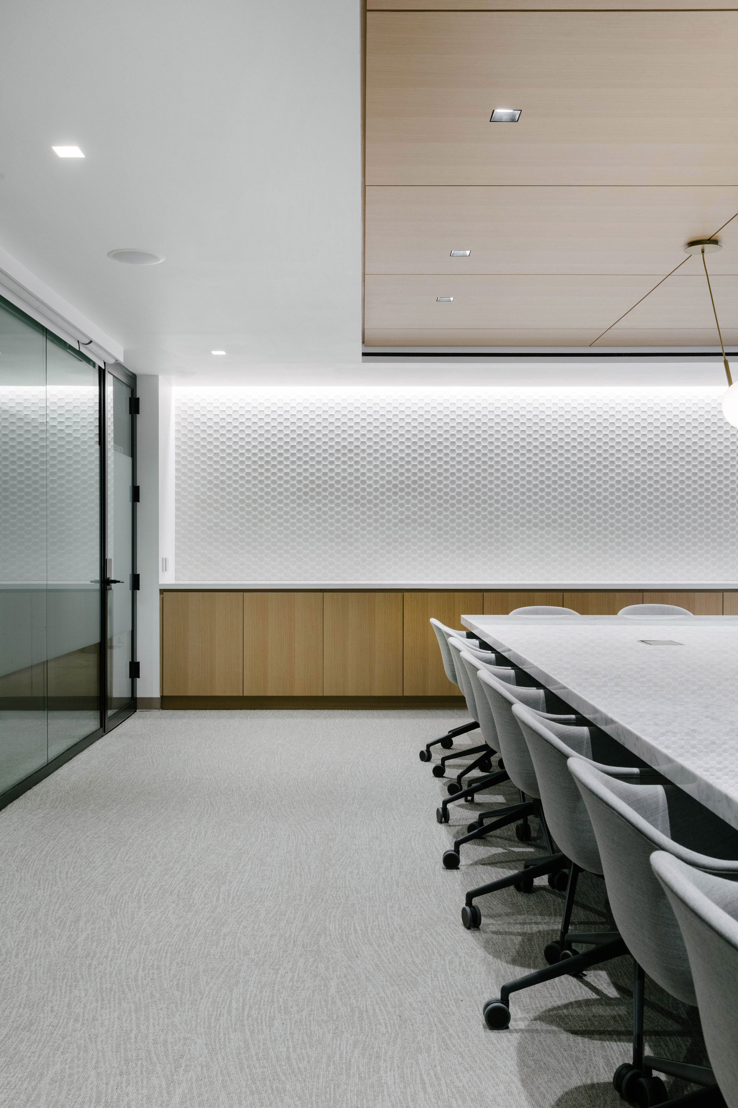
The office spans 30,000 square feet (2,787 square metres) and is complete with a large boardroom.

Swedish studio Halleroed has also designed a floor for an office that has multiple storeys in a building in Manhattan's Garment District with moody details evocative of a David Lynch movie.

Midtown Office by Format Architecture Office

Other New York offices include Glossier's headquarters with curvy pink couchesBIG's architecture office in Brooklyn, and the home base of Arianna Huffington's Thrive Global.

Photography is by Nick Glimenakis.


Project credits:

Engineering and lighting design: Cosentini Associates
Consruction management: AECOM Tishman

The post Format Architecture Office imbues Manhattan office with "boutique sensibility" and cafe seating appeared first on Dezeen.


from Dezeen https://ift.tt/3ckt4eA

Cluster of hull-like roofs form The National Maritime Museum of China

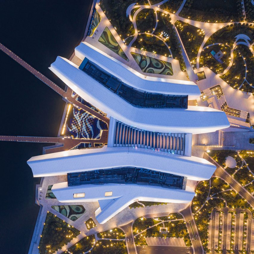
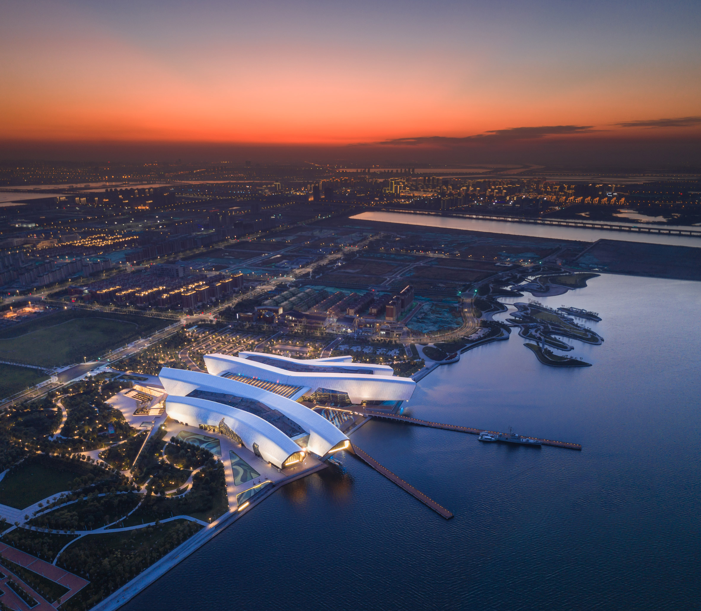
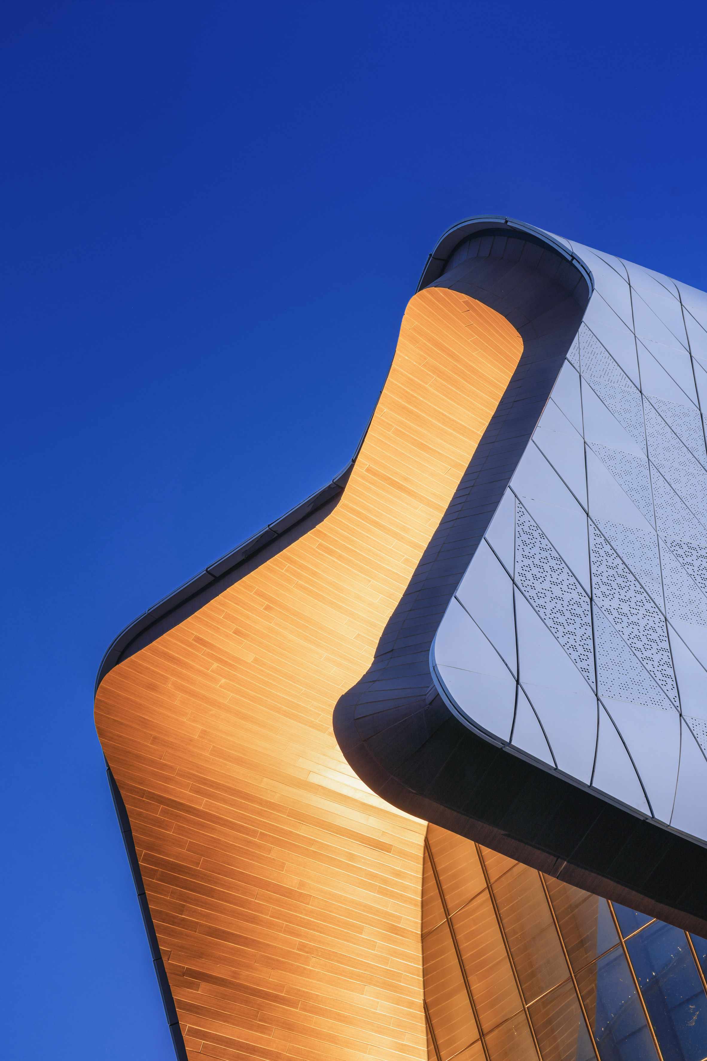
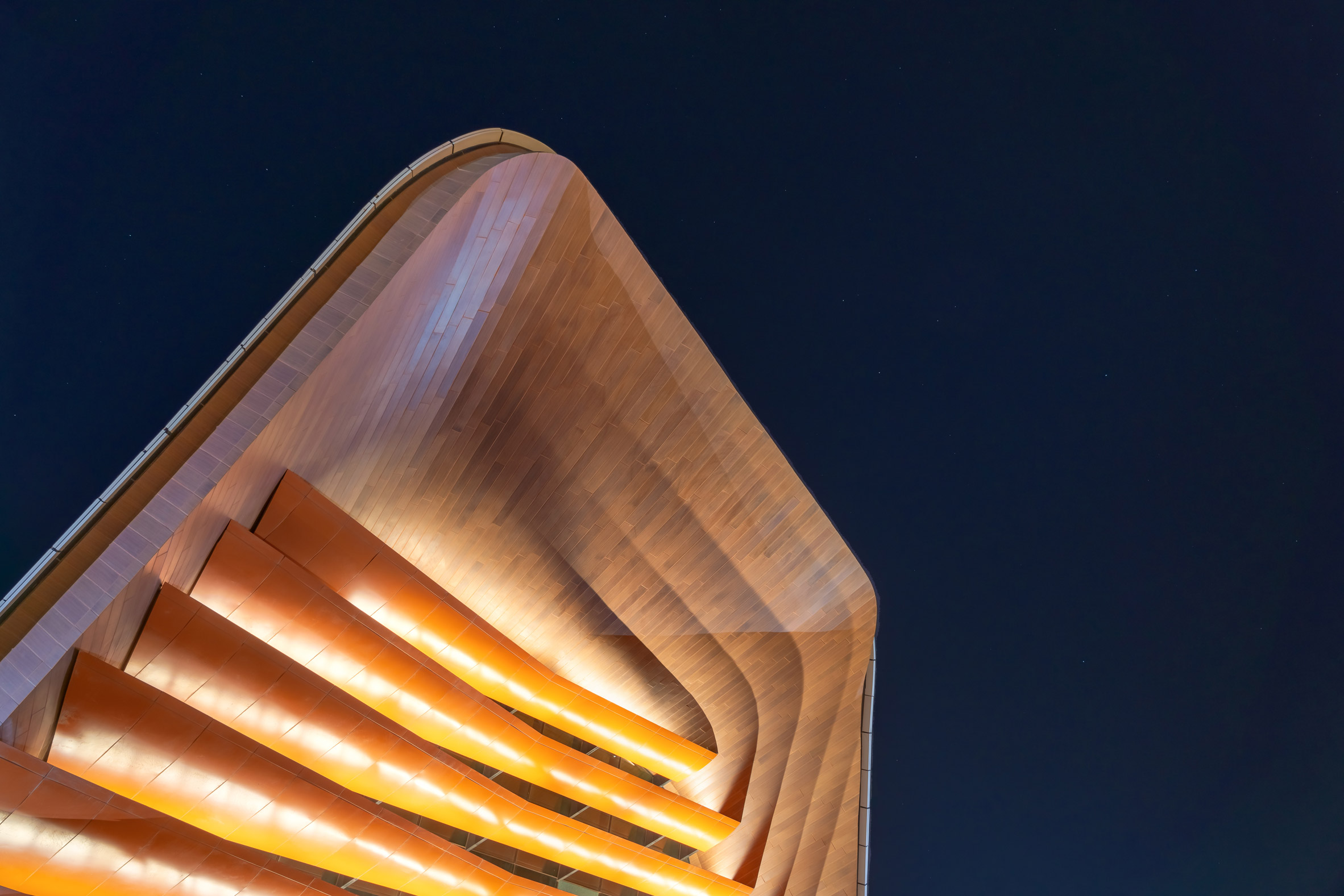
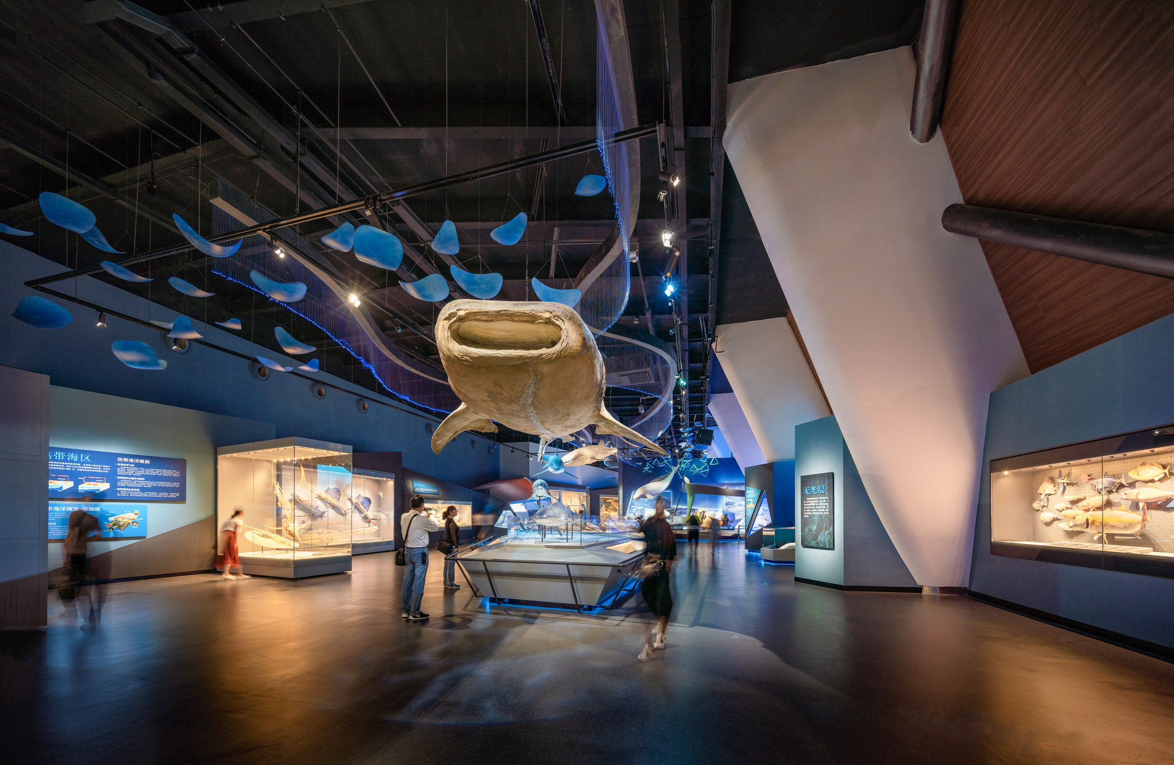
Australian practice Cox Architecture designed The National Maritime Museum of China in Tianjin as four metal-clad wings that fan out to overlook Bohai Bay.

China's first National Maritime Museum, the building is located in the Binhai New Area. This wetland area has been recovered from the bay and extensively developed over the past decade.

The National Maritime Museum of China by Cox Architecture

Cox Architecture won a 2013 international competition to design the museum, which has been six years in the making.

Across an area of 80,000 square metres, the museum houses six display areas and 15 exhibition halls.

The National Maritime Museum of China by Cox Architecture

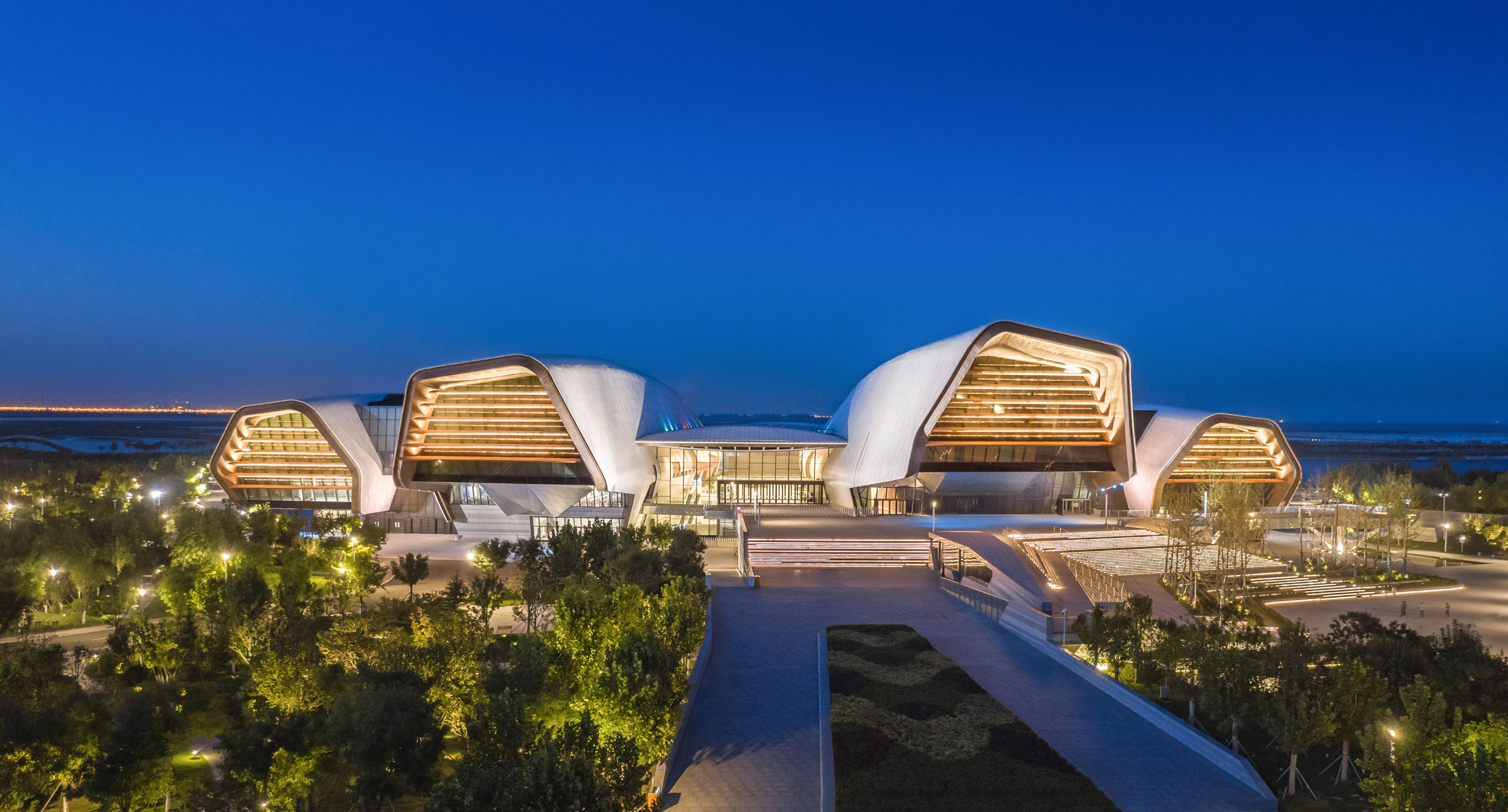
Diamond-shaped panels of silver aluminium cover the exterior of each form, with some perforated and others solid.

The underside of the of the roofs deep reveals –  designed to cope with heavy snowfall in winter – are lined with of wood.

The National Maritime Museum of China by Cox Architecture

Landscaped areas create a new series of promenade-like routes along the bay, sheltered by the cantilevering forms of the museum.

Winding paths that cut through its wooded parkland surroundings and extending into the bay with two long jetties.

The National Maritime Museum of China by Cox Architecture

Rather than a single, monolithic structure, Cox Architecture broke the museum down into a cluster of long, thin pavilions, that project towards the bay like upturned hulls of large ships.

"From Philip Cox's initial watercolour sketches, the design evolved and certain compelling metaphors either resolved or emerged," said Cox Architecture.

"Jumping carp, corals, starfish, moored ships in port and and open palm reaching out from China to the maritime world."

The National Maritime Museum of China by Cox Architecture

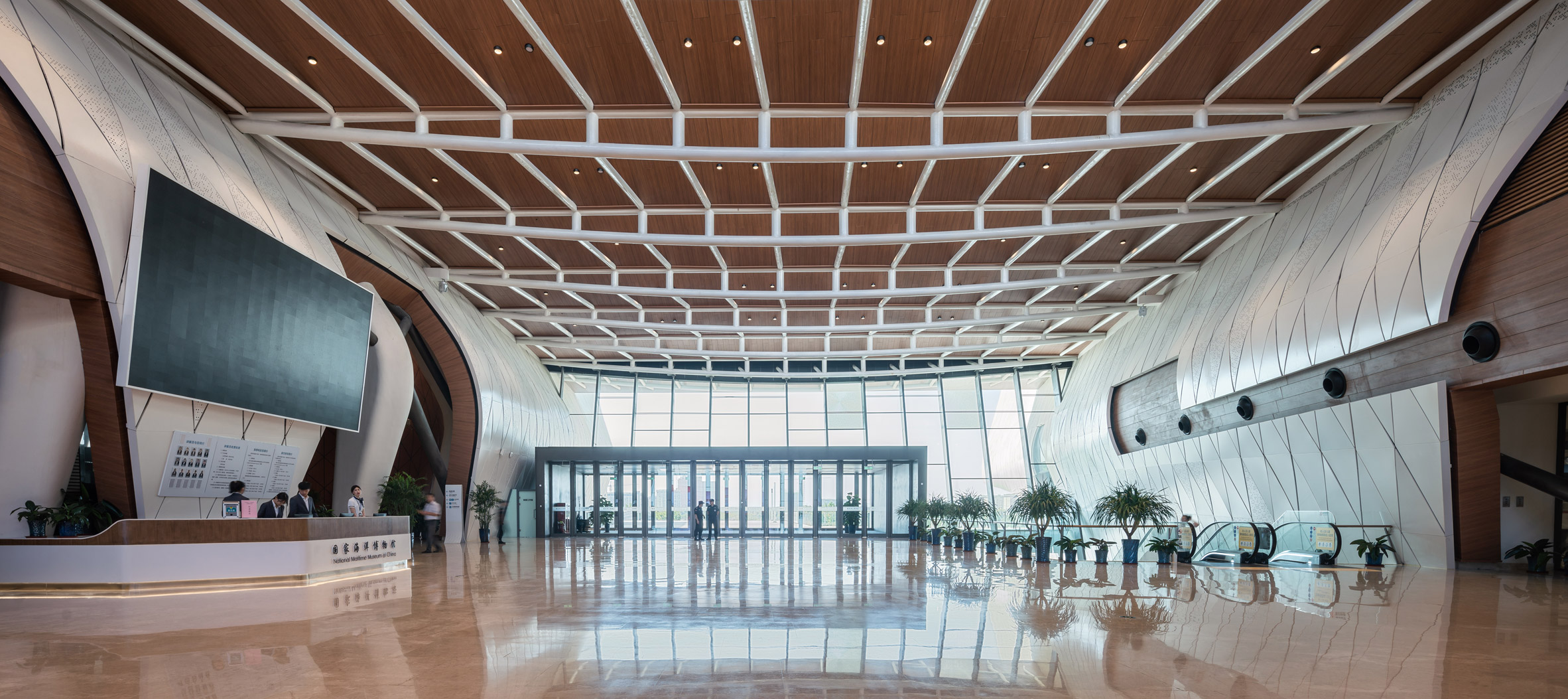
This "open palm" arrangement is focused around a central glazed reception hall, providing access between the three exhibition levels and lower-level storage areas, creating a dramatic visual axis through the building and out towards the bay.

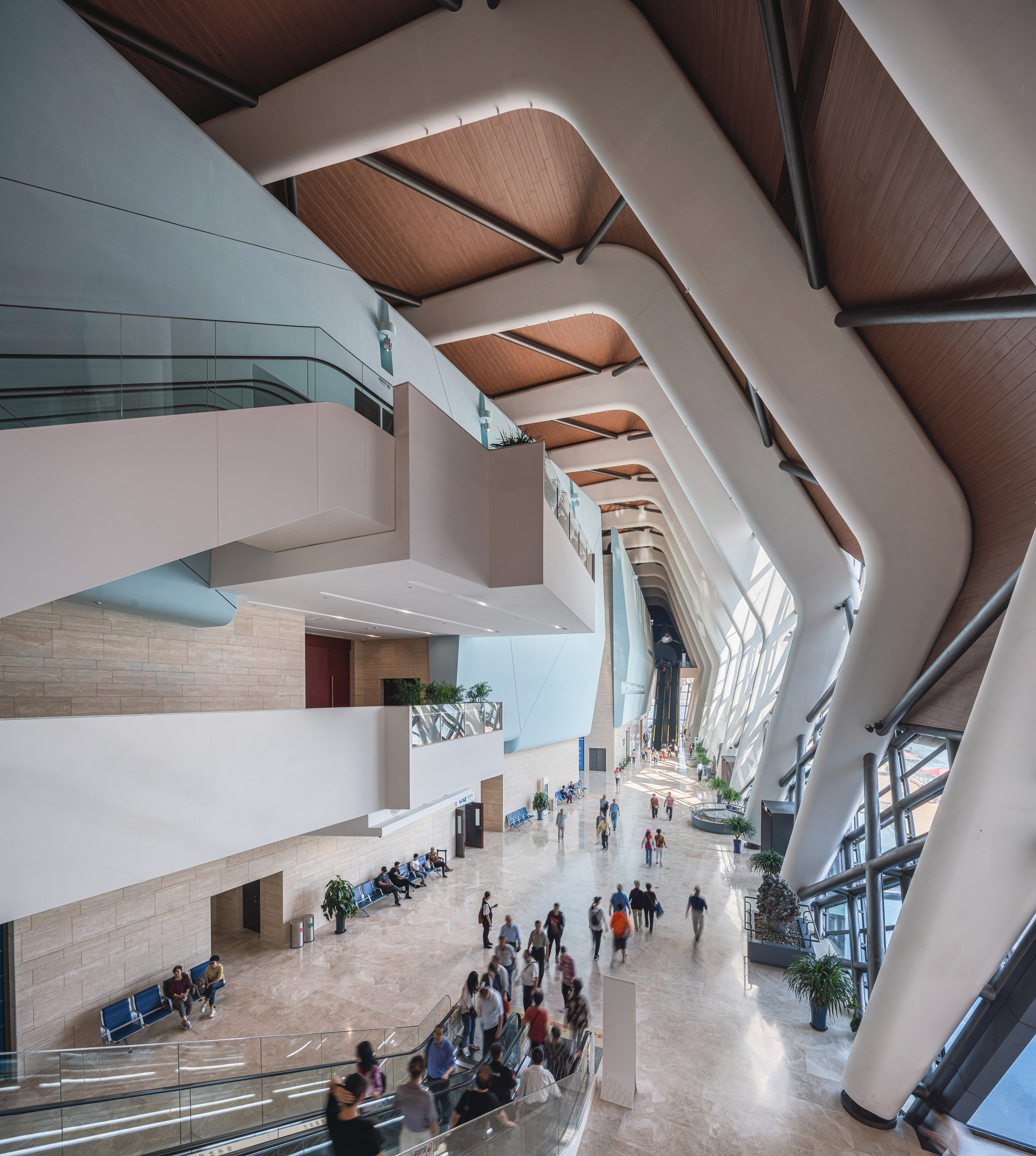
Inside the wings, each of which is dedicated to a particular exhibition theme, a ribbed steel structure creates a dramatic space alongside the core areas housing exhibitions and circulation.

The National Maritime Museum of China by Cox Architecture

A stone floor and white walls create bright, open atrium spaces, overlooked at the upper levels by balconies in contrast to the more enclosed exhibition halls.

"The articulated pavilions provide a constant connection between inside and out," said the practice. "The user experience exists within the landscape and is a key organising device of the plan, helping to orientate visitors on their journey."

The National Maritime Museum of China by Cox Architecture

Cox Architecture was founded by Philip Cox in Sydney in 1967. The practice recently revealed designs for a new airport in Sydney designed with Zaha Hadid Architects.

The National Maritime Museum of China joins several other interestingly-shaped public buildings in the city.

Bernard Tschumi Architects has designed a copper-coloured museum in Tianjiin shaped like a factory with chimneys, and MVRDV built a public library shaped like a giant eyeball.


Project credits:

Architect: Cox Architecture
Cox Team: Hang Ling, Alex Leese, Jack Dodgson, Ashley Beckett, Jayson Blight, Jaegeun Lim, Alex Munoz, Michael Bailey, Philip Cox, Lei Li, Leon McBride, Troy Rafton, James Ryan, Mitchell Page, Julian Farrell, Andrew Butler, Belinda Williamson, David Reasbeck, Ayo Akinola, Mark Sierzcula, Perry Gustafson, Kim Huat Tan, Spyros Barberis, Megan McKenzie, Gary McFeat, William Gray, Michael Rayner, Adrian Taylor, Roger Mai, Joseph Hartley, Karen Appleyard, Matthew Napper, Brendan Gaffney, Katy Roberts, Katie Holzberger, Mark Hadfield, Maxie Navius, Jaclyn Sun, Casey Vallance, Marianella Picon, Robert Callanan, Martin Hayes, Tae Won Kang, Solomon Romion, Brendan Kenny, Vesna Lazarevic, Steve Hunter, Thomas Nelson, James Sia, Tracey Maree, Akiko Spencer, Joachim Clauss, Tim Morgan, Brett Miles, Tommy Miller, Anya Meng.
Client: National Maritime Museum Preparatory Office Chinese Government and Tianjin Municipality
Local design institute partner: Tianjin Architecture and Design Institute (TADI),
Key consultants: Arup, Lord Cultural Resources, Urbantect

The post Cluster of hull-like roofs form The National Maritime Museum of China appeared first on Dezeen.


from Dezeen https://ift.tt/3eBC0y4

Read and Rest Hotel in Beijing includes a library dedicated to print magazines

Read and Rest Hotel by Office AIO

Guests can flick through a curated selection of contemporary publications in this Beijing hotel, which Office AIO has finished with minimal greyscale interiors.

Read and Rest Hotel is nestled amongst the winding alleys of Beijing's Xiang'Er hutong.

Read and Rest Hotel by Office AIO

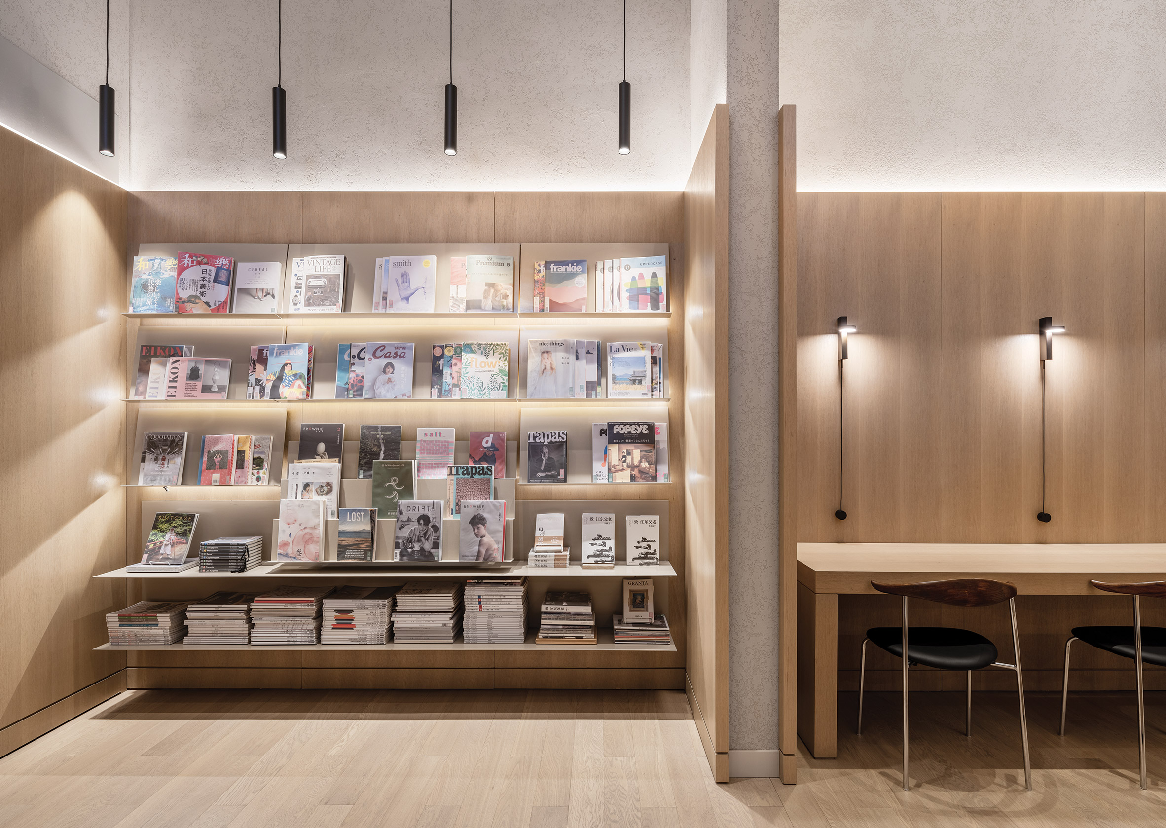
Office AIO – which completed a coffee bar in Xiang'Er back in 2016 – has designed the hotel's 60 guest rooms, communal areas and its in-house library, which is stocked with a global roster of print publications.

"While reading spaces are not traditionally regarded as a 'standard' in terms of hotel amenities, we do find this focus especially embraceable and refreshing," said the studio's founders, Tim Kwan and Isabelle Sun.

"Though the habit of reading can happen essentially anywhere, incorporating a library into a hotel highlights and promotes this action," they told Dezeen.

Read and Rest Hotel by Office AIO

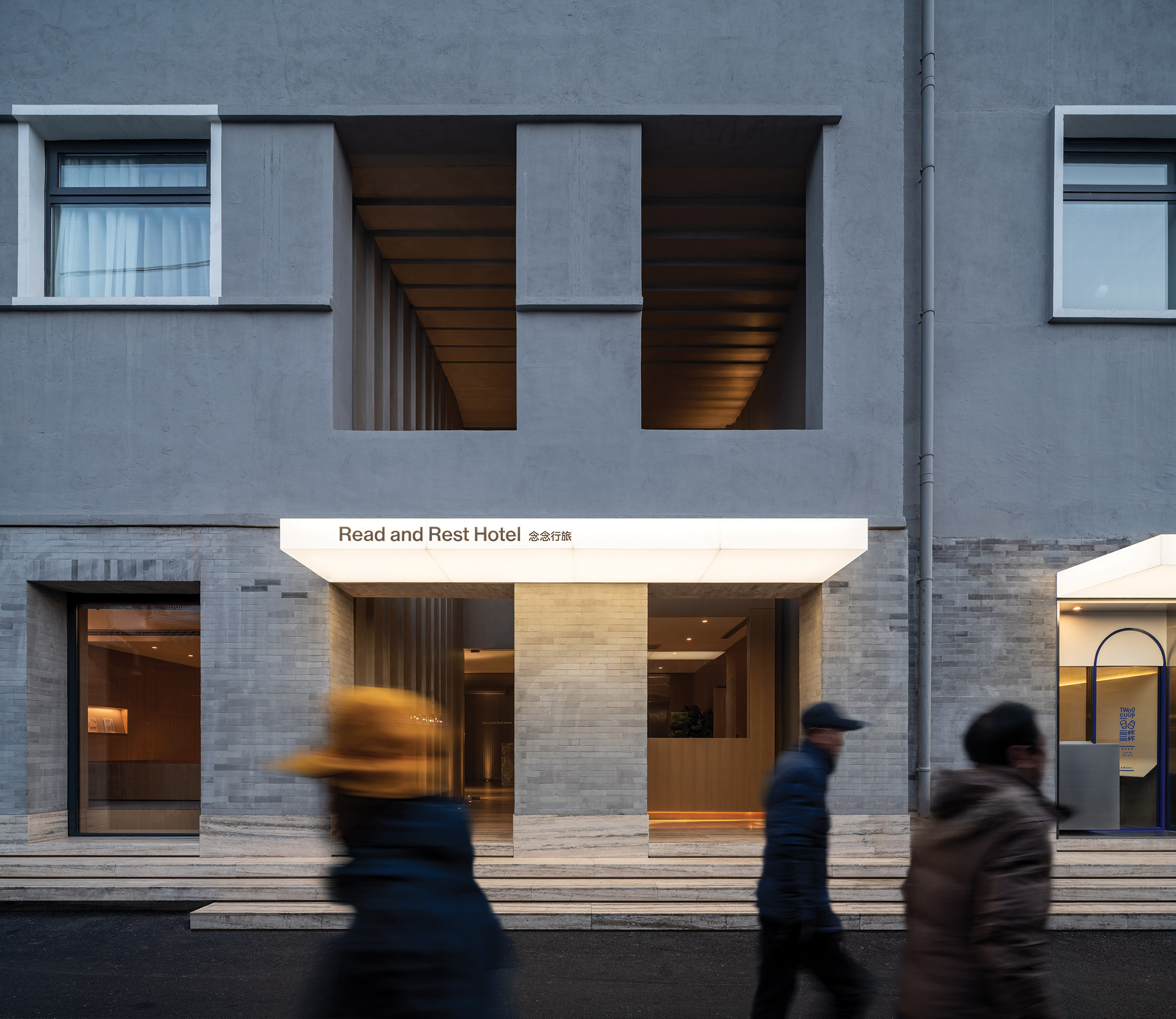
The hotel takes over a solemn grey-brick building that had been originally constructed for government use in the 1960s.

To make its facade appear more inviting, the studio expanded two ground-level doorways and a pair of windows on the first floor to create four huge openings.

Read and Rest Hotel by Office AIO

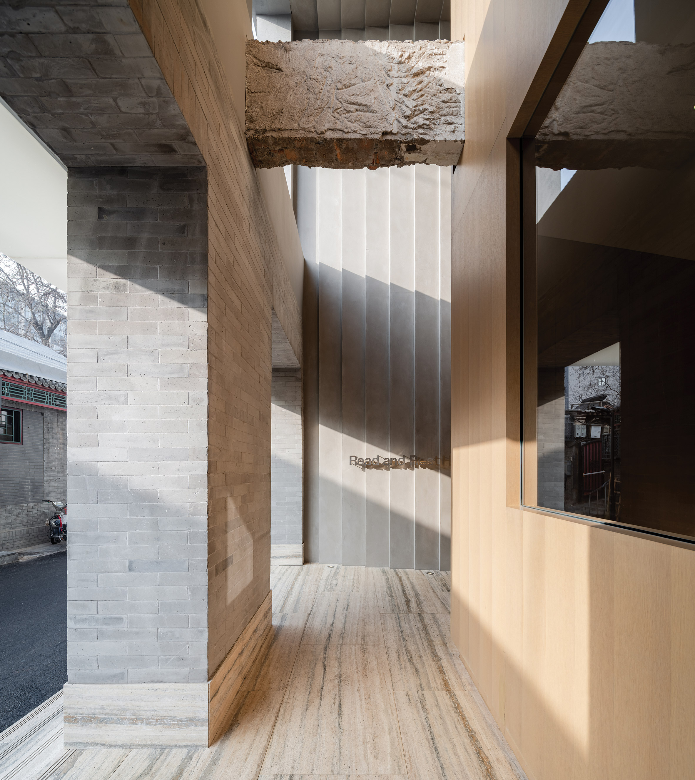
These look through to a dramatic double-height entryway, which is meant to feel like a marked departure from the busy Beijing streets.

It features natural stone floors and pleated grey-plaster walls.

"Through this passage of scale and space the guests can let go of their sense of time and reach a state of enlightenment much like entering a utopian fairy tale," explained the studio.

Read and Rest Hotel by Office AIO

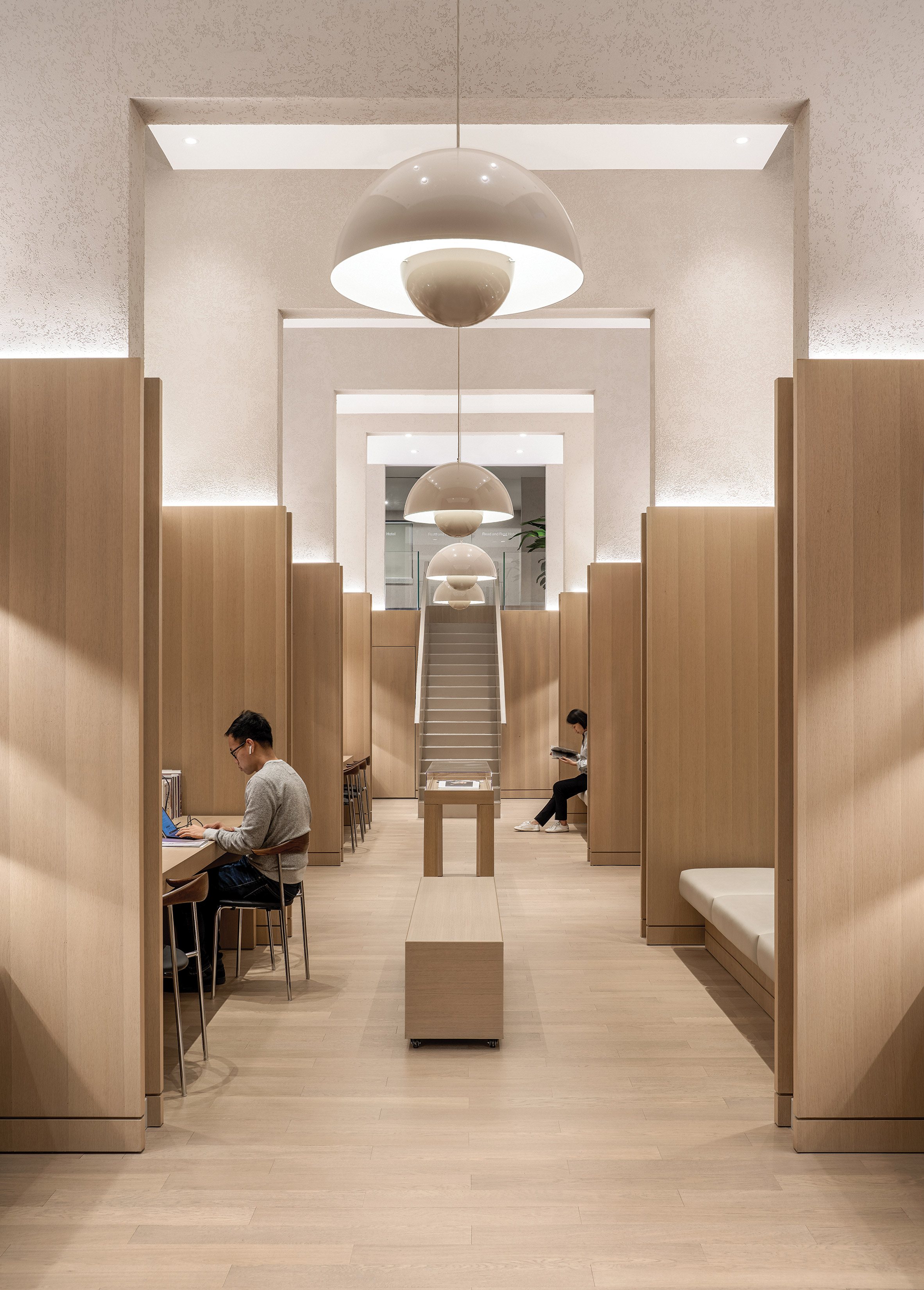
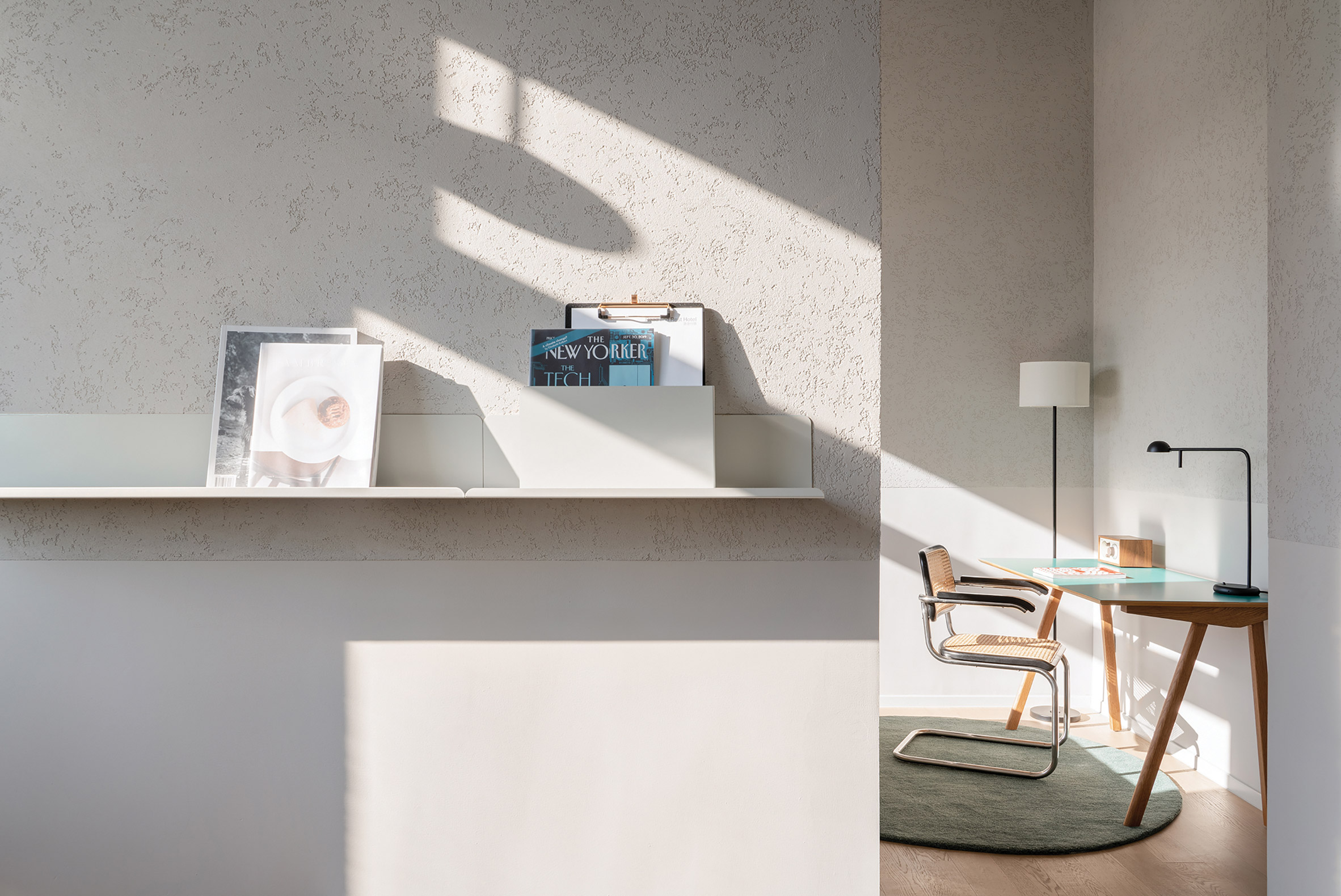
After traversing the hotel lobby, guests eventually reach the library which is almost entirely lined with oakwood.

It's flanked on both sides by a sequence of alcoves – one side has been fitted with creamy cushioned bench seats, where guests can perch with a publication of their choice, while the other has built-in work tables.

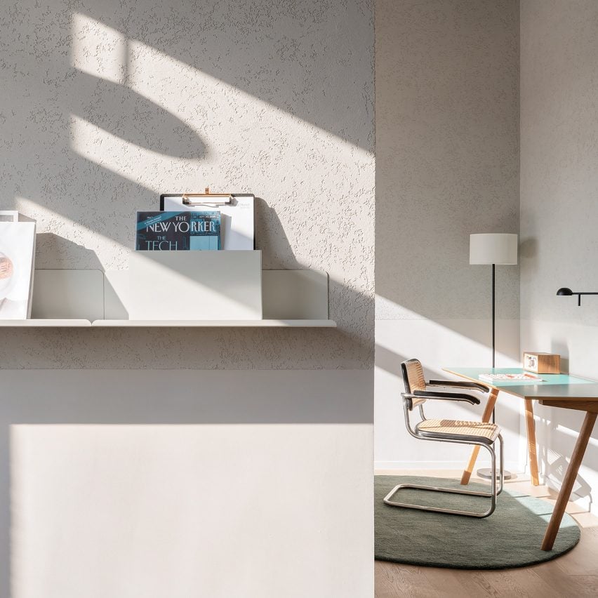
Magazines are displayed on a tiered, wall-mounted shelf towards the front of the room. Domed glossy lamps have been suspended from the ceiling.

Read and Rest Hotel by Office AIO

During the booking process guests are encouraged to share their personal interests, so that complementary print titles can be included in their rooms upstairs.

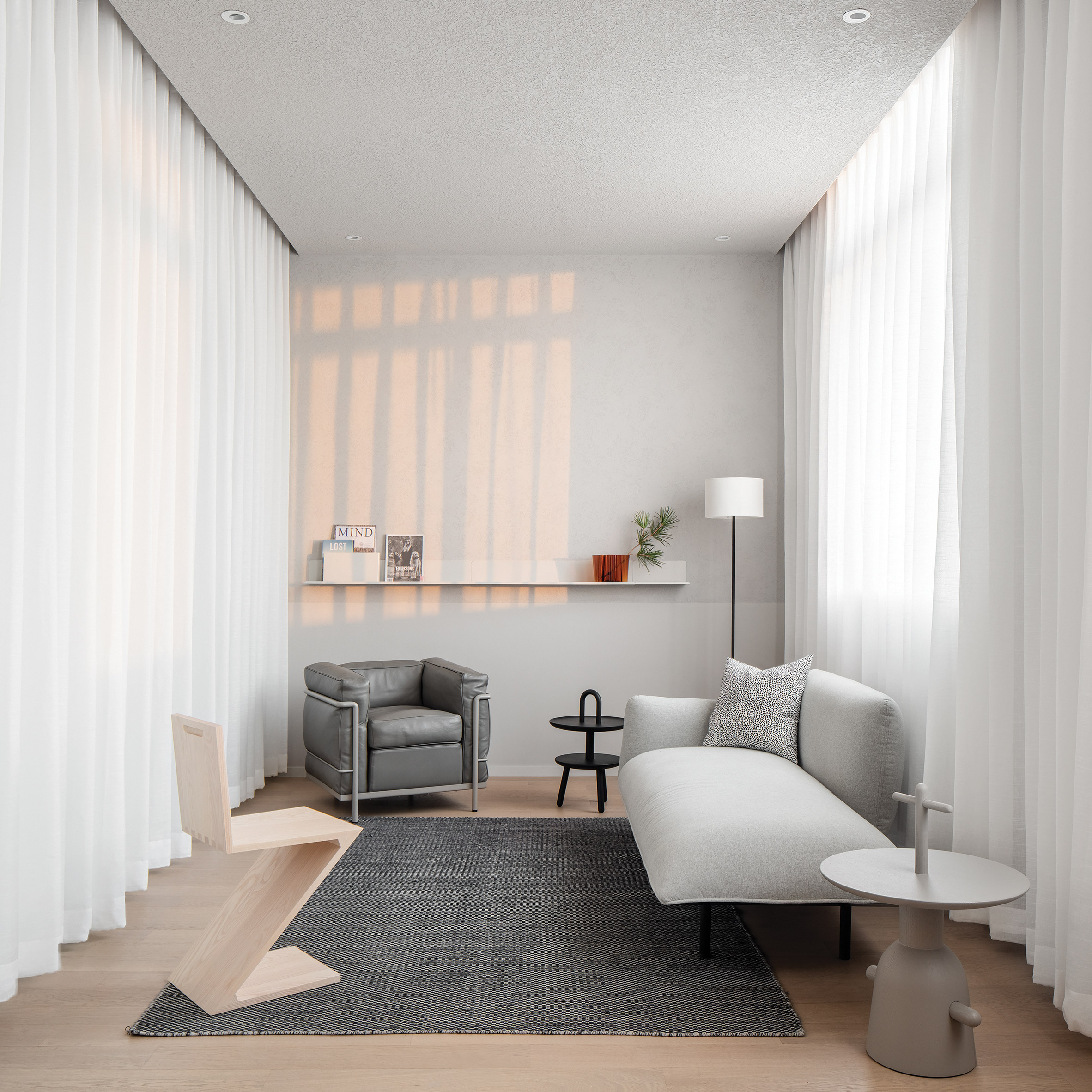
The studio has tried to make each room a "quiet nest" where guests feel they can retreat to unwind. Walls have been washed with a soft-grey plaster, complemented by light-hued wooden flooring.

Read and Rest Hotel by Office AIO

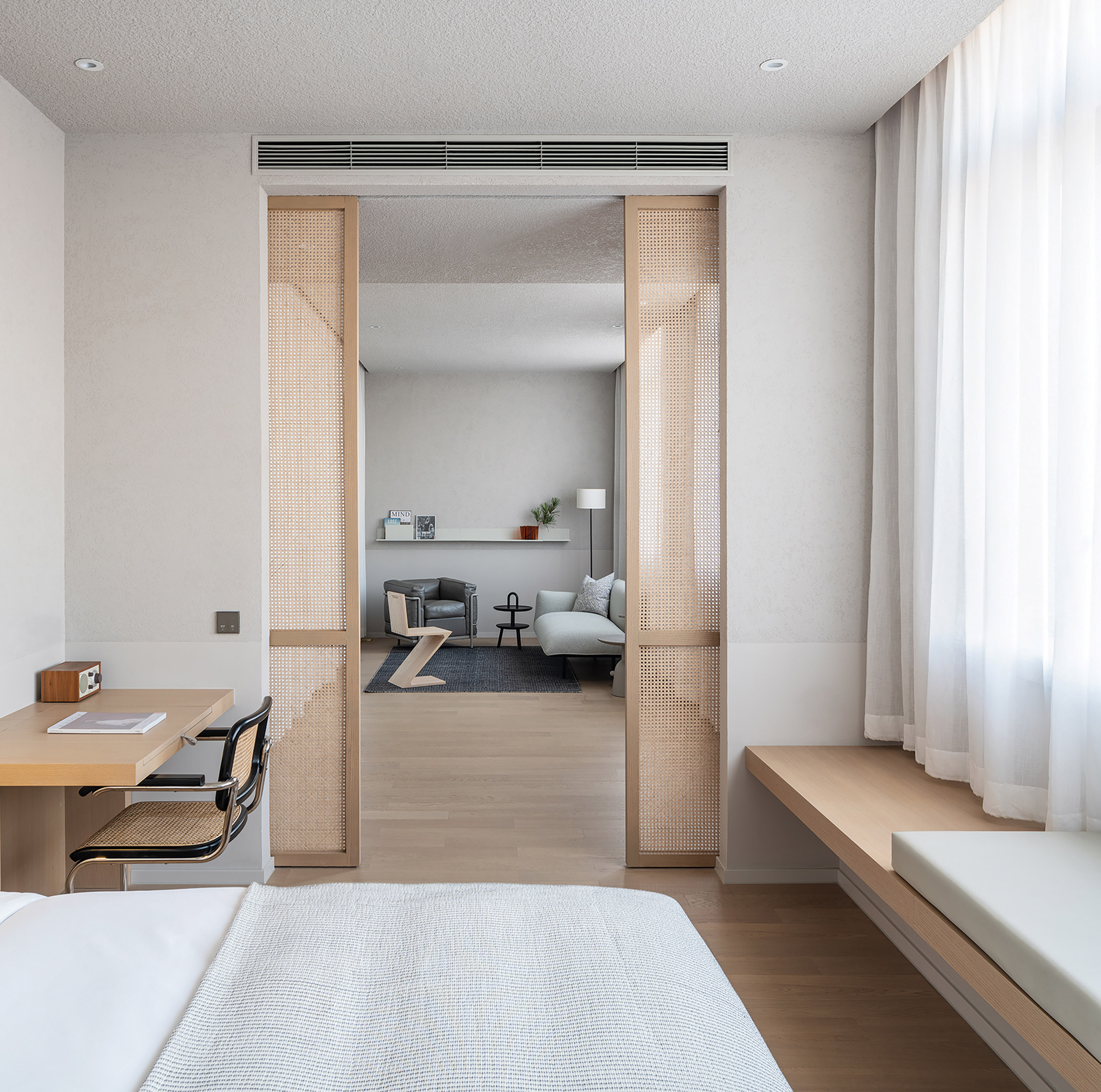
Chunky ledges installed beneath the windows offer a spot for reading, along with the writing desks that appear in the corner of the rooms.

Some of the larger suites also come with a relaxing lounge area. These are separated from the bedrooms by sliding cane screens.

Read and Rest Hotel by Office AIO

Office AIO was established in 2014 by Tim Kwan and Isabelle Sun, who will both be on the judging panel of this year's Dezeen Awards.

The studio's Read and Rest Hotel isn't the only getaway that's great for reading enthusiasts – at the end of 2019, Atelier Tao+C completed a glass-walled capsule hotel in the mountains of China's Zhejiang Province, the interiors of which are lined with bamboo bookshelves.

Photography is by Wen Studio.


Project credits:

Design: Office AIO
Lead design: Tim Kwan
Project team: Isabelle Sun, Xue Zhao, Steven Tse, Haipeng Ren
Contractor: Beijing Dongyi Yuanda Building Decoration Engineering
Cement surfaces: Beijing DaGu Architecture Technology Development
Graphic designer: MEAT

The post Read and Rest Hotel in Beijing includes a library dedicated to print magazines appeared first on Dezeen.


from Dezeen https://ift.tt/2AplemZ

There are only two days left to enter Dezeen Awards 2020

With only two days left to enter Dezeen Awards 2020, it's time to start finalising your entry.

Here are some entry tips to help you get started:

Entry form: Follow the instructions on the entry form precisely and read the terms and conditions carefully before entering.

Images: Your square hero image should best represent your project or studio and will be published if you get shortlisted. You can upload up to ten gallery images. Do not upload renderings or digital visualisations. Include architectural plans where appropriate. There is a 10MB limit on each image that you upload.

Video: We recommend that you include a link to a video in the relevant field on the entry form.

Entry text: You will need to provide a short and long project description and explain why you should win a Dezeen Award. Entries that do not answer the questions set will be at a disadvantage. Write your entry succinctly and clearly, avoiding exaggeration and sticking to the facts where possible.

Word count limit: Please take the word count limit into consideration when writing your entry.

Entering on behalf of the designer: You will need the architect's or designer's permission if you are entering on their behalf.

Editing your entry: You may return and edit your entry as many times as you like. However, once you've made payment, you cannot change your entry.

Submitting your entry: Once you've paid, we will send you a confirmation email as well as a VAT receipt.

Enter Dezeen Awards 2020 today

Make sure you complete your entry well before the deadline at 23:59 BST on 2 June.

Enter Dezeen Awards now. If you have any questions or need help, please email awards@dezeen.com.

The post There are only two days left to enter Dezeen Awards 2020 appeared first on Dezeen.


from Dezeen https://ift.tt/3dloGgR

Saturday, 30 May 2020

Mexican students build low-cost solar lamps from natural waste materials

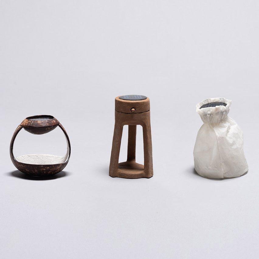
Six students from the Instituto Tecnológico de Monterrey in Mexico have designed low-cost solar lamps made from mud, beans and cactus slime for people living in isolated rural areas with limited electricity.

Led by Moisés Hernández, the Solar project saw six students develop six different lamps made from waste materials found in rural Mexico, such as wicker, coconut bark and the maguey pulquero plant.

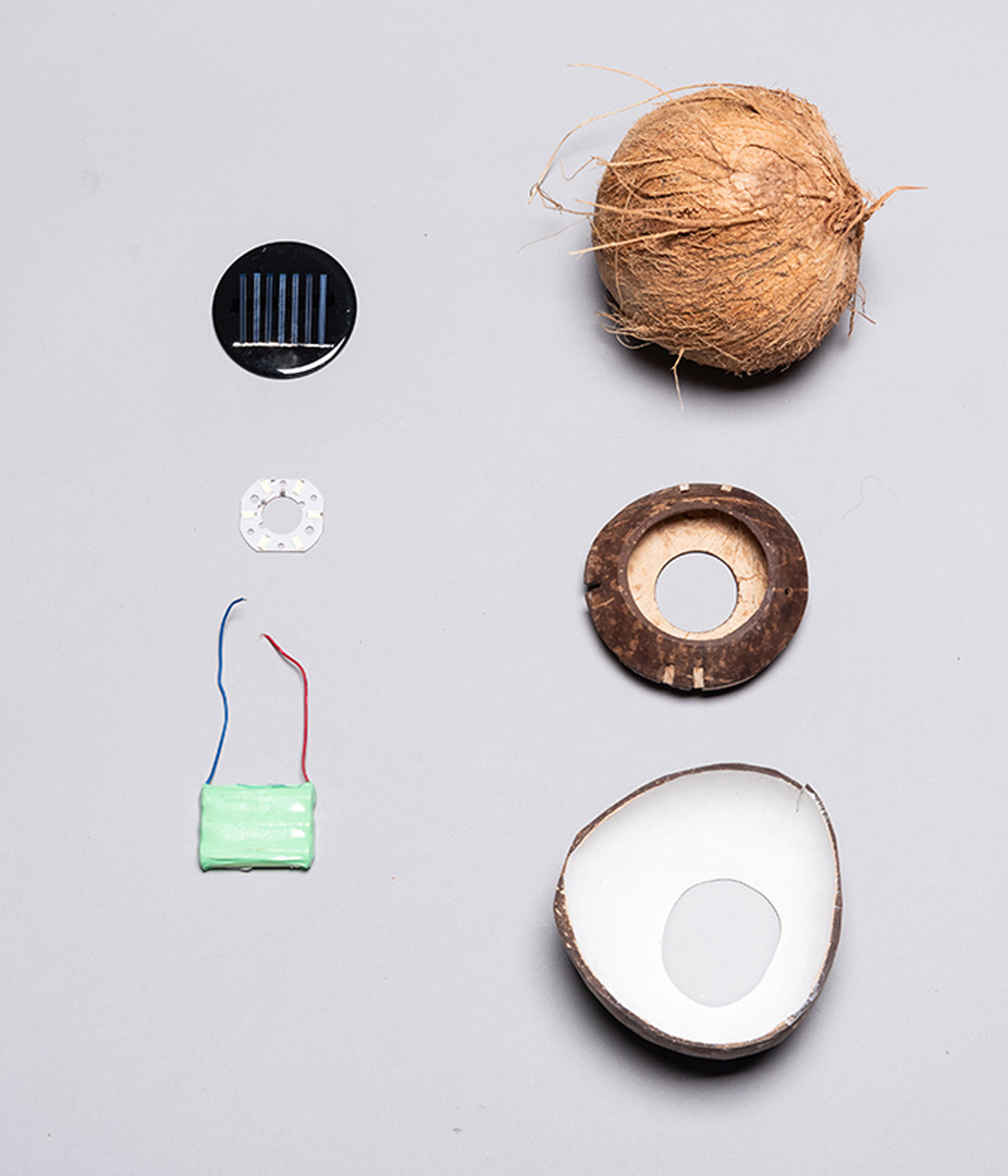
Using solar cells and LED technology, the lamps propose a sustainable solution to the need of nearly seven million Mexicans that live in isolated rural areas with limited or no access to electricity.

Mexican students design low-cost solar lamps for people without electricity
Each of the six solar lamps are made from waste materials found in rural Mexico including wicker, coconut shell and mud

Taking cues from the solar-powered Little Sun lamp by Icelandic artist Olafur Eliasson, Hernández and his students aimed to create lights with the lowest possible carbon footprint using bio-materials and low-cost manufacturing methods.

While some of the chosen materials will not last as long as Eliasson's plastic Little Sun, Hernández told Dezeen, the goal of the project was to design lamps with bodies that can be easily produced using local materials.

This way, people would need just the simple electronic components and the solar panel. The main structure could be fixed or replaced by making another from materials found in the surrounding environment.

Mexican students design low-cost solar lamps for people without electricity
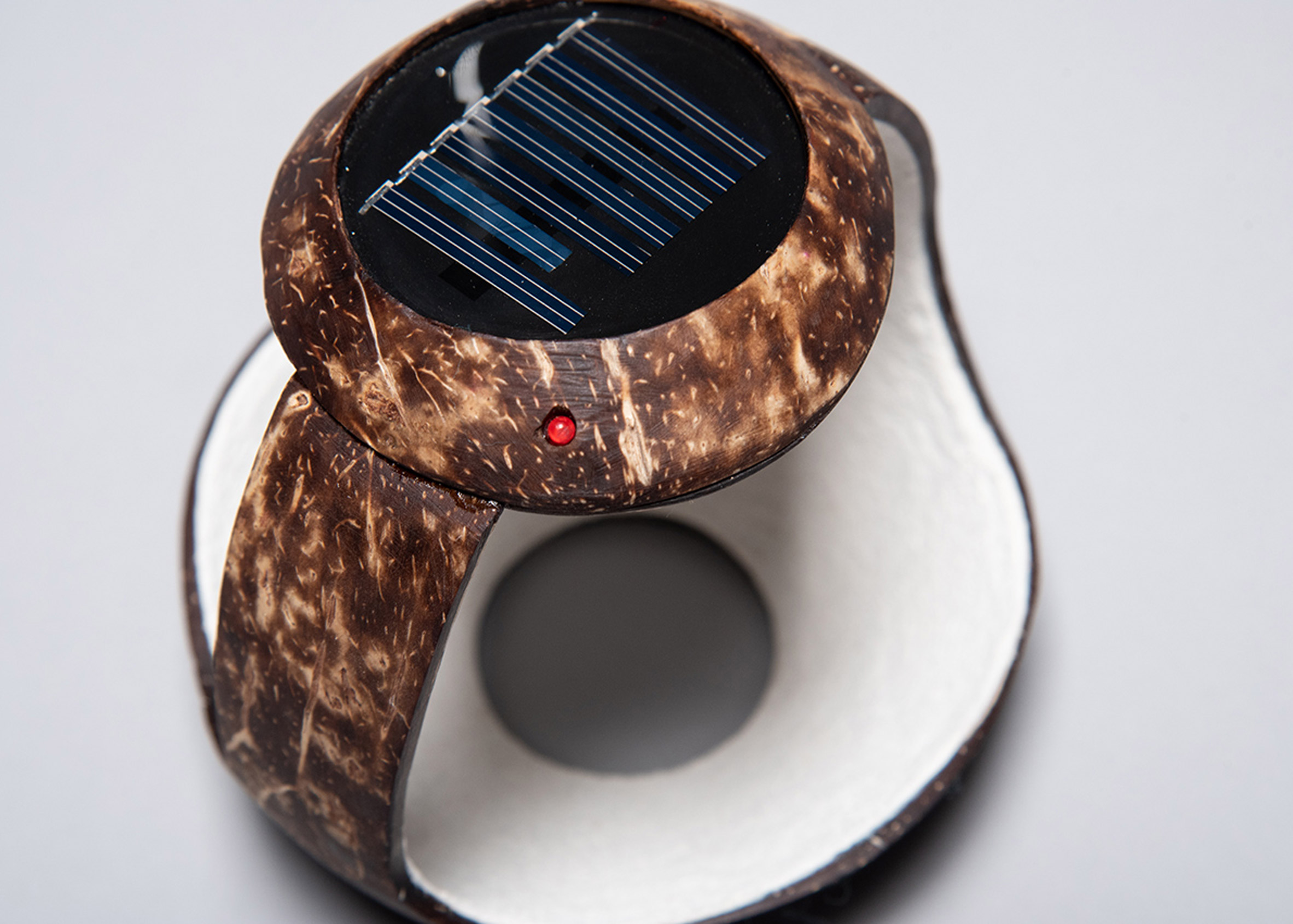
Rafael Sánchez Brizuela made the body of his lamp from a coconut shell

"What we intend with this project is to look for new ways of production in rural areas or isolated communities where they do not have any injection plastic facilities to make the main bodies of lamps," Hernández explained.

"With these new material ideas that came from different sites across Mexico, where the weather and context are so different, the students visualised new scenarios where these type of technological objects can be assembled and distributed to local people."

Mexican students design low-cost solar lamps for people without electricity
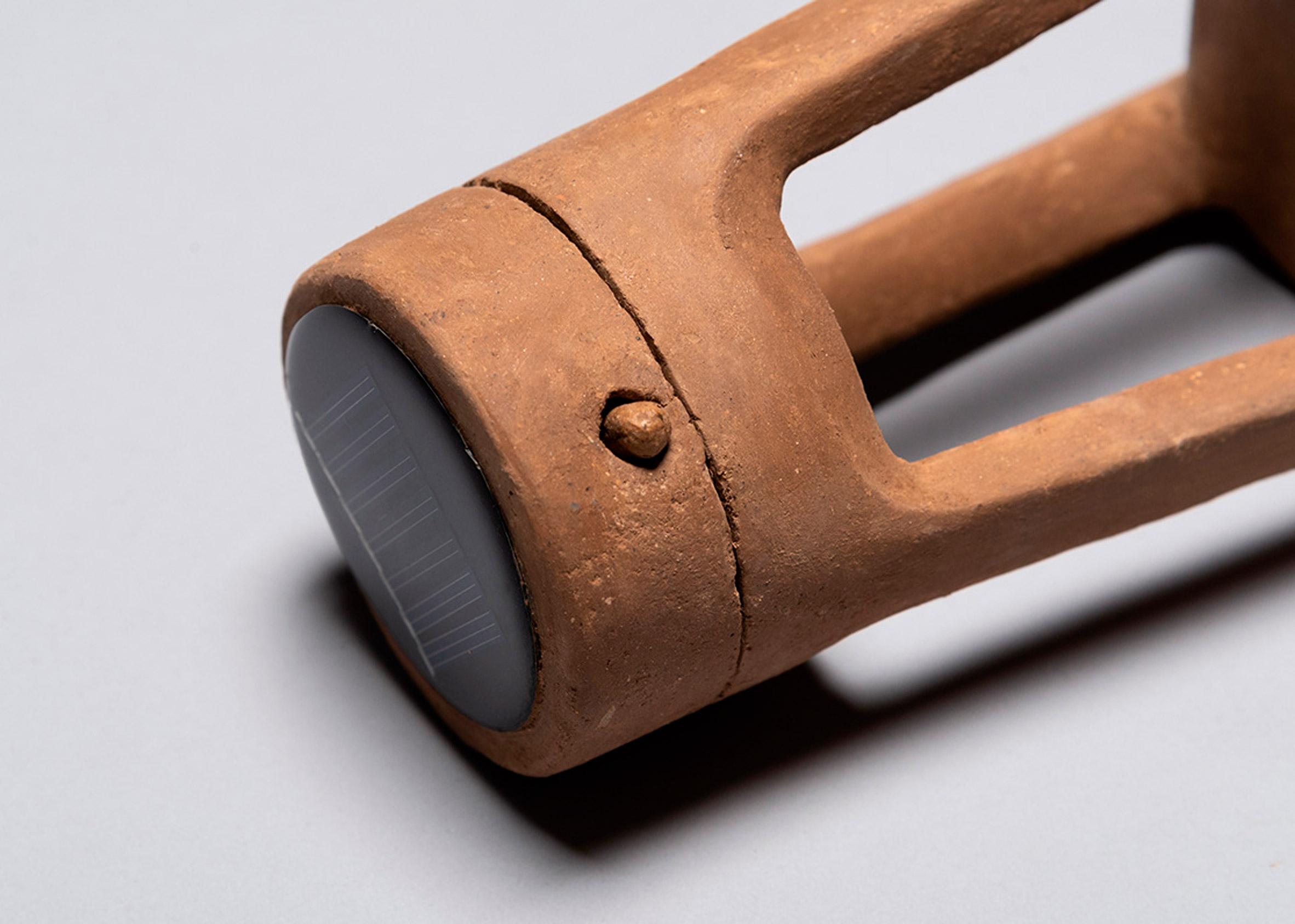
Luis Fernando Sánchez Barrios' lamp is made from mud, recycled paper and cactus slime

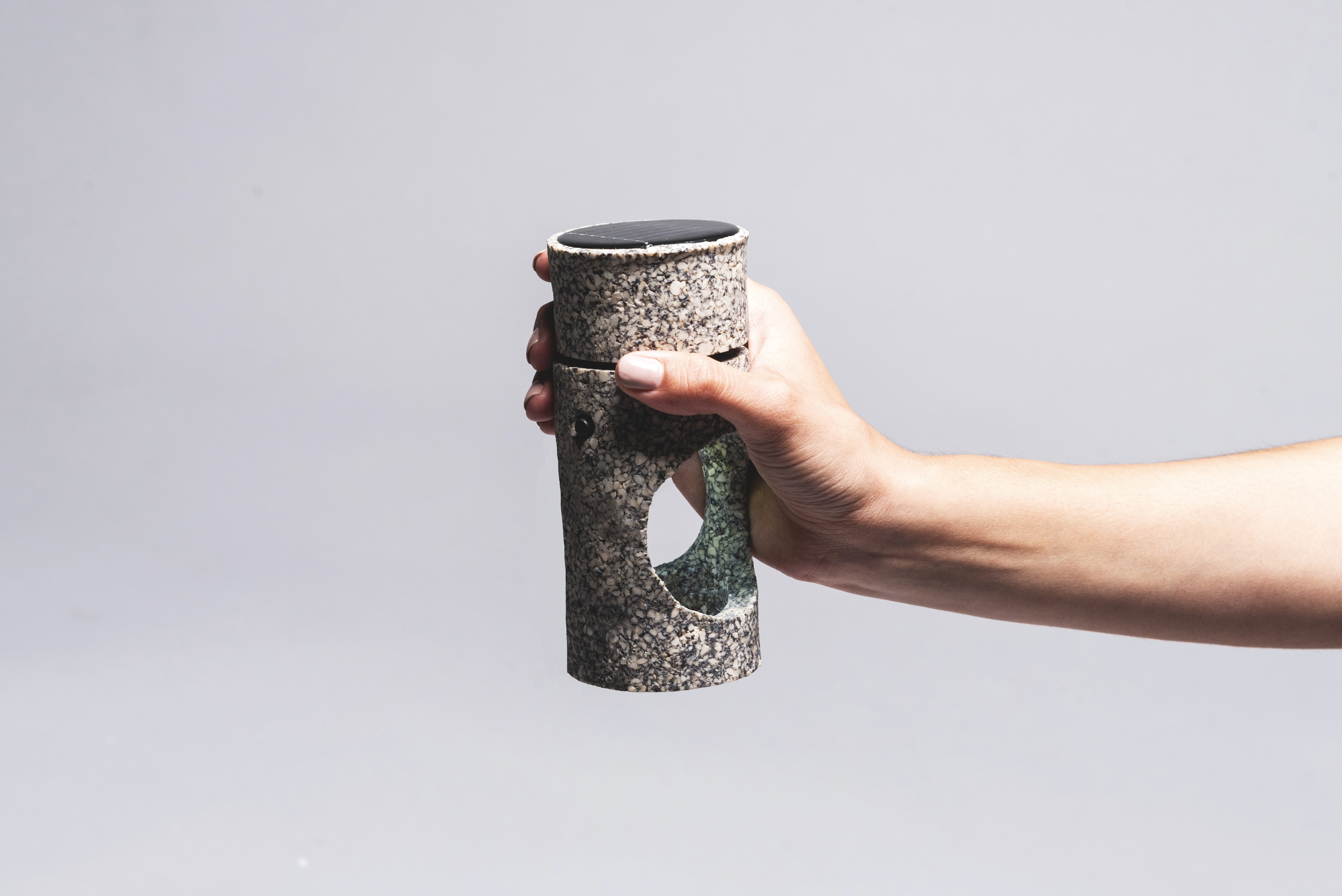
The Adobe solar lamp by Luis Fernando Sánchez Barrios is built from mud, recycled paper and cactus slime – a mixture that the designer says offers a substance similar to cooked clay.

Designed for marginal communities that are dispersed throughout Mexico, Barrios' lamp references "pre-hispanic knowledge" of materials as well as an environmental awareness.

Mexican students design low-cost solar lamps for people without electricity
Oscar Andrés Méndez Hernández used black beans to build his solar lamp

Oscar Andrés Méndez Hernández looked to the black bean when considering natural materials for his solar lamp, which is designed to provide light on a worktable.

The LED sits above a circular cut-out in the centre of the structure, allowing the user to appreciate the texture and colours of the material as the light shines on its surface.

Mexican students design low-cost solar lamps for people without electricity
Discarded animal tissue was used to create Naoto Ricardo Kobayashi Utsumoto's lamp

A coconut shell was used to form the body of Rafael Sánchez Brizuela's lamp, while animal tissue waste – also known as collagen – that has been pulverised and injection moulded was used to create Naoto Ricardo Kobayashi Utsumoto's translucent, brown-hued lamp.

Mexican students design low-cost solar lamps for people without electricity
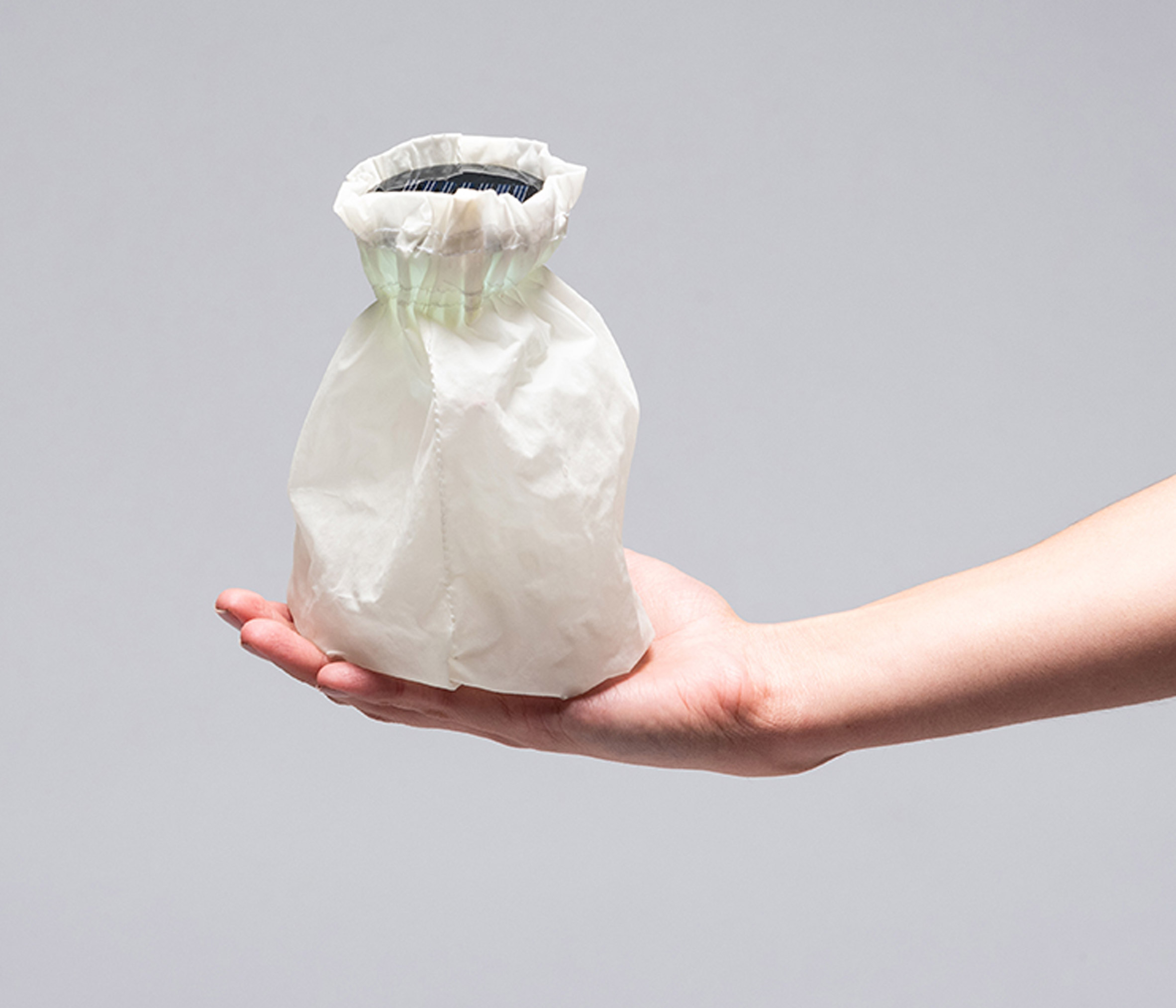
Viridiana Palma Dominguez used waste from the maguey pulquero plant to make her lamp

Viridiana Palma Dominguez made the body of her lamp from the cuticle and skin of the maguey pulquero plant – the contents of which is used to make an alcoholic drink called pulque.

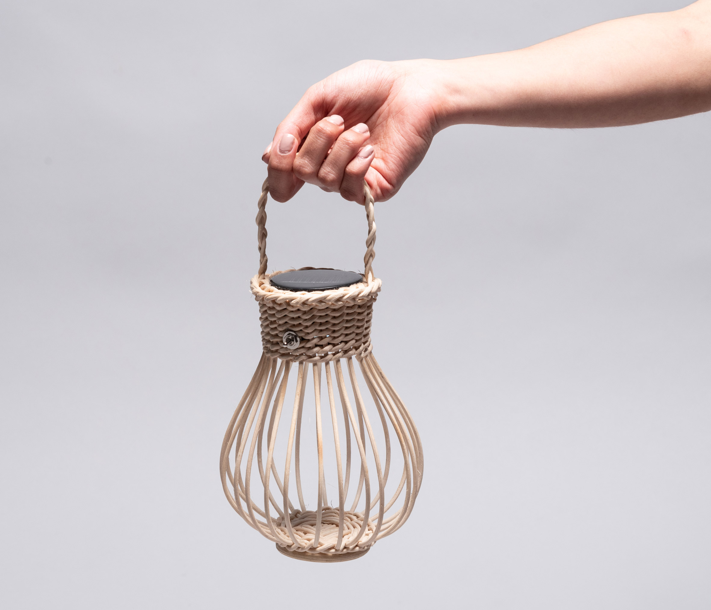
Aniela Mayte Guerrero Hernández, on the other hand, looked to more traditional materials, using handmade wicker by craftsmen in Tequisquiapan, Queretaro, a region located in the centre of Mexico.

Mexican students design low-cost solar lamps for people without electricity
Aniela Mayte Guerrero Hernández's lamp body is made from wicker

Hernández and his group of students are just some of many designers who seek out unusual materials to make more interesting and sustainable products.

Other creations include a fashion collection made from seaweed, lighting made from discarded cow intestines and tableware made from out-of-date eggs.

The post Mexican students build low-cost solar lamps from natural waste materials appeared first on Dezeen.


from Dezeen https://ift.tt/36JFTxW