From influencing voters to making veganism mainstream, graphic design can change people's behaviour. We've rounded up seven projects for our review of 2019 that demonstrate the persuasive power of good graphic design.
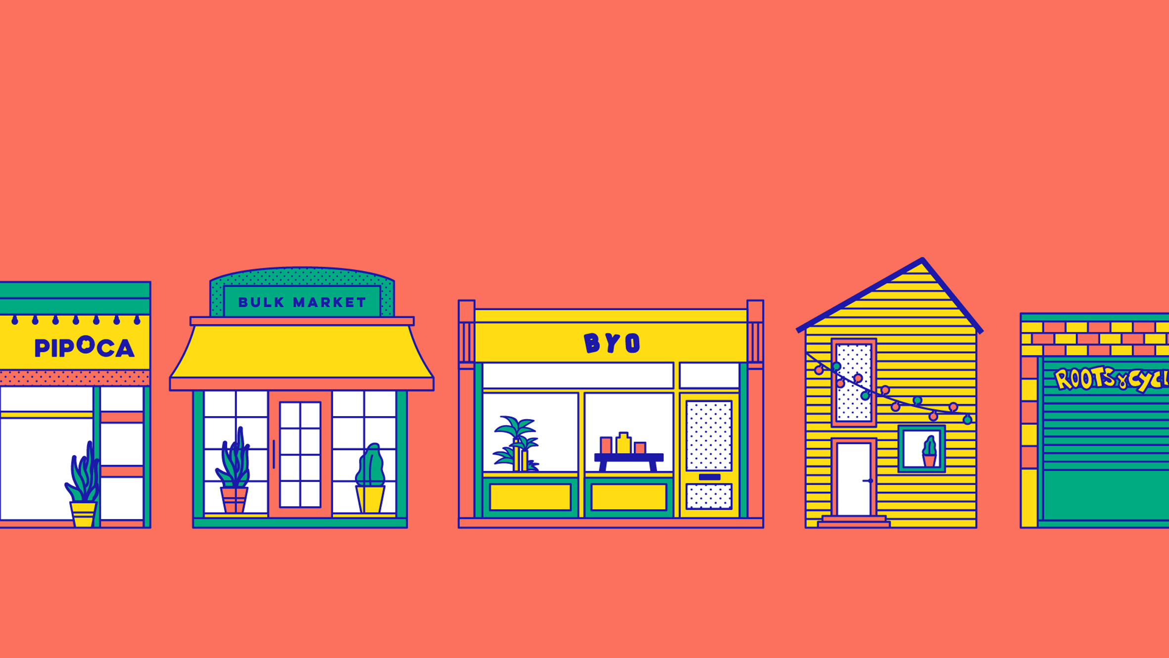
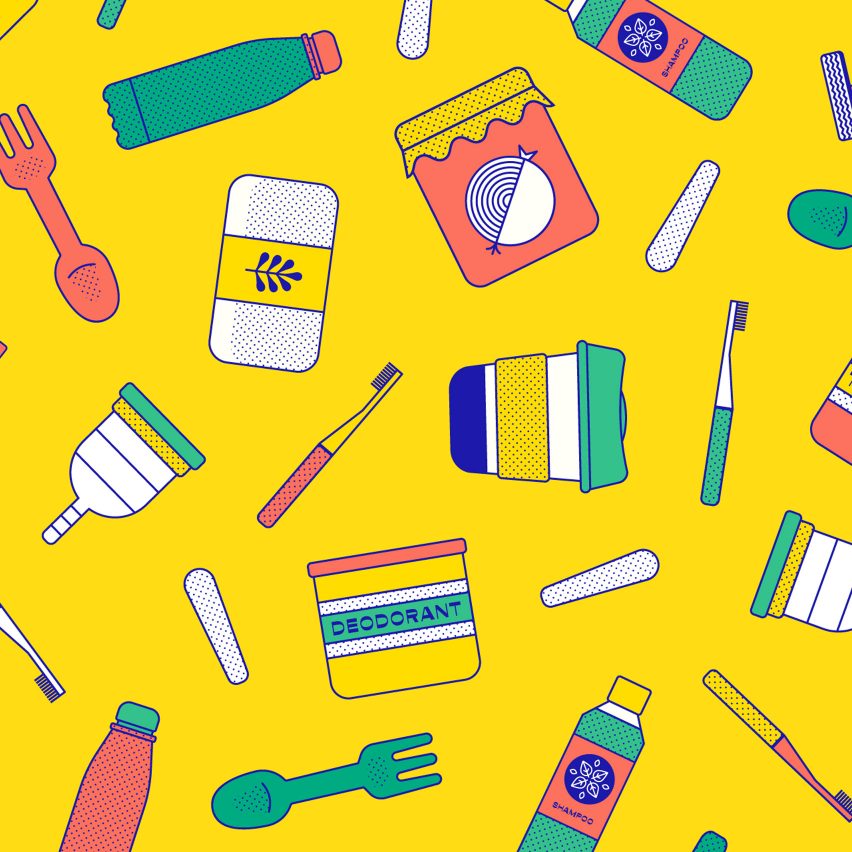
Useless is a digital directory for London's zero-waste shops
Ethical creative agency Nice and Serious developed Useless, an online platform that directs Londoners to their closest zero-waste shops and offers tips on how to reduce reliance on plastics.
Its easy-to-use functionality and aesthetics are what makes Useless useful. Co-founder Tom Tapper explains that as a creative agency, Nice and Serious was well placed to create a resource that doesn't feel cumbersome to use and that communicates information in a clear and contemporary way.
The site's design is playful and vibrant, and uses bold colours and simple illustrations to put a serious message across.
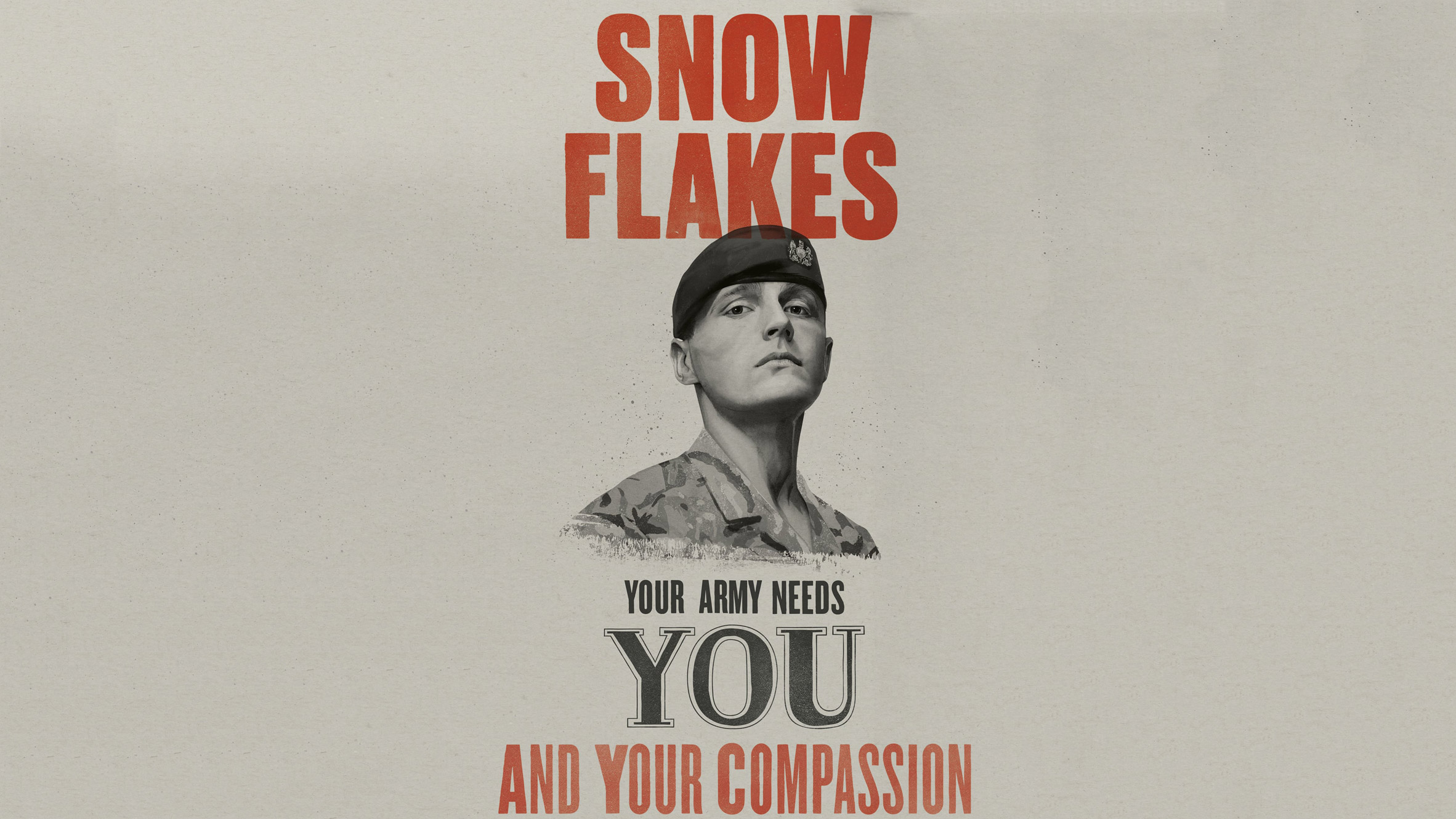
British Army calls on "snowflakes" and "millennials" in recruitment drive
A 2019 British Army recruitment campaign drew inspiration from a well-known first world war poster in its targeting of "snowflakes, selfie addicts, class clowns, phone zombies, and me, me, millennials".
This unusual approach to army recruitment was designed by creative agency Karmarama, who created a series of six posters and three TV adverts calling on young people between the ages of 16 and 25 to join the British Army.
The campaign uses the tagline: "Your army needs you", a spin on the more familiar "Your country needs you", and turns stereotypes about young people into positive attributes, for example by praising millennials for their self-belief.
Find out more about the recruitment campaign ›
![]()
Brexit Party logo "a very clever piece of graphic design" says Design of the Year winner
The Brexit Party's new logo caused a stir earlier in the year when designer, Ben Terrett, described the arrow-shaped logo as a "very clever" piece of graphic design.
Richard Bentall, professor of clinical psychology at the University of Sheffield, was less complementary, describing the fact that the logo creates an arrow pointing towards the party's choice box as an "unfair advantage".
Find out more about the Brexit Party's logo ›
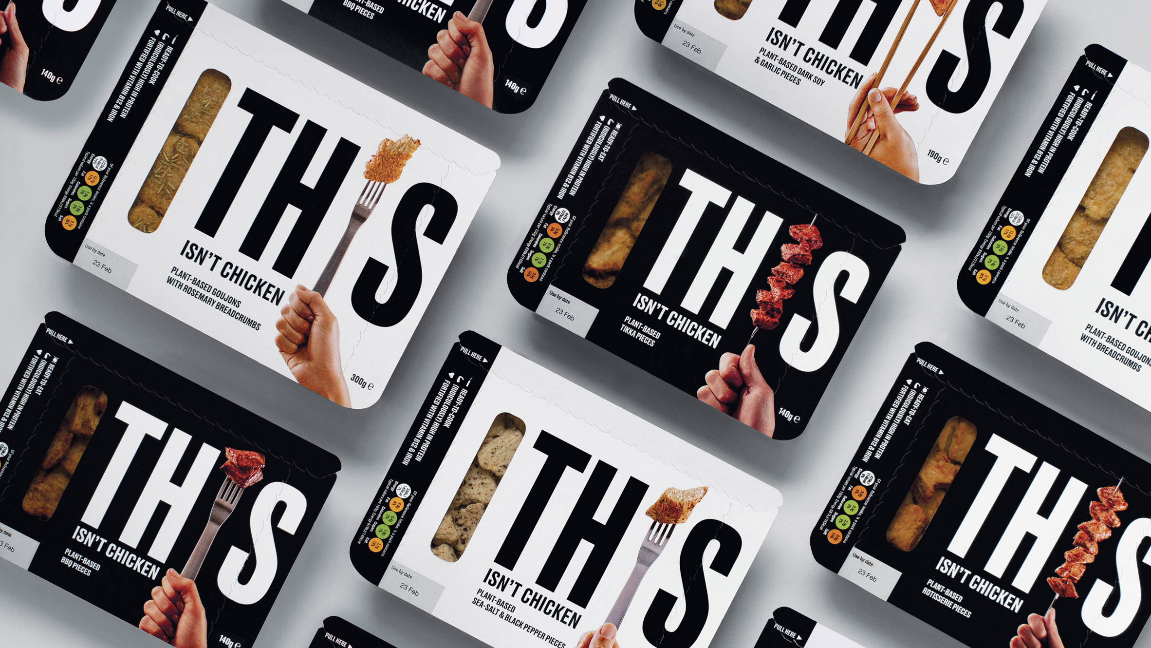
Johnson Banks creates meat alternative packaging that isn't "preachy"
Design studio, Johnson Banks, shunned "preachy language" and even the colour green in its branding of alternative meat company, This.
The studio recognised the appeal of meat as a potential selling point and incorporated this into the visual language, instead of "guilt-tripping" people into modifying their eating habits. By making the name as large as possible on a plain background, the studio also aimed to create maximum "shelf stand-out".
Find out more about Johnson Banks' approach to vegan food marketing ›
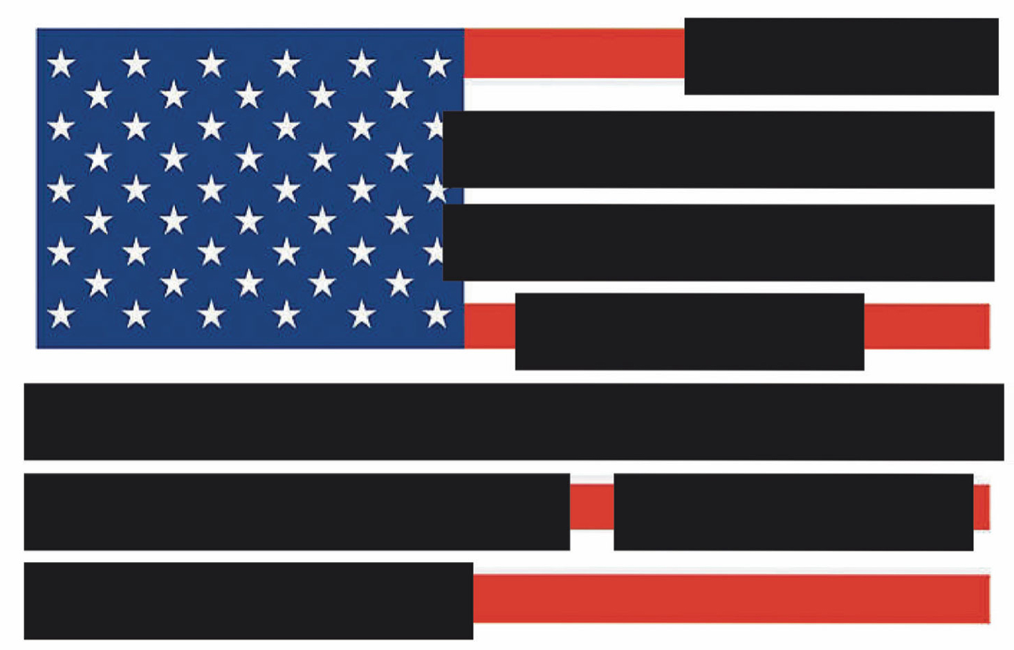
Tucker Viemeister's blacked-out US Flag criticises redacted Mueller Report
When the Mueller Report into Donald Trump's suspected collusion with Russia was released to the public with significant portions redacted, American industrial designer Tucker Viemeister decided to draw attention to what was missing.
Viemeister's Redacted US Flag features thick black lines covering sections of the 13 stripes that appear on the US flag to emulate the redacted sections of the report. The graphic is one of a number of projects the designer has created that criticise the Trump administration.
"It is the role of the designer not just to make the world more beautiful – but to critique the one we live in," Viemeister explained to Dezeen.
Find out more about Viemeister's stand against redaction ›
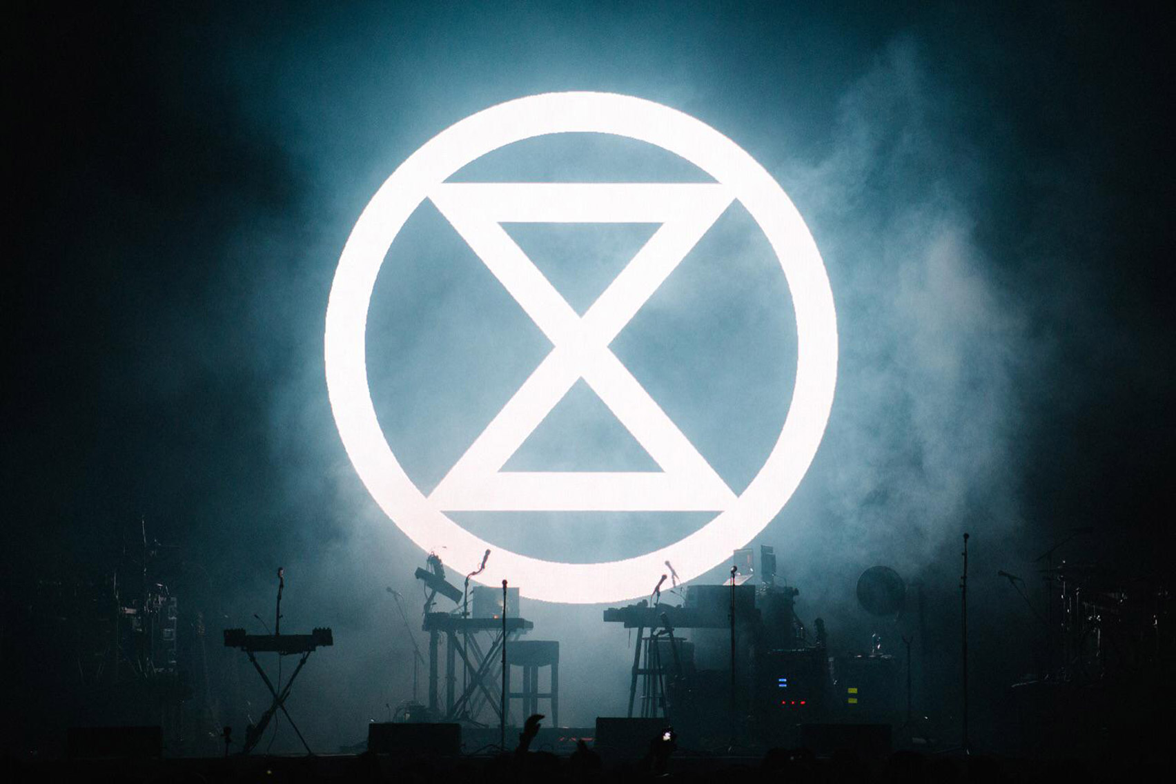
Extinction Rebellion uses bold graphics in protest against climate change
Extinction Rebellion made its presence known this year with a strong, easily recognisable visual identity featuring striking graphics and a bold colour scheme.
Symbolism, such as human and animal skulls, is used throughout the group's branding to reference its primary objective of preventing human extinction. The group's logo is a stylised hourglass symbol to represent that time is running out to save the planet.
The non-violent group seeks to draw attention to the impact of climate change in an effort to change legislation and relies on large numbers of members to spread the message. Participation is encouraged with branded DIY protest posters for flyposting, which activists can print at home.
Find out more about Extinction Rebellion's visual identity ›

Glug creates digital database of protest posters for today's climate strikes
In a similar vein, creative networking organiser Glug aimed to create the world's biggest database of protest posters in 2019 to help potential activists be a part of global climate strikes.
They called on a group of creatives from the design and advertising industry to submit their posters to a large digital archive which protesters can access free-of-charge.
Find out more about Glug's climate change poster database ›
The post Seven graphic design projects that aimed to change the world in 2019 appeared first on Dezeen.
from Dezeen https://ift.tt/34XU40J