Tuesday, 10 December 2019

The Willis Faber & Dumas building is a revolutionary high-tech office

Willis Faber & Dumas building by Foster Associates – Norman Foster and Micheal Hopkins

We continue or high-tech architecture series by looking at Foster Associates' Willis Faber & Dumas building, a revolutionary office block in Ipswich, which was completed in 1975.

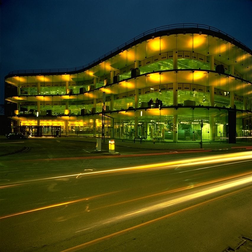
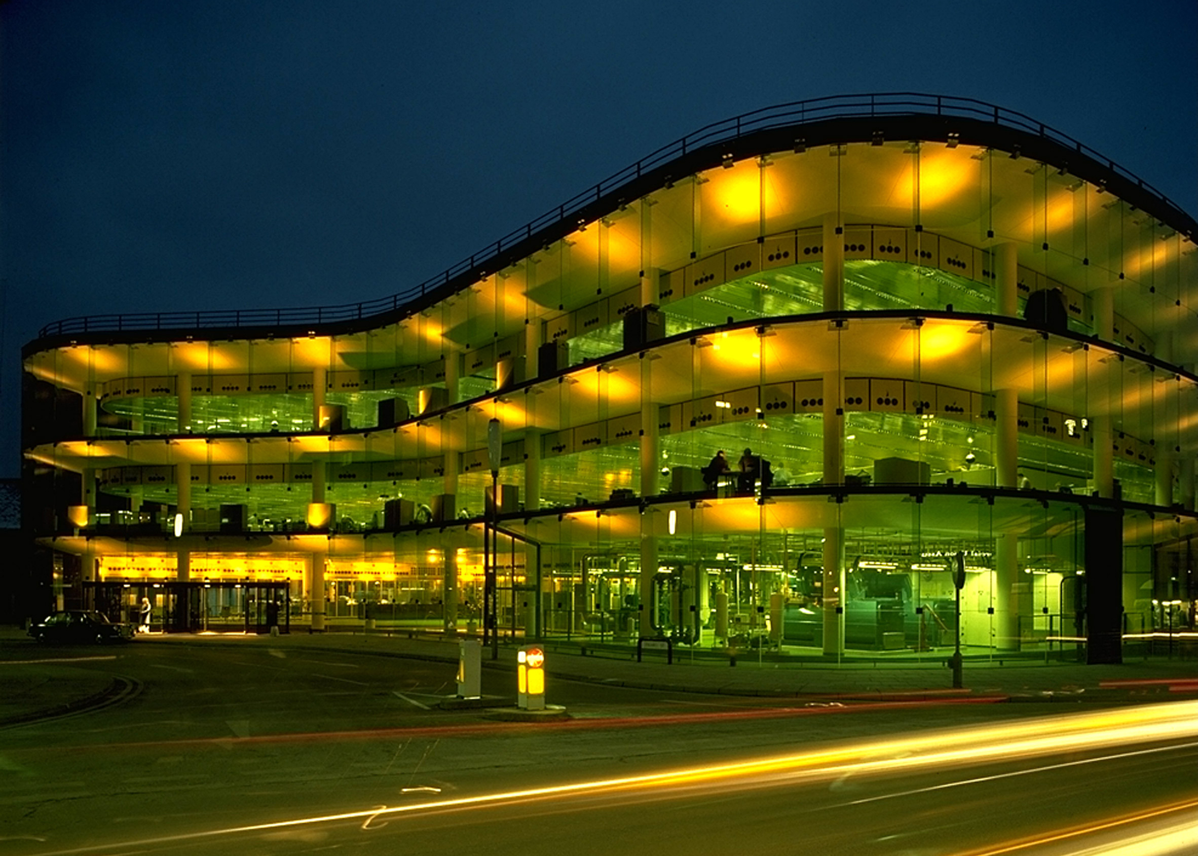
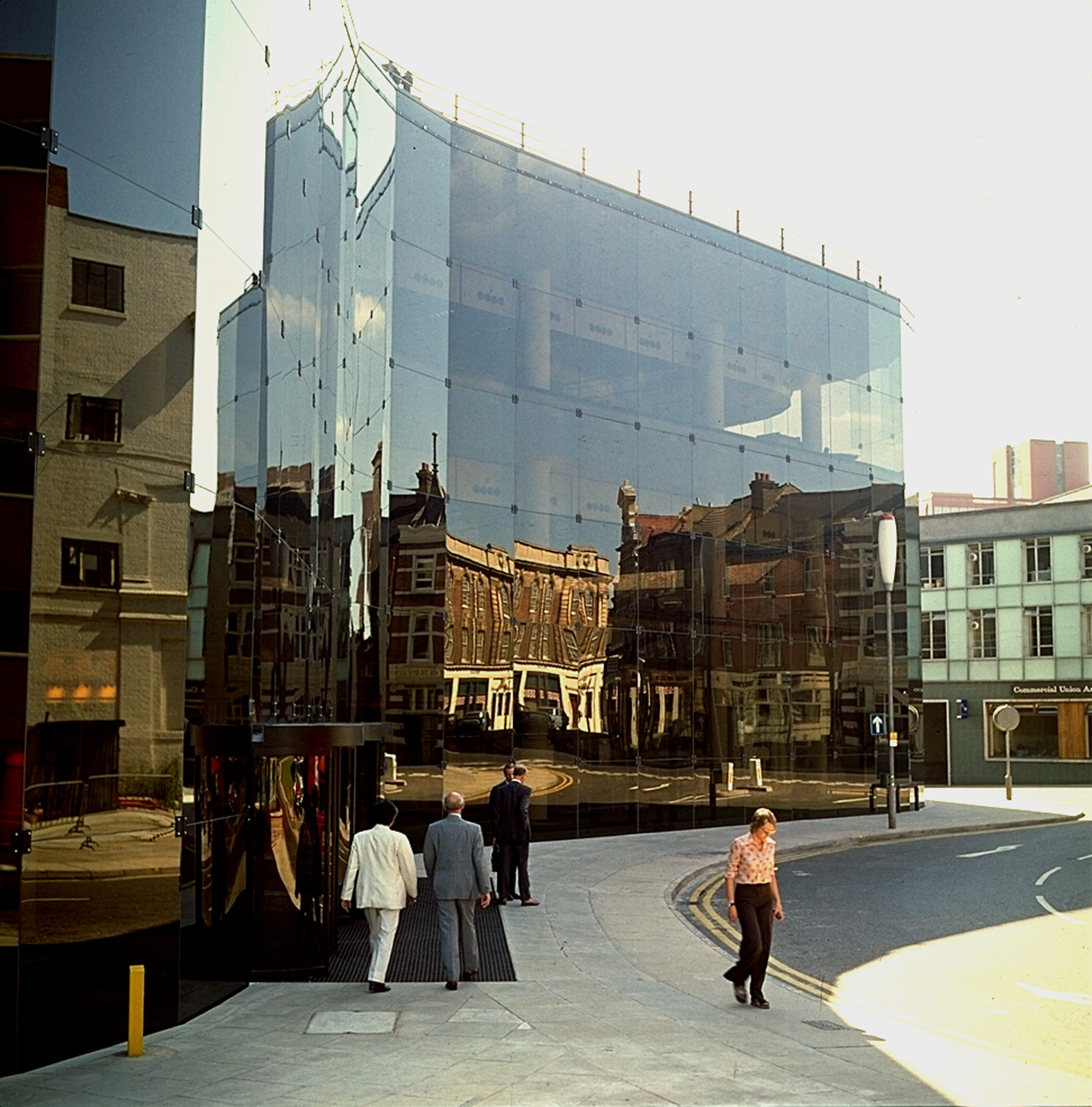
Built as the headquarters of insurance company Willis Faber & Dumas, the three-storey block occupies its entire site and is wrapped in a glass curtain wall that reflects the surrounding buildings.

As with other early high-tech buildings, such as the Centre Pompidou in Paris, the Willis Faber & Dumas building was designed to contain open and flexible internal spaces.

At this building, these spaces were used as open-plan offices, something that was rare at the time, according to Norman Foster.

Willis Faber & Dumas building by Foster Associates – Norman Foster and Micheal Hopkins
Photo is by Ken Kirkwood

"The traditional office was separation between those who managed and those who did the work," he told Dezeen.

"In an office, the head was isolated in his own room, with a space before it where you would go through a secretary before you could get into the inner sanctum."

He continued: "So the idea of taking all these walls down and management coexisting, being seen in the same space, this was revolutionary. Unheard of."

Willis Faber & Dumas building by Foster Associates – Norman Foster and Micheal Hopkins
Photo is by Ken Kirkwood

The office was the first major commission won by Norman and Wendy Foster after they established Foster Associates following Team 4's breakup in 1967. Michael Hopkins, who would later go on to set up a practice with his wife Patty Hopkins, was project architect on the building.

Willis Faber & Dumas wanted "an office environment sympathetic to human values" in a building that was "neither over-ambitious nor pedestrian", according to the insurance broker's client statement.

Willis Faber & Dumas building by Foster Associates – Norman Foster and Micheal Hopkins

The building stands at the edge of Ipswich. It was built on an irregularly shaped site determined by the medieval street layout of the historic town.

Its structure was designed by Anthony Hunt, the engineer of many high-tech buildings including Team 4's Reliance Controls factory, the Hopkins House, Foster Associates' Sainsbury Centre and the Grimshaw's Eden Project.

Although the building fills the irregular site, it was built with a regular grid of reinforced concrete columns, which are set 14 metres apart, giving the building flexible and open interior spaces.

Willis Faber & Dumas building by Foster Associates – Norman Foster and Micheal Hopkins

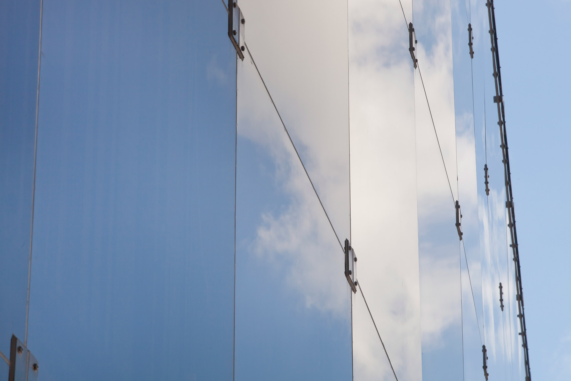
Like with many high-tech buildings, the latest technology was used for the facade. The office block is wrapped in a curving, bronzed-glass curtain wall, which is hung from the building's frame and reflects the surrounding historic buildings. It was developed with the glazing manufacturer Pilkington.

Two-metre-square panels are connected with fittings in the corners and silicone jointed to create a glass wall that wraps around the entire building.

Willis Faber & Dumas building by Foster Associates – Norman Foster and Micheal Hopkins
Photo is by Tim Street Porter

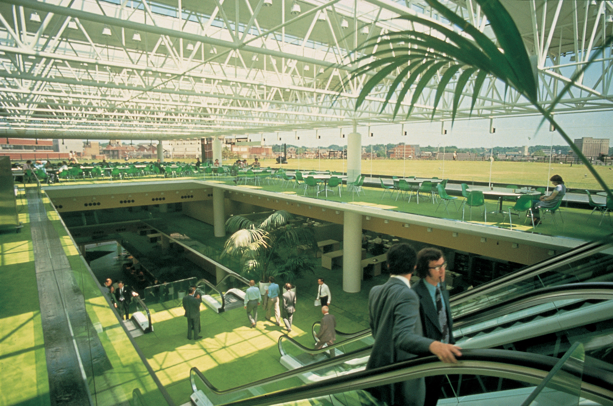
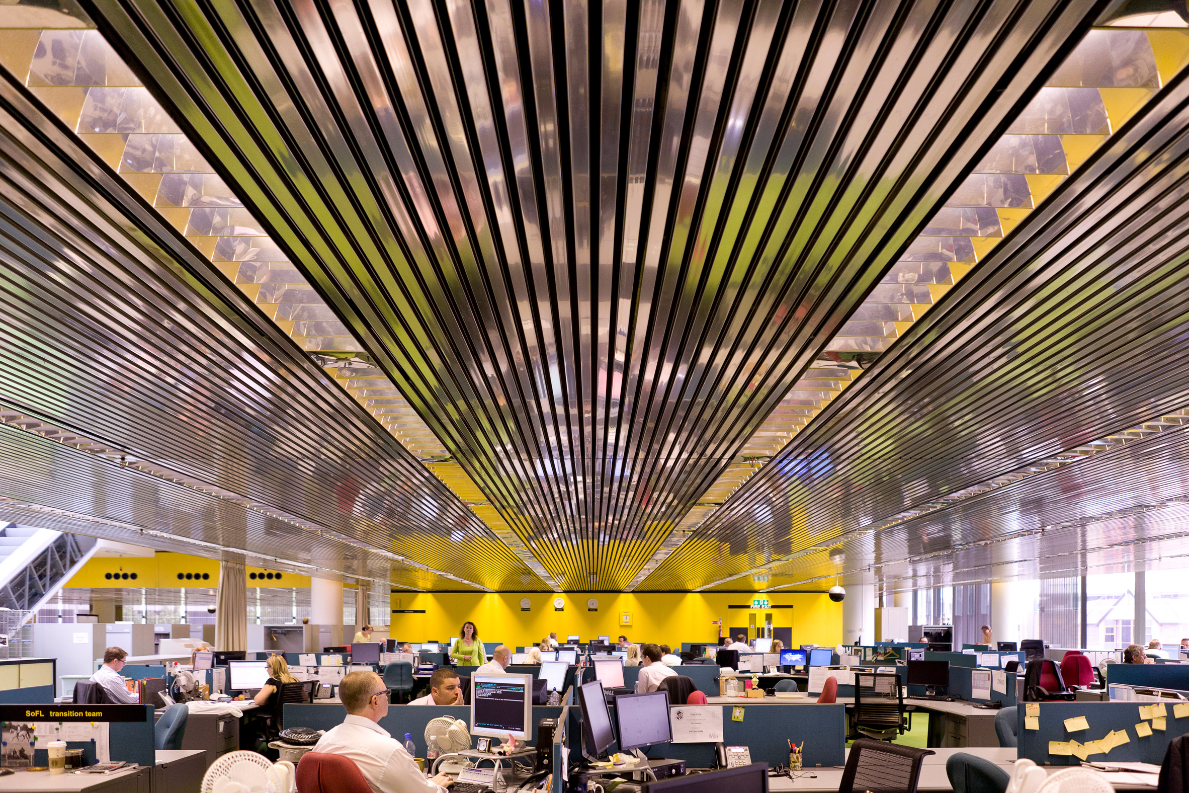
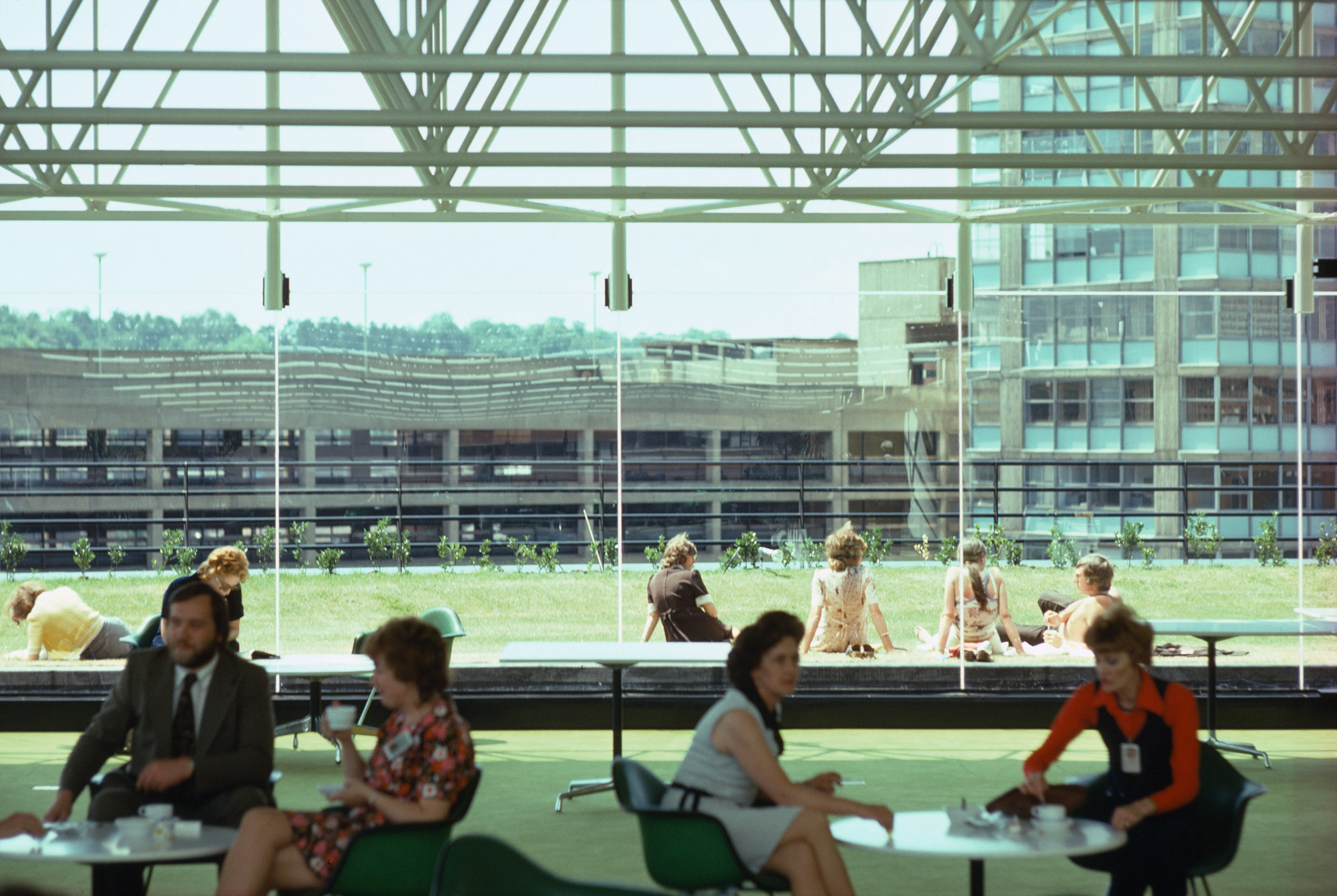
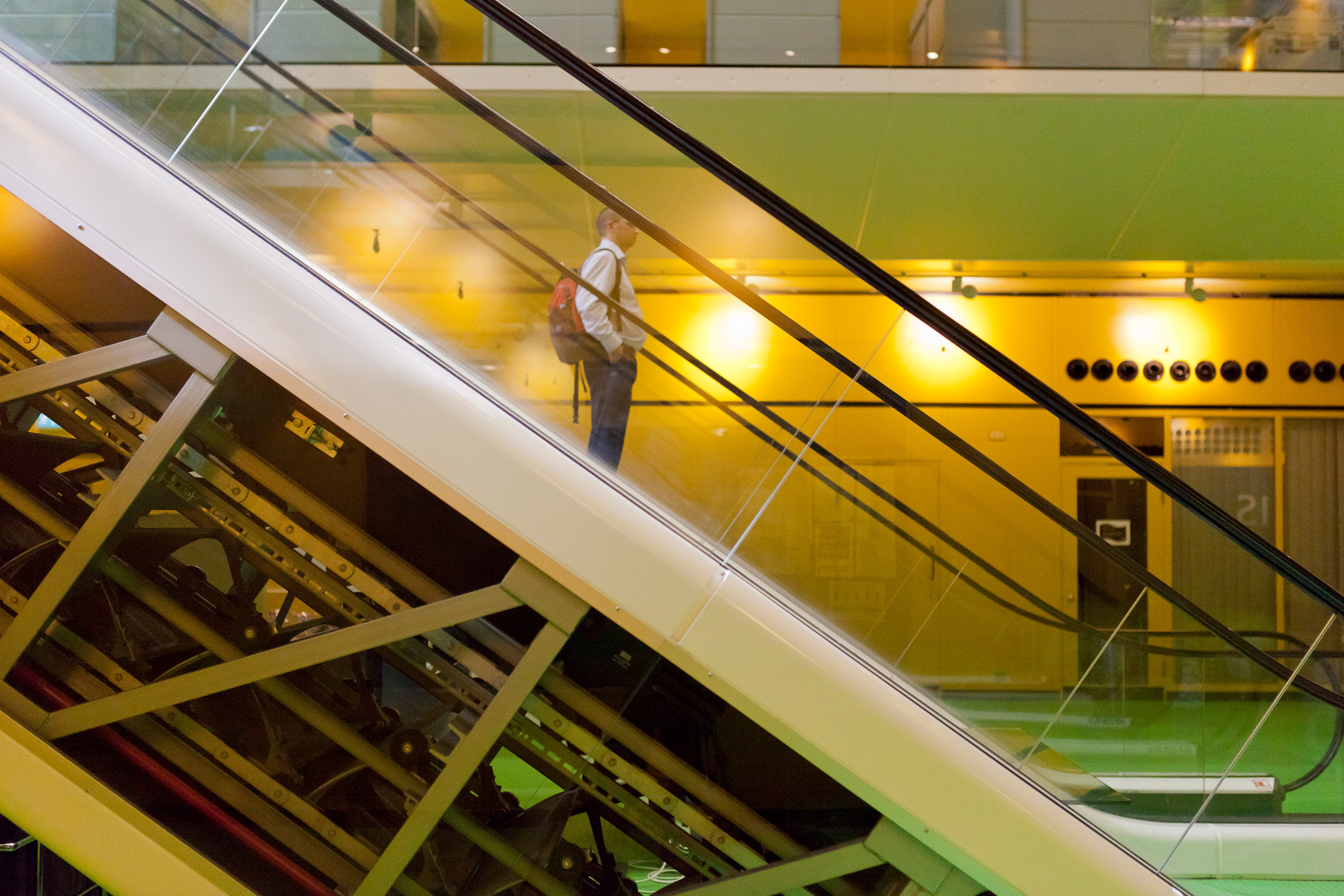
The offices for 1,350 of the insurance broker's employees are arranged around an atrium that has three pairs of escalators to bring people from the ground floor up to a restaurant in a pavilion on the third floor.

This was reportedly the first use of escalators in an office building.

Willis Faber & Dumas building by Foster Associates – Norman Foster and Micheal Hopkins
Photo is by Tim Street Porter

According to the studio, the building was "conceived in a spirit of democratising the workplace and encouraging a greater sense of community".

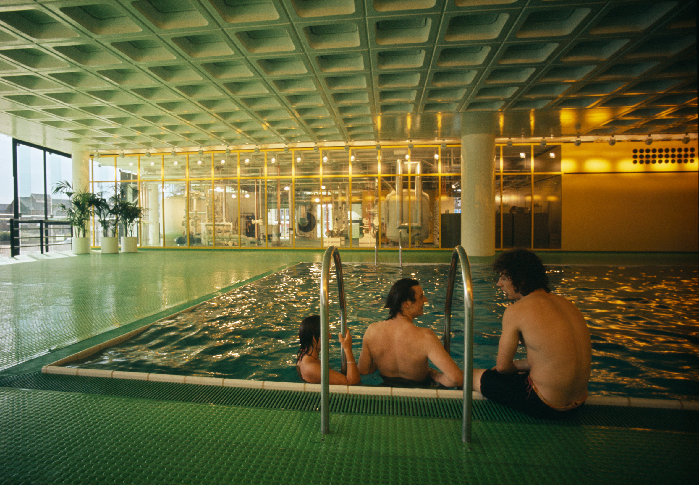
Along with open office spaces, the building had a rooftop restaurant, a garden and a ground-floor swimming pool. This pool was covered over, but not filled in, to provide more floor space for the office in 1994.

The office was also built with raised floors, which meant that it could be easily fit with new technologies as they developed.

Willis Faber & Dumas building by Foster Associates – Norman Foster and Micheal Hopkins
Photo is by Tim Street Porter

Although senior management at Willis Faber & Dumas were initially resistant to the idea of open-plan offices for all, when they moved into the building they changed their minds, according to Foster.

"I remember the opening day in Willis Faber. And I can even remember the guy who was running it, Ronnie Taylor – this is going back to the 1970s – he insisted on having his own enclosed office. On the first day, he instructed for it to be taken down," he said.

"The interesting thing is that when those boundaries were taken down, nobody wanted to put them up again."

Willis Faber & Dumas building by Foster Associates – Norman Foster and Micheal Hopkins

The building was Grade I-listed in 1991. It was the forerunner of many offices designed by Foster's studio, including the Bloomberg building, which won the Stirling Prize in 2018.

"At that time is was really revolutionary," said Foster. "Willis Faber, which is the forerunner of Bloomberg, is a deep-plan building about lifestyle. A swimming pool, a roof garden, the integration of art. It is still quite revolutionary. Even now it's a talking point."

High-tech architecture
Dezeen's high-tech architecture series explores the style

Led by architects Foster, Richard RogersNicholas Grimshaw, Michael and Patty Hopkins and Renzo Piano, high-tech architecture was the last major style of the 20th century and one of its most influential.

High-tech is an architectural style that emerged in the UK in the late 1960s, which saw the expression of structural elements and building services usually hidden within buildings.

Our high-tech series celebrates its architects and buildings ›

Illustration is by Jack Bedford. Photography is by Nigel Young, unless stated.

The post The Willis Faber & Dumas building is a revolutionary high-tech office appeared first on Dezeen.


from Dezeen https://ift.tt/36rMOL7

Dezeen's top 10 conceptual architecture projects of 2019

House Inside a Rock by Amey Kandalgaokar

This year designers created a huge variety of conceptual architecture from a straw bale school to a bamboo colony on Mars. Semi Han continues our review of 2019 with 10 of the most intriguing concepts.


East 34th Street conceptual skyscraper by MAD Architects

East 34th Street, New York, USA, by MAD Architects

Chinese studio MAD Architects envisioned a 232-metre tall skyscraper to sit next to the Empire State building at East 34th Street. Unlike its neighbours, it is designed to curve, bend and taper so that it softens the skyline.

Inside, shops and public amenities would encircle a multi-storey atrium and large green wall, which could offer visitors a "new type of 'urban nature' in a vertically dense city".

Read more on East 34th Street ›


Straw Bale School by Nudes

Straw Bale School, Malawi, by Nudes

Straw Bale School is a concept for a secondary school in Malawi. The school would be built from wooden A-frames topped with straw bales arranged linearly to create forms that vary in height.

The school's classrooms would be placed within the A-frames with entrances incorporated into the ends of each module.

Read more on Straw Bale School ›


Low cost-shipping container housing, Lima, Peru, by TRS Studio

Peruvian-based TRS Studio envisioned homes created from two repurposed shipping containers topped with a polycarbonate roof for this affordable housing concept.

Each 60-square-metre house would contain a living area, kitchen, bathroom, a master bedroom and a small garden.

Read more on these shipping-container houses ›


Infinity London 360 degree pool by Compass

Infinity London, London, UK, by Compass

Compass Pools proposed creating a 360-degree infinity pool with views across London at the top of a 55-storey skyscraper in the city.

Accessed via a submarine-style door, the pool would be built from transparent acrylic panels around the edges and on the floor and would encase 600,000 litres of water.

Read more on Infinity London ›


Notre-Dame proposal by Miysis Studio

Notre-Dame glass roof proposal, Paris, France, by Miysis Studio

Following the devastating fire at Paris' Notre-Dame in April, Miysis Studio was one of numerous practices to envision how the cathedral's destroyed roof and spire could be rebuilt.

Designed to be a "balance of history and future", the visualisation studio combined a replica of Eugène Viollet-le-Duc's lost spire with a steel and glass roof.

Read more on Miysis Studio's Notre-Dame roof and spire proposal ›


Preikestolen boutique hotel by Hayri Atak Architectural Design Studio

Preikestolen boutique hotel, Rogaland, Norway, by Hayri Atak Architectural Design Studio

Designed to evoke the thrill of hiking in the mountains, Hayri Atak Architectural Design Studio created this concept boutique hotel 600 metres above the Lysefjorden fjord in Norway.

The nine suites would have panoramic views of the fjord from their balconies, while a glass swimming pool would be cantilevered over the cliff to immerse guests in the sheer drop.

Read more on Preikestolen boutique hotel ›


House Inside a Rock by Amey Kandalgaonkar

House Inside a Rock, Saudi Arabia, by Amey Kandalgoankar

Influenced by the archeological site of Mada'in Saleh in Saudi Arabia, Amey Kandalgoankar envisioned a contemporary concrete house embedded into a giant boulder.

The designer contrasted simple concrete forms with the rock's texture. A tall entrance shaft runs through the centre of the rock, with a long horizontal living area running across it. Above, terraces are fitted on top of the rock base, alongside a shaded penthouse and outdoor swimming pool.

Read more on House Inside a Rock ›


Twine by Antony Gibbon

Twine by Antony Gibbon

Designer Antony Gibbon conceived a two-bedroom home underneath a twisting ribbon-like roof. The form splits the living room on one side and bedrooms on the other, with a sunken amphitheatre-like outdoor seating area placed at the centre.

Residents sitting in the living area would enjoy views of the imagined rolling hills and waterfront landscape, through glazed arches underneath the smooth, wave-like roof slab.

Read more on Twine ›


The Farmhouse by Fei and Chris Precht and

The Farmhouse by Fei and Chris Precht

Fei and Chris Precht designed The Farmhouse tower to provide residents with food to help them live more sustainably and reconnect with agriculture.

Reacting to transportation's damaging environmental impact in food production, the designers proposed a cross-laminated timber tower that would contain farming systems needed to feed the residents.

Read more on The Farmhouse ›


Seed of Life by Warith Zaki and Amir Amzar

Seed of Life, Mars, by Warith Zaki and Amir Amzar

The woven bamboo structures of Seed of Life would be constructed by robots on Mars in this concept by Warith Zaki and Amir Amzar.

The designers envision that the bamboo would be farmed on the red planet to avoid transporting materials from Earth.

Read more on Seed of Life ›

The post Dezeen's top 10 conceptual architecture projects of 2019 appeared first on Dezeen.


from Dezeen https://ift.tt/2PvdYtF

Artist Panayiotis Terzis creates vibrant works inspired by his upbringing in Greece

Panayiotis-terzis-art-itsnicethat-01
The Thessaloniki-born and NYC-based artist is a man of many disciplines. Not only does he create colour-rich paintings and drawings, but he also lends his hands to Risograph printing and publishing at Mega Press, a RisoLab in Manhattan.

Read more


from It's Nice That https://ift.tt/2P9Nq2a

Vikram Kushwah shares the intimate and revealing backstory behind his award-winning series

Nt_november_youtube_thumbnails_2
The fashion and documentary photographer tells us about his beautiful series The Education I Never Had in which he visits the Indian school his father has taught at for the last 35 years, and reflects on how their lives have become so different.

Read more


from It's Nice That https://ift.tt/2Yzd0QW

"In choosing blue, Pantone has missed the mark once more"

Pantone colour of the year 2020 is Classic Blue

Pantone played it safe and still missed the mark by picking Classic Blue as its colour of the year for 2020, says Michelle Ogundehin.


After the debacle of naming Living Coral as its 2019 Color of the Year (COTY), a shade supposedly based on the natural pigmentation of healthy ocean coral, despite this being in perilously short supply, Pantone played it safe for 2020. Its hue for the start of the new decade is Classic Blue.

Described variously as "elegant in its simplicity", "reflective" and "an anchoring foundation", it's unsurprising really. Such an influential global institution, professionally dependent on industry recognition of its colour sense, couldn't afford another such politically insensitive misstep. And, seeing as blue is routinely cited as one of the Western world's eternally favourite colours – no doubt because it instantly recalls cloudless summer skies and warm calm seas – it couldn't go wrong with such an inoffensive pick. Or could it?

Certainly, the dominant narrative in many other 2020 COTY camps has been green. Whether dark or bright, neon or dusky, colour companies and trend forecasters from Dulux and WGSN to the US-based Behr paints, plumped for the colour intuitively associated with regrowth and rebirth. Green reassures us at a primal level and speaks of optimism.

Crucially, it's representative of the wider ecological story that's top of the cultural agenda right now. In this way, green chimes with the zeitgeist and its ascension of the colour charts is born of authenticity, not marketing.

Such an influential global institution, professionally dependent on industry recognition of its colour sense, couldn't afford another such politically insensitive misstep

Nevertheless, blue is arguably the most democratic of colours. It literally means all things to all people, with a welter of associations depending on the precise tone in question, hence its universal appeal. Consider the psychological meaning of navy – solid, upright, commonly representative of quality and dignity (expensive designer goods are often packaged in such tones for this reason) – which is quite different to that of light blue, which tends to evoke comparisons with the sky, implying serenity and calm.

In between we have a whole spectrum of brighter, more upbeat mid-tones which recall the colours of an idyllic Mediterranean sea, thus watery connotations abound, think cleanliness, liberation and unbounded freedom.

Pantone's Classic Blue is pitched somewhere in-between these mid sea blues and the falling ink of a dusky sky. A move away from the strictures and conformity of the darker shades, but just short of the happy-clappy-vibes simplicity of a child's paint-box blue.

Blue is arguably the most democratic of colours

It's more of a full-fat, deep blue, but still very much within the canon of unapologetic colours customarily favoured by Pantone – remember 2017's Kermit Green and 2018's violent violet? According to Leatrice Eiseman, executive director of the Pantone Colour Institute, Classic Blue is "a boundless blue evocative of the vast and infinite evening sky" while also being a colour that challenges us to "think more deeply, increase our perspective and open the flow of communication".

Except what sort of communication might that be for blue is nothing if not replete with contradictions. After all, despite all the positive sea and sky symbolism it's also traditionally associated with woe and depression as in "to have the blues". This phrase is assumed to be derived from the 17th century English expression "the blue devils", which described the hallucinations of an alcoholic in the grip of cold turkey. In fact, "blau sein" is still slang for drunk in Germany.And what of The Blues themselves, the very manifestation in music of melancholia underscored by narcotic addiction.

Regardless, Eiseman was quoted in the New York Times asserting that young people don't associate blue with sadness anymore, saying: "I think that's kind of an older generation reaction". I beg to differ. Although I'll concede that Classic Blue is definitely more in-your-face moody than down-in-the-mouth glum.

On the other hand, there's its associations with sex. Blue movies denote pornography, and a certain invigorating little pill for men was also coloured blue. Then again, the Virgin Mary was historically depicted garbed in blue as a show of holy respect and devotion, but this is primarily because, way back when, blue pigment was made from crushed Lapis Lazuli, highly-sought after and more pricey than gold.

I'll concede that Classic Blue is definitely more in-your-face moody than down-in-the-mouth glum

In Greece blue is believed to ward off the evil eye, and yet in the Middle East and Latin America, it's the colour of mourning. But pivot again and mid-blue tones are frequently used for many corporate logos and uniforms as they're thought to prompt feelings of trust and loyalty, which is probably also why they're included in 53 per cent of the world's flags.

Throw in idioms like "blue sky thinking" to suggest unfettered creative thought and "blue blood" to infer someone of aristocratic heritage, and it's clear that blue is far from straightforward.

Interestingly, for this year's presentation, Pantone sought to further elucidate its colour choice with a fully immersive sensory installation. Classic Blue therefore has its own soundtrack ("a nostalgic song that takes us to a place of comfort and familiarity"), a fabric ("a soft, velvety texture to print on"), a tea ("a wellness oriented, elegant and expansive berry melange with subtle citrus notes") and a scent ("a fragrant contemplation of where sky and sea meet"). All yours to purchase in limited-edition runs (albeit the track can apparently be downloaded for free): colour as a complete consumer experience!

For sure this acknowledges that colour has the power to impact a lot more than just the visual side of our lives, it is, in the words of Laurie Pressman, vice president of the Pantone Color Institute, "a way to express and affect ideas and emotions".

In this supremely anxious and confusing era where rage and rebellion have become the action of choice, it's just not the moment to champion escapism

But this is also precisely why, for all their potentially flighty assertions, COTY announcements end up carrying such weight. It's natural for people to want to belong and feel "on-trend", therefore sales of this colour inevitably rise and the prophecy is duly declared a success. However, because it's driven only by a carefully orchestrated media grab for attention, bolstered by feverish bandwagon jumping as brands small and large scramble to display stock in the now newly requisite it-colour, it does not mean it can be taken as a true indication of the state of the nation.

For in choosing blue, so seemingly popular and uncontroversial, I think Pantone has missed the mark once more. Although it's not alone this time. PPG, the Pennsylvania-based American Fortune 500 paint conglomerate, has just named Chinese Porcelain as its 2020 COTY. A blend of cobalt and ink blue, it's a cooler, more sophisticated version of Pantone's Classic Blue, characterised as redolent of "calmness and restful sleep while also offering the spirit of hopefulness – a precious commodity in a restless world." Indeed.

Dee Schlotter, senior colour manager at PPG Paint expounds: "The need for simplicity and escapism from technology is in part, the reason that consumers are craving blues like Chinese Porcelain that bring us closer to natural elements such as the sea and sky".

It certainly chimes with Pantone, which claims: "Imprinted in our psyches as a restful colour, Classic Blue brings a sense of peace and tranquillity to the human spirit, offering refuge". Fair enough on both counts, but just because we hunger for something doesn't make it good for us. I'd argue instead that in this supremely anxious and confusing era where rage and rebellion have become the action of choice, it's just not the moment to champion escapism.

Rather, it's time to get real. Or as the former US Navy Seal turned motivational author, Admiral William H McRaven so memorably put it: "If you want to change the world, first make your bed". Unfortunately, we appear to have made ours rather badly, so in the tug of love between green and blue, I'm on the side of planting our collective feet (and a lot of trees) firmly on the ground, not having our heads in the clouds. Either way, storms are indubitably ahead, so where would you rather be?

The post "In choosing blue, Pantone has missed the mark once more" appeared first on Dezeen.


from Dezeen https://ift.tt/2Px1LV3