Wednesday, 11 December 2019

Merging architecture and landscape "came very naturally" to Snøhetta says co-founder

Kjetil Trædal Thorsen of Snøhetta

Snøhetta celebrates its 30th anniversary this year. In the first part of an exclusive interview with Dezeen, co-founder Kjetil Trædal Thorsen explains that the firm's ultimate aim has always been to make buildings for the betterment of society.

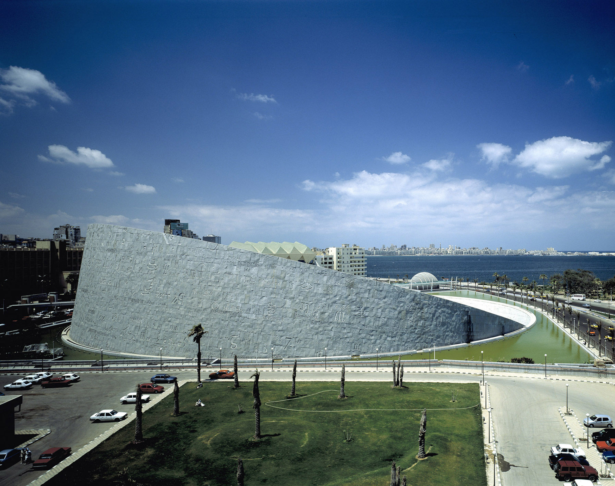
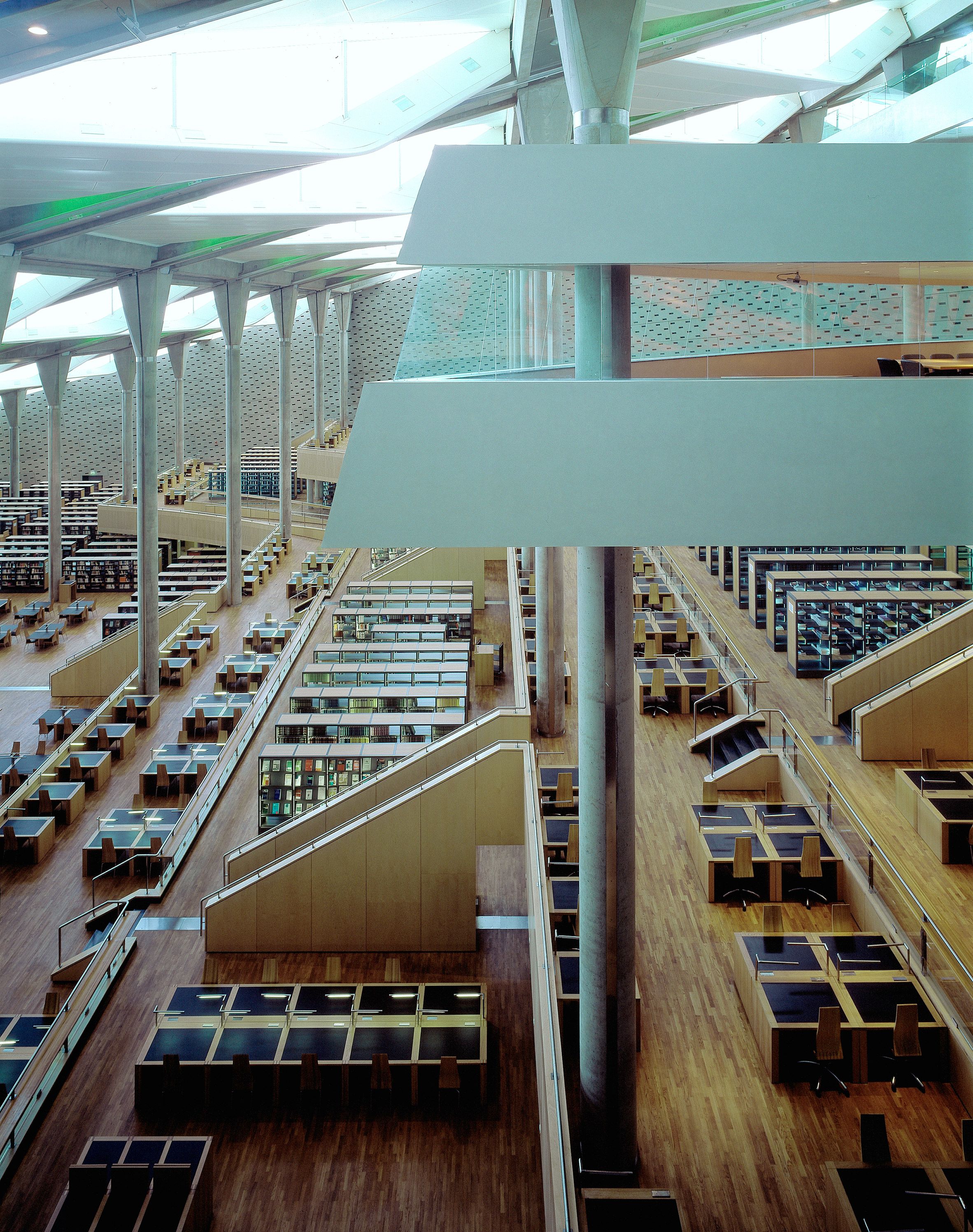
Thorsen and partner Craig Dykers founded Snøhetta in 1989, after winning the competition for the Bibliotheca Alexandrina in Alexandria, Egypt. At the time, neither of them had ever completed a building.

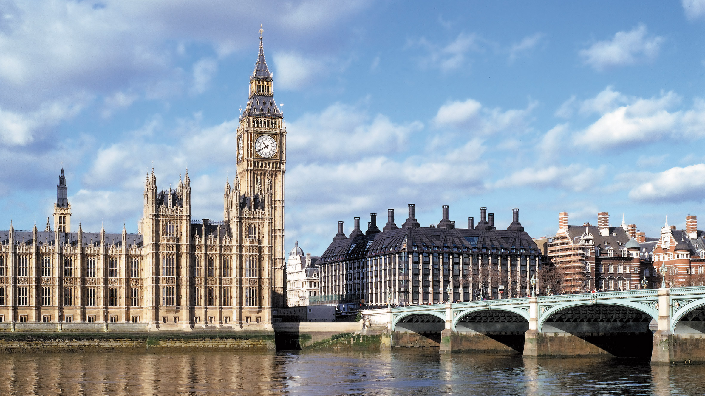
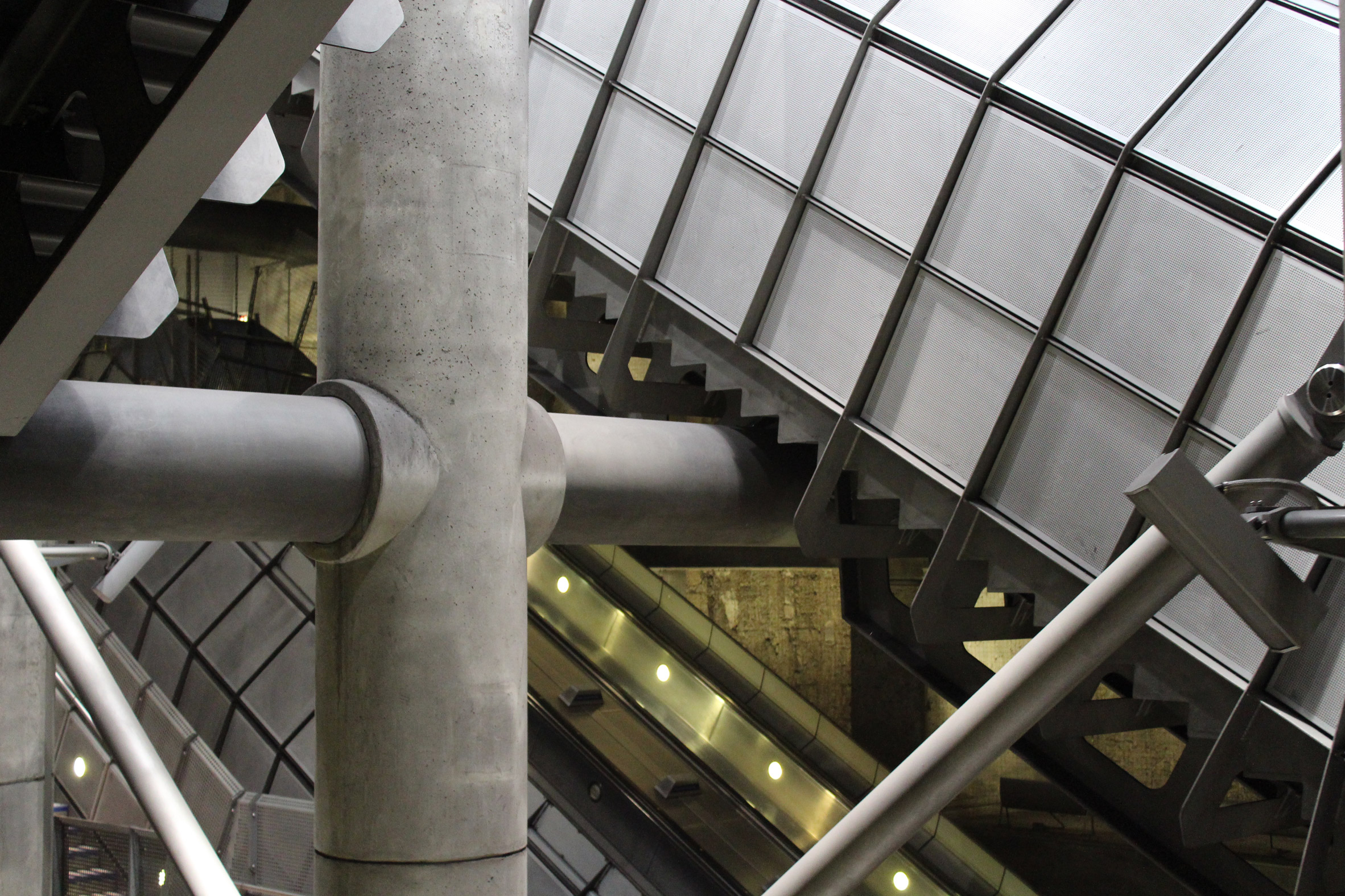
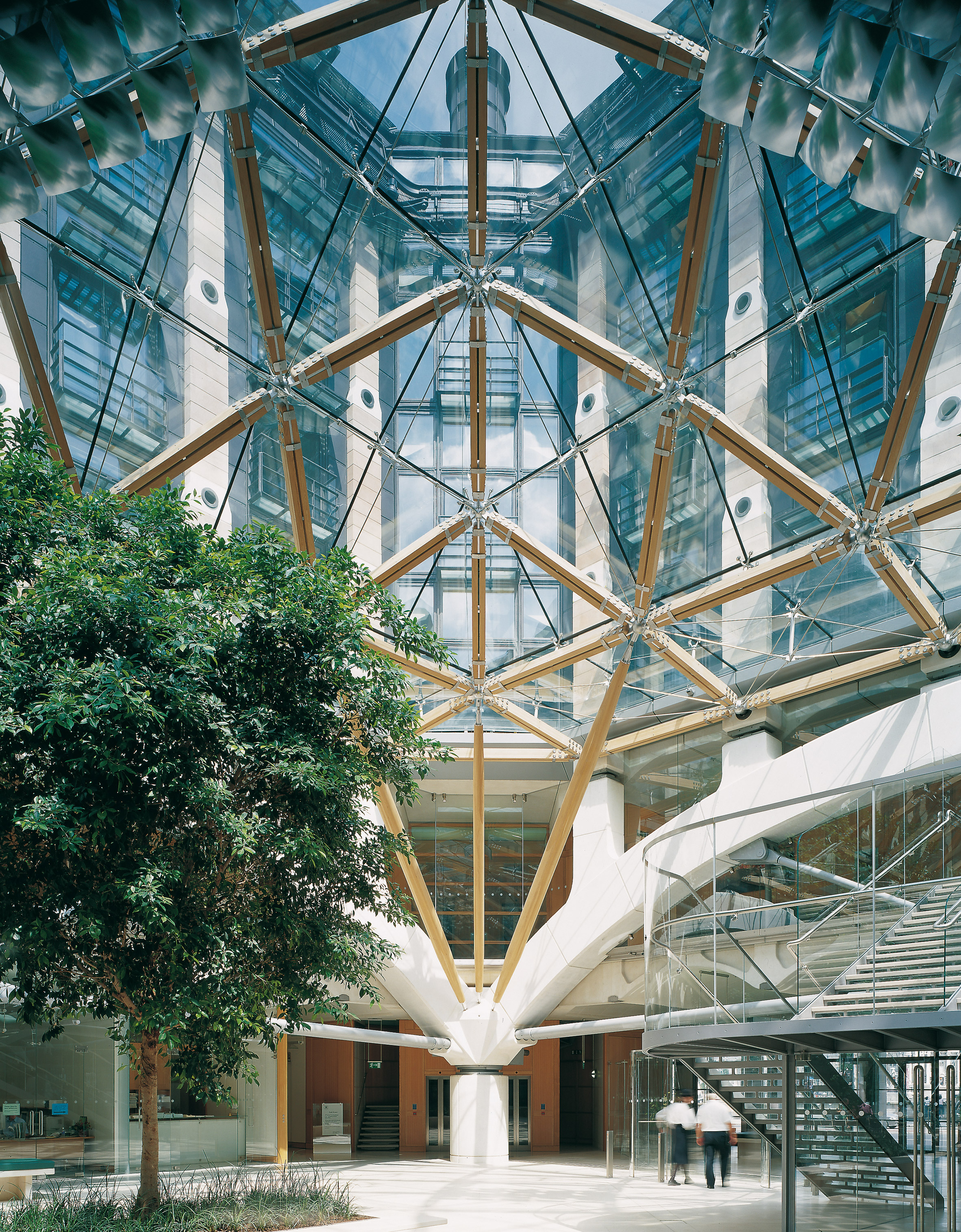
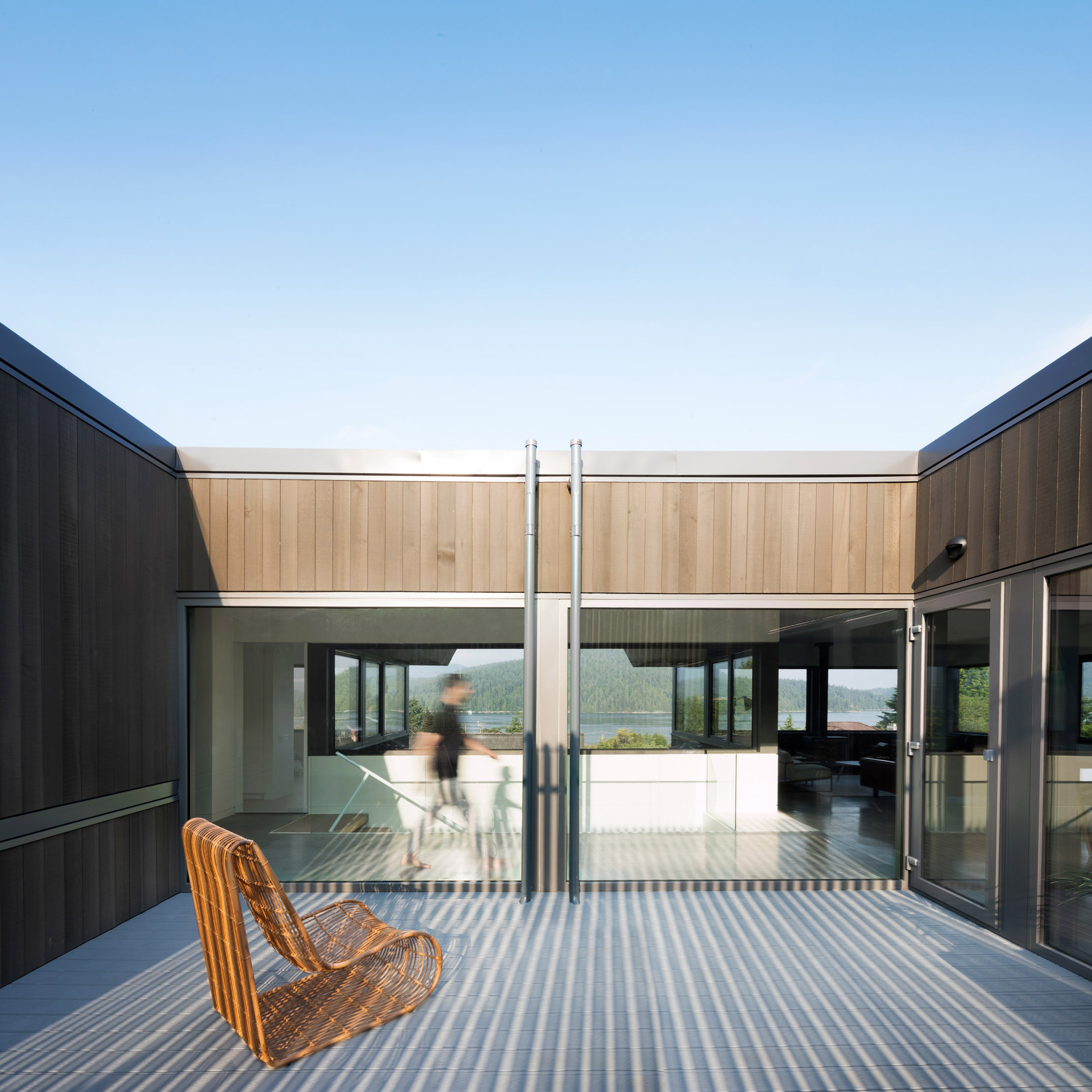
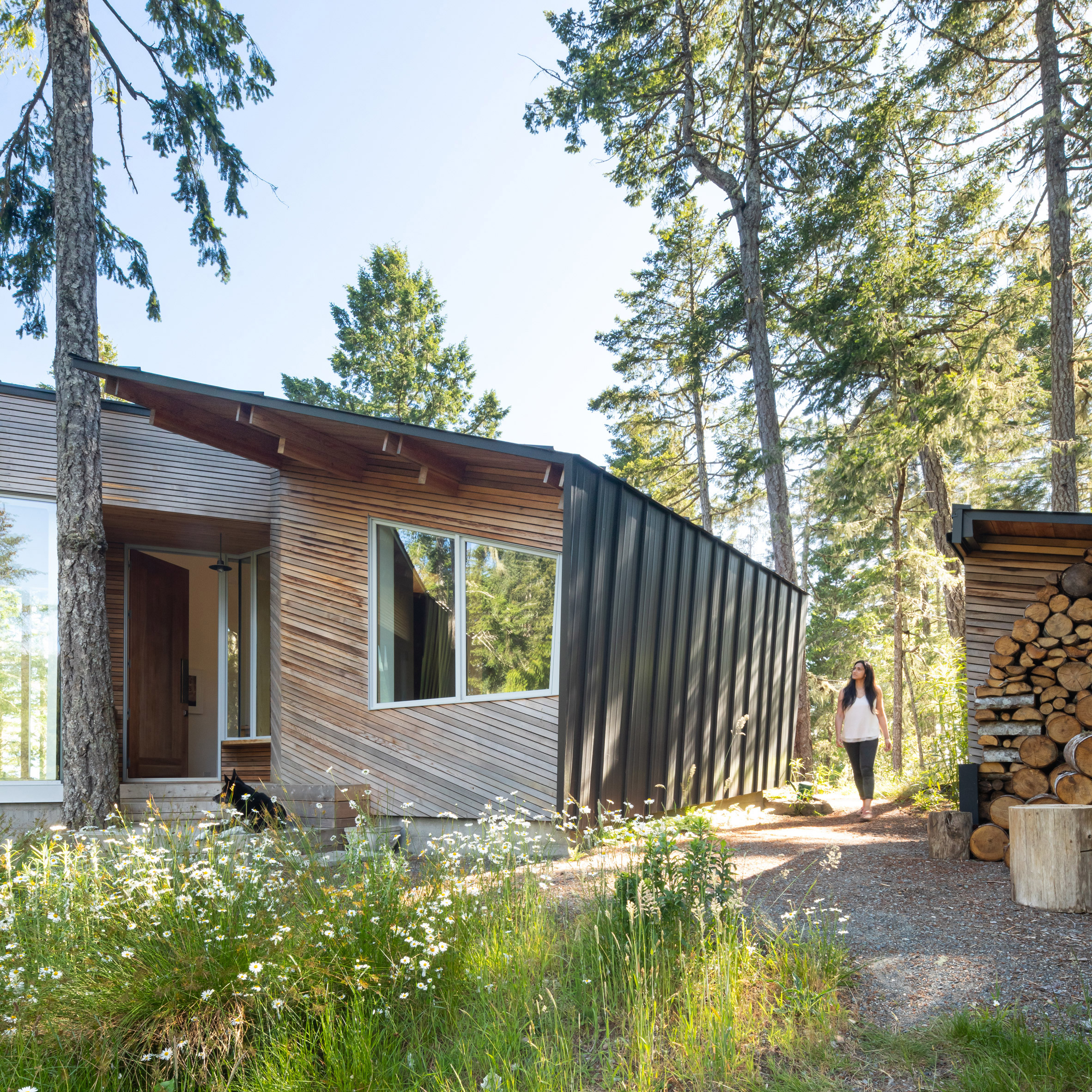
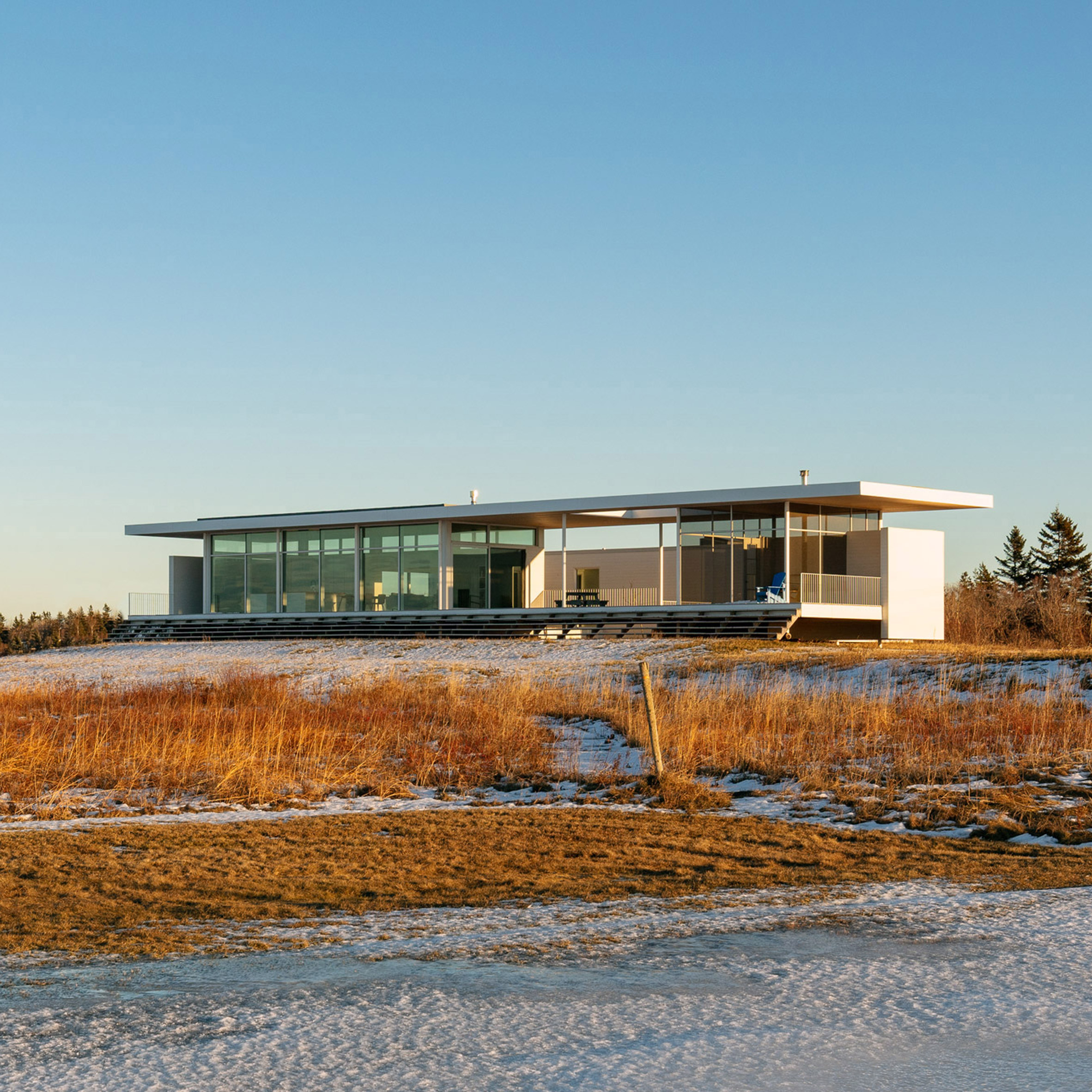
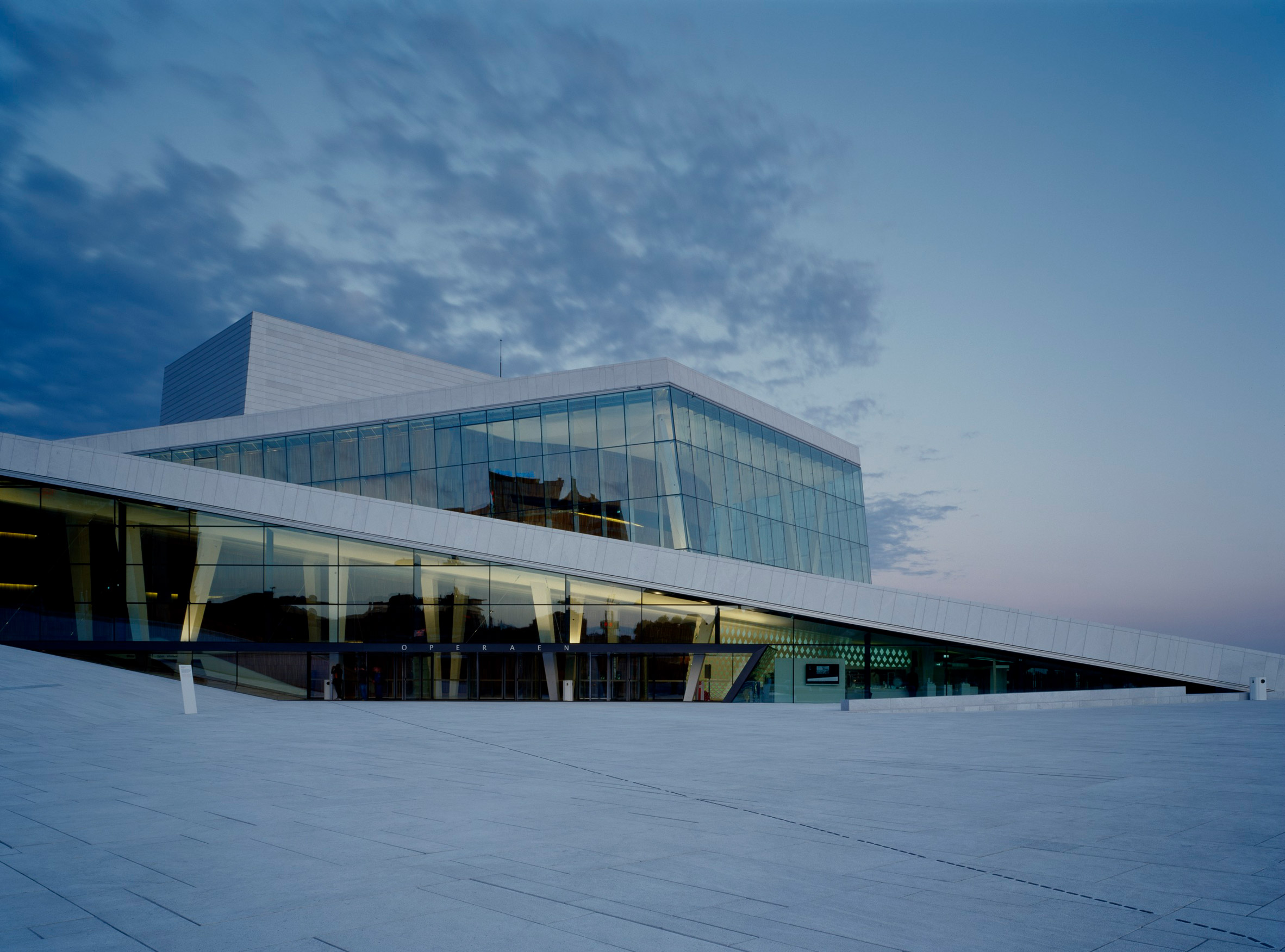
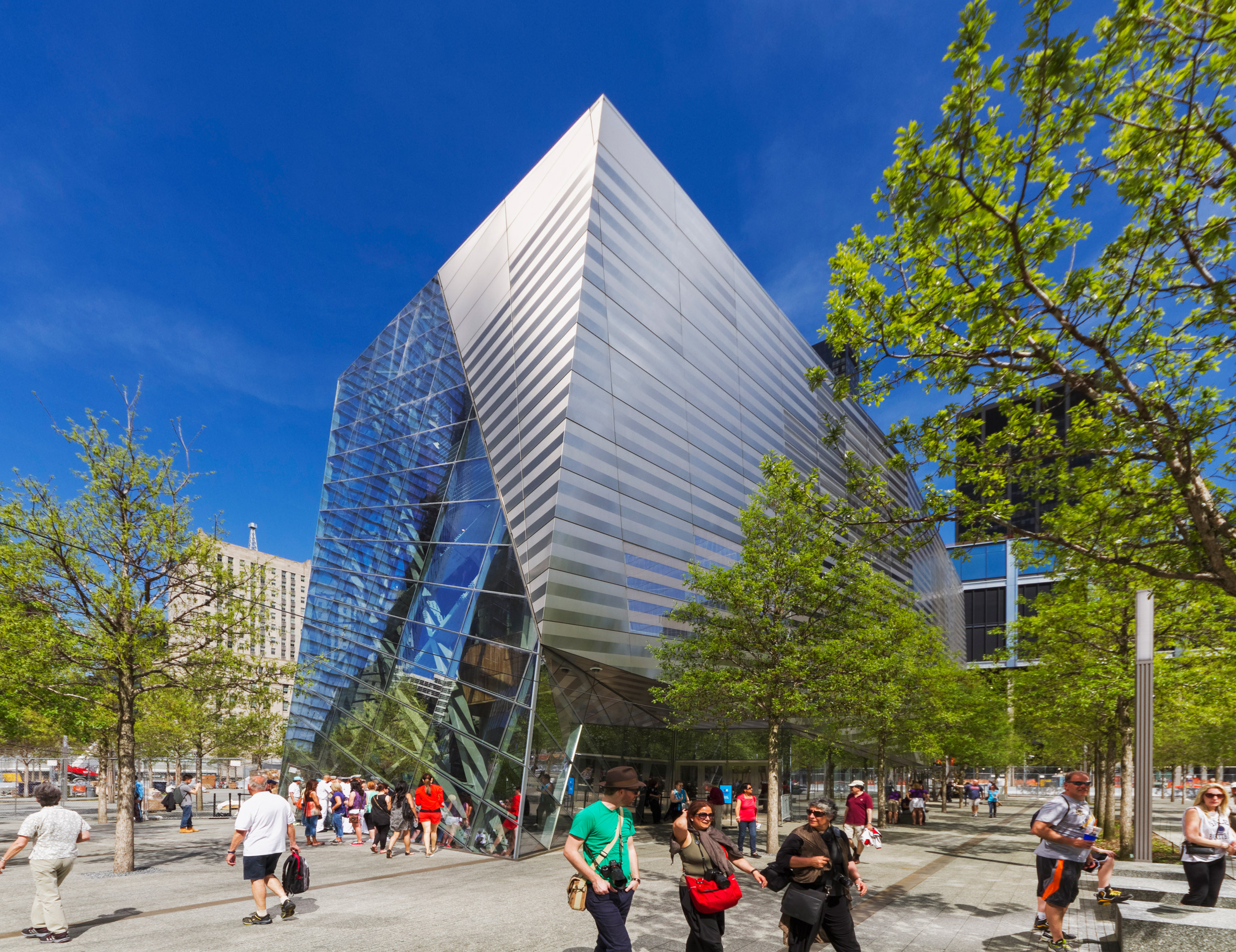
Projects that followed included the Oslo Opera House, which famously has a plaza on its roof, and the National September 11 Memorial Museum in New York. Both are designed with the idea of creating valuable public space.

Bibliotheca Alexandrina by Snøhetta
Bibliotheca Alexandrina in Alexandria, Egypt, was the first project Snøhetta won. Photo is by Gerald Zugmann

"We started off, I think, very clearly with a picture of how architecture could contribute to better social awareness," explained Thorsen.

"We were trying to create buildings that could generate some sort of public ownership – like libraries and concert houses – by changing the attitude towards them."

"We're neglecting our public space"

Norway-based Thorsen had previously been part of a collective of architects and landscape architects. They borrowed the name Snøhetta from the highest peak in Norway's Dovre region, because their first office was located in the attic above a pub called the Hall of Dovre.

When he teamed up with US-based Dykers, they carried on both the name and the landscape-oriented approach.

"In a way, [the library] was something that opened up the possibility of combining this landscape and architectural practice," said Thorsen. "It was maybe the first understanding of how an architectural concept could be contextualised."

Oslo Opera House by Snøhetta
The Oslo Opera House famously has a plaza on its roof. Photo is by Gerald Zugmann

"It came very naturally to us," he added. "We were seeing at the time that construction projects didn't have budgets for their outdoor areas. So it was like whatever was left over from the construction could be spent on the landscape."

"We said that this can't be the case, because we're neglecting our public space," he continued. "This is how we ended up at the Oslo Opera House, where there is no differentiation between public space, building and site."

"Architecture is a great societal tool"

As well as creating buildings that integrate public space, Snøhetta also wants to use architecture to make culture accessible to everyone on the planet. This has led to projects like the King Abdulaziz Centre for World Culture in Saudi Arabia.

"We strongly believe that culture and cultural buildings are going to free the free spirit of this world," said Thorsen.

King Abdelaziz Centre for World Culture by Snøhetta
The firm has faced criticism for working on the King Abdulaziz Centre for World Culture in Saudi Arabia

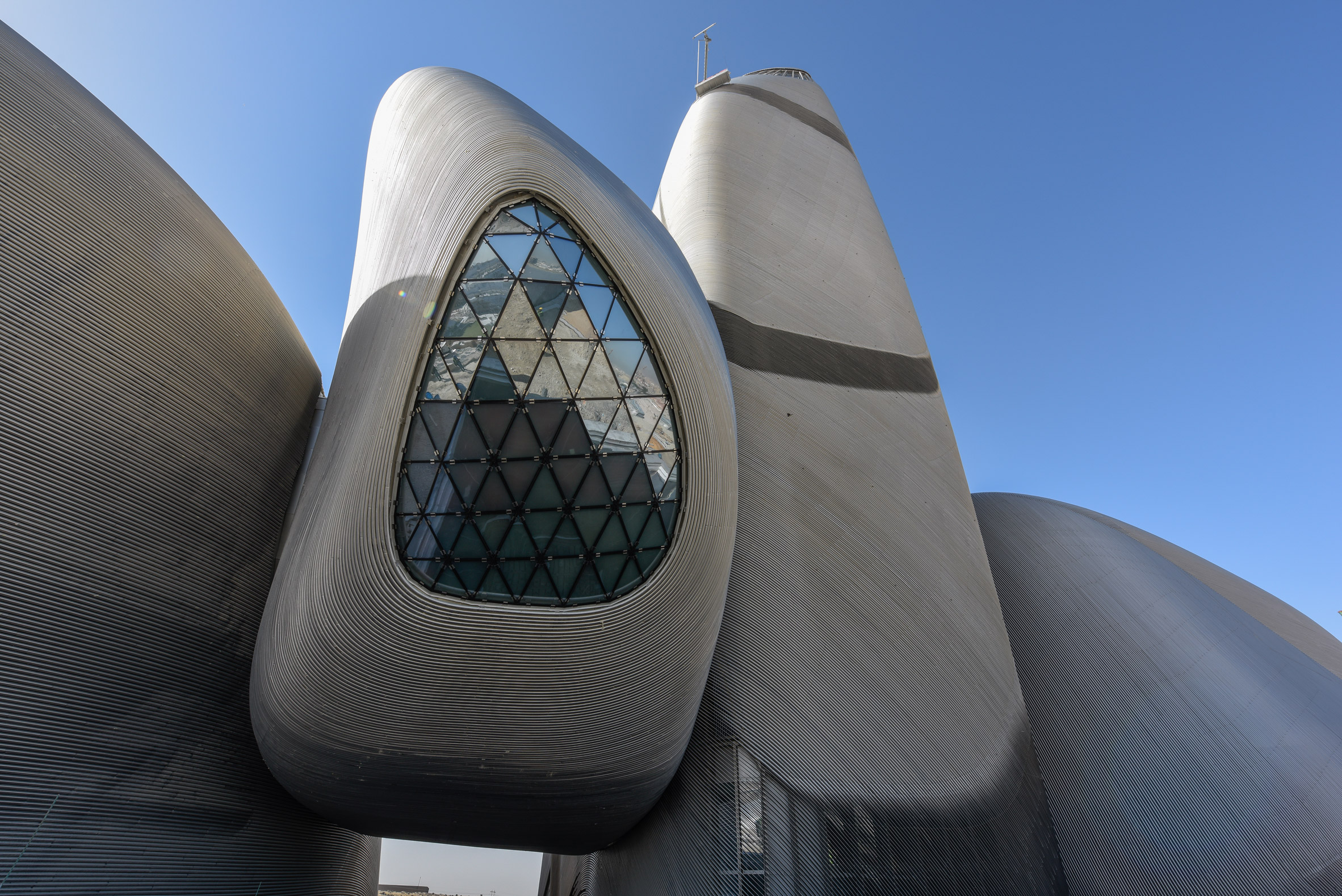
The firm has faced criticism for accepting a commission from an authoritarian regime. But Thorsen believes that architects have a duty to create buildings that improve the lives of citizens everywhere.

"We're making culture accessible in a place where it hasn't been," he said. "These border lines are difficult, but I've always believed that architecture is a great societal tool."

"That's why architecture needs to expand into these larger contexts of societal responsibility and it needs to be taken by those who have the insight, the education and the money."

Multi-disciplinary practice

In recent years, Snøhetta has expanded its practice beyond just architecture and landscape, into interiors, products and graphic design. Thorsen describes it as building up "a picture of the totality of the physical world".

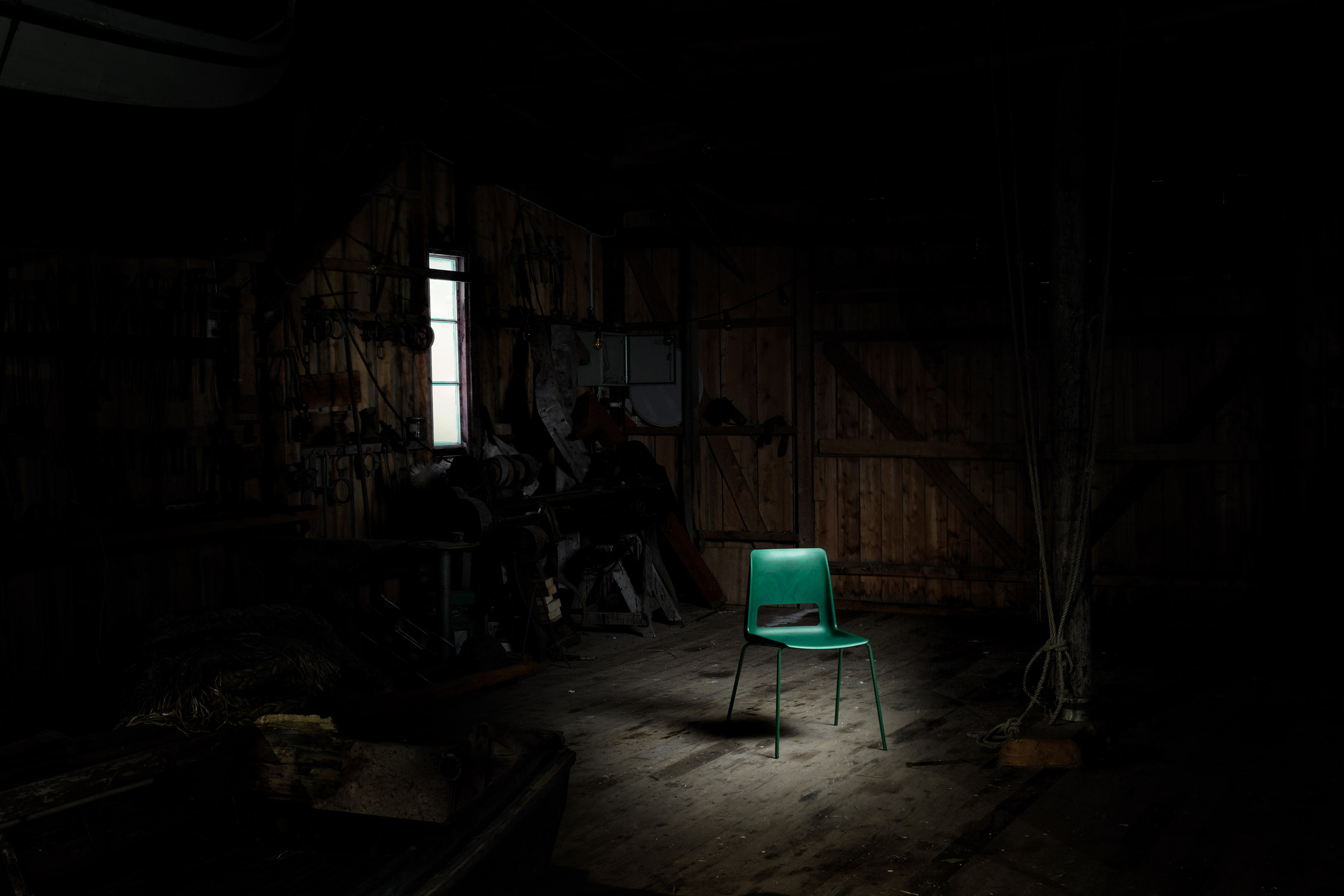
With offices in four continents, the firm's diverse range of projects includes an underwater restaurant, a chair made from recycled fishing nets and graphics for Norway's national bank notes.

Norwegian National Bank Notes
Snøhetta also designed the graphics for Norway's national bank notes

"We really believe in this total principle," added Thorsen. "It's about values, content, content innovation, performance, inclusion of a larger public, a feeling of unity, place, environment, technological development, etc."

"All these things come together in a huge complexity, and we're trying to solve them by cross-professional work," he continued.

Read on for an edited transcript from the first part of the interview with Thorsen. Part two will be published on Dezeen in the coming days.


Amy Frearson: How has the way Snøhetta works changed over the past 30 years?

Kjetil Trædal Thorsen: When it comes to everything that has to do with technology. I feel like a dinosaur, in a way. When we drew the Alexandria library, of course it was by hand. There were no renderings, no BIM. It feels like a different life and so distant from everything that we're doing at the moment.

Amy Frearson: Has technology changed your approach to design?

Kjetil Trædal Thorsen: Completely. Tools change how you perceive things, what you do and how you work with them. You have to reinvent yourself continuously because of time and changes around you. At the same time you change yourself. So you follow this kind of change both ways. Major change is really how the profession operates in relationship to its own tools, in relationship to clients and in relationship to the different markets that you're working with.

We were lucky that one of our first projects was in Egypt. We were in a position where we had to listen, to find out what was happening in the local environment in Alexandria. We had to be contextual from the very beginning.

Amy Frearson: Can you tell me about that first project and the early days of Snøhetta? How did the studio start?

Kjetil Trædal Thorsen: In 1987 we had a very loose constellation of landscape architects and architects. We started with both professions from the very beginning. There is an area in Norway called Dovre, which is a mountain area, and the highest peak is called Snøhetta. And because we established ourselves in the attic above a beer place in Oslo, called the Hall of Dovre, we called ourselves Snøhetta.

In 1989, we won the competition for the library in Alexandria. We had been testing ourselves in Norway on quite a few competitions, but were only ever getting second or third place. We didn't seem to win anything. I think we were pushing the borders too far at the time. At that same time, we also opened the architecture gallery ROM, which was pushing exhibitions as an inspiration for the local community of architects and artists, pushing the representation of international names in Oslo.

Bibliotheca Alexandrina by Snøhetta
Bibliotheca Alexandrina opened to the public in 2002. Photo is by Gerald Zugmann

Amy Frearson: What do you mean when you say pushing too far?

Kjetil Trædal Thorsen: Design-wise, the concepts that we were developing at the time were coming out of this constellation of landscape architecture and architecture. So many of them already had this intersection with the water, up and over. It was a lot of stuff.

We had a very introverted architectural scene, very traditional, very organised, very solid crafting. The average level of architects was quite high and we had some really great offices, but there was no inspiration of moving into any other kind of things, beyond the Norwegian tradition for very beautifully crafted, straightforward architecture. We were a little younger and we had different design ambitions, maybe.

So we set up an office in LA. It was a temporary office. We rented an apartment and got equipment from film studio rental places.

Amy Frearson: Why did you choose LA?

Kjetil Trædal Thorsen: I had friends there, Christoph Kapeller and Craig Dykers, who became my partner. So we set up a studio there to design the Alexandria library. It was nice getting away, doing it differently, not being in an office in Oslo under a different latitude. LA was interesting. We spent five weeks there, then we moved back to Oslo and then we won the competition.

Amy Frearson: So when you won the competition for the Alexandria library, you hadn't built anything else?

Kjetil Trædal Thorsen: No. So we established a shareholding company with a larger group of people. Then we were struggling for four years to sign the contract of that competition that we won.

Amy Frearson: So the project ended up taking quite a lot of time? You had time to establish your office in the meantime?

Kjetil Trædal Thorsen: We were working on it from 1989 until 2000, but the official opening was in 2002. Everything was a little chaotic. But one of the things that I don't regret is that it did take so much time, because I couldn't imagine having to jump into it with an unexperienced team who had never built anything. One of these high-speed Chinese projects would be impossible for a new office, established based on a competition. So at least we had time to build both skills and organisation.

We relocated to Cairo for almost a year and a half, with 14 people and kids and families, which we did from 1993 to 1995. We actually did the design in Cairo with our local engineering partner. We had to educate young stonemasons to be able to carve a granite wall. We opened a quarry. It was very much hands-on architecture. We were following every piece of the building, from A to Z, on site.

In a way, it was something that opened up the possibility of combining this landscape and architectural practice. It was maybe the first understanding of how an architectural concept could be contextualised. Could this library have been designed for anywhere else? No, most likely not. It was for this very particular site in Alexandria, depending on the very precise north-east-west situation to get indirect light into the space, and protected against the sound from the south. All of these things started coming together as a very specific kind of idea.

From then on, a lot of things started spiralling, more or less by coincidence. In 2000 we won the Opera House. So there was a 12-year project, awaiting an eight-year project. Two projects over 20 years, although of course there were a lot of other projects happening in between. Then in 2005, the Ground Zero Memorial and expanding into New York, and in 2008, the King Abdulaziz Centre for World Culture.

National September 11 Memorial Museum by Snøhetta
National September 11 Memorial Museum was completed in 2014. Photo is by Gerald Zugmann

Amy Frearson: So you see these projects as defining very distinct chapters in your history?

Kjetil Trædal Thorsen: Yes. After that things started rolling and expanding, and we also expanded our disciplines. We had interiors, landscape and architecture, then expanded with graphic design and product design. We were trying to get this picture of the totality of the physical world.

Amy Frearson: So your original concept, this merging architecture and landscape, has also defined how Snøhetta as a practice has grown and developed?

Kjetil Trædal Thorsen: It came very naturally to us. Norway gave us a direct connection to nature obviously – it's a very unpopulated country, so even if you live in the city, you live in the countryside. But this combination also came out of necessity. We were seeing at the time that construction projects didn't have budgets for their outdoor areas. So it was like whatever was left over from the construction could be spent on the landscape.

We said that this can't be the case, because we're neglecting our public space. But if we combine the two, we can also combine the budget. So we can actually use the full construction budget also on the landscape. This is how we ended up at the Oslo Opera House, where there is no differentiation between public space, building and site.

Amy Frearson: Is this still a problem in architecture today, do you think? Do buildings still come before landscape?

Kjetil Trædal Thorsen: I think it's a big problem. Even in urban planning, we seem to plan objects first and then look at whatever is left. It's been a long-standing problem, with the western world's urbanisation, where everything is based on a grid system. That grid system came out of control. But we still love the typology and we keep developing cities as if we didn't have democracies.

Snøhetta unveils S-1500 chair made from recycled plastic and steel
Snøhetta's S-1500 chair is made from discarded fish nets

Amy Frearson: What principles and values has Snøhetta held onto over the past 30 years?

Kjetil Trædal Thorsen: I think you have to remember that 1989 was the time when sustainability was defined into the UN for the first time, with our former prime minister Gro Harlem Brundtland's definition of social, environmental and economical sustainability. I think we grabbed and held on to the social sustainability part of that, by trying to create buildings where there was no differentiation between the aesthetics of something and its social sustainability. We were trying to create buildings that could generate some sort of public ownership – like libraries and concert houses – by changing the attitude towards them. We strongly believe that culture and cultural buildings are going to free the free spirit of this world.

We started off, I think, very clearly with a picture of how architecture could contribute to better social awareness, but not necessarily out of the position of a third-world country or a western-world country, but more based on questions. Like when we were doing the Alexandria library, we asked, why would you design such a big, expensive library in a city where 50 per cent of the population is illiterate? The answer was, well that's why. That's maybe also why Ground Zero was such an important breaking point for us. It was bringing a site of big trauma back into an everyday situation.

The same goes in places like Saudi Arabia. We're still receiving criticism about working in Saudi, especially after Khashoggi, it's become much tougher. But we're trying to talk to a very young generation of Saudis who are extremely curious. There is a fairly big underground scene when it comes to film, literature, art. We're making culture accessible in a place where it hasn't been.

Amy Frearson: How do you deal with working in places like Saudi, where the situation is so fundamentally different?

Kjetil Trædal Thorsen: These border lines are difficult, but I've always believed that architecture is a great societal tool. Architecture is not like art. You can accept art in its own right, but architecture has a different kind of position. That's why architecture needs to expand into these larger contexts of societal responsibility and it needs to be taken by those who have the insight, the education and the money.

And in a way, you get to this point where you say, If you really believe this kind of total principle, then the values, the content, the content innovation, the performative aspects of it, the inclusion of a larger public, the feeling of unity, place, environment, technological development, structural, what kind of materials are you using, how lightweight can you actually construct a building with endless kind of choice of materials.

So all these things come together in a huge complexity. And for us, it's trying to solve it by cross professional work. In the future, where these groups of different disciplines are highly specialised and bring them to the table that can be very generous. And then transposition between the different professions and then see how we can work within the creative industry and actually giving real solutions.

Amy Frearson: What are going to be Snøhetta's big focuses going into the future?

Kjetil Trædal Thorsen: This notion of maintaining and enhancing our social responsibility is still on the move, and this urban planning notion from an architectural perspective. What does that mean for the objects of communal living, for bottom-up and top-down processes?

We really believe in this total principle. It's about values, content, content innovation, performance, inclusion of a larger public, a feeling of unity, place, environment, technological development, etc. All these things come together in a huge complexity, and we're trying to solve them by cross-professional work.

The post Merging architecture and landscape "came very naturally" to Snøhetta says co-founder appeared first on Dezeen.


from Dezeen https://ift.tt/2siXfl6

Hick Duarte uses his camera to document the plurality of Brazilian youth culture

Hick-duarte-photography-itsnicethat-list
Based in São Paulo, Hick is committed to portraying the visual codes of Brazilian youth in all their complexities. He does so through considered casting, experimentation across media, and a collaborative mindset.

Read more


from It's Nice That https://ift.tt/2YF0U8U

Michael and Patty Hopkins took high-tech architecture to historical settings

Michael and Patty Hopkins: High-tech architecture

We continue our high-tech architecture series with a profile of Michael and Patty Hopkins, who designed one of the movement's most pragmatic buildings – Hopkins House – and went on to develop historicist high-tech architecture.

High-tech architecture, a style that emerged in the UK in the late 1960s and saw the expression of structural elements, had many contradictions.

It often merged structural rationally with exaggerated details or combined the bespoke with mass-produced societal solutions. However, it found some of its most paradoxical manifestations in the later work of Hopkins Architects, the creators of what some termed "historicist high-tech", or "high-tech brick and stone".

High-tech architecture: Michael and Patty Hopkins
Hopkins Architects historicist high-tech buildings include Portcullis House

Before creating the work that made them something of the misfits of the movement, Michael and Patty Hopkins (née Wainwright) followed a textbook British high-tech trajectory.

Both studied at London's Architectural Association, considered the birthplace of the style along with Regent Street Polytechnic, with tutors such as Cedric Price, Bob Maxwell and Peter Smithson and heavyweights of industrial design such as Buckminster Fuller and Charles and Ray Eames looming large.

Both, once they had graduated, spent time working in the offices of what was then Foster Associates (now Foster + Partners): Michael Hopkins as project architect on the Willis Building in Ipswich, and Patty Hopkins on the Pond House extension in Hampstead.

High-tech architecture: Michael and Patty Hopkins
Patty and Michael Hopkins first project together was Hopkins House. Photo courtesy of Historic England Archive

So when it came to establishing their own office in 1976 Patty and Michael Hopkins were well-versed in this new style and ready to take it in their own direction. They did soto dramatic effect in their first project for their own home and studio: Hopkins House in Hampstead.

Reminiscent both of the Eames House in Santa Monica and the Pond House that Patty had worked on nearby, the Hopkins House was a translation of the industrial lessons that the duo had learnt while working Foster into the world of the domestic. It demonstrated that high-tech was far more than just the architecture of workplaces and industry.

Collaborating with engineer Antony Hunt – a key figure in establishing the reputations of many high-tech architects – the structure is an incredibly stripped-back, modular framework of mass-produced components. The minimal and open living spaces, enlivened with pops of blue colour, are completely exposed to the outside save for sets of slim Venetian blinds.

High-tech architecture: Michael and Patty Hopkins
Hopkins House is Michael and Patty Hopkins home. Photo courtesy of Historic England Archive

So pragmatic was its approach that critic Colin Davis described how the project virtually "designed itself", and Fuller was suitably impressed when he visited – allegedly asking his trademark question of how much it weighed.

Another deft demonstration of the Hopkins' grasp of high-tech came shortly after at the Greene King Brewery. This time the project that was entirely about industry, creating an expressive shed of steel and glass. With these strong statements of the Hopkins Architects' architectural approach, clients soon took notice, and true to high-tech's preoccupation with standardisation and industrial process, a commission soon came for not only a building, but an entire building system.

High-tech architecture: Michael and Patty Hopkins
Hopkins Architects developed the Patera Building System with Anthony Hunt

Nigel Dale, a former architecture student who had moved into industrial production, had seen the architectural style emerging in Britain and noted its practical, and economically attractive, "new factory style". Dale saw an opportunity to revive Britain's aesthetically bereft industrial estates.

His solution was the Patera Building System, commissioned in 1980 with Hopkins Associates as the architect collaborating once more with Hunt as engineer. It was a high-tech dream commission – a refined, glass and steel system that would be developed as a prototype and subsequently rolled out for large-scale manufacture.

High-tech architecture: Michael and Patty Hopkins
Only six Patera structures were built

The visual similarities to Foster's Sainsbury Centre for the Visual Arts (also engineered by Hunt some two years earlier), are worth noting – with an exterior metal truss supporting a lightweight shell of cladding incorporating all of the necessary services. These sheds were to be immediately identifiable, possessing design individuality and an architectural signature and yet still being mass-produced and eventually ubiquitous.

In many ways, Patera was as high-tech as the Hopkins would ever get – architecture as product rather than a construction of constituent parts. As historian Angus Macdonald puts it, "[Patera] was an industrial product rather than an assembly of the product of industry".

High-tech architecture: Michael and Patty Hopkins
The Patera system influenced Hopkins Architects next project – the Schlumberger Research Centre. Photo courtesy of Historic England Archive

But beyond a prototype, only six Patera structure were ever built – two for the practice's own office and others for a project for BT in London's Docklands. Dale dropped the idea, and without the backing of an ambitious developer the system could never be rolled out in the numbers required to make it economical to clients. This was after all, a highly bespoke system that would be too expensive to design on a one-off basis.

Patera's ideas, however, were not abandoned – Hopkins Architects acquired the patents to the system (Hunt was still certain of its potential). Many of its lessons worked their way into the firm's next key project for the high-tech style – the Schlumberger Research Centre in Cambridge, the first phase of which was completed in 1985.

High-tech architecture: Michael and Patty Hopkins
The Schlumberger Research Centre was topped with a membrane roof. Photo courtesy of Historic England Archive

Schlumberger is notable for its inclusion of what would become something of a Hopkins trademark – a row of three lantern-like tensile membrane roofs designed by Ove Arup, supported by heroic masts and cables engineered once again by Hunt. This was no longer the high-tech of refined but demure industrial sheds, but something more flamboyant.

Beneath these big-top roof elements is a simple structure of triangular trusses supported by hollow steel columns and infilled with glazing. It is very similar to Patera but dispensing with its more complex joints, harking back instead to the straightforward Hopkins House or Greene King shed. Schlumberger marked a departure from a more purist, radical high-tech and a movement towards a new language.

This shift became starker in 1984 with the commission for the Mound Stand at Lord's Cricket ground in London – the first project by the practice to deal with a historic urban context. Many of Hopkins Architects projects up to this point had dealt with the contexts of rural areas, industrial estates or leafy London suburbs: here, the project was to be centred around Frank Verity's original cricket stand, built in the 1890s.

Michael Hopkins was aware of this odd match, referring to the Mound Stand project as his "reconciliation with history". The lightweight steel members and tensile fabric canopy familiar to high-tech are all there, but sitting above and drawing their geometrical arrangement from an arched brick base that was also extended.

High-tech architecture: Michael and Patty Hopkins
Bracken House was an early example of Hopkins Architects more historical high-tech architecture. Photo is by Katie Chan

Some ten years into their practice and these doyens of British high-tech were building with load-bearing brick – had Hopkins Architects simply been pigeon-holed too early? After this "reconciliation with history", there was a marked change in the firm's work as it attempted to reflect the urban and material complexity of the city while remaining true to its radical high-tech roots.

It was an approach neatly surmised by the title of a lecture Michael Hopkins delivered a lecture to London's Royal Society of Arts in 1992: "Technology Comes to Town".

Bracken House in 1992, Glydenbourne Opera House in 1994 and Nottingham's Inland Revenue Centre in 1995 were all notable examples of this new high-tech with brick and stone, often combining heavy, load bearing bases with lighter steel roof structures.

High-tech architecture: Michael and Patty Hopkins
Photo is by Deror Avi

This is not to say that the practice abandoned a more conventional high-tech aesthetic entirely: New Square in 1992 drew on Mies van Der Rohe in the creation of an exposed steel frame infilled with aluminium panels. the Saga Group Headquarters in 1998 drew on some of the ideas of Schlumberger for the creation of a vast hangar-like pavilion space.

In 1994, the year Glyndenbourne completed, both Michael and Patty were jointly awarded the RIBA Royal Gold Medal – only the third time in its history it has been awarded to a male-female partnership.

The peak of these attempts to create a kind of high-tech classicism came with the commission for Westminster Underground Station in 1999 and Portcullis House in 2002. This was a case of taking high-tech roots – in this instance quite literally the structure's support in the form of Westminster Underground Station's colossal steel tubes – and attempting above ground to develop a sort of classical high-tech that would be in dialogue with the neighbouring Houses of Parliament without sliding into historicism.

High-tech architecture: Michael and Patty Hopkins

This was quite the stylistic juggling-act. The result is a combination of prestressed sandstone pillars from which protrude steel canopies and window boxes, the whole straddled by "spider-leg" girders supporting a roof dotted with fourteen ventilation chimneys (designed to echo the adjacent Norman Shaw Buildings). Inside, gull-wing concrete arches support the floors and a large central courtyard sits beneath an oak-beam canopy in the centre of the inner stone piers which transfer loads to the underground station below.

The project was nominated for the Stirling Prize in 2001 and remains a contentious scheme. Shortly after the designs were published, architectural critic Jonathan Glancey claimed it had been conceived in the "Gormenghast school of architecture: a night-marish, castelline device…".

"At best", he wrote "it has a kind of cartoon-like character".

High-tech architecture: Michael and Patty Hopkins
Photo is by Richard Davies

Hopkins Architects' later work never quite returned to these stylistic extremes – nor had to deal with such impressive contexts – but nonetheless oscillates between the two poles of Schlumberger and Portcullis House, maintaining an equal interest in both.

High-tech brick proved popular with schools, universities and offices, with projects at the University of Nottingham, the Pilkington Laboratories at Sherborne School in 2000, a scheme for Northern Arizona University in 2007, Abingdon School in 2015 and the Evelina Children's Hospital in 2005.

Trademark Hopkins fabric canopies popped up above many pavilions or open spaces, such as the Buckingham Palace Ticket Office in 1995, Goodwood Racecourse in 2001 and Hampshire County Cricket Club in 2001. And of course, the concept of a lightweight, shed-like structure proved effective for the cedar-clad "bowl" of the London 2012 Olympic Velodrome.

Much like high-tech itself, the more "sensitive" style that Hopkins are seen as having pioneered has never really left us – even Foster + Partner's Stirling-prize winning Bloomberg Headquarters appears to owe something to the Hopkins' particular brand of high-tech. In many ways, it is the essence of British high-tech: radical technological beginnings wrapped up in ideas of tradition, the civic and sustainability.

High-tech architecture
Dezeen's high-tech architecture series explores the style

Led by architects Foster, RogersNicholas Grimshaw, Michael and Patty Hopkins and Renzo Piano, high-tech architecture was the last major style of the 20th century and one of its most influential.

Our high-tech series celebrates its architects and buildings ›

Photography is courtesy of Hopkins Architects unless stated.

The post Michael and Patty Hopkins took high-tech architecture to historical settings appeared first on Dezeen.


from Dezeen https://ift.tt/2LLhQ8y

Top 10 Canadian houses on Dezeen in 2019

Hatley House Residence by Pelletier de Fontenay

From a snow-covered gabled home to clifftop residences, Canada's residential architecture continued to boom this year. Bridget Cogley selects 10 highlights to continue our review of 2019.


Hatley House Residence by Pelletier de Fontenay

Hatley House Residence by Pelletier de Fontenay

Three different volumes are topped with gabled roofs and clad in slender wood boards to form this house in rural Quebec. Montreal studio Pelletier de Fontenay outfitted the residence with white walls, polished concrete floors, and black cabinets inside.

The house also contains a meditation room in one of the pitches on the upper level, wrapped with plywood walls, floors and ceilings to add warmth.

Find out more about Hatley House Residence ›


House H by Chris Collaris

House H by Chris Collaris

Dutch architect Chris Collaris sourced light-grey stone called eramosa from a nearby quarry to build the linear House H in Canada's Great Lakes region, close to the US border.

Reclaimed wood wraps around the flat roofline and is also grey, as is the flooring of a large patio, to create a greyscale palette that contrasts with the property's grassy landscape. The monochrome palette continues inside the home with white walls and cabinetry, and black furniture.

Find out more about House H ›


Residence Le Nid by Anne Carrier

Residence Le Nid by Anne Carrier Architecture

Residence Le Nid perches on a hillside overlooking the Saint Lawrence River in Quebec. Local studio Anne Carrier Architecture clad the two-storey dwelling with wood to match the bark on the pine trees that surround the property.

An outdoor bridge accesses the top floor of the house, complete with a covered patio, while three bedrooms are located downstairs.

Find out more about Residence Le Nid ›


La Barque Residence by ACDF

La Barque Residence by ACDF

This lake house by Montreal architecture firm ACDF is nestled into a hillside and an example of another project with blackened wood details. A concrete base supports a top volume clad in blackened timber that extends out to rest on pilotis.

La Barque Residence is on Lake Ouareau in Saint-Donat – two hours north of Montreal – and has a curved wooden ceiling inside evocative of the hull of a boat. A kitchen and dining room is on the upper floor, while below is a family room and sauna.

Find out more about La Barque Residence ›


Deep Cove House by D'Arcy Jones

Deep Cove House by D'Arcy Jones Architects

D'Arcy Jones Architects' Deep Cove House is notable in its contrasting front and rear facades. Its rear patio and garden open up to expansive ocean views, while its street-facing facade is closed off and windowless for maximum privacy.

The local studio integrated the house within a hilly site north of downtown Vancouver. The walls of its upper portion are slanted to help reduce glare and allow water to run off, including from its wrap-around windows.

Find out more about Deep Cove House ›


Dans L'Escarpement by YH2

Dans L'Escarpement by YH2

Montreal architecture firm YH2 has built a holiday home on Quebec's Lake Carré accessed from an outdoor wooden footbridge designed to be reminiscent of a treehouse.

The three-storey home's construction alternates between exposed concrete and wood cladding, and its interiors are almost entirely covered in wood for a warm and natural feel.

Find out more about Dans L'Escarpement ›


Chalet du Bois Flotte by Atelier Boom-Town

Driftwood Chalet by Atelier Boom-Town

Driftwood Chalet overlooks an estuary along Quebec's Saint Lawrence River in Canada. The exterior comprises dark sheet-metal that wraps around its pitched roofline and exterior walls, alongside moments of cedar planks that will gradually silver in contact with the salty air.

The holiday home has white walls inside, polished concrete floors and black and wood furniture to complement the look of the build outside.

Find out more about Driftwood Chalet ›


Bowen by Burgers Architecture

Bowen Island Residence by Burgers Architecture

Two rectangular, gabled volumes stretch atop a granite cliff on Bowen Island, an island to the north of Downtown Vancouver, for this residence by Burgers Architecture.

The local studio designed this holiday home with floor-to-ceiling walls and windows for uninterrupted views of the Strait of Georgia and the Gulf Islands.

Find out more about Bowen Island Residence ›


Sooke House by Campos Studio

Sooke House by Campos Studio

Another woodland retreat in British Columbia is Sooke House located on Vancouver Island, designed by local architecture firm Campos Studio.

The home is for a woman and her dog, and interiors comprise polished concrete floors, white walls, and wood-clad ceilings, cabinets and accent walls for a soft touch that relates to its lush surroundings.

Find out more about Sooke House ›


La Grande Percee by Atelier Pierre Thibault

Le Blanc Residence by Atelier Pierre Thibault

Last up in Dezeen's 2019 Canadian houses roundup is this remote residence by Atelier Pierre Thibault, built on a sandy site in a village in the province of New Brunswick.

The home is raised on stilts to allow for pools of water to flow underneath, while a glazed exterior provides views of Canada's Northumberland Strait. Inside, the home features pale wood and white accents, which are intended to relate to its the sandy, windswept surrounds.

Find out more about Le Blanc Residence ›

The post Top 10 Canadian houses on Dezeen in 2019 appeared first on Dezeen.


from Dezeen https://ift.tt/2rACHES

Fhuiae Kim explores “the third language” in her calming graphic design works

Fhuiae-kim-work-graphic-design-itsnicethat-list
The Seoul-based designer is interested in pursuing the third language through her delicate graphic design works. This is not a written form of language, nor a pictorial one, but somewhere in between.

Read more


from It's Nice That https://ift.tt/2P8qW1g