London creative agency Justified wanted to create a "rallying symbol" when developing the visual identity for the Museum for the United Nations, which is designed to engage the younger generation.
The Museum for the United Nations: UN Live is a newly established creative organisation that aims to connect people to the work carried out by the United Nations (UN), in a bid to bolster climate action.
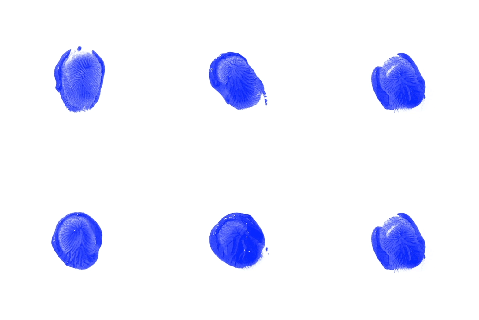
Based around the emblem of a blue fingerprint made in paint, Justified's new branding for UN Live was born from an initial brief to create a logo that can "transcend language, culture and religion" in order to speak to a global audience.

More specifically, the studio was given the brief to target a younger demographic – something the UN had been struggling with up until now, according to Justified's creative director, Joshua Ogden.
"The standard of design and visual stimulation is so much higher than it ever was before, so a corporate identity wouldn't sit right with the youth in today's climate," Ogden told Dezeen.
"Lots of companies are starting to realign to be more sustainable, transparent, and to have more authentic brand narratives, which is something that every brand should be adapting, because young people can just see through the bullshit now."

The organisation approached Justified with nothing but its name, Museum for the United Nations: UN Live, which couldn't be changed.
"If you can't change the typography and you can't change the name, then the actual identity is quite difficult to create," said Ogden.
Therefore the studio wanted to create a flexible and universal symbol that could be adapted and wouldn't need to be in any particular language.

The branding was developed by combining three main ideas: the UN's signature blue, the unique fingerprint and the symbol of peace.
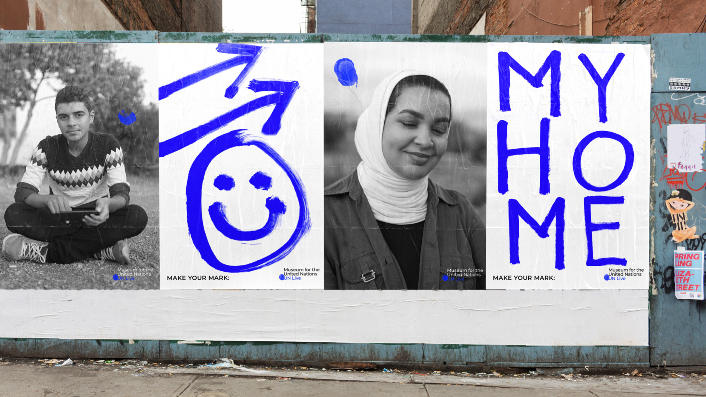
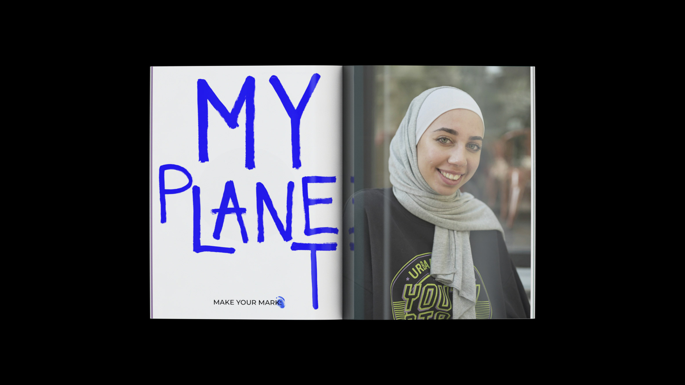
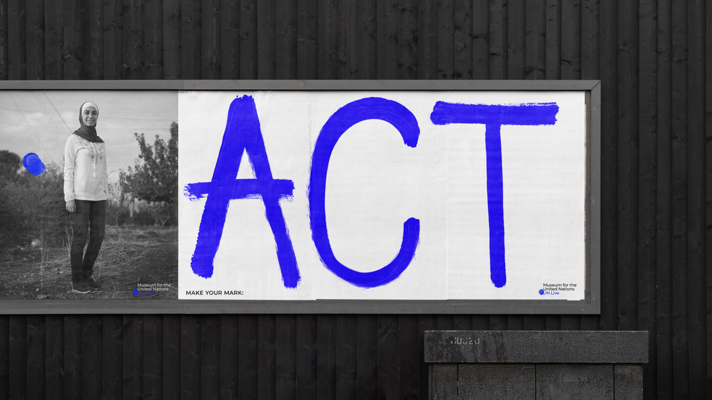
"We then evolved this into an actual visual system, to make it a bit more fresh and dynamic," said Ogden. "When it's paired with photography, for instance, it feels more contemporary."
According to the studio, the logo was designed as a "rallying symbol" that could be adapted and personalised by different people, including those within the organisation as well as its audience and contributors.

"We wanted to create an identity that is remarkable, not trademarkable," said Ogden. "So it's okay if you feel like you've seen the logo before, because that's not the point – it's designed to be adaptable and to evolve."
"This year, maybe it's just a fingerprint, but next year it might be a completely different version of it," he added. "We're open to that changing, because the idea that everyone has their own unique fingerprint is a nice idea to move forward with."
Justified also collaborated with graphic design studio Village Green to develop an additional finger-painted-style typography to accompany the logo.
"When we started using different elements together, it became a different visual style than people are used to seeing with the UN," Ogden continued.

"Even though we're actually using all the codes that they currently use, it's just being adapted in a more playful way," he added.
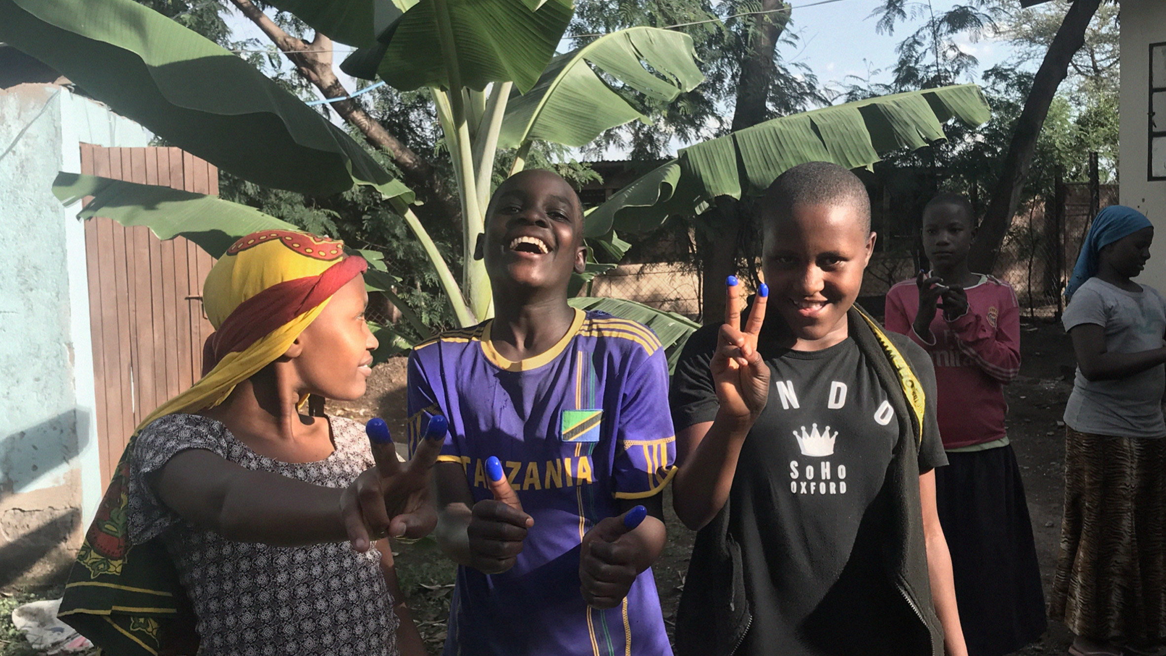
For Justified, the fingerprint is an expression of personality, following the campaign's "Make your mark" slogan. It also represents the UN Live as an inclusive platform for self-expression and action, while also being relatable on a global scale.
"We wanted to make the topic of climate change relatable to each city without explicitly saying 'climate change' because as soon as you say the words, people feel lost," Ogden added.
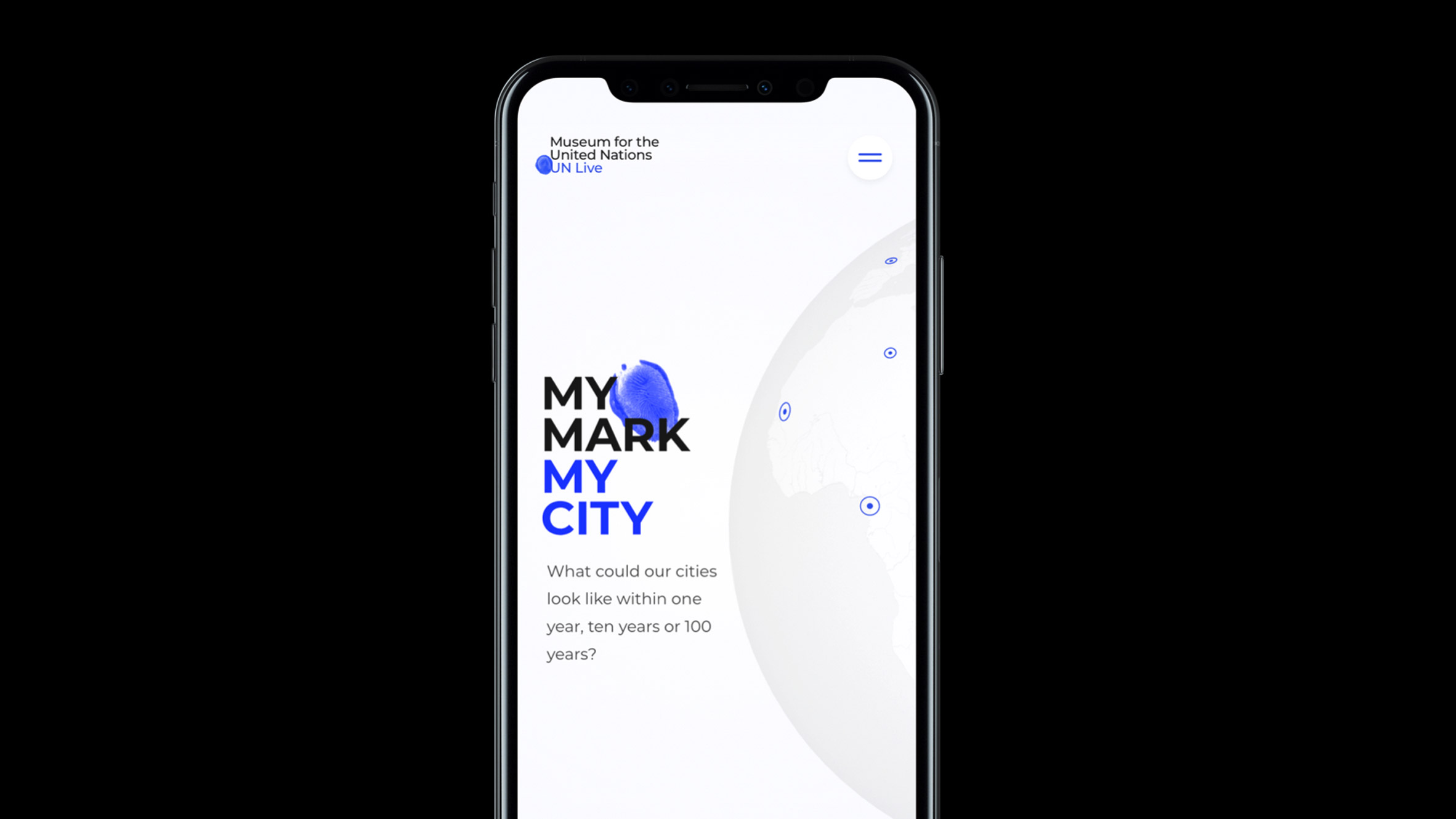
The finger and thumbprint emblem was also extended across the initiative's website, which was also built by Justified.
The online platform is solely how the museum exists for now, but there are plans for there to be a physical space in Denmark in the future.

As the studio explained, the completion of the brand identity then lent itself to the UN Live's first campaign titled My Mark: My City.
The project is currently taking place in five countries around the world, including India, Kenya, Jordan, Colombia and Brazil.
It asks local change-makers and innovators to imagine and create solutions to the climate crisis by sharing their ideas on how to make their city more sustainable.
Norwegian design and architecture firm Snøhetta recently teamed up with the Wikimedia Foundation to develop a new visual identity for its global organisation, which will be generated in partnership with volunteers from around the world.
Like Justified aimed to do with UN Live, Wikimedia chose Snøhetta as its design partner for its ability to create strong brand identities that "transcend geographical boarders and bring people together".
The post Justified creates smudged blue fingerprint logo for United Nations museum appeared first on Dezeen.
from Dezeen https://ift.tt/2uZKBZM
