Saturday 7 March 2020

Natalie Dionne Architecture creates Brick House from Montreal apartment building

Brick House by Natalie Dionne Architecture

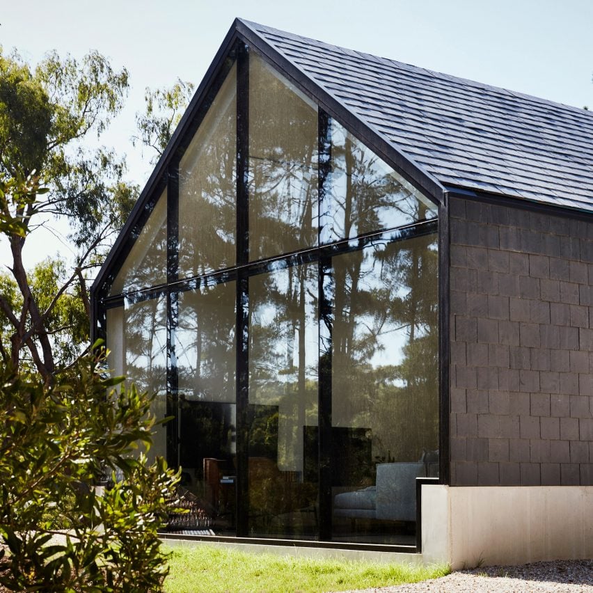
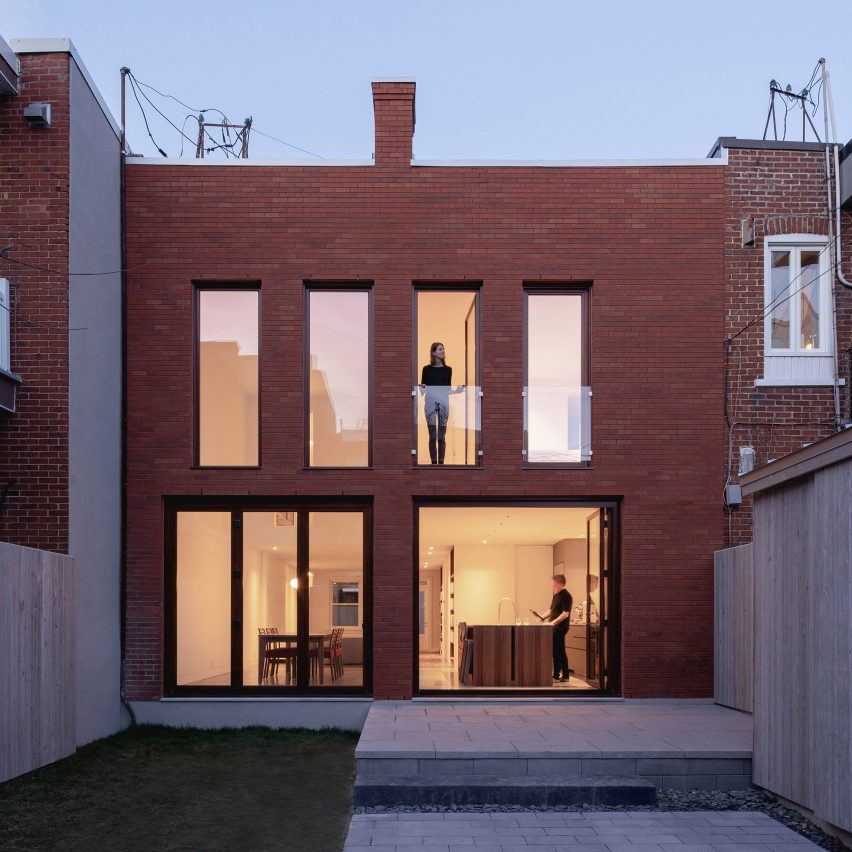
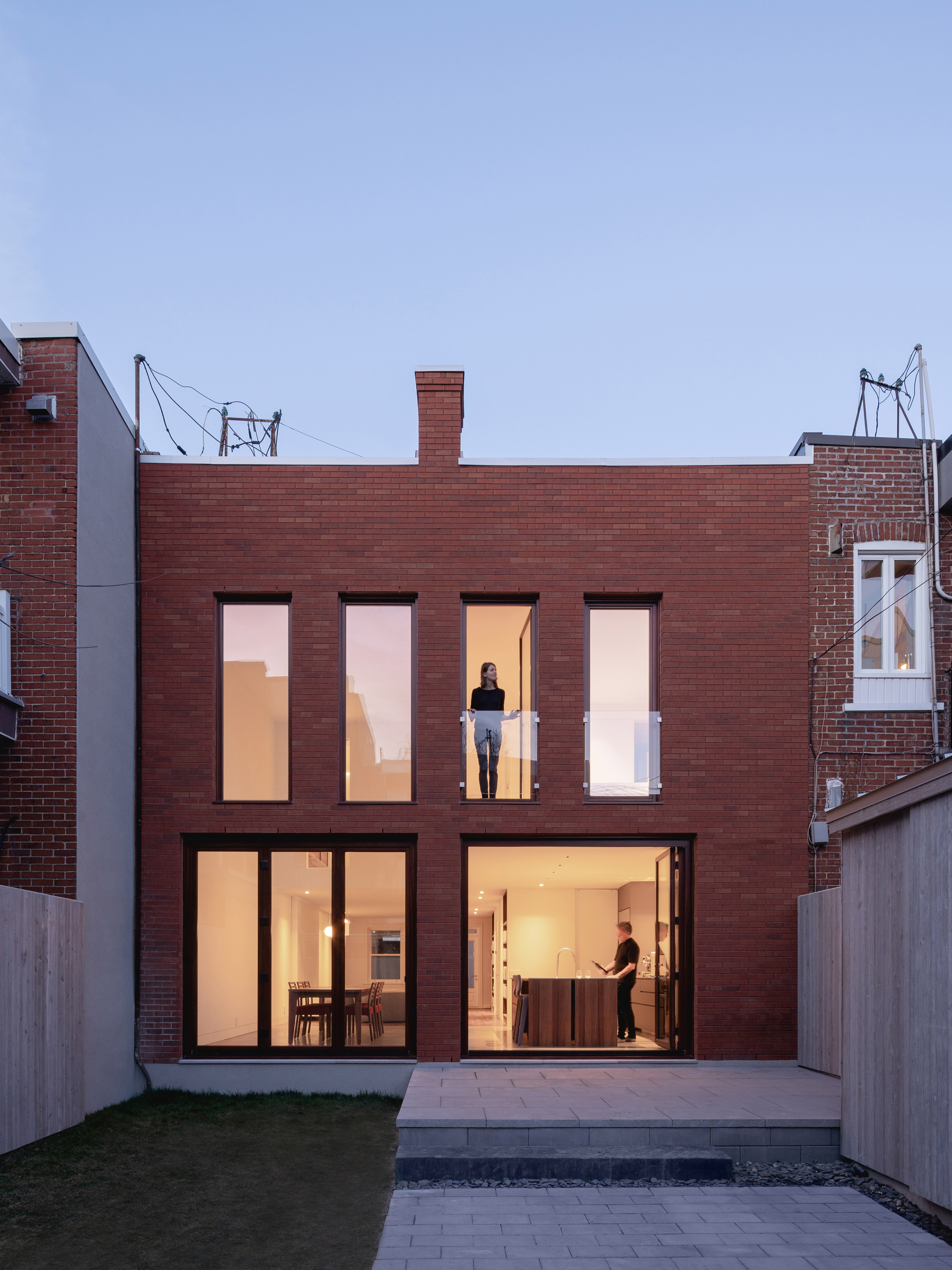
Montreal firm Natalie Dionne Architecture added a new brick facade to an apartment building in the city to transform it into a light-filled and contemporary home.

Natalie Dionne Architecture overhauled a three-unit apartment in residential neighbourhood Villeray to create the residence called Brick House.

Brick House by Natalie Dionne Architecture

"Montreal is known for its lively neighbourhoods and its traditional streets, lined with two-and-three-story row houses," explained Natalie Dionne Architecture.

"Often built in the first half of the 20th-century, these homes no longer correspond to today's lifestyles," the studio added. "It shows how traditional houses found everywhere in Montreal can be adapted to new realities."

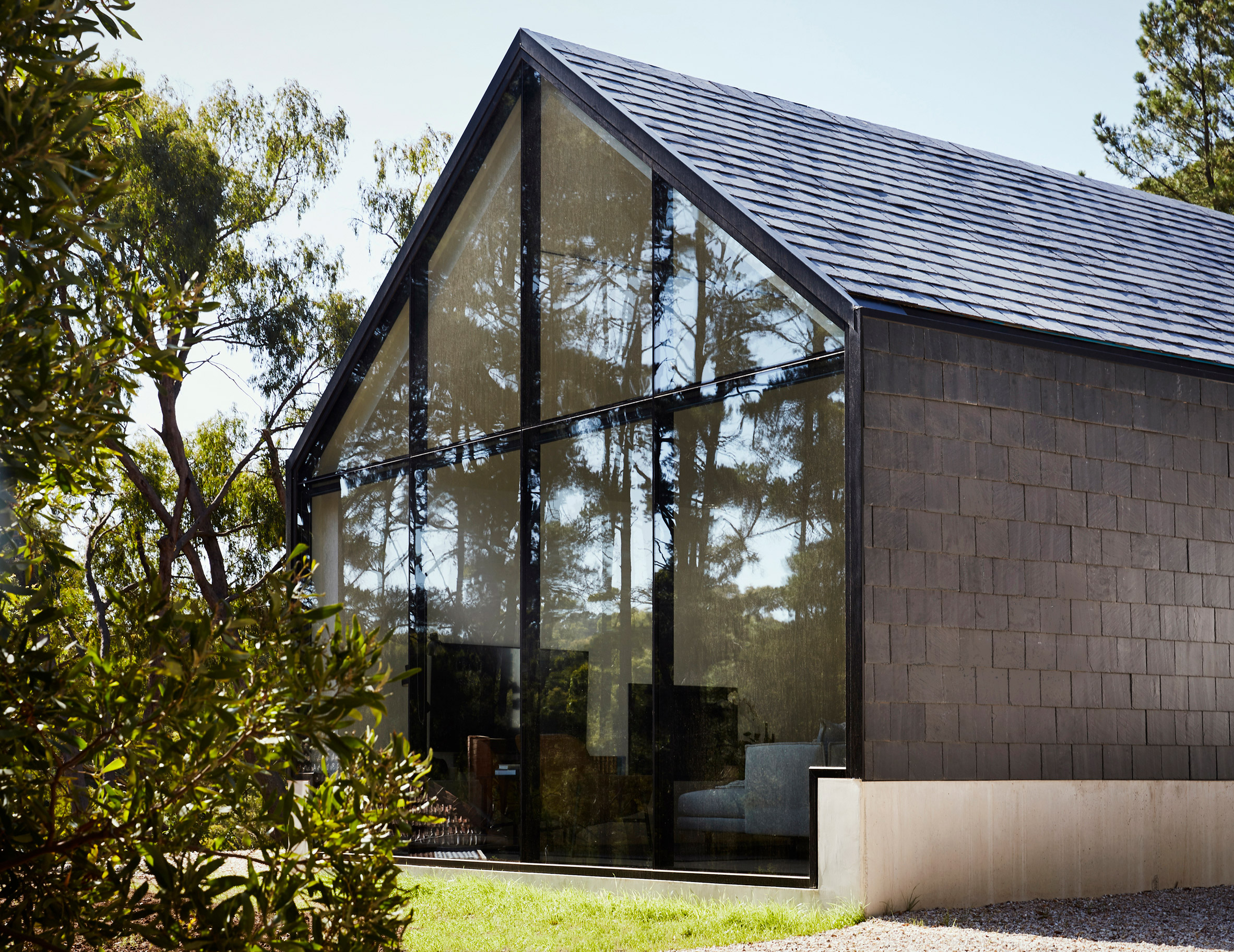
The firm designed the renovation to improve the living space's connection to the exterior, and open up the interiors to the back yard. To do this, it replaced the back wall with a new brick facade featuring plenty of windows.

Brick House by Natalie Dionne Architecture

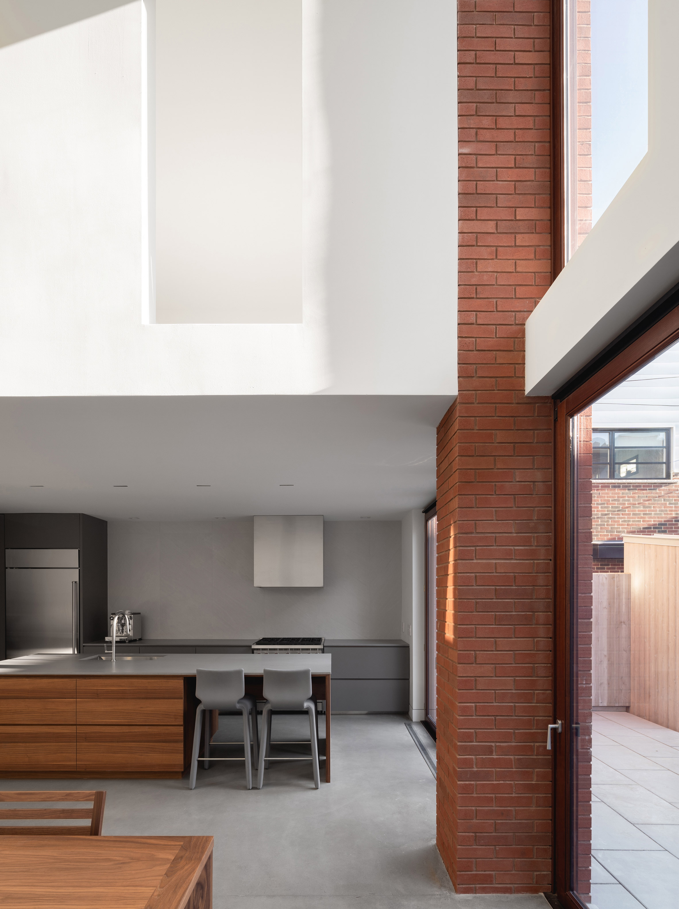
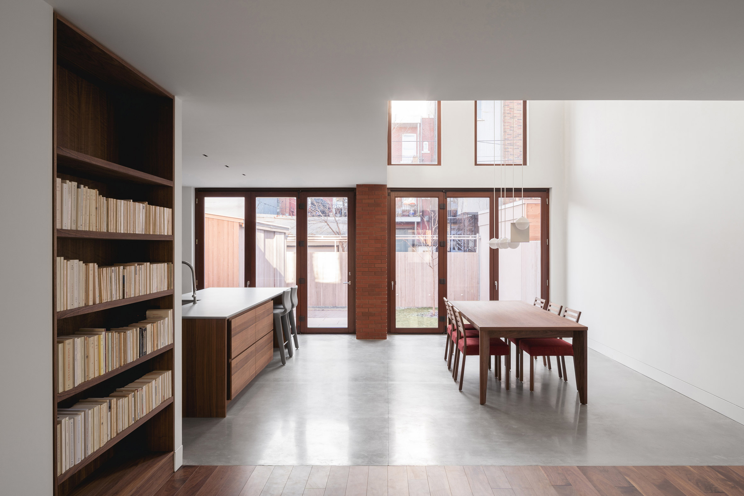
On the ground floor, two walls of pivoting glass doors allow the kitchen and dining room to extend out into the garden. "The backyard thus becomes an integral part of the home's living spaces, particularly during the long summer nights when family and friends rally around," said the firm.

These openings are separated by an exposed brick column, which used to contain the home's chimney.

Brick House by Natalie Dionne Architecture

"A centrally located chimney, no longer in use, becomes an aesthetical object, which reinforces the composition of the symmetrical facade while adding a touch of fantasy to it," it added.

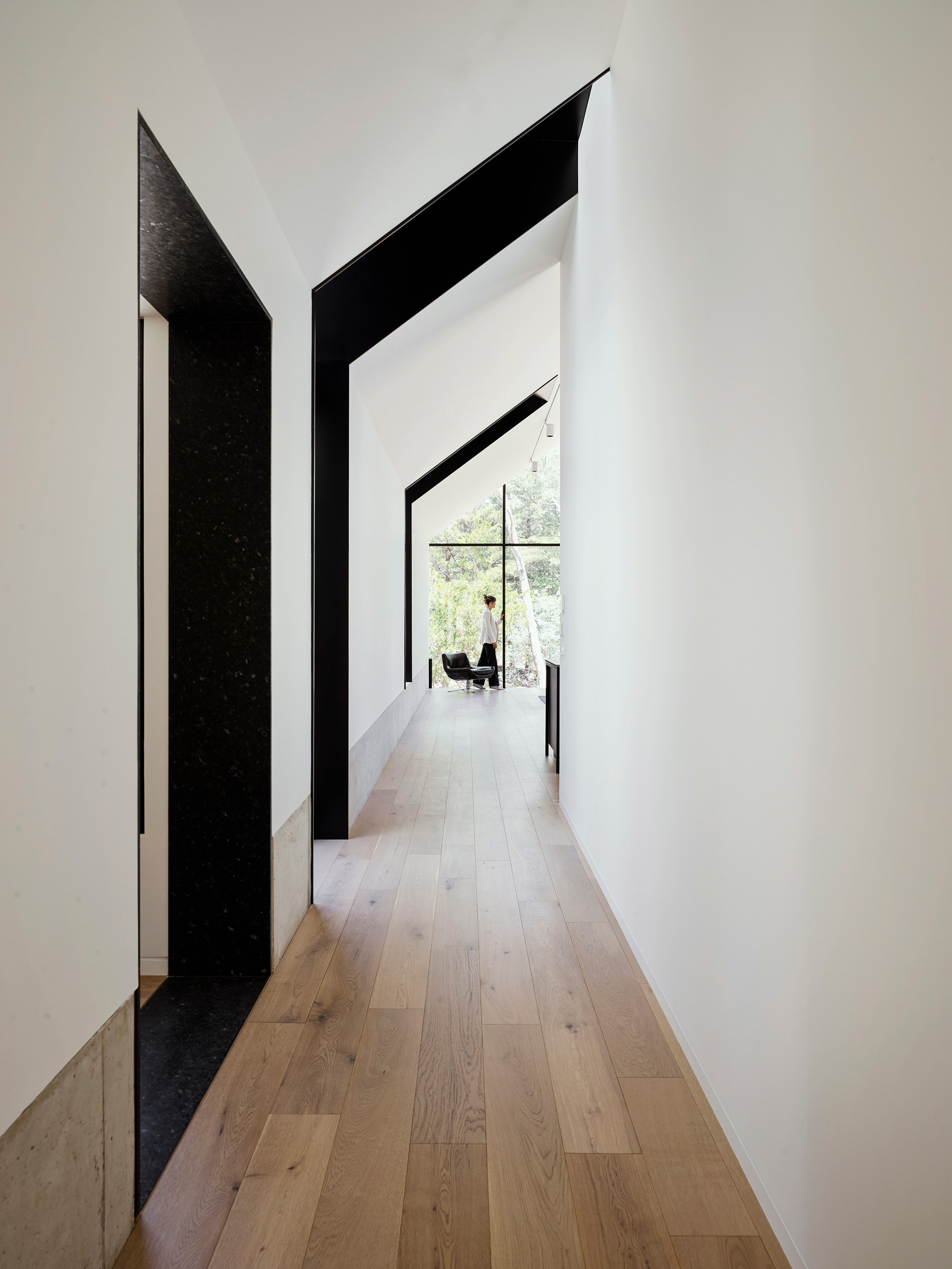
This new configuration allows guests to see through the home and into the back yard as soon as they enter the home.

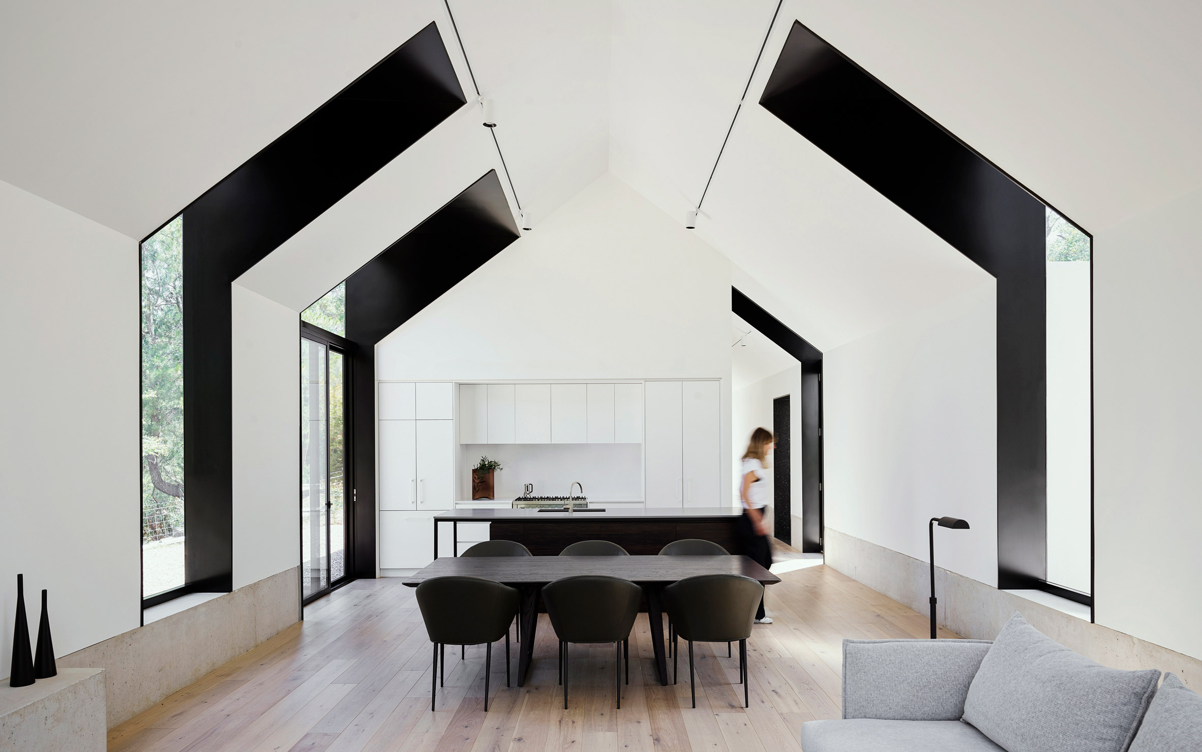
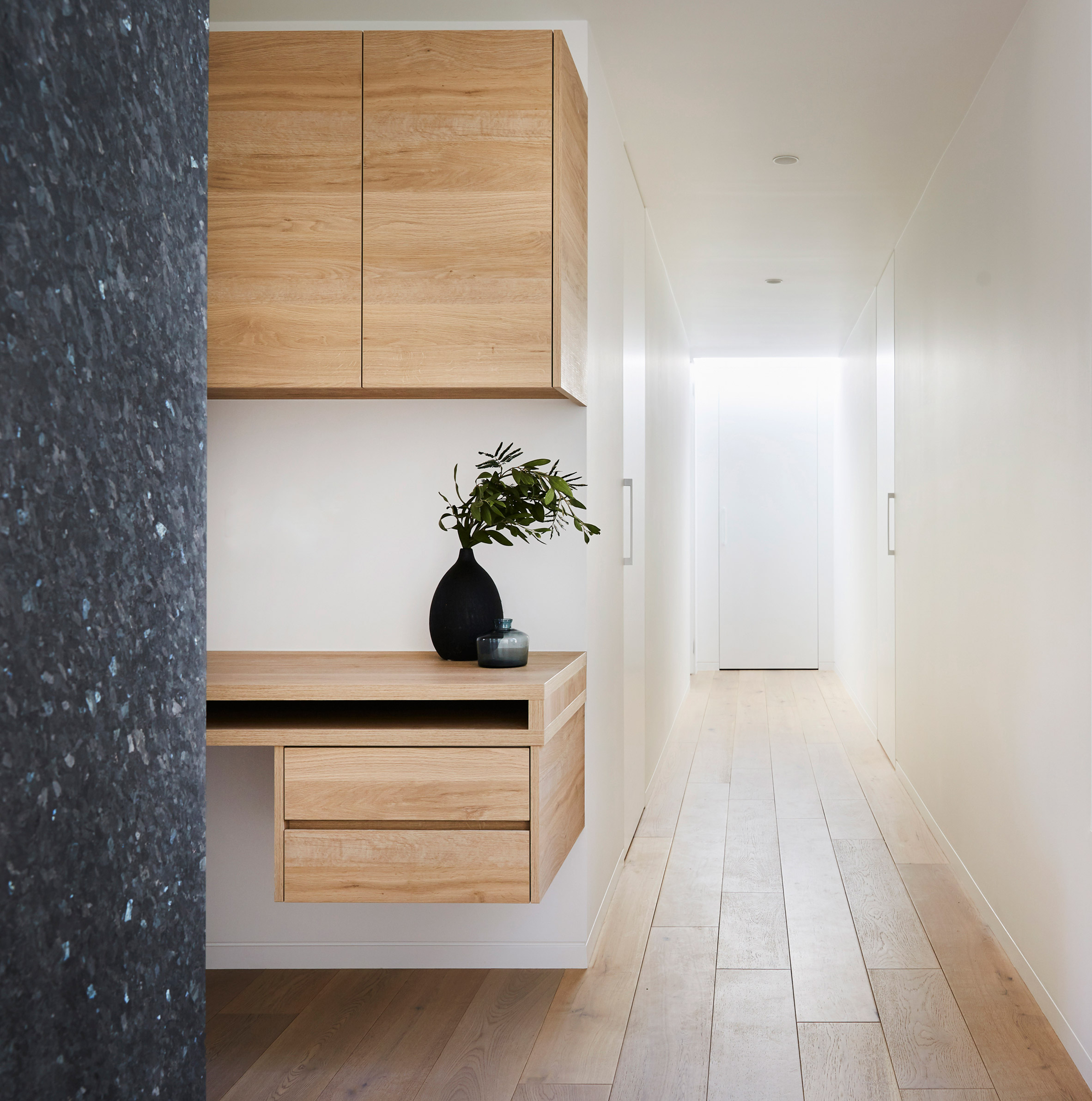
All of the 172-square-metre home's main living areas are located at ground level. There is a small mud room and half bathroom at the front of the house, near the main entrance

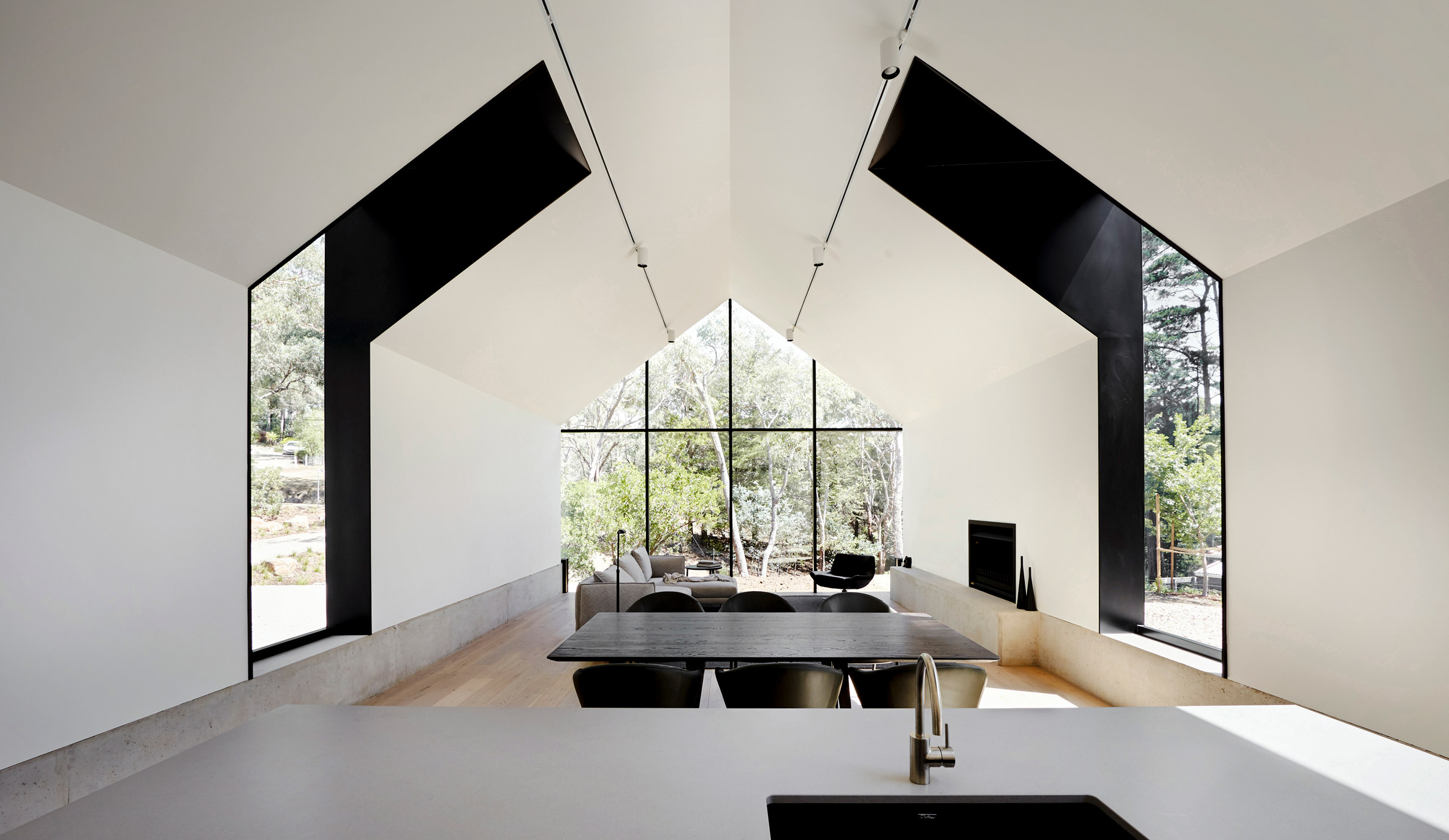
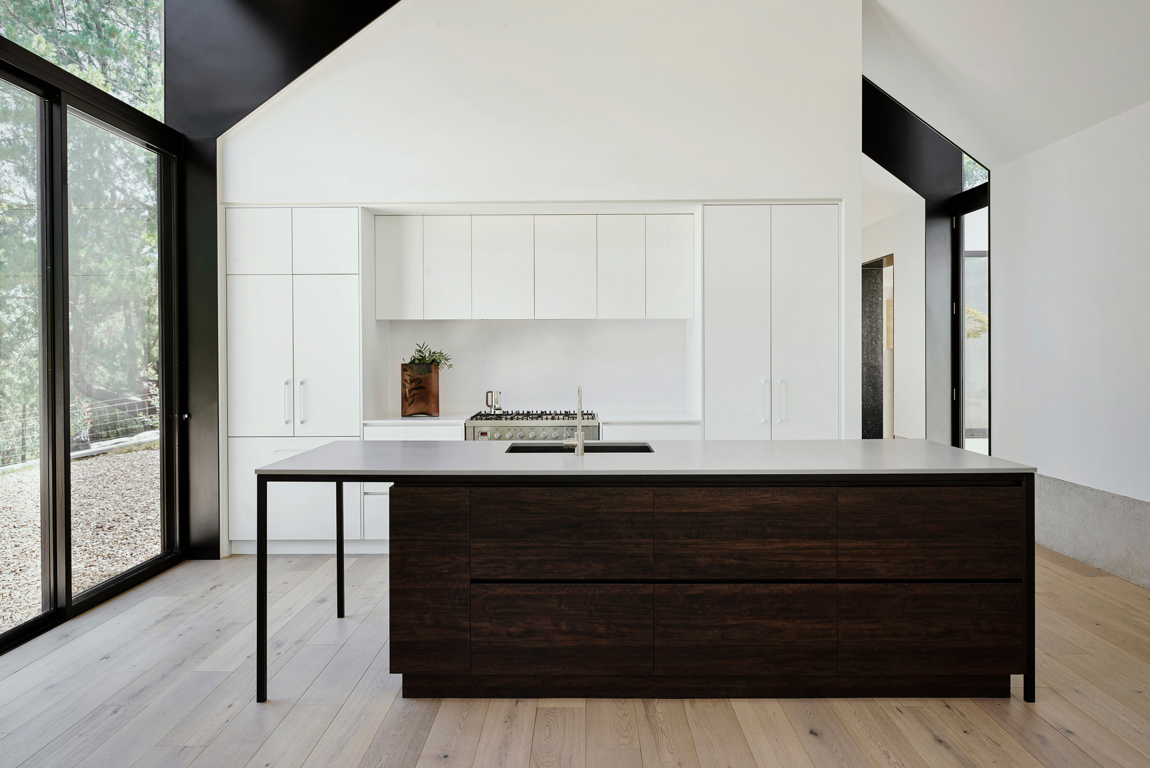
In the middle is the living room, with the kitchen and dining room opening out onto the back yard.

Brick House by Natalie Dionne Architecture

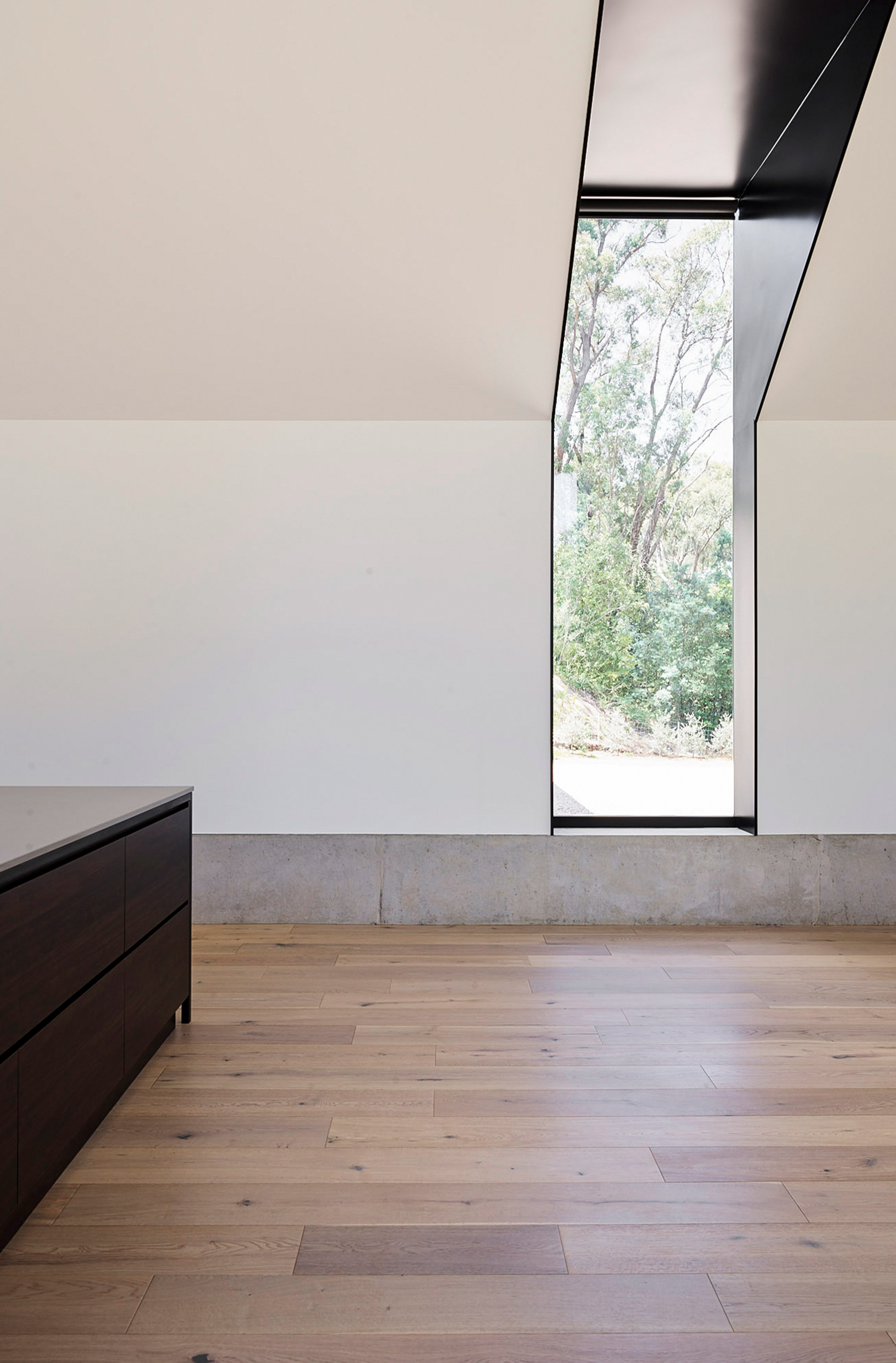
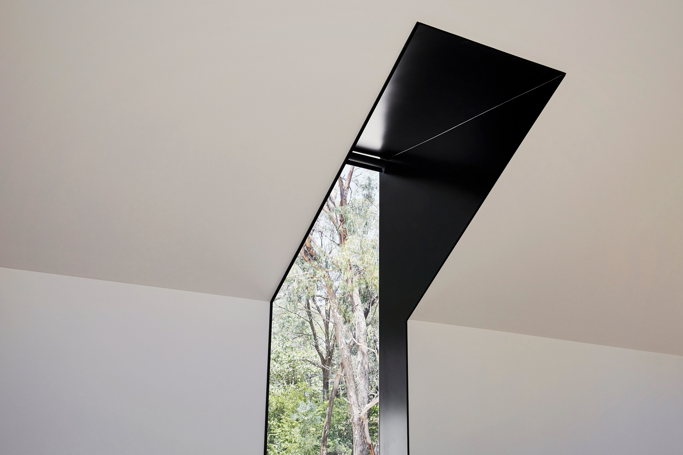
On the upper level, four south-facing, narrow openings match the position of the original windows. Their contemporary form is taller though, admitting more light into the home.

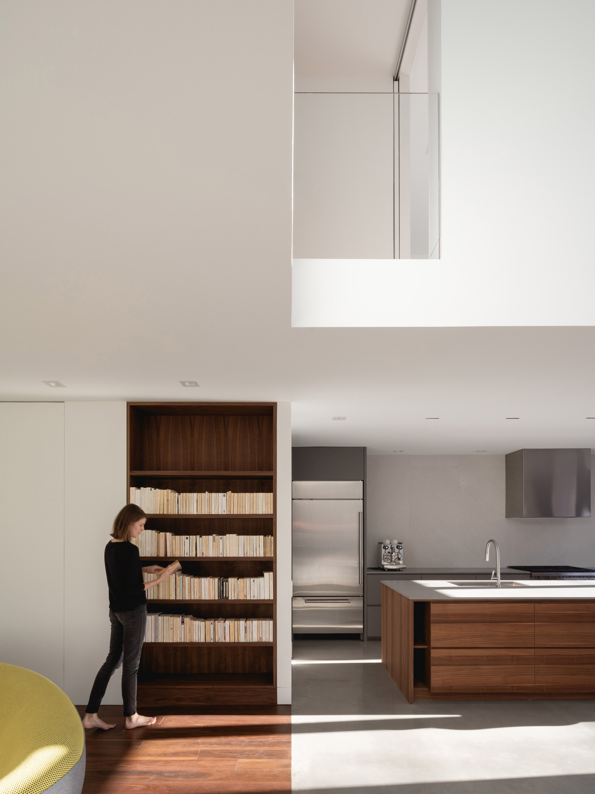
A skylight illuminates the home's stair, located in the middle of the plan. The landing upstairs overlooks the double-height dining room, a condition that the architects liken to an interior "balcony".

Brick House by Natalie Dionne Architecture

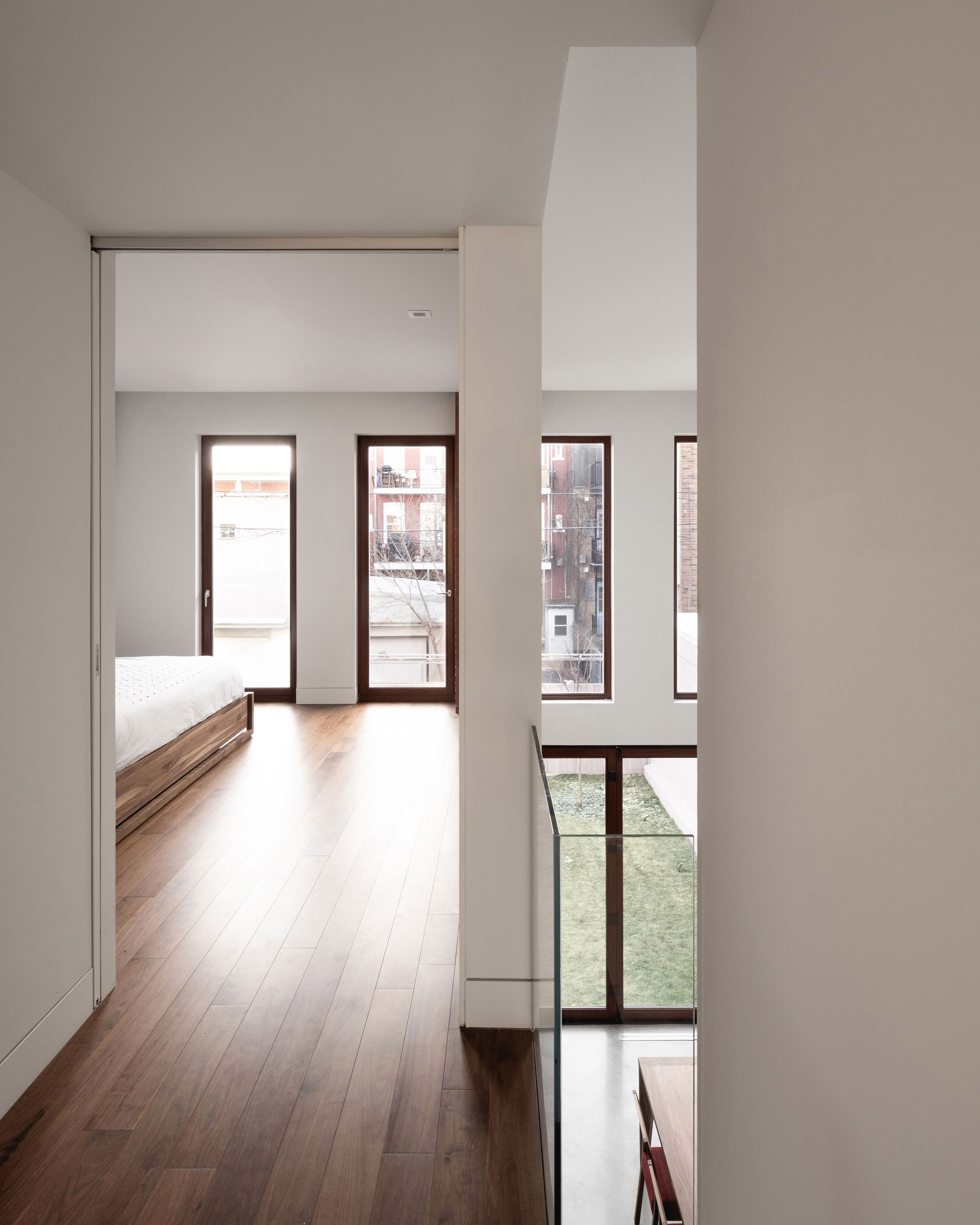
There are two bedrooms at the front of the home, facing the street, while the master bedroom is located at the back.

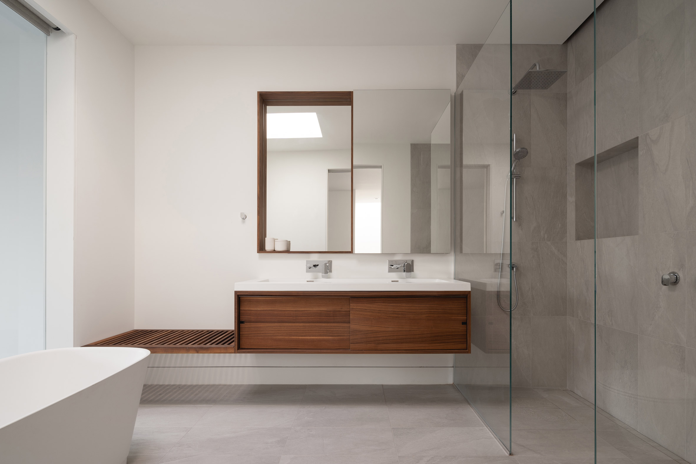
The minimal interiors are completed with a limited range of materials. In the kitchen and dining room, a polished concrete floor provides a transition to the exterior.

Brick House by Natalie Dionne Architecture

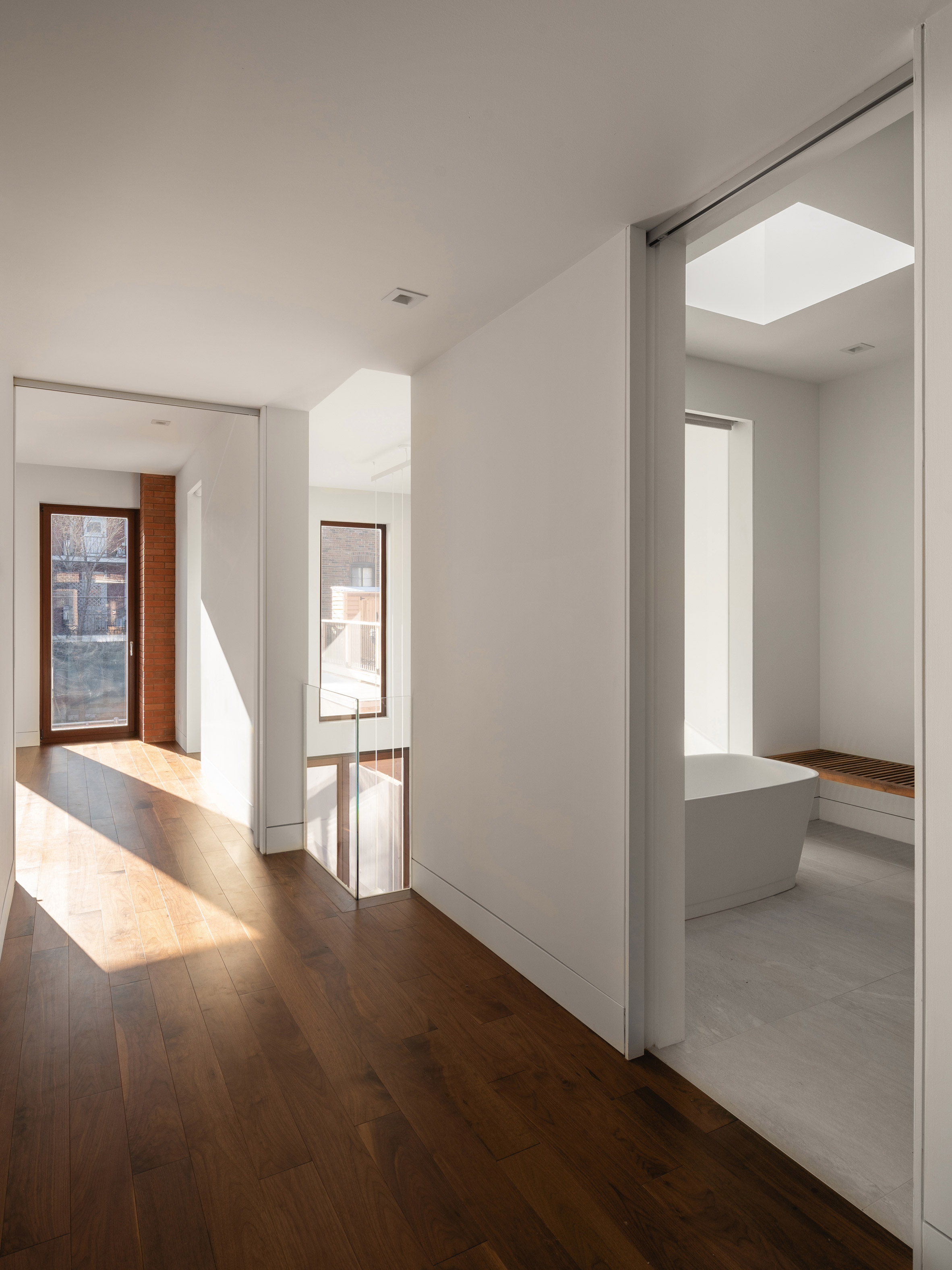
Walnut floors in the other living spaces have a softer feeling underfoot, and match the home's built-in cabinetry.

"The choice of noble materials and a subdued palette bring calm and harmony to the contemporary interiors," the studio said.

Brick House by Natalie Dionne Architecture

Natalie Dionne Architecture is a residential architecture studio led by architect Natalie Dionne and her partner Martin Laneuville. The firm's other projects include a Montreal house extension, which involved adding a geometric volume onto the back of a brick townhouse.

Similar renovations to Montreal's traditional building stock include a Victorian House that was restored and expanded by Michael Godmer and a project by Jean-Maxime Labrecque that makes extensive use of steel grates for railings and interior walls.

Photography is by Raphaël Thibodeau.


Project credits:

Architect: Natalie Dionne Architecture
Design Team: Natalie Dionne, Rosemarie Faille-Faubert, Corinne Deleers and Martin Laneuville
Clients: France Houle and Leonard Eichel
Contractor: PA Construction
Engineer: Conception Structurale Donald Arsenault
Cabinetmaker: Sebago Design

The post Natalie Dionne Architecture creates Brick House from Montreal apartment building appeared first on Dezeen.


from Dezeen https://ift.tt/2VUruM0

Dots, Dashes, and Lines Form Astronomical Maps Painted by Shane Drinkwater

All images © Shane Drinkwater

Australian artist Shane Drinkwater writes on his website that when it comes to painting, he in interested in the “making.” Using a system of lines, dashes, numbers, and circles, Drinkwater creates works that often appear as astronomical maps of imagined star systems. Abstract stars form repeated patterns around vibrant planets. The artist allows the act of painting to dictate how the cosmic compositions land on his canvas, and the results are visually arresting.

“I delve into the act of painting with a minimum repertoire of visual elements aiming for a maximum visual intensity,” Drinkwater writes. “Ideas and images appear through the making of the work, language becomes unnecessary, I let the work speak for me.” To see more of these cool maps and other paintings by Shane Drinkwater, follow the artist on Instagram. (via This Isn’t Happiness)


Do stories and artists like this matter to you? Become a Colossal Member and support independent arts publishing. Join a community of like-minded readers who are passionate about contemporary art, apply for our annual grant, and get exclusive access to interviews, partner discounts, and event tickets.


from Colossal https://ift.tt/2TJfpGZ

Kelly Wearstler designs relaxed and beachy Santa Monica Proper hotel

Santa Monica Proper by Kelly Wearstler

American interior designer Kelly Wearstler scoured vintage shops to source the eclectic furniture that decorates the living room-style lobby of this hotel in Santa Monica, California.

Santa Monica Proper by Kelly Wearstler

Santa Monica Proper occupies the 1920s Santa Monica Professional Building and a curvilinear extension designed by local firm Howard Laks Architects.

Located on Wilshire Boulevard in the coastal Californian city, it forms the lastest in the Proper hotel chain Wearstler runs with her husband Brad Korzen and Brian De Lowe.

Santa Monica Proper by Kelly Wearstler
Photograph by Mathieu Salvaing

Wearstler also designed the San Francisco Proper that features clashing patterns, colours and textures, and vintage furniture.

The interior designer developed the Santa Monica outpost to incorporate a similarly eclectic mix of details in palettes that allude to its beach setting.

Santa Monica Proper by Kelly Wearstler

The sprawling lobby and ground floor restaurant contains a mix of contemporary furniture and repurposed finds from vintage shops. She chose the eclectic mix paired with various greenery to make it feel like a large living room, to encourage visitors to relax.

Santa Monica Proper by Kelly Wearstler

"When we started with all the design, we started shopping for all the furniture and it took quite some time," Wearstler told Dezeen.

"They are not just the normal vintage pieces that you would associate with California easy living," she added. "There's a lot of really great anomaly."

Santa Monica Proper by Kelly Wearstler
Photograph by Mathieu Salvaing

There are a number of different seating areas designed for both working or enjoying a drink from the bar. These include tables decorated accompanied by different chairs, and white nooks fitted with curved sofas.

Santa Monica Proper by Kelly Wearstler
Photograph by Mathieu Salvaing

"It's a really great meeting place until we created these alcoves that are really great spaces for dining, meetings and just hanging out," the designer added. "It just feels someone's living room. It's just super relaxed. It's easy.

The lobby is punctuated with huge, tile clad columns with bulbous tops. Walls are rendered with hand-troweled, pitted gritty plaster texture and the floors are covered in patterned woodwork.

Santa Monica Proper by Kelly Wearstler

"If you have a bird's eye view on the reception, the pattern of the wire brushed oak hardwood floors is reminiscent of opened umbrellas," Wearstler said. "So there's a lot of very multi-directional activity on the floor, which was really interesting in this curvaceous shaped reception."

The designer chose pitted travertine, more commonly used as a building material, to make a reception desk. The front is covered in striations that are reminiscent of a beach shell.

Santa Monica Proper by Kelly Wearstler

Other details include a large pair of fan-shaped bamboo wall lights designed by Ingo Mari.

"Those are quite amazing to find a pair; there was only a very small amount produced and they were actually made in a small village in Japan," Wearstler added.

Santa Monica Proper by Kelly Wearstler
Photograph by Mathieu Salvaing

Santa Monica Proper has 271 guest suites split across both the landmarked building and the new structure. Wearstler chose floral wallpaper and deeper hues for the rooms in the existing building and a muted, neutral palette for those in the extension. Textiles and wall coverings are from the designer's own collection.

A common theme across the two buildings is a curved headboard in the hotel rooms. "The bed is a radius headboard that reminded me of a sunset in California," she said.

Santa Monica Proper by Kelly Wearstler
Photograph by Mathieu Salvaing

The hotel also has a rooftop – a key feature for each Proper outpost. In Santa Monica, this includes the restaurant Calabra decorated with richly textured dark wood, brickwork and stone.

A private swimming pool and deck is located to one side of the rooftop. Near its entrance, it features nooks reminiscent of those in the ground floor lobby. The rear is more open and comprises curved seating areas tucked among large plants.

Santa Monica Proper by Kelly Wearstler
Photograph by Mathieu Salvaing

Santa Monica Proper is completed with another restaurant, called Ondo, located on the ground floor of the historical building, and a fitness centre. An ayurvedic spa will also open later this year.

Photography is by The Ingalls, unless stated otherwise.

The post Kelly Wearstler designs relaxed and beachy Santa Monica Proper hotel appeared first on Dezeen.


from Dezeen https://ift.tt/2PW7IMr

House clad in slate shingles by Telha Clarke features glazed gable end

Hepburn Springs House by Telha Clarke

Projecting windows and a fully glazed gable end provide views of nature from inside the black and white living space of a house in the resort town of Hepburn Springs, Australia.

Melbourne architecture office Telha Clarke was commissioned by a client living in the city to create a contemporary second home on a semi-rural site.

Hepburn Springs House by Telha Clarke

Hepburn Springs House occupies a plateau, and is accessed via a driveway that descends from the street before crossing a gully and rising again to reach the small area of flatter land.

Two adjoining volumes are arranged perpendicular to one another.

Hepburn Springs House by Telha Clarke

A larger gabled structure is entirely clad in slate shingles.

This contrasts with the plain white render of the adjoining guest wing and garage.

Hepburn Springs House by Telha Clarke

The single storey building is entered through an opening in the wall beside the garage.

A path formed by irregular stone slabs leads to a glazed door that opens into the open-plan living space.

Hepburn Springs House by Telha Clarke

The living area is contained in a lofty, gabled structure intersected by four large dormers.

These windows extend from above the eaves to a concrete plinth running along the building's perimeter.

Hepburn Springs House by Telha Clarke

Viewed from outside, the concrete base anchors the house in the landscape.

Inside it helps to break up the overall volume fo the large room.

Hepburn Springs House by Telha Clarke

The plinth also provides casual seating nooks inserted into the dormers.

Black walls around the windows contrast with the white interior, framing the views.

Hepburn Springs House by Telha Clarke

A kitchen island made from dark timber provides another counterpoint to the wall of white units behind it.

The wood's textured surface introduces a natural detail to the pared-back, heigh ceilinged space.

Hepburn Springs House by Telha Clarke

Beyond the kitchen is a corridor leading to the master bedroom suite.

An opening lined with richly patterned black granite creates a clear threshold between the two parts of the house.

The guest wing has a distinctly different scale and materiality to the main living space, which reflects its more intimate functions.

Hepburn Springs House by Telha Clarke

"Deliberately simpler in form and maintaining a select material palette, the guest wing is inward looking, low and muted, allowing light and shadow to express the outside landscape," said Telha Clarke.

"The contrast in volumes and materials heightens the sense of reveal when one moves through the threshold into the main expanse."

Hepburn Springs House by Telha Clarke

A cosy workspace with a suspended wooden desk and cabinets is situated by the entrance to the guest wing, which also contains a large bathroom and two bedrooms.

Glazed gable ends are an arresting way to create expansive views from a building.

In Italy, architecture studio Geza designed one for a house on a slope in the Alps, and Atelier Tao+C added one in when converting a rammed-earth structure into a hotel in China.

Photography is by Lynton Crabb.

The post House clad in slate shingles by Telha Clarke features glazed gable end appeared first on Dezeen.


from Dezeen https://ift.tt/39uZhzm

Pavel Míček Architects sinks house into a hillside in Czech mountains

Weekend House in Beskydy by Pavel Míček Architects exterior

Pavel Míček Architects has built a concrete holiday home in the Beskydy Mountains of eastern Europe.

Weekend House in Beskydy is a 185-square-metre cottage for a family of four, located in the Moravian Wallachia region of the Czech Republic.

Weekend House in Beskydy by Pavel Míček Architects exterior

With its simple A-frame shape, the house is designed to match the traditional properties of the region. But it is clearly a modern building, featuring simple materials and fuss-free details.

The base of the house is a cast concrete cuboid, sunken into the hillside, while its more lightweight upper level is a triangular prism clad in larch boards and shingles.

Weekend House in Beskydy by Pavel Míček Architects exterior

Inside, bedrooms, bathrooms and utility rooms are all located on the lower level.

This completely frees up the first floor, which serves as a spacious living space, dining area and kitchen, with plenty of room for guests.

Weekend House in Beskydy by Pavel Míček Architects exterior

There is also a mezzanine slotted in under the highest section of the roof.

"The basic form of the house – with its dominant wooden roof, and also its position in a steep slope – reflect the traditional way of building in the Moravian Wallachia," explained architect Pavel Míček.

Weekend House in Beskydy by Pavel Míček Architects living space

"The open gables of the roof do not disturb the silhouette of the building in the landscape, however they also express the free spatial disposition of the house," he told Dezeen.

"They mediate a new relation of the interior to the landscape."

Weekend House in Beskydy by Pavel Míček Architects kitchen

Material finishes inside the house follow those of the exterior, with a mix of concrete and wood.

In some places the concrete is left exposed, but there are also concrete blocks that have been painted white. Larch covers walls, floors and ceilings, matching kitchen cabinets and a few bespoke furniture elements.

Weekend House in Beskydy by Pavel Míček Architects dining space

Windows come in a mix of shapes and sizes, from the triangles at the front and rear of the living space, to the recessed windows that offer extra privacy for the three bedrooms.

Weekend House in Beskydy by Pavel Míček Architects staircase

The two staircases, positioned alongside one another, also contrast with one another.

The first, leading up from the ground floor, is made from steel. The second, ascending to the mezzanine, is made from wood and has storage space concealed underneath it.

Weekend House in Beskydy by Pavel Míček Architects bedroom

The house also features a sheltered balcony that spans the width of the building. Facing northwest, it offers a place for residents to watch the sun set over the mountains.

Based in Zlín, Míček founded his architectural practice in 2003. The clients of Weekend House in Beskydy are close friends and the architect has been working on the project with them since 2011.

Weekend House in Beskydy by Pavel Míček Architects exterior

Now the residence is complete, the plan is for it to be used by their whole circle of common friends.

Míček sums it up as "a non-traditionally traditional cottage in an idyllic mountain landscape".

Photography is by Boys Play Nice.


Project credits:

Architecture: Pavel Míček Architects
Structural engineering: Vladimír Uchytil
Mechanical engineering: Oto Nový
Building physics: Milan Farář
Electrical engineering: Jaroslav Tesař
General contractor: Drga stavební společnost
Windows: Jánošík okna – dveře
Larch facing, floors: Dveře a podlahy
Interior: Pavel Míček Architects
Kitchen: Akrees
Kitchen appliances: Siemens
Hob: Bora
Sanitary technology: Laufen
Sofa: mm interiér
Chairs: Vitra
Heat pump: IVT centrum

The post Pavel Míček Architects sinks house into a hillside in Czech mountains appeared first on Dezeen.


from Dezeen https://ift.tt/3cGEjiS