Thursday, 19 March 2020

Human Subjects Distorted by Nature in Double-Exposure Photographs by Christoffer Relander

“Miss Autumn.” All images © Christoffer Relander, shared with permission

During the first frost in the southern region of Finland, Christoffer Relander (previously) shot dense patches of branches, ferns, and blades of grass as part of a new set of double-exposure photographs. Titled We Are Nature Vol. 6, the monochromatic project merges human figures with nature to generate a portrait of a woman whose forehead is substituted with overflowing brush. Another image shows two kids whose features are obscured by leaves and vines.

The Finland-based photographer, who has a background in graphic design, tells Colossal that he decides how to pair each subject and natural element based on graphical compositions and forms. “The botanical textures are matched more after the overall mood. If it feels wrong, I will simply trust my gut,” he says.

Whereas many of his previous projects had been blended in-camera, Relander altered his method for this series thanks to extra time indoors due to the ongoing coronavirus pandemic. “I decided, however, to still bring inspiration from both the multiple exposure film algorithms (negative film) and some basic darkroom techniques,” he writes.

When doing it in-camera, the manipulation is basically done instantly. Then while using external software (Photoshop) I get more flexibility and options. Not always for the better. I have ruined artworks by taking it too far. Doing it in-camera can feel really rewarding when done right. But the pressure can be tiring.

For more of Relander’s works that expertly blend themes of nature and humanity, head to Instagram or Behance.

“Blood tie”

“Butterfly mind”

“First frost”

“Frosted back”

“Guardian”

“Resting butterfly”

“Triplets”


Do stories and artists like this matter to you? Become a Colossal Member and support independent arts publishing. Join a community of like-minded readers who are passionate about contemporary art, apply for our annual grant, and get exclusive access to interviews, partner discounts, and event tickets.


from Colossal https://ift.tt/2U3NJy0

Camira creates colourful Oceanic fabrics from recycled plastic bottles

Oceanic by Camira

Dezeen promotion: British textile company Camira has created fabrics that contain recycled plastic collected from oceans and beaches.

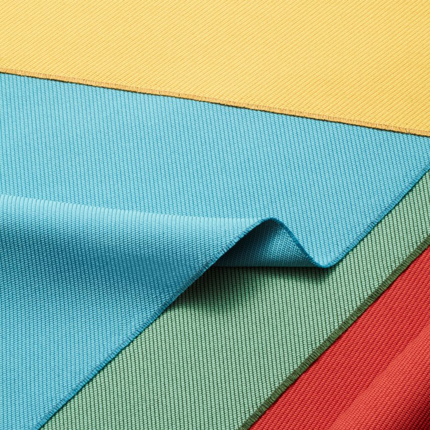
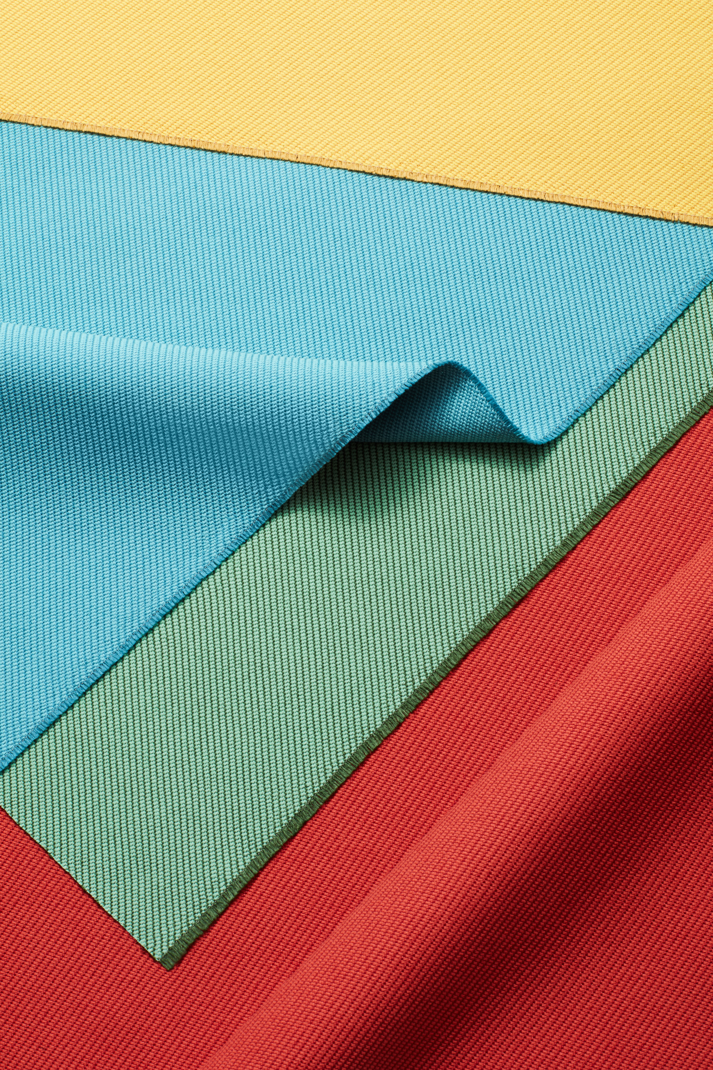
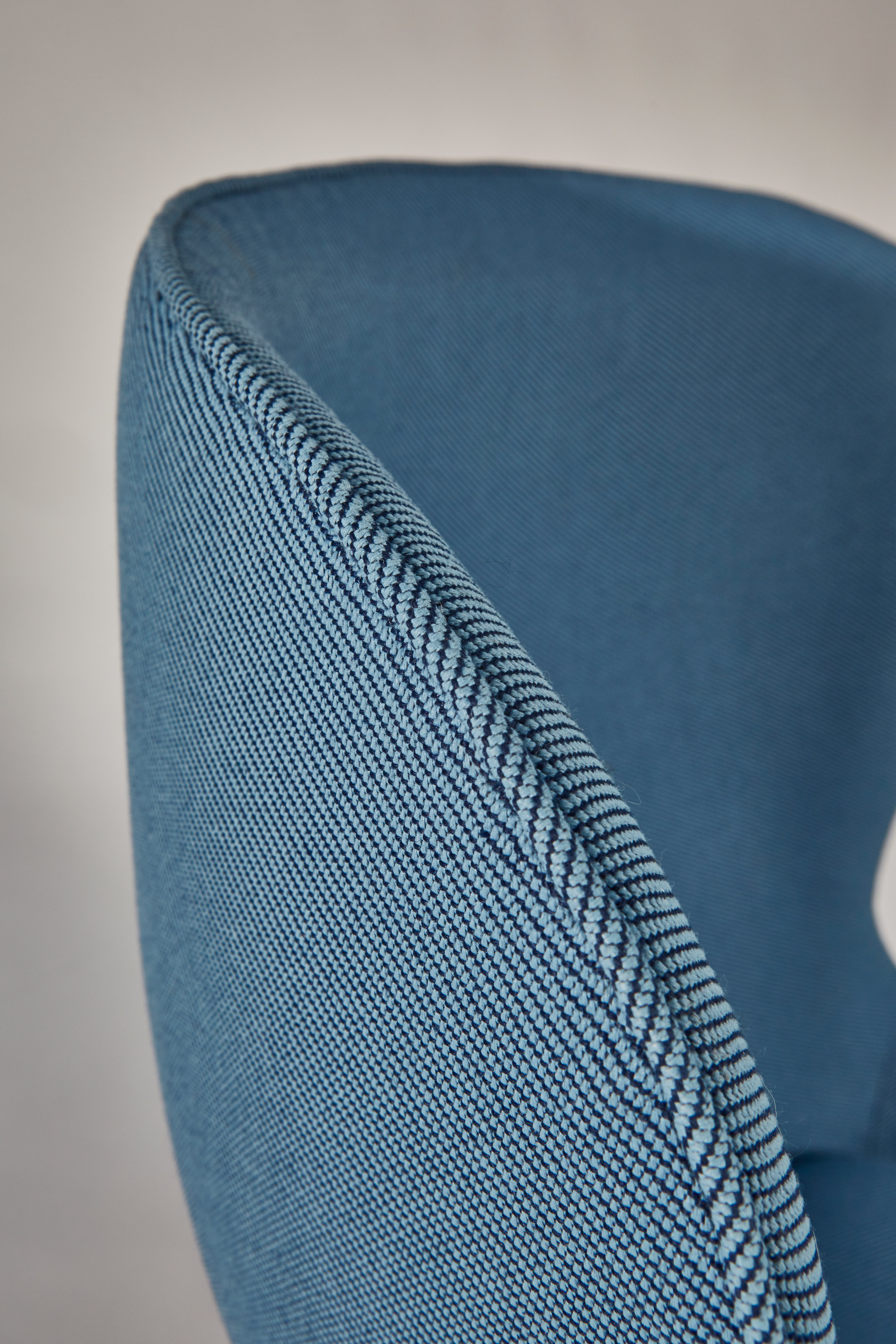
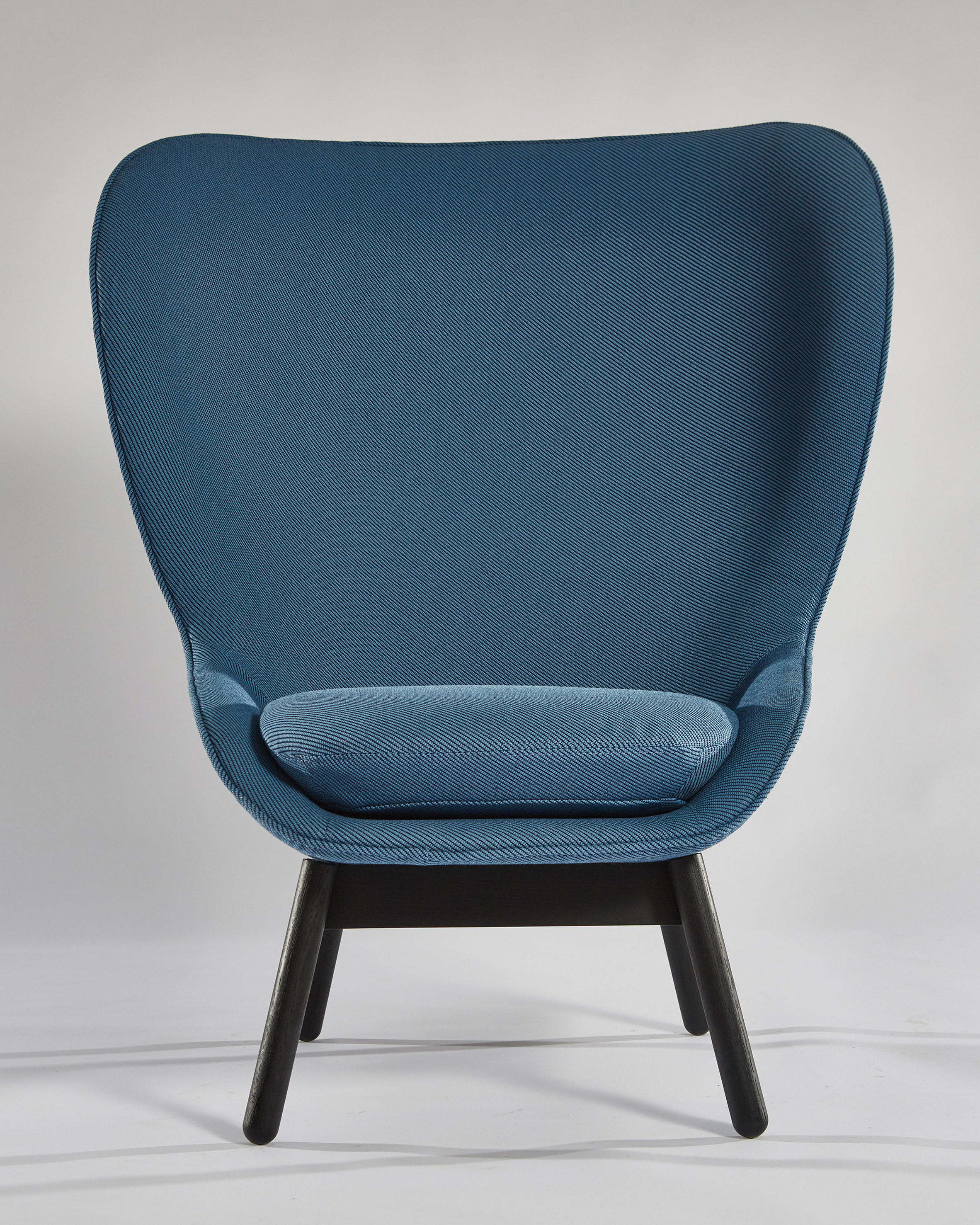
Camira's Oceanic range has a twill weave comprising a light warp and a deeply saturated weft.

Up to 50 per cent of the fibres are created from recycled plastic bottles that were sourced from the Mediterranean sea and beaches as part of the SEAQUAL Initiative – an organisation that works to combat marine plastic pollution by collecting and processing bottles.

Oceanic by Camira

"For every two kilograms (four metres) of oceanic fabric sold, one kilogram of waste is removed from the ocean," said Camira. "One metre of fabric equates to 26 plastic bottles."

The SEAQUAL Initiative processes marine plastic and post-consumer plastic bottles diverted from landfill to make the yarn.

The waste is washed, shredded into a mixture and then extruded into chips. The fibres are treated into yarn and texturised, before being sent to Camira's factory in Huddersfield, England.

Oceanic by Camira

Oceanic comprises 16 shades in total, ranging from neutrals to pastels and bolder options. Colours include soft yellow, turquoise, bright red and sage green.

Camira was founded in 1974 and is based in Mirfield, West Yorkshire. It has six factories, five of which are in the UK and one in Lithuania.

Oceanic is the latest in a series of recycled textiles that Camira has produced in the past 20 years, beginning with a wool fabric made from old jumpers called ReSKU.

"We've always strived to break the traditional 'take-make-waste' model in favour of recycling, re-use and cyclical loops where we upcycle waste inputs to create new fabric," Camira said.

Oceanic by Camira

Camira has also made other fabrics containing recycled plastic water bottles, including collections called Xtreme, Lucia and Rivet.

As part of its bid to become more sustainable, the brand has aimed to create a more circular production method with its yarn supplier. In this process, remnants from its factories are taken back to the supplier and recycled into new yarn. Up to 25 per cent is incorporated into a new fabric.

Oceanic forms part of a greater collection of designs made with recycled plastic, including 3D-printed lampshades, marbled tiles, and a terrazzo-like material by Plasticiet.

The post Camira creates colourful Oceanic fabrics from recycled plastic bottles appeared first on Dezeen.


from Dezeen https://ift.tt/2WpHBS8

Pablo Dorigo Sempere turns Venice canal algae into postage stamps

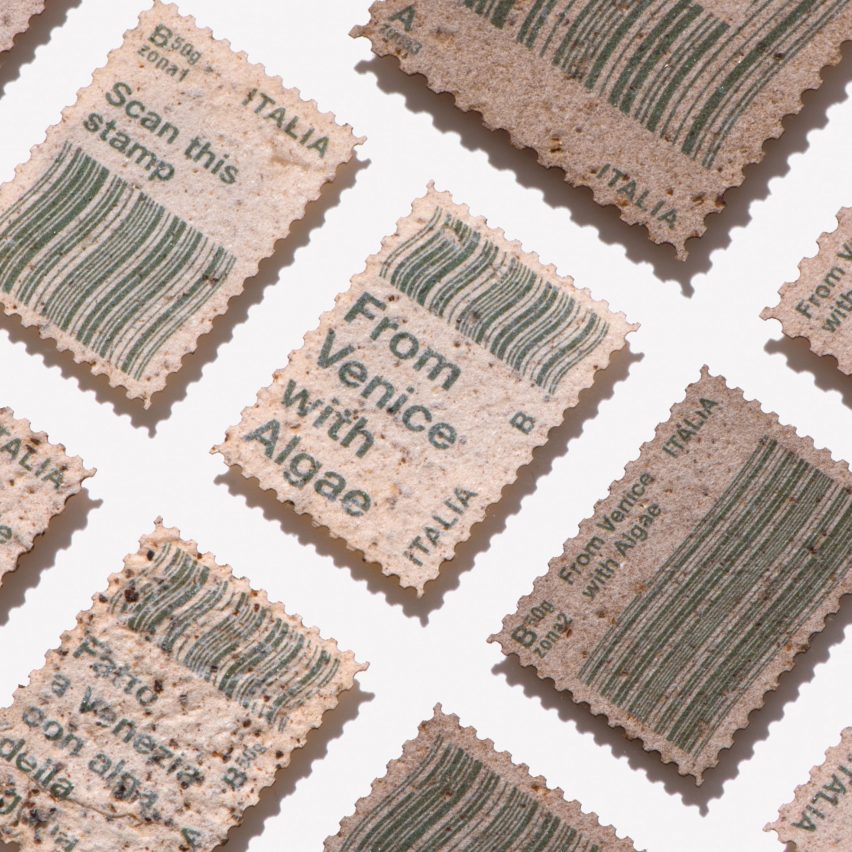
Spanish-Italian designer Pablo Dorigo Sempere has extracted algae polluting the Venetian Lagoon and used it to make paper postage stamps for the Italian city.

Dorigo Sempere made the product to showcase the qualities and ingredients of algae paper.

Otherwise known as Shiro Alga Carta, this material was first produced in 1992 by Venetian paper company Favini.
Titled From Venice with Algae, the stamp project takes its name from a play on the well-known saying "from Paris with love", which comes from the name of a 2010 action film.

The designer hopes that, by using the paper method to make stamps, the innovative and eco-friendly material will be sent to and seen by people all across the world.
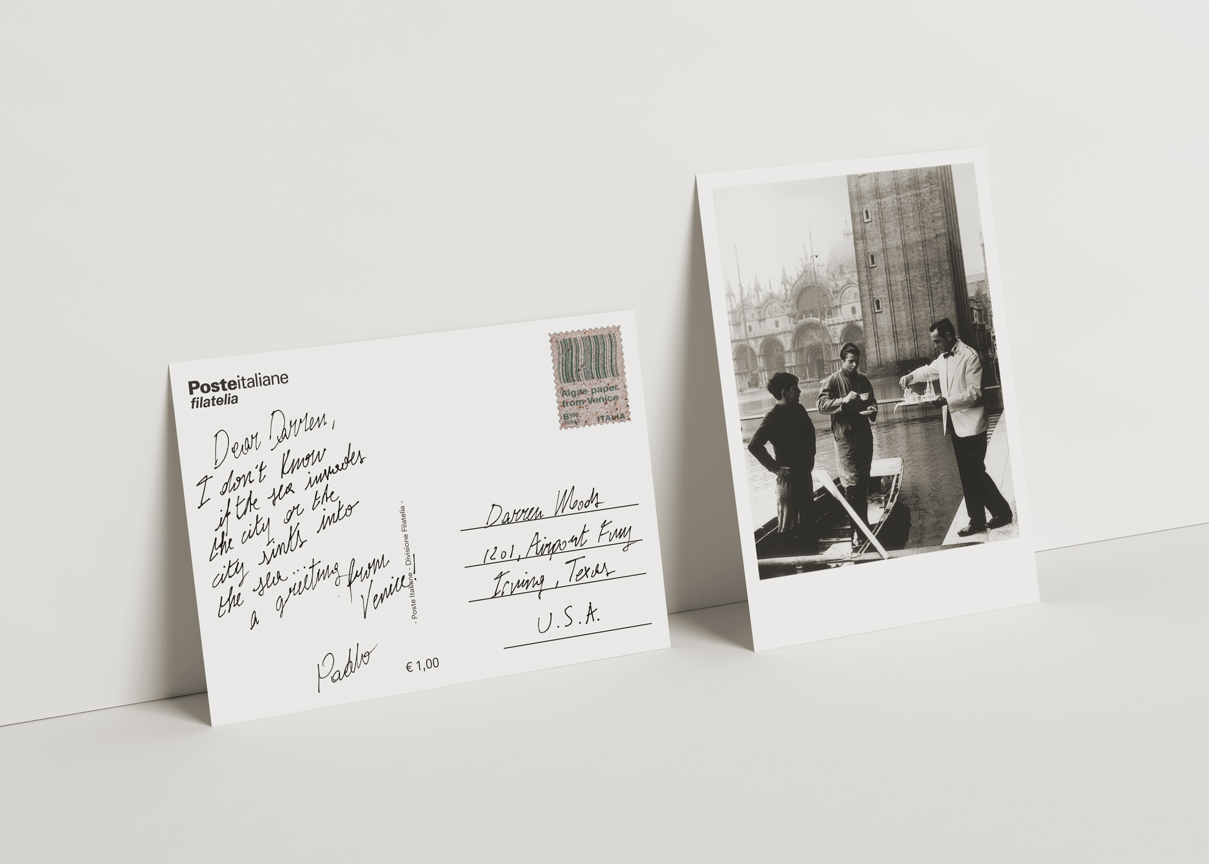
"Stamps are very interesting objects in themselves, since they have always represented historical moments, but also show a high level of technology," Dorigo Sempere told Dezeen.

"If we go into collectibles, stamps are the objects that achieve the highest weight-to-value ratio in the world," he continued.

"The stamp has the extraordinary power to travel all over the world and to tell a story."

"Being in the environmental situation in which we are, I realised that working with paper in a sustainable way can be as necessary as working with any other typical everyday object."
Favini started making its Shiro Alga Paper when the Italian government asked the company to find a technique to make use of the build-up of algae that was harming the ecosystem in Venice's canals. As well as enhancing the marine life, it is beneficial because it makes paper without using trees.

The company extracts and dries the algae, before grinding it down in a special mill and combining it with paper pulp.

In a bid to better understand the Shiro paper's materiality, Dorigo Sempere learnt to make the paper from scratch with the raw ingredients, including thin powdered algae, coarse powdered algae and cellulose fibres.

Dorigo Sempere organises the production of paper into three phases: preparing the pulp into fibres, forming the paper on a wire-mesh mould, and finally drying and finishing the paper's surface.

The first step in the process is to hang the cellulose fibres in clear water for 24 hours, allowing them to macerate.

These fibres are then moved into a container and mixed with the thin and coarse powdered algae in different amounts, depending on the desired colour and texture of the final result.

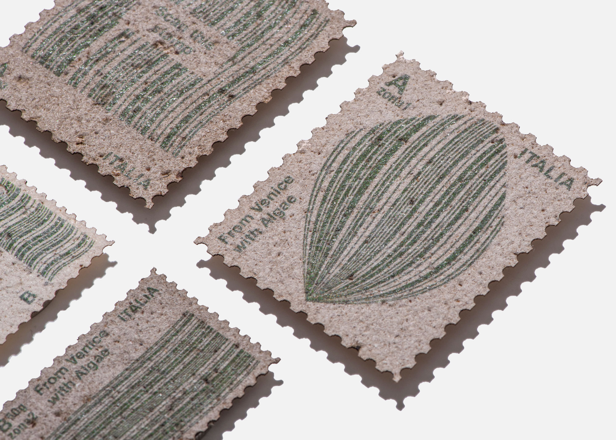
The thicker the powdered algae, the more irregular and rough the surface texture and the darker the colour of the paper. It can range in colour from ivory to dark brown.

More or less visible grain can also be achieved depending on the composition of the mixture.

A deckle – a frame-like device used to shape the pulp – is then dipped into the container and used to scoop up the fibres, before leaving them to dry under a press for 48 hours.

The thickness of the paper can be determined by altering the depth at which the frame is immersed in the mixture. Dorigo Sempere decided on a width of around 0.3 millimetres.

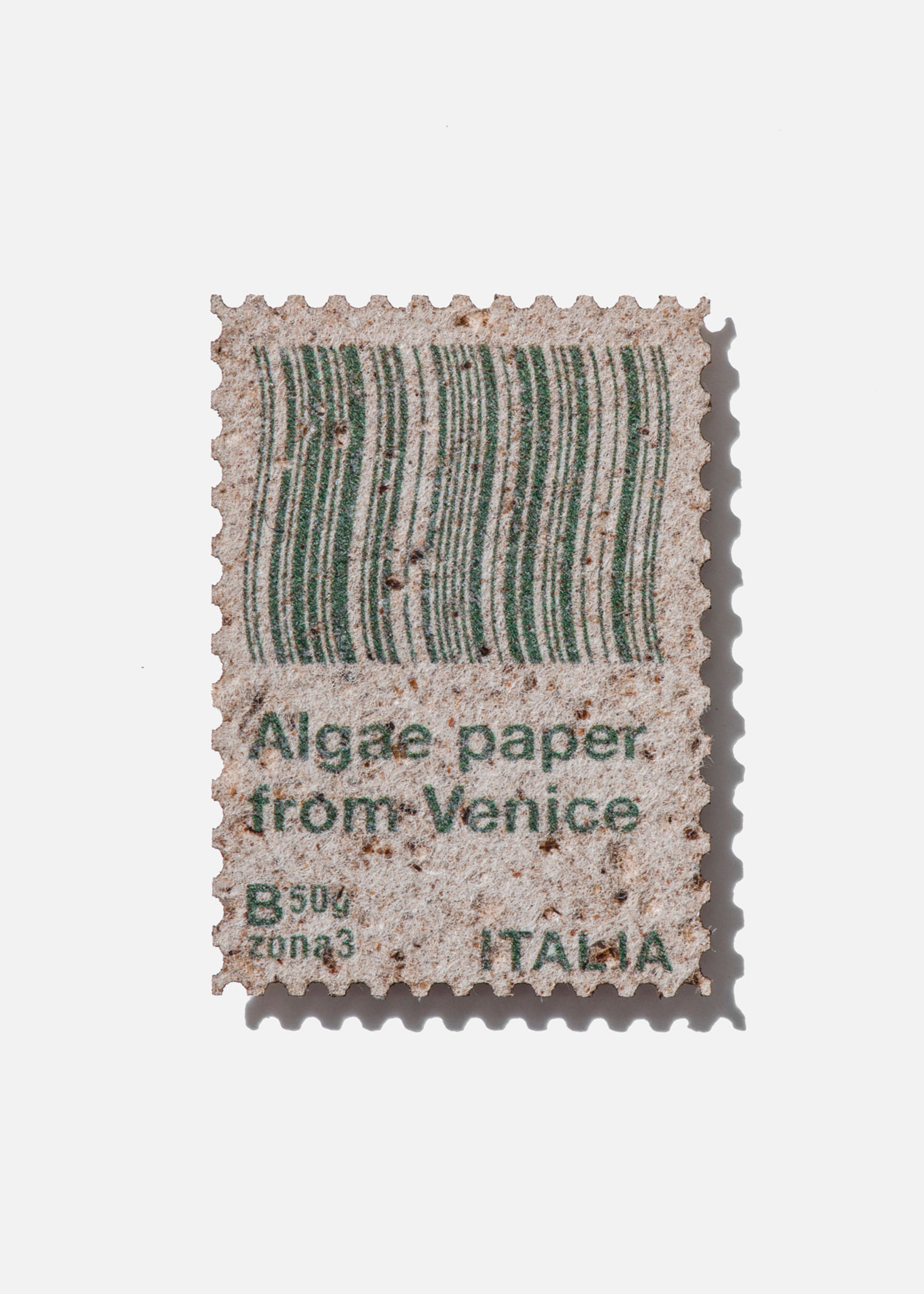
In order to make the paper into postage stamps, the designer gave each piece serrated edges and replaced the watermarks found on typical stamps with barcodes.

He designed each barcode, which has been laser printed onto its algae stamp, to be both graphically and aesthetically pleasing and readable by optical sensors.

Users can also scan the codes with a smartphone, which will take them to a web link telling the full story of the creation of the algae paper.
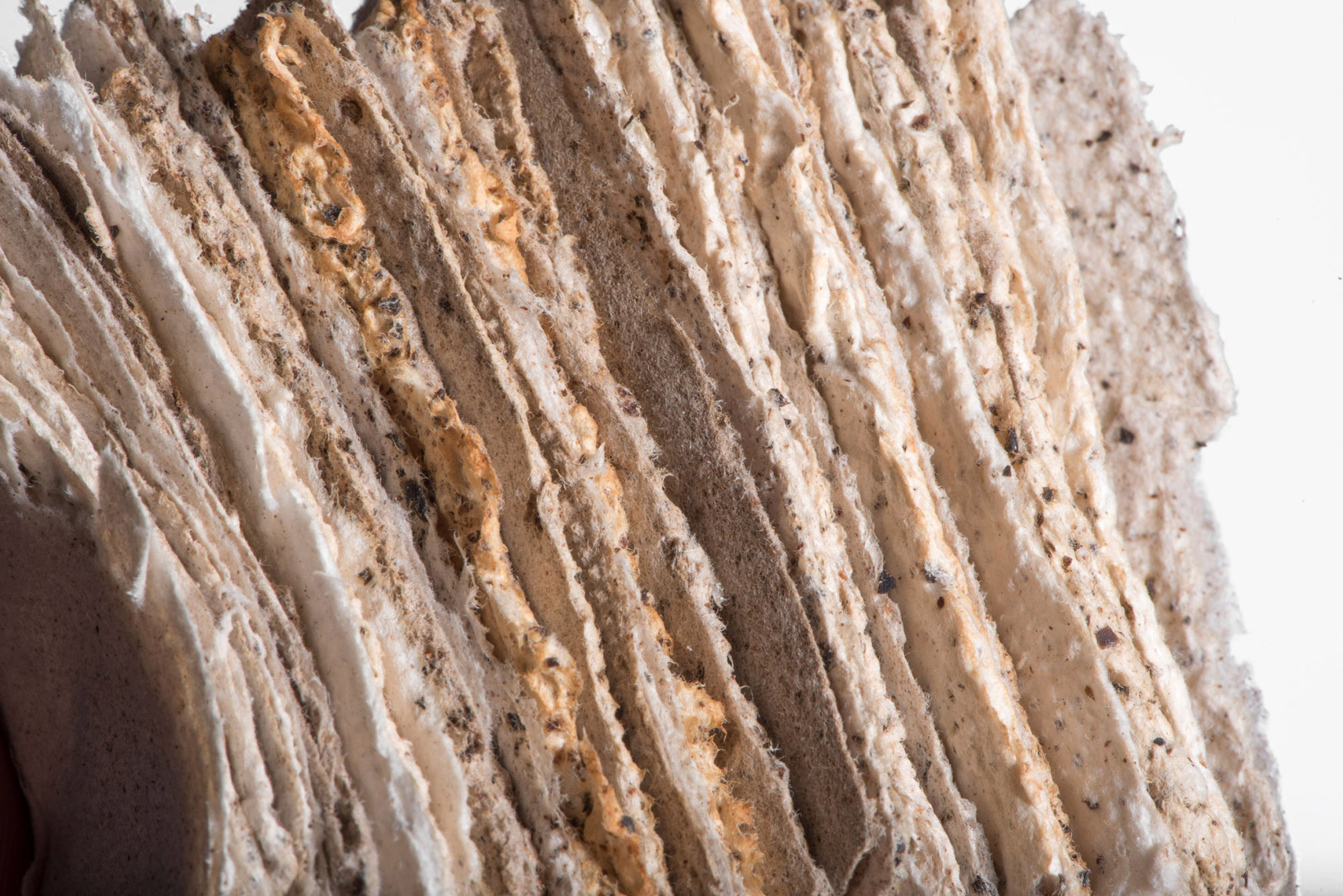
After discovering that a 10 per cent ratio of algae caused the paper to become fragile and prone to crumbling, Dorigo Sempere decided on a percentage of algae that is between three and eight per cent.

This ratio gave him the option of controlling the colour and texture of the material without compromising on quality and printability of the paper.
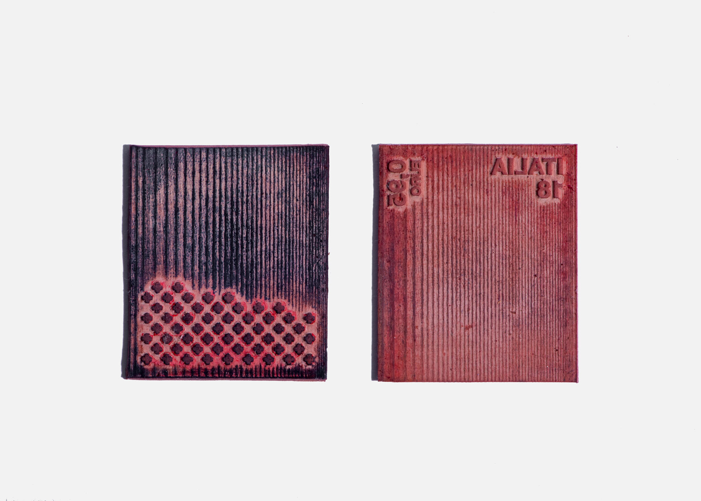
According to the designer, the algae paper performs just as well as traditional paper, but boasts an off-white hue and powder-like appearance as a hint towards what organic ingredients lay within.

Dorigo Sempere is among many designers exploring the positive qualities of algae.

The Bio-Integrated Design Lab at the Bartlett School of Architecture designed a series of algae-infused tiles that have the ability to filter toxic chemical dyes and heavy metals out of water.

Cast Iron Design, on the other hand, created a guide book for the city of Boulder in Colorado using recycled paper printed with ink made from a by-product of blue-green algae, spirulina.

Images by Pablo Dorigo Sempere on behalf of Student Design.

The post Pablo Dorigo Sempere turns Venice canal algae into postage stamps appeared first on Dezeen.


from Dezeen https://ift.tt/3a5mqbR

A letter from our editor: Getting through these tough and turbulent times

The current crisis is already impacting the creative community, but countless initiatives and schemes are being set up to help.


from It's Nice That https://ift.tt/2vy8rfM

Meet Mikki Lee, the winner of this year’s Book Illustration Competition

The creative will receive a commission worth £5,000 to illustrate a new collection of love poetry edited by Imtiaz Dharker.


from It's Nice That https://ift.tt/2x6YZAs