Friday, 20 March 2020

Plasticiet stretches recycled plastic like taffy for Mother of Pearl furniture

Plasticiet stretches recycled plastic like taffy for Mother of Pearl furniture

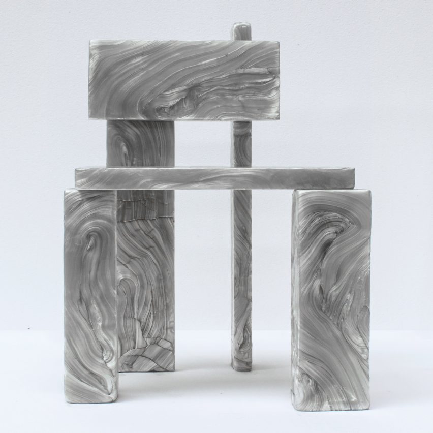
Monolithic slabs of pearlescent polycarbonate make up the latest designs from Dutch startup Plasticiet, which aims to bring new value to recycled plastic.

Plasticiet debuted its limited-edition Mother of Pearl collection at the Collectible design fair in Brussels earlier this month.

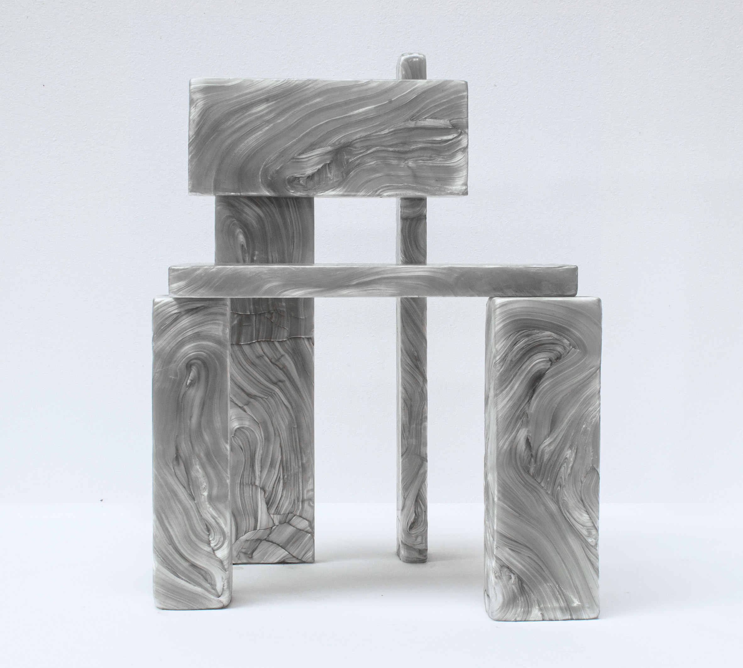
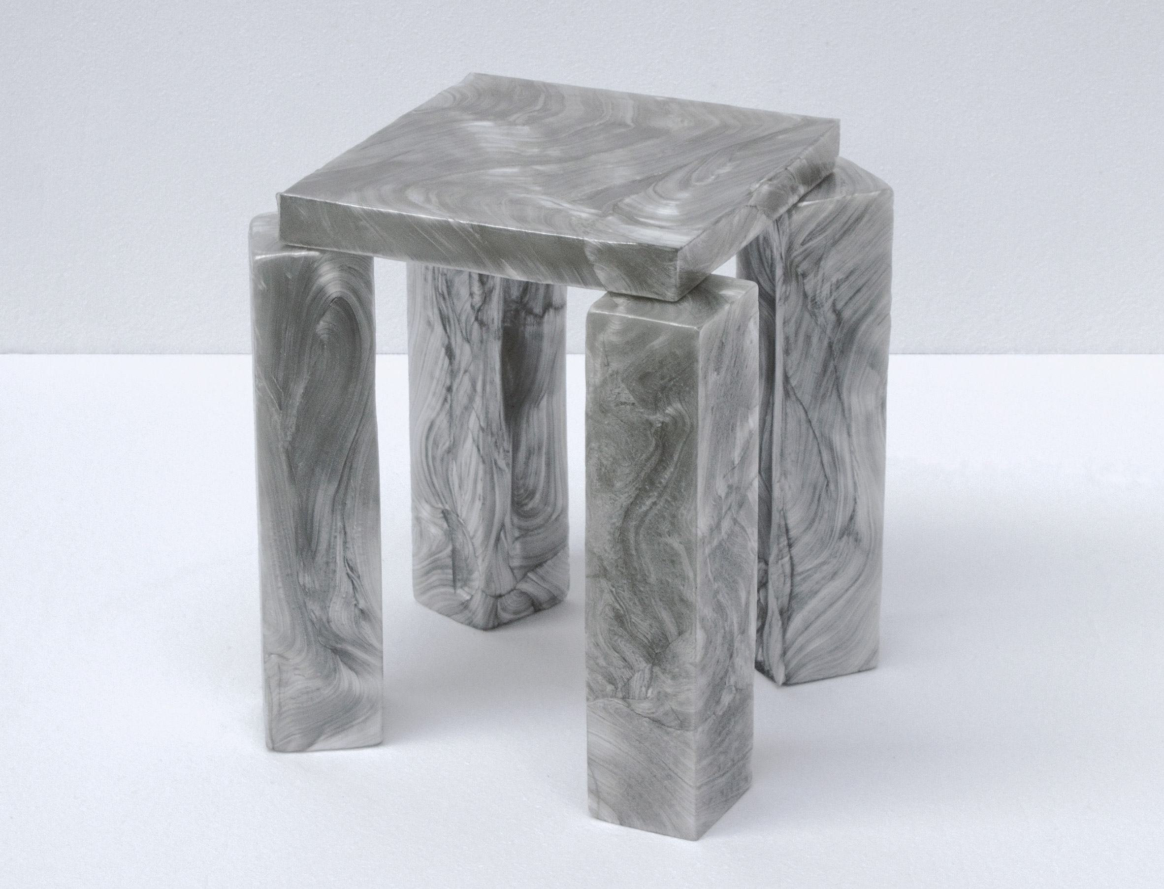
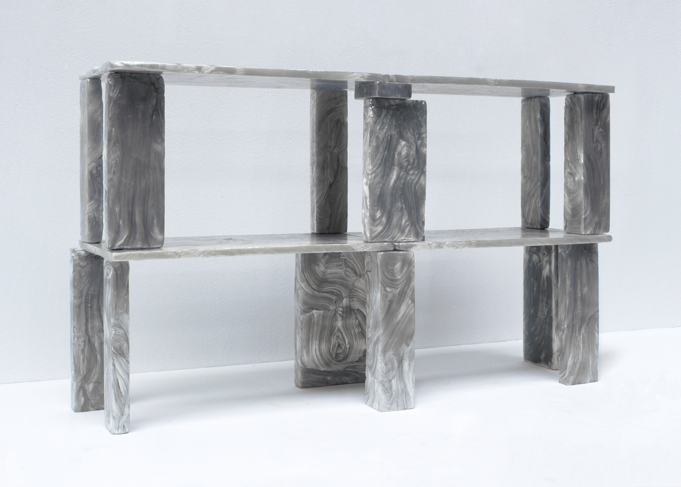
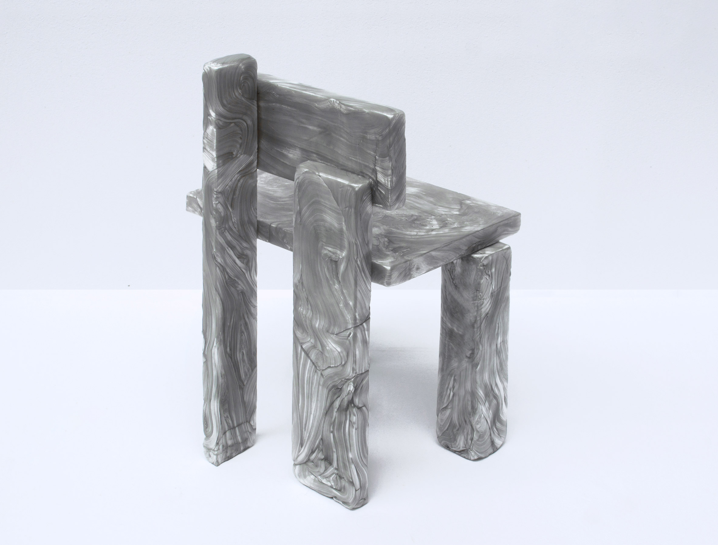
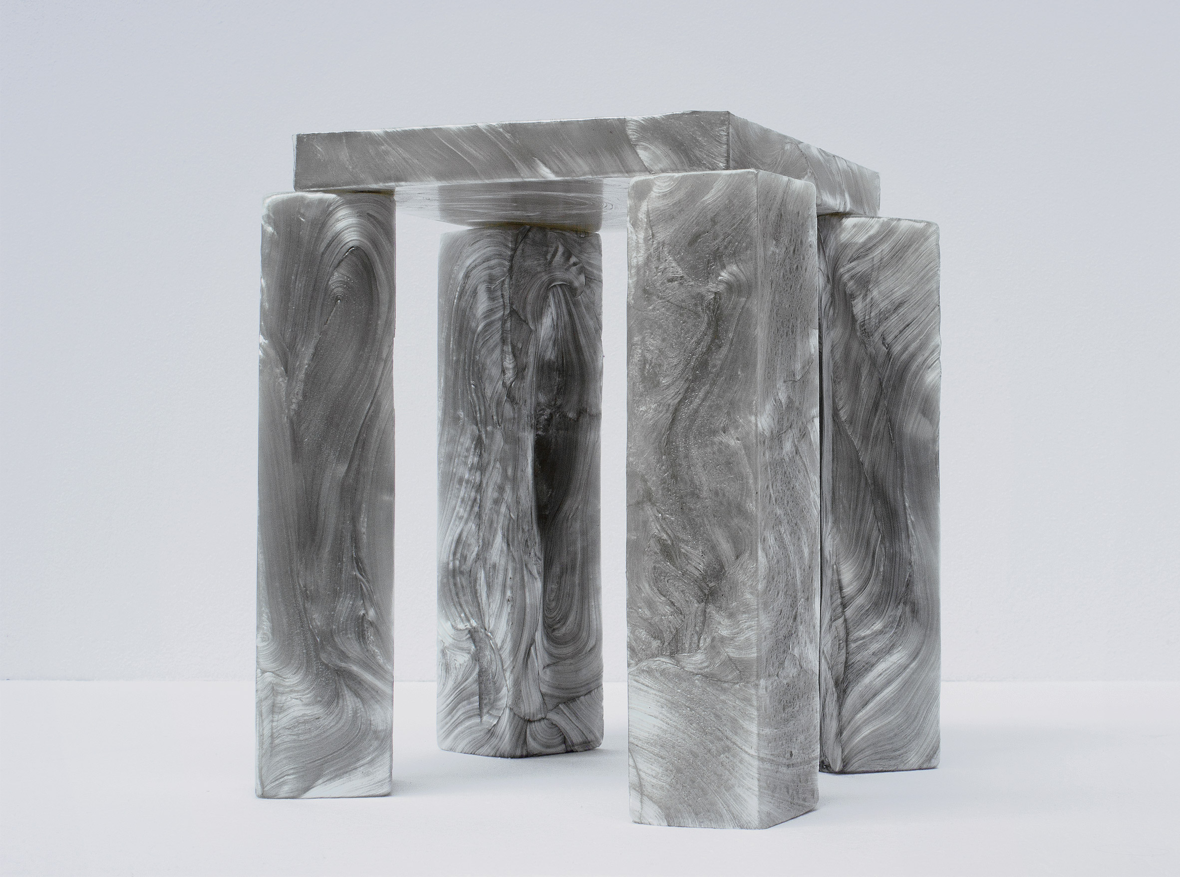
Consisting of a chair, stool and shelving design, each object in the series is made from slabs of recycled polycarbonate that feature a swirling, shiny finish reminiscent of the natural material after which the collection is named.
Plasticiet stretches recycled plastic like taffy for Mother of Pearl furniture

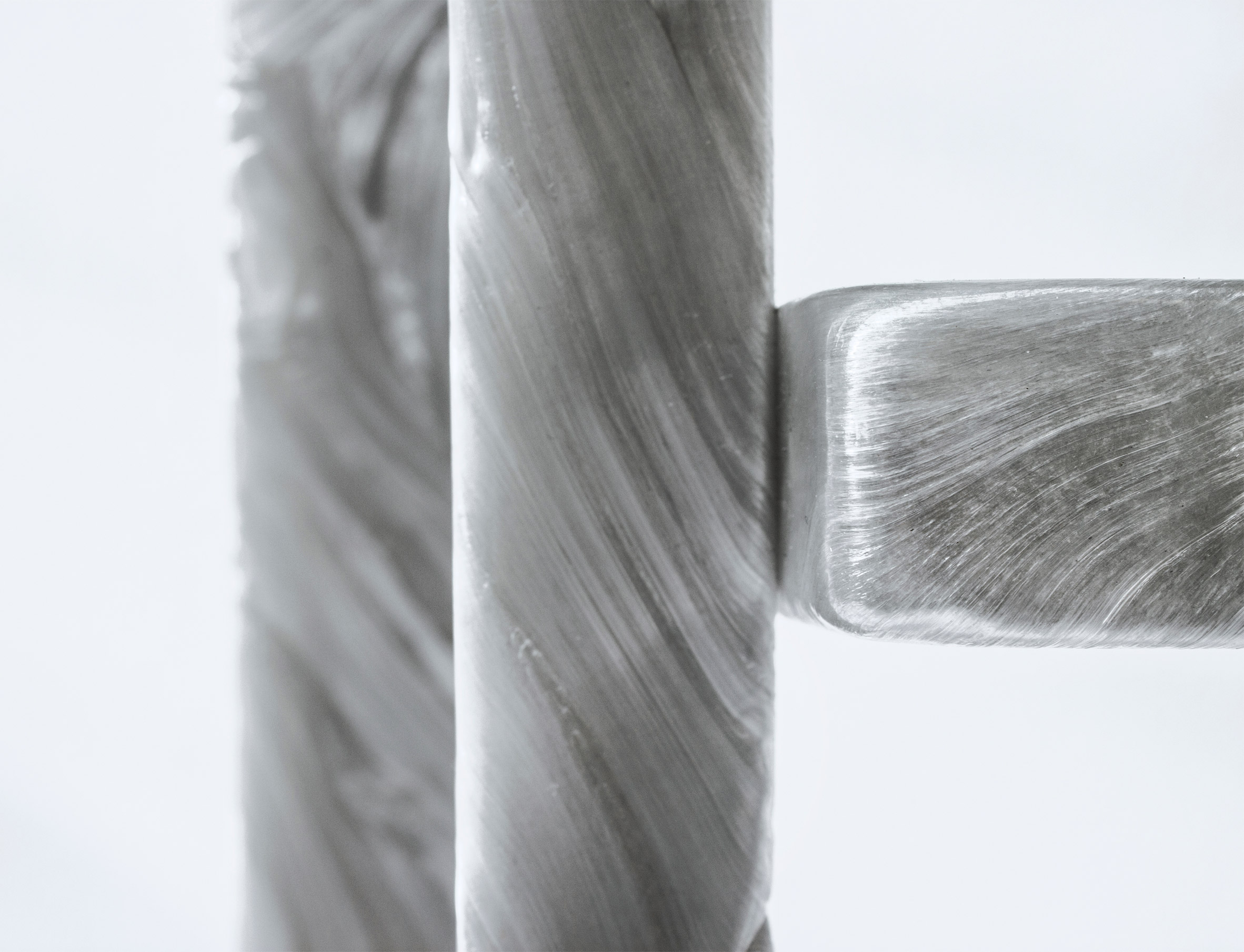
This effect is created by kneading and stretching recycled plastic in a technique similar to that used for making the chewy sweet taffy from hot sugar.

"The material is stretched and folded numerous times, aerating it," explained Joost Dingemans, co-founder of Plasticiet.

"The tiny stretched air bubbles captured within the translucent plastic reflect light, resulting in an iridescent glow resembling mother of pearl," he added.
Plasticiet stretches recycled plastic like taffy for Mother of Pearl furniture

Each slab used to create the furniture is individually moulded before being connected together. The final forms were inspired by primitive human-made stone artefacts from the final part of the Stone Age.

"We can create much larger pieces than what the collection currently shows by playing with the composition and holding in mind that polycarbonate is an extremely tough material," Dingemans told Dezeen.

"Currently the largest single block we've made was around 15 kilograms, which is twice the size of the chair's seat," he continued. "At that weight it's quite a tough job stretching and folding the material, but we're planning to go bigger still!"
Plasticiet stretches recycled plastic like taffy for Mother of Pearl furniture

Rotterdam-based Plasticiet was founded by Joost and Marten van Middelkoop, who work with plastic companies across the Netherlands to find new uses for recycled plastics.

The company produces sheet-plastics that have a similar look to man-made stone composites like terrazzo, and recently collaborated with eyewear company Ace & Tate to create a store interior made from one ton of local waste in Antwerp, Belgium.

"There are several companies in the Netherlands with whom we partner such as LC Plastics, Suez and PRC," said Dingemans.
Plasticiet stretches recycled plastic like taffy for Mother of Pearl furniture

As the designer explained, they often visit the companies' shredding facilities to see what's available, or they receive a call when a batch of plastic arrives that's contaminated with leaves, water or a wrong plastic type mixed within.

"The regular plastic industry often cannot deal with this because it will damage their machinery," added Dingemans. "Normally batches like this end up in 'thermal recycling' or in other words; incineration."

"Each sheet material in our collection tells a different origin story," he continued. "For instance our Chocolate Factory material is made of discarded moulds from the chocolate industry where the pastel tones are used as colour coding, while Nova mainly contains off-cuts from the production of air cleaning units."
Plasticiet stretches recycled plastic like taffy for Mother of Pearl furniture

For the Mother of Pearl collection, the duo wanted to show that recycled plastic could hold its own among other high-end materials and craft techniques used to make limited-edition and collectible design objects like those shown at the Collectible fair.

"The Mother of Pearl collection is made out of polycarbonate, a highly technical plastic used in construction, electronics and even bullet-proof 'glass'," said Dingemans.

"Hence the slightest amount of contamination renders it almost useless for its current purposes. We're happy to craft this material into pieces that allow it to shine again."
Plasticiet stretches recycled plastic like taffy for Mother of Pearl furniture

Recycled plastic is rapidly gaining in popularity among designers, with recent examples including the "first 100 per cent recycled cladding material", home accessories made from clumps harvested straight from the factory floor and marbled tiles made from post-consumer plastic waste.

The post Plasticiet stretches recycled plastic like taffy for Mother of Pearl furniture appeared first on Dezeen.


from Dezeen https://ift.tt/2vCPSHt

Sam Jacob Studio builds contemporary neolithic shelter in Shenzhen port

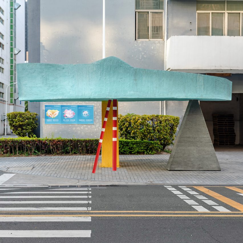
Yantian Dolmen by Sam Jacob Studio in Yantian port district of Shenzhen

London architecture practice Sam Jacob Studio has created a shelter that combines prehistoric monumental elements with contemporary forms in Shenzhen, China.

Named the Yantian Dolmen, the structure is one of a group of street furniture pieces being built by Sam Jacob Studio in the Yantian port district of Shenzhen.

The shelter is constructed from a mixture of geometric and abstract shapes that are informed by municipal structures and neolithic monuments.

Yantian Dolmen by Sam Jacob Studio in Yantian port district of Shenzhen

"It is both familiar and alien," said Sam Jacob, founder of Sam Jacob Studio.

"It combines two different types of idea of shelter – one that's prehistoric, the other part of the everyday language of the street," he told Dezeen.

"On the one hand monumental, on the other municipal," he added.

Yantian Dolmen by Sam Jacob Studio in Yantian port district of Shenzhen

The shelter does not have an immediately recognisable form or distinct purpose.

"It's designed to reflect the more open possibilities of street life – that the way its used can change over time rather than remain fixed," explained Jacob.

"It's in part of an old port which is being opened up, and there are still lots of people working there so the street is pretty populated, with people sitting there and eating lunch. The shelter gives shade and seating," he added.

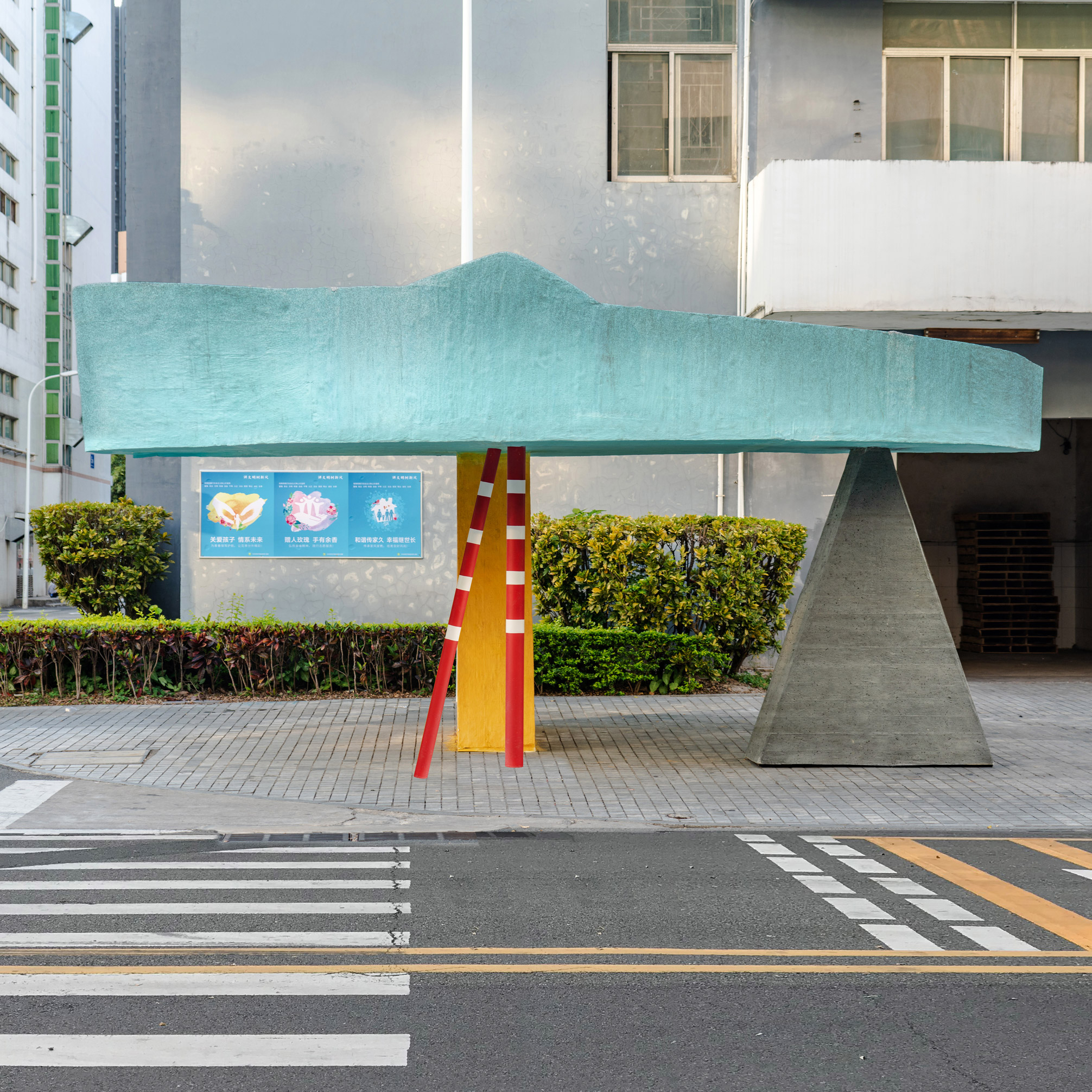
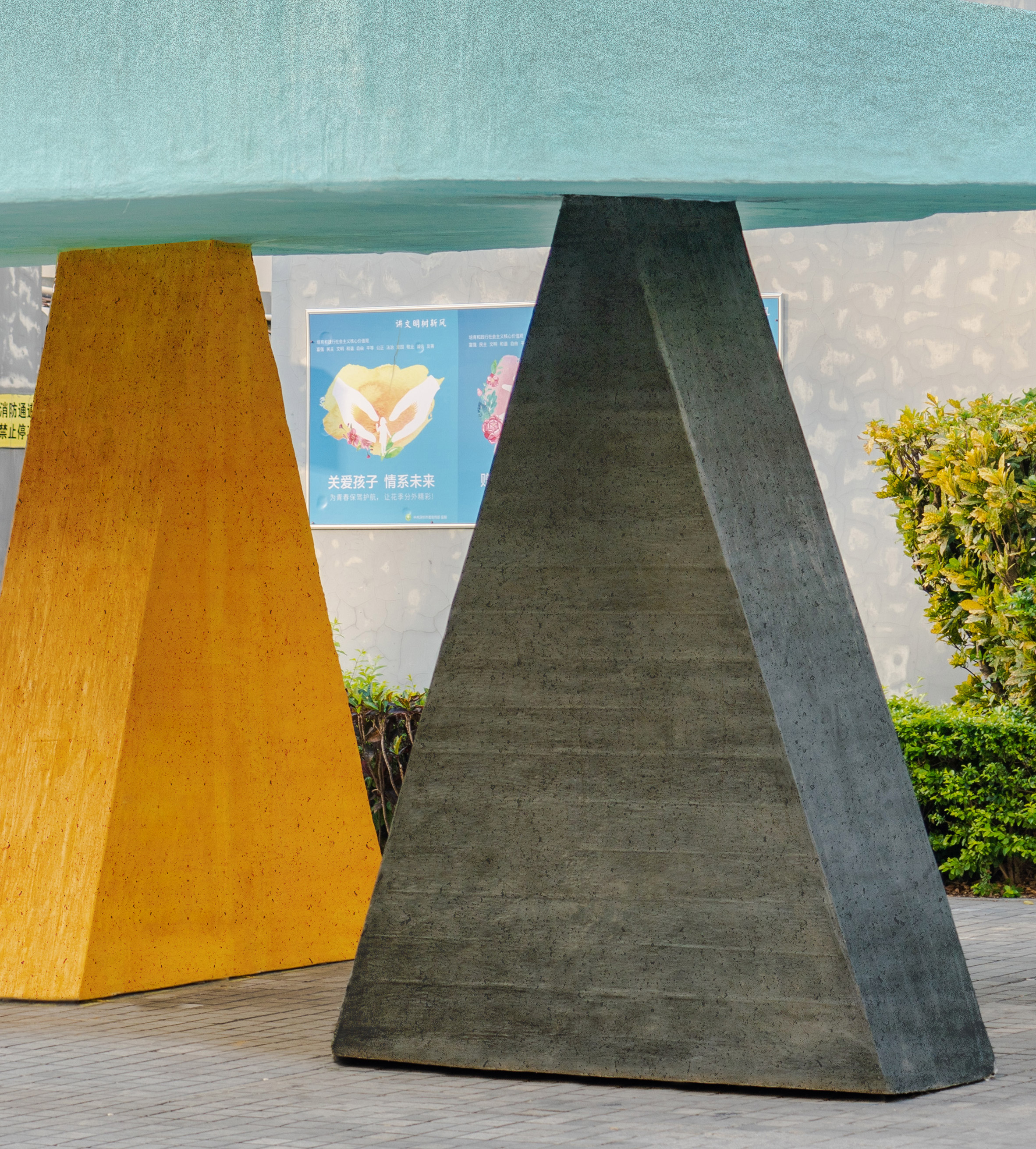
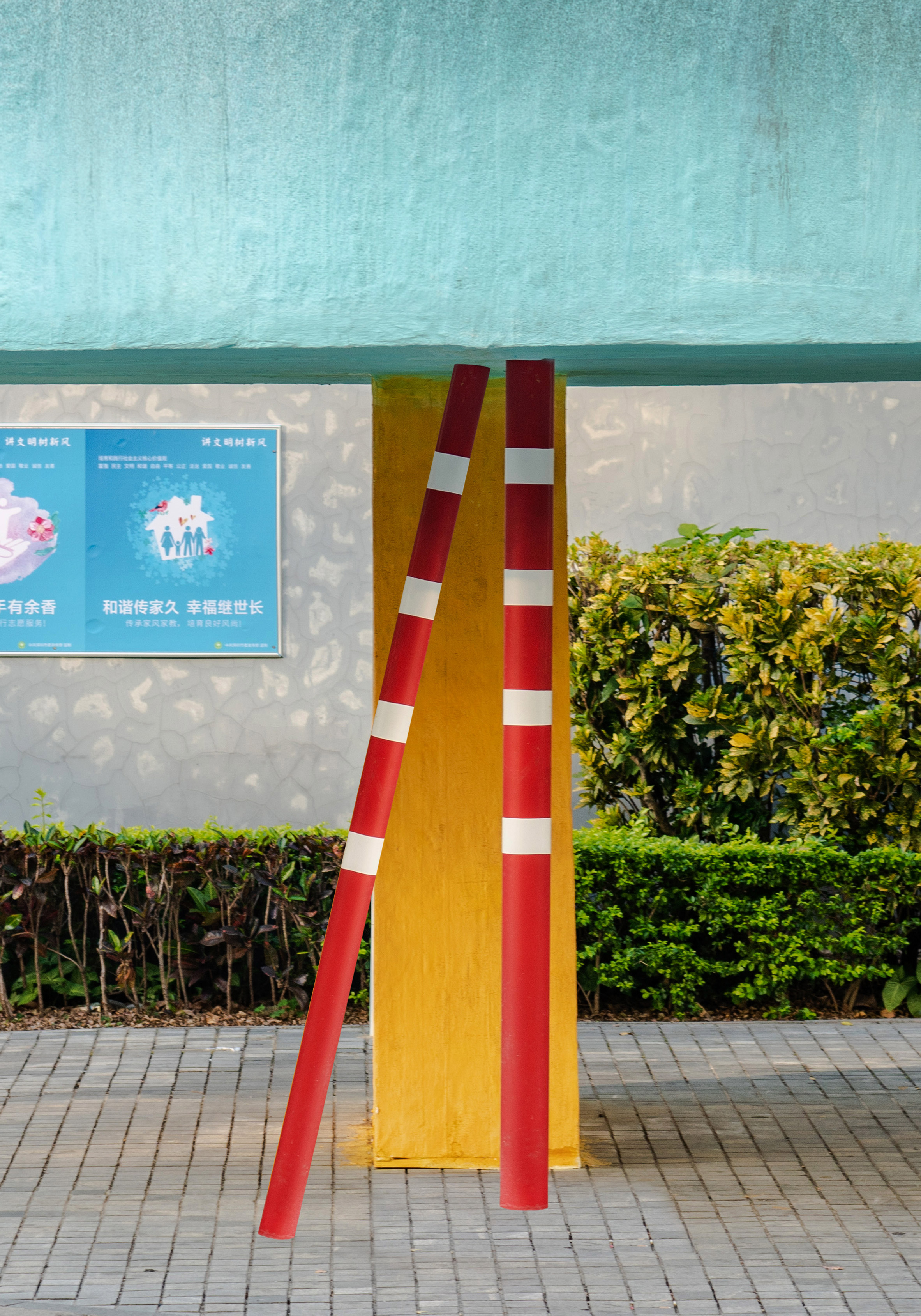
It is formed from two triangular blocks – one grey and one yellow – along with two red-and-white striped poles, supporting a turquoise-coloured disk.

The major elements are made from polystyrene and covered with a hard coating.

Yantian Dolmen by Sam Jacob Studio in Yantian port district of Shenzhen

Yantian Dolmen is the latest project designed by Jacob that combine neolithic and contemporary ideas. Another example is his 1:1 replica of the Avebury standing stone in Milton Keynes called the MK Menhir.

"I'm interested in the objects and spaces of a culture that we will never really understand. They are often so suggestive of use, meaning and the role they played in these societies, yet they remain open to interpretation," explained Jacob.

Sam Jacob Studio was founded in 2014 by Jacob, who was one of the three founders of influential architecture studio FAT. The studio has recently designed the Cartoon Museum in central London and a hairdresser in south London.

The post Sam Jacob Studio builds contemporary neolithic shelter in Shenzhen port appeared first on Dezeen.


from Dezeen https://ift.tt/395TcbJ

Land beauty salon is tucked in skinny slot between Osaka shops

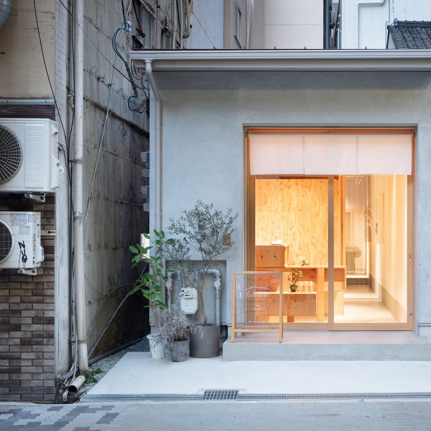
Land salon in Osaka designed by Sides Core

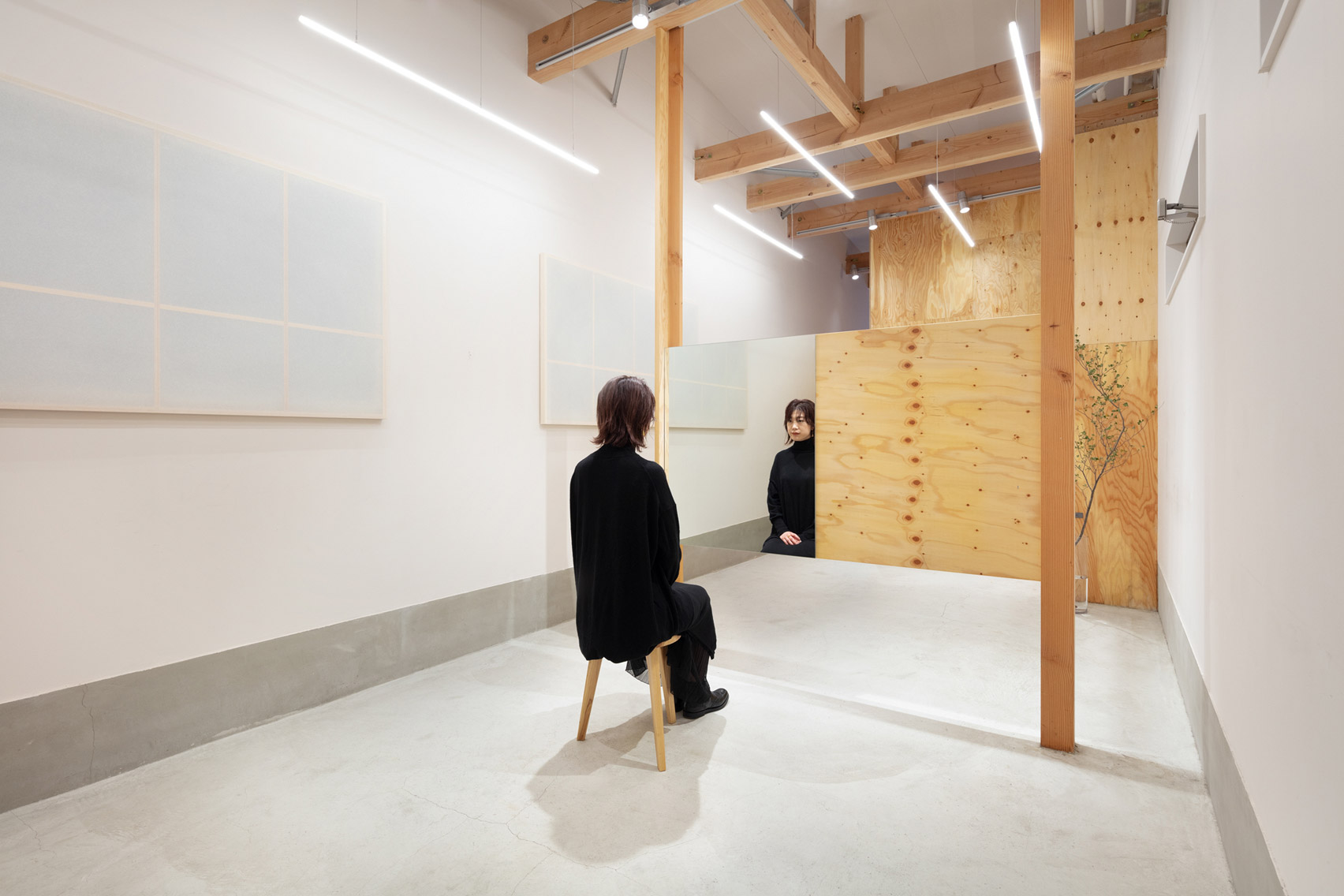
Design studio Sides Core was charmed instead of challenged by the narrow floor plan of Land beauty salon in Osaka, Japan, which makes the most of its slender proportions.

Land is run by a married couple and is situated in Nishi-Ku, a ward of Osaka that is home to a number of trendy fashion and homeware boutiques.

Land salon in Osaka designed by Sides Core

The salon measures 59 square metres but is squeezed onto a narrow site between two buildings.

Osaka design studio Sides Core wanted to draw attention to in its interior design scheme for the space.

Land salon in Osaka designed by Sides Core

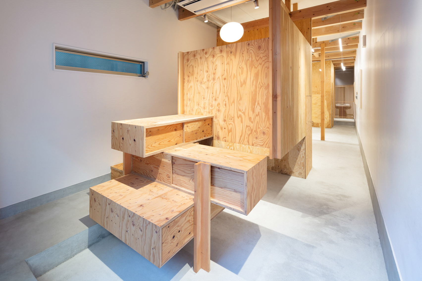
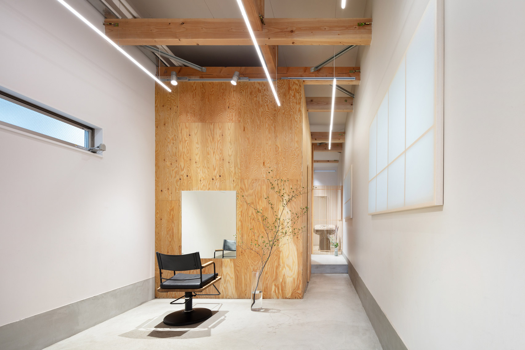
A passageway has been created on one side of the salon, allowing passersby on the street to see through the deep floor plan to the rear of the space.

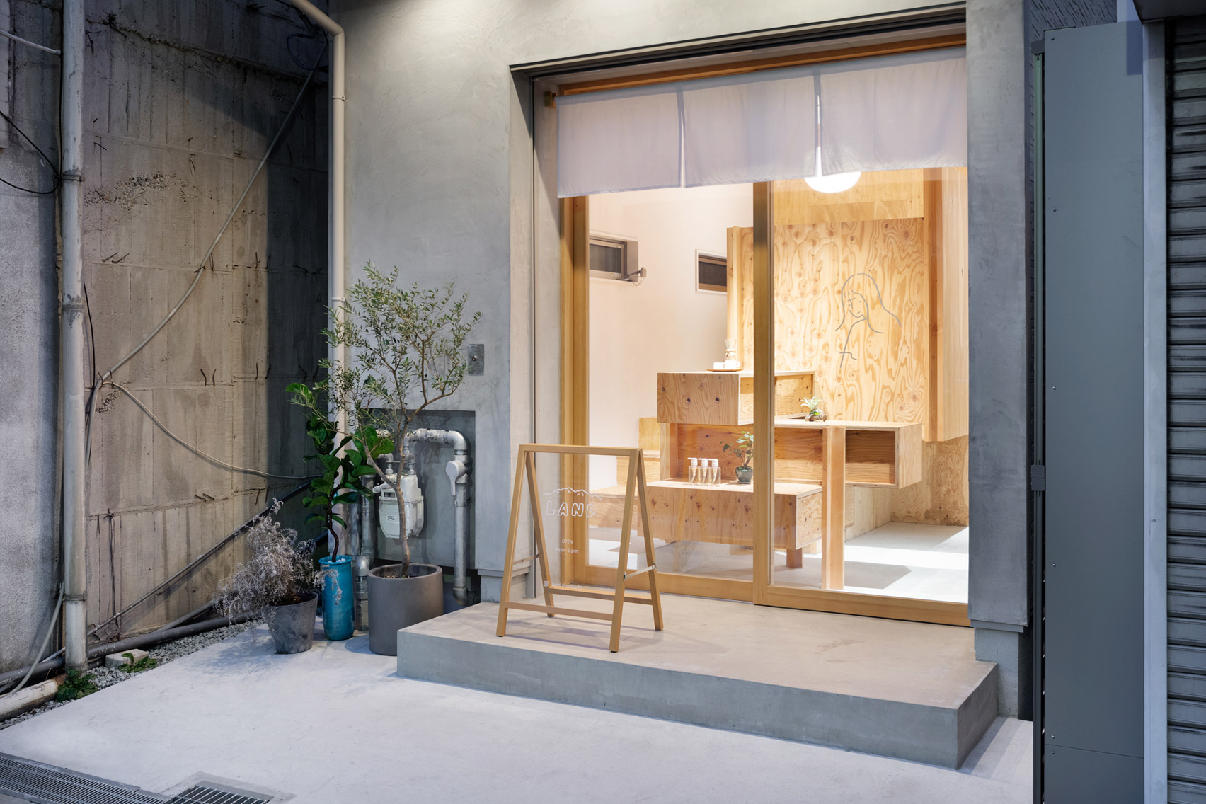
The facade of the salon has also been fitted with a noren, a traditional Japanese fabric divider that's cut with slits so that people can easily pass through it.

Land salon in Osaka designed by Sides Core

"Clients duck under the curtain and enter, feeling psychologically drawn down the passageway, further into the space," explained the studio.

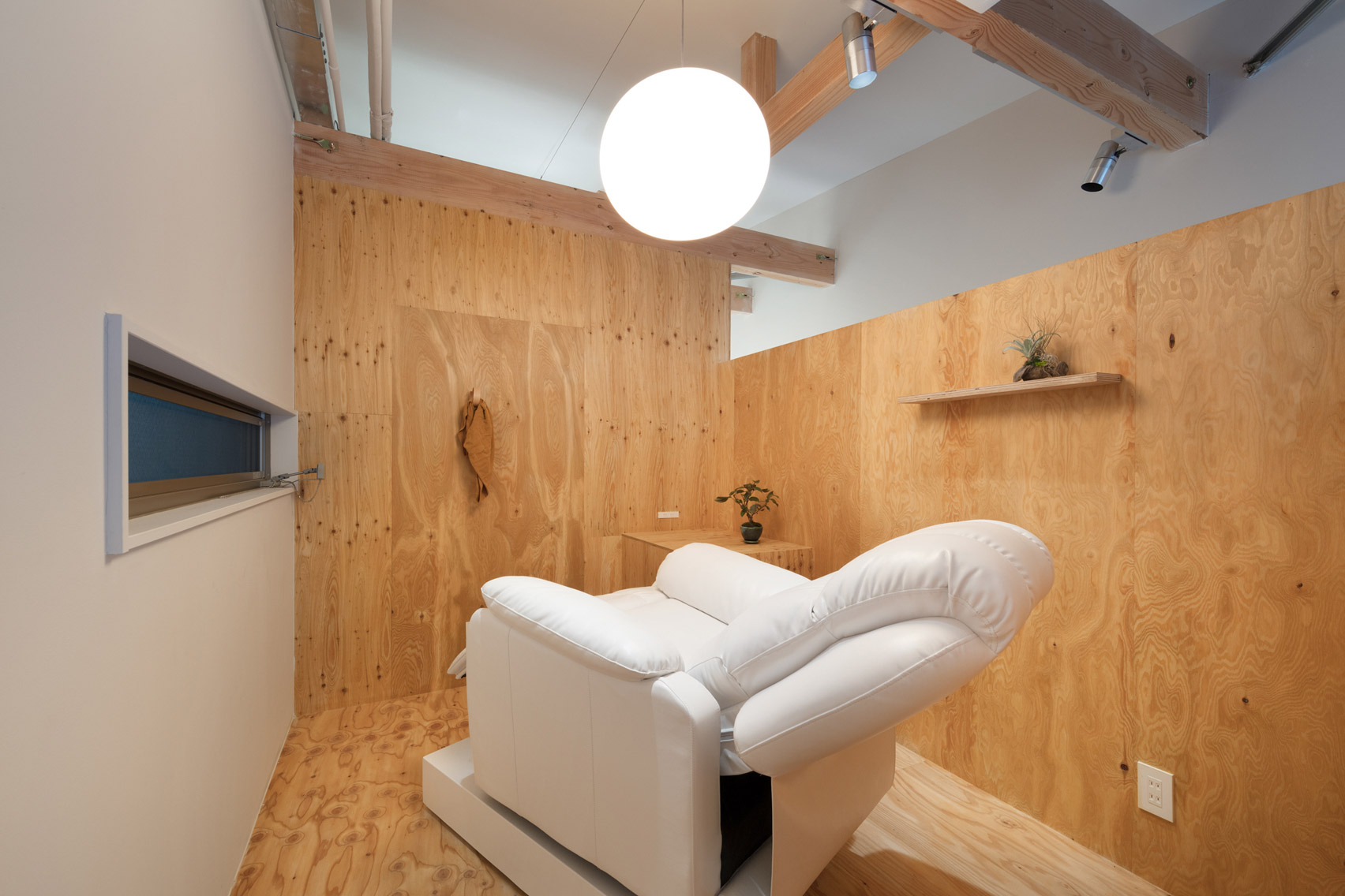
Cosmetic eyelash treatments will be carried out in a boxy timber volume that's been erected in the entryway.

Land salon in Osaka designed by Sides Core

Accessed via a short flight of stairs, the floor of the room has been raised 90cm to create a sense of separation from the main body of the salon and provide clients with privacy.

At its centre are a simple white reclining chair and a spherical lantern.

Land salon in Osaka designed by Sides Core

The volume also helps conceal the salon's four hair-cutting stations, which are divided by horizontal timber panels.

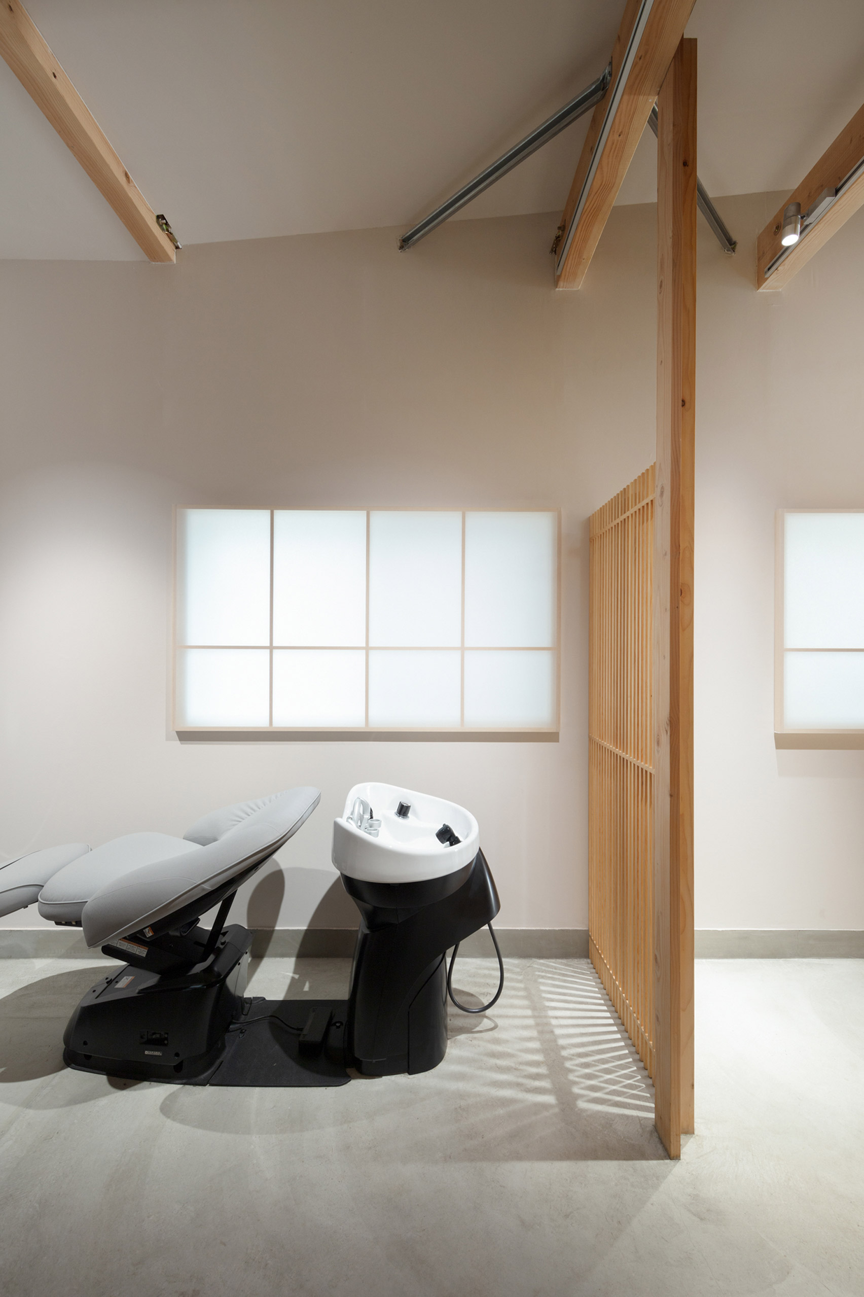
Behind lies the shampooing area and a space for head massages, closed off by slatted wooden screens.

Land salon in Osaka designed by Sides Core

The salon has been finished with an overall minimalist aesthetic.

Just a handful of LED strip lights have been suspended from the ceiling and potted plants have been sparingly dotted across the floor.

Land salon in Osaka designed by Sides Core

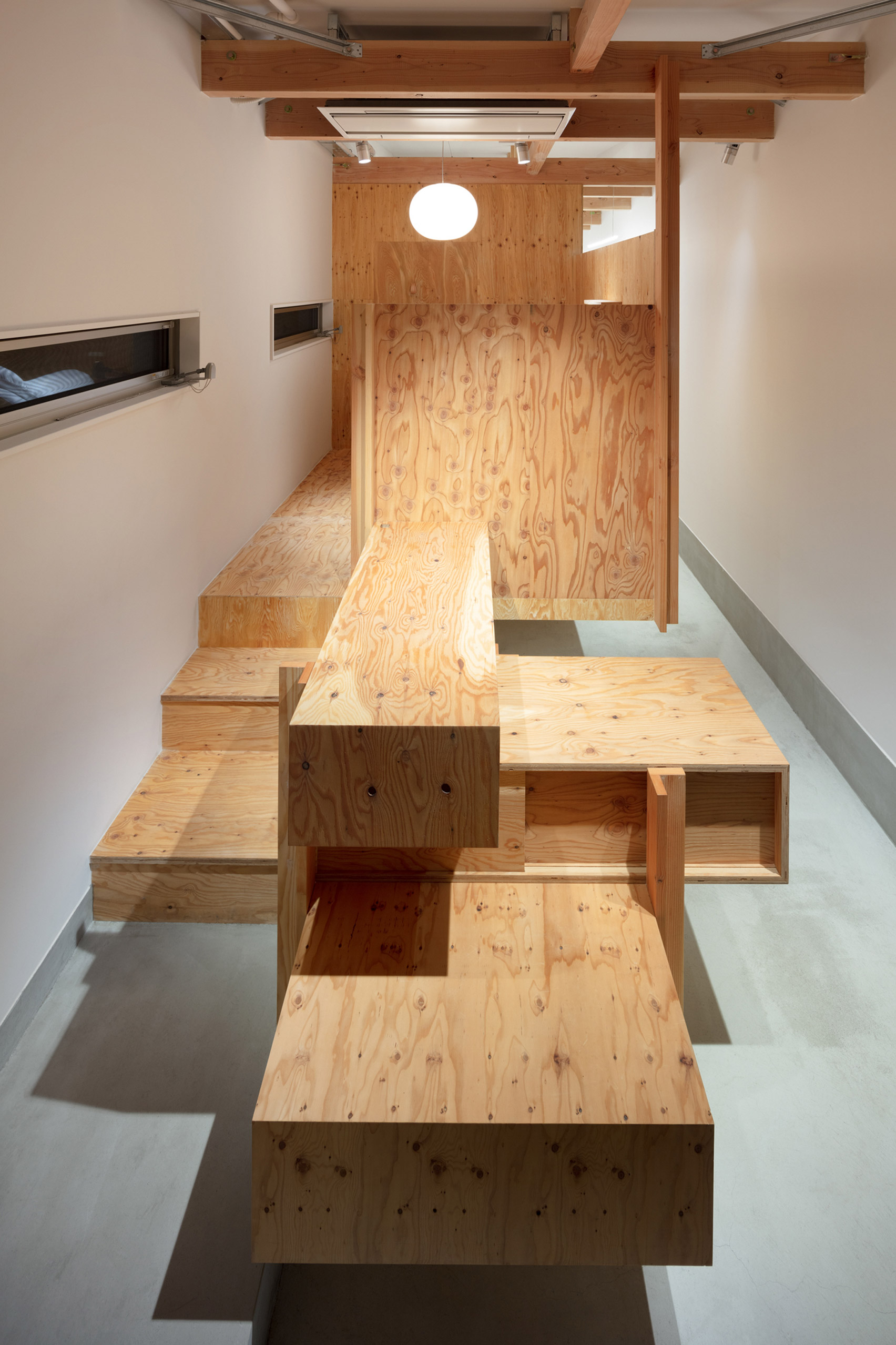
Rectangular wooden boxes are irregularly stacked in the entryway to form a service counter, inbuilt with drawers for grooming products.

The studio also intended it to loosely resemble a stepped tansu – a type of mobile storage cabinet from Japan.

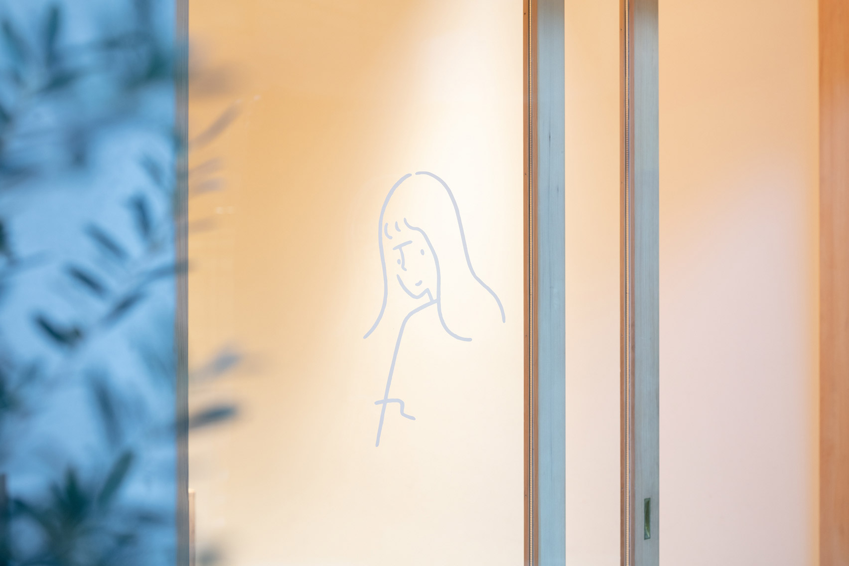
Illustrator Yu Nagaba create dLand's logo and a hand drawn-style decal of a young girl that has been applied to the front window.

"Framed by the facade's sliding glass doors, it seems to float in Land's passageway space, welcoming visitors in – the literal face of the salon," added the studio.

Land salon in Osaka designed by Sides Core

Sides Core was established in 2005 by Sohei Arao and Sumiko Arao.

Land joins a roster of beauty parlours that Sides Core has designed. The studio overhauled a hairdresser in 2016, incorporating a small library that could display the owner's personal collection of books and vinyl records.

Back in 2015, it also created a hair salon where the styling mirrors are suspended from the ceiling by a system of clamps and cables.

Photography is by Takumi Ota.

The post Land beauty salon is tucked in skinny slot between Osaka shops appeared first on Dezeen.


from Dezeen https://ift.tt/3bdnzyu

Kari Kola illuminates Irish mountainside with 1,000 lights

Kari Kola illuminates Irish mountainside with 1,000 lights

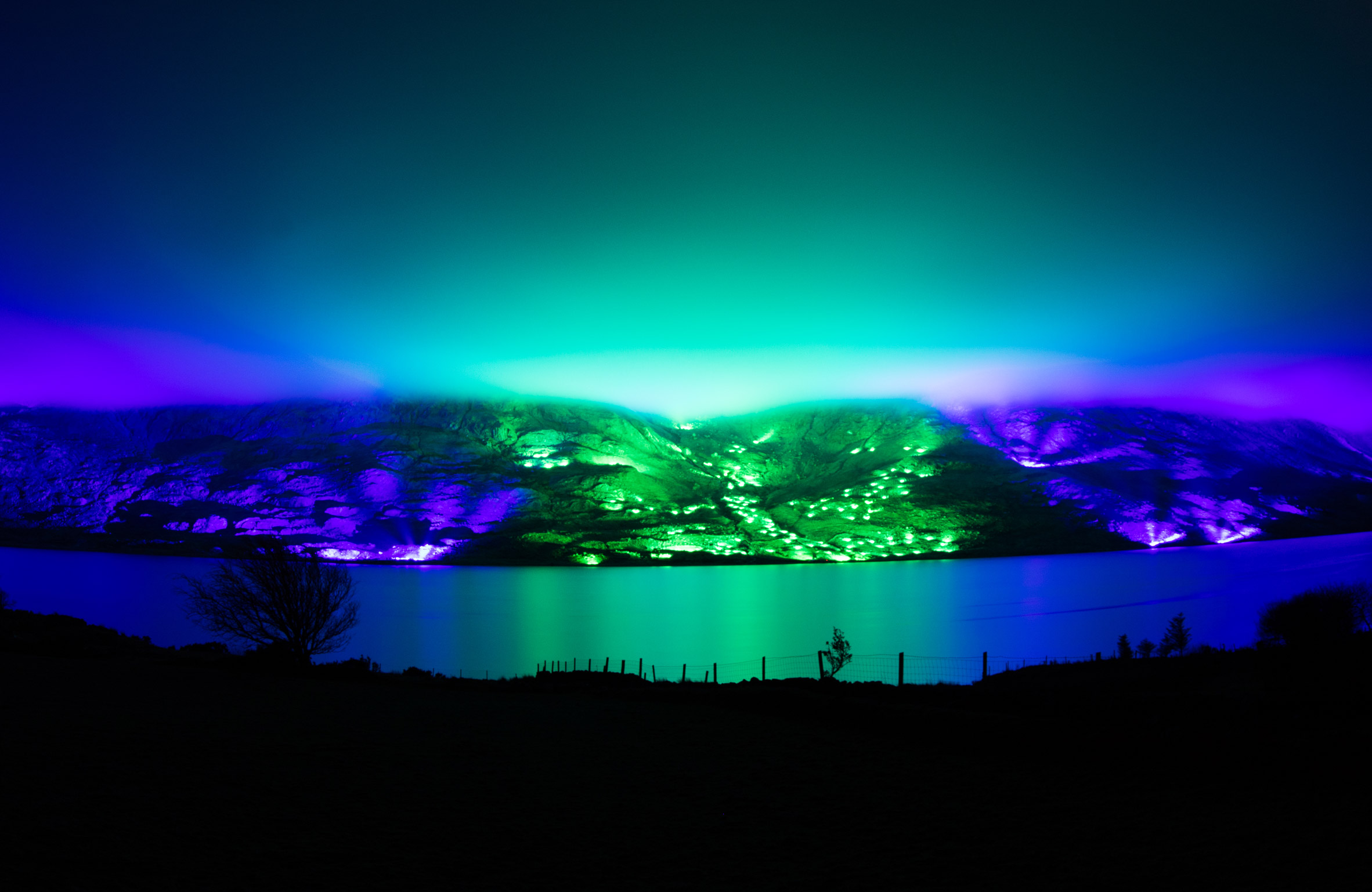
Finnish artist Kari Kola used myriads of emerald and blue lights to transform an area of Ireland's Connemara mountains into what he claims was "the largest site-specific light artwork ever created".

The Savage Beauty installation comprises 1,000 large lamps spread over three miles of the Irish mountain range flanking Loch na Fuaiche in north Connemara.

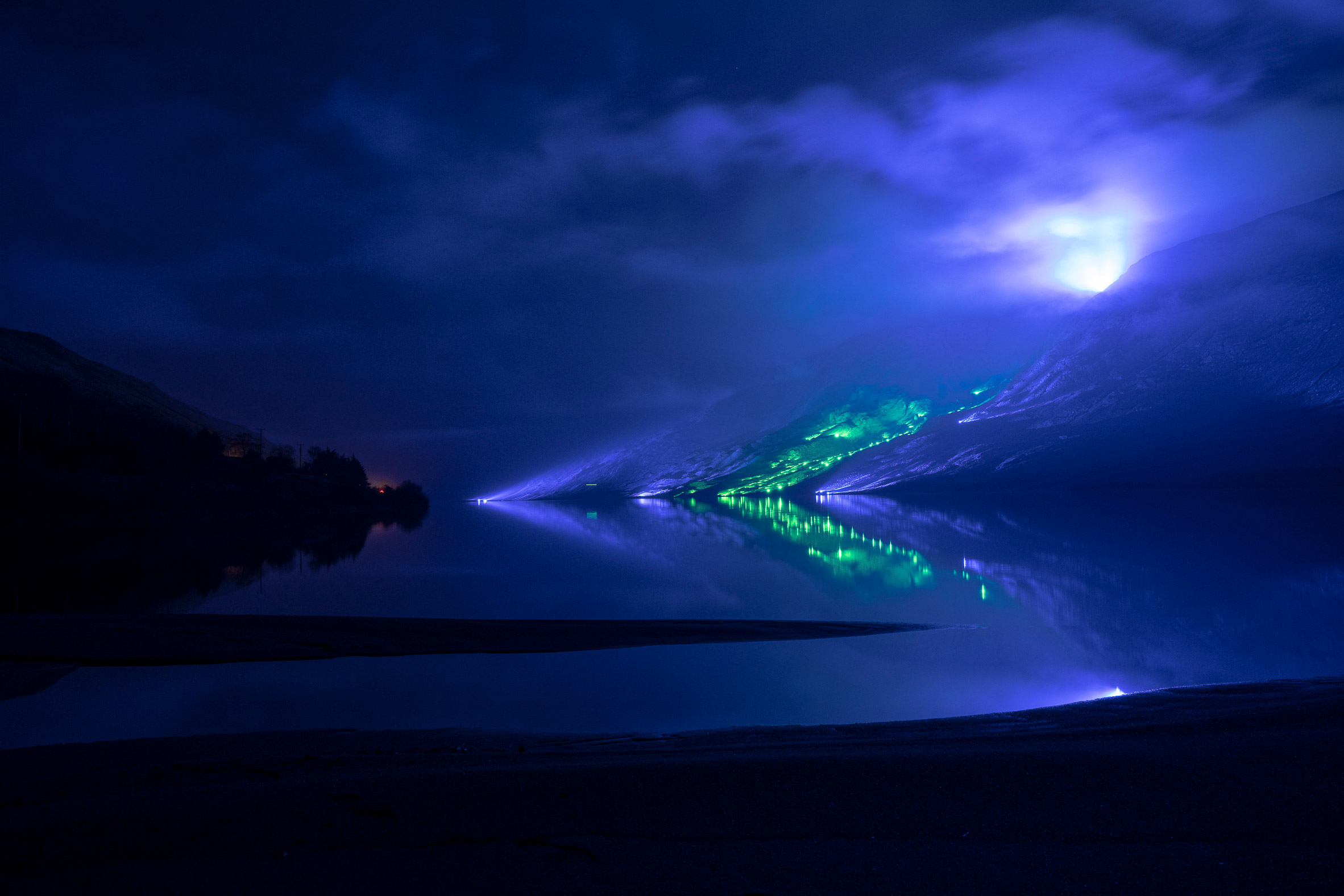
The artwork flooded the undulating topography in vibrant, pulsating colours. Intended to highlight the beauty of this remote landscape, the green and blue light was reflected in the loch and illuminated the low-lying clouds.

Kari Kola illuminates Irish mountainside with 1,000 lights

Kola was commissioned to create the artwork as part of the Galway 2020 European Capital of Culture events programme.

The installation takes its name after a quote by Irish poet and playwright Oscar Wilde, who described Connemara as "a savage beauty".

"Since I can't paint, I paint with light," said Kola, who has produced more than 2,000 installations in unique locations, including illuminating Unesco's Paris headquarters for the opening of the 2015 Year of Light, and lighting Stonehenge for World Heritage Day in 2018.

"I'm also interested in light beyond its artistic value," the artist added. "Everything on the planet is based on light. If I can choose, I always work with nature because that’s the best art that we have."

It took several weeks to install the lights, as well as the 20 kilometres of cables connected to 16 generators that were deposited by helicopter across the mountainside.

Plans for up to 20,000 people to participate in self-guided walks to view the artwork over the St Patrick's weekend had to be cancelled due to the outbreak of the coronavirus.

Kari Kola illuminates Irish mountainside with 1,000 lights

However, the light show went ahead privately and was documented in a film made available as a "digital edition" for the wider public to view without needing to visit the site.

"I am very disappointed that the public exhibition of this work had to be cancelled," said Kola, "but I hope that the digital edition will show how we played with scale in Connemara and created something that people would not expect."

Studio Drift also utilises lights to create captivating installations. The Amsterdam-based studio's latest work saw it program 300 drones to perform a routine at NASA's Kennedy Space Center in Florida.

This installation was initially held in Miami Beach, where 300 drones were choreographed to mimic a flock of birds.

The post Kari Kola illuminates Irish mountainside with 1,000 lights appeared first on Dezeen.


from Dezeen https://ift.tt/394dtOP

Thursday, 19 March 2020

Escribanorosique Arquitects use white bricks and timber for house in Spain

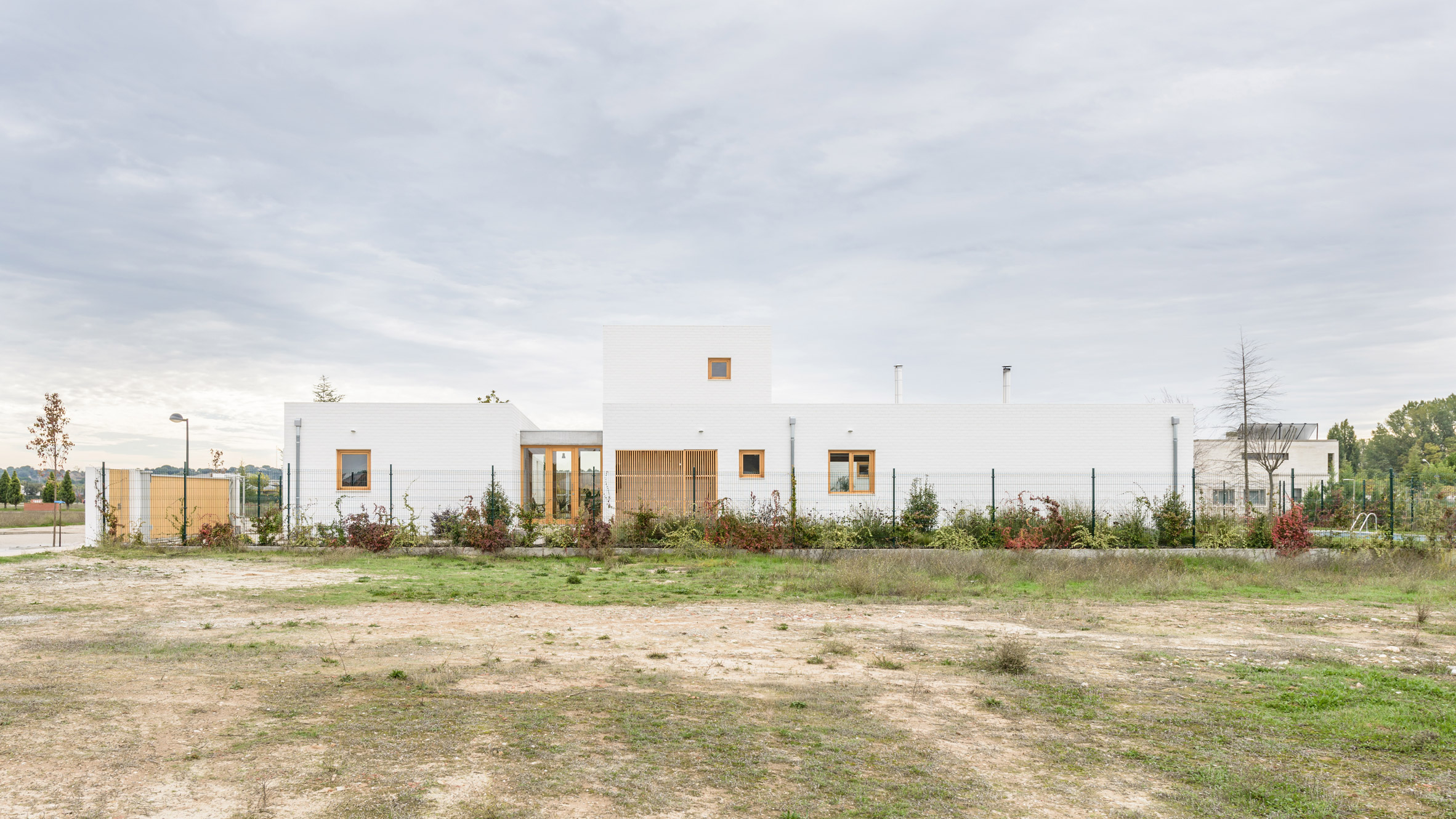
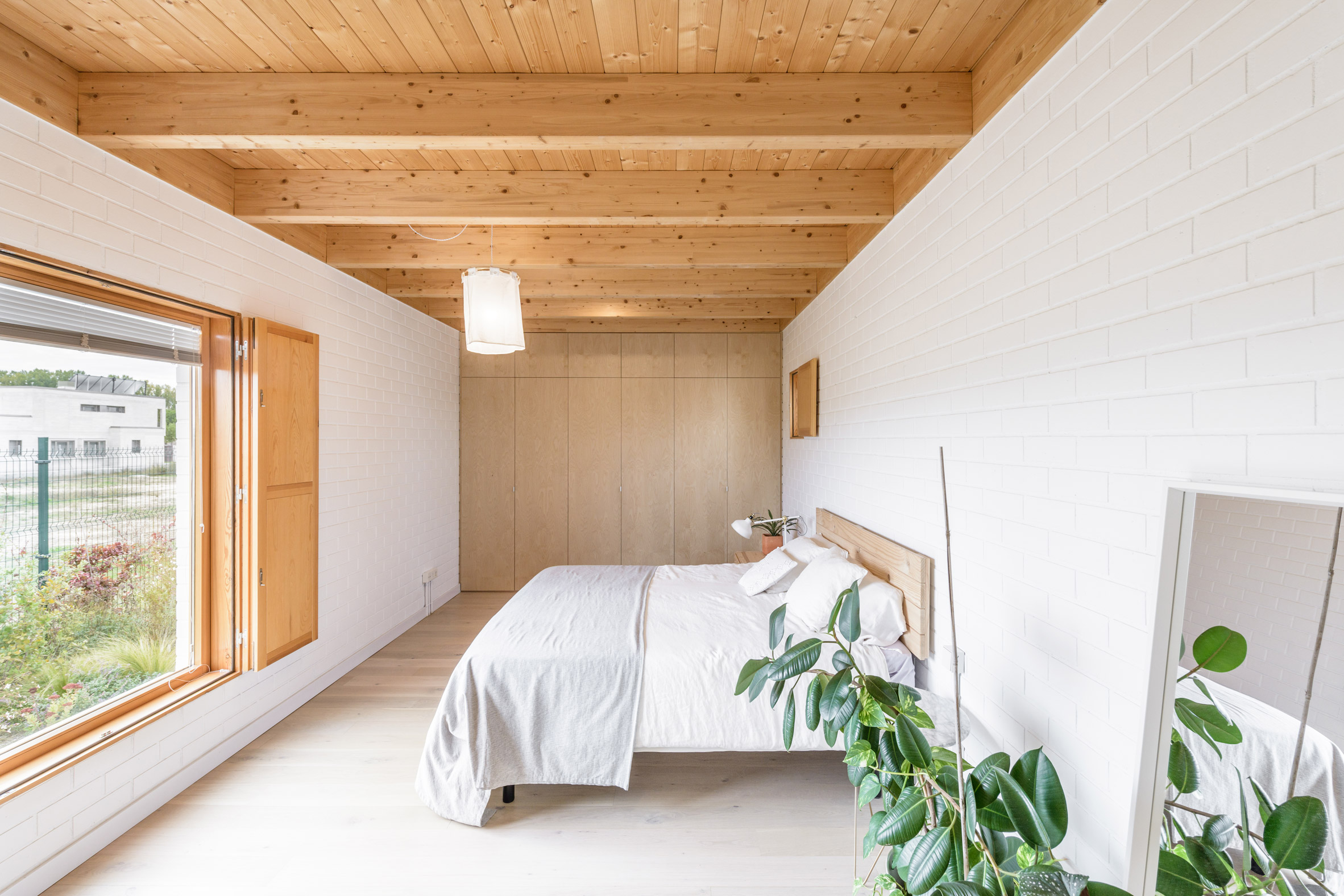
White-painted bricks and pale timber reveals define this home in Spain by Escribanorosique Arquitects, set around a series of paved courtyard spaces.

Called Casa SD, the house is located close to the city of Valladolid in northwest Spain.

Escribanorosique Arquitecto

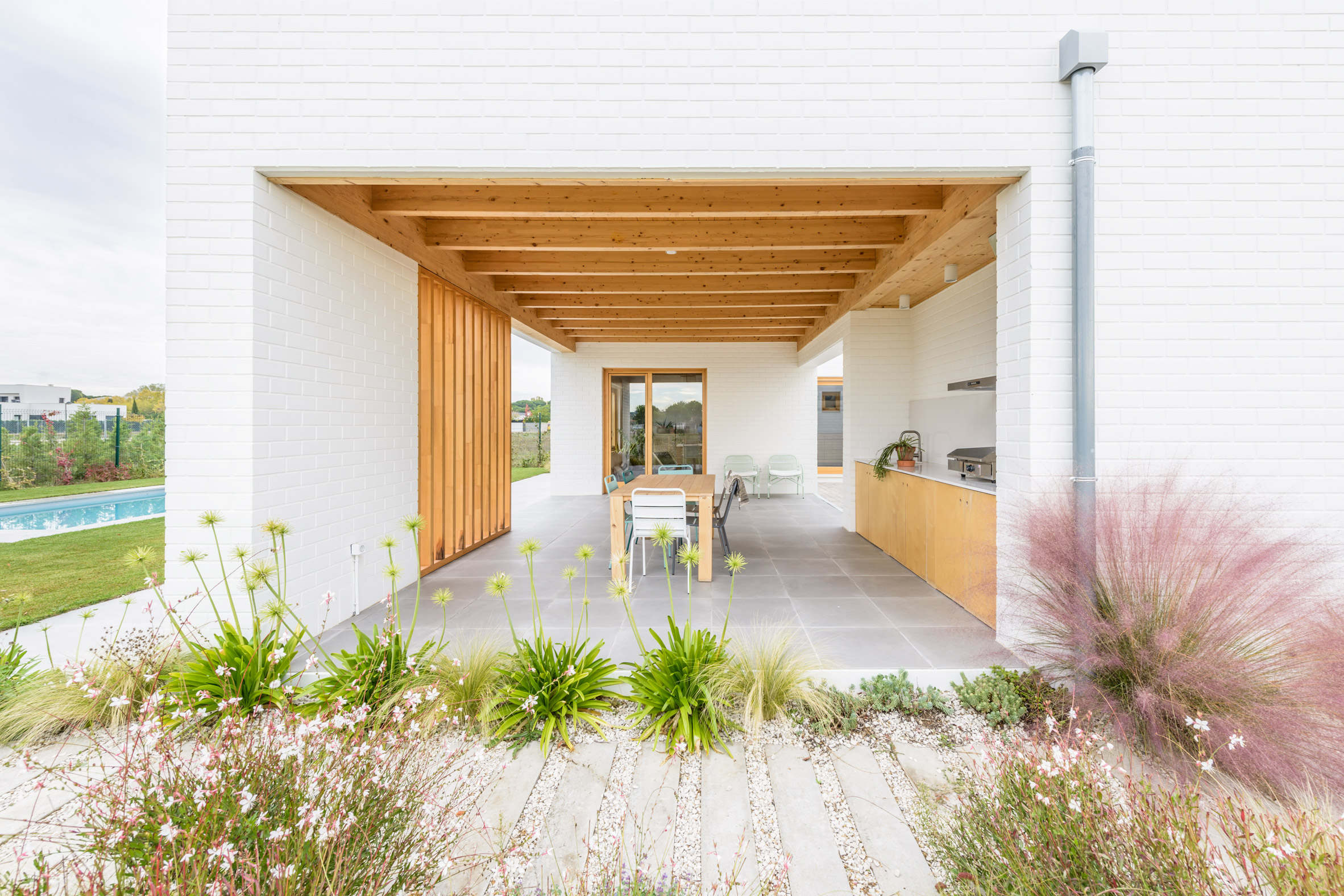
External patios on both levels act as outdoor extensions of its living spaces.

"The plot is located where the views out are not of particular interest," Escribanorosique Arquitects co-founder Esther Escribano Rivera told Dezeen.

"So we decided that the idea of building the house around a landscaped, external space made a lot of sense."

Escribanorosique Arquitecto

Two courtyards positioned to follow the sun throughout the day organise the plan of the home.

To the east a long, thin courtyard is aligned with the main entrance, dividing the home into a block housing the garage and plant room and another housing all of the living spaces.

Escribanorosique Arquitecto

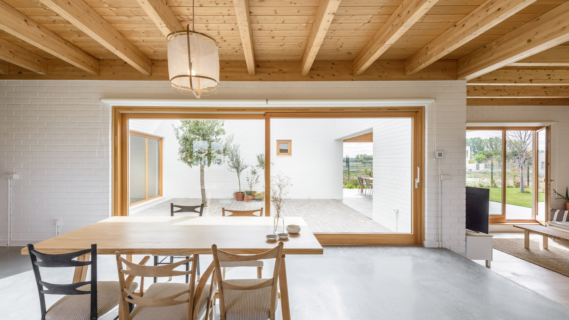
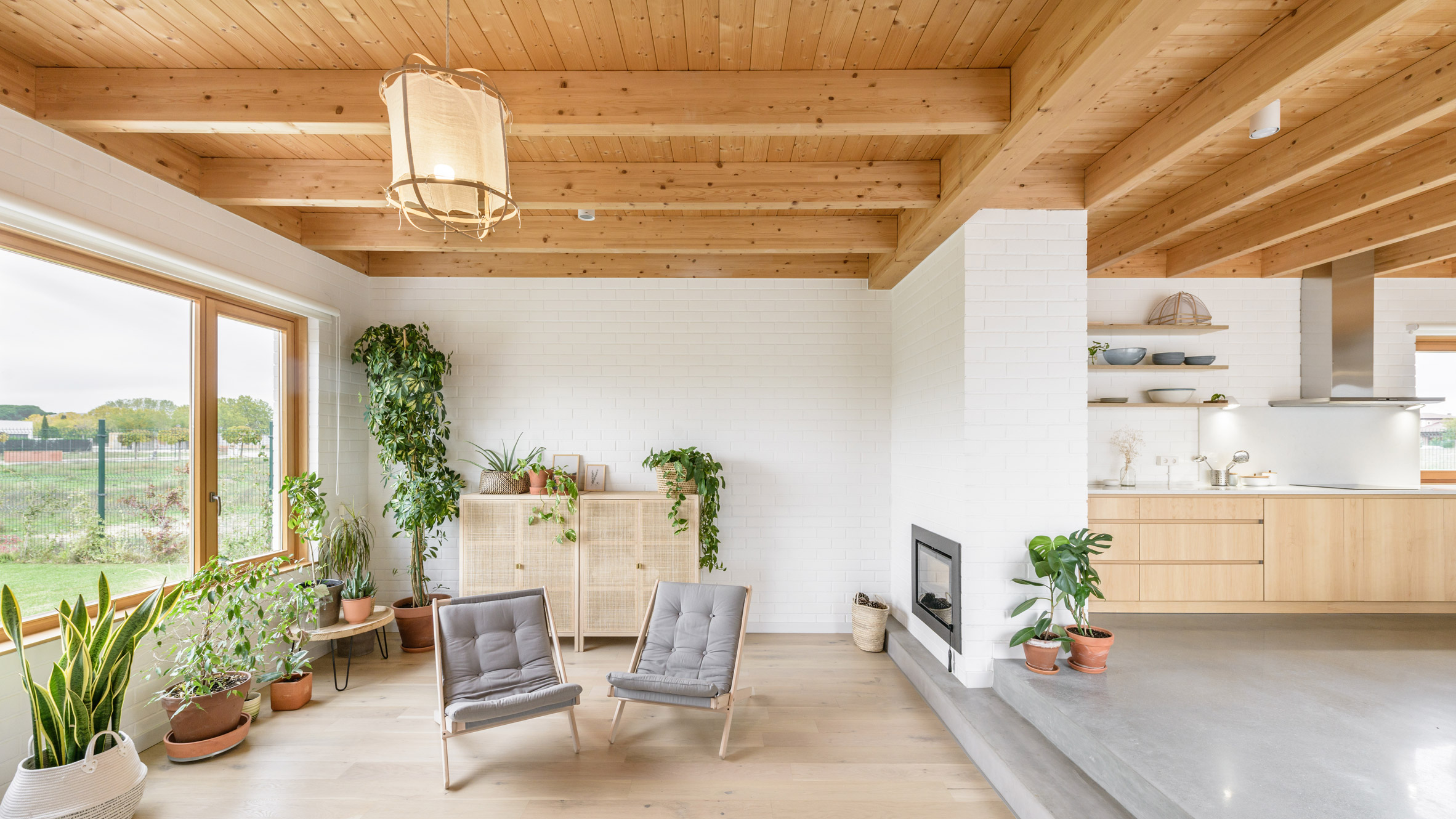
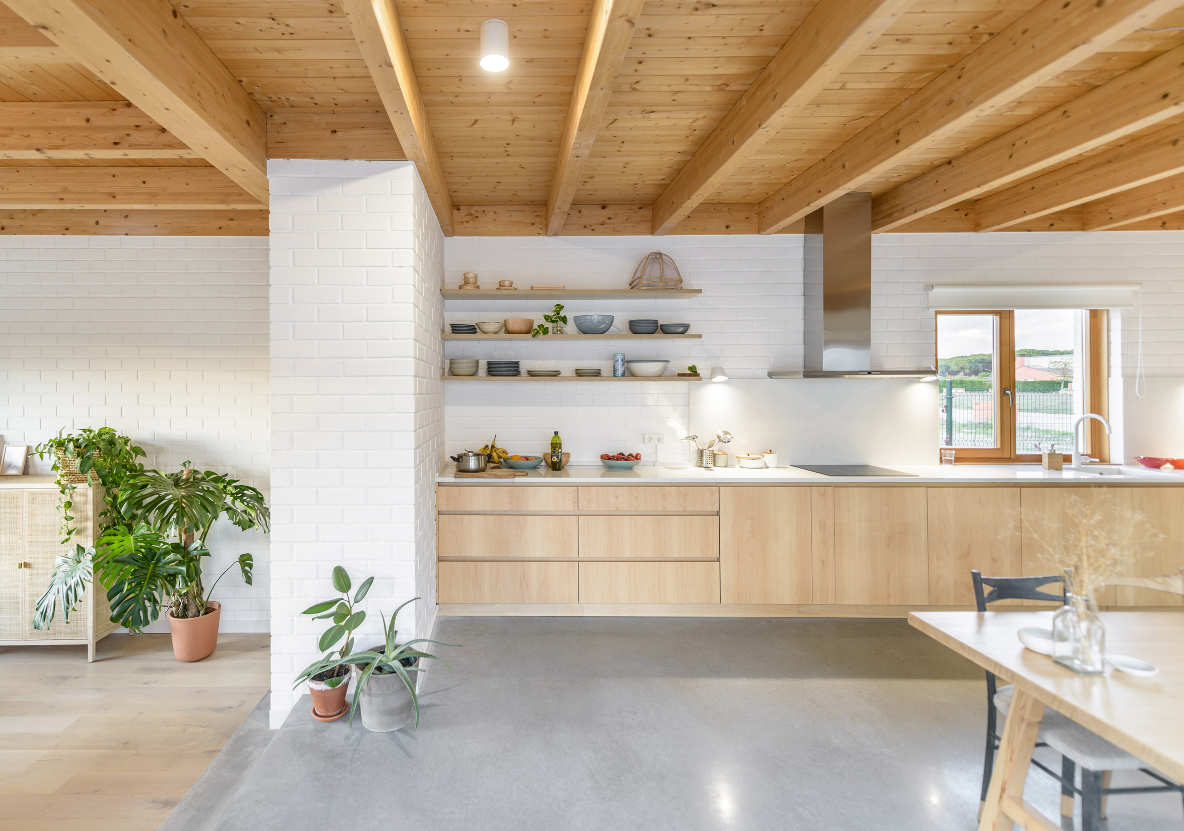
A square courtyard sits in the centre of the living area, hugged by an L-shaped kitchen, living and dining area.

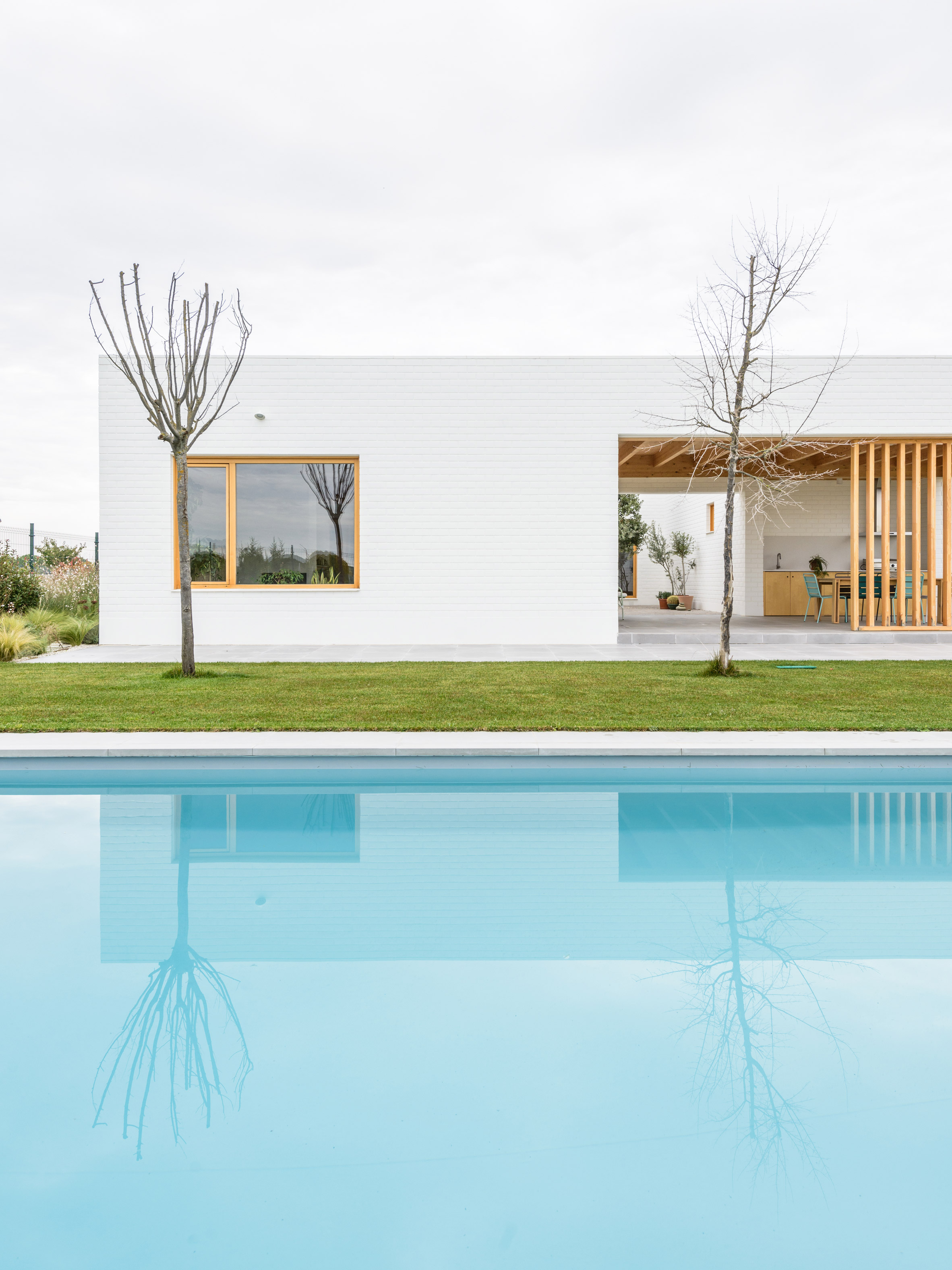
This courtyard spills out onto an external patio shielded by a slatted wooden partition, before opening out to a garden with a pool.

Escribanorosique Arquitecto

"The living areas are a series of connected spaces, which can keep their own character and independence with no actual divisions," said the practice.

Sliding glass doors connect the living spaces to the internal courtyard.

Escribanorosique Arquitecto

External windows have been kept to a minimum and small in size.

Miniature windows provide glimpses between internal spaces.

Escribanorosique Arquitecto

On the first floor, a high parapet surrounds a terrace connecting to the guest bedroom,.

Large, wood-lined openings, in contrast to the rest of the home, provide views out over the landscape.

Escribanorosique Arquitecto

"The terrace on the first floor is the only place where we generate openings which look out towards the landscape, over the surrounding residential properties and towards the hills," said Rivera.

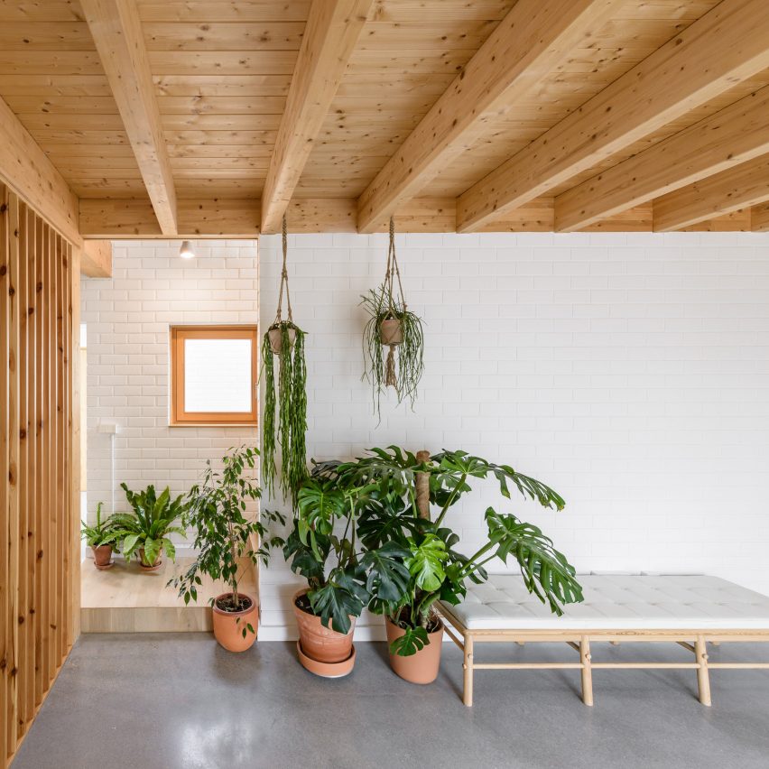
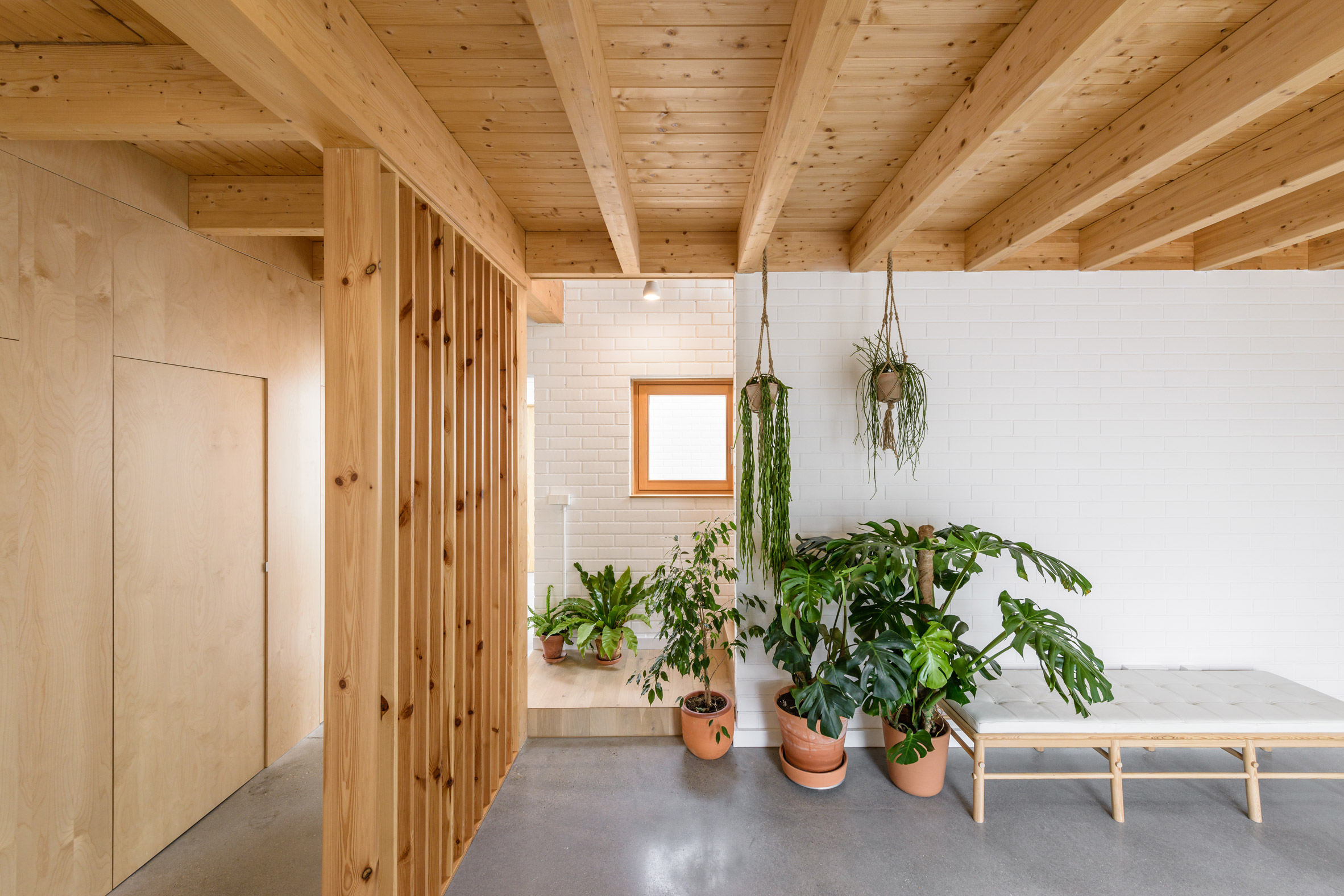
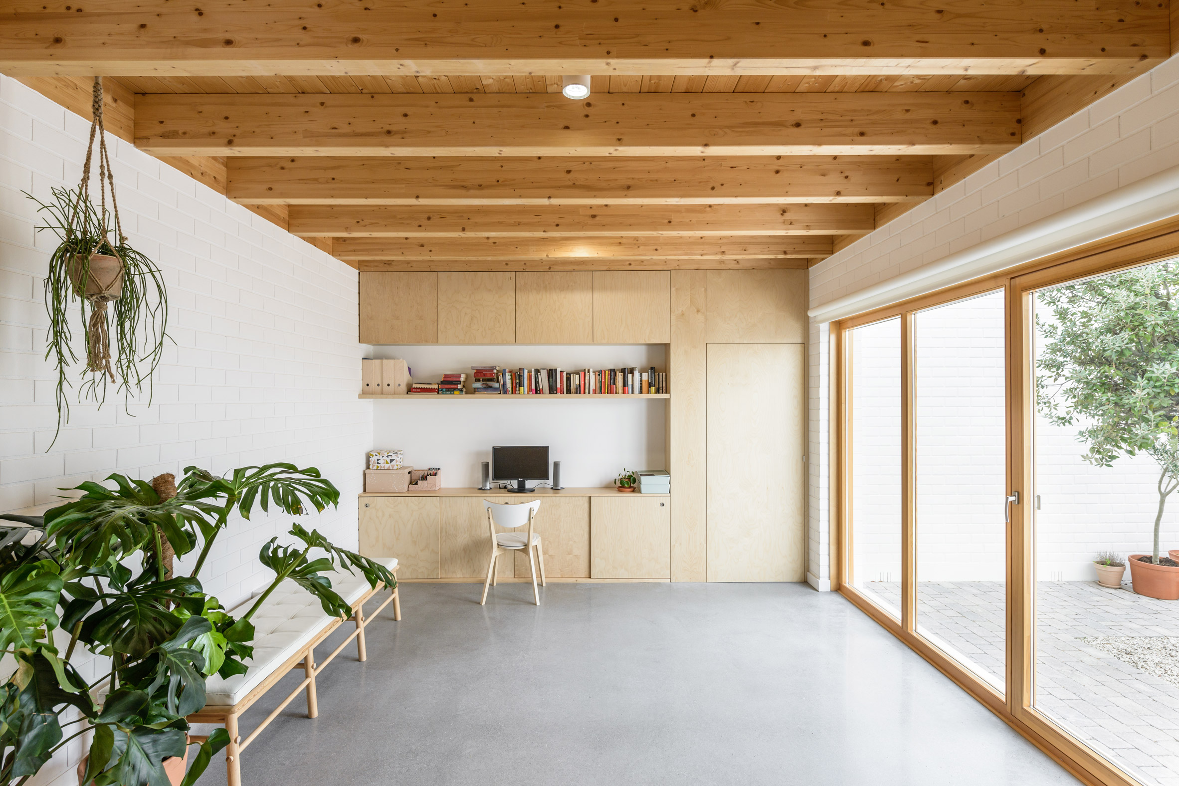
A simple palette of white brick, timber, built-in furniture and concrete floors creates open and bright living spaces.

Escribanorosique Arquitecto

"We think it is important that materials express themselves, so we decided not to hide or cover them, except for the white paint we applied to the brick," said Rivera.

"We love the defined shadows that the sun produces in Spain, and white painted brickwork maximises this effect whilst also helping to minimise the massing."

Escribanorosique Arquitecto

Escribanorosique Arquitects was founded in 2007 by Esther Escribano Rivera and Miguel Angel Rosique Valverde.

A similar strategy was adopted by Architect Bernardo Richter for a recent home in Brazil, which features an almost windowless brick exterior and looks into a central courtyard.

Photography is by Juan Carlos Quindós.

The post Escribanorosique Arquitects use white bricks and timber for house in Spain appeared first on Dezeen.


from Dezeen https://ift.tt/392hjYU