
As luxury new builds continue to shoot up in Acton, an area in west London, its inhabitants suffer first hand from the crippling effects of gentrification.

from It's Nice That https://ift.tt/2WKRuKr
As luxury new builds continue to shoot up in Acton, an area in west London, its inhabitants suffer first hand from the crippling effects of gentrification.

Throughout her ongoing and multidisciplinary project, Flora, the artist gathers snippets while on her walks through Chicago.

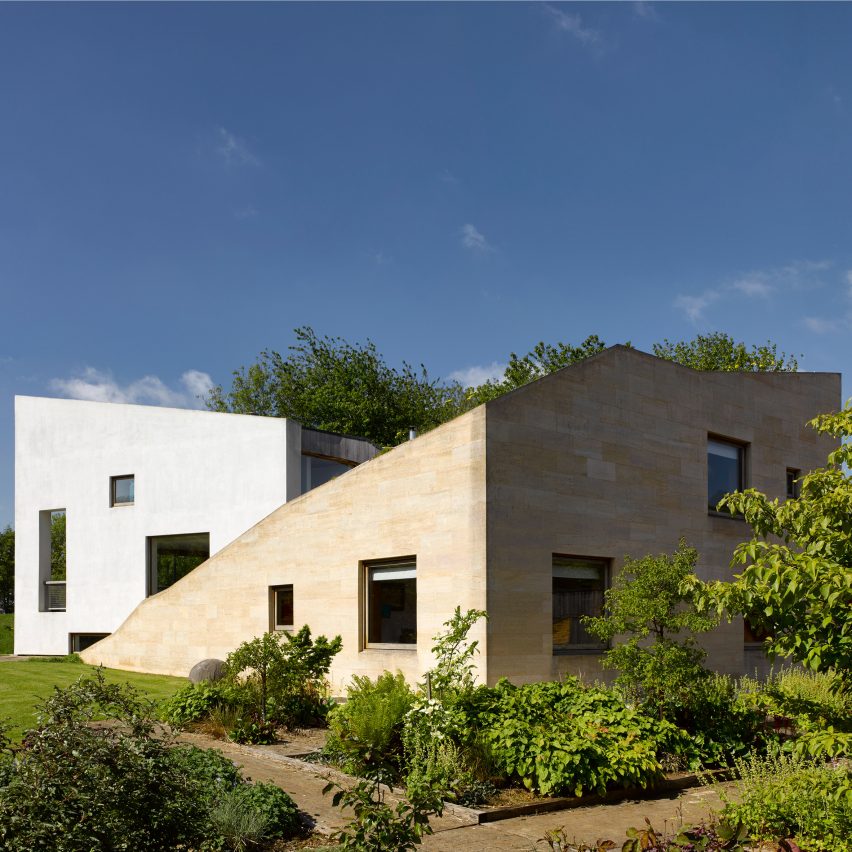
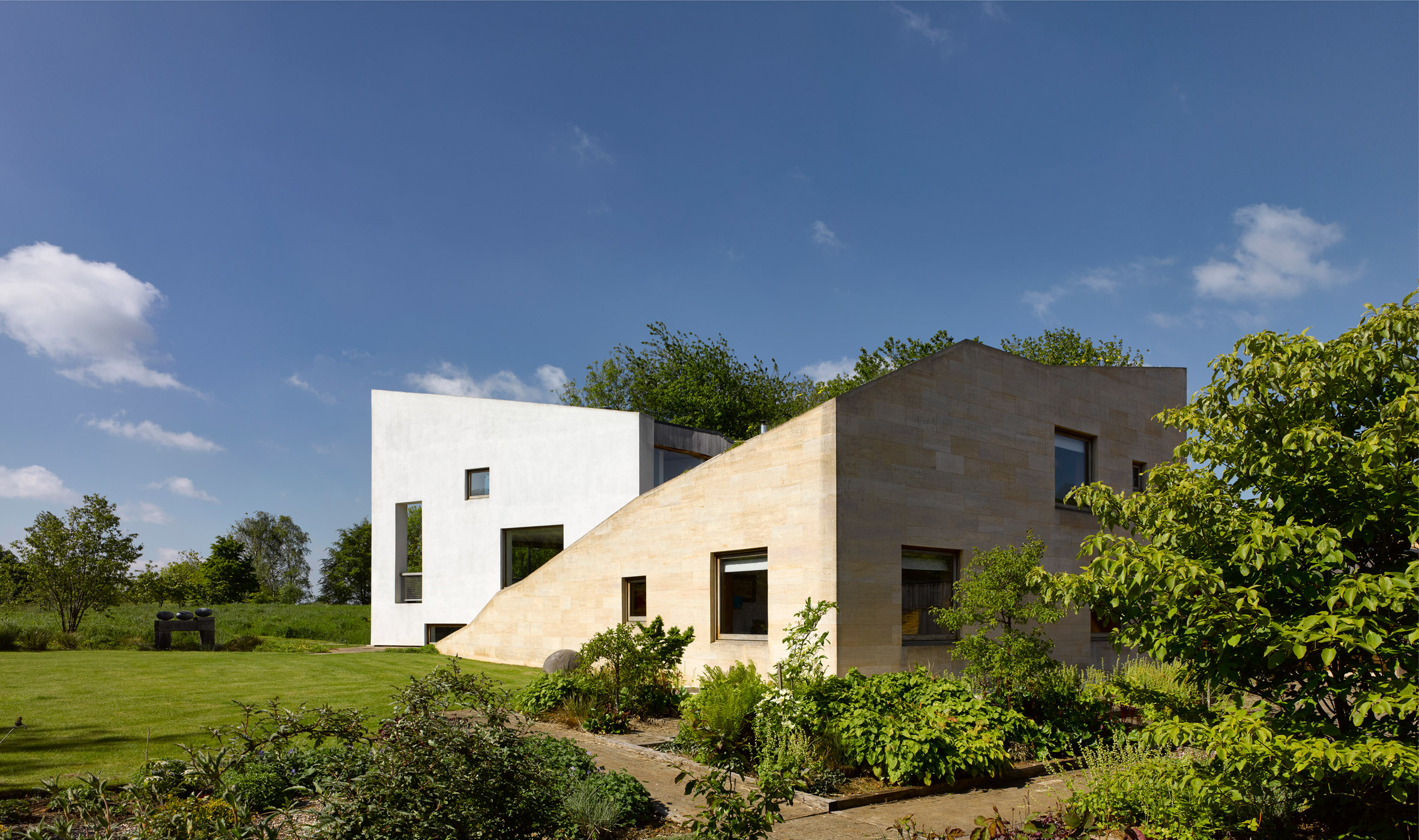
Sloping green roofs top the two distinct wings of Stonecrop, a British house designed by Featherstone Young to be adaptable and energy efficient.
Located in a designated conservation area in Rutland, the dwelling has a principle wing dedicated to everyday use, and a smaller second wing with three bedrooms for visitors.
It was designed by Featherstone Young so that the guest zone would only opened up and heated when the extra space is required, ensuring flexibility and limiting energy consumption.
"The client wanted a house that was both adaptable and energy efficient," explained the London studio's co-founder Sarah Featherstone.
"Their sons were teenagers when the project commenced so they knew that when the house was complete they would no longer be living permanently at home," she told Dezeen.
"This meant they wanted a house that was comfortable and worked well when only the two of them there but when their sons and their future families visited it needed to be able to accommodate them all."
Stonecrop measures 347 metres squared, and its angular wings fold around a central circular courtyard.
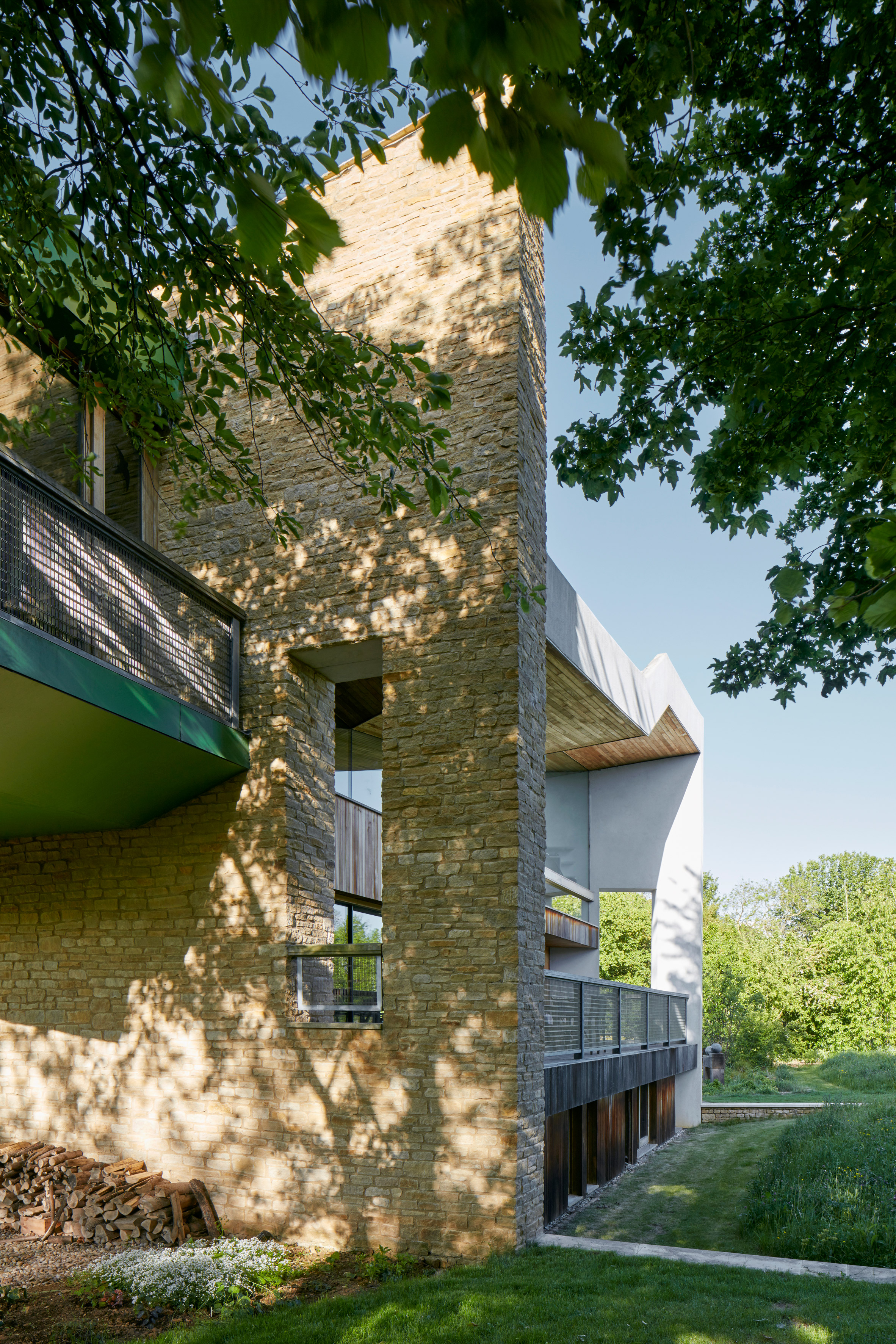
The main wing branches off a buffer wall on the rear side of the house, which is built from local limestone rubble and forms part of the dwelling's hybrid masonry and steel structure.
Stonecrop's striking aesthetic was developed to ensure the home complemented its surroundings – appearing as though it emerges out from inside the landscape.
Similarly, its materiality nods to its rural setting, dominated by the Clipsham limestone quarried a few miles away from the house.
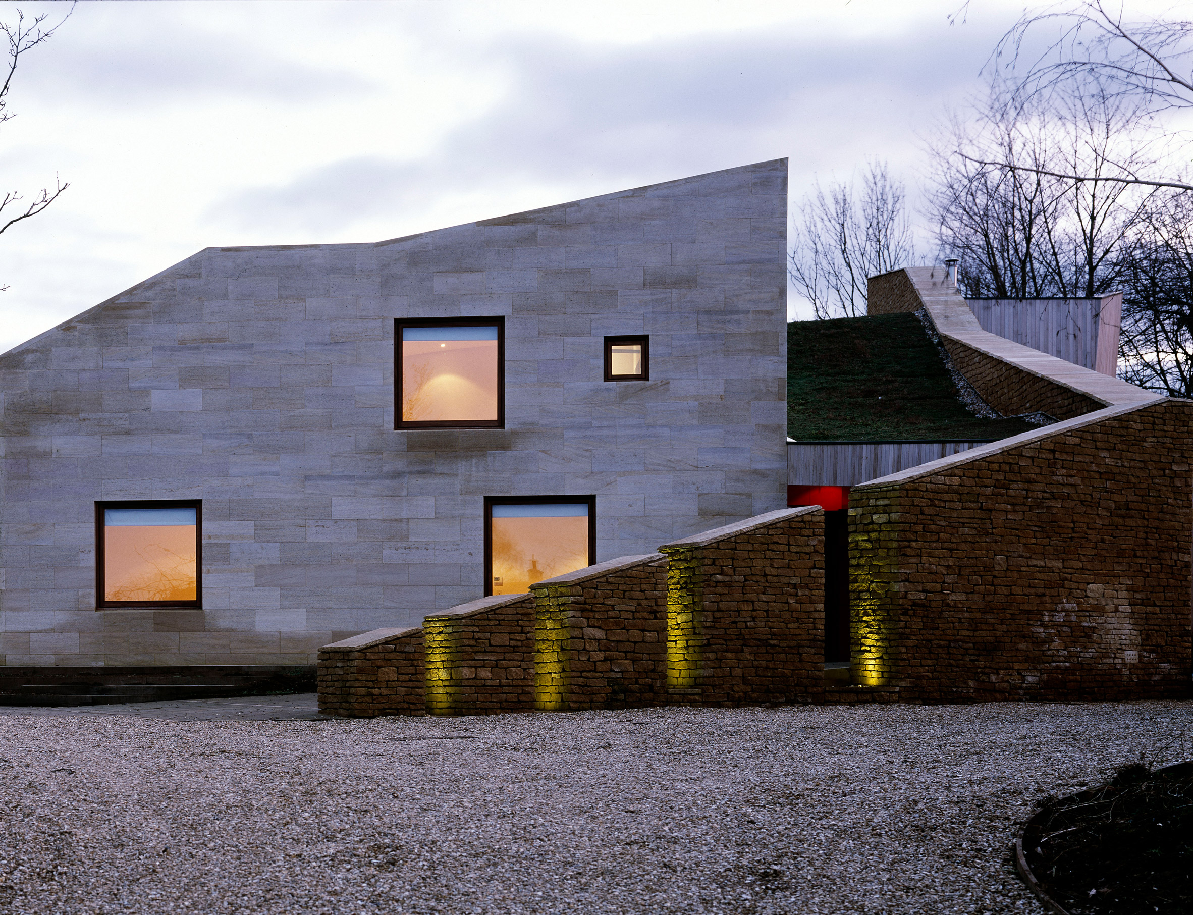
"It is important that, being located within a village, the house is sympathetic to its character and that its design captures the sense of place," explained Featherstone.
"By this I don't mean copy the style of houses already there, but understand and interpret the local vernacular to create a new house rooted in place, but of its time."
This buffer wall's textured finish and limited windows, is intended to "convey the sense of protection" while providing thermal mass.
It is contrasted with the guest wing of the house that is clad in the same limestone but with a smoother finish with larger windows.
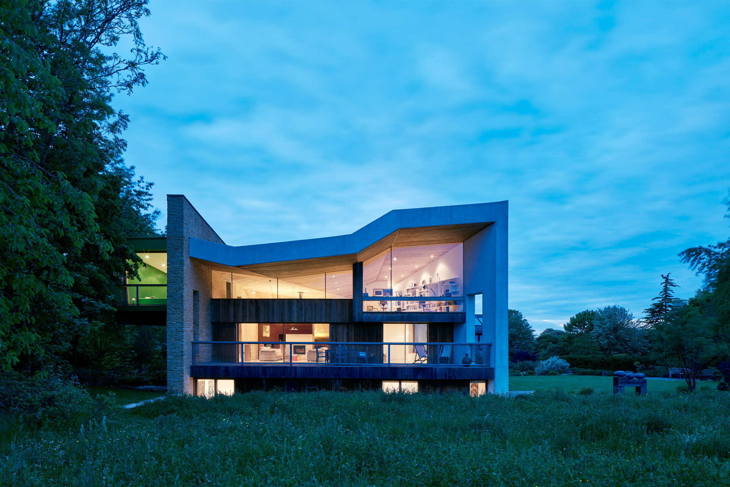
Stonecrop's principle wing slots in between this buffer wall and the guest zone, where it emerges out and extends upwards with a white-rendered facade.
On its tallest side, it reaches five metres in height and opens out with large glazed areas that look out over the surrounding landscape.
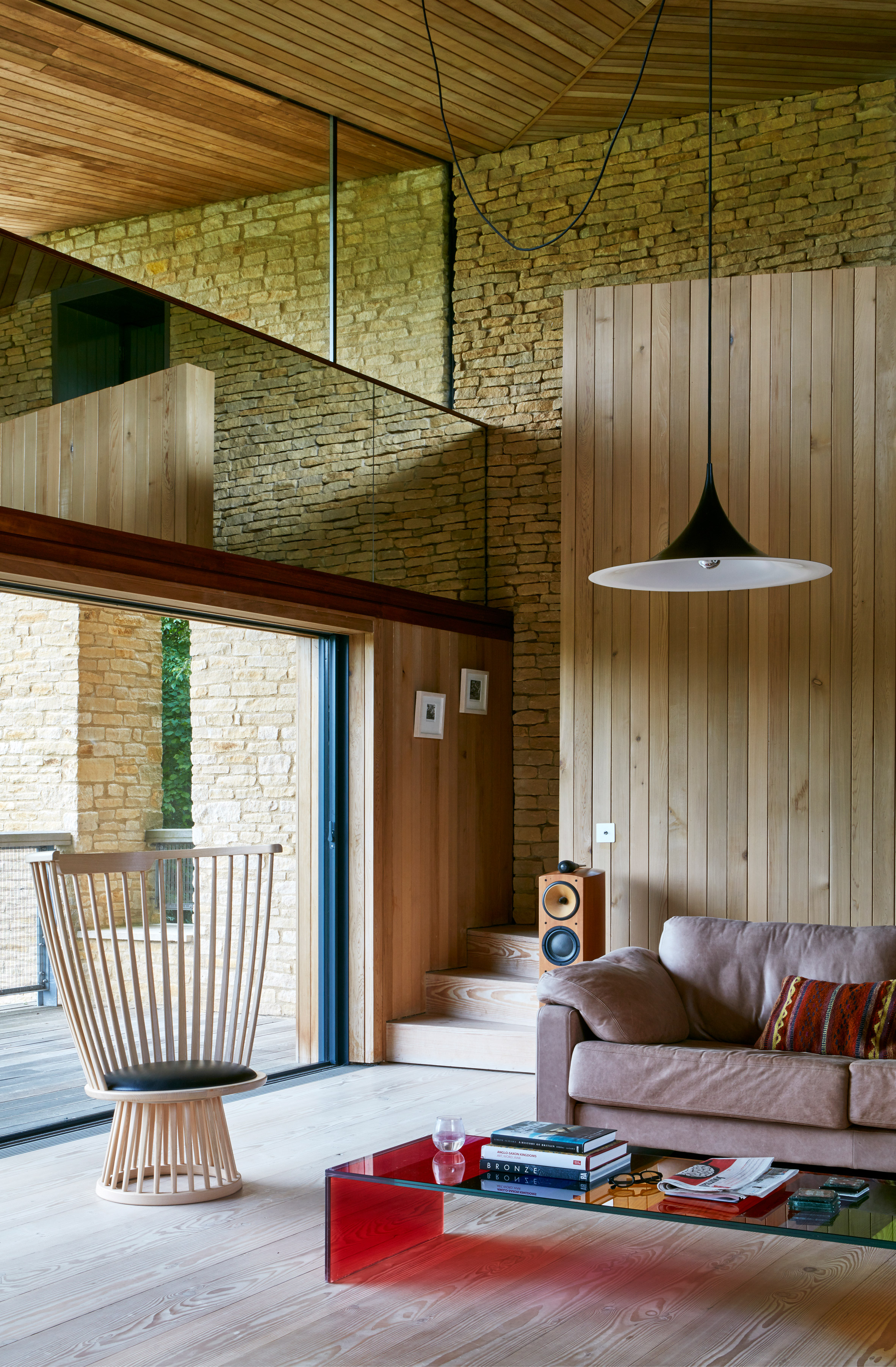
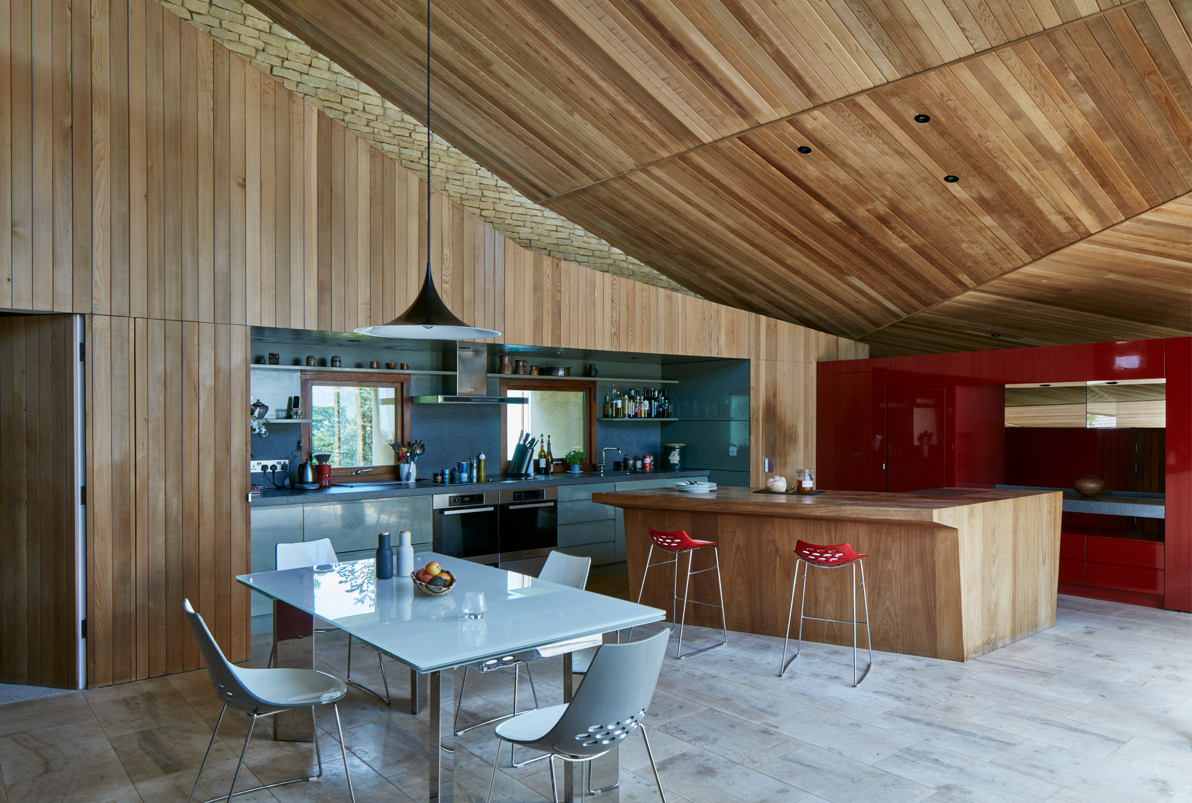
Inside, Stonecrop's focal point is an open plan living area on the ground floor, with glossy red partition walls that are "treated like pieces of furniture" rather than extending to the ceiling.
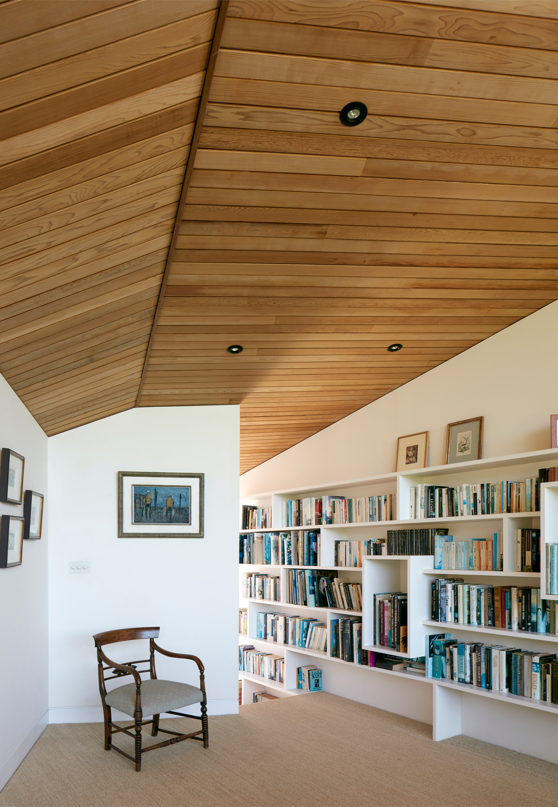
Here, the external material finishes extend inwards where they are teamed with faceted cedar-clad ceilings and walls that feature throughout the house.
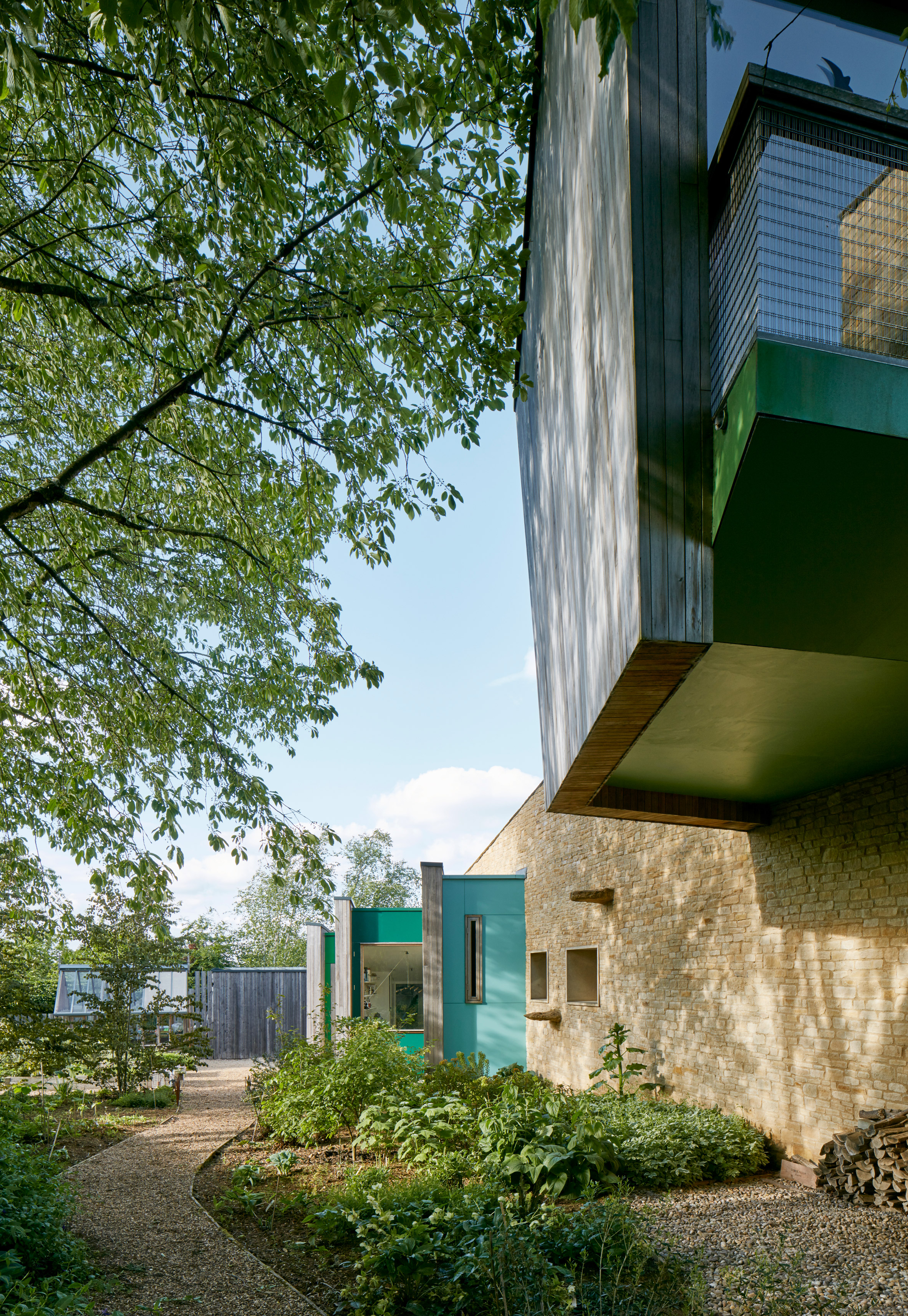
The home's more utilitarian spaces such as a the utility room and larder are housed in pod-like structures that extend out from the buffer wall.
This also includes a study, which is cantilevered from the highest floor to evoke an eyrie – the large nest of a bird of prey found high in trees or cliffs.
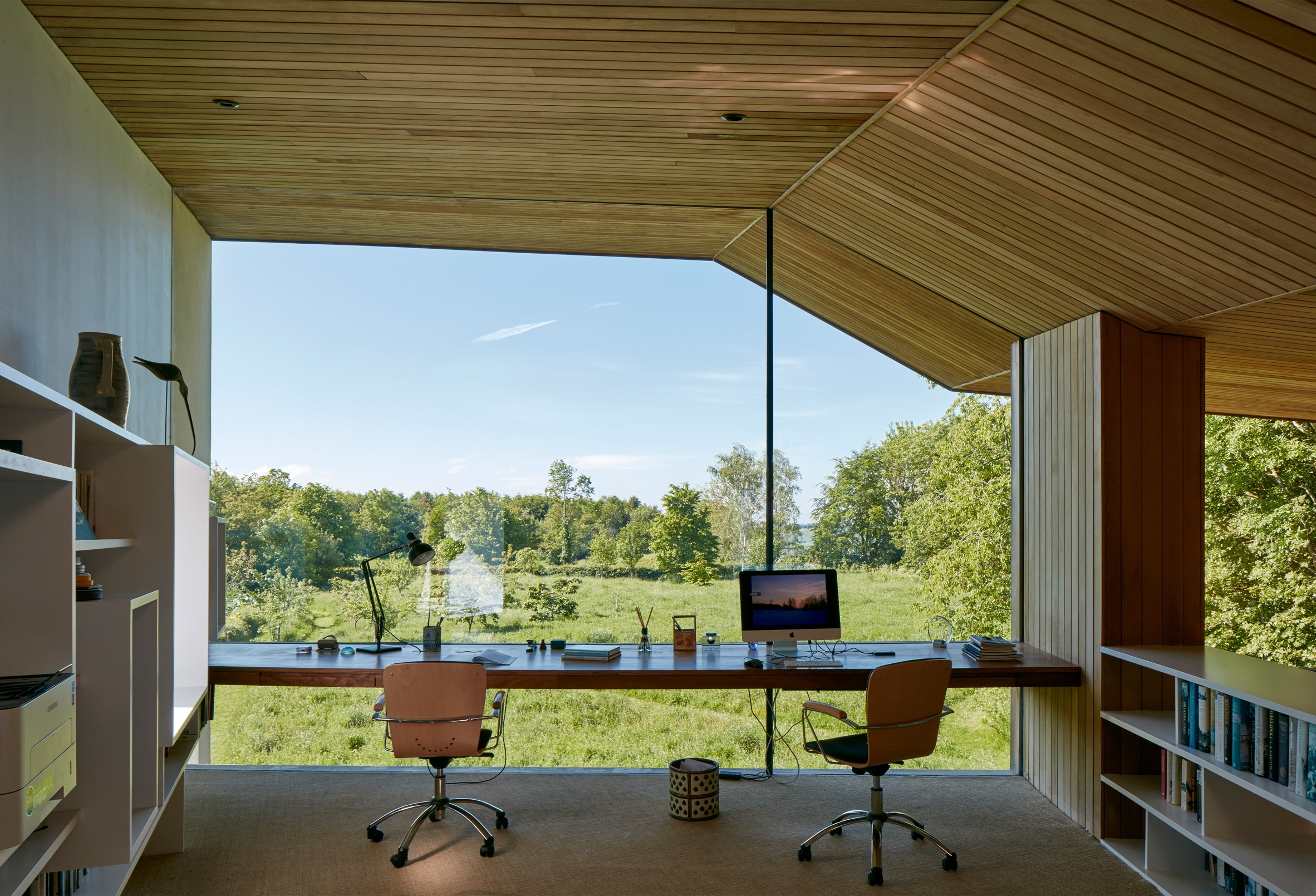
"Our clients have an interest in astronomy and love of trees, so we created a tree-house type eyrie located at the highest level of the house cantilevered off the stone buffer wall," said Featherstone.
"This space nestles within the surrounding trees and offers magnificent views across the surrounding farmland."
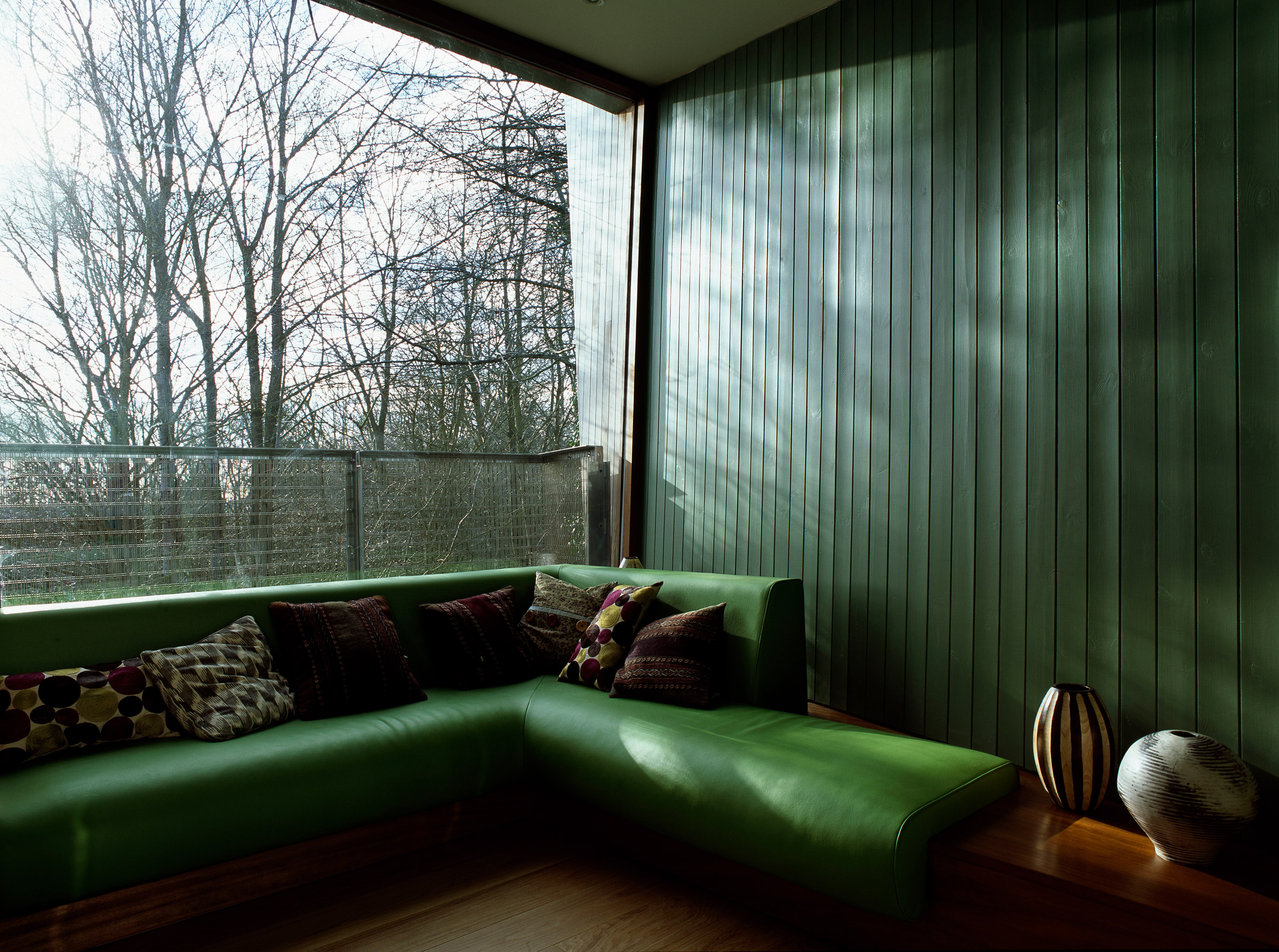
A visual connection to the outside is present throughout the entire house, offering occupants views out onto the series of different gardens.
Landscaped by John Dejardin, these gardens around the house and have spaces that are for planting or relaxing.
Featherstone Young is a London architecture studio founded in 2002 by Featherstone and Jeremy Young.
Other projects by the studio include a house cantilevered over a river in Wales, a day centre for homeless people in east London and a residential building within an old board-game factory.
Photography is by James Brittain unless stated.
Project credits:
Architect: Featherstone Young
Design team: Jeremy Young, Sarah Featherstone, Iris Papadatou
Structural engineer: Conisbee
Quantity surveyor: Burke Hunter Adams
M&E: In-gine (formerly Michael Popper Associates)
Landscape Architect: John Dejardin
Building Contractor: John Perkins Projects Ltd and Peter Wallis
The post Featherstone Young divides rural Stonecrop house into two distinct wings appeared first on Dezeen.

The Collective Colouring Book has been compiled in just four days to respond to the crisis with stellar international illustrators lending their linework.


Japanese car brand Nissan has filed a trademark application for a flat monochrome logo that would see it join other brands opting for minimalist rebrands.
Documents filed in Great Britain, Peru, Uruguay, Chile, and Argentina show that Nissan has registered a flat, two-dimensional update of its existing logo.
The design references the two geometric forms that comprise the current logo – a circle with a rectangle overlaid – but reduces these to a pair of stylised lines enclosing the Nissan logotype.
The font is also reduced in weight and elongated slightly for a more agile aesthetic.
Images of the new logo have been circulating online, but when approached by Dezeen for comment, the company said the trademarked logo "may or may not be used for future products and or services".
Carmakers follow minimal rebranding trend
If the logo is released, Nissan would join the trend for flat identity redesigns that are simpler and better suited to digital applications.
It would echo the redesigns of other automotive manufacturers including BMW, MINI and Volkswagen, which have all recently adopted flat, two-dimensional logos.
Nissan's original logo can be traced back to when the company took control of DAT Motors (formerly Datsun). Datsun's logo featured a blue rectangle placed over a red circle – representing Japan's flag.
The company introduced the current chrome-effect logo in 2001. The three-dimensional reinterpretation of the original shapes was described as representing the "sophistication, modernism, creativity and perfection" in Nissan's products.
Flat logos are optimised for online
The new flat logo is more in line with many brands that are eschewing the skeuomorphic style of recent decades. Skeuomorphic graphic designs feature embellishments such as shadows and metallic effects, intended to give the illusion of three-dimensions.
Flat design uses simple two-dimensional elements that render more efficiently when used online. This makes it easier for them to load faster and scale more smoothly.
Other brands that have adopted flat design identities recently include Mastercard, which switched to a minimal emblem and a lower-case logotype positioned outside the symbol.
British condom manufacturer Durex has also opted for a flattened logo featuring a font it called One Night Sans, while food delivery service Deliveroo launched a simplified rebrand in 2016.
The post Trademark documents reveal Nissan's stylised flat logo appeared first on Dezeen.


