Wednesday, 1 July 2020

Call for registration to Furniture China 2020 trade fair

Furniture China 2020

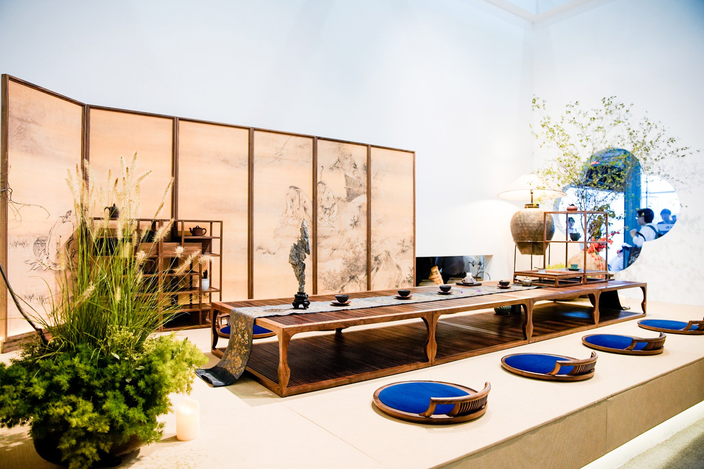
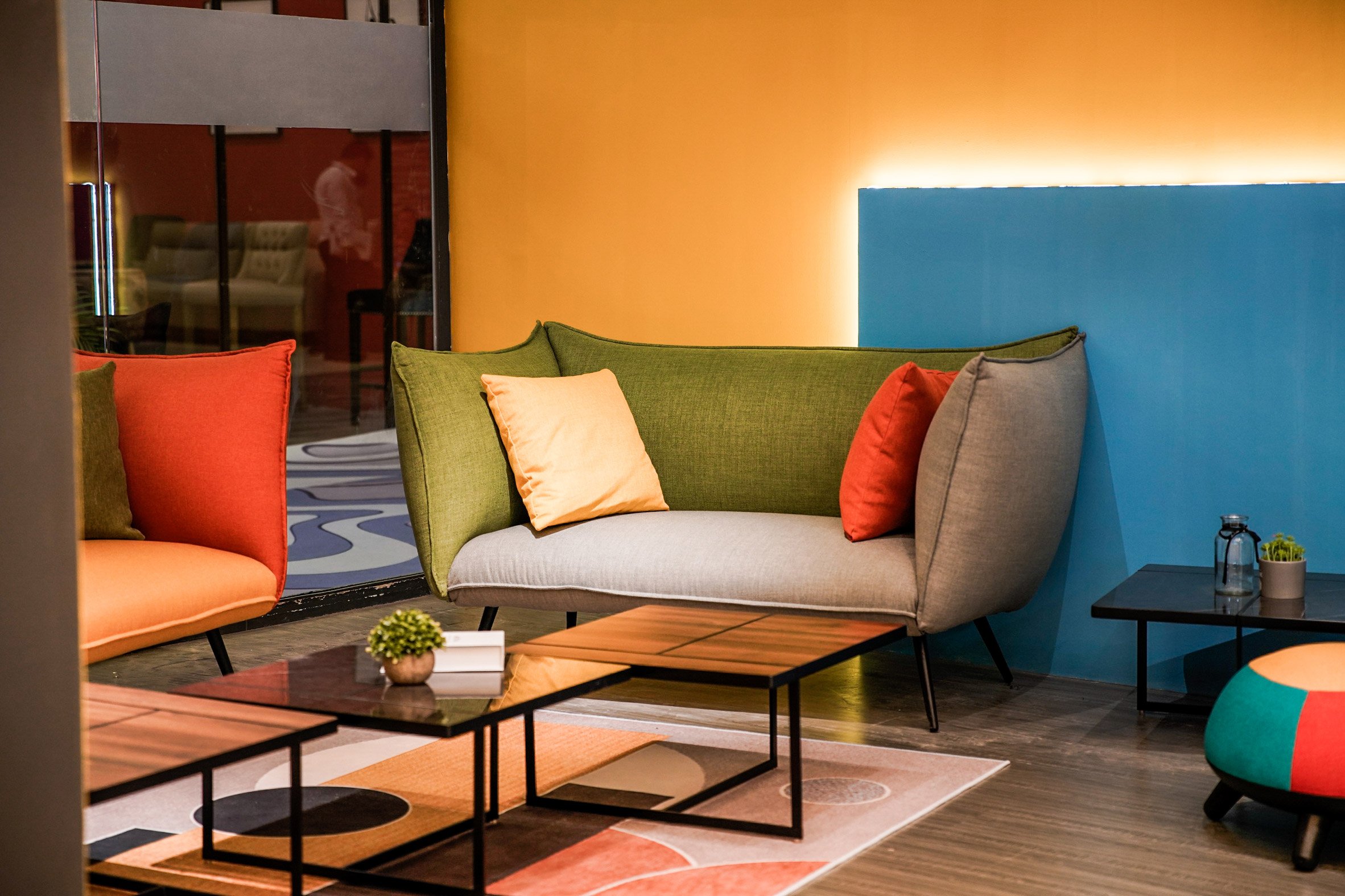
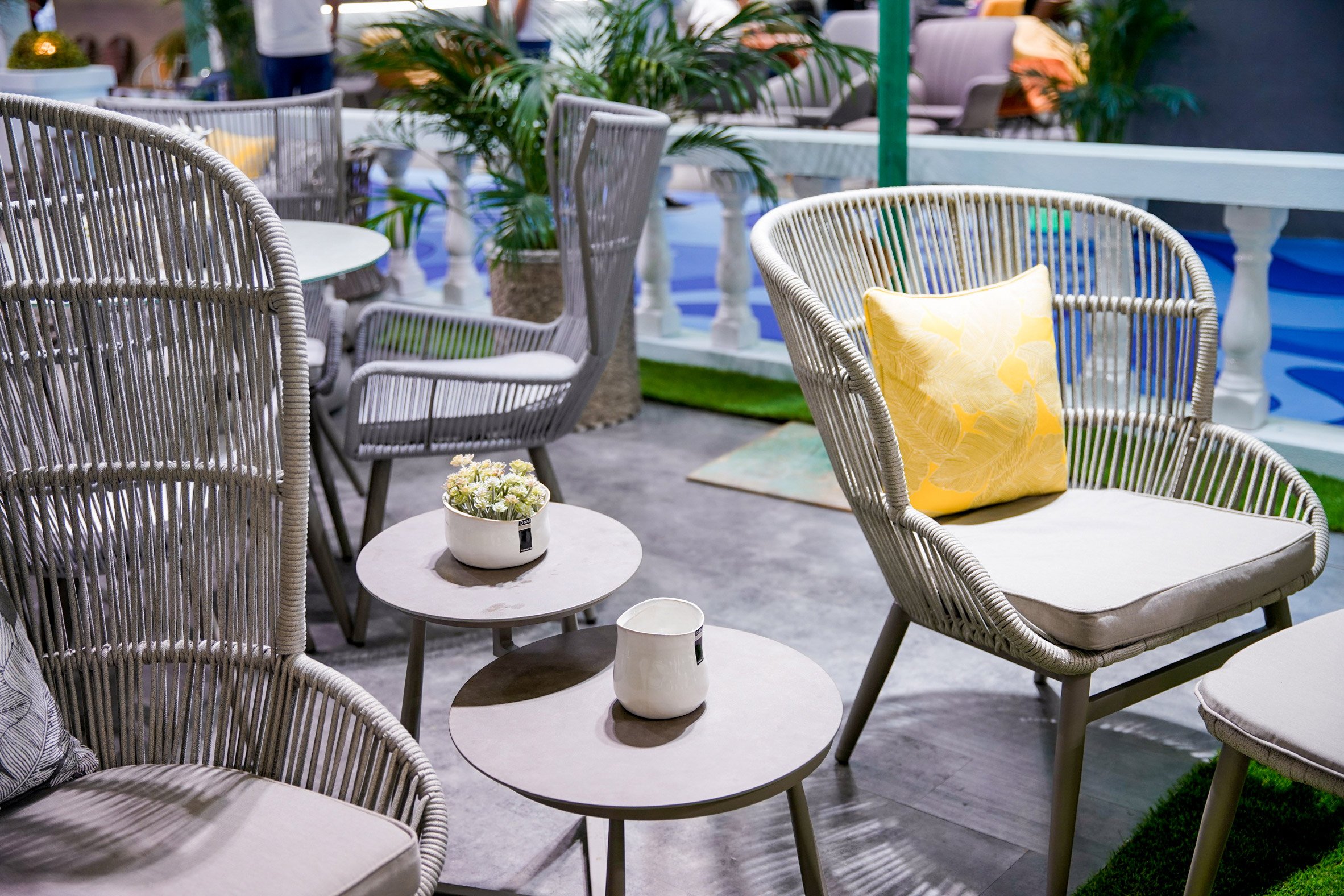
Dezeen promotion: participants from around the world are invited to register for the virtual version of international trade fair Furniture China, which will be held in conjunction with an onsite event in Shanghai in September.

The 26th China International Furniture Expo will host suppliers, buyers, designers and vendors in Shanghai from 8 to 12 September alongside the online platform, called Digital Trade Show. This will be live from 8 August to 8 November for buyers and attendees who can not attend the fair due to coronavirus.

Furniture China 2020

"The domestic market is sure to be focused during this time, while the new technology adopted to digital platform is the true next step to connect international markets," said Wang Mingliang, founder and director of the Shanghai Sinoexpo Informa Markets, which manages the event.

For the virtual showcase, Furniture China will select an estimate of 1,000 brands to present their products, including furniture and light fixtures for over three months. Each exhibitor will have an online showroom it can customise with text, video and photographs of its products and services.

Buyers will be able to contact suppliers and negotiate deals directly through the online portal, which will also host video meetings and industry news.

Furniture China 2020

While some foreign exhibitors will be unable to showcase at the exhibition due to travel restrictions from the pandemic, the fair understands the importance of the industry's "in-person experience".

Attendees able to visit the fair in person can expect slight changes in programming as organisers work to control the pandemic.

"Physical exhibition plays an irreplaceable role in the furniture and home furnishing industry with its focus on the in-person experience," Mingliang added.

Furniture China 2020

Registration is now open to visit onsite Furniture China. The event will take place from 8 to 12 September 2020 at SNIEC in Shanghai, in conjunction with Maison Shanghai 2020 from 8 to 11 September at SWEECC.

Subscription is also open to engage in the Digital Trade Show from 8 August to 8 November 2020.

The post Call for registration to Furniture China 2020 trade fair appeared first on Dezeen.


from Dezeen https://ift.tt/3eQgmGN

11 memorable graphic design projects by Milton Glaser

11 memorable graphic design projects by Milton Glaser

To mark the passing of Milton Glaser, we've rounded up 11 of the New Yorker's most interesting graphic designs from the past six decades, including a previously unreleased symbol of togetherness that he was working on up until his death.

Born on 26 June 1929, Glaser died exactly 91 years later on his birthday in New York, where he had lived all his life. His best known I ♥ NY project expressed his pride for the city and soon became a universally recognised symbol.

Around the same time as this campaign, the artist designed a poster for American singer Bob Dylan and co-founded the lifestyle and culture New York magazine.

Glaser continued to create graphics up until the last days of his life, when he was still working on a project designed to create a collective spirit during the coronavirus outbreak.

Here are 11 graphic design projects by the late artist:

11 memorable graphic design projects by Milton Glaser

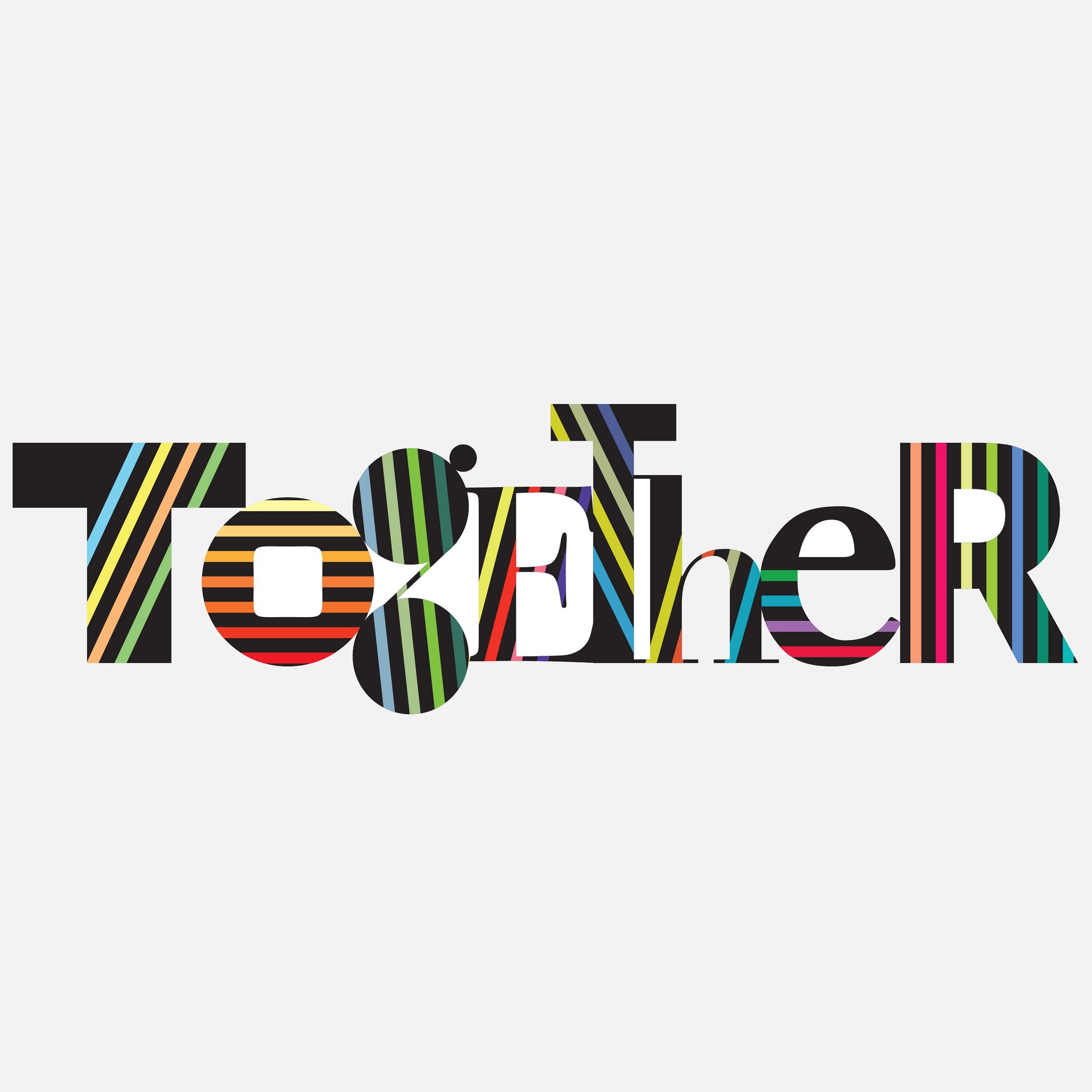
Together

Up until his death on 26 June 2020, Glaser was working on a graphic project that would represent the idea of collectivity during the forced isolation of the Covid-19 pandemic.

As the artist told the New York Times, he hoped that the project, titled Together, would be distributed to public schools across the city to spread the message that "we are not alone".

"'We're all in this together' has been reiterated a thousand times, but you can create the symbolic equivalent of that phrase by just using the word 'together', and then making those letters [look] as though they are all different, but all related," he told the publication.


I heart New York logo by Milton Glaser

I ♥ NY Campaign

Created in 1977 as part of an advertising campaign commissioned by New York State, the iconic I ♥ NY logo was designed to increase tourism and raise the spirits of New Yorkers after the city's fiscal crisis.

Glaser, who designed the logo pro bono, chose to use a lettering similar to the well-known American Typewriter font for its "informality and literary reference", as well as the fact that it provided a visual contrast to the voluptuous heart.

The designer later revisited the emblem after the attacks of September 11, adapting it to say "I ♥ NY More Than Ever".


10 memorable graphic design projects by Milton Glaser

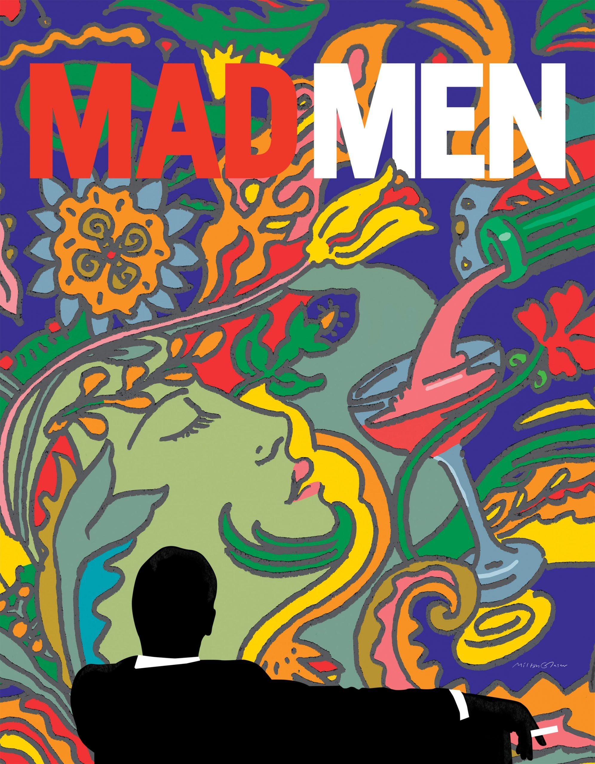
Mad Men poster for AMC

The final season of American drama television series Mad Men was advertised with a series of Art Nouveau-style posters and animations designed by Glaser in 2014.

The design features the iconic silhouette of protagonist Don Draper, as seen in the show's opening credits, set against a backdrop of an illustration of a woman's head next to a glass being filled with a drink.

10 memorable graphic design projects by Milton Glaser

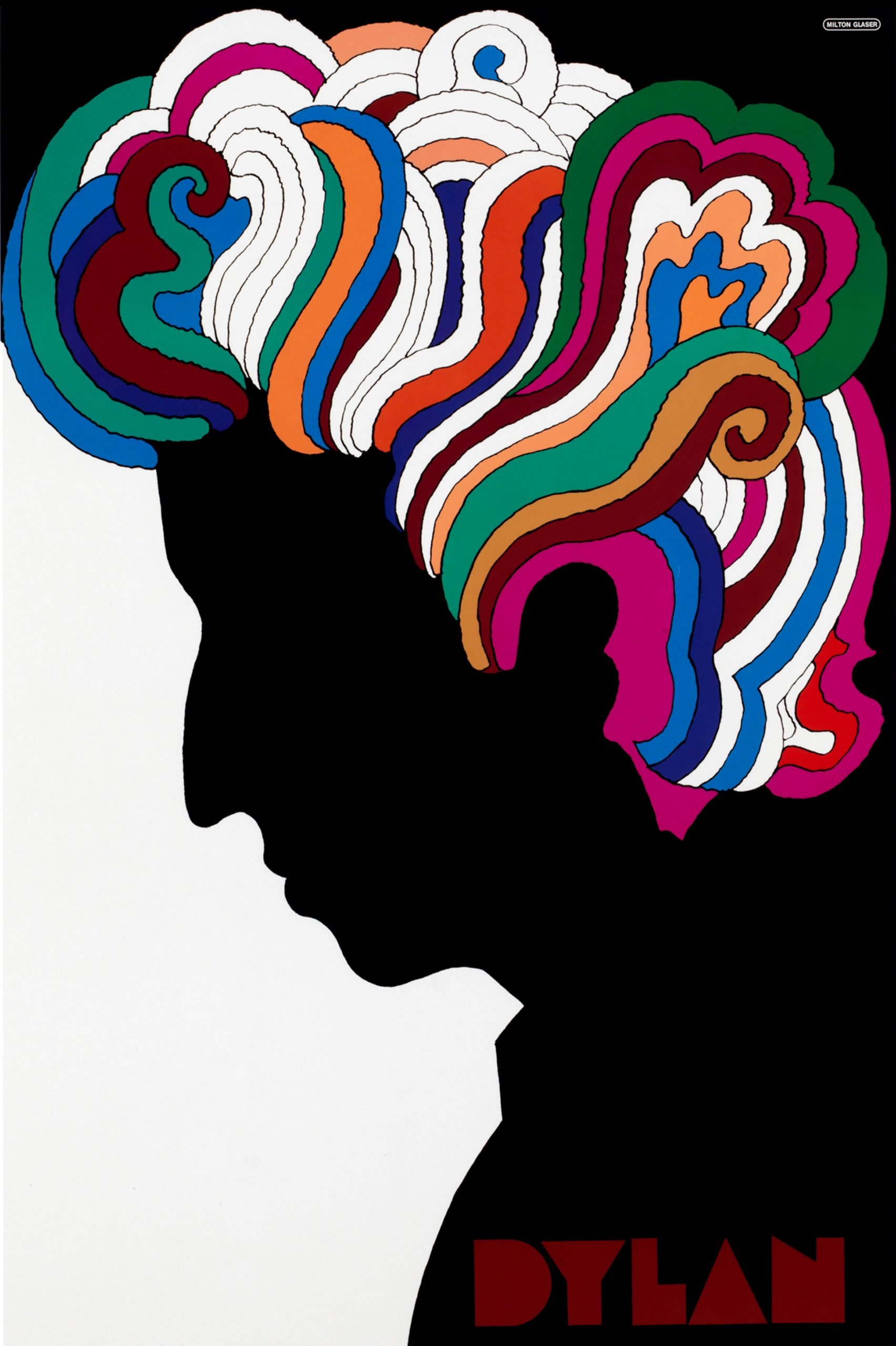
Bob Dylan poster for CBS Records

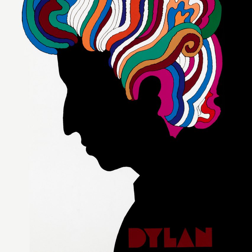
Glaser applied his signature psychedelic style to a poster he designed for Columbia Records in 1967 to illustrate Bob Dylan's Greatest Hits album. The work led to a surge of fame as a graphic designer.

Taking design cues from a self-portrait by French-American artist Marcel Duchamp, the poster sees Dylan's side profile illustrated as a black silhouette, providing a stark contrast to the rainbow-coloured, swirling lines designed to represent the singer's curly locks.


11 memorable graphic design projects by Milton Glaser

New York magazine logo

In 1968 Glaser founded New York magazine with American editor Clay Felker as a competitor to The New Yorker. Here he served as president and design director until 1977.

In addition to creating the curly logo for the life, culture, politics and style magazine, Glaser also designed a poster to promote the publication titled New York Is About New York, depicting the city's Empire State Building at four different times.


10 memorable graphic design projects by Milton Glaser

Trump Vodka bottle

Glaser was also responsible for designing a gilded vodka bottle for US president Donald Trump, shortly before the former entrepreneur licensed his name to an anonymous Dutch-distilled vodka in 2006.

The bottle, which boasts a cubic design reminiscent of a skyscraper, features two sides coated in gold with the letter T cut out to show just the transparent glass, and two sides of the design in reverse.

When speaking to Fast Company about the design in 2016, however, Glaser told the publication that the bottle appealed "to the lowest level of human activity".

"What you're selling is envy and status," he said, adding that he "wouldn't, under no circumstances, do a job for Trump today," as he saw him as "an extremely dangerous figure in American life."


10 memorable graphic design projects by Milton Glaser

Get Out The Vote graphic for US election

Glaser was among a host of designers who created graphics to encourage Americans to travel to polling stations and vote in the 2016 presidential elections.

The colour-block poster, designed as part of the design organisation AIGA's Get Out The Vote campaign, has the words "To Vote is to Exist" written across the front of a ballot box, as a voting slip being dropped inside.

10 memorable graphic design projects by Milton Glaser

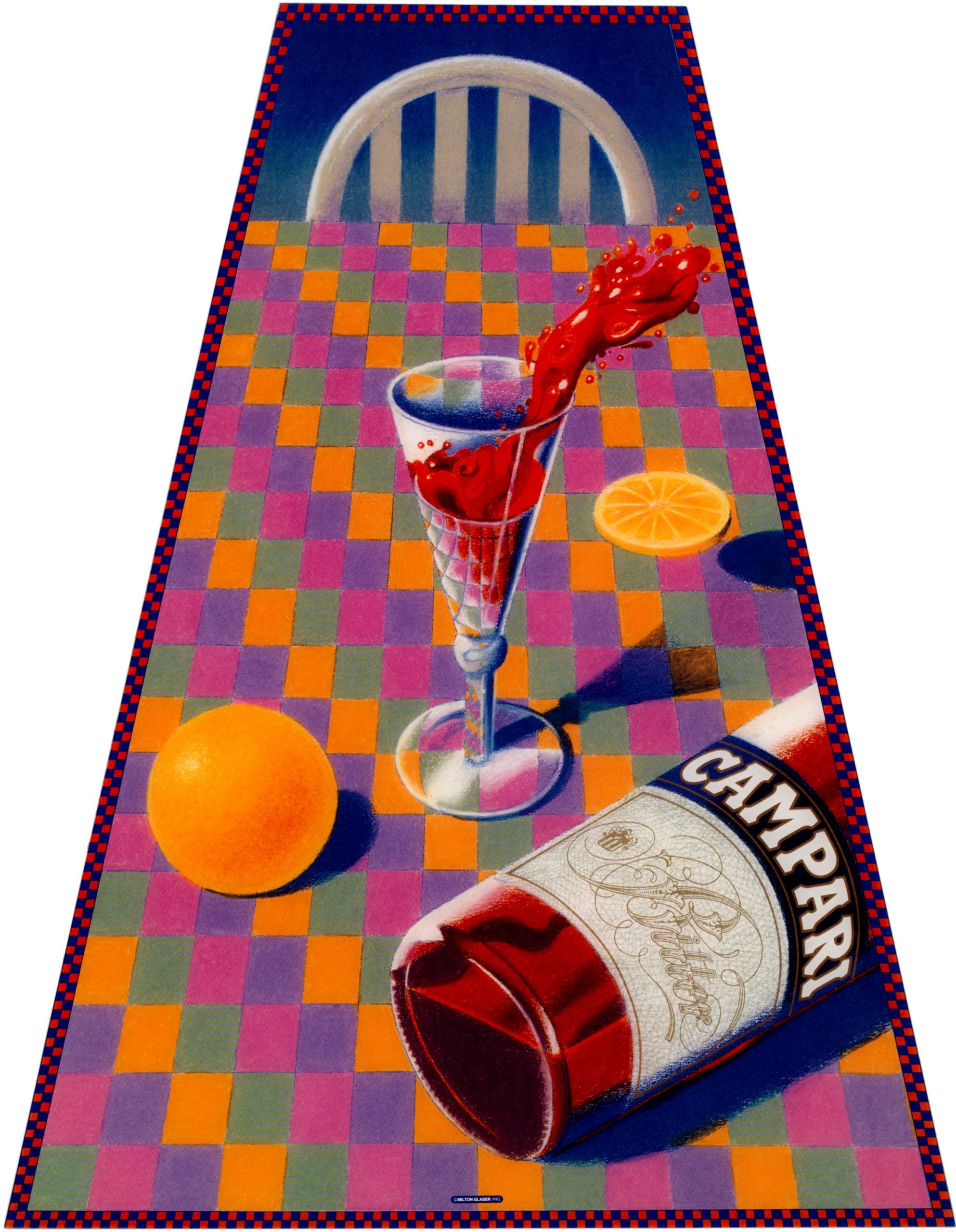
Campari poster

In 1992, Glaser designed a vibrant poster for Italian alcohol brand Campari to promote its famous aperitif, best known for its use in Negroni cocktails.

The poster depicts a trapezoidal view of a table covered with a green, pink, purple and yellow-checkered cloth, on top of which is a bottle of the liqueur and a glass of its dark red liquid spilling over.

11 memorable graphic design projects by Milton Glaser

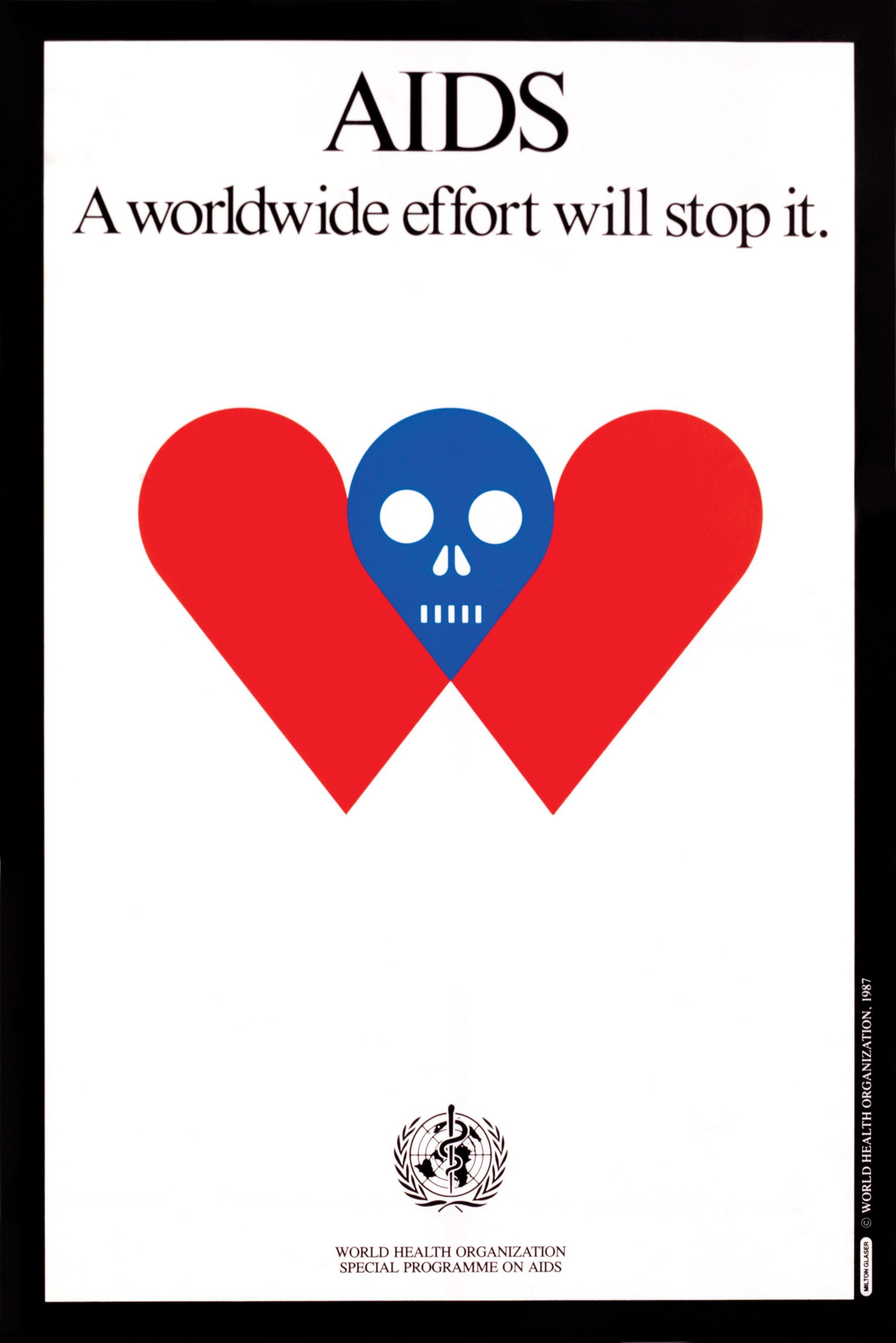
World Health Organisation

Glaser designed a poster for the World Health Organisation (WHO), titled AIDS: A Worldwide Effort Will Stop It.

The poster, released in 1987, featured a simple, red love heart symbol that had been split in half and separated, joined together in its centre by an emblem of a blue skull.

10 memorable graphic design projects by Milton Glaser

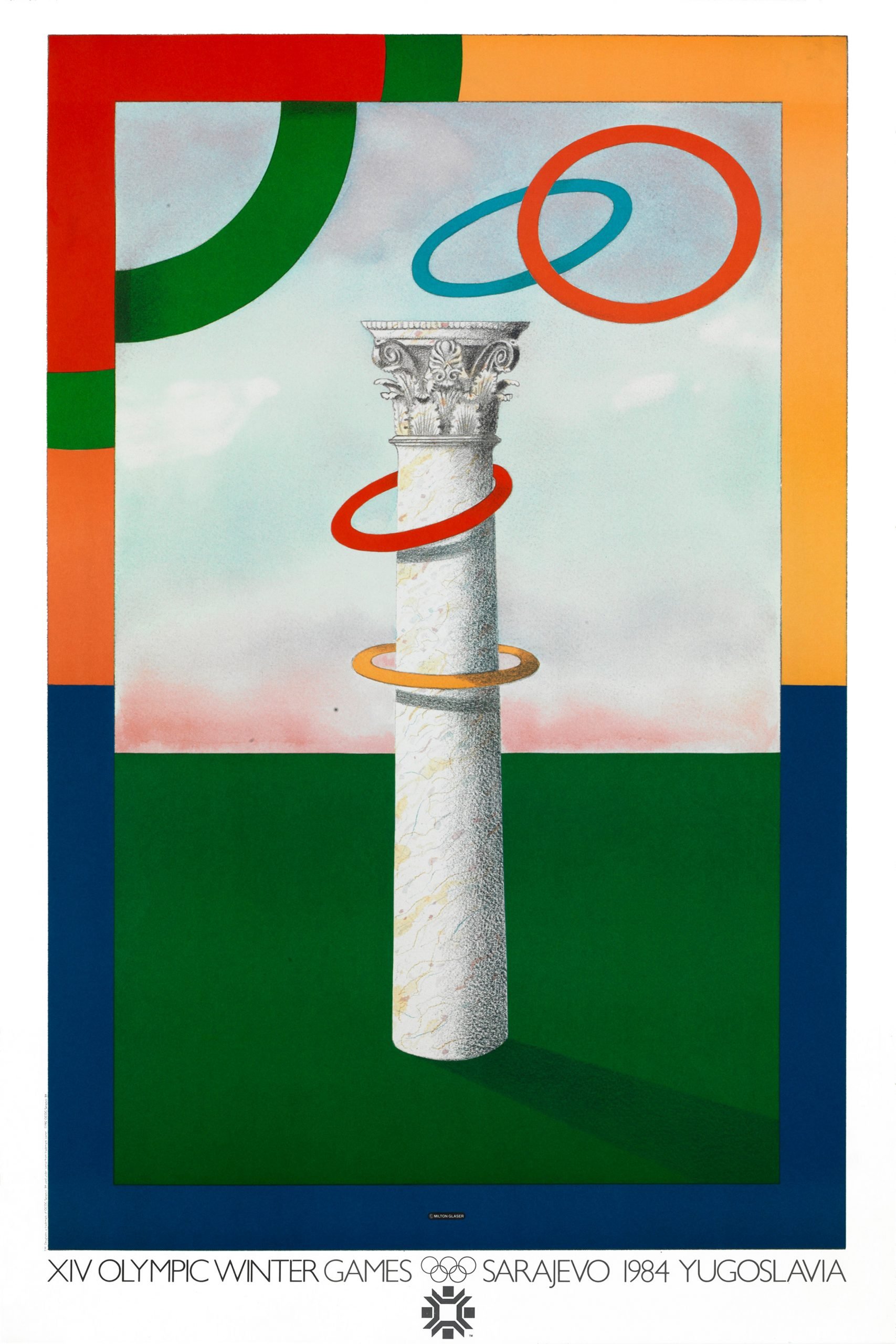
XIV Olympic Winter Games

To promote the 1984 XIV Olympic Winter Games held in Sarajevo, Glaser turned the Olympic symbol into a ring-toss game – with the imaginary player throwing the rings onto a Corinthian-style column.

The traditional Olympic colours of red, green, blue, yellow have been used to create a border around the outside of the poster.


10 memorable graphic design projects by Milton Glaser

It's Not Warming, It's Dying campaign

In 2014 Glaser launched a campaign to raise awareness of climate change. Called It's Not Warming, It's Dying, the initiative aimed to create a greater sense of urgency around climate change.

The campaign's visual identity features a green disc obscured by black smoke to symbolise "the disappearance of light" from the planet.

Images courtesy of Milton Glaser Inc.

The post 11 memorable graphic design projects by Milton Glaser appeared first on Dezeen.


from Dezeen https://ift.tt/2Zlaa2Y
Grove Park house by O'Sullivan Skoufoglou Architects has wooden lining and verdant views

Grove Park by O'Sullivan Skoufoglou

O'Sullivan Skoufoglou Architects has created ash-lined living spaces with expansive windows inside a gardener's home in Lewisham, southeast London.

Grove Park is an end-of-terrace house that was originally built back in the 1980s.

Grove Park by O'Sullivan Skoufoglou

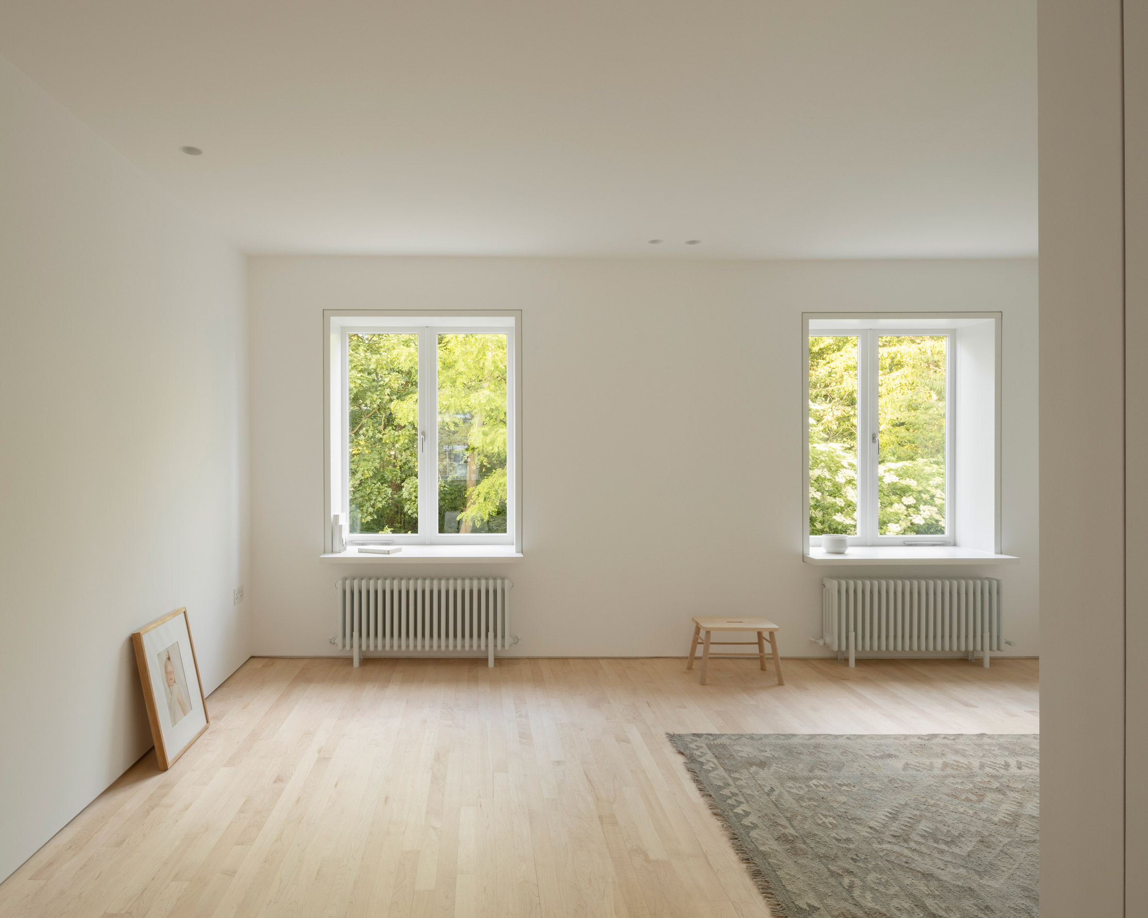
The wood-lined rooms that O'Sullivan Skoufoglou Architects has created are on the home's ground floor, which was extended by incorporating a small garage that was on site.

"The previous ground floor was in real need of repair, with both doors and windows, and the internal cellular, low-ceilinged, cramped and dark layout in bad shape," studio co-founder Amalia Skoufoglou told Dezeen.

Grove Park by O'Sullivan Skoufoglou

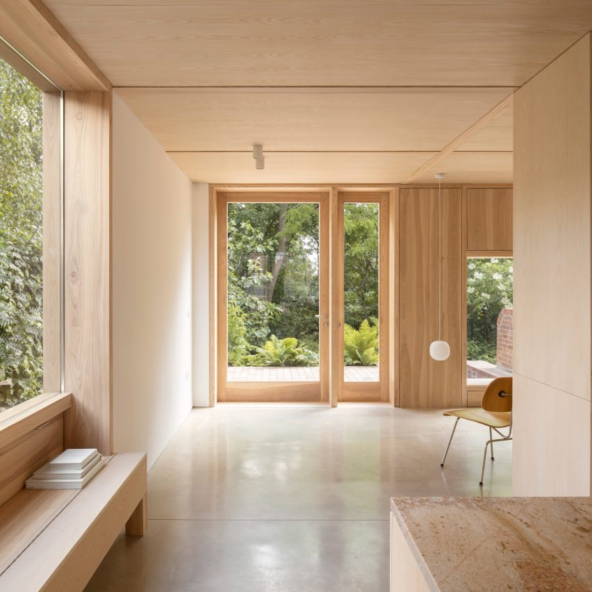
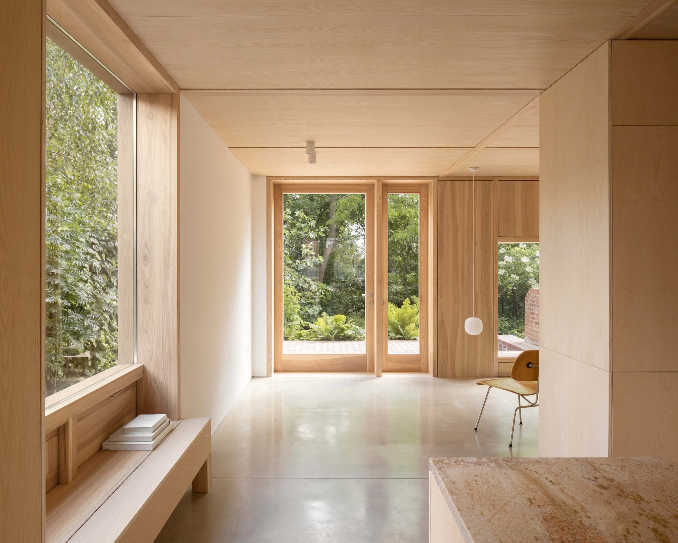
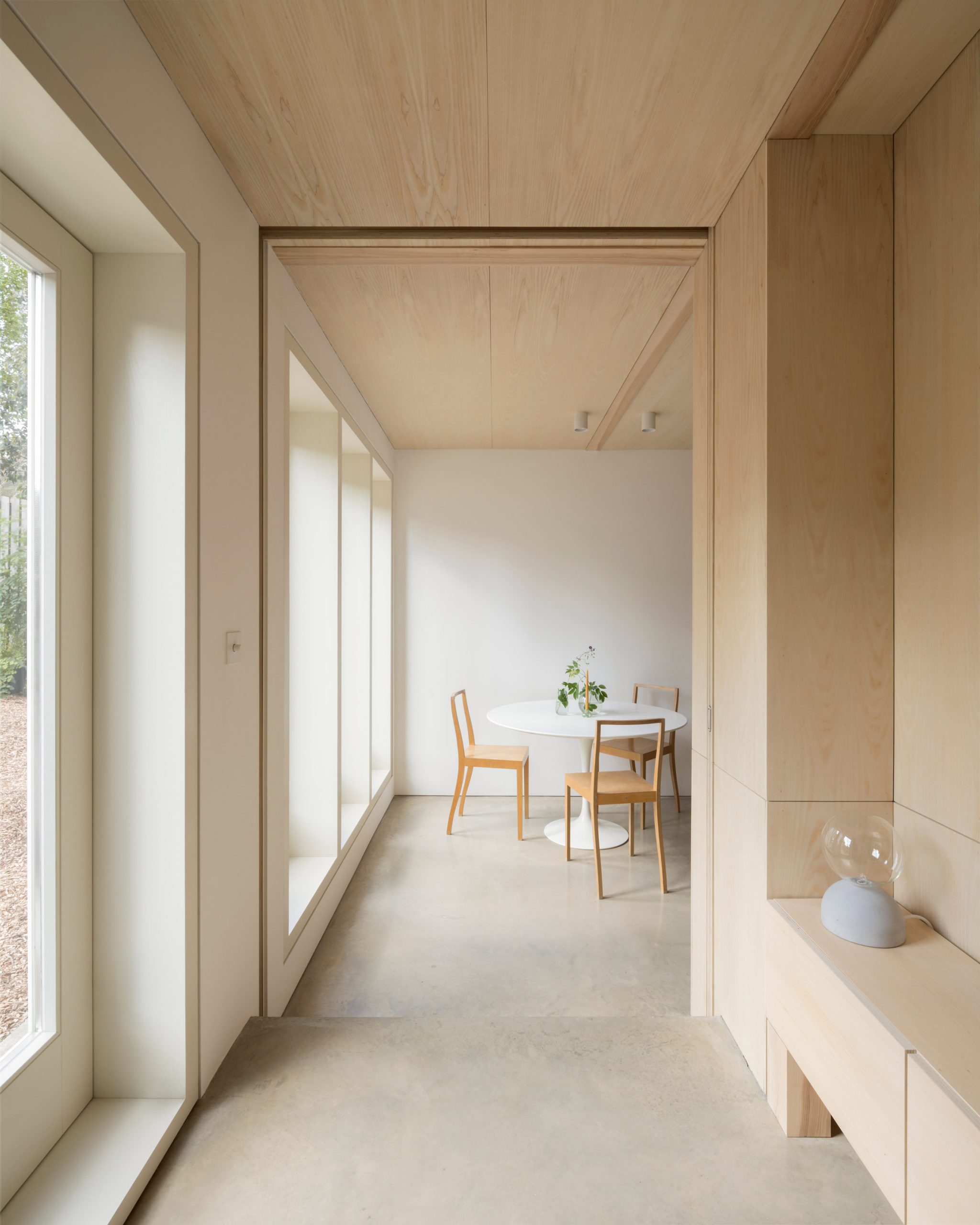
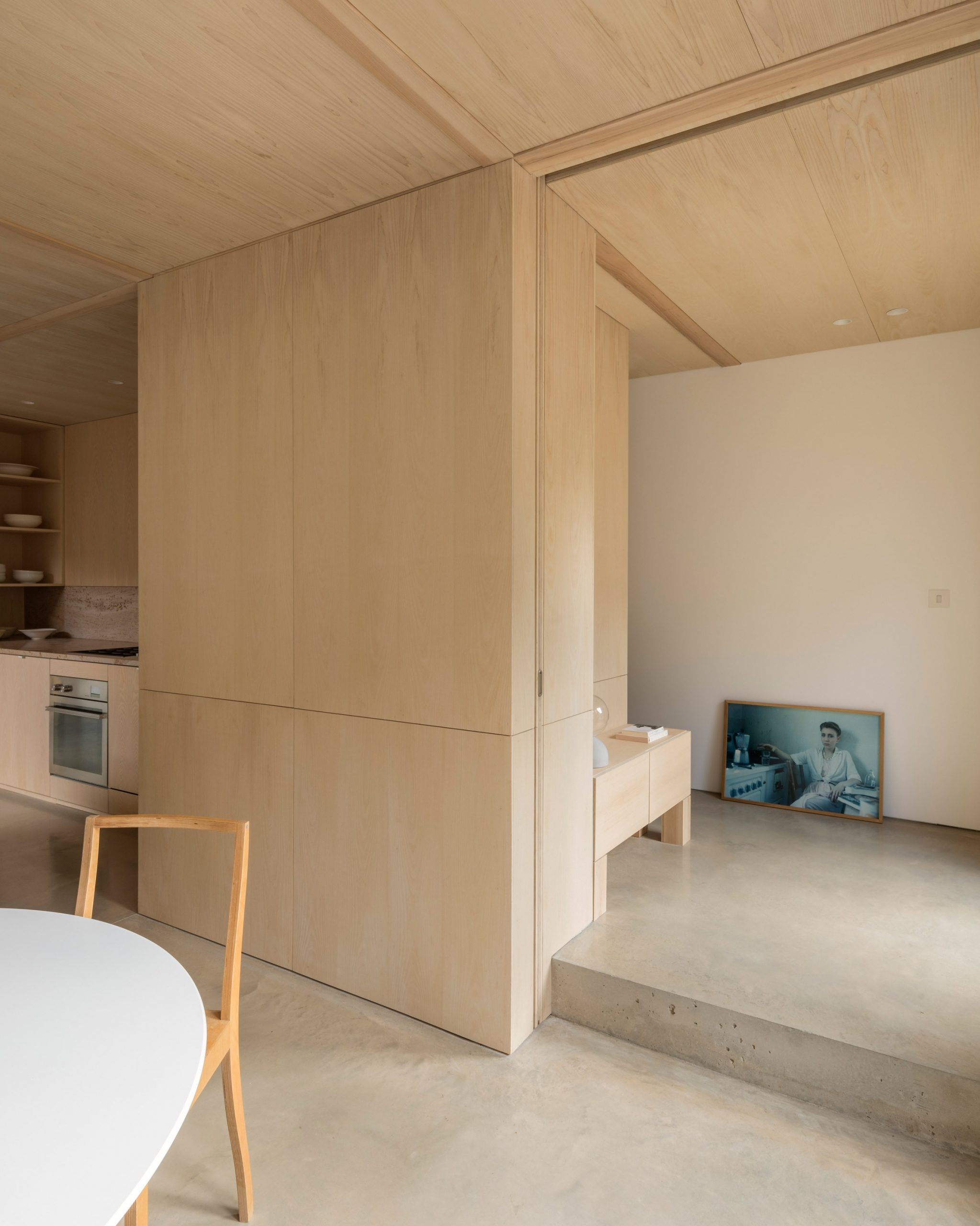
Inside, there's a kitchen, a dining area that faces the street and a lounge which has been orientated towards the garden and the wild woodland that lies beyond.

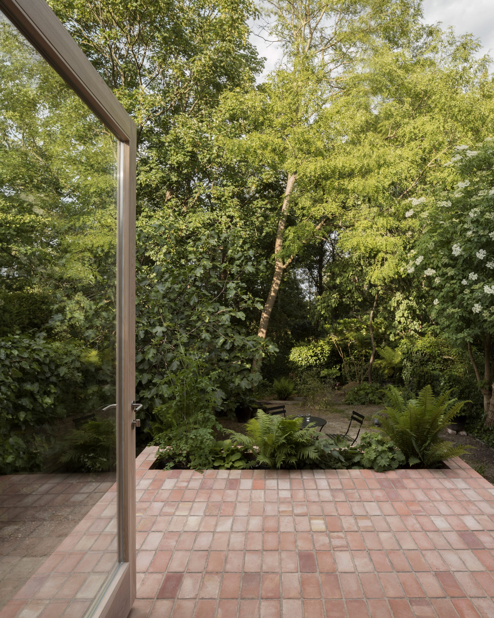
This was done at the request of the client who, being a keen gardener, wanted living spaces to have a close visual connection with the outdoors.

Grove Park by O'Sullivan Skoufoglou

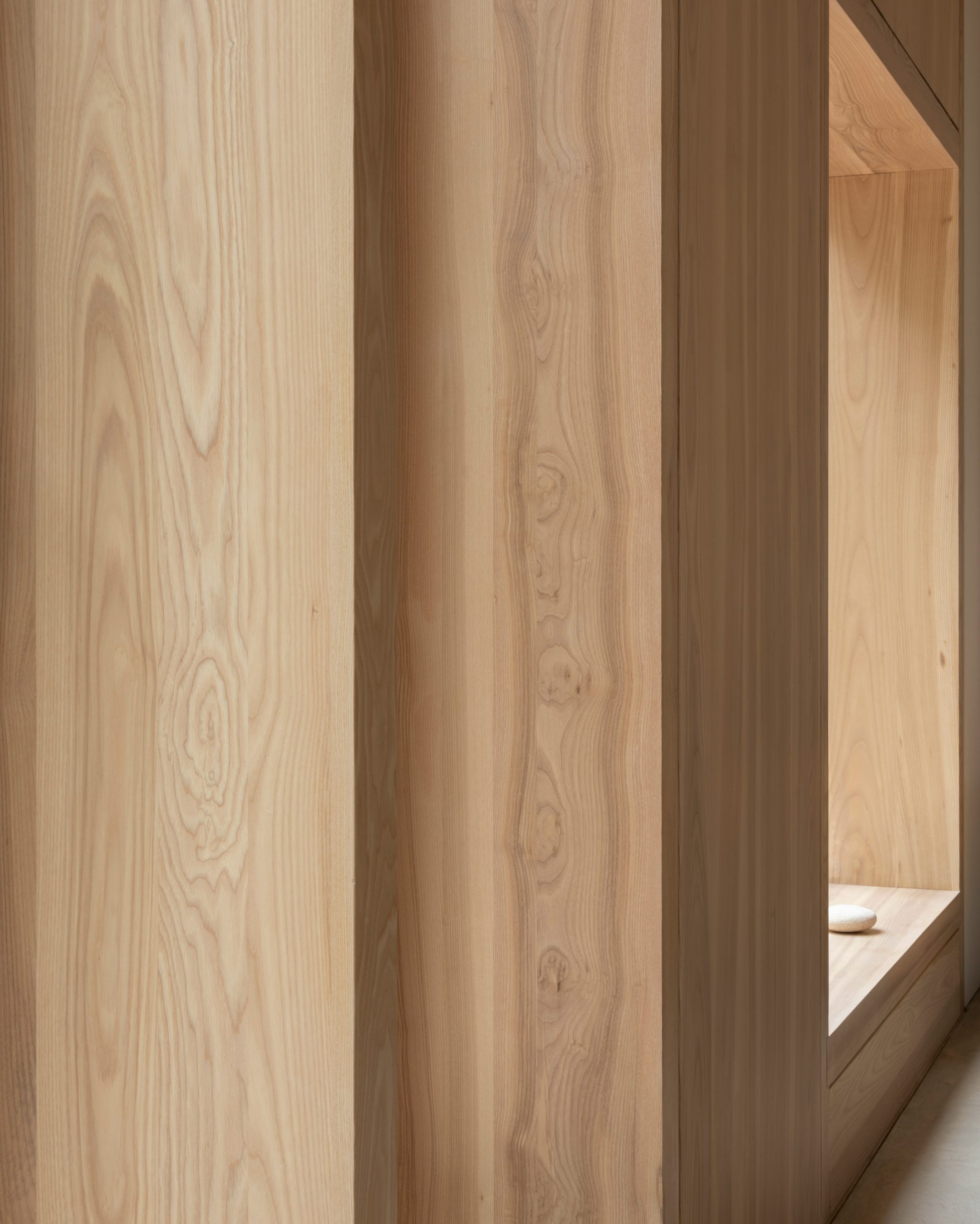
The ceiling is supported by a full-length ash flitch beam – a type of beam typically used in the construction of timber structures, which comprises a central steel plate sandwiched between two wooden panels.

Shorter ash struts extend perpendicularly from the central beam to form a series of rectangular openings.

These have been filled with ash wood panels that were prefabricated off-site, along with the window frames and doors.

Grove Park by O'Sullivan Skoufoglou

"The interior spaces during the summer are surrounded by heavy foliaged trees and cast dark shadows on the interiors," explained Skoufoglou.

"Both maple and ash were considered at the outset for their light appearance and veining. Ash won out in the end because the external timber panelling and doors were made in Lithuania and ash is more readily available."

Grove Park by O'Sullivan Skoufoglou

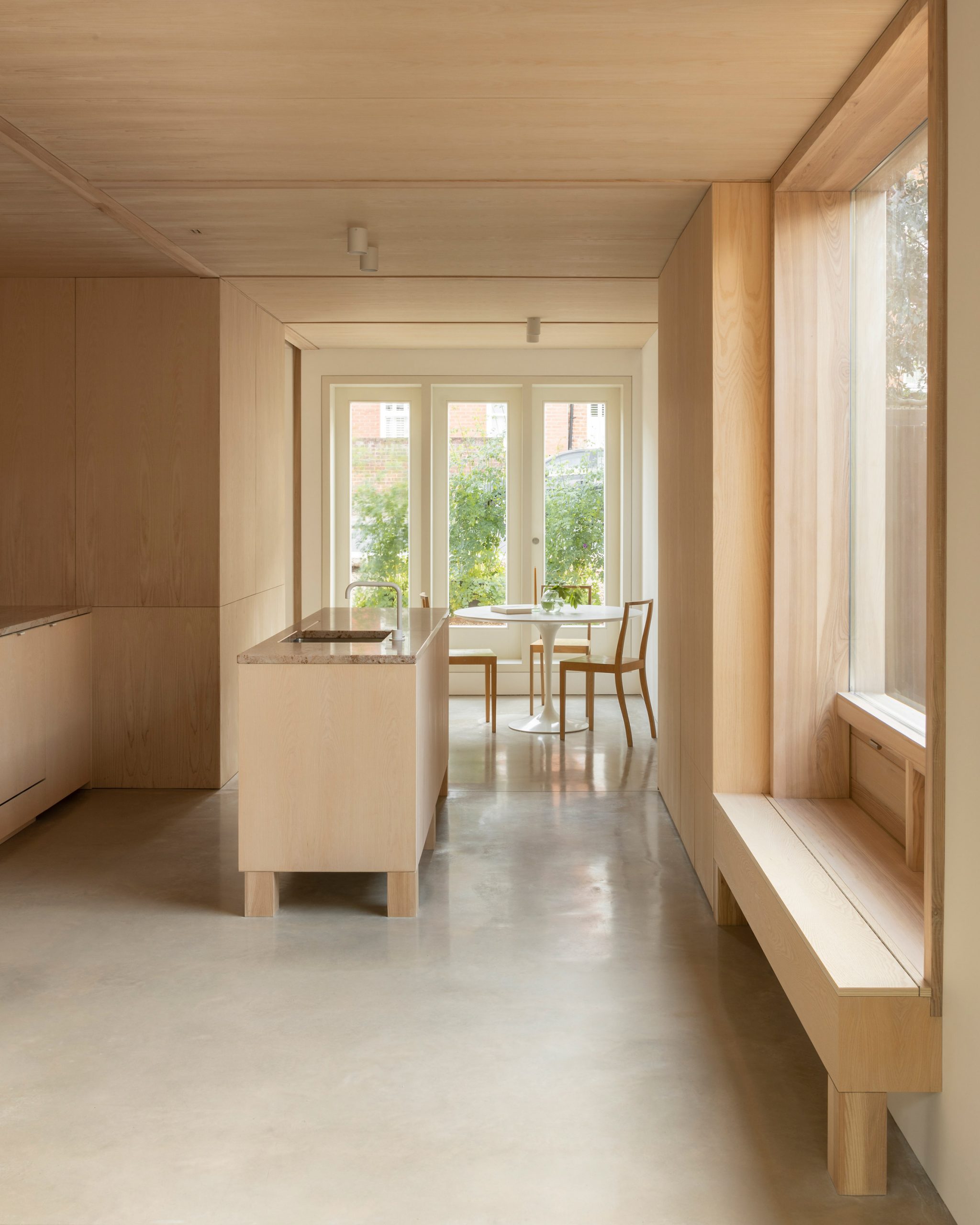
Ash-veneered plywood has then been used to craft the storage cabinetry in the kitchen and the central breakfast island.

Countertops and the splashback running behind the stove are made from creamy Shivakashi granite. The flooring throughout Grove Park is polished concrete, which was cast in-situ.

Grove Park by O'Sullivan Skoufoglou

To reveal another perspective of the garden and bring in additional natural light, a huge picture window has been created in the wall opposite the kitchen.

It has a deep-set frame where a comfy seating nook has been built in.

Grove Park by O'Sullivan Skoufoglou

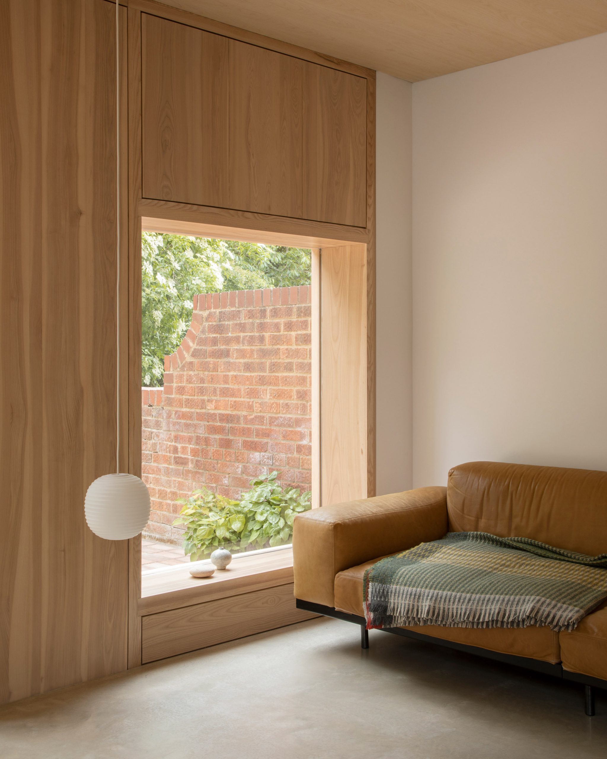
Another picture window features in the ash-lined front wall of the lounge area, which is dressed with a tan-leather sofa and simple spherical pendant lights.

Large panels of glazing have also been inset in the door.

Grove Park by O'Sullivan Skoufoglou

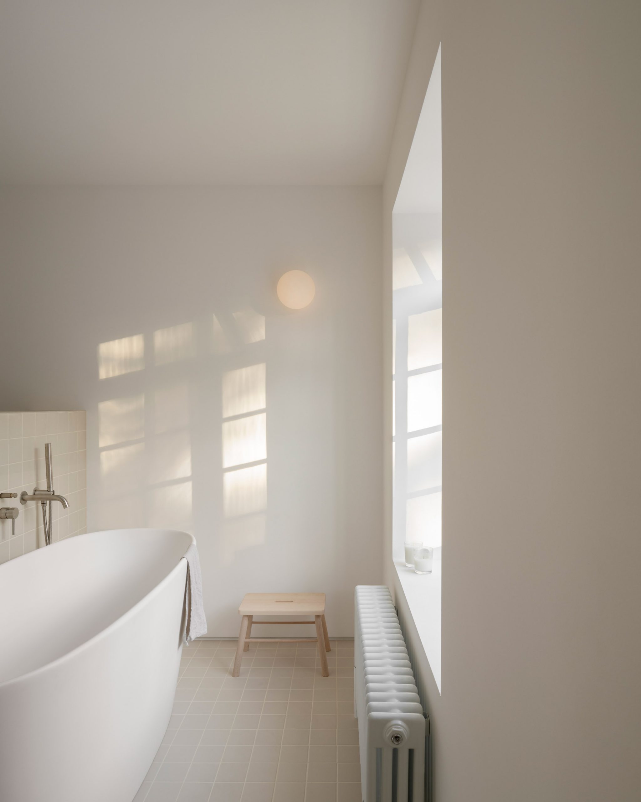
The project additionally saw the studio create a large master bedroom on the first floor of Grove Park house. It has its own en-suite, which has been finished with a freestanding tub and soft-beige tiling.

A stepped terrace has also been built in the back garden, made from red bricks to match the facade of the house.

Grove Park by O'Sullivan Skoufoglou

O'Sullivan Skoufoglou Architects was founded in 2016 by Jody O'Sullivan and Amalia Skoufoglou.

The studio often uses wood in its work. Three years ago it created an extension for a home in northwest London, which featured oak louvres protruding from its front window. In 2018, it also decked out a skincare store in the English town of Stamford with ash and cane wood.

Photography is by Ståle Eriksen.

The post Grove Park house by O'Sullivan Skoufoglou Architects has wooden lining and verdant views appeared first on Dezeen.


from Dezeen https://ift.tt/3dPMVDx

Migrant’s Bureau reveals manifesto for new generation of architects at Virtual Design Festival

In the third and final part of Virtual Design Festival's collaboration with the London Festival of Architecture, social design and urbanism practice Migrant's Bureau reveals its manifesto for a new generation.

Migrant's Bureau's work facilitates design interventions, research, podcasts and community workshops for disenfranchised and migrant communities.

In its manifesto for London Festival of Architecture, Migrant's Bureau describes how it sees the next generation as multifaceted, cross-collaborative, caring, political and inclusive.

Migrant's Bureau for VDF and LFA
Migrant's Bureau hosts workshops and design interventions

"When we first emerged, we recognised the missing link within our respective design industries that only told a single narrative and presented this as a default for all communities to adhere to," Migrant's Bureau director Alisha Fisher said.

"With our knowledge, diversity and the digital community of the Migrant's Bureau team, we are able to translate these narratives that communities can choose to relate [to], foster and create with."

Migrant's Bureau for VDF and LFA
Supper clubs function as an intimate space to share knowledge

The studio's past projects include design interventions, community workshops, and even supper clubs.

"After attending panel discussions and lectures, we decided we'd like a more intimate space to share knowledge and somewhere where you could do this over the process of sharing food," team member Rufus Shakespeare explained.

"It became a space of mutual aid and skill-sharing between collectives and grassroots organisations."

Migrant's Bureau was nominated by architect, project manager and quality assurance champion Yẹmí Aládérun.

"Migrant's Bureau research, curate and design urban interventions within cities, communities & trans-local environments," Aládérun said.

"They seek to interpret the migratory experiences of everyday life, recognising the influence that culture, geography and social circumstances have on lived experiences of the city and its architecture."


Manifestos: Architecture for a New Generation is an annual collaboration between London Festival of Architecture and the Design Museum. It aims to highlight work by an emerging generation of voices in architecture who are expanding the parameters of what architecture can be, who London is for and what its future holds.

The post Migrant’s Bureau reveals manifesto for new generation of architects at Virtual Design Festival appeared first on Dezeen.


from Dezeen https://ift.tt/2ZmshWe

"Celebrating Pride Month feels unavoidably different" say queer designers

LBTQ Pride 2020

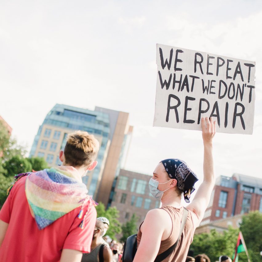
Against the backdrop of coronavirus lockdowns and anti-racism protests, Pride Month 2020 has been about resistance and solidarity say LGBT+ designers.

This year's month-long time of celebration for the queer community has happened in a unique social, political and environmental context that has reaffirmed the need for action, report queer designers from Europe and the USA.

"Celebrating Pride month in these days feels unavoidably different," said Formafantasma co-founder Andrea Trimarchi.

"There is so much forthright and vigorous defiance in the face of a more aggressively hostile external context than we've seen probably since the 1990s," said designer Adam Nathanial Furman.

"There may not be a Pride parade this year, but it is more important than ever to be brave and loud and open to keep up visibility," agreed 2LG Studio co-founder Russell Whitehead.

"Honestly, Pride, to me, has felt more prideful this year," said architectural designer A L Hu. "The spirit of Pride is in resisting."

"We are witnessing the unbearable struggles of the black community"

The coronavirus pandemic saw many Pride events cancelled as part of measures to slow transmission rates, while anti-racism protests have happened around the world following the death of George Floyd at the hands of the police in Minneapolis a few days before Pride Month began on May 25.

In the first few weeks of June two black trans women in America, Riah Milton and Dominique Fells were murdered.

"This year celebrations in many countries were postponed or cancelled or held digitally because of Covid-19," Trimarchi told Dezeen. "But we are also witnessing the unbearable struggles of the black community and even more so of the black trans community."

Together with his partner, Simone Farresin, they are Italian design duo Formafantasma, a design studio based in the Netherlands with a focus on sustainability.

Trimarchi believes that it is extremely important that the queer community shows solidarity with the black community as the safety of both is often threatened by similar forces.

"While it is very much important to recognise the specificity of each minority and to do not generalise it is also important to recognise that the political forces that are shaping our lives and undermining the rights of the queer community are also very often the ones that threaten the safety of the black people and that do not recognise the ecological crisis we are all drowning in and the clear cause of the recent pandemic," said Trimarchi.

"It is vital to realise that ecological crimes and social injustice are born from the same heteronormative, very often western culture we must rethink."

"The spirit of Pride aligns with the spirit of Black Lives Matter"

British interior designer Whitehead believes that the oppression faced by black and trans people should be at the forefront of the LGBT+ community's focus this year. Whitehead and his partner Jordan Cluroe are the founders of 2LG Studio, which stands for Two Lovely Gays.

"At this time, in particular, black trans lives are under threat and must surely be the focus of Pride," Whitehead told Dezeen.

A L Hu, a queer, non-binary person of colour working as an architectural designer at Solomonoff Architecture Studio in New York, agreed.

"The spirit of Pride aligns with the spirit of Black Lives Matter," said Hu.

New York has seen numerous protests against racism and rallies in support of the black trans community. On 14 June 15,000 people took to the streets dressed all in white for the Brooklyn Liberation march for black trans lives. Protests against police brutality were at the forefront of the Queer Liberation march in New York on 28 June.

"The spirit of Pride is creating the space you need to thrive but has been denied by the structures of society," Hu told Dezeen.

"The spirit of Pride is breaking out of the storylines and stereotypes that have been written for you, and fighting for your right to exist and live even when violence and death threaten to annihilate.

Solidarity with Black Lives Matter is "an obvious choice"

However, current anti-racism protests demonstrate that Pride should return to its revolutionary roots believes Hu.

"I hope it's clear now to allies that parades and celebrations hosted and funded by corporate interests are not what Pride is about, no matter how beautiful and festive and fun and inclusive those events can be," they said.

"The fact that Stonewall was a riot and the civil rights protests were written off as 'riots' makes solidarity with Black Lives Matter an obvious choice."

Seeing queer activists organise against violence directed at black and trans lives in 2020 has been inspiring, said Nathanial Furman, a London-based queer designer of Argentine, Japanese and Israeli heritage, particularly when trans rights in the UK and US are under threat.

"Overall there is still plenty more solidarity and love, and forceful support for those within our coalition who are most vulnerable," he said.

"It has been with true pride, rather than 'Barclays Pride' or 'Ernst & Young Pride', that I've watched the radical and outspoken aspects of the community come back to the fore."

However, prejudice is still rife in the design industry believes Furman.

"Queers and other minorities are accepted into the profession if they manage to make it past the barriers, so long as they design artefacts that are not recognisably different from those that would be designed by those who tolerate them," he told Dezeen.

"They want any form of expression that is not their own to be contained in sanitised, temporary events, parades that make them feel they are inclusive for turning up and waving a flag but really leave our cities as entirely their territory, as machines for the constant reinforcement of the status quo, for all the other 364 days in the year."

The commercialisation of Pride Month, said Trimarchi, has also allowed corporations to exploit the LGBT+ community and pollute the environment for too long.

"Let's forget about the stupid rainbow gadgets that brands are polluting the world with, appropriating a flag that doesn't belong to them," he said.

The main image is by Life Matters via Pexels.

The post "Celebrating Pride Month feels unavoidably different" say queer designers appeared first on Dezeen.


from Dezeen https://ift.tt/3g9BGqS