Thursday 13 August 2020

Casa Atibaia designed to be "ideal modernist jungle home"

Casa Atibaia renderings designed by Charlotte Taylor and Nicholas Préaud

Creatives Charlotte Taylor and Nicholas Préaud took cues from the modernist architecture of Lina Bo Bardi to dream up these renderings of Casa Atibaia, an imaginary home that hides in a São Paulo forest.

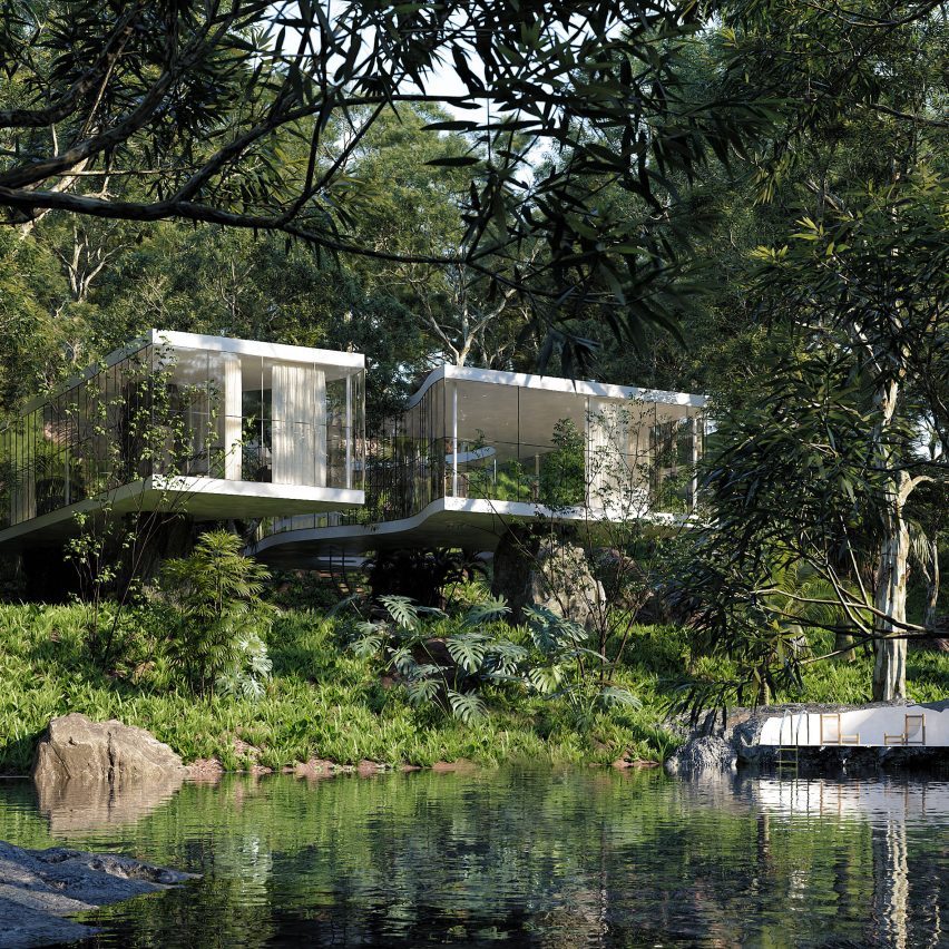
In a series of ultra-realistic renderings, the pair have envisioned Casa Atibaia to be nestled amongst the forested banks of the Atibaia river in São Paulo.

This is the first collaborative project between Préaud, who is co-founder of 3D visualisation practice Ni.acki, and Taylor, who runs Maison de Sable, a studio that works with a range of visual artists to create fictional spaces.

Casa Atibaia renderings designed by Charlotte Taylor and Nicholas Préaud

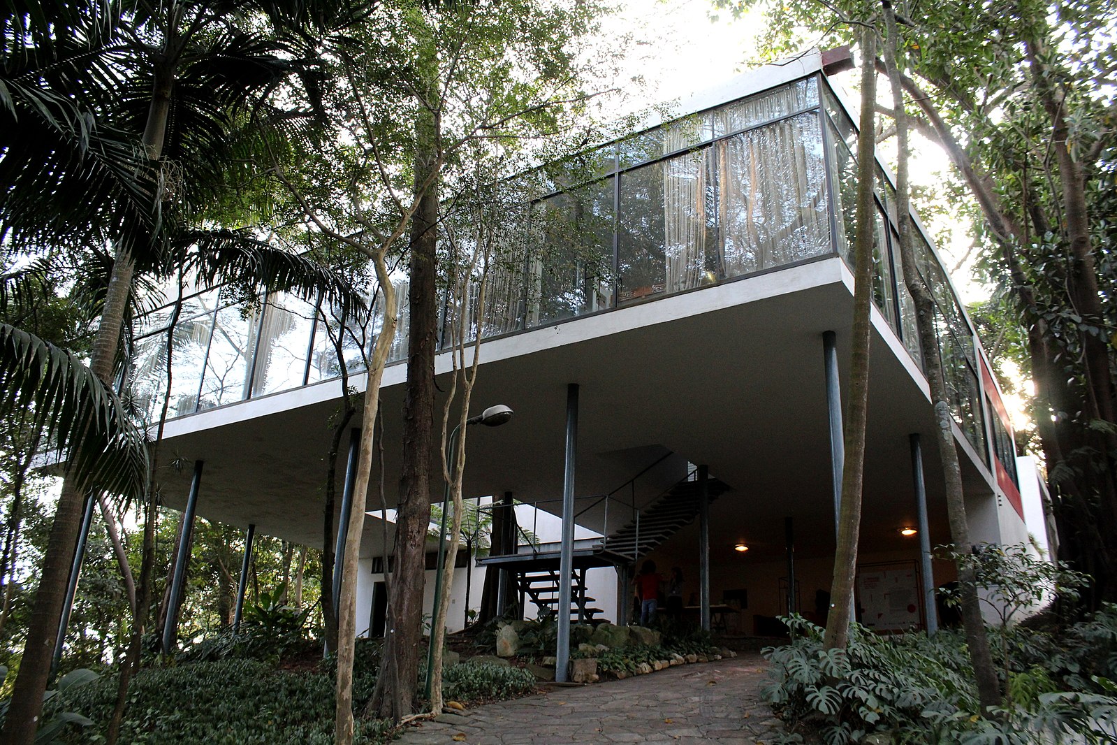
The imaginary home was informed by Casa de Vidro, or Glass House, which Italian-born Brazilian architect Lina Bo Bardi designed in 1951 for herself and her husband, writer and curator Pietro Maria Bardi.

Comprising a concrete and glass volume supported by slim pilotis, the house is considered a significant example of Brazilian modernism – an architectural movement that both Taylor and Préaud have come to admire during their careers.

Casa Atibaia renderings designed by Charlotte Taylor and Nicholas Préaud

"Lina Bo Bari has been a huge inspiration for the most part of my career," Taylor told Dezeen.

"Discovering Nicholas had an equal passion and excitement towards Brazilian modernism was a perfect match, something we had to explore."

"Having lived and studied architecture in Brazil, I was overwhelmed by the presence and national pride around modernist jewels such as Casa de Vidro or Casa das Canoas by Oscar Niemeyer," continued Préaud.

"These homes have become landmarks not only for their style and modern construction methods at the time, but also because of the simplicity of the lifestyle they implemented."

Casa Atibaia renderings designed by Charlotte Taylor and Nicholas Préaud

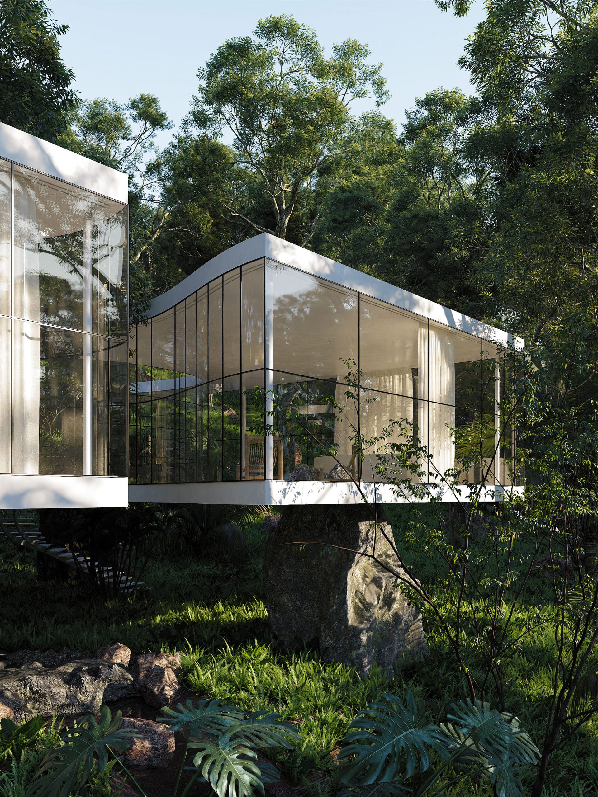
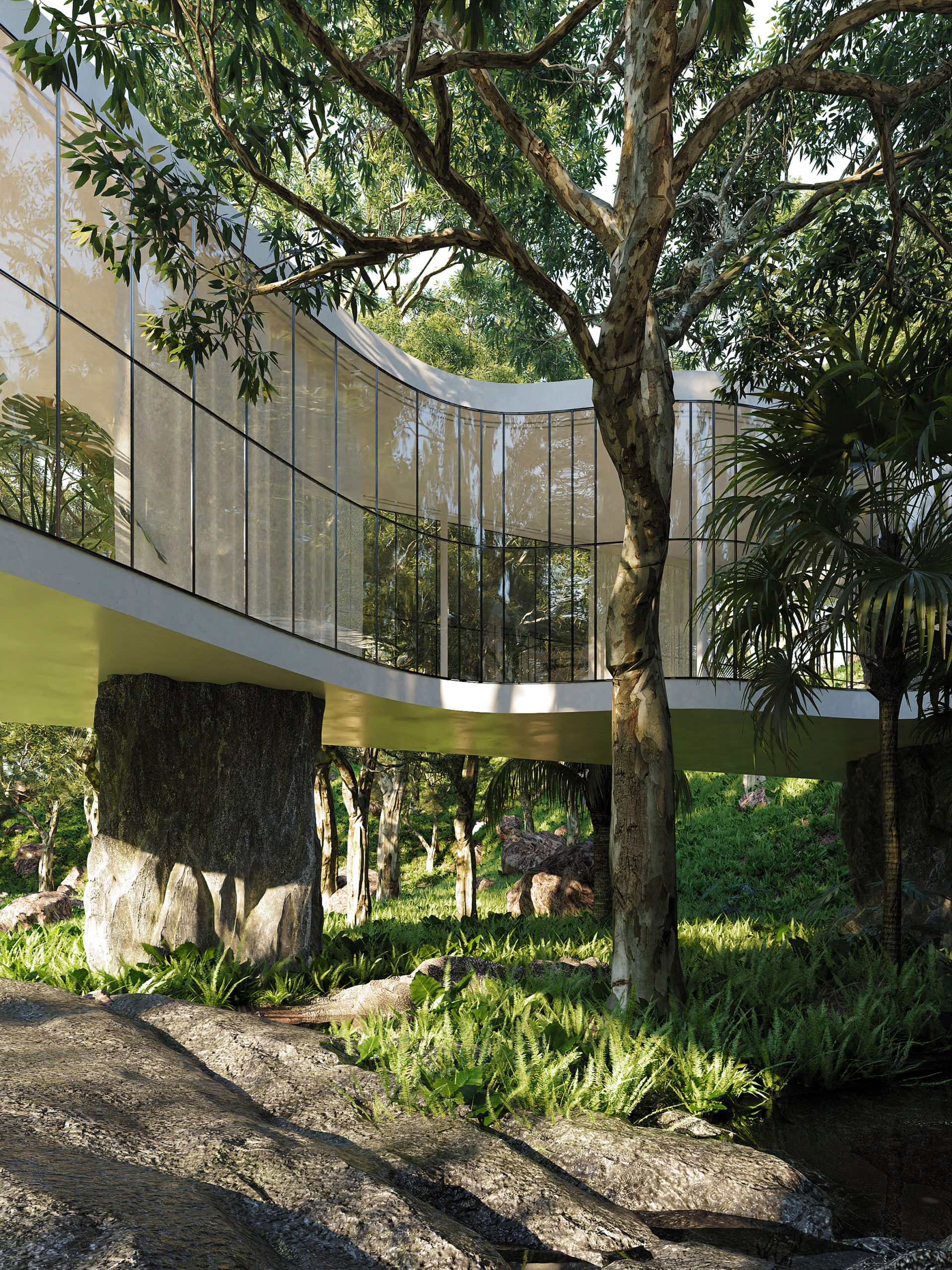
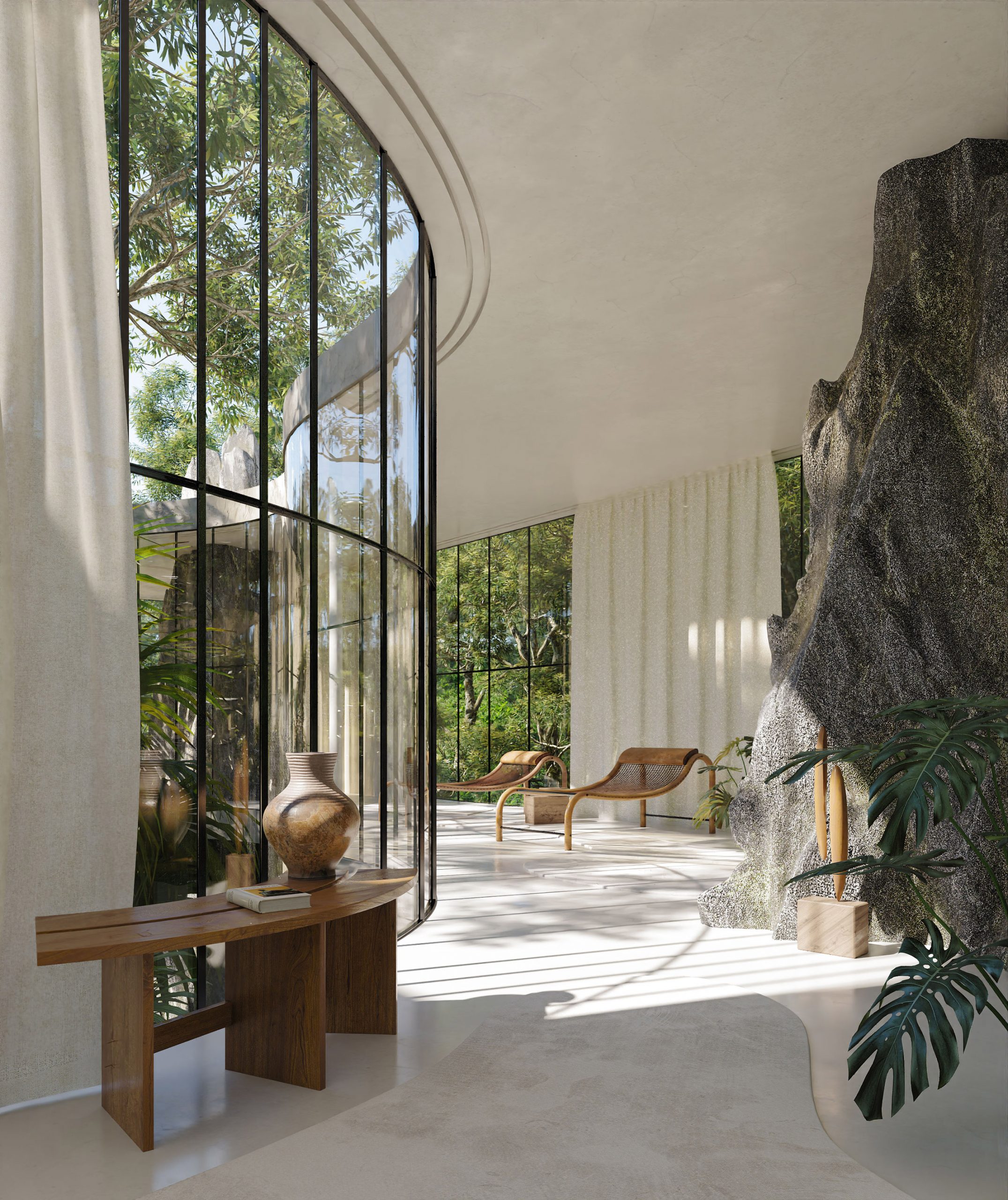
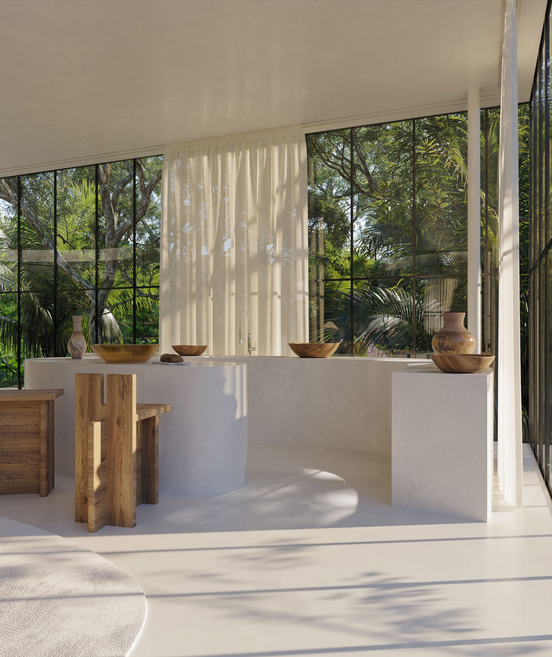
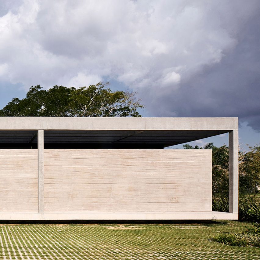
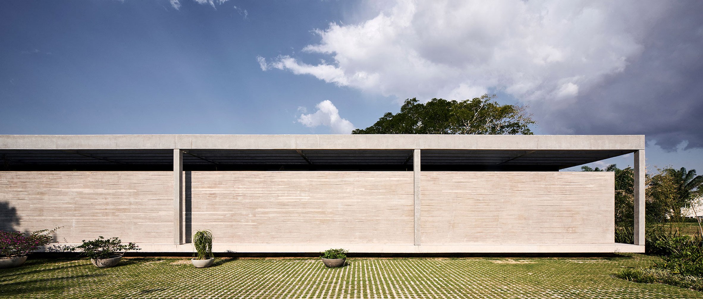
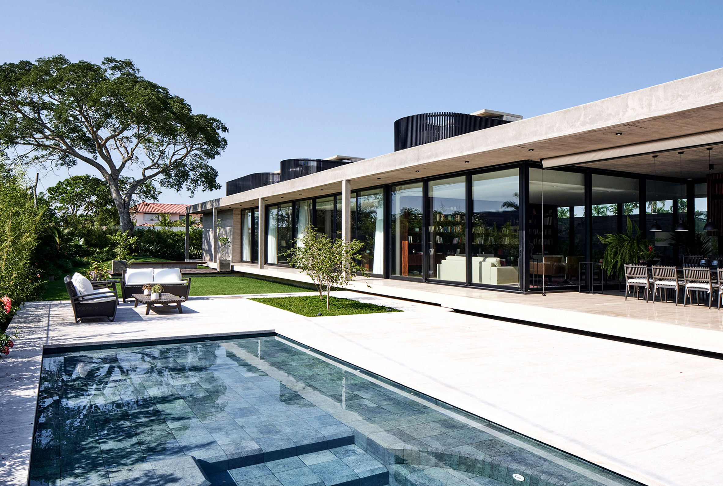
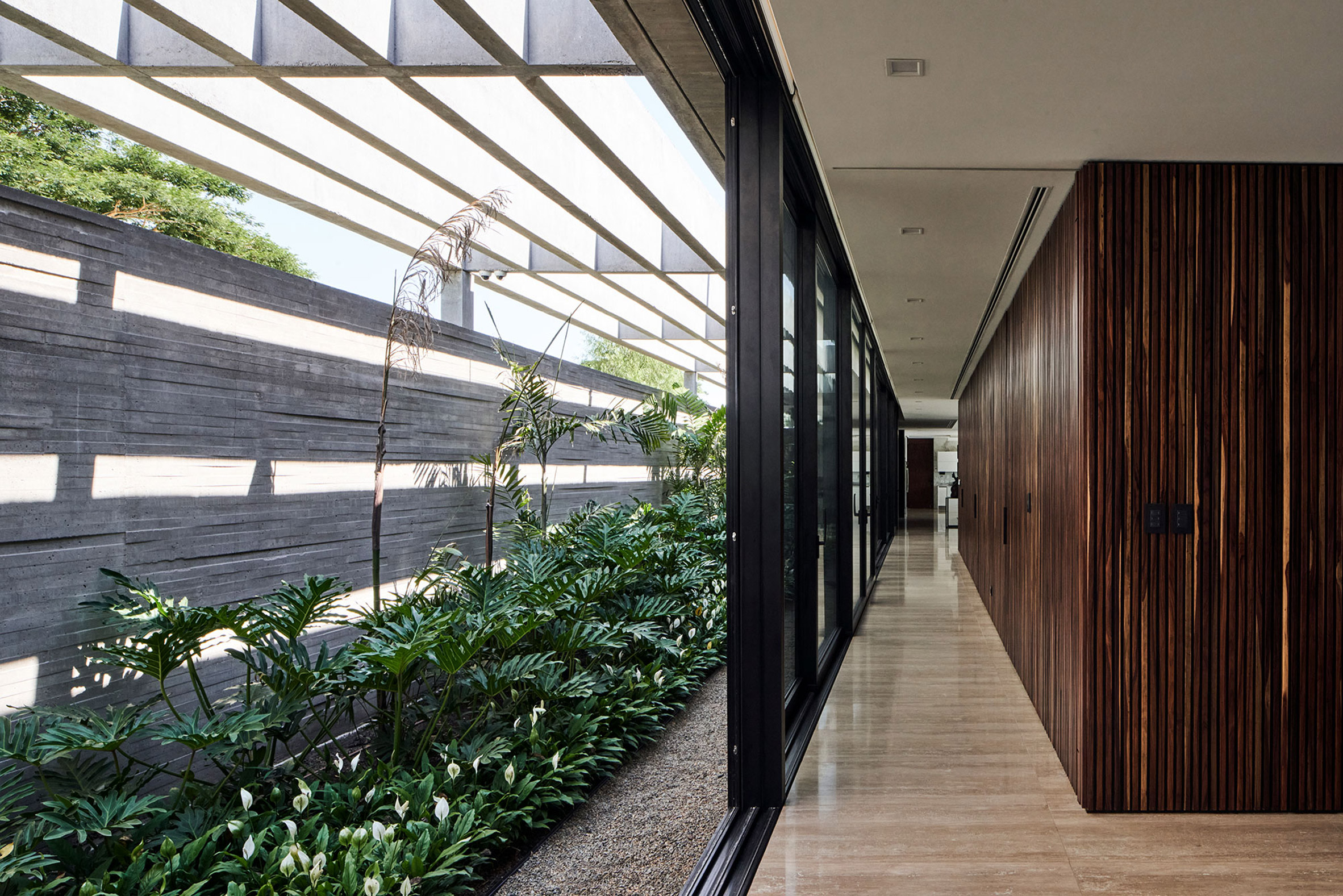
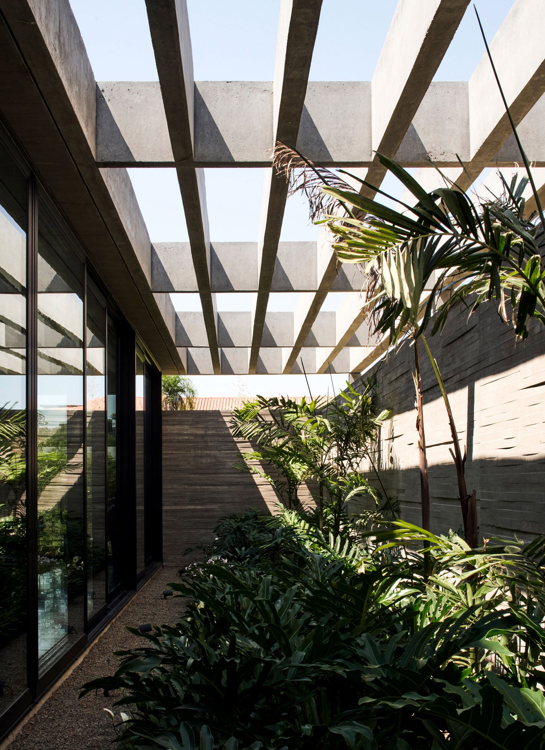
Like Bo Bardi's Casa de Vidro, the imaginary Casa Atibaia features a white-concrete framework and expansive glass windows.

However, instead of pilotis, this house would instead be elevated by huge jagged boulders that jut out from the terrain below.

Casa Atibaia renderings designed by Charlotte Taylor and Nicholas Préaud

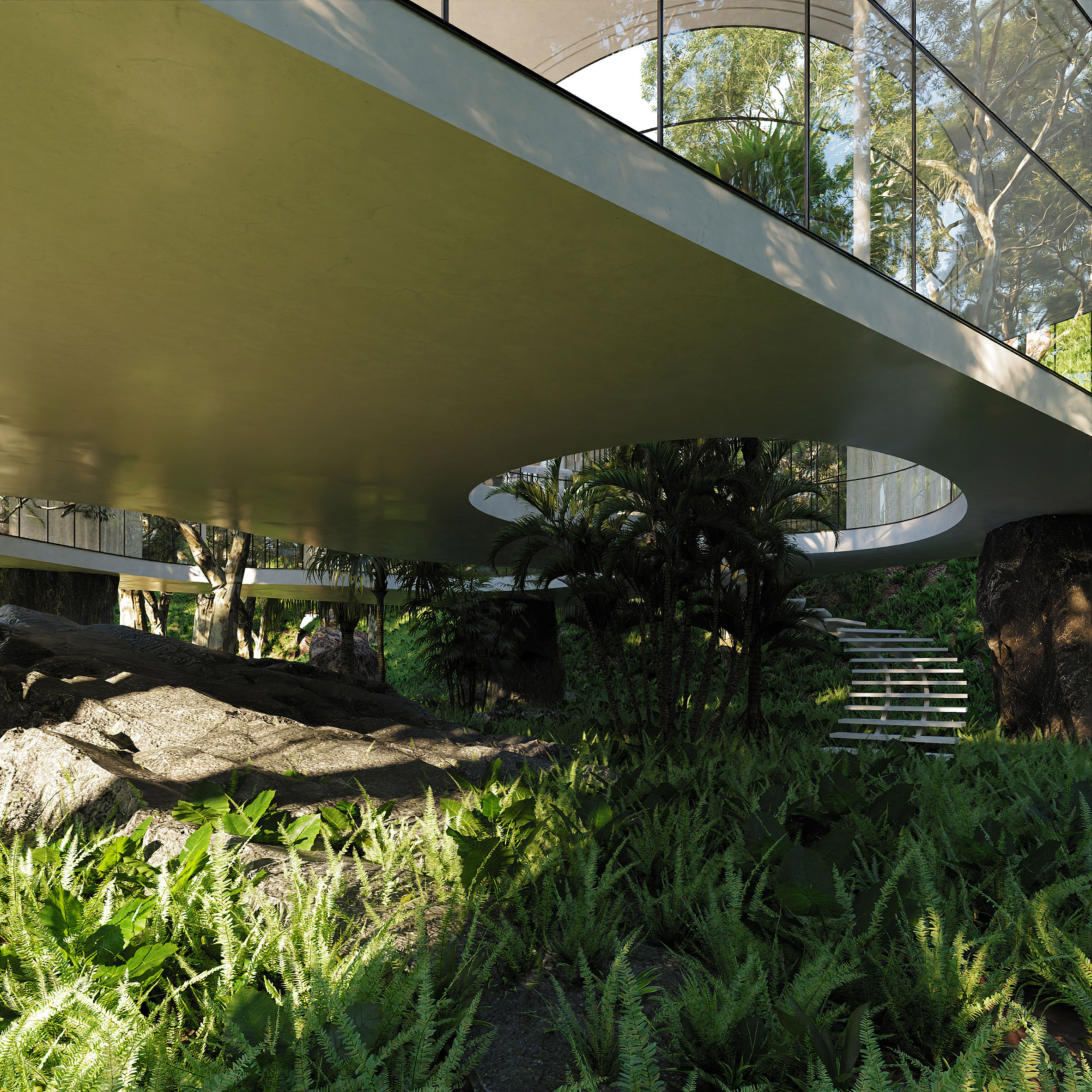
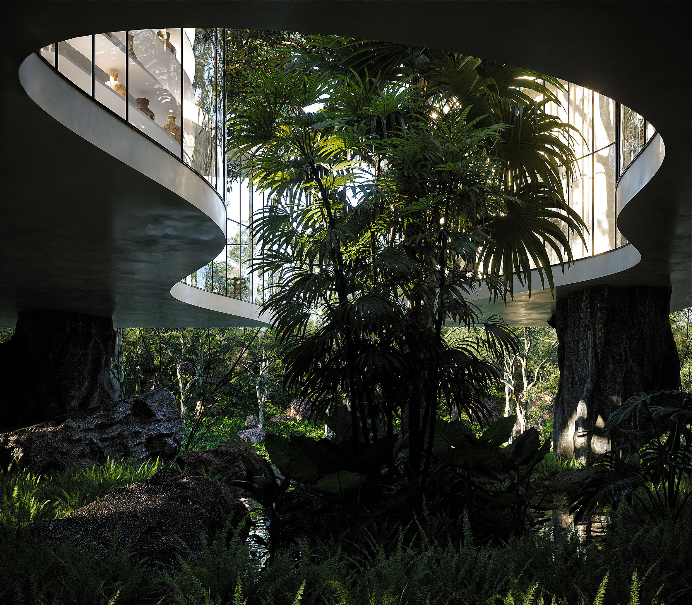
Taylor and Préaud's creation would also be much more sinuous in shape – the river-facing elevation of winding inwards to form a courtyard around a cluster of existing palm trees.

This courtyard would help loosely separate the private and communal quarters of the home.

"Lina Bo Bardi's Casa de Vidro was an inspiration mostly in terms of this ethereal feeling of a delicately suspended home... gentle curves, extended raw concrete slabs and a primal relationship with the elements are our tribute to Brazilian modernism," the pair explained.

Casa Atibaia renderings designed by Charlotte Taylor and Nicholas Préaud

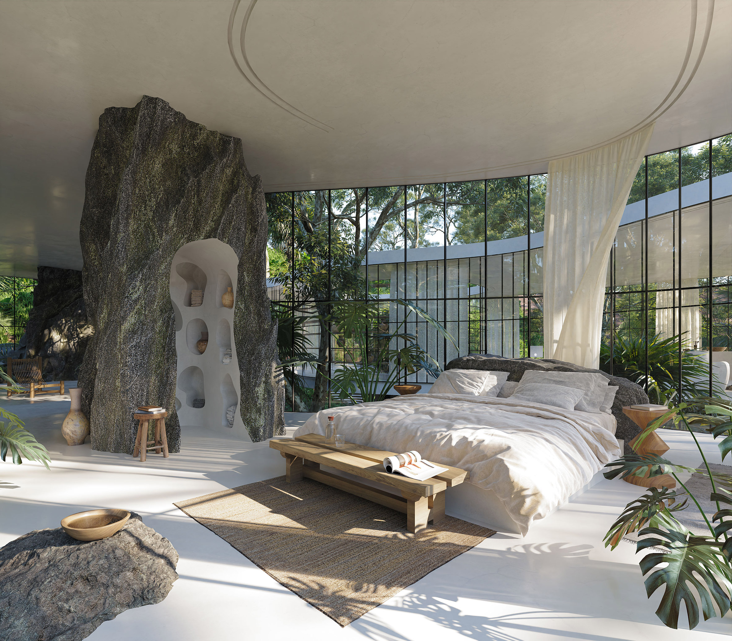
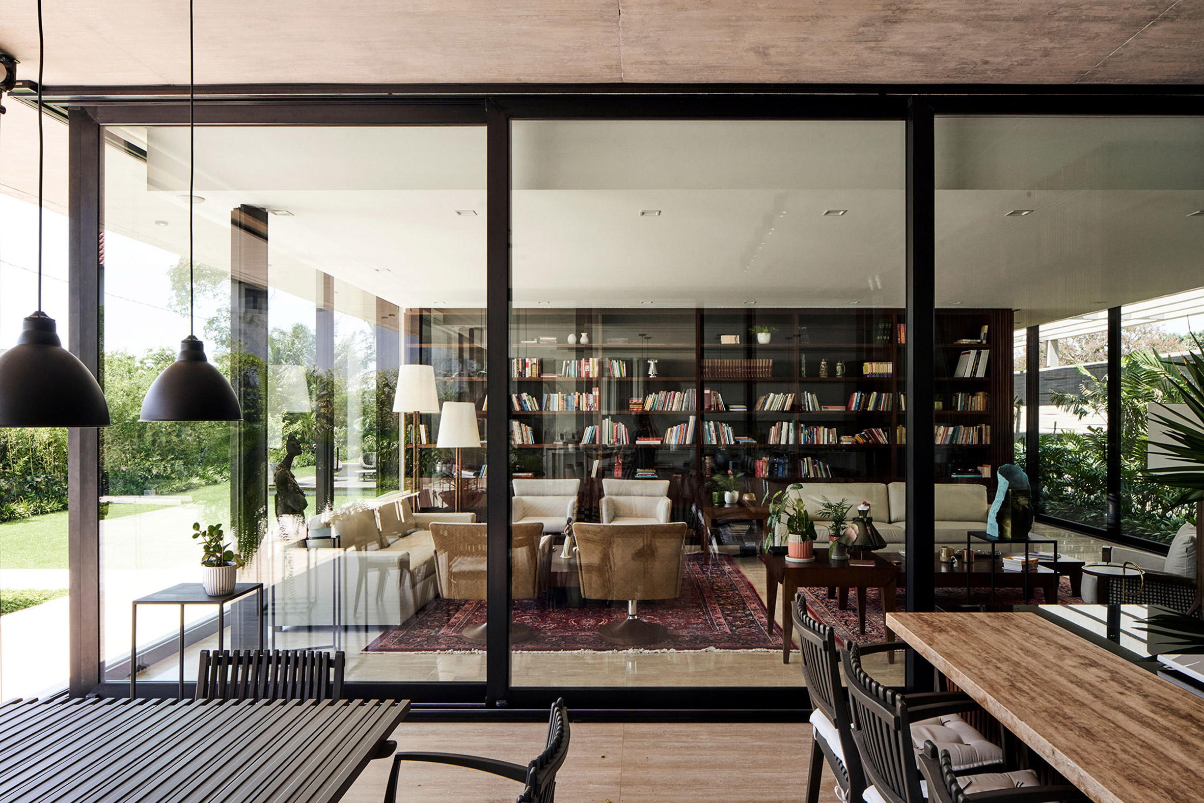
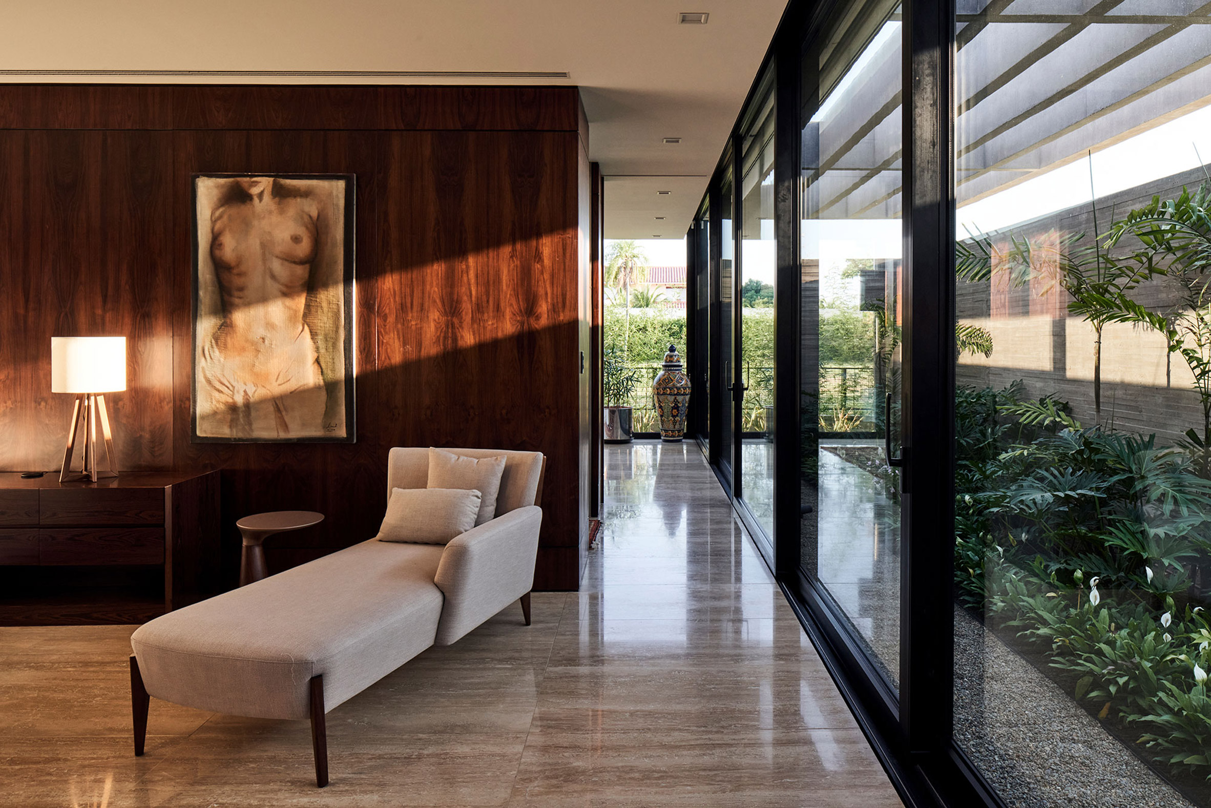
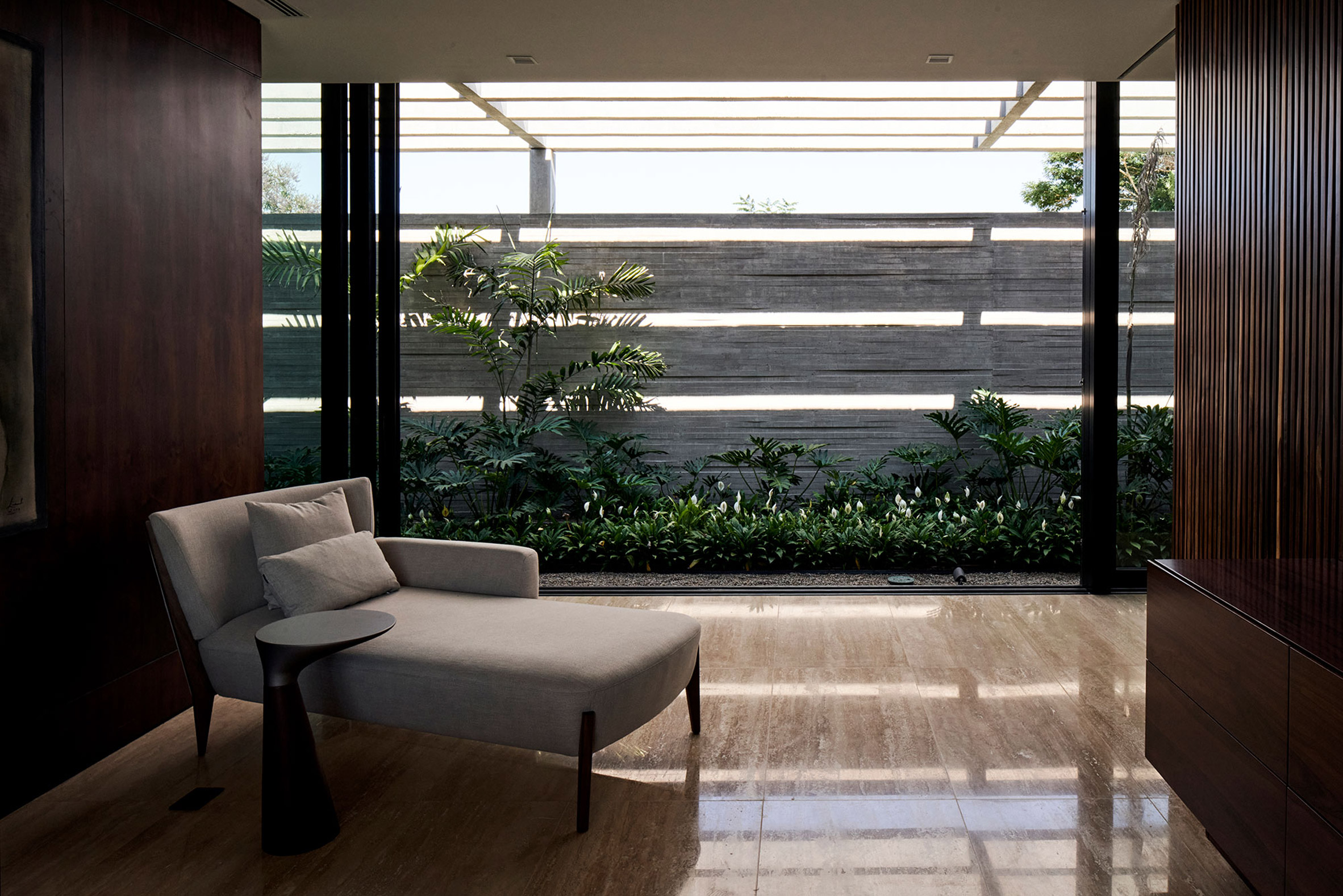
Some of the boulders propping up the home would pierce through the interior and be adapted into functional elements like bookcases, a bed headboard, or craggy plinths for displaying earth-tone vases.

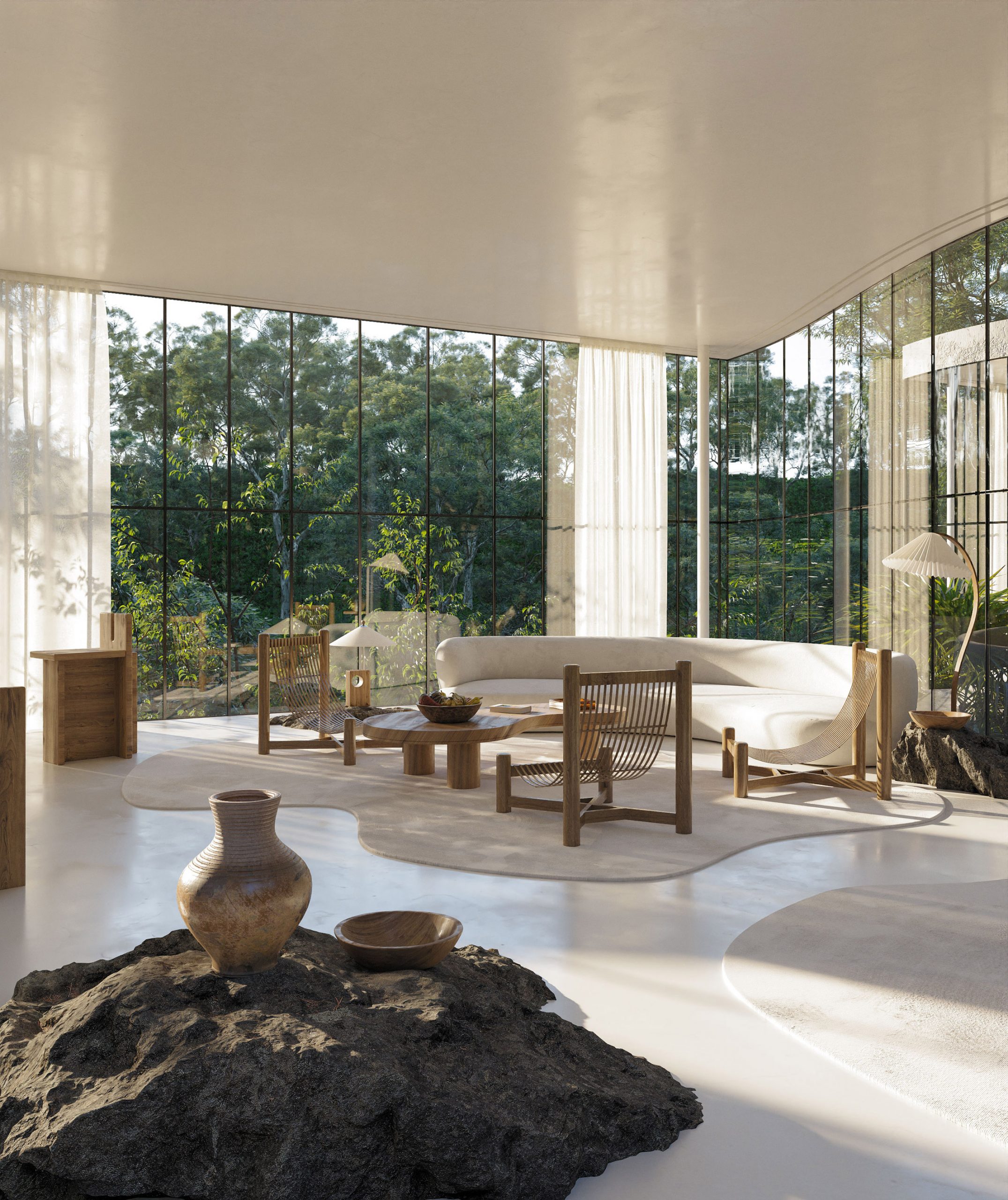
In the living room, a curving cream-coloured sofa is accompanied by a couple of sloping armchairs and a floor lamp with a concertina-fold shade.

Wooden high-back chairs surround the stone breakfast island in the adjacent kitchen.

Casa Atibaia renderings designed by Charlotte Taylor and Nicholas Préaud

The home would otherwise be dressed with a blend of contemporary and antique decorative pieces, ideally from the likes of French designers like Charlotte Perriand and Pierre Chapo.

"It would definitely be a dream home for us in another life," added Taylor and Préaud.

Casa Atibaia renderings designed by Charlotte Taylor and Nicholas Préaud

"Casa Atibaia is a design experiment in which we combined both our impressions and aspirations of the ideal modernist jungle home," the pair continued.

"Through this experiment we sought to squeeze out the essence of what Brazilian modernism means to us, blurring the boundaries between inside and out while maintaining a cosy, homey feeling."

Casa Atibaia renderings designed by Charlotte Taylor and Nicholas Préaud

Charlotte Taylor was one of nine individuals to feature in Dezeen's roundup of 3D designers, visualisers and image-makers.

She said the recent rise of dreamy renderings coming from the likes of her and Préaud may be down to the fact that, in light of the global coronavirus lockdowns, the appetite for escapism is "at an all-time high".

Earlier this year, in response to the pandemic, Child Studio designed Casa Plenaire – a fictitious seaside villa where those stuck at home could imagine having the "perfect holiday".

The post Casa Atibaia designed to be "ideal modernist jungle home" appeared first on Dezeen.


from Dezeen https://ift.tt/2CotzIX

Dewi van de Klomp's foam furniture morphs and sags in response to its contents

Dewi van de Klomp designs Soft Cabinets from foam rubber

Books, plates and glasses are engulfed by the squishy shelves of Dutch designer Dewi van de Klomp's Soft Cabinets, which are made from foam rubber in a bid to bring more attention to the "overlooked" material.

Van de Klomp's Soft Cabinets were born from research into various materials that can be found around the house and would otherwise go unnoticed.

The Utrecht-based designer came across a piece of bright pink foam rubber – a material typically used for cushioning in car seats and wall insulation – and "fell in love" with its potential.

Dewi van de Klomp designs Soft Cabinets from foam rubber

Drawn to the unique texture, colour and shape of the foam, van de Klomp started to experiment with using it to make a series of objects in an attempt to show the material's "poetic side".

"The foam is a relatively overlooked material even though everybody knows it," said the designer. "With the soft cabinets I aim to increase its perceived value."

Dewi van de Klomp designs Soft Cabinets from foam rubber

The foam furniture collection comprises a series of shelves in different shapes and sizes that take on new forms depending on their contents, bending and warping as books, magazines, plates or glasses are slotted inside.

While some sit flush to the ground, others stand on legs that have been slid over a metal frame attached to the wall that the cabinet is placed up against.

Some of the shelves are held in place on the wall by a series of "pins" within the cut-outs in the foam, while others are left to lean on their sides. The more objects placed inside the shelves, the more they sag.

Dewi van de Klomp designs Soft Cabinets from foam rubber

"The cabinets seem almost alive," said the designer, "protecting their content while carrying them in their own way, questioning and challenging our vision of strength and resistance and therewith the material used, in a very poetic way."

Each of the pieces are cut by a machine before being finished off by hand, and are produced on-request only.

Dewi van de Klomp designs Soft Cabinets from foam rubber

Van de Klomp said her designs have received mixed reviews, with some criticising the cabinets for not being functional enough. However, functionality was not her main goal when creating the pieces.

"Not everyone has to understand or be a fan of my work," she said. "I like to flirt with the boundaries of design. Functionality is not a must. It is about the story that I would like to tell."

"For example, with these cabinets, the work is not about having the most functional cabinet, but rather they are showpieces. Literally, they are designed to show your nicest books or dishes. Not the stuff you are using daily, but the stuff you love so much you want to show it off."

"But also, in a figurative sense, the cabinets show the foam material in its purest form," she added. "They are designed to make you start appreciating the material and to show off the material itself."

Dewi van de Klomp designs Soft Cabinets from foam rubber

Van de Klomp first released the foam furniture designs in 2013, but recently rereleased a resized version of one of the green cabinets, which now has a wall attachment.

The Soft Cabinets have been presented in several shows, including the Fetishism exhibition in 2015 to 2016 at the Trapholt Museum in Kolding, Denmark, which was curated by trend forecaster Lidewij Edelkoort.

They were also featured in the interiors of Isabel Marant's first men's store in Paris, which opened in 2019.

Dewi van de Klomp designs Soft Cabinets from foam rubber

Beirut-based company Blocksfinj also used foam to create a series of furniture that mimics marble and terrazzo, which were shown during the 2018 edition of Beirut Design Week.

The two collections of building blocks, called Moonstruck and Bonding Blues, can be used as stools or stacked to create room dividers and benches and chairs.

The post Dewi van de Klomp's foam furniture morphs and sags in response to its contents appeared first on Dezeen.


from Dezeen https://ift.tt/3izAvSS

Wednesday 12 August 2020

Tree-like column is centrepiece of Apple Central World by Foster + Partners

Apple Central World by Foster + Partners

A timber-clad column and overhanging roof that resembles a tree canopy characterise Foster + Partners' latest Apple Store, which it has completed in Bangkok, Thailand.

Named Apple Central World, the store is designed by Foster + Partners with "a quiet sculptural presence" to juxtapose with the lively plaza of Central World – the capital city's largest shopping centre.

It is wrapped in floor-to-ceiling curved glass facades that provide passersby uninterrupted views inside and frame the tree-like interiors, referred to by Apple as the Tree Canopy.

Apple Central World by Foster + Partners

"Located in one of the city’s iconic urban centres, the new store establishes a quiet sculptural presence at the heart of the bustling Central World Square on the intersection of Rama I and Ratchadamri roads," explained Foster + Partners.

"It forms a new social focus for the city and an inviting backdrop for the city’s famous New Year celebrations and numerous other annual festivities."

Apple Central World by Foster + Partners

Apple Central World was designed by Foster + Partners' Bangkok office in collaboration with Apple and local studio Architects 49.

It is the second Apple Store by Foster + Partners in Bangkok, following the completion of the tree-lined Apple Iconsiam store in 2018.

Apple Central World by Foster + Partners
Photo is courtesy of Apple.

Apple Central World's setting is described by Foster + Partners as a "dizzying urban spectacle", overlooked by multiple vehicular and pedestrian routes around the site. This presented the opportunity for multiple entrance points to the store.

Guests can enter from either the ground level or the first floor, which is directly connected to the shopping centre and Bangkok's Mass Transit System via a new bridge and walkway.

The store has a diameter of 24.4 metres, with the sculptural column clad in 1,461 slats of European white oak placed at its centre.

Where the column meets the ceiling, it fans outward to merge with the roof of the store. It then extends beyond the store's perimeter to form a three-metre-long cantilever that shades the glazing.

Apple Central World by Foster + Partners
Photo is courtesy of Apple.

The floor-to-ceiling glazing that envelops the store was chosen by Foster + Partners to dematerialise the boundary with the outside – similarly to many of the studio's other Apple Stores including Apple Sanlitun in Beijing.

In the case of Apple Central World, the glazing is intended to address the "public plaza and the famous Erawan shrine located across the road".

Apple Central World by Foster + Partners

The store's sales areas are split over two levels, and there is also a basement level that contains a private boardroom for business customers.

The floors are connected by a spiral staircase that cantilevers from the central column, with treads made from solid blocks of polished stainless steel chosen for a "reflective, sculptural quality".

Apple Central World by Foster + Partners
Photo is courtesy of Apple.

Foster + Partners has also incorporated a cylindrical elevator that is clad in the same polished stainless steel, resembling a minimalist sculpture that spans the shop floors.

Externally, Apple Central World is complete with benches and large Terminalia trees to offer a quiet place for the locals and visitors to rest.

Apple Central World by Foster + Partners

Foster and Partners was founded by Norman Foster in 1967. It has offices internationally but its headquarters remain in London, UK. The studio is behind the design of all the latest Apple Stores, including Apple Marunouchi in Tokyo and Apple Aventura in Miami.

Other recent projects by the studio include a proposal for an over-station skyscraper in central Sydney, the masterplan for One Beverly Hills and Dolunay Villa in Turkey.

Photography is by Bear and Terry unless stated.

The post Tree-like column is centrepiece of Apple Central World by Foster + Partners appeared first on Dezeen.


from Dezeen https://ift.tt/2XX0r30

Interview: The Founders of the Neon Art Collective ‘She Bends’ Discuss the Womxn at the Forefront of the Trade

Artwork by Megan Stelljes. All images courtesy of She Bends, shared with permission

Since co-founding She Bends, Meryl Pataky and Kelsey Issel have been upending the notion that neon signage is solely a commercial endeavor. The duo fosters a collective of womxn creating the illuminated works, offering support for the artists while working to make the medium more sustainable and diverse.

Especially in times like these, there should be an inherent responsibility that messages, especially those in bright lights, be important messages or calls to action. Talking about things that are uncomfortable, shedding light on them, should be the role of neon art, and in my experience is the work I like the most. —Meryl Pataky

Contributor Claire Voon recently spoke with the duo in a new interview that’s available to all readers thanks to the support of Colossal Members. The three dive into how COVID-19 has changed She Bends’ plans, the commercialization of neon, and the role toxic positivity plays in modern messaging.


By Meryl Pataky


from Colossal https://ift.tt/3aj5Sy8

Concrete colonnade wraps 54-metre-long house in Bolivia

Casa 54 by Sommet

A slender, lush garden is hidden behind the walls of this long concrete house in Santa Cruz, Bolivia, designed by local firm Sommet.

The architectural design studio completed Casa 54 in a gated community in the city with a simple form: a 54-metre-long (177-foot-long) one-storey volume.

Casa 54 by Sommet

It is constructed predominantly from concrete, including the elevated platform, roof and rectangular columns that run around the perimeter.

"In this house, we tried to use long-lasting natural materials that reveal the construction method in the house's aesthetics," Sommet co-founder Sebastián Fernández de Córdova told Dezeen.

Casa 54 by Sommet

"Concrete is the main material of the house," he added. "It is both the structure and the finishes.

"Therefore, we can say that in this house the construction method is revealed in its final image from the beginning, leaving no room for mistakes during the construction process."

Casa 54 by Sommet

A concrete wall runs behind the columns at the front of the property to shield a long and slender interior garden behind.

The form of the columns is also mirrored by a concrete pergola that allows natural light into the green space.

Casa 54 by Sommet

At the rear of the house, meanwhile, glazed walls are slightly indented to create a covered corridor that opens out to the back garden, where there is a pool and deck.

The rear glazing runs along the bedrooms, living room, and the kitchen and dining room. It also wraps behind an outdoor, covered dining area that is slotted in between the kitchen and the lounge.

Casa 54 by Sommet

"We used floor to roof windows in order to blur the boundary between interior and exterior spaces," Fernández de Córdova added.

"Being able to integrate the inside and the outside visually and physically was a key aspect on the design concept of the house."

Casa 54 by Sommet

Inside, the studio chose a simple palette to complement the exposed concrete. Marble floors run throughout while warmth is provided by dark wood that forms a bookshelf in the lounge, slatted walls in the bedrooms and a wall along the garden.

"Wood is used on the interior along the main corridor by the interior garden," the architect said.

Casa 54 by Sommet

"It not only gives a warmer atmosphere, but also casts the shades created by the concrete pergola," he added.

Other recently completed concrete houses include a residence just outside of Buenos Aires that contrasts the material with charred wood and a weekend retreat in Chile with a wavy concrete roof.

Photography is by Cristóbal Palma.

The post Concrete colonnade wraps 54-metre-long house in Bolivia appeared first on Dezeen.


from Dezeen https://ift.tt/33ZNcCB