Saturday 7 November 2020

Residence for Two Collectors is an art-filled Chicago penthouse

Chainmail drapery at Residence for Two Collectors by Wheeler Kearns Architects

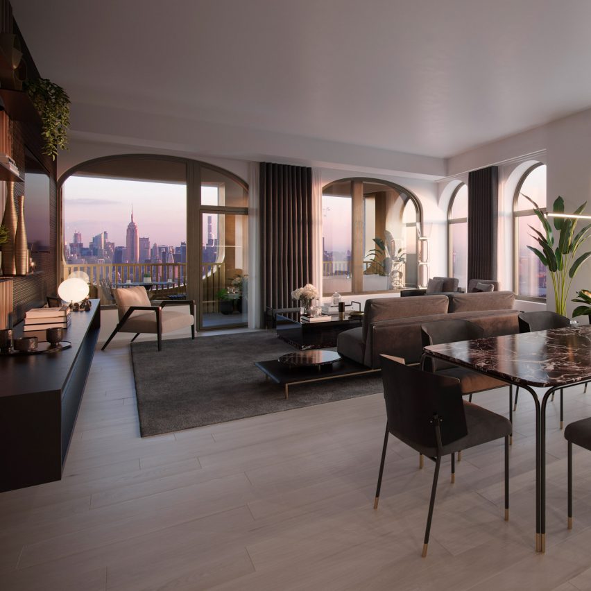
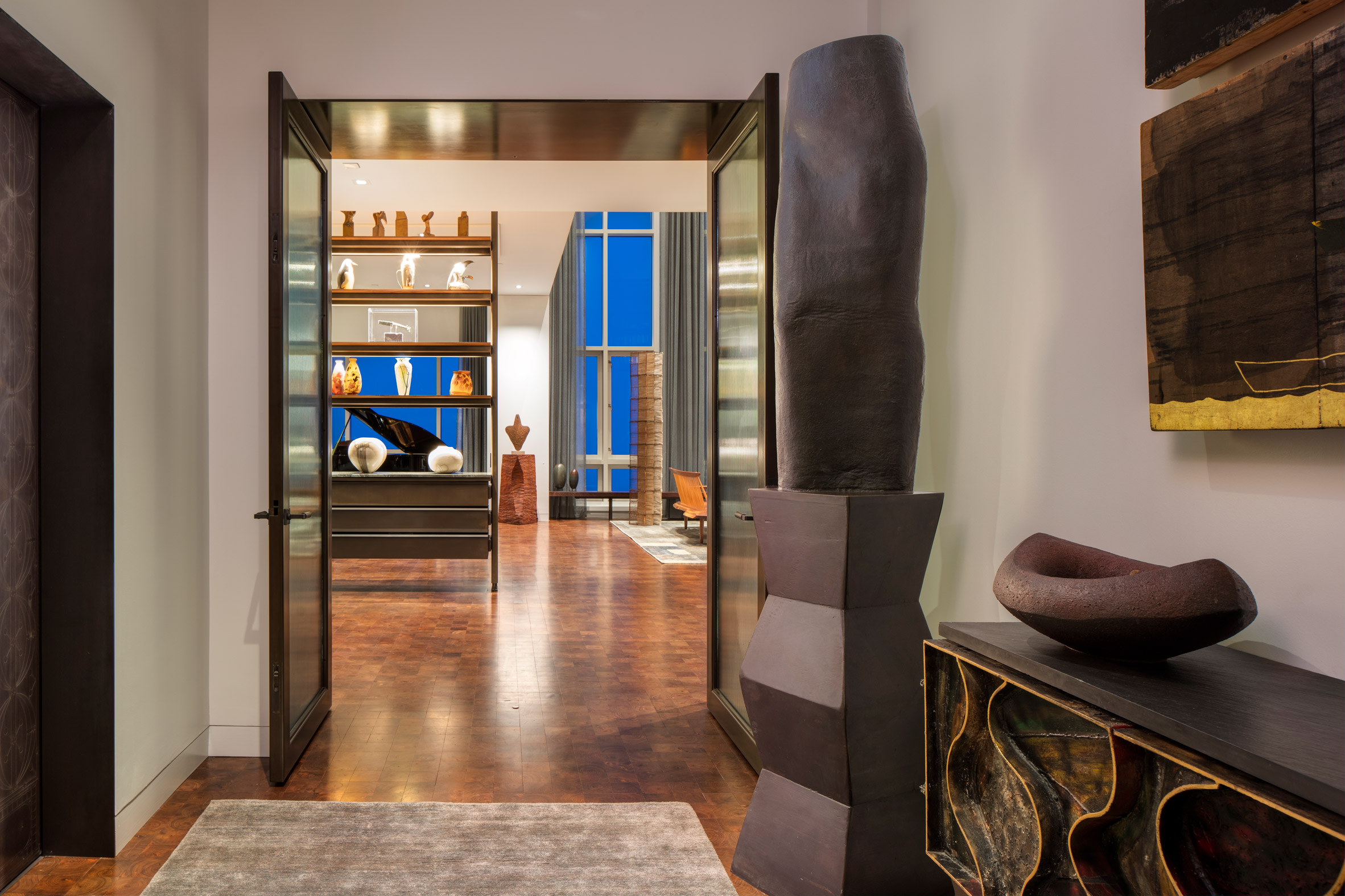
An extensive art collection is complemented by industrial detailing, a walnut floor and earthy, muted colours in this Chicago penthouse flat that local studio Wheeler Kearns Architects designed for two art collectors.

Working together with Sharlene Young of Symbiotic Living, Wheeler Kearns Architects created the interior of Residence for Two Collectors for a couple who wanted a home that would have space for their family, art and furniture.

Foyer of Residence for Two Collectors by Wheeler Kearns Architects
The foyer features wooden accessories and earthy colours

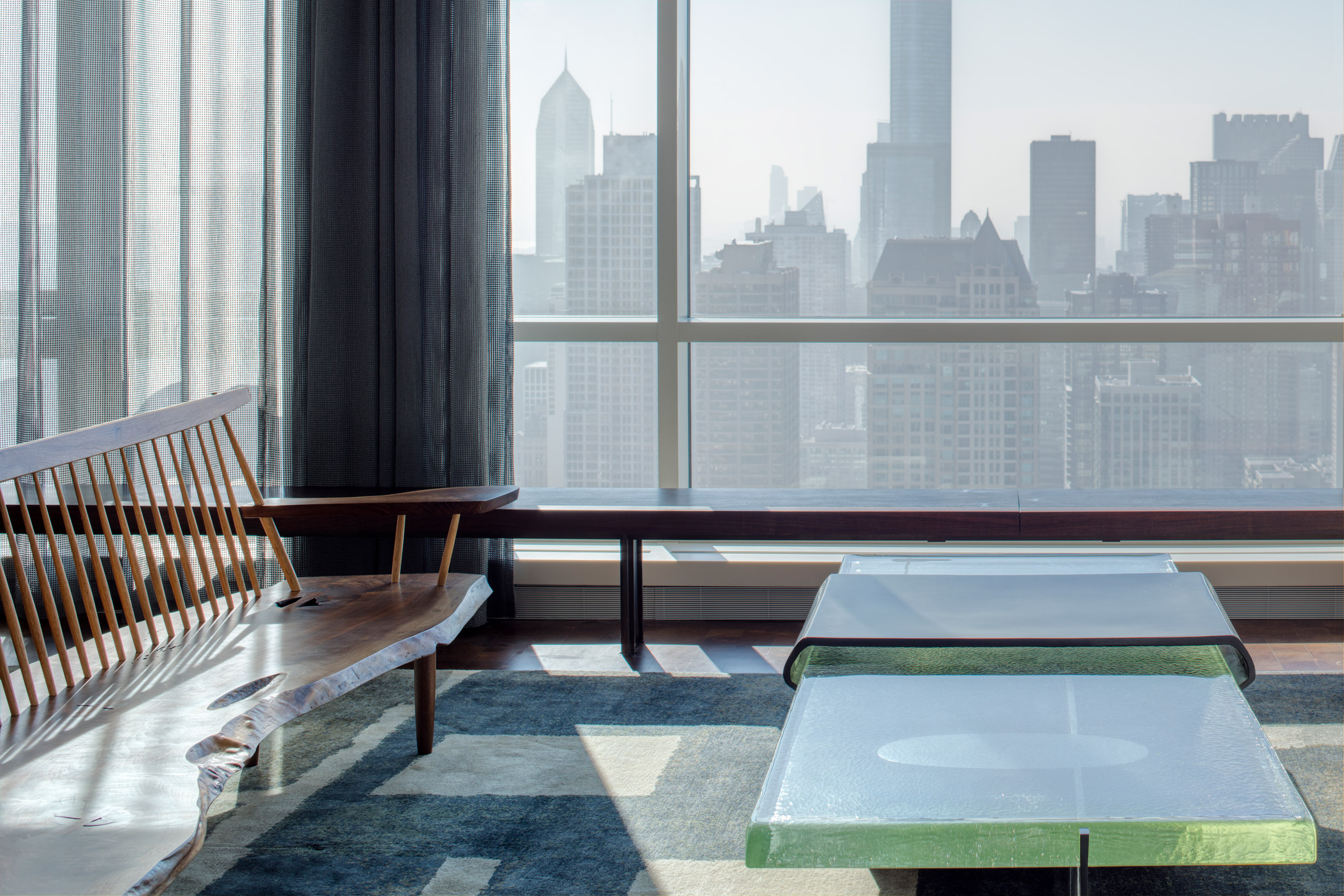
Located in a Chicago high-rise, the penthouse flat measures 6,350 square feet (590 square metres) and was gutted to a shell condition ahead of Wheeler Kearns Architects' refurbishment.

Designed for a couple and their dog, the residence is intended to be a welcoming space for family and friends. The owners, who are actively engaged in the community, also wanted room to host philanthropic events for up to 75 people.

View from Residence for Two Collectors by Wheeler Kearns Architects
In the living room, floor-to-ceiling windows overlook the Chicago skyline

"As such it is a bit of a transformer, with a series of perforated metal partitions that open and close to adjust to the needs of the day," Wheeler Kearns Architects principal Dan Wheeler told Dezeen.

"Acoustics and lighting systems were carefully integrated into the shell to attend to the technical demands."

Guest room of Residence for Two Collectors by Wheeler Kearns Architects
The guest room has sliding doors for privacy

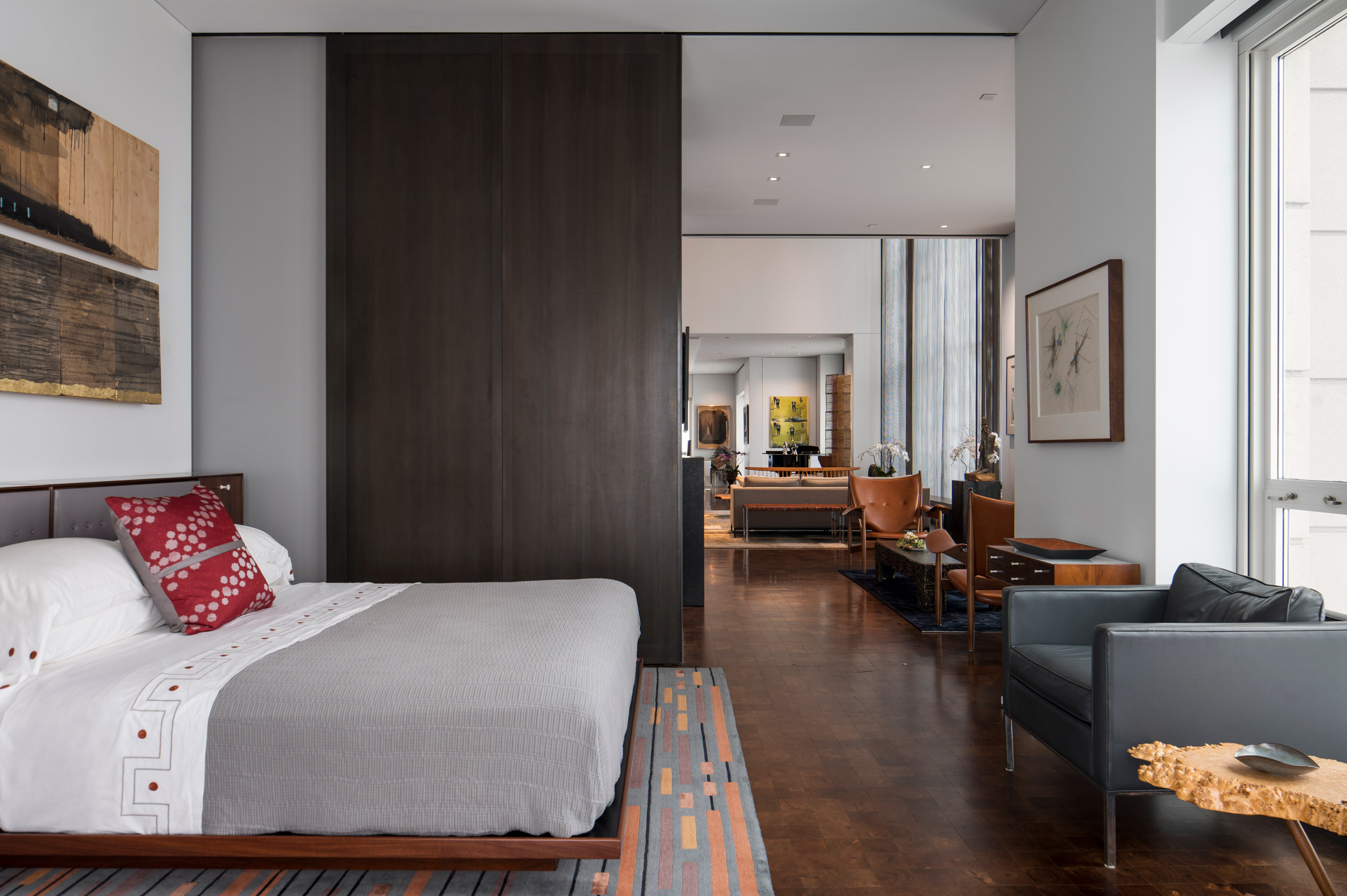
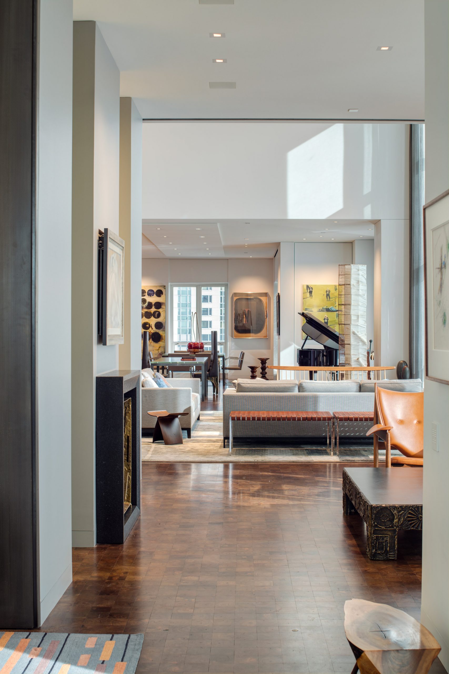
The apartment has a master bedroom and a kids' room as well as a guest room, family room, living room, dining room, a sitting room and two offices.

A kitchen and a laundry room complete the residence, which also features a terrace and has its own service entrance in addition to the main foyer.

Dining room of Residence for Two Collectors by Wheeler Kearns Architects
The dining room is located in-between the living room and kitchen

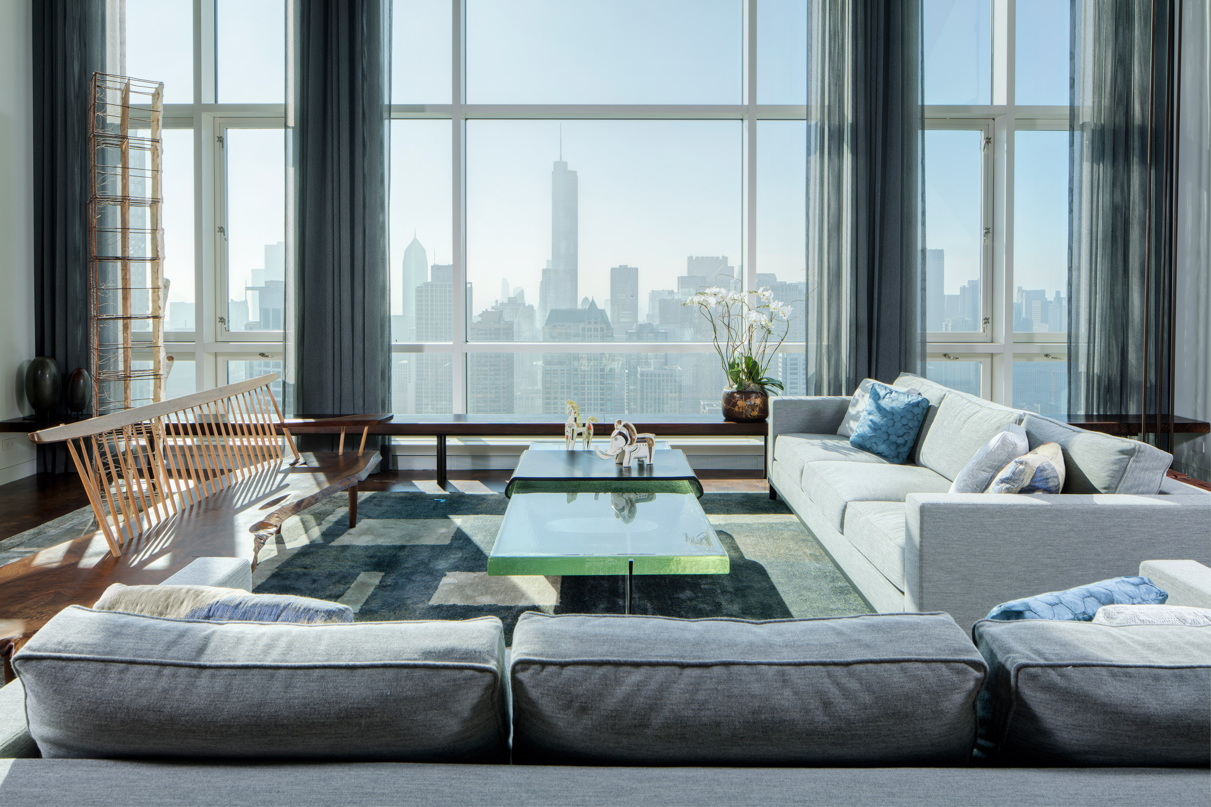
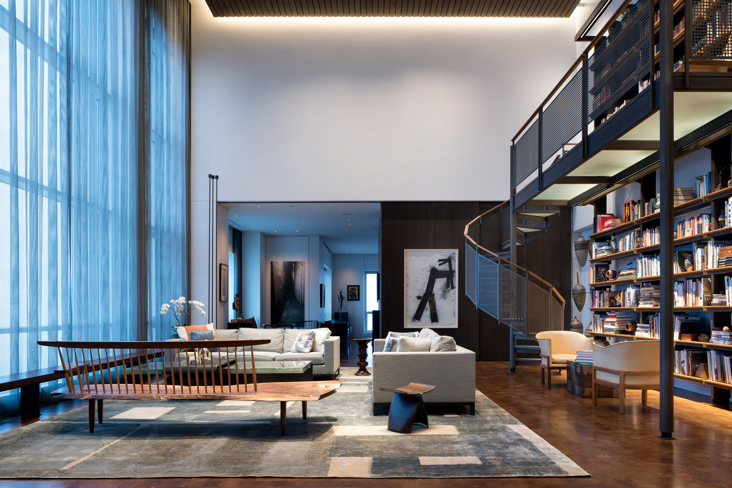
As all rooms are on one floor and many are open-plan, the walnut flooring and muted wall colour are intended to keep the design consistent throughout.

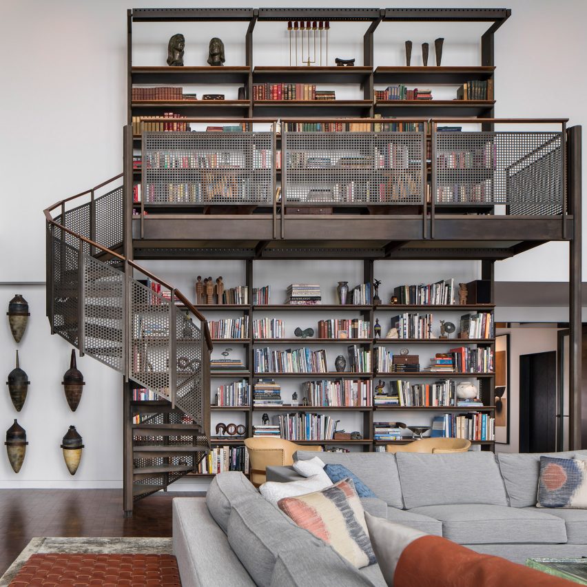
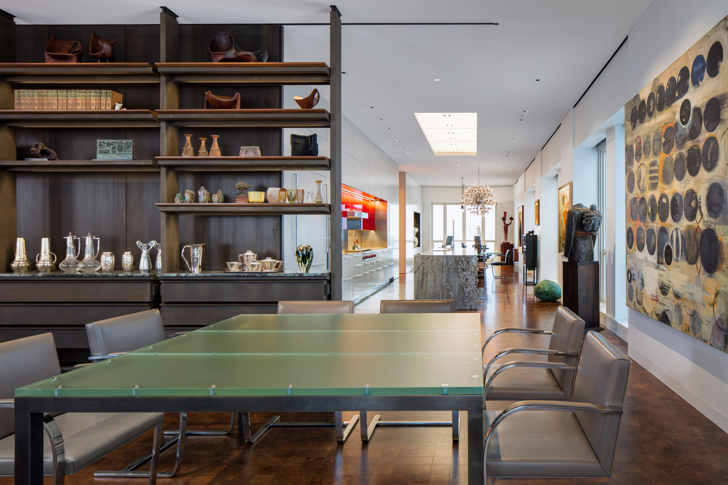
One of the owner's father was a machinist, which informed a steel and wood material palette that runs through the apartment.

Sitting room of Residence for Two Collectors by Wheeler Kearns Architects
Pieces from the owners' art collection decorate the walls

"This led to a use of metals, patinated plate and perforated sheet steel," Wheeler explained. "[The owner's] focus was down to the selection of the profile of a screw head, something that we could all love."

Book shelf in living room of Residence for Two Collectors by Wheeler Kearns Architects
The large, custom-made book shelf with a dedicated spiral staircase

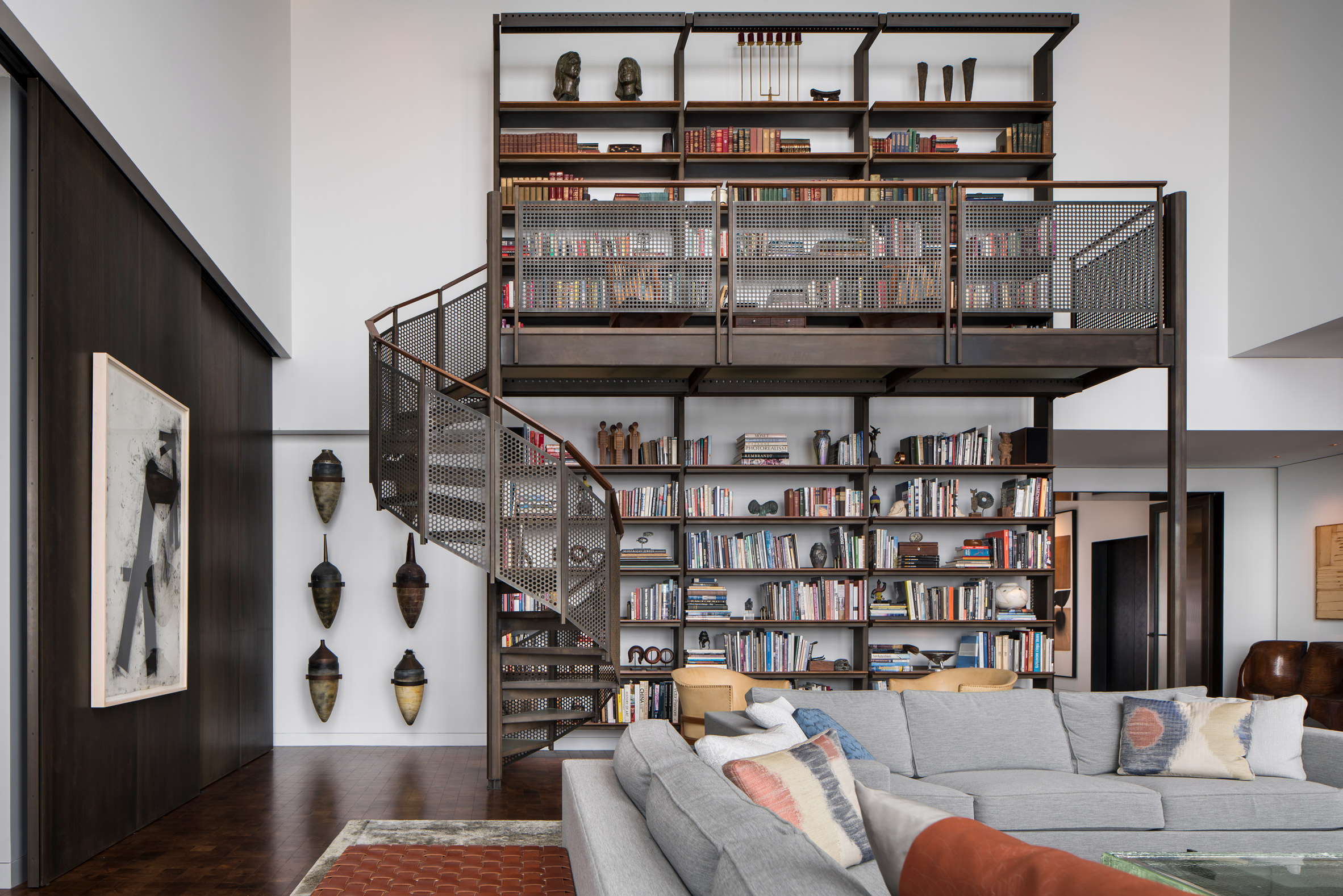
"She was drawn to the end-grain walnut block flooring inspired by factory flooring, but here softer, warmer, each milled squared, laid in a grid to purposely bely directionality in the residence," he added.

"Those two elements, steel and walnut, drove the project home."

Chainmail drapery at Residence for Two Collectors by Wheeler Kearns ArchitectsChainmail curtains let light into the living room
Chainmail curtains let light into the living room

To design the interior the studio worked together with Young, who is the founder of Symbiotic Living, an interior architecture and design firm.

The owners' extensive art collection played a big part in her choices for the interior design with key pieces including a George Nakashima bench, Harry Bertoia sculptures and furniture by Paul Evans.

Glass table at Residence for Two Collectors by Wheeler Kearns Architects
A green custom-cast glass table adds warmth

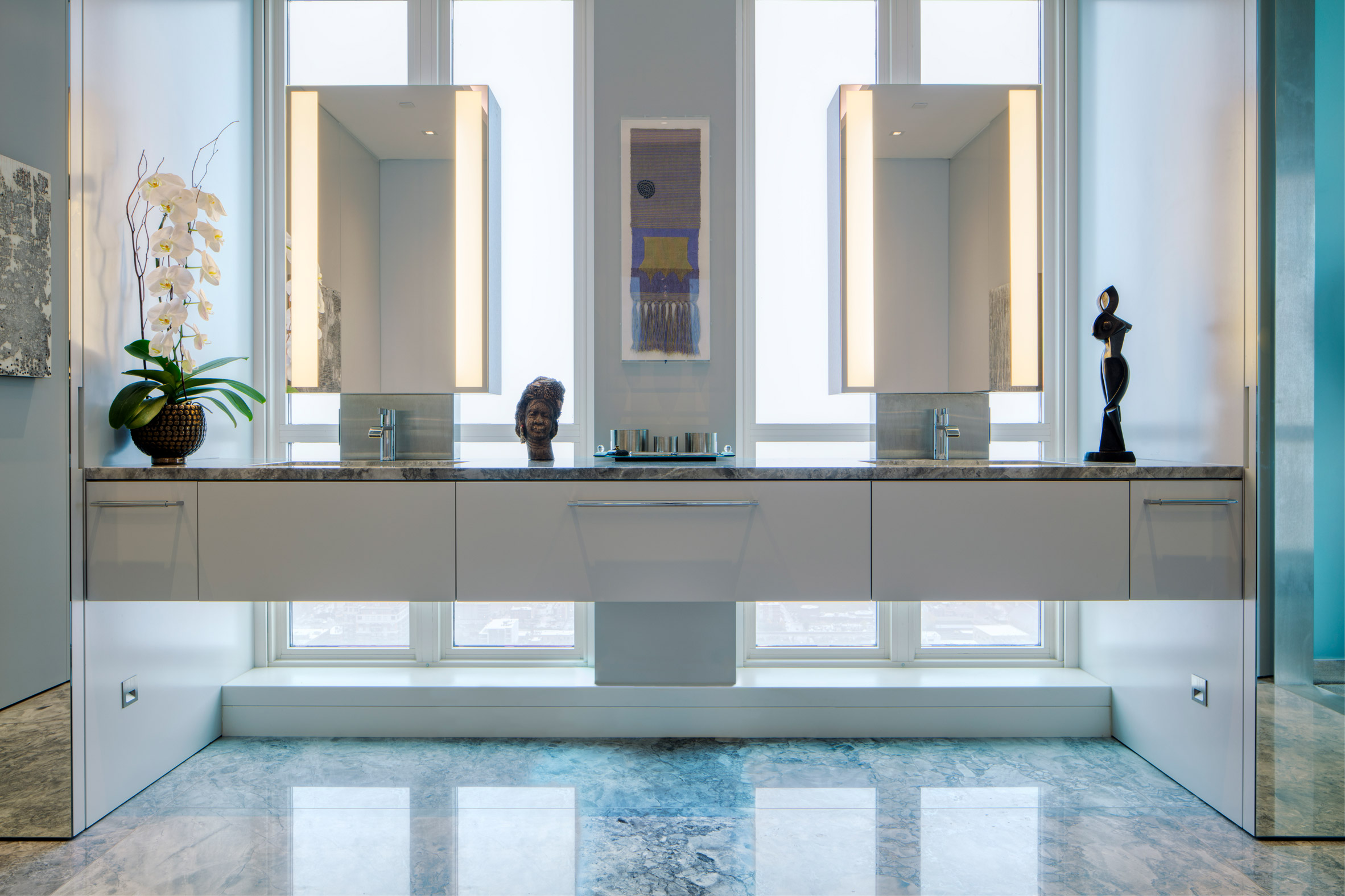
Even the bathrooms, of which there are two as well as an additional powder room, are filled with art. The master bathroom features a lighter colour scheme with pale blue-grey walls and a marble floor.

Other details include a custom-made loft and bookshelf with a spiral staircase take up one side of the living room, which opens up into the dining room, drapery that resembles chainmail.

Bathroom of Residence for Two Collectors by Wheeler Kearns Architects
Sculptures decorate the master bathroom

"Chainmail, a material used historically in both Eastern and Western cultures, conveys strength and endurance, yet it also bears the surprising qualities of visual softness and ability to diffuse sunlight," she explained.

Also in Chicago, Vladimir Radutny overhauled an industrial loft on the city's Michigan Avenue inside a century-old structure that was built for automotive assembly and display.

Photography is by Tom Rossiter Photography.


Project credits:

WKA Team:​​ Dan Wheeler, FAIA, Principal, ​​​Janette Scott, AIA, Project Architect
Consultants ​General Contractor: JDL Development Corporation
Owners Construction Advisor/Manager: Peter Seigel
Structural Engineer: Halvorson and Partners
Millwork: Glazebrook Woodworking
Acoustical Consultant: Threshold Acoustics
Lighting Design: Mitchell Cohn Lighting
MEP: BES Engineering Systems
Interiors: Sharlene Young with Wheeler Kearns Architects (founder of Symbiotic Living)

The post Residence for Two Collectors is an art-filled Chicago penthouse appeared first on Dezeen.


from Dezeen https://ift.tt/2U2g72m

Ten home kitchens that use colour to make a statement

Duck-egg blue kitchen with pink terrazzo breakfast bar

We've rounded up 10 residential kitchens by designers who have experimented with bright tiles and coloured cabinets to challenge the ongoing trend of all-white cooking spaces.


Duck-egg blue kitchen with pink terrazzo breakfast bar

Plaster Fun House, Australia, by Sans-Arc Studio

A pink-terrazzo breakfast bar is complemented by duck-egg blue cabinetry, spherical pendant lights and abundant brass detailing in this kitchen by Sans-Arc Studio.

It was built as part of an extension to a cottage in Torrensville and takes its cues from art deco and P&O architecture – a style that emerged following the popularity of cruise liners in the 1930s.

Find out more about Plaster Fun House ›


Mustard yellow kitchen with orange splashback tiles

Delawyk Module House, UK, by R2 Studio

R2 Studio introduced mustard-yellow cabinets to the cooking space of this 1960s home on a London council estate, as part of a playful redesign of the dwelling for a young family.

The kitchen units are teamed with retro, orange splashback tiles, minimal silver handles and an oak floor has been stained dark for contrast.

Find out more about Delawyk Module House ›


Bubblegum-pink kitchen with parquet blue tiles

Nagatachō Apartment, Japan, by Adam Nathaniel Furman

A bubblegum-pink kitchen suite sits at the heart of this Tokyo apartment that Adam Nathaniel Furman designed as "a place of happiness, joy and lightness" for a retired couple.

The units are paired with slender, blue wall tiles that are arranged in a herringbone pattern and a stripy watermelon-green floor. There is also an adjoining breakfast nook with a lilac carpet that is intended to resemble icing.

Find out more about Nagatachō Apartment ›


Bright yellow and turquoise kitchen

House P, China, by MDDM Studio

MDDM Studio combined vibrant yellow walls with earthy terrazzo fixtures made from green, orange and beige stones to create this colourful kitchen in a Beijing apartment.

Contrasting turquoise accents, seen on the cabinets and sliding doors to the room, were also added to accentuate the colour of the green stone in the terrazzo.

Find out more about House P ›


Terracotta-coloured kitchen and breakfast bar

Klinker Apartment, Spain, by Colombo and Serboli Architecture

Terracotta-coloured cement lines the ceiling, wall and floor of the kitchen inside of Klinker Apartment, a holiday home by Colombo and Serboli Architecture in an art-nouveau building in Barcelona.

These warm surfaces are complemented by matching cabinetry and a central breakfast island but contrasted with the surrounding patterned floor tiles that were saved from the flat's previous fit-out.

Find out more about Klinker Apartment ›


Seaweed-coloured kitchen with marble worktops

Belgian Apartment, Belgium, by Carmine Van Der Linden and Thomas Geldof

The birch-wood cabinets and shelving that line this apartment's kitchen have been stained a murky shade of green to evoke seaweed and marram grasses, paying homage to its setting on the Belgian coast.

They are paired with a dusky plaster wall finished in the same colour, alongside chunky industrial steel detailing, light marble worktops and a speckled grey floor.

Find out more about Belgian Apartment ›


Multi-coloured kitchen with concrete countertops

Kennington House, UK, by R2 Studio

Kennington House's multi-coloured cooking space was designed by R2 Studio as "a kitchen that doesn't scream 'kitchen'" by avoiding the use of cold and shiny surfaces.

Instead, it is lined with birchwood cupboards that have cobalt blue, lemon yellow and sage green matt finishes, adorned with coral-hued stools and concrete countertops.

Find out more about Kennington House ›


Plum-purple kitchen with green cabinetry

Esperinos, Greece, by Stamos Michael

This kitchen is one of several rooms in a guest house in Athens that Greek designer Stamos Michael overhauled to evoke a gallery-style space.

Warm plum-purple walls are animated by a large piece of modern art and set against emerald-hued cabinetry and black, industrial-style shelves.

Find out more about Esperinos ›


Blush-pink kitchen with grey cabinets

Apartment in Born, Spain, by Colombo and Serboli Architecture

Blush-coloured quartz was used to craft the flecked breakfast island and splashback inside this kitchen in a 13th-century apartment in Barcelona.

They are offset with grey kitchen units with brass handles, exposed oxblood-hued extraction ducting and a coral-coloured arched volume on one side that conceals a small toilet.

Find out more about Apartment in Born ›


Bright green kitchen with terrazzo detailing

White Rabbit House, UK, by Gundry & Ducker

A large green kitchen island with an overhanging monochrome worktop made from terrazzo is positioned at the centre of this kitchen in Gundry & Ducker's White Rabbit House.

The island is teamed with a backdrop of matching built-in wall cabinets, arched windows and doorways, and a floor lined with large slabs of luminous white, blue and grey terrazzo.

Find out more about White Rabbit House ›

The post Ten home kitchens that use colour to make a statement appeared first on Dezeen.


from Dezeen https://ift.tt/36aShas

Atelier Scale designs The Folds playground to encourage tactile play

Kid playing at The Folds by Atelier Scale

Atelier Scale has created The Folds, a small community playground in Changzhou, China, as a place for children to explore in a more tactile and less regulated way than usual.

The studio deliberately minimised the use of playground equipment to allow children to play with the folded shapes of the place itself.

View of The Folds by Atelier Scale
The Folds' shape was informed by waves

"We believe that the folding landform can encourage children to perceive the space with their hands and feet," Atelier Scale founding partner Huicheng Zhong told Dezeen.

"Children can run, climb, play hide and seek, and decide how to have fun by themselves. We hope that this space will not be bound by function or program, with less purpose and more instinct."

Grass by The Folds by Atelier Scale
It features less equipment than regular playgrounds

The Folds has been shortlisted for the Dezeen Awards 2020 in the landscape project category.

The shape of the playground, which features plenty of hiding spaces and nooks as well as a separate seating area with a fountain, was inspired by the movement of water.

"An abstract field of wave is the initial idea for the folding landform," Zhong said. This was partly developed due to time constraints, as the studio was only given one month to construct the playground.

Exploring The Folds by Atelier Scale
Children are encouraged to explore the space

"We came up with a simple design strategy – a repetitive pattern of folding gesture, which not only makes material fabrication and arrangement much easier and cheaper but also makes construction more predictable and controllable," Zhong explained.

"The modular approach didn't restrict the creativity of the design, we have developed interesting variations based on the folding modules."

Seating at The Folds by Atelier Scale
A seating area features an undulating shape and a decorative fountain

Atelier Scale used plastic timber in a light wood colour for the folding decks to create a "warm and safe" atmosphere.

"Plastic timber is a material that looks almost like wood, but with longer duration than normal wood material, with a similar price," Zhong said.

The Folds by Atelier Scale seen from above
Sturdy plastic timber was used to build the playground

Metal safety fences and edges were painted a bright yellow hue.

The Folds, which is located in the corner of the central public space of a mega residential development, has already been turned into a number of different play spaces by local children.

Child playing at The Folds by Atelier Scale
There's plenty of spaces for children to discover

"The spaces were explored by the kids with their own sense and motivation," Zhong said. "The neutral spaces were observed as a cave, a valley, a slide, and a house, by different children."

Atelier Scale is a landscape architecture studio based in Los Angeles.

Other contenders for the Dezeen Awards 2020 in the landscape project category include the undulating public square Karen Blixens Plads and Snøhetta's cantilevered viewing platform in Austria.

The post Atelier Scale designs The Folds playground to encourage tactile play appeared first on Dezeen.


from Dezeen https://ift.tt/3n25lWm

Friday 6 November 2020

This week David Adjaye and Aston Martin collaborated to design apartments and SUVs

David Adjaye and Aston Martin-designed apartment

This week on Dezeen, architect David Adjaye and car brand Aston Martin partnered to design apartments in a New York skyscraper and limited-edition SUVs for their residents.

In total five Aston Martin Residences will be built within the 244-metre-tall 130 William skyscraper, which was designed by Adjaye and is currently under construction in Manhattan.

As part of the collaboration, Adjaye designed a limited-edition Aston Martin DBX, which each of the five residents will also receive.

The Tulip viewing platform
Foster + Partners reveals updated visuals of The Tulip viewing platform as planning inquiry begins

As the planning inquiry into The Tulip tourist attraction in London began, architecture studio Foster + Partners revealed updated visuals showing the interiors and base of the proposed 305.3-metre-high tower.

New London Architecture chairman Peter Murray spoke out in defence of the structure saying that it will help the City of London recover from the coronavirus pandemic.

"A lot of the inquiry will focus on just how much harm The Tulip will do to the historic views of the Tower of London, but it needs also to take on board the fact that The Tulip will bring new life to the City of London itself," he said.

Exterior of Powerhouse Telemark by Snøhetta in Porsgrunn, Norway
Snøhetta designs carbon-negative Powerhouse Telemark office in Norway

Also in architecture news, Snøhetta revealed its latest carbon-negative Powerhouse office in the city of Porsgrunn, Norway.

The angular building, which is designed to produce more energy than it will consume over its lifespan, is highly insulated and covered with a large photovoltaic canopy.

VR architecture conference
Space Popular designs world's first VR architecture conference as alternative to "boring" Zoom talks

This week also saw architecture studio Space Popular design the venue for the first-ever architecture conference held in virtual reality. Named Punto de Inflexión, the conference was held in nine virtual rooms set out in a grid that was based on Barcelona's street plan.

The studio also unveiled a spa in Bangkok that is built around a luscious garden planted with dragon trees and lipstick palms.

Social-distancing bench
Object Studio creates portable social-distancing bench for Amsterdam

In response to the ongoing Covid-19 pandemic Dutch design firm Object Studio has created a social-distancing bench. Named CoronaCrisisKruk the portable seat lets users sit together while staying apart.

Also responding to coronavirus, urban theorist Richard Florida said at a conference that the pandemic "may make cities more affordable to artists and creatives".

Wohnregal apartment block
Wohnregal is a prefabricated concrete live-work apartment block in Berlin

Popular projects on Dezeen this week include a six-storey housing block in Berlin made from precast concrete slabsa modular housing scheme in Portugal's Vale de Cambria and a shop for Dutch fashion label Daily Paper that has a facade made from over 13,000 flattened aluminium cans.

This week on Dezeen is our regular roundup of the week's top news stories. Subscribe to our newsletters to be sure you don't miss anything.

The post This week David Adjaye and Aston Martin collaborated to design apartments and SUVs appeared first on Dezeen.


from Dezeen https://ift.tt/2GB7g4K

Vertical Cities Soar Into the Sky in Otherworldly Digital Paintings by Artist Raphael Vanhomwegen

All images © Raphael Vanhomwegen, shared with permission

Raphael Vanhomwegen describes his process as “visual brainstorming,” a technique that involves rendering his digital paintings quickly “to keep a spontaneous going-with-the-flow feeling.” The Belgium-based artist depicts vertically built cities with houses, shops, and stairwells that spring up from a hillside or body of water. Whether in technicolor, neutral shades, or moody grays, the soaring architecture is otherworldly and even foreboding as it appears to peek through surrounding fog. In many works, a few figures are perched on the balcony or a swarm of birds flies overhead.

When painting, Vanhomwegen focuses on his internal thoughts and allows himself to move comfortably through the practice of adding a new walkway or leafy vine. “You need to at least be obsessed with one particular subject that you will explore way too much than necessary,” he shares with Colossal, noting that his favorites are tiny houses and moody scenes. Similarly, he strives to imbue each artwork with volume and energy, an idea he expands on:

Every brushstroke should have a meaning in order to be visually interesting. This is idealistic, of course. I am also one of those people who think nothing is more beautiful than a sketch. I almost never saw a finished drawing look better than a very good sketch. That’s why I almost never finish my drawings. It feels like adding more notes to a perfect musical piece. It’s just not worth it.

To keep up with Vanhomwegen’s unearthly architectural paintings, head to Instagram. (via Jeroen Apers)


from Colossal https://ift.tt/3kcKFJK