Monday 9 November 2020

Tadeas Podracky's The Metamorphosis furniture rejects mass-produced design

Design Academy Eindhoven graduate Tadeas Podracky rejected formal design methods when creating these unconventional furniture objects, which he made by layering materials like "a bird weaving its nest".

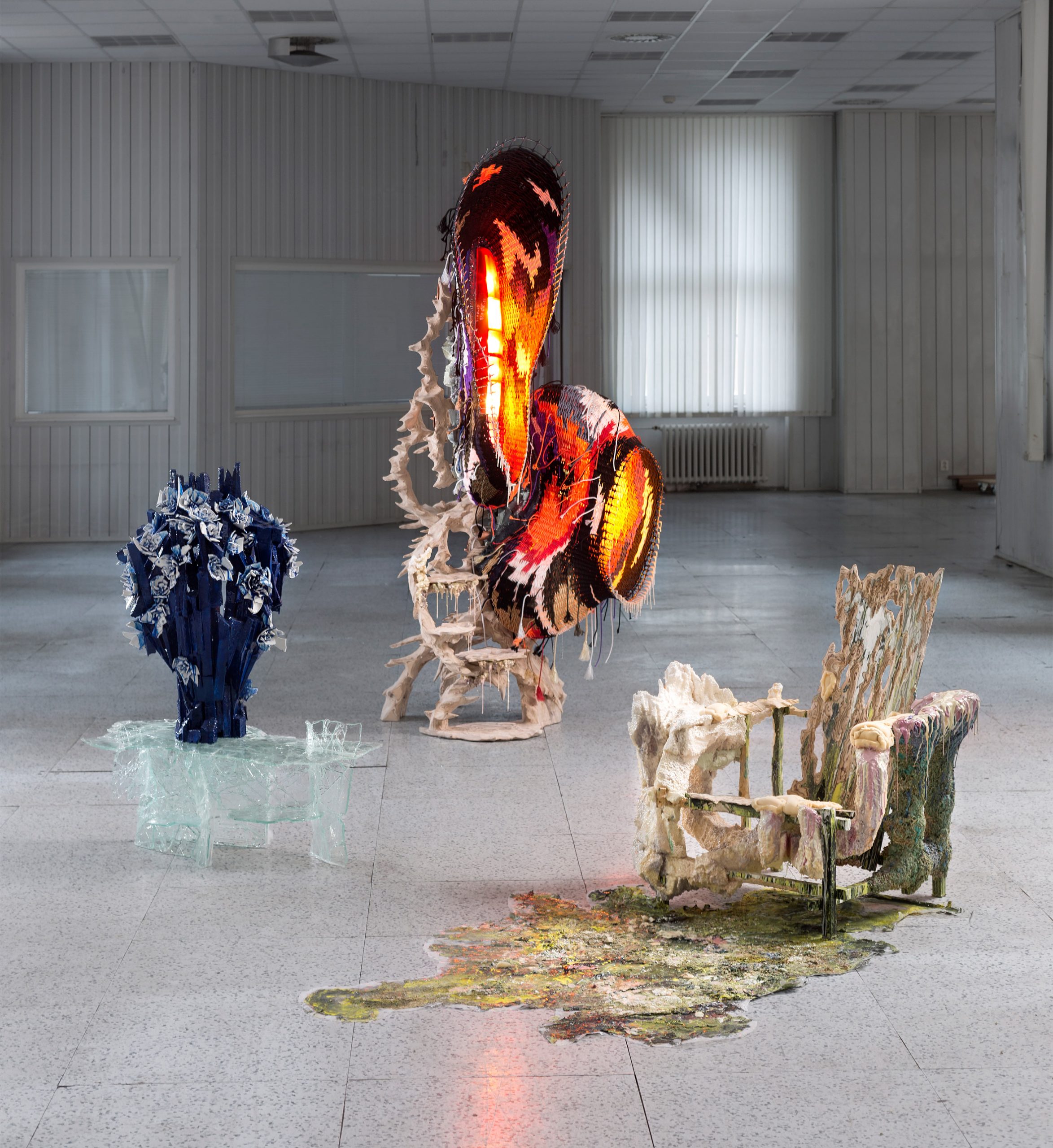
The Metamorphosis collection comprises three sculptural objects that the designer refers to as "functional art", which act as a chair, a table and a light.

Each is made using materials Podracky found around his home, or that were easy to access, during a period of quarantine.

These include paint, wood, textiles, discarded materials like spare car parts, pieces of broken ceramics and broken sheets of glass – materials that he felt had a level of "authenticity of scarcity".

The Metamorphosis furniture collection by Tadeas Podracky
Podracky's The Metamorphosis collection is a series of functional art objects

Podracky used his "creating through destroying" technique when making the collection to grant each of the pieces a high level of unpredictability to achieve his goal of authenticity.

The Metamorphosis furniture is his way of rejecting mass production and industrial manufacturing processes, which he feels makes objects "ugly and uniform".

"Design has rendered our environment impersonable. Living in prefabricated houses that are occupied by mass-produced furniture, where we spend most of the day escaping to virtual worlds," said Podracky.

"Through questioning construction methods, putting emphasis on authenticity and revaluing materials' ability to reveal character, I propose a new methodology of making – a reformulated approach to design that is based on emotional decisions, unpredictability and expression."

The Rietveld chair from The Metamorphosis collection by Tadeas Podracky
The Rietveld chair is coated in layers of paint, polystyrene and foam

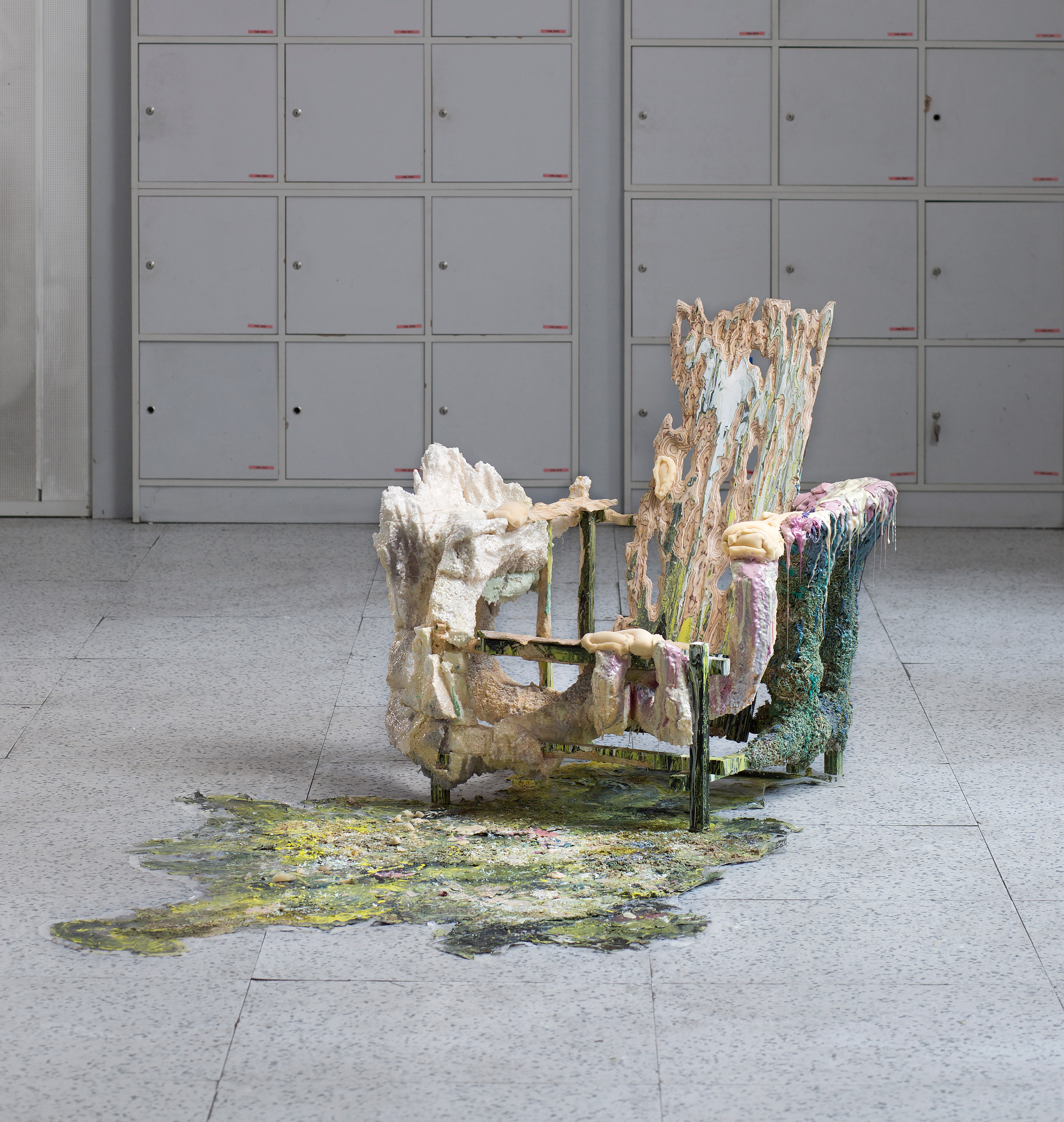
The Rietveld chair takes its name from Dutch designer, Gerrit Rietveld, whose works inspired the geometric shape of its base structure.

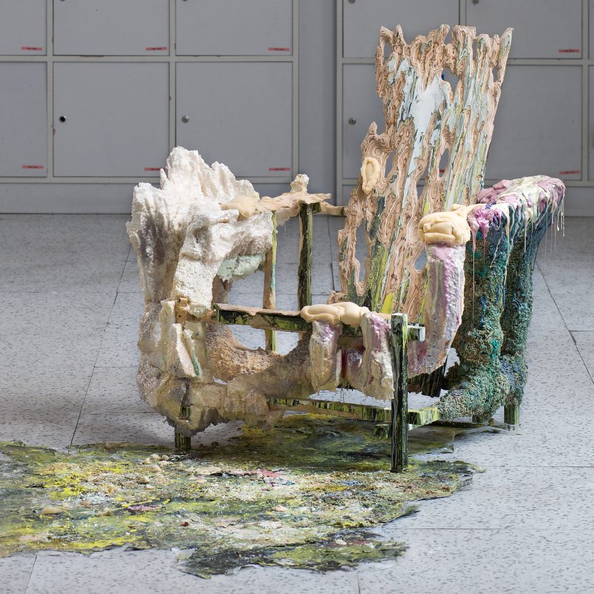
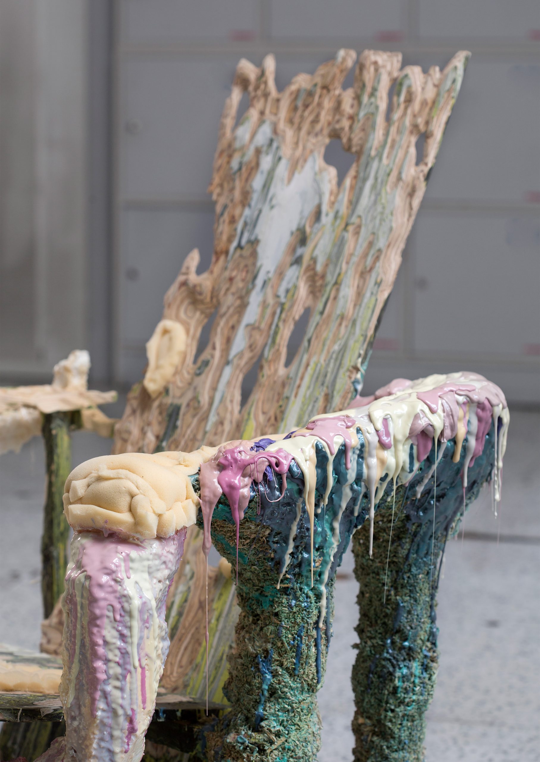
Podracky crafted the chair from wood, before messily covering it in layers of black, white and yellow paint. He then used a chainsaw to carve away at the structure to reveal the layers of wood inside.

The designer then stuck clumps of woody materials such as moss and mulch mixed with a blue liquid to the top half of the chair, before securing sections of polystyrene and foam to the bottom half and dripping more liquid over the top.

Detail of the Rietveld chair from The Metamorphosis collection by Tadeas Podracky
Podracky wanted the creation process to be as "unpredictable" as possible

"My aim in the metamorphosis of Gerrit Rietveld's iconic chair was to deconstruct it both physically and ideologically," he explained. "For me, the Rietveld chair represents a symbol of the emphasised functionality and beginning of design for mass production."

"It could be read as an iconoclasm or a critique on modernism, which is undoubtedly partially true, but I aimed to create a dialog between me and a modernist icon in order to learn and be able to relate to it," he added.

The Growth light from The Metamorphosis collection by Tadeas Podracky
The Growth piece is illuminated by discarded car lights

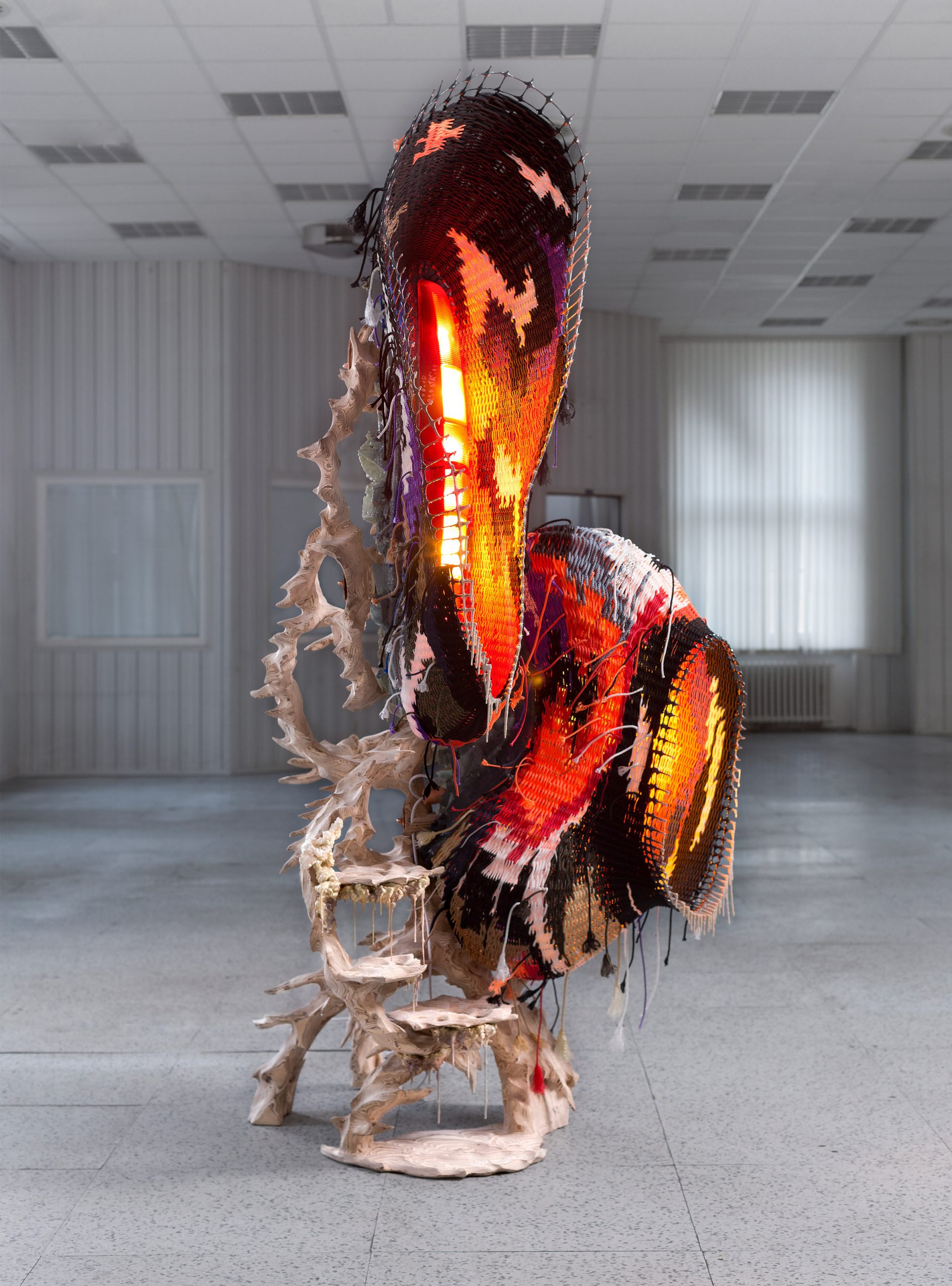
For the lighting piece, called Growth, Podracky let an "intuitive use of materials and emotional decisions" determine the outcome.

He built a cage-like frame from which he hung different materials such as wood and woven fabric, securing them in place with glue. The light sources inside the structure are made from discarded car-headlights.

"My aim was to let the object grow through my hands by glueing and combining different elements like the process of a bird weaving its nest," the designer explained.

The Creating Through Destroying table from The Metamorphosis collection by Tadeas Podracky
Podracky also designed a glass table with a shattered effect

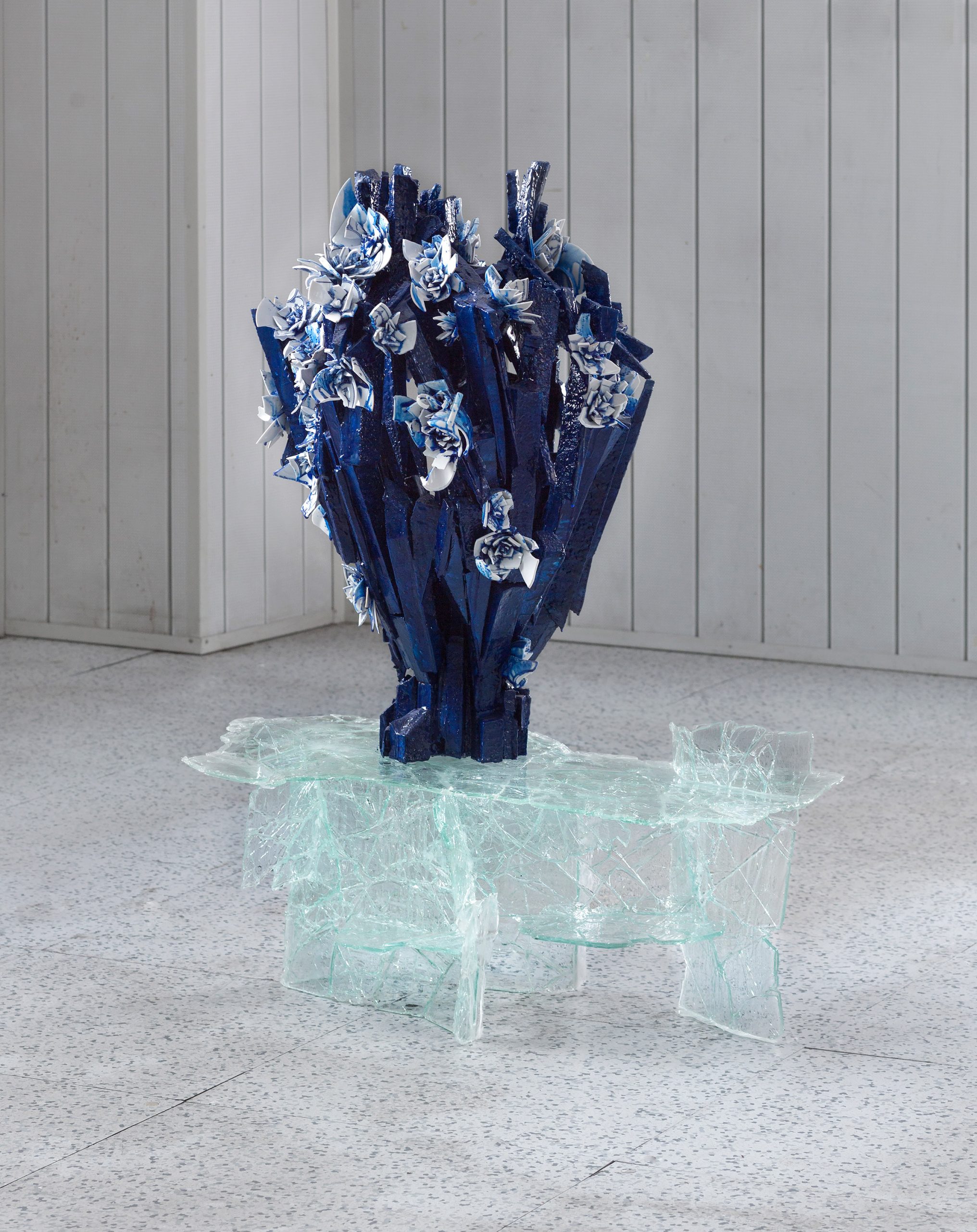
Podracky used recycled pieces of glass to make the Creating Through Destroying table, which is topped with a blue and white vase made from reconstructed broken fragments of porcelain.

The table boasts a shattered, fragile effect, while the vase sits solidly on top, dotted with flowers made from pieces of ceramic.

Podracky's The Metamorphosis collection was shown during Dutch Design Week as part of the Design Academy Eindhoven graduation display.

Dezeen teamed up with Dutch Design Week to present an exclusive virtual tour of the event, which took place entirely online this year due to the coronavirus pandemic.

We also hosted a series of live discussions during the design week, including a talk between trend forecaster Li Edelkoort and designers Sabine Marcelis, Giorgio Gascia and Gianmaria Della Ratta about the impacts of Covid-19 on the design community.

The post Tadeas Podracky's The Metamorphosis furniture rejects mass-produced design appeared first on Dezeen.


from Dezeen https://ift.tt/3pdB1dh

Sunday 8 November 2020

AW2 designs Bedouin-informed tent resort in Saudi Arabia's AlUla desert

Tented Resort by AW2 in Saudi Arabia's AlUla desert

French architecture studio AW2 has revealed its design for a glamping resort made up of 47 luxury tents in the AlUla desert in Saudi Arabia.

Named Ashar Tented Resort, the development is set to be built as part of the Royal Commission of AlUla's drive to increase tourism in the AlUla desert area, which includes the Madâin Sâlih UNESCO World Heritage site.

The tourist accommodation will consist of 47 suites that will take their forms from the tents used by the nomadic Bedouin people who occupied the area.

Ashar Tented Resort by AW2
Ashar Tented Resort will be built in the AlUla desert

"The inspiration of the architecture begins with the simple rectangle shape of the Bedouin tent, with its adjustable canvas to maximise cooling and provide sun shading," said AW2 partner Stéphanie Ledoux.

"From this basis, we developed a layout that would include all the modern functions of a luxury hotel room while maintaining maximum contact with the surrounding nature," she told Dezeen.

"The canvas is here used as a protection and privacy device."

Tent suite in AlUla desert
Each suite will be built from compressed-earth bricks

The resort will be arranged along a path that follows the site's surrounding rock formations.

Each suite, which will either have one, two or three bedrooms, will be constructed with compressed-earth brick walls and topped with a tented structure.

Restaurant in AlUla desert
Two restaurants will be built on the site

"The site is composed of three main elements: the sand, the rocks and the vast sky," explained Ledoux.

"These components are used as layers in our architecture: the sand is the platform on which we build, the rocks are the inhabited spaces, the tented roofs are the protective 'sky'."

Ashar Tented Resort
The resort will be wrapped around rock formations

Alongside the tented suites, Ashar Tented Resort will also have two restaurant buildings and a spa, which will all also be made from compressed-earth bricks.

The spa will include a pool within the surrounding rock formations.

Rock swimming pool
A spa will have a swimming pool within the rocks

"The spa will bring guests another step closer and literally inside nature," said Ledoux.

"It will be the epitome of the architecture experience with treatment rooms facing the rock cliff creating an exclusive sanctuary," she continued.

"A rock pool suspended between two rock cliffs provides guests with a unique sensory experience converging two natural elements – water and earth – to frame an elevated breath-taking view across the valley."

Ashar Tented Resort
Each suite will have a tented roof

AW2 designed the scheme of Ashar Tented Resort with the aim of limiting its visual and environmental impact on the AlUla desert.

"The visual impact of the tent is limited by the low and soft curves of the canvas which complement the sandy dunes," said AW2 partner Reda Amalou.

"The buildings are otherwise environmentally efficient, with the canvas acting as a double layer to create natural cooling between the roof and the tent," Amalou told Dezeen. "All walls are finished with a locally sourced mud coating."

Ashar Tented Resort
The resort is part of a wider development of the AlUla desert

The resort, which is set to open in 2021, forms part of a wider strategy to encourage international tourism in Saudi Arabia.

"The project is at the heart of Saudi Arabia's strategy to open the country to international travellers," explained Amalou.

"Ashar Tented Resort will be the first international standard resort in AlUla. It aims to create a statement in hospitality for visitors to the AlUla world heritage site."

French architect Jean Nouvel is designing a subterranean hotel that will be carved into a sandstone hill as part of the development of the AlUla desert.

Also as part of the country's tourism push, Kengo Kuma and Foster + Partners are designing "world's most ambitious tourism development" on a series of islands in the Red Sea.

The post AW2 designs Bedouin-informed tent resort in Saudi Arabia's AlUla desert appeared first on Dezeen.


from Dezeen https://ift.tt/3le3ZHx

MW Works uses dark wood and sandy walls for interiors of Ocean Drive apartment in Miami

Interiors of Ocean Drive apartment by MW Works in Miami, Florida

American studio MW Works has converted and refurbished a large beachside apartment on Ocean Drive in Miami, Florida, using tropical hardwood and sand-coloured plaster.

The studio knocked together two units in a new high-rise building to create a home for a family of six relocating from Seattle.

Media room of Ocean Drive apartment by MW Works in Miami, Florida
Living areas feature plaster walls and concrete floors

Materials were chosen to make the most of the quality of light and views of the seashore.

"The irregular surface of the plaster highlights the changing quality of light throughout the day and lends a softness to private spaces," said MW Works.

Dining area of Ocean Drive apartment by MW Works in Miami, Florida
Dark tropical hardwood in the dining area

The Ocean Drive apartment's five bedrooms are placed around the perimeter and decorated in a paler palette, while the kitchen and dining areas in the middle are darker and moodier.

"Bedroom volumes are treated in pale, sandy tones of hand-troweled plaster reflecting natural light deep into the floor plate," said the studio

"The heart of the unit is clad in dark tropical hardwood with careful detailing emphasising mass and craft."

Kitchen of Ocean Drive apartment by MW Works in Miami, Florida
Plaster and dark wood in the kitchen

Wide wooden planks form the floors. Handles and light switches are set into the doors and walls to create an uncluttered atmosphere.

In the living room and media room, pale concrete floor slabs and a plastered ceiling bounce light around from the floor to ceiling glazing. Balconies overlook a stretch of beach with Miami's signature lifeguarding huts.

Children's bedroom of Ocean Drive apartment by MW Works in Miami, Florida
The home is for a family of six

Gauzy curtains and earthy-coloured rugs continue the highly textured, refined yet beachy aesthetic of the apartment on Ocean Drive.

"Woven baskets and patterned floor coverings add a layer of softness," said MW Works. "Amongst the neutral canvas varied shades of blue, orange and red respond to the native flora and fauna of southern Florida."

Master bedroom of Ocean Drive apartment by MW Works in Miami, Florida
Bas relief texture in the master bedroom

In the master bedroom, the headboard wall dividing the bed area from the bathroom has a detailed geometric pattern in bas relief.

"This design opportunity grew out of the client's extensive travel in the middle east and their interest in mathematical patterns," said MW Works.

"Working with the craftspeople who would install it, we developed a pattern and a fabrication procedure to create an abstracted surface to catch the morning light."

Bathroom of Ocean Drive apartment by MW Works in Miami, Florida
The Miami apartment has ocean views

In the ceilings, an LED lighting system is programmed to track with the sun and change across the course of the day. At night, one of the bathrooms lights up with an approximation of moonlight.

Based in Seattle, MW Works was founded in 2007 by Steve Mongillo and Eric Walter. The studio often works with natural textures, cladding a cabin in Washington with blackened cedar and using reclaimed timber for a home in Seattle.


Project credits:

Architecture and interiors: MW Works
General contractor: Dowbuilt
Local contractor: Woolems
Engineer (MEP): Shamrock Engineering
Engineer (low volt): Visual Acoustics
Engineer (structural): PCS Structural Solutions
Lighting: Niteo
Furnishings: Studio DIAA; Matt Anthony Designs
Carved Countertops: The Vero Stone
Plaster (walls, master headboard): Cathy Connor Studio C
Wood (casework, floor, ceiling): Dowbuilt
Metal (casework, hardware, patinas): Dowbuilt
Interior landscape garden: Formaneta
Custom concrete: John Dietrich
Metals: Argent

The post MW Works uses dark wood and sandy walls for interiors of Ocean Drive apartment in Miami appeared first on Dezeen.


from Dezeen https://ift.tt/3eF5OuI

Van Eijk & Van der Lubbe designs Utrecht care facility like a boutique hotel

Domstate Zorghotel rehabilitation centre by by Van Eijk & Van der Lubbe, Utrecht

Domstate Zorghotel is a rehabilitation centre in Utrecht, the Netherlands, designed by Dutch studio Van Eijk & Van der Lubbe to give patients a hotel experience.

Van Eijk & Van der Lubbe deliberately approached the interiors of the 84-bed health facility like they were creating a 4-star hotel to give patients a more comfortable stay.

"Unlike similar 'healing environments', this care hotel is designed from the user's perspective," said the studio.

"The interior actively participates in the rehabilitation process of the patients," they added. "From small interior accessories to large spatial gestures, everything is focussed on the process of healing."

Lobby of the Domstate Zorghotel rehabilitation centre by by Van Eijk & Van der Lubbe, Utrecht
Top: the care facility has 84 bedrooms. Above: a grand piano sits in the lobby

In the patients' rooms elements such as a mirror, a shelf and a headboard hang from a curved rail on the wall on thick leather straps. As well as providing a striking visual element, the rail can be used for rehabilitation exercises.

Straps on handles and peepholes placed at different levels cater to patients with different levels of mobility.

Door handles at Domstate Zorghotel rehabilitation centre by by Van Eijk & Van der Lubbe, Utrecht
Door handles have accessible straps

To add to the boutique hotel vibe, each floor of rooms has a different colour scheme.

Colour is a central part of making the interiors feel less institutional. The lobby features a grey-blue curving reception desk and rounded seating with a mustard-yellow base.

Walker parking with planter at Domstate Zorghotel rehabilitation centre by by Van Eijk & Van der Lubbe, Utrecht
Parking for mobility walkers and plants

Fabric curtains on rails can be used to screen areas off and a grand piano can be used for practices and performances.

Graphic markings on the floor mimic different floor finishes and change colour according to the area, such as blue in the lobby, green in the dining room and pink in staff areas.

Staff offices for Domstate Zorghotel rehabilitation centre by by Van Eijk & Van der Lubbe, Utrecht
Staff areas are also colourful

In Domstate Zorghotel's restaurant, a curving green unit provides a discreet place to park wheelchairs and walkers. Rooms such as this are designed to subtly encourage guests to practise for real-world situations when they leave.

Plants spill out of boxes in the built-in dividers and seating areas.

Staff area of Domstate Zorghotel rehabilitation centre by by Van Eijk & Van der Lubbe, Utrecht
Colourful patterns cover the floors

Van Eijk & Van der Lubbe were careful to make sure the staff areas are fun and comfortable too.

A pink curved multi-level banquette screened by plants in pink planters forms an attractive place for employees to sit outside of their desks. Geometric markings in the pink floor add interest to another staff area.

"In the areas of the building where employees work, it's OK for them to colour outside the lines," said Van Eijk & Van der Lubbe.

"The design for these areas is aimed at making the most of innovation and diversity in day-to-day work."

Kitchen in Domstate Zorghotel rehabilitation centre by by Van Eijk & Van der Lubbe, Utrecht
Van Eijk & Van der Lubbe designed the facility to be fun

Van Eijk & Van der Lubbe was founded in 1998 by Dutch designers Miriam van der Lubbe and Niels van Eijk. Their previous work includes a mirrored concept car and the refurbishment of a concert hall in Eindhoven.

Domstate Zorghotel has been shortlisted for Dezeen Awards 2020 in the leisure and wellness interior category, alongside a children's hospital in Thailand and an underground spa in New York.

The post Van Eijk & Van der Lubbe designs Utrecht care facility like a boutique hotel appeared first on Dezeen.


from Dezeen https://ift.tt/2IhGQFy

Saturday 7 November 2020

Neue's minimal designs for Norwegian passports go into circulation

Norway's new passports by design studio Neue, which feature illustrations of the country's landscape that change from day to night under UV light, have been realised after six years of development.

Oslo-based studio Neue won a competition to overhaul the country's passports and ID cards in 2014 with its design.

UV light changes Norway's new passports
The new design is harder to forge

Entrants were asked to submit a design based on the theme of Norway's landscapes. The primary reason for renewing the passports is to increase their security by making them harder to forge.

The finalised versions of the Neue-designed travel documents have now been unveiled, and include the Norwegian passport, diplomatic passport, emergency passport and travel document.

Neue studio's design for the covers of Norway's new passports
The passport covers feature a simplified version of Norway's crest

The exteriors are coloured red, blue, white and navy respectively, as a nod to Norway's flag. A simplified version of the country's crest and the name of the document is embossed in gold on each cover.

Inside the passports and travel documents, each page is printed with a different depiction of the Norwegian landscape, including mountainous scenes with lakes and streams.

The inside pages of Norway's new passport
Neue designed the passport as part of a competition in 2014

These background illustrations work both as decoration and a security element. When the pages are placed under a UV light, the landscape transitions from day to night scenes.

Some pages reveal ribbons of fluorescent blue and green to represent the northern lights, while others illuminate the moon.

A double-page spread of the passport
Each page of the passport features illustrations of Norway's landscape

"The design has to create a sense of belonging and connection across age, gender and regions in Norway," the studio explained. "Therefore it was important to look at our historical foundation and what in the Norwegian culture that creates a sense of belonging – its nature."

"[Norway's nature] is, and has always been, part of our history," it added. "The landscapes surrounding us give a sense of belonging and pride, and fill a symbolic function for the entire nation."

"Images of scenery and landscape can easily become clichés, but by being widely accepted and deeply rooted in Norwegian culture, they are also very easy to identify with."

"By using illustrations of single parts of a wide Norwegian panorama, we want to show the contrasts in landscapes and climates that have shaped us, offered opportunities and resources, places for recreation and the scenes of important historical events."

A double-page spread of the passport under UV light
The illustrations change from day to night scenes under UV light

Dezeen launched an unofficial competition to redesign the UK passport back in 2017 to imagine what the cover should look like after Brexit.

Scottish graphic designer Ian Macfarlane was awarded first prize with a cover that softly transitions between the burgundy EU passport and the dark blue of the old, pre-EU British passport.

Since then, the UK government confirmed that after Brexit the official British passports will lose their burgundy covers and go back to having dark blue ones like the ones had before it joined the European Union in 1973.

The post Neue's minimal designs for Norwegian passports go into circulation appeared first on Dezeen.


from Dezeen https://ift.tt/2IgWZLN