Friday 20 November 2020

Freitag store in Kyoto is designed to resemble the brand's own warehouse

Freitag store in Kyoto has industrial interiors

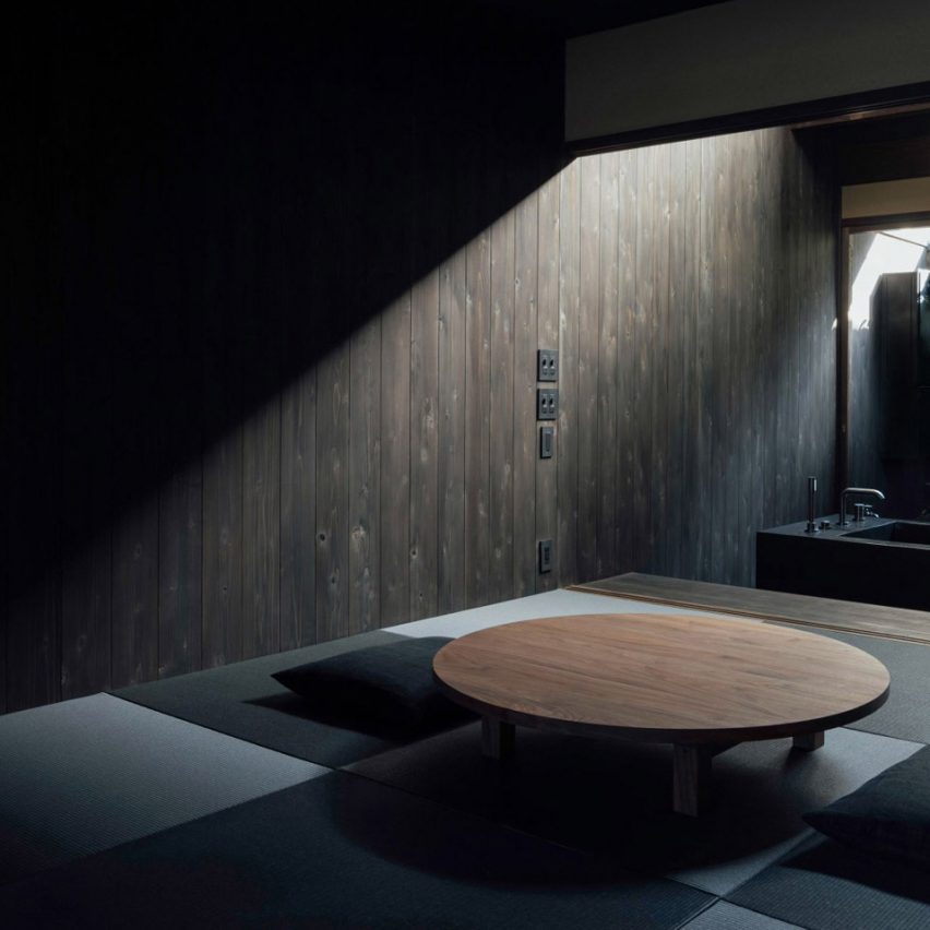
Hazard lines and metal shelving are some of the industrial finishes that Torafu Architects has included in bag brand Freitag's store in Kyoto – which even includes its own workshop.

Freitag's Kyoto store, which is shortlisted in the small retail interior category of the 2020 Dezeen Awards, occupies what was formerly two separate retail units in the city's Nakagyo-ku district.

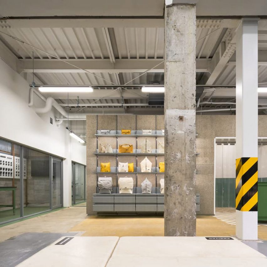
The interiors of the store have been designed by Torafu Architects to look like Freitag's logistics warehouse at the brand's headquarters in Zurich, Switzerland.

Freitag store in Kyoto has industrial interiors
Top image: the store's exterior. Above: hazard lines have been painted on some of the store's surfaces

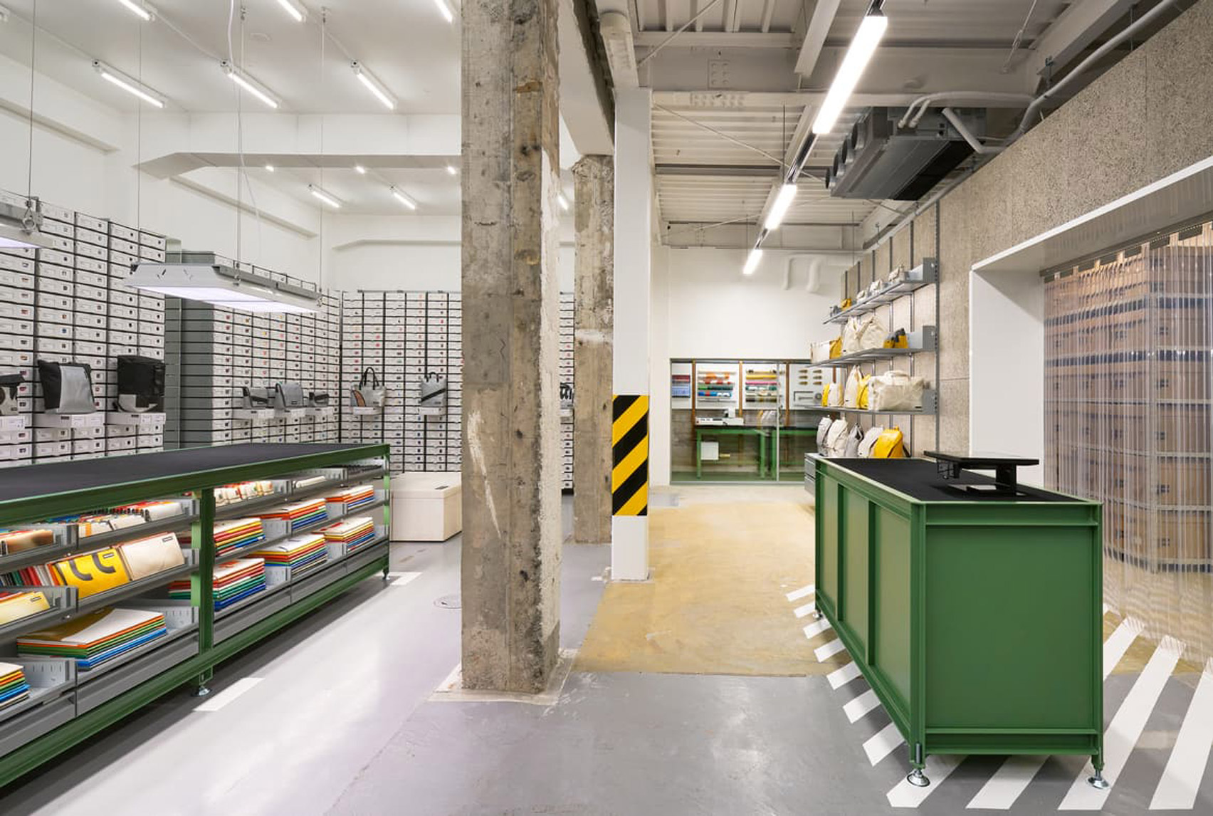
Industrial-style details have been incorporated throughout the 80-square-metre space, which the architecture practice said they left in a "skeleton state". For example, black-and-yellow hazard lines have been painted around one of the store's structural columns.

Similar lines appear beneath the green cash desk. Just opposite sits a matching rubber-topped counter where customers will be able to set down and inspect any potential purchases.

PVC flap curtains were used to screen off the shop's storeroom, which is enclosed by a volume clad in wood-wool boards. Simple strip lights have also been fitted across the ceiling.

Freitag store in Kyoto has industrial interiors
Freitag's bags are displayed on metal shelves or stored in drawers

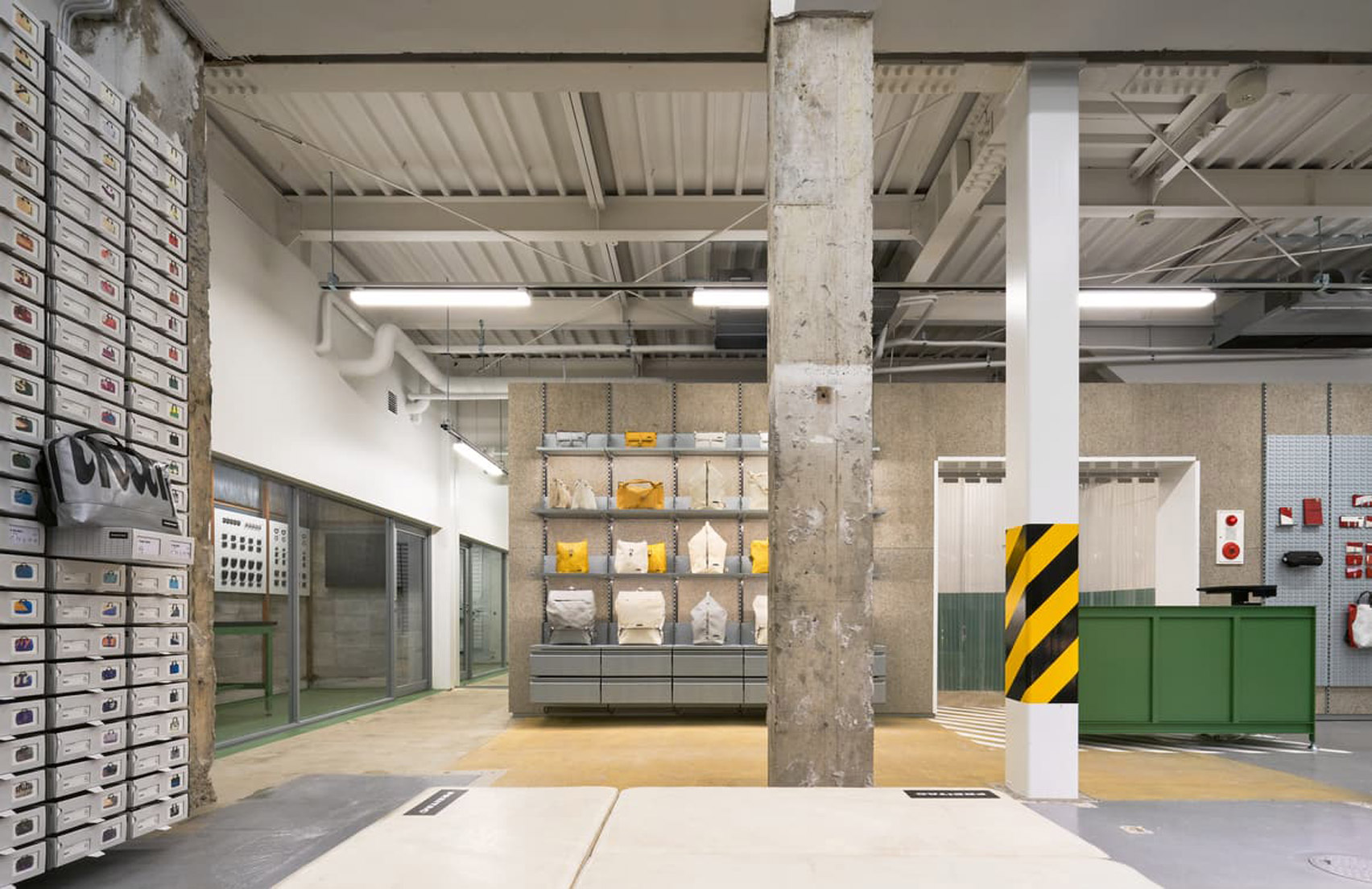
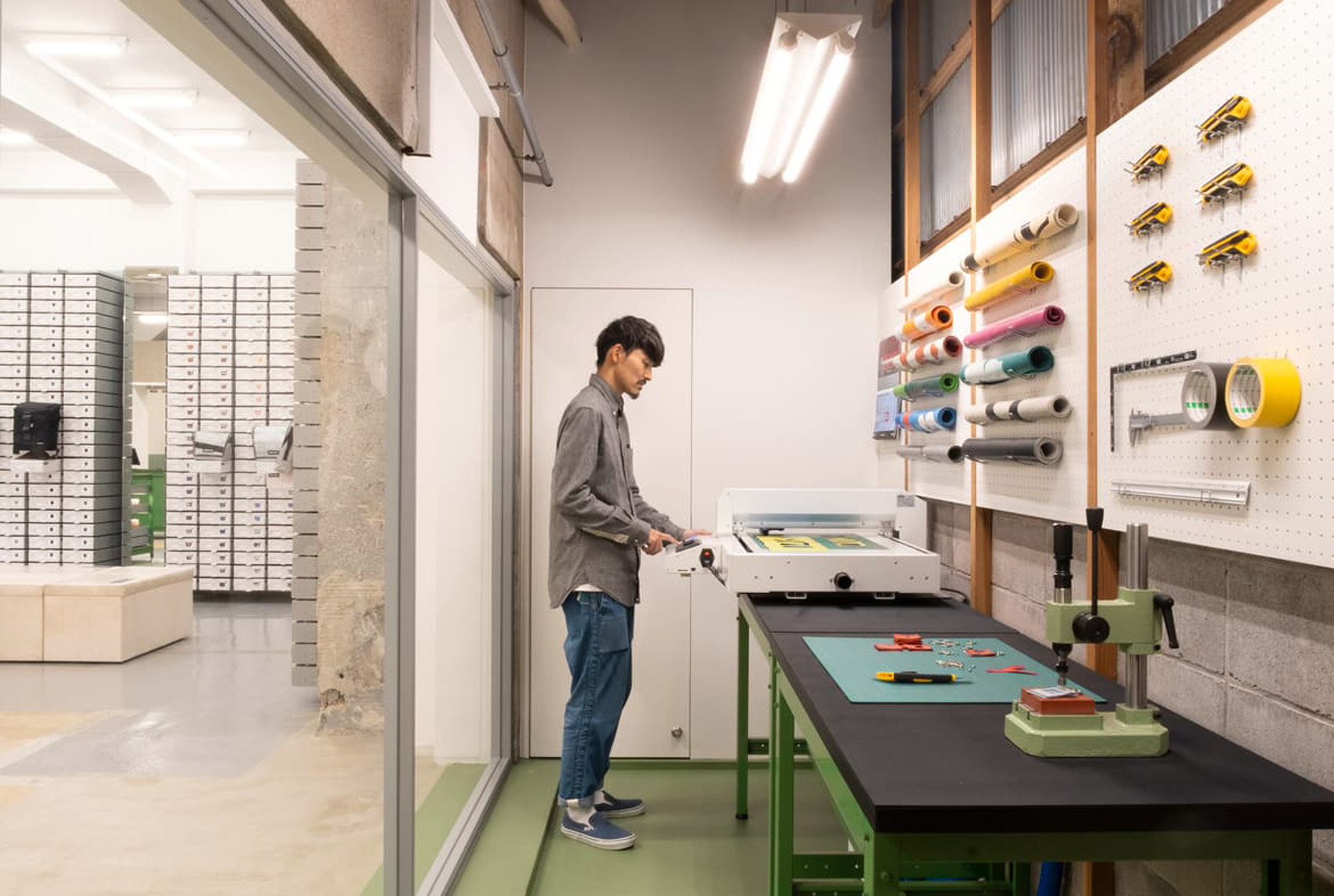
Bags are displayed on metal shelves or on top of pallets which have been stacked up in the store's front window.

Uniform rows of drawers that run across the entire left-hand side of the store contain more Freitag bags, each of which is crafted from recycled truck tarpaulin.

The brand first removes any eyelets or straps left on the tarps before cutting, washing and turning them into a range of different bag models such as backpacks, totes or holdalls.

Towards the rear of the store is a workshop, where customers will be able to experiment with using tarp offcuts themselves and turn them into a small accessory of their choice.

Freitag store in Kyoto includes its own workshop
The store includes a workshop where customers can make their own accessories

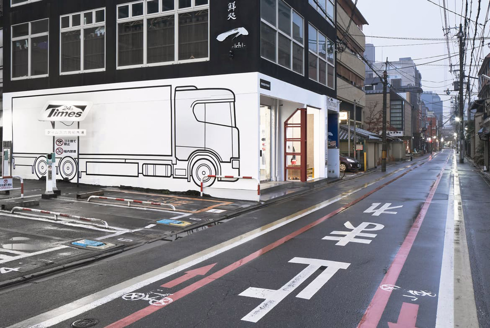
More industrial touches appear on Freitag's facade, where a red-steel beam has been installed in place of the wall that once divided the two retail units.

A large drawing of a truck has also been created on the store's side elevation so that customers "never forget the origin of every unique specimen".

Exterior of Freitag store in Kyoto features mural
The store's side elevation features a mural of a truck

Torafu Architects was founded in 2004 by Koichi Suzuno and Shinya Kamuro. The practice's Freitag Kyoto store will compete against four other projects in the small interior category of this year's Dezeen Awards.

Amongst them is an Aesop store in Shinjuku, which features a contrasting mix of steel and plaster surfaces.

Also on the list is Small Icon, a tiny bakery in Yokohama that's decorated in the same warm, golden hues as a loaf of bread.

Photography is by Taichi Ano.

The post Freitag store in Kyoto is designed to resemble the brand's own warehouse appeared first on Dezeen.


from Dezeen https://ift.tt/35NPuFq

Malika Favre's Kama Sutra typeface shows sex as a "deeply pleasurable and sometimes funny act"

Letter O from Malika Favre's Kama Sutra typeface

Naked bodies pretzeled together into different sex positions form the letters of the alphabet in the Kama Sutra A-Z coffee table book by French illustrator Malika Favre.

Couples are pictured in ecstatically contorted constellations, each drawn in Favre's characteristic, minimal style using only four colours.

Letter A from the Kama Sutra typeface
Above: the letter A is depicted as a sexual position. Top image: the Kama Sutra A-Z is open on page Q

Each letter is paired with an erotic verse or text, from classics by Emily Dickinson and Shakespeare to modern works by Michael Faudet and American poet Stephanie Burt.

"I wanted to show how relevant and timeless erotic poetry is as a whole and bring different voices into it," Favre told Dezeen. "I wanted the final selection to be a mix of eras, genders, sexual orientations and tones."

Malika Favre's book Kama Sutra A-Z
Favre's book comes with an embossed slip case

The alphabet itself was first designed for Penguin's reissue of the Kama Sutra – a Sanskrit text that gained notoriety for advocating adventurous sex positions but is actually more like an ancient self-help manual to love and courtship.

After illustrating the letters that spell out the book's name, Favre went on to finish the alphabet for an exhibition at Somerset House.

"The whole project was quite challenging for me as I was carefully trying to walk that line between sensuality and vulgarity," she remembered.

Favre based her designs on the iconic Futura typeface. It has a clean, geometric shapes created by German typographer Paul Renner in the 1920s, which made it one of the most widely-used fonts of the century.

"I have always been a big fan of this bold and unapologetic font," Favre said. "Its visual balance acted as a very strong backbone for my work and left enough space for interpretation without losing the understanding of the letter itself."

"Having consistency throughout the letters was very important to me, so working within the constraints of an existing font made sense from a design standpoint," she continued. "Also, I love giving myself ground rules before breaking out of them."

Letter V from the Kama Sutra typeface
The letter V is intended to showcase a reversed power dynamic between a man and woman

From there, she playfully moulded bodies together to fit the different letters and illustrate a range of power dynamics and preferences.

The figures are offset against an entirely matte black background. One member of the couple is depicted with bright white skin and red gloves and stockings, while the other is theatrically clad in yellow gold leaf.

Letter E from Malika Favre's Kama Sutra typeface
A man props up a woman to form the letter E

"I remember first picking the palette very instinctively and then looking up the meaning of the colours in Hinduism to make sure it worked both on a visual and symbolic level," Favre said.

"Yellow represents learning while red is the colour of sensuality and purity so the fit was absolutely perfect."

Letter G from the Kama Sutra typeface
Members of the couple have contrasting yellow and white-coloured skin

The idea of including poetry to complement the letters came to Favre after reading the work of Mexican American writer Sandra Cisneros, which reaffirmed to her that erotica doesn't have to be kitschy or cringey.

In the final book, verses from Cisnero's poem Beatrice accompany the letter S, which Favre describes as "one of the naughtiest". It reads: "Kiss me. I am an odd geometry of elbows and skin, a lopsided symmetry of sin and virtue".

Letter O from Malika Favre's Kama Sutra typeface
The figures are always rendered in the same colours

This matches the letter S, and the rotational symmetry of its curves, formed by a woman's swooping legs on top and a man's kneeling stance on the bottom.

"The poem itself has to echo the letter, whether it was the shape of it, its underlying story or the action. It just had to feel right," she said

Letter L from the Kama Sutra typeface
The letter L is formed by two women

"Everybody wanted to help, too, [the publisher] Counter-Print, my assistant Lea, close friends, my partner of course – I had suggestions coming from all sides, which goes to show that erotica is as universal as it is approachable," she continued.

"I hope that this book will proudly sit on people's shelves and coffee tables, be shared and enjoyed privately or publicly and that it will maybe help a few people to look at sex as what it is: a beautiful, highly enjoyable, deeply pleasurable and sometimes funny act."

Letter D from Malika Favre's book Kama Sutra A-Z
Each letter is accompanied by an erotic poem or text

Favre has previously designed an alphabet using the naked female form topped with a cartoon bunny face, in her work for London studio Airside.

Earlier this year, Filipino graphic designer Julius Raymund Advincula released a typeface made entirely from the folds and creases of his own body.

The post Malika Favre's Kama Sutra typeface shows sex as a "deeply pleasurable and sometimes funny act" appeared first on Dezeen.


from Dezeen https://ift.tt/2UGjKvm

Thursday 19 November 2020

Coffey Architects recalls industrial "found spaces" for King's Cross office block

22 Handyside Street in King's Cross by Coffey Architects  

UK studio Coffey Architects has created an office block at 22 Handyside Street that aims to recreate the feel of the former industrial spaces in King's Cross, London.

Built as part of the development of the King's Cross area of London, the office block completes a row of buildings that contains the pink R7 building designed by Morris + Company and Fumihiko Maki's Aga Khan Centre.

22 Handyside Street in King's Cross by Coffey Architects
Coffey Architects' block stands next to R7

Coffey Architects derived the form of the three-storey office block from the grade II-listed mainline and underground railway tunnels that lead to the nearby station, which the building stands directly above.

The structural grid, combined with a desire to allow daylight into the building, lead the studio to align the building diagonally with a series of pitched roofs running between the two streets on the corner site.

These pitched roofs create distinctive rooflines on the block's two street-facing facades and help mark the office as a landmark building at the edge of the King's Cross development.

22 Handyside Street office block
The office block has pitched facades

"At three stories you recognise that the roof can play a part," explained Coffey Architects founder Phil Coffey.

"It's not purely decoration, it is literally driven by the direction of the tunnels, which combined with the grid form the roofline," he told Dezeen.

"That drives the elevation, which then offers two fronts one to York Way and one to Handyside Street. It also creates a corner, which acts as a gateway to King's Cross.

Office block in King's Cross
The roofs run diagonally to the facades

The form also recalls the industrial sheds that would have previously been on the site and aims to be a playful addition to King's Cross.

By recalling this found, industrial architecture Coffey hopes that the building will appeal to technology, media and telecommunications (TMT) tenants.

Perforated anodised aluminium panels,
The building is covered in perforated anodised aluminium panels

"When we first wandered around King's Cross what we really noticed was the playfulness of all the buildings, especially the fringe buildings, which are the buildings which sit basically above the tunnels into King's Cross," said Coffey.

"Those found spaces, industrial spaces are what the TMT tenants are after," he continued. "So how can you make a new building that has that kind of sensibility?"

Office space in 22 Handyside Street
The upper floor has pitched ceilings

On the upper floor, this found aesthetic is most visible as the ceilings follow the form of the diagonal, pitched roofs above to create a space which rises to 6.7 metres high.

Described by the studio as a "gallery-like space" this open-plan office space is broken up by the structural steel columns.

Pitched ceiling in office space
The ceilings are 6.7 metres high

"We thought it'd be nice to have something that's informal on the top floor, that feels comfortable for those kinds of tenants," explained Coffey.

"So the roof both works in terms of its urban context, but it also works in terms of tenancy context and the kind of buildings that people want to work in."

Office views across King's Cross
The office has views across King's Cross. Photo is by Phil Coffey

Below this upper storey is a second office floor, while the ground floor contains the building's reception, cafe and further offices.

The entire structure is wrapped in embossed and perforated anodised aluminium panels, which aim to enliven the building's facades and create a dappled interesting light effect inside that changes throughout the day.

Dappled light in office block
The perforated panels create a dappled light effect

"We wanted something that lightened the whole building, in terms of actual brightness and reflection, and also something that accepts the light and creates shadows inside the building," explained Coffey.

"I really believe that if you make a building where there's wit about light, if there are shadows and dappled movements during the day, then you're conscious of your environment and you will care more for it and for yourself."

Pattern of light
Light patterns change throughout the day. Photo is by Phil Coffey

Overall Coffey hopes that the building will be an enjoyable marker of one of the entrances to the development.

"It's super important because it's a gateway building and the client wanted something that's kind of different and a little bit fun," said Coffey. "I think that's what we gave them. In essence, it's designed with a smile."

King's Cross station
King's Cross station can be seen from the office. Photo is by Phil Coffey

22 Handyside Street is the latest building to complete as part of the development of King's Cross in central London.

Nearby Thomas Heatherwick's studio recently completed a shopping centre formed of two converted 19th-century coal warehouses and British designer Tom Dixon opened a new flagship store inside a Victorian coal yard.

Photography is by Tim Soar unless stated.


Project credits:

Client: King's Cross Limited Partnership
Development manager: Argent
Architect: Coffey Architects
Delivery architect: Stride Treglown
Contractor: BAM
Structural engineer: Arup
MEP engineer: E3
Facade consultant: FMDC
Cost consultant and employers agent: Faithful and Gould
BREEAM assessor: Sweco
Workplace: KKS
Landscape architect: Townshend Landscape Architects
Fire consultant: Fire Surgery
Acoustic consultant:  Ion Acoustics

The post Coffey Architects recalls industrial "found spaces" for King's Cross office block appeared first on Dezeen.


from Dezeen https://ift.tt/3lR5lsb

OMA designs underwater sculpture park The ReefLine for Miami Beach

The Reefline by OMA

Architecture firm OMA is building a seven-mile-long, underwater sculpture park, which it says will bolster the shoreline of Miami Beach against the effects of climate change and include installations that can only be viewed while snorkeling.

Initiated by Argentinian curator Ximena Caminos, The ReefLine is intended to respond to, and raise awareness of, the way climate change is causing rising sea levels and coral reef damage in the coastal city.

OMA partner Shohei Shigematsu, who heads the firm's New York office, is leading the masterplan project, working with a team that includes marine biologists, researchers, architects and coastal engineers.

Section of The Reefline by OMA
Above: The ReefLine will stretch from South Beach to the north. Top image: OMA's staircase-like installation

"The ReefLine is a unique project that brings attention to and mitigates the dangers of climate change in Miami Beach, while simultaneously enriching the city's vivid art scene," Shigematsu explained.

"We look forward to collaborating with a diverse group of experts and professionals on our first underwater cultural masterplan and sculpture."

The ReefLine masterplan will be composed of geometric concrete modules, stacked approximately 20 feet (six metres) under water and approximately 900 feet (247 metres) off shore. They will run seven miles from South Beach at the southern end of the city all the way to the north to enhance the coastal resilience of the Miami Beach shoreline.

Masterplan of The Reefline by OMA
OMA's masterplan is composed of geometric concrete structures that will form an artificial reef

As climate change warms the ocean and causes damage to coral, this structure is also intended to act as an artificial reef where endangered marine life can live.

To achieve this, structures will be constructed with State of Florida-approved materials for artificial reef deployment. According to the team this includes concrete and limestone as they are chemically similar to natural reef substrate.

"The ReefLine will provide structure for corals and sponges to naturally colonize, adding biodiversity to an area that is currently an underwater desert of sand," the team told Dezeen. "In the future, we are looking into the feasibility of transplanting nursery grown corals to the structure from University of Miami's Rescue-a-Reef programme."

Artworks installed in between the concrete framework will also be made of similar materials and intended as an extension of the reef. Contributing artists will have access to a 3D printer that is able to replicate artificial reef modules from cement to include in their designs.

Featured projects are being curated by Caminos, who is the founder of BlueLab Preservation Society and Coral Morphologic. The project is being completed with the City of Miami Beach and researchers from the University of Miami.

OMA's installation in The Reefline by OMA
OMA's installation will feature spiral staircases arranged in a circle

"This series of artist-designed and scientist-informed artificial reefs will demonstrate to the world how tourism, artistic expression, and the creation of critical habitat can be aligned," Camino explained.

"The ReefLine is a singular investment in civic infrastructure, public art and environmental protection that will pay dividends over the coming decades and attract ecologically-minded tourists and art lovers to Miami Beach."

OMA is also among the contributing artists and will be one of the first to complete its structure in the sea. Its design will be composed of spiral stairs rotated around a circular opening overhead.

Leandro Erlich installation in The Reefline by OMA
Leandro Erlich will create an underwater traffic jam

Argentinian conceptual artist Leandro Erlich, meanwhile, will create a sculpture of a traffic jam. The project will be an underwater version of his Order of Importance installation, which featured 66 sand-covered sculptures of cars and trucks on Miami Beach to raise awareness of the climate-change crisis.

Construction on The ReefLine is set to begin next year and will be completed in seven stages. The first mile is slated to finish in 2021.

The ReefLine is among a number of projects venturing under the sea. Earlier this year Swiss designer Yves Behar unveiled his design for French ocean conservationist Fabien Cousteau's underwater pressurised research station that will be "the ocean's equivalent to the International Space Station".

Other completed underwater architecture projects include a restaurant in Norway by Snøhetta, a Maldives villa with a bedroom under the sea and the Coral Greenhouse by Jason deCaires Taylor on the seabed off the coast of Australia.

The post OMA designs underwater sculpture park The ReefLine for Miami Beach appeared first on Dezeen.


from Dezeen https://ift.tt/36Qelrp

Minimalist Japanese guesthouse and robot dog feature in today's Dezeen Weekly newsletter

Maana Kamo guesthouse

The latest edition of our Dezeen Weekly newsletter features the transformation of a 100-year-old townhouse in Kyoto into a tranquil and moody guesthouse.

Readers were in awe over the Maana Kamo guesthouse, which Japanese architect Uoya Shigenori created by stripping back and reconfiguring a 100-year-old townhouse in Kyoto's Higashiyama District.

The guesthouse is shortlisted in the hotel and short stay interior of the year category at Dezeen Awards 2020. All of the award winners will be announced next week.

Robot dog
A robot dog will be used at Battersea Power Station

Other stories in this week's newsletter include UK architecture studio Foster + Partners taking on a robot dog to oversee construction at Battersea Power Stationa design competition in collaboration with LG Display, 30 architect-designed kitchens and a concept for a grow-your-own steak kit that uses human cells.

Subscribe to Dezeen Weekly

Dezeen Weekly is a curated newsletter that is sent every Thursday, containing highlights from Dezeen. Dezeen Weekly subscribers will also receive occasional updates about events, competitions and breaking news.

Read the latest edition of Dezeen Weekly. You can also subscribe to Dezeen Daily, our daily bulletin that contains every story published in the preceding 24 hours.

Subscribe to Dezeen Weekly 

The post Minimalist Japanese guesthouse and robot dog feature in today's Dezeen Weekly newsletter appeared first on Dezeen.


from Dezeen https://ift.tt/3ffaFTA