Sunday, 22 November 2020

Reed Watts creates "discrete but identifiable" cricket pavilion in Richmond upon Thames

Teddington Cricket Club by Reed Watts

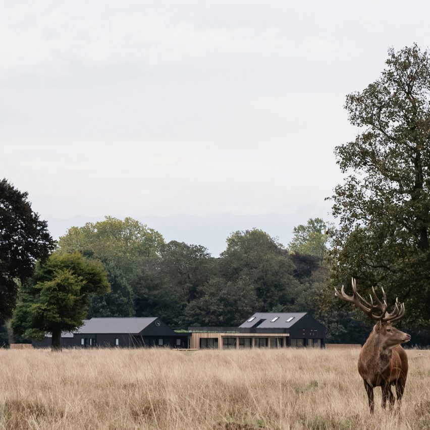
UK architecture studio Reed Watts has created a timber clubhouse for an amateur cricket team in London's Bushy Park that is designed to be both modern and familiar.

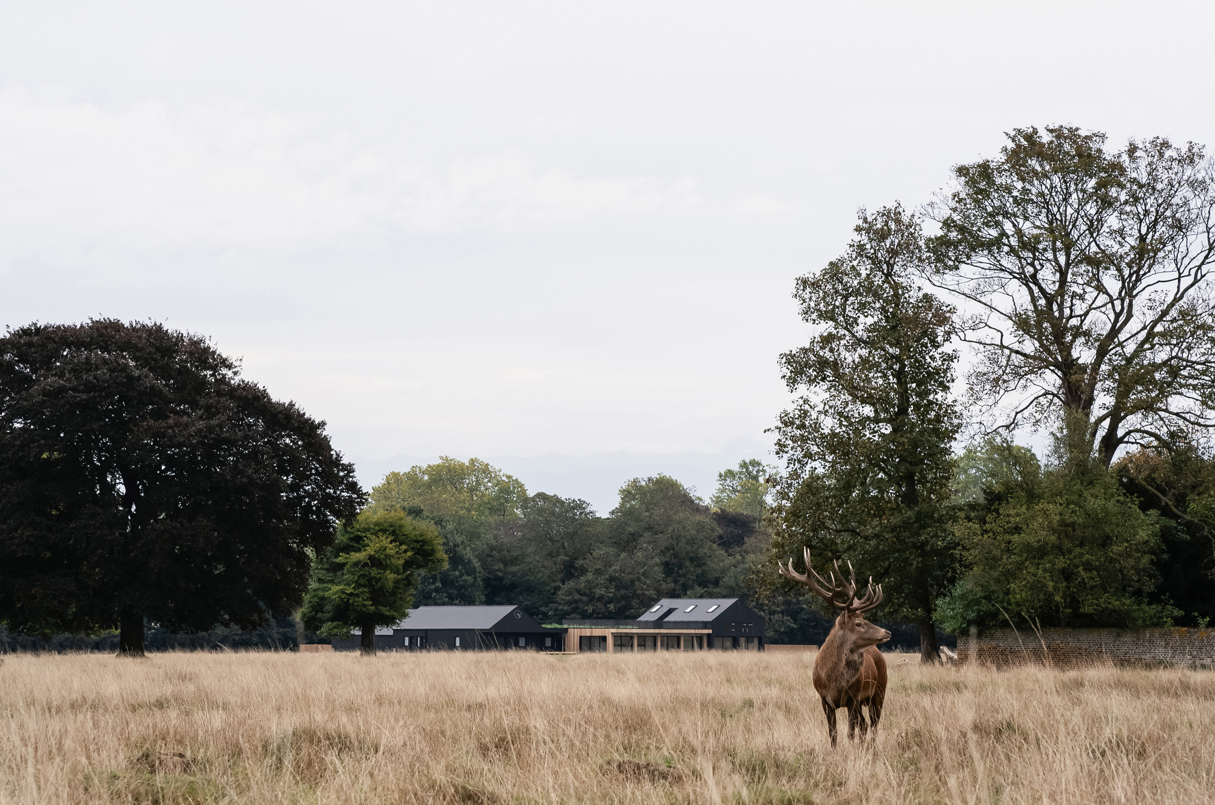
The sports pavilion was built to provide changing facilities and social spaces for Teddington Cricket Club, which has been based in Bushy Park – a Royal Park alongside Hampton Court Palace in Richmond upon Thames, south-west London – since 1863.

Teddington Cricket Club in Bushy Park
Teddington Cricket Club's pavilion is in Bushy Park

Reed Watts designed the building to replace the club's previous clubhouse in a pair of prefabricated huts that were built in world war two.

The studio wanted Teddington Cricket Club's new pavilion to reference these former structures and be respectful to its scenic location in the Royal Park.

Teddington Cricket Club clubhouse
The clubhouse is for an amateur cricket team

"The core concept responded to the dual brief of club and landowner to create a discrete but identifiable building that maintains the beautiful setting of the Bushy Park, while doubling the amount of floor space of the club's current building," explained Reed Watts' co-founder Jim Reed, who describes himself as a local resident and "reluctant part-time cricketer" who often gets roped into playing for the team.

"We were keen to design a distinctly modern structure but also one that imbued a sense of familiarity that would put users and park visitors at ease," he told Dezeen.

"The new building works better for spectators as well as players, providing better views and facilities while referencing the form of the previous clubhouse, fashioned from two Nissen Huts."

Cricket pavilion in London
The clubhouse has three distinct elements

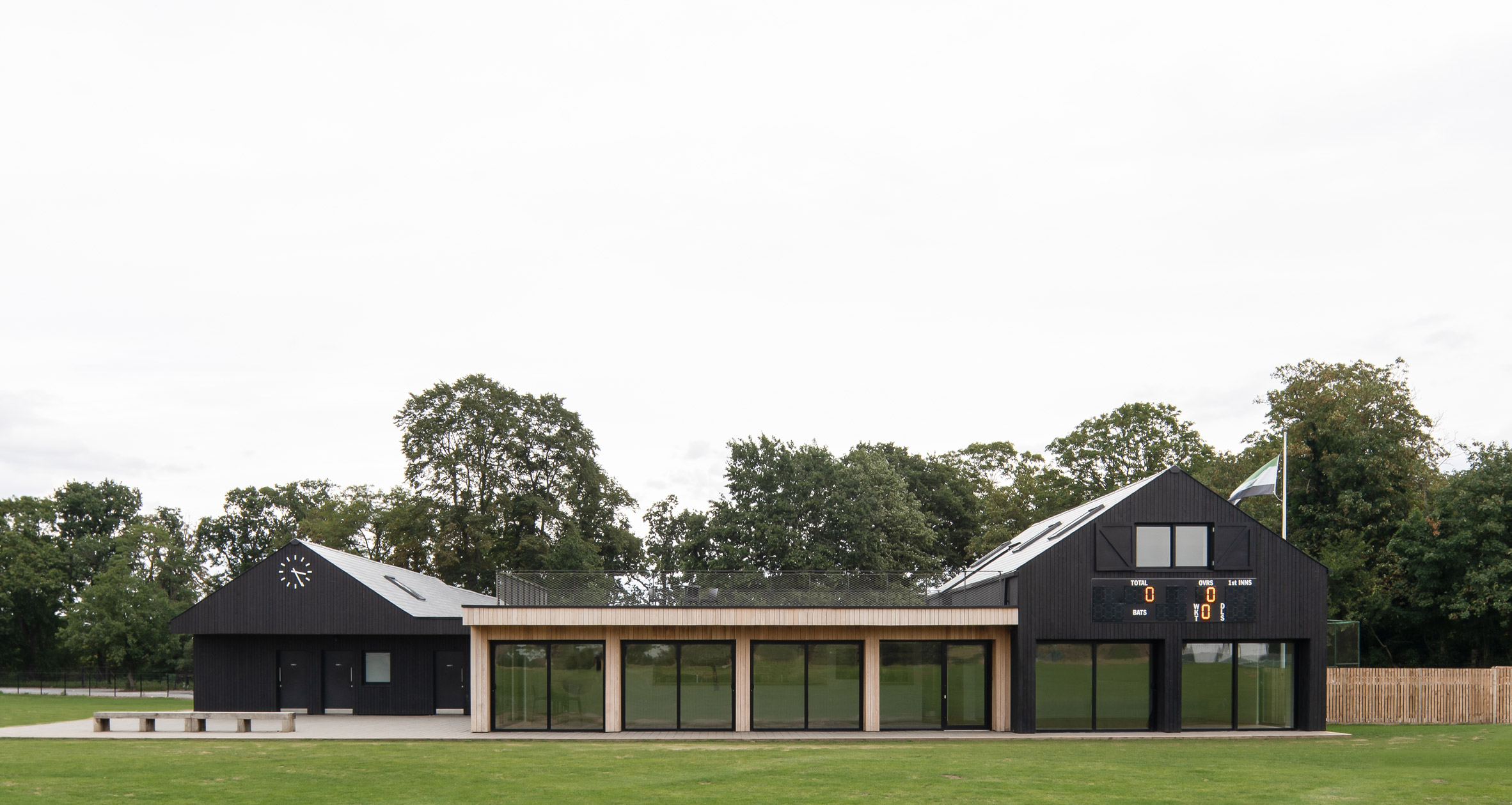
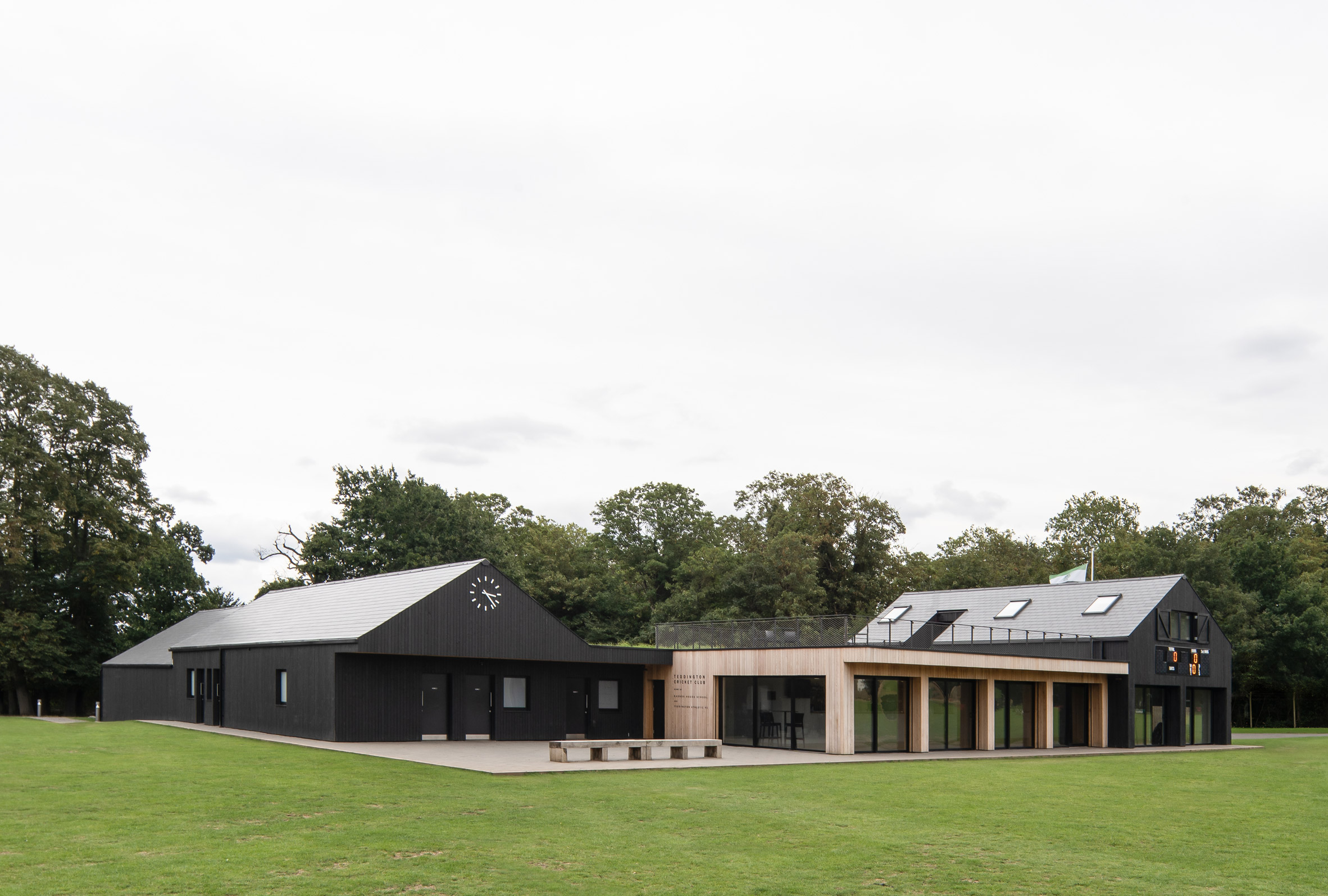
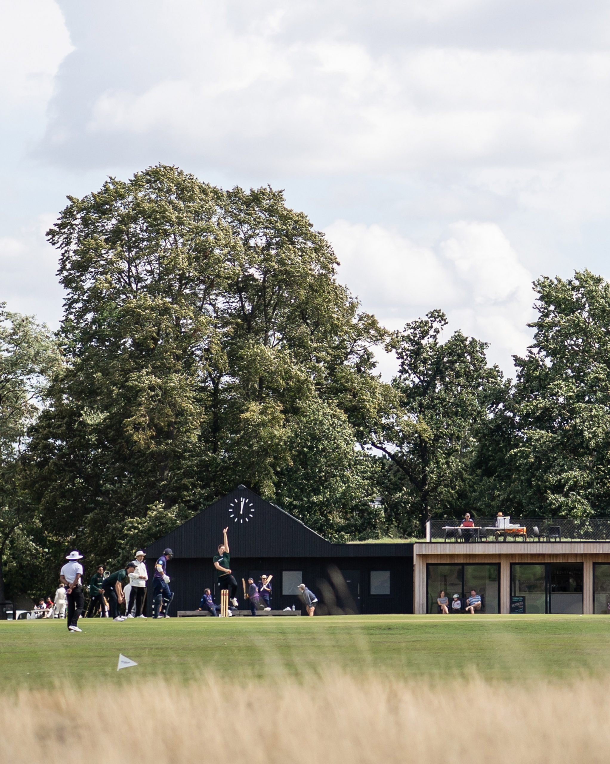
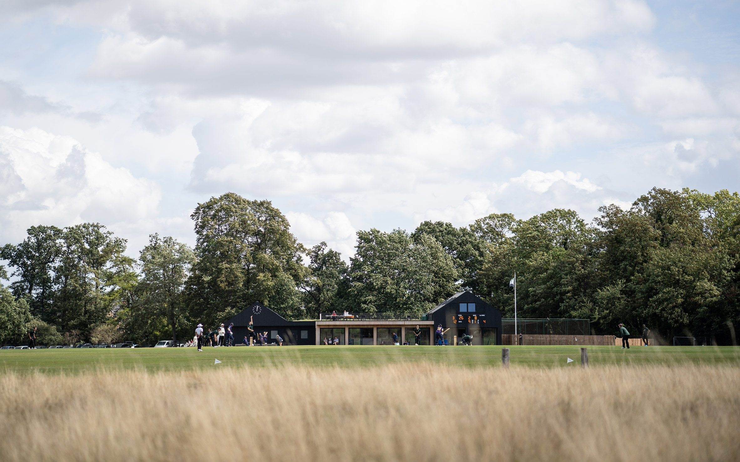
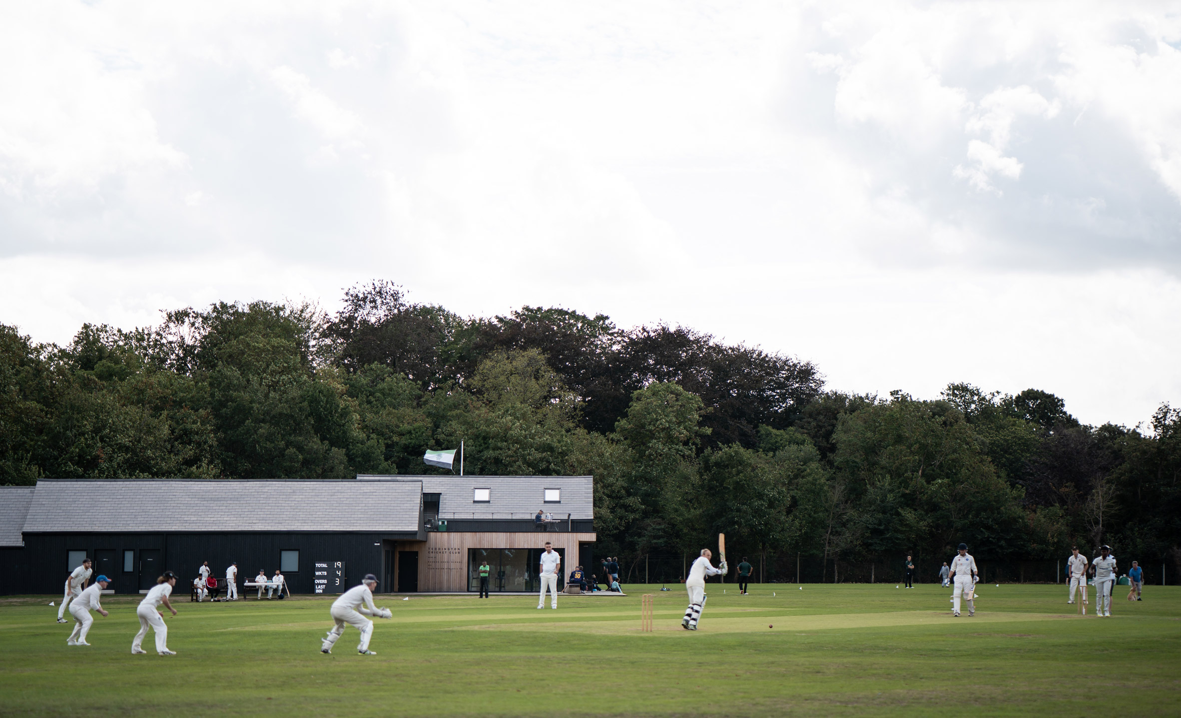
The clubhouse is formed from two black, pitched roof structures – one fronted by a clock and the other a scoreboard – connected by a flat-roofed section clad in natural-coloured timber.

"We kept the form simple, with little ornamentation," said Reed. "The focus is on the activity, in this case cricket – the players, umpires, clock and scoreboard."

"These are easily distinguished against the calm timber backdrop of the pavilion," he added. "There's a familiarity to it without pastiche."

Bar in Teddington Cricket Club
A bar has views over the cricket pitch

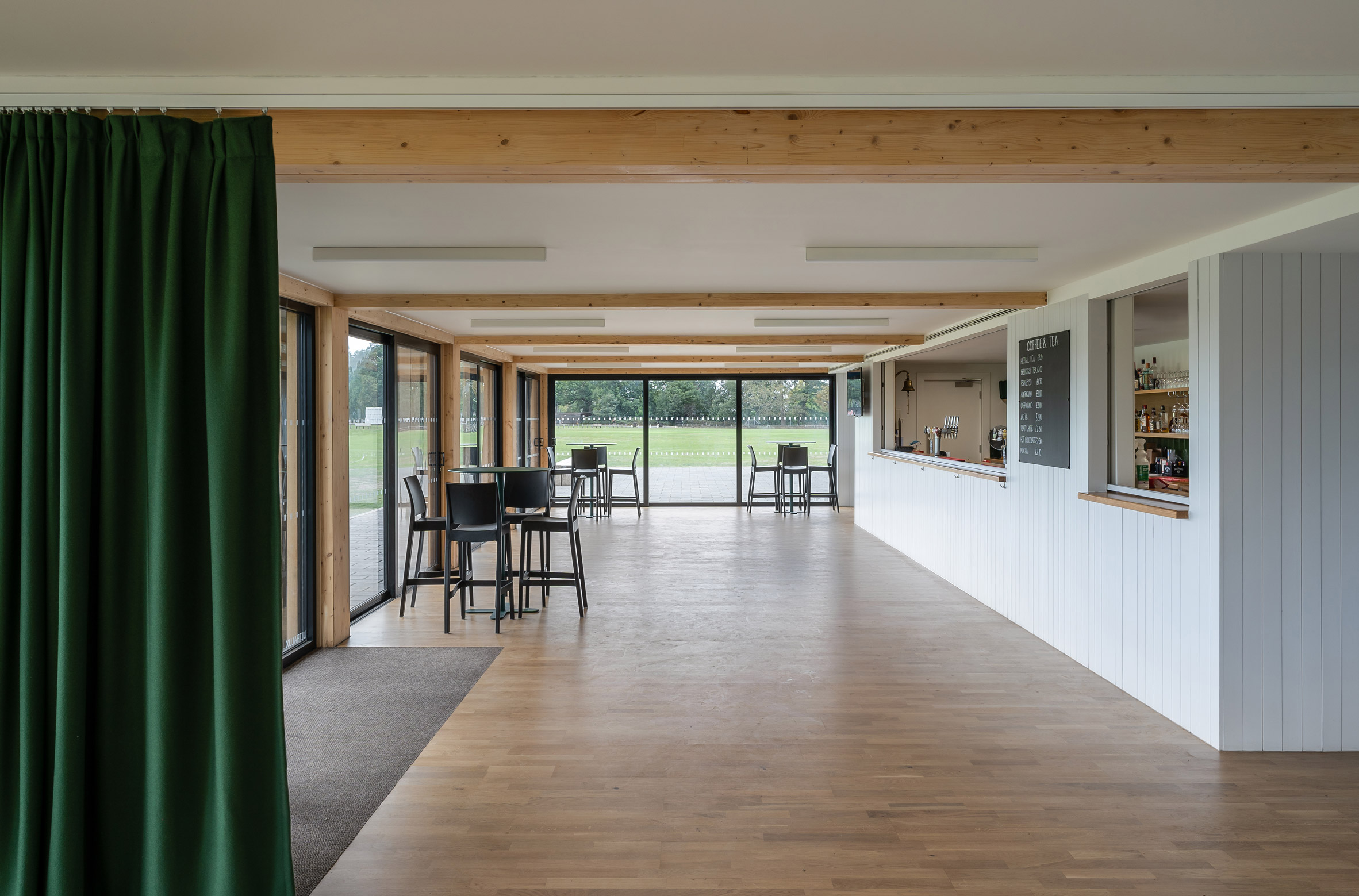
The central section, along with the smaller of the pitched roof structures, contains the club's public spaces, which were designed so they could also be used by the local community.

This block contains a bar and cafe with large windows to give views of the pitch, along with toilets, the club office and scorer's box. A roof terrace on top of the flat-roofed section provides an additional viewing area for spectators.

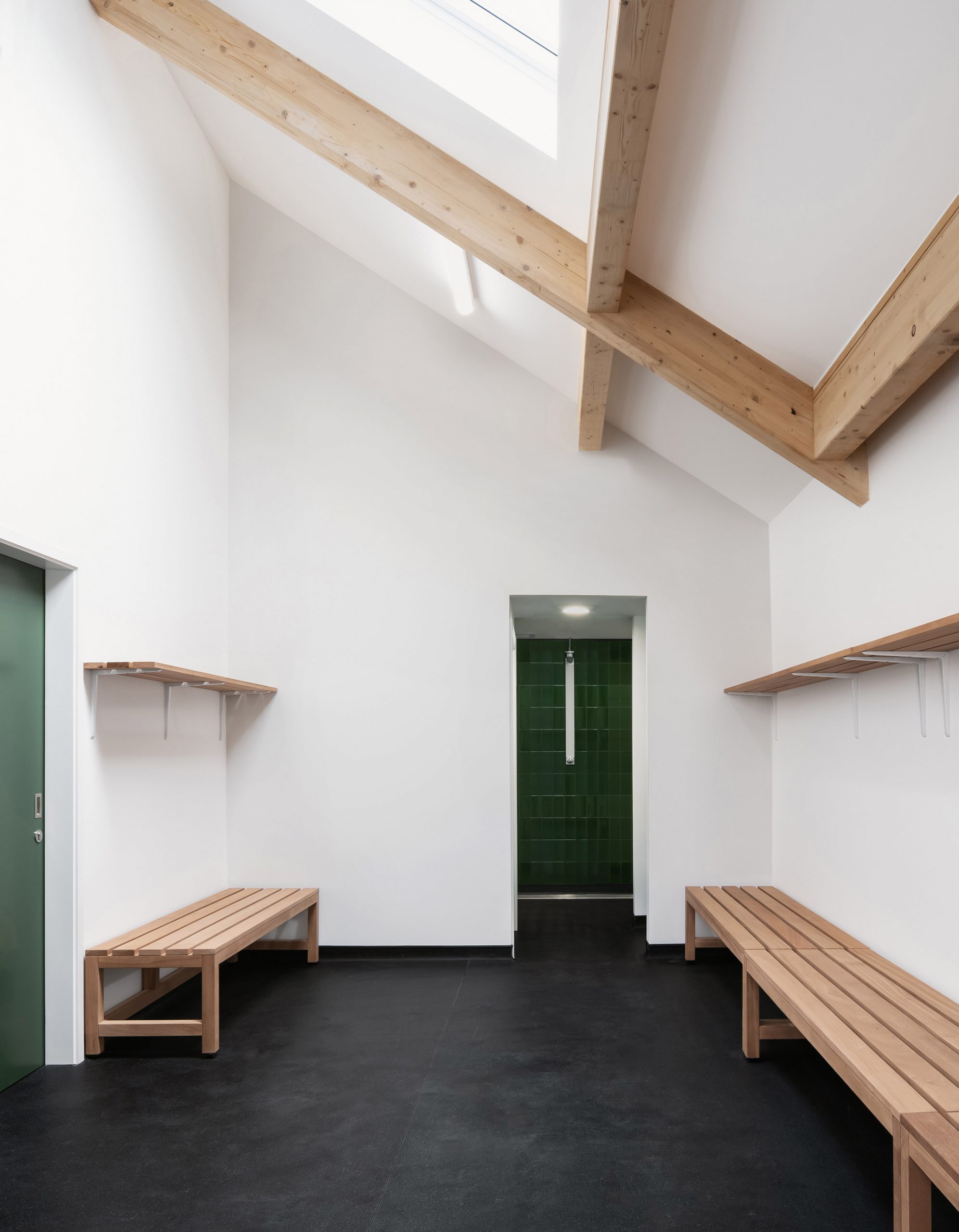
The second pitched-roof block contains four hanging rooms for players and one for match officials, as well as storage spaces for equipment.

Cricket pavilion with roof top terrace
The pavilion has a rooftop terrace

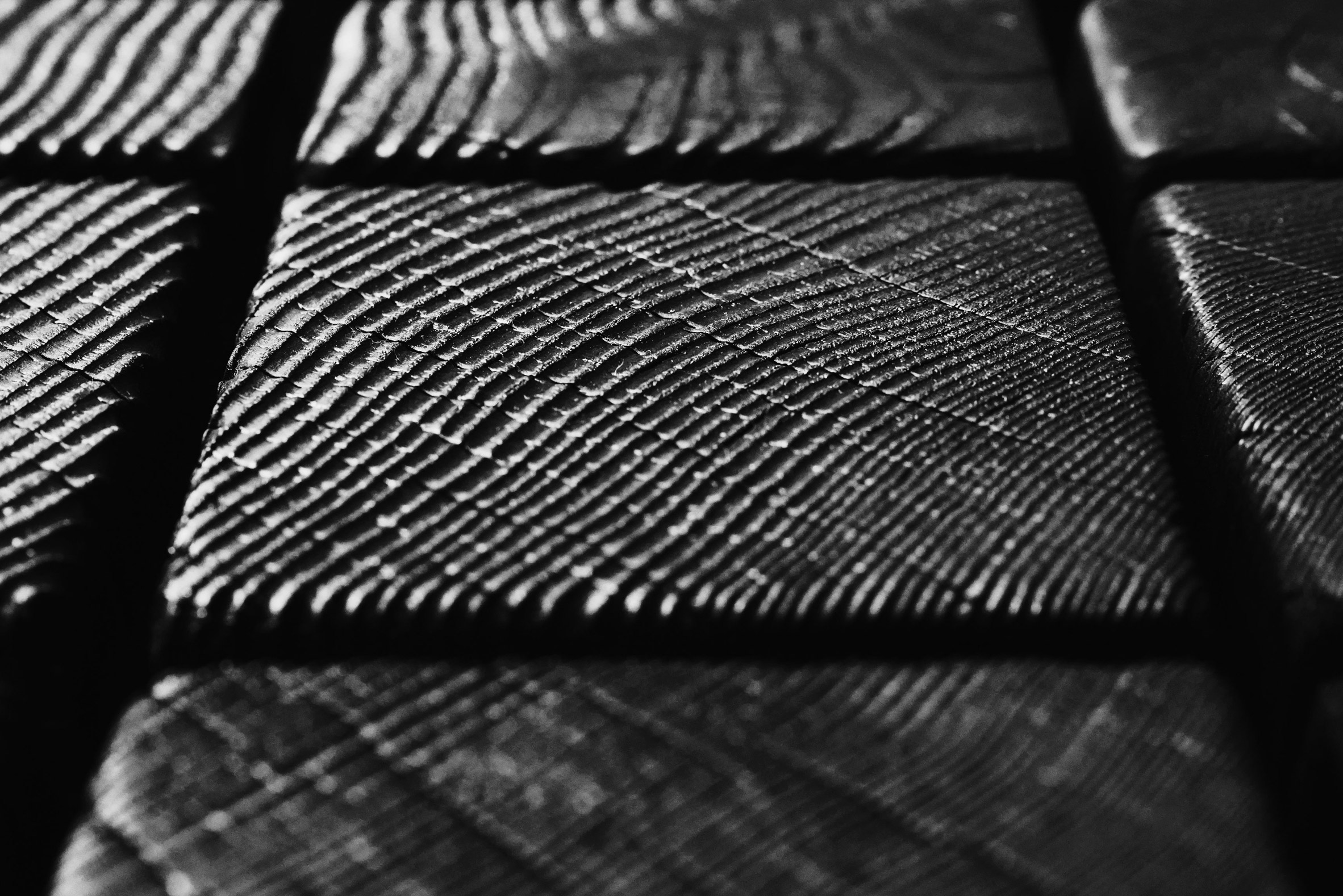
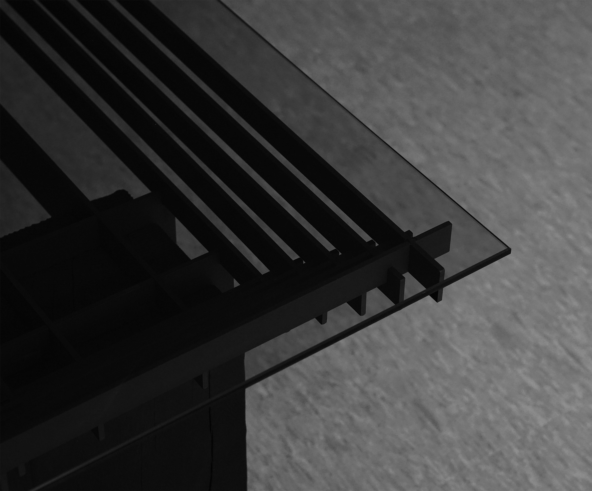
The structure combines a wooden frame with a structural insulated panel (SIP) system of walls made from timber, and is clad in larch that was stained black for the pitched-roof structures.

It also has a ground source heat pump, water storage tanks and green roofs help to help reduce the building's environmental impact.

According to the studio, this timber finish was designed to soften the building's appearance in the park.

Changing room in cricket club
The cricket club contains five changing rooms

"Finding an appropriate language to respond to the mature landscape setting of Bushy Park was key," explained Reed.

"The strong form of the clubhouse is softened by the Siberian larch cladding, which helps to nestle the building against the backdrop of mature trees," he continued. "The L-shaped plan also relates to the dual cricket pitches – with each flank facing a pitch - and is used to hide the training nets to the rear."

Cricket pavilion in London park
The pavilion was designed to be sympathetic to its location in a Royal Park

Overall, Reed Watts aimed to create a building that was modern but still clearly recognisable as a cricket clubhouse.

"There seemed to be an expectation that new pavilions should be reproductions of Edwardian buildings with little or no sense of place," said Reed.

"Before we became involved, this is what the club had imagined – white render, red tiles and a dovecot – a generic typology," he continued.

"We didn't think this represented the club's ambitions or values and certainly did little to respond to the landscape setting. While the new building does reference historical forms, the layout and minimal detailing are distinctly modern."

Cricket pavilion
The pavilion is used by Teddington Cricket Club and the local community

London-based architecture studio Reed Watts was established in 2015 by Reed and Matt Watts. The studio previously designed a set of modular sleeping pods from wooden panels as temporary accommodation for homeless people in London.

Photography is by Ben Tynegate.


Project credits:

Client: Teddington Cricket Club
Architect: Reed Watts Architects
Project Manager: CA Peter Lawrence, Stallworthy
Landscape architect: Colvin & Moggeridge
Planning advisor: Reed Watts Architects
Structural engineer: Evolve
M&E consultant: Baystar
Quantity surveyor: Peter Lawrence, Stallworthy
Principal designer: Reed Watts Architects
BREEAM consultant: JAW
Ecology: LUC
Arboriculture: Canopy Consultancy
Main contractor: GPF Lewis

The post Reed Watts creates "discrete but identifiable" cricket pavilion in Richmond upon Thames appeared first on Dezeen.


from Dezeen https://ift.tt/3pTZXXC

BLUE Architecture Studio adds U-shaped glass box to Shanghai coffee shop

Street view of % Arabica West by BLUE Architecture studio

Beijing-based BLUE Architecture Studio has renovated the % Arabica West shop in Shanghai's Xuhui district, adding a glass box and a courtyard to open the cafe up to the surrounding neighbourhood.

The studio's aim for the 50-square-metre renovation was to break the boundary between the commercial space and the street.

To do so it designed a U-shaped glass box, which contains the coffee counter, till and preparation area, in place of a regular facade. The box is surrounded by a courtyard-style seating area.

Street view of % Arabica West by BLUE Architecture studio
Top: a glass box instead of a facade opens the cafe up. Above: trees in the cafe courtyard make it blend in with the street

"The space is completely opened up to form a small courtyard around a U-shaped glass box," the studio said.

"Curved glass doors that can be completely opened, and ground materials that extend in from the outside."

Interior of % Arabica West by BLUE Architecture studio
Customers sit on built-in cement benches

BLUE Architecture Studio also took the minimal style of % Arabica's shops into consideration when creating the design, which has been shortlisted for Dezeen Awards 2020 in the restaurant interior category.

"The use of materials continues the brand's consistent minimalist style, using white paint and plain cement as the keynote," BLUE co-founder and architect Shuhei Aoyama told Dezeen.

"Green plants become the protagonist of the space, blurring the boundary between indoor and outdoor."

Benches at % Arabica West by BLUE Architecture studio
The studio used white and grey hues to create the minimalist design

Built-in cement benches along the walls provide seating space, while green plants were used to enhance the courtyard feel and create a dialogue with the Chinese parasol trees that line the street.

"The shops make part of their commercial space outdoor and contribute to the city street," Aoyama said.

View out from % Arabica West by BLUE Architecture studio
The coffee shop is located in the Xuhui district in Shanghai

"Although the commercial area of the shops is smaller, they create a rich three-dimensional street space experience, so that people's life can truly relate to the urban space," he added.

An air conditioning system was installed at the outdoor lounge area, as well as an air curtain machine at the entrance, to create a "more pleasant experience" in both winter and summer.

BLUE Architecture Studio was founded by Japanese architects Yoko Fujii and Shuhei Aoyama in Beijing in 2014.

The % Arabica West coffee shop will compete against four other restaurant interiors in the restaurant interiors awards category, including the Embers restaurant in Taipei that features a "vortex" of cedar planks and South Korea's minimalist DooSooGoBang restaurant.

Photography is by Eiichi Kano.

The post BLUE Architecture Studio adds U-shaped glass box to Shanghai coffee shop appeared first on Dezeen.


from Dezeen https://ift.tt/3nFHuMy

Archmongers uses primary colours to revive a home in the modernist Golden Lane Estate

Golden Lane flat by Archmongers

London studio Archmongers has renovated a duplex flat in one of the city's most influential housing estates, using shades of red, yellow and blue to complement the modernist materials palette.

The three-bedroom home is located within Hatfield House on the Golden Lane Estate, a complex designed and built in the 1950s by Chamberlin, Powell and Bon, the same architects responsible for the Barbican.

View through front door at Golden Lane flat by Archmongers
The renovation celebrates the original design of the Golden Lane flat

Archmongers' refurbishment is designed to celebrate the flat's key features – the bright and open living spaces, the efficient organisation of spaces, and material details like the terrazzo stairs and tiled surfaces.

Referencing historic photos of original Golden Lane flats, architects Margaret Bursa and Johan Hybschmann sought to reinstate details that had been removed or covered over in an earlier remodelling, which they described as "mundanely neutral".

Kitchen in Golden Lane flat by Archmongers
Wooden frames create subtle separation between kitchen and living spaces

The architects added chunky wooden frames to recreate separation between the kitchen and lounge space, without losing the visual connection.

Bespoke steel storage cabinets were installed, while original hardwood window frames and parquet flooring were uncovered.

Red front door at Golden Lane flat by Archmongers
Details are picked out in primary colours

"The biggest change was, in many ways, bringing it back to what it once was," Hybschmann told Dezeen. "Not because we had to, but because it made a lot of sense."

"The original palette of materials felt very modern and we wanted any new element or surface to be as relevant for many years to come."

Blue closet in Golden Lane flat by Archmongers
These bright colours also feature in the bedrooms

Bursa and Hybschmann chose to apply primary colours to various details in the renovated flat, referencing some of the historic exterior details on the Golden Lane Estate.

Shades of red and yellow highlight the front door and entrance area. The same hues feature in the first floor bedrooms and bathroom, along with blue tones – the idea was to give every room its own colour, in a high-gloss finish.

Bedroom shelving Golden Lane flat by Archmongers
Each bedroom has its own colour

"We've tried as best as possible to colour match the red, yellow, blue and dark blue exterior panels of each of the blocks making up the estate," explained Hybschmann.

"They work very well together and it's a nice reference to bring into the interiors of the building."

Bedroom window in Golden Lane flat by Archmongers
The colours reference details on the building's exterior

Other material details also help to tie spaces together. The granite surfaces in the kitchen echo the terrazzo of the staircase, while the new black quarry tiles in the kitchen match up with those in the external hallways.

The bathroom was given an upgrade too, to make it more suitable for modern living. It now includes a Japanese-style bath and a walk-in shower, with a new internal window that allows more daylight in.

The home is brought to life by the addition of the clients' midcentury furniture and large book collection.

Shower and bath in Golden Lane flat by Archmongers
The bathroom was updated with a Japanese-style bath and walk-in shower

Archmongers has previously worked on other modernist refurbishments, in the Barbican and The Ryde in Hertfordshire, along with various council houses in London. The architects' ongoing aim is to show the inherent potential in these midcentury buildings.

"Being able to work on another of London's iconic modernist estates was a privilege," added Bursa.

"Our experience helped us to deliver spaces sympathetic to the original vision while also creating a home that will intrigue, invite exploration, and provide opportunities for people to discover, enjoy, and deepen their engagement with modernist architecture."

Photography is by French + Tye.

The post Archmongers uses primary colours to revive a home in the modernist Golden Lane Estate appeared first on Dezeen.


from Dezeen https://ift.tt/3nSaJfr

Saturday, 21 November 2020

Gridded steel frames slice through charred-timber bases for Lin table series

Gridded sheets of steel support thick beams of blackened-timber for these Lin tables by Studio Shinyoo, whose bases have been burned three times over.

Studio Shinyoo employed a traditional east Asian method used to preserve wood known as Yakisugi or Shou Sugi Ban, which also prevents damage from insects.

Each table in the one-off Lin furniture series comprises a solid timber base whose top section has been cut multiple times in straight lines to form a grid.

Lin table collection by Studio Shinyoo
The Lin table series is made using blackened timber, steel and glass

The timber is then burnt three times in order to grant it its black finish. In between each firing, the designers brush away any loose grains to ensure the base remains stable.

Sheets of steel are then slotted into these incisions and stacked on top of one another in a grid-like formation. Grooves in the steel enable each sheet to sit at the same level.

Finally, the tables are topped with a pane of tinted-black glass.

The Lin table series by Studio Shinyoo features a gridded steel structure
Sheets of steel slot into cuts in the wood, arranged in a grid-like formation

In addition to ridding of the need for any glue or nails, the crossed steel frame also ensures that the natural wood doesn't warp and lose its shape over time, and works to evenly distribute the weight of items on the tabletop.

Studio Shinyoo likens this gridded structure to the repeated lines of trees in a forest. The collection takes its name from this idea, and is a combination of the Chinese word 林[lin], meaning "forest", and the English word "line".

As the designers told Dezeen, this grid-based joinery method is based on the beam-column design that was originally used to build roofs in Ancient Greek and traditional east-Asian architecture. The timber acts as the beam structure while the steel frames serve as the columns.

The Lin table series by Studio Shinyoo is made from blackened timber
The timber bases are burnt three times over to achieve their jet-black finish

"If we think about the origin of the table, the table was a ground before it was elevated. The elevated ground needed to be fixed at a seating height for comfort. Then there were legs to maintain its height and finally, it became a table," said the studio, which is based in Sweden and South Korea.

"This process is very similar to how humans built a house for the very first time as protection to protect them from the burning sun, cold rain, snow and even predators," it continued.

"Regardless of east and west, humans developed the beam-column structure because they needed a roof. The universal intersection of furniture and architecture is discovered right here."

"Despite the culturally distinct characteristics of Ancient Greek and Asian architecture, we can find a universality inside of it through the beam-column structure," the studio added.

The Lin table series by Studio Shinyoo features glass tabletops
The gridded steel structure means no glue or nails are required in assembly

Multidisciplinary practice Viewport Studio also used charred wood when creating its Essential Furniture collection, which is built from discarded offcuts of timber.

The studio aimed to demonstrate that furniture can be manufactured with little energy consumption when creating the side and coffee tables. The tables use slot-like joineries to minimise material waste, while the timber is sourced from within a 10-mile radius of the place of production.

The post Gridded steel frames slice through charred-timber bases for Lin table series appeared first on Dezeen.


from Dezeen https://ift.tt/2KwZ8UD

Warm beige hues update Résidence Esplanade in Montreal

Guest bedroom inside Résidence Esplanade in Montreal

Design pair Michael Godmer and Catherine Lavallée created a sequence of meditative, beige-tone spaces in the partial renovation of this home in Montreal.

Résidence Esplanade is situated in Mile End, a trendy area of Montreal host to various eateries, coffee bars and vintage stores.

The property was originally built as two separate apartments, but five years ago was converted into the two-floor house it stands as today.

Guest bedroom inside Résidence Esplanade in Montreal
The colour beige has been applied throughout Résidence Esplanade

Much of the property's unique decor details were eliminated during the renovation works. Its new owner, a young professional who collects furniture and works of art, tasked Michael Godmer and Catherine Lavallée with designing a slightly more distinctive interior.

"We wanted to add identity to the house's soul," Godmer told Dezeen.

He and Lavallée have, for now, overhauled the home's upstairs landing, study and one of its bedrooms – the rest of the rooms will be worked on at a later date.

Guest bedroom inside Résidence Esplanade in Montreal
Walls in the bedroom have been loosely limewashed

The three revamped areas have been completed in various shades of beige, a colour that the design pair says is "reminiscent of the soft winter light" that they saw on the first day they visited Résidence Esplanade.

In the bedroom, walls have been loosely rendered with lime paint that leaves behind an eggshell-coloured finish.

A tall wardrobe inlaid with cane panels has been set towards the rear of the room, while a white-oak sideboard has been set beneath the window so that the owner can display personal trinkets or ornaments.

In the corner of the room is also a blush-pink slouch chair.

Home office inside Résidence Esplanade in Montreal
In the study, a work desk has been set into a niche in the wall

Limewashed surfaces continue into the home's study. An oak work desk has been built within a niche in the wall, accompanied by a simple black tub chair and a spherical pendant lamp that dangles from the ceiling.

Textural interest is added by the corrugated panelling that has been set at the back of the niche.

Finally, fluted glass doors with buttermilk-coloured framing have been fitted in front of each of the rooms on the first floor.

Home office inside Résidence Esplanade in Montreal
The back wall of the niche is corrugated

Godmer and Lavallée say they plan to apply a similarly calming aesthetic throughout the rest of the home when they start the second phase of the renovation.

"We are also looking at adding a mezzanine and a rooftop terrace for [the owner] to enjoy summer days having views of Mont-Royal mountain," added Godmer.

Résidence Esplanade in Montreal has fluted glass doors
Fluted glass doors have been installed on the home's first floor

Résidence Esplanade is one of several homes that Michael Godmer has designed in his home city of Montreal. Others include Elmwood Residence, a Victorian-era townhouse in the Outremont neighbourhood which Godmer updated by creating a sequence of monochromatic living spaces.

Earlier this year, Godmer also made over the Montreal home that he shares with his partner, Mathieu Turgeon and their two poodles. Inside, it boasts fresh white walls and an array of wooden fixtures and furnishings.

Photography is courtesy of Catherine Lavallée.


Project credits:

Design: Michael Godmer and Catherine Lavallée
Construction: Frédéric Lalonde
Cabinetmaking: Il Fabrique

The post Warm beige hues update Résidence Esplanade in Montreal appeared first on Dezeen.


from Dezeen https://ift.tt/3fmfnzh