Wednesday 2 December 2020

Tej Chauhan's watch for Rado is informed by "old sci-fi movies and pop culture"

Industrial designer Tej Chauhan reveals the science-fiction influences behind his special edition of Rado's True Square watch in the latest exclusive video as part of Rado Design Week.

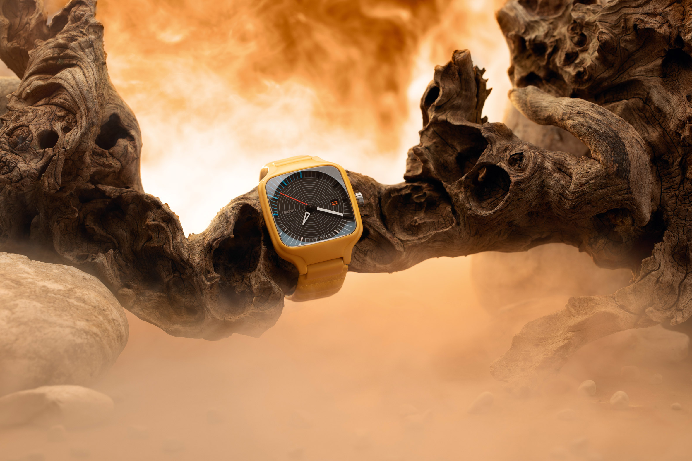
The British designer has created a vibrant twist on the Swiss watch brand's True Square timepiece, employing bold uses of colour, graphics and texture.

Chauhan looked to science-fiction films such as 2001: A Space Odyssey, Blade Runner and Moon to develop the watch design.

"My influences come from typography, old sci-fi movies and popular culture," Chauhan explained in the video.

"We wanted to strike a balance between something contemporary and something traditional."

Produced in ceramic with a matt yellow finish, the watch face features an intricate display of silver concentric circles and indexes, as well as a small window fitted with a date indicator featuring a custom-designed font.

Instead of using the True Square's traditional linked ceramic strap, Chauhan used quilted leather to create a strap with a pillow-like surface that imitates watch links.

"I wanted to do something completely different with the strap, which emulated watch links but is clearly this kind of soft tactile material," he said.

Working with Rado to develop this design, Chauhan's watch is made using the brand's injection moulding technology and its signature high-tech ceramic material.

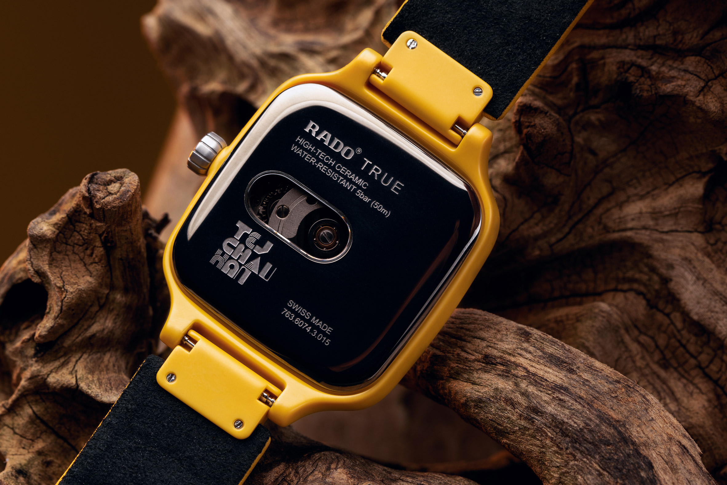
Introduced to the industry by Rado in the 1990s, the material is used in watchmaking due to its lightness and durability, making it extremely comfortable for the wearer.

"I wanted something that was completely distinctive, visually engaging, felt great when you picked it up and even better when you put it on," Chauhan said.

"Something that was really inspiring for me was being able to go to the heart of the Swiss watchmaking industry and see Rado's process from beginning to end."

Tej Chauhan, industrial designer

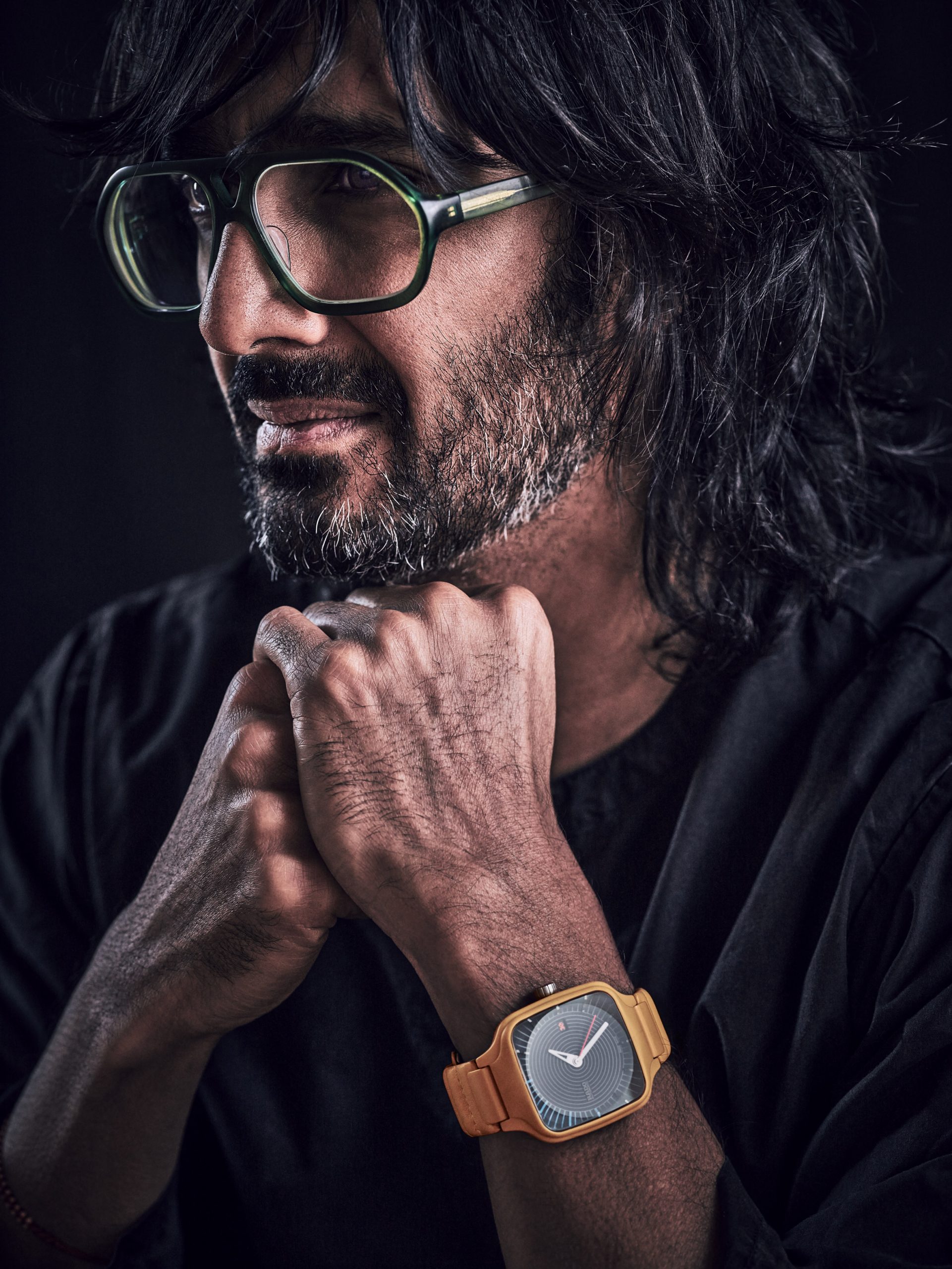
Based between London and Helsinki, Chauhan approaches industrial design with a look to the end user's emotional response, often embedding his designs with small details meant to elicit joy and wonder.

His portfolio of work includes product design such as furniture, homeware and technology including a car tyre using the graphics of a Nike Air Force 1 sneaker and a soft stool with a cubby for a laptop.

Chauhan will be speaking about the watch to Dezeen's founder Marcus Fairs, Rado's CEO Adrian Bosshard and its vice president of product development Hakim El Kadiri in a live talk at 4:00pm London time today as part of Rado Design Week.

Chauhan's True Square watch is one of four watches by a roster of global designers that will be revealed during Rado Design Week, a week-long collaboration between the Swiss watch brand and Dezeen.

Dezeen will publish exclusive videos revealing special editions of Rado's True Square watch by designers Tej Chauhan, YOY, Formafantasma and Thukral & Tagra, followed by a live conversation with each of the designers. Click here to check out the schedule.

The post Tej Chauhan's watch for Rado is informed by "old sci-fi movies and pop culture" appeared first on Dezeen.


from Dezeen https://ift.tt/36ujJ4t

Foster + Partners withdrawals from Architects Declare climate change group

ACAN calls on Foster + Partners to withdraw from Amaala airport project

Breaking news: UK architecture studio Foster + Partners has withdrawn form climate change action group Architects Declare, stating that aviation needs "sustainable infrastructure to fulfil its purpose".

The studio led by Norman Foster revealed the decision to leave the group, that it was one of the founding signaries of when it launched in 2019, in a statement issued to Dezeen.

"Foster + Partners has withdrawn from Architects Declare because, since our founding in 1967, we have pioneered a green agenda and believe that aviation, like any other sector, needs the most sustainable infrastructure to fulfil its purpose," said the statement from Foster + Partners.

"Unlike Architects Declare we are committed to address that need."

"Aviation has a vital role to play" in confronting global warming

The decision was made following tensions over signatories including Foster + Partners and Zaha Hadid Architects designing airports.

The studios have been criticised for being involved in the aviation sector with Architects Declare telling Dezeen last week that high-profile architects are "clearly contravening" climate pledges.

However, Foster + Partners believes that aviation has a role in tackling climate change and preventing future pandemics.

"We believe that the hallmark of our age, and the future of our globally connected world, is mobility," continued the statement.

"Mobility of people, goods and information across boundaries. Only by internationally coordinated action can we confront the issues of global warming and, indeed, future pandemics. Aviation has a vital role to play in this process and will continue to do so. You cannot wind the clock backwards."

More to follow...


The post Foster + Partners withdrawals from Architects Declare climate change group appeared first on Dezeen.


from Dezeen https://ift.tt/2Jjmvkp

The Book of Homelessness is the first graphic novel created by homeless people

Accumulate London's The Book of Homelessness

London charity Accumulate has released an "honest, painful and revelatory" book telling the stories of 18 different people and their experiences of homelessness.

Over 160 pages, The Book of Homelessness incorporates collages, illustrations, comics, poems and prose, all created as part of a three-month course organised by the charity.

Through workshops in everything from creative writing to drawing and sequencing, hosted at Shoreditch's Autograph Gallery, Accumulate aimed to allow people affected by homelessness to take control over telling their own stories, on their own terms.

Sue Pickford Cheung's contribution to Accumulate London's The Book of Homelessness
Author Sue Pickford Cheung wrote and illustrated an introductory piece for the book

"When you are excluded and marginalised from society, control is taken away from you," Accumulate founder Marice Cumber told Dezeen.

"If you're homeless and living in a hostel, your breakfast is at a certain time, your dinner is on a rota so you can't even choose what you're eating," she added. "You're living on such a small budget that you can't choose to do anything and you don't have a voice. So it was really important to me that this is their story and they have the right to tell it."

Collage by Luke Smith
Luke Smith contributed a collage about his experiences of homophobia

The result is what Accumulate describes as "the world's first-ever graphic novel created by people affected by homelessness".

Using a range of different mediums, this serves to reveal the multiplicity of experiences, which are hidden behind the blanket term of "the homeless".

"You have people that were leaving abusive relationships and people who were fleeing countries, where they were threatened with torture," Cumber said.

"Others were being rejected from their home or suffering violent attacks because of their sexuality. But the thing that runs like a river through the whole book is that everybody was escaping or fleeing from something."

Chris Fox's comic strip for Accumulate London's The Book of Homelessness
A comic strip by Chris Fox tells his story of sleeping rough after being kicked out by his family

One of the stories that particularly struck her is that of Chris Fox, which is illustrated in the book through simple, pencil-drawn comic strips with accompanying text.

"He had a very abusive stepfather, who chucked him out of his home. He was pleading with his mother to let him come back in the house but she wouldn't let him. He ended up in a tent and got into heroin," she explained.

"It's not an easy read. All the stories are very honest, painful and revelatory."

Drawing by Dave Sohanpal
Dave Sohanpal drew this piece on top of a Home Office asylum application form

The book itself was laid out by publisher and graphic designer Patrick Fry using a simple, monochrome palette punctuated with bursts of colour in order to allow the stories to remain the focal point.

Meanwhile, scale and font vary throughout, in order to pull out poignant abstracts and visuals while playing up the DIY, bricolage feel of the publication.

"It's not flippant, it's not trendy," said Cumber. "It's very matter of fact, good, honest design. The book holds people's life stories, so it needs some gravitas to it."

Abstract from Hamahoullah Diallo's contribution to Accumulate London's The Book of Homelessness
Poignant abstracts like this one by Hamahoullah Diallo were transposed onto colourful backdrops

The workshops, as well as the printing of the book, was entirely crowdfunded. All profits from the sale of the publication will ultimately be shared between the authors and fed back into The Accumulate Art School for the Homeless.

Here, the charity provides higher-level creative education for people who are experiencing homelessness, with the aim of increasing their sense of self-worth and potential for employment.

Since 2016, Accumulate has also helped eight students progress onto degree courses at a university through its scholarship scheme and the hope is that sales of the book will help to fund another bursary.

Sketch and poem by Amalia Walrond for Accumulate London's The Book of Homelessness
Amalia Walrond contributed sketches and poems

According to Cumber, the graphic novel has not just had an impact on those who made it but also on those who have purchased it so far.

"It's been a really educational process for them to understand the variety of stories that people have. It's not just the druggie, the alcoholic, the lazy person that doesn't want to work," she explained.

"A lot of people have written to me and said: 'I now recognise how privileged I am. I've got a supportive family, I live in a nice place.' So they've also learnt a bit about themselves and how they see their own lives."

Accumulate London's The Book of Homelessness
The book is on sale via Accumulate's website

Last year, London architecture firm Hildrey Studio developed a database called ProxyAddress, which provides homeless people with an address for one of the more than half a million houses that are currently standing empty in England.

With this, they can register for a bank account or apply for a job until they have found more permanent accommodation.

Meanwhile, Shelter from the Storm and Holland Harvey Architects transformed an abandoned supermarket in Islington into a 42-bed shelter, complete with integrated cafe.

The post The Book of Homelessness is the first graphic novel created by homeless people appeared first on Dezeen.


from Dezeen https://ift.tt/2I3DTsG

Tuesday 1 December 2020

OEO Studio creates colourful cantina for Copenhagen eatery Hija de Sanchez

Bar seating at Hija de Sanchez Cantina by OEO Studio

Instagram-friendly shades of pastel pink, sandy yellow and cobalt blue feature in Hija de Sanchez Cantina, a new Mexican restaurant in Copenhagen designed by OEO Studio.

Located in the docklands district of Nordhavn, the restaurant captures the colours and forms of Mexico City and combines them with Scandinavian furniture and materials.

Bar seating at Hija de Sanchez Cantina by OEO Studio
Hija de Sanchez Cantina is designed with a "casual cantina feel"

The project is the brainchild of former Noma chef Rosio Sanchez, who already has one restaurant in the city – the Hija de Sanchez Taqueria in Kødbyen.

The idea here was to expand the concept, moving up from tacos and cocktails to a full restaurant menu, but without losing the casual dining experience that made the taqueria so popular.

Shades of pink and yellow at Hija de Sanchez Cantina by OEO Studio
Shades of pink, yellow and blue reference the architecture of Mexico City

To achieve this, OEO Studio founders Thomas Lykke and Anne-Marie Buemann decided to divide the space up into a mix of zones.

There are a mix of high and low tables, with some spaces facing the bar, some clustered around an indoor tree, and others positioned alongside the windows. There's also an area overlooking the open kitchen.

Window seats at Hija de Sanchez Cantina by OEO Studio
The Mexican elements are complemented by Scandinavian furniture

"It was very important to me that, no matter where you sat, there was a unique perspective and height," said Sanchez.

"I also really wanted the space to have the illusion of a long bar and to give a casual cantina feel," she continued. "The different seating heights makes it very unique experience for guests, so one can try a different area each time they return – anywhere from the bar, kitchen bar, to the dining room."

Lobby at Hija de Sanchez Cantina by OEO Studio
The lobby features blue walls and a Mexican wall rug

Colours are used to pick out different elements throughout the space. In the lobby area, bright blue walls create a bold contrast with the vivid tones of hanging wall rug by Mexican brand Mestiz.

The main dining room features a zigzagging wall partition and a shelving area, both coloured in a pale shade of pink. Along with the dusky rose floor and the yellow-beige wall tiles, they give the restaurant a unique colour palette.

Counter dining at Hija de Sanchez Cantina by OEO Studio
Charcoal-coloured bricks and grey countertops help to soften the aesthetic

Shades of grey help to soften the impact of the colour. As well as the exposed concrete structure of the building, OEO Studio introduced charcoal-coloured bricks and grey countertops.

"Mexico is full of vibrant colours and Mexicans are not afraid of using them in exteriors and interiors – in sharp contrast to the Scandinavian architectural and design culture that is our background," said OEO Studio co-founder Thomas Lykke.

"In the design process, we were very inspired by Mexican architects such as Luis Barragán and by Mexican art, craft and design. Our concept was to create a space that gives you the flavours of Mexico, in Copenhagen."

Mutina wall tiles at Hija de Sanchez Cantina by OEO Studio
Furniture includes tables that were custom made from Caribbean walnut

Furniture and lighting were carefully selected, to reinforce the relaxed vibe.

There are products sourced from Mexico, like pendant lights from designer David Pompa and Silla chairs, as well as a few of OEO Studio's own designs, including the Pauline bar stools for Brdr Krüger and tables made from Caribbean walnut.

Greenery plays an important role too. The indoor tree is the centrepiece of the space and is accompanied by desert succulents and trailing plants.

Open kitchen dining at Hija de Sanchez Cantina by OEO Studio
A more muted space flanks the open kitchen

Hija de Sanchez is not the only restaurant OEO Studio has designed for a former Noma chef – the office also worked on Inua in Tokyo, which is headed up by chef Thomas Frebel.

More recently, the studio has also completed a revamp of Michelin-starred Kadeau.

Photography is by Michael Rygaard.

The post OEO Studio creates colourful cantina for Copenhagen eatery Hija de Sanchez appeared first on Dezeen.


from Dezeen https://ift.tt/2Vqcft2

Peruvian mountains surround geometric and red Casa Huayoccari by Barclay & Crousse

Lima studio Barclay & Crousse has completed this house with reddish stone and concrete walls, and dramatically slanted roofs to echo mountains.

Casa Huayoccari is located in the valley of Urubamba, a mountainous setting considered sacred by the Incas. The house appears to be enclosed by the Pitusiray mountain range, which provided the cues to design the house in separate volumes with mono-pitched roofs.

Exterior of Casa Huayoccari by Barclay & Crousse
The Pitusiray mountain range appear to enclose Casa Huayoccari

"Casa Huayoccari stands at 2,950 metres above sea level, in a special place within the valley, giving the impression of being in the centre of a circle of surrounding mountains, and not in a lineal valley, which is in fact the case," said Barclay & Crousse.

"The project does not refer to the traditional architecture of the valley, but instead the mountains which surround it."

In addition to the rooftops, the house is designed to step down the sloped site – the firm has also landscaped outdoor areas into terraces.

Patio of Casa Huayoccari by Barclay & Crousse
The house has an L-shaped plan around a patio

"The sloping land is treated with stone made terraces and a platform which generates a horizontal ground for the house to be installed on," it explained.

"The traditional gable roof is decomposed in two planes adopting the pitch of the surrounding mountains and thus generating spatial compressions that frame the low valley and spatial dilatations, which lead towards the Pitusiray mountain."

While the form of the house draws on its surroundings, the materiality is rather different. Local Andesita Red Stone covers the roof and forms the lower portions of the walls, while the upper half is board-marked concrete, which includes pozzolanic cement that gives it a red tint.

Interior of Casa Huayoccari by Barclay & Crousse
The walls of the house had a reddish hue

"It's a cement of volcanic origin, and has ferrite in its components, so it has a natural, reddish color that oxidates (getting darker) with weathering," said the studio.

Barclay & Crousse has protruded a cluster of chunky, red window frames from the concrete walls. The lower walls meanwhile are punctuated by large, wood-framed windows.

Lounge in Casa Huayoccari by Barclay & Crousse
A sloped, white-washed wall tops the lounge

The studio, which is led by architects Sandra Barclay and Jean Pierre Crousse, was originally enlisted to design two sister houses for the site. Casa Huayoccari is the first and was completed in 2018.

It has an L-shaped floor plan that wraps a patio at the house's entrance – an area covered by a white-painted sloped ceiling with views to the Pitusiray peak.

Dining room in Casa Huayoccari by Barclay & Crousse
Ceramic floor tiles and wood form a warm material pallete

From here there is access to the living and dining rooms, which occupy the ground floor alongside three bedrooms. The main bedroom is located on the first floor and has access to a terrace.

Barclay & Crousse has white-washed portions of the concrete walls inside the house, to create a bright interior, while the red stone remains exposed and is complemented by a glossy flooring tile.

Stairs in Casa Huayoccari by Barclay & Crousse
Stone steps lead to the first floor

The interiors are intended to be kept naturally warm and cool by the shape of the roofs.

"In the afternoon, the roof, covered in stone, protects the house from the strong sunshine, but its thermic inertia enables the accumulated heat to propagate during the night, a period of time during which the temperature drops due to the altitude where the house is situated," said the studio.

Bedroom in Casa Huayoccari by Barclay & Crousse
A large window offers views of the mountain from the bedroom

Barclay & Crousse is led by Peruvian architects Jean Perre Crousse and Sandra Barclay. The pair set up their studio in Paris in 1996, before relocating to Lima in 2006.

The studio has completed a number of projects in Peru, which it told Dezeen is making a comeback following decades "erased from the architectural map" thanks to international recognition of impressive new buildings in the country.

Other projects include the clifftop Casa C3an archaeology museum and the Edificio E university building in northern Peru, which was awarded the Mies Crown Hall Americas Prize in 2018.

Photography is by Cristóbal Palma.


Project architects: Sandra Barclay and Jean Pierre Crousse
Assistants: Tommaso Cigarini, Andrea Otero
Structural engineer: Jorge Indacochea
Contractor: Fernando Parra

The post Peruvian mountains surround geometric and red Casa Huayoccari by Barclay & Crousse appeared first on Dezeen.


from Dezeen https://ift.tt/3oeETJI