Friday 4 December 2020

Studiomama transforms Yotam Ottolenghi's test kitchen into "happy space"

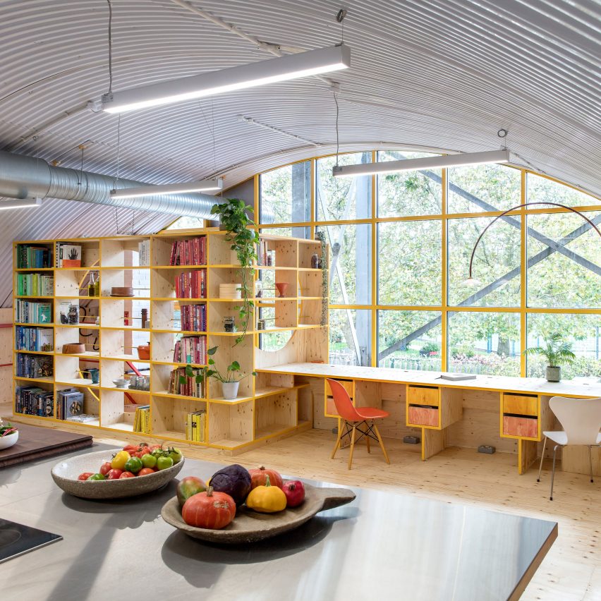
Yotam Ottolenghi's test kitchen features plywood furniture

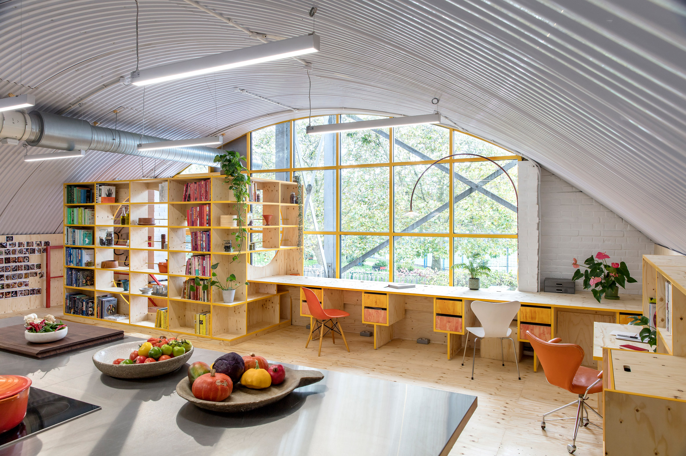
Multidisciplinary practice Studiomama has completed a colourful overhaul of chef Yotam Ottolenghi's test kitchen in London, creating pops of saffron yellow and raspberry red.

Israeli-English chef Ottolenghi is revered for his take on Middle-Eastern cooking and has come to own six different eateries across London.

His test kitchen – where he develops and trials out new recipes with staff – is located in the north of the capital, occupying a disused railway arch.
Yotam Ottolenghi's test kitchen features plywood furniture
Yotam Ottolenghi's test kitchen takes over a disused railway arch

The industrial setting was proving less than inspiring for Ottolenghi, so Studiomama was brought on board to revamp the kitchen.

Although no significant changes could be made to the structure of the railway arch itself, the studio instead used bright colours to give the culinary space a fresh feel.
Yotam Ottolenghi's test kitchen features plywood furniture
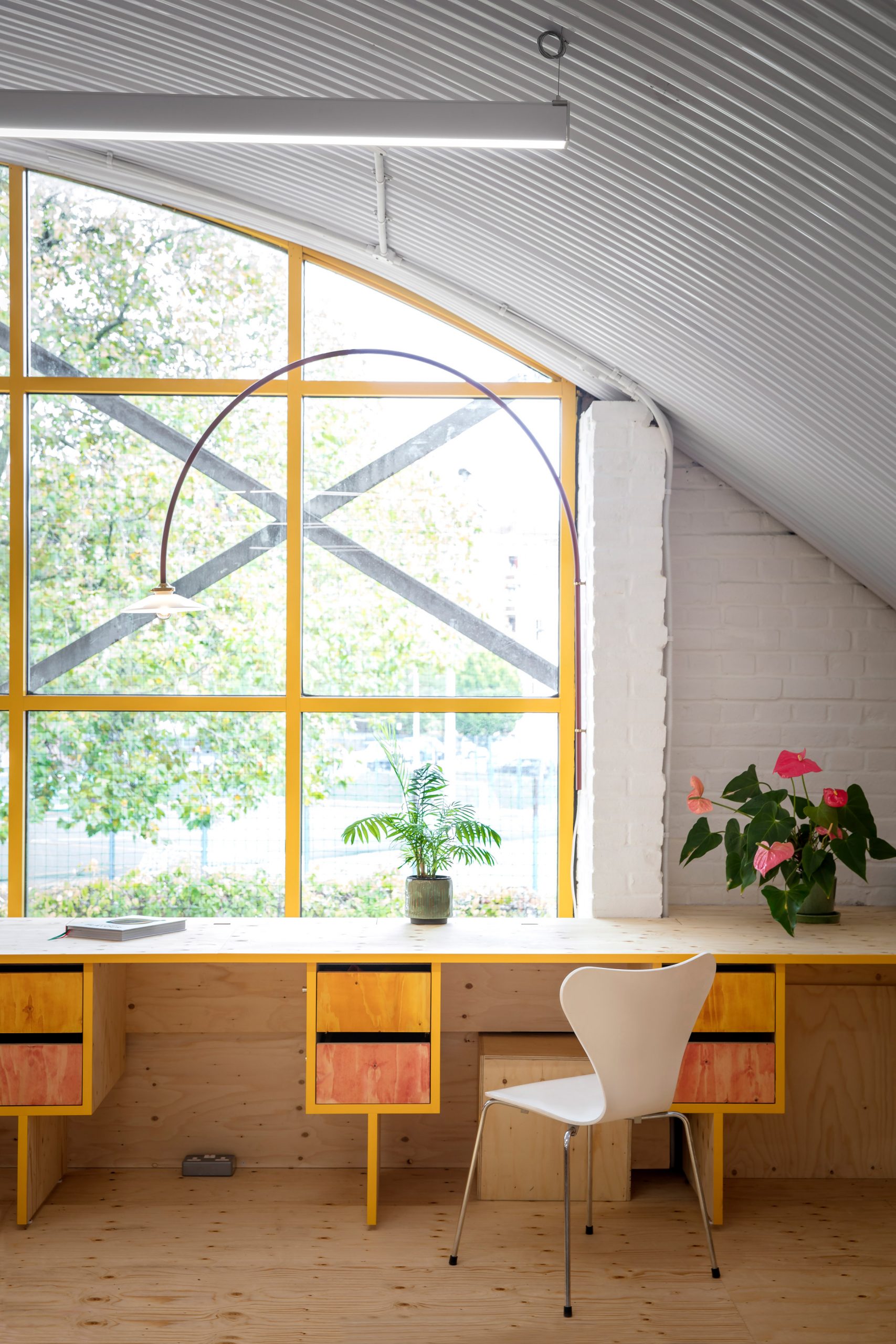
The window features a yellow gridded frame

"The Studiomama team managed to transform our test kitchen from a nondescript industrial unit under a grubby railway arch line into a sunny, happy space, where the functionality is perfectly adjusted to our needs: recipes testing, food photography and office work," explained Ottolenghi.

"Simply being in the room is now a joy."
Yotam Ottolenghi's test kitchen features plywood furniture
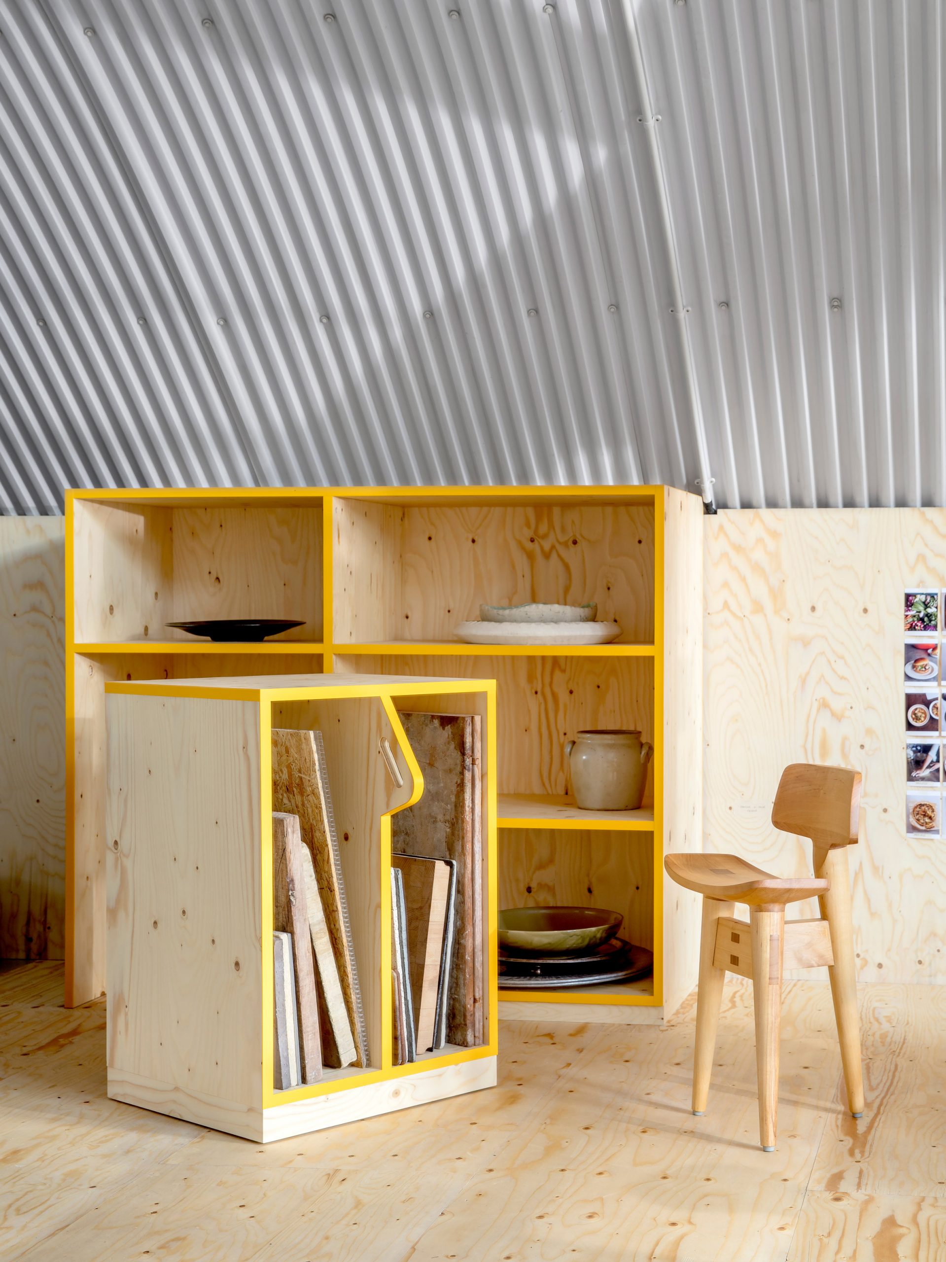
Yellow paint has also been applied around the borders of shelves

The huge sloping window that fronts the test kitchen now features a gridded, sunny yellow frame.

This same shade of yellow has been applied as a trim to the plywood bookcase, desk and shelves that have been fitted in the test kitchen.

One slightly larger shelving unit is specifically dedicated to storing different material offcuts, against which staff can artfully photograph plated dishes.
Yotam Ottolenghi's test kitchen features red staircase
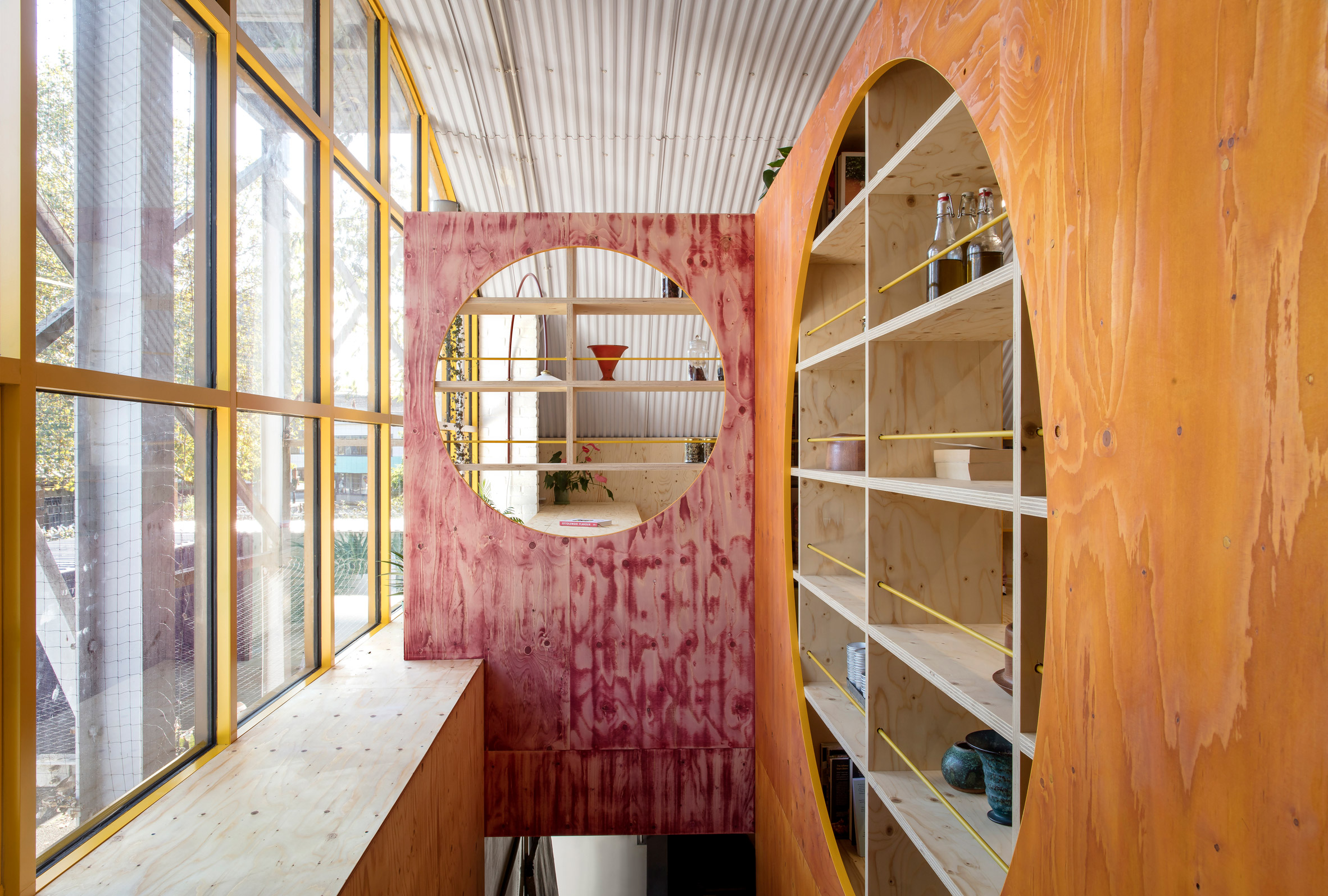
Some elements of the test kitchen have been stained red

Some drawers and the inner side of the bookcase – which is punctuated with a round opening – have been stained pinky-red in a nod to the hue of Ottolenghi's signature raspberry meringue roulade.

A red iteration of Belgian brand Muller Van Severen's Hanging Lamp has also been installed beside the window and a berry-coloured coating has applied to the stairs, which leads down to a storeroom.
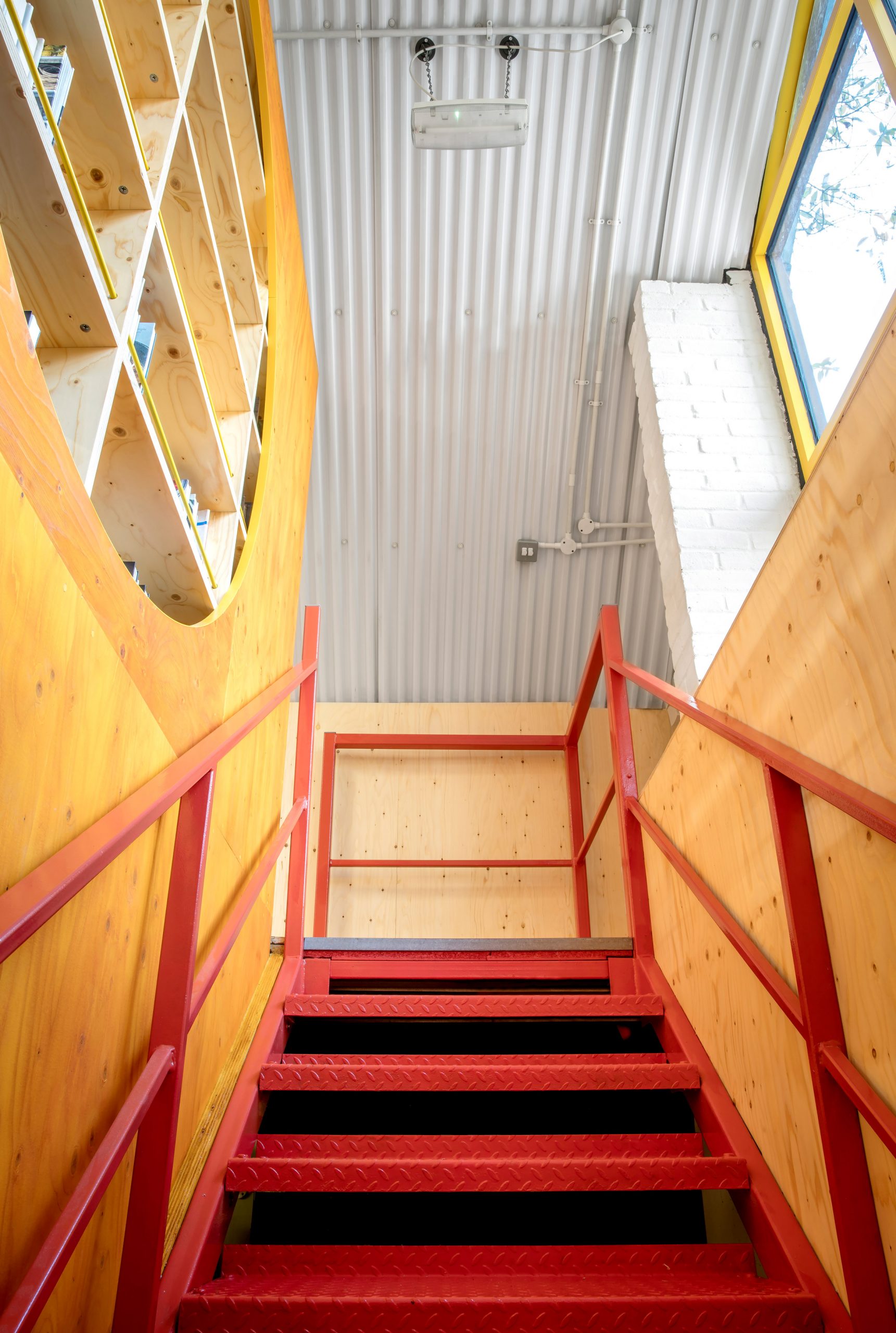
Yotam Ottolenghi's test kitchen features red staircase
Red paint has also been applied to the kitchen's metal staircase

The pops of yellow and red are also meant to be evocative of the roster of colourful spices that Ottolenghi incorporates throughout his food.

Plywood lines a majority of surfaces in the office area of the test kitchen, but the cooking area has been finished with grey safety flooring and steel prep counters, made large enough so that staff can work at a distance if necessary.
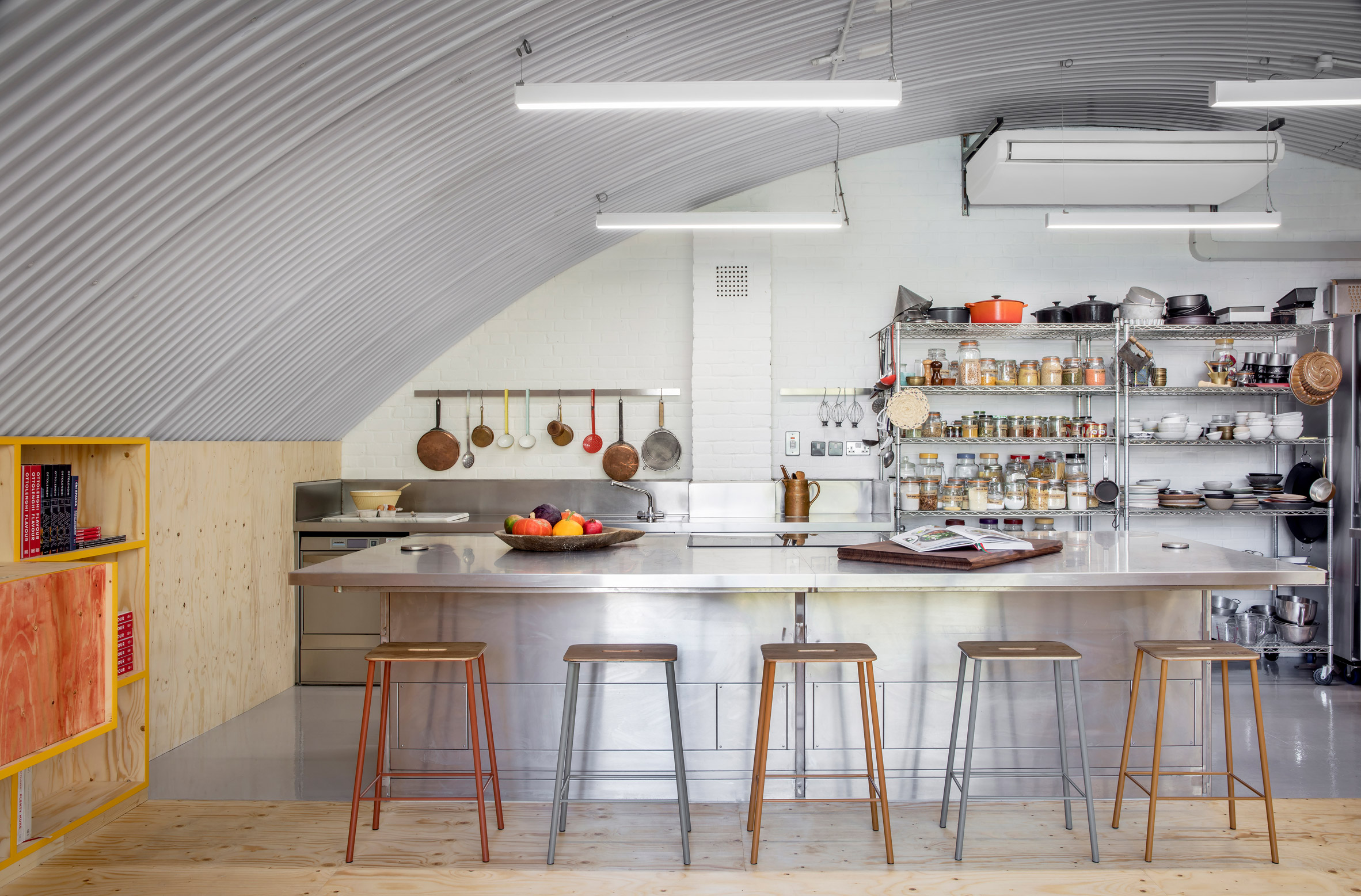
Yotam Ottolenghi's test kitchen
Steel surfaces feature in the cooking area

Based between London and Stockholm, Studiomama was set up in the year 2000 by creative couple Nina Tolstrup and Jack Mama. Previous projects include the revamp of a 300-year-old loft in Stockholm and the transformation of a tiny 13-square-metre cab office into a home.

The studio has also created a number of furnishings, such as a trestle table and a wardrobe that unfolds to become a room divider.

Photography is by Moonraystudio.


Design: Studiomama
Carpenter: Armariadesign

The post Studiomama transforms Yotam Ottolenghi's test kitchen into "happy space" appeared first on Dezeen.


from Dezeen https://ift.tt/3lIuYup
Carlo Ratti Associati designs "world's first fully compostable marker"

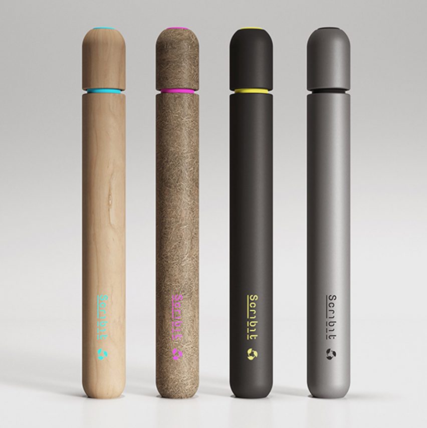
Italian studio Carlo Ratti Associati (CRA) has designed a concept for a compostable marker pen comprising natural fibres and a water-based, edible ink that would break down within six months.

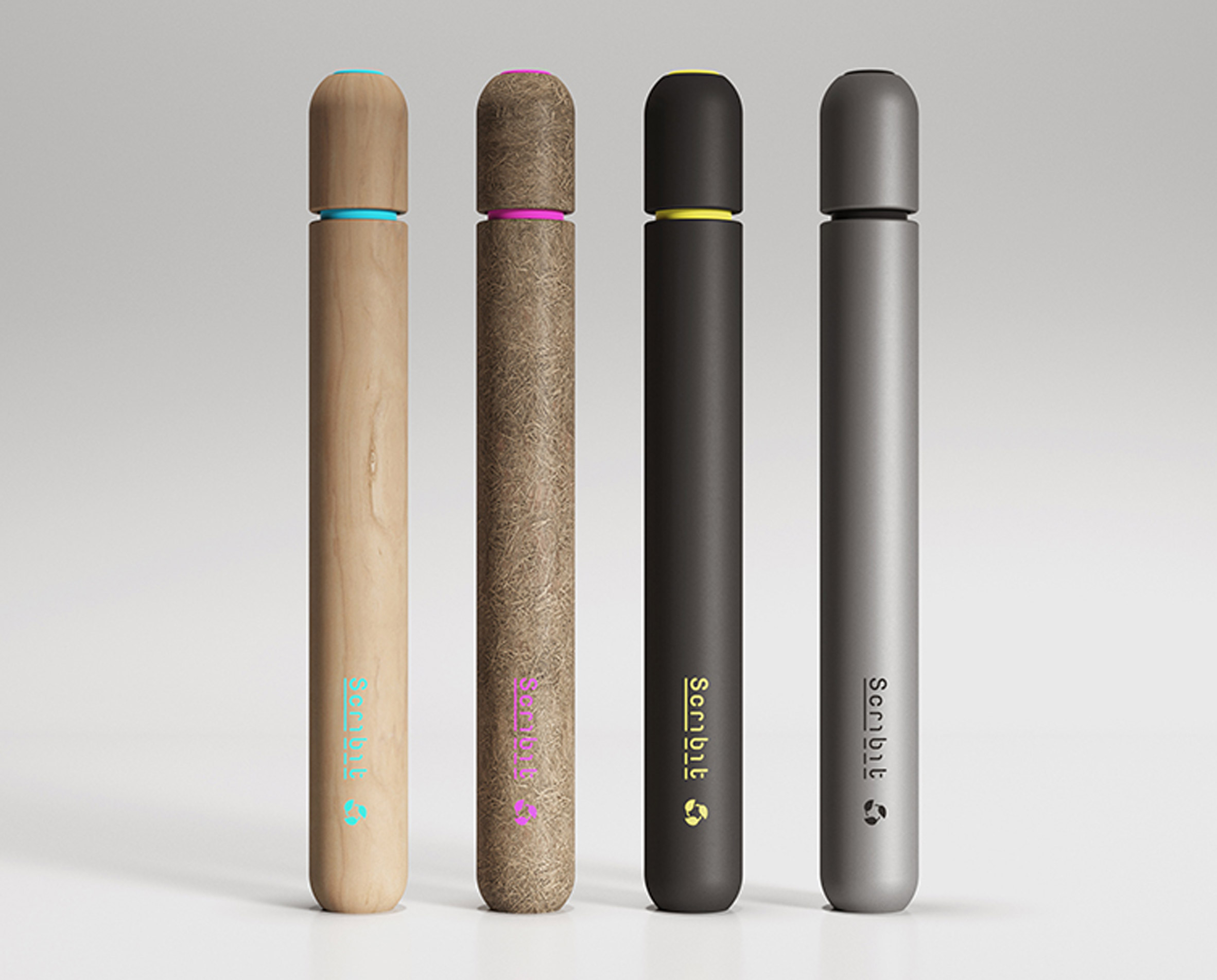
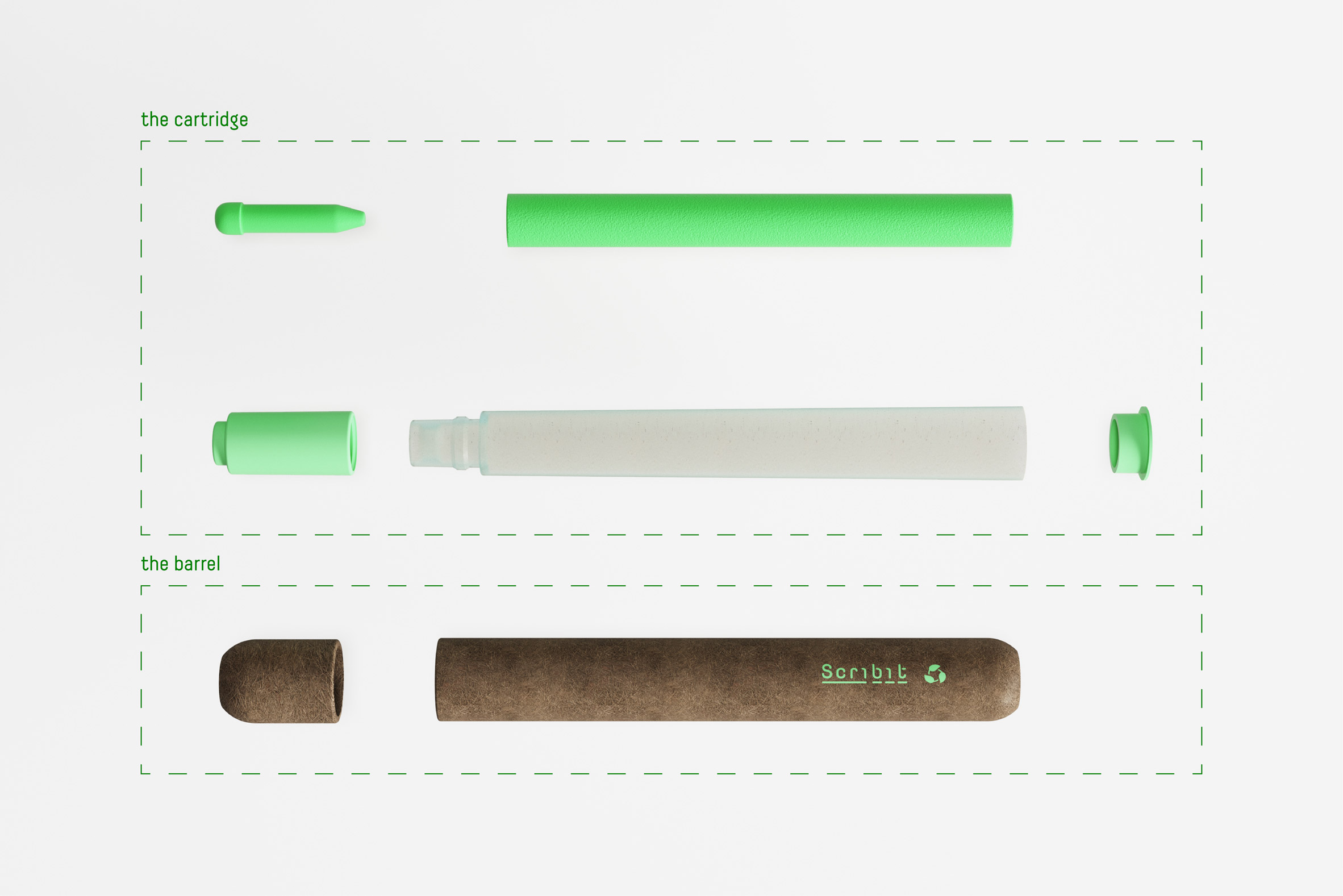
The Scribit Pen comprises a barrel made from a choice of either wood, bioplastic or anodised aluminium, which is designed for repeated use.

This holds a nib and cartridge made from natural fibres including sawdust, hemp fibres, polyhydroxybutyrate (PHB) – a polymer that is used to produce biodegradable plastic – and lignin.

The replaceable cartridge would be filled with a non-toxic, water-based ink made from edible ingredients and composted after it is used.

Compostable Scribit Pen concept by Carlo Ratti Associati
Carlo Ratti Associati has designed a concept for the "world's first" compostable marker pen

"Upon learning that over 35 billion markers are sent to the landfills every year, we began to work on a solution in line with the concept of circular economy," said the CRA design team.

"As we arrived at the innovative concept to create a cartridge that can be separated from the barrel, we tested a large amount of organic fibres in order to produce the biodegradable cartridge with the optimal performance."

Exploded view of compostable Scribit Pen concept by Carlo Ratti Associati
The Scribit Pen is made using natural fibres and a water-based ink

Designed for CRA's drawing robot Scribit, the pen is currently a concept and is in its development stage. The design has been billed by the studio as a "world first".

As the design team told Dezeen, it is working towards a final product that would be 100 per cent compostable, with at least 90 per cent of the product decomposing within six months in a general composting environment.

Compostable Scribit Pen concept by Carlo Ratti Associati
The barrel of the pen will be made from wood, bioplastic or anodised aluminium

"We are proud of Scribit's success, and how it has empowered thousands of people around the world to change the way they draw," said Italian architect and CRA founder Carlo Ratti.

"However we were troubled by the amount of plastic produced by the markers that the robot uses," he continued. "By developing the new Scribit pen, we can turn one of humankind's primordial acts – drawing – into a fully sustainable one."

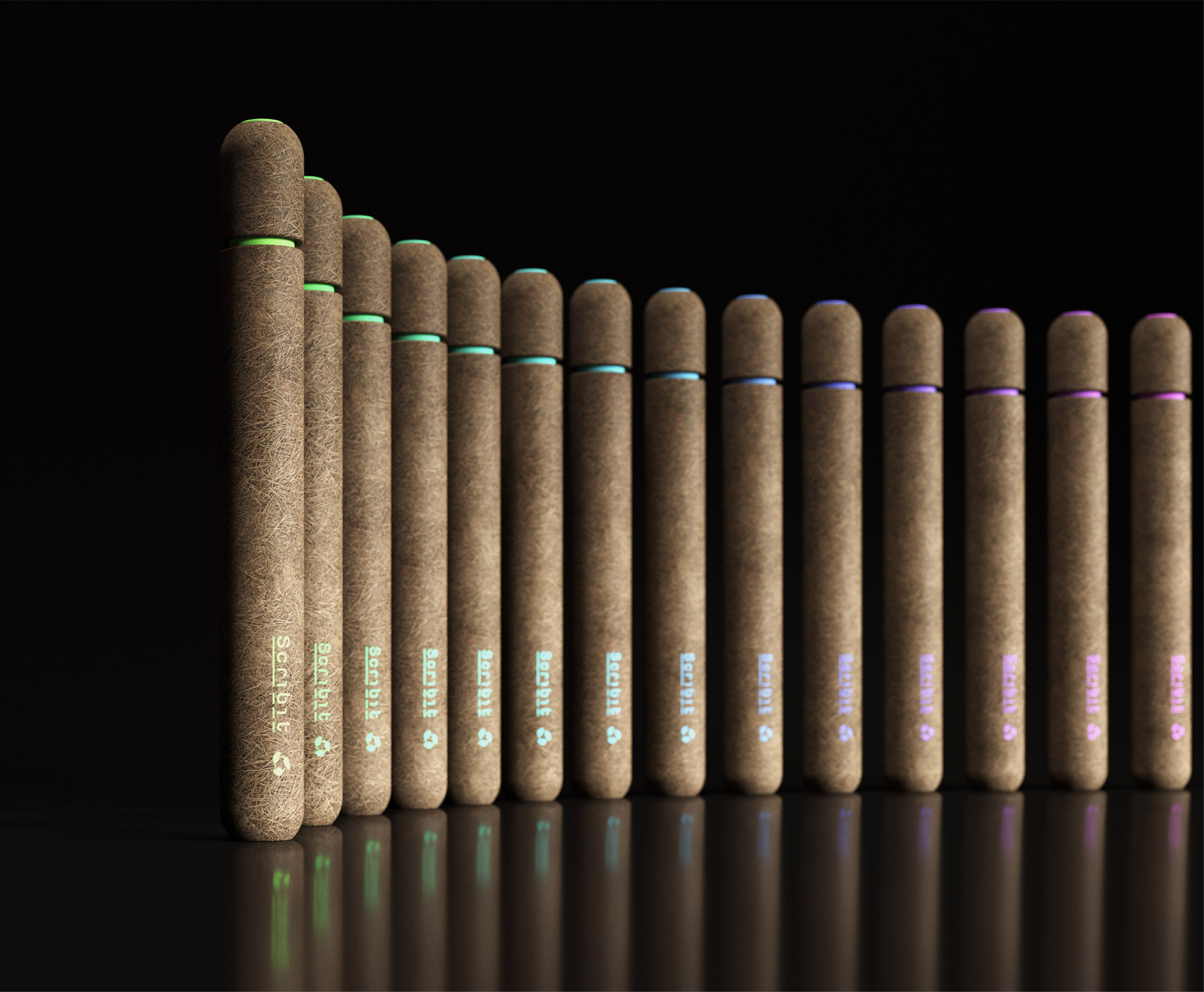
Visual of the compostable Scribit Pen by Carlo Ratti Associati in use
Carlo Ratti Associati hopes the pen will decompose by 90 per cent within six months

This isn't the first time CRA has geared its efforts towards designing products for a circular economy. For last year's Milan design week the studio grew a series of arched architectural structures from mushroom mycelium, which were later returned to the soil.

It also developed an experimental orange juice bar that turns the waste fruit peel into 3D-printed bioplastic cups to drink the contents from.

The post Carlo Ratti Associati designs "world's first fully compostable marker" appeared first on Dezeen.


from Dezeen https://ift.tt/37Ar3uz

Competition: win a Rado True Square watch by YOY, Formafantasma or Tej Chauhan

True Square FormaFantasma for Rado

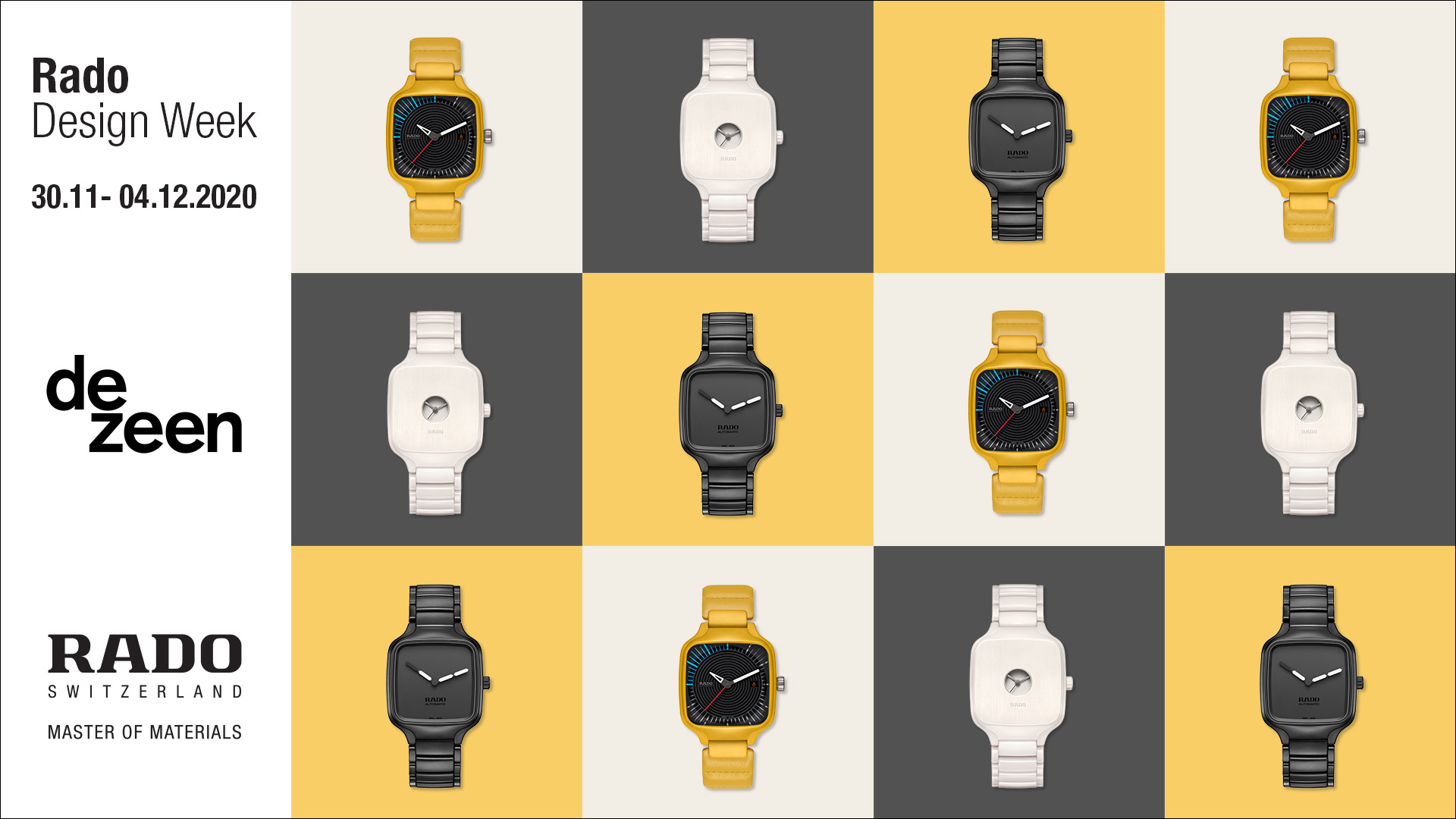
To celebrate the end of Rado Design Week, we are giving readers the chance to win one of the Swiss watch brand's unique new timepieces in a special competition.

Rado Design Week was a week-long collaboration of videos and talks hosted by Dezeen, which revealed a collection of watches that Rado created in partnership with designers YOY, Tej Chauhan, Formafantasma and Thukral & Tagra.

To celebrate, we're giving away a watch from the new collection. One reader will win a Rado True Swuare watch of their choice designed by Japanese studio YOY, Italian duo Formafantasma or British designer Tej Chauhuan.

True Square Undigital by YOY for Rado
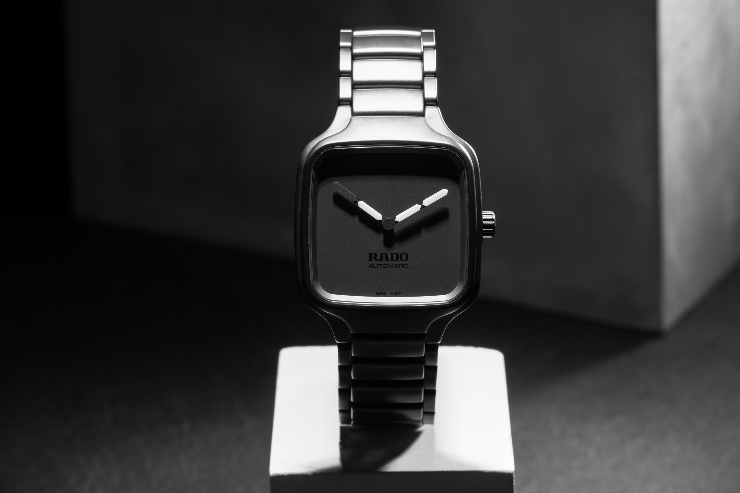
The Rado True Square Undigital watch by YOY

Tokyo-based studio YOY was founded in 2011 by Naoki Ono and Yuki Yamamoto. As well as designing furniture, lighting and interior decoration, the duo has created the Rado True Square Undigital watch.

Undigital features the display of a digital watch transferred onto an analogue time display with hands.

True Square Undigital by YOY for Rado
The Undigital watch features the face of a classic digital watch

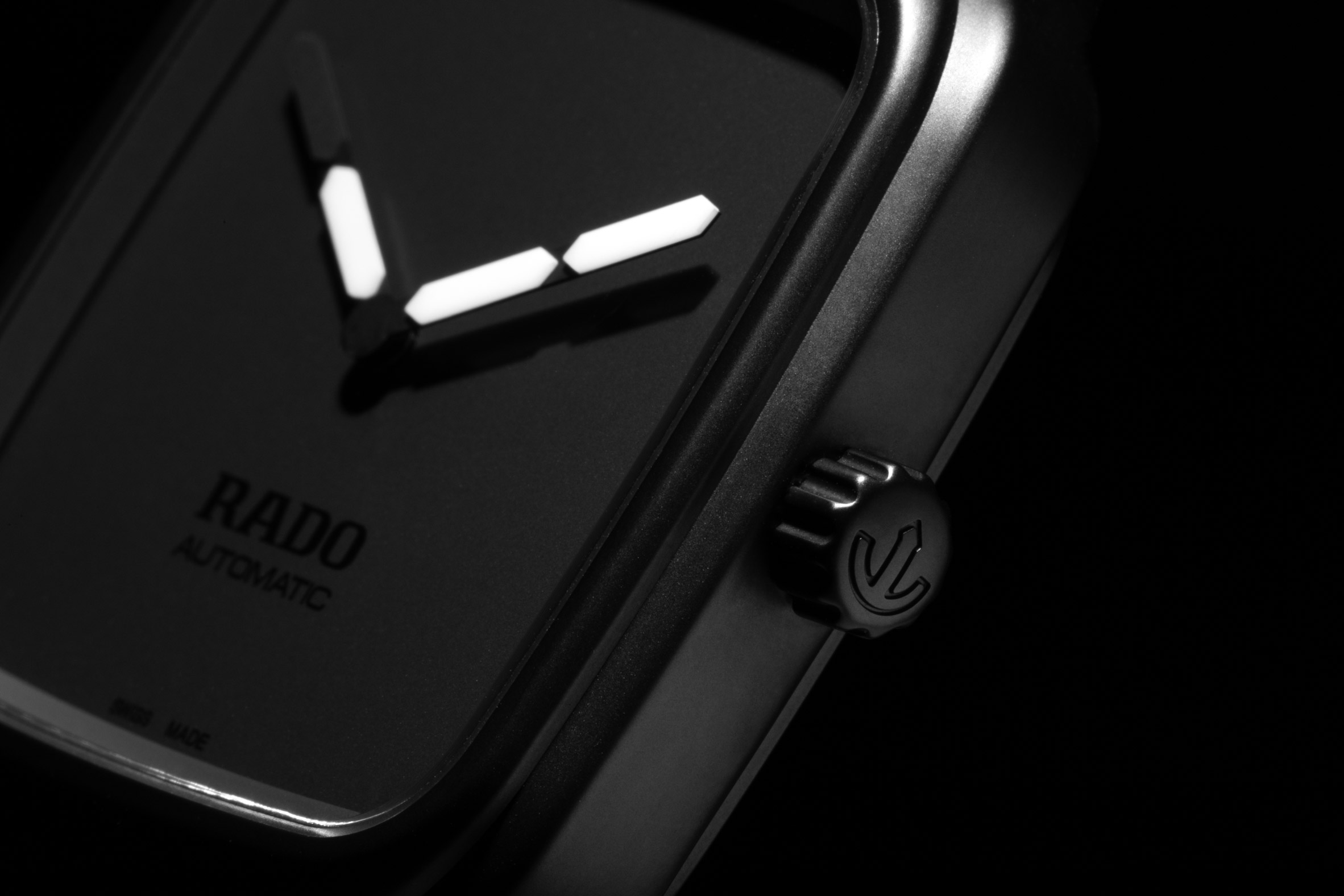
White Super-LumiNova hands pop against the matt black dial, which Rado said has "a completely puristic appearance."

A matt black PVD-coated titanium back and high-tech ceramic bracelet ensure the watch is lightweight and comfortable to wear.

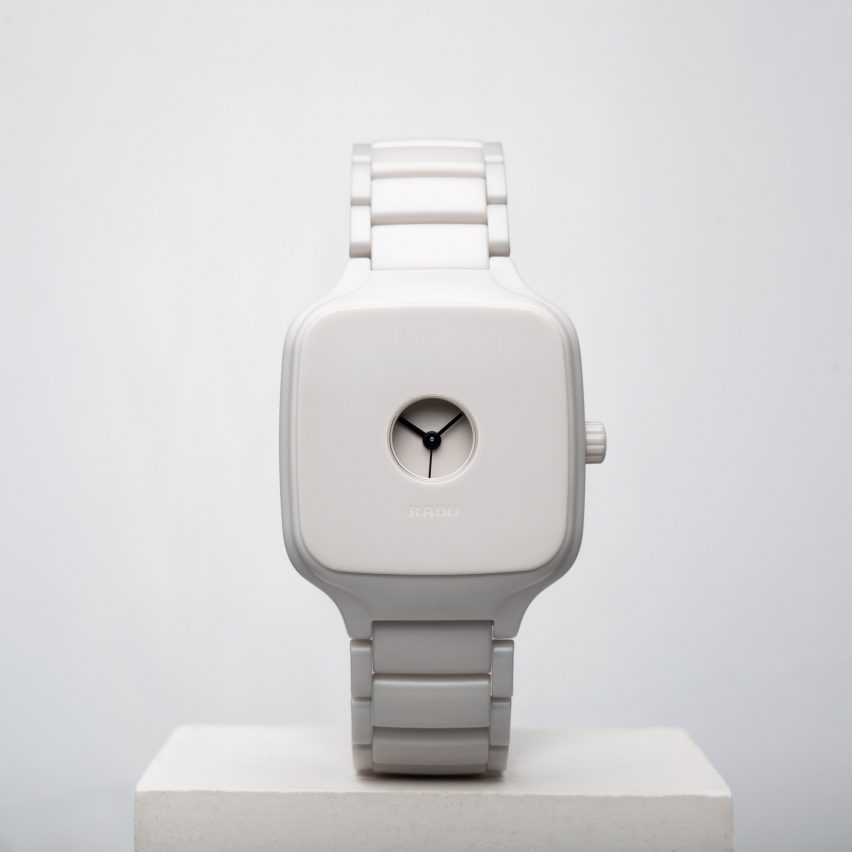
The True Square Formafantasma watch for Rado
The True Square Formafantasma watch

Andrea Trimarchi and Simone Farresin are the founders of the Amsterdam-based studio behind the True Square Formafantasma watch.

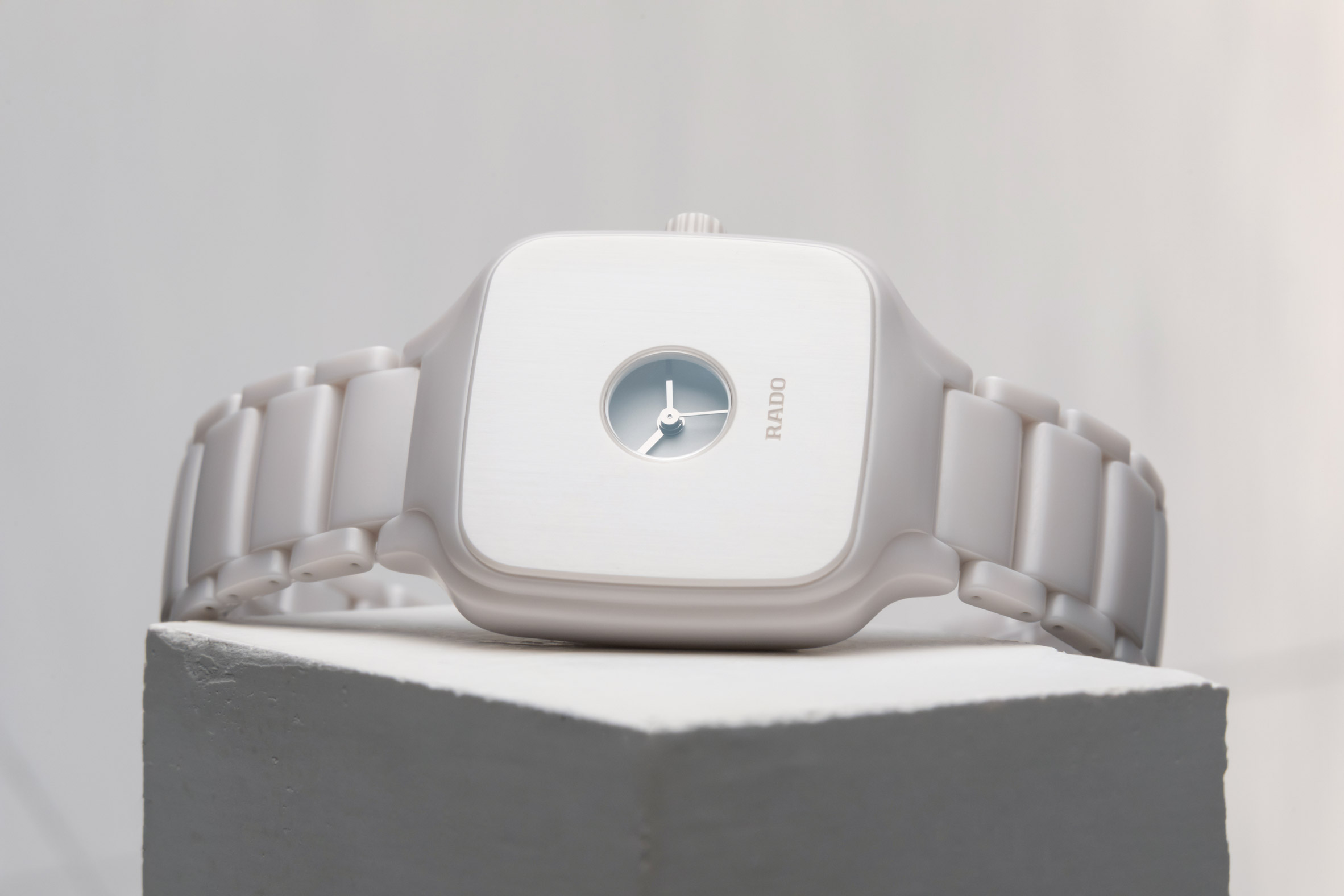
This special edition nods to historical pocket watches thanks to its closed face design – only a small opening gives a glimpse of the time, which is hidden under a scratch-resistant layer of ceramic to protect the dial.

The window itself boasts sapphire crystal whilst the matt light grey, ceramic titanium bracelet has a three-fold clasp.

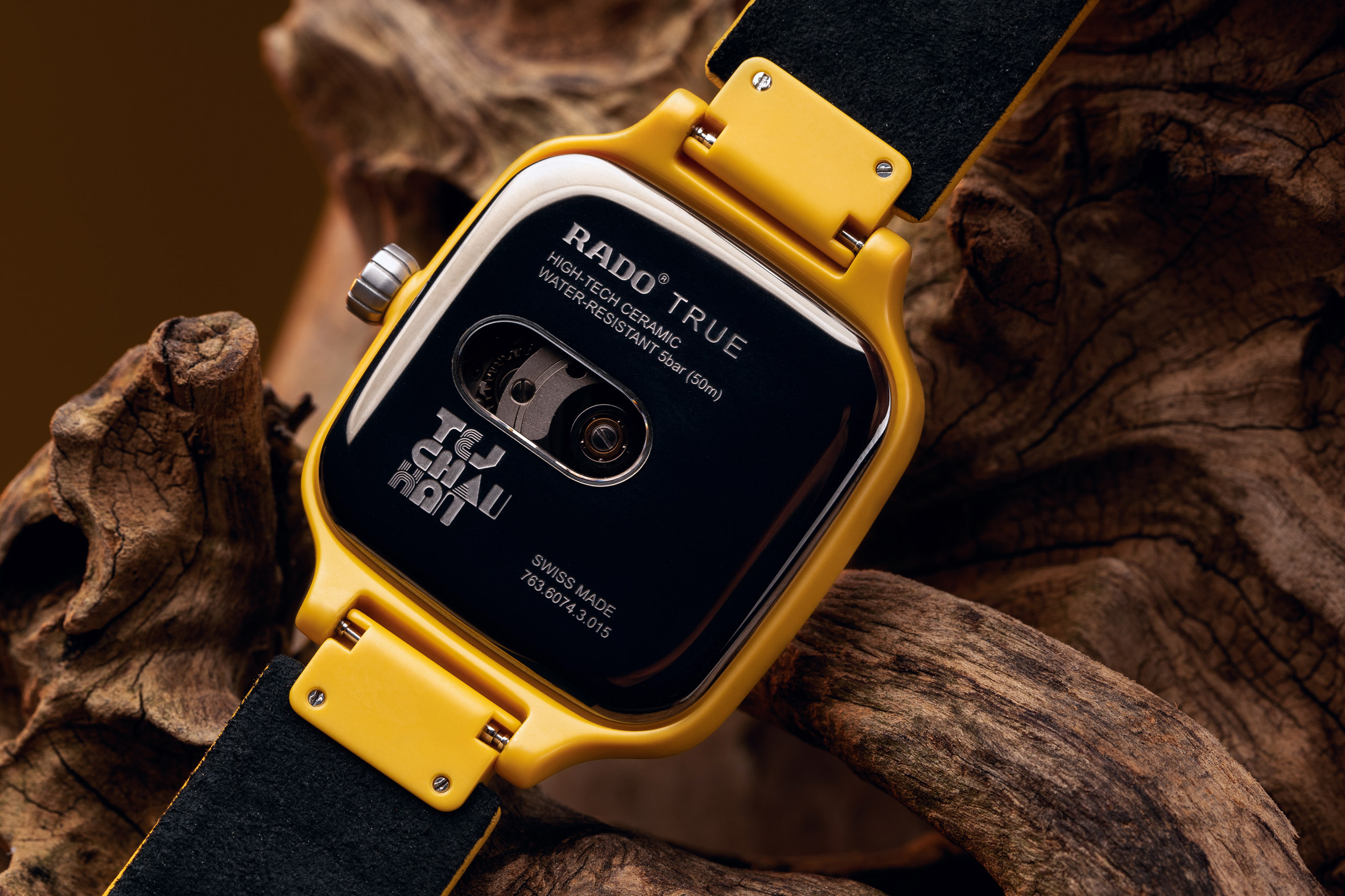
Rado True Square Tej Chauhan watch
The Rado True Square Tej Chauhan watch for Rado

The final watch up for grabs as part of this reader competition is by British designer Tej Chauhuan, who has offices in London and Helsinki.

The inspiration behind this piece was "futurist visions of popular culture, movies, typography and colour theory," said Rado. "We strategically used shape, colour and material to bring joy to people," added Chauhuan.

The Rado True Square Tej Chauhan watch for Rado
The watch's yellow ceramic case contrasts with its dark grey back

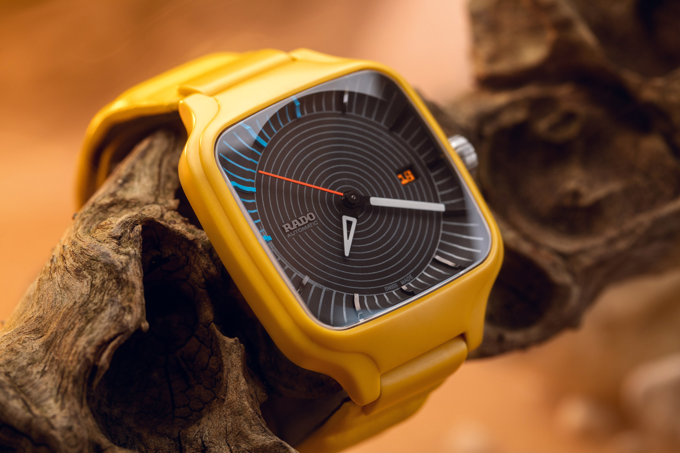
The watch's yellow ceramic case contrasts with its polished dark grey PVD coated stainless steel back, whilst the hands in white and neon red stand out against the matt black dial.

An opening at three o'clock shows the date displayed in a typography especially designed by Chauhan.

Blue indexes between nine and 12 o'clock refer to the time of day when things start moving – in the morning at the office or in the evening on a night out.

Cushioned leather and a stainless steel folding clasp in dark grey complete the bracelet, also in yellow.

Rado Design Week
This week is Rado Design Week, hosted by Dezeen

Rado Design Week has been running on Dezeen over the past four days. Each day, one of the special editions was unveiled, followed by a live talk with the designers.

In addition to the three watches available to win in this competition, Rado Design Week featured Indian duo Thukral & Tagra, whose watch design is still in development.

Watch all the talks and videos here.

Rado was founded in 1917 and has received many awards for its watches. It is best known for introducing high-tech ceramic, ultra-light high-tech ceramic, colourful high-tech ceramic and CeramosTM to the industry.

One reader will win a watch of their choice designed by YOY, FormaFantasma or Tej Chauhuan.

Competition closes 1 January 2021. Terms and conditions apply. One winner will be selected at random and notified by email.

The post Competition: win a Rado True Square watch by YOY, Formafantasma or Tej Chauhan appeared first on Dezeen.


from Dezeen https://ift.tt/2L8FrTl

Droog turns the face mask into a flirtatious fashion statement

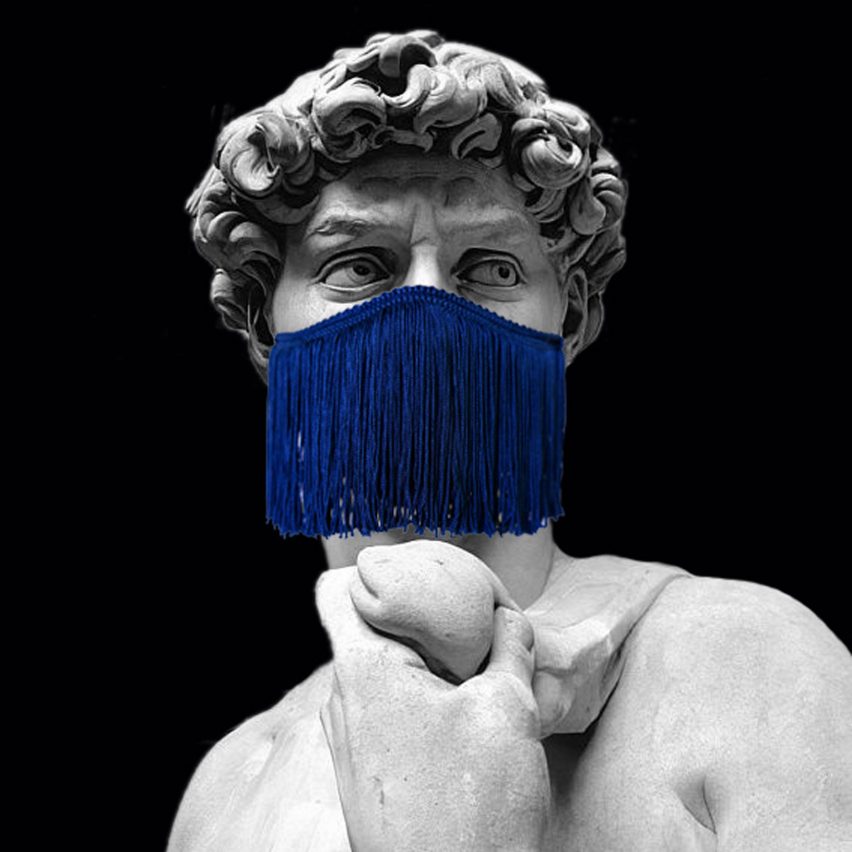
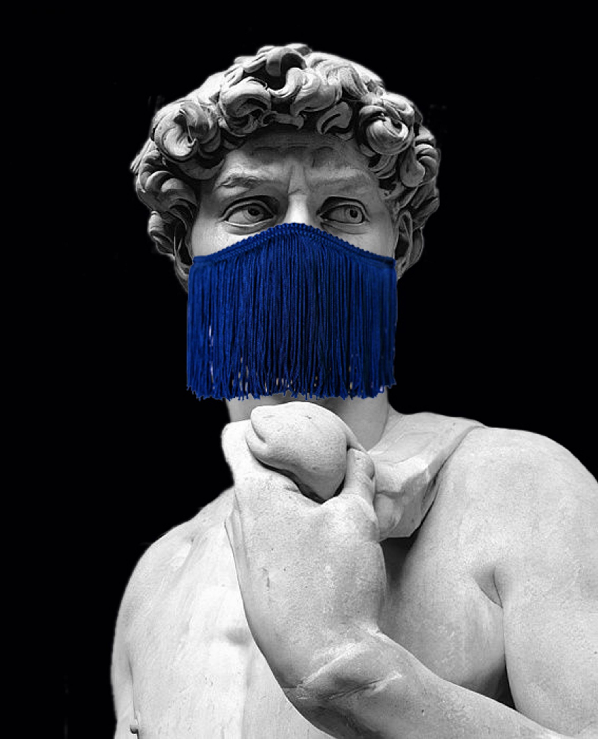
Michelangelo David wearing Le Freak face mask by Droog

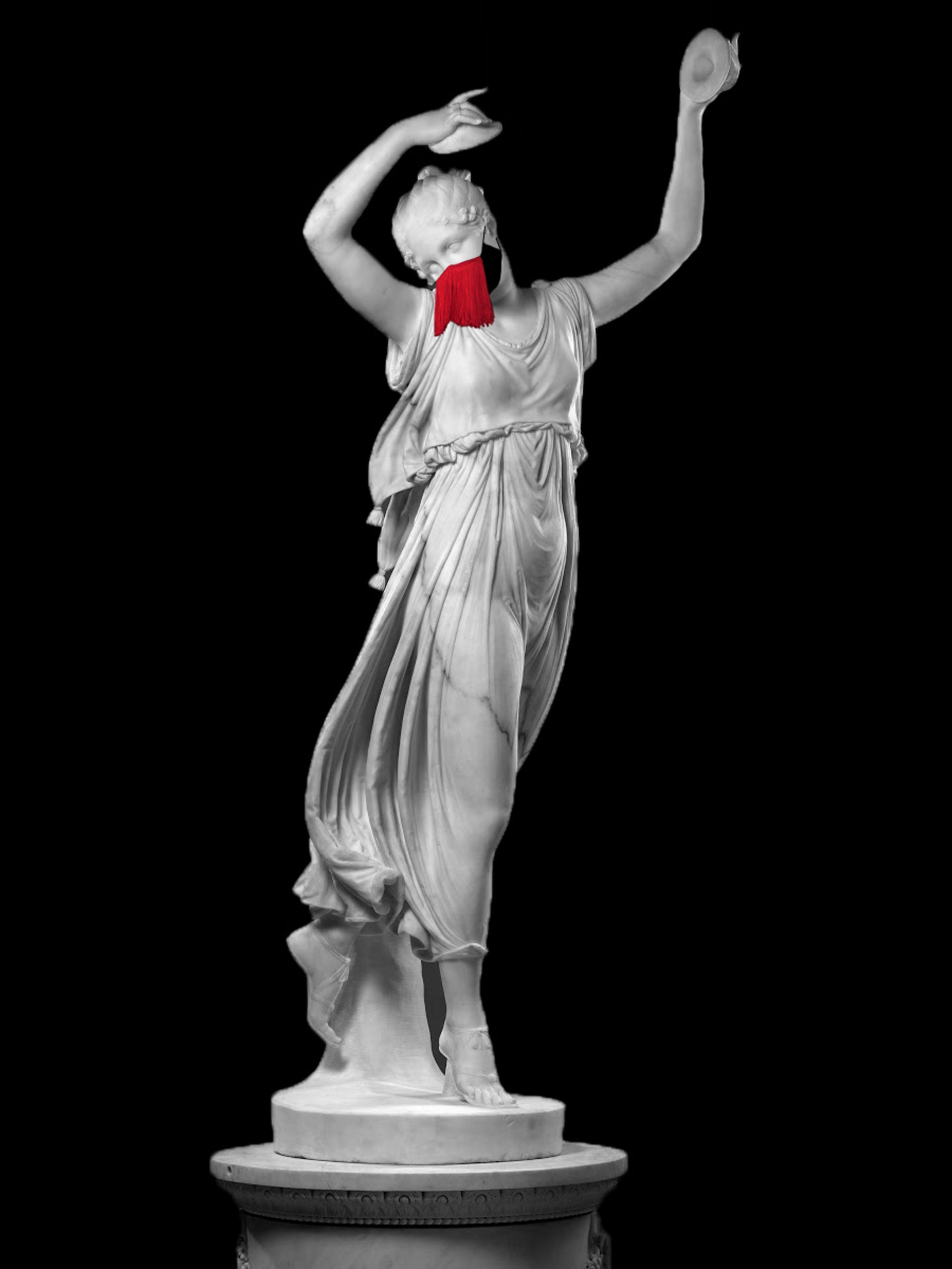
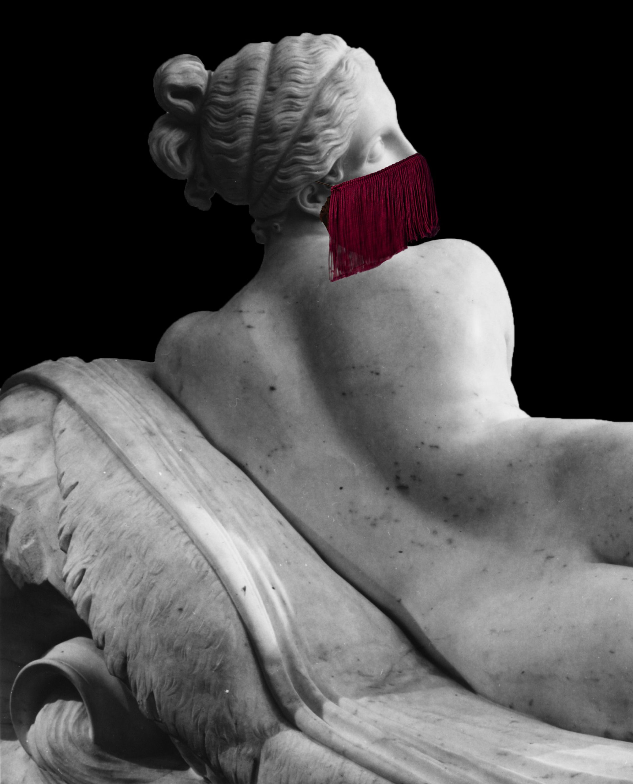
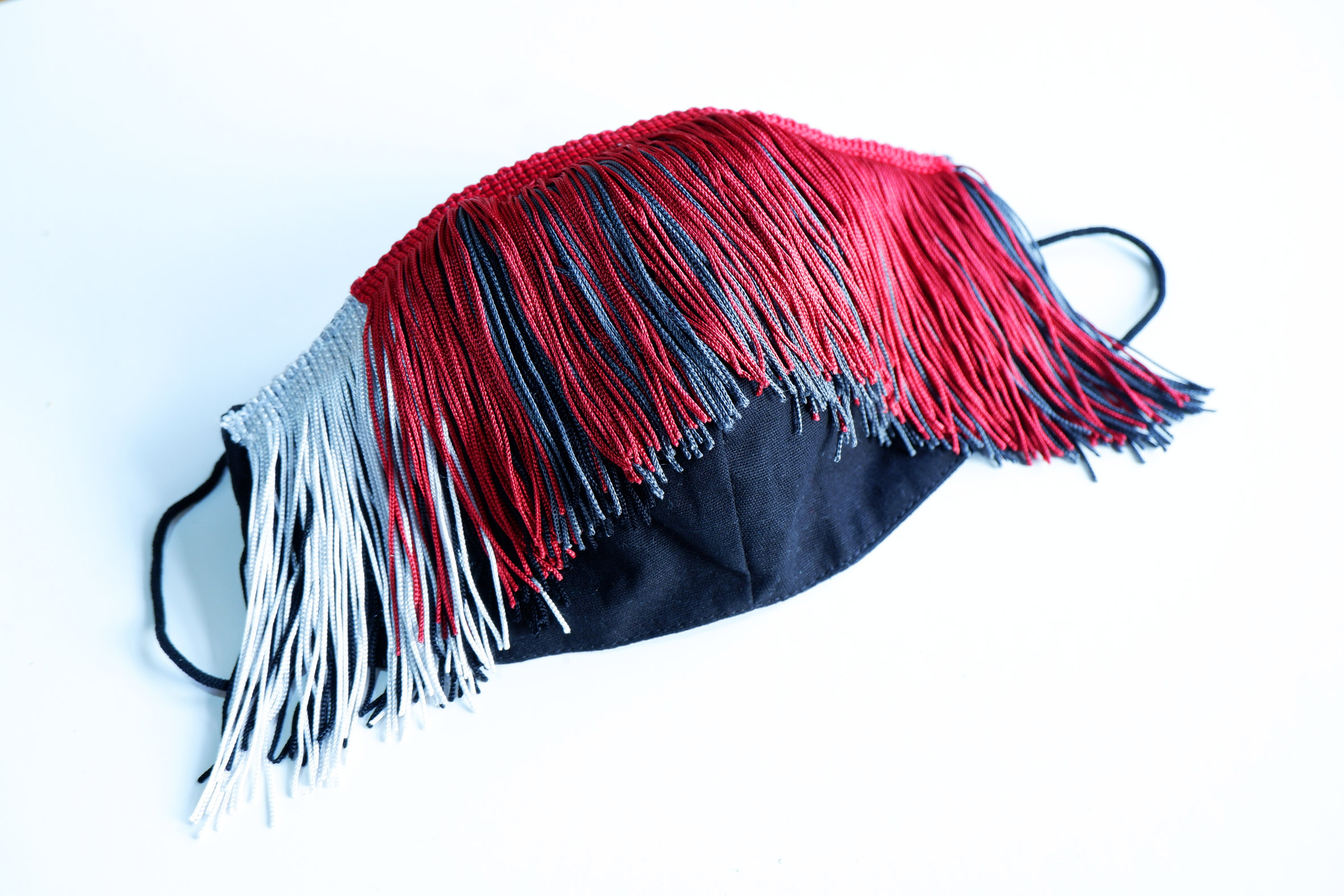
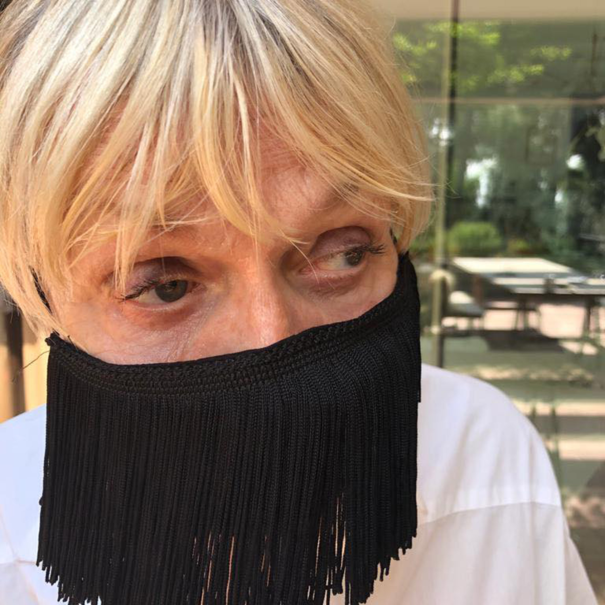
Dutch design platform Droog has launched Le Freak, a mask that uses colourful tassels to express personality.

Droog collaborator Yev Kravt designed the mask after being uninspired by most other face coverings on the market.

At a time when it is often mandatory to wear a mask, to slow the spread of Covid-19, Kravt wanted to create a design that would bring cheer to both herself and those around her.

Michelangelo David wearing Le Freak face mask by Droog
Le Freak is a mask with a fringe of tassels

"I found the commonly used designs for regular face masks a bit dull," she told Dezeen. "I feared the lack of expression, the lack of style."

By adding a fringe of fabric tassels, the designer was able to create a mask with its own unique style. It is intended to bring a variety of references to mind, from Arabian Nights to the Addams Family.

Canova dancer wearing Le Freak face mask by Droog
Unlike most masks, this design brings extra movement to the face

While masks typically have a static appearance, this one brings a new form of animation to the face.

"Our facial expression is hard to recognise when all we have to go on is our eyes," Kravt said.

"A Le Freak mask has a flirtatious aspect. The colour and movement back and forth create a very playful appearance."

Canova Naiad wearing Le Freak face mask by Droog
The design is presented on the faces of famous statues

Kravt came up with the idea while collaborating with Droog founder Renny Ramaker on the exhibition Onward & Upward: Art in the Garden of Life, which is currently on show at Droog's gallery in Amsterdam.

"[The exhibition] is themed around finding solace in art in times of uncertainty. In this gloomy time, I realised then I was in need of solace myself," she explained.

Le Freak face mask by Droog in blue and red
The design is made from cotton and canvas, and is available in 10 different colours

Kravt was particularly inspired by the work of one exhibitor, Design Academy Eindhoven graduate Yi-Fei Chen, whose latest work explores the idea that masks are seen in western cultures as a loss of individuality, while in eastern countries they are a symbol of safety.

Chen has created a face shield that is both a safety measure and a fashion statement. Kravt's project aims to do the same thing.

"When something is considered safe, it is not allowed to be aesthetically pleasing to the eye," Kravt said. "Especially when it comes to masks."

Le Freak face mask by Droog in red
Designer Yev Kravt hopes the design will cheer people up

"But you can change your mood and those around you with a mask, by connecting with your emotions," she added. "Even though our lockdown style is bound to sweatpants and sweaters, the moment we go out we should not forget to feel elegant, we should not forget to dress up, because that does make you feel better from time to time."

"Hopefully, Le Freak will inspire us to move on, cheer us up and give us a good belly laugh – something we dearly need at the moment."

Renny Ramakers wearing Le Freak face mask by Droog
The mask is modelled here by Droog founder Renny Ramakers

Made from a mix of cotton and canvas, Le Freak is available in 10 different colours, including shades of pink, purple, green, red and blue.

It is available to buy from Droog's online shop. This shop is one of several arms of the Droog platform, which grew out of an exhibition back in 1993 and launched the careers of designers including Marcel Wanders, Hella Jongerius and Piet Hein Eek.

Droog co-founder Renny Ramakers tells the story of the brand in a talk broadcast as part of Dezeen's Virtual Design Festival earlier this year.

The post Droog turns the face mask into a flirtatious fashion statement appeared first on Dezeen.


from Dezeen https://ift.tt/3lBd9gV

Thursday 3 December 2020

Peter Pichler draws on agricultural vernacular for Italian Alpine hotel

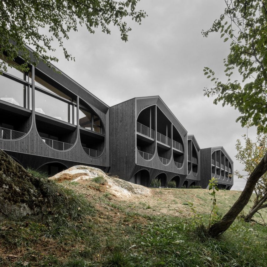
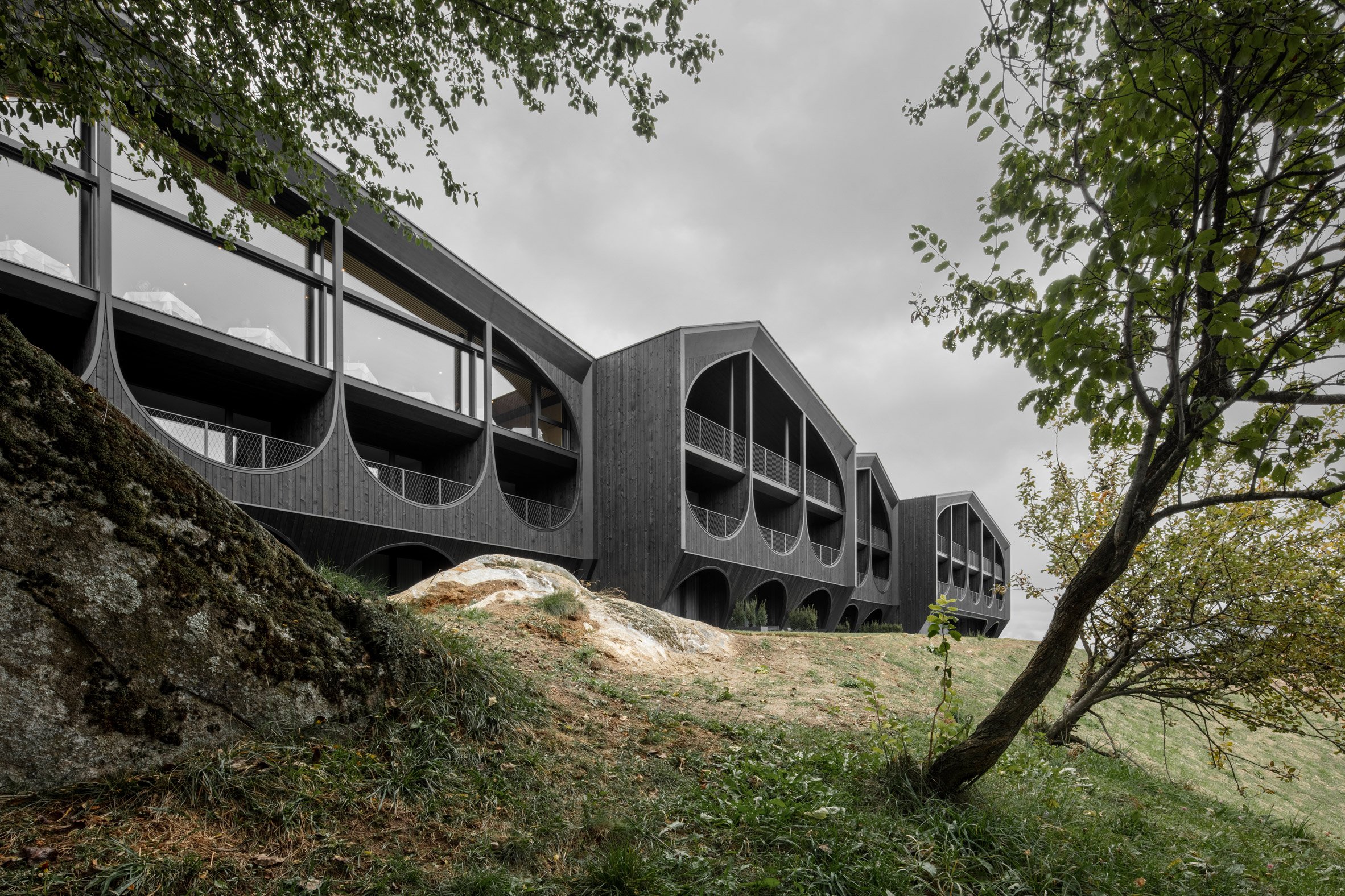
The exterior of Hotel Milla Montis by Peter Pichler Architecture

Peter Pichler Architecture takes visual cues from agricultural architecture and traditional farming equipment to design the Hotel Milla Montis in South Tyrol, Italy.

Located in the small Alpine village of Maranza with views of the Dolomites, the hotel is segmented into four staggered volumes, unified by blackened larch cladding and large curved cut-outs in their facades.

It is designed by Milanese studio Peter Pichler Architecture to recall traditional wooden barns in the region and ensure it is a sensitive addition to its rural setting.

The exterior of Hotel Milla Montis by Peter Pichler Architecture
Above: Hotel Milla Montis is intended to evoke a series of wooden barns. Top image: it is wrapped in black larch cladding

"Hotel Milla Montis is inspired by the vernacular architecture of the region and the classic wooden barn, giving a contemporary reinterpretation of this typology," explained the studio's founder, Peter Pichler.

"Maranza is a small village in South Tyrol with a significant agricultural background," he continued. "At Peter Pichler Architecture, we always try to enhance the local context, traditions, and elements that characterise the place."

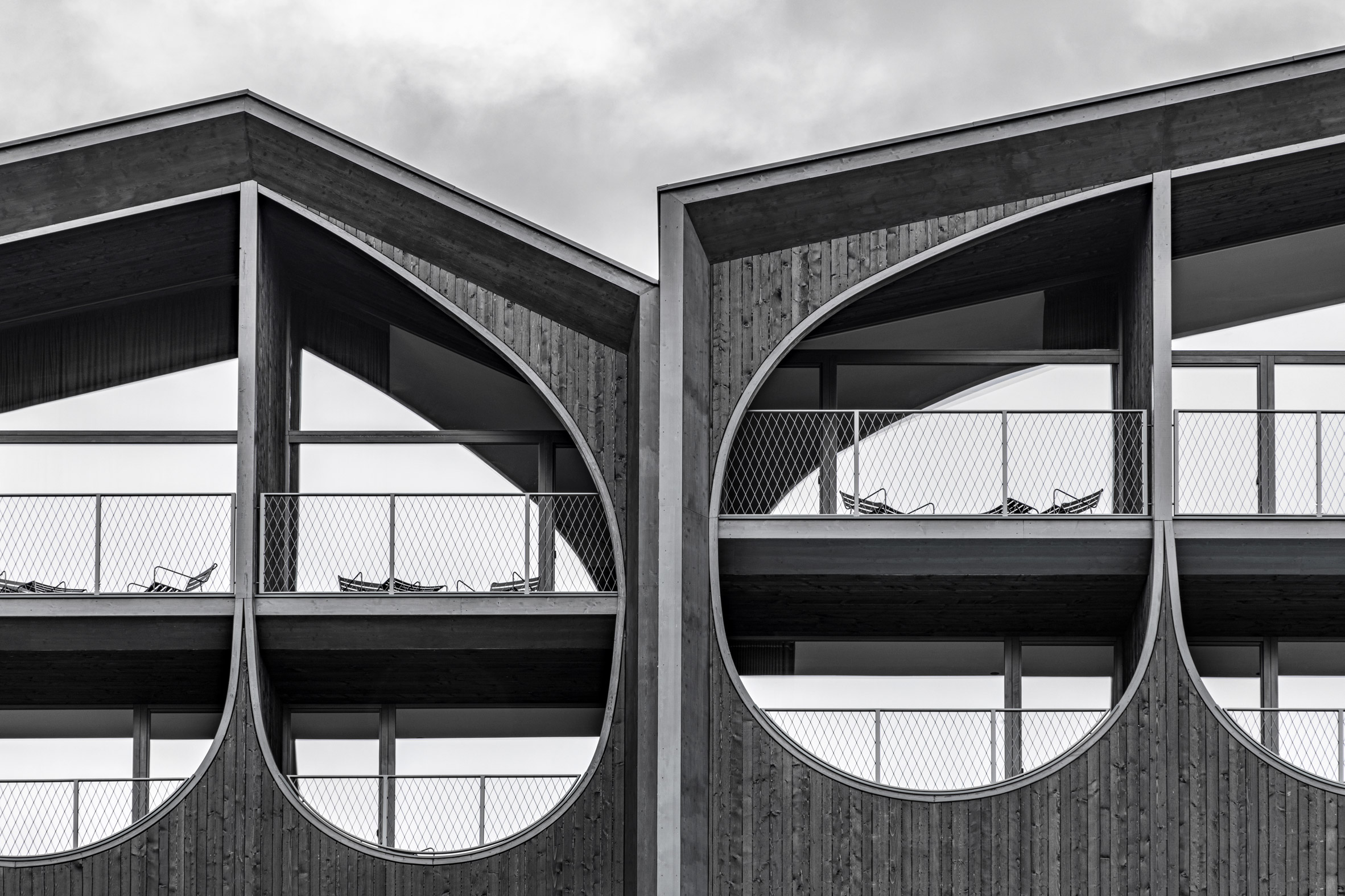
A detailed photo of Hotel Milla Montis' facade by Peter Pichler Architecture
Facade cut-outs are designed to evoke local farmers' pitchforks

Hotel Milla Montis contains 30 rooms that range from doubles to large suites with private saunas. Many of them have access to a private balcony, framed through the large curved cut-outs in the facade.

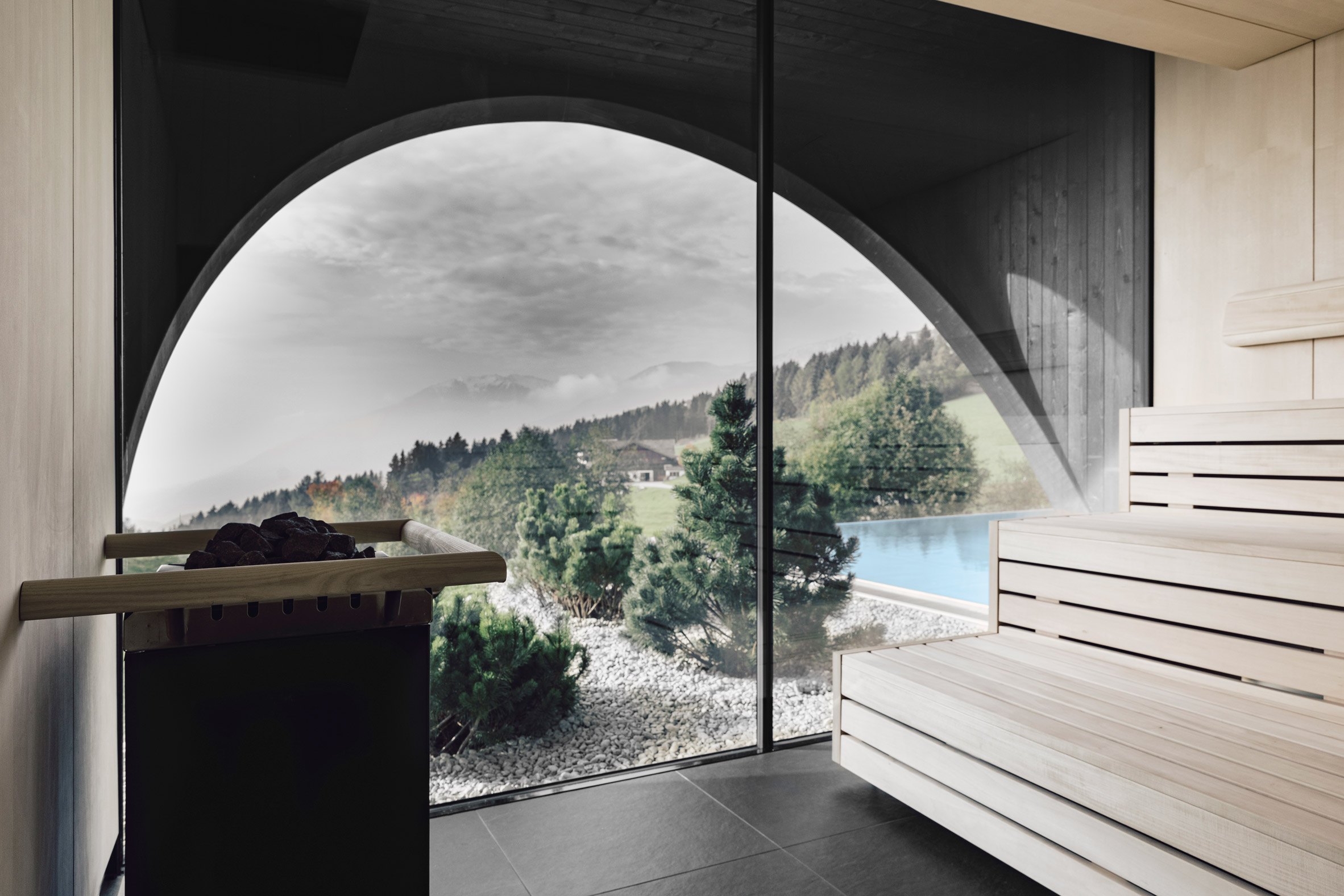
There are also a number of shared facilities including a bar, restaurant, and spa, all of which have been positioned with views of the Dolomites.

A spa inside Hotel Milla Montis by Peter Pichler Architecture
Each cut-out frames views of the Dolomites

The distinctive cut-outs across its facade are designed by Peter Pichler Architecture to emulate the shapes of pitchforks used by local farmers in Maranza.

Teamed with the black-painted larch cladding, sloped roofs and fragmented layout of the hotel, the cut-outs are also hoped to reduce the visual impact and perceived scale of the building.

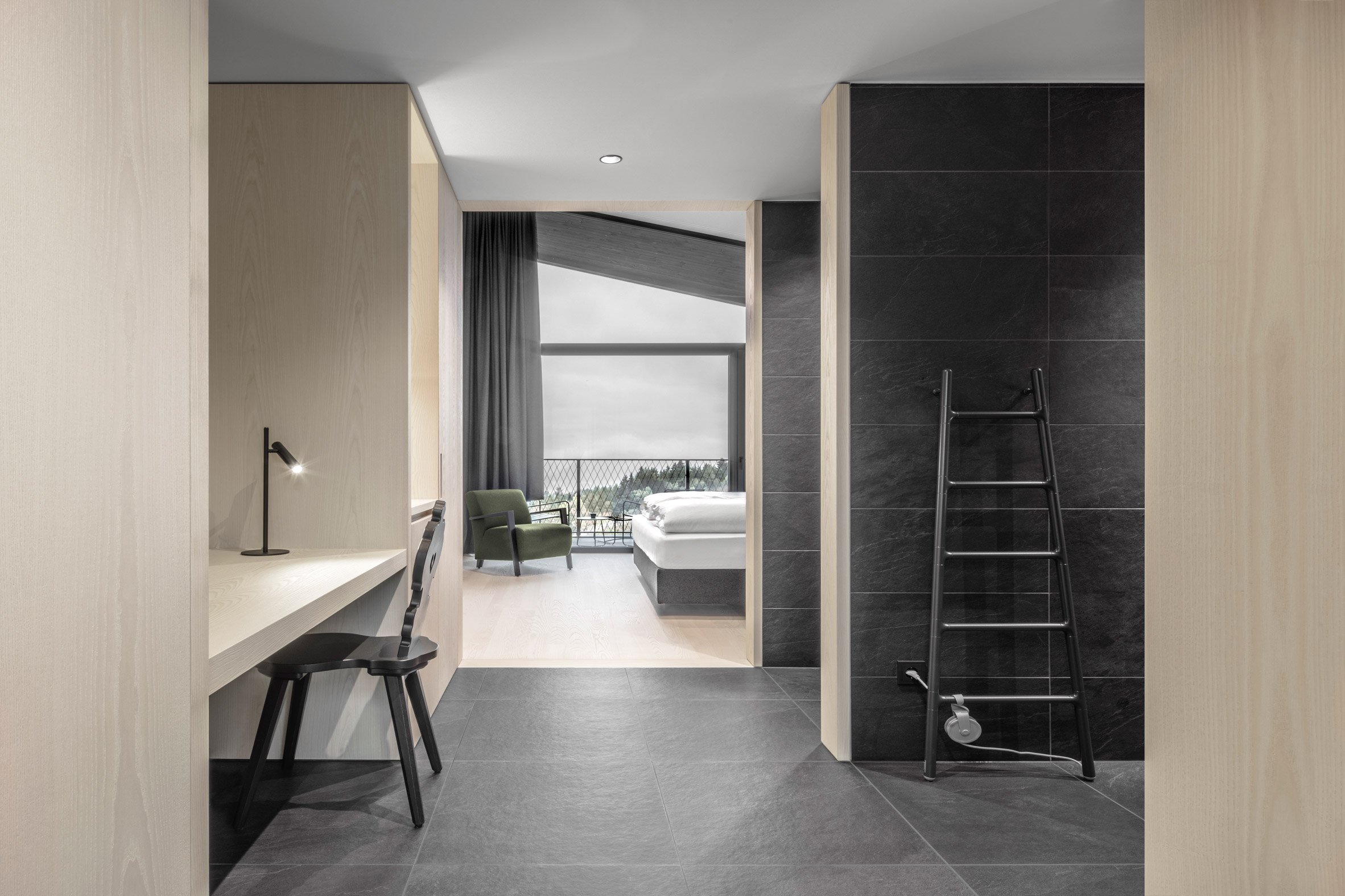
A hotel room inside Hotel Milla Montis by Peter Pichler Architecture
Light ash wood is used throughout the hotel interiors

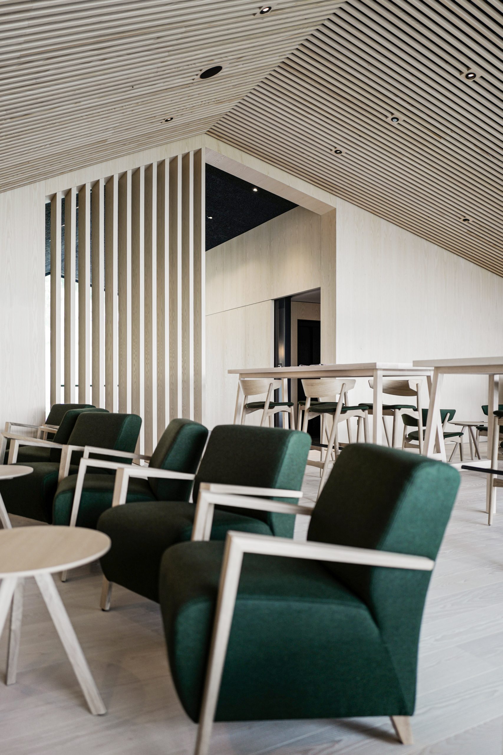
Hotel Milla Montis's interiors are described by the studio as having "a timeless Alpine style", and like the exterior, uses wood as the predominant material.

Light ash wood furnishings are married with green woollen textiles, chosen to contrast with the hotel's exterior and introduce "a dash of colour" that nods to the surrounding landscape.

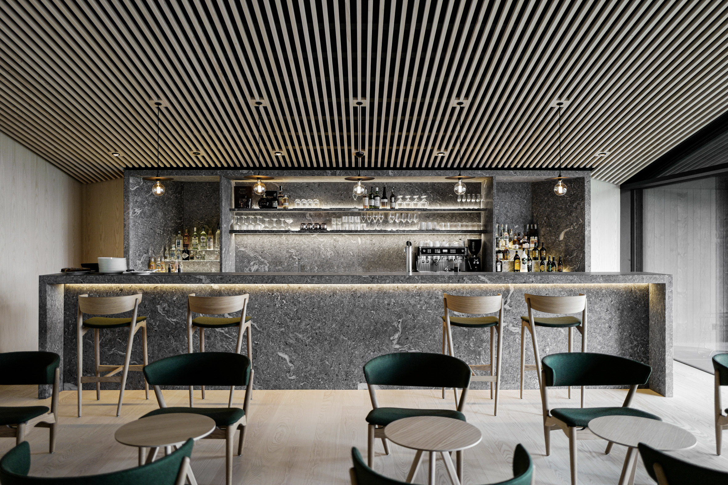
The bar inside of Hotel Milla Montis by Peter Pichler Architecture
Ash is teamed with green woollen textiles

There are also a number of stone furnishings, including a large counter in the bar made from Gneiss sourced from Passeier Valley in South Tyrol, and slate tiles in the spa and bathrooms.

According to the studio, almost all Hotel Milla Montis' furniture is custom made, excluding a few classic carved-wood Tyrolean chairs in some of the hotel rooms.

The bar inside Hotel Milla Montis by Peter Pichler Architecture
The bar features a large made from Gneiss rock

Peter Pichler Architecture was founded by Pichler in Milan in 2015. It is headed up in collaboration with Silvana Ordinas.

Elsewhere in Italy, the studio is currently developing a series of treehouses with sharply pointed roofs and blackened wood cladding for a mountain forest in the Dolomites. It has also designed a collection of gabled treehouses for a forest in Kitzbühel, Austria, as part of a 7-star hotel that is being built in the small Alpine town.

Photography is by Gustav Willeit, Daniel Zangerl and Jörgen Camrath.


Project credits:

Architect: Peter Pichler Architecture
Principals:
Peter Pichler, Silvana Ordinas
Competition design team: Peter Pichler, Cem Ozbasaran, Giovanni Paterlini, Marco Caprani, Alessandro Altamura
Project team: Peter Pichler, Simona Alù, Giovanni Paterlini, Cem Ozbasaran
Interiors: Peter Pichler Architecture
Structural engineering: iPM
MEP: Reichhalter
Construction company: Gasser Paul
Wood construction: Brida
Electro planning: Studio E-Plan
Project management: Michaeler & Partner

The post Peter Pichler draws on agricultural vernacular for Italian Alpine hotel appeared first on Dezeen.


from Dezeen https://ift.tt/3qlOWyJ