Friday 11 December 2020

Fashion photographer Elena Iv-skaya makes Qeeboo products "the stars" in colourful photo shoot

Dezeen promotion: Design brand Qeeboo has teamed with fashion photographer Elena Iv-skaya to create a series of colourful images to mark the four-year-old brand's coming of age and renovated its collections catalogue 2021.

Featuring blocks of intense, clashing colour, the twenty images feature models interacting with a selection of Qeeboo's figurative products.

Model with turtle-shaped poufs designed by Marcantonio
Top: Stefano Giovannoni's Kong lamp. Above: Models were shot on colourful backgrounds with products including Marcantonio's Turtle Carry

In one shot a model is surrounded by a multi-functional trio designed by Marcantonio that resemble turtles, while in another, a model poses under a cherry-shaped lamp designed by Nika Zupanc.

The colourful campaign was designed to enhance Qeeboo's playful-narrative approach.

Model with cherry lamp by Nika Zupanc
Model with Nika Zupanc's cherry lamp

Since Qeeboo was launched in 2016 by Italian designer turned entrepreneur Stefano Giovannoni, the company's product catalogue has grown to include furniture and lighting by international designers such as Marcantonio, Nika Zupanc, Studio Job, Marcel Wanders, Front, and Andrea Branzi.

The images are intended to encapsulate Qeeboo's spirit.

"Qeeboo products are emotional and narrative, expressly not bourgeois but suitable for all; once created, they are entrusted to our interpretation in order to acquire a new life," said the brand.

Marcantonio's Giraffe in Love
Marcantonio's Giraffe in Love was photographed

For fashion photographer Elena Iv-skaya, who worked as a model before stepping behind the lens, it was her first collaboration with a design brand.

"The biggest difference with a fashion shoot is that the iconic Qeeboo objects were the stars, not the models," she recalled. "It was a perfect match. My somewhat surrealist and minimalist creative approach integrated really well with Qeeboo designs that are full of mystery but also ironic and fun at the same time."

Stefano Giovannoni's Rabbit Tree
Stefano Giovannoni's Rabbit Tree is featured in the shoot

Iv-skaya, who is known for her signature bold use of colour, said she was inspired by the way American visual artist Man Ray created interactions between models and objects in his black and white images.

"The interaction of the model and the object becomes the story of the images revealing their poetic and somewhat surrealist facets," she explained.

"The biggest difficulty was to find a way to make this interaction original and at the same time showing the purpose of the object."

Fallen Chandelier by Studio Job
Studio Job's Fallen Chandelier is also featured

For the brand, Giovannoni said that the collaboration serves as "a point of arrival and restart that allows us to look ahead with confident optimism."

In 2015, the year before launching Qeeboo, Giovannoni told Dezeen that most design brands will disappear within five years. Qeeboo, which is majority-owned by the designer and backed by a Hong Kong investor, set itself apart from the competition at the time by focusing on affordable products that are sold by the best concept and department stores worldwide.

Find all of Qeeboo's products on its website.

The post Fashion photographer Elena Iv-skaya makes Qeeboo products "the stars" in colourful photo shoot appeared first on Dezeen.


from Dezeen https://ift.tt/3m3HVPC

CAN adds fake mountain to Edwardian house in south London

Mountain View by CAN Architecture

A fake Disneyland mountain informed this playful revamp of a family house in south London by architecture studio CAN.

Architect Mat Barnes, founder of CAN, renovated and extended the two-storey Edwardian house in Sydenham for his own family.

Rear extension of Mountain View by CAN Architecture
A rear extension is topped by a fake mountain

The project included adding a rear extension, topped by a fake mountain made of foamed aluminium. This element is designed in tribute to the Matterhorn Bobsleds ride at Disneyland in California.

This element gives the project its name, Mountain View.

"I loved the idea of elevating this heavy mountain on an unfeasibly thin structure," said Barnes.

Red and white columns in Mountain View by CAN Architecture
Inside, the house is filled with colours, patterns and playful references

The imaginative details don't end there. The house also contains a monochromatic lounge filled with architectural fragments and a kitchen made from recycled chopping boards and milk bottle tops.

"We're surrounded by so many colours and textures in the outside world that to me it feels natural to bring many different patterns and fabrics inside too," added Barnes.

Mountain View by CAN Architecture
Red and white columns reference ranging poles

The renovation centres around the rear extension, which made it possible to create an open-plan living and dining space opening onto the garden.

Instead of fully demolishing the original rear walls, sections of them remain. They create a soft partition between the kitchen and dining area in the original part of the building, and the new lounge space beyond.

Kitchen shelves and plants in Mountain View by CAN Architecture
The kitchen is made from recycled chopping boards and milk bottle tops

These vibrant spaces are filled with contrasting colours, from the bright orange of the staircase underside to the royal blue of the trusses that span the ceiling. Even the kitchen is designed to stand out, with alternating panels of blue and grey.

There are further references to mountain geography, such as structural columns painted red and white like ranging poles, or the south-facing wall with its rough, rock-like texture.

Textured walls in Mountain View by CAN Architecture
Half-demolished walls separate the kitchen from the lounge

At the same time, there are plants and artworks spanning floor to ceiling, including a mosaic-tiled staircase emblazoned with the words "waste not want not" and a pair of cartoon-style arrows.

"The height of the room brings us such joy," said Barnes. "It feels somewhat grand or cavernous, with the variety of materials bringing texture and an unexpected warmth."

Architectural fragments in blue living room of Mountain View by CAN Architecture
A monochromatic living room is decorated with architectural fragments

The living room at the front of the house was envisioned as a contrast to the multicoloured rear. Almost everything in this room  is painted in the same shade of blue, including the architectural mouldings that decorate the walls.

Upstairs, a reorganised layout allowed Barnes to add an extra bedroom and bathroom. There are now four bedrooms in total, including a master en-suite.

View into bathroom of Mountain View by CAN Architecture
The family bathroom features blue and white chequerboard tiling

The redecorated family bathroom features an orange ceiling and chequerboard-patterned walls, made of blue and white tiles – a reference to an old fireplace in the house.

The hallway is noticeably calmer, with white walls, exposed wooden floorboards and a glazed ceiling. Here, the changing daylight gives the space its character.

Mountain View by CAN Architecture
A mosaic-tiled staircase is emblazoned with a message

"It's a lovely house to live in, for the kids to play in, and for us to enjoy," added Barnes.

"It is also great to hear our daughter tell everyone she has a mountain on top of her house!"

Window in Mountain View by CAN Architecture
One wall boasts a rough, rock-like texture

Barnes founded CAN in 2016, having previously been an associate at Studio 54 Architecture. His first solo projects include a blue and white striped house extension.

Photography is by Jim Stephenson.

The post CAN adds fake mountain to Edwardian house in south London appeared first on Dezeen.


from Dezeen https://ift.tt/3n9eBsv

Dezeen's top 10 museums and galleries of 2020

Museums of the year

We're continuing our review of the year with the museums and galleries that turned our readers' heads in 2020, including a minimalist structure by Álvaro Siza and a spiralling pavilion by BIG.


The exterior of Humao Museum of Art and Education, China, by Álvaro Siza and Carlos Castanheira

Humao Museum of Art and Education, China, by Álvaro Siza and Carlos Castanheira

The windowless Humao Museum of Art and Education was developed by Álvaro Siza and Carlos Castanheira to evoke a mysterious floating object on the banks of Dongqian Lake in Ningbo.

Its corrugated-metal walls cloak unexpectedly bright and spacious interiors that include white-walled art galleries and a full-height atrium that is enveloped by a maze of ramps.

Find out more about Humao Museum of Art and Education


An aerial view of Musée Atelier Audemars Piguet, Switzerland, by BIG

Musée Atelier Audemars Piguet, Switzerland, by BIG

Curved glass walls that spiral up and out of the landscape enclose this museum and workshop that BIG designed for watchmaker Audemars Piguet in the Vallée de Joux.

Crowned by a green roof, the winding walls converge in a clockwise direction and are designed to give visitors the feeling that they are meandering through the spring of a watch when inside.

Find out more about Musée Atelier Audemars Piguet ›


An aerial view of Nancy and Rich Kinder Building, USA, by Steven Holl Architects

Nancy and Rich Kinder Building, USA, by Steven Holl Architects

Cloud formations influenced Steven Holl Architects' wavy roofscape design for the Nancy and Rich Kinder Building, which was built as part of an overhaul of the Museum of Fine Arts Houston campus.

The roof meets with translucent glass tubes that are stacked vertically all around the museum and emit a soft glow at night – intended to set it apart from its surroundings.

Find out more about Nancy and Rich Kinder Building ›


The atrium inside He Art Museum, China, by Tadao Ando

He Art Museum, China, by Tadao Ando

A pair of helical staircases sweep around the skylit atrium at the heart of the He Art Museum, which Tadao Ando completed in Guangdong, China, earlier this year.

Externally, the museum resembles a stack of staggered concrete disks, enclosed by a vertically slatted facade that gently filters light into the gallery spaces. Light is also drawn in through a large oculus in the atrium, designed by Ando to mimic the ethereal use of light in churches.

Find out more about He Art Museum ›


The exterior of Depot Boijmans Van Beuningen, Netherlands, by MVRDV

Depot Boijmans Van Beuningen, the Netherlands, by MVRDV

Over 1,600 reflective glass panels enshroud the bowl-shaped Depot Boijmans Van Beuningen, used by MVRDV to help the building blend in with its surroundings in Rotterdam's Museumpark.

It contains a mix of storage spaces and areas for art maintenance that will open to the public next year, making it the first publicly accessible art depot in the world. According to MVRDV, the goal is to offer a "new type of experience" for museum-goers.

Find out more about Depot Boijmans Van Beuningen ›


The exterior of US Olympic and Paralympic Museum, USA, by Diller Scofidio + Renfro

US Olympic and Paralympic Museum, USA, by Diller Scofidio + Renfro

Four angular volumes that are covered in diamond-shaped panels and arranged in a pinwheel formation make up the US Olympic and Paralympic Museum in Colorado.

It is designed by Diller Scofidio + Renfro to be highly accessible and features a spiralling ramp at its heart that offers access to all of the galleries. Smooth floors suited to wheelchairs also feature throughout, alongside benches with guards for canes and moveable cafe seating.

Find out more about US Olympic and Paralympic Museum ›


The exterior of Phoenix Central Park, Australia, by Durbach Block Jaggers and John Wardle Architects

Phoenix Central Park, Australia, by Durbach Block Jaggers and John Wardle Architects

Sydney's Phoenix Central Park gallery and performance venue by Durbach Block Jaggers and John Wardle Architects was named Cultural building of the Year at the Dezeen Awards 2020.

Its galleries take the form of a stack of irregular boxes crafted from concrete and are unified with a timber-lined auditorium via an undulating facade of long pale bricks.

Find out more about Phoenix Central Park ›


The interiors of MuseumLab, USA, by KoningEizenberg Architecture

MuseumLab, USA, by KoningEizenberg Architecture

KoningEizenberg Architecture overhauled an old, damaged library in Pittsburgh that had been struck by lightning to create this children's museum.

The building's original worn-looking walls, brickwork and columns have been preserved to celebrate is history, and in areas, they are married with contemporary additions such as a white-mesh staircase and elevated walkway.

Find out more about MuseumLab ›


Inside the Jingdezhen Imperial Kiln Museum, China, by Studio Zhu-Pei

Jingdezhen Imperial Kiln Museum, China, by Studio Zhu-Pei

Vaulted red-brick galleries and courtyards that are sunken below ground define the Jingdezhen Imperial Kiln Museum in China.

Crafted by hand, the sweeping galleries are intended to evoke a collection of traditional brick kilns and pay homage to the museum's setting in Jingdezhen, a city known as the world's "porcelain capital".

Find out more about Jingdezhen Imperial Kiln Museum ›


An open arcade of Plantel Matilde, Mexico, by Arcadio Marín

Plantel Matilde, Mexico, by Arcadio Marín

Pools of water and artwork sit between the open arcades and monolithic, concrete walls of Plantel Matilde, the gallery and studio of Mexican sculptor Javier Marín that was drawn up by his brother, Arcadio.

Located on a former agave field in the Yucatan jungle, the building takes cues from the sculptor's works, as well as church cloisters and traditional hacienda courtyards.

Find out more about Plantel Matilde ›

The post Dezeen's top 10 museums and galleries of 2020 appeared first on Dezeen.


from Dezeen https://ift.tt/3n8kYw8

Seaside hotel by K-Studio declared Ultimate Winner at AHEAD's 2020 global awards show

Seaside hotel by K-Studio

Dezeen promotion: an abandoned wine factory converted into a hotel by Athens architects K-Studio has been named Ultimate Winner of the AHEAD Global Awards in a livestream broadcast on Dezeen today.

Built within the derelict structures of an abandoned wine factory on Greece's western Peloponnese coastline, the Dexamenes Seaside Hotel took home the highly coveted AHEAD Global Ultimate Accolade as well as the Creative Conversion Award.

Untouched since the 1920s, the wine factory's existing buildings were sensitively preserved by design practice K-Studio while interventions that would complement their brutality were added.

On site, the studio were presented with two concrete blocks that were divided lengthwise into two rows of 10 storage tanks. These tanks became the identical hotel rooms arranged in a linear plan with their openings towards the adjacent beach.

Seaside hotel by K-Studio
Hotel rooms are located within the factory's former storage tanks

A wide promenade raised above the sand and leads down to the water connecting the rooms to a lightweight structure at the end of the block, which houses the reception, bar, dining room and lounge.

Judges described the design as "the height of unpretentious luxury" and praised it for respecting both its past and its surroundings.

Seaside hotel by K-Studio
Judges praised the design for respecting both its past and its surroundings

"This transformation was the main challenge of the project," commented K-Studio, which has previously designed a Greek restaurant in London that references old Athenian eateries. "We worked with the bare aesthetic of the site without introducing any elements or materials alien to it. This defined our palette of concrete, steel timber and engineered glass."

"New construction leaves the existing buildings relatively untouched to retain their strong presence and we contrast and balance old and new by using the industrial palette in an elegant way," it added.

Rosewood hotel in Bangkok
The 33-storey Rosewood hotel in Bangkok took home the Urban Award

The Ultimate Winner is the top accolade given at the AHEAD Global Awards – a virtual hospitality design award show that took place over three days and marks the culmination of eight regional AHEAD events that took place throughout 2019 and 2020. AHEAD stands for Awards for Hospitality Experience and Design.

This year's event saw 48 regional winners from 2019-2020 compete head-to-head to decide the ultimate winners.

Ahead awards
Santa Monica Proper Hotel won the People's choice award

As well as the ultimate winner and the category winners, which were selected from the shortlist by a panel of over 60 judges from across the hospitality and design industries, AHEAD presented a People's Choice Award to the Santa Monica Proper Hotel designed by local firm Howard Laks Architects, which was voted for by a live audience during the second day of the ceremony.

With a living room-style lobby and details that allude to its beach setting, the Californian hotel's relaxed interior designed by Kelly Wearstler was described as "carefully considered, densely layered but never overpowering".

Asbury Ocean Club
The 54-room Asbury Ocean Club scooped the Beachfront Beauty Award

Elsewhere, category winners included the Asbury Ocean Club, a project on the USA's Jersey Shore that was led by architect Anda Andrei. It scooped the Beachfront Beauty Award garnering praise for its "magical ocean views", lush greenery, "unparalleled amenities" and generous proportions.

The judges especially liked its "intimate residential feel" which Andrei created by sourcing one-of-a-kind furnishings from across the world such as a limited edition chair by Charles Kalpakian and a vintage Ultrafragola mirror by Ettore Sottsass.

The Wild Coast Tented Lodge
The Wild Coast Tented Lodge won the Gamechanger Award

A 36-tent safari camp near Sri Lanka's Yala National Park secured the Gamechanger Award. The judges selected the Wild Coast Tented Lodge on account of its iconic architectural form which was created on a limited budget.

Designed by hospitality studio Nomadic Resorts alongside interior designer Bo Reudler Studio, the sustainably built complex features a series of bamboo dwellings clad in reclaimed teak shingles that were designed to mimic rocky outcrops scattered across the local landscape.

Amanyangyun hotel in Shanghai
The Amanyangyun hotel in Shanghai won the Regeneration category

The Amanyangyun hotel in Shanghai was crowned winner of AHEAD's Regeneration category. Designed by Kerry Hill Architects as part of a restoration of a 2,000-year-old forest, the project also involved the preservation of several antique buildings from the Ming and Qing dynasties that were salvaged from their original site in Jiangxi province, to avoid demolition to make way for a new dam.

The judges applauded the way the project celebrated craftsmanship, history and culture.

Omaanda lodge in Namibia
Named as the winner in the Rural Retreat category, the Omaanda lodge in Namibia was constructed using local building methods

The awards ceremony also acknowledged hotels built in remote locations with a dedicated Rural Retreat category, which was topped by the Omaanda in Namibia – a lodge set within the 9,000-hectare Zannier Reserve near the Namibian capital Windhoek.

Conceived by Zannier Hotels, the camp was built using the traditional building methods of the Owambo, the largest ethnic group in Namibia.

The Retreat at Blue Lagoon
Design Group Italia and Basalt Architects's design for The Retreat at Blue Lagoon was named as best Sanctuary

The Sanctuary Award went to The Retreat at Blue Lagoon – a 62-room resort hotel embedded in the lava formations and turquoise geothermal pools of Iceland's Blue Lagoon complex within the UNESCO Global Geopark.

Created by Design Group Italia in collaboration with Icelandic firm Basalt Architects, the Retreat’s architecture and design reference the striking landscape of lava, vivid green moss and bright blue water that surround the Blue Lagoon complex.

The Standard London
The Standard London secured the Social Scene Award

Despite the current Covid-19 restrictions that make socialising more difficult, AHEAD chose to celebrate those hotels with exceptional public areas with its Social Scene category.

The Standard London by ORMS topped the list thanks to its rooftop restaurant by Peter Sanchez Iglesia and ground floor reception, bar and restaurant, all of which boast colourful, 1970s-inspired interiors by Archer Humphryes Architects.

Rosewood hotel in Bangkok
The Urban Award went to the Rosewood hotel in Bangkok whose interiors are intended to honour to Thai culture

Described as "a dramatic addition to the Bangkok skyline", the 33-storey Rosewood hotel in Bangkok took home the Urban Award - an accolade created for the best large, luxury newbuild property in an urban location.

The building's form, designed by Kohn Pedersen Fox with Tandem Architects as executive architect, is inspired by the wai – the Thai gesture of hands pressed together in greeting.

The winners were announced in a livestream broadcast on Dezeen today hosted by Sleeper Magazine's editor-at-large Guy Dittrich.

The post Seaside hotel by K-Studio declared Ultimate Winner at AHEAD's 2020 global awards show appeared first on Dezeen.


from Dezeen https://ift.tt/2JY2csK

"Grey alone would be too depressing for 2021's colour of the year"

2021 colour of the year

With its pick of two colours of the year for 2021, Pantone has tried to both reflect the depressing past year and predict hope for 2021, says Michelle Ogundehin.


The tricky thing with a colour of the year is to determine whether it is intended to be a prediction of what is needed for the year ahead, or if it stands as a sort of anticipatory reflection of what already exists.

Clearly, it's easier to conjure the latter as you have a fairly solid basis for speculation, the year past. Plus, most major colour companies annually scour the globe for psychosocial clues or gather together a merry band of international trend forecasters and pick their brains, all for intimations of where the winds of change may collectively take us. But throw in the fact that this process often starts at least two years in advance of the year in question and the potential to get it all horribly wrong is laid bare.

In other words, most major brands would start work on 2021 predictions in Q3 of 2019, with the results are announced as work concludes on 2022 – it's about allowing time for preparation of the requisite PR collateral as well as actual manufacture of any supporting product.

The potential to get it all horribly wrong is laid bare

Thus, while musing on 2020 at the end of 2018, I'd wager there were few pollsters wondering which precise shade of puce might best represent the possibility of a global pandemic! Dulux ultimately gave us Tranquil Dawn, a pale greyish green, the US paint giant Behr presented Back to Nature, a more yellowish-green, and Pantone went all misty for a profoundly optimistic Classic Blue redolent of an unblemished Mediterranean sky.

With this as a foretaste of how out of step such things can become, I was hardly holding my breath for 2021's exercise in colour fortune telling. Just as well as in September Dulux launched Brave Ground, a cardboard box brownish beige while talking worthily of the need to have courage.

A few months later trend agency WGSN contrarily plumped for Artificial Intelligence Aqua, all upbeat zing and similar in shade if not tone to US paint company Benjamin Moore's more muted pick of Aegean Teal.

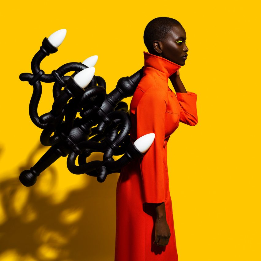
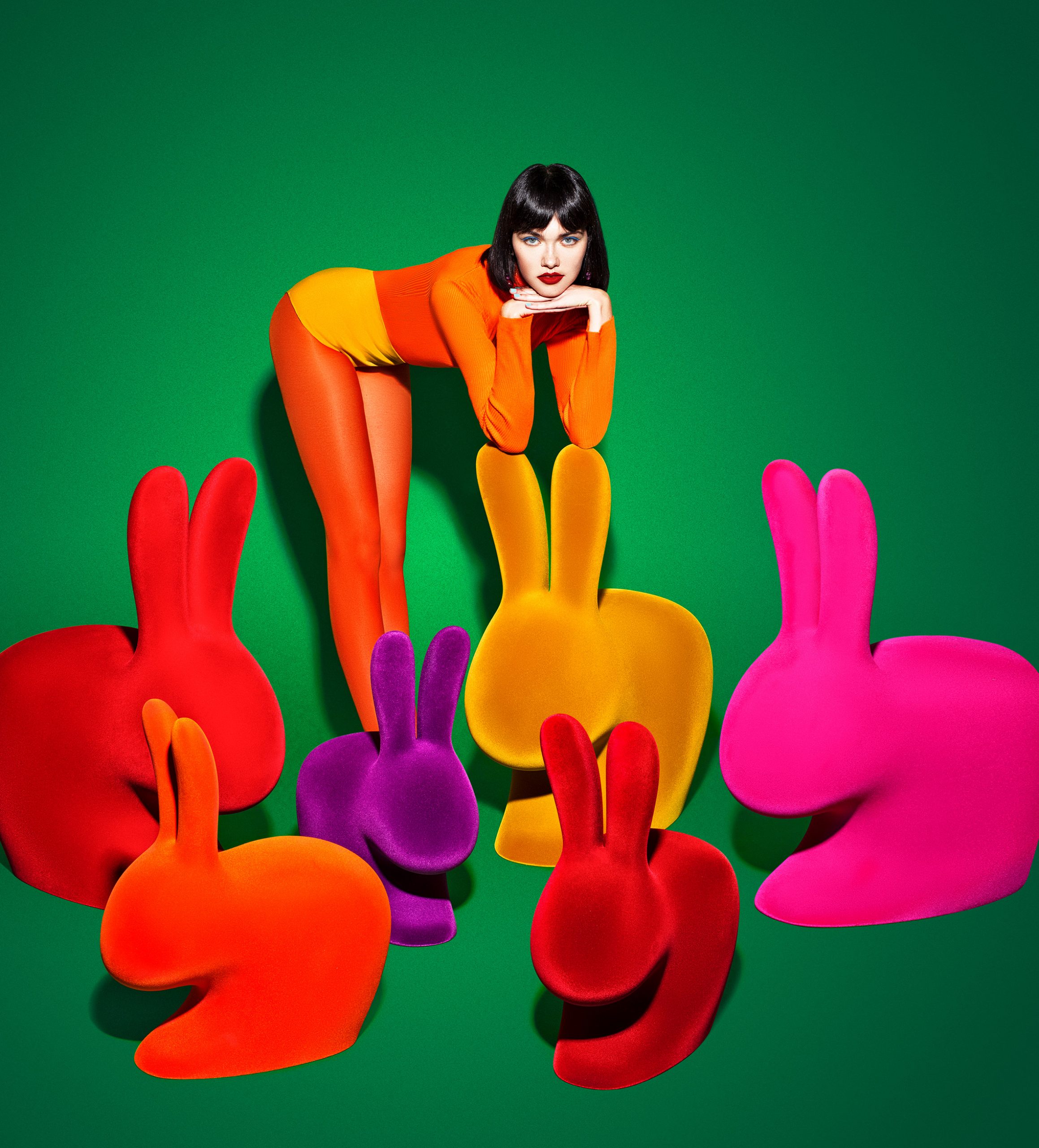
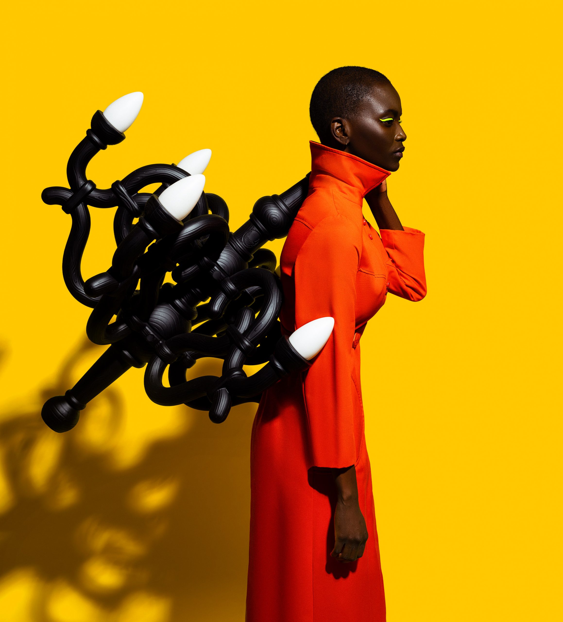
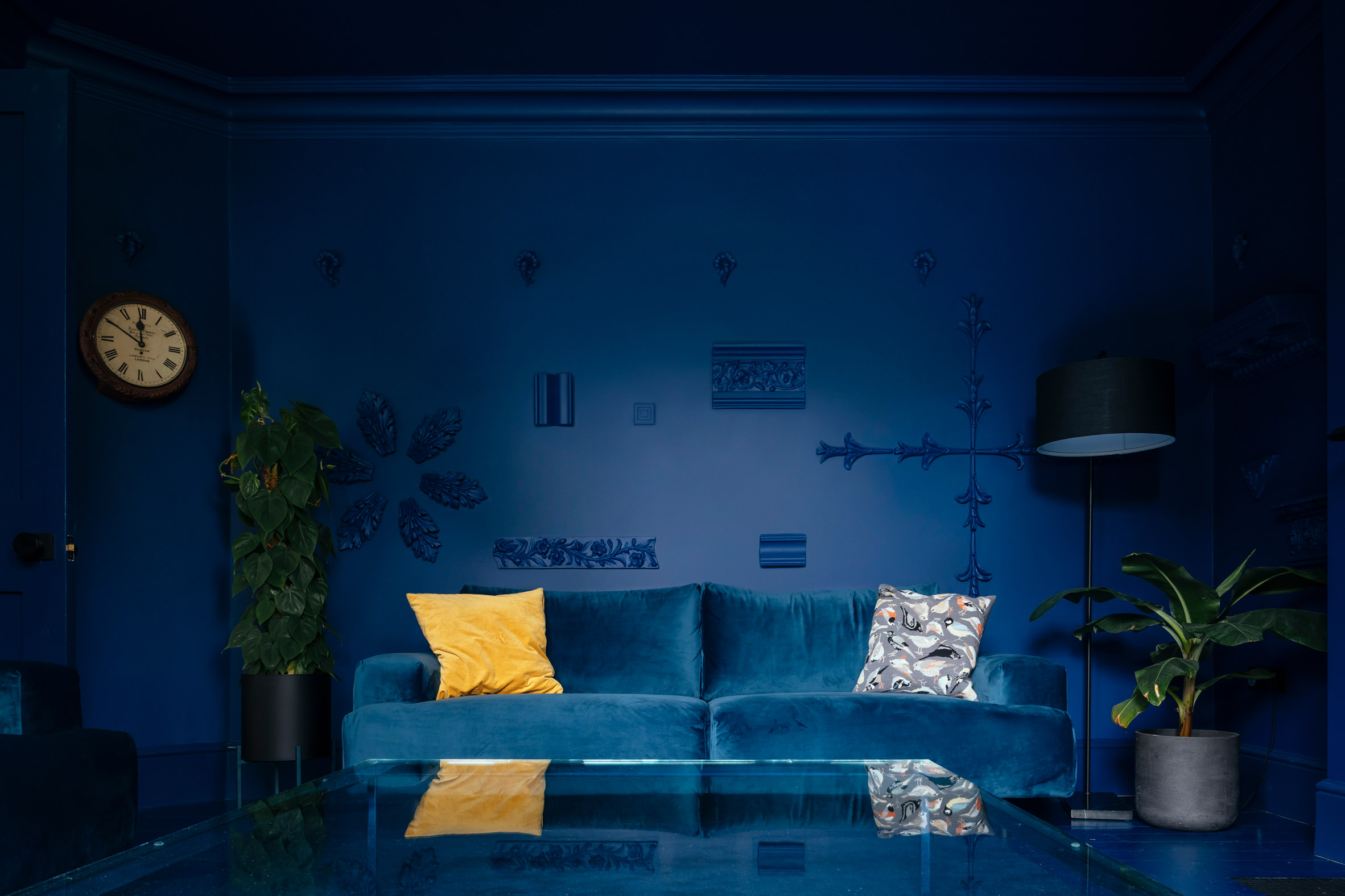
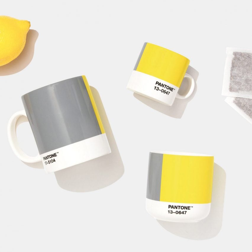
Now Pantone has proffered a down in the dumps Ultimate Grey. But wait, no, it's also bringing to the party Illuminating, a vivacious bright yellow. Talk about hedging your bets! The presentation of such a spectrally diverse colour coupling is to literally cover both sides of the table at once.

According to Pantone executive director Leatrice Eiseman, this year's double-dip gamble – for let's call it what it is – signifies how "different elements come together to express a message of strength and hopefulness that is both enduring and uplifting".

Pantone has proffered a down in the dumps Ultimate Grey. But wait, no, it's also bringing to the party Illuminating

Right. What I see is a bog-standard grey – described accurately as "practical and rock solid" paired with a pretty unapologetic yellow that recalls Mr Happy, the Roger Hargreaves cartoon character.

You can't help but imagine the backstage boardroom debates as the Pantone powers that be plumped for the grey, maybe coming from the same emotional wellspring of mehhr as Dulux. Then at the last minute, they lost their nerve – or came to their senses, depending on how generous you care to be, and recognised that grey alone would be too depressing.

Cue the eureka moment of let's send it out alongside its polar opposite and call it deliberate! Genius. And Pantone has form in this regard. In 2016 it debuted both a pale pink and a light lavender blue in an expression of "societal movements toward gender equality and fluidity"?

It can cheerfully concede that we're neck-deep in the doldrums while cheerfully suggesting that everything will be absolutely AOK come spring

Consequently, we have its answer to the earlier posited conundrum of what should a colour of the year represent — where we're at or what we need? As far as Pantone are concerned, for 2021, it's both.

This way it can cheerfully concede that we're neck-deep in the doldrums while cheerfully suggesting that everything will be absolutely AOK again come a sunny spring – or vaccine.

If only it were that simple. Instead, as a species, we've been shown to be largely chaotic, over-cossetted, and possibly evolved to the point of weakness. Gout is on the rise in adults as is rickets in children, both 18th-century diseases re-emerging in the 21st century as a result of increasingly sedentary lifestyles, hunched over phones and screens and not enough time spent outdoors physically engaging with what's left of the natural world.

Our modern sophistication has brought us rising rates of chronic disease, obesity and depression, even before Covid-19 lurched onto centre stage. Arguably, we are already in the midst of grey – or box beige – times, and already painfully aware of just how under-whelming they are too.

After all, grey is nothing more than the thinking person's magnolia. The sophisticate's default when decorative indecision strikes but beige is deemed stylistically verboten. But it is still a colour of submission.

Grey customarily signifies the dull, drab and dreary. It is a watered-down shadow of a stronger hue, a concession to a lack of discernible character. Indeed, who can forget former UK prime minister John Major's damming satirical Spitting Image puppet, depicting him head-to-toe in grey, from skin tone to clothing. Regardless, such shades crept up the popularity charts as pundits raced to declare them terribly à la mode.

Grey is nothing more than the thinking person's magnolia

And yellow? Well, yellow is globally perceived as representative of optimism, creativity and enlightenment, associated as it is with the sun and its life-giving warmth. However, there is a corollary to all that jolly positivity.

In China, adult movies are often referred to as "yellow" films, in Italy "giallo" refers to crime stories, and it is also almost universally used as the colour of caution. Why? Because the human eye processes yellow first, making it perfect for traffic road signs that urge us to slow down.

Historically yellow also depicts cowardice, betrayal and madness, the latter because it's typically the colour of malady — think jaundice, malaria and pestilence, all diseases that render the skin yellow to signal the sickness within. Perhaps it's no surprise too then that many early sources of natural yellow pigments were acutely toxic: cadmium, lead and chromium.

In conclusion then: Pantone's picks for 2021 could be read as heralding a year of anodyne boringness underpinned by a capricious hint of malice and decay. Alternatively, the selected duo says the sun will shine once more but in the interim just mask up and carry-on cowering at the altar of heightened hygiene.

Ultimately, the only thing more irritatingly predictable than the declaration of such an overtly happy clappy yellow to signal hope for the future, is the avalanche of perky lemon things that nobody needs or wants, that will inevitably follow it. No doubt they'll all be set fetchingly against a backdrop of infinitely forgettable greige too.

The post "Grey alone would be too depressing for 2021's colour of the year" appeared first on Dezeen.


from Dezeen https://ift.tt/341XmSh