Friday, 6 August 2021

Curved concrete walls snake through Berlin artist's residence by Philipp von Matt

O12 residence by Philipp von Matt

German architect Philipp von Matt has incorporated a skylit studio and a ground floor exhibition space into this artist's home in Berlin.

Located in the city's central Mitte district, the O12 house belongs to a French artist and is described by Von Matt as "a hybrid of artwork and architecture that responds to the critical challenge of balancing professional and private life".

Concrete staircase with gold mesh railing in O12 residence
The O12 residence features curved concrete walls (top image) and a concrete stairwell (above)

The 670-square-metre house is divided into three floors. Its plaster-rendered exterior is designed to blend in with the surrounding architecture, punctuated by various different sizes and styles of windows alongside a garage door at ground level.

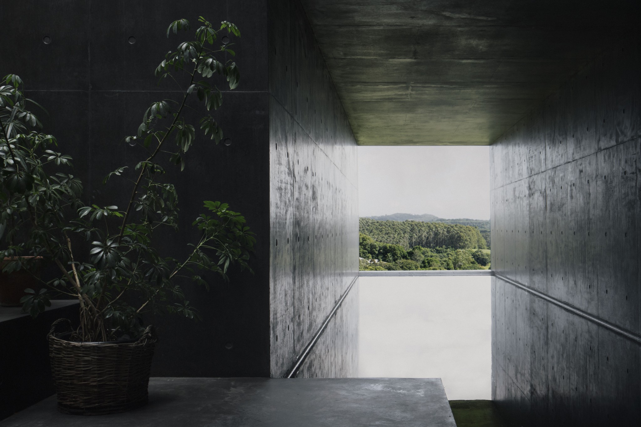
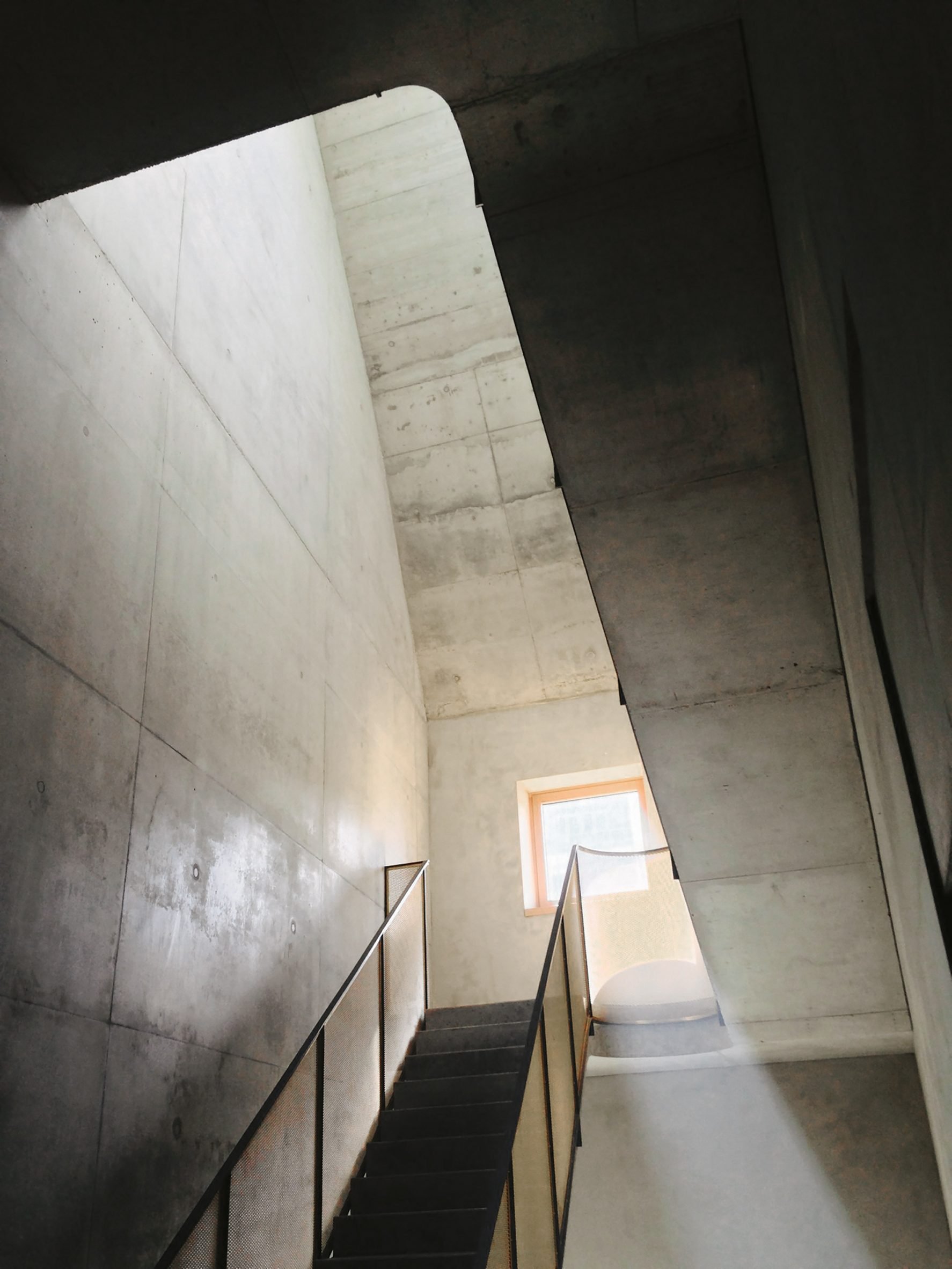
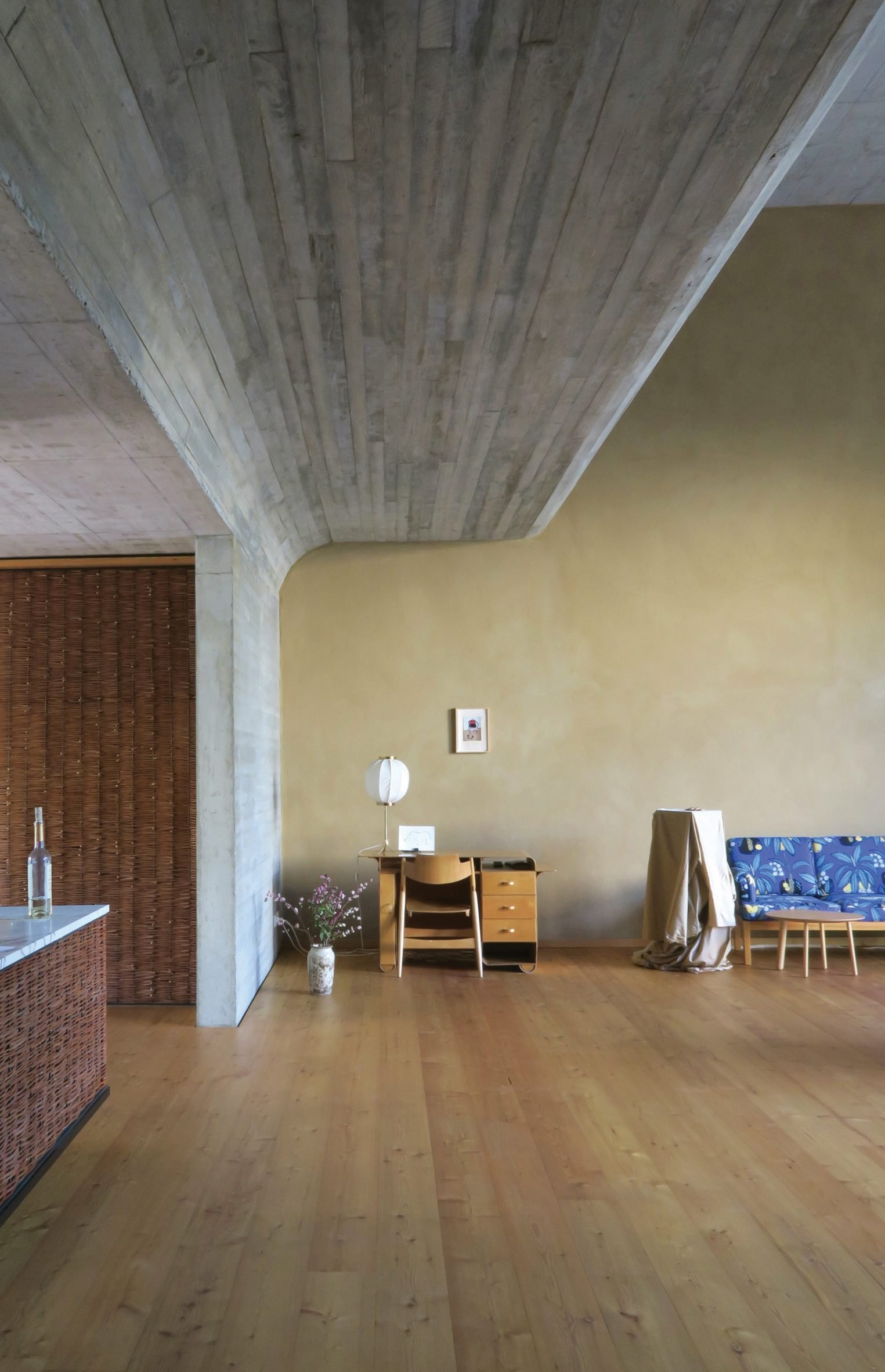
A raw concrete corridor and open staircase with a brass mesh bannister zigzags up the side of the building from the front door to the first and second floors.

Concrete room with coral coloured armchair and wooden furnishings in Berlin home by Philipp von Matt
The ground floor hosts a gallery and exhibition space

The way that light filters down in shafts from above is intended to evoke the drawings of classical Italian architect and artist Giovanni Battista Piranesi.

"I am fascinated by the friction between the ordinary and the remarkable and I like the quality of creating something ordinary because it is not easy to achieve," explained Von Matt.

"Like that feeling of comfort when you enter an old building that has been standing for hundreds of years."

Room with curved concrete ceiling and wooden floors in O12 residence
The kitchen opens onto a double-height living room

The ground floor hosts the house's more public spaces including a gallery and an exhibition space with a courtyard garden. The rest of the rooms unfold along the stairway with larger double-height rooms opening up to views on the west and more intimate spaces including the bedrooms and bathrooms to the east.

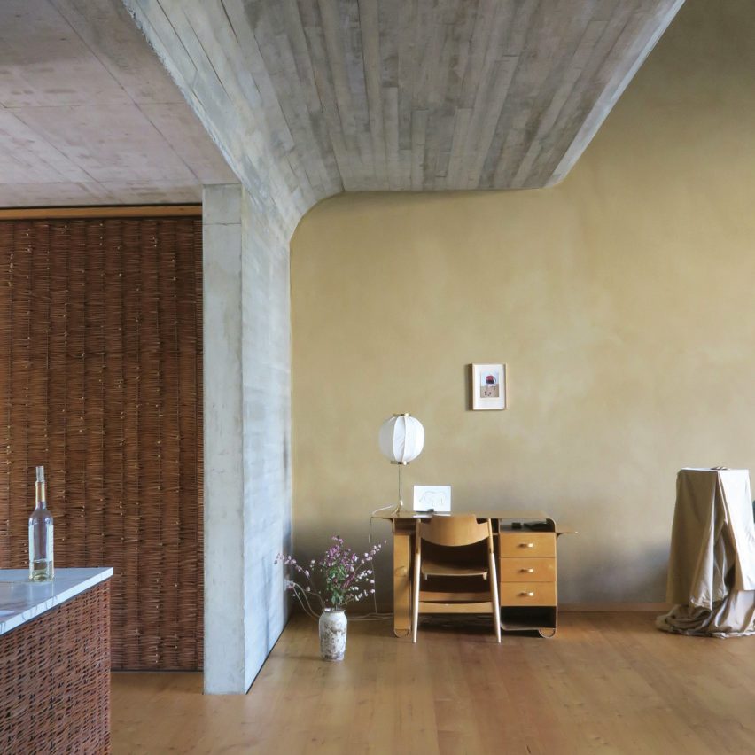
The first-floor hosts a kitchen that merges into a dramatic double-height living room via an undulating wall of curved reinforced concrete.

Pointy white fireplace in front of brown wall in interior by Philipp von Matt
A triangular fireplace centres the living room

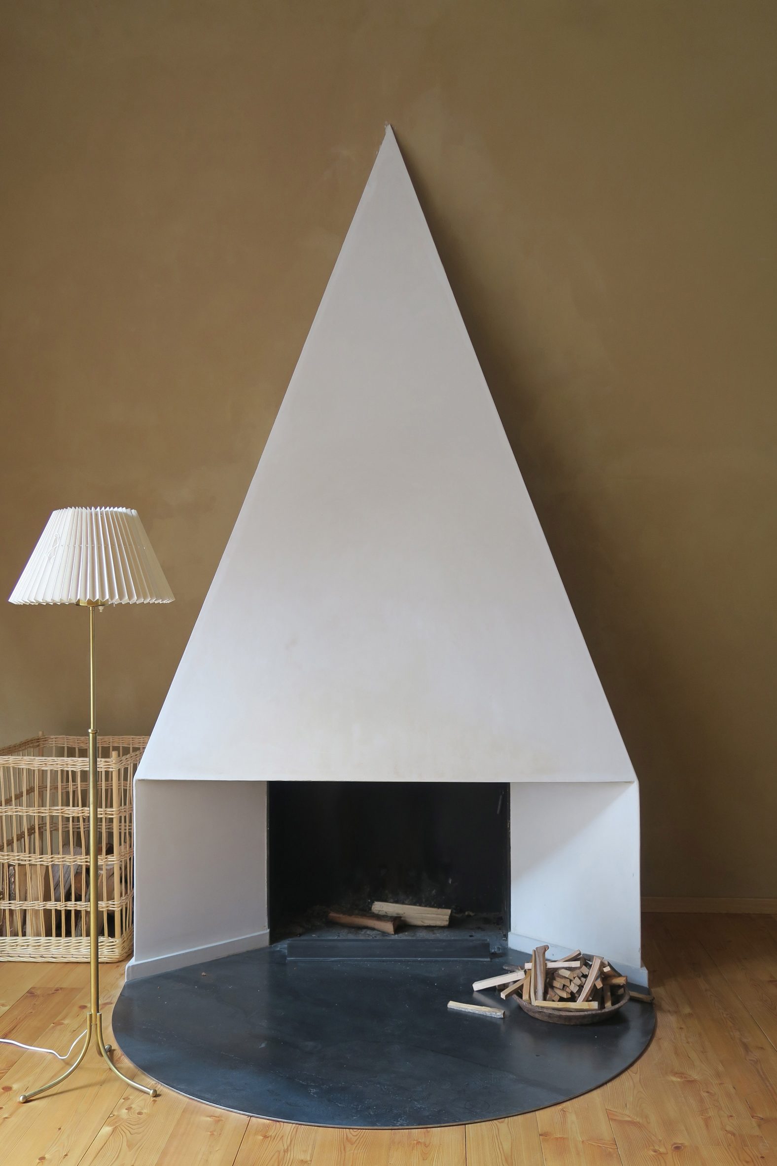
A triangular fireplace that sits at one end of the room was designed to recall the Pyramid of Cestius in Rome as well as Antonio Canova's tomb in Venice.

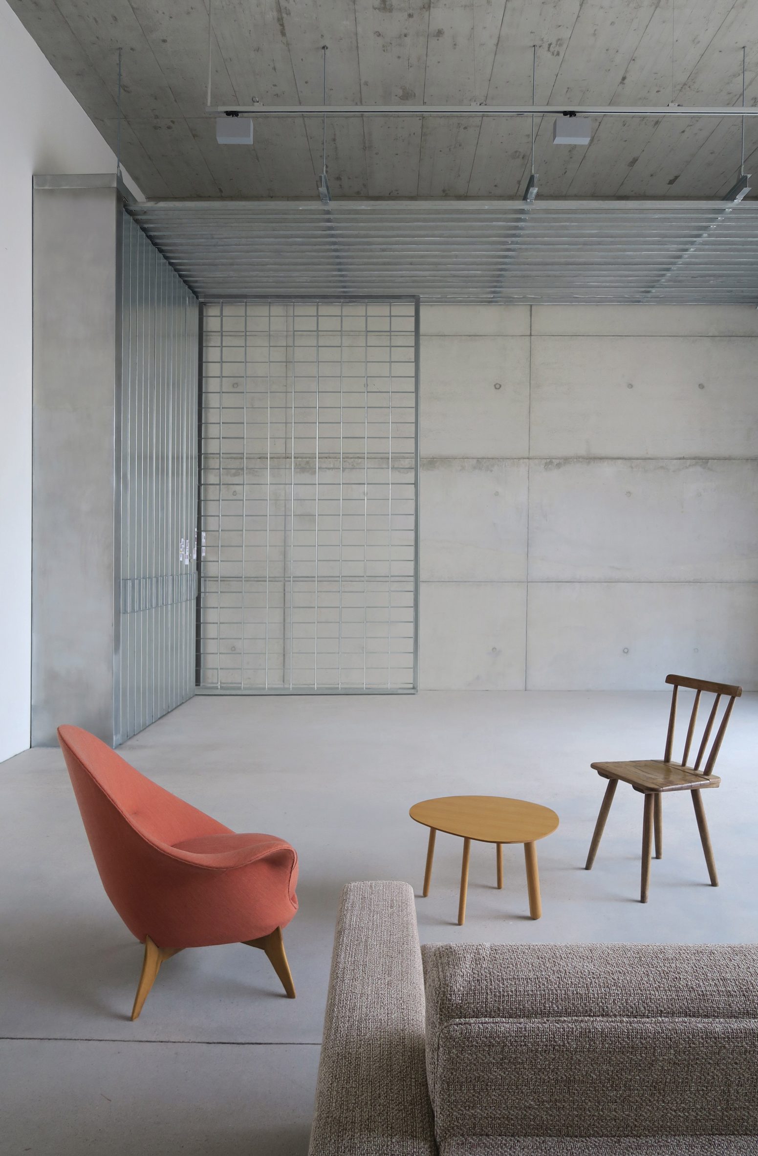
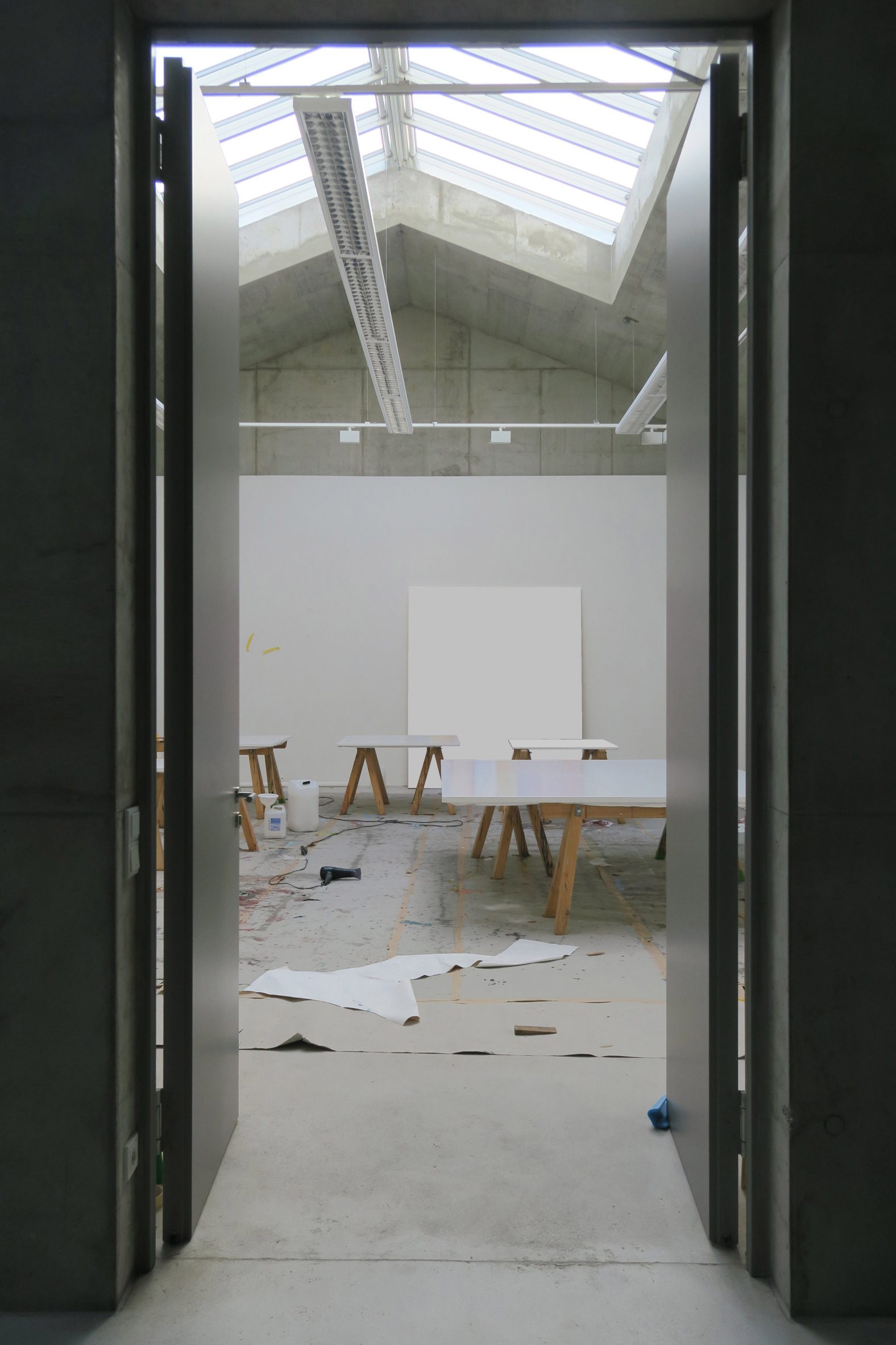
The house's top floor is exclusively occupied by the artist's atelier.

"Natural light plays a central role as it influences the shift in atmosphere, with open, light-flooded rooms and more intimate, warmly lit ones," said the architect.

The studio features a large skylight that lends the room the appearance of an open-air studio.

Kitchen with white seating arrangement and whicker storage wall in O12 residence
Whicker doors conceal storage in the kitchen

"The skylight engages in a whispered visual dialogue with the nearby industrial buildings in a continuous fluctuation between interior and exterior, concentration and contemplation," he explained.

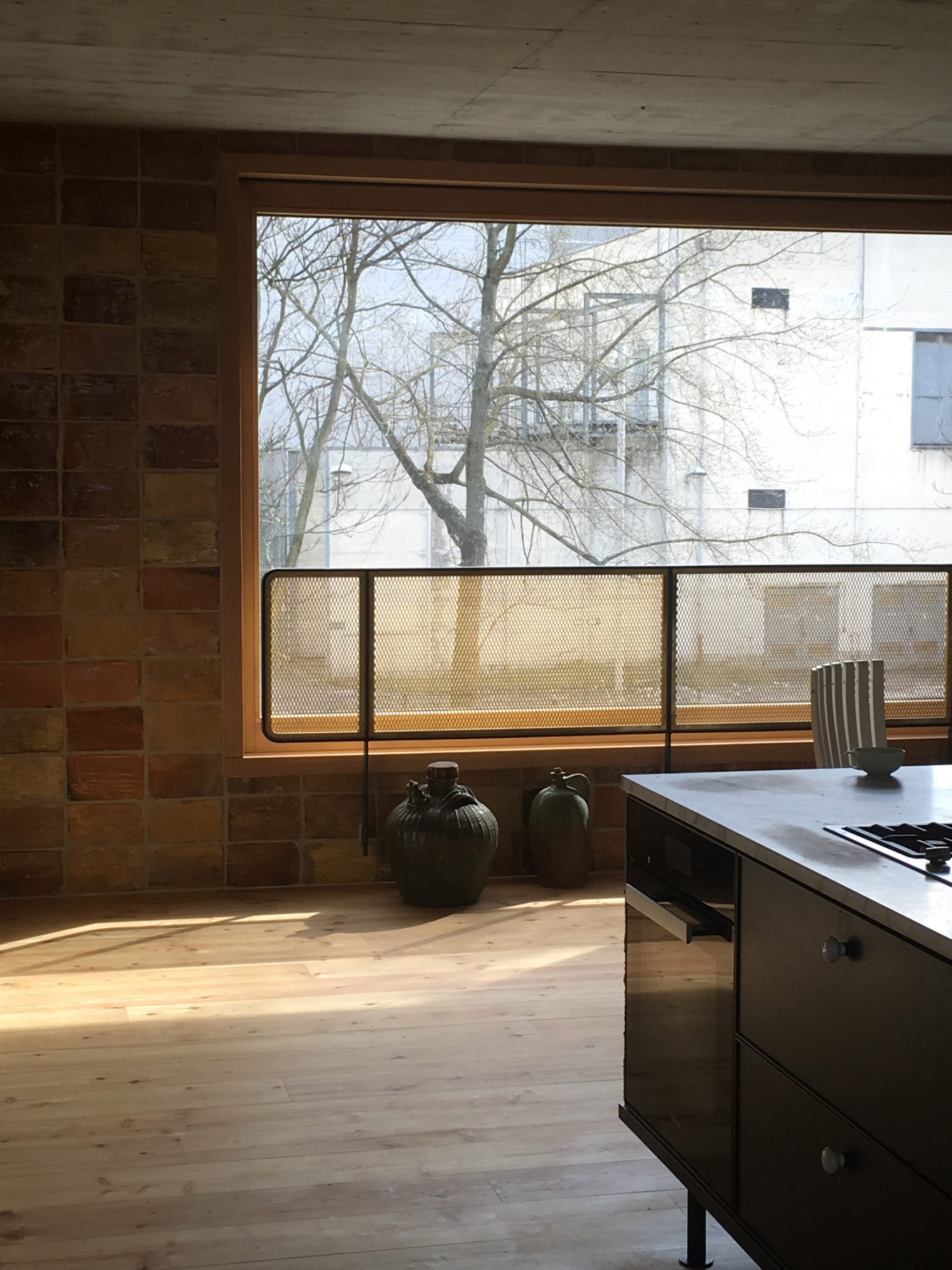
"The studio is the most secret and intimate space, yet one that also invites external impulses. In fact, the room's only window frames Berlin's landmarks such as the TV tower, expanding the private horizon into the urban environment."

Kitchen with brick walls and wooden floors in interior by Philipp von Matt
The brass mesh banister from the stairwell also features in the kitchen

Colours and materials were selected to amplify the natural light. The rooms dedicated to art are rendered delicate, neutral hues while the living spaces become increasingly warm and inviting.

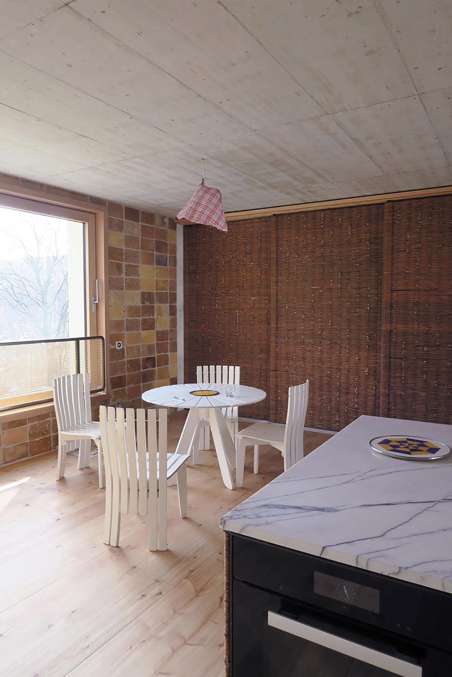
The studio deliberately paired contrasting and unexpected materials such as industrial concrete and steel with wood, clay plaster, terracotta, ceramics and wicker.

Artist's studio with trestle tables in O12 residence
An artist's studio sits on the top floor

Dezeen has rounded up a selection of artist's houses that double as gallery spaces, which includes a garden shed for making and displaying sculptures and a showroom for a Japanese landscape architect with its own rock garden.

Photography is courtesy of Philipp von Matt.

The post Curved concrete walls snake through Berlin artist's residence by Philipp von Matt appeared first on Dezeen.


from Dezeen https://ift.tt/3Cob7tW

Thursday, 5 August 2021

Carbon-capturing Celour paint allows anyone to "participate in CO2 removal in their daily lives"

Celour paint by Kukbong Kim

Design graduate Kukbong Kim has developed a paint made from demolished concrete that is capable of absorbing 20 per cent of its weight in carbon.

Called Celour, the paint can sequester 27 grams of CO2 for every 135 grams of paint used.

"That is the same amount of carbon dioxide that a normal tree absorbs per day," Kim said.

The indoor-outdoor paint is made of waste concrete powder, a cement-based residue from concrete recycling that is normally buried in landfills, where it can alkalise the soil and have a detrimental effect on local ecosystems.

Celour in red, blue and yellow
Celour is a carbon-capturing paint that comes in three colours

Through a chemical process called mineral carbonation, which takes place when the paint reacts with the CO2 in the surrounding air, Kim says Celour can reabsorb a significant part of the emissions that were generated by producing the cement in the first place.

Eventually, she hopes to optimise the capturing capacity of the paint so that it completely negates the carbon footprint of the cement it is made from.

"I think it is too early to describe Celour as carbon neutral," Kim said. "It needs further study but I want to make it a carbon-negative product. That is my goal."

"It's not enough if we just stop emissions, as we already have high levels of CO2 in the air," she added. "We need to participate in CO2 removal in our daily lives."

Concrete naturally reabsorbs some of the carbon it emits

Cement is the most carbon-intensive ingredient in concrete and is responsible for eight per cent of global emissions.

But when concrete is recycled, only the aggregate is reused while the cement binder is pulverised to create waste concrete powder and sent to landfill, where it can disturb the pH balance of the surrounding soil.

"Waste concrete powder is high in calcium oxide," Kim explained. "And when it is buried and comes into contact with groundwater or water in the soil, it turns into calcium hydroxide, which is strongly alkaline."

Kukbong Kim's process for making carbon-capturing paint from waste concrete powder
The waste concrete powder is filtered, pulverised and mixed with a binder, water and pigments

With her graduate project from the Royal College of Art and Imperial College London, the designer hopes to show the usefulness of this industrial waste material by maximising its natural ability to capture carbon.

Studies have shown that cement already reabsorbs around 43 per cent of the CO2 that is generated in its production through the mineral carbonation process.

This is set off when concrete is cured by adding water, which reacts with the calcium oxide in the cement and the CO2 in the air to form a stable mineral called calcium carbonate or limestone.

A traditional concrete block continues to cure throughout its life but because this process is reliant on exposure to air, only its outer layers will react with the CO2 while its core will remain uncarbonated.

Celour could store carbon for thousands of years

But Kim was able to improve the material's carbon-capturing capabilities by turning the waste concrete pounder into a paint, mixed with a binder, water and pigments.

This is spread thinly on a surface so that more of the material is exposed to the air and can carbonate.

In addition, the coarse powder was further filtered and pulverised to increase the relative surface area of the particles while a polyvinyl alcohol (PVA) binder creates small gaps for air to enter.

"I have done a lot of experiments with different ingredients to maximise carbon absorption by increasing the surface area that comes into contact with carbon dioxide in the air," she explained.

"Graphene, which can capture lots of carbon thanks to its structure, was also considered as a binder but excluded because it is currently priced high and cannot be mass-produced."

Hand applying blue Celour paint with a brush
The paint can be used both indoors and outdoors

Cement has long been used to create traditional paint, which is also capable of sequestering CO2. But Kim hopes to harness these carbon-capturing benefits while keeping a polluting waste material out of landfills and avoiding the emissions associated with making new cement.

How long the paint is capable of storing carbon is dependent on what happens to it after it is no longer needed. But Kim says it could be locked away for thousands of years unless exposed to extreme heat, which would alter the chemical structure of the carbonate.

As part of our carbon revolution series, Dezeen has profiled a number of carbon capture and utilisation companies that are working on turning captured CO2 into useful products from bioplastic cladding to protein powder and concrete masonry units.

The post Carbon-capturing Celour paint allows anyone to "participate in CO2 removal in their daily lives" appeared first on Dezeen.


from Dezeen https://ift.tt/3yGlZkV

BAAO and 4|MATIV add bright colours to Mi Casita Preschool in Brooklyn

Mi Casita preschool

House-shaped openings and cheerful hues are found in a New York daycare centre designed by American firms BAAO and 4|MATIV.

The Mi Casita Preschool and Cultural Center is located within a new mixed-use development in the Bedford-Stuyvesant neighbourhood. The 3,500-square-foot (325-square-metre) space was designed collaboratively by local firms BAAO and 4|MATIV.

Mi Casita preschool in Brooklyn
The preschool is housed in a mixed-use development in Brooklyn

The goal was to create a space that embodied the school's mission of being a "home away from home" and celebrated the different cultures that coexist in Brooklyn.

The centre features several rooms that are loosely organised around an L-shaped trough, which functions as both a bathroom sink and a social gathering spot. Natural light flows in through large, street-facing windows.

The project was designed by American firms BAAO and 4|MATIV
House-shaped openings are found throughout the space

The space features simple and clean finishes, including white walls and pale maple flooring. Pops of colour are incorporated throughout.

"Colour is used for dramatic effect throughout the space," the team said. "Turquoise on the ceiling and light globes give the sense of being under a bright blue sky."

The blue is paired with splashes of sherbet orange, which is found on walls in the main area and in a stairwell leading down to a co-working space for parents.

The school's mission inspired the development of graphic elements that relate to home and the city. In the bathroom, for instance, the team installed tilework that resembles a collection of buildings.

Graphic elements that relate to home and the city in the bathroom
Tile patterns resembling buildings feature in the bathroom

"A graphic in shades of pale blue in the tile mosaic around the bathroom and trough sink references the city skyline and is echoed as a linear element in the window treatment," the team said.

In other areas, the designers created wall cutouts that are shaped like gabled houses. The openings serve as passageways and child-sized reading nooks.

Movable furniture allows the nursery to be reconfigured for special events
Child-sized reading nooks are shaped like gabled houses

On the mezzanine, a house-shaped cutout holds seasonal displays that relate to the curriculum.

Movable furniture allows the nursery to be reconfigured for special events, including performances organised by an artist-in-residence.

The preschool by BAAO and 4|MATIV features wooden elements
The mezzanine's house-shaped cutout

This isn't the first time that BAAO, formerly known as BFDO, and 4|MATIV have collaborated. The two firms previously worked together on the Maple Street School in Brooklyn, which features soft pastel tones and an abundance of wood.

The photography is by Lesley Unruh.

The post BAAO and 4|MATIV add bright colours to Mi Casita Preschool in Brooklyn appeared first on Dezeen.


from Dezeen https://ift.tt/3jrpdSH

An experimental nuclear fusion power plant features in today's Dezeen Weekly newsletter

A visual of a circular power plant by AL_A

The latest edition of our Dezeen Weekly newsletter features a prototype power plant designed by AL_A to test the viability of nuclear fusion technology as a carbon-free energy source.

Set to be built in the UK county of Oxfordshire and completed in 2025, the nuclear power plant will be the first of its kind according to A_LA.

Readers are sceptical of the science behind the technology, with one commenter stating: "Seems to be jumping the gun somewhat. The technology does not yet exist."

Federal House by Edition Office
Edition Office has completed a black concrete home in rural Australia

Other stories in this week's newsletter include a black concrete house in Australia, 10 interiors designed to show off the owners' art collections and accommodation built from shipping containers for people experiencing homelessness.

Subscribe to Dezeen Weekly

Dezeen Weekly is a curated newsletter that is sent every Thursday, containing highlights from Dezeen. Dezeen Weekly subscribers will also receive occasional updates about events, competitions, and breaking news.

Read the latest edition of Dezeen Weekly. You can also subscribe to Dezeen Daily, our daily bulletin that contains every story published in the preceding 24 hours.

Subscribe to Dezeen Weekly ›

The post An experimental nuclear fusion power plant features in today's Dezeen Weekly newsletter appeared first on Dezeen.


from Dezeen https://ift.tt/37psxbj

Marie Boulanger explores how typography perpetuates gender stereotypes

XX, XY by Marie Boulanger

Type designer Marie Boulanger has written a book about how typography is a "dangerous tool" for reinforcing gendered stereotypes and bias in design.

Called XX, XY: Sex, Letters and Stereotypes, the book unpacks how fonts can be assigned masculine or feminine associations that are used to reinforce the binary when designing products and packaging.

The book is by type designer Marie Boulanger
Top: the back of the book displays chromosomes. Above: its blue and pink spine quips at gender stereotypes

"Type is used as a dangerous tool to cement layers of stereotypes conveyed through every component of design such as type, colour and layout when it shouldn't be," said Boulanger.

"Through association, letters become signs which are instantly perceived as male or female. This takes the focus out of the formal qualities of typefaces," she added. "When used like this, type is a very powerful tool and I want to show that it's up to us to know and do better."

XX, XY letterforms
The book shows how masculine and feminine attributes are assigned to different typefaces

London-based Boulanger examines typeface anatomy, a term given to the "body parts" of letterforms, and explains how and why we attribute masculine or feminine qualities to fonts.

The designer highlights how bold and confident lettering is often associated with masculinity, while delicate and ornamental typography tends to be deemed feminine.

The book cautions against gendering letterforms
XX, XY's cover displays a subtle alphabet

XX, XY unpacks how masculine and feminine associations have been formed over time, and explains that it is important to challenge these biases in the design industry to work towards a more equitable world.

Boulanger argues that gendering typefaces lead to products marketed to people in a way that enforces stereotypes.

"There is a very deep link to marketing," explained the designer.

"Classifying things into categories is a gateway to more sales, especially for products targeted at women," she continued. "Women are responsible for a huge majority of consumer purchases."

Historical and present day examples are used
Boulanger looks at gender associations from art history to product design

The designer titled her project in reference to the XY-sex determination system, which uses XX and XY to classify sex chromosomes.

The book's cover displays a greyed-out alphabet with the letters XX and XY highlighted in black. A pink-to-blue gradient has been sprayed along its edges, blurring the two colours.

Two anatomical skeletons by scientist John Barclay
A spread showing anatomical skeletons by scientist John Barclay from the 18th century

"The name came to me instantly, alongside the cover design," Boulanger told Dezeen. "It elegantly carries the main premise of the whole argument. We treat and describe letters like human beings."

Boulanger's book is illustrated with a mix of imagery borrowed from art history and current typographic work.

Boulanger explains how we perceive different typefaces
Boulanger compares how we perceive different typography

The designer created the book in an attempt to make her research on how we automatically cast gendered judgement on letterforms accessible to a varied audience.

With the dimensions and weight of an average paperback novel, the book is designed to be something that can be read while travelling or left on a bedside table.

Masculine and feminine beauty products illustrated in XX,XY
The book explains how the typography used on products can be gendered

Currently only published in French, the designer hopes that her project will soon be distributed in English, primarily for the purpose of education.

"Education has always been the main driving force behind this project," said Boulanger. "I hope students use this book to realise that we can all shape what's next. We can find better ways of designing and speaking about our design work."

Other recent typographic projects include a typeface designed for a bowel cancer charity that looks like intestines. Another typeface, Periods for Periods, was created to protest period poverty and is made solely out of full stops.

The images are courtesy of Marie Boulanger.

The post Marie Boulanger explores how typography perpetuates gender stereotypes appeared first on Dezeen.


from Dezeen https://ift.tt/3lDEUca