Wednesday, 11 August 2021

Boîtier for Bike cabinet by Boîtier

Boitier for Bike cabinet by Boitier

Dezeen Showroom: home-gym furniture company Boîtier has launched a cabinet for stationary bikes designed to conceal equipment in a steel-enforced drawer.

The Boîtier for Bike cabinet is designed to look like a piece of mid-century furniture, with a cherrywood and veneered wood structure and brass handles.

Wooden cabinet in mid-century style in a minimal white apartment hallway
Boîtier for Bike allows users to conceal their stationary bike in a cabinet

The drawer the stationary bike is placed upon is a custom platform load-tested to more than 180 kilogrammes, meaning users can workout safely upon it without moving the equipment. To store the bike again after use, they only need to close the drawer.

In addition, the Boîtier for Bike cabinet includes a shelf for books and ornaments, which should make it further blend into the decor of a living room or bedroom.

Mid-century cabinet with the full-height side drawer opened to reveal a stationary bike
Users simply pull open the drawer, hop on the bike and ride it on the steel-enforced platform

Boîtier founder Preston Emory started the company after experiencing hesitancy in buying his own home gym equipment for a one-bedroom apartment because it would create an eyesore.

He has worked with New Orleans makerspace Scale Workspace to bring Boîtier for Bike to the market and expects to make it available through a limited release in the coming months.

Product: Boîtier for Bike
Brand: Boîtier
Contact: info@boitierhome.com

About Dezeen Showroom: Dezeen Showroom offers an affordable space for brands to launch new products and showcase their designers and projects to Dezeen's huge global audience. For more details email showroom@dezeen.com.

Dezeen Showroom is an example of partnership content on Dezeen. Find out more about partnership content here.

The post Boîtier for Bike cabinet by Boîtier appeared first on Dezeen.


from Dezeen https://ift.tt/3k0PGXN

Design Museum curator picks five highlights from Charlotte Perriand: The Modern Life exhibition

Charlotte Perriand reclining on a chaise longue

The latest exhibition at London's Design Museum provides a retrospective look at the life and work of 20th-century designer Charlotte Perriand. Chief curator Justin McGuirk shares his top five exhibits in this roundup from the show.

Currently on show at the Design Museum in London until 5 September 2021, Charlotte Perriand: The Modern Life journeys from Perriand's collaborative designs with Le Corbusier right through to her final architectural project, the Les Arcs ski resort in France (pictured above.)

The exhibition examines the French designer and architect's work through a feminist lens in an attempt to reinstate her accomplishments in the history of design.

Over three sections and seven decades, it explores how Perriand's reputation evolved from a pioneer of modernist design to a proponent of socialist architecture.

Curator McGuirk said he became motivated to place the designer at the heart of the exhibition's narrative after seeing the extensive Charlotte Perriand exhibition at Fondation Louis Vuitton.

"My desire was to bring the focus back to Charlotte Perriand herself," McGuirk told Dezeen.

"She had an incredible life and a prolific career that lasted seven decades. She's a fascinating figure. I hope that people take away that she was dynamic, independent, she had a cheeky sense of humour and that she liked collaborating with people."

Charlotte Perriand: The Modern Life exhibits lesser-known drawings, large-scale interior reconstructions and original furniture in an attempt to show these sides of the designer. It falls on the 25th anniversary of Perriand's last significant presentation in London, which was held at the Design Museum in 1996.

In chronological order, McQuirk takes us through his selection of five of Perriand's top designs for Dezeen:


Charlotte Perrian reclining on a chaise longue

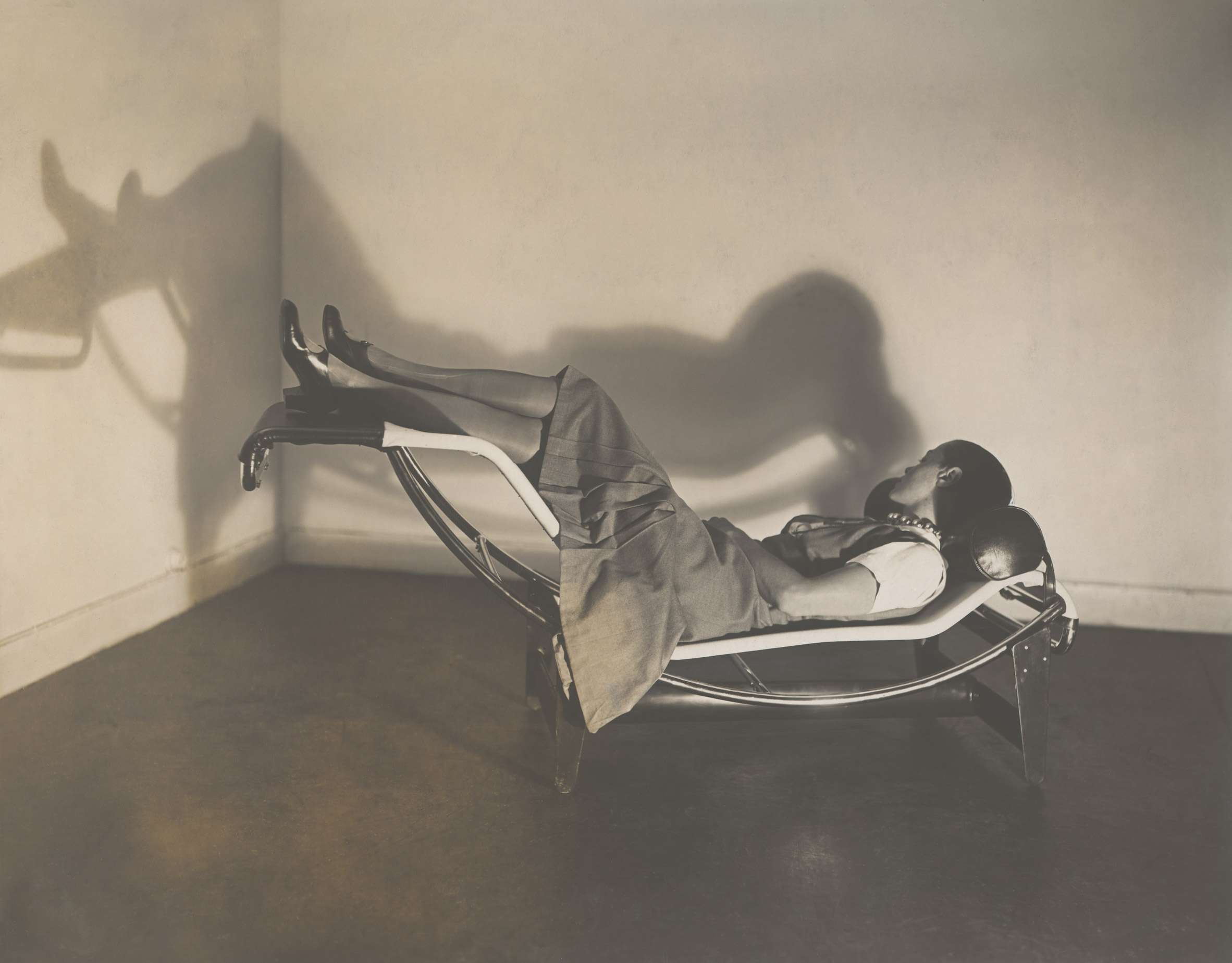
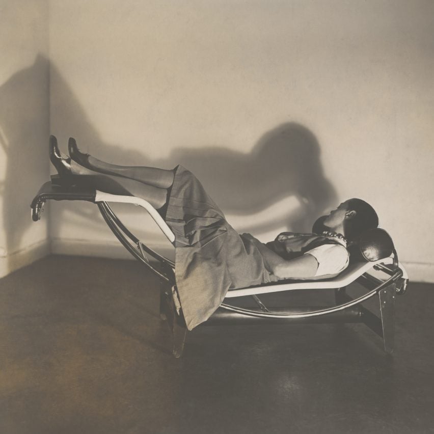
Chaise Longue Basculante B306, 1928-29

"What's interesting about the chaise longue is that it continues that language of kind of machine aesthetic efficiency and modernist materials; this idea of furniture as equipment. But it's incredibly elegant and comfortable.

"Some of the early tubular steel designs by designers like Mies van der Rohe were quite functional and not necessarily as elegant or as comfortable as what Perriand produced a couple of years later.

"All of the chaise lounge drawings are done by Perriand. In the middle of the century when Corbusier wanted to put the furniture back into production under his own name alone, he couldn't do it as he didn't own the drawings. They were hers. That's not to say that work is all hers but the drawings remind us that she was really needed."


Charlotte Perriand's drawings of La Maison au bord de l'Eau

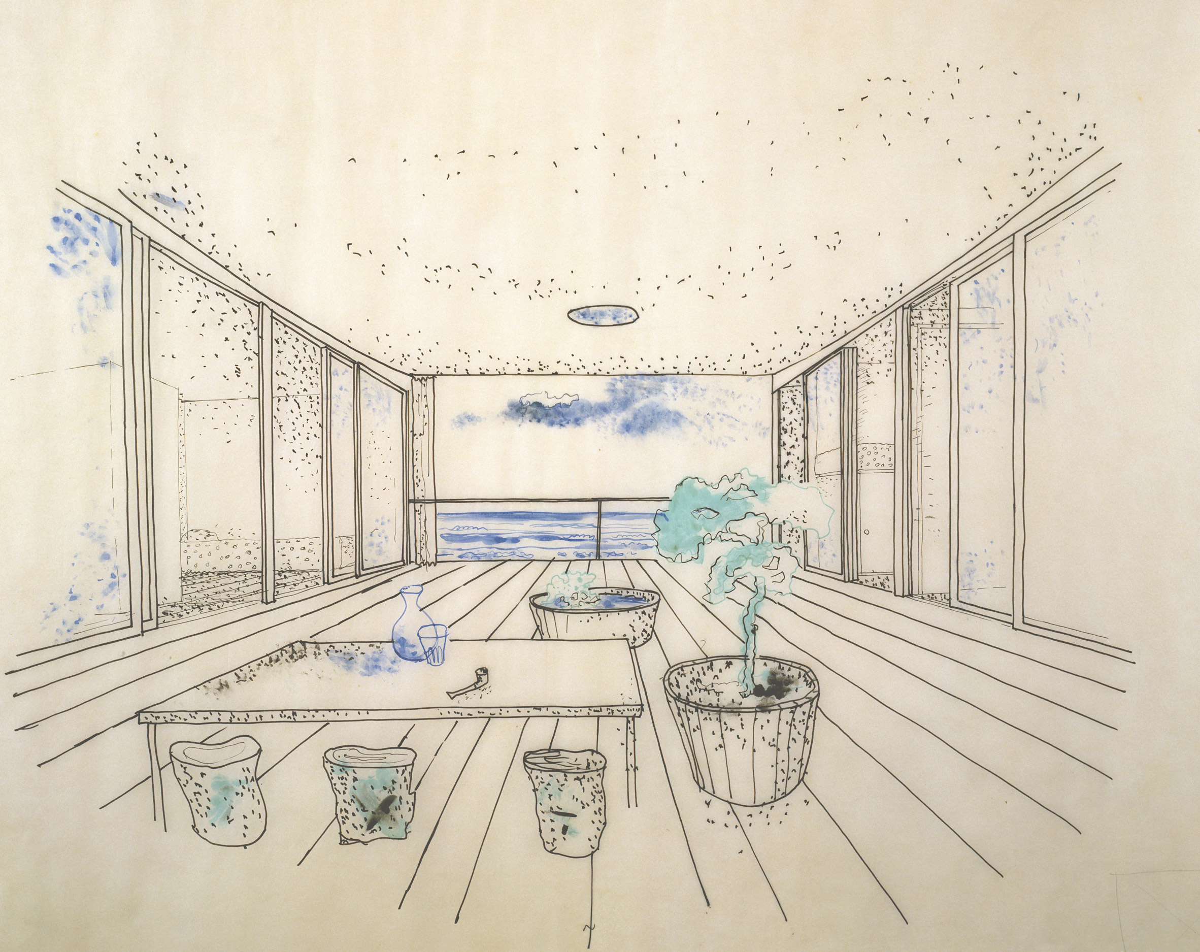
Drawings of La Maison au Bord de l'Eau, 1934

"Most of Perriand's architecture related to the question of leisure; be it little weekend homes or ski resorts. She was wrestling with how you could give the masses access to leisure. She was entering a new world where people had more free time and things that previous generations hadn't necessarily had, such as weekends and paid holidays.

"Perriand produced a number of designs in the mid-1930s that were cheap weekend homes, easy to either build yourself or get someone to build for you. This was one of those.

"There's something about the way all the rooms open onto that little courtyard and the idea of looking out to sea that's absolutely enticing. It's so modest and so seductive.


Charlotte Perriand Table a six

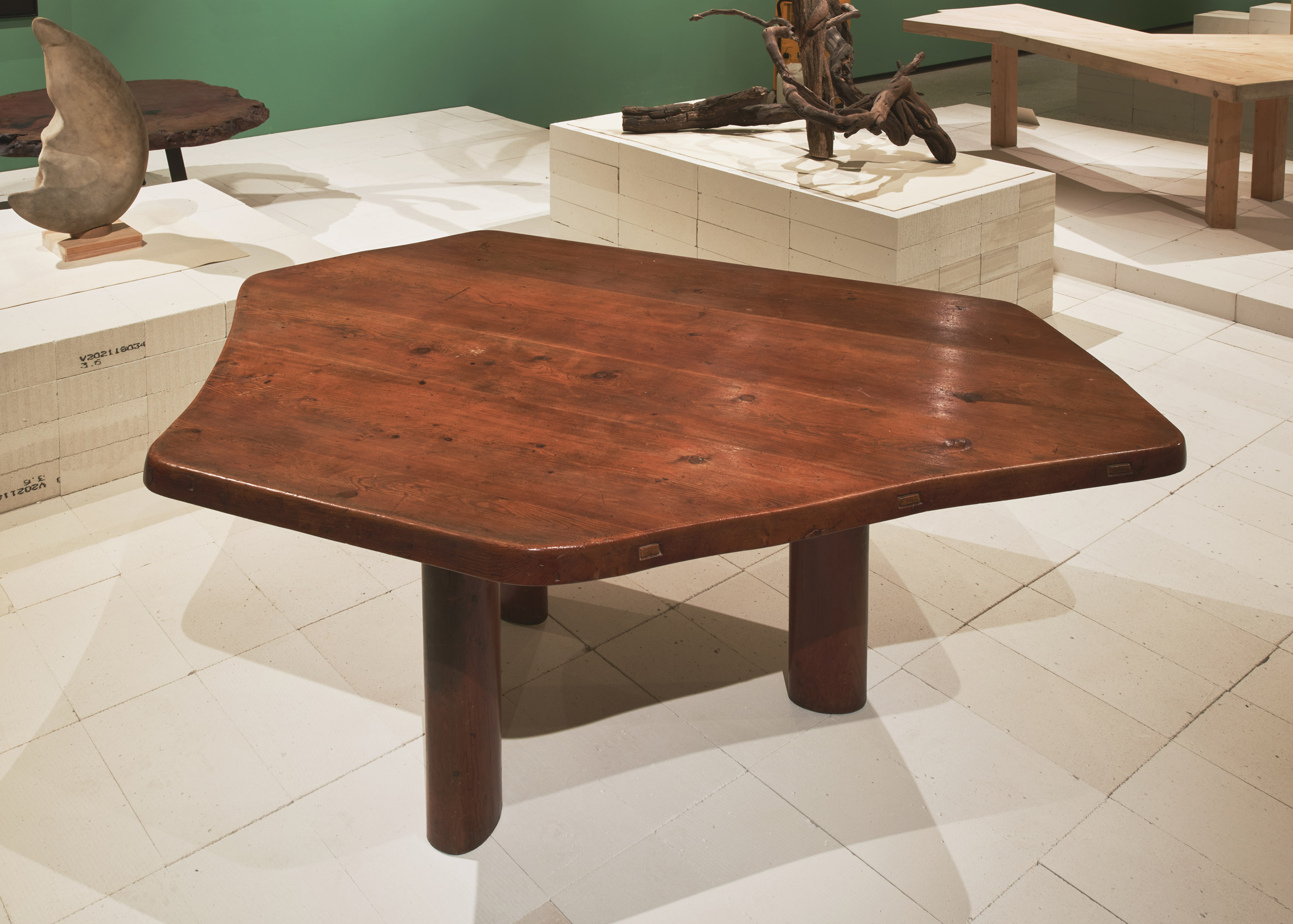
Table à six pans, 1949

"It's a really important moment in her career. Perriand starts to turn her attention to wood and to nature in general. She starts to design these tables which are inspired by the objects she finds in nature, like stones and pieces of driftwood.

"They're organic in shape. They have heavy wooden tops. They have a kind of flesh-like quality; she thinks of the legs like a woman's thigh.

"Although there is this artistic sensibility, they're also highly practical tables. They have six sides but only three legs so you can fit quite a lot of people around and create more space underneath for people's knees. What I love about these tables is that she's thinking about how many people she can bring together. It's a very social table.

"It's also a table that you can turn in many different directions so it can fit awkward small spaces. Throughout her career, she's always thinking about how to achieve the best use of the space."


Charlotte Perriand's wall divider and storage unit

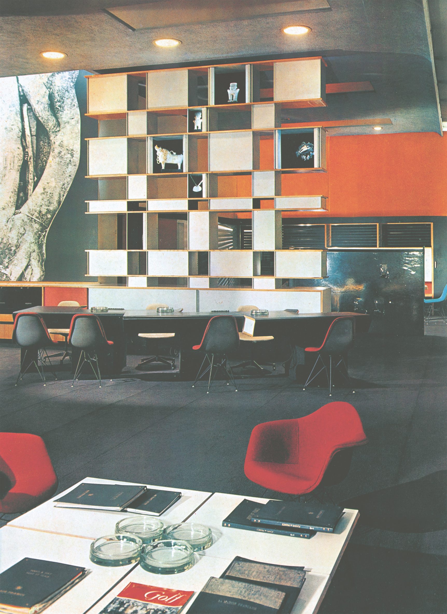
Bibliothèque, La Maison du Mexique, 1952

"It's the signature Perriand work. First of all, you can assemble these shelves in different ways, using the same parts. She makes the consumer part of the creative process in a way because you can also arrange them differently.

"Her furniture is often architectural. So it's not just a bookcase or a storage unit. it's replacing a wall. It's a spatial divider.

"The other thing I love about it is that it's in the most modest room imaginable: a student dormitory. It's such a design classic. It's great design, but she's making it available in a very humble setting because she believes that good design was for everyone."


A red prefabricated kitchen

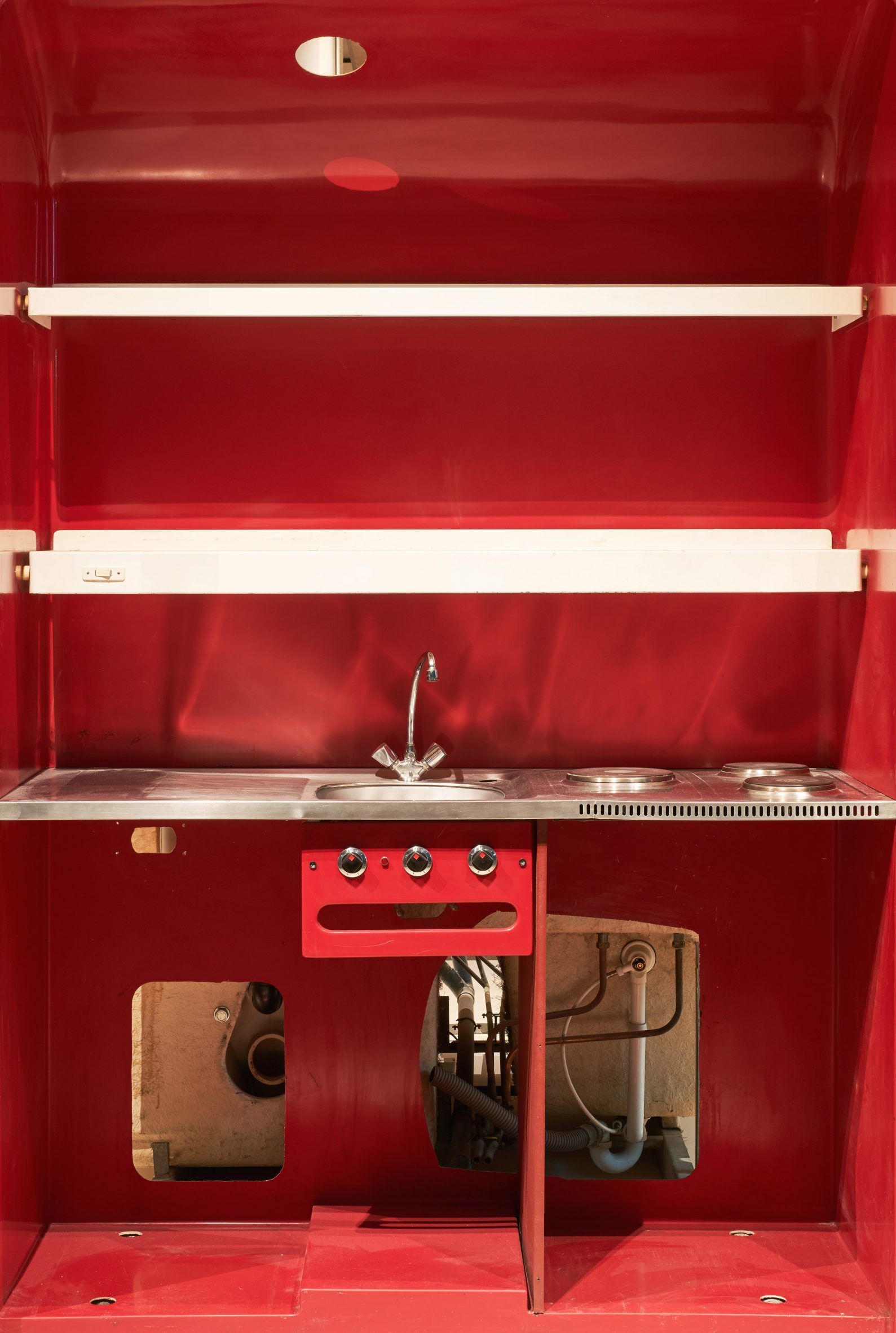
Prefabricated kitchen and bathroom, Les Arcs, 1967-1969

"It shows her thinking about prefabrication. She was a woman of her time trying to use the latest thinking and technologies to make construction more efficient. She put a lot of her energy into modularity.

"She understood that she had to build tens of thousands of hotel rooms for Les Arcs and that it would be much more efficient if you could just build the bathrooms and kitchens off-site, and then drop them into place. So that's what she did.

"They have a very 1960s modular aesthetic so they're timepieces. But it shows it shows someone who is both of that time and highly practical."

Photography is courtesy of ADAGP, Paris and DACS, London 2021 and AChP.


Charlotte Perriand: A Modern Life is on show at the Design Museum in London until 5 September 2021. See Dezeen Events Guide for an up-to-date list of architecture and design events taking place around the world.

The post Design Museum curator picks five highlights from Charlotte Perriand: The Modern Life exhibition appeared first on Dezeen.


from Dezeen https://ift.tt/3s5Ayff

Tuesday, 10 August 2021

Holiday Home by Orange Architects is a timber-clad cabin with a flexible interior

A woman walking downstairs into the dining room

Dutch office Orange Architects has completed a compact holiday home on the island of Texel in the Netherlands, featuring an interior that adapts to its occupants' changing needs throughout the day.

Rotterdam-based Orange Architects designed the holiday cabin for a site nestled in a forest, from which the owners can walk to the North Sea coast in just ten minutes.

Black-timber cabin
The holiday home is located on the island of Texel

The building is clad externally in black-stained timber and features an irregular roof form that rises on one side to accommodate a loft-level sleeping area.

The house occupies just 70 square metres of its woodland site and is carefully positioned in response to the prevailing climate.

Its northern elevation is more closed-off to protect it from cold winds, while the southern elevation opens up to allow sunlight to stream in.

Holiday Home located in a forest
The cabin is clad in black timber

Inside the building, light-coloured birch panelling creates a warm contrast to the black exterior.

Rather than using walls to separate the living areas, the architects employed a system of movable wooden panels that can divide the interior into dedicated functional zones if needed.

A woman walking downstairs in Holiday Home
Light coloured birch furnishings inside contrast with the black exterior

During the day, when there is less need for private spaces, the ground-floor living room, bedroom, entrance hall and shower area form a single open space.

In the evening, the rotating birch screens can be used to separate the bedroom and transform the shower and sink area into an en-suite bathroom.

"By allowing the interior to be transformed, the space inside is optimised, keeping it compact and efficient, avoiding unused rooms during the daytime," Orange Architects said.

Despite its compact footprint, the house's interior feels bright and spacious due to the use of light-coloured timber and the height of the main living area.

Windows incorporated into the southern elevation extend to five metres, while skylights positioned above the bedroom, library and attic allow plenty of natural light to enter.

Floor to ceiling glass sliding doors run along the cabin
An outside deck can be accessed via floor to ceiling doors

Doors can be opened to connect the living room with a south-facing deck. The outdoor space is lined with vertical slats that can be rotated to form a protective screen when the wind blows.

The building was prefabricated by a specialist contractor on the mainland before being dismantled and transported to the island.

This method allowed the house to be quickly assembled on-site, with the interior fittings added to an already watertight building envelope.

The dining room inside Holiday Home
Wooden panels can divide the interior into separate rooms

Black timber cabins are a popular typology for remote hideaways. You can see ten more examples in our black-cabin round up, which features cabins from around the world, from Norway to Brazil.

Recently, Office of McFarlane Biggar Architects + Designers designed a cabin clad in black-stained cedar for a site on British Columbia's Bowen Island, while Studio Puisto created a timber cabin that is raised above the ground in a Finnish forest.

Photography is by Sebastian van Damme.

The post Holiday Home by Orange Architects is a timber-clad cabin with a flexible interior appeared first on Dezeen.


from Dezeen https://ift.tt/3iA4zAt

Best Practice transforms storage shed into backyard studio in Seattle

Shed-O-Vation houses a gym and office

US firm Best Practice Architecture has converted a simple outbuilding on a Seattle property into an office and workout space for use during the coronavirus pandemic.

The project, called Shed-O-Vation, was designed for a home on a leafy property in Seattle's Madrona neighbourhood. It was Best Practice Architecture's second commission for the owner.

A black wooden shed in a garden in Seattle
Best Practice converted a garden shed into an office space and gym

In 2018, the local firm oversaw the interior renovation and expansion of the property's main house. When the coronavirus pandemic struck in 2020, the clients re-hired the architects to convert a basic storage shed into an office and small gym.

"When COVID forced these homeowners to confront the need to accommodate working and exercising from home, they reconsidered how to integrate these essential functions into a new home-life reality," the team said.

A boy stands in the doorway of a black shed
The architects based the design on the main house, which they completed two years prior

The original shed was a simple, utilitarian box totalling 125 square feet (11.6 square metres).

The architects devised a scheme that expanded the building by 92 square feet (8.5 square metres) and mimicked the design vocabulary of the main house. The shed's wooden siding and sloped roof were left intact.

"The contemporary aesthetic recalls the design elements from the primary house renovation, with each design decision carefully considered for function, multi-use and comfort," the team said.

An open window at Shed-O-Vation provides a view into the gym
A tall, sliding window lets in natural light and connects the shed to the garden

To provide natural light and a connection with the landscape, the architects installed a tall, accordion window on one side of the building. Inside, a concrete bench sits just under the glazed opening.

Within the structure, the team used a simple palette of materials and colours.

Black synthetic rubber covers the floor and a portion of the walls. Suspended overhead are LED Stix fixtures from Sonneman, while hooks were used to hang several bikes from the wall.

One side of the room is lined with birch plywood closet doors that conceal shelving and a built-in desk painted seafoam green. Plywood was also used to fabricate cubbies for stashing exercise gear.

"Wood-paneled cabinets expertly organise and conceal equipment while also creating a pleasant and clutter-free environment for both work and respite," the team said.

A sea-green coloured built in desk and bikes hanging on the wall
A simple colour palette of black, green and beige was used inside

Started in 2011, Best Practice is led by partners Ian Butcher and Kailin Gregga.

Other projects by the firm include a men's footwear shop that features hexagonal lamps, an optometry store with mirrored surfaces, and the conversion of a garage into living quarters for a grandmother.

Photography is by Rafael Soldi.

The post Best Practice transforms storage shed into backyard studio in Seattle appeared first on Dezeen.


from Dezeen https://ift.tt/3xHTzpm

Commenter says BIG's Marsk Watchtower in Denmark is "asking for trouble"

In this week's comments update, readers are concerned about BIG's recently opened Marsk Watchtower in Denmark and discussing other top stories.

Photos of the BIG-designed Marsk Watchtower in Denmark are attracting attention from readers.

The 25-metre-high viewing tower was built at Marsk Camp to draw tourists to the area, which is surrounded by UNESCO World Heritage-listed marshland.

"This wouldn't be allowed in the UK"

Readers aren't sold. "Hmmm," said Andy. "This seems to be asking for trouble after what has been happening in NYC with Heatherwick's not dissimilar structure."

"The risk here is lower as it's quite rural," replied Christopher. "Putting this near a busy city center would be dangerous."

"This wouldn't be allowed in the UK," continued Sam. "A landing would be required every 10 steps to provide an area to rest but also an area to break a fall if someone was to trip and tumble down."

Mads Kjaedegaard had different grievances: "So, in a landscape where the main attraction is that it is flat land and where the existing architecture takes its cue from local materials, someone thought it was a good idea to build a top-heavy, ill-proportioned metallic structure from which you can see exactly the same as you can from the ground? Also, keep to the railing and hope it's not a wet day."

Do commenters have a point? Join the discussion ›

California Meadow House by Olson Kundig
Low-lying pavilions form expansive California Meadow House by Olson Kundig

Reader says "you could train for a marathon in that hallway"

Commenters are blown away by the scale of a house in northern California. The residence was designed by Olson Kundig and features an underground bar, vineyard and reflecting pools.

"You could train for a marathon in that hallway," said Salamoon. "It's the biggest space in this house for sure."

"Sublime," added BillH11103. "But who really needs four dining spaces yet only one living space? And, no cinema room? Hmm..."

Design Junkie was less keen: "Dull... no quirks, colours, or any visual interest other than being a high-quality build. Might as well be a high-end treatment centre for wealthy children to escape the city. Expensive boredom."

What do you think of California Meadow House? Join the discussion ›

The exterior of Cornish Cottage by Jonathan Tuckey
Jonathan Tuckey Design adds modern extension to traditional Cornish house

Commenter calls renovation "sensitive and elegant"

Readers are discussing Jonathan Tuckey Design's renovation of a historic house in Cornwall, England. The studio added a stone-clad extension that contrasts with the original lime-rendered building.

"Congratulations to the architect for twisting quaint charm into cynical abstraction," said JB.

Ken M Steffes disagreed: "Beautiful use of material and I understand the cantilevered addition. It has purpose and makes sense when you look at the overall property access."

"A pretty fabulous addition," concluded Chris. "I imagine if people could have cantilevered 400 years ago, they would have cantilevered 400 years ago."

Are you impressed? Join the discussion ›

Marble Arch Mound by MVRDV
Marble Arch Mound attraction reopens and made "free for everyone to climb" in August

Reader says Marble Arch Mound is a "national embarrassment" 

Marble Arch Mound in London continues to attract comments – last week because Westminster City Council apologised for opening the £2 million attraction before it was ready and this week because it has been reopened for free to visitors during the month of August.

"No thanks," said Kevin.

"People will go to Oxford Street and Hyde Park because they want to visit Oxford Street and Hyde Park," added DVE. "They aren't going to go to see a pile of scaffolding and turf."

Alfred Hitchcock agreed: "Why don't they just admit that they made a terrible error of judgement and take the stupid thing down? It's a national embarrassment."

Are readers being harsh? Join the discussion ›

Read more Dezeen comments

Dezeen is the world's most commented architecture and design magazine, receiving thousands of comments each month from readers. Keep up to date on the latest discussions on our comments page.

The post Commenter says BIG's Marsk Watchtower in Denmark is "asking for trouble" appeared first on Dezeen.


from Dezeen https://ift.tt/3AuCnVR