An animation exploring a student's fear of the unknown after graduating and a book that tells the story of loneliness while studying abroad is included in our latest school show by students at the University for the Creative Arts.
Projects also include is a book that teaches children how recycling can be rewarding, and another that examines the human destruction of coral reefs.
University for the Creative Arts
School: University for the Creative Arts
Courses: BA (Hons) Illustration and Animation and BA (Hons) Illustration
School statement:
"Storytelling and finding visually impactful ways of conveying messages are at the core of how we change perspectives. University for the Creative Arts (UCA) illustration courses focus on these visual narratives, whether creating characters for a children's book, producing a graphic novel or developing illustrations or animations for advertising or apps.
"Exploring a wide range of styles and mediums, the class of '21 have created and developed their unique voices. These voices can be heard loud and clear in UCA's graduation showcase. You can explore a selection of the graduates' provoking and original work here."
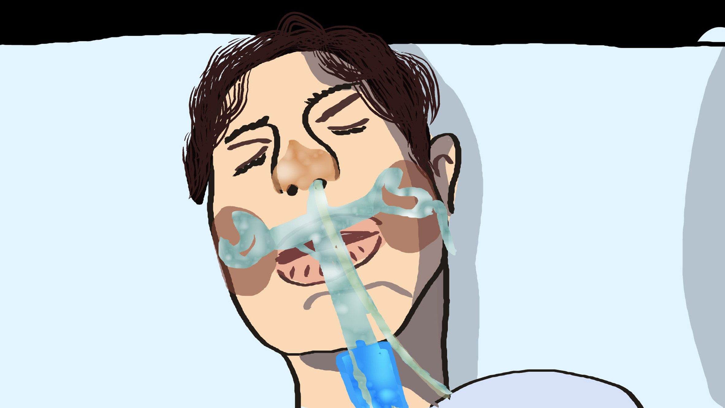
Oliver Pratt
"Pratt's short film is an account of the time he spent in Intensive Care at St. Thomas' hospital with Covid-19. The virus triggered a reaction where his immune system started attacking itself, causing heart muscle damage – an ailment known as Multi-system Inflammatory Syndrome.
"The film draws on Pratt's recollection of events and the feelings of confusion, unease and powerlessness."
Student: Oliver Pratt
Course: BA (Hons) Illustration and Animation, UCA
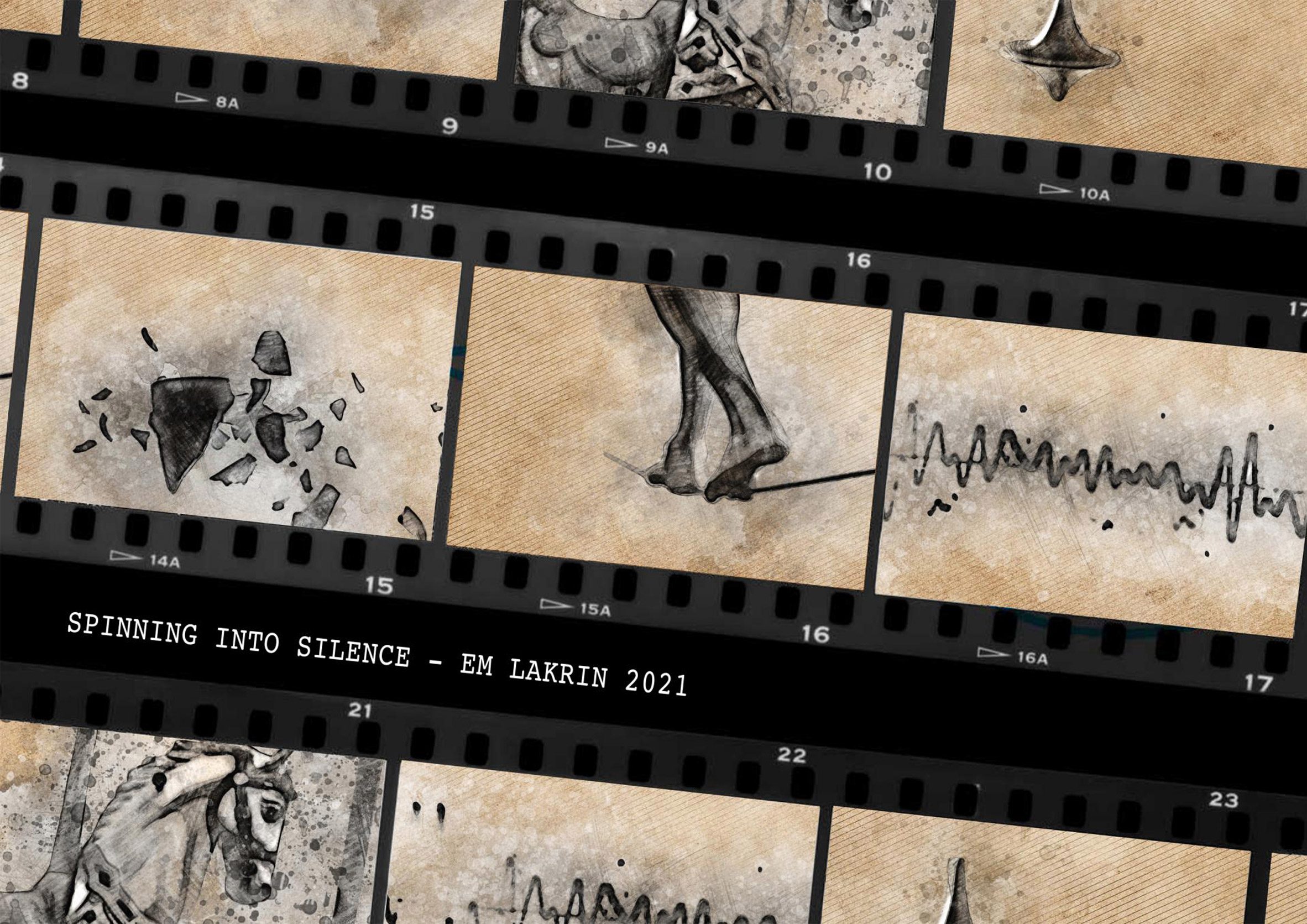
Emily Larkin
"Emily Larkin is a multi-award-winning animator whose deaf awareness film, 'Who's not listening?' has received plaudits at international film festivals. Larkin's graduation film 'Spinning into Silence' is a 2D hand-drawn animation that aims to raise awareness about vestibular disorder – a condition Larkin suffers from.
"The film shows visually and audibly what life living with the disorder is like. Larkin wanted the viewer to experience someone who lives with a vestibular disorder's perspective on the world. The visuals have been kept simple in order to process the visuals and audio at the same time. To achieve the visual textures it took many layers, with each frame requiring 182 hand-drawn layers."
Student: Emily Larkin
Course: BA (Hons) Illustration and Animation, UCA
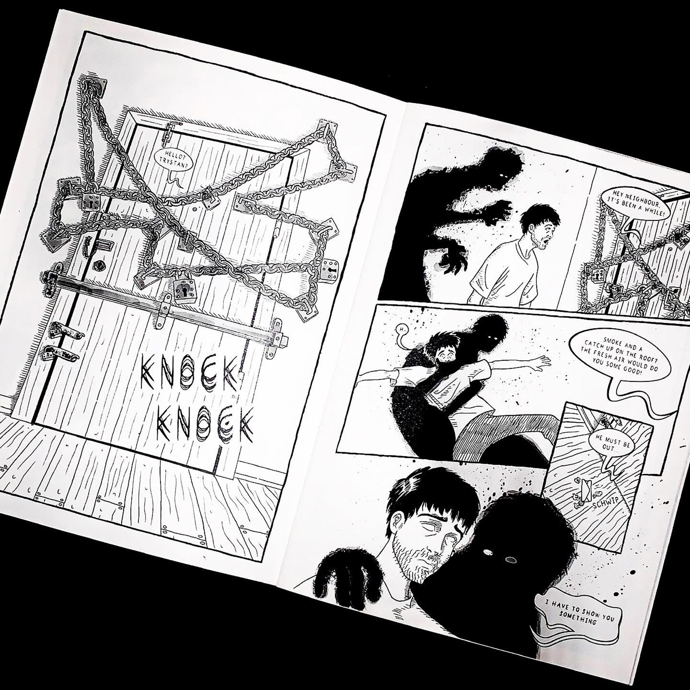
Benedict Abbit
"I'm a cartoonist who has written and designed my comic called Mindlurker. I love the personable feel of a comic. It's like holding a film or tv show in your hands, but you can move at your own pace. Stop on an image whenever you please or reveal a surprise hidden on the next page at your discretion.
"The comic tackles unresolved trauma and is based on things I learned during the darkest parts of my struggle with mental health. It is about the importance of understanding oneself and not being afraid to explore 'the darker' parts of oneself."
Student: Benedict Abbit
Course: BA (Hons) Illustration and Animation, UCA
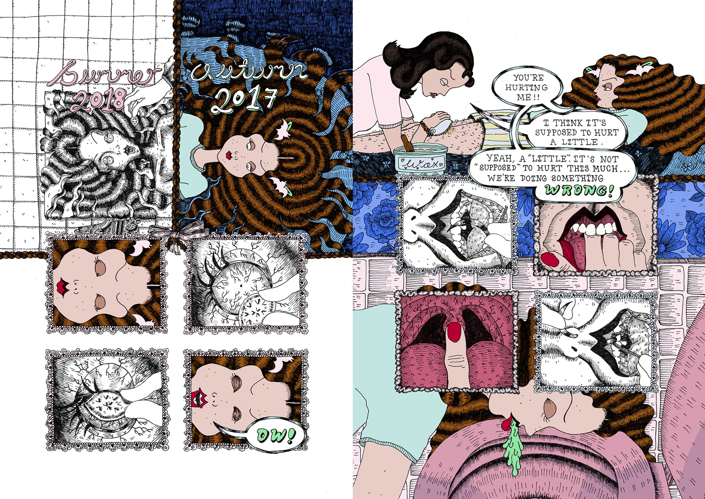
Beatrice Mossman
"Beatrice Mossman is a comic creator and illustrator with a specific interest in comics and film academia. Her passion is writing and illustrating coming-of-age horror narratives. Mossman uses her work to deconstruct the experience of girlhood. After all, what's scarier than being a teenage girl?
"Her style is greatly influenced by 1940s and 1950s teen-humour comics and chick-flick horror films. Her illustrations are packed with detail and each page of her comic is designed for maximum impact. Outside of her degree, Mossman edits Hell-hued, an open-submissions horror zine, and contributes to numerous other zines."
Student: Beatrice Mossman
Course: BA (Hons) Illustration, UCA
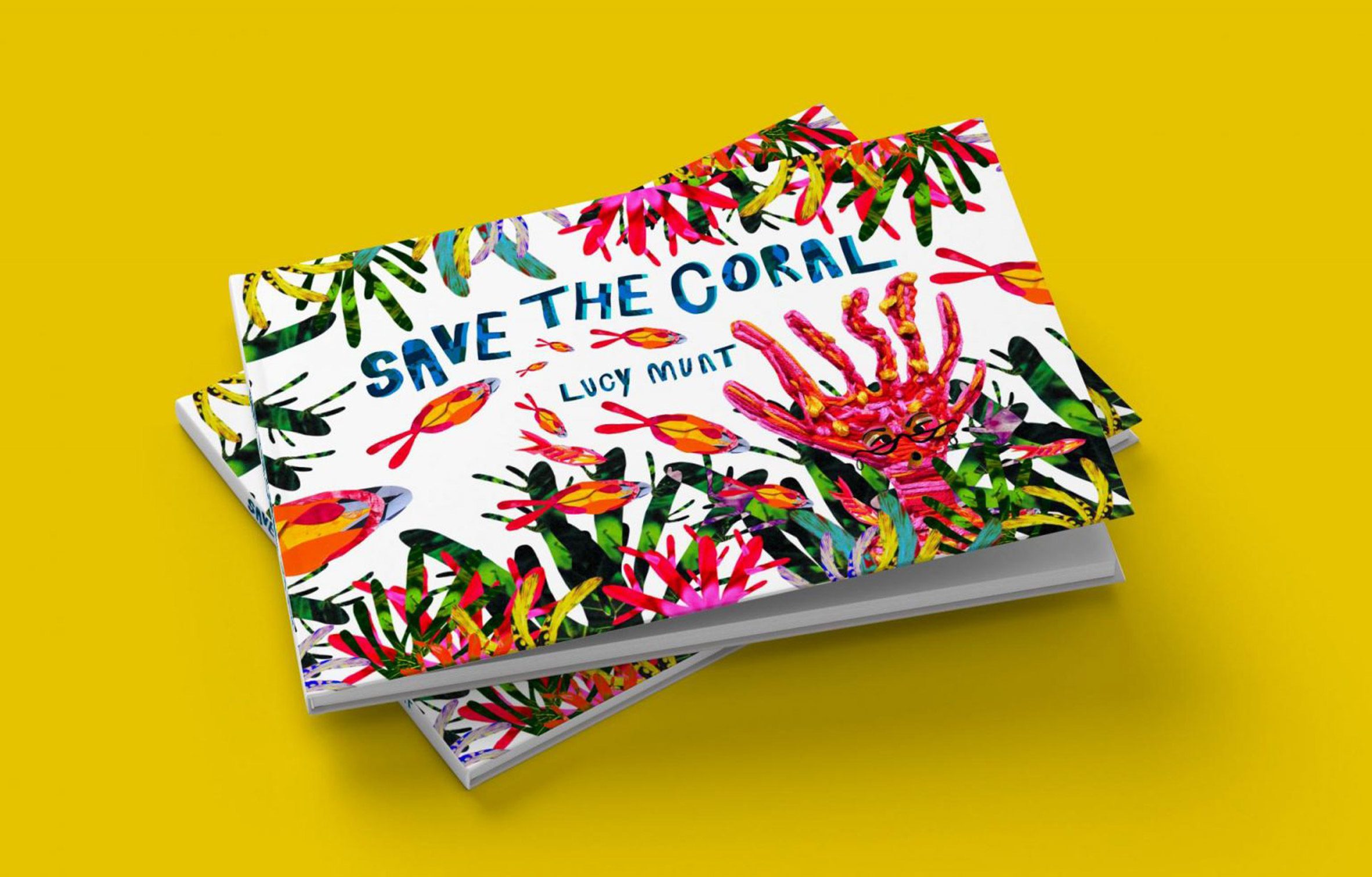
Lucy Munt
"Illustrator Lucy Munt decided to take decisive action to help protect the coral reefs by creating and illustrating a book for future generations to learn about the effects of human destruction on coral. The text, aimed at six to nine-year-olds, includes beautifully drawn full-colour illustrations by the artist.
Munt designed the cover to capture young readers' attention. Fifty per cent of the Great Barrier Reef is dead. Coral helps humans with treatments for cancer, asthma, heart disease and arthritis. Lucy conveys this vital information and what we can do to prevent this destruction in a stylish book, which pops with its colourful illustrations."
Student: Lucy Munt
Course: BA (Hons) Illustration, UCA
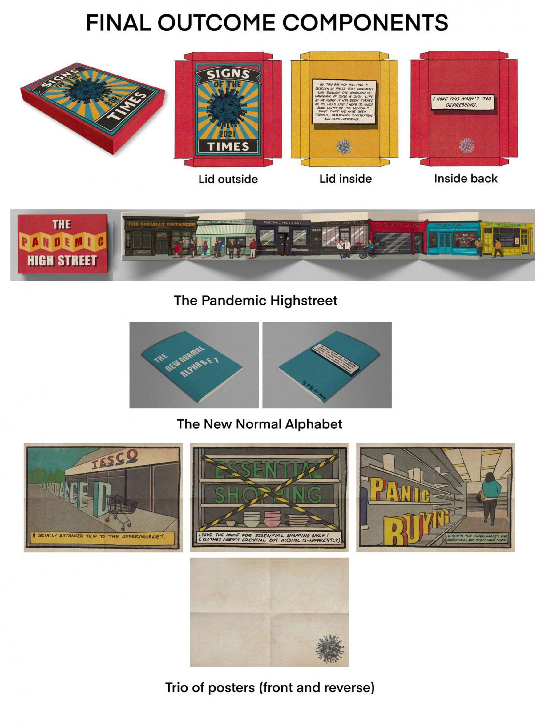
Betty Onion
"Signs of the Times is an archival document that aims to capture a special time in history through illustration and words. Onion looks at how the world has changed during the pandemic. The pandemic high street combines elements of reportage and signage, coming together in a piece that visually explains how life has changed.
"The new normal alphabet is an in-depth look at 26 words that once had little meaning but have now become part of daily life. It serves as a reminder of the hard times we have lived through and the ways our lives changed. The box Onion designed acts as an archival piece, holding the documents together."
Student: Betty Onion
Course: BA (Hons) Illustration, UCA
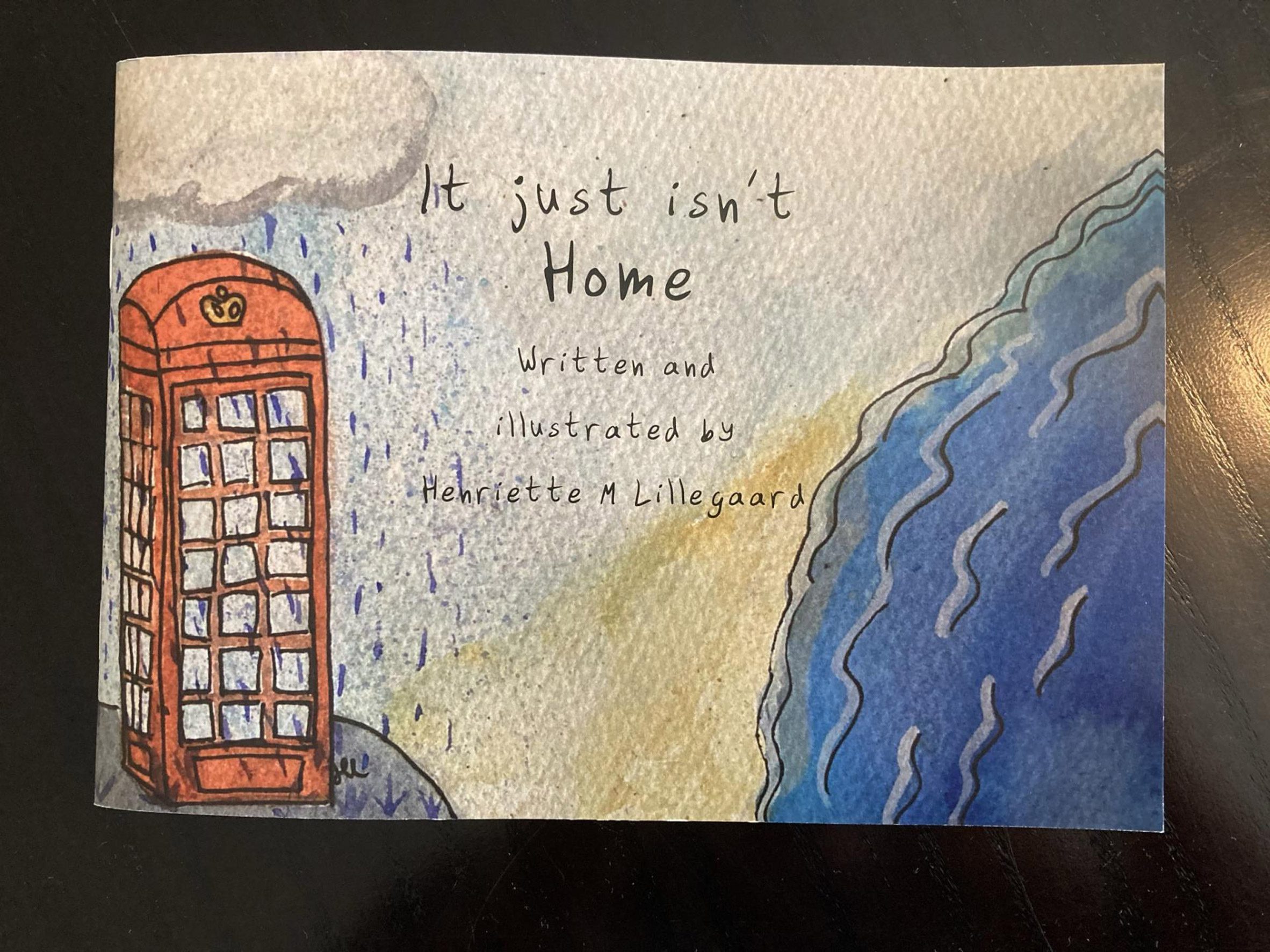
Henriette Moberg Lillegaarde
"It just isn't Home is a book written and illustrated by Henriette M Lillegaard, telling stories about the experience of homesickness and loneliness whilst studying abroad in the United Kingdom.
"As a student studying away from home, the feeling of homesickness was quite acute at times. Lillegaarde decided to express the experience through watercolour illustrations, layering and some subtle 3D effects in the hope that others in a similar situation might relate to it."
Student: Henriette Moberg Lillegaarde
Course: BA (Hons) Illustration
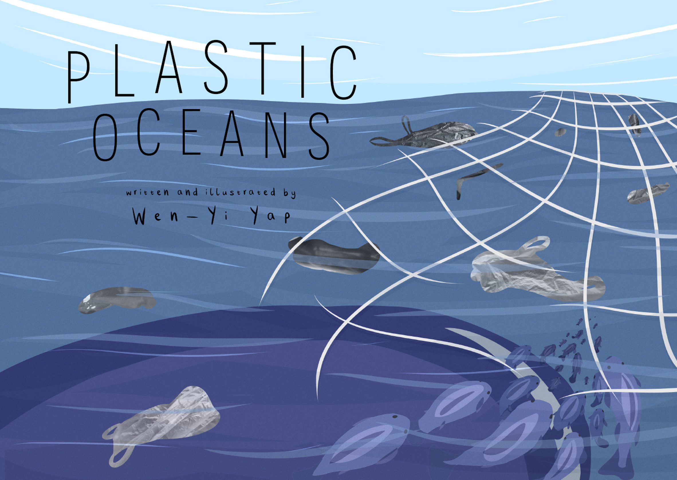
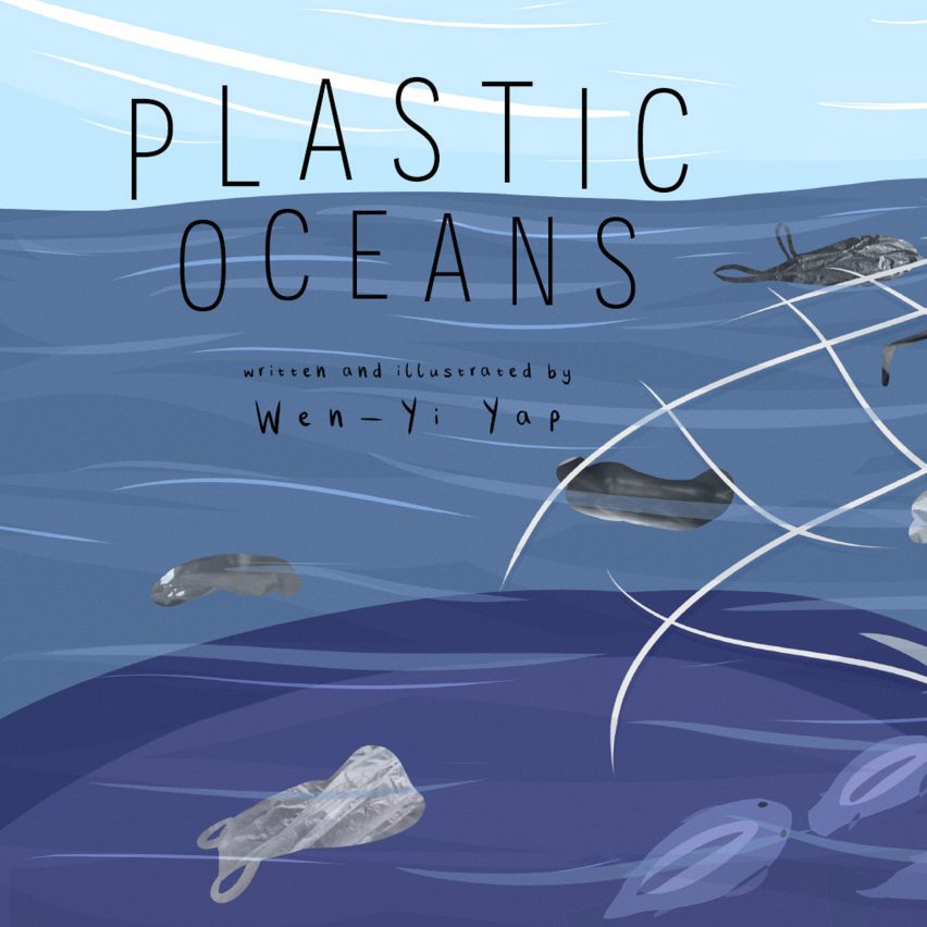
Wen-Yi Yap
"Yap's book is about plastic pollution and the devastating consequences it has on animals. Yap wanted to teach young children how important it is to keep our planet clean, but not in a daunting and overwhelming way. The book shows children that recycling can be fun and rewarding, and the more people become aware, the more they can work together to make a change."
Student: Wen-Yi Yap
Course: BA (Hons) Illustration, UCA
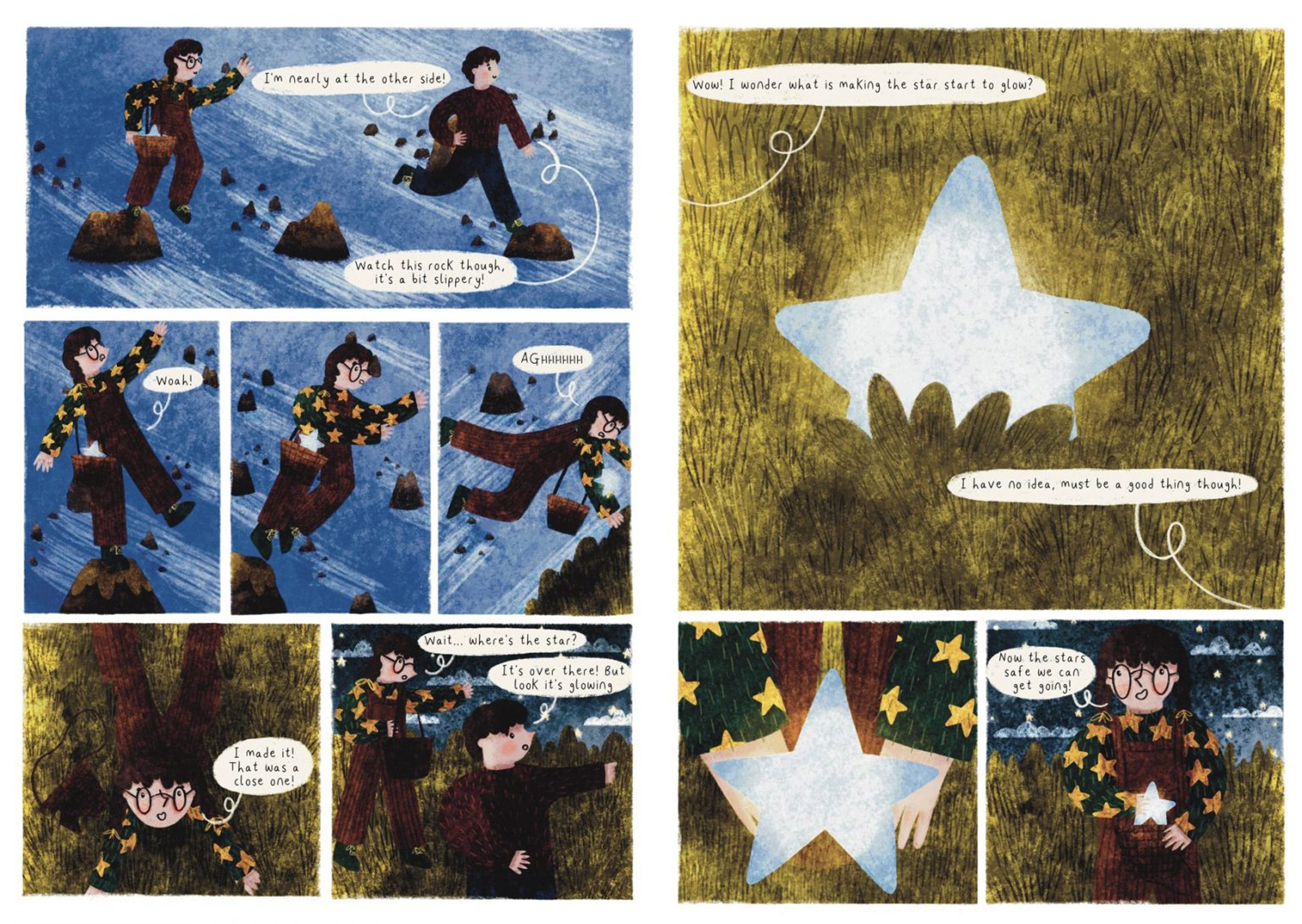
Jude Gibbs
"George and Daisy's Starry Adventure is a graphic novel about two siblings who go on an adventure to help the star that fell to earth back in the sky. They encounter some issues along the way, but eventually overcome them to help the star."
Student: Jude Gibbs
Course: BA (Hons) Illustration and Animation, UCA
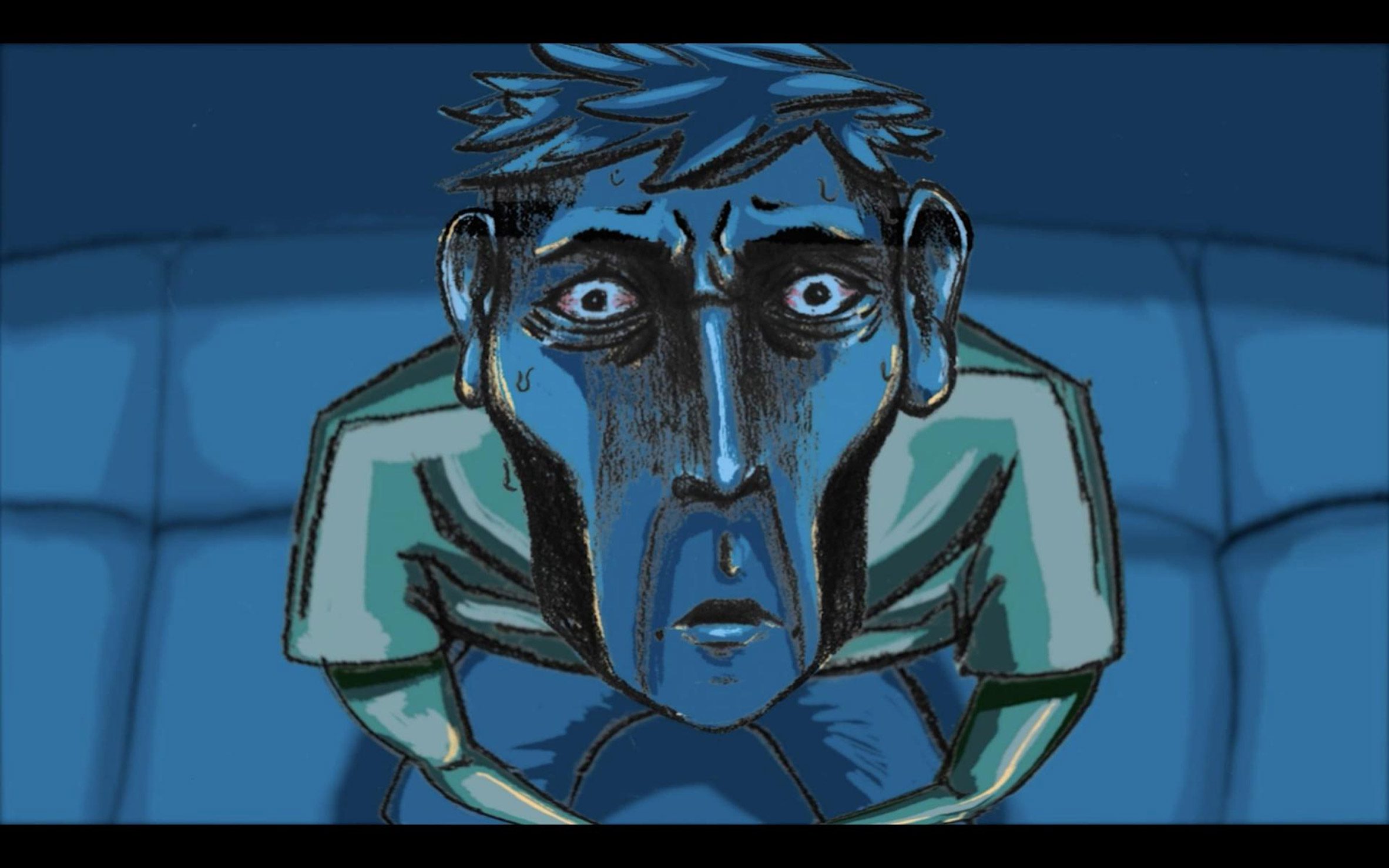
Lucia Matano
"Matao's animation explores the never-ending game of life and the fears of growing up and out of one's comfort zone. It focuses on the idea of leaving the past behind and moving forward before you become trapped by it. Frustration, fear and desperation are explored through the genre of horror and its tropes.
"This topic stems from Matano's personal fear of growing up, leaving university and moving onto the unknown. The animation expresses the struggle and acceptance of this fear and their hopes to move forward to a new chapter."
Student: Lucia Matano
Course: BA (Hons) Illustration and Animation, UCA
Partnership content
This school show is a partnership between Dezeen and University for the Creative Arts. Find out more about Dezeen partnership content here.
The post University for the Creative Arts spotlights ten student illustration projects appeared first on Dezeen.
from Dezeen https://ift.tt/3k1iDmn