Monday, 23 August 2021

Lena Bergström's fossil-free candleholder "symbolizes the light at the end of the tunnel"

Fossil-free steel candleholder

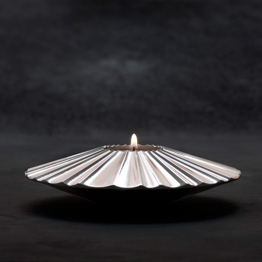
Swedish designer Lena Bergström has created the world's first object made from steel produced without creating carbon emissions.

The candleholder, pictured above, was unveiled last week by Swedish steelmaker SSAB, which has produced the first fossil-free batch of the alloy.

“The candleholder, with its softly pleated rays beaming out from the candle, symbolizes the light at the end of the tunnel," said Bergström. "It is a symbol of hope. A piece of the future.”

Fossil-free molten steel
The fossil-free steel will be produced commercially from 2026

SSAB intends to convert its factory at Oxelösund in Sweden to fossil-free production in 2025 and begin commercial production in 2026.

"The first fossil-free steel in the world is not only a breakthrough for SSAB," said SSAB CEO and president Martin Lindqvist. "It represents proof that it's possible to make the transition and significantly reduce the global carbon footprint of the steel industry."

"We hope that this will inspire others to also want to speed up the green transition."

Fossil-free steel to be used by Volvo

Last week SSAB delivered the first batch of emissions-free steel to Swedish carmaker Volvo, which will use it to explore how to reduce its own supply-chain emissions.

Volvo estimates that steel accounts for around 35 per cent of the emissions caused by the production of a petrol-powered car and 20 per cent of an electric vehicle.

"As we continuously reduce our total carbon footprint, we know that steel is a major area for further progress," said Håkan Samuelsson, chief executive at Volvo.

"The collaboration with SSAB on fossil-free steel development could give significant emission reductions in our supply chain."

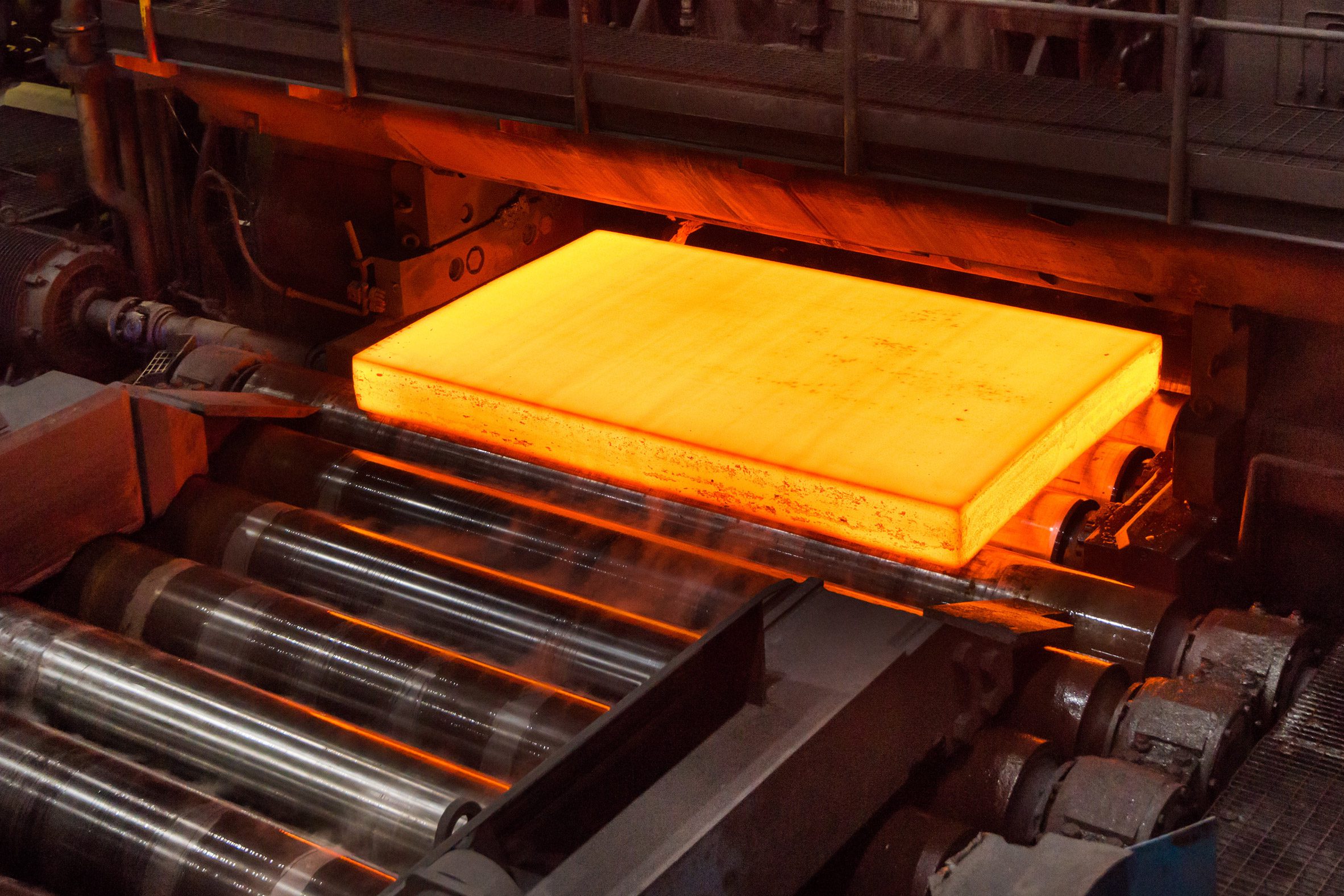
To produce the steel, SSAB heated a blast furnace by burning "green" hydrogen instead of coal and coke using a process called Hydrogen Breakthrough Ironmaking Technology (HYBRIT).

Unlike "blue" hydrogen, which is extracted from fossil fuels and which generates carbon emissions, green hydrogen is obtained via the electrolysis of water, producing no emissions.

The innovation could help decarbonise the steel industry, which currently accounts for around seven per cent of global emissions and produces two tonnes of greenhouse gases for each tonne of steel.

Conversion to HYBRIT to reduce national emissions

Once SSAB converts its plant to HYBRIT, greenhouse gas emissions will be reduced by 90 per cent, it said. This will reduce Sweden's national emissions by two to three per cent, according to SSAB Oxelösund head of production Era Kapilashrami.

SSAB has steelmaking plants in Sweden, Finland and the US and intends to convert them all to HYBRIT in the future. It plans to phase out its other steel products and be completely free of fossil fuels by 2045.

Doing so could reduce Sweden’s total CO2 emissions by around ten per cent and Finland’s by approximately seven per cent.

“It’s a crucial milestone and an important step towards creating a completely fossil-free value chain from mine to finished steel," said Jan Moström, president and CEO of LKAB, a mining group that partnered with SSAB and renewable-energy company Vattenfall on the HYBRIT project.

LKAB mines and processes iron ore using machinery powered by bio-oil, a synthetic fuel produced by heating biomass in a reactor without oxygen.

Lindqvist predicts the automative and heavy transport industries will be early adopters of fossil-free steel, followed by construction companies.

There is pressure on Sweden's high-polluting industries to decarbonise. Recently, the country's biggest cement factory was stripped of its licence to mine limestone on environmental grounds, affecting the country's construction sector.

The post Lena Bergström's fossil-free candleholder "symbolizes the light at the end of the tunnel" appeared first on Dezeen.


from Dezeen https://ift.tt/382ZESz

Sunday, 22 August 2021

HAS uses frosted glass to "blur boundaries" in Chongqing bookshop

The interiors of The Glade Bookstore in Chongqing

Translucent glass shrouds the books within this bookshop in Chongqing, designed by architecture studio HAS Design and Research.

Located in Chongqing's dense city centre, The Glade Bookstore is a bookshop, restaurant and exhibition space designed to act as a "spiritual and restful place" in the otherwise bustling Chinese city.

A window into The Glad Bookstore in Chongqing
The Glade Bookstore is a peaceful store inside the bustling city of Chongqing

HAS Design and Research (HAS) drew on the prominent Chinese artist Guanzhong Wu's ink painting The Mountain City of Chongqing to create the bookshop, in a bid to blend metropolitan life with the feel of the countryside.

"We started to imagine if the city centre could feel like the traditional Chongqing topography and stilt houses that are in Guanzhong Wu's painting," principal architect Jenchieh Hung told Dezeen.

A bookcase covered in frosted glass inside The Glade Bookstore
The books are displayed behind frosted glass panels

To recapture the spirit of the painting, the architects used organic materials and neutral colours.

Inside, charcoal-coloured walls and a glossy, polished concrete floor create a calming ambience. Books are displayed behind frosted glass panels in Douglas fir bookshelves, effectively "blurring the boundaries" between fiction and reality.

Hung hopes that this element of illusion gives customers some respite from the surrounding "lacklustre concrete constructions".

Books arranged on large wooden bookshelves in The Glade Bookstore
Douglas fir wood and polished concrete floors add to the calming atmosphere

"In our design, we always consider nature, because humans are part of nature and nature teaches us everything, including a spiritual atmosphere and a sense of belonging," said Hung.

"However, in The Glade Bookstore, the visitors aren't able to have any interaction with nature because they are inside the building. So we created a 'man-made nature' inside of the building," he continued.

"For example, the fir wood bookshelf has a unique wooden smell, like a tree. Semitransparent frosted glass blurs the boundaries."

Three sofas inside the white lobby of The Glade Bookstore
The architects drew on the mountains and stilt houses of Chongqing to inform the design

Nestled among a number of high-rise buildings, The Glade Bookstore is spread out over two floors and 1,000 square metres.

The lower floor includes room to read, rest and discuss books. A set of undulating stairs leads to the split-level first floor, which serves as a "micro-mountain city to form a dynamic and explorative reading space".

The second floor provides customers with a place to drink coffee, order from the bakery, drink at the bar and eat at the restaurant. An exhibition space can also be found here.

"We started creating multi-layers of rooms with different heights, trying to link Chongqing topography and stilt houses into our design space," explained Hung.

"The split first floor and second floor have the spatial form of stilt houses; the lower floor is like the 'grey space' of stilt houses," he added.

The dining area in The Glade Bookstore
The bookshop includes a restaurant and exhibition space as well as books

Other bookshops in China include Harbook, a store in Hangzhou, China designed by Alberto Caiola. The store displays books on a giant geometric display that intersects with steel archways, which are designed to attract younger customers.

In Shanghai, local architecture studio Wutopia Lab used bookshelves made from perforated aluminium and quartz stone in the maze-like bookstore.

Photography is by Yu Bai.

The post HAS uses frosted glass to "blur boundaries" in Chongqing bookshop appeared first on Dezeen.


from Dezeen https://ift.tt/3AYcL3S

ConForm Architects creates "homely" office in brutalist Smithson Tower

An office table in Smithson Tower

ConForm Architects has completed a "homely" office for a financial firm on the 11th floor of the recently refurbished Smithson Tower, the brutalist complex designed by Alison and Peter Smithson in the early 1960s.

Formerly known as the Economist Building – and home to the publication of the same name until 2016 – the Grade II-listed Smithson Tower in London's Mayfair was refurbished by DSDHA.

A sofa inside Smithson Tower
The office space is located within the brutalist Smithson Tower by Alison and Peter Smithson

Each 3,600-square-foot floor plate was emptied and primed for individual leases. ConForm Architects was invited to fit out the building's 11th floor to create an HQ for a financial firm.

The young London-based practice, led by Ben Edgley and Eoin O'Leary, said that its design responds to the contemporary move towards designing offices that are collaborative rather than cellular.

A chair inside Smithson Tower by ConForm Architects
ConForm Architects renovated the 11th floor of the building for a financial firm

Historically, the building's octagonal floor plans saw circulation concentrated around a single central core, while the interiors of each office featured partitions that aligned with the perimeter facade's columns.

"A strip-out around the central core offered unparalleled 360-degree views, and the foundation for a great 21st-century open plan proposal," said the architects of DSDHA's refurbishment.

"This condition informed initial thoughts and discussions with the client, who appreciated and wished to retain this open-plan nature, whilst also requiring privacy and acoustic separation for meeting rooms and between various operational spaces."

A large office table and chairs
The architects transformed the office from a cellular arrangement into a collaborative workspace

The space is split into eight zones defined by the strong structural grid of the existing building and its columns.

These zones are designed to cater to different ways of working and include informal and comfortable working environments that have a domestic feel to them. The aim, the architects said, was to create a home-away-from-home for guests and staff.

"The floor plan feels open and creates impressive views to the surrounding city, but the design concept also celebrates and reflects the uniqueness of the classic layout," said the firm.

A black office chair and table in Smithson Tower
The space is split into eight areas defined by the structural grid of the existing building

Low-level joinery at sill level divides up the zones while also providing storage, concealing services and protection for the air handling units.

Above this, the architects have replicated the existing white framing of the glazing that frames views between spaces.

Fixed desk spaces are located to the northeast and southeast of the plan, offering up the more impressive city views. This also allows the often high-capacity meeting rooms to avoid overheating during regular morning meetings, and assists the limited air circulation capacity.

The reception is positioned by the passenger lifts with views across Green Park and Hyde Park beyond.

"A major challenge to the scheme was incorporating and adapting the existing air conditioning and heating and cooling infrastructure," explained the firm.

"The Economist Building was the first building in the UK to have air conditioning and the historic system was geared around exclusively servicing the cellular perimeter offices."

An office table and chairs inside the office
Fixed desks provide views over London from the Mayfair location

The original circulation route around the building's core correlated with that of the air ducts. The firm took the opportunity to accentuate this service zone by lowering the head height and lining the core with acoustic panels by Danish brand Kvadrat.

This, it said, provides a more intimate and contextual path around the building's core.

The building's octagonal plan is reflected in the floor finishes, which cut diagonally across the office's different zones to deliberately blur any distinct thresholds and help enhance the open-plan design.

White interiors of Smithson Tower
Employees benefit from an open plan design

"As this concept developed, the diagonal axis became increasingly interesting as it offered through views across each corner, between primary spaces," explained ConForm.

"Further historical research revealed an early concept sketch design undertaken by the Smithsons, of a diagonally gridded ceiling plan that sought to connect column and mullion locations to their counterpart on the perpendicular elevation at a 45 degree angle," the studio added.

"Junctions where these diagonals met the core featured angular internal feature columns. This diagonal concept became a key design feature delineating spaces and connecting spaces across the plan."

Dezeen has created a round-up of cosy offices that blur the boundaries between work and home, including rooms modelled on Airbnb apartments and a workplace featuring a black-painted napping room.

Photogtaphy is by Lorenzo Zandri.

The post ConForm Architects creates "homely" office in brutalist Smithson Tower appeared first on Dezeen.


from Dezeen https://ift.tt/3y2H0Fa

Projects Office designs non-institutional interior for mental health facility in Edinburgh

Orange lighthouse interior at CAMHS Edinburgh by Projects Office

London studio Projects Office has used seaside-inspired colours and imagery to create a comfortable but practical interior for a mental health unit at the Royal Hospital for Children and Young People in Edinburgh.

The Child and Adolescent Mental Health Service (CAMHS) facility is designed to feel non-institutional, so as to make patients feel at ease, but to also look distinctly different than a domestic environment.

Orange lighthouse interior at CAMHS Edinburgh mental health unit by Projects Office
The CAMHS facility is designed to make patients feel at ease

The Projects Office team – led by architects Bethan Kay, James Christian and Megan Charnley – collaborated with art consultancy Ginkgo Projects on the interior, envisioning it as "a third space which is neither hospital nor home", but instead has its own identity.

They developed this approach following a series of workshops and interviews with young patients, their parents and staff members.

These sessions, carried out with help from artist James Leadbitter, helped the architects understand many of the subtle details that can make a big difference to how patients feel in a space.

Lighthouse and skylight in communal lounge facilities at CAMHS Edinburgh mental health unit
The inpatient communal lounge includes a lighthouse-inspired den

For instance, the bedrooms are designed so that occupants can easily personalise then, giving them a feeling of ownership. But they can easily reverted after patients are discharged, giving a clean slate to the next resident.

"At a time of stretched NHS funding and increased demand for mental health services, we believe that good design is a powerful and cost-effective healing tool," said James Christian.

"We also believe that asking patients, staff and parents what they really need and want from healthcare spaces leads to richer, more useful spaces."

Quiet zone in communal lounge at CAMHS Edinburgh mental health unit
Colours and patterns take inspiration from the seaside

The mental health unit includes outpatient facilities for five to 18 year-olds and an inpatient unit for 12 to 18 year-olds.

The designers found that the seaside was often mentioned as an environment that helps to improve mental health, which is why Projects Office used this as the starting point for the design. Colours, patterns and motifs incorporate various seaside references.

Banquettes in dining room at CAMHS Edinburgh
Banquettes in the dining room extend up to the ceiling to create more privacy

"We took a playful approach to our designs for the artworks, whilst taking care to avoid the sometimes patronising wall graphics that can appear in children's hospitals," Christian told Dezeen.

"Each graphic intervention reinforces the overall coastal theme, but a varied approach has been taken to how they manifest in the different spaces," he explained.

"This ranges from simple maritime pendants that spell out the name of the unit in a TV room all the way to a large lighthouse mural with a goal and targets, for ball games in the central garden."

Seating nooks in communal areas at CAMHS Edinburgh
Seating nooks are integrated into the walls in several rooms

For the communal areas, a key challenge was to offer a sense of safety and privacy to all patients, particularly those suffering severe distress, without creating blind corners.

The designers tackled this with upholstered seating nooks built into the walls, banquettes that extend up to the ceiling, and a lighthouse-inspired den.

Bedroom at CAMHS Edinburgh
Bedrooms include a window seat with a moveable ottoman

"A spectrum of levels of privacy and togetherness is utilised to create zones that range from communal activity and convivial conversation through to nooks and corners that offer the opportunity for private conversation and to retreat without feeling isolated from others," said Christian.

All of this was achieved on a tight budget thanks to the use of standard and off-the-shelf elements. Standard hospital furniture was simply customised, while bespoke furniture elements were built from simple plywood.

Bedroom desk and shelving at CAMHS Edinburgh
Shelves and wall boards allow patients to personalise the space

A similar approach features in the bedrooms, although these spaces have a softer and more relaxed feel.

Playful shelving and large wall boards make is easy for patients to display their personal belongings, while a window seat integrates a movable ottoman, creating a variety of different ways for families to sit together.

Both details help to make the rooms feel less like a hospital.

Lighthouse mural at CAMHS Edinburgh
A lighthouse mural in the garden courtyard creates opportunities for play

The project was funded by Edinburgh Children’s Hospital Charity. The charity's CEO, Roslyn Neely, said the results have exceeded expectations.

"Coming to CAMHS can be a very stressful time for children, young people and their families so it was important to ensure that, from the moment they arrive, they know they are in a safe place where they will be supported and valued," she said.

"Ginkgo and Projects Office have gone above and beyond to make sure children and young people were involved in the design and have transformed the space from bare and clinical to bright, welcoming and suitable for children and young people experiencing mental health difficulties."

The post Projects Office designs non-institutional interior for mental health facility in Edinburgh appeared first on Dezeen.


from Dezeen https://ift.tt/3y2nxVb

Ten minimalist bedrooms designed for serene sleep

Minimalist bedroom in Ledge House

For our latest lookbook, we have selected ten minimalist bedrooms from the Dezeen archive designed to provide an undisturbed night's sleep.

These spartan but stylish bedrooms show how a clean, minimalist interior can create the ultimate space for relaxation.

With neutral and muted colours, organic materials and geometric shapes, the ten projects also showcase how a little design can go a long way.

This is the latest roundup in our Dezeen Lookbooks series that provide visual inspiration for designers and design enthusiasts. Previous lookbooks include Japandi interiorsart-filled homes and concrete living rooms.


Regent's Park Loft by Originate bedroom

Regent's Park Loft, UK, by Mezzanine

This London flat features a monochrome interior that functions as a backdrop to the owners' collection of art and modern furniture.

In one of the bedrooms, a raised bed sits on a plinth under the eaves of the house. The colour palette has been kept neutral, creating a calm space for sleep.

Find out more about Regent's Park Loft ›


Minimalist Barbican apartment by John Pawson

Barbican flat, UK, by John Pawson

Architect John Pawson, a master of minimalism, pared-back this flat in Londons's iconic Barbican estate to a "state of emptiness".

In its bedroom, a timber bed frame and headboard sits against the wall, overlooking the city outside. A marble plinth in the corner of the room holds a Buddha figurine.

Find out more about Barbican flat ›


Brown Box, Vietnam, by Limdim House Studio

Decorative lights and furniture in rounded shapes add interest to this minimalist bedroom in Vietnam, which features curved walls and arched niches.

Grey plaster was used to create an organic-looking finish on the walls, while a terrazzo floor complements the wooden furniture, which has a midcentury-modern feel.

Find out more about Brown Box ›


Bedroom storage cabinets in dark wood

Azabu Residence, Tokyo, by Norm Architects and Keiji Ashizawa Design

This Japandi-style bedroom in Tokyo features panelling in dark wood. The material was also used to create practical storage spaces and a bookshelf.

A small tree and angular wall-hung bedlamps are the room's only decorative details, but sheer floor-to-ceiling curtains add a luxurious touch and keep out the sunlight.

Find out more about Azabu Residence ›


A-PLACE by Thisispaper Studio

A-Place, Poland, by Thisispaper Studio

It's all about the bed in this sleeping space in a holiday apartment in Warsaw designed by Thisispaper Studio. A woven headboard and base in a pale green hue with black edges is the only source of colour in the room.

White lights, walls and furniture contrast against the room's wooden floorboards and match its thin curtains.

Find out more about A-Place ›


Bedroom of Belgian apartment features white joinery

Coastal apartment, Belgium, by Carmine Van Der Linden and Thomas Geldof

Wooden joinery decorates this apartment on the Belgian coast. While it was painted seafoam green in the rest of the flat, the panelling was kept a natural white in the bedroom.

A Surface Sconce sculptural lamp in polished bronze by Henry Wilson functions as both a lamp and an art piece in the otherwise sparsely decorated room.

Find out more about A-Place ›


Ledge House by Desai Chia Architecture

Ledge House, US, by Desai Chia Architecture

Ledge House in Connecticut has large rectangular windows and glass doors that span the house – including in the white bedroom.

The wooden bed matches a small bedside table that holds a Flos Bellhop lamp. A black linear pendant light hangs over the bed and matches the black door frames to give the room a more graphic feel.

Find out more about Ledge House ›


Bedrooms of Circulo Mexicano hotel in Mexico City by Ambrosi Etchegaray

Círculo Mexicano, Mexico, by Ambrosi Etchegaray

The simple style of the Christian Shaker sect informed the interior of this hotel in Mexico City, with its pared-down rooms where blocky plinths form the base for the beds.

These are covered with beige-coloured linen with exposed seems and illuminated by lantern-like wooden lamps.

Find out more about Círculo Mexicano ›


House and Office in Hofu by Tato

Hofu House, Japan, by Tato Architects

The calm bedroom in Hofu House, Japan, is entirely lined in wooden panels, creating an intimate feel.

The room looks out onto a courtyard and a private terrace and holds just two beds and a small wooden stool that is used as a bedside table.

Find out more about Hofu House ›


Villa Cardo by Studio Andrew Trotter

Villa Cardo, Italy, by Studio Andrew Trotter

This holiday house in Puglia was informed by local houses and designed as a series of minimal white blocks. The theme continues in the bedroom, where the rugged stone wall features a niche displaying a colourful vase.

Geometric shapes and sculptures lend the otherwise almost monastic room the feel of a gallery.

Find out more about Villa Cardo ›


This is the latest in our series of lookbooks providing curated visual inspiration from Dezeen's image archive. For more inspiration see previous lookbooks showcasing Mediterranean-style tilingU-shaped kitchens and concrete living rooms..

The post Ten minimalist bedrooms designed for serene sleep appeared first on Dezeen.


from Dezeen https://ift.tt/3B0bNEh