Dezeen and surface brand CDUK are teaming up to host a conversation with designer Oliver Heath on biophilic design and the importance of using sustainable materials. Watch live from 3:00pm London time.
Dezeen's founder and editor-in-chief Marcus Fairs will moderate the discussion, which is the second in-person talk to be streamed from Dezeen's new Studio Space in London.
Heath will deliver a presentation exploring how biophilic design principles can help improve health and wellbeing in our homes, workplaces and healthcare and leisure spaces.
Heath will also discuss how using sustainable materials in our interiors can promote a feeling of closeness to nature, as well as reducing the impact that design has on the environment.
The talk coincides with the launch of PaperStone, a recycled paper composite surface material that is distributed by CDUK in the United Kingdom and Ireland.
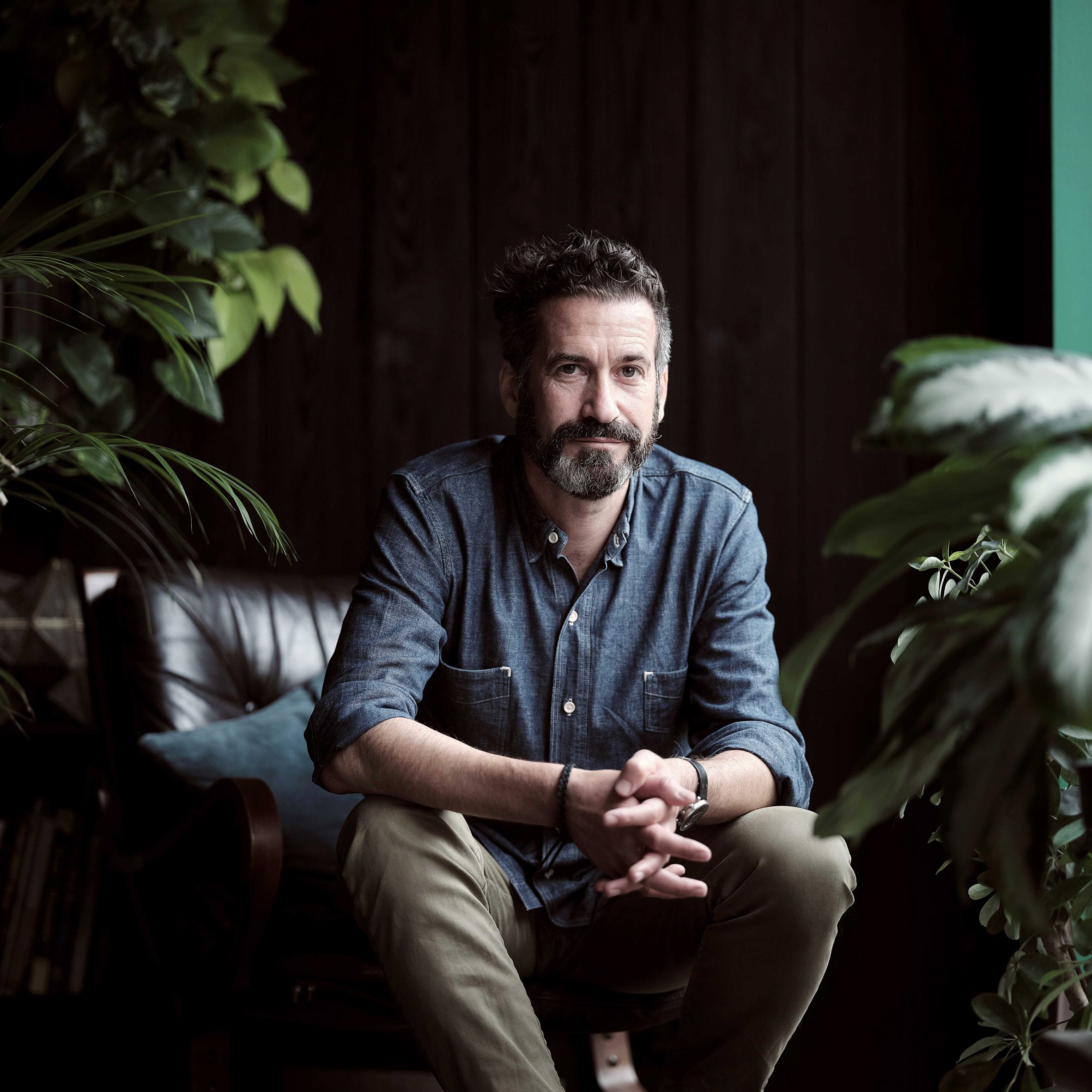
Oliver Heath, founder of Oliver Heath Design
Heath, an architectural and interior designer, is the founder of his eponymous practice Oliver Heath Design, which focusses on delivering biophilic design projects that prioritise heath and wellbeing.
Oliver Heath Design has completed interiors for clients including Apple, Bloomberg, Booking.com, Deutsche Bank and Interface.
Heath also leads the talks programme for Planted, a contemporary design event and digital forum aimed at reconnecting spaces with nature. Last year Dezeen collaborated with Planted to present a virtual showcase of sustainable design brands and products.
This live stream was produced by CDUK as part of a partnership. Find out more about Dezeen's partnership content here.
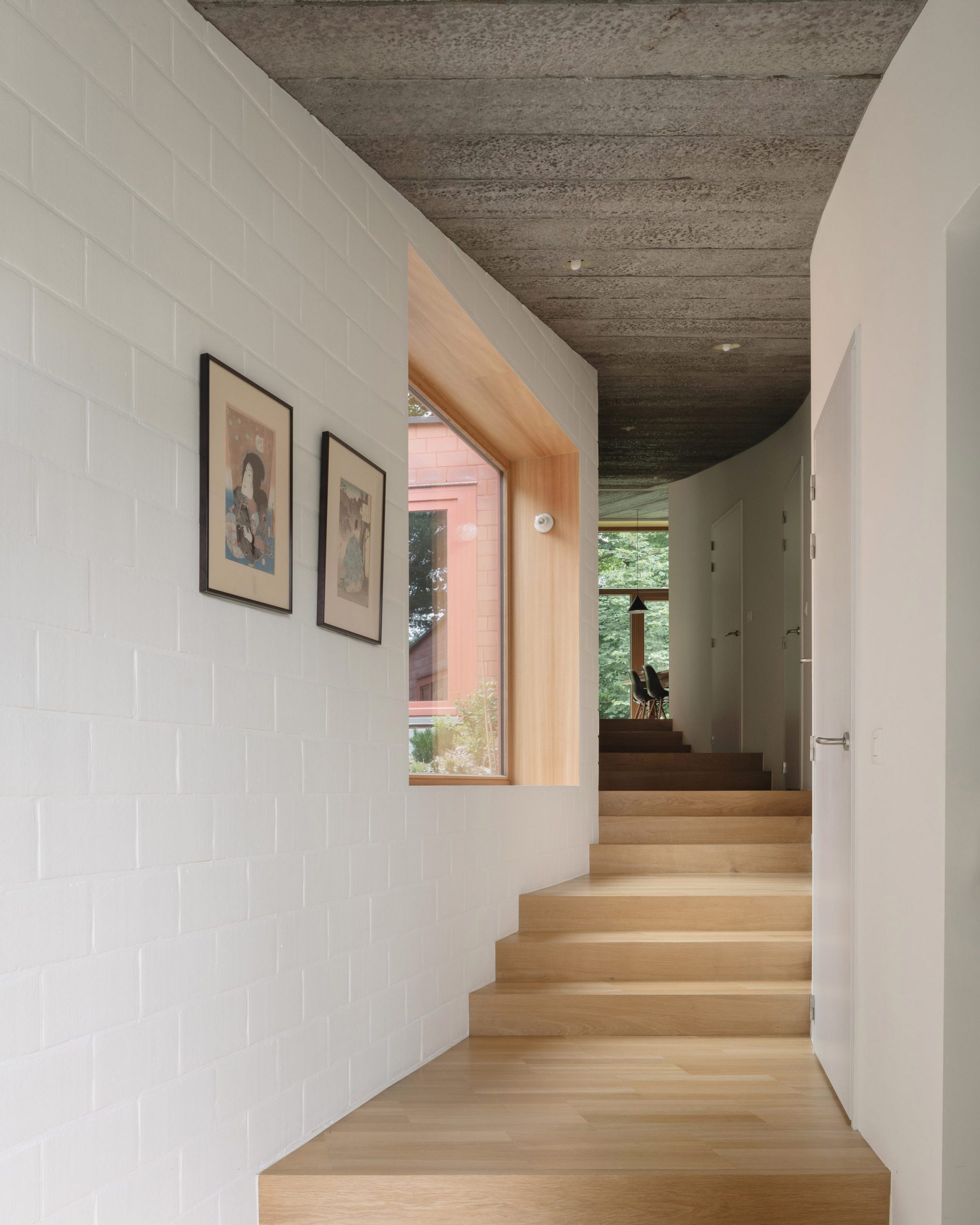
Antwerp studio Bovenbouw Architectuur has designed a house in Belgium with an interior that spans four levels and was designed to make visitors feel like they are walking up a path.
Located in Bazel, close to the River Scheldt in northern Belgium, the brick bungalow follows the shape of the sloping terrain that surrounds it. At its lowest level, the front door opens up to a walkway of wooden steps that leads through the house.
The house sits on a slope in northern Belgium
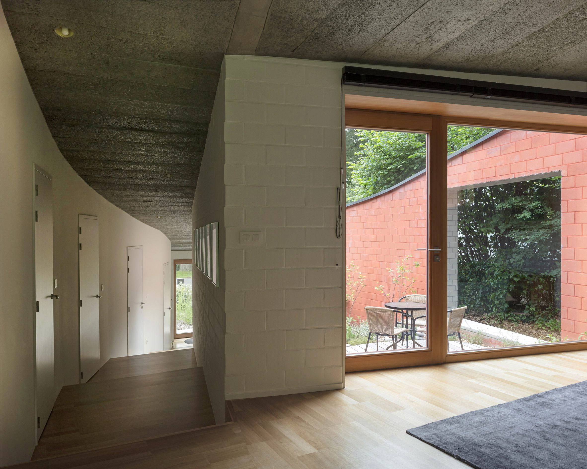
To the right of the walkway are doors leading to three bedrooms and two bathrooms, while a large window on the left provides views out to a sheltered terrace that functions as an "outdoor room".
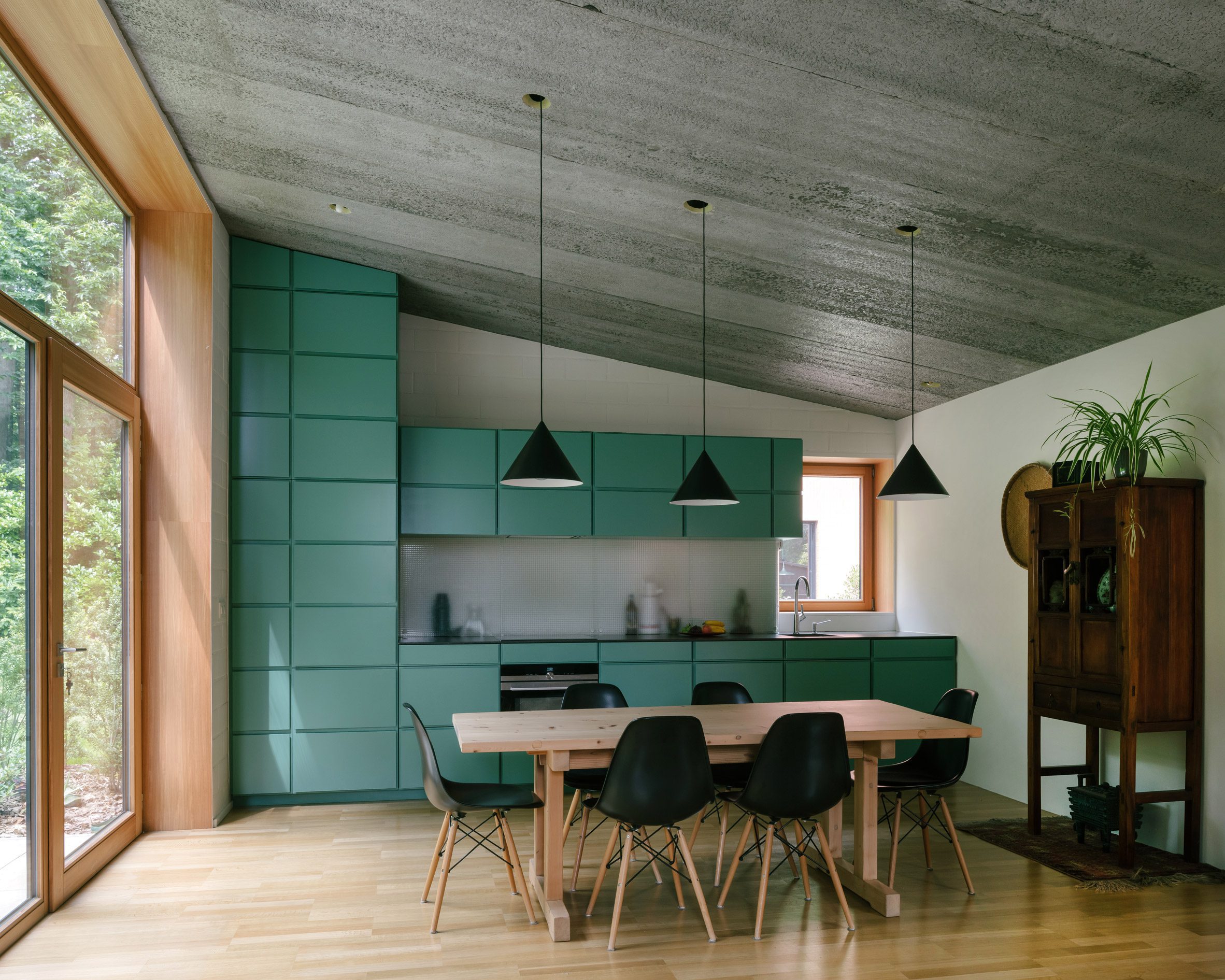
At the top of the house sits a large living room and kitchen, with windows to the east and west and French doors that open out to the terrace.
Coloured bricks were used for the interior and exterior
"We liked the idea to see the house as a walk up the slope, a path," Bovenbouw Architectuur founder Dirk Somers told Dezeen. "When you walk up the 'path', the corridor, you look into the trees in the back of the garden."
"When you arrive in the living room you turn back and look into the patio back to the street," he added. "Because of the sloping walls, you look out into the green without seeing the street or the adjacent villas."
A walkway leads from the entrance and up through the house
The house was commissioned by a client for her mother, whom she and her family frequently visit at weekends.
Bovenbouw Architectuur wanted to create a design that would set this new house apart from the more traditional houses in the neighbourhood.
"Most older houses in the street use a split level section, but since this is a modest house we preferred to design the house in a more connected relation to the topography," Somers said.
Contrasting colours give the house a graphic feel
The 146-square-metre residence was built from brick, but the studio wanted to make sure it felt light, rather than imposing.
"Therefore all the brickwork and blockwork is very graphical and flat, more like a pattern," Somers explained.
French windows open out to the terrace from the kitchen
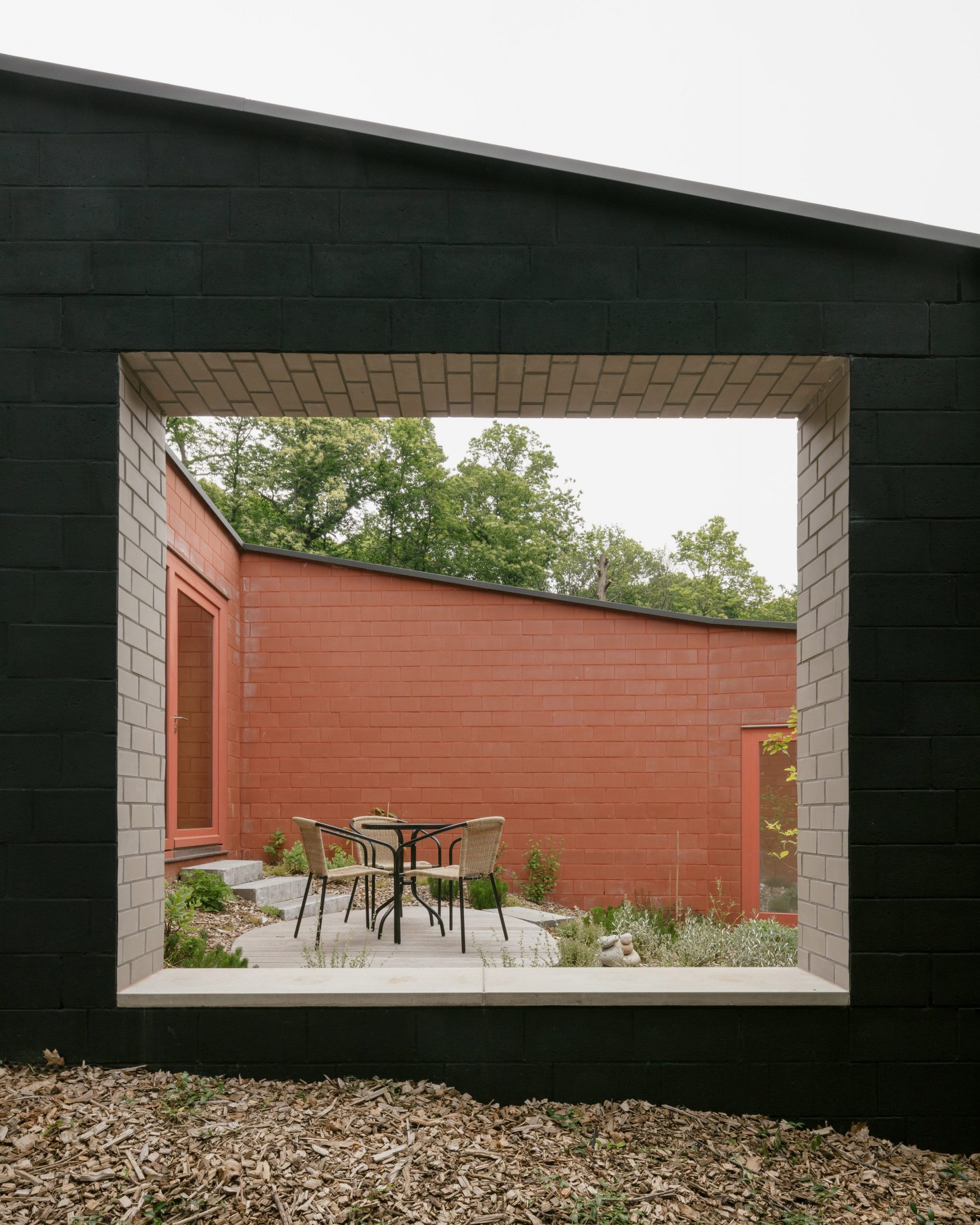
The large bricks on the exterior have been painted black, while the interior brick walls are white. Only the bricks used for the terrace retain their natural russet hue.
Using different colours for the different spaces helped give the house a playful feel and a "weightless" appearance, according to the studio, which angled some of the brickwork to show off the contrasting hues.
"Essentially the house is made of many of these patterns stitched together," Somers said.
"This also explains the 45-degree angles of the brickwork around the patio. Other 'patterns' beside the walls are the kitchen and bathroom tiles."
The living room and kitchen are located on the uppermost level
As well as the stepped interior, the architects used the unusual terrain to create the sheltered terrace that the team sees as a room in itself.
"The outside room exploits the south-facing orientation, without being too squeezed between the neighbours' hedge and the building itself," Somers said. "The patio turns the side of the house into an actual place with a specific intimacy."
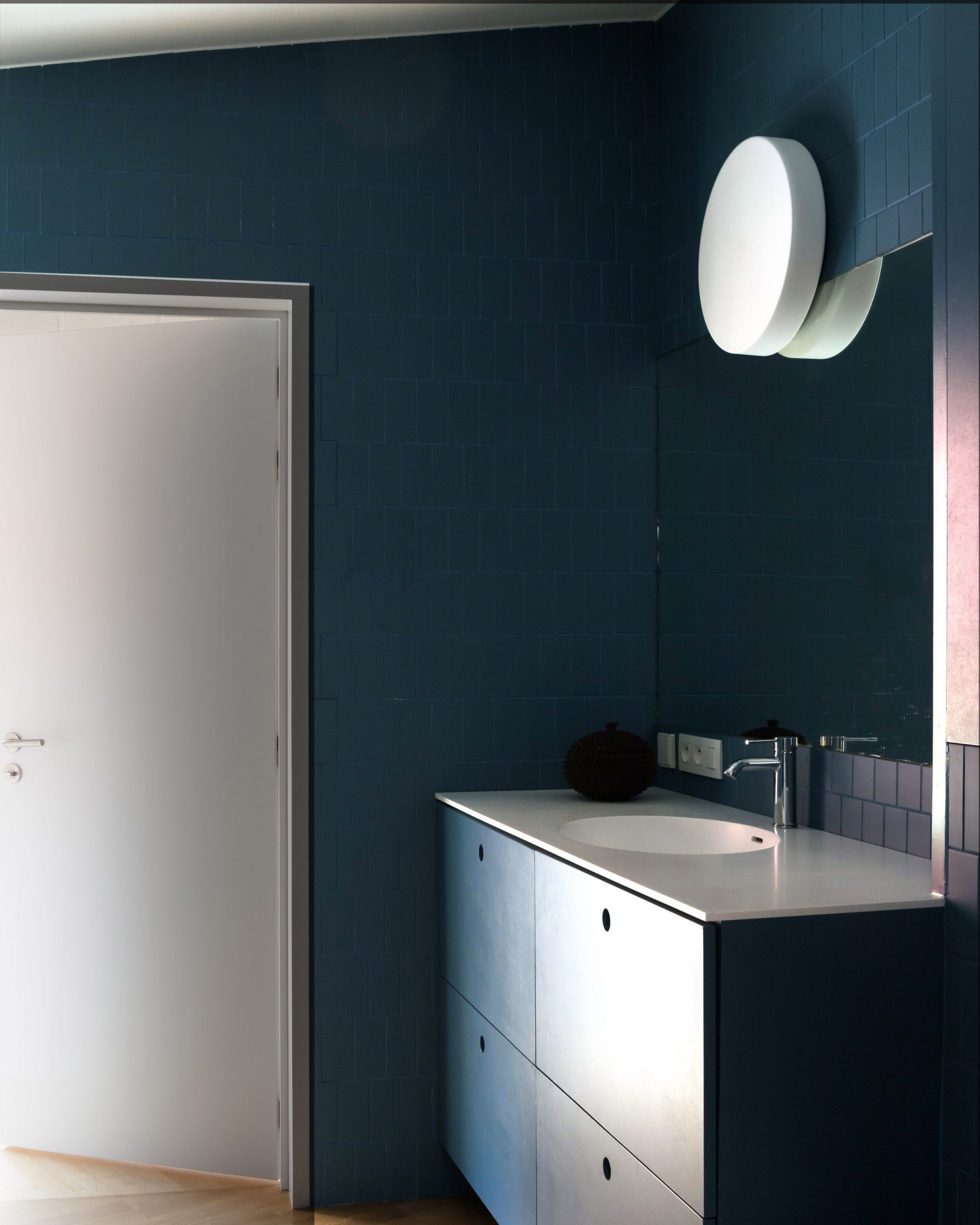
The dark-blue bathroom features a graphic tile design
Bovenbouw Architectuur was founded by Somers in 2011 and is based in Antwerp.
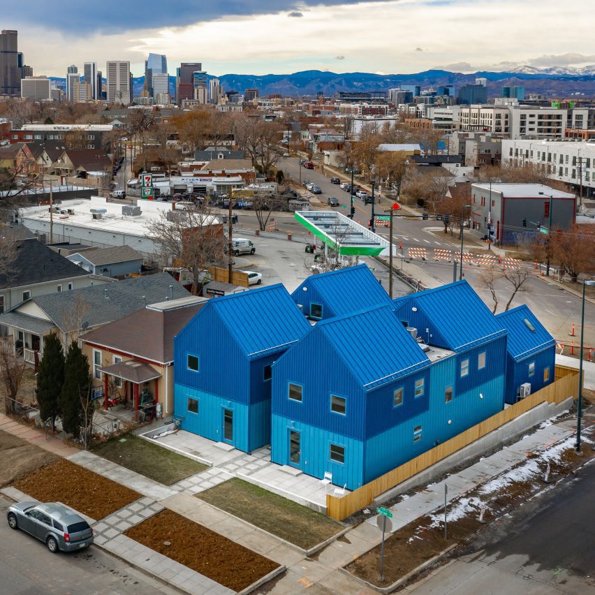
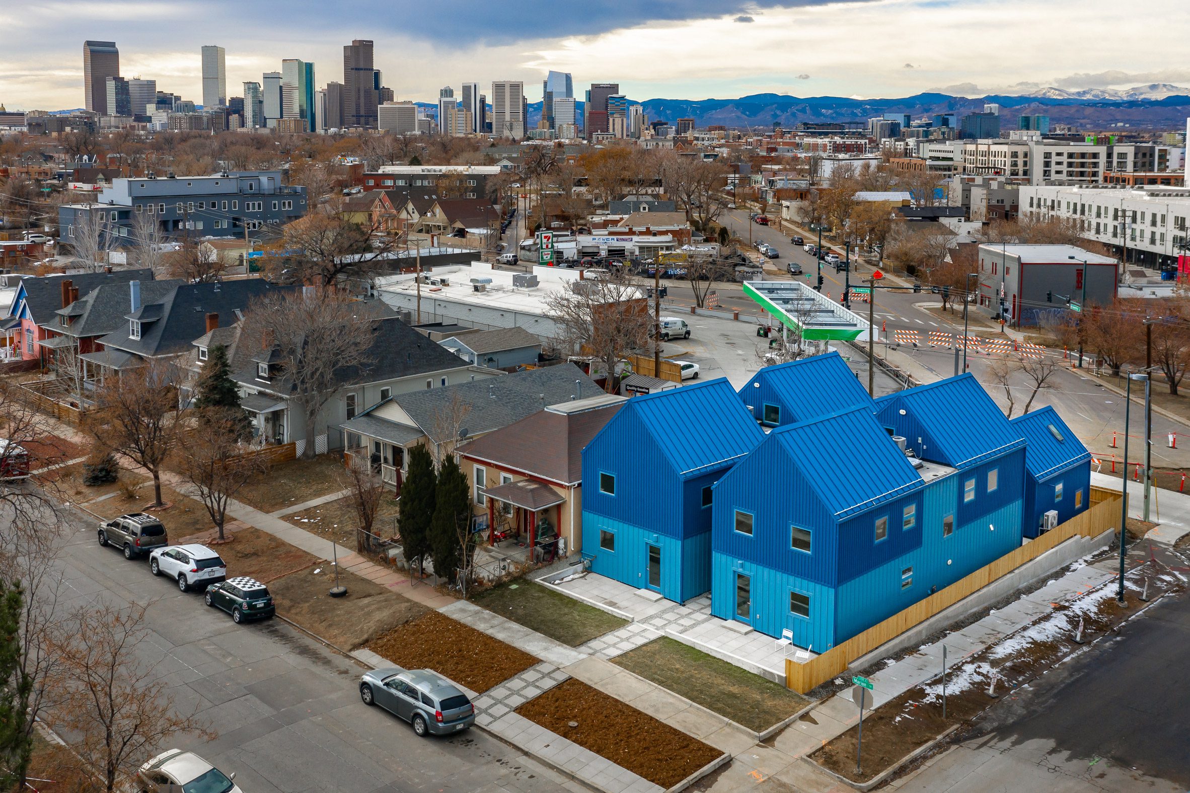
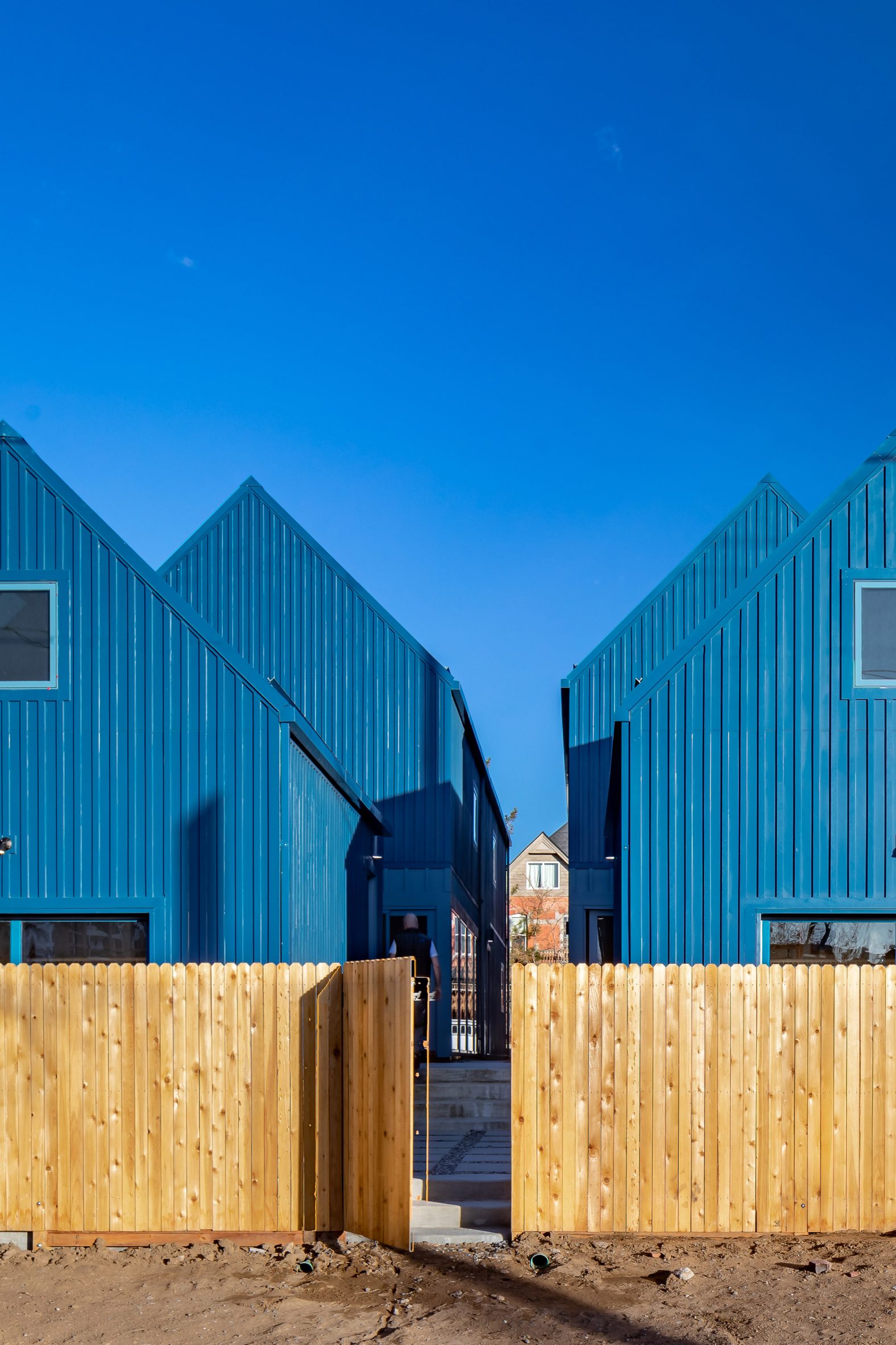
Architecture firm Productora has completed a small housing complex in Denver, Colorado, that provides eight units with shared amenities on a lot that would typically accommodate only two single-family homes.
Located at the corner of East 36th Avenue and North Merion Street, just north of downtown Denver, the project was commissioned by real estate developer Continuum Partners in collaboration with local non-profit Biennial of the Americas.
The housing complex sits on the corner of two streets in North Denver
"This experimental project is located in the first belt of low-density neighborhoods surrounding downtown Denver at only two miles of the city centre," said Productora. "It provides centrally located, low-cost housing for individuals or couples while integrating within the morphology of the suburban environment."
The team realised that buildings designed as single-family homes in areas such as North Denver are often shared by multiple smaller households. The goal of this project was to better reflect the reality of residents' living arrangements.
Two identical sets of houses have mirrored layouts
"The project acknowledges how larger single-family residences in well-located neighborhoods are frequently shared by roommates and friends, and was designed to cater to those needs," Productora explained.
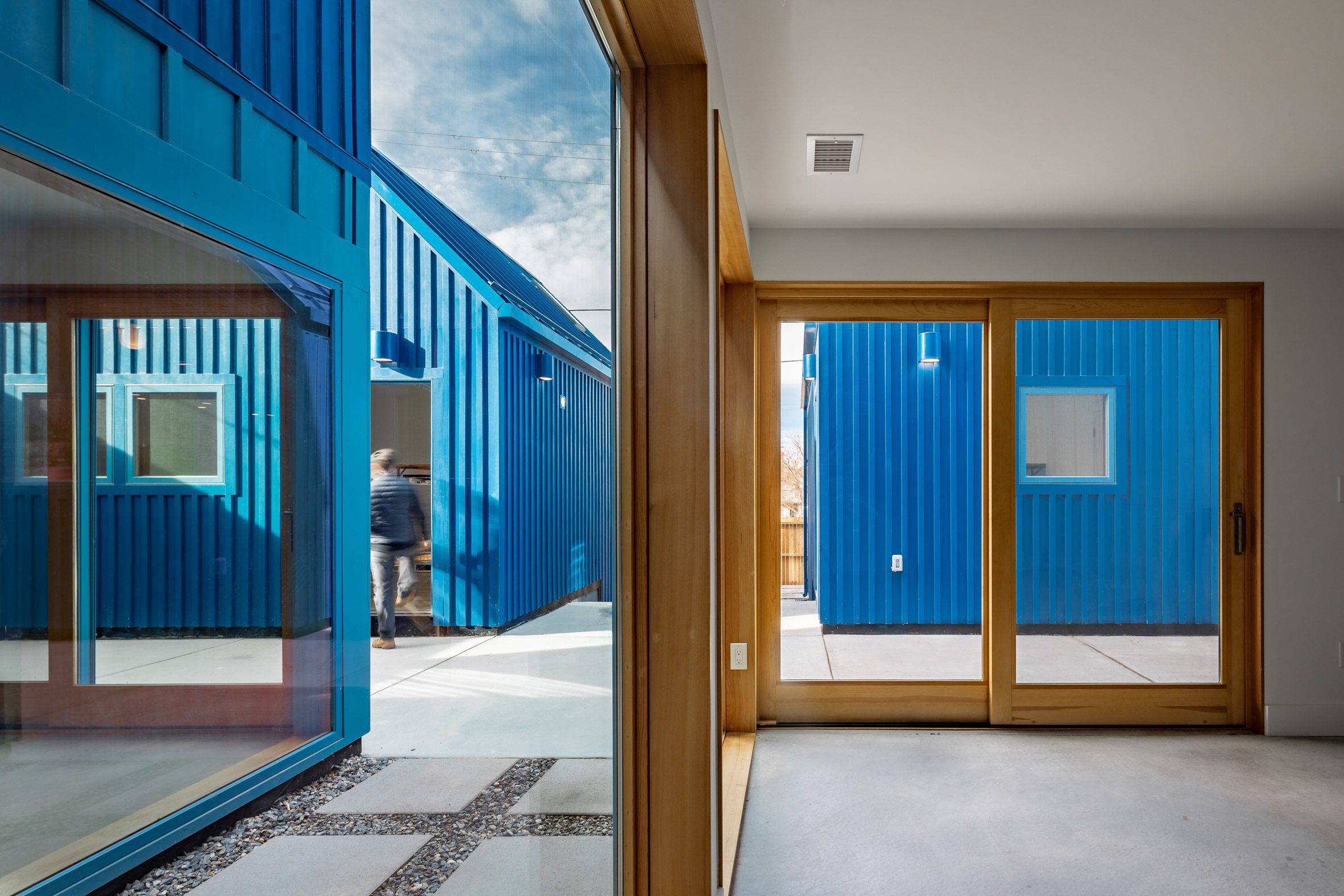
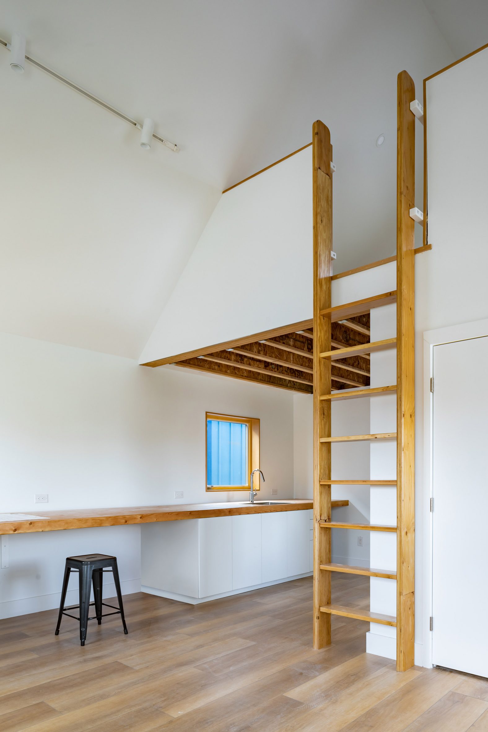
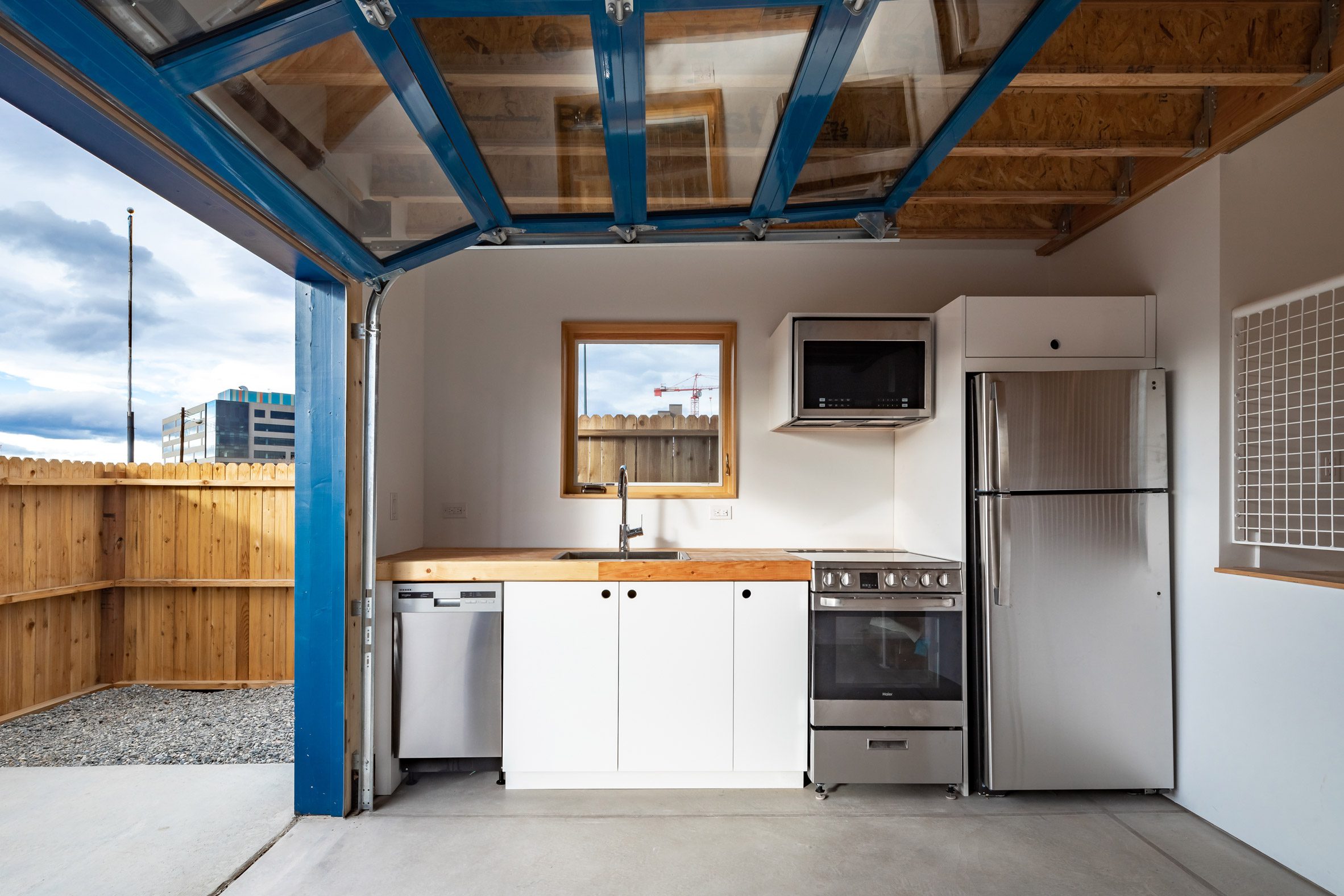
Their design comprises two identical sets of houses with mirrored layouts. A larger volume sits at the front the lot, facing the street, and contains three studios and a shared kitchen and living room. At the back of the property, two accessory dwelling units – or ADUs – bring the total number of units to eight.
External materials are left blue to save on costs
"Integrating shared kitchen and living room, laundry areas, a powder room, and paved outdoor areas, the project stages a subtle balance between the need for privacy and the possibility of social interaction," Productora added.
Each of the studios enjoys its own ensuite, as well as a kitchenette and second sink. The ground floor is set up with a communal area that includes a full kitchen, and enough space for shared meals. These face each other and can open out to a shared patio via sliding glass doors.
Kitchen and living areas are designed to be shared between residents
"The front houses have double-height entrance areas, and the communal kitchen and living areas have large glazed surfaces to interact with each other," the architects explained.
Gabled roofs echo the typical profile of neighbouring buildings. However, these are much steeper and stand out through their shade of bright blue.
According to the architects, this is the standard colour in which the materials were provided, which allowed them to reduce construction costs. Matching the roofs, the exterior wooden facades are clad in vertical boards and battens finished in a similar hue.
To meet the limited budget, Productora used standard details throughout all four buildings. Still, the interiors offer light-filled and unpretentious living spaces.
Neutral interiors contrast the buildings' bold blue facades
Increasing density and house prices in cities, along with changing demographic trends, have increased interest in co-living arrangements. Other examples include a micro-apartment concept in Seoul that is meant to be a "blank canvas" for residents, and a house in London that was reconfigured to offer living and rehearsal spaces to seven music students.
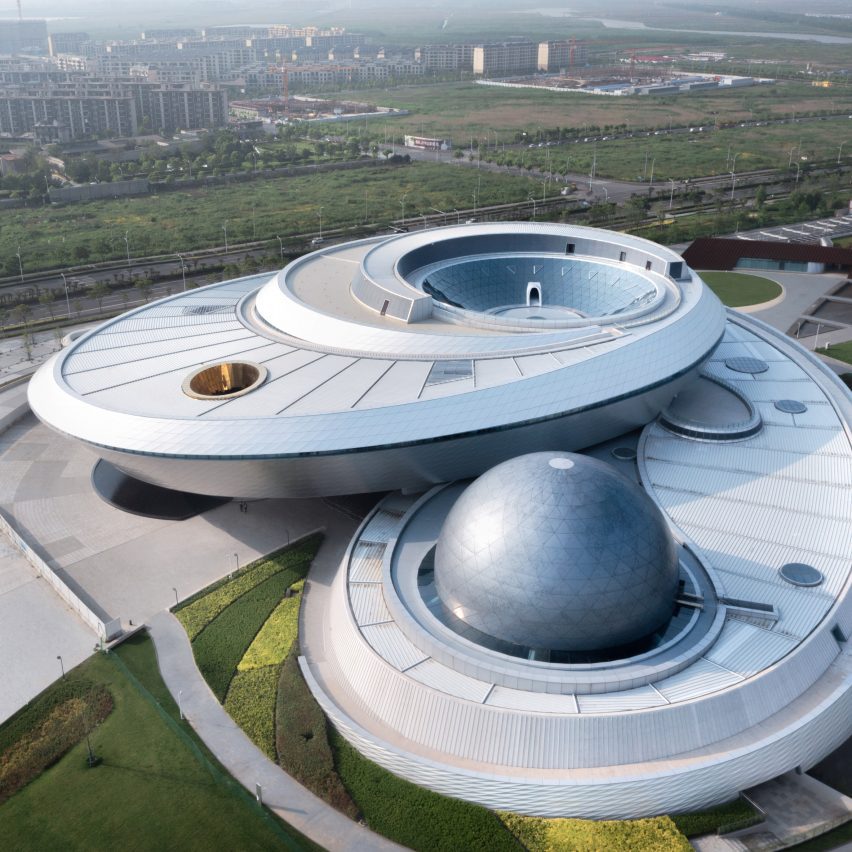
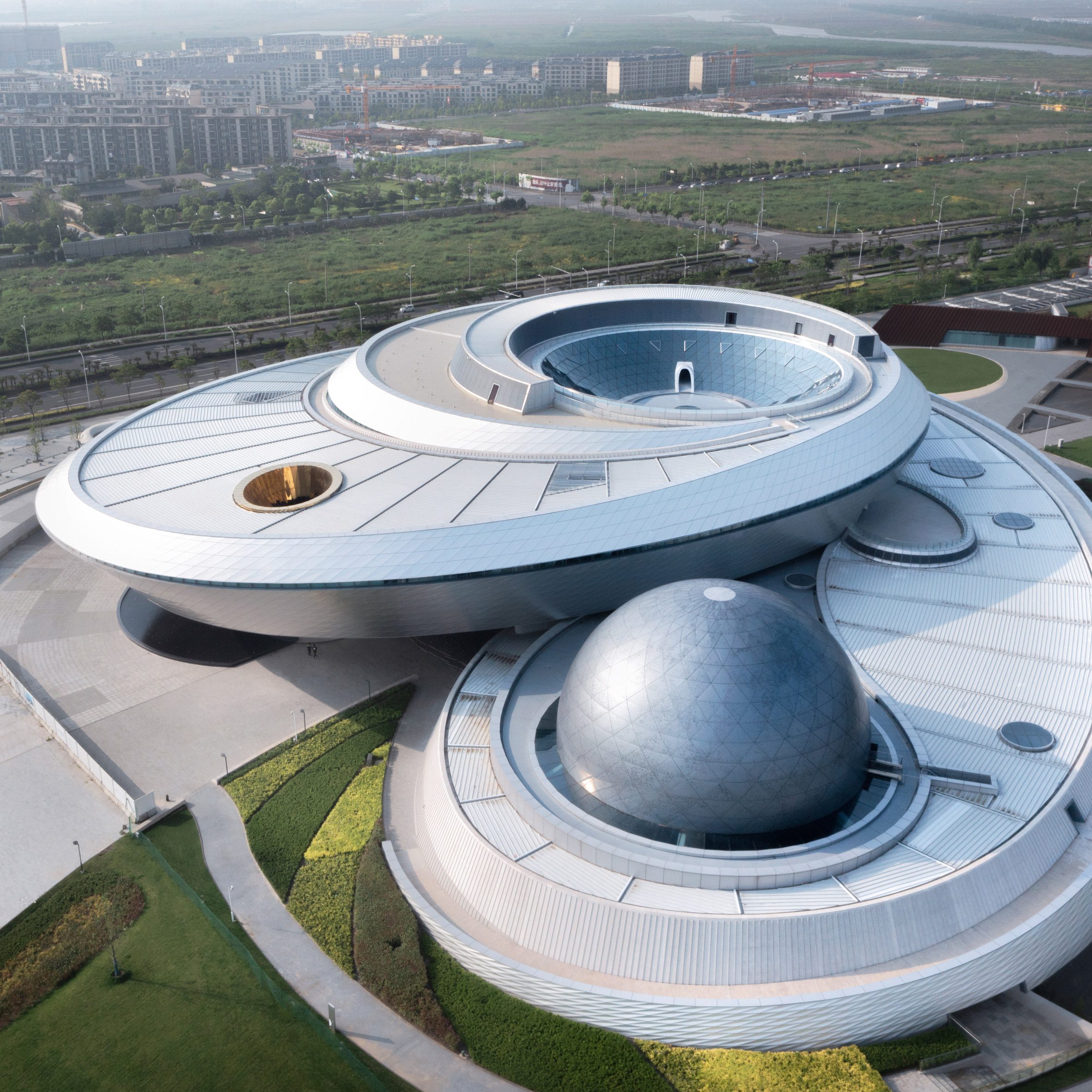
The studio designed the Shanghai Astronomy Museum, which is the world's largest museum dedicated to astronomy. The form of the museum is informed by shapes and geometry found within the universe and has no straight lines or right angles.
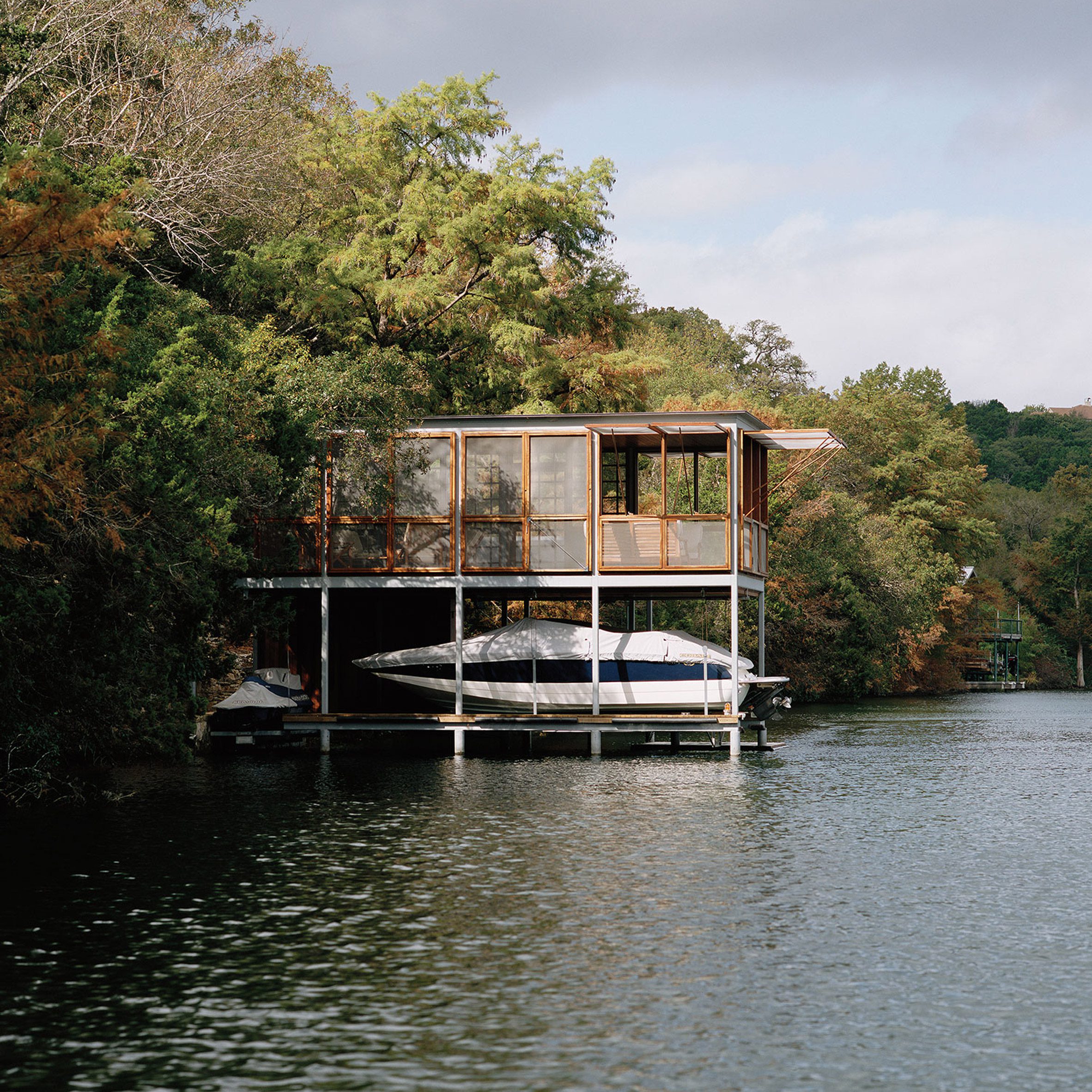
American studio Andersson/Wise designed an off-grid boathouse that sits on Lake Austin in Texas, which features openings that allow occupants to dive directly into the water below.
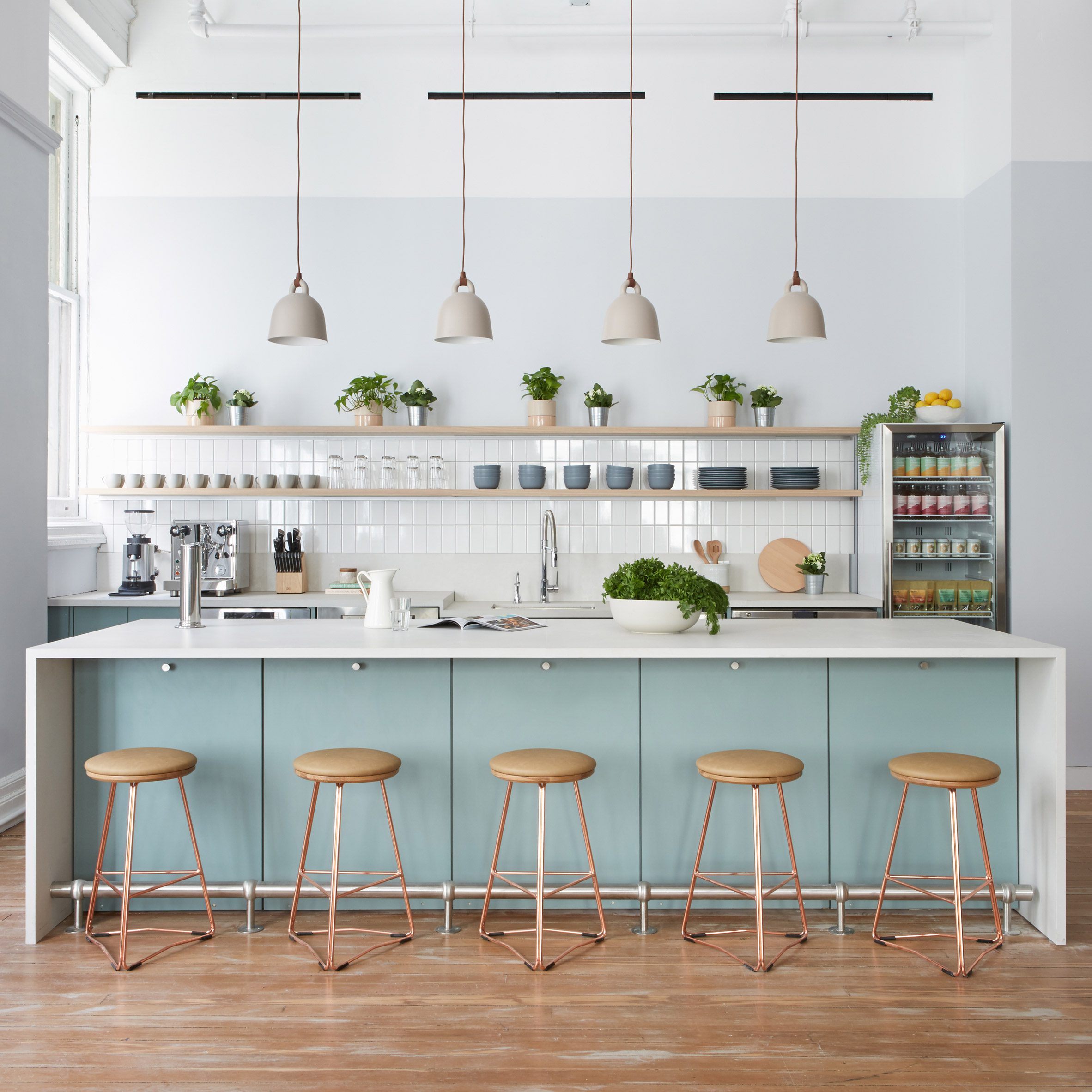
Alda Ly Architecture designed the Parsley Health NYC Flagship Center in Manhattan's Union Square neighbourhood. The medical office is distinguished by its pared-back interiors, ample natural light and abundant greenery throughout the clinic to create a calming atmosphere.
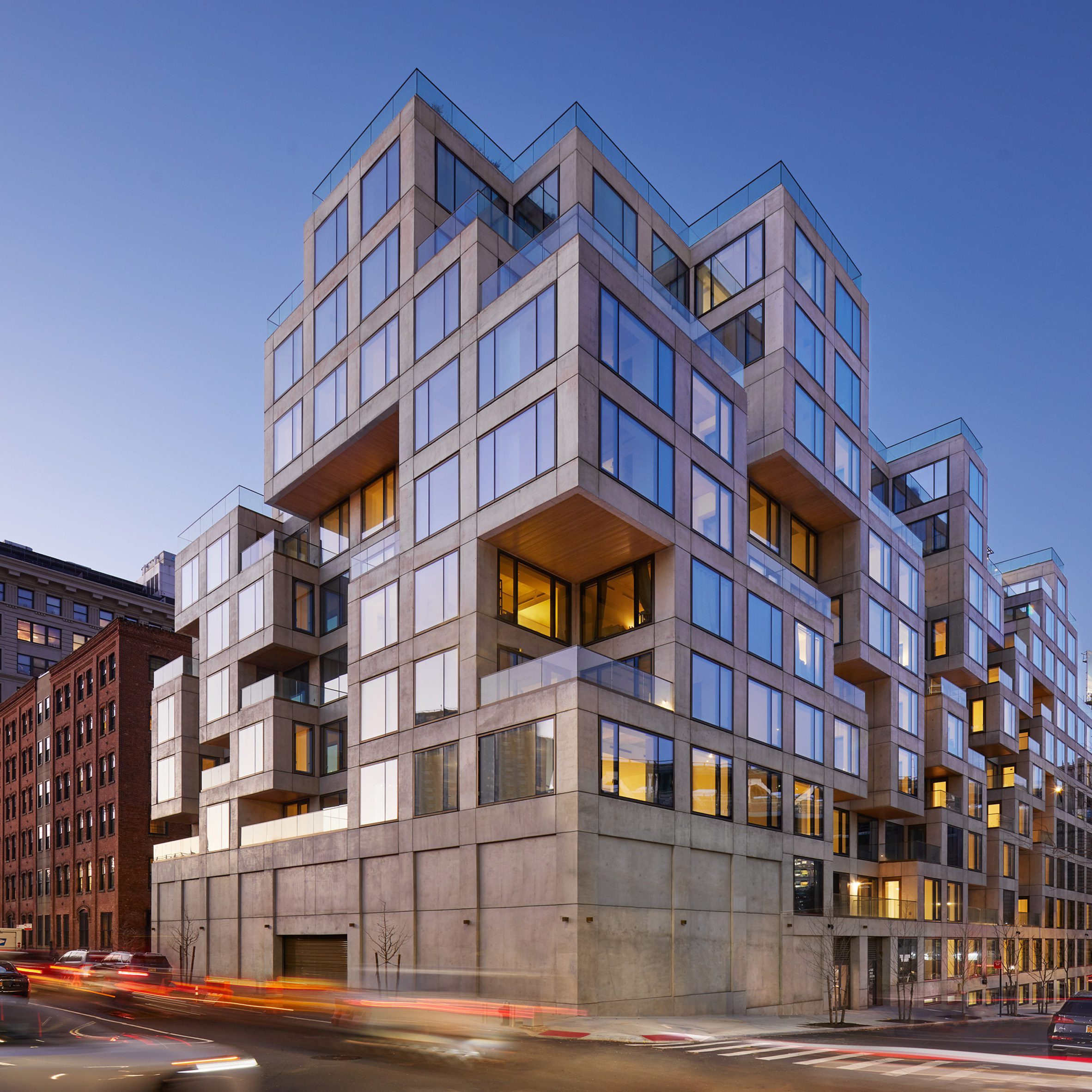
The firm recently designed the 98 Front residential building in Brooklyn, which has a facade made up of irregularly stacked concrete and glass cubic volumes reminiscent of wooden block game Jenga.
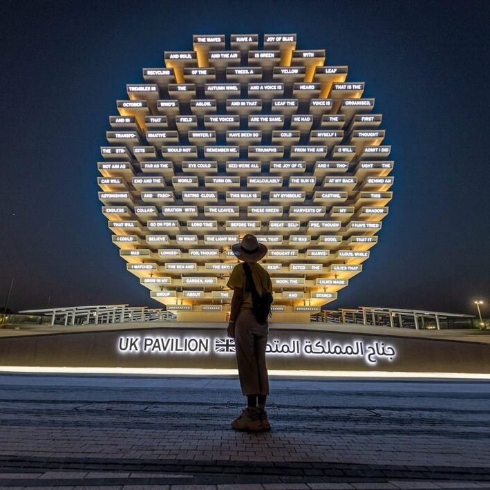
British designer Es Devlin has unveiled a cross-laminated timber pavilion, which is the UK's contribution to the Dubai Expo 2020.
The UK Pavilion has been designed to display a series of AI-generated poems during the international event, which opened in Dubai this week.
Poems created from words submitted by visitors and generated by AI are written in English and Arabic using LED lights on the facade.
"A giant ice cream cone spouting gobbledygook"
Commenters are baffled. "The poem in these photos is an utterly nonsensical list of words," said Rupert. "Surely the UK could have come up with something a bit more dynamic and engaging than a giant wooden ice cream cone on its side spouting gobbledygook."
"Another classic example of an 'Instagram' project," added Daniel Pex. "A superficial project devised purely so it looks good on social media."
Guy continued: "It reportedly cost £44 million! It's scandalous. Who oversaw this and allowed taxpayers to be so misled? Heads most definitely need to roll!"
"What are the chances a single visitor will ever stand there, read the 'poem', and be emotionally moved by its machine-generated content?" asked Ali March.
"Slim to zero I'd wager. This pavilion is pointless and meaningless, a cacophony of random shapes and awkward spaces that promise to confuse and underwhelm."
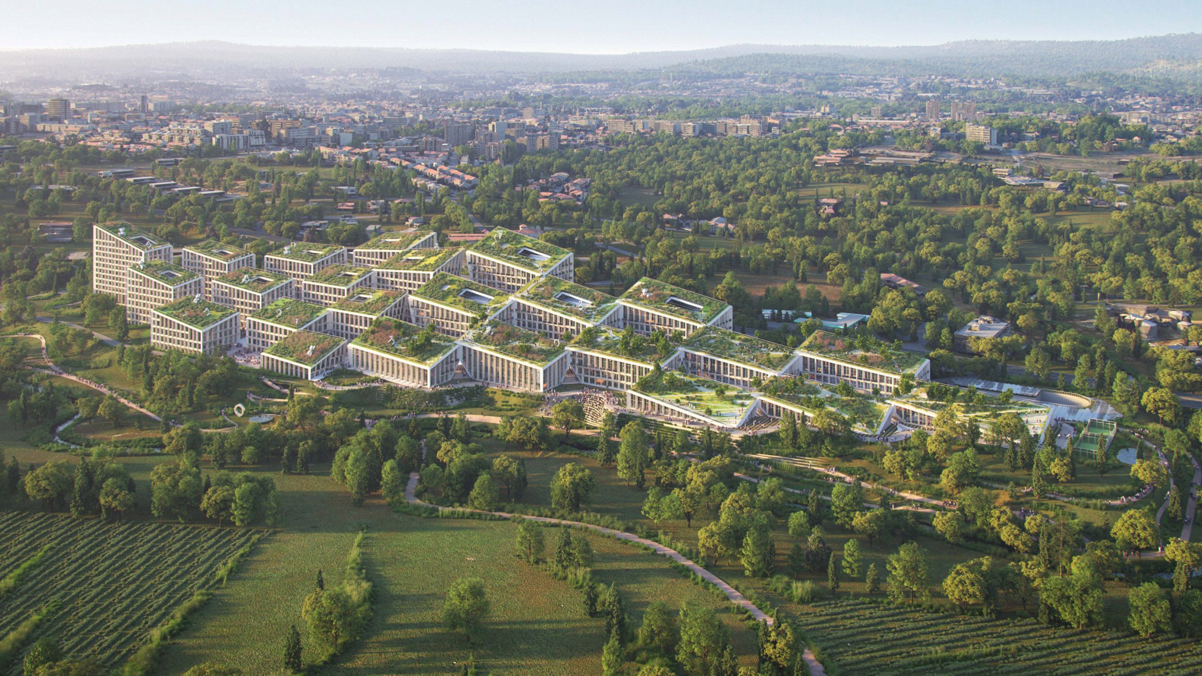
"At what point did we stop building cities?" asked Jane.
"Would you know it's Porto?" continued Jacopo. "I love modern architecture, but this is so anonymous – it could be anywhere. Where are the bright contrasting colours? BIG probably had this idea for Vancouver or Seattle but it got refused and reused for Porto."
JOM agreed: "A missed opportunity for having a great project from a great Portuguese architect."
Commenters are debating Swedish car manufacturer Volvo's logo redesign, which has been revealed as a flat, less colourful version of its longstanding Iron Mark logo.
"I prefer the new version," said Pleez Donsumi. "The old looked a bit tacky."
"The old logo was dated," continued Marc Sicard, "but who made the circle and arrow drawing? That's an awful combination of thicknesses, bad proportions, etc. In this kind of work, execution is key, and this execution is really bad."
Darin Kirschner agreed: "The traditional slab serif type isn't harmonious with the very simple circle and arrowhead. The thicks and thins of the font aren't represented in the surround and make this logo unbalanced. Volvo cars are very meticulous, so to rebrand their identity in this way is disingenuous."
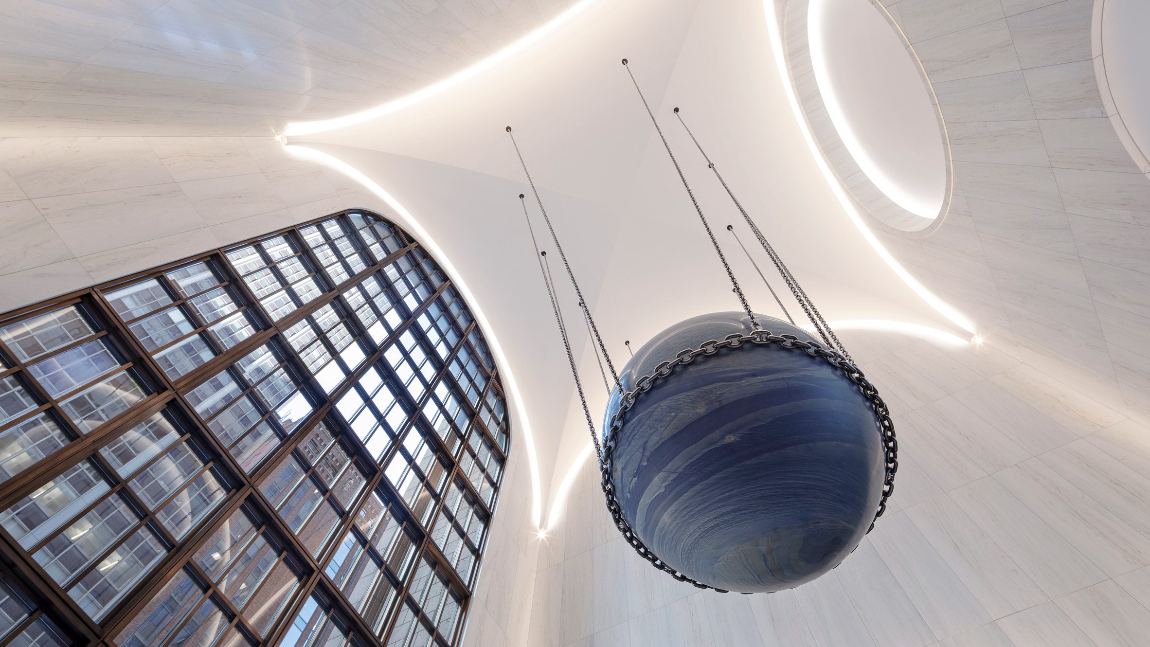
Commenters think redesign of the AT&T's lobby is "James Bond-ish"
Readers are debating Gensler's redesign of the lobby inside the postmodernist AT&T building in Midtown Manhattan. It aims to pay homage to the existing structure, but commenters aren't convinced.
"Anonymous, sterile and derivative," said Enter Ranting. "The original space had so much character. This is basic. The ominous Ball of Damocles looks like it's ready to slip out of its chains at any second."
"That ridiculous sphere really pretty much kills it," added Vead F. "No idea what anyone, client, artist, or architect was thinking with that one. It looks like something that belongs in a Bond villain's headquarters, like a world in chains."
"The one saving move is this astonishing piece of stone hanging in what almost could be a space designed for it alone," replied Frank. "There is something special about it that is both James Bond-ish and profoundly experiential all at the same time."
Dezeen is the world's most commented architecture and design magazine, receiving thousands of comments each month from readers. Keep up to date on the latest discussions on our comments page.