Wednesday 6 October 2021

Klopf Architecture revamps mid-century home at Stanford University

Stanford University by Klopf Architecture

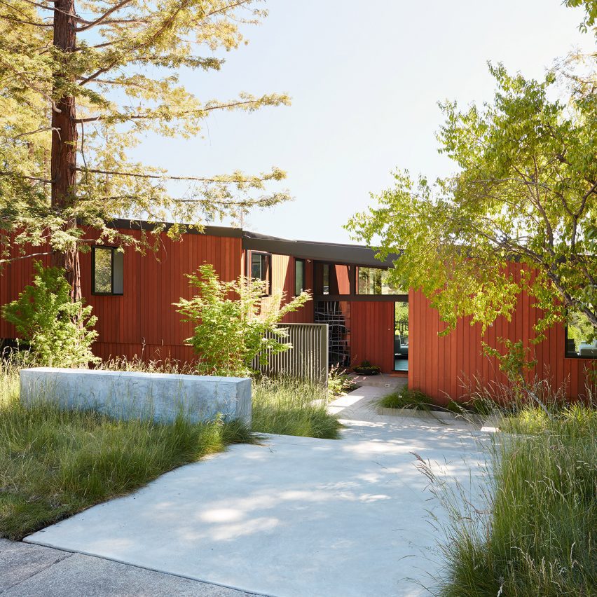
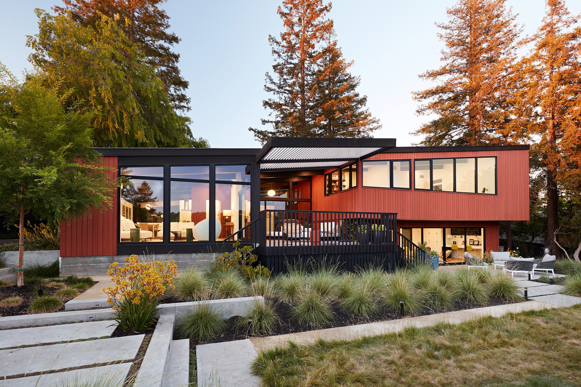
Redwood cladding and large stretches of glass feature in a 1960s house in northern California that has been updated by American firm Klopf Architecture.

The project, called Stanford Mid-Century Modern Remodel/Addition, entailed a full renovation of a 1962 dwelling on the Stanford University campus near Palo Alto. It was originally built for a professor.

Stanford Mid-Century Modern Remodel/Addition
The project involved the renovation of a mid-century property on the Stanford University campus

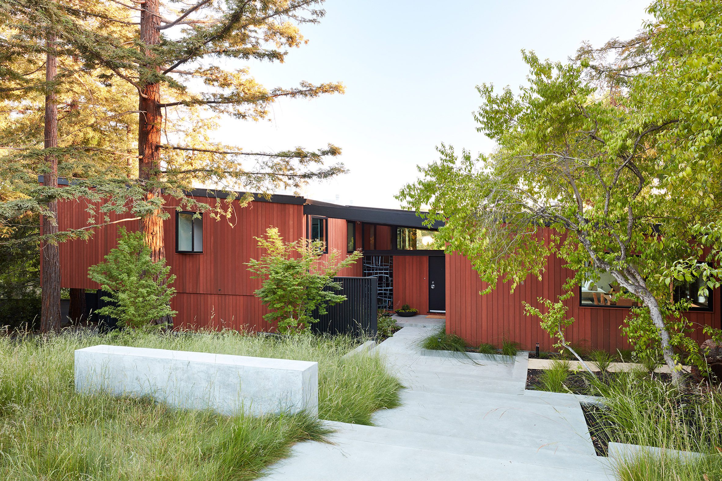
The wood-clad, split-level house – designed by the late Chinese-American architect Roger Lee – was close to its original condition when it was purchased by the current owners.

"The clients were able to see beyond the dated materials and finishes, single-paned glass and uninsulated walls," said San Francisco-based Klopf Architecture.

Mid-century renovation by Klopf Architecture
Work to update the exterior included replacing the redwood siding and enlarging openings

The overall goal was to strengthen the connection between inside and out, and provide more space for a family of four.

"As with many original mid-century modern homes, the house was scaled to the 1960s lifestyle, where rooms were smaller and openings to views were limited and tightly framed," the architects said.

Stanford Mid-Century Modern Remodel/Addition
A slated shade covers a deck at the back of the home

"[The clients] approached us to help them expand and update the entire home – one the family could settle into and enjoy for years to come."

The renovation needed to align with Lee's vision, not only because of the clients' appreciation of mid-century modern architecture, but also because the home carries a historical designation. The renovation plans had to go through a strict design review.

Wooden panelling in the kitchen by Klopf Architecture
A rethink of the internal layout involved opening up the kitchen area

For the H-shaped house, the architects ended up reconfiguring the interior and bumping out walls to add 1,100 square feet (102 square metres) to the floor plan. The project also entailed converting a carport to an enclosed garage so it could be used as storage space.

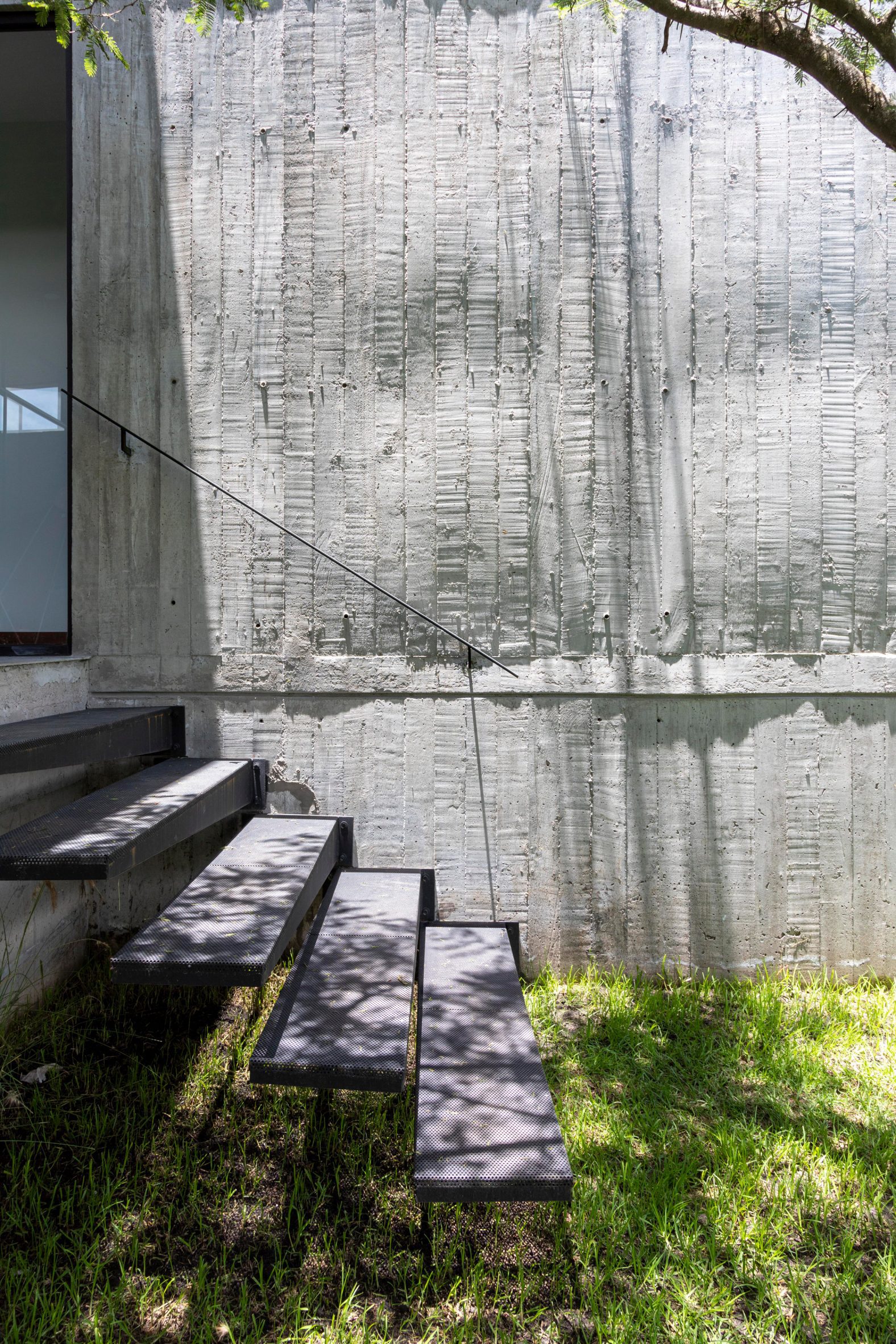
On the exterior, the team replaced redwood siding and added more glazing. In particular, windows were enlarged on the rear elevation to improve the interior's connection to the landscape.

Monochrome living room
A black-and-white colour palette was used in the living room

"We were able to broaden those views, continuing and extending on the original architecture to take full advantage of the unobstructed natural views across the rear facade of the house," the team said.

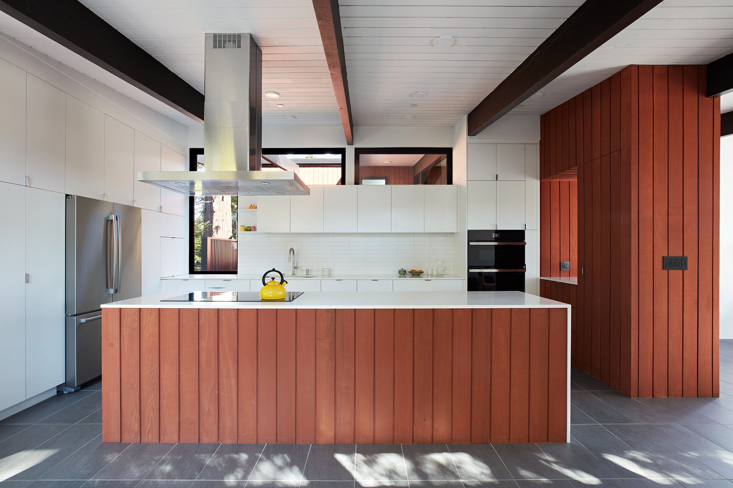
Within the home, rooms were shifted and enlarged. The kitchen, which was formerly closed off and tucked into a corner, was opened up.

Klopf Architecture added a second staircase to the mid-century renovation
A second staircase was added during the renovation work

"Today the much-larger kitchen is connected to the living area, where a short wall with a cutout offers a visual glimpse into the kitchen and a handy pass-through counter for serving guests," the team said.

"A new breakfast nook was also added to create another spot where the family can gather for casual meals."

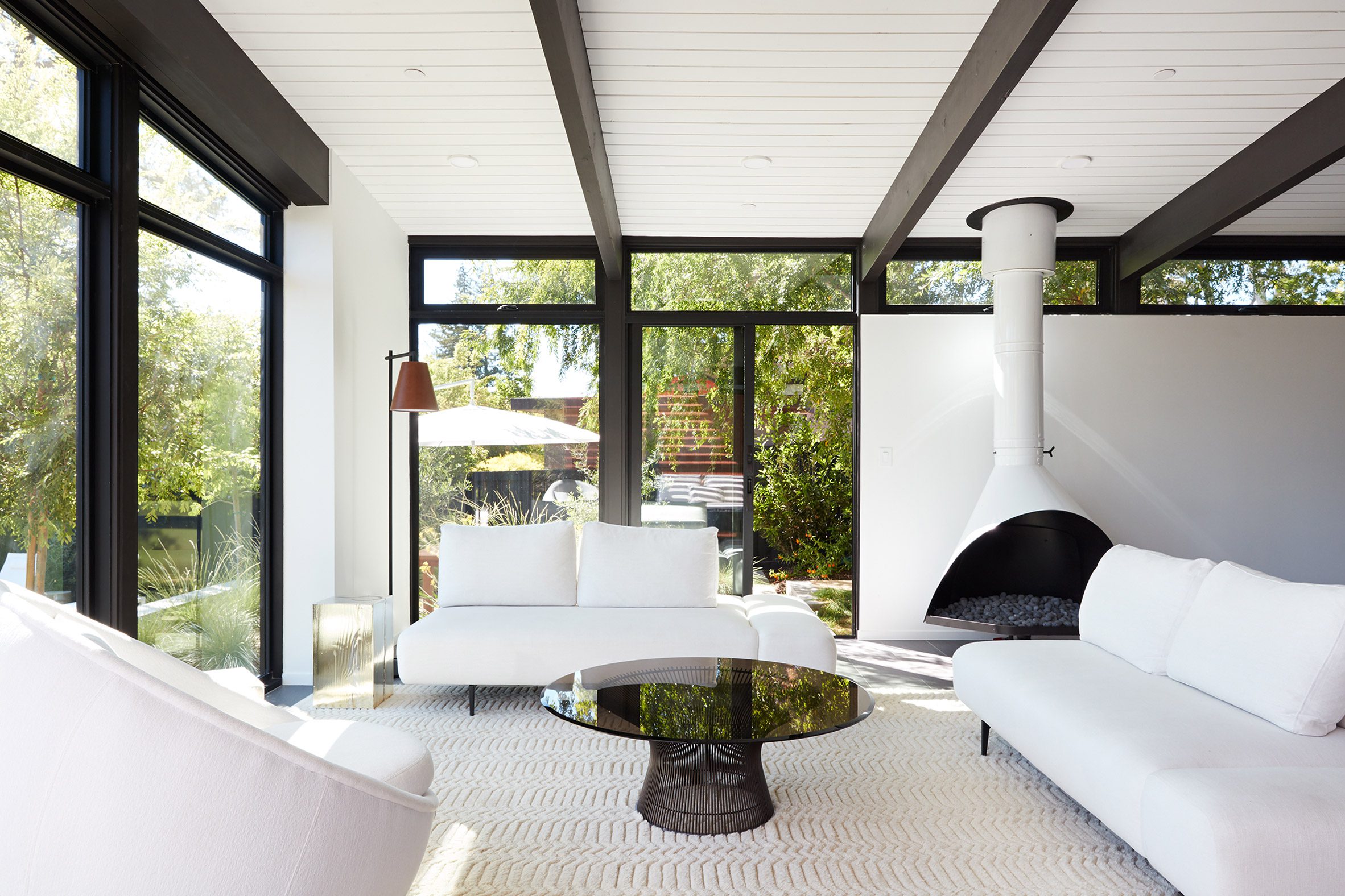
The living room was freshened up with a black-and-white colour palette. An original wood-burning Malm fireplace was restored, and a gas burner was installed to comply with California's strict air standards.

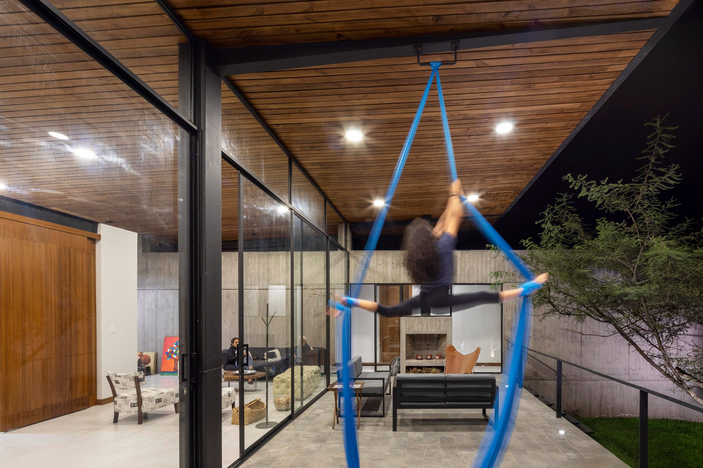
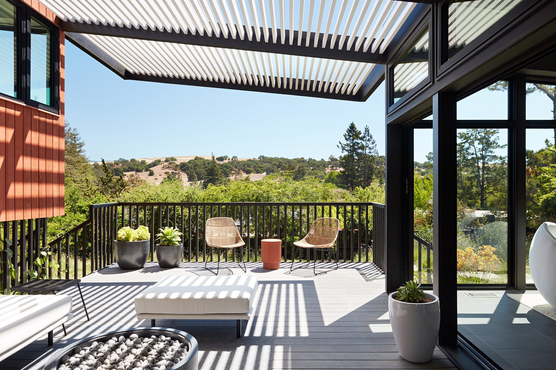
Large glass, sliding doors provide access to a covered patio.

A bedroom at the mid-century home
Large windows reveal scenic surroundings in the bedroom

"The new deck was re-envisioned as an extension of the main living room," the architects said. "A new slatted pergola above provides the homeowners welcome relief from the hot afternoon sun."

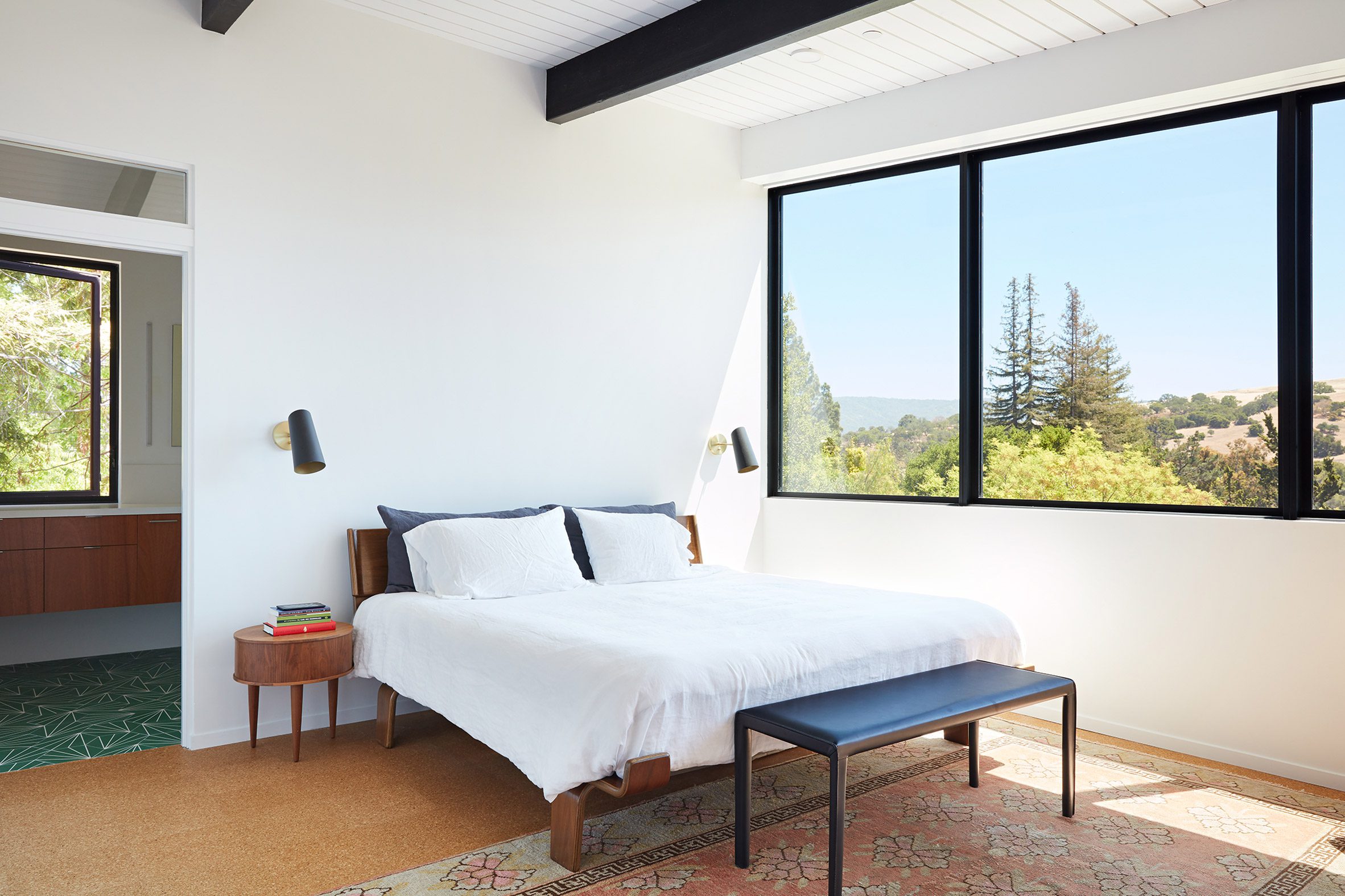
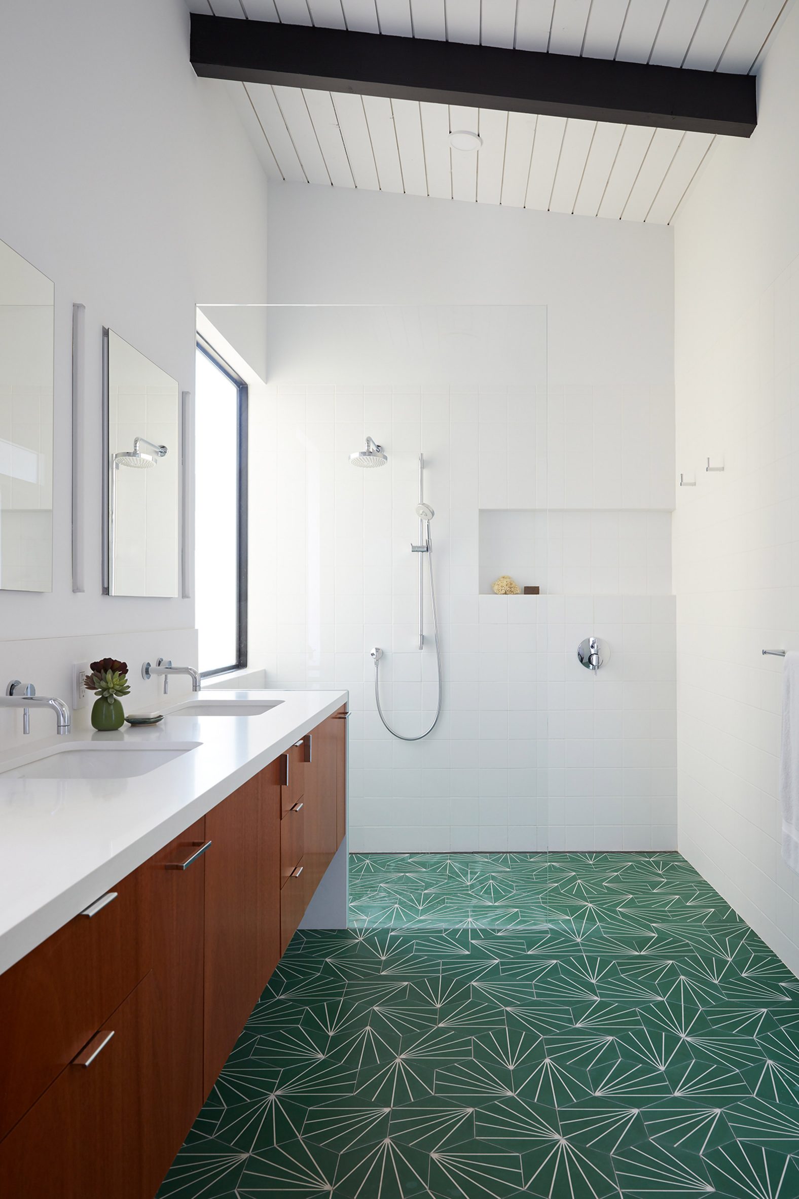
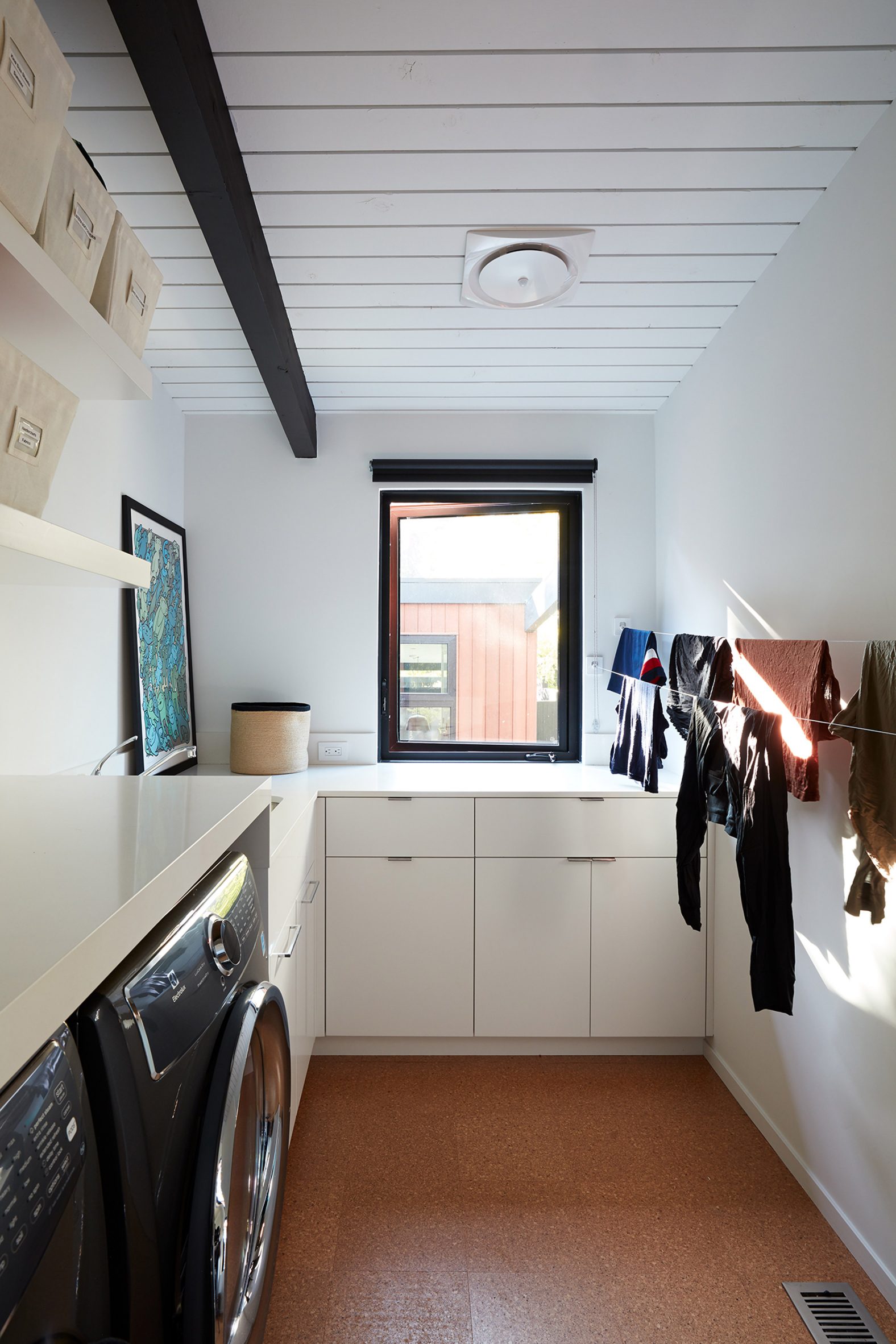
On the home's top level, the team expanded two bedrooms and added a laundry room and a half-bathroom.

The updated design was kept within the vision of original architect Roger Lee

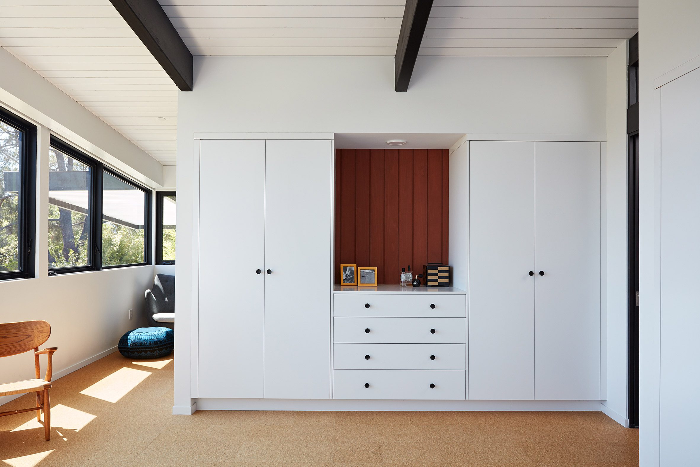
Also on the top level is the main bedroom suite, where small, horizontal openings were replaced with tall windows. A new corner office looks out toward the scenery.

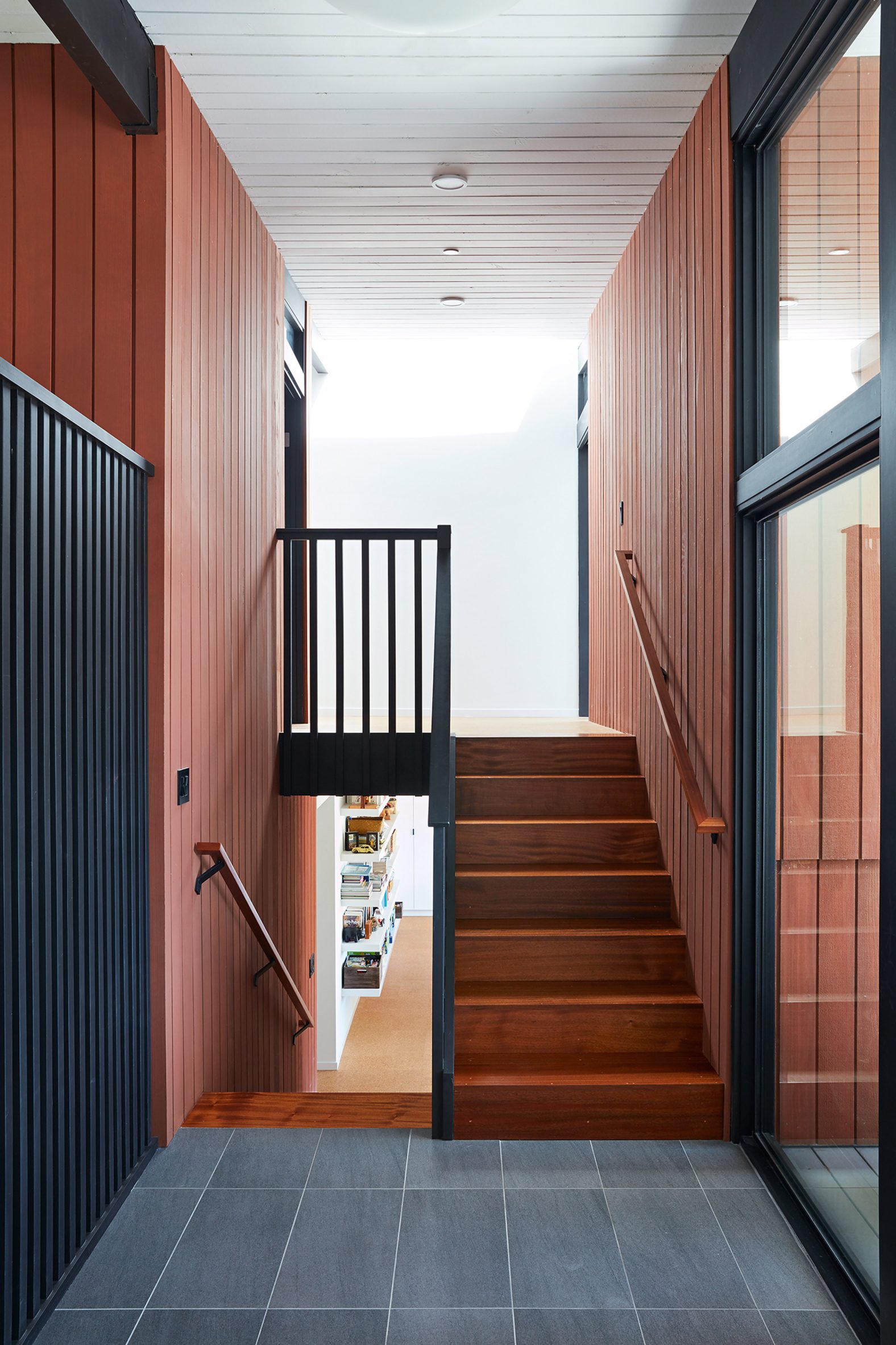
A second staircase was added to the home, helping provide a better connection to the home's lowest level.

A bathroom was added
Green tiles cover the floor in one of the bathrooms

Originally utilitarian in nature, the lowest floor encompassed a bathroom, laundry facilities, storage space, and an area related to a backyard swimming pool with a drain in the centre of the floor.

The ageing pool was removed, allowing the team to fully rethink the ground-level space.

Laundry room
A laundry room was added on the top level

"Without the need for a pool room, we were able to convert the area into a much more comfortable and functional living space with a new family room and guest suite," the team said.

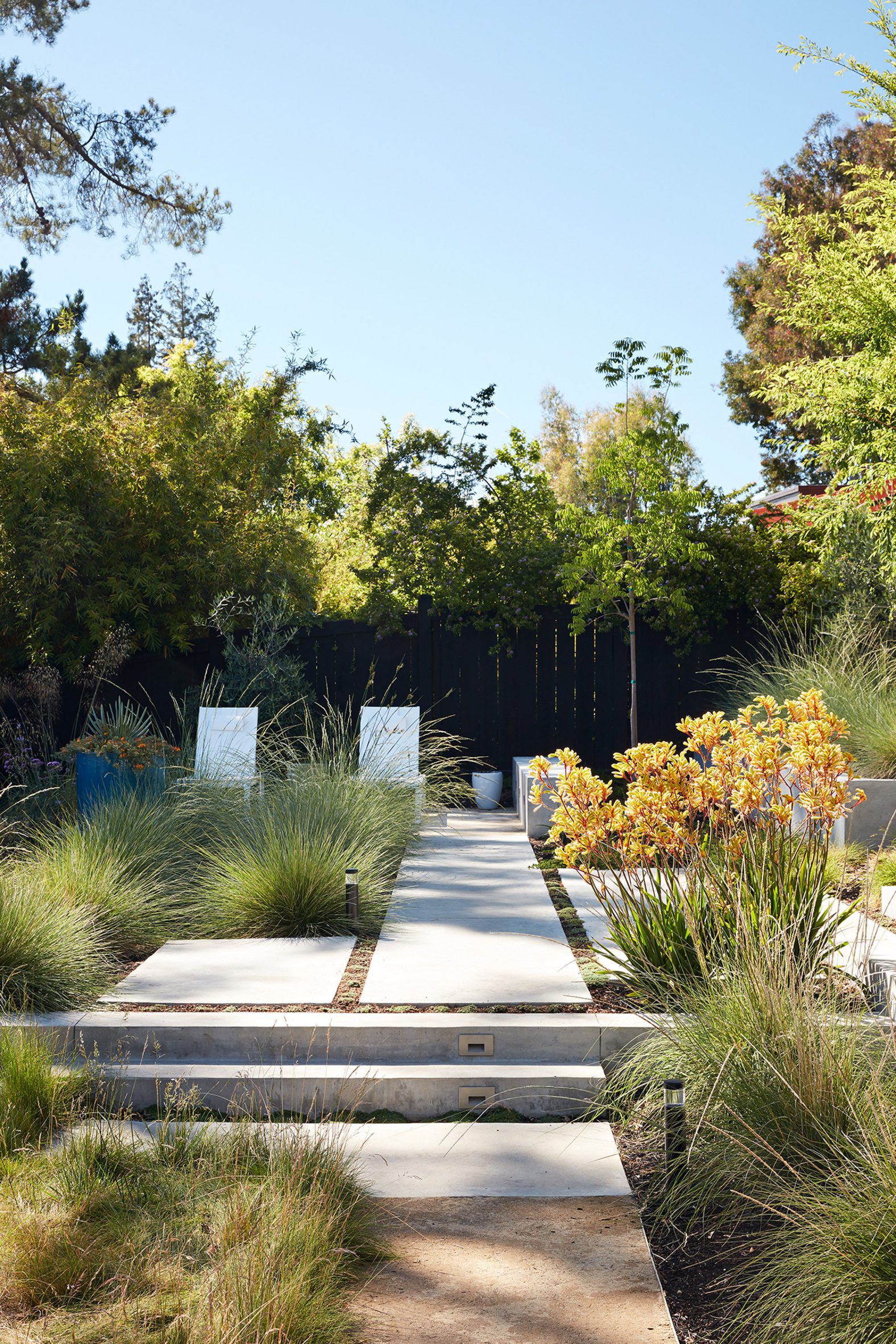
The project also entailed updates to the landscape, which was done in collaboration with Outer Space Landscape Architecture of San Francisco.

Plans and stones in the garden
Maintaining a connection to the outdoors was part of the brief

Klopf Architecture has remodeled numerous mid-century modern homes in California, including a plywood-clad, four-bedroom dwelling in Palo Alto that was built by the visionary developer Jospeh Eichler.

The photography is by Mariko Reed.


Project credits:

Architect: Klopf Architecture
Architect team: John Klopf, Klara Kevane, Noel Andrade
Contractor: ORB Construction, Brendan O'Reilly
Structural engineer: Sezen and Moon
Landscape architect: Outer space
Furnishings and decoration: Urbanism Designs

The post Klopf Architecture revamps mid-century home at Stanford University appeared first on Dezeen.


from Dezeen https://ift.tt/3FoIoqr

Bernardo Bustamante Arquitectos combines eucalyptus and concrete in Quito home

Casa 9B by Bernardo Bustamante Arquitectos

Board-formed concrete imprinted with eucalyptus planks forms the exterior of this home in Quito, Ecuador, by local firm Bernardo Bustamante Arquitectos.

The low-slung house is sited on a corner lot in the Tumbaco neighbourhood, on the outskirts of Quito. Local planning regulations required that the house have a generous front yard, and prohibited the construction of a fence or other obstruction.

The concrete exterior of Casa 9B
Casa 9B is situated in the Tumbaco area of Quito

To try and provide the occupants with more privacy, Bernardo Bustamante Arquitectos designed the 350-square-metre home's two street-facing facades with a monolithic concrete exterior and selective punched openings in the bedrooms.

The home's overall composition is an "L"-shaped volume with a rounded corner that is meant to match the outline of the street. Three bedrooms and a home office are laid out along a corridor, forming the long leg of the "L", while the communal spaces are clustered in the perpendicular volume.

A curved exterior wall around Casa 9B by Bernardo Bustamante Arquitectos
Bernardo Bustamante Arquitectos designed the house in a curved 'L' shape

In contrast to the opaque exterior facade, the inward-facing sides of the home are light and open.

"The private area is made with a system of concrete load-bearing walls, with discreet openings, making the rooms contained and warm spaces, while the social area is completely opened by large windows that merge with the garden and the sky," the architects explained.

Casa 9B by Bernardo Bustamante Arquitectos
Facades oriented away from the street feature large panels of glazing

In the communal areas, the roof is also slightly raised, allowing light to pour in through clerestory windows on all sides of the home.

"The program is organized between the private and services area, maintaining a height of a single floor," the architects said. "This enhances the contemplative gardens that are yielded to the public space. Inside, the social area enjoys a large roof slightly inclined to a floor and a half high, where a wonderful space is generated."

The bottom face of this roof is clad in wooden boards that run from the interior to the exterior. It provides a deep overhang to protect the glass wall from direct sunlight and shelter a section of the patio.

Eucalyptus grows abundantly in the region, and was also used for interior finishes and doors.

Concrete walls are imprinted with the eucalyptus boards used to form them

The combination of the eucalyptus printed into the concrete boards and the wood itself lends continuity to the finishes between exterior and interior.

"This vertical modulation of the marks of the molds in the concrete is repeated in the metal and wooden doors, generating order in the facades," said Bernardo Bustamante Arquitectos.

A child swings on tope inside Casa 9B
Local eucalyptus wood was also used for interior finishes and doors

Eucalyptus is also incorporated into a residential project in Ecuador as living trees that provide structural supports for a canopy.

The photography is by Andres V Fotografia Arquitectonica.


Project credits:

Architects: Bernardo Bustamante, Doménika Baquero
Design team: Bernardo Bustamante Arquitectos
Builder: Bernardo Bustamante Arquitectos
Engineering: Iván Delgado

The post Bernardo Bustamante Arquitectos combines eucalyptus and concrete in Quito home appeared first on Dezeen.


from Dezeen https://ift.tt/3BlAKdW

Cassina's Pro collection of reissued iconic furniture pieces features on Dezeen Showroom

LC7 Chair by Charlotte Perriand for Cassina

Italian brand Cassina has presented a selection of its most iconic furniture pieces on Dezeen Showroom, including designs by Philippe Starck, Patricia Urquiola and Ronan and Erwan Bouroullec.

The products are presented as part of Cassina's new Pro collection, which brings together the brand's most iconic pieces designed for the workplace and hospitality sector.

The range encompasses chairs, sofas, desks and tables that were designed by renowned architects and designers and have now been reimagined with a contemporary twist.

Products included in the Pro series range from desks that now feature integrated power access, to sofas with more compact footprints to suit smaller spaces.

Read on to see more products included in the Pro collection:

LC7 Chair by Charlotte Perriand for Cassina

LC7 Siège tournant, fauteuil swivel armchair by Charlotte Perriand

French architect and designer Charlotte Perriand originally designed the LC7 Siège tournant swivel armchair in 1927 for her Paris apartment.

The armchair features an enveloping backrest and padded seat cushion that come in a choice of leather or fabric, which are supported by five tubular steel legs that can be finished in polished chrome or painted.

The chair has now been reissued and also been integrated in Cassina's Collection Le Corbusier, Pierre Jeanneret, Charlotte Perriand.

Find out more about LC7 Siège tournant, fauteuil ›


Petit bureau en forme Libre writing desk by Charlotte Perriand for Cassina

Petit bureau en forme Libre writing desk by Charlotte Perriand

Another reissued piece designed by Perriand in collaboration with Pernette Perriand-Barsac is the Petit bureau en forme Libre writing desk, originally designed in 1956.

The desk, which has an asymmetrical curving form with smooth rounded edges, comes in a solid Canaletto walnut as well as a range of matt lacquered finishes.

Minimal updates have been made to the overall design of the desk, but it has now been adapted for professional use with the addition of power units, cable passages and non-slip padding.

Find out more about Petit bureau en forme Libre ›


Ventaglio Pro table by Charlotte Perriand for Cassina

Ventaglio table by Charlotte Perriand

Ventaglio is a multifunctional table designed by Perriand in 1972, which can be used as a kitchen table, living room table or desk.

The table is distinguished by its simple and elegant form and comes in natural oak or oak-stained black finishes.

It is composed of 14 adjoining planks that intersect to create an irregular shape, which provides ample space on the tabletop for computers and work devices. The desk also includes integrated power access.

Find out more about Ventaglio ›


Utrecht armchair by Gerrit T Rietveld for Cassina

Utrecht armchair by Gerrit Rietveld

Dutch architect Gerrit Rietveld originally designed the Utrecht armchair in 1935 for a department store in Amsterdam. Designed for large-scale distribution, the chair was conceived as four puzzle-like parts that could be assembled on site.

Its composition is made up of a generous seat with a reclining backrest and two angular armrests that double as the front legs.

The chair is seen as an example of the neoplasticism art movement, which is characterised by the use of bright colours and austere geometries.

Find out more about Utrecht ›


A photograph of a red chair

Back-Wing armchair by Patricia Urquiola

Spanish architect and designer Patricia Urquiola created the Back-Wing armchair as a second piece to join Cassina's Back-Wing collection, which includes a dining chair created in 2018 by Urquiola.

The chair has an ergonomic form that envelops its user and a solid wooden structure that demonstrates the "fine woodworking skills of the Cassina joinery".

To offer comfort, the seat is made from flexible polyurethane foam that can be upholstered in Cassina's wide range of fabrics and leathers that come in multiple colours.

Find out more about Back-Wing ›


Volage EX-S Slim sofa by Philippe Starck for Cassina

Volage EX-S Slim sofa by Philippe Starck

French designer Philippe Starck has updated his Volage EX-S Slim sofa for Cassina, which now has a smaller footprint to suit smaller spaces such as offices and lobbies.

The new compact sofa features thinner armrests to maximise seating space, which is offered through its generous 75-centimetre depth.

The sofa, which is available in three sizes, features a distinct tufted Chesterfield seatback made using an innovative capitonné tufting process, which Starck and Cassina developed exclusively together.

Find out more about Volage EX-S Slim ›


Cotone Slim sofa by Ronan and Erwan Bouroullec for Cassina

Cotone Slim sofa by Ronan and Erwan Bouroullec

French design duo Ronan and Erwan Bouroullec have expanded their seating range called Cotone Slim, which Cassina describes as "uncluttered modern decor to furnish corporate headquarters, executive offices and waiting areas."

The sofa is characterised by its slim, minimalist form and features a tapered linear frame made from extruded aluminium. The backrest is available with either a high back to foster privacy or a low back to enhance a sense of openness.

Find out more about Cotone Slim ›


Sarpi Office system by Carlo Scarpa for Cassina

Sarpi Office table by Carlo Scarpa

Italian architect Carlo Scarpa originally designed the Sarpi Office table in 1974, which was based on one of Scarpa's earlier designs called the Doge table.

The new version of the table includes its predecessor's distinct base but inverts it to create a smaller footprint, which makes it suitable for office spaces of varying sizes.

The table is now available with a timber top and also includes integrated power access and a cable slot.

Find out more about Sarpi Office ›


Exord chair by Jeffrey Bernett

Exord chair by Jeffrey Bernett

American designer Jeffrey Bernett created the Exord armchair, which is designed for both residential and office settings.

The chair has an ergonomic and body-supporting form and is available as a high-back swivel or an automatic return chair.

Its base can be customised with a choice of anthracite painted steel, polished aluminium or black-painted aluminium.

Find out more about Exord ›


Nuvola Rossa bookcase

Nuvola Rossa bookcase by Vico Magistretti

Italian industrial designer and architect Vico Magistretti originally designed the versatile Nuvola Rossa bookcase in 1977.

The folding bookcase, which doubles as a room divider, has a tall diagonal structure that supports six shelves.

The bookcase is available in a choice of two custom colours created for the Cassina collection: goose-beak or grey.

Find out more about Nuvola Rossa ›


About Dezeen Showroom: Dezeen Showroom offers an affordable space for brands to launch new products and showcase their designers and projects to Dezeen's huge global audience. To launch a new product or collection at Dezeen Showroom, please email showroom@dezeen.com.

Dezeen Showroom is an example of partnership content on Dezeen. Find out more about partnership content here.

The post Cassina's Pro collection of reissued iconic furniture pieces features on Dezeen Showroom appeared first on Dezeen.


from Dezeen https://ift.tt/2YrRstu

Marmi Maximum tiles by Fiandre Architectural Surfaces

Marmi Maximum tiles by Fiandre Architectural Surfaces

Dezeen Showroom: Italian brand Fiandre Architectural Surfaces has expanded its premium Marmi Maximum tile range, adding nine new colours.

The Marmi Maximum porcelain tile series is informed by the world's finest marbles. Among the new additions is Nero Damascato, a dark marble with bold gold veining.

A photograph of Marmi Maximum tiles by Fiandre Architectural Surfaces in Nero Damascato
Marmi Maximum is available in nine new colours including the dark Nero Damascato

Also included is Divine Blue, a cobalt shade that Fiandre describes as "deep and nuanced" and Lepanto Rubino, a burgundy tile with milky veining.

The other new colours are Bardiglio Sublime, Breccia Mirabile, Calacatta Dorato, Cremo Superiore, Grand Carnico and Majestic Onyx.

Marmi Maximum tiles by Fiandre Architectural Surfaces
Other new shades in the range include Bardiglio Sublime and Lepanto Rubino

The Marmi Maximum tiles are available in large and standard formats ranging from 300 x 150 centimetres to 75 x 37.5 centimetres.

The large-format tiles have a thin profile making them ideal for not only cladding spacious areas but creating elements such as bathroom furnishings, countertops, sliding doors, movable partitions and seating.

Product: Marmi Maximum
Brand: Fiandre Architectural Surfaces
Contact: msghedoni@granitifiandre.it

About Dezeen Showroom: Dezeen Showroom offers an affordable space for brands to launch new products and showcase their designers and projects to Dezeen's huge global audience. For more details email showroom@dezeen.com.

Dezeen Showroom is an example of partnership content on Dezeen. Find out more about partnership content here.

The post Marmi Maximum tiles by Fiandre Architectural Surfaces appeared first on Dezeen.


from Dezeen https://ift.tt/3FoGQgg

Flek Pure by 3form is a completely recycled architectural material

Flek pure is used as partitions

Dezeen Showroom: architectural material manufacturer 3form has released Flek Pure, a recycled material that mimics the effect of terrazzo.

Flek Pure is the successor to 3form's previous Flek collection that was launched in 2019.

It is constructed with 100 per cent recycled materials, using a combination of 3form's in house factory waste. This includes pelletized trimmings from the brand's resin products, which create Flek Pure's terrazzo look.

four Flek Pure swatches placed beside each other
The material is available in three different colours and a clear option

The material can be used to produce privacy partitions, room dividers, accent pieces and exterior walls.

Flek Pure has a translucent look that highlights the shadows and silhouettes of the objects behind it.

It is available in a range of swatches including a two earth-toned hues, a bright yellow hue and a colourless option.

A decorative made using Flek Pure is mounted on a wall
The material can be used to create wall art

"The most exciting part of the design process was our motivation to keep innovating," said Charles Moore, 3form's senior product development engineer.

"We didn’t stop when the Flek Collection first launched because we knew we wouldn't be satisfied until we reached 100 percent recycled material."

"This was a challenging, extensive process, but the result is so rewarding."

Product: Flek Pure
Brand: 3form
Contact: sydney.austin@3-form.com

About Dezeen Showroom: Dezeen Showroom offers an affordable space for brands to launch new products and showcase their designers and projects to Dezeen's huge global audience. For more details email showroom@dezeen.com.

Dezeen Showroom is an example of partnership content on Dezeen. Find out more about partnership content here.

The post Flek Pure by 3form is a completely recycled architectural material appeared first on Dezeen.


from Dezeen https://ift.tt/3mn2ubO