Dezeen promotion: packaging for children's pens and a make-up set designed to look like an egg carton are among the winners in the Packaging Design category of the 2021 iF Design Award.
The iF Design Award spotlights the latest designs across communication, product design, architecture, packaging, user experience and interior design.
For the Packaging Design category this year, the award focused on projects that create interesting narratives and show how packaging can be used as a tool for storytelling.
Below are the award-winning projects. Explore the rest of the winning designs on the iF Design Award's website.
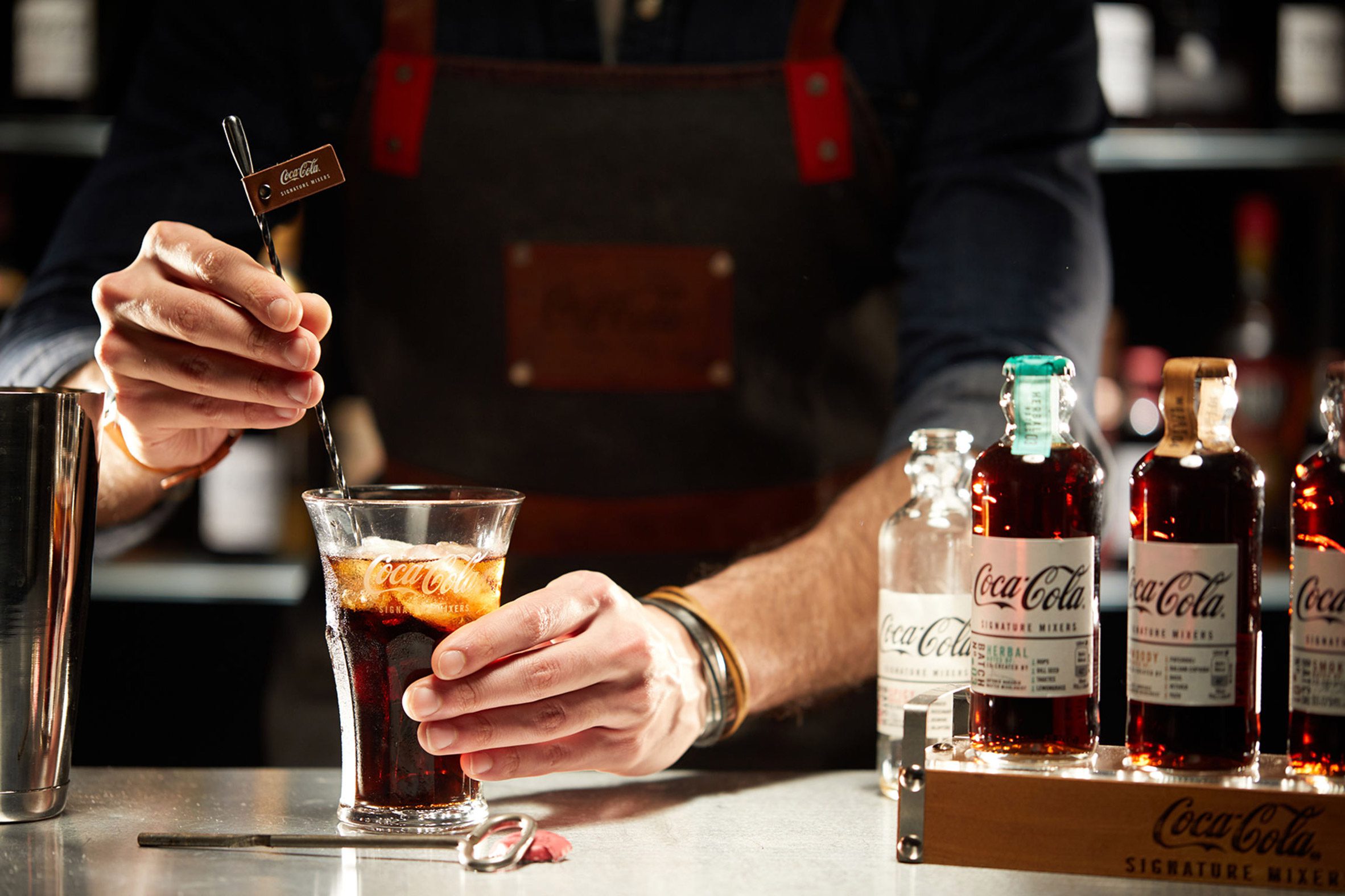
Dragon Rouge Coca-Cola Signature Mixers Creation
Coca-Cola's Signature Mixers bottle design is a reimagination of the brand's first glass bottle from 1899. It aims to combine the familiarity of Coca-Cola with contemporary mixology aesthetics and won a prestigious iF Gold Award in its category.
Project: Dragon Rouge Coca-Cola Signature Mixers Creation
Manufacturer: Coca-Cola GmbH
Designer: Dragon Rouge GmbH
Category: Beverages
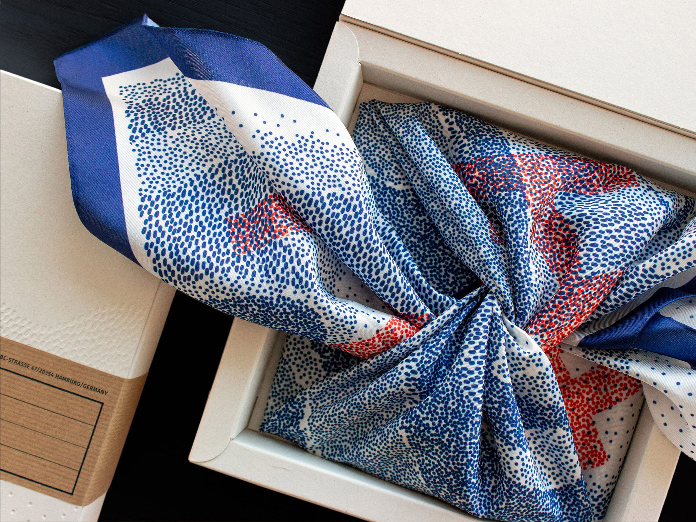
Grace of Waste – the upcycled Furoshiki
Furoshiki is a reusable cloth inspired by the Japanese tradition of wrapping gifts in a reusable material.
It is made from ocean plastic and features a pattern that illustrates the location of floating islands of garbage in the oceans.
Project: Grace of Waste - the upcycled Furoshiki
Manufacturer: Peter Schmidt Group
Designer: Peter Schmidt Group
Category: Industry
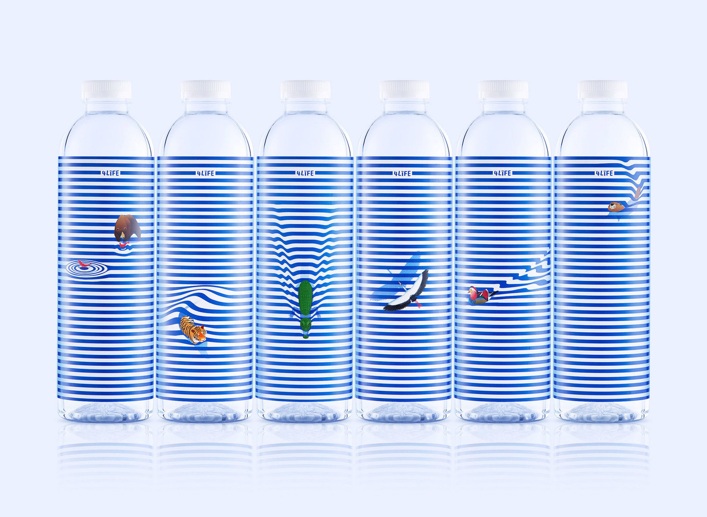
4Life Mineral Water by Doi Chaang
4Life Mineral Water is spring water sourced from Doi Chaang, a forest in northern Thailand.
Its design references how important water is to forest animals and intends to raise awareness of the local habitat.
Project: 4Life Mineral Water
Manufacturer: Doi Chaang Coffee Original
Designer: Prompt Design
Category: Beverages
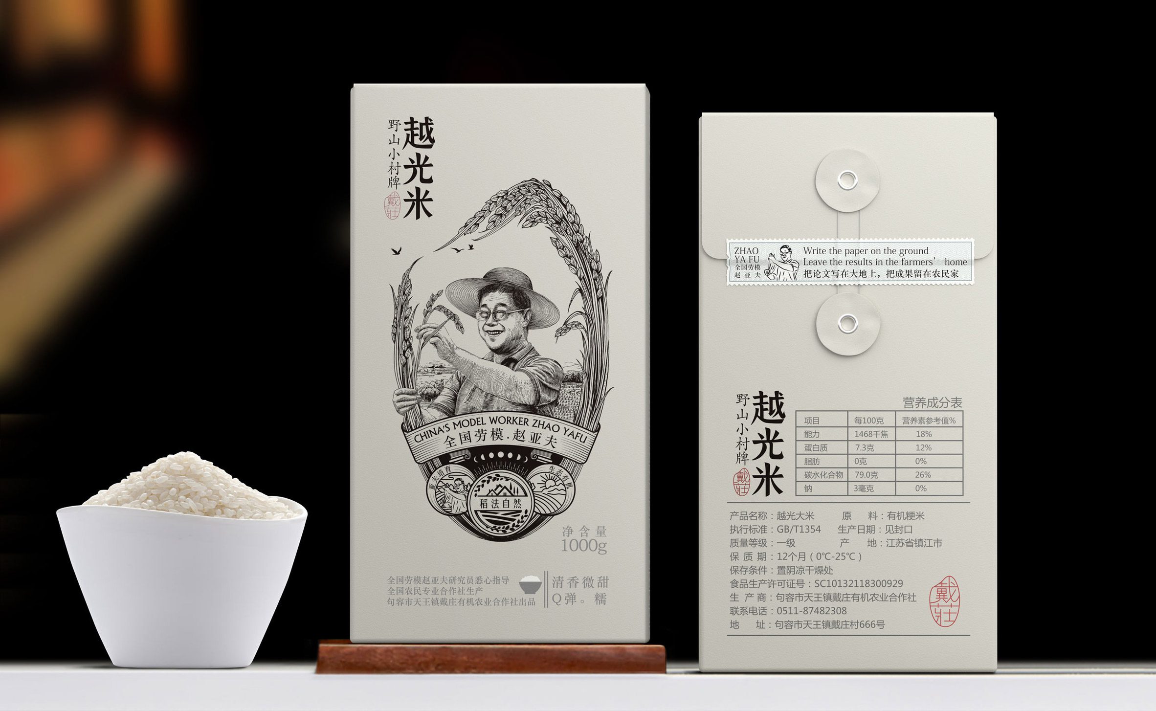
Yafu Rice
The outer packing of Yafu Rice includes an illustration of a trusted figure in Chinese culture called "China's Model Worker," based on agricultural scientist Zhao Yafu.
The inner bag features a seal that gives the packaging a handcrafted feel.
Project: Yafu Rice
Manufacturer: Shenzhen Bob Design
Designer: Shenzhen Bob Design
Category: Food
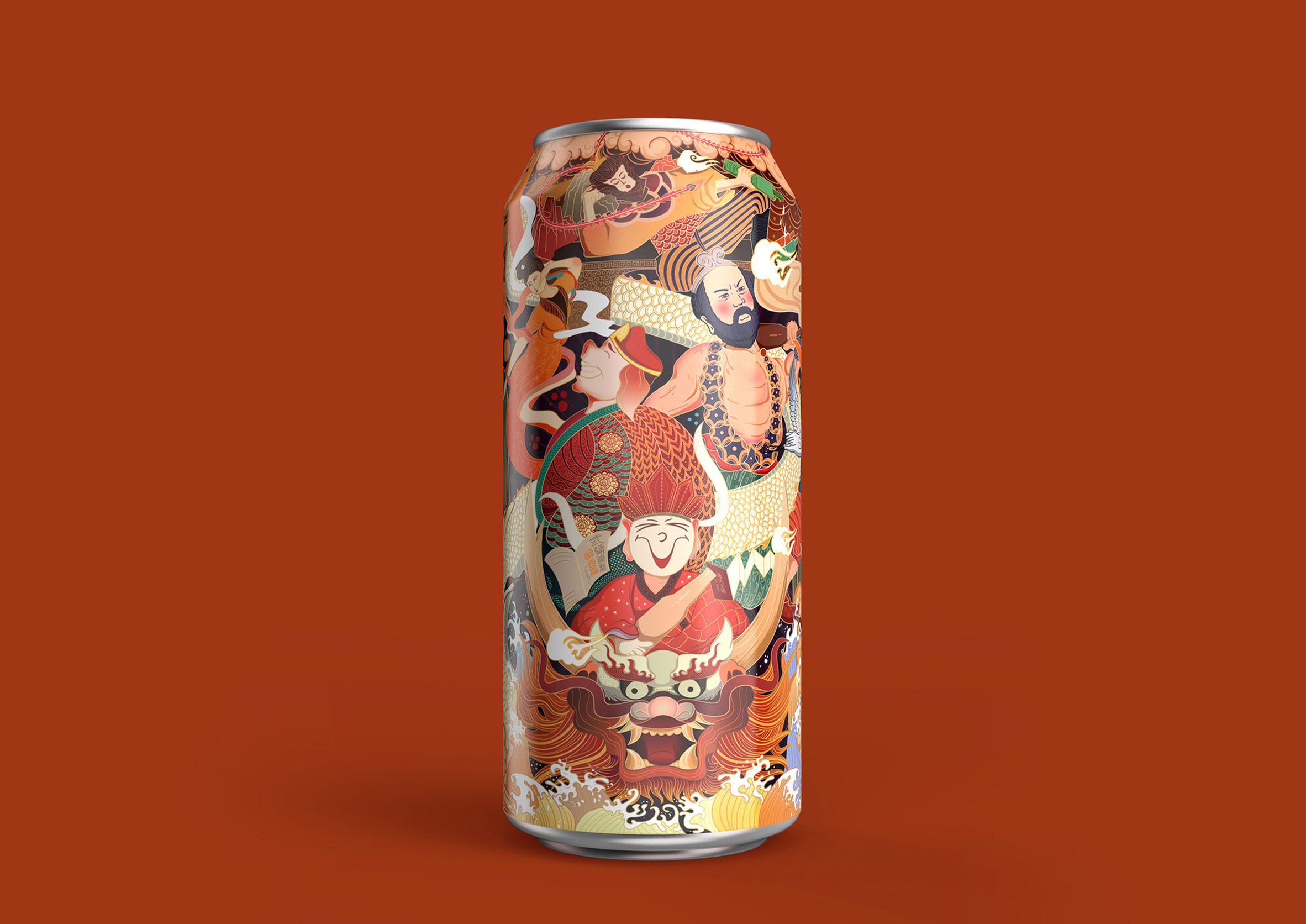
Dou You Ji
Dou You Ji is a beer can with bold, colourful graphics intending to reference scenes from Journey to the West, a Chinese legend here represented by humorous images.
Project: Dou You Ji
Manufacturer: Shenzhen Chengzui Cultural
Designer: Shenzhen Oracle Creative Design Co.
Category: Beverages
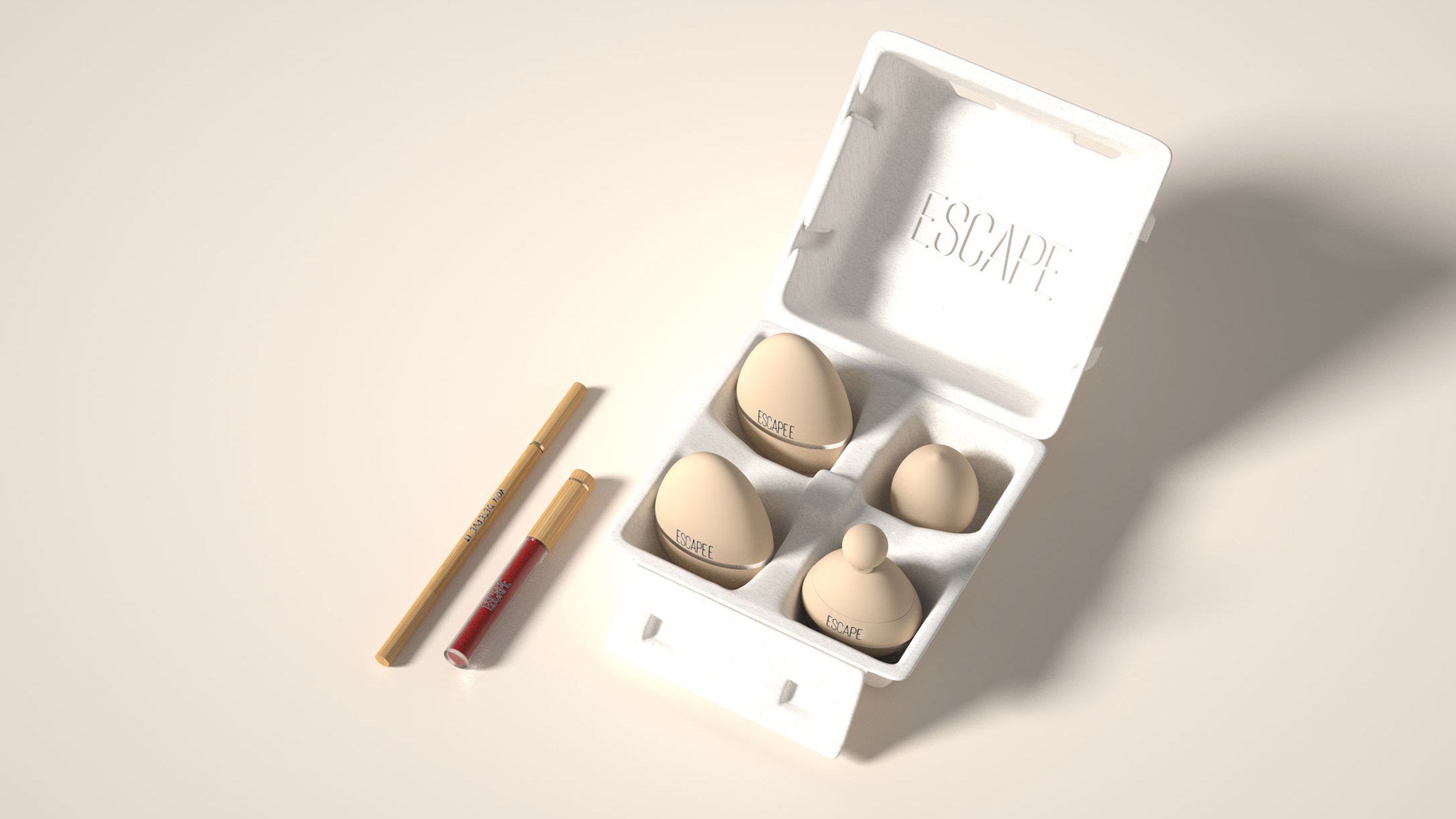
BXL Polaris Team
BXL Polaris Team is a package design for liquid foundation, based on the design of an egg carton. The bottles are partly transparent so that users can easily distinguish between products.
Project: BXL Polaris Team
Manufacturer: Shenzhen Baixinglong Creative Packaging
Designer: Shenzhen Baixinglong Creative Packaging
Category: Beauty/Health
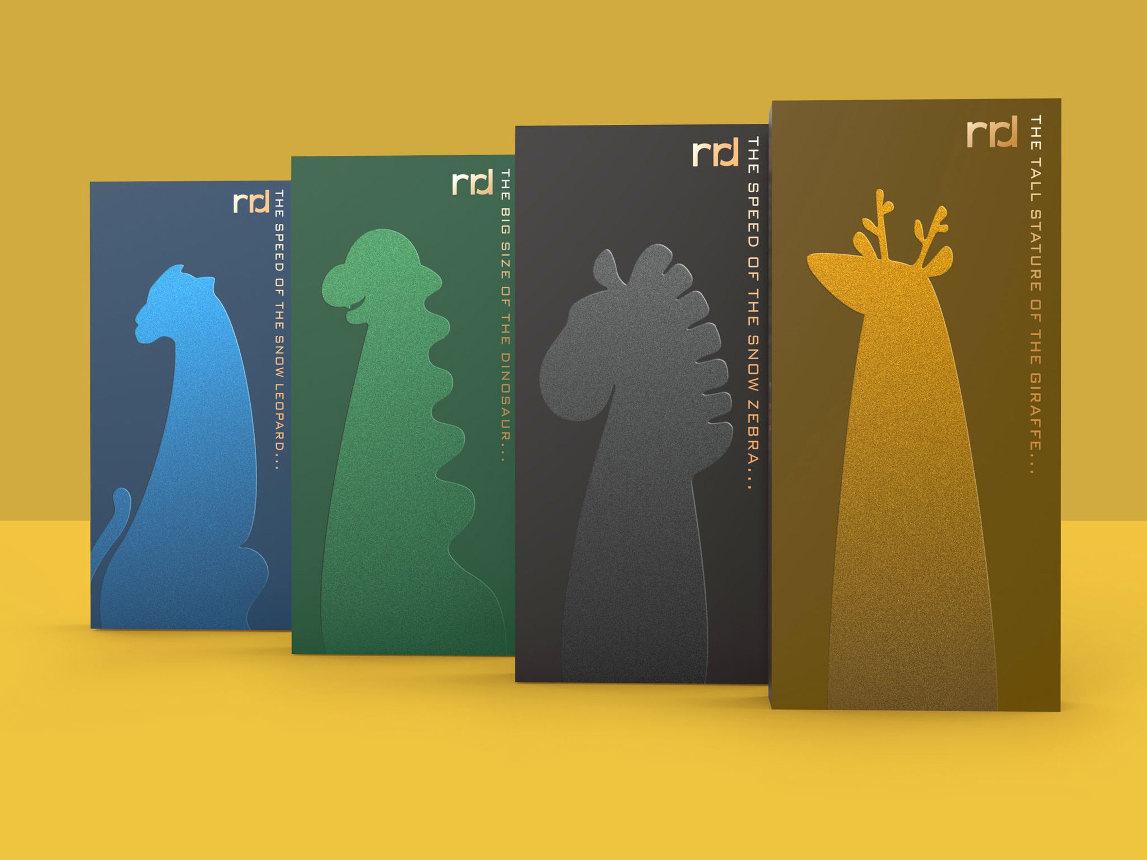
RRD Pen packaging
These children's pens have abstracted silhouettes of animals illustrated on their packaging, and are made from reusable and eco-friendly materials. Each pen is covered in animal skin patterns.
Project: RRD Pen packaging
Manufacturer: Dongguan Donnelley Printing Co
Designer: Dongguan Donnelley Printing Co
Category: Consumer products
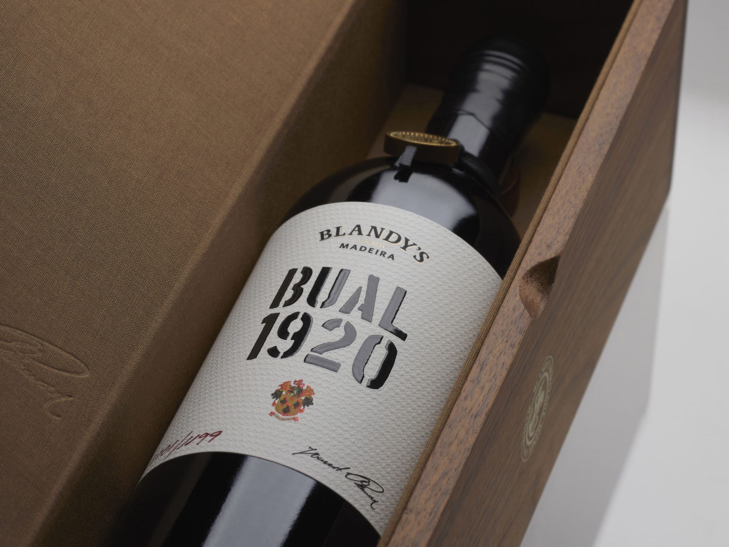
Blandy's Bual 1920
This is the first wine from the Blandy's Heritage Wine Collection, a collection of Madeira wines.
Its packaging pays homage to Blandy winemakers and their family history.
Project: Blandy's Bual 1920
Manufacturer: Blandy's
Designer: Omdesign
Category: Beverages
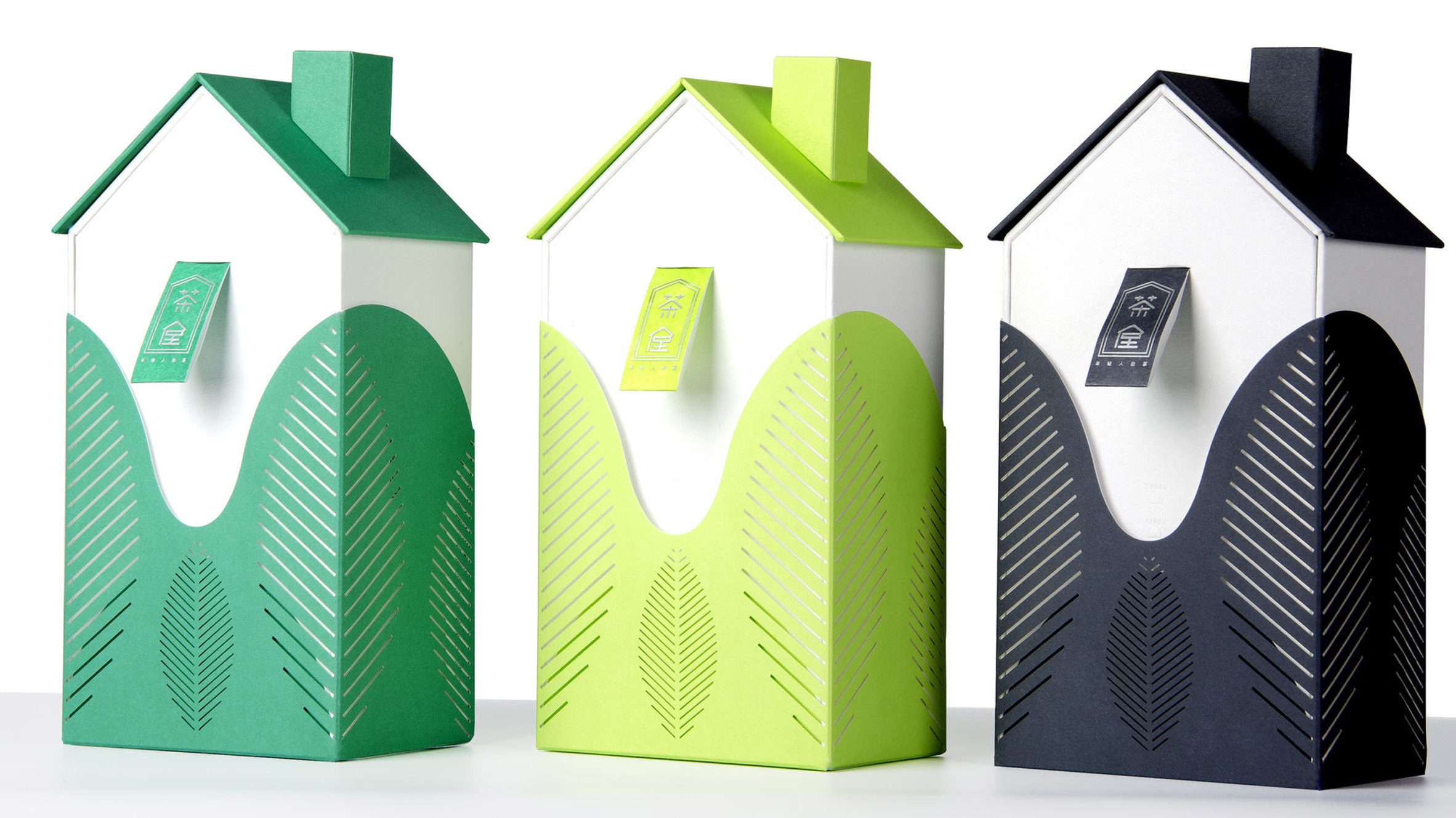
Tea House tea packaging
This tea packaging was designed to be interactive and aims to establish a new relationship with consumers by encouraging young people to experience different types of tea.
Project: "Tea House" tea packaging
Manufacturer: ZRP Printing Group Co
Designer: ZRP Printing Group Co
Category: Beverages
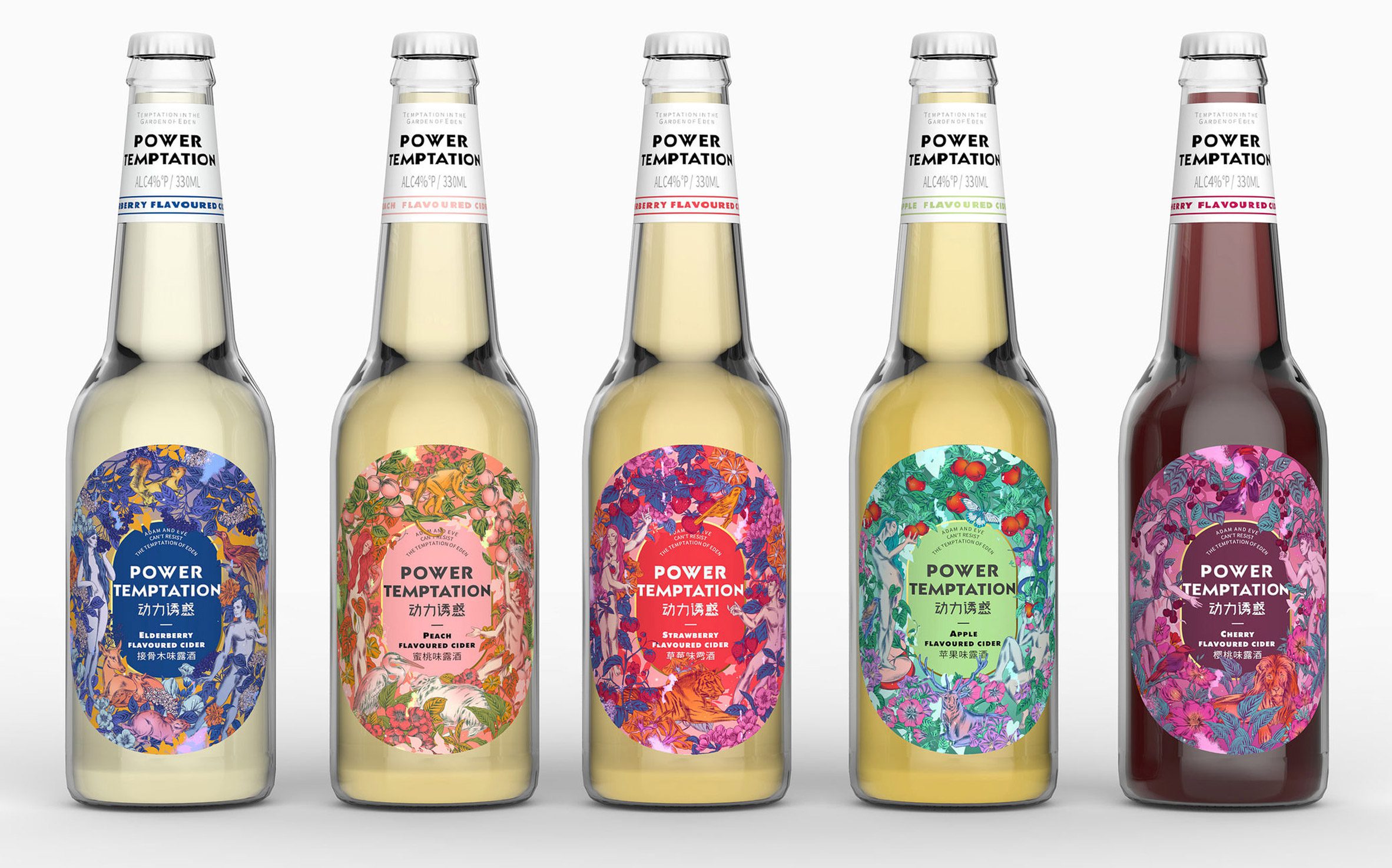
Power Temptation
The "Power Temptation" bottle was designed for the young Chinese market.
It features decorative labels that tell the story of Adam and Eve and their time in the Garden of Eden.
Project: Power Temptation
Manufacturer: Left and Right Creative Design (Shenzhen) Co
Designer: Left and Right Creative Design (Shenzhen) Co
Category: Beverages
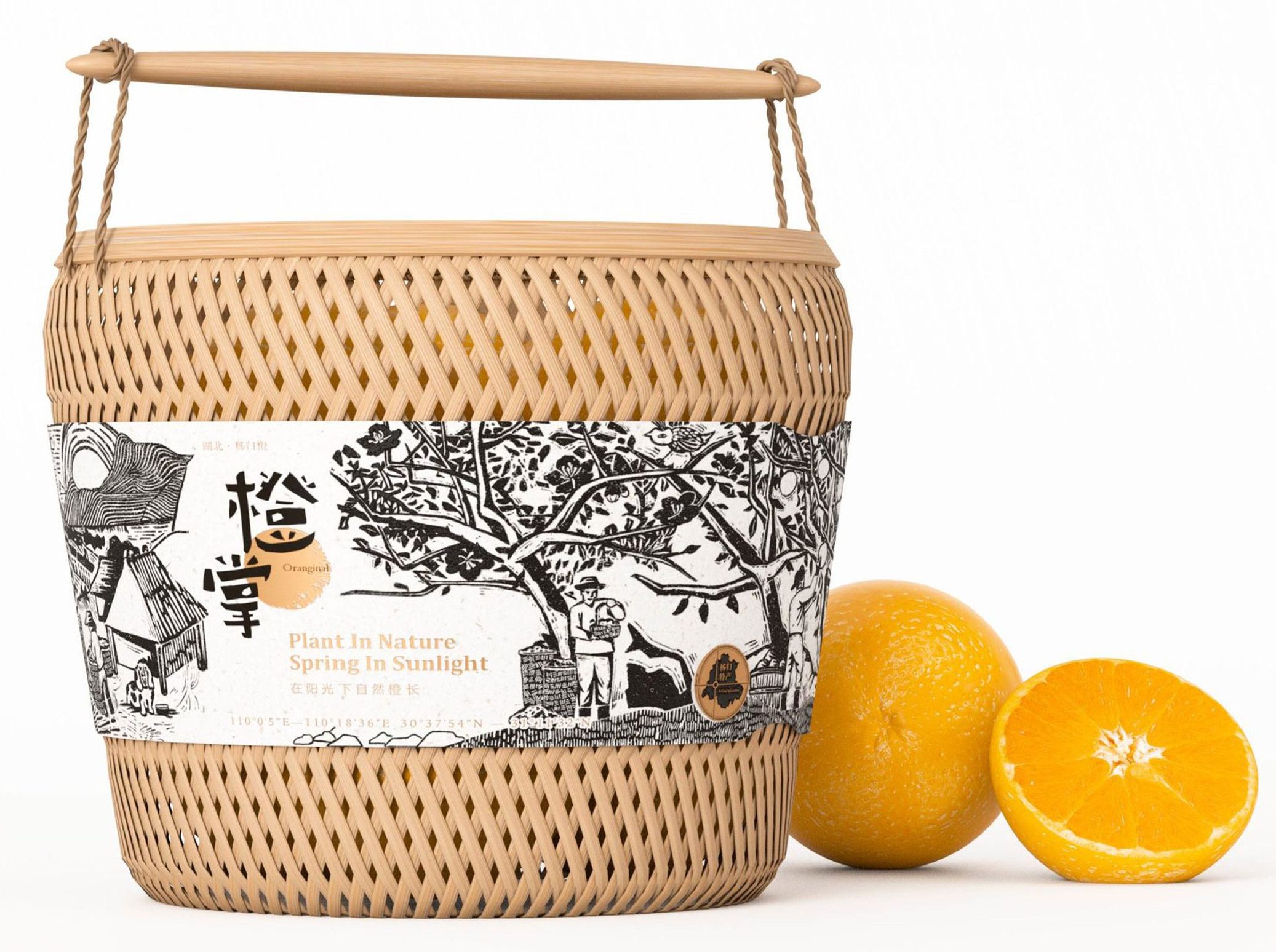
Oranginal
Orange + Original's design references Chinese fruit cultivation. Its packaging includes woven bamboo baskets and aims to raise awareness about the hard work of fruit farmers and show the distinguished tradition of crafts in Chinese culture.
Project: Oranginal
Manufacturer: inDare Design Strategy Limited
Designer: inDare Design Strategy Limited
Category: Food
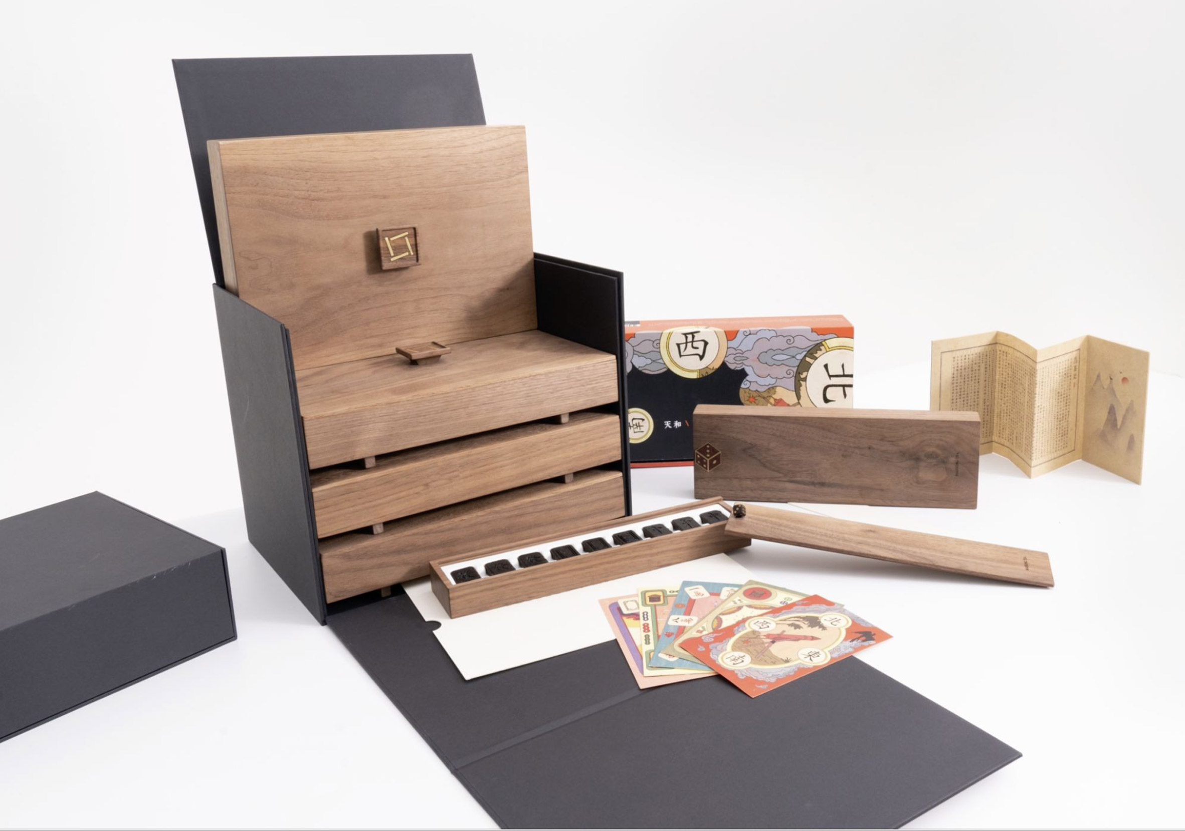
Mahjong Tea
Mahjong Tea's packaging design hopes to enhance the enjoyment of drinking tea.
Its tea box is made of untreated wood and brass. As the box ages, it develops a decorative patina.
Project: Mahjong Tea
Manufacturer: Suncharm Media Co
Designer: Suncharm Media Co
Category: Beverages
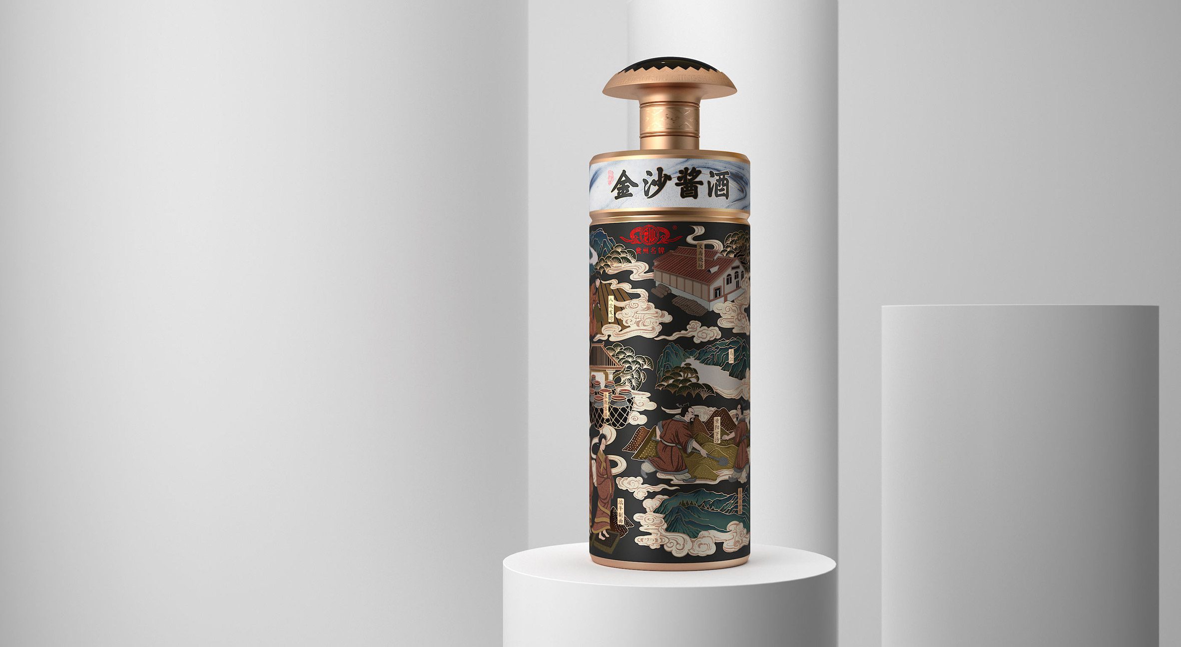
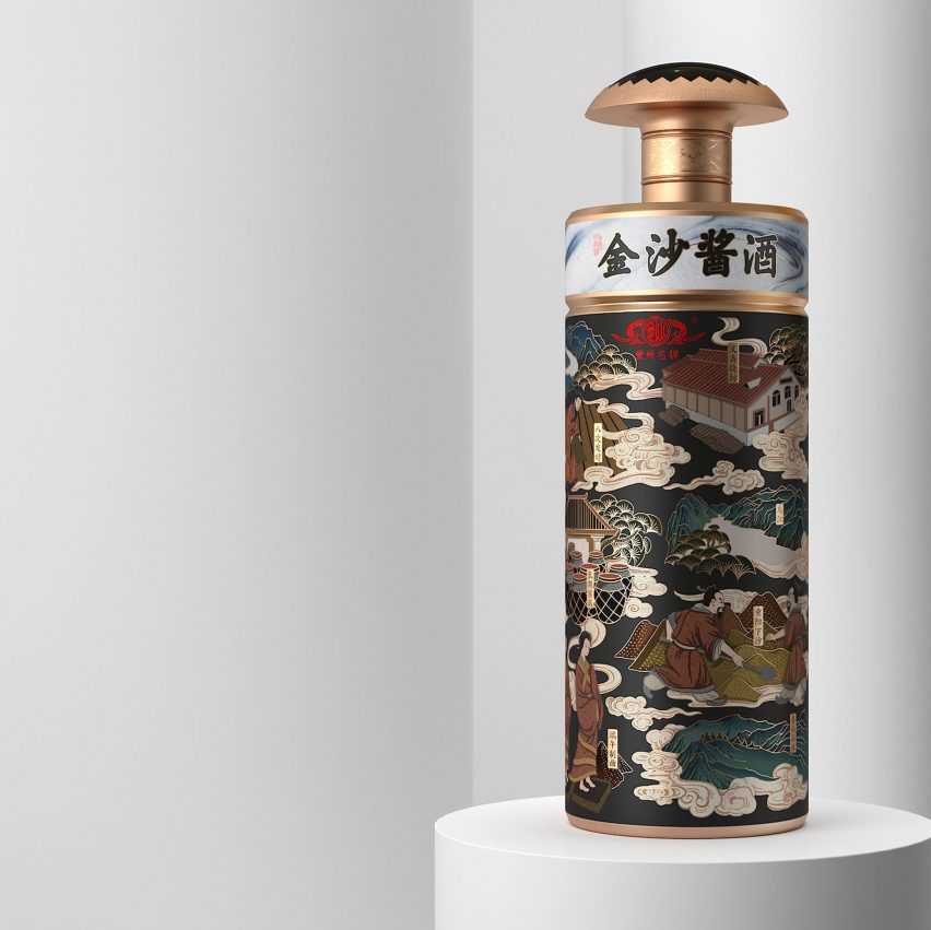
Jinsha sauce liquor
This packaging design intends to represent the brand's historical origins, depicting its ancient brewing techniques.
The outer box has an abstract graphic design created with Chinese ink washes and its top cover unfolds like a picture scroll.
Project: Jinsha sauce liquor
Manufacturer: Shenzhen Chaopai International
Designer: Shenzhen HJRdesign Consultant Co
Category: Beverages
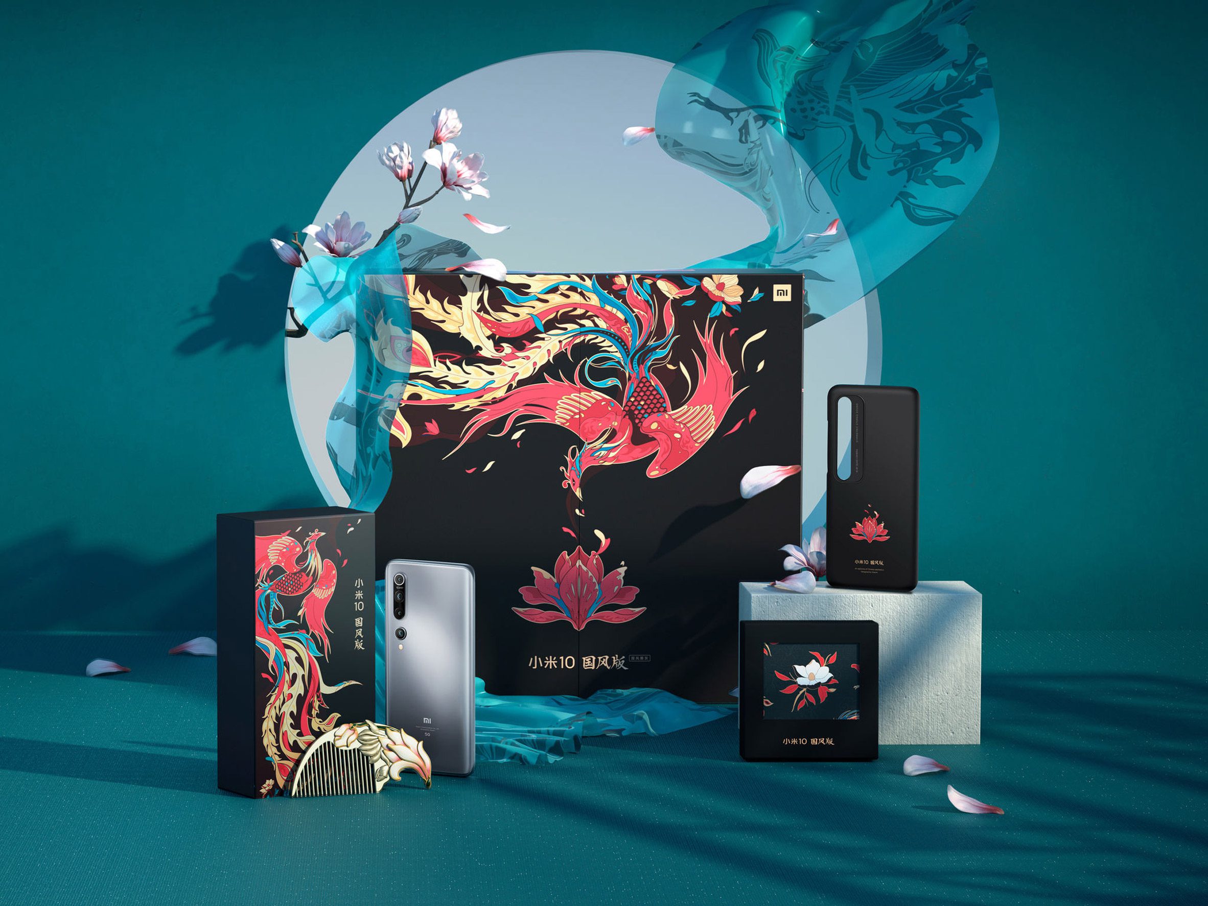
Mi 10 national style version of packaging design
The design of this smartphone gift set is a response to the trend of Chinese cultural icons used in packaging. The boxes feature bold images that relate to Chinese culture.
Project: Mi 10 national style version of packaging design
Manufacturer: Xiaomi
Designer: Xiaomi
Category: Consumer Products
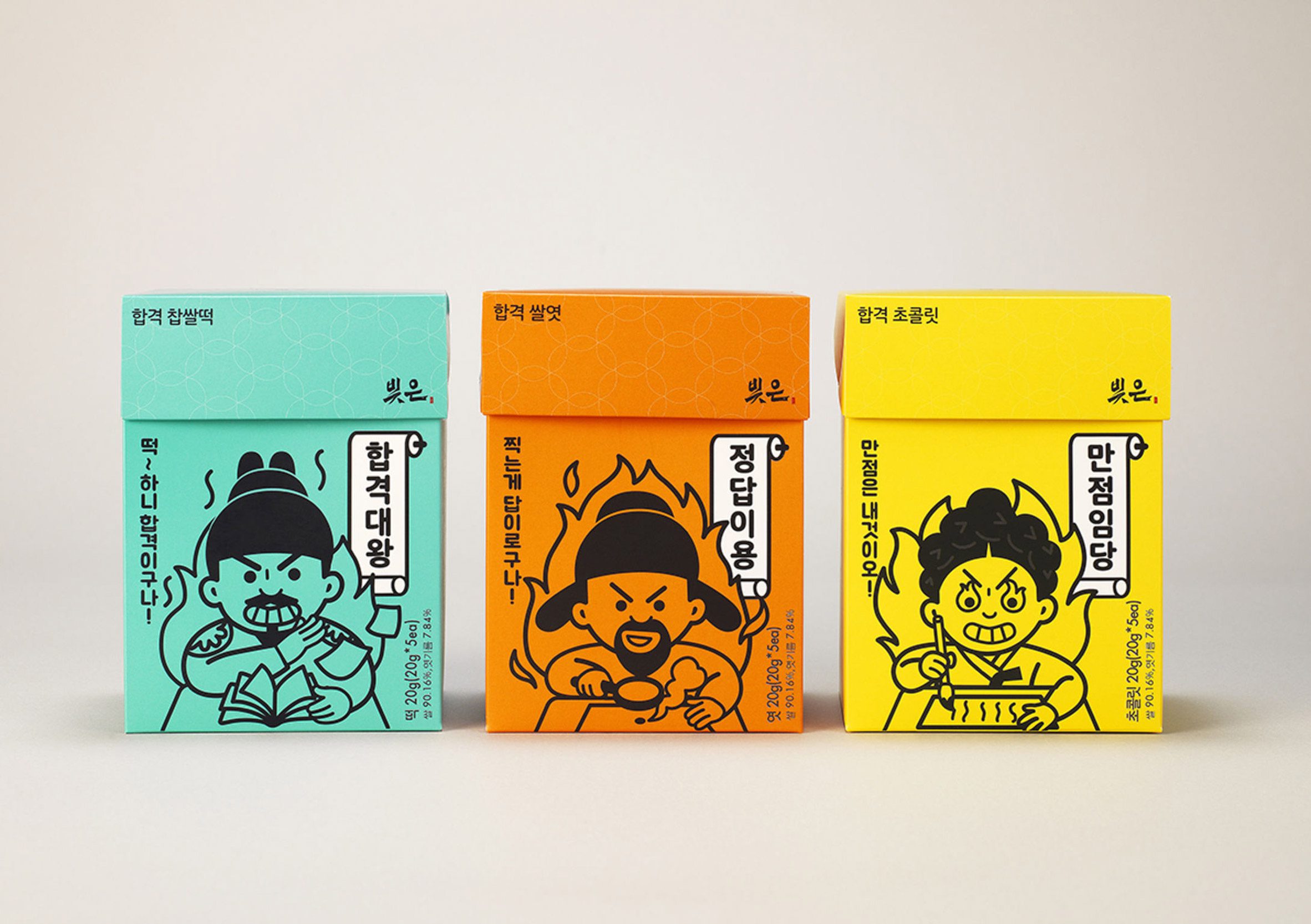
Bizeun gift set for the examinee
The Bizeun gift set for Korean sticky rice cake packaging depicts Korean cultural leaders.
Its colourful illustrations aim to encourage students to prepare for their exams.
Project: BIZEUN GIFT SET for the examinee
Manufacturer: SPC Group
Designer: SPC Group
Category: Food
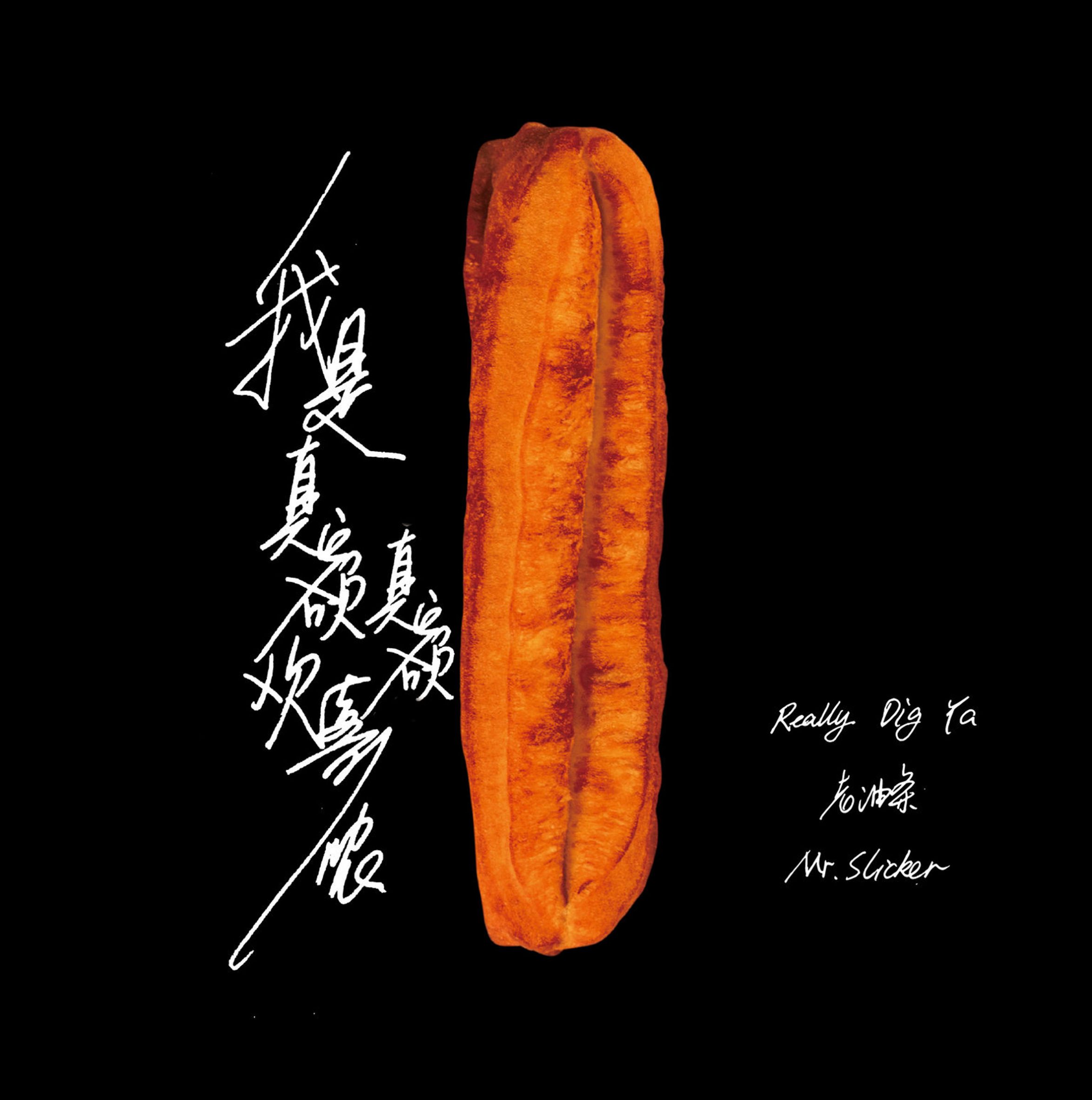
Really Dig Ya
Singer Zhou Yong's folk music album Really Dig Ya features lyrics in the regional Shanghai dialect, which more and more young people can't speak, according to the singer.
The album cover draws attention to Shanghai's culture and references a deep-fried dough stick, a local favourite food.
Project: Really Dig Ya
Manufacturer: China Digital Culture Group
Designer: Bangqian Zheng, Shanghai Dongxiang Culture Communication Co
Category: Consumer products
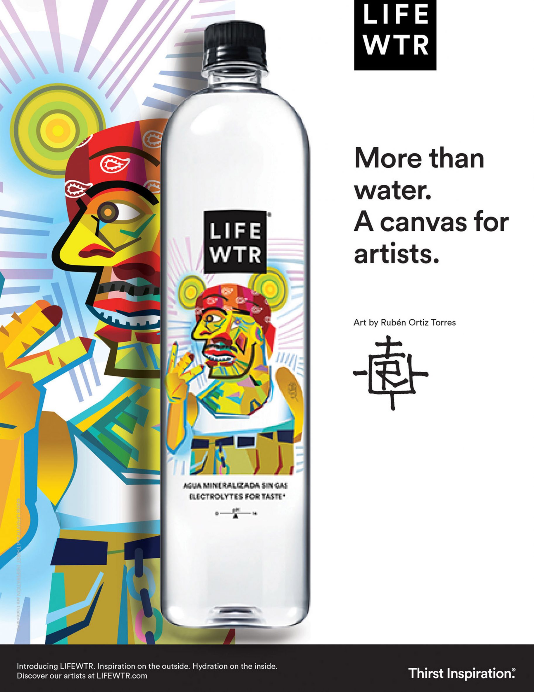
LIFEWTR S1 Arte Sin Fronteras Mexico
In 2019, LIFEWTR launched Mexico with Art Without Borders, a series exploring the power of art to foster cultural understanding. This is a continuation of the project.
Project: LIFEWTR S1 Arte Sin Fronteras Mexico
Manufacturer: PepsiCo
Designer: PepsiCo
Category: Beverages
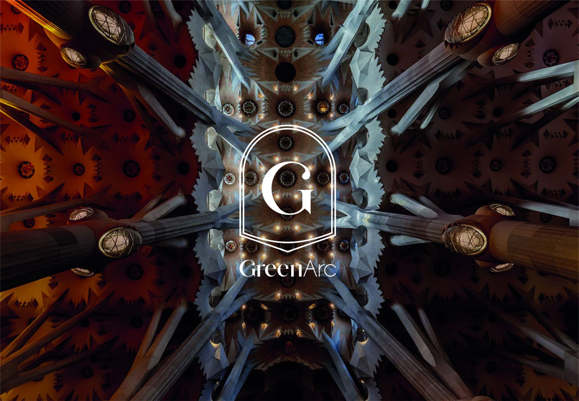
GreenArc
GreenArc is a creative partnership that references Roman Catholic imagery in its packaging.
Divine Lumiere, its first collection, features a shopping tote bag informed by the La Sagrada Familia basilica. An illustration of the building's architecture is printed on the inside of the bag.
Project: GreenArc
Manufacturer: B:SCOPE
Designer: B:SCOPE
Category: Consumer products

MMINNI liquor packaging
MMINNI-X-lab is a brandy designed to appeal to young people. Its colourful packaging and vessels that look like laboratory bottles are intended to represent young people's "fearless spirit of exploration".
Project: MMINNI liquor packaging
Manufacturer: Yantai Changyu Pioneer Wine Company
Designer: Shenzhen Oracle Creative Design Co
Category: Beverages
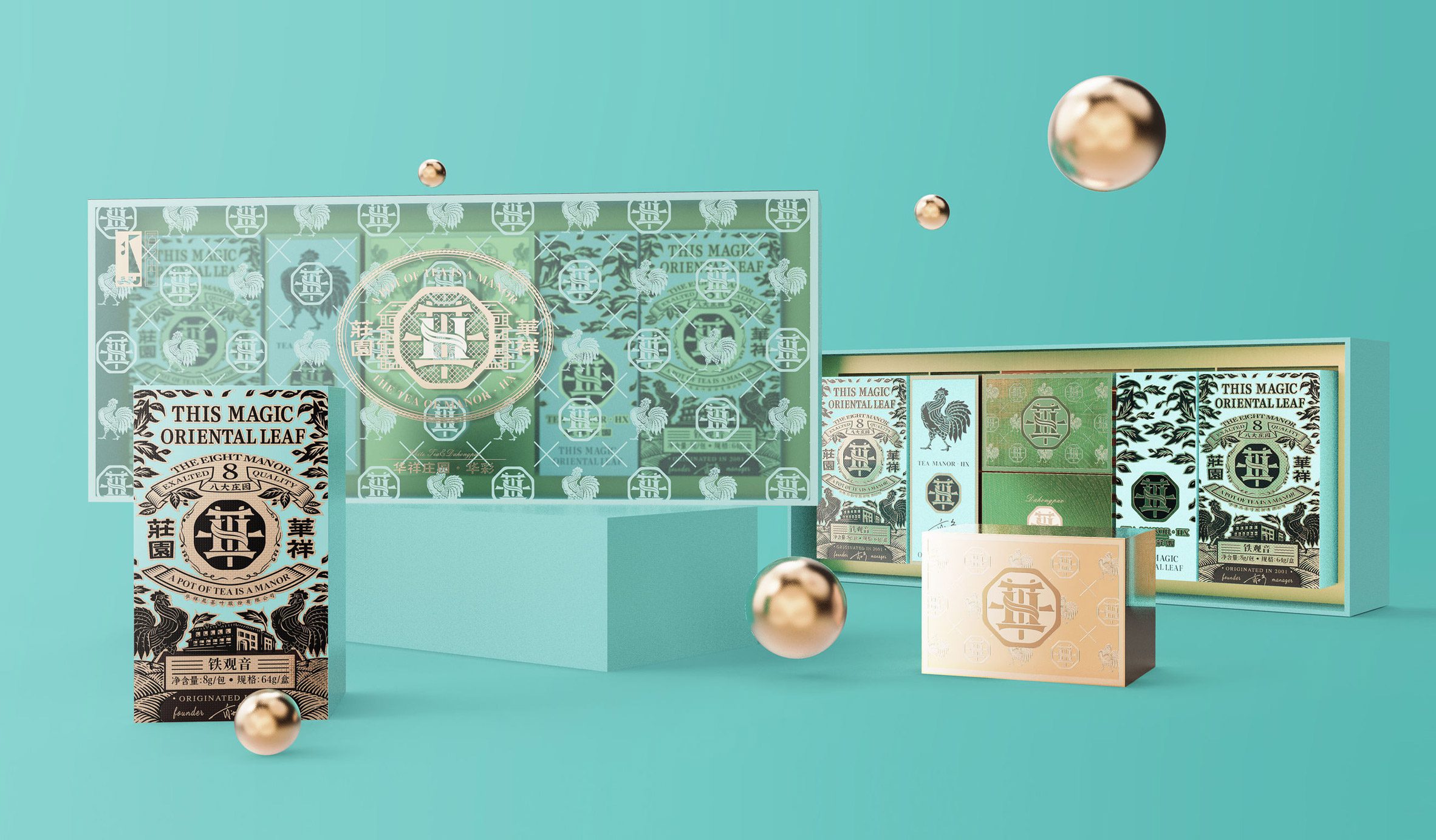
Huaxiang Manor Tea
Huaxiang Manor Tea's design intends to express the natural beauty of the environment where the tea has grown.
This includes the estate's gardens and house, introducing the consumer to the teas but also to Huaxiang Manor.
Project: Huaxiang Manor Tea
Manufacturer: Shenzhen Qianhai Phecda Creative Design Co
Designer: Shenzhen Qianhai Phecda Creative Design Co
Category: Beverages
Partnership content
This article was written by Dezeen for iF Design Award as part of a partnership. Find out more about Dezeen partnership content here.
The post iF Design Award 2021 winners use packaging design to create engaging narratives appeared first on Dezeen.
from Dezeen https://ift.tt/3ArlScO