Sunday 17 October 2021

Lucabe Coffee Company opens in mid-century Indiana bank building

The exterior of the coffee shop

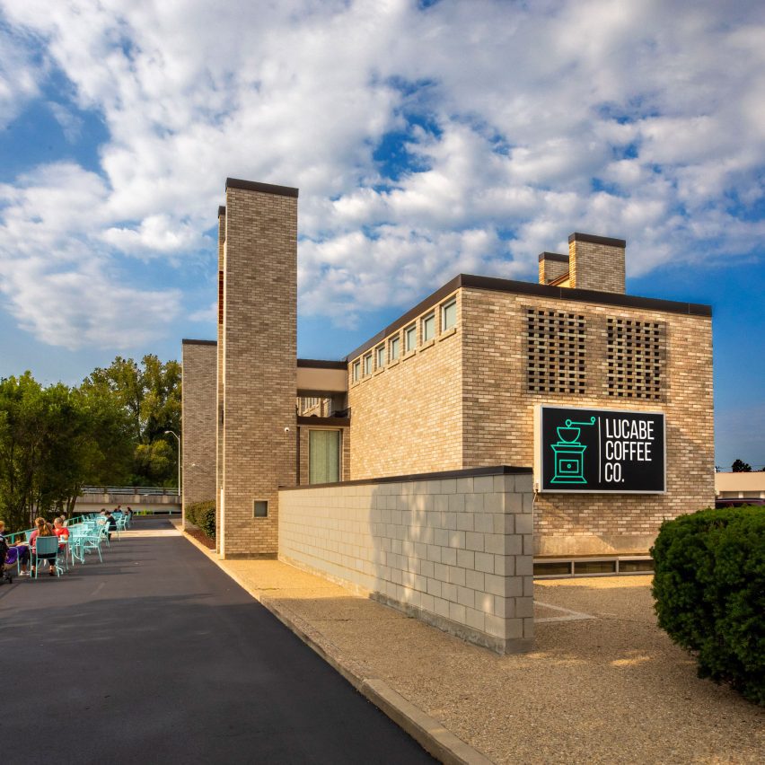
The Irwin Union Bank building in Columbus, Indiana, originally designed by notable American architect Harry Weese, has reopened as a coffee shop.

After being left vacant for a year, the glazed brick structure is now home to the second location of local coffee chain Lucabe Coffee Company.

The exterior of Lucabe Coffee Company's cafe
Lucabe Coffee Company has opened a cafe in an old bank building in Columbus

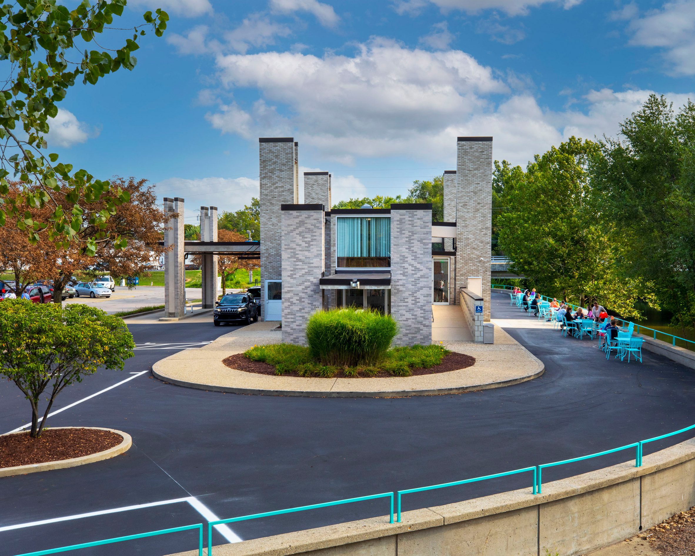
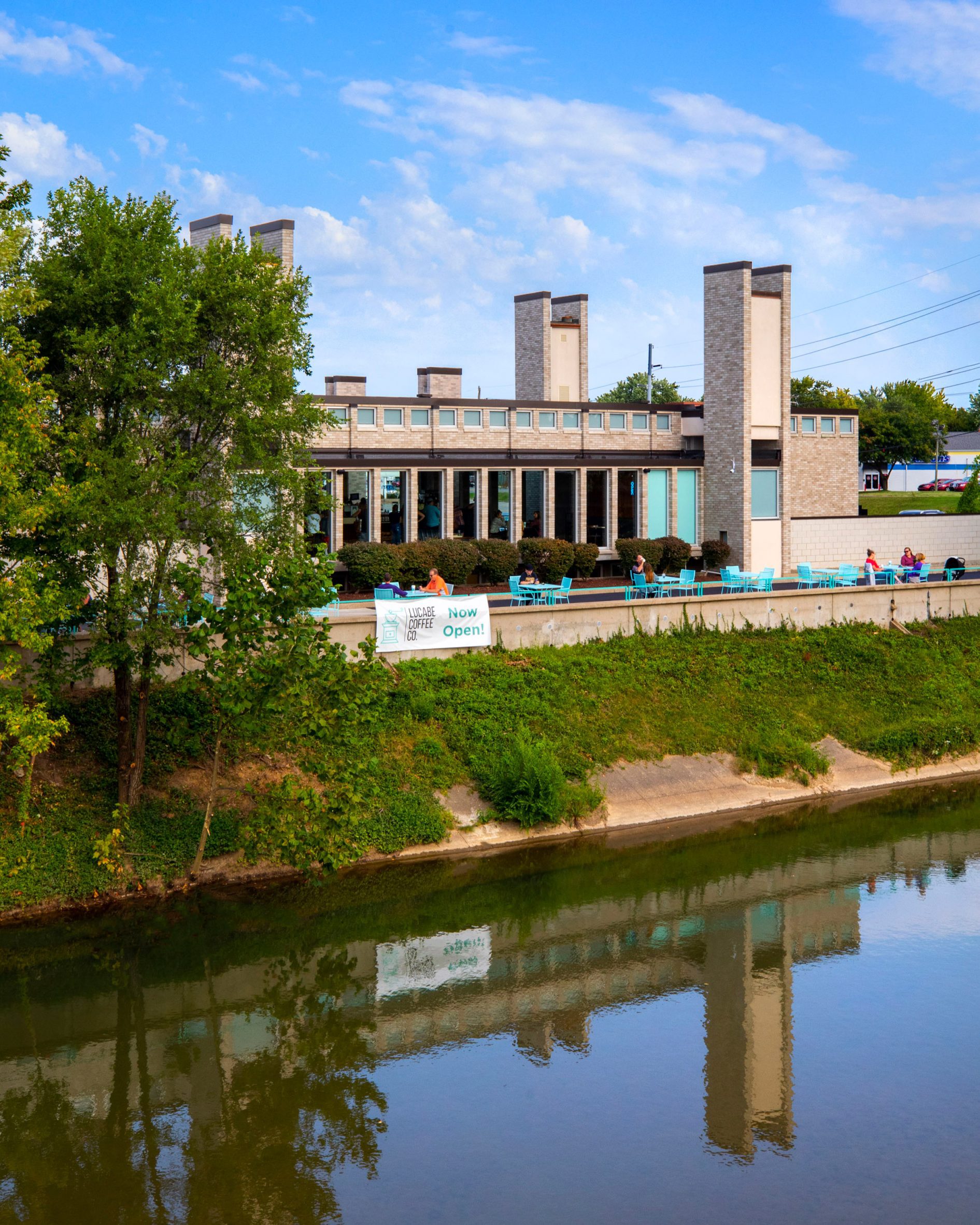
Dating back to 1961, the bank building is affectionately known by the community as the "dead horse," after its four crenellated towers which rise up like the limbs of a horse on its back.

When Weese originally designed the building, these towers were rather meant to evoke "a child's vision of a castle," according to a press release from the Landmark Columbus Foundation – a local nonprofit dedicated to preserving the city's architectural heritage.

Glazed brick building of Lucabe Coffee
The team decided to keep many of the building's existing features

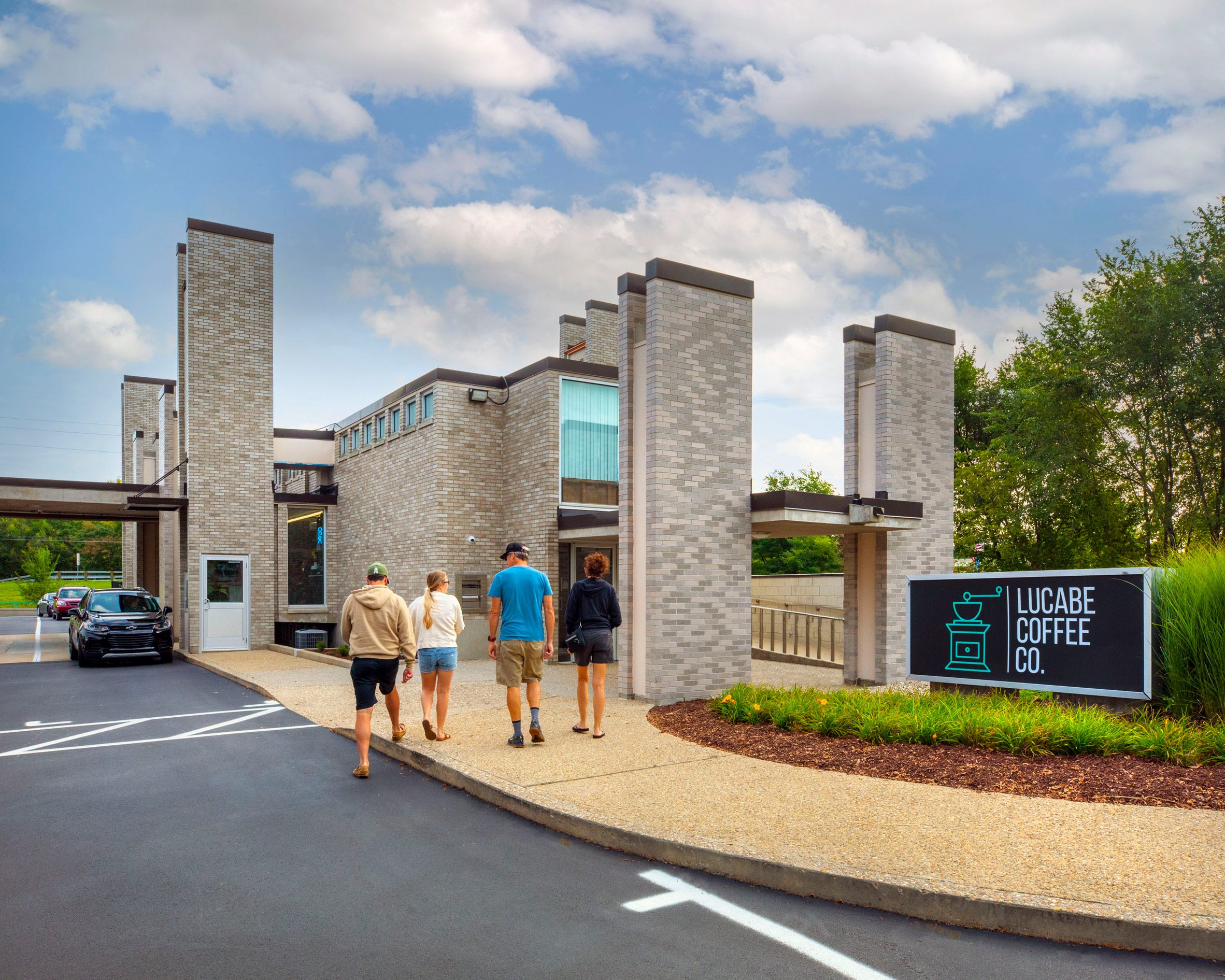
Repurposing the building entailed a light-touch renovation, which was completed by owners Tyler and Alissa Hodge, alongside local architecture studio Daugherty Design Plus. "This was very much a DIY project done by the owners of Lucabe Coffee Company with help from others in the community," said a spokesperson for the project told Dezeen. "It was a uniquely 'Columbus' undertaking in that way."

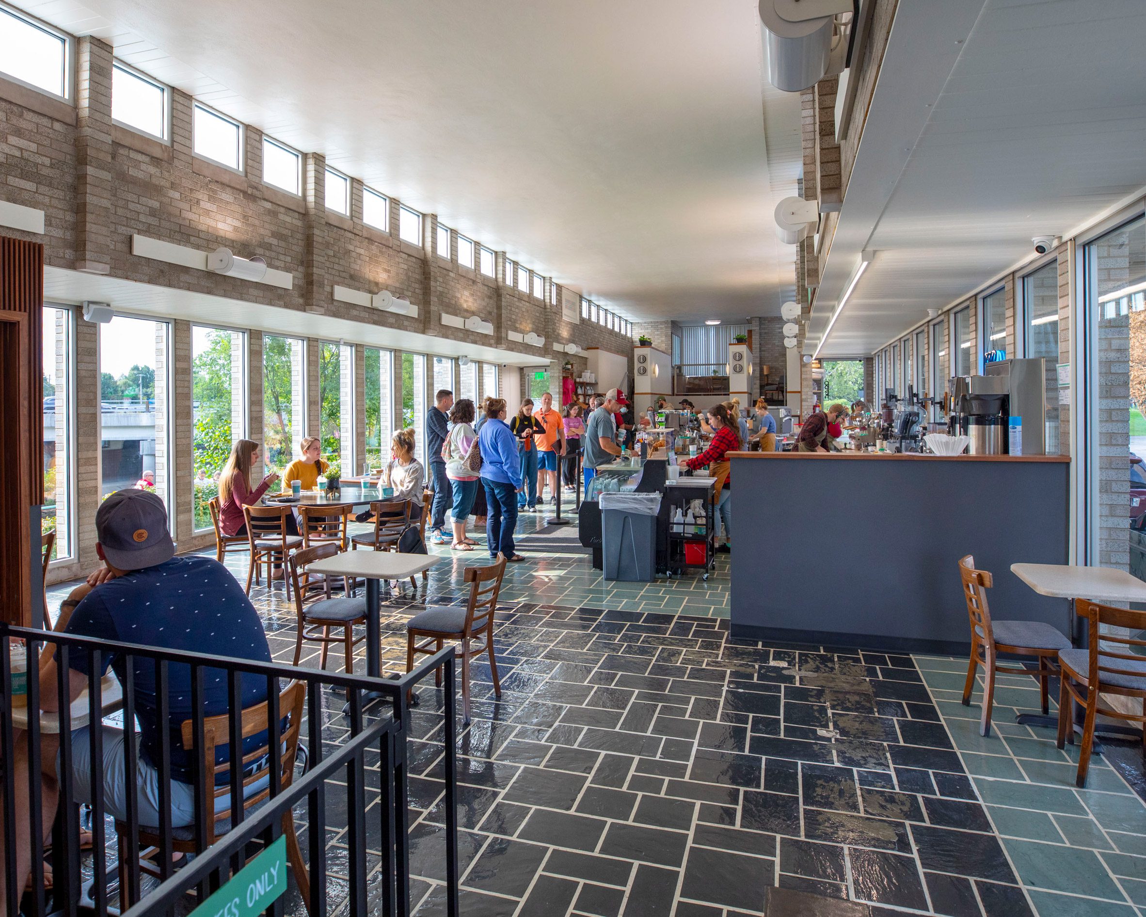
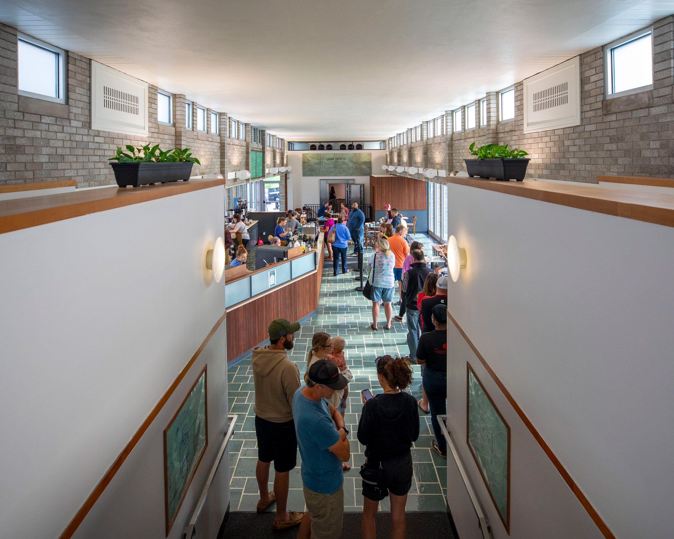
The intervention focused on preserving the original features and highlighting them wherever possible. For instance, the bank's drive-through window still acts as a service counter for customers to pick up coffee from their cars.

Cars queue up to park at Lucabe Coffee cafe
The bank's drive-through window is still in use

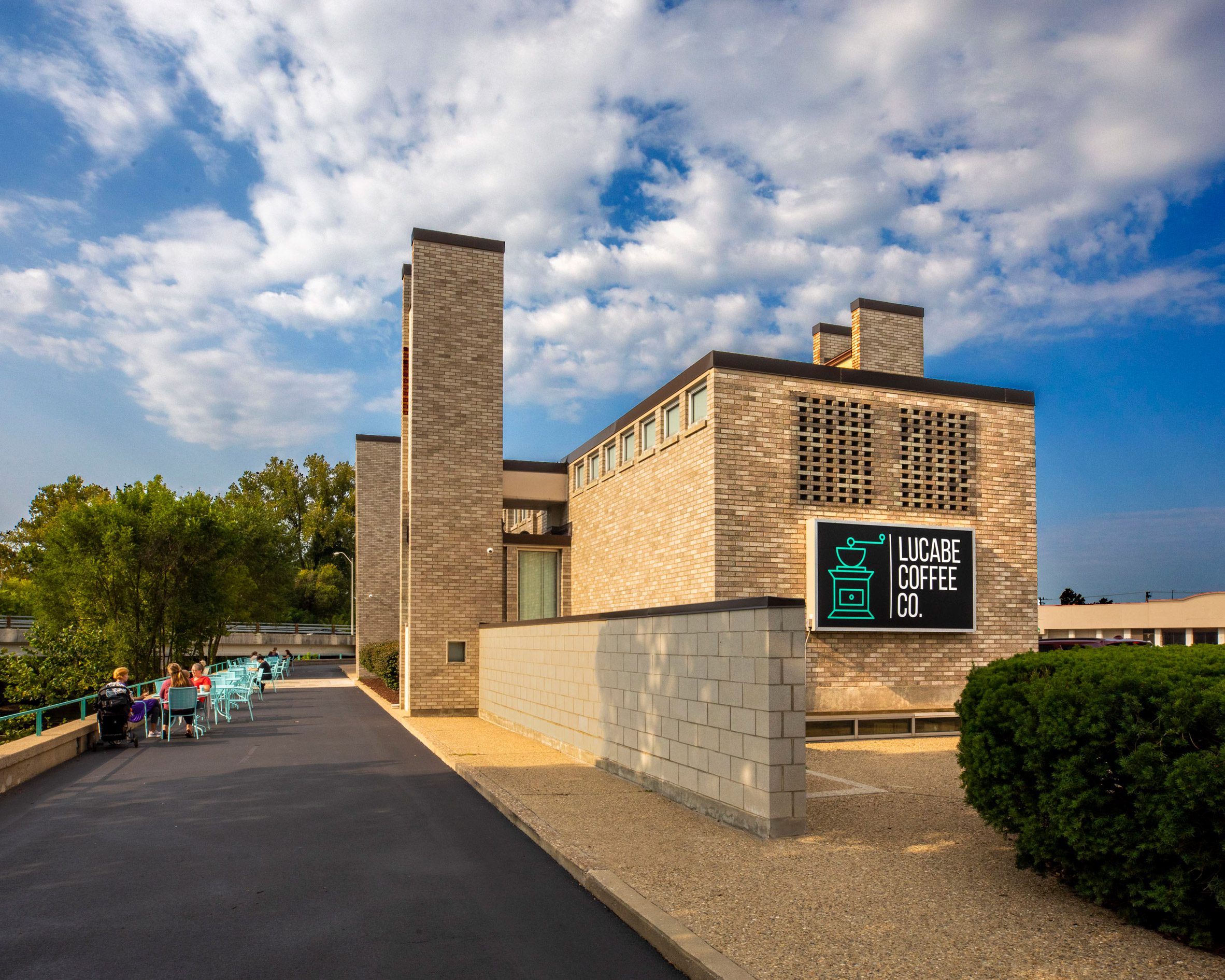
Carpets and several layers of glue covering the interior floors were cleared out to reveal the original interlocked stone pattern the architect had intended.

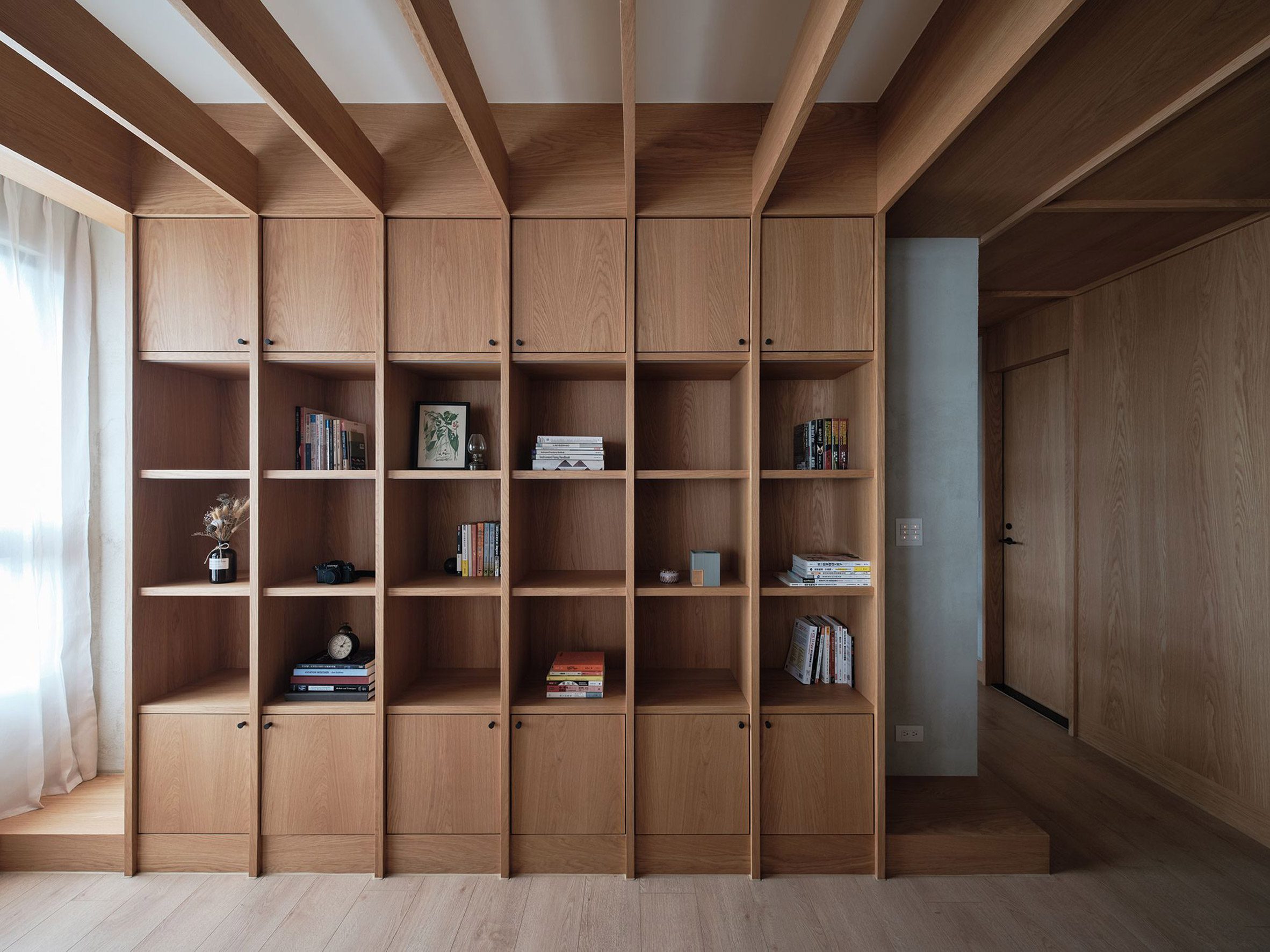
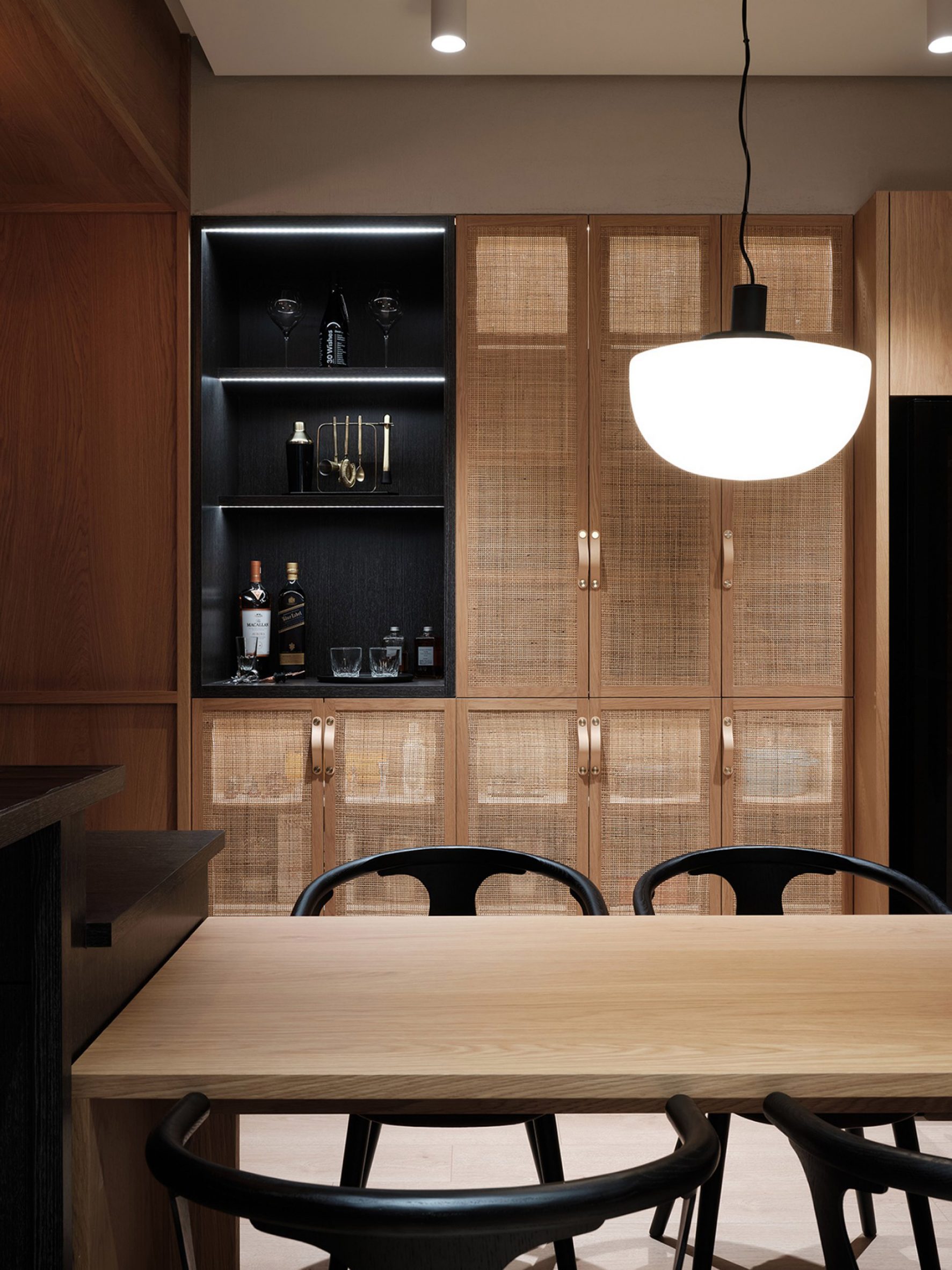
"The inside of the building is inspired by the modern design of that era, featuring black, wood, and grey elements and a nod to the original interior with an open view to the vault," the Landmark Columbus Foundation explained.

Lucabe Coffee Company has also made the most of the building's location overlooking the Haw Creek River, along which runs a trail popular with cyclists and joggers, to include exterior seating for its patrons.

The Landmark Columbus Foundation organises the Exhibit Columbus architecture festival, which this year coincides with the bank building's 60th anniversary.

Original patterned stone floors were uncovered and restored inside

This third iteration of the event, which spotlights the Midwest's contribution to American architecture, is themed New Middles: From Main Street To Megalopolis, What Is The Future Of The Middle City?

According to the city of Columbus, Harry Weese designed more buildings in the city than any other architect in the 1950s and 60s.

His others include an industrial compound for the Cummins engine corporation, and the First Baptist Church.

Weese also collaborated closely with Finnish expatriate Eero Saarinen, but is best known for his design of Washington DC's subway stations, recognisable for their vaulted structural system.

Customer seating enjoys scenic views of the Haw Creek River

Other coffee shops in unique settings include a café inserted into an industrial building in China's Northern Hebei Province, and an all-blue coffee shop by Julia Jamrozik and Coryn Kempster.

The photography is by Hadley Fruits, provided courtesy of Landmark Columbus Foundation.


Project credits:

Architect of record: Daugherty Design Plus
Design advising:  AtelierRISTING, Hitchcock Design Group, Schiller Projects, Landmark Columbus Foundation

The post Lucabe Coffee Company opens in mid-century Indiana bank building appeared first on Dezeen.


from Dezeen https://ift.tt/3AJSAX6

Loop Architects wedges Thy National Park visitor centre into dune landscape

Aerial view of coastal visitor centre

Danish firm Loop Architects has completed a visitor centre for Thy National Park in Northern Jutland, Denmark, which has a concrete structure that is embedded in the coastal landscape.

The building was designed by Loop Architects for a site in the small coastal village of Nørre Vorupør, which is located at the heart of the 244-square-kilometre park.

An aerial view of Thy National Park visitor centre
Top image: Loop Architects has completed a visitor centre for Thy National Park. Above: it is embedded into the landscape

It is intended as a gateway attraction to encourage passersby to explore the area, which became Denmark's first national park in 2008.

"We won the architectural competition in 2019 with a building that met the client's ambition for a visitor centre whose architecture gently nudges its visitors to enter and explore the park," said Loop Architects' partner Morten Nymann.

An visitor centre embedded in a dune landscape
Its roof is accessible to visitors

Loop Architects' design responds to criteria stipulated in the competition brief that the building should be integrated into the existing dune and heath landscape of Thy National Park.

The visitor centre features robust cast-in-situ concrete walls that emerge from the dunes and funnel visitors towards entrances from the adjacent road and car park.

A coastal visitor centre in Denmark
The centre is surrounded by concrete walls and paving

The landscape design by studio SLA allows visitors to walk around, alongside and on top of the building, enabling them to experience views over the sea, the village and the national park.

Walls that extend out from the building create sheltered public spaces that also frame views toward the surroundings.

The concrete walls and pavement outside the building have a warm tone intended to reference the local sand. These surfaces continue into the interior to enhance the connection between outside and inside.

Externally, the concrete is complemented by galvanised window frames and seating made from sawn wooden blocks that emphasise the connection with the natural setting.

Interiors of Thy National Park visitor centre
A large window frames outward views

Loop Architects chose a range of more refined materials for the building's interior, with wooden window frames and oak doors forming part of a neutral and natural palette.

The visitor centre's main space is an open central hall with entrances on two sides. A large window in the rear wall frames a view of the North Sea and the adjacent whitewashed fishermen's cottages.

Daylight pours into the space through the large opening, as well as through a skylight that spans the entire width of the rear wall and illuminates a display of the region's flora and fauna.

Danish visitor centre with wood and concrete interiors
Wooden window frames and oak doors feature inside

Elsewhere, Dorte Mandrup is also designing a visitor centre that is partially embedded into its coastal surroundings. Named The Whale, it will be used as a viewpoint for whale watching in Norway.

On the island of Serifos, Mold Architects submerged a house into a rocky hillside and incorporated large glazed openings that look straight out to sea.

Photography is by Rasmus Hjortshøj, COAST.

The post Loop Architects wedges Thy National Park visitor centre into dune landscape appeared first on Dezeen.


from Dezeen https://ift.tt/30oavpF

FWS_work designs Residence W as a tranquil retreat in the city

Residence W by FWS_work

Interior design studio FWS_work has used natural materials and neutral colours to complete this calming apartment renovation in Xinpu, Taiwan, designed to offer the owner a refuge from his busy job as a pilot.

Dubbed Residence W, the apartment was intended as an antidote to city life, with its entry, kitchen, reading, dining and living areas all combined into one bright, calm space.

Living area and bathroom of Residence W divided by wooden screen
FWS_work designed Residence W for a pilot in Taiwan

"The project focuses on creating a light-filled open space with a neutral palette of tactile materials to form sensory warmth and relaxation," explained FWS_work, which is based between New York and Taipei.

"The selective materials and joinery details evoke the owner's memories of his childhood country home, as well as Mediterranean retreats during travels."

Inbuilt shelving by FWS_work
Inbuilt shelving helps to keep the interior uncluttered

Based on the pilot's daily routine, which involves constant trips and only short stints at home, FWS_work designed an intuitive circulation defined by freestanding fixtures including a half-height divider that connects to the reading desk and the extended kitchen counter.

An existing structural beam was clad with oak wood panels to soften its appearance while creating a visual barrier between the functional kitchen and the laid-back living and dining area.

Kitchen with rattan doors in Residence W
Rattan cabinet doors in the kitchen reveal the tableware beyond

In the kitchen, black-stained millwork, encaustic ceramic tiles, leather handles and stone countertops were chosen to contrast with the otherwise neutral palette.

"The darkness of the kitchen and bar counter fosters a pure state of immersion that allows the owner to dive into his passions for cooking and whisky tasting," said the studio.

"The warm LED lighting penetrates through the rattan cabinet doors, accompanied with the reflections of glasses and tableware behind to enrich the backdrop."

In the hallway, which connects the apartment's open plan area with the bedrooms, one of the original partial partition walls was replaced with woven cane panels and ribbed glass.

This lets in sunlight while providing privacy and sound insulation for the rooms beyond.

Hallway with rattan screens by FWS_work
Light streams into the hallway through rattan screens

A circular wall light at the end of the corridor echoes the circular mirror at the apartment's entrance, offsetting the otherwise angular interior.

The bedroom features a similarly neutral colour palette, paired with a dark teal ceiling that creeps down onto the upper part of the walls to blur the boundary between the two.

Bedroom with teal ceiling and wooden furniture in Residence W
The bedroom has a teal ceiling

Residence W is shortlisted in the apartment interior category of the 2021 Dezeen awards.

Other projects in the category include a split level apartment set within the remnants of a 1970s brutalist commercial building and an apartment in Paris with a sinuous plywood wall that winds through its interior.

Photography is by Suiyu Studio.

The post FWS_work designs Residence W as a tranquil retreat in the city appeared first on Dezeen.


from Dezeen https://ift.tt/30AZ7qH

Jackson Clements Burrows designs mass-timber student accommodation in Melbourne

The facade has a multicoloured look

Australian studio Jackson Clements Burrows has completed a mass-timber student accommodation scheme at La Trobe University in Melbourne, Victoria, which has been shortlisted in the housing category of Dezeen Awards 2021.

Two sweeping arcs providing accommodation for 642 students hug a central courtyard on the 18,000-square-metre site, which is the first to complete in a new masterplan for the university's eastern residential precinct.

The buildings at La Trobe University have a curving form
Jackson Clements Burrows built the student housing using mass timber construction

With a total of 4,500 cubic metres of cross-laminated and glue-laminated timber used for its structure, the building is the largest mass-timber project in Victoria, an approach that saw it win out over a competing concrete design.

The local studio aimed to create a design that would mediate between the large scale of the buildings and "finer grain" experiences for residents, with numerous through-routes uniting the buildings with the courtyard and surrounding paths.

La Trobe University student accommodation has a colourful exterior
Aluminium sun panels in a variety of colours clad the exterior of the building

"The radial forms negotiate their way around the established gum trees which flank the site boundary and form sculptural clusters," explained the studio.

"While both buildings have respective 'front doors' to the street network, a finer grain of pathways sneak between to reveal the development's inner, more colourful heart."

A building has a white panelled exterior
Buildings are connected by a series of winding paths and walkways

The typical floor plan of each arc is split into two wings around a central lift and stair core. One wing houses a mixture of studio, four, five and six-bedroom apartments and the other communal spaces, study areas and kitchens.

Circulation areas have been treated as "vertical streets", where the lifts, staircases and theatre-style seating combine to encourage chance encounters and impromptu meeting areas.

Externally, the building is defined by a series of aluminium panels providing sun-shading. These are finished in grey on the outside of the arcs and shades of green, orange, pink and red on the inside.

These colourful panels, along with the glazed ground-floor areas and external seating spaces, are intended to enliven the routes that lead around the buildings, alongside seating areas in the central courtyard.

La Trobe University student accommodation has a wood lined interior
The wooden structure was left exposed throughout the interior of the building

"A transparent glazed curtain wall for communal spaces and continuous seating along perimeters create pedestrian scale and encourage students to informally sit, gather and engage with the buildings and broader street context," said the studio.

Much of the wooden structure was left exposed internally. In the communal circulation spaces, it is visible in monumental glulam columns almost 20 metres in height, as well as on staircases and sanded CLT ceiling and wall panels.

Interior view of the living spaces
Living spaces have floor-to-ceiling windows

Other projects recently completed in Melbourne include Austin Maynard Architects' Teracotta House, clad in terracotta tiles and reclaimed bricks.

Also nominated in the housing category of the 2021 Dezeen Awards is Zozaya Arquitectos's set of curving beach-front apartments.

The post Jackson Clements Burrows designs mass-timber student accommodation in Melbourne appeared first on Dezeen.


from Dezeen https://ift.tt/3APqvgX

Saturday 16 October 2021

Superette cannabis dispensary in Toronto resembles a retro grocery store

Superette marijuana shop Toronto

Bold graphics and a checkerboard floor feature in a Superette marijuana shop in Toronto, which was created by the brand's in-house team in collaboration with Canadian designer Emily Robinson.

Based in Toronto, Superette was founded in 2019 by entrepreneurs Mimi Lam and Drummond Munro. The company now operates six brick-and-mortar shops in Canada and plans to open locations in the United States next year.

Cannabis shop in shipping containers
The shop is located within a complex made from shipping containers

Aiming to make "buying cannabis as enjoyable as consuming it", the company has prioritised creating products and retail environments that have a nostalgic feel. Bodegas, pharmacies and hardware stores are among the influences.

The retailer's latest shop is located at Stackt Market, a shopping complex made of shipping containers in downtown Toronto. Billed as the company's first "SuperMarket", the new 800-square-metre space has a look that mimics a classic grocery store.

Red and white checkerboard floor
A checkerboard floor defines the space

It was designed by an in-house team in collaboration with British Columbia's Emily Robinson Design.

"SuperMarket follows the blueprint of a quintessential neighbourhood grocery store, from the interior design and customer flow to merchandising and product assortment," the team said.

Partition in the store
A partition separates the front vestibule from the main store

Wide, glazed doors lead into an entryway stocked with plastic shopping baskets. A tall partition separates the front vestibule from the rest of the store – a legal requirement for a marijuana dispensary.

The shop is awash in vibrant colours and graphic elements with a pop art aesthetic. Underfoot is a red-and-white, vinyl checkerboard floor.

Red central counter
The Superette store has a central U-shaped counter

Merchandise is displayed on simple shelves that one might find in a convenience store. In the centre of the space is a U-shaped checkout counter, and in the rear is a row of vintage refrigerators.

In a faux-produce section, products are mixed in with novelty fruit. The store also features a rocket-shaped gumball machine and a Wheel of Fortune-style Super Spin game.

Wheel of Fortune-style Super Spin game
A Wheel of Fortune-style Super Spin game adds to the retro feel

Rather than offering a menu like in many cannabis stores, the shop encourages customers to browse around.

"There is no menu at SuperMarket," the team said. "Instead, customers shop with their eyes as they would in a traditional supermarket, with guidance from a budtender should they need it."

All types of cannabis products are sold at the shop, including flowers, pre-rolls, vapes and edibles. The store also offers apparel and accessories, such as hats, stash jars, pipes and grinders.

Merchandise is displayed alongside custom props – like Super O's and Tomato Soup – that are playful takes on household staples like boxed cereal and canned soup.

Superette added custom props to the store
Playful custom props are on display

The company wants to demonstrate how cannabis can be sold as an everyday product.

"Superette's whole retail vision is about applying traditional retail principles to cannabis retail – where it's not being done – and merchandising cannabis like you would any other consumer packaged goods," the team said.

Stack of retro supermarket products
The cannabis shop takes cues from nostalgic retail environments

Dispensaries have been popping up in Toronto ever since Canada legalised marijuana for recreational use in 2018. Others include a shop by StudioAC that features displays made of industrial grating and a store by Paolo Ferrari that has mirrored ceilings and sniff jars connected to digital display screens.

The photography is by Alex Lysakowski.

The post Superette cannabis dispensary in Toronto resembles a retro grocery store appeared first on Dezeen.


from Dezeen https://ift.tt/3DO0l01