Sunday 24 October 2021

The Folio Society creates bold neon-coloured Philip K. Dick box set

The Complete Short Stories: Philip K Dick box set by The Folio Society box open to reveal glitch patterned lining and four neon-coloured volumes

Rich illustrations by 24 different artists combine with dayglo graphic design to make The Complete Short Stories: Philip K. Dick, a limited-edition box set of books by The Folio Society and La Boca.

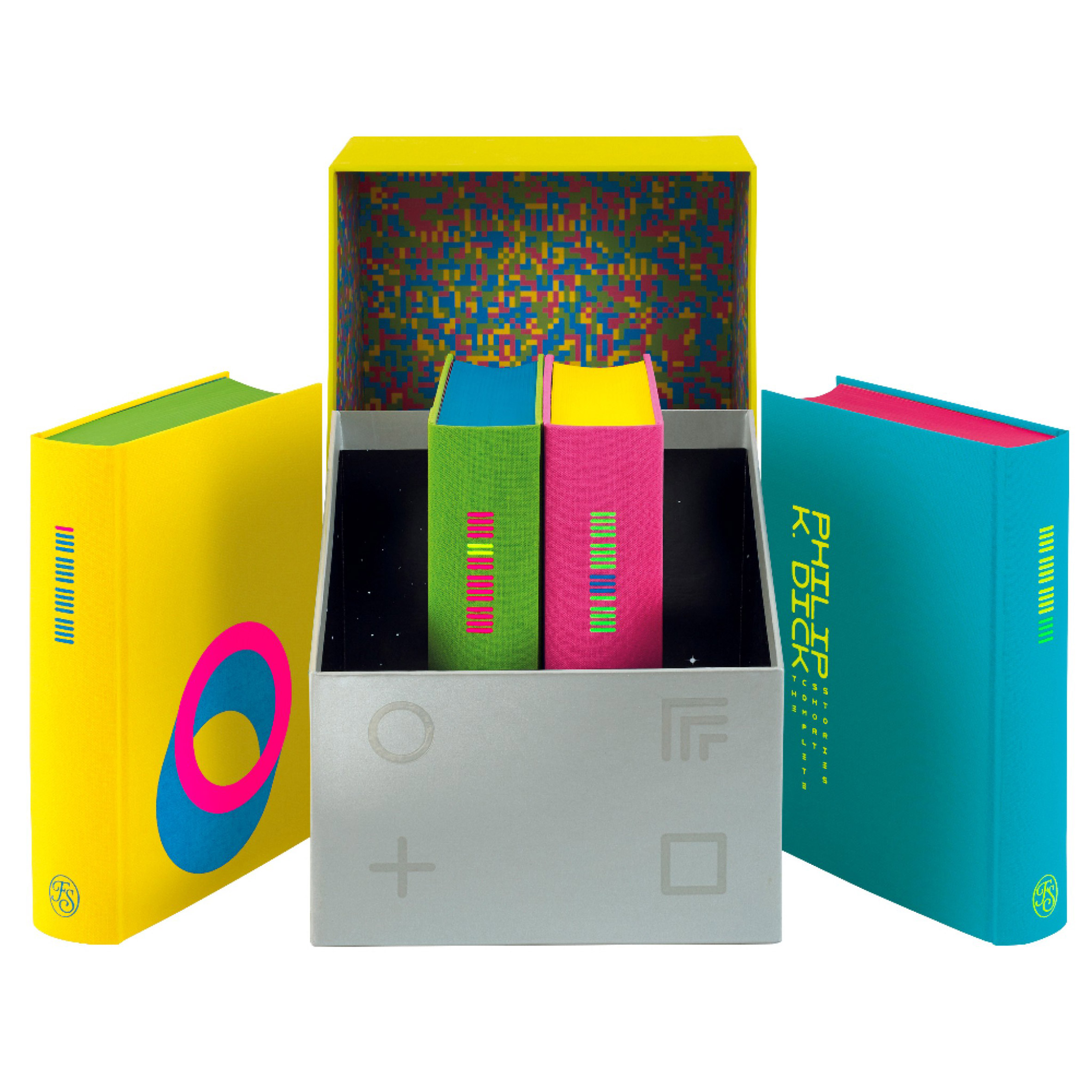
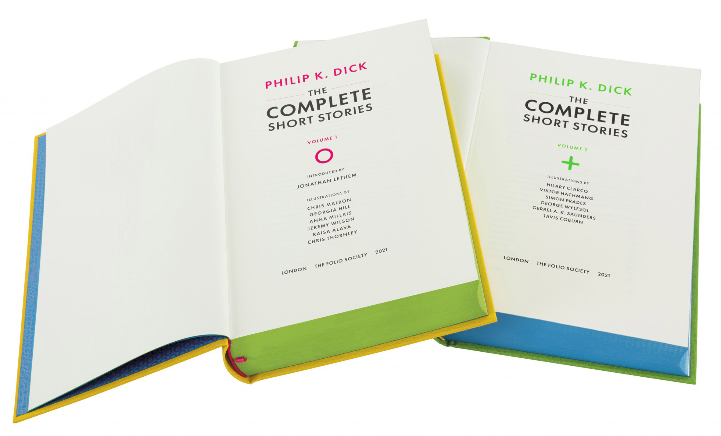
The four-volume hardback set brings together all 118 of the revered science-fiction author's short stories and features illustrations by 24 artists, as well as neon book bindings and a presentation box designed by UK studio La Boca.

The Complete Short Stories: Philip K Dick box set by The Folio Society box open to reveal glitch patterned lining and four neon-coloured volumes
The Complete Short Stories: Philip K. Dick was published in a limited edition of 750 copies

The project was art directed by The Folio Society's Sheri Gee and Raquel Leis Allion. The duo decided that, because of the breadth of the stories, they wanted to go beyond the usual approach of commissioning a single artist.

To create a contrast from the illustrations they brought in design studio La Boca, which tends to work in a bold and graphic style, for the books and packaging design.

The Complete Short Stories: Philip K. Dick four volumes stacked to reveal their fluorescent page edges and a square symbol on the cover of the top volume
The books' graphic design includes symbols based on Zener cards, for assessing telepathic ability

La Boca's approach for The Complete Short Stories is based on colours, symbols and codes.

"Primarily La Boca wanted the books to feel slightly mind-bending when seen in the flesh," Allion told Dezeen. "Initially it was thought that the neon palette wouldn't reproduce well on screen, but we were surprised that it worked and when the books are viewed in the flesh, they have that extra level of sensory stimulation."

The Complete Short Stories: Philip K. Dick closed box
The soft-close presentation box features illustrations on its inner lining

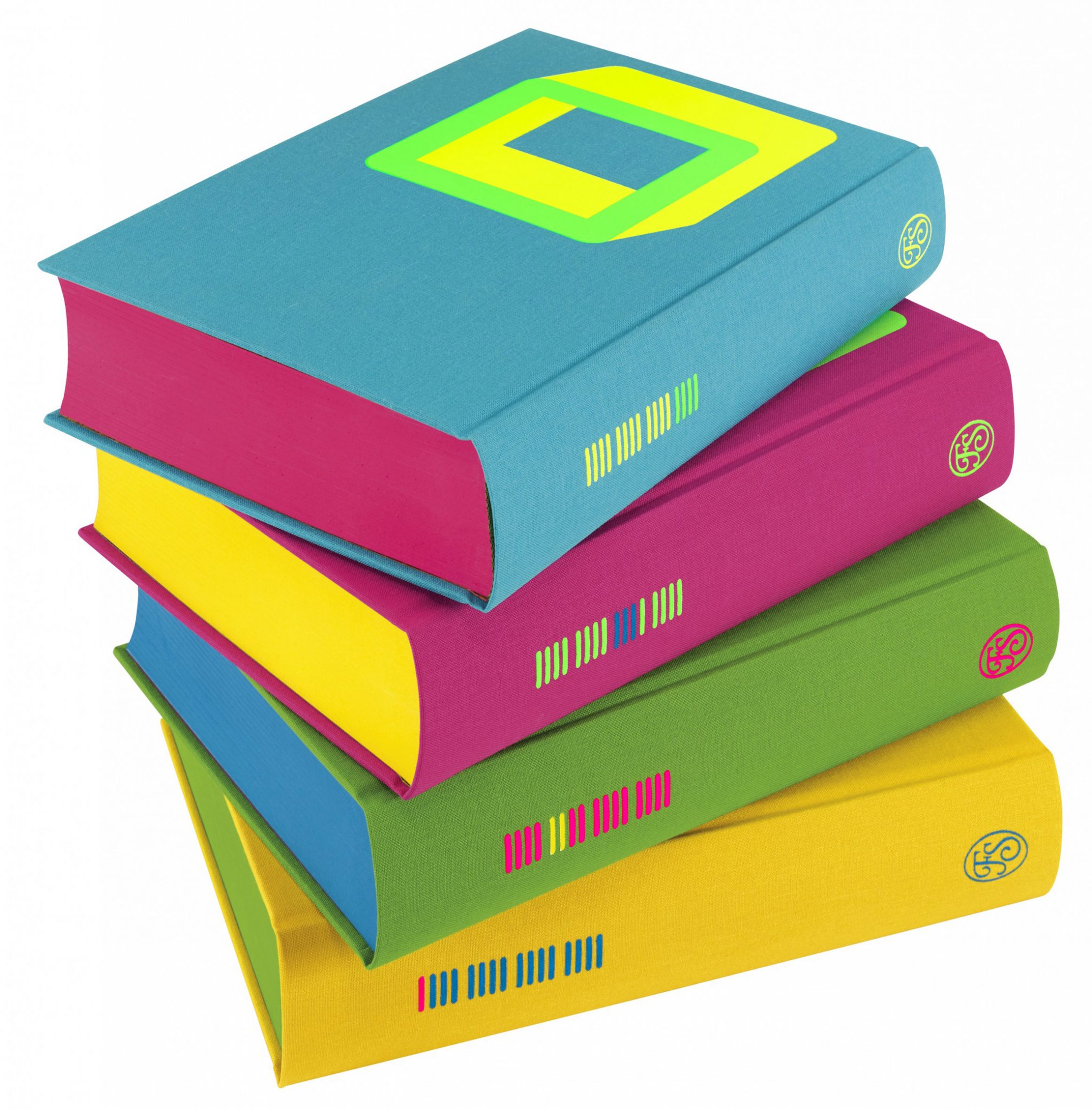
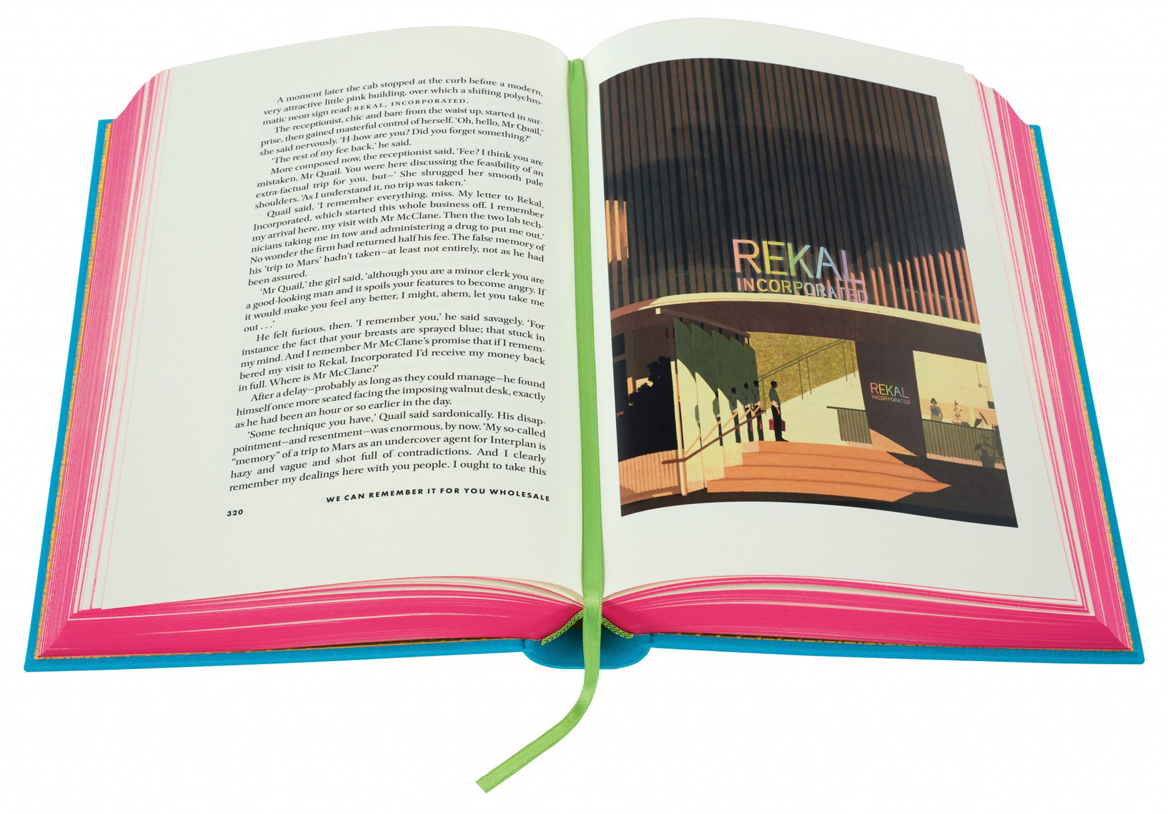
La Boca's design has the books' bindings, cover illustrations, page edges and ribbon markers rendered in a four-colour palette of highlighter pink, yellow, green and blue, but arranged differently on each volume.

While the first volume is yellow with green page-edges and a pink ribbon bookmarker, the next volume is green with blue pages and a yellow ribbon marker, and so on.

Four volumes of The Complete Short Stories: Philip K. Dick lined up in the presentation box
Neon colours and abstract graphic design characterise the approach by independent studio La Boca

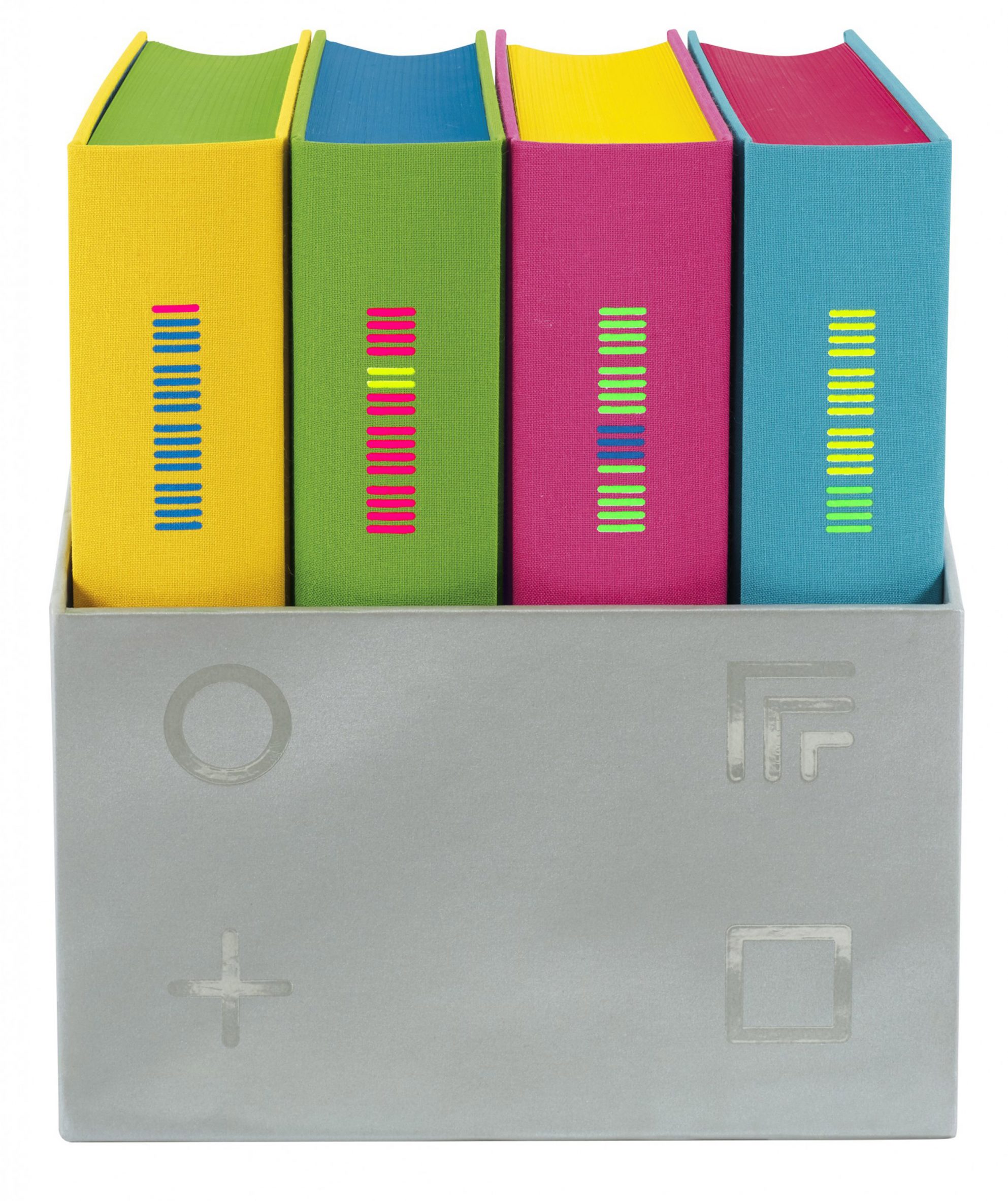
The covers are printed with graphic symbols designed to reference the Zener cards designed by US psychologist Karl E. Zener in 1930.

These were used to test for extrasensory perception (ESP) and chosen for the book covers because telepathy is a recurring theme in some of the short stories.

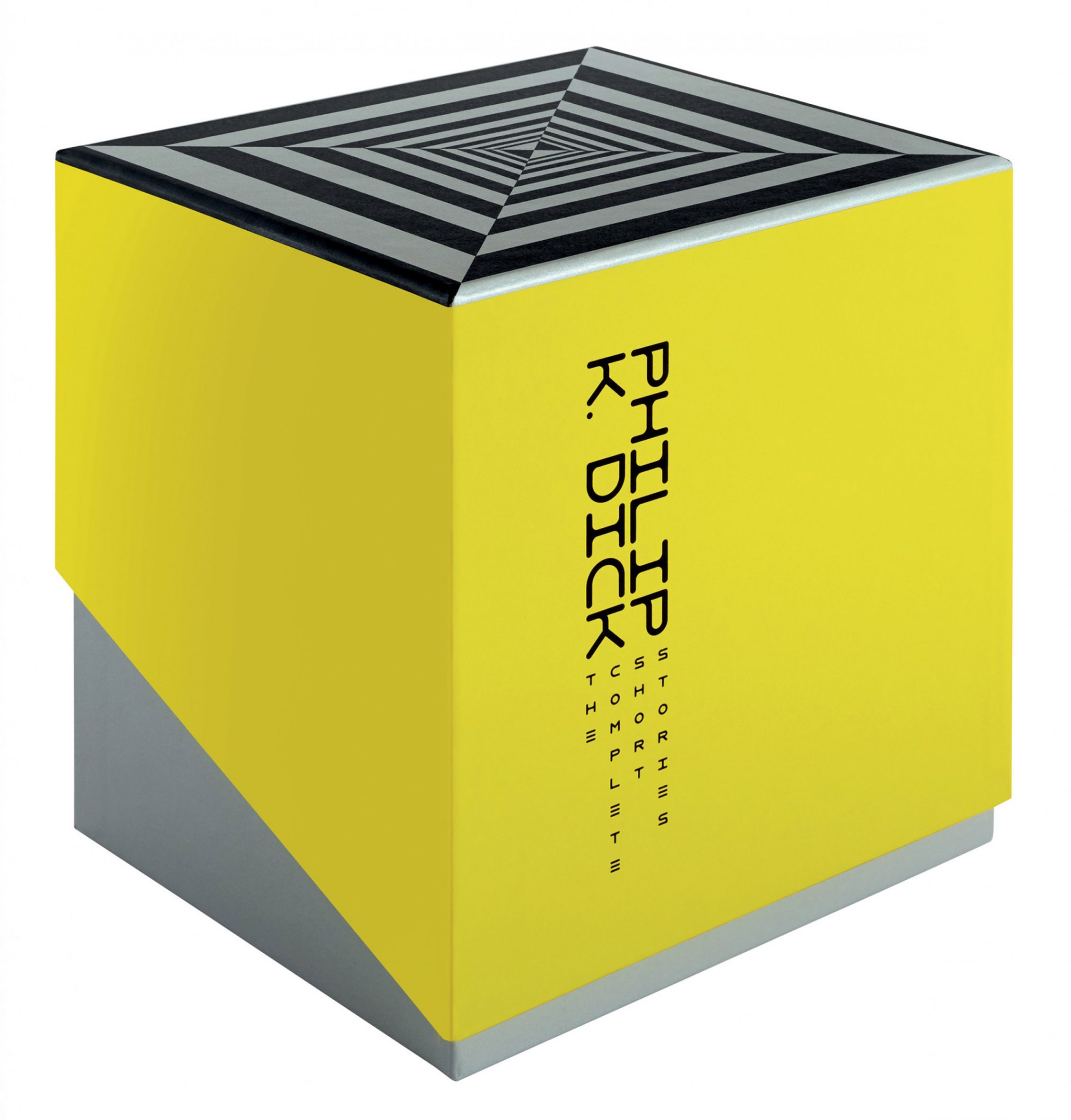
The symbols are screen-printed with fluorescent inks on the Duchesse cloth bindings. The same symbols are echoed on the relevant title page and spot-varnished on one side of the box.

Title pages on The Complete Short Stories: Philip K. Dick
The books feature two-colour titles pages that coordinate with the neon scheme

Illustrations also feature on the inside of the box on two specially designed papers. There is a glitch-style grid pattern in the same four neon colours on the top part of the box, and a black night sky sparkling with silver stars inside the bottom part, both reflecting the science fiction themes in the texts.

"The inside of the box could become a forgotten void of space, which made La Boca think it would probably be exactly the type of place Philip K. Dick would explore," said Allion.

"The illustration is designed to be a kind of pixel camouflage that is in stark contrast to the solid colours on the outer side of the box," Allion continued. "La Boca wanted the inside to hold a surprise after lifting the lid, like gazing into a fathomless digital world."

The outside of the box is yellow and silver and is deliberately quite heavy, so that the lid needs to be lifted off with both hands.

The Complete Short Stories: Philip K. Dick open to illustration
The collection includes 24 illustrations by 24 different illustrators

"The illustration on top of the box is a sort of diving point; the reader is looking down on it whilst lifting the lid," said Allion. "It's designed to act as a signifier that you are in the process of entering the cosmic world of Philip K. Dick."

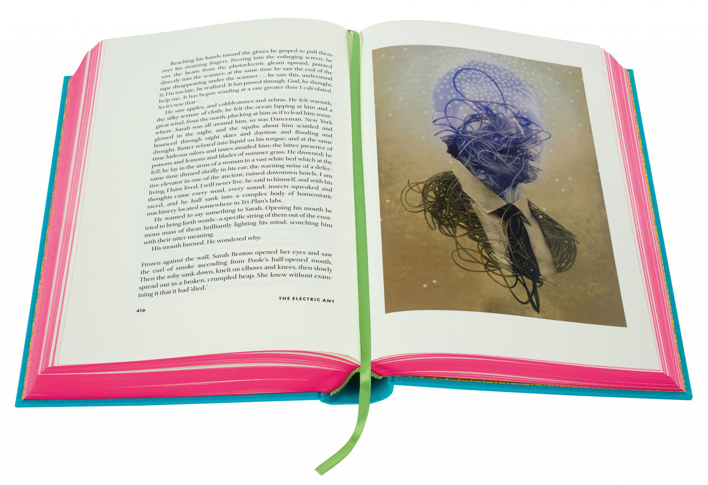
There are six illustrations per volume, representing a wide spectrum of styles and mediums. The set includes works by famous artists, such as Dave McKean and Georgia Hill, as well as creations by emerging practitioners.

The Complete Short Stories: Philip K. Dick open to spaceship illustration
The Folio Society would usually commission one illustrator per project but decided to take a different approach for this collection

The Complete Short Stories: Philip K. Dick was published in a limited run of 750 numbered copies and sold out in three days.

The author is best known for the novels The Man in the High Castle and short story Do Androids Dream of Electric Sheep?, which was adapted into the movie Blade Runner.

The Complete Short Stories: Philip K. Dick open to architectural illustration
There are six illustrations per volume

The Minority Report, which was adapted into a movie by Steven Spielberg, is one of the 118 short stories included in this collection.

The Complete Short Stories: Philip K. Dick was the public vote winner for graphic design of the year at the Dezeen Awards.

The Complete Short Stories: Philip K Dick open to a page with a ghostly illustration
Each of the volumes has a ribbon bookmark in a different colour from the all-neon palette

Other shortlisted designs include the Norwegian passport by Neue Design Studio and the Magic Canvas, a children's psychotherapy tool by Magpie Studio.

The Folio Society is a UK publisher that produces illustrated hardback editions of classic fiction and non-fiction.

The design studio La Boca was founded in 2002, and its past work includes an illustrated film poster for the movie Parasite.

The post The Folio Society creates bold neon-coloured Philip K. Dick box set appeared first on Dezeen.


from Dezeen https://ift.tt/2ZoxOzD

Rough-sawn cedar clads Whidbey Dogtrot house in Washington by SHED

Whidbey Dogtrot House

Cedar siding and a central breezeway feature in this compact home in the Pacific Northwest designed by US firm SHED for a couple who will soon retire.

The project, called Whidbey Dogtrot, is named after its location on Whidbey Island, which lies just north of Seattle. The single-storey dwelling is perched on a bluff overlooking the Puget Sound.

The house includes a breezeway
Whidbey Dogtrot overlooks the Puget Sound

The project was designed by Seattle's SHED Architecture and Design for a couple who are transitioning into retirement. They desired a compact, low-maintenance home that embraces its picturesque setting.

"In addition, the home needed space for guests, visits from adult children, hobbies, music and a home office," the team said.

Dogtrot house with a breezeway
The home was informed by traditional dogtrot-style houses

For inspiration, the architects looked to the dogtrot-style house, which features a central breezeway covered by a roof.

They conceived a low-lying home made up of two rectangular volumes flanking an open-ended passage, where the front door and a wooden bench are located. The building is topped with a black, standing-seam metal roof.

Open-plan living quarters
Living quarters include an open-plan kitchen and dining area

Exterior walls are clad in rough-cut, western red cedar with a semi-transparent black stain.

To ensure privacy, the team limited the amount of apertures on the front elevation, which faces west. The home opens up on the east, where large stretches of glass offer sweeping views of the landscape.

One side of the house contains the primary living quarters, which total 915 square feet (85 square metres). This area encompasses an open space for cooking, dining and lounging, along with a bedroom suite and reading nook.

The other side holds a 281-square-foot (26-square-metre) flex space and bathroom.

Reading nook in Whidbey Dogtrot house
A bedroom suite features a reading nook with surrounding views

Throughout the dwelling, the team incorporated neutral colours and contemporary decor. Interior finishes include pale wooden cabinetry, creamy white walls and concrete flooring. Heat is provided by a hydronic system.

"The home is thoughtfully designed to make the most of its square footage," the architects said. "The result is a modest and functional dwelling strongly anchored to its site."

House clad in rough-sawn wood
Western red cedar wraps the building

Other projects by SHED include a sustainable Seattle home that was influenced by circus tents and Japanese design, and the conversion of a horse stable into a studio and guesthouse.

The photography is by Rafael Soldi.

The post Rough-sawn cedar clads Whidbey Dogtrot house in Washington by SHED appeared first on Dezeen.


from Dezeen https://ift.tt/3pv7Hlh

Peter Pichler completes angular concrete-and-glass villa in Italian vineyard

The exterior of the villa is cream hued

The folded form of this villa, designed by Peter Pichler Architecture for the owners of a vineyard in South Tyrol, is intended to merge with the existing landscape and form a shield around its central courtyard.

The Milan-based studio won an invited competition in 2018 to design the property, which replaced an existing structure within the Kastelaz vineyard in the Termeno district in Italy.

Aerial top view of the villa by Peter Pichler Architecture
Kastelaz Hof was designed by Peter Pichler Architecture and built on an elevated site

The estate's owners wanted to build a contemporary home on the elevated site, which enjoys spectacular views of the surrounding Alpine landscape.

The design of the house responds to its setting, nestled among trees and vines and looking along the valley towards Lake Caldaro.

Kastelaz Hof has an angular form
The structure has a low-lying form that overlooks the town

"The geometry of the villa evolves from local site conditions," the studio said. "It creates a flowing and harmonious transition with the landscape and is barely noticeable from the nearby village."

The angular structure appears to emerge from the earth of the hilltop, with its sloping walls connecting seamlessly with the roof.

Kastelaz Hof has views across the mountainous landscape
The studio used glass and concrete across the exterior of the Kastelaz Hof

The horseshoe-shaped plan wraps around an internal courtyard that is protected from the winds funneling up the valley from Lake Garda to the south.

The building's external surfaces evoke the tone and texture of the chalk-stone retaining walls found throughout the surrounding vineyards.

A large driveway connects with a cave-like garage embedded in the sloping terrain, while a set of stairs leads up the hill to the house's main entrance.

Inside, the house is arranged as three connected wings. One wing contains the main living space with the kitchen and dining area alongside, while the other two wings accommodate bedrooms, including the large main suite.

Kastelaz Hof by Peter Pichler Architecture tapers into the ground
There is an outdoor courtyard at the centre of the villa's horseshoe plan. Photograph is by Samul Holzner

Full-height glazing along with carefully positioned windows and skylights ensure the spaces feel bright and connected with the views.

"The wide glass facades are designed to frame and highlight the surroundings and to let the landscape enter the indoor spaces while maintaining internal privacy," the studio added.

Interior view of staircase and hallways at Kastelaz Hof
The studio applied a light and airy look throughout the interior

The architects chose materials that create a warm, yet simple and minimal atmosphere. A palette featuring concrete, terrazzo and wood ensures there is consistency between indoor and outdoor spaces.

In addition to the central courtyard, a large terrace on the upper floor provides an alternative space for outdoor relaxation and is connected to a mezzanine lounge.

A bedroom at Kastelaz Hof has full height windows and a terrace
Floor-to-ceiling windows provide views out to the landscape

Architect Peter Pichler and his wife Silvana Ordinas established Peter Pichler Architecture in Milan in 2015.

The studio's previous projects include a hotel in a forest featuring pointed cabins set among the trees, and a mountainside restaurant with three cantilevered gables that project out towards the views.

Photography is by Gustav Willeit unless stated otherwise.

The post Peter Pichler completes angular concrete-and-glass villa in Italian vineyard appeared first on Dezeen.


from Dezeen https://ift.tt/3nljhfX

Flooat creates "fluctuating landscape" inside publishing office near Tokyo

Interiors of Kadokawa office in Tokorozawa

Design studio Flooat has used elevated work areas, structural columns and chunky plinths to simulate natural topography inside the offices of book publisher Kadokawa in Japan.

The 9,000-square-metre workspace, dubbed Kadokawa Tokorozawa Campus, is situated just north of Tokyo in the city of Tokorozawa.

Local studio Flooat was tasked with designing its spacious interior and decided against erecting walls or partitions to organise the floor plan.

Lounger area of office by Flooat with beige couches and tall plants
A lounge area filled with greenery sits at the heart of the office (top and above)

Instead, the team set out to create a "fluctuating landscape" of different seating areas that would suit the different work styles of staff employed across Kadokawa's various departments.

"The publishing giant is well established in a wide range of products from literary works to comics," said Flooat.

"But it has recently expanded into film, animation and video games. We designed the office to help employees follow their individual sensibilities within a collective of creative talent."

Seating area in Kadokawa office with black couches and grey armchairs
Relaxed seating areas encourage staff to sit and hang out during the day

At the heart of the office is a lofty lounge area dressed with sofas and relaxed wide-back armchairs. Here, the staff is encouraged to hang out and chat throughout the day or host casual catch-ups with colleagues.

There is also what Flooat refer to as a "book bar", with a long counter where visitors can sit and flick through the publisher's latest releases, which are displayed on a tall gridded shelf in front.

Workspace interior by Flooat with wooden desks and bar seating
Display plinths that double up as benches appear throughout the office

Towards the outer edge of the office, a series of platforms are topped with formal desks. Set away from the hustle and bustle of the lounge, these raised areas provide a space for employees to do solo work without distractions.

Dropped ceilings have been constructed above each platform to foster a more enclosed, intimate feel.

A series of chunky display plinths have been dotted across the room to further enhance the "landscape" of the office. Some of these double up as bench seats, while others act as foliage-filled planters.

Flooat's topographical concept has also been applied to the interior's material and colour scheme, which has been curated to incorporate elements of nature.

The exterior of some of the office's structural columns, for example, has been rendered to resemble layers of earth, while the surrounding surfaces are finished in wood or a traditional Japanese plaster made of earth, lime, sand and plant fibres.

Breakout area on raised wooden platform in Kadokawa office
Focused work areas have been created on raised platforms

"I wanted to use traditional Japanese techniques in a modern office space," explained Flooat designer Yumika Yoshida.

"This material also creates beautiful shadows, so people who work here can feel the changes in the space as time passes throughout the day."

Office hallway with grey flooring tiles by Flooat
Drop ceilings were installed to make work areas feel more private

"I chose materials that are not homogeneous and give a sense of nature," she continued. "I wanted to create a space that would not give the cold impression of artificial materials."

This feeling is amplified through an abundance of potted plants and an outdoor terrace that floods the interior with natural light.

Cafe-style seating area with planters in Kadokawa's office in Tokorozawa
Structural columns were designed to resemble layers of earth

Flooat's Kadokawa Tokorozawa Campus is shortlisted in the large workspace interior category of this year's Dezeen Awards.

Other projects in the running include Education First's office in Denver, which is designed to reference the city's outdoorsy culture, and the YTL headquarters in Kuala Lumpur with their luxe mixture of marble and bronze surfaces.

Photography is by Tomooki Kengaku.


Project credits:

Design: Flooat, Okamura Corporation
Design planning: Suppose Design Office

The post Flooat creates "fluctuating landscape" inside publishing office near Tokyo appeared first on Dezeen.


from Dezeen https://ift.tt/3psPWD7

Saturday 23 October 2021

Almaborealis designs sew-your-own clothing kit for children

Convertibles by Almaborealis

Design studio Almaborealis has created a modular DIY kit containing pieces of fabric in an easy puzzle format that invites children to sew their own clothes.

Now called Puzzleware, formerly known as Convertibles, the project has been shortlisted for this year's Dezeen Awards in the wearable design category.

DIY clothes kit
Puzzleware is a DIY kit for kids

Almaborealis founder Maija Nygren took cues from early learning theories, such as loose parts play, to design a tactile kit for children aged four to 12 that encourages them to make their own clothes.

Puzzleware kits include pieces of colourful Scottish lambswool, which Nygren says are 100 per cent biodegradable, designed with lace holes so that children can sew the fabric together to make themselves a garment.

Children's clothes made from a Convertibles kit
The project is designed for children to make their own clothes

Each kit comes with a chunky blunt knitting needle and a Learn to Stich card printed on recycled paper, created to be accessible to children.

"The idea for Puzzleware was born through a combination of factors," Nygren told Dezeen.

Blunt knitting needle
Each kit comes with a knitting needle

"I realised that my now eight-year-old daughter hadn’t stitched a single stitch during her time in school, and began to research the sustainability aspect (or lack thereof) of manufacturing processes for fast fashion clothes," she added.

"This huge industry is creating a vast void where home sewing and clothes-making once was."

"This generation and those to come are losing not only the skills to make clothing, but all that comes with it; understanding the value of materials and the skilled makers of our clothing, and where these everyday items come from," explained the designer.

Child knitting Convertibles clothes
The project hopes to engage children in creativity

Having previously worked in children's theatre as a costume designer-maker, Nygren was interested in creating bright and bold clothing that would entice children visually, but also engage them in learning a new skill.

"I love very textured knitting that is squeezable, like a big hug!" said Nygren. "But I wanted my knits to give something more to children than just aesthetics or protecting them from the elements  – I felt that there was a great untapped opportunity to explore whether kids could better be involved in making their own clothes."

Young child making clothes
The kits are made for children between the ages of four and 12

According to recent findings, arts cuts in UK schools have led to a rapid decline in the number of students taking part in creative subjects.

Nygren hopes that introducing children to creative projects at a young age will contribute to them gaining skills such as improved hand-eye coordination, dexterity and creative problem-solving.

Puzzleware kits use the puzzle format for its flexibility, letting children extend their garments with new pieces of fabric as they grow.

Nygren also fitted each piece of lambswool with different numbers of lace holes according to their sizes, in order to avoid using fixtures such as poppers or buttons that might cause children discomfort when wearing their clothes.

Clothes in puzzle formation
Puzzles informed the project's format

"I needed to figure out how children could construct clothes in a frustration-free manner, with technical guidance, but maintaining autonomy and creative freedom," said the designer.

Puzzleware kits come in biodegradable packaging that was designed in line with the project's sustainability ethos, according to the designer.

"Providing children with an activity that supports lifelong learning and creative and critical thinking, as well as problem-solving skills, is another aspect of sustainability altogether,"  she added.

Young boy in knitted jumper
Puzzleware intends to be sustainable

In 2018, designer and engineer Ryan Mario Yasin won a Dezeen Award for creating Petit Plit, a children's clothing line of pleated garments designed to stretch as the wearer grows.

The photography is courtesy of Maija Nygren.

The post Almaborealis designs sew-your-own clothing kit for children appeared first on Dezeen.


from Dezeen https://ift.tt/3matcG2