Monday, 1 November 2021

Geometric brick rooms installed in Spanish passageway

Types of Spaces

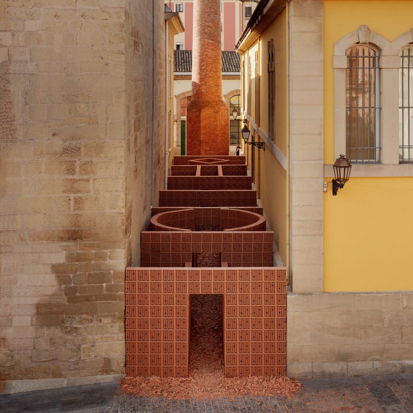
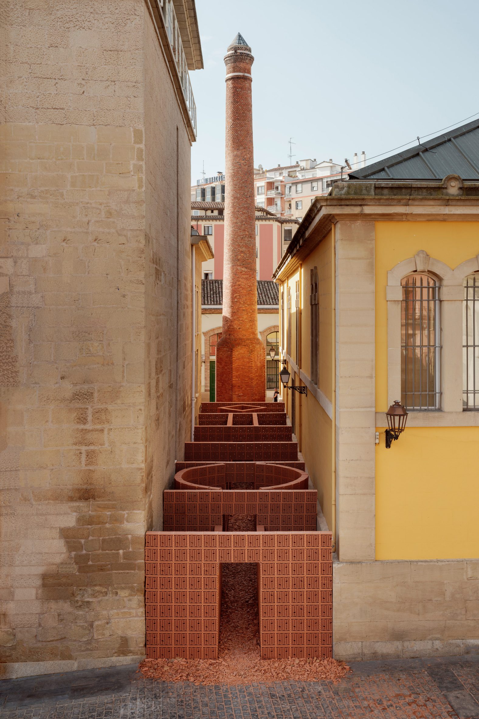
Architecture offices Palma and Hanghar have inserted a "playful sequence of rooms" made from thermal bricks into an empty passageway that leads to a monumental chimney in Spain.

Called Types of Spaces, the project was a temporary installation commissioned as part of last month's Concéntrico design and architecture festival in the city of Logroño in northern Spain's Rioja province.
Types of Spaces installation
Types of Spaces was installed in an unused passageway

Mexico City practice Palma collaborated with Spanish firm Hanghar to create Types of Spaces, which was located within an unused public passageway that leads to the site of Fábrica de Tabacos, an old tobacco factory.

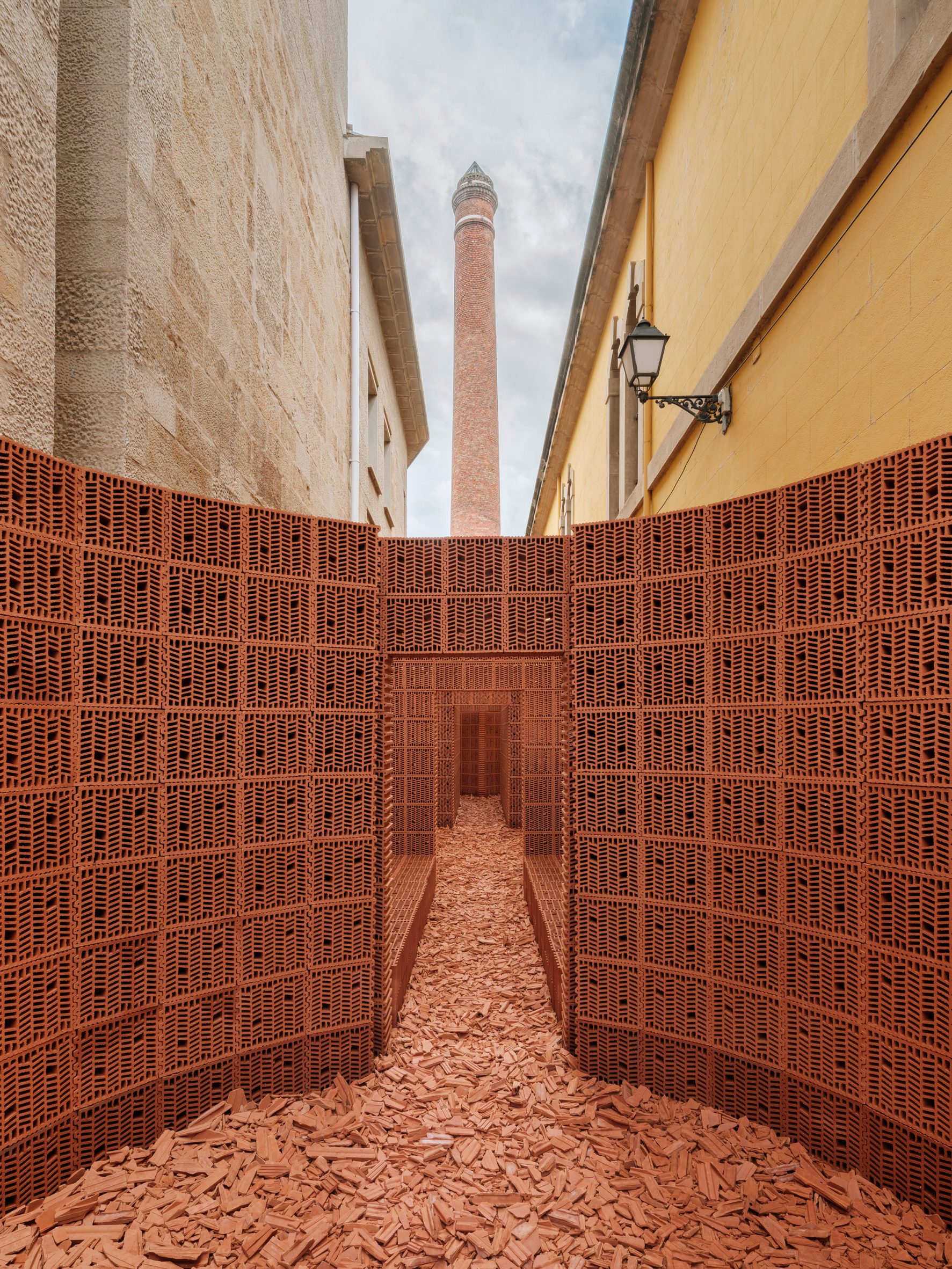
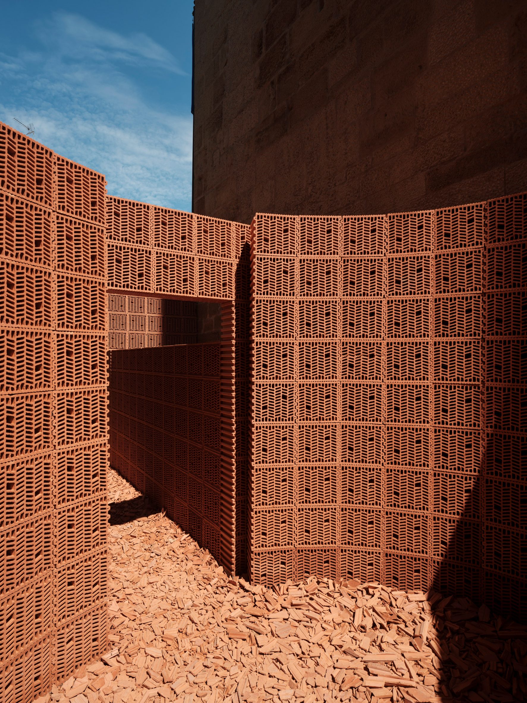
The installation comprised a series of geometric open-air spaces built from naturally terracotta-coloured thermal clay bricks, which the designers described as "an ephemeral and playful sequence of rooms."
Discarded brick chips
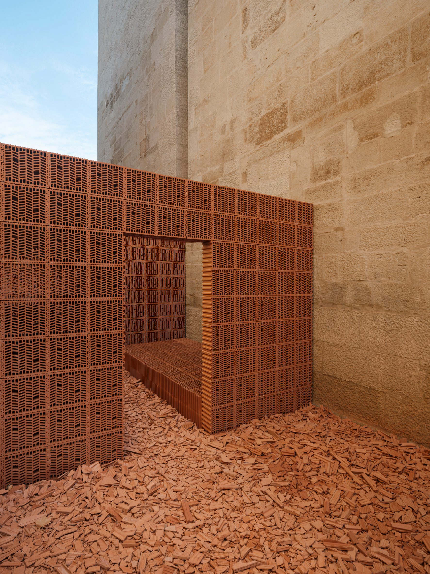
The installation was built on discarded brick chips

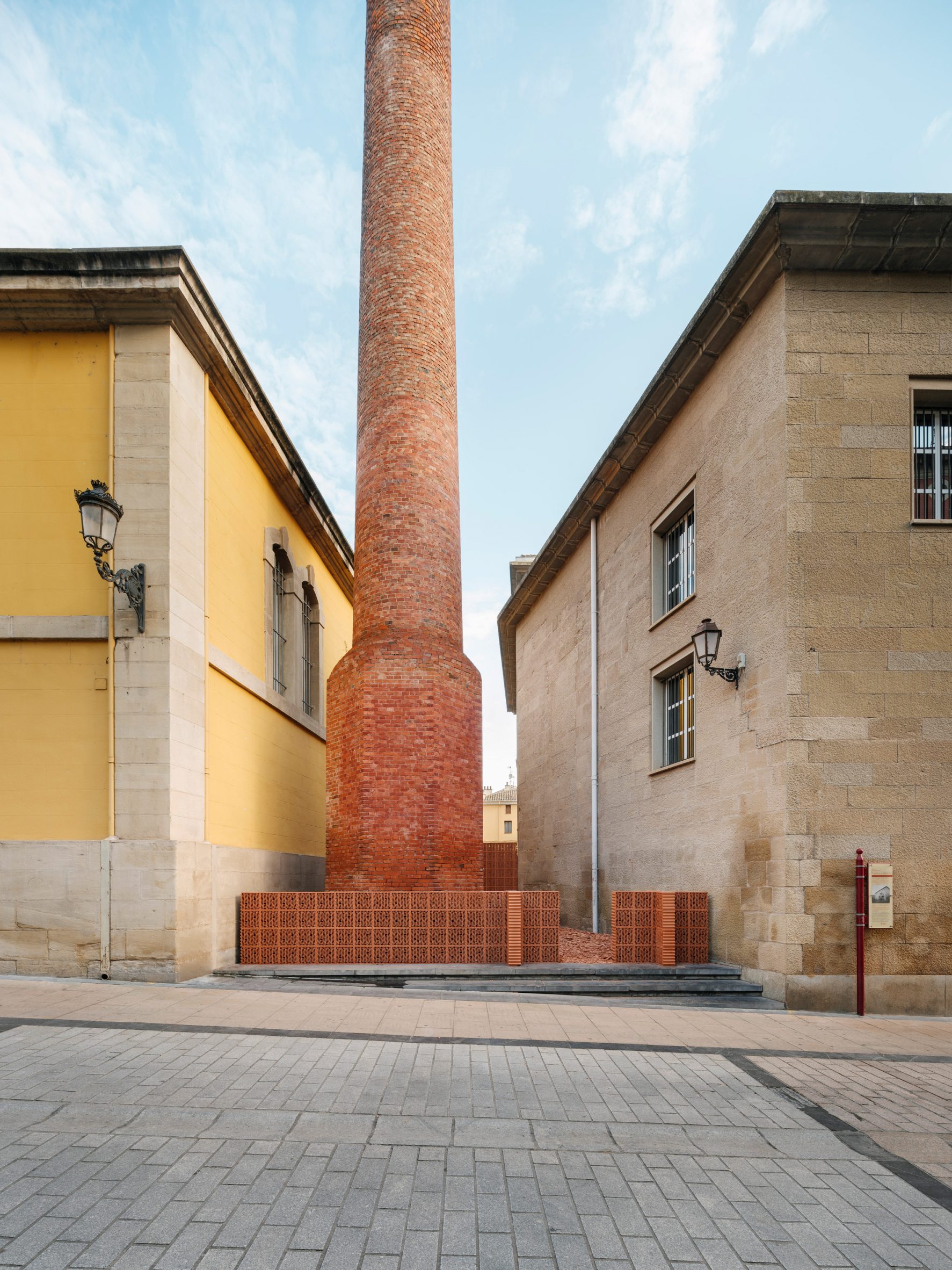
Arranged on a surface of discarded brick chips, the "rooms" provided an immersive gateway to a similarly-coloured red brick chimney that is located at the end of the passageway.

"When we were invited to participate in the festival, we were presented with several possible locations across the whole city to choose from," Palma architect Diego Escamilla told Dezeen.
Red-brick chimney
A similar-coloured chimney is located at the end of the passageway

"The passageway wasn’t even presented in the first meetings by the organisers because they thought we might not be really interested in it," Escamilla added.

"In the end, it was the perfect site for us. A discreet part of the city that could easily go unnoticed at first, but could awaken the curiosity of visitors and invite them to go through it."
View from end of installation
The chimney can be viewed from the end of the installation

While the chimney is a remaining symbol of Fábrica de Tabacos, the factory is no longer in use. Today, its site is split between the Regional Parliament of La Rioja and a public library.

"The project took inspiration from both the site and the material we built it from," explained Palma architect Ilse Cárdenas.

"The starting point for the design was to divide the long passage into a series of concatenated 3.6-metre square rooms in order to form a spatial procession of corridors and rooms of a domestic character in an attempt to reconstruct the void of the passage," added Hanghar architect Eduardo Mediero.

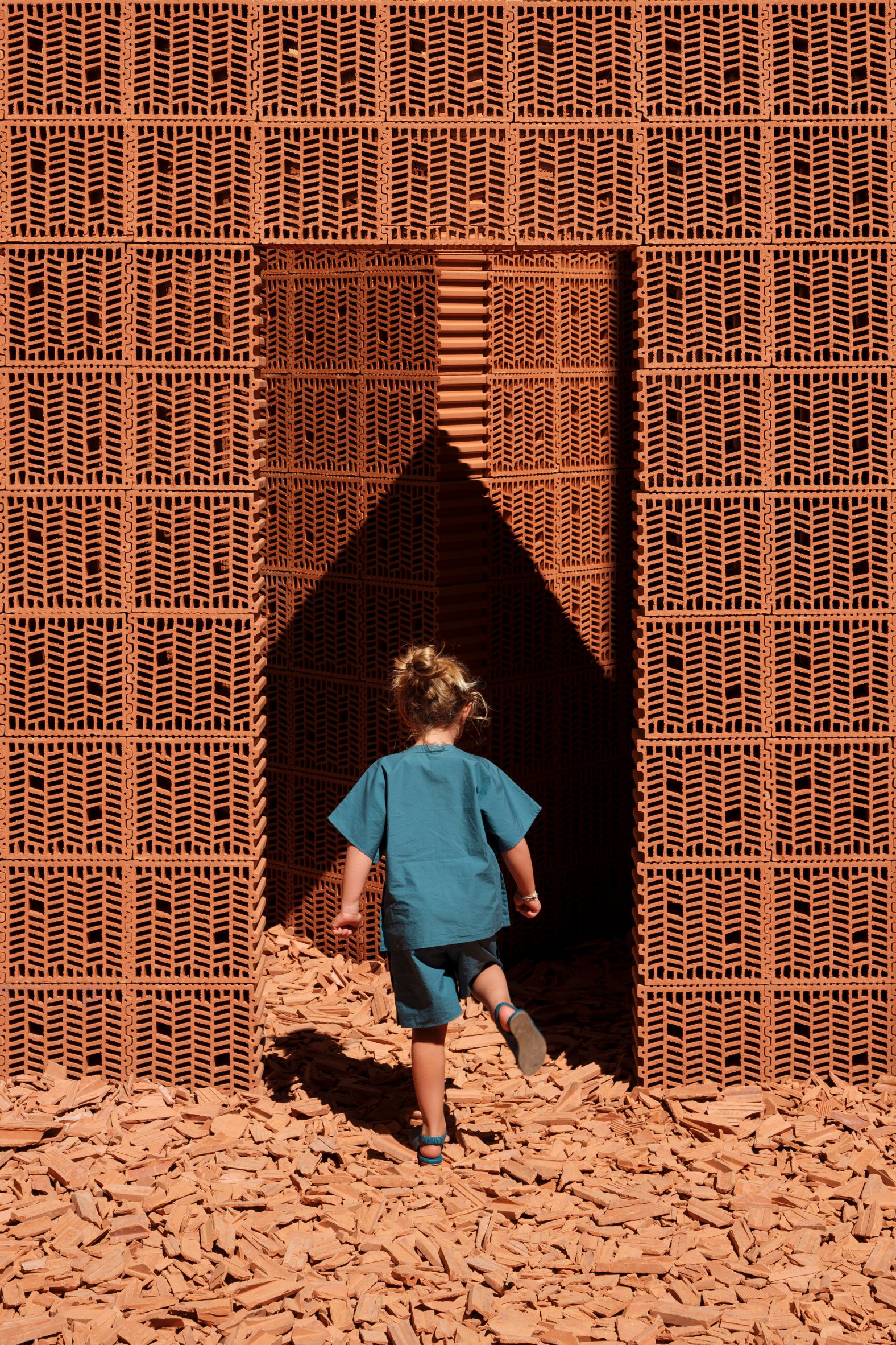
Using 30-by-30-centimetre bricks, the architects say that they took advantage of the bricks' interlocking system, only using minimal mortar reinforcement to secure them in place in order to ensure their reuse once the installation was dismantled.
Thermal clay brick installation
Thermal bricks interlocked to create the "playful rooms"

Palma and Hanghar sourced the bricks from Cerámica Sampedro, a factory in Spain that accepted the bricks back after Concéntrico.

"Our main objective with the project was to not generate waste or trash by buying new materials, which usually happens with many ephemeral projects," said Cárdenas.

"With brick as the main element, we decided to not use anything else, and build the whole pavilion with it. We think it creates a really nice dialogue with the chimney," concluded Mediero.
A room inside the installation
The project was installed for the duration of Concéntrico design and architecture festival

Other recently designed playful installations include a colourful Lego laundrette constructed in London as a place for children to play by Yinka Ilori.

The photography is by Luis Díaz Díaz.

The post Geometric brick rooms installed in Spanish passageway appeared first on Dezeen.


from Dezeen https://ift.tt/2ZQZXzo

Opel launches Rocks-e to bring "electric mobility to everyone"

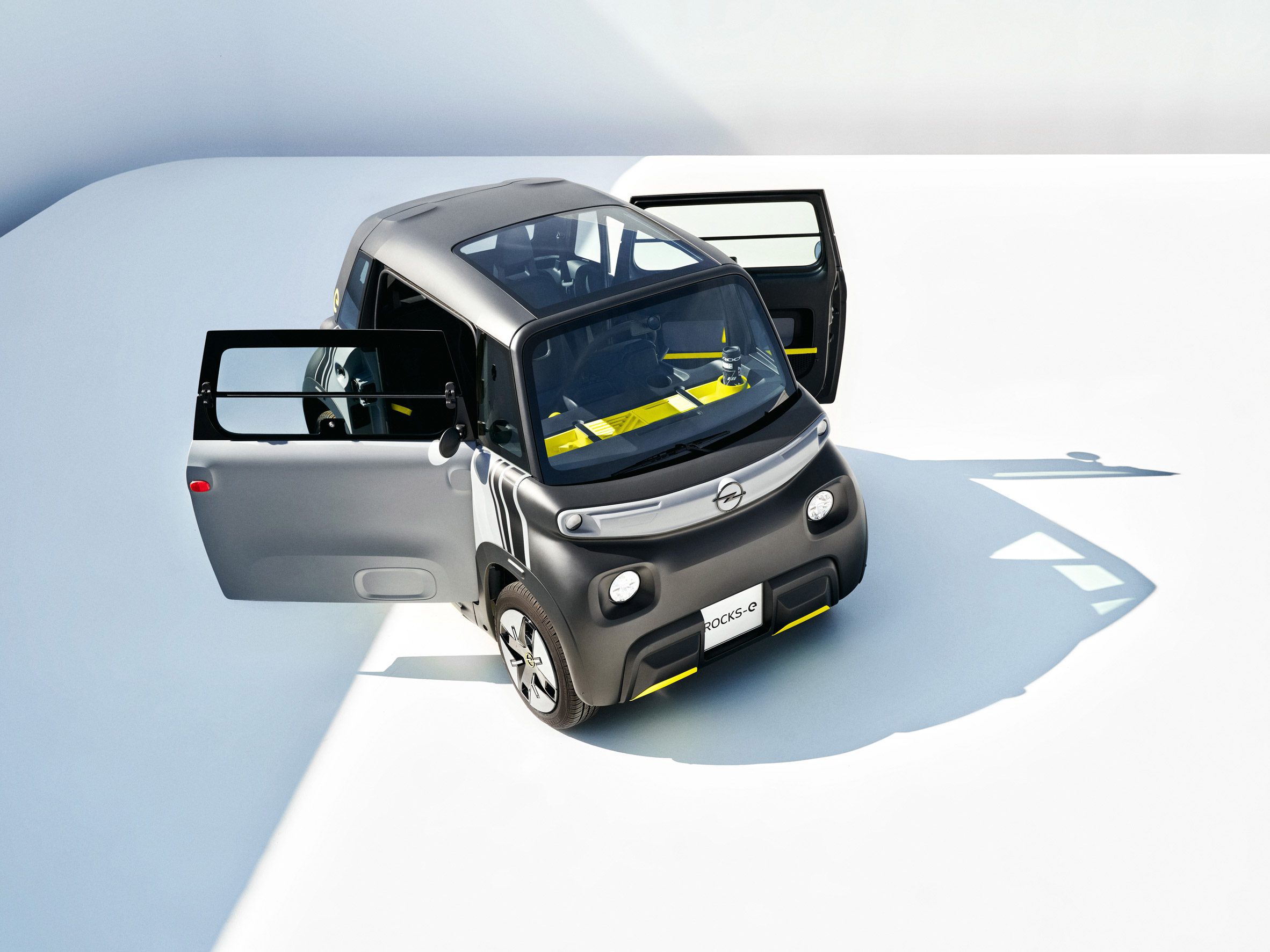
Opel Rocks-e

Dezeen promotion: German carmaker Opel has launched an electric Sustainable Urban Mobility vehicle that aims to bridge the gap between car and scooter and can be driven by people as young as 15.

Named the Rocks-e, the Sustainable Urban Mobility vehicle (SUM) is officially classified as a light motor vehicle.

Opel Rocks-e
Opel Rocks-e bridges the gap between car and scooter

The vehicle will be launched in Germany this autumn and can be driven by people as young as 15 with the appropriate license.

The two-seater vehicle is just 2.41 metres long and 1.39 metres wide and weighs only 471 kilograms.

Opel Rocks-e
It is officially classed as a light motor vehicle

"Our new Opel Rocks-e is uncompromising in every respect," said Stephen Norman, Opel's head of sales and marketing.

"The design is bold and pure, the dimensions are extremely compact," he continued. "Our SUM drives purely on electricity and the price is unbeatable."

Charging station for electric car
It can be fully charged in 1.5 hours

The electric car is designed as an emission-free, easy-to-park vehicle for city use. It has a range of up to 75 kilometres (46 miles), which can be covered at up to 45 kilometres per hour (28 miles per hour).

It has a 5.5-kilowatt-hour battery that can be fully recharged. To enable easy, convenient charging, a three-metre-long cable is integrated into the car.

Opel Rocks-e
A permanent charging cable is contained within the car

Opel designed the Rocks-e to be efficient, but also have a strong aesthetic that aligns with its ambitions.

"The Rocks-e enables electric mobility to everyone and will attract a lot of attention in city traffic with its unusual, purist design," added Norman.

Opel Rocks-e
Doors open opposite directions

The front of the car is distinguished with the new Opel Vizor brand face with LED headlights and indicators.

Both of the car's doors were designed to be identical to improve production cost. This means that they swing in different directions. While the passenger doors open in the usual direction, the driver's door is reversed and swings backward.

Opel Rocks-e
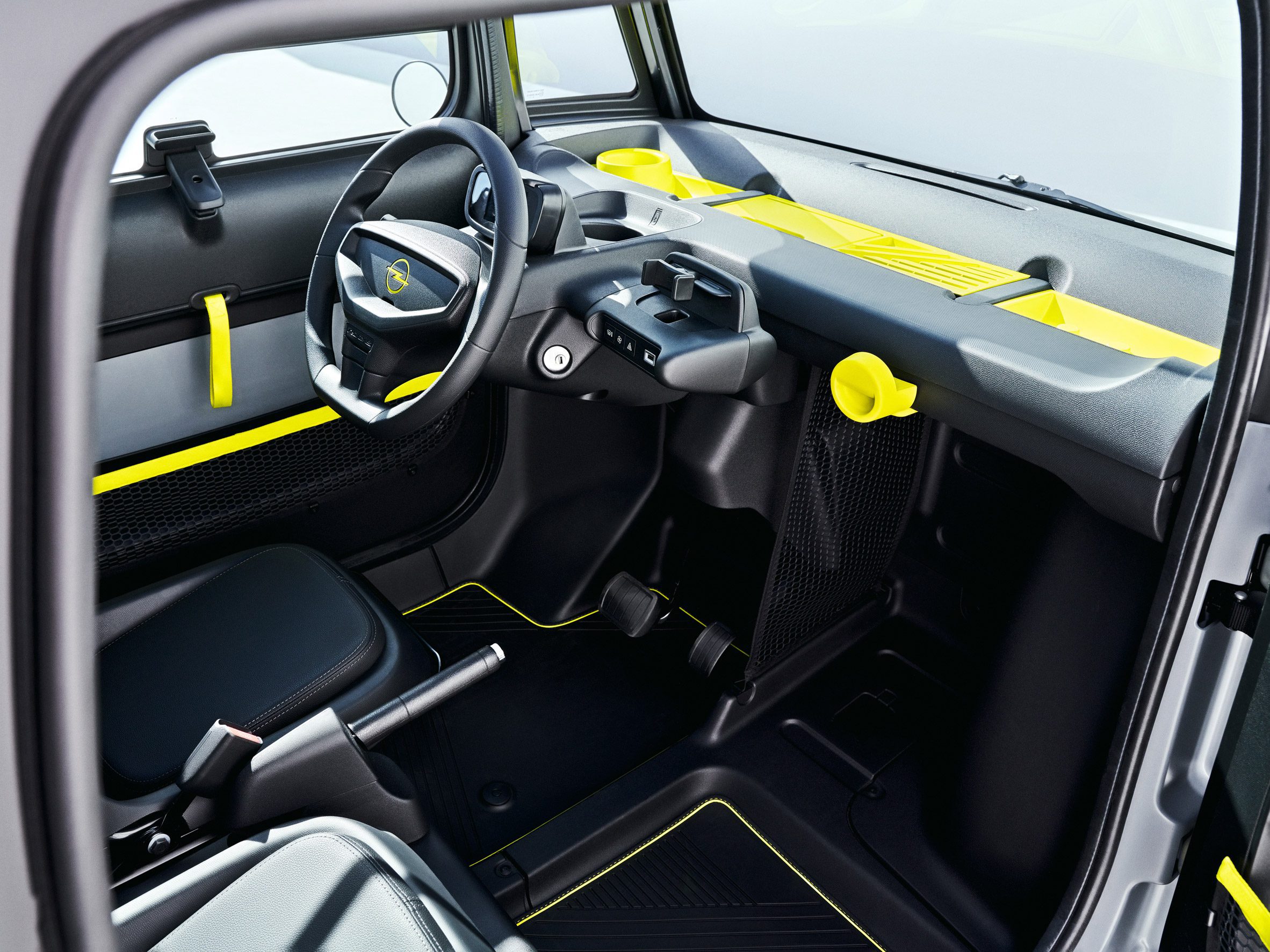
The interior is simple and clear

Inside the vehicle, the focus is on simplicity with essential information easily visible.

The light and open interior is topped with a panoramic glass roof.

Opel Rocks-e
It is topped with a glass roof

The vehicle has been released as part of Opel's PACE! strategy, which will see an electrified variant of each Opel model released by 2024.

Find out more about the Rocks-e on its website.


Partnership content

This article was written by Dezeen for Opel as part of a partnership. Find out more about Dezeen partnership content here.

The post Opel launches Rocks-e to bring "electric mobility to everyone" appeared first on Dezeen.


from Dezeen https://ift.tt/3w28yuV

Sunday, 31 October 2021

Klima wraps Maple Haus in the Utah mountains in weathering steel

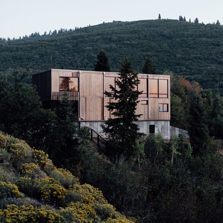
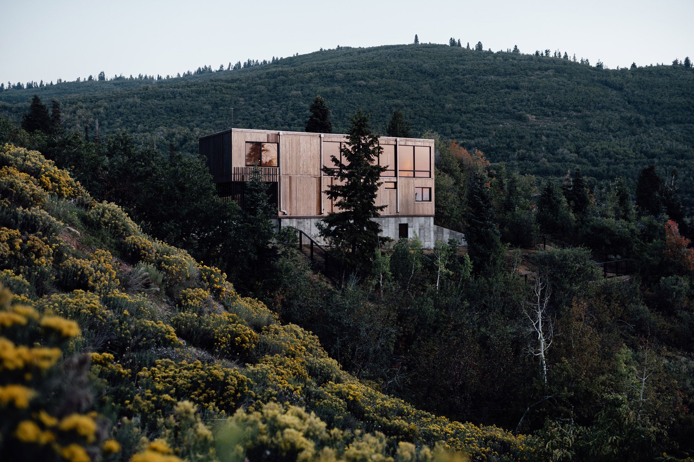
Maple Haus by Klima

Local firm Klima Architecture prioritised energy efficiency and a low-maintenance exterior while designing this three-level family residence near Park City, Utah.

The studio designed Maple Haus for a site just outside of Park City, a ski town on the eastern front of Utah's Wasatch Mountains.

Maple Haus by Klima Architecture
Maple Haus is located in Utah's Wasatch Mountains

The project was designed by Klima Architecture, which was founded in 2010 as Park City Design + Build and took on a new name last year.

The house was initially designed by to be a home for the studio's founder Chris Price. But due to the area's favourable real estate market, he ended up selling the home to new owners who use it as a full-time residence.

View from Maple Haus
The house sits in a forested community

The house sits within a forested community with an eclectic mix of abodes, from older cabins to contemporary dwellings. Price has lived in the neighbourhood for over a decade and has designed four homes there, including the Meadows Haus and Tree Haus.

"I gravitated here because historically you could get really cheap lots, and there is the utmost advantage of not having an overarching homeowner's association with design guidelines," said Price.

Cube-like external structure
A property called the Cube House informed the dwelling's design

He added that many Park City neighbourhoods have adopted restrictive guidelines, resulting in an "uninspiring built landscape."

While designing Maple Haus, Price took inspiration from an adjacent property – the Cube House, designed by the late architect John Sugden, who had apprenticed under Mies van der Rohe.

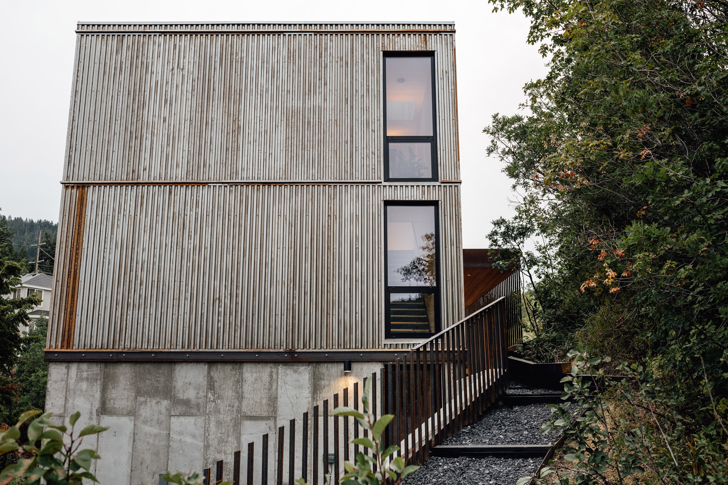
Corten steel facade
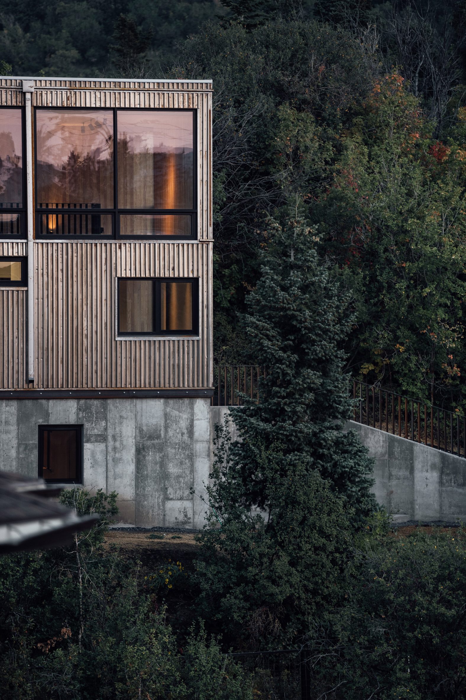
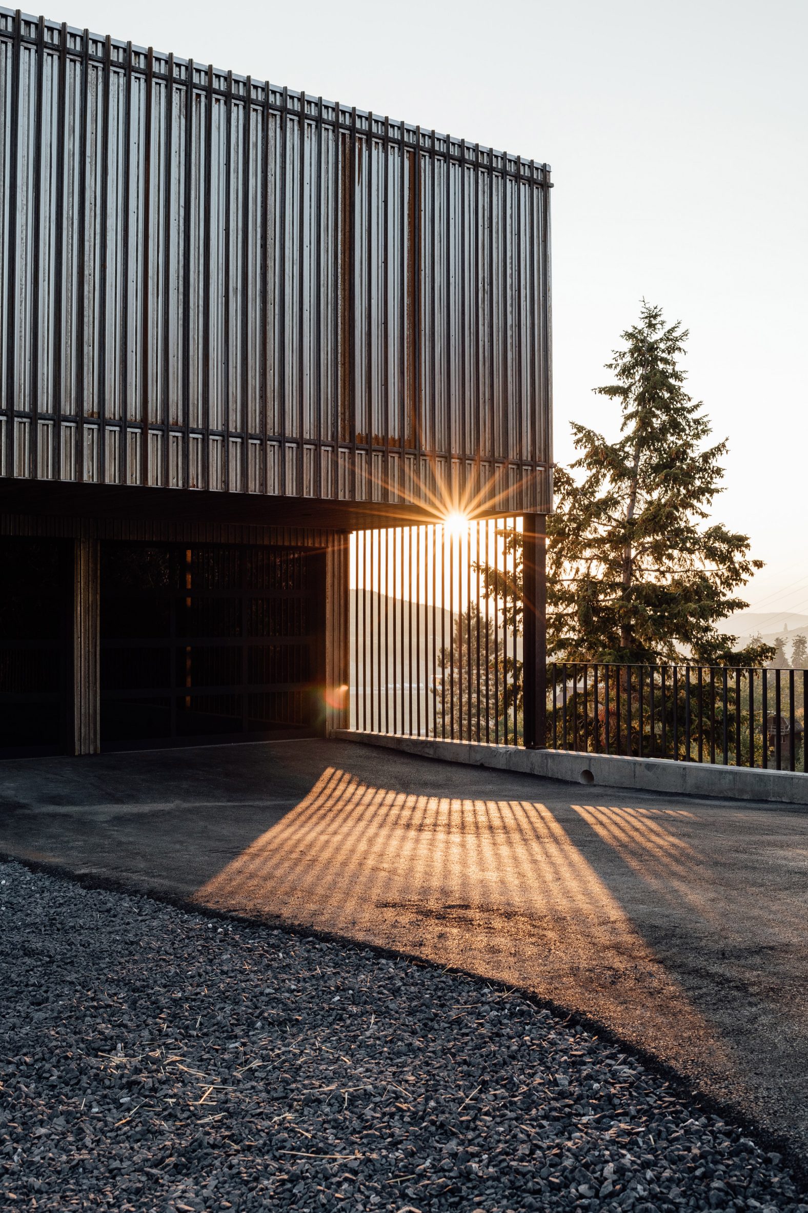
Klima wrapped the house's upper levels in Corten steel

"In true Mies/German efficiency, the house was built around a rigid grid of steel and glass, all on a concrete plinth," said Price.

"I wanted to take a notch out of this philosophy and design this house with the same rigour, but with modern materials and Passive House detailing."

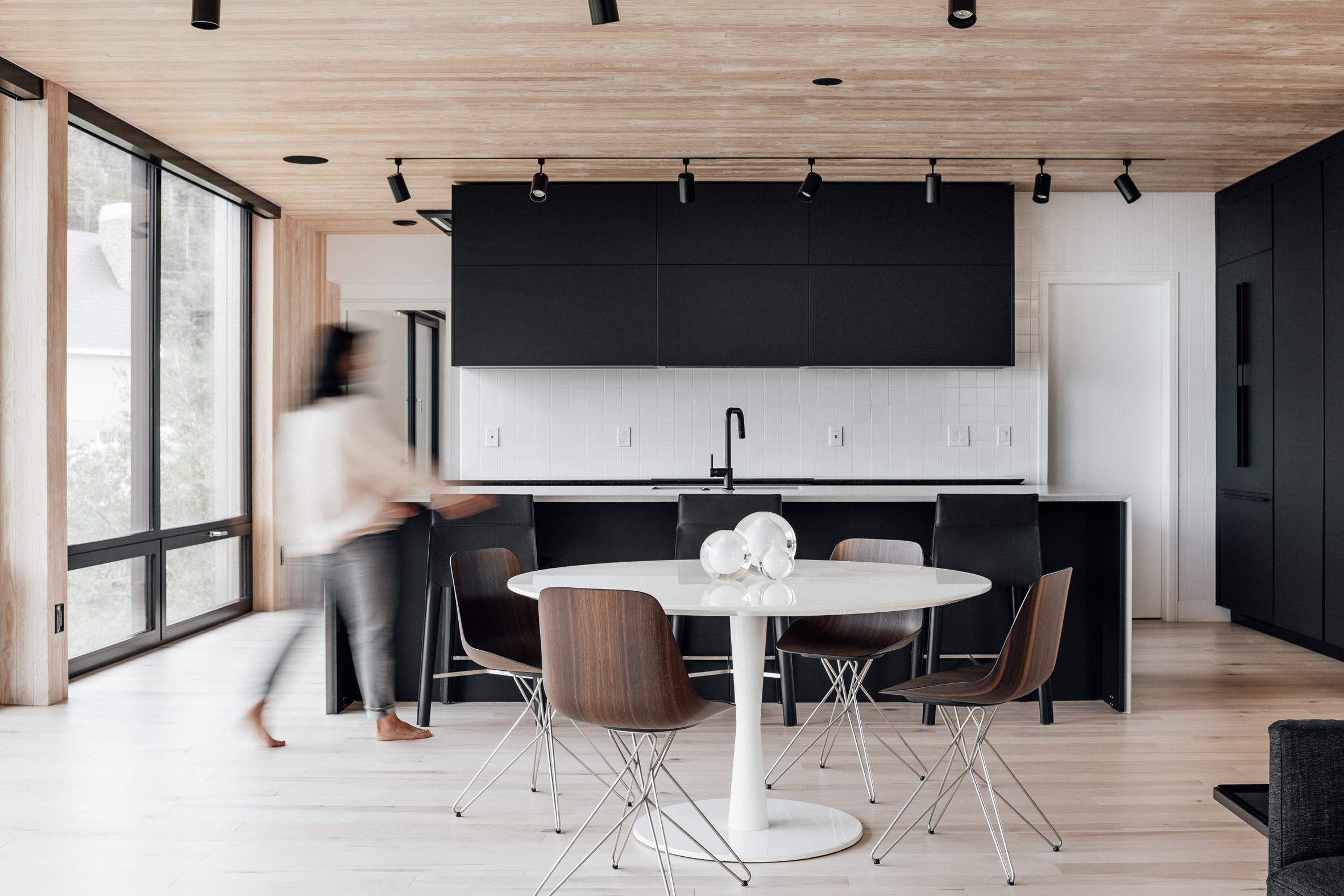
Black kitchen cabinets by Klima
Kitchen counters are topped with black granite

Approximately rectangular in plan, the Maple Haus rises three levels on a sloped site. The house measures 60 by 24 feet (18 by 7.3 metres) and is laid out on a 12-foot (3.7-metre) grid.

"This helped minimise material waste when framing, and allowed us to work faster," said Price.

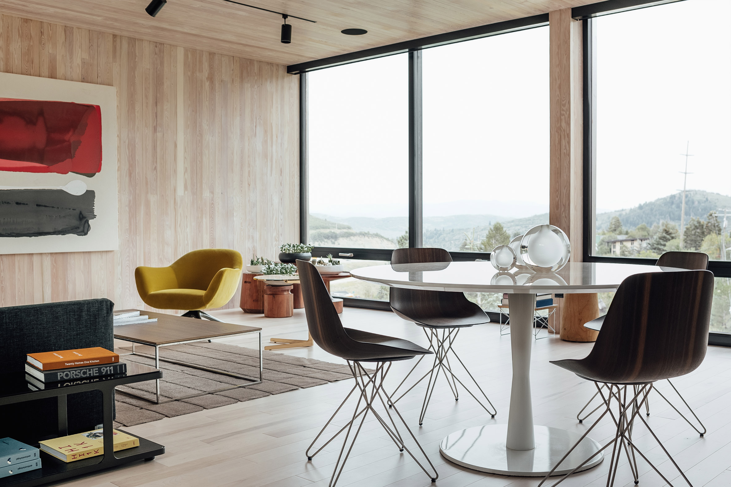
Wooden walls inside
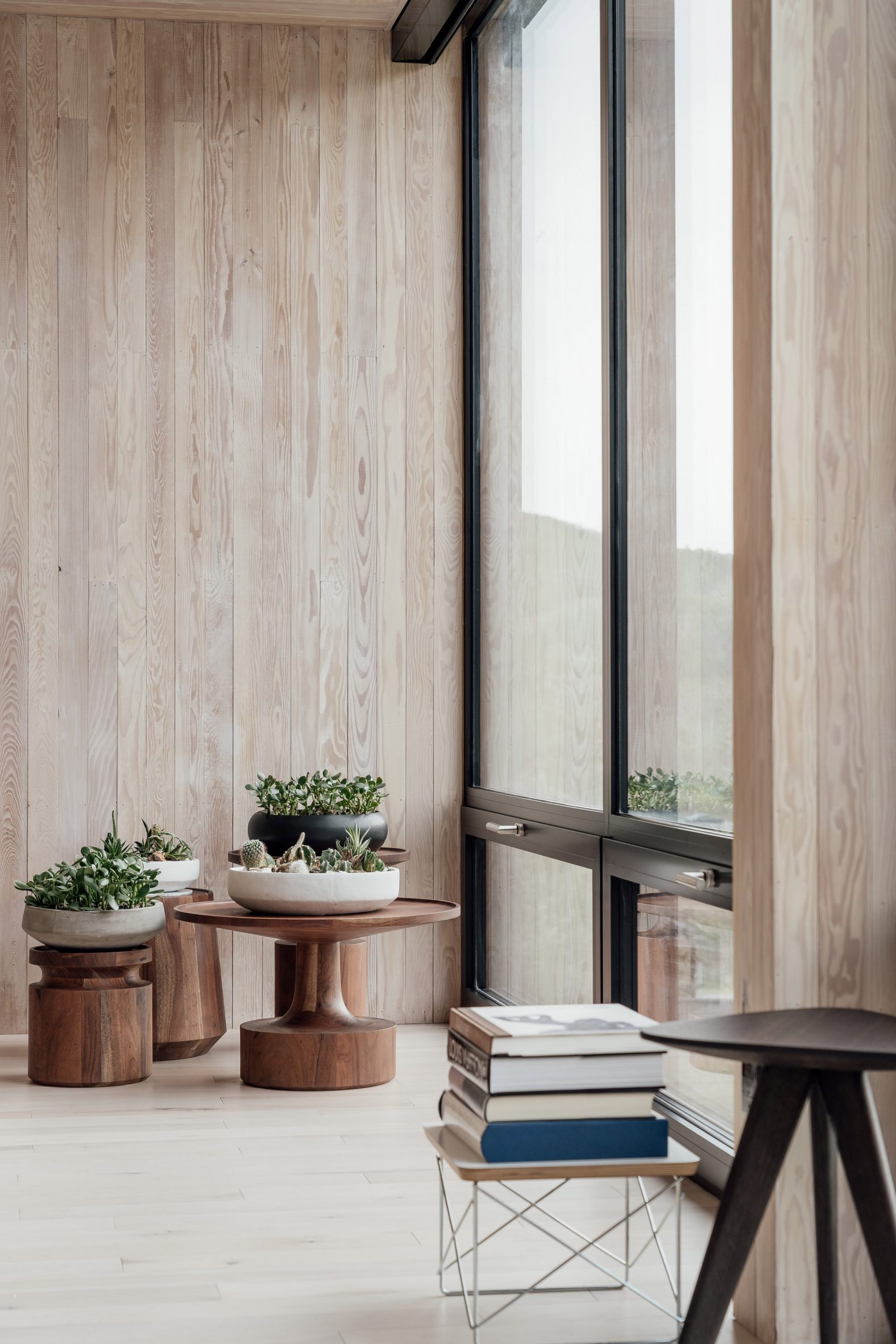
Wood clads the property's interior walls

Creating an air-tight building envelope was a key concern. The architect used double-stud construction to form super thick walls filled with insulation. Triple-pane windows help lock in heat.

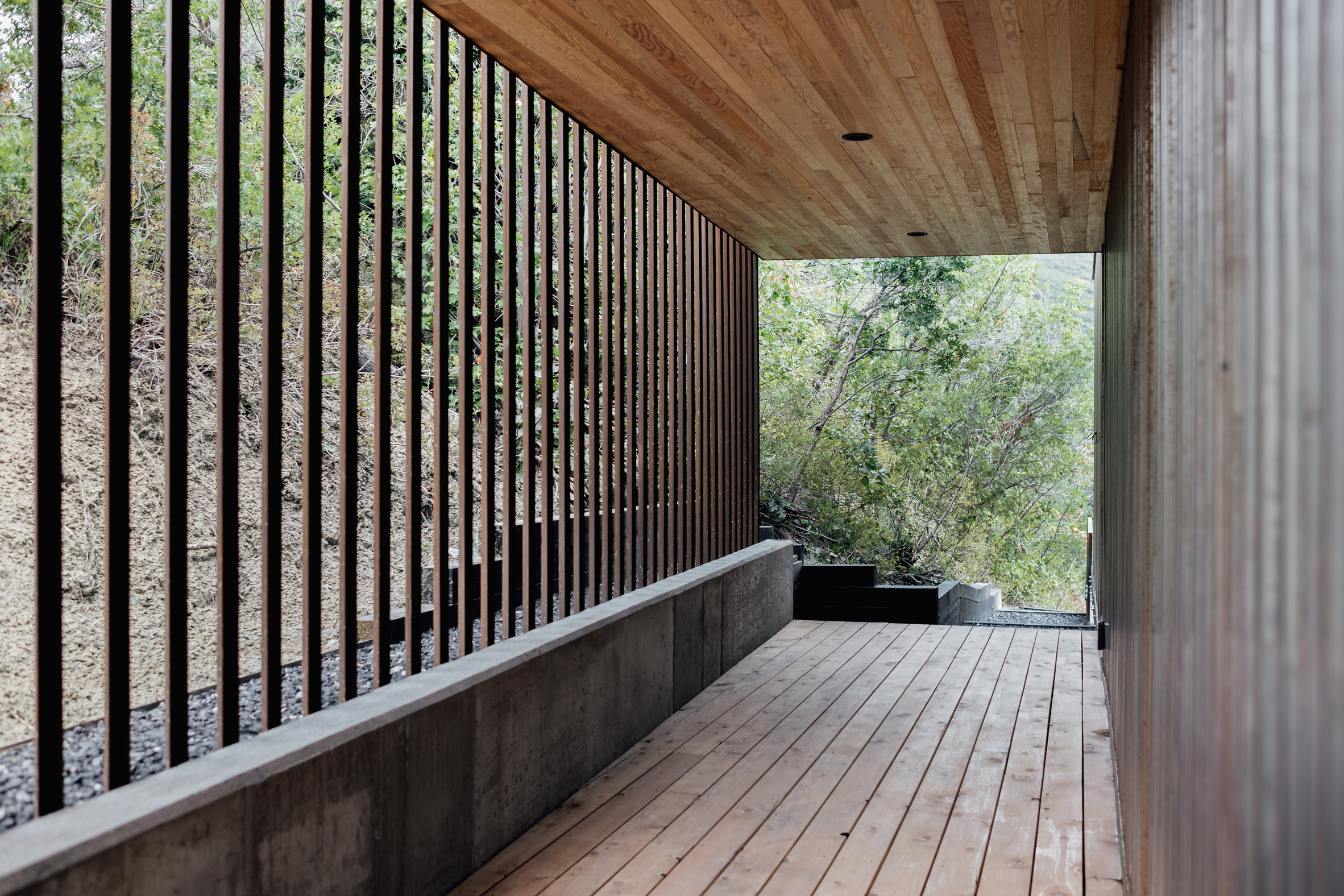
The base has a concrete exterior, while the upper levels are wrapped in Corten steel – a low-maintenance material that holds up well against fire, bugs and sunlight.

"On top of the steel siding is a second solar screen made of steel angle iron," said Price. "This functions solely on the southwest and northwest sides of the home, blocking around 30 per cent of that harsh western light."

Within the home, the team created light-filled spaces with crisp detailing.

Central staircase
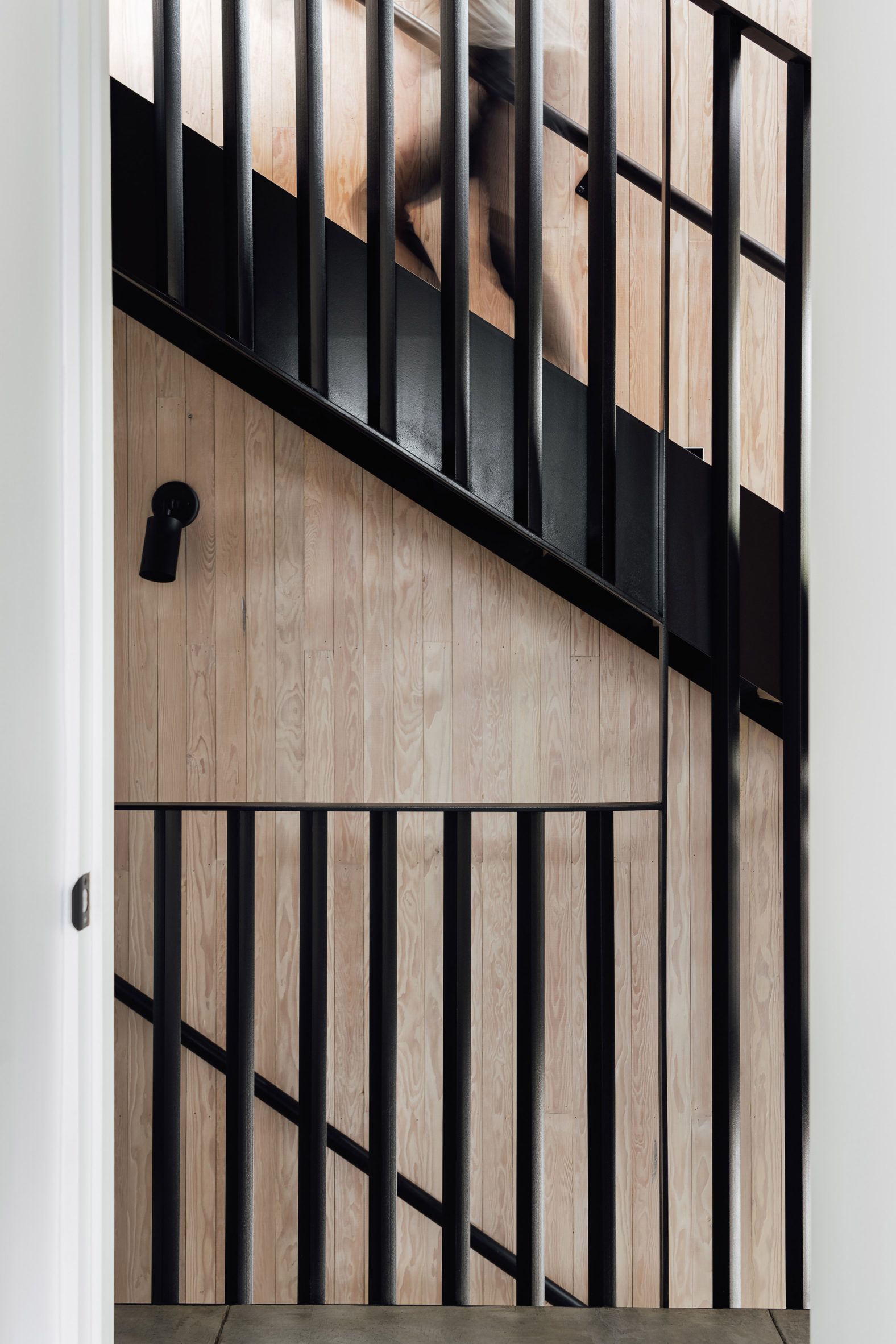
A staircase with wood-veneer treads connects the three levels

The lowest level holds two bedrooms, while the middle floor contains a garage and guest quarters. The top level encompasses the main suite and an open-concept kitchen, dining area and living room.

All three levels are connected by a staircase made of black-painted steel with wood-veneer treads. Price and his father built all of the home's steelwork.

Maple wood features in the house
Klima used various earthy woods were used in the design

Earthy materials help tie the home to its natural setting. Hem fir was used for walls and ceilings, while maple was used for floors. Counters are topped with black granite.

Rooms were initially dressed with furniture from the Italian brand Poliform.

Bathroom with large glass windows
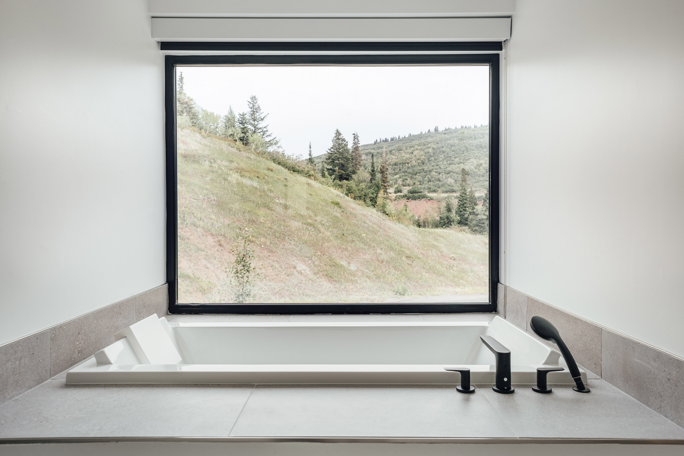
Large windows connect occupants to their outside surroundings

Large stretches of glass help occupants feel connected to the scenic landscape – a high desert, alpine ecosystem with pine and oak trees. An operable, triple-pane skylight brings in light from above while also allowing hot air to escape.

The roof is designed to allow for photovoltaic panels and a roof terrace in the future.

The house is located just outside of Park City, a ski town

Once a mining area, Park City is now a beloved destination for skiers and nature enthusiasts. Other projects in the mountain town include a residence by Imbue Design that consist of wood-clad, rectilinear volumes that are positioned around a central courtyard.

The photography is by Kerri Fukui and Lauren Kerr.

The post Klima wraps Maple Haus in the Utah mountains in weathering steel appeared first on Dezeen.


from Dezeen https://ift.tt/3butKQF

Wowowa uses colourful accents to update 60s home in Melbourne

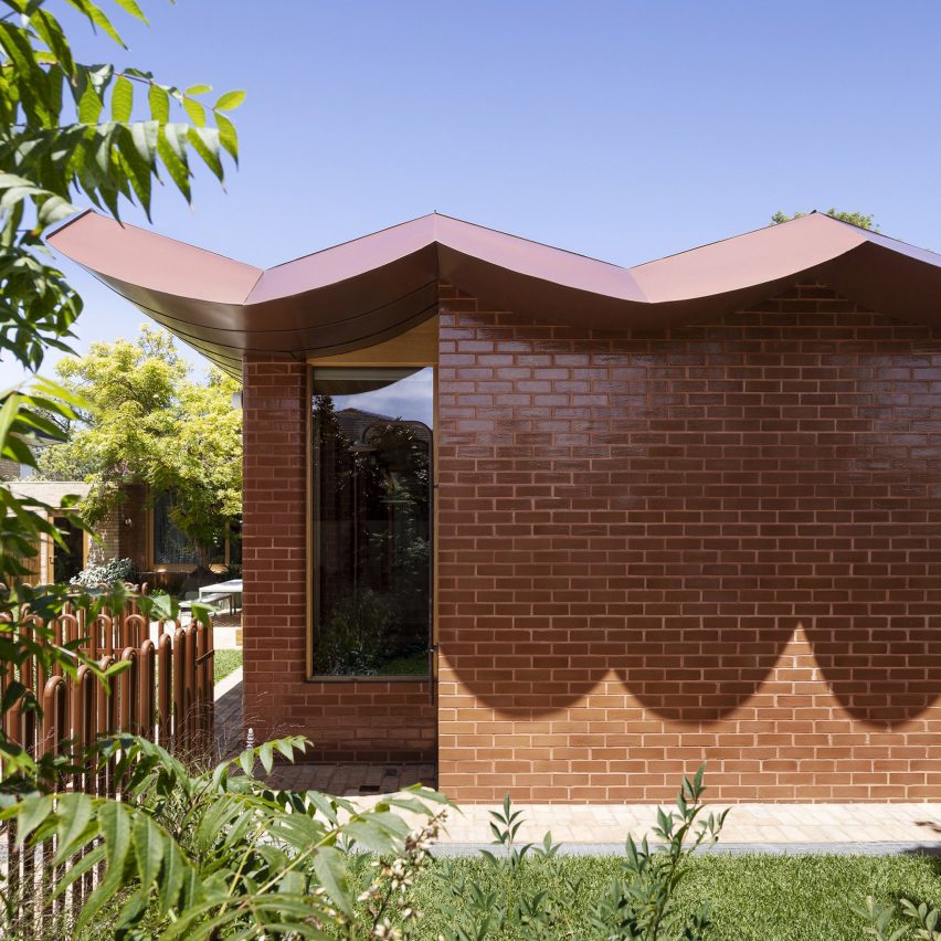
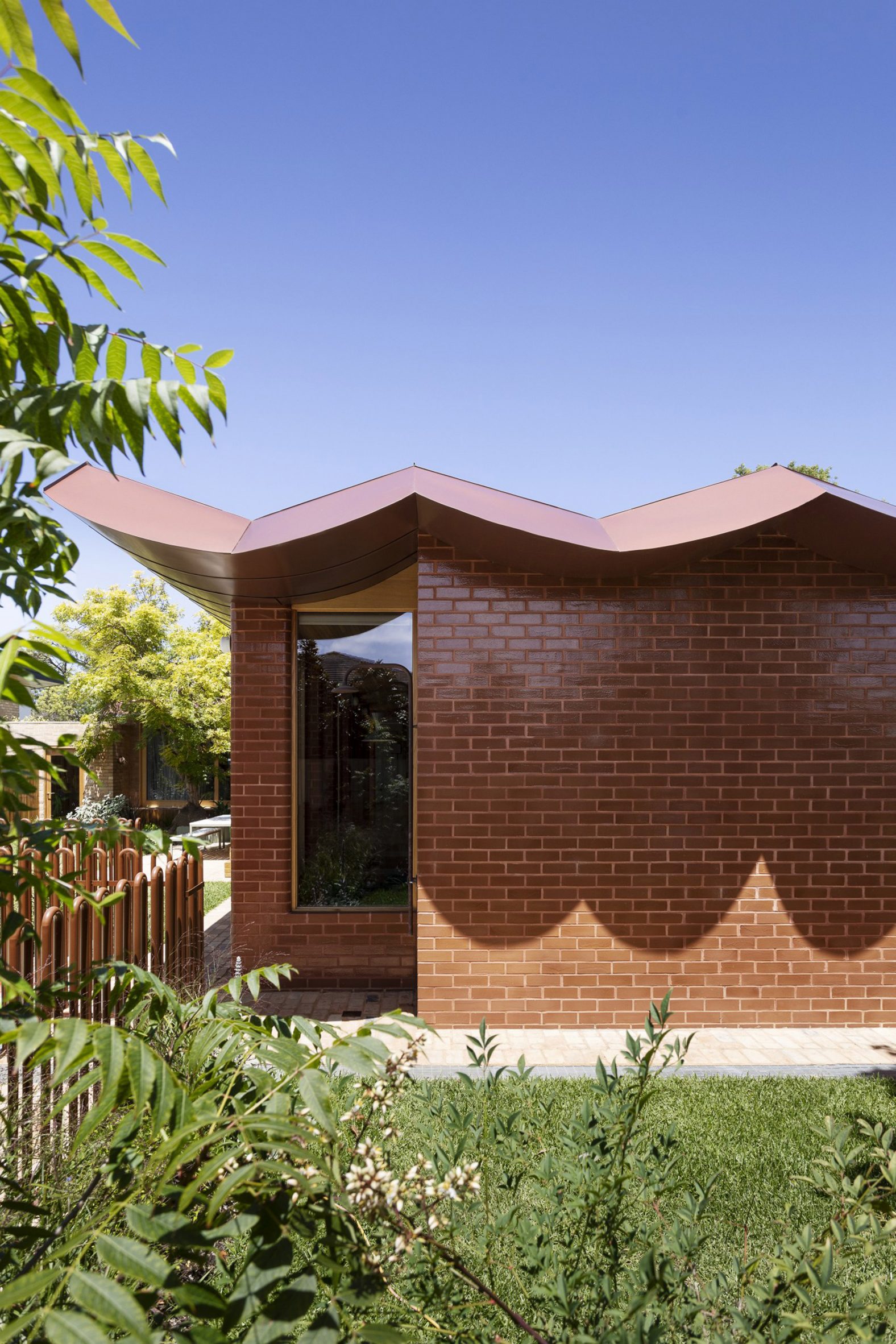
The roof of the home is scalloped

A scalloped metal roof and brightly coloured accents feature in a renovation and extension of a 1960s home in Melbourne by local architecture studio Wowowa, which has been shortlisted in the residential rebirth category of Dezeen Awards 2021.

Designed to express the client's own personal aesthetic the renovation, called Pony, adds four new bedrooms and two bathrooms to the existing single-storey home.

The layout was also reconfigured to improve the relationship to the garden.

The profile of pony's roof is scalloped
Top: Wowowa renovated and extended a 1960s home in Melbourne. Above: the exterior of the home was clad in glazed bricks

"The plan was arranged along a double-axis – a prominent post-war design driver to increase connection to the garden, creating a front, back and central courtyard," explained the Wowowa.

"Our design exaggerated the existing axial plan through a clip-on colonnade."

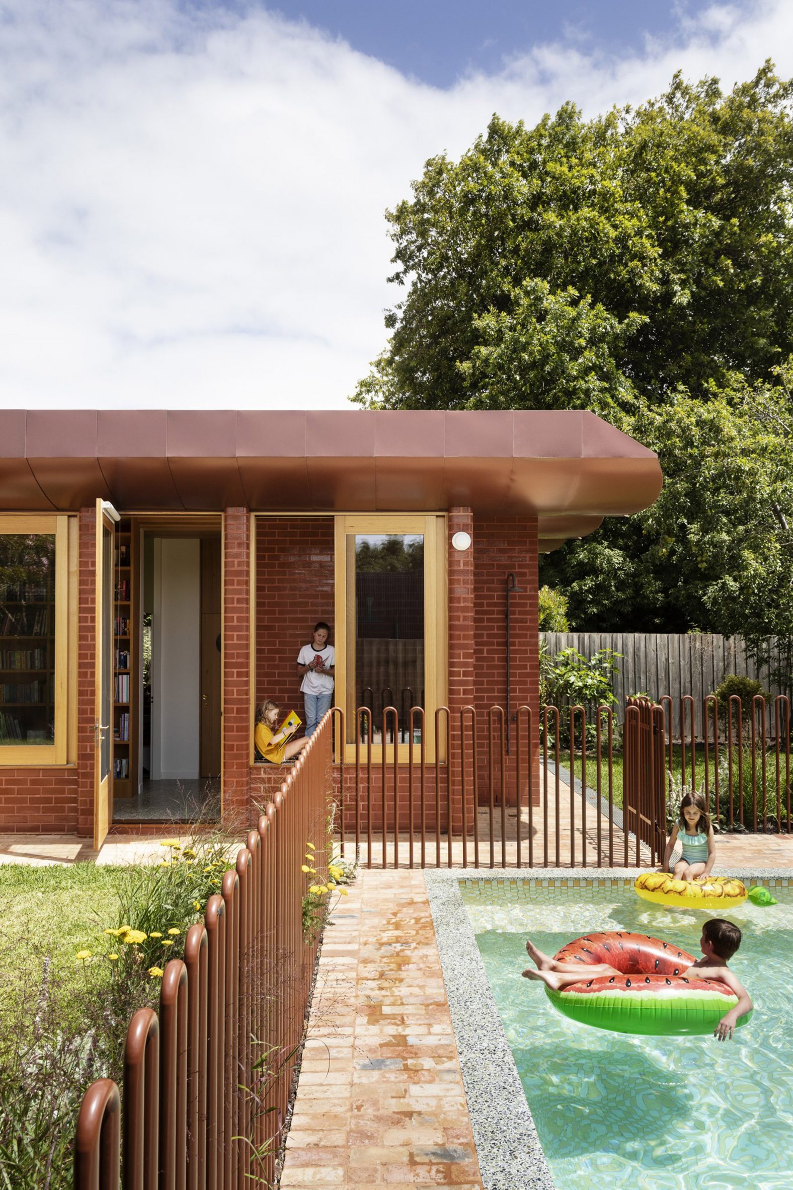
This "clip-on colonnade" extends the axis along the rear of the home and is defined by a run of glazed brick columns framing large windows, creating a bright corridor space that connects a new strip of children's bedrooms.

There is a gated pool area at pony
Wowowa added four new bedrooms and two bathrooms to the single-storey structure

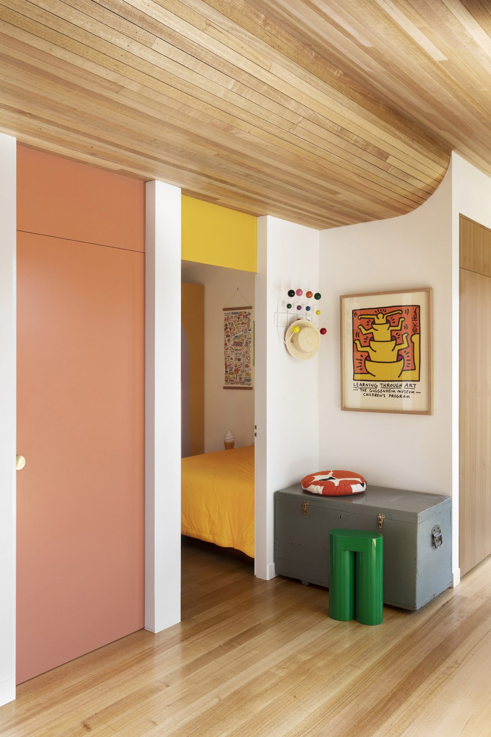
Above, the scalloped roof structure is expressed internally by a wooden ceiling that sweeps "like the belly of a whale" above this new corridor, referencing the construction of boats.

"The structural design, cladding and construction methodology for the roof form was not dissimilar to the construction of a boat, with a keel, bow and stern," said the practice.

Moving the children's bedrooms to this wing freed up space within the original footprint, which now contains a large en-suite main bedroom to the south alongside a new sitting area, connecting via the entry hall to a large kitchen, living and dining area.

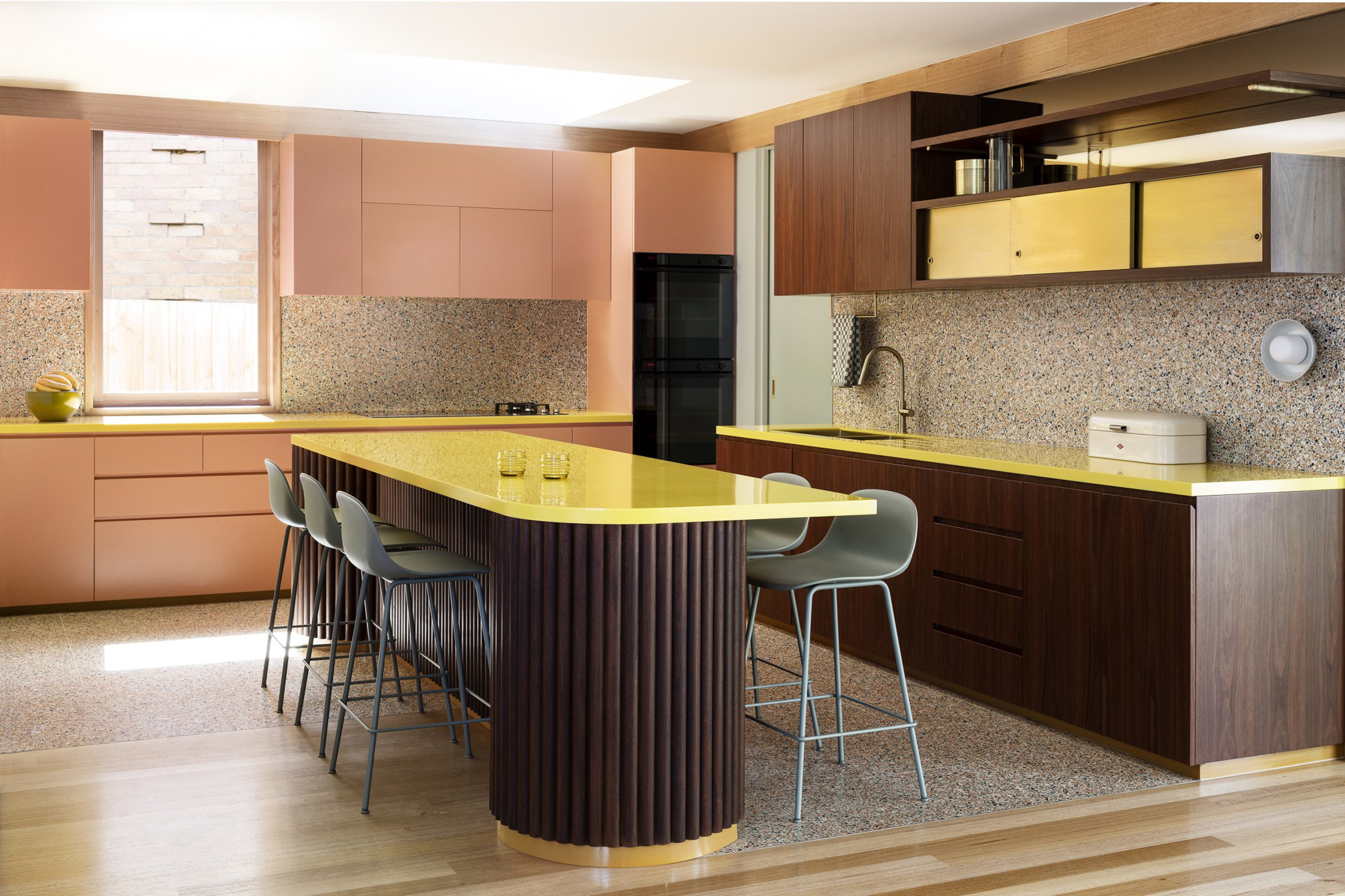
Designed to be the heart of the home, this central space is organised around a bright yellow table and counters, with a "desert inspired" colour palette expressed through terrazzo splash backs and pastel pink cabinets.

"Reflecting their personal aesthetic through form, materiality and colour, the interiors are an accretion of small moments of delight that allow a family to find a quiet moment alone or come together," described the practice.

Interior view of the kitchen at pony
Colourful accents were added to the home including pale pink and yellow cabinetry

Sliding doors to the north connect to a new courtyard created by the extension, allowing the living and dining areas to open out onto an area of raised decking.

"Each axis has the capacity to be closed from the next, allowing a separation of the noisy living spaces from quiet adult areas and children's study zones," it continued.

The home has wooden floors and ceilings
The ceiling has an undulating form that follows the shape of the scalloped roof

The colourful accents in the kitchen extend into the new bedrooms, where pinks and yellows have been used to finish doors and furniture.

Previous projects by Wowowa include a home in Melbourne with cylindrical brick turrets and copper cladding, designed to reference agricultural buildings.

Other projects shortlisted in the residential rebirth category of the 2021 Dezeen Awards include Šilta Šiauré's charred timber clad block of holiday apartments and Matt Gibson's renovation and restoration of a Melbourne home.

The post Wowowa uses colourful accents to update 60s home in Melbourne appeared first on Dezeen.


from Dezeen https://ift.tt/2Y2gsbd

Ten elegant interiors with a dark and moody atmosphere

house h apartment by kc design studio

With Halloween approaching, our latest lookbook highlights 10 dramatic dark interiors from the Dezeen archive, including a concrete-walled restaurant and a gothic nightclub.

These ten projects each make use of dark colours and low light to create an intriguing atmosphere.

While in some cases – such as in a nightclub – the dark colour palette suits the function of the space, other projects chose monochrome hues to minimalise visual distraction or stand out from more colour-saturated competitors.

This is the latest roundup in our Dezeen Lookbooks series that provides visual inspiration for designers and design enthusiasts. Previous lookbooks include smart storage solutions, homes with playful slides, and interiors with window seats.


Voisin Organique restaurant by Various Associates

Voisin Organique, China, by Various Associates

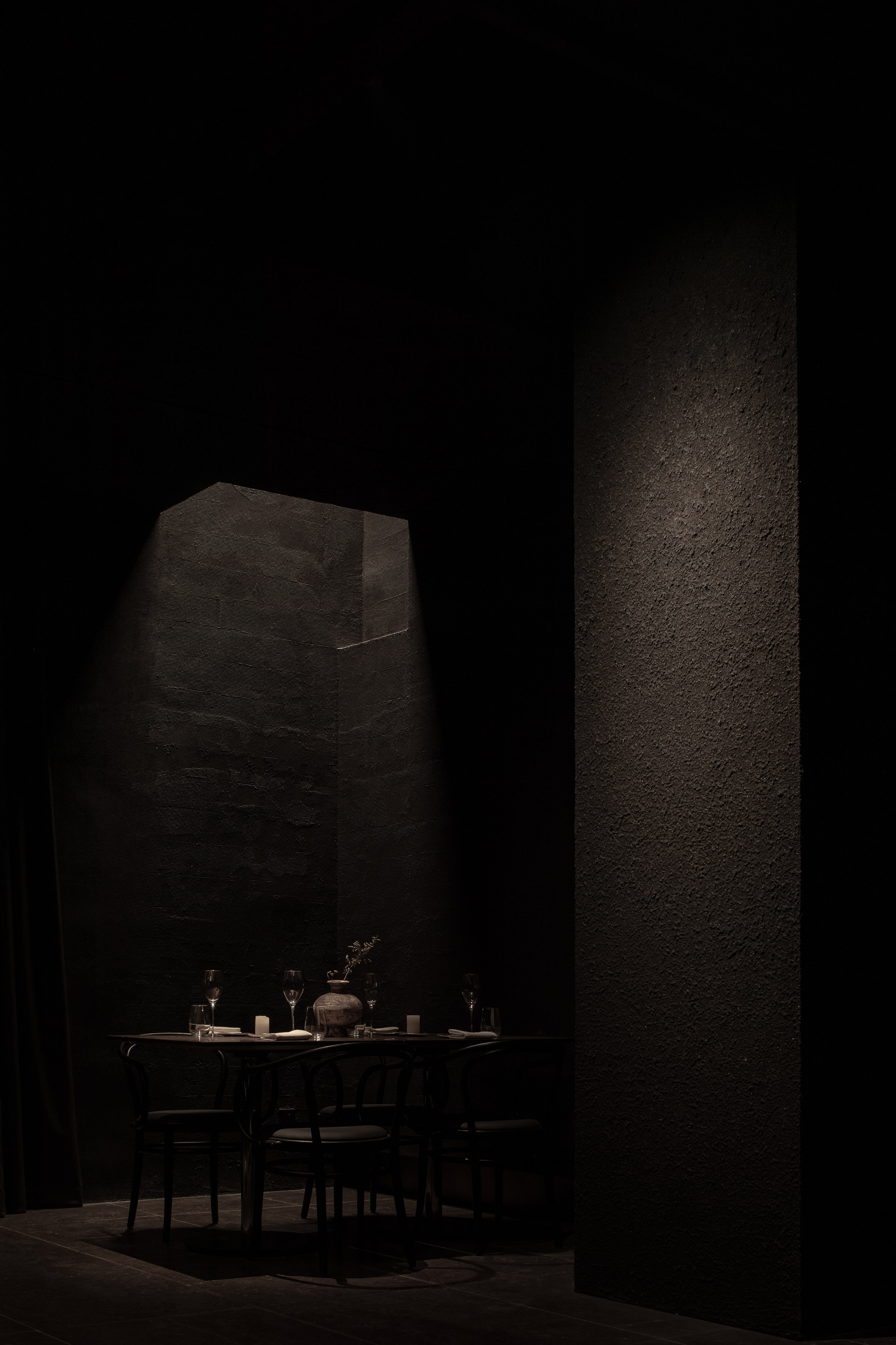
Cavernous ceilings and low lighting was used to create a dark and moody setting at this farm-to-table restaurant in Shenzhen by Various Associates.

The studio took advantage of the space's shadowy qualities to create an experience that aims to mimick "wandering in a valley".

Surfaces were covered in a matte-finish foil that only dimly reflects the light, which was used sparingly throughout the restaurant. Just a handful of spotlights were added to the ceiling.

Find out more about Voisin Organique ›


Shibuya Apartment 201,202 by OgawaArchitects

Shibuya apartment, Japan, by Hiroyuki Ogawa Architects

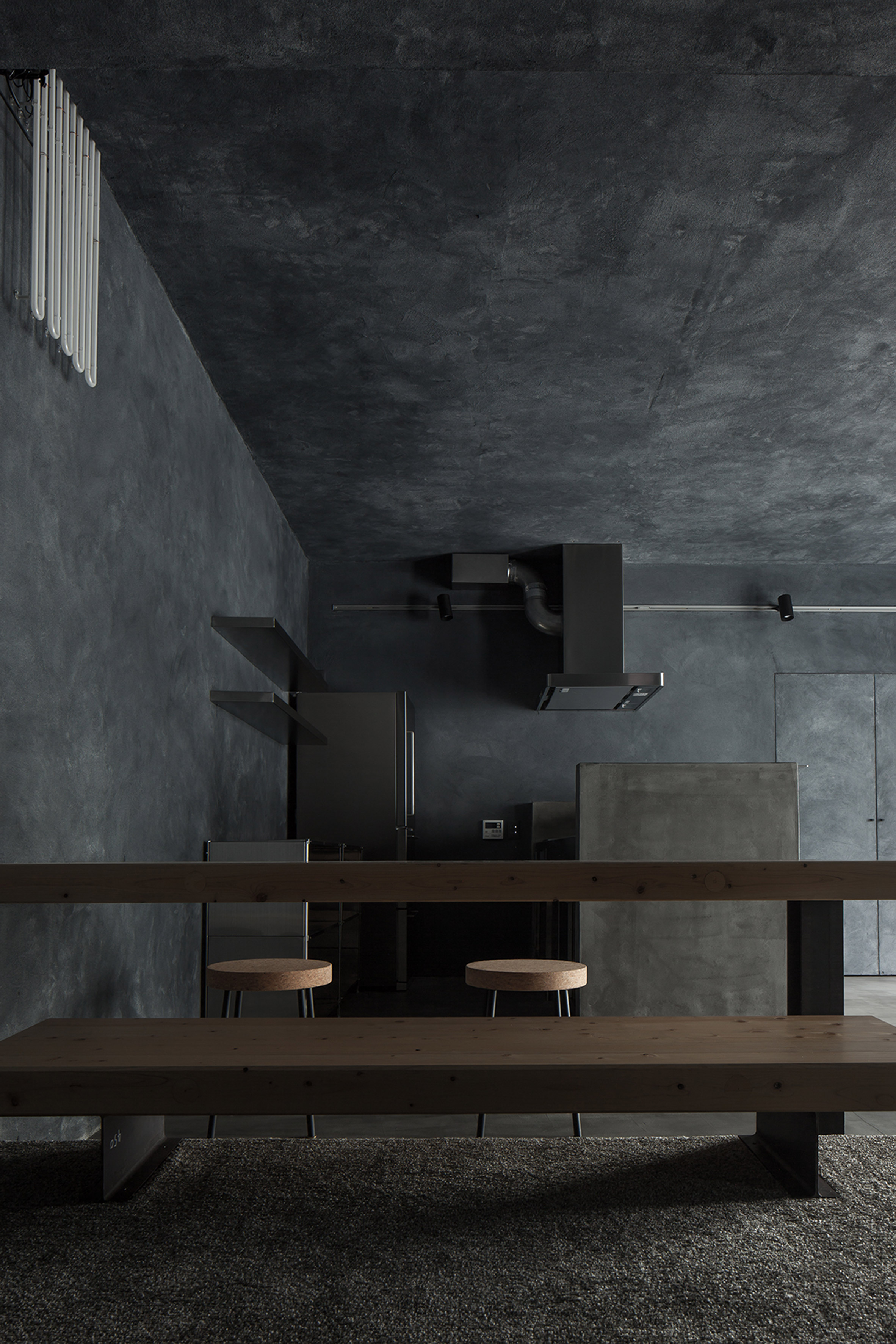
Hiroyuki Ogawa Architects overhauled two apartments in Tokyo, renovating one of them with a material palette of dark plaster, concrete and grey carpet.

The walls and ceilings of the Airbnb apartment were covered with dark plaster which is illuminated by a large full-height window. Matching dark concrete fixtures were added to the living space, including a kitchen island and bar.

Find out more about Shibuya apartment ›


House H in Taiwan designed by KC Design Studio

House H, Taiwan, by KC Design Studio

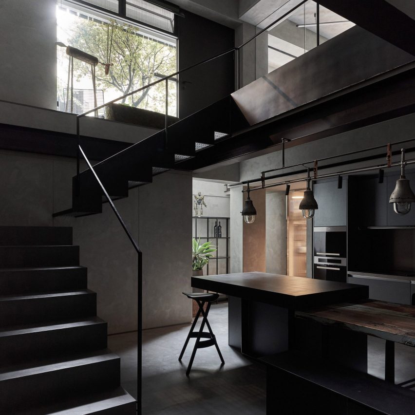
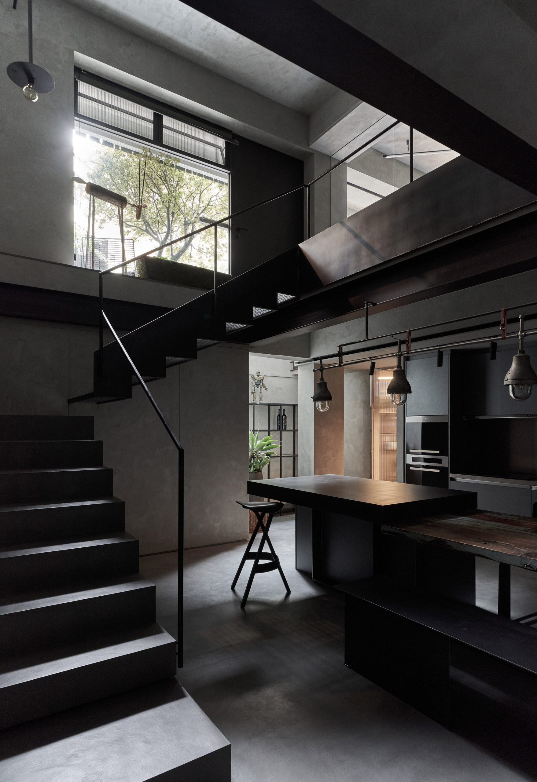
KC Design Studio applied a greyscale palette to its renovation of this cave-like apartment in Taipei.

A corner-fitted staircase folds and rises along the textural plastered walls of the basement, below a large window that connects the two floors of the apartment. Cabinetry and fixtures were coloured in a slate hue to further add to the dark look of the space.

Find out more about House H ›


B018 bunker nightclub by Bernard Khoury has been refurbished

B018, Lebanon, by Bernard Khoury

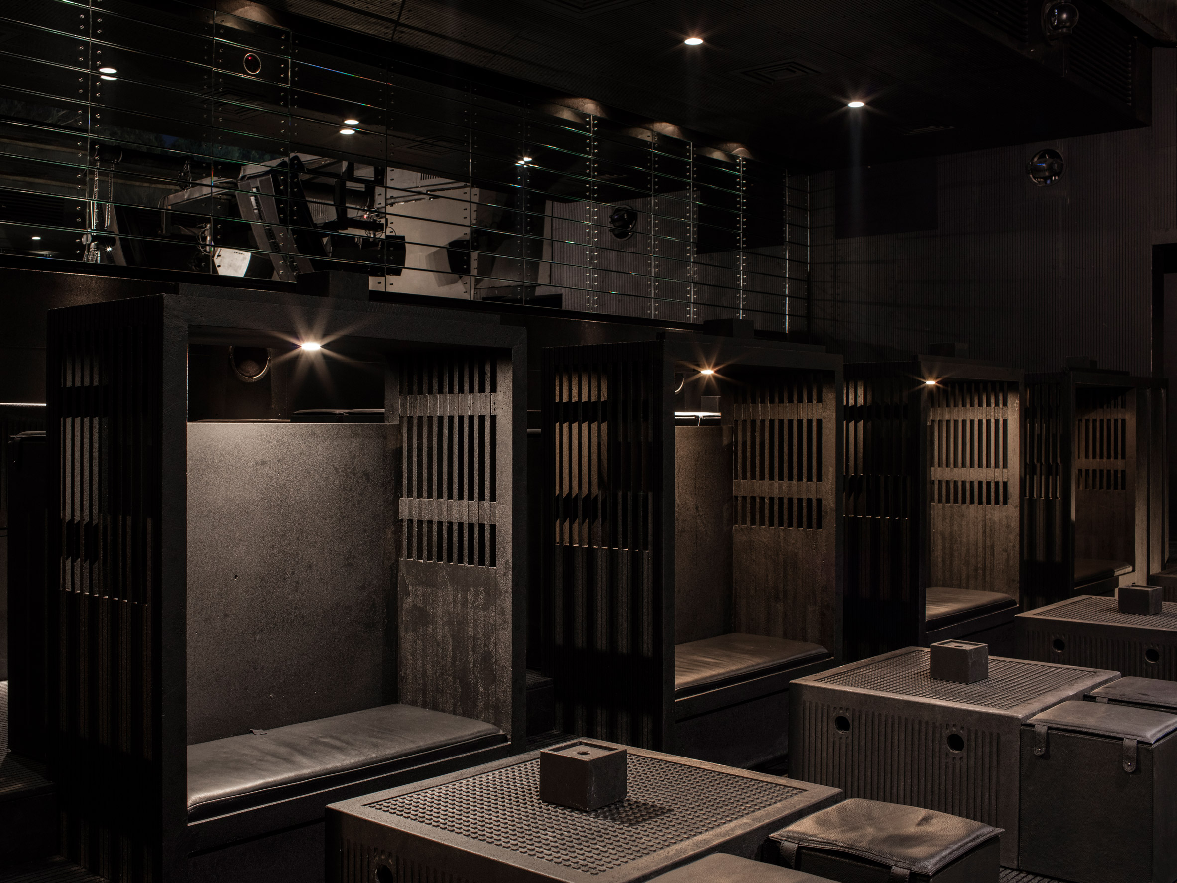
Lebanese architect Bernard Khoury designed the dark interior of the B018 nightclub in Beirut to have a gothic feel. It references both religious architecture and abattoirs.

The interior was built with solid stone, including walls, floors, ceilings and furniture. Altar-like seating was added to the space, with carved-out grills that provide glimpses into neighbouring booths.

Find out more about B018 ›


The Krane, Copenhagen, Denmark, by Arcgency Resource Conscious Architecture

The Krane, Denmark, by Arcgency

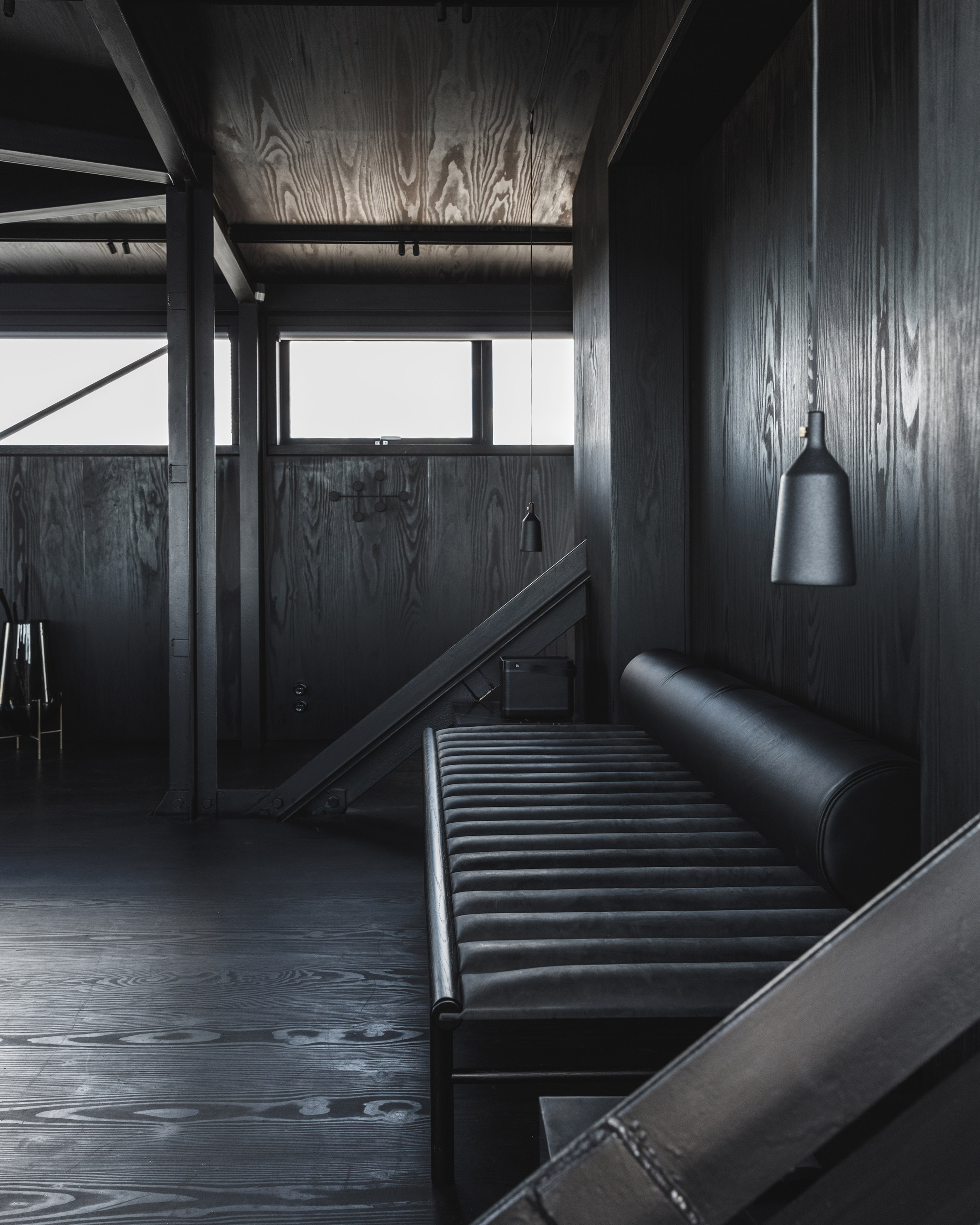
An industrial coal crane on the waterfront of Copenhagen was renovated by Arcgency into a luxury retreat with black interiors.

The space features all-black interiors with built-in and custom furniture crafted from leather, wood, stone and steel. The studio clad the walls, floors and ceilings of the space in wooden panels that were stained jet black.

"Black plays a pivotal role in muting and minimising visual distractions so people feel almost enveloped in the interior," the studio explained.

Find out more about The Krane ›


Fusion Danilo paint showroom designed by JG Phoenix

Danilo showroom, China, by JG Phoenix

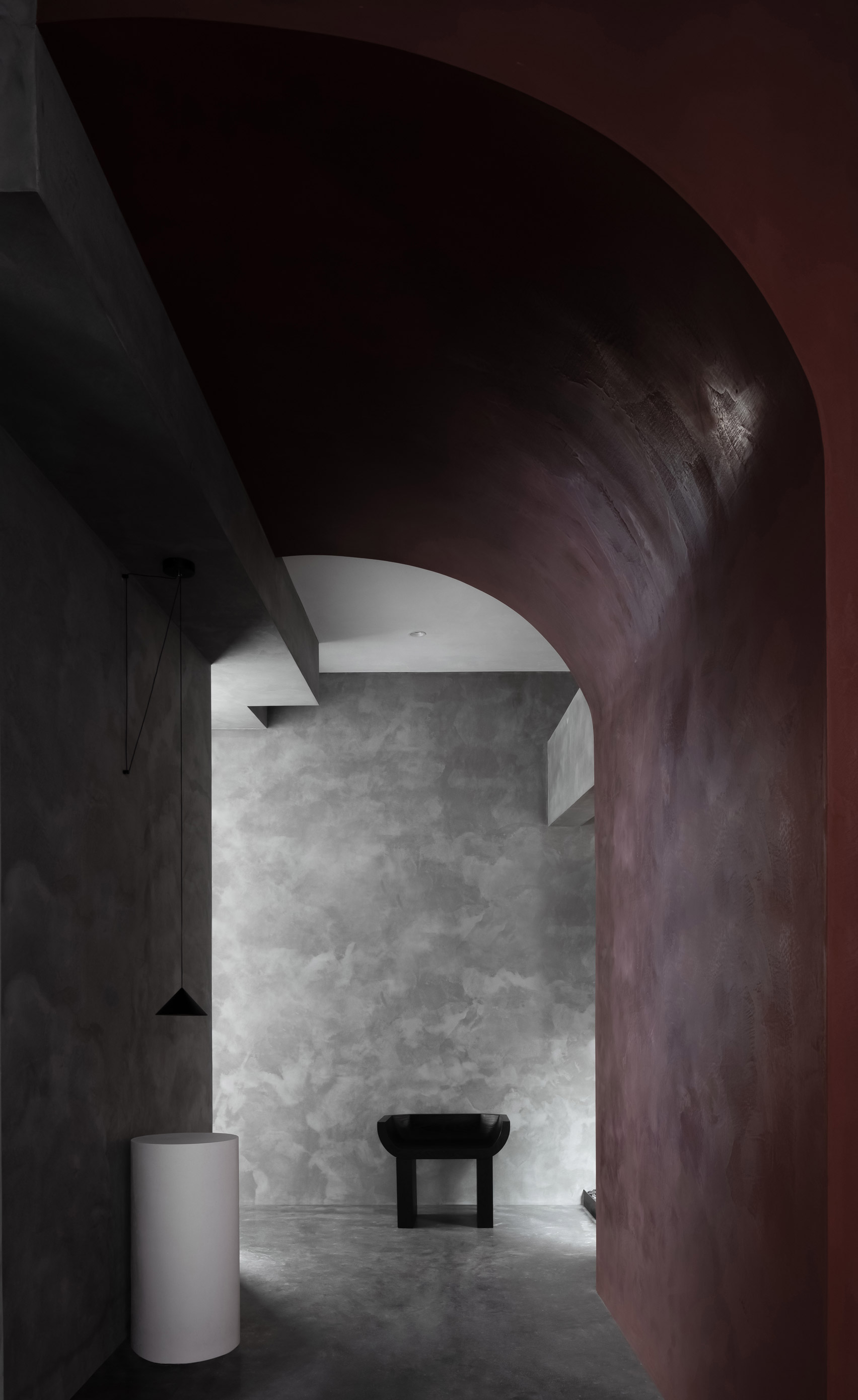
Located in Shantou, China, the Danilo paint showroom by JG Phoenix was informed by the ancient philosophy of yin and yang.

Muted, red vaulted corridors are connected with dark cave-like spaces through circular openings in walls. Boldly shaped furniture was placed in front of the textural walls to accompany the space's curving form.

Find out more about Danilo showroom ›


IN 2 by Jean Verville

IN 2, Canada by Jean Verville

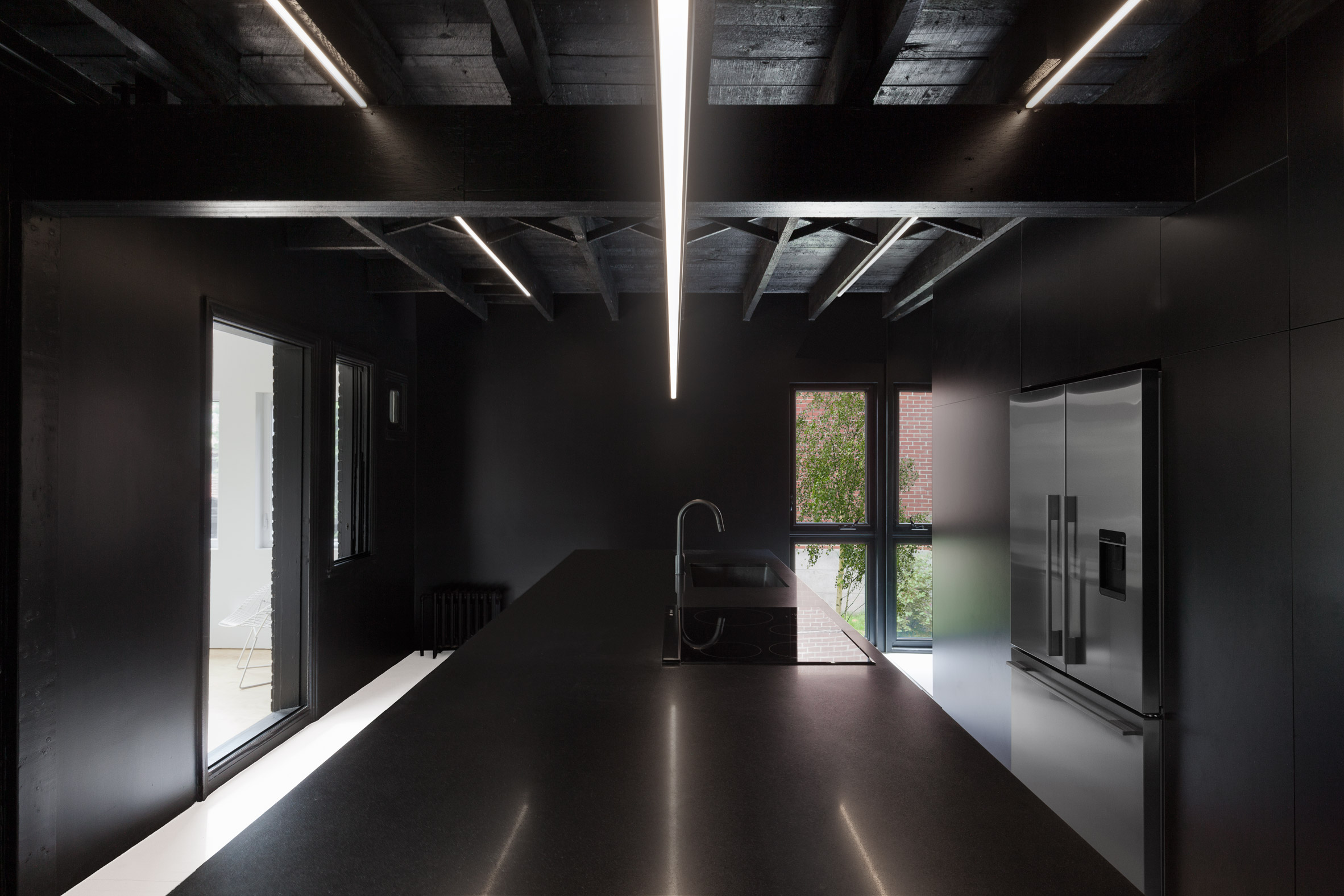
Canadian architect Jean Verville transformed the interiors of a 1950s cottage into a monochromatic home that was stripped of its original features, fixtures and finishes.

In places, rooms were swathed in black paint. The kitchen features an all-black interior with walls, ceilings, cabinetry and fixtures removed of colour. Windows looking out to the garden provide the interior with pops of green.

Find out more about IN 2 ›


Terrace House, Japan, by Atelier Luke

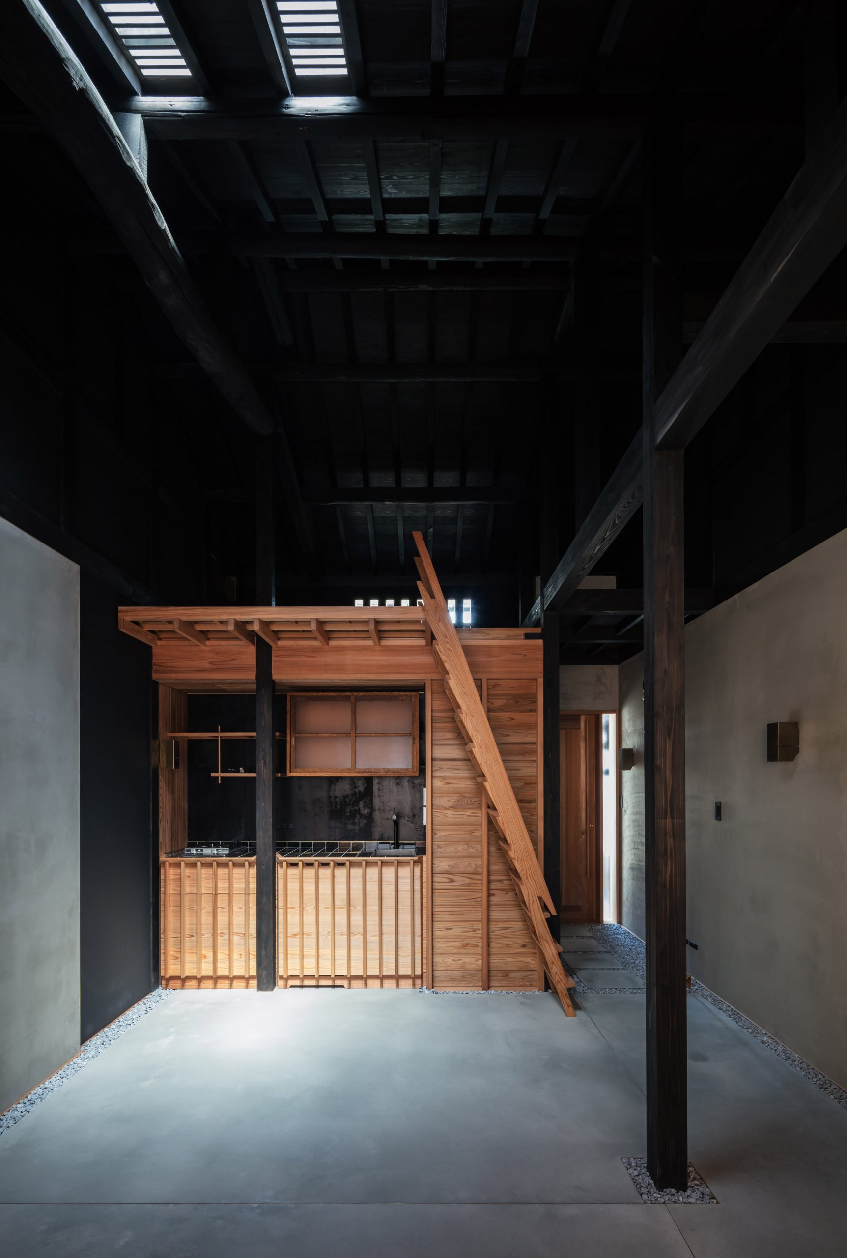
Japanese-Australian architecture studio Atelier Luke renovated this house in Kyoto, stripping it back to its structural elements in an effort to highlight the previously hidden beams.

The studio stained the upper level of the home and the internal timber structure and ceiling black to create "a spacious void of shadows".

The black-stained skeleton extends to the poured concrete floors and highlights a warmly-hued cedar volume at the centre of the space that contains a bathroom, kitchen and lofted sleeping space.

Find out more about Terrace House ›


Lucky Cat restaurant by AfroditiKrassa

Lucky Cat restaurant, UK, by AfroditiKrassa

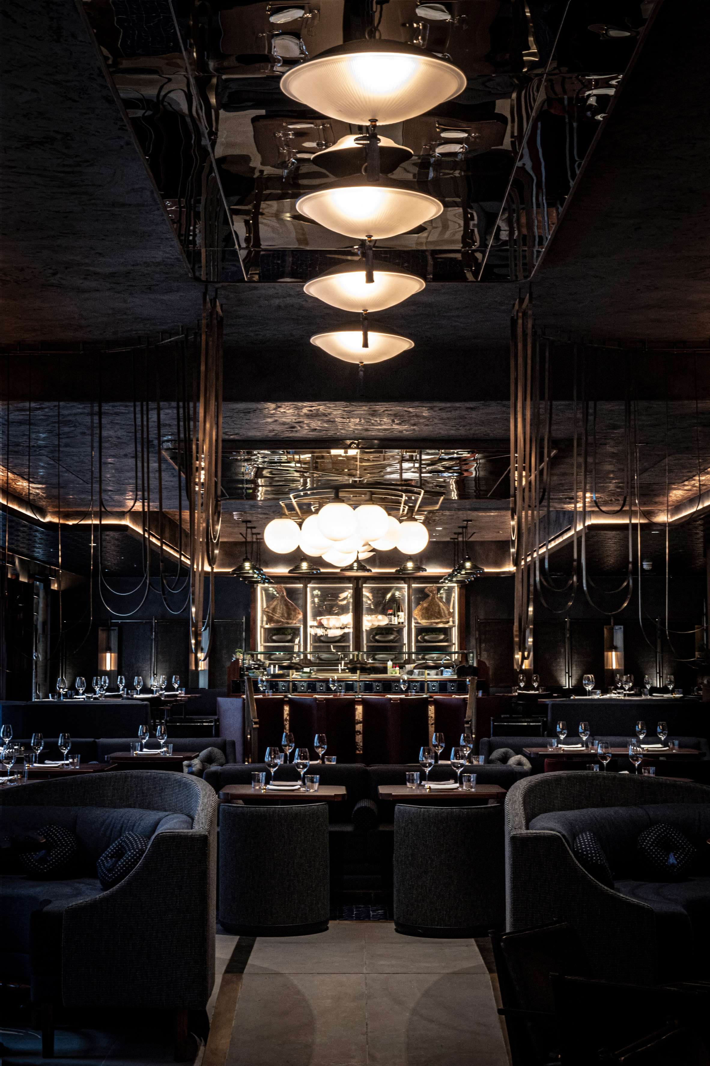
AfroditKrassa blanketed the interior of this restaurant in London with moody tones in an effort to separate it from the colour-saturated Instagrammable aesthetics of many other restaurants.

The studio looked to underground Japanese jazz cafes to inform the design, incorporating wood parquet flooring, an ink-black ceiling, black painted bamboo and black-linen screens.

Find out more about Lucky Cat restaurant ›


Salon Sociedad by Communal

Salón Sociedad, US, by Communal and OTRA Arquitectura

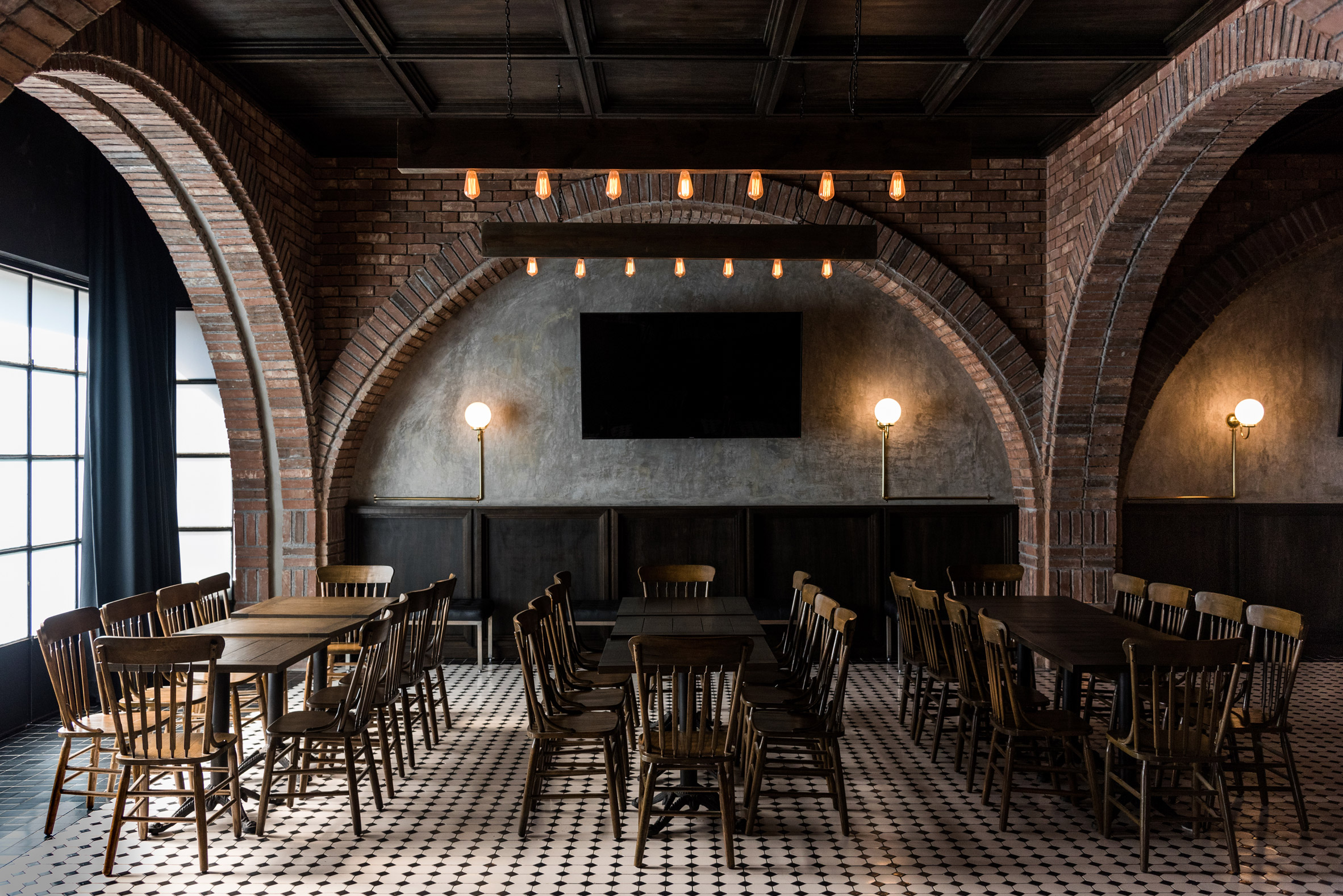
Mexican studios Communal and OTRA Arquitectura added a dark and rustic palette to the interior of Salón Sociedad in Monterrey.

Dim lighting filters through the space via frosted glass panels set between vaulted brick arches. At the rear of the space, arches were filled with concrete and clad with dark wood panelling.

Find out more about Salón Sociedad ›


This is the latest in our series of lookbooks providing curated visual inspiration from Dezeen's image archive. For more inspiration see previous lookbooks showcasing smart storage solutions, window seatsplywood interiors and marble bathrooms.

The post Ten elegant interiors with a dark and moody atmosphere appeared first on Dezeen.


from Dezeen https://ift.tt/3EwGZwR