Wednesday 8 December 2021

Dezeen's top 10 shop interiors of 2021

The store has concrete interiors

As part of our ongoing review of 2021, Dezeen rounds up the top 10 most remarkable and intriguing shop interiors of the year – from a cannabis dispensary made to look like an old-fashioned grocery store to a makeup boutique arranged around a large, mossy mound.


The Apple Store has marble interiors

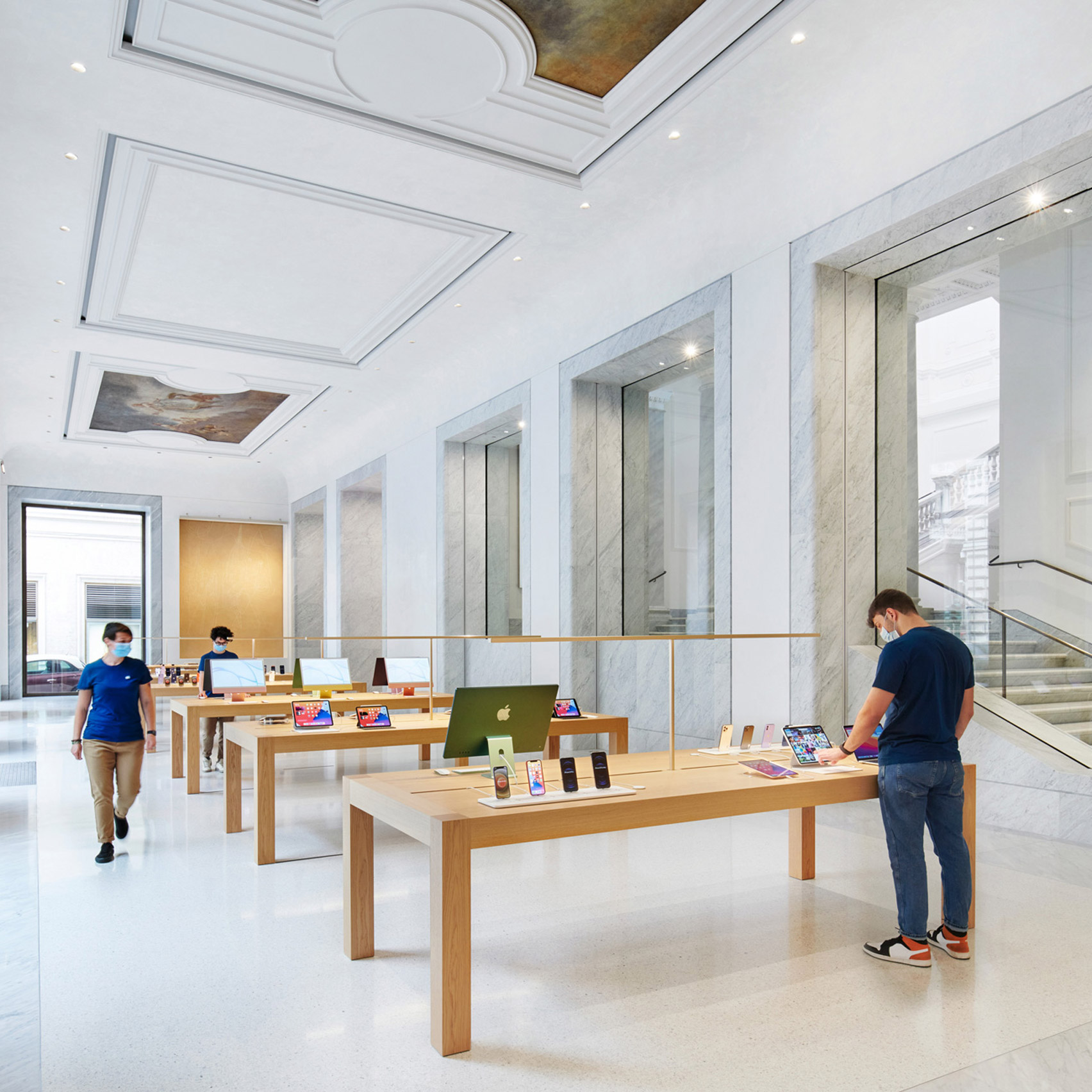
Apple Via del Corso, Italy, by Foster + Partners

UK architecture firm Foster + Partners refurbished and converted Rome's historic Palazzo Marignoli into the largest Apple Store in Europe.

The shop is arranged around a tree-lined courtyard, while original artworks were refurbished and placed in the ceiling to make for an unusually grand technology store.

Find out more about Apple Via del Corso


Superette marijuana shop Toronto
Photo is by Alex Lysakowski

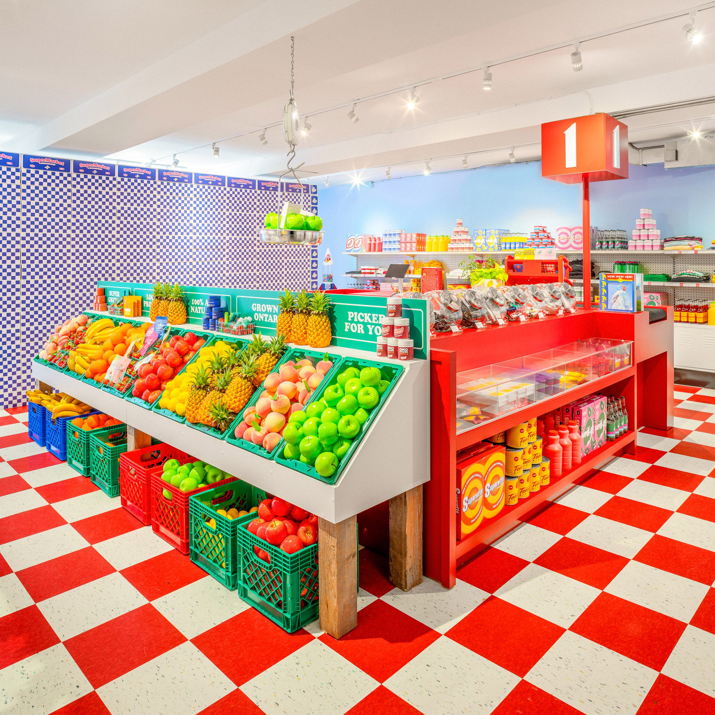
Superette Toronto, Canada, by Superette and Emily Robin

Canadian marijuana merchant Superette aims to make "buying cannabis as enjoyable as consuming it" and recently opened its latest store in Stackt Market in downtown Toronto, a shopping complex made of shipping containers.

The brand's in-house team collaborated with British Columbia designer Emily Robin, bringing together bold graphics and a chequered floor to mimic a classic grocery store.

Find out more about Superette Toronto ›


Lost & Found Hangzhou store by BLUE Architecture Studio
Photo is by Tantan Lei

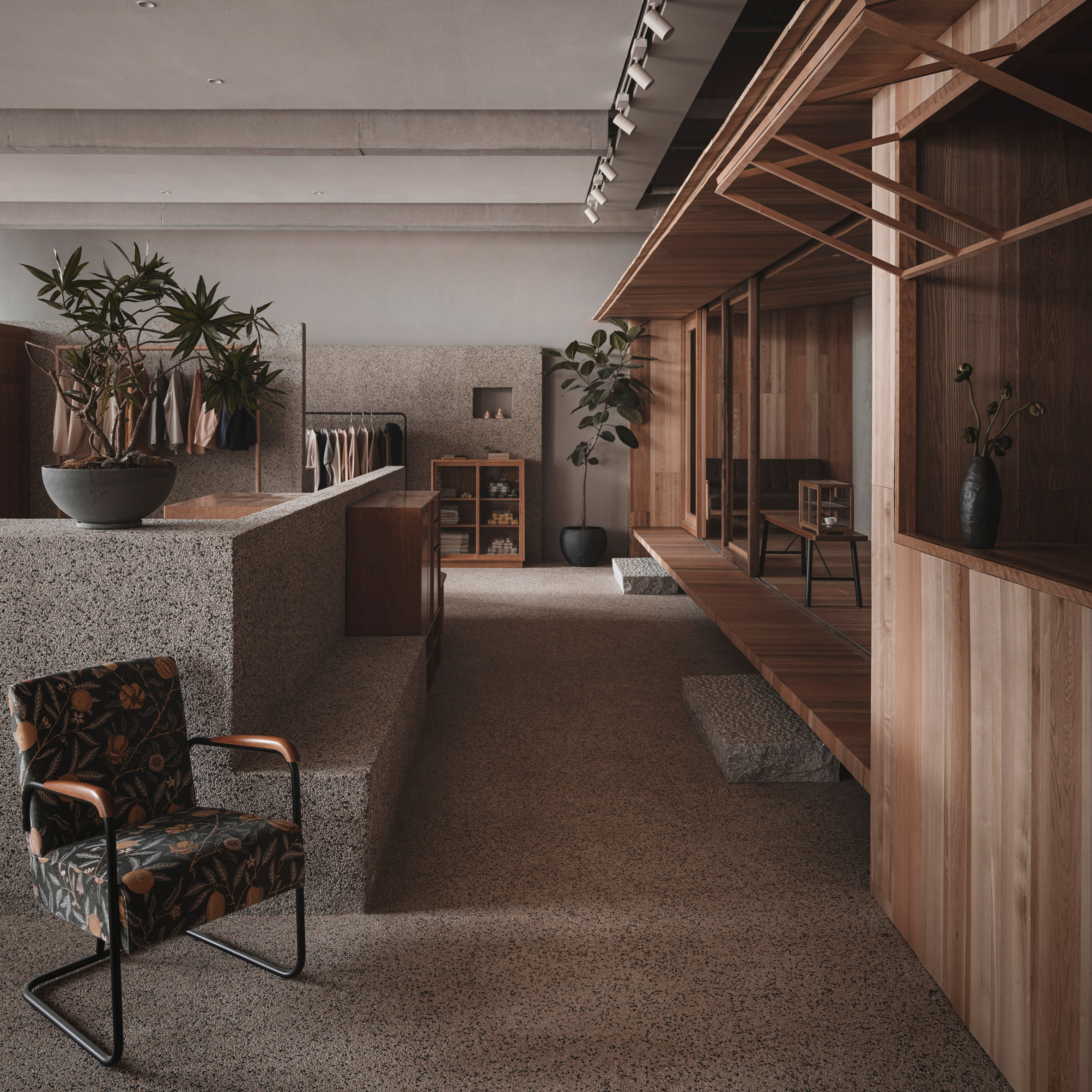
Lost & Found Hangzhou, China, by BLUE Architecture Studio

Six different types of wood feature in this furniture and homeware store designed for lifestyle brand Lost & Found by Beijing-based studio BLUE Architecture Studio.

Mixed-height stone partition walls and even an entire wooden cabin complete with pitched roof inside the store help elicit a natural, rustic atmosphere.

Find out more about Lost & Found Hangzhou ›


a blue tiled interior
Photo is by Gavriil Papadiotis

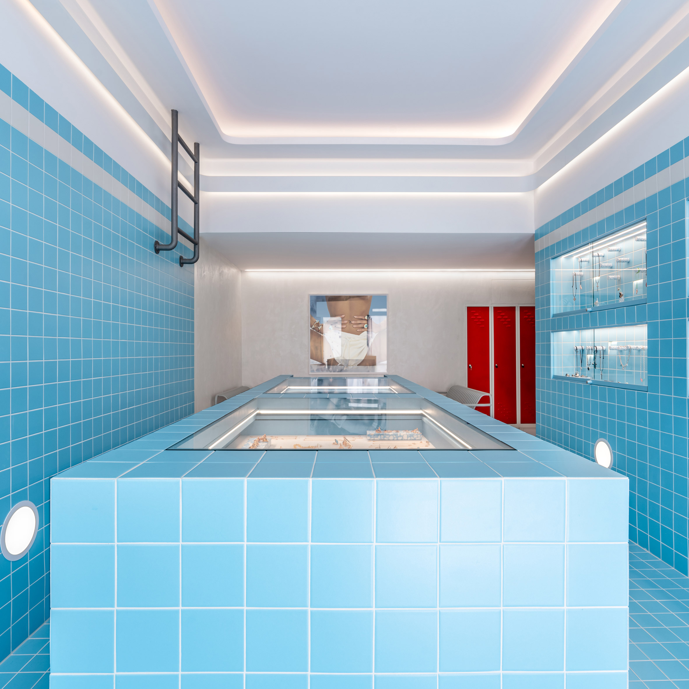
Mykonos jewellery store, Greece, by Saint of Athens

This jewellery shop on the Greek island of Mykonos was designed to resemble a 1960s swimming pool, with light blue terrazzo tiles, lockers and a pool ladder.

Creative agency Saint of Athens worked with Dive Architects on the project for Italian brand Gavello to make the store stand out from its neighbours.

Find out more about this jewellery store ›


Atwater Village lifestyle boutique Dreams
Photo is by Ye Rin Mok

Dreams, USA, by Adi Goodrich

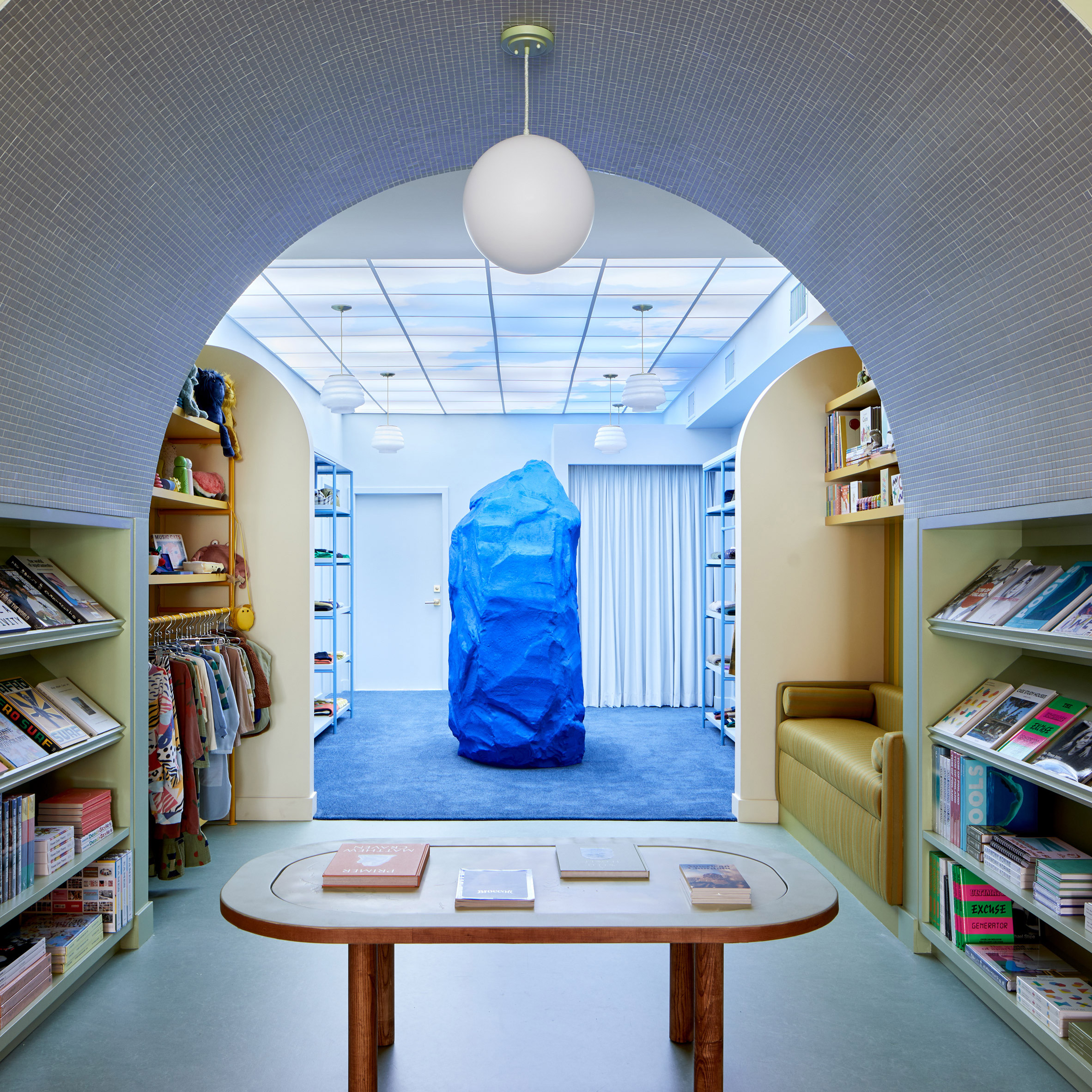
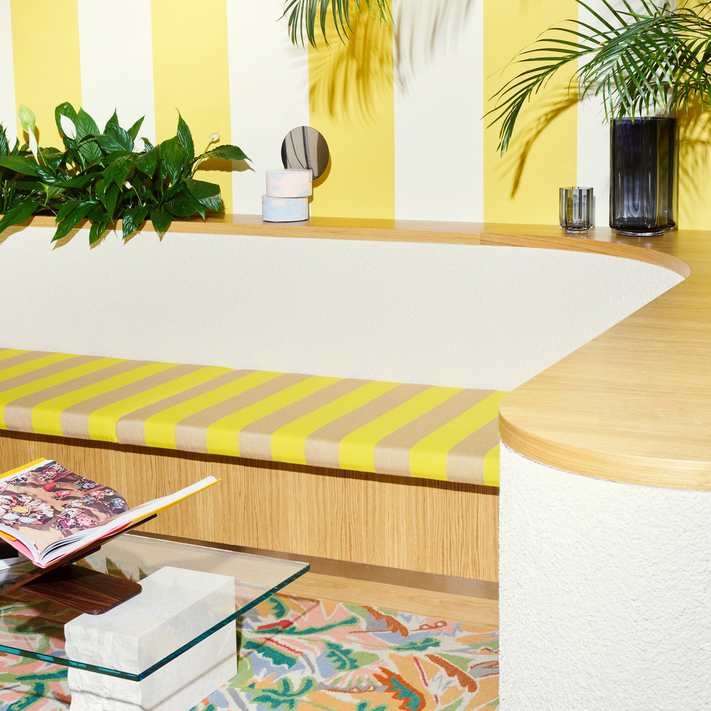
Spatial designer Adi Goodrich took a surrealist approach to this lifestyle store in Los Angeles.

The space's interiors reference dreams and nod to Salvador Dalí paintings, with a lobster phone and a large blue rock helping to create a dreamlike quality that matches the shop's name.

Find out more about Dreams ›


Concrete interiors

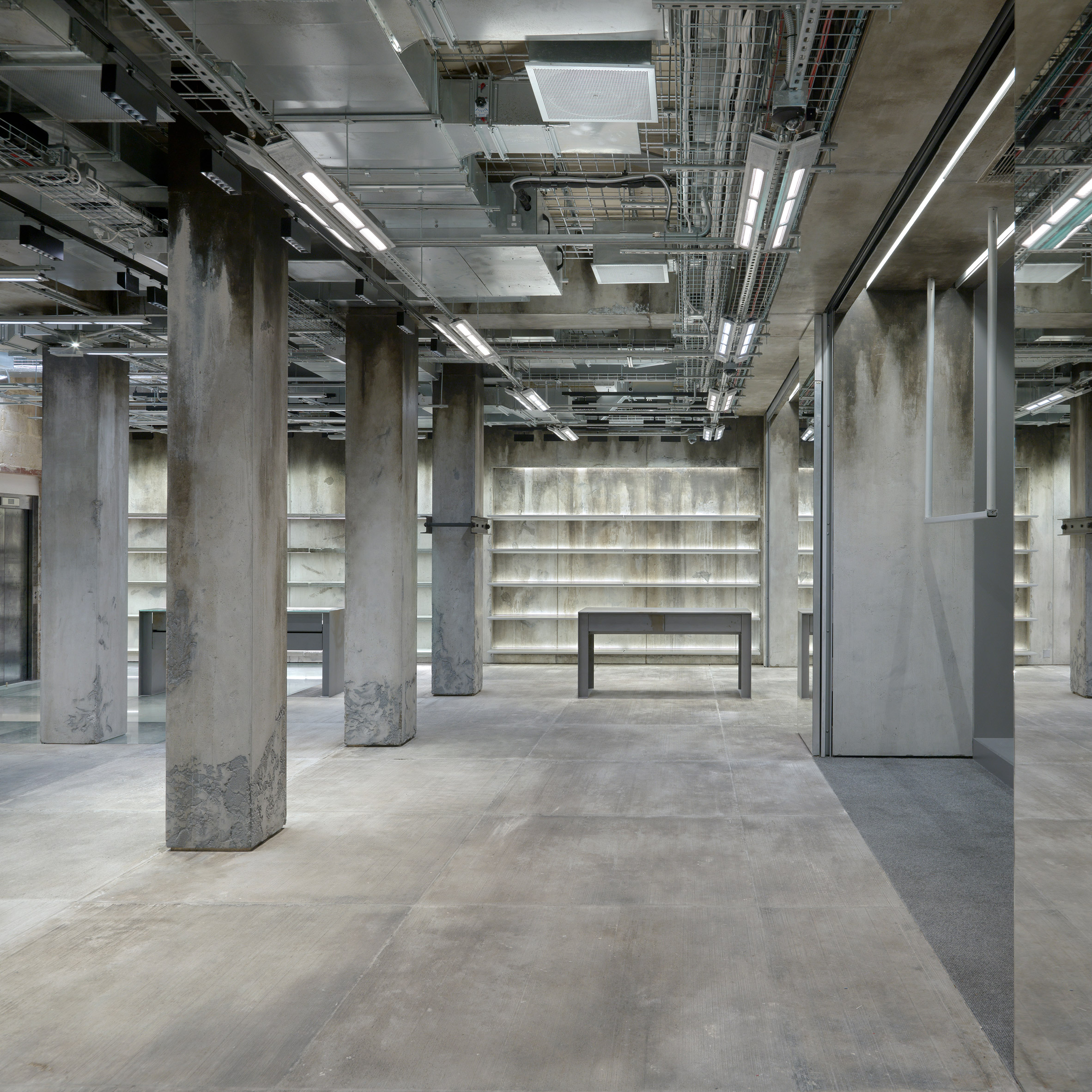
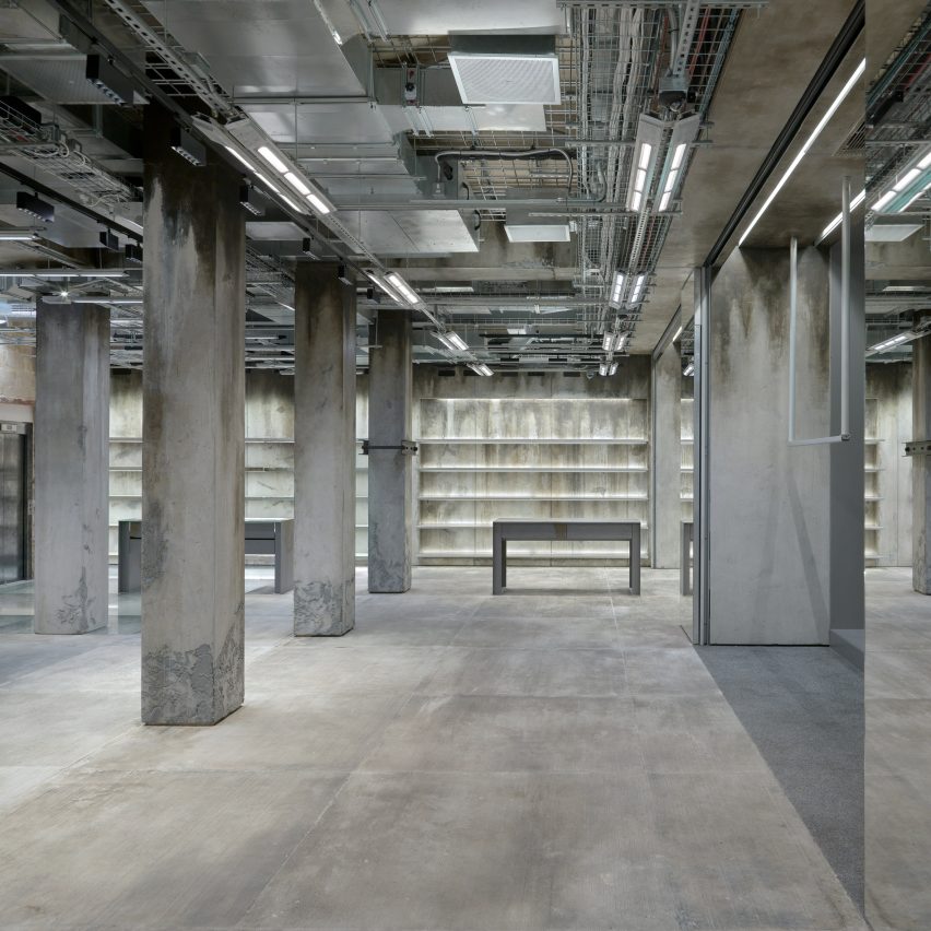
Balenciaga flagship store, UK, by Balenciaga

Luxury fashion brand Balenciaga has described the construction site-informed new aesthetic of its flagship branch in London as "Raw Architecture".

Deliberately stained and cracked concrete is used throughout, while cables and pipes in the ceiling remain exposed and some parts of the floor are fitted with glass panels revealing rubble strewn across the ground beneath.

Find out more about the Balenciaga London flagship store ›


Glossier in Seattle

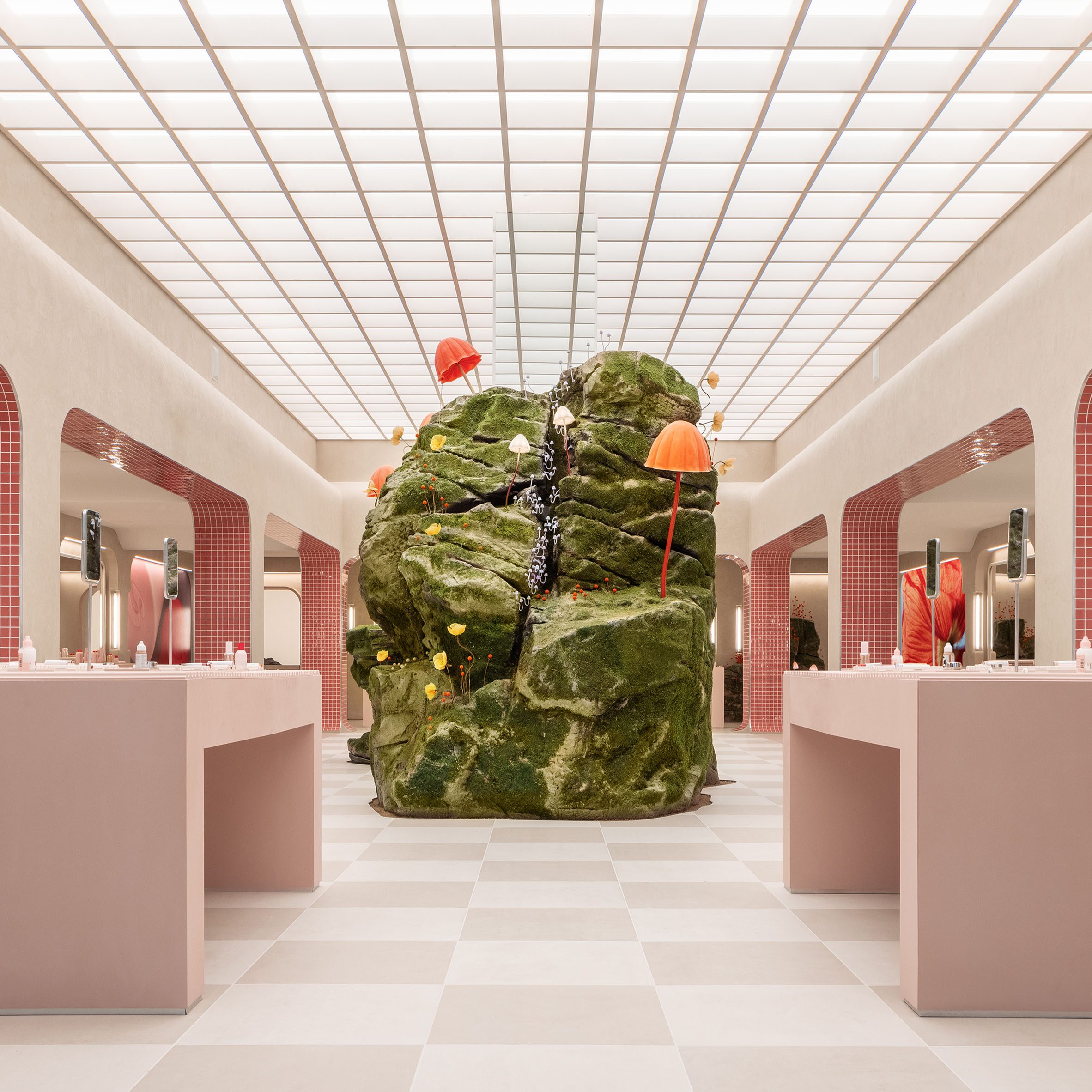
Glossier Seattle, USA, by Glossier

Right in the centre of this cosmetics store is a large boulder covered in moss and colourful mushrooms – or at least, a sculpture of one based on an installation by designer Lily Kwong.

Online beauty brand Glossier's in-house design team surrounded the sculpture with contrasting pale pink furniture and decor in this Seattle store.

Find out more about Glossier Seattle ›


Seating area of Dulong jewellery store by Norm Architects
Photo is by Jonas Bjerre-Poulsen

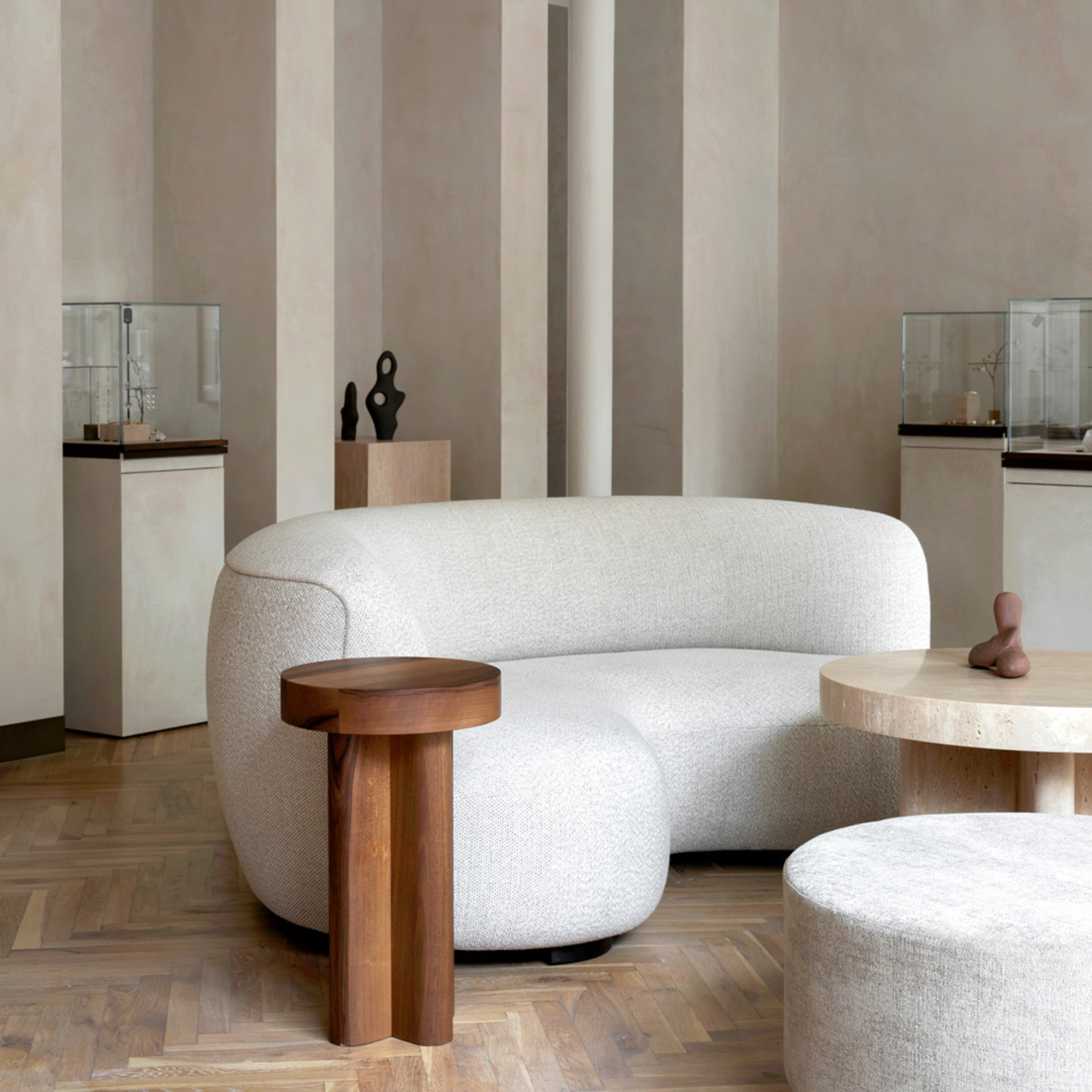
Dulong Copenhagen, Denmark, by Norm Architects

Danish firm Norm Architects based its design for this Dulong jewellery showroom on the studios of great modernist artists such as Pablo Picasso and Henri Matisse.

The store is arranged like a living room, with a curved sofa and round coffee table in the middle and natural materials like oak, clay and linen used to engender a homely feel.

Find out more about Dulong Copenhagen ›


Bund Post Office by Yatofu Creatives
Photo is by Wen Studio

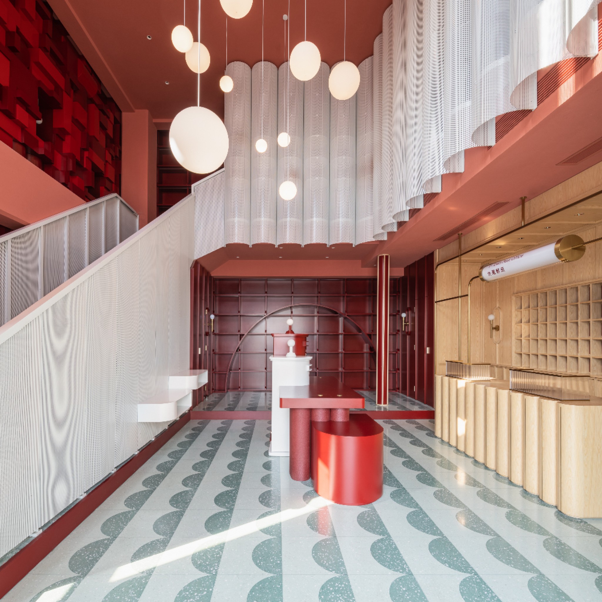
Bund Post Office, China, by Yatofu

Bund Post Office in China's Zhejiang province was decked out in reds, greens and white by design studio Yatofu, which said the "festive palette" is supposed to reference the often celebratory occasions associated with sending packages.

The project, which also features a terrazzo floor and a fluted timber service counter, was named small retail interior of the year at the 2021 Dezeen Awards. Judges called the space "playful, engaging and beautifully done".

Find out more about Bund Post Office ›


Bold striped interior inspired by Alain Delon in Moniker men's department interior by Snøhetta

Moniker Fashion Universe, Norway, by Snøhetta

Moniker Fashion Universe, in Oslo, is a 1,500-square-metre concept store that Norwegian design studio Snøhetta said is supposed to feel like a treasure hunt.

Fixed partition walls create a maze of rooms set within a different "visual universe" built around different personality traits and based on, for example, space travel, motor racing and the French Riviera.

Find out more about Moniker Fashion Universe ›

The post Dezeen's top 10 shop interiors of 2021 appeared first on Dezeen.


from Dezeen https://ift.tt/3IosUEm

Henning Larsen draws on domestic interiors for office in Copenhagen

Wooden office staircase

Wood-lined meeting areas that imitate the living room of a house are intended to create a sense of "hyggeligt" or coziness in this office building in Copenhagen, designed by Danish practice Henning Larsen.

Described as "A Home for Housing", the 7,400-square-metre office was completed for KAB, Denmark's largest administrator of non-profit housing which manages over 64,000 housing units across its capital city.

Red brick exterior of KAB headquarters in Copenhagen
Henning Larsen has designed the KAB headquarters in Copenhagen

In addition to being an office for KAB, the building is a gathering place for 44 housing groups and some 120,000 residents, designed by Henning Larsen to be "representative of Denmark's approach to collectivism, welfare, and the home itself."

This informed the concept of the design, which was based on applying the traditional spaces of the home, such as the living room, kitchen, staircase and garden, to an office building.

Red brick exterior of KAB headquarters in Copenhagen
The building is covered in textured red brick

"We were interested in the play between the office and the home – the two places in which we spend the majority of our daily lives – and how we could infuse the headquarters with the best of both worlds," said Signe Kongebro, global design director and partner at Henning Larsen.

The office is organised around a skylit, wood-lined atrium, with a large reception desk and office canteen sitting among large potted trees.

Wooden office atrium
The office is organised around a wood-lined atrium

A wooden staircase at the centre of this atrium crosses back and forth up the six-storey building to connect to communal kitchen landings on each floor.

"The stairs are a play on the classic stairwell of residential buildings, which is typically the place you meet your neighbour," said associate design director Troels Dam Madsen.

Smaller meeting spaces look out onto this atrium, and to the west a grid of windows frames a series of rooms designed to resemble the interiors of a house, giving the impression of looking into the windows of an apartment block.

Floor lamps, paintings on the walls and more domestic-feeling furniture have all been used to create a feeling of homeliness in these spaces, with wooden wall finishes used throughout to give a "scent and texture not often associated with the workplace."

Wooden office staircase
Wooden stairs link up the building

"When you peek into the windows of the meeting rooms from the stairs, you are observing a household at work," the practice said.

Around the perimeter of each floor is a ring of more traditional office areas, finished with exposed ducting and concrete and wooden dividers with built-in shelving.

Glazed office spaces
The offices are intended to have a domestic feeling

At the top of the building is a rooftop garden for both visitors and employees, providing contrasting views in every direction of the building's crossroads site, including views of an adjacent railway.

The exterior of the office, treated with a robust finish of textured redbrick, was designed to have "no front or back", with each side featuring many thin windows and openings onto the surrounding garden spaces designed by landscape firm SLA.

Office rooftop terrace
The building is complete with a rooftop terrace

Other offices that have looked to domestic interiors for inspiration include Polish architect Mateusz Baumiller's conversion of a military warehouse into an office for three production companies.

The post Henning Larsen draws on domestic interiors for office in Copenhagen appeared first on Dezeen.


from Dezeen https://ift.tt/3oyT6UX

M&S Oxford Street demolition "simply incompatible" with net-zero commitment says C20 Society

M&S Oxford Street store

The Twentieth Century Society has launched a petition calling on Marks & Spencer to abandon the controversial demolition of its store on London's Oxford Street or risk "betraying its own carbon targets".

Launched on 2 December and already supported by more than 1,400 signatures, the petition asks the high-street retailer to retrofit its art deco flagship rather than tearing it down to make space for a new building designed by UK studio Pilbrow & Partners.

The redevelopment would waste the embodied carbon of the existing building, generate 39,500 tonnes of CO2 emissions and counteract M&S's recent commitment to becoming net-zero by 2045, according to The C20 Society director Catherine Croft.

"As recently as September 2021, M&S made admirable commitments to carbon reduction across its business and to achieve net-zero within the coming years," she argued in an open letter to the retailer.

"No matter how it's spun, this proposal is simply incompatible with those commitments."

Listings application turned down

The C20 Society previously filed a listing application for the 1930s Orchard House and its two extensions, which have been home to M&S for the last 90 years, in a bid to preserve its cultural heritage and embodied carbon.

But Westminster City Council turned down the application as it deemed the shop neither "innovative nor of sufficient architectural quality", particularly in light of the various expansions and amendments made to it over the years.

Pilbrow & Partners' redevelopment plans, which were approved by the borough's planning committee last month, will see the six-storey complex with its varying floor levels and ceiling heights replaced by a single 10-storey building.

The new scheme will have almost double the floor space as the original structure, with M&S occupying the lower two levels and part of the first floor while the remainder will be turned into rentable office spaces fringed in garden terraces.

M&S property director Sacha Berendji argued that the new building "positively contributes to our net-zero targets over the long term", as it is lower carbon in operation through its improved energy efficiency and on-site renewable energy.

"We are following the UK Green Building Council's framework to achieve a net-zero carbon building," Pilbrow & Partners explained.

To compensate for the project's 39,500-tonne carbon footprint, M&S will pay for £1.2 million worth of offsets via the Westminster City Council, which will go towards encouraging carbon savings in the local community.

However, this does not make the final project net-zero, as that would require purchasing offsets that actively remove carbon from the atmosphere rather than simply mitigating emissions elsewhere.

According to the architect's own calculations, 2.4 million trees would need to be planted and maintained to suck the emissions generated by the redevelopment out of the atmosphere.

M&S redevelopment "betraying its own carbon targets"

To honour its net-zero goal, Croft argued M&S should renovate and retrofit the existing building to be more energy efficient.

"The company board risks betraying its own carbon targets in the midst of a global climate crisis," she said. "Save and re-use this building and show your customers and investors that M&S is serious about sustainability and its own net-zero commitments."

"The amount of embodied carbon in the building is enormous compared to the sorts of savings they might be making through encouraging the recycling of clothing," Croft added.

Westminster city councillor Geoff Barraclough, who voted against the scheme, explained during a planning meeting that the project's emissions would effectively negate the carbon savings, which the council is set to achieve over the next 23 years with its £17 million retrofitting scheme.

The sentiment was echoed widely on social media, with urbanist David Milner decrying the redevelopment as a "very very poor decision in the context of a climate emergency".

Earlier this year, Westminster City Council signed off another controversial redevelopment near Picadilly, which will see the 1960s French Railways House torn down in favour of an eight-storey complex designed by Make.

"It's a borough, which has just about the highest pressure for redevelopment in the whole country," Croft told Dezeen.

"It would be good if the borough were tougher on environmental issues and prepared to take the lead more because it's absolutely up at the forefront of the debate."

The top image is courtesy of Google Street View.

The post M&S Oxford Street demolition "simply incompatible" with net-zero commitment says C20 Society appeared first on Dezeen.


from Dezeen https://ift.tt/3GqM2ju

Oxford chair by Arne Jacobsen for Fritz Hansen

Oxford office chair by Arne Jacobsen for Fritz Hansen pictured by a window

Dezeen Showroom: Fritz Hansen has released an updated version of the midcentury Oxford office chair by Arne Jacobsen, which combines a timeless aesthetic with modern sensibilities.

The Oxford chair, which was originally designed for professors at St Catherine's College in Oxford, is shaped to support a person's body as they sit within it.

Image of an office with the Arne Jacobsen Oxford office chairs
The Oxford chair is a midcentury chair that was designed by Arne Jacobsen

The reworking of Arne Jacobsen's office chair has been upgraded for use within offices, the home, and a "new generation of workspaces".

Its simplistic yet contemporary form aims to bring a modern look to workspaces. The chair can be also be customised with armrests, bases, upholstery and is available as a low- or mid-back model for optimal comfort.

Image of the Oxford office chair in a brown leather upholstery
The midcentury chair has been redesigned by Fritz Hansen to suit office life

An extended seat provides users with natural posture that works with the chair's upgraded tilt mechanism and adjustable seat to better suit all body types and uses.

Armrests were designed and angled to fit tidily below tabletops for a clean look and finish.  Multiple bases including a four-point fixed base and a five-point wheeled base can be similarly customised in different finishes.

Product: Oxford chair
Designers: Arne Jacobsen
Brand: Fritz Hansen

About Dezeen Showroom: Dezeen Showroom offers an affordable space for brands to launch new products and showcase their designers and projects to Dezeen's huge global audience. For more details email showroom@dezeen.com.

Dezeen Showroom is an example of partnership content on Dezeen. Find out more about partnership content here.

The post Oxford chair by Arne Jacobsen for Fritz Hansen appeared first on Dezeen.


from Dezeen https://ift.tt/3EHWgvq

"The great transformer of Barcelona" architect Oriol Bohigas dies aged 95

Spanish architect Oriol Bohigas

Oriol Bohigas, the Catalan architect behind the modernisation of Barcelona, has died at the age of 95.

Bohigas, who had Parkinson's disease for a number of years before his death, passed away on 30 November 2021.

An architect and urban planner who co-founded the firm MBM Arquitectes, he was best known for his work transforming the city of Barcelona ahead of the 1992 Summer Olympics.

Barcelona had grown haphazardly in the aftermath of the second world war and was cut off from its beaches by industrial buildings, but interventions made by Bohigas in the 1980s and 1990s reconnected the city to its waterfront and turned it into a thriving modern city and tourism capital.

Oriol Bohigas, Spanish architect
Oriol Bohias was awarded the Gold Medal of the Generalitat of Catalonia in 2013. Photo is by Discasto via Wikimedia Commons

With MBM Arquitectes, Bohigas designed the Villa Olímpica athletes' village, replacing the industrial site on Barcelona's beachfront with what would later become market housing, and Port Olímpic, a new port for the influx of tourists.

Rather than focusing on a few key sports buildings, the Olympic project saw investment spread across the city, adding green spaces, major road arteries and neighbourhood improvements that would outlast the Summer Games.

A lifelong advocate for modernity

The project continued work that Bohigas had begun in 1980 as urban planning delegate on the Barcelona City Council, from where he pushed for the transformation of the city.

He had been a lifelong advocate for modernity, arguing in print as early as 1950 for a departure from the neoclassical and monumental architecture favoured by Spain's nationalist dictator, Francisco Franco, who ruled until 1975.

After graduating from the Barcelona School of Architecture, he joined with other like minds in forming Grupo R, to advocate for modern and rationalist architecture in the city.

Later, he became a professor at the Escuela Técnica Superior de Arquitectura de Barcelona and was elected its director in 1977, and he co-founded MBM with Josep Martorell and David Mackay.

Olympics regeneration work emulated worldwide

The culmination of Bohigas's work, the pre-Olympics transformation of Barcelona, is now celebrated the world over as a successful example of urban regeneration. Other cities have tried to emulate "the Barcelona Model", including London in its preparations for the 2012 Olympics.

In another sign of the project's uniqueness, the RIBA awarded Barcelona its 1999 Royal Gold Medal for Architecture – the only time it has chosen a city and not an individual or studio – and singled out Bohigas as one of five key individuals.

"With London getting a new mayor you need someone like Oriol Bohigas, who was the head of a school of architecture, who got the city going and developed a theory," said judge Peter Carolin at the time.

President of the Government of Catalonia, Pere Aragonès i Garcia, was among those to pay tribute to Bohigas on Twitter last week.

"Goodbye to the great transformer of Barcelona," he wrote. "To the long-sighted architect. To the committed intellectual. A benchmark for the country has died. Rest in peace, Oriol Bohigas."

Among Bohigas' other well-known projects is the Pavilion of the Future at the Universal Exhibition in Seville in 1992 and the Design Museum of Barcelona. He also authored many books.

The main image is by Galazan via Wikimedia Commons.

The post "The great transformer of Barcelona" architect Oriol Bohigas dies aged 95 appeared first on Dezeen.


from Dezeen https://ift.tt/31BYApi