Friday 10 December 2021

Herzog & de Meuron unveils plectrum-shaped AstraZeneca research centre

Disc-shaped glass research centre for AstraZeneca

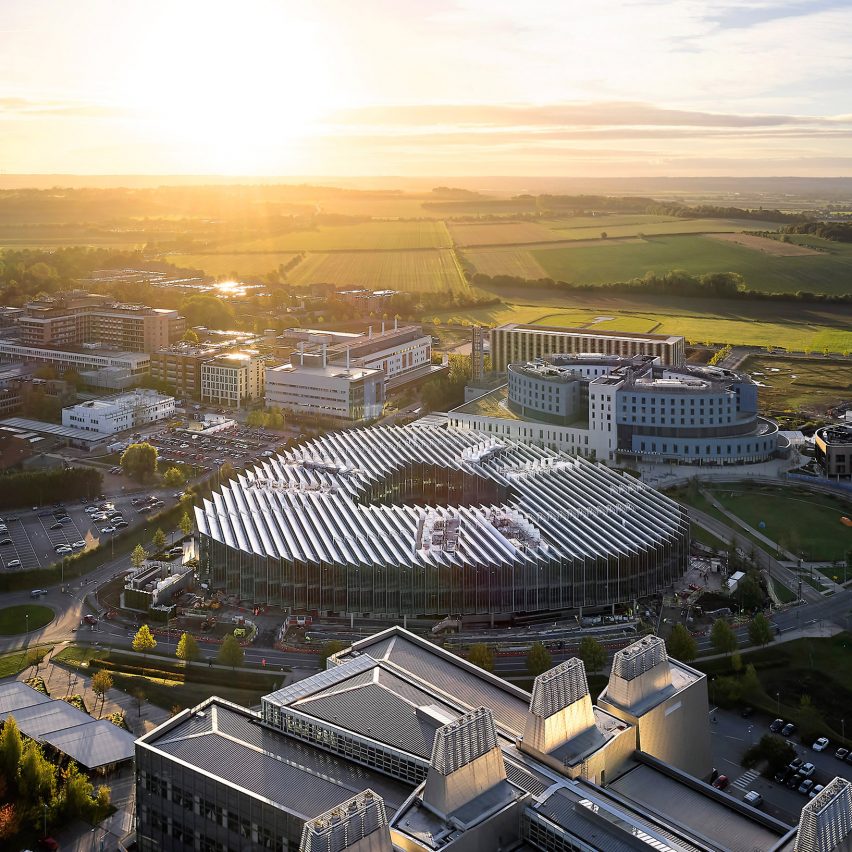
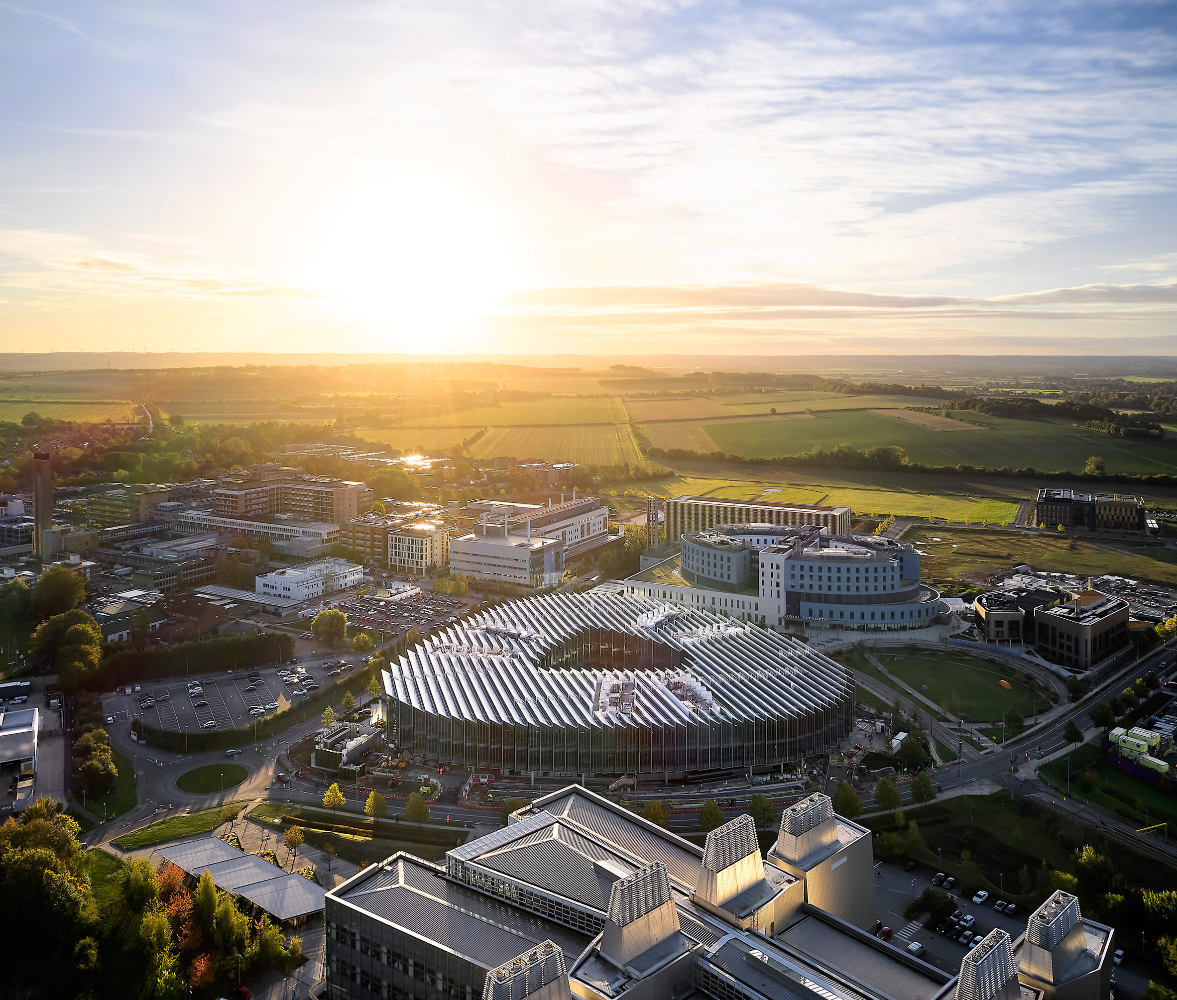
Swiss studio Herzog & de Meuron has completed The Discovery Centre, a glass-clad facility for research and development designed for pharmaceutical company AstraZeneca in Cambridge.

The research centre, which is shaped like a triangular guitar plectrum and features a sawtooth-shaped roof, is located in the middle of the Cambridge Biomedical Campus and was designed in relation to its surroundings.

Research centre in Cambridge by Herzog & de Meuron
The centre features a stepped glass facade and a jagged roof. Photo is courtesy of AstraZeneca

"Eight years ago, when AstraZeneca did a competition in 2013 for this project, they had a new vision for the company," Herzog & de Meuron architect and project director Tomislav Dushanov told Dezeen.

"[They] wanted to basically shift the focus in their company to science – place science in the middle of everything; make science visible."

Location of AstraZeneca's DISC in Cambridge
DISC sits in the centre of the Cambridge Biomedical Campus

AstraZeneca's brief for the architects was to create a building that placed the emphasis on the scientific research that was taking place inside, rather than hiding it away. The company also wanted the centre to be an inviting space.

"AstraZeneca said: 'when we move to Cambridge we will be in the middle of this campus, we will be in the middle of our competition, so instead of pushing everybody away, we will invite everybody in'," Dushanov said.

"So this was the business idea, which we had to turn into an architectural idea."

Courtyard or research and development centre in Cambridge
The three-storey building holds laboratories for AstraZeneca. Photo is by David Porter

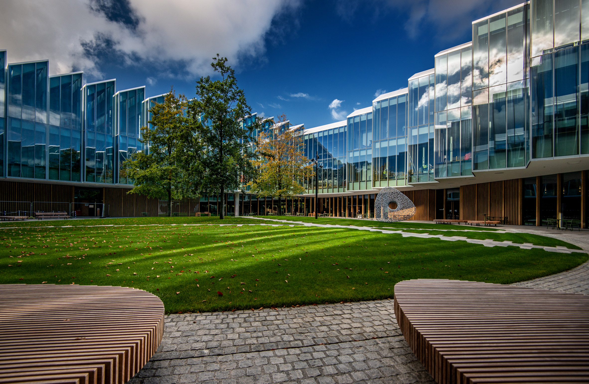
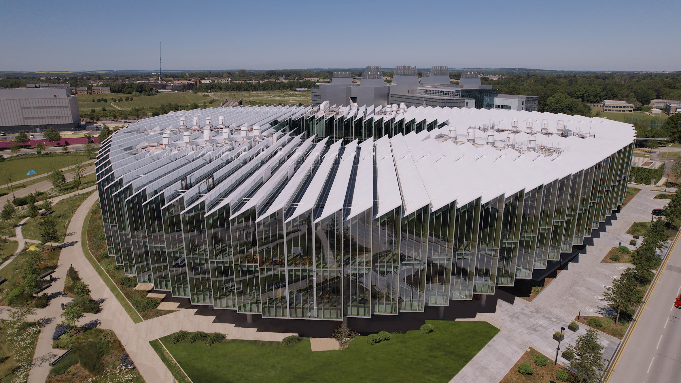
Known as The Discovery Centre (DISC), the resulting 20-metre-high building is shaped like a triangle to make full use of the site.

"By occupying the entire site we created facades along all the streets around, something which is not happening in the other buildings," Dushanov explained.

"The other buildings are kind of objects sitting within green fields, while we bring a bit of an urban quality by aligning with the street and creating the streetscape."

View out from The Discovery Centre by Herzog & de Meuron
Six rectangular glass boxes surround a central courtyard

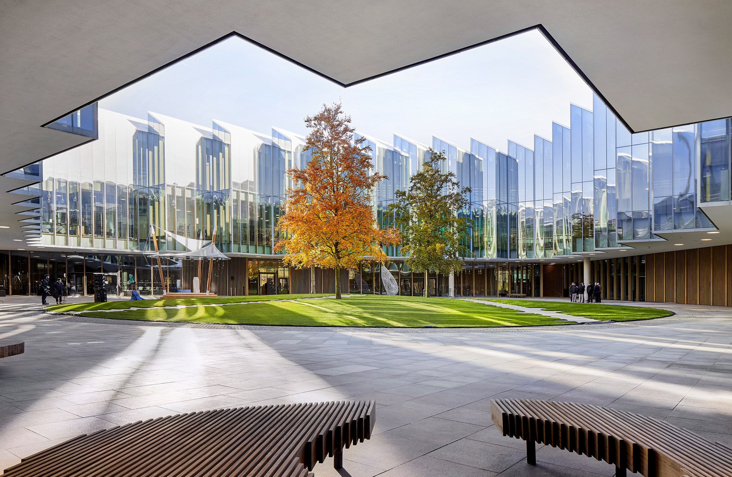
The three-storey DISC has a concrete structure with a fully-glazed wooden facade. The upper floors of the building, which have a stepped glass facade, sit on six rectangular glass boxes that have been grouped in three pairs around an open courtyard.

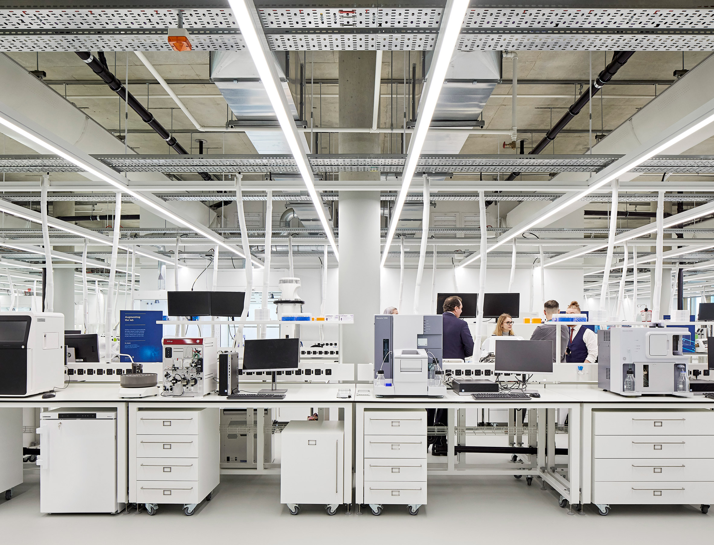
These boxes run vertically through all floors and house the laboratories, which take up 19,000 square metres of the 55,000-square-metre site.

"We have only a three-storey structure, which created this very low-laying horizontal building that also in a way responded to an idea of AstraZeneca's: not to create an imposing Big Pharma corporate piece, but something which is more nested in the neighbourhood," Dushanov said.

"It doesn't feel large because it is low," he added. "We created this glazed facade, which reflects everything around it, but we also broke the building into almost like row houses."

"This zigzag that you see is a further breakdown of the scale of the building, so that you don't feel this huge magnitude."

Interior in the DISC, Cambridge
White oak wood was used for the interior

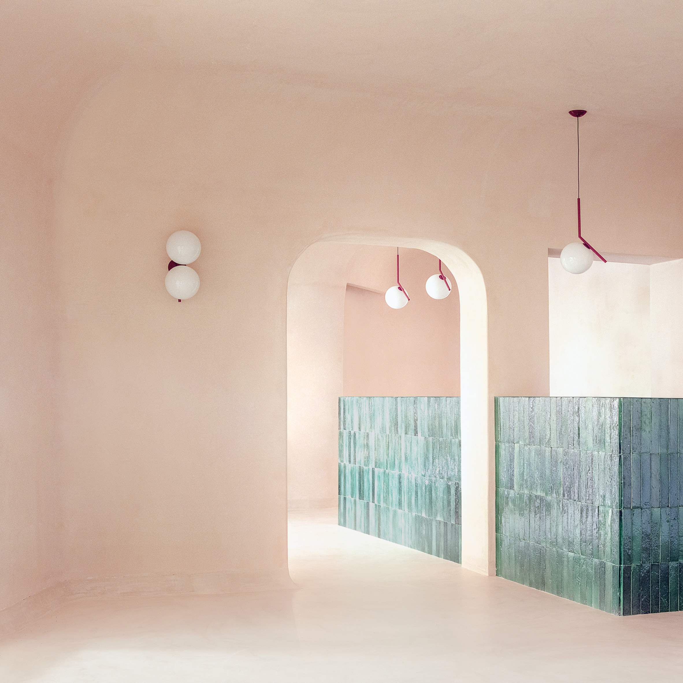
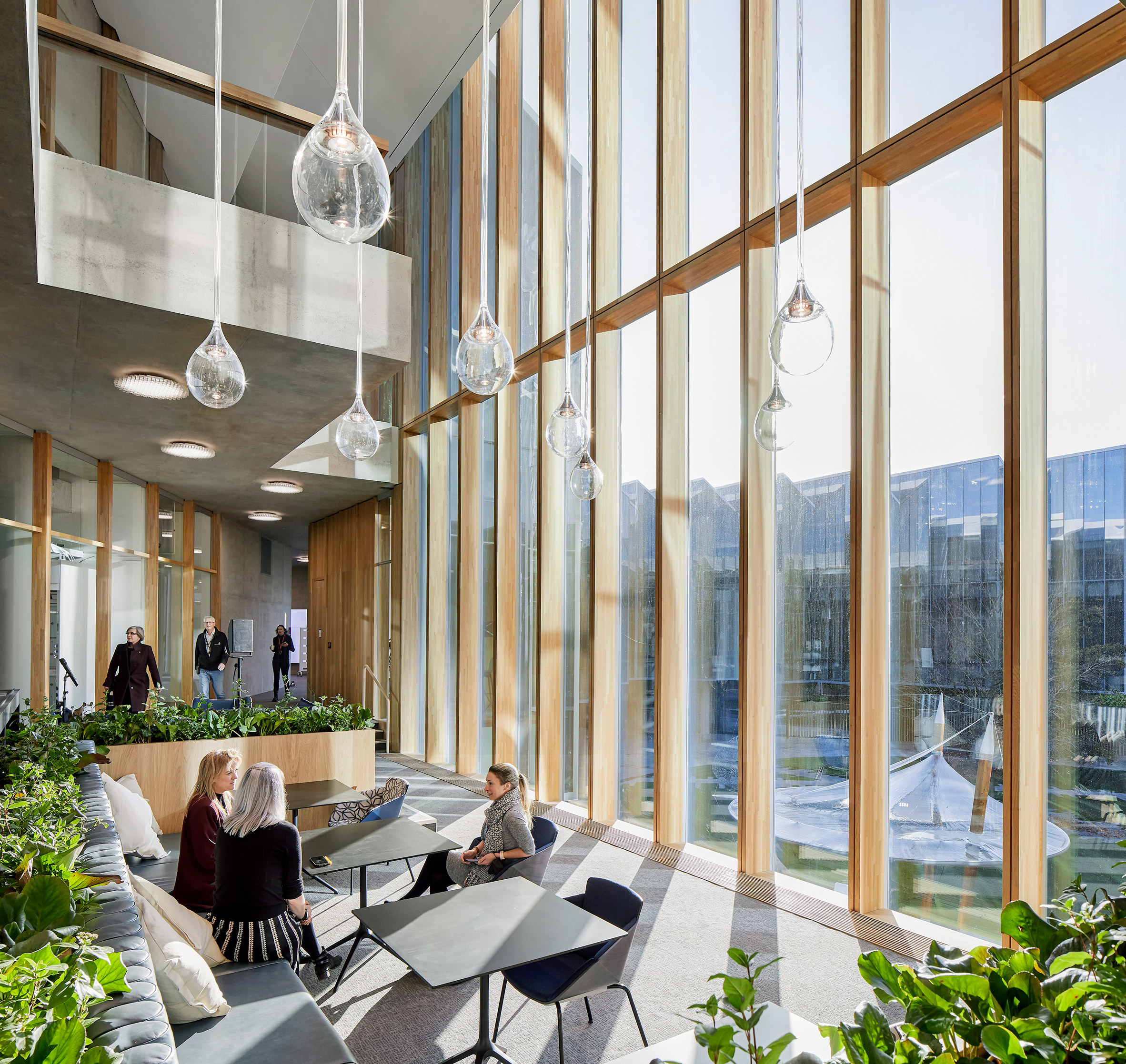
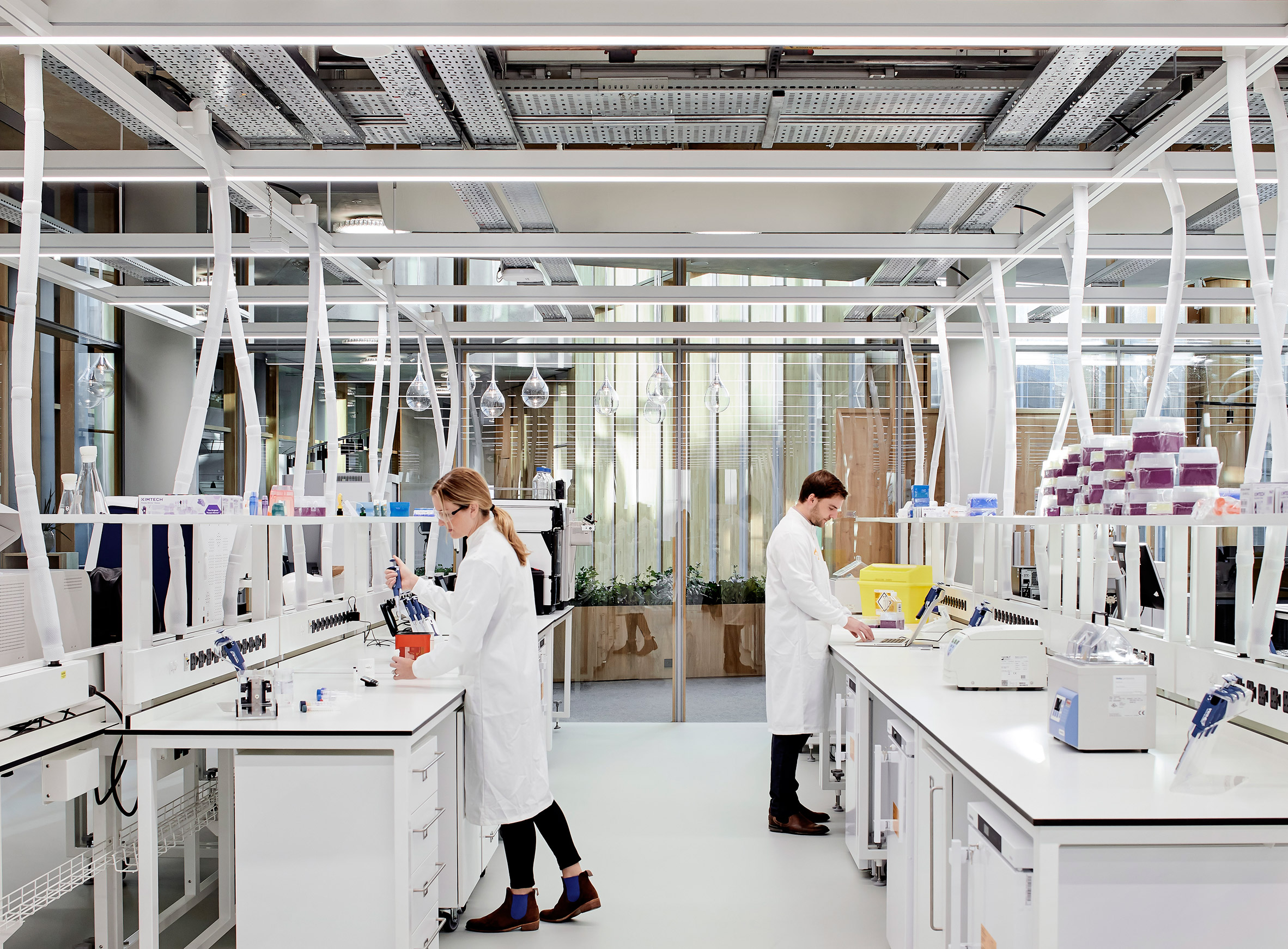
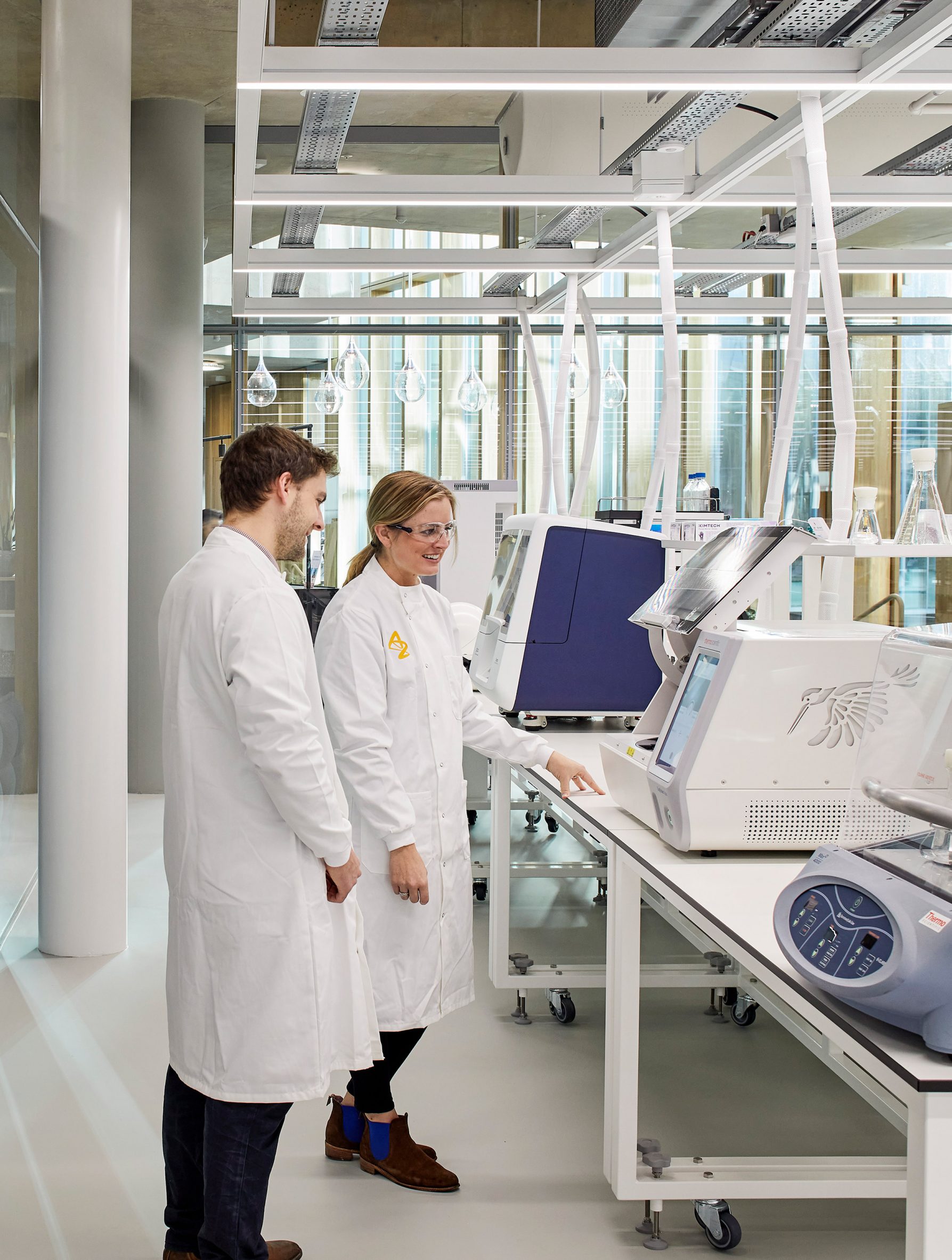
Inside the centre, the laboratories have floor-to-ceiling windows to "make science visible for employees and visitors", Herzog & de Meuron said.

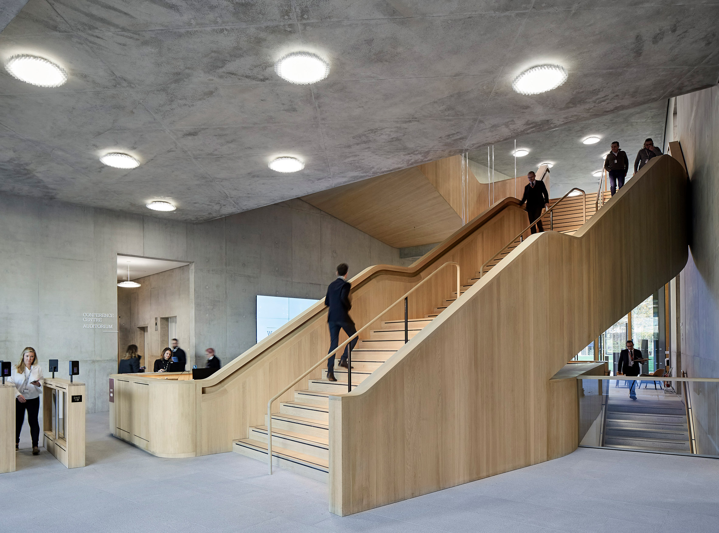
Workspaces have an open-plan layout, with contrasting colours and materials chosen for the lab areas, the social areas and other workspaces.

Wooden, glazed facade of AstraZeneca's DISC
The concrete building has a wooden facade that is fully glazed

"We wanted to have a very simple material palette, which directly reflects the programme of the building," Dushanov said.

"The laboratory is the colour of science, white, for its purity and for its cleanness," he added.

"And the spaces outside them are in much more organic material and much more tactile – it is a natural oak facade, both for the outer facade and for the facade of the laboratories. Same for the floor. And people outside of the science box can be directly linked and see the people inside."

Laboratory inside AstraZeneca DISC
Laboratories have been kept all white

As well as the laboratories and other workspaces, DISC also has a conference centre, an auditorium, a cafe and a restaurant, all located on the ground floor of the building.

The centre is heated by 174 boreholes that provide geothermal energy and also has four hybrid cooling towers, as well as a ground source heat pump. In addition, the building was designed with high levels of insulation to ensure energy efficiency.

View of laboratory inside The Discovery Centre
Laboratory spaces open up towards social areas

Herzog & de Meuron's design for the sawtooth glass roof also means that the interiors receive plenty of natural light.

"This energy efficiency is aligned to the company’s Ambition Zero Carbon programme that commits to zero carbon emissions from its operations across the world by 2025, and for its entire value chain to be carbon negative by 2030," AstraZeneca said.

The new centre will accommodate over 2,200 scientists working on AstraZeneca's medicines. The pharmaceutical company has numerous other research centres across the globe and is perhaps best known for developing the Oxford/AstraZeneca vaccine to protect against COVID-19 together with the University of Oxford.

Scientists at work at the DISC in Cambridge
The centre will accommodate more than 2,200 research scientists

When designing the centre, Herzog & de Meuron also wanted to take into account the way in which science and public perceptions of science have changed in the last decade.

"Since we started working on that, [it has changed] from the isolated scientist who has his or her laboratory, works in isolation and comes up with the discovery, to a huge collaboration," Dushanov said. "We discussed and researched how you create space for innovation."

Other recent Herzog & de Meuron projects include the M+ museum in Hong Kong and a glass triangle skyscraper that is set to be built in Paris.

Photography is by Hufton + Crow unless otherwise stated.

The post Herzog & de Meuron unveils plectrum-shaped AstraZeneca research centre appeared first on Dezeen.


from Dezeen https://ift.tt/3GBfEux

Dezeen's top 10 bar and restaurant interiors of 2021

Maido restaurant by Child Studio with cherry wood panelling and soft blue coffered ceiling

Next up in our review of 2021 is a roundup of Dezeen's top 10 bar and restaurant interiors this year from across the globe, including a sushi eatery in a converted post office and a cavernous pizzeria.

Istetyka restaurant Kyiv by Yakusha Design
Photo is by Yevhenii Avramenko

Istetyka, Ukraine, by Yakusha Design

This Kyiv restaurant by local studio Yakusha Design was crowned restaurant and bar interior of the year at the Dezeen Awards 2021 for its mixture of rough and smooth surfaces.

Diners are served a menu of healthy fast food at undulating bench seating and round tables displaying chubby textured clay vases crafted by local artisans.

Find out more about Istetyka ›


Cloud Artists Lounge
Photo courtesy of Cheng Chung Design

50% Cloud Artists Lounge, China, by Cheng Chung Design

The cavernous walls of a brick art installation form the interior of 50% Cloud Artists Lounge, a hybrid restaurant and exhibition space in Mile City, China.

Hong Kong office Cheng Chung Design commissioned local artist Luo Xu to create the brick structure, which was made without steel reinforcements or nails and is intended to act as a neutral backdrop for art and curved furniture within the space.

Find out more about 50% Cloud Artists Lounge ›


Relief ceiling features in Veneno restaurant in Guadalajara
Photo is by Cesar BĂ©jar Studio

Veneno, Mexico, by Monteon Arquitectos Asociados

Monteon Arquitectos Asociados designed the Dezeen Awards-shortlisted Veneno with a photograph of an archaeological site in mind.

Located in Guadalajara, the restaurant features a relief ceiling depicting ancient ruins, with the theme echoed in its sand-coloured plaster walls and light-hued timber furniture.

Find out more about Veneno ›


Myrto pizzeria by Studio Wok
Photo is by Simone Bossi

Myrto, Italy, by Studio Wok

Italian firm Studio Wok drew upon the rocky caves of Sardinia to design the interior of pizzeria Myrto in the town of Porto Cervo.

Cave-like pink plaster walls are interrupted only by arched window openings, custom furniture pieces and burgundy-coloured lights designed by Michael Anastassiades for lighting brand Flos.

Find out more about Myrto ›


Elgin Cafe by Renesa Architecture in Punjab, India
Photo is by Niveditaa Gupta

Elgin Cafe, India, by Studio Renesa

A lively green granite interior was added to Elgin Cafe in Punjab in order to evoke the feeling of al fresco dining, according to New Delhi architecture office Studio Renesa.

Defined by granite sourced locally from Udaipur, the restaurant features various other elements that give the feeling of being outdoors, including wicker chairs, lush potted plants and a panelled green ceiling.

Find out more about Elgin Cafe ›


Maido restaurant by Child Studio with cherry wood panelling and soft blue coffered ceiling
Photo is by Felix Speller

Maido, UK, by Child Studio

Design firm Child Studio inserted dark cherry wood panelling and a blue coffered ceiling into a former 1960s London post office to create Maido, a sushi restaurant intended to honour its location's heritage.

"We were fascinated by the unique story of this building and aimed to capture the nostalgic atmosphere of 1960s London, paying tribute to the modernist public spaces of the era," explained the studio's founders Alexy Kos and Che Huang.

Find out more about Maido ›


Mimi Kakushi restaurant by Pirajean Lees
Photo is by Maha Nasra Eddé

Mimi Kakushi, UAE, by Pirajean Lees

Motifs that nod to Japan's 1920s jazz era take centre stage in Mimi Kakushi, an ornately-designed restaurant in Dubai by British practice Pirajean Lees.

Decadent elements were added to the space, which is a converted nightclub, including bespoke stained glass windows, traditional Japanese joinery and luxurious beaded curtains that cast dramatic shadows on the dining tables.

Find out more about Mimi Kakushi ›


The Budapest Cafe by Biasol
Photo is by Derek Swalwell

The Budapest Cafe, Australia, by Biasol

The Budapest Cafe in Melbourne by local studio Biasol takes cues from the geometric symmetry and nostalgic colour palette known to the feature films of director Wes Anderson.

Walls are embellished with quirky steps to nowhere, while rust-coloured banquettes and retro chairs were inserted to be reminiscent of scenes found in Anderson's 2014 movie The Grand Budapest Hotel.

Find out more about The Budapest Cafe ›


Soho Speakeasy
Photo is by Felix Speller

SOMA, UK, by Max Radford and Cake Architecture

Designer Max Radford and the studio Cake Architecture borrowed rich colours from Indian artworks to create this intimate basement cocktail bar in London's Soho.

Darkly-hued curtains wrap concealed booths and reference the theatres of the nearby West End, in an attempt to add a sense of mystery to what the design team called "a contemporary interpretation of the Soho subterranean speakeasy, inspired by the spirit of India and beyond."

Find out more about SOMA ›


Photo courtesy of Lucas Muñoz

Mo de Movimiento, Spain, by Lucas Muñoz

Nominated at this year's Dezeen Awards in the sustainable interior category, Spanish restaurant Mo De Movimiento was assembled almost entirely out of upcycled junk and site construction waste at the former theatre and recording studio.

Rubble weighing 1,700 kilograms produced from the renovation was transformed into thick tiles that make up continuous bench seating, while other furniture was created from wooden structures found on the site.

Find out more about Mo de Movimiento ›

The post Dezeen's top 10 bar and restaurant interiors of 2021 appeared first on Dezeen.


from Dezeen https://ift.tt/3IGOzrM

Eight contraceptive designs that revolutionise sexual health

Hex condom by Lelo

Last week Dezeen reported on the invention of Wondaleaf, an adhesive prophylactic which its creator claims is the world's first unisex condom. Here, we round up eight other contraceptive designs with the potential to challenge ideas about sexual health.


Australian scientists create ultra-thin condom from grass fibres

Grass fibre condom by the University of Queensland

Researchers at the University of Queensland discovered a way of extracting nano-fibres from the Australian native spinifex grass to use for condoms that are thinner and stronger than standard latex.

They were assisted by the indigenous Queensland community of Indjalandji-Dhidhanu, which has long used spinifex as an adhesive for spearheads.

Find out more about the grass fibre condom ›


Smart condom

i.Con by British Condoms

Described as a fitness tracker for the penis, the i.Con is a smart condom ring manufactured by British Condoms.

The wearable tech device measures penis girth, thrust counts and duration of intercourse as well as detecting signs of sexually transmitted infections – and users are even able to share their data publicly online, if they wish.

Find out more about i.Con ›


Coso device by Rebecca Weiss

Coso by Rebecca Weiss

After she was diagnosed with a cervical cancer precursor that meant she is unable to take the female birth control pill, German design graduate Rebecca Weiss developed Coso – a male contraceptive device that uses ultrasound waves to halt sperm regeneration temporarily.

Users of the James Dyson Award-winning gadget fill it up with water, turn it on and dip in their testicles. Contraceptive effectiveness starts two weeks after the first application and the effect is reversible, with fertility expected to return no later than six months after the last application.

Find out more about Coso ›


Hex condom by Lelo

Hex by Lelo

Swedish sex toy company Lelo developed a condom with hexagon-shaped cells intended to have better structural integrity and extra grip compared to a regular condom, despite still being made from latex.

"There's a reason why honeycombs are the shaped they are, and why snake scales move the way they do," said Filip Sedic, founder of Lelo. "They're nature's go-to shape for anything needing to be at once lightweight, and incredibly strong."

Find out more about Hex ›


Condom based on fruit

Love Guide by Guan-Hao Pan

Created by Taiwanese designer Guan-Hao Pan, these condom packages are modelled on phallic fruit and veg denoting their girth.

The idea is that users can hold the cylindrical tubes and determine the correct size for them – whether that be courgette, turnip, banana, carrot or cucumber.

Find out more about Love Guide ›


Colourful condoms

S.T.Eye by Daanyaal Ali, Muaz Nawaz and Chirag Shah

UK schoolchildren Daanyaal Ali, Muaz Nawaz and Chirag Shah won a prize at the 2015 TeenTech Awards for their S.T.EYE concept, which saw them design condoms that change colour when a sexually transmitted disease is detected.

The proposed condom design would be embedded with chemical indicators that would react to the bacteria that cause infections such as chlamydia and syphilis, changing colour to warn of the risk.

Find out more about S.T.Eye ›


Bearina by Ronen Kadushin

Bearina by Ronen Kadushin

Bearina is a concept for a contraceptive intrauterine contraceptive device (IUD) that works using a one-cent coin.

In normal copper IUDs like the coil, metal ions dissolving from the device act as spermicide, so the Bearina provides a holder for a coin with a nylon thread.

It's the brainchild of Ronen Kadushin, who open-sourced the design so anyone can download the production files and theoretically manufacture an IUD at the fraction of the price of a conventional model.

Find out more about Bearina ›


Condom wrapper

One-Handed Condom Wrapper by Ben Pawle

British designer Ben Pawle created a condom wrapper for people with disabilities that can be opened with a simple finger-clicking action to break both the outer layer of foil and the thin plastic lining inside.

"I guess it's just common sense – why is a condom an obstacle and hinderance instead of enhancing a moment?" Pawle said.

Find out more about the One Handed Condom Wrapper ›

The post Eight contraceptive designs that revolutionise sexual health appeared first on Dezeen.


from Dezeen https://ift.tt/3ybBjGy

"It's time to reconsider the whole colour of the year carnival"

colour of the year

With its choice of a shade of purple, which it claims is blue, as colour of the year, Pantone has once again failed to use the opportunity to talk meaningfully about how colour reflects moments, says Michelle Ogundehin.


It's time to reconsider the whole colour of the year carnival. The extraordinary hiatus of the last two years granted us a reprieve from trends as we knew it. Bigger issues – health, community, sustainability, the climate – came to the fore and we had a moment to consider what we liked for ourselves.

And yet, most of the big paint companies alongside Pantone, the self-acclaimed "global colour authority for the design community", persist in declaring a single shade as emblematic for the year ahead.

Somehow, trends pegged to the sentiments of a single company now seems wrong. Previously, it felt more fun. Today, the societal landscape has been fundamentally altered and yet this colour of the year (COTY) carnival continues. And when we know it's just a huge marketing exercise, it feels especially outdated.

Of course, you could cheerfully ignore the whole spectacle were it not for the aggrandising justifications which accompany such pronouncements. There's also the fact that Pantone insist on defining its latest release as blue: "a dynamic periwinkle blue hue with a vivifying violet-red undertone".

Pantone also call it Very Peri, a name so awful it doesn't merit further mention

To even primary age children, that's purple. If we're going to get pedantic, I'd call it a saturated lilac. Significantly, it's not lavender, which has more of a blue, rather than red, undertone (more on this later). But Pantone 17-3938 is definitely not a blue.

Pantone also call it Very Peri, a name so awful it doesn't merit further mention. Albeit to note that periwinkles are commonly known in European folklore as the "flower of death" because its vines were apparently woven into headbands worn by dead children or criminals on their way to execution.

In the interest of balance, other sources variously claim that the plants symbolise sentimentality or tranquillity and it can even be considered capable of exorcism. Regardless, according to Pantone, its COTY 2022 displays "a carefree confidence and a daring curiosity" that will help us to "embrace this altered landscape of possibilities, opening us up to a new vision as we rewrite our lives".

It continues, "blending the faithfulness and constancy of blue with the energy and excitement of red, this happiest and warmest of all the blue hues introduces an empowering mix of newness." Except purple was used in the Neolithic era by prehistoric artists to decorate their caves, so I'm unsure as to the basis of the reference to "newness".

Purple also has roots in Greek mythology. Hercules's dog was said to have discovered the colour when walking on the beach. His owner, en route to court the nymph Tyro, saw the dog bite into a Murex sea snail and his drool turn purple. Legend has it that the nymph demanded a gown of the same colour, and so Tyrian purple was born.

The colour is still routinely associated with royalty, extravagance, wealth and power

Certainly, it's true that the pigment was originally derived from the mucus of these snails. But tens of thousands of molluscs were required to yield an ounce of dye. It was an extremely laborious process thus the colourant was highly coveted and restricted only to those who could afford it.

Indeed, in Roman times only the Emperor was permitted to wear Tyrian purple. And in 1547, when the Earl of Surrey was tried for high treason against Henry VIII, evidence against him included his flagrant wearing of the hue. Accordingly, even after synthetic purple compounds were created in the 1850s, the colour is still routinely associated with royalty, extravagance, wealth and power. It was the colour of the elite. A portent of vanity, greed and pride.

It's also a shade right on the edge of the colour spectrum. It's harder for the eye to see, which makes it comparatively more tiring. It agitates. It's a colour that operates on the margins of the visible world that nonetheless demands to be noticed. It craves recognition. Appropriate then that it was adopted by the Women's Suffrage movement.

It was also later associated with the psychedelic drug culture of the 1960s and 70s. Notably, its opposite number is green. Literally, the easiest colour for the eye to perceive as it's placed at the heart of the spectrum, green is universally acknowledged as restful and restorative.

Lilac tones of purple, similar to its sticky-sweet perfume, is irritating

And yet, according to Pantone, Pantone 17-3938 "is a symbol of the global zeitgeist of the moment and the transition we are going through… expressing what people are looking for that colour can hope to answer." Hmmm. So, we need a difficult colour that frustrates and alienates? A colour of individualism and hierarchy? I think not.

If we are to evaluate Pantone 17-3938 purely objectively, it's the red undertone that causes all the problems. It adds heat ergo anger, passion or reactivity. To have chosen more of a lavender tone, would have been unexpected. Subtle. Considered.

Lavender can be quite modest and sedate yet still pack a punch. It's a team player not an attention seeker. Lavender is a soothing solution seeker. Whereas Lilac tones of purple, similar to its sticky-sweet perfume, is irritating. It's the over-eager puppy to lavender's grown-up Labrador. A love it or loathe it colour. A marketeer's dream then for headlines?

It cannot be denied that different colours reflect different moods and moments

Generally speaking, it's said that colours within the purple sector – those composed primarily of blue and red – engage the intellect and engender concentration. It's reputed to be a shade favoured by those of a creative disposition, as well as mystics. Something I believe reflects more the rarity of its natural origins than any grounding in fact. No doubt Prince chose it as his signature colour because it made him feel like a violet majesty.

But wherever you stand on the legitimacy of colour psychology, it cannot be denied that different colours reflect different moods and moments. Shades inevitably flow in and out of popular consciousness, whether buffeted by fashion or political concerns.

Colour of the year could be an opportunity to talk meaningfully about such issues. Once again, Pantone choose not to rise to that challenge.

Michelle Ogundehin is a thought-leader on interiors, trends, style and wellbeing. Originally trained as an architect and the former editor-in-chief of ELLE Decoration UK, she is the head judge on the BBC's Interior Design Masters, and the author of Happy Inside: How to Harness the Power of Home for Health and Happiness, a guide to living well. She is also a regular contributor to many prestigious publications worldwide including Vogue Living, FT How to Spend It magazine and Dezeen.

The post "It's time to reconsider the whole colour of the year carnival" appeared first on Dezeen.


from Dezeen https://ift.tt/3IG9UBl

Six fashion and textiles courses on Dezeen Courses

Six models lined up dressed in pastel coloured knitwear

Interested in studying fashion and textiles? Check out six fashion and textile courses in the UK, USA and online listed on Dezeen Courses.

The courses include programmes at institutions in London, Plymouth and Bath in the UK as well as Chicago and New York in the US.

These range from undergraduate and postgraduate programmes to short courses which can be completed remotely.

Studying fashion and textile design allows students to explore practical and theoretical skills relevant to the world of fashion.

Undergraduate courses teach the basics of fashion theory and hands-on methods of creating textiles and garments, as well as how to communicate them. Postgraduate courses provide the opportunity to specialise in specific materials, processes and consumer groups.

Short courses are open to those interested in honing their own skills, or as an introduction to the discipline.

Here are six fashion and textile courses on Dezeen Courses:


Six models lined up dressed in pastel coloured knitwear

Fashion Design BA (Hons) at Bath Spa University

The Fashion Design BA (Hons) course at Bath Spa University in Bath, UK, aims to prepare students to enter the fashion world by providing them with theoretical, technical and design-focused skills.

Find out more about the course ›


Magazine spread with models posing, text and pastel backgrounds

Fashion Communication BA (Hons) at Plymouth College of Art

The Fashion Communication BA (Hons) course at Plymouth College of Art in Plymouth, UK, aims to future-proof students for careers in fashion marketing, media and promotion.

Find out more about the course ›


Brightly coloured and textured textiles

Textile Design for Fashion and Interiors BA (Hons) at Bath Spa University

The Textile Design for Fashion and Interiors BA (Hons) course at Bath Spa University in Bath, UK, aims to provide students with aesthetic and theoretical textile skills.

Find out more about the course ›


Man cuts fabric in fabric store with hats on wall

Fashion Design and Sewing Course at School of the Art Institute of Chicago

The Fashion Design and Sewing: Adult Continuing Education course at School of the Art Institute of Chicago teaches students the fundamentals of sewing through to creating hems and bodices.

Find out more about the course ›


Parson's Design students looking at a textile exhibition

Master of Fine Arts in Textiles (MFA) at Parsons School of Design

The Master of Fine Arts in Textiles (MFA) course at Parsons School of Design in New York City aims to provide students with diverse creative skills needed in fashion design, textiles, interior design, fine arts, architecture and more.

Find out more about the course ›


Brown and cream knitwear hanging against a white background

Design: Textiles MA at Bath Spa University

The Design: Textiles MA course at Bath Spa University in Bath, UK, aims to develop student's creative design practice and explores research in knit print, fashion, interiors and textile design.

Find out more about the course ›

Dezeen Courses

Dezeen Courses is a service from Dezeen that provides details of architecture, interiors and design courses around the world. Click here for more information.

The post Six fashion and textiles courses on Dezeen Courses appeared first on Dezeen.


from Dezeen https://ift.tt/3pLp1kw