Saturday 11 December 2021

Emotional Clothing responds to the wearer's changes in stress levels

Two female models wearing tops by Iga Węglińska

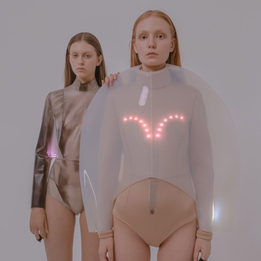
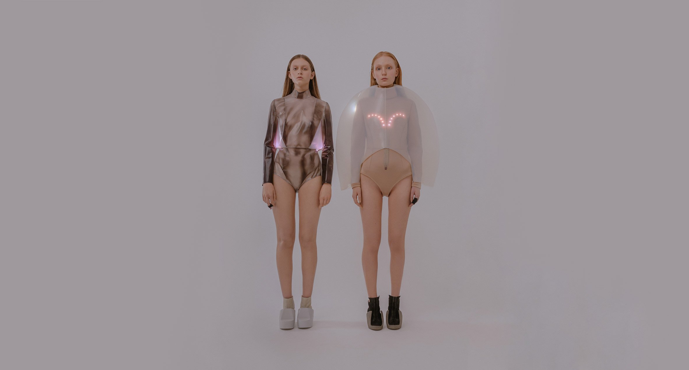
Polish fashion designer Iga Węglińska has made two tops that change colour or flash with lights to help the wearer identify when they are feeling stressed or anxious.

The Emotional Clothing collection, which formed Węglińska's doctoral dissertation at the Academy of Fine Arts in Krakow, is designed to "broaden the experience of clothing".

Two models stand next to each other wearing tops with LED lights
Węglińska has created a collection that responds to stress levels

"Emotional Clothing is made of polysensory garments intended to expand the limits of experiencing clothing through experiences based on sensory substitution," Węglińska told Dezeen.

Sensory substitution is when the brain takes information from one sense, such as touch, and transforms it into the perception of another sense, such as sight. It is commonly used to help people who are vision-impaired use their sense of touch to read braille.

The designs aim to make people focus more on their bodies

"The collection is designed to stimulate our sense of taking part and force us to focus more on our bodies, for example by calming our breath to reduce a stress level," the designer added.

Węglińska's garments react to the wearer's heart rate, temperature and Galvanic Skin Response (GSR) via sensors, which, in turn, trigger visual lighting changes. Stress usually causes a rise in temperature and a faster heartbeat.

One top changes from black to translucent

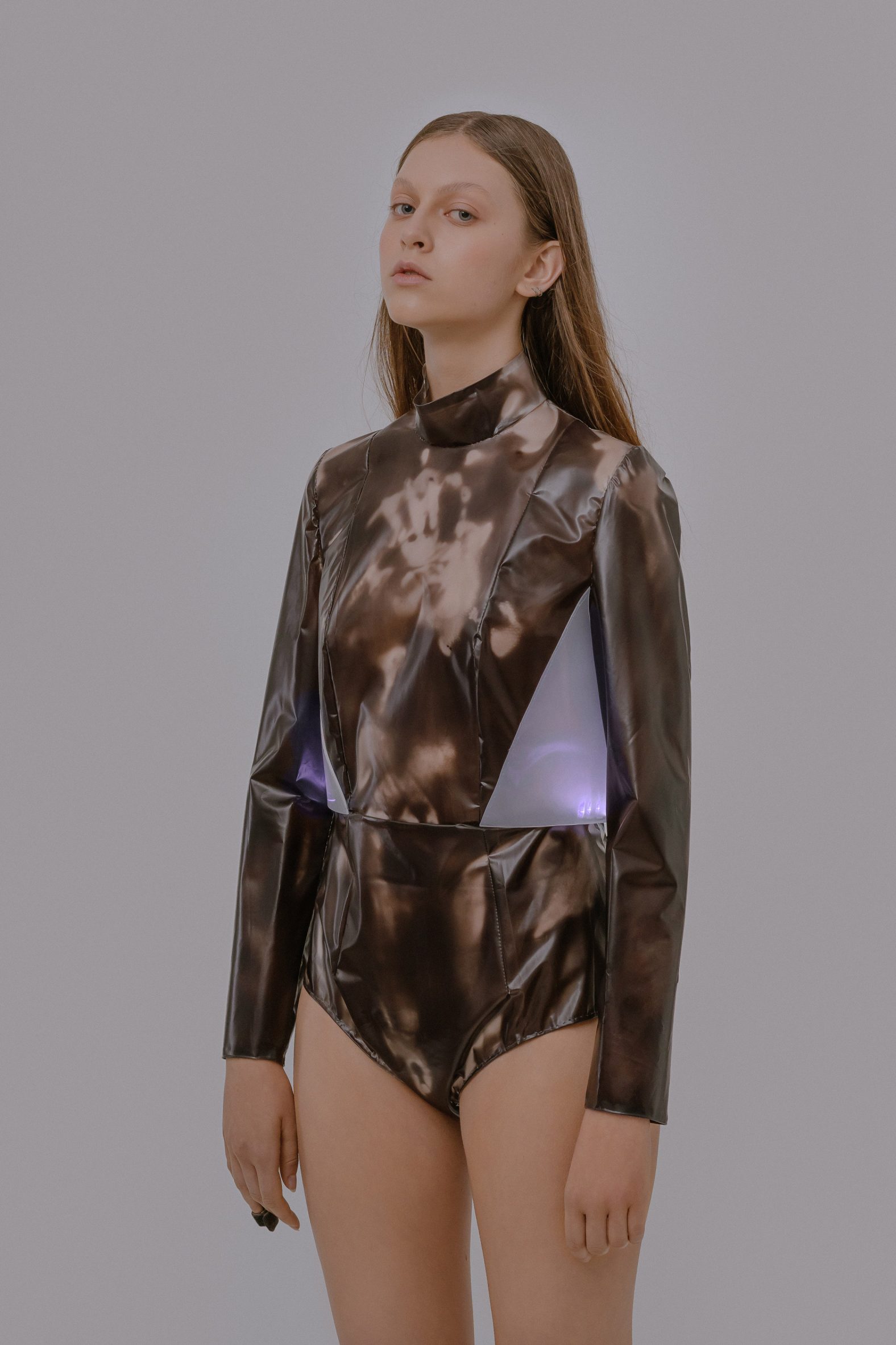
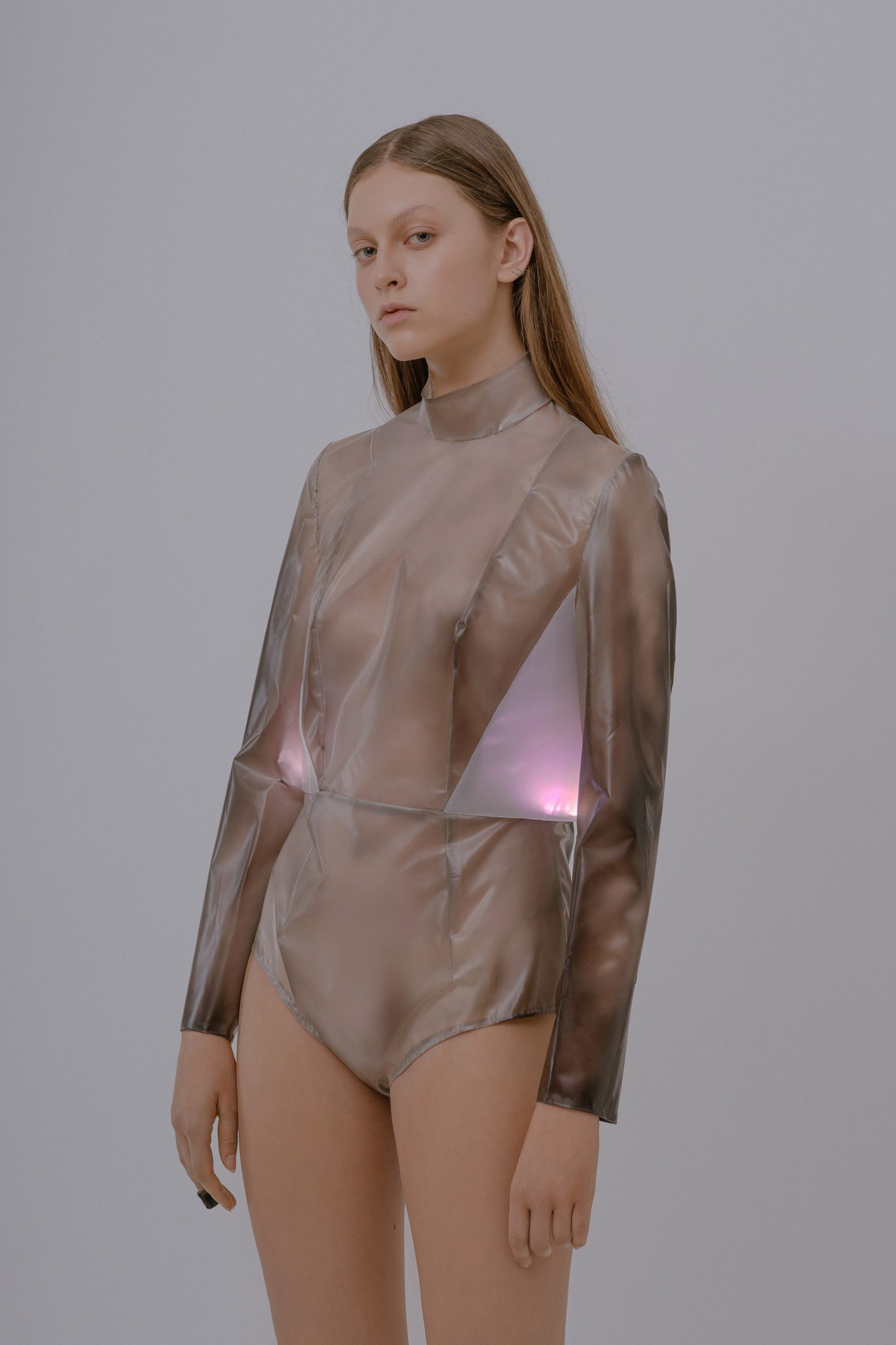
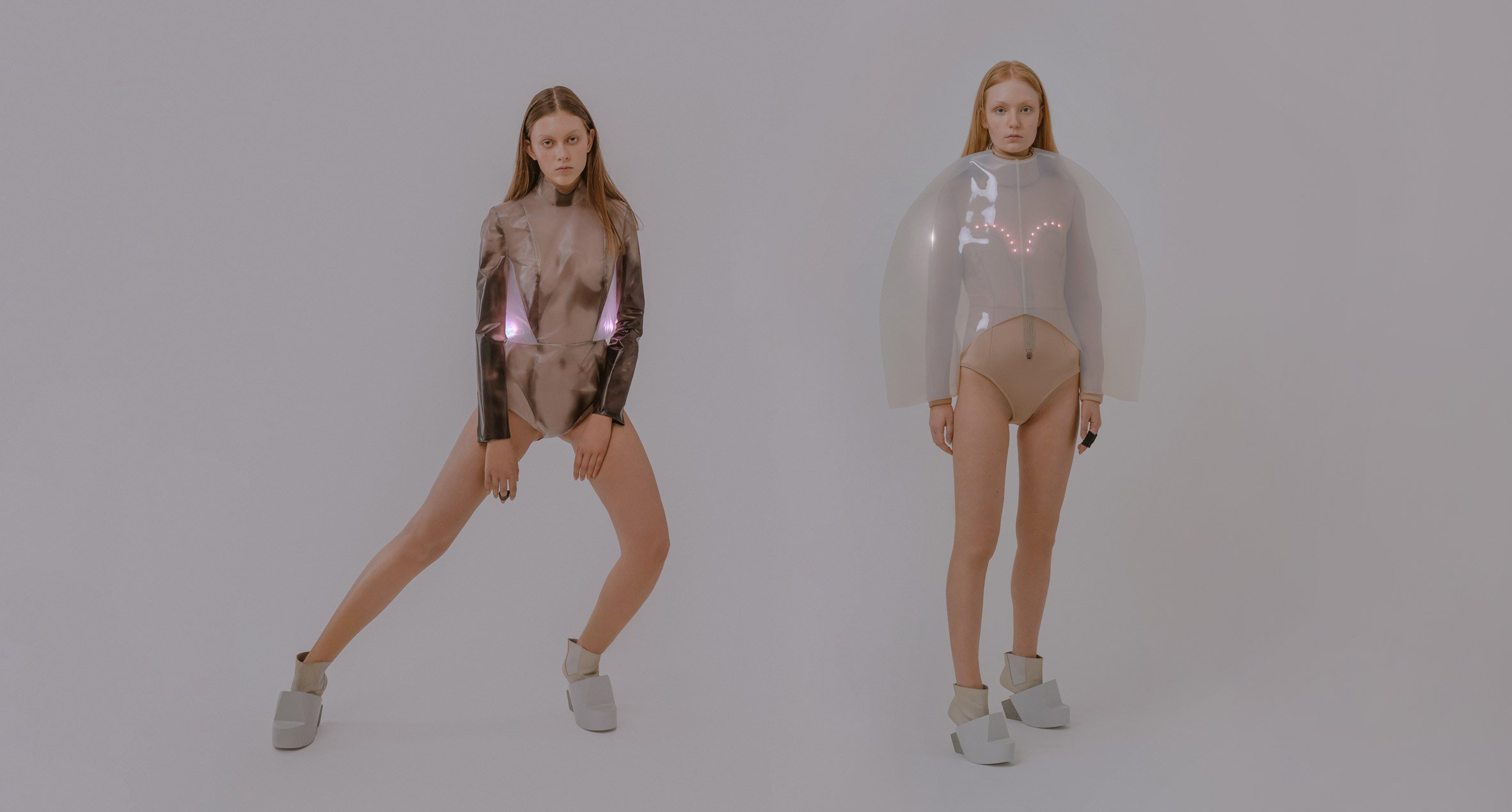
One of the long-sleeved tops is slim-fitting and comes with a sleek turtle neck. It responds to body temperature and heart rate by changing from black to translucent and vice versa.

Lights incorporated into the sides of the top flash to the beat of the wearer's heart via information gathered from sensors attached to the wearer's fingers.

Pink LED lights decorate a balloon-like top

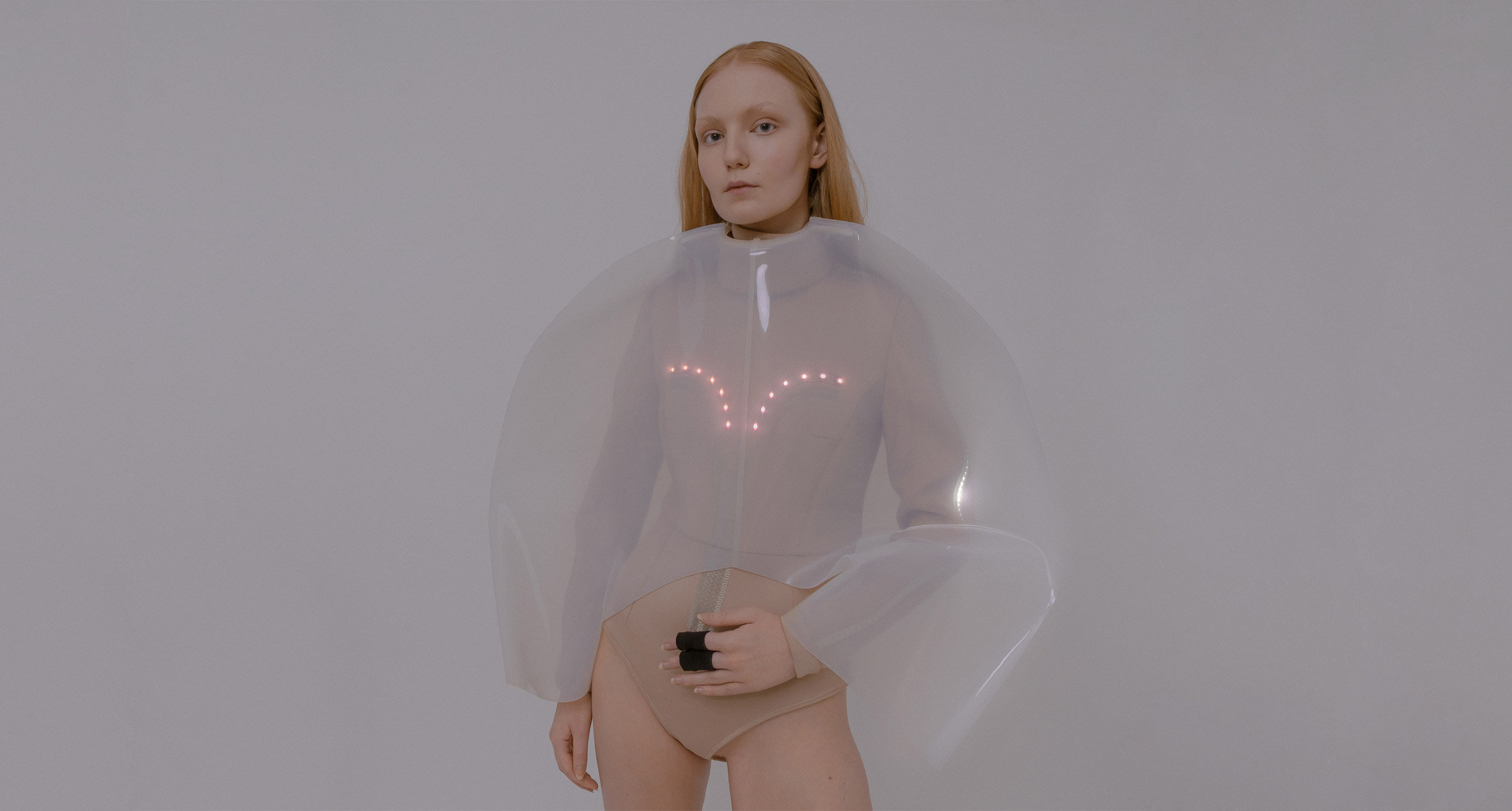
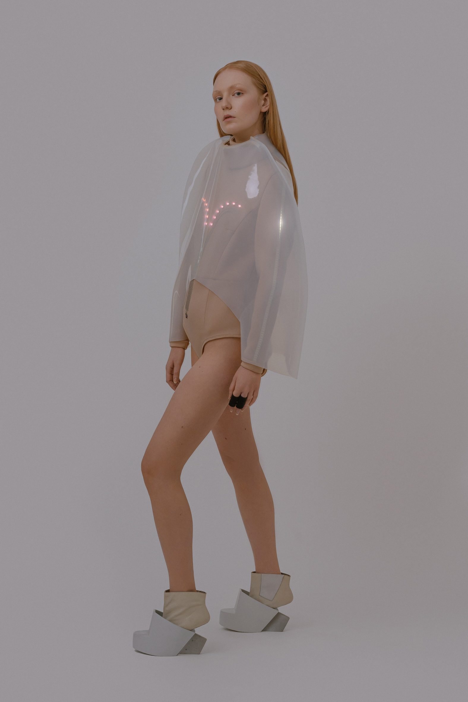
The other top has a puffy, balloon-like silhouette and features a string of pink LED lights above the chest. It measures stress levels by sensing changes in sweat levels on the wearer's skin.

The sensor sends a signal from the sweat to a white light that runs along the arms and around the neck. When the colour changes from warm to cold, it symbolises the need to slow the breath and calm down.

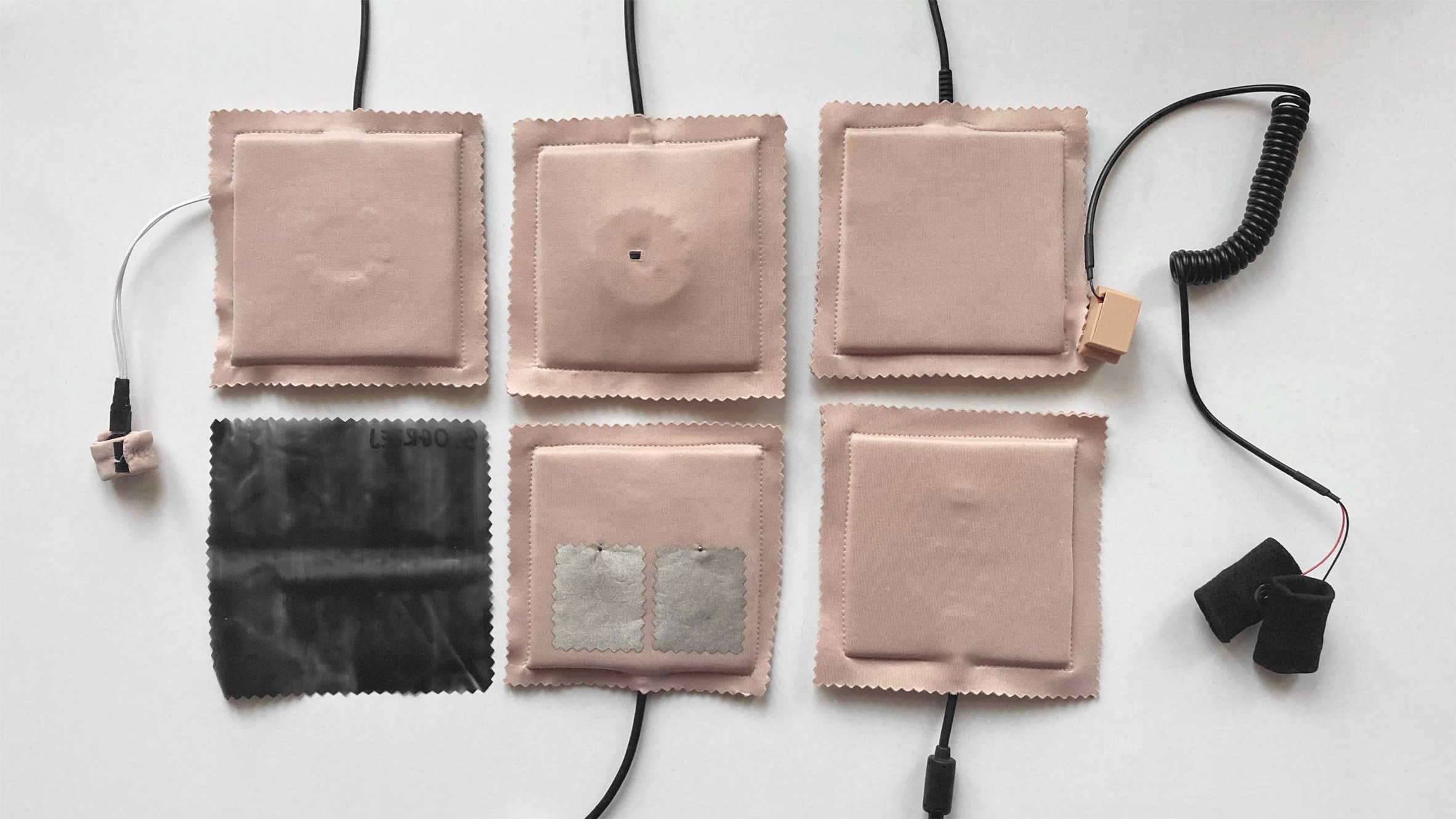
Węglińska used a conductive thread to sew conductive materials in the tops together. This thread carries an electrical current, allowing light to travel.

A see through top from Iga Węglińska's collection
The designer drew on the practice of biofeedback

Węglińska hopes that the tops could help people who become stressed or anxious to calm down or practice mindfulness after seeing the item change colour.

This is similar to biofeedback – a therapeutic technique that aims to help people understand their bodies better with sensors that measure key bodily functions.

"The intelligent materials used in the tops are supposed to stimulate cognitive involvement and mindfulness," the designer said.

"By interacting with the pieces, the wearer can not only be informed about their own body changes, but they can help us to focus more about the intimate relation with clothing, control the body reactions or even set goals to achieve by playing with smart materials reactions like color changes or movement."

Two models pose in Iga Węglińska's clothes
Lights react to the wearer's bodily changes

With the help of a chemist and a programmer, the designer experimented with several smart materials, testing the input and output signals to find the one that worked best.

In the end, she used a combination of materials such as neoprene, thermoplastic polyester or polyurethane leather and polylactic plastic. The resultant tops are supposed to mirror the behaviour of human skin.

6 sample sensors
Sensors measure heart rate and temperature

"Any relations to the human skin in my designs aimed to underline the prosthetic nature of the works, as well as emphasize the intimate relationship with the object," she explained.

"Skin – like my concept – reacts to psychophysiological changes in the human body: it sweats, blushes and it has goosebumps."

Fingers attached to a sensor
Conductive thread carries lights through the material

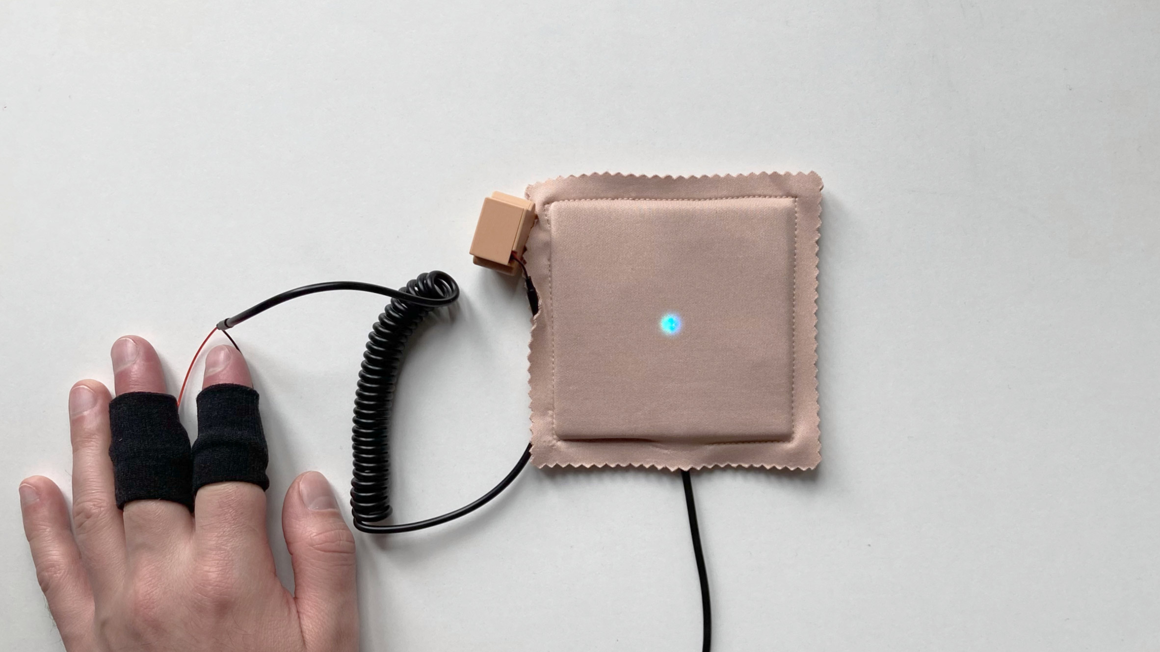
To test the sensors, Węglińska recruited a group of study participants to wear the clothes. She measured their levels of hedonic arousal using smart materials samples.

Węglińska was inspired to make the collection based on a thesis by Andy Clark and David Chalmers, which argues that material objects can take over our thinking and could be treated as external elements used in the process of perception.

Among other recent designs aimed at improving mental health issues is The Healing Imprint by Laura Deschl, a therapeutic garment made to help heal trauma.

Meanwhile, designer Rui Sun's Emotional First Aid Kit was created to provide comfort in stressful situations.

The post Emotional Clothing responds to the wearer's changes in stress levels appeared first on Dezeen.


from Dezeen https://ift.tt/3ymBjno

Ménard Dworkind fills Tiramisu restaurant in Montreal with plants and mirrors

Tiramisu restaurant interior in Montreal

Montreal studio Ménard Dworkind has completed a new restaurant within the city's Hilton hotel, fronted by an operable glass wall and filled with a variety of plants and eclectic finishes.

The restaurant, called Tiramisu, "recalls the Italian exuberance of the 1960s", according to the local firm, which was commissioned to design the 3,900-square-foot (362-square-metre) interior that includes a dining room, bar, cafe, and quick-service counter.

Rounded service counter
Tiramisu's interiors include a rounded service counter with reflective strips near the entrance

The building's main frontage sits on Boulevard Saint-Laurent, one of the city's main commercial arteries. Large movable glass panels run along the outside of the building, bringing in plenty of natural light and giving diners views of the busy streetscape.

"The space is bathed in natural light from the impressive 75-foot-long operable facade," said Ménard Dworkind.

Tiramisu tiled walls
Eclectic finishes include tiled walls and curved mirrors

A variety of reflective surfaces such as mirrors, glass, and chrome help reflect the light that comes in from the storefront.

For example, a rounded service counter near the entrance is lined with reflective strips.

Tiramisu by Ménard Dworkind
The reflective surfaces help to bring light deeper into the space

According to the architects, the decision to include counter-service options near the entrance was motivated by the coronavirus pandemic.

"Triggered by the pandemic's stop of indoor dining, the layout of the restaurant was rethought and designed to weather another outbreak," the architects explained.

By having easy takeout options already considered in the design, the adjustment would be smoother if future lockdowns were to occur.

The bar sits the furthest back into the space. It is topped with an inverted pyramid shape, which is covered by acoustical panelling to help dampen sounds within the large room.

Pendant lights
Pendant light made up of stacked metallic disks feature over dining tables

Ménard Dworkind built this area a few steps higher than the rest of the space, which gives the bar patrons an overview of the whole restaurant.

The finishes within the bar also adopt a different palette than the rest of the space. It features darker tones such as walnut furniture and flooring, and grey marble surfaces.

The bar area towards the back of the restaurant is purposefully darker

Ménard Dworkind worked with Canadian lighting studio Lambert & Fils to design custom fixtures for Tiramisu, which include walnut lamps that illuminate the bar, and a pendant light made up of stacked metallic disks surrounding a light bulb.

Throughout the entire venue, the architects include plenty of planters, including greenery hanging from above the bar, and in every corner of the space.

Tiramisu restaurant
The restaurant is designed to recall 1960s Italy

Ménard Dworkind was founded in 2017 and is led by Guillaume Ménard and David Dworkind.

Other hospitality projects completed by the firm in Montreal include a pizzeria that takes cues from New York City in the 1970s, and a coffee bar with retro accents.

The photography is by David Dworkind.


Project credits:

Team: Guillaume Ménard, David Dworkind, Benjamin Lavoie-Laroche

The post Ménard Dworkind fills Tiramisu restaurant in Montreal with plants and mirrors appeared first on Dezeen.


from Dezeen https://ift.tt/30gcUTG

Wutopia Lab creates chocolate-informed pavilion on Shanghai farm

Polycarbonate pavilion

Architecture studio Wutopia Lab has created a cloud-shaped pavilion called the Shrine of Everyman on a shallow pool designed to look like melted chocolate near Shanghai, China.

Described as a "sacred space for ordinary people", the 35-square-metre resting spot replaces an old roadside pumping station on the Dongtanya Quad Shan Farm, which is owned by food and beverage multinational Bright Food.

Shrine of Everyman pavilion in Shanghai
Wutopia Lab has created a polycarbonate pavilion in Shanghai

Exploring the idea of what constitutes a sacred space and a feeling of shared memory, Shanghai-based Wutopia Lab drew on the history of food production on the site, in which chocolate has played an important role.

"One of the key charms of traditional Chinese culture is that everyday places can be elevated into sacred spaces through the construction of shared memories," explained Wutopia Lab founder Yu Ting.

Polycarbonate pavilion by Wutopia Lab
It sits on a shallow pool of water designed to look like melted chocolate

"Milk chocolate, reinvented by Shanghai's food industry (including the predecessor of Bright Food) during a time of material scarcity, was a boon to the Chinese people of that period, and was once an integral part of Shanghai's culinary memory."

The Shrine of Everyman's shallow, semi-circular pool, designed to look like a pool of melted chocolate, cantilevers out towards a river that runs alongside the roadside site.

Polycarbonate screens inside Shrine of Everyman
Its polycarbonate screens frame views of surrounding farmland

A thin walkway leads across the pool into the gabled form of the pavilion, which has been created by thirteen layers of polycarbonate screens supported by a steel frame structure and topped by a steel-sheet roof.

The translucent white of these plastic screens was chosen to symbolise milk, and they have been cut through by a series of cloud-shaped openings that frame views out across the farmland.

"Using my daughter's favourite motif, the cloud, as a symbol, the layers of polycarbonate panels form jagged doorways and overlapping silhouettes to rewrite the flat experience of the landscape," described Ting.

Both the edge of the pool and the interior of the Shrine of Everyman are illuminated at night, giving it an ethereal quality and signalling the pavilion's location across the landscape.

Polycarbonate pavilion
The pavilion is illuminated at night

"[The pool] allows the pavilion to be visually prominent in the surrounding landscape by achieving a floating effect, both from the perspective of the road and from the water surface," said Ting.

"Inside, you can look into the distance and see a beautiful earthly landscape that was reclaimed by countless ordinary people...you know that everyday miracles are actually done by ordinary people."

Aerial view of Shrine of Everyman
The pool is designed to help make the pavilion visually prominent

Cloud-like forms have been incorporated in several of Wutopia Lab's projects, including a bookshop in Taizhou designed in collaboration with Office ZHU, and a cafe for children in Dalian.

The photography is by CreatAR Images.


Project credits:

Architect: Wutopia Lab
Lead architect:
Yu Ting
Project architect:
Mu Zhilin
Design team:
Nan Xu, Kejie Mi
Construction design company:
Shanghai Zhumeng Architecture Design
Owner:
Shanghai Qian Yi Agricultural Development
Construction Company:
Shanghai New Landscape Architecture Industrial
Structural consultant:
Miao Binhai
Lighting consultant:
Zhang Chenlu

The post Wutopia Lab creates chocolate-informed pavilion on Shanghai farm appeared first on Dezeen.


from Dezeen https://ift.tt/3rWVZB5

Six purple interiors that nod to Pantone's 2022 colour of the year

Cafe Krujok

Colour company Pantone claims that its 2022 colour of the year is a shade of blue, but most people see purple. In this lookbook, we round up six interiors from around the world that are definitely purple.

Described by Pantone as a "periwinkle blue," the colour of the year – called Veri Peri – marries the "constancy" of traditional blue with the "energy and excitement" of red, according to the colour brand.

However, Dezeen opinion writer Michelle Ogundehin argues that the colour is actually a shade of purple. Here, we have collected projects in which designers added statement sofas, bright tiles, and plush carpets in various purple hues to the interiors, demonstrating the striking colour's versatility.

This is the latest roundup in our Dezeen Lookbooks series that provide visual inspiration for designers and design enthusiasts. Previous lookbooks include domestic gyms, interiors that feature Danish design and kindergartens that pop with colour.


Purple student kitchen interior by Masquespacio
Photo is by Masquespacio

Resa San Mamés student accommodation, Spain, by Masquespacio Bilbao

Valencia-based creative studio Masquespacio employed its signature colour-blocking style throughout the Resa San Mamés student accommodation in Spain.

Light purple tiles can be seen running along walls of the open-plan area, which the studio hoped would encourage a sense of community among students.

Find out more about Pieces Home Resa San Mamés student accommodation ›


Photo is by Dylan Chandler

Apartment, US, by Harry Nuriev and Tyler Billinger of Crosby Studios

The owners of this New York apartment used bold colours, geometric shapes and unexpected materials to bring their personal styles into the residence.

Different shades of purple pop up on the walls, carpet, leather cabinets, armchair and shelving unit. The colour contrasts against the grey walls and curtains in the living room.

Find out more about Harry Nuriev and Tyler Billinger's apartment ›


Photography is by Inna Kablukova

Cafe Krujok, Russia, by Eduard Eremchuk and Katy Pititskaya

A lilac hue covers the soft, velvety walls of Cafe Krujok in Russia, which designers Eduard Eremchuk and Katy Pititskaya designed to embody "the essense of a donut" (Krujok is a round donut.)

The berry-coloured purple is meant to be a visual representation of donut glazing, and the room also features glossy dough-like beige furniture.

Find out more about Cafe Krujok ›


Cabinette eating area
Photo is by Luis Beltran

Cabinette, Spain, by Masquespacio

A pastel purple wall contrasts against the room's overall pale turquoise tone and adds to the whimsical look of this co-working office in Valencia by Masquespacio.

Located in the city's La Fuensanta neighbourhood, Cabinette was informed by the 1960s film Playtime by renowned French director Jacques Tati.

Find out more about Cabinette ›


A purple sofa integrated into the living room floor
Photography is by Darren Bradley

Pam and Paul's House, US, by Craig Steely Architecture

An eye-catching purple sofa has been plunged into the centre of the living room in Pan and Paul's House's. Craig Steely Architecture sunk the sofa into a 144-square-foot (13-square-metre) pit to create a distinct lounging area.

Inhabitants can relax on the plush cushions while taking in views of the surrounding Santa Cruz Mountains.

Find out more about Pam and Paul's House ›


Photo is by Claire Esparros

Pieces Home, US, by An Aesthetic Pursuit

A purple-blue paint was used on the doorframe and flooring of this rental house in Maine that is equipped with furniture and products that guests can purchase.

"Colour led the inspiration for the project, with pattern and texture coming in as key elements to round out the concept," said creative agency An Aesthetic Pursuit.

Find out more about Pieces Home ›

This is the latest in our series of lookbooks providing curated visual inspiration from Dezeen's image archive. For more inspiration see previous lookbooks showcasing domestic gyms, interiors that feature Danish design and kindergartens that pop with colour.

The post Six purple interiors that nod to Pantone's 2022 colour of the year appeared first on Dezeen.


from Dezeen https://ift.tt/3DMAYvh

Friday 10 December 2021

LayRed 55 flooring by IVC Commercial

LayRed 55 flooring by IVC Commercial

Dezeen Showroom: designed to look like wood or stone, IVC Commercial's LayRed 55 intends to deliver natural-looking flooring with added durability and acoustic performance.

LayRed 55 is a luxury vinyl tile created by IVC Commercial to combine the benefits of strength, comfort, acoustics and design.

LayRed 55 flooring by IVC Commercial
The LayRed 55 flooring is built from 12 layers, each targeting a benefit such as durability or acoustic performance

It has a 12-layer design, including a rigid vinyl core with dual-layer glass fibre reinforcement and an underlay beneath it that dulls impact noise. The underlay is integrated into the design, assuring better longevity.

On top, a 0.55-millimetre-thick wear layer is double coated with TwinGuard lacquer, protecting it from scratches and stains and giving it a matt finish.

LayRed 55 flooring by IVC Commercial
The luxury vinyl tile is available in a range of wood looks as well as stone effects

LayRed 55 is available as a plank of 131.7 x 18.9 centimetres in 14 wood looks or as a tile of 60.96 x 30.33 centimetres in eight stone effects.

The flooring is made in Belgium using 30 per cent recycled materials.

Product: LayRed 55
Brand: IVC Commercial
Contact: projectsuk@ivc-commercial.com

Dezeen Showroom offers an affordable space for brands to launch new products and showcase their designers and projects to Dezeen's huge global audience. For more details email showroom@dezeen.com.

Dezeen Showroom is an example of partnership content on Dezeen. Find out more about partnership content here.

The post LayRed 55 flooring by IVC Commercial appeared first on Dezeen.


from Dezeen https://ift.tt/3dClRcX