Friday 17 December 2021

Controversial M&S Oxford Street demolition "offers tangible and substantial carbon benefits" claims architect

Render of M&S Oxford Street flagship by Pilbrow & Partners

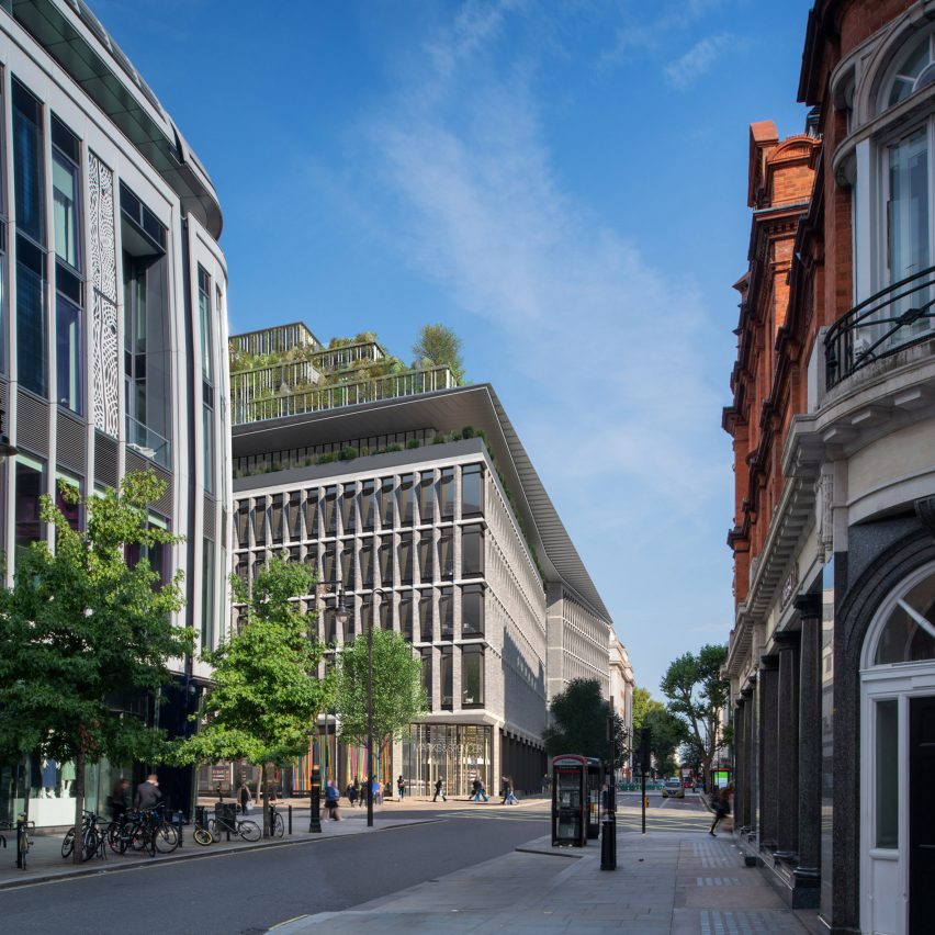
Replacing London's flagship Marks & Spencer store on Oxford Street with a new building will lead to lower lifetime carbon emissions than could be achieved with a retrofit, according to its architect Fred Pilbrow of Pilbrow & Partners.

"It's not always right to refurbish" old structures, Pilbrow told Dezeen, claiming that the contentious project is akin to trading in a gas guzzler for a Tesla.

"I would liken this to a discussion about a not-very-well-performing diesel car from the 1970s," he said. "And what we're trying to do is replace it with a Tesla."

"In the short term, the diesel car has got less embodied carbon," he added. "But very quickly, within between nine and 16 years, we will be ahead on carbon because our Tesla will perform better."

New build beats refurbishment in operation

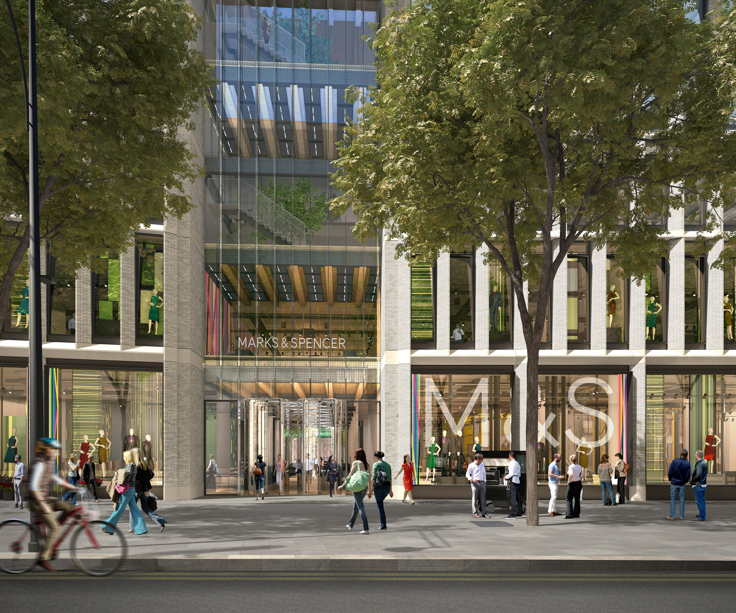
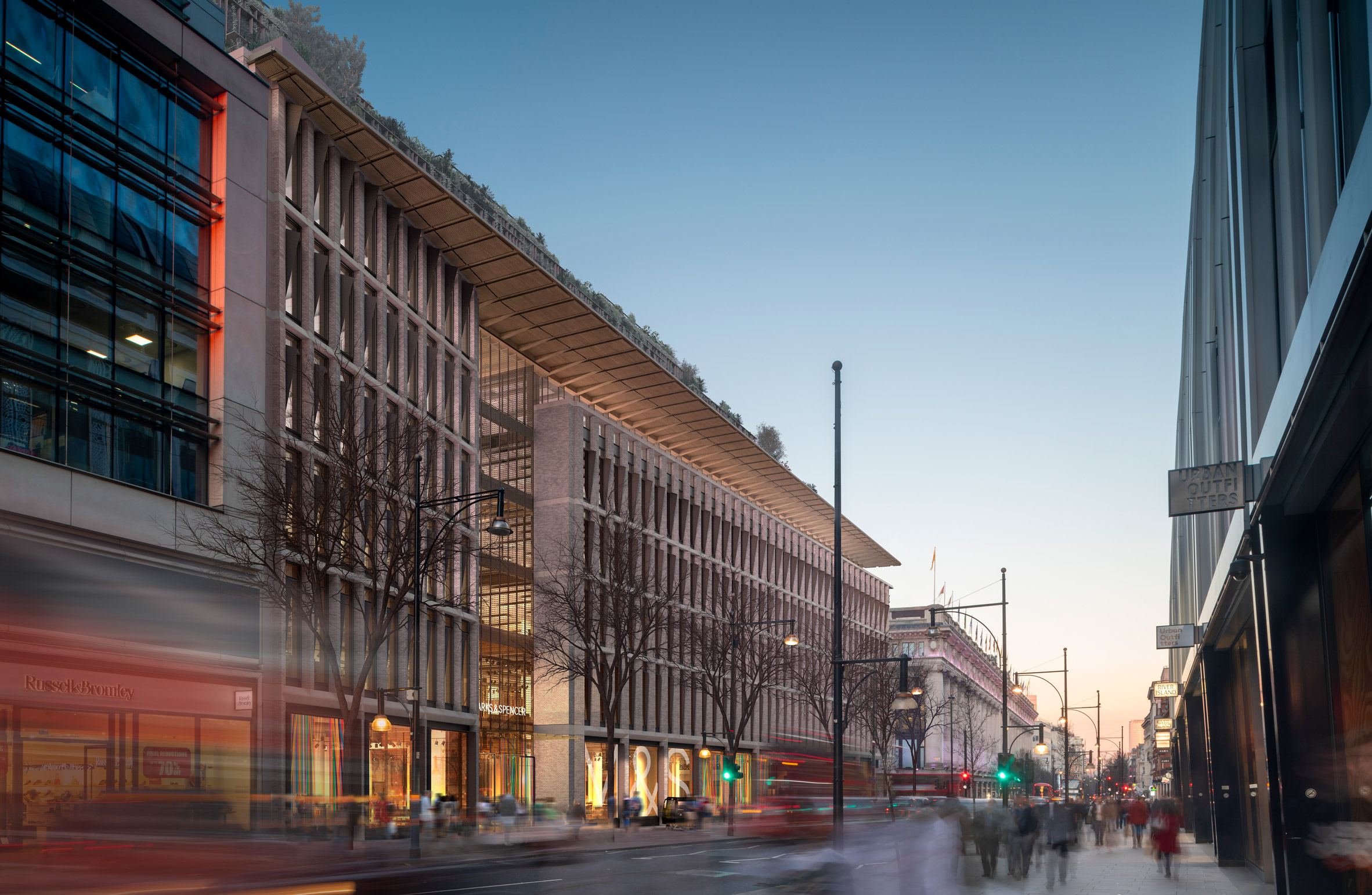
Pilbrow made the comments in response to widespread criticism of his redevelopment, which will see the 1930s Orchard House plus the two extensions that have been home to M&S for almost a century torn down in favour of a new mixed-use 10-storey building.

In a petition against the project, which has so far reached more than 2,000 signatures, Twentieth Century Society director Catherine Croft argued that choosing demolition over refurbishment was a waste of embodied carbon and "simply incompatible" with M&S's aims to reach net-zero emissions by 2045.

But Pilbrow says his practice worked with engineering firm Arup to ascertain and compare the whole-life carbon footprint of retrofitting the buildings with that of a new build and found that in this case, the new build will have a lower footprint overall.

Rendered front of M&S Oxford Street Store
The M&S Oxford Street redevelopment was designed by Pilbrow & Partners

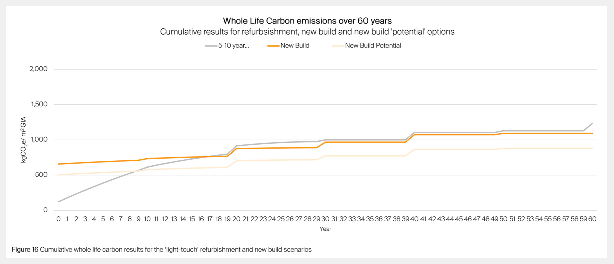
That's because, while the embodied carbon footprint of the new build is almost 10 times larger per square metre than that of the refurbishment due to the need for new materials and construction work, its superior operational performance makes up for this over time.

According to Arup's assessment, retrofitting the existing complex with an all-electric system, air-source heat pumps and an upgraded facade would only achieve an energy performance of 257 kilowatt-hours per square metre per year.

In comparison, the new build consumes a mere 44 kilowatt-hours per square metre, outperforming LETI's 55-kilowatt-hour target for commercial offices for 2030.

Arup graphic of cumulative whole life carbon results for the light-touch refurbishment and new build scenarios
The report shows when the carbon footprint of the new build breaks even with that of a refurbishment

"A bespoke, well-engineered new building can deliver lower operational energy than a refurbishment if you look at the integration of structure and systems," Pilbrow said.

"We deploy displacement ventilation with mixed modes, allowing the building to operate with natural ventilation in midseason; we can draw cooler air through the structure at night to pre-cool the slabs, which then passively moderate the internal environment," he added.

"Those are highly sophisticated strategies that you can't do in a refurbishment."

Thanks to these carbon savings, the footprint of the new build breaks even with that of the retrofit after 16 years, the report shows.

Embodied carbon footprint to be lowered

Pilbrow & Partners is also working on further reducing the building's embodied carbon footprint from 650 kilograms of CO2e per square metre to below 500 kilograms.

The aim is to achieve this by reusing 90 per cent of the building's existing materials, including the concrete frame and portland stone elevation, as well as dialling up the new build's use of cross-laminated timber (CLT) and the amount of ground granulated blast-furnace slag (GGBS), which is used instead of emissions-intensive cement in its post-tensioned concrete structure.

These measures would get the redevelopment in line with LETI embodied carbon targets, as well as allowing it to break even with the carbon footprint of a refurbishment after only nine years.

"The new building offers tangible and substantial carbon benefits over its planned 120-year life," Pilbrow said. "After nine years, we're going to be better. And for the next 111 years, we're going to continue to do better."

"None of the three existing buildings on the site has this level of design life," he added. "They will require increasing investment to remain operational."

Existing building is "a real mess"

The Twentieth Century Society and industry figures including Create Streets founder Nicholas Boys Smith have also argued that the Orchard House building should be preserved on heritage grounds.

But according to Pilbrow, the 1930s design by architects Trehearne and Norman is neither fit for purpose nor architecturally significant.

Render of M&S Oxford Street flagship by Pilbrow & Partners at night
The new mixed-use development will have 10 storeys

"It's kind of a headache, you can't tell where you're going, it's shambolic, it's crowded, it's a real mess," he said. "And certainly, it's not Trehearne and Norman's best work."

"We're trying to make a rounded judgment," he added. "And for me, in totality, the case for replacement very substantially outweighs the case for retention."

The post Controversial M&S Oxford Street demolition "offers tangible and substantial carbon benefits" claims architect appeared first on Dezeen.


from Dezeen https://ift.tt/3F9bEAU

Reader edit by Astro Lighting

Reader edit by Astro Lighting

Dezeen Showroom: lighting brand Astro Lighting has created a stylish range of bedside readers including fixtures combining both ambient and task lights.

Astro Lighting's reader edit covers both classic and contemporary wall-mounted designs that provide focused task lighting for the bedside.

Zeppo reader light by Astro Lighting
Astro Lighting's selection of readers includes Zeppo, which incorporates an opal glass ambient light

One of the choices is the Zeppo Reader, which offers ambient lighting in the form of a round opal glass diffuser beside its small directional LED task light.

Another is the Edge Reader Mini, which in addition to its task light, has an indirect light that shines a soft glow onto the wall behind the panel.

Edge Reader Mini by Astro Lighting
The Edge Reader Mini incorporates an indirect light behind its wall-mounted panel

There is also the Side by Side USB, which incorporates a more classic fabric shade for its ambient light, and also includes integrated USB charging.

Made to suit hospitality, commercial, and high-end residential projects, Astro Lighting's readers can be adapted to any interior through their finishing and mounting options.

Product: Reader edit
Brand: Astro Lighting
Contact: marketing@astrolighting.com

Dezeen Showroom

Dezeen Showroom offers an affordable space for brands to launch new products and showcase their designers and projects to Dezeen's huge global audience. For more details email showroom@dezeen.com.

Dezeen Showroom is an example of partnership content on Dezeen. Find out more about partnership content here.

The post Reader edit by Astro Lighting appeared first on Dezeen.


from Dezeen https://ift.tt/3E6FhBM

Balenciaga designs concrete Berlin store to reference the city's modernist architecture

Concrete Balenciaga store in Berlin

Fashion brand Balenciaga has opened its first retail location in Berlin, which continues the brand's Raw Architecture aesthetic and boasts monolithic concrete slabs and distressed surfaces.

Located in Charlottenberg in western Berlin within the Grade II-listed Haus Cumberland building, the store occupies 296-square-metres across the ground floor.

In sharp contrast to the building's neoclassical exterior, the store's interior features Balenciaga's Raw Architecture concept, which the brand introduced to its retail locations at the recent unveiling of its Sloane Street store in London.

Interior image of the Balenciaga Berlin store
Balenciaga decorated the store with a concept it describes as Raw Architecture

The Raw Architecture concept aims to produce an "unfinished" quality designed in juxtaposition to retail's typically refined surroundings.

"The newly designed space continues Balenciaga’s Raw Architecture concept, which preserves and responds to existing sites, effecting an unfinished or in-progress quality, the roughness and nonconformity of which contradicts with a store’s mostly polished surroundings," said Balenciaga.

The stone facade of the Balenciaga Berlin store and its arched windows and awnings were adorned with the sans-serif Balenciaga logo. Inside, digital screens display the fashion house's campaign imagery and content.

Interior image of the Balenciaga Berlin store
Aged concrete panels reference the modernist history of Berlin

The floor of the store is blanketed in squared poured-concrete slabs that reflect the sidewalk paving outside.

Stained and cracked concrete panels cover the walls beneath a dropped ceiling, which was purposely left uncovered to expose the industrial facilities and century-old structure it is intended to conceal above.

Balenciaga explained that it used aged and distressed concrete in an effort to "echo Berlin's modernist architecture legacy".

Mirrored glass, grey curtains and aluminium shelving cover the walls in front of and between the aged concrete, while thin metal clothes railings add a touch of delicacy, yet underline the store's industrial setting.

Walls have a cracked and distressed look at the Balenciaga Berlin store
The store uses aged materials and furnishings

"Heavily aged hanging bars add to a reduced material palette and survey of elements representative of varying eras, at once emphasizing the vastness of their space and the complexity of urban experience," said the fashion house.

The Raw Architecture aesthetic is carried over to the store's furnishings, with distressed, worn-leather seating placed in groups of four throughout the store to add to its decaying look.

Interior image of the Balenciaga store
The store is blanketed in concrete

In other recent Balenciaga news, the fashion brand transformed five former aviation fuel tanks at Tank Shanghai into couture salons draped in cream-coloured curtains.

During Paris Fashion Week in October 2021, Balenciaga made headlines with its Spring Summer 2022 collection, which included a short film featuring The Simpsons.

The post Balenciaga designs concrete Berlin store to reference the city's modernist architecture appeared first on Dezeen.


from Dezeen https://ift.tt/3q4YJtx

Dezeen's top 10 Chinese architecture projects of 2021

Chinese architecture

At the end of yet another big year for Chinese architecture, Dezeen's China editor Christina Yao continues our review of 2021 by picking out 10 of the most impressive projects completed in the past 12 months.


A half domed volume emerges from a pool of water

Hometown Moon, Tai'an, by Syn Architects

Set in the dramatic landscape surrounding Mount Tai, this ceremonial hall is topped with a semicircular window that reflects on a pool of water to create a moon-like effect when illuminated.

Syn Architects used rock, stone and concrete on the walls and floors of the structure as a nod to the surrounding landscape.

Find out more about Hometown Moon ›


A pink concrete community centre
Photography is by Zhang Chao

Peach Hut, Henan Province, by Atelier Xi

Named Peach Hut, this tinted concrete community pavilion and bar was designed by Atelier Xi to overlook a field of peach trees in Henan Province.

The building is the first of seven small pavilions that are being built in the region as small community centres.

Find out more about Peach Hut ›


The ceiling was covered in wood
Photo is by Jin Weiqi

Yang Liping Performing Arts Centre, Dali, by Studio Zhu-Pei

This performing arts building, designed by Studio Zhu-Pei, has a rectangular roof that spans a landscape of free-flowing indoor and outdoor spaces.

Its undulating outline was designed to mimic the surrounding mountains, while the roof's underside is covered by wooden battens arranged like a bird's nest.

Find out more about Yang Liping Performing Arts Centre ›


Chinese architecture
Photo courtesy of Jonathan Leijonhufvud

Chapel of Sound, Beijing, by OPEN Architecture

This monolithic open-air concert hall was built entirely from concrete to resemble a piece of natural rock. It was designed by OPEN Architecture to blend into the surrounding mountainous landscape.

The structure is composed of a series of layers, each of which cantilevers out from the previous layer to create an inverted cone shape, with the studio claiming that the resulting good acoustics omits the need for additional sound-absorbing materials.

Find out more about Chapel of Sound ›


Aerial view of a large circular astronomy museum
Photo is by ArchExist

Shanghai Astronomy Museum, Shanghai, by Ennead Architects

Designed to reflect the shapes and geometry of outer space, the world's largest astronomy museum in Shanghai has no straight lines or right angles.

"The notion of orbital motion and its relationship to time became a primary source of architectural inspiration," explained Ennead Architects design partner Thomas J Wong.

Find out more about Shanghai Astronomy Museum ›


The Cloudscape of Haikou by MAD Architects
Photo is by CreatAR Images

Cloudscape library, Haikou, by MAD

Cast in seamless white concrete, the structure of this library has a unique amorphous, flowing form. The building's interior and exterior were cast as one vessel, without any right angles.

Large curved cut-outs on the building, which was designed by MAD, frame the surrounding sea views.

Find out more about Cloudscape library ›


Pinghe Bibliotheater at the Shanghai Qingpu Pinghe International School China
Photo is by Jonathan Leijonhufvud

Shanghai Qingpu Pinghe International School, Shanghai, by OPEN Architecture

Instead of containing all of its learning spaces in a single building, the Qingpu Pinghe school features a variety of unusual structures, including a theatre and library known as "the blue whale" (above).

The aim, according to OPEN Architecture, was to find an alternative to the "school-as-megastructure" model. The studio explained that this design concept was informed by the African proverb, "it takes a village to raise a child".

Find out more about Shanghai Qingpu Pinghe International School ›


Cofco Cultural and Health Center exterior view
Photo is courtesy of Aogvision

Cofco Cultural and Health Center, Shanghai, by Steven Holl

Sat among rows of identical apartments blocks, this "social condenser" created by Steven Holl was intended to bring the community together by providing a new public space.

The cultural and health centre comprises a pair of concrete buildings punctured by irregular openings.

Holl explained that the use of green space, fresh air and natural light was an attempt to respond to health concerns raised during the Covid-19 pandemic.

Find out more about Cofco Cultural and Health Center ›


The building has red internal facades
Photo is by 10 Studio

Henderson CIFI Tiandi, Shanghai, by Jean Nouvel

Architect Jean Nouvel designed this colourful, covered shopping street with rows of potted plants, linking two main roads at either end.

The thoroughfare references traditional Chinese shopping streets and is punctuated by pedestrian bridges.

Find out more about Henderson CIFI Tiandi ›


Outside the Shan-Shui distillery by Neri & Hu
Photo is by Chen Hao

Shan-Shui whisky distillery, Mount Emei, by Neri&Hu

Neri&Hu used a modern interpretation of Chinese vernacular architecture for this whisky distillery.

With Mount Emei as a backdrop, its design is intended to celebrate the rural setting and represent the Chinese notion of the duality of natural elements.

Concrete and stone were used throughout the site, while materials like wood and copper pay homage to the history of whisky production.

Find out more about Shan-Shui whisky distillery ›

The post Dezeen's top 10 Chinese architecture projects of 2021 appeared first on Dezeen.


from Dezeen https://ift.tt/3E5ehCv

Melt table collection by Marble Balloon

Melt table collection by Marble Balloon

Dezeen Showroom: stone takes on the shape of running liquid in the Melt series of tables, created by Turkish brand Marble Balloon.

Designed by brand co-founders Ali Balkaya and Mert Cahit Ertural, the Melt collection includes a coffee table, side table and console, all with stone tops carved to look as if they are melting down the sides of the furniture.

A photograph of the Melt coffee table by Marble Balloon
The Melt table collection features stone tops carved to look as if they are dripping liquid

The designers were inspired by the Pamukkale Travertines from their native Turkey, where the deposits of white limestone look soft and cloud-like.

They wanted to craft a similar sensory illusion in the Melt collection, which combines stone tops with curved wood veneer bases.

Melt side table by Marble Balloon
A side table forms part of the collection, along with a coffee table and console

Marble Balloon describes the collection as "blurring the lines between solidity and fluidity".

The tabletops are available in either travertine or white sugar marble, while the wood veneer comes in either dark brown California Burl, cool-toned Grey Vavona, or golden Walnut Burl.

Product: Melt
Designer: Ali Balkaya and Mert Cahit Ertural
Brand: Marble Balloon
Contact: info@marbleballoon.com

Dezeen Showroom

Dezeen Showroom offers an affordable space for brands to launch new products and showcase their designers and projects to Dezeen's huge global audience. For more details email showroom@dezeen.com.

Dezeen Showroom is an example of partnership content on Dezeen. Find out more about partnership content here.

The post Melt table collection by Marble Balloon appeared first on Dezeen.


from Dezeen https://ift.tt/3F6AJg0