Saturday 18 December 2021

Vaulted church replaces building destroyed in Mexico's 2017 earthquake

Sanctuary of the Lord of Tula

Colombian studio AGENdA Agencia de Arquitectura and Mexican firm Dellekamp/Schleich have completed a replacement for a church in Jojutla that was destroyed in Mexico's 2017 Puebla earthquake.

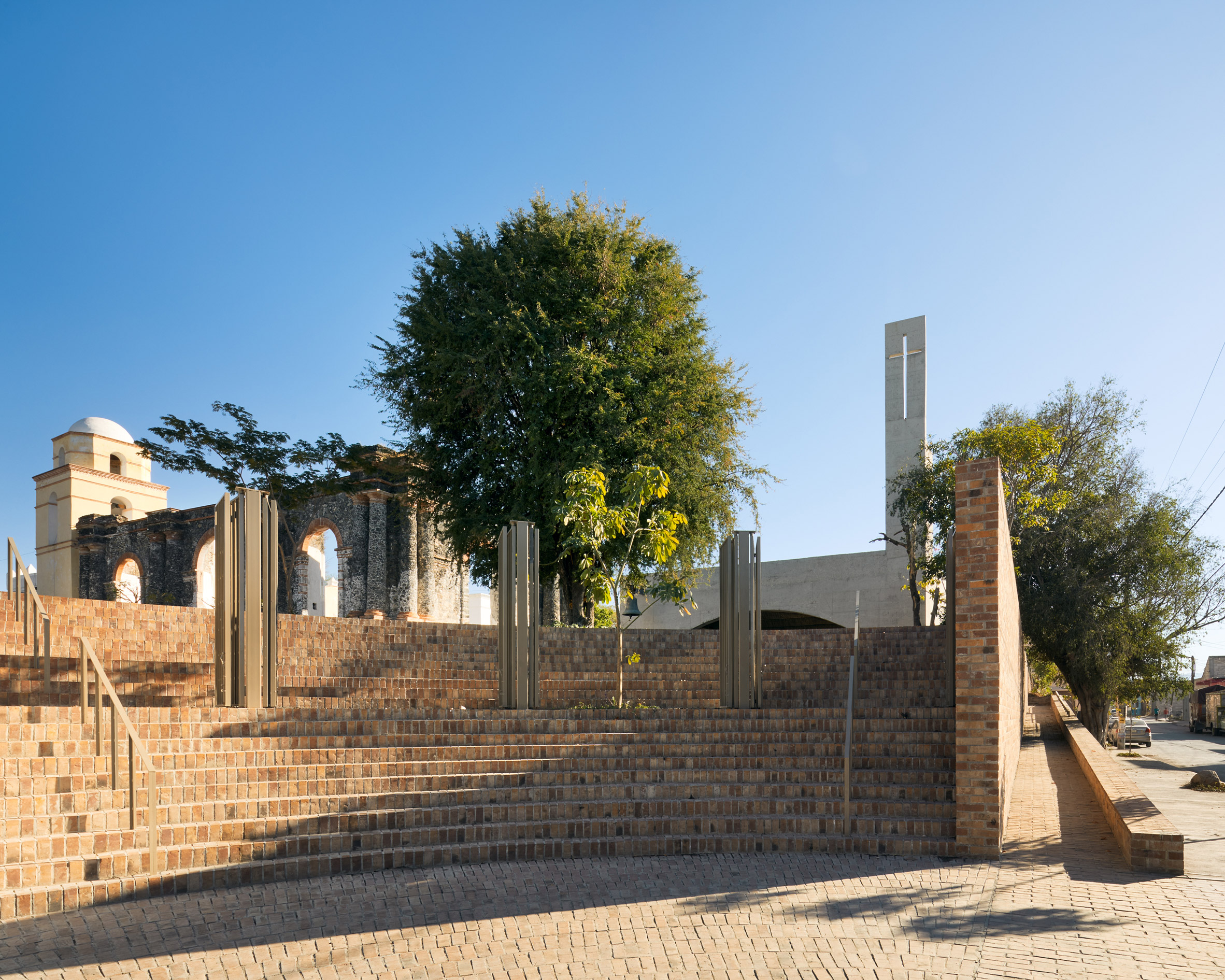
Jojutla, a town in the state of Morelos in central Mexico, was struck particularly hard by the earthquake on 19 September 2017. In addition to destroying over 2,600 homes, it also severely damaged the Santuario Señor de Tula (Sanctuary of the Lord of Tula), which had stood for over 500 years.

Señor de Tula Sanctuary
Señor de Tula Sanctuary replaces a church destroyed in 2017

"Four years after the earthquake, the Jojutla master plan is continuing with its strategy of reconstructing the public space to empower citizens through their collective identity and make public space the home for everyone," said the team.

The 450-square-metre structure that replaces the church comprises a simple brick-vaulted roof that rests on arched concrete walls on all four sides.

Arched walls on church in Mexico
Arched walls form a four-pronged structure

The walls only touch the ground at the corners, leaving large gaps under the arches for air and light to pour in.

"This solution allows the passage of air and the entry of comfortable light for ceremonies, thus avoiding the use of mechanical air conditioning systems and excessive energy consumption in artificial lighting," the team explained.

A central nave is flanked by two traditional aisles of pews

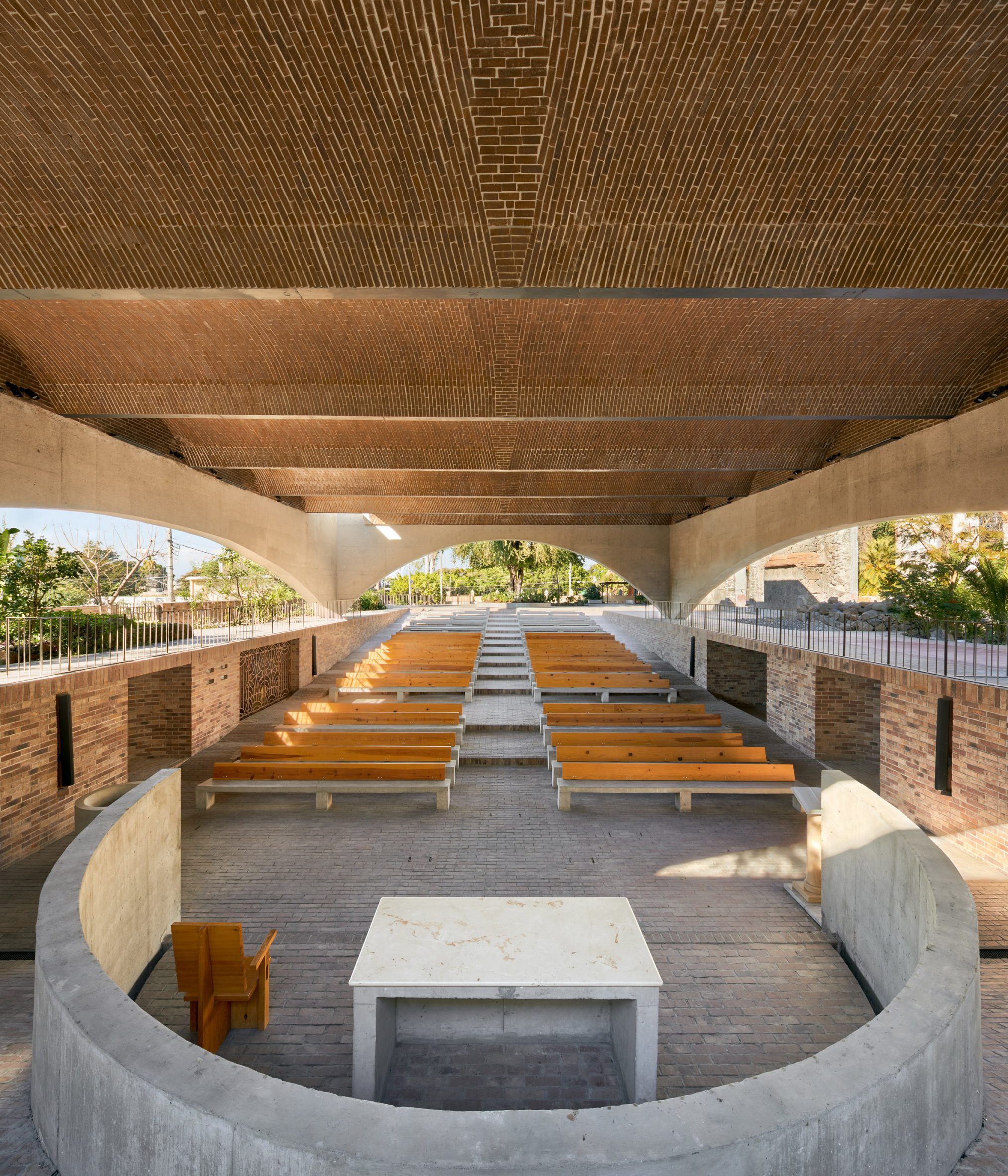
In plan, the church's layout nods to historical Christian designs, with a central nave flanked by two aisles. Worshippers enter from the back via a public plaza.

The altar is at the front, partially enclosed by a semi-circular concrete wall.

Church stepped flooring
The church has stepped flooring

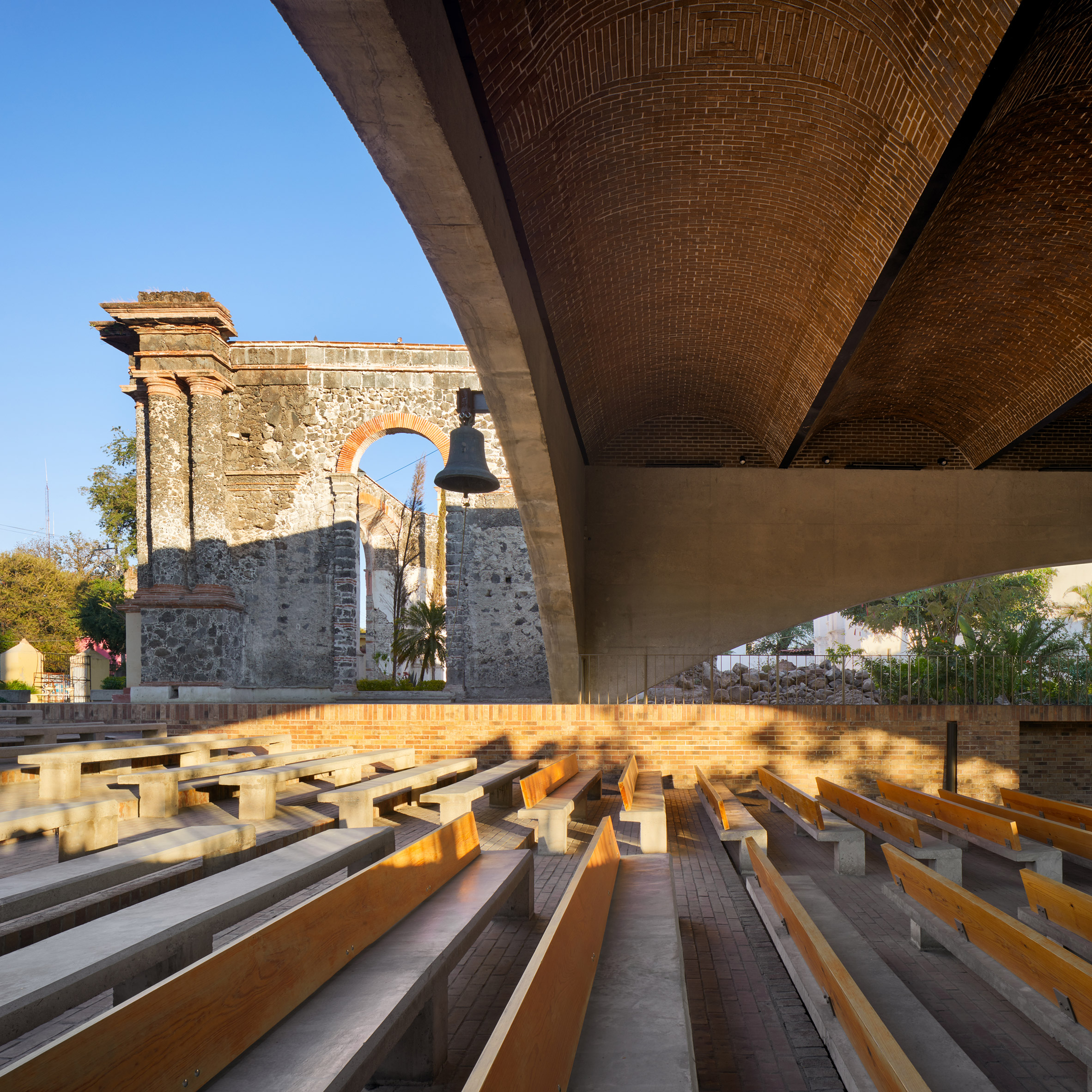
The architects created a stepped floor that runs the entire length of the space and out into the plaza.

This causes the overhead height to be lowest at the church entrance and highest above the altar.

"The staggering of the floor from the atrium towards the altar produces a slow detachment from the outside world, which allows building a relationship of privacy and seclusion without losing contact with the tropical space of the gardens and nature," the team said.

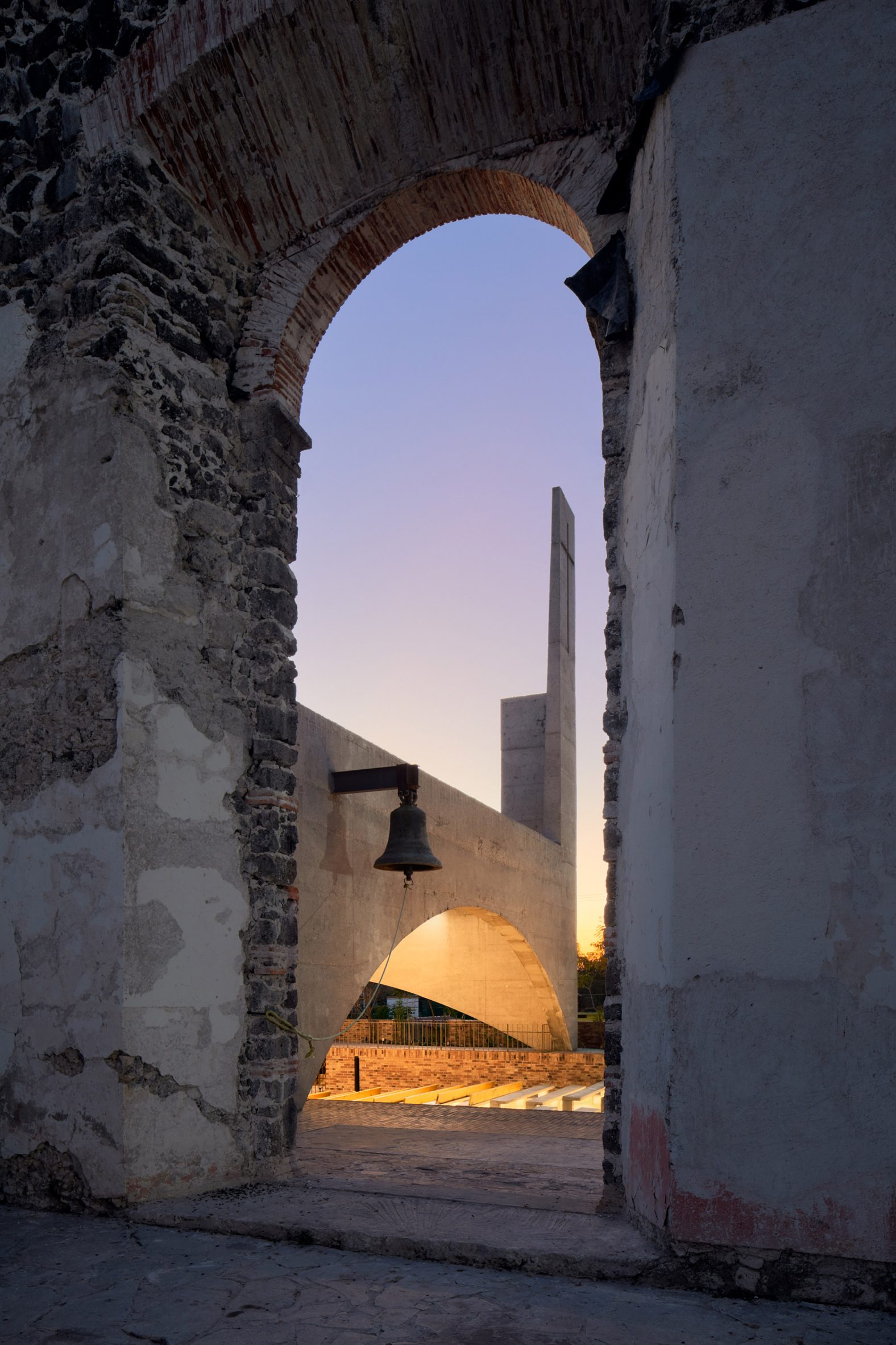
Behind the altar, the brick arches stop short of the back wall. This creates an opening in the roof, through which sunlight illuminates a large metal cross.

Brick-paved church
Brick pavers form the floors and vaulted ceiling

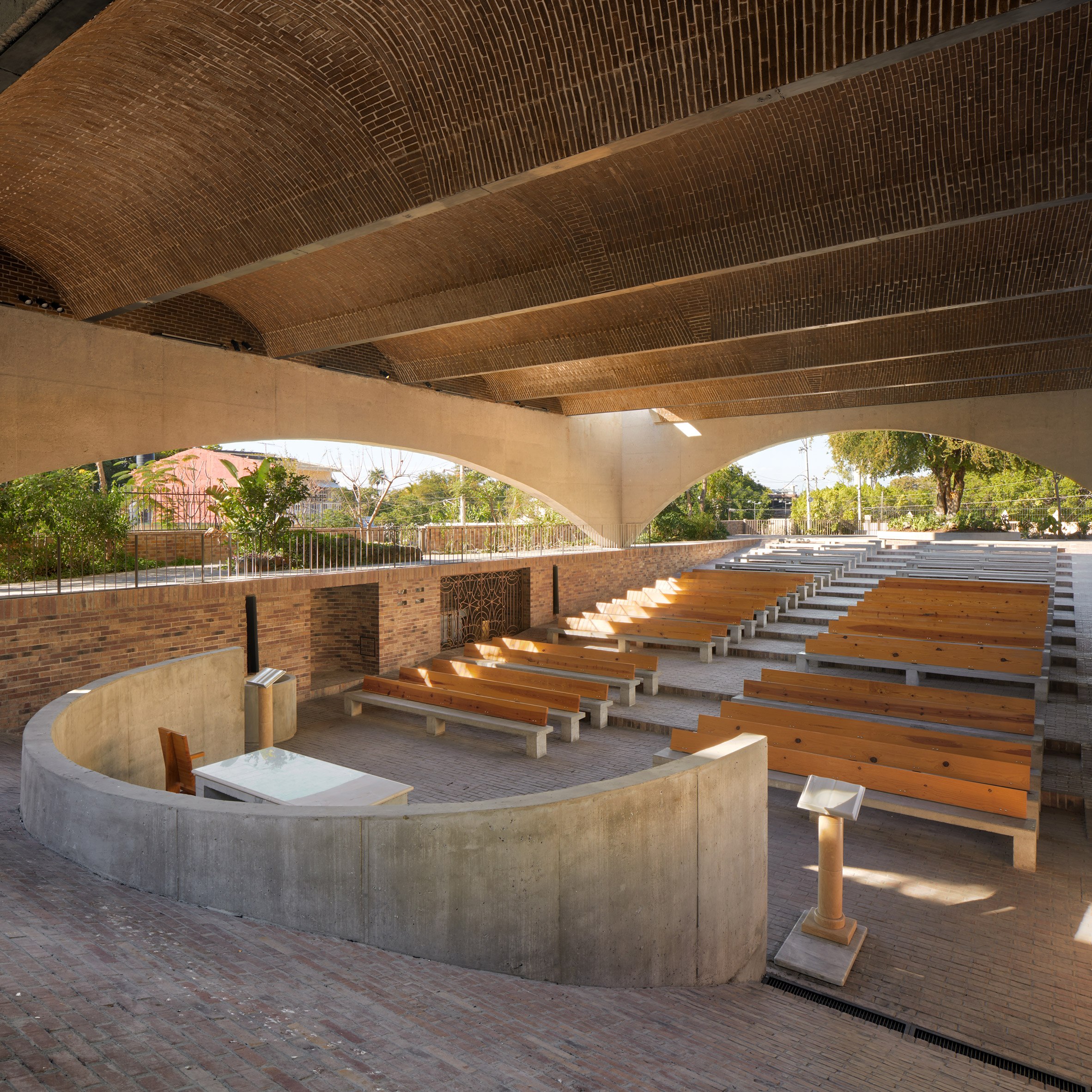
AGENdA and Dellekamp/Schleich used a minimal palette for their intervention, leaving the brick pavers that form the floors and ceiling and the walls of cast-in-situ concrete exposed.

On the exterior facing the plaza, a church bell was salvaged from the ruins of the original sanctuary, as a reminder of the building that was lost.

Church bell from original building
A church bell was salvaged from the ruins of the original sanctuary

Elsewhere in Jojutla, earthquake recovery efforts have included a new public square designed by MMX.

Meanwhile in Mexico City, which was also hit, a pavilion designed by Lanza Atelier, TO, and architect Alberto Odériz was built to commemorate the event.

The photography is by Rafael Gamo.


Project credits:

Clients:  Carlos Zedillo, Alejandra de la Mora, Javier Garciadiego, Carlos Farah (Infonavit), Cristina Rubio (Fundación Hogares)
Architects: Derek Dellakamp, Jachen Schleich (Dellekamp/Schleich), Camilo Restrepo Ochoa (AGENdA Agencia de Arquitectura)
Team: Francisco Eduardo Franco Ramírez, Jose Manuel Estrada, Gustavo Hernández, Elizabeth Molina, Sana Frini, Samuele Xompero, Santiago Sitten, Mariana Víquez (Dellekamp/Schleich), Mariana Mejía, Camilo Toro, Helen Winter (AGENdA Agencia de Arquitectura)
Structural design: Oscar Trejo, Sergio López
Installations: Ubaldo Velazquez
Landscape design: Hugo Sánchez, Tonatiuh Martínez, Paulina Zarate (Taller de paisaje Entorno)
Lighting design: Carlos Hano (Lightchitects)
Acoustic design: Xicotencatl Ladrón Guevara
Construction: Serafín Adame, Eloy Cruz, Francisco López, Alexis Garicoits Hernández, David Herrera, Andres Flores Castañeda, José Apolinar Ballesteros Rodríguez, Ricardo Antonio Ballesteros Amaro, Bernardo Pedro Cruz López
Site supervision: Juan Carlos Martínez, Marcelino Delgado Castrejon
Project management: Rafael Luna, Juan Fronjosa, Ruth Cantera
Municipal management: Roque González
Materials: Concrete CEMEX, Ladrillera Mecanizada
Special thanks: Diocese of Cuernavaca, Obispo Ramón Castro Castro, Germán Arrieta Fuentes

The post Vaulted church replaces building destroyed in Mexico's 2017 earthquake appeared first on Dezeen.


from Dezeen https://ift.tt/3e4UQzh

Tomoaki Uno Architects designs house in Japan with Aztec-informed pyramid

Pyramidal study of Takamine-cho House

A truncated stone pyramid containing a study stands in one corner of the introverted Takamine-cho House, designed by Tomoaki Uno Architects in Japan's Aichi Prefecture.

Located in a green residential district in Nagoya, the stone and concrete dwelling takes cues from the pyramid of Tenayuca, an Aztec pyramid in the Valley of Mexico.

Stone study of Takamine-cho House
Takamine-cho House references Aztec pyramids

It was designed by local studio Tomoaki Uno Architects for a client who wanted a home built using traditional dry stone construction methods.

According to the studio's founder, as this form of masonry construction is traditionally only used in Japan "for the foundations of castles, castle foundations, and stone walls", he turned to Aztec architecture for ideas.

Stone study of Takamine-cho House
It features a stone pyramid containing a study

"I felt pretty uneasy and uncomfortable about using this traditional Japanese masonry as part of a building with a different purpose," Tomoaki Uno explained.

"I couldn't get rid of the awkward feeling that I was trashing the tradition, and a lot of time passed without being able to propose," he continued. "It was the pyramids of Tenayuca that brought me out of this impasse."

Japanese water garden
The home is arranged around a courtyard and water garden

Protruding from one corner of the home, the pyramid sits next to a central courtyard and water garden, around which the rest of the inward-looking concrete home has been arranged.

"The overall plan is to give a feeling of openness to the rooms while protecting the private space surrounding the two gardens," explained Uno.

Concrete-walled living room
A concrete structure is exposed throughout

The upper level of Takamine-cho House has an L-shaped plan containing a living, dining and kitchen area, which overlooks the courtyard through glass curtain walls.

On the home's lower floor there is the main bedroom, alongside four smaller bedrooms that are arranged around a garage.

Apart from the glazing overlooking the courtyard, the home contains only a few small windows, opting instead for a series of small skylights in its exposed concrete ceilings.

The pyramidal study is accessed internally through an opening in the living space, or directly from the street where a projecting concrete opening sits at the top of a staircase.

Concrete fireplace

Inside, it is lined with concrete panels and has a concrete fireplace. A skylight and an opening overlooking the water garden provide natural lighting.

Set against the concrete and stone, black ironwork has been used for the courtyard doors and, internally, for the handles of sliding wooden doors and stair balustrades.

Concrete walls with black door
The concrete is paired with black ironwork

In the basement, the bedrooms are brightened with warm pale wood elements such as shelves and cupboards.

Tomoaki Uno Architects was founded by Uno in Nagoya in 1990. Other recent projects by the studio include Ogimachi House, a pared-back and therapeutic home built almost entirely from wood to create a "healing" atmosphere.

The photography is by Yasuo Hagiwara.

The post Tomoaki Uno Architects designs house in Japan with Aztec-informed pyramid appeared first on Dezeen.


from Dezeen https://ift.tt/3p6oiuS

Dezeen's top 10 house extensions of 2021

Mirrored house extension

Continuing our review of the year we look at the house extensions that turned heads in 2021, including a polycarbonate-clad tower and a mirrored art gallery on stilts.


A rear extension to a Georgian house
Photo is by Adam Scott

A Cloistered House, UK, by Turner Architects

In its renovation of an abandoned Georgian house in London, Turner Architects added a large rear extension that incorporates a pair of courtyards and a green roof.

The project, which was informed by monastic cloisters, contains a sequence of living spaces that leads out into the back garden. The courtyards are accessed through sliding doors, creating seamless links between the inside and outside when opened.

Find out more about A Cloistered House ›


Polycarbonate-clad house in Paris
Photo is by Caroline Dethier

Staying in Paris, France, by Java Architecture

Java Architecture introduced this six-by-four-metre tower to an old stone dwelling that was found hidden away in a courtyard in Paris.

The vertical extension contains three storeys of living spaces and is animated with a mix of different facade treatments, including slatted wood screens and translucent polycarbonate panels.

Find out more about Staying in Paris ›


Kitchen of House Recast
Photo is by French + Tye

House Recast, UK, by Studio Ben Allen

One of the most experimental extensions on this list belongs to the House Recast, a Victorian home in London that was renovated by Studio Ben Allen for a retired couple.

The project, which won the Don't Move, Improve! 2021 contest, uses brightly coloured concrete for both its structural elements and decorative details. The architect said this was informed by the home's original Victorian architecture.

Find out more about House Recast ›


Black exterior of Cottage on the Point in Quebec
Photo is by Raphaël Thibodeau

Cottage on the Point, Canada, by Paul Bernier Architecte

This screened porch and stained cedar-clad volume were added to a rustic lakeside cabin in Quebec as part of a wider renovation project.

Paul Bernier Architecte designed the extensions to echo the rustic look of the existing dwelling without blending in with it. Both new additions also incorporate large portions of glazing that frame views of the surrounding trees and night skies.

Find out more about Cottage on the Point ›


Kitchen of Concrete Plinth House
Photo is by Nick Dearden

Concrete Plinth House, UK, by DGN Studio

In east London, a Victorian semi-detached house was extended by DGN Studio to transform its dark north-facing kitchen into a bright and open room suited to gatherings.

The extension stands on a sunken concrete floor that is left exposed and designed to maximise ceiling height. It is complemented by navy kitchen units with concrete worktops and brightened by an exposed roof structure made from oak.

Find out more about Concrete Plinth House ›


Timber diagrid roof in House for Theo and Oskar by Tigg + Coll
Photo is by Andy Matthews

House for Theo and Oskar, UK, by Tigg + Coll Architects

Accessibility was a priority in the design of this house extension, which Tigg + Coll Architects carried out for a family with two children that have a rare muscular disorder.

The timber-roofed wing is accessible by wheelchair and contains facilities designed specifically for the children, Theo and Oskar, after whom the house is named. Its distinctive diagrid roof was engineered to help create spacious bedrooms and to also support hoists.

Find out more about House for Theo and Oskar ›


Mirrored house extension
Photo is by Katie Huisman

Malinka Gallery, Canada, by F2A Architecture

Balanced over steep bedrock in the Okanagan Valley, this mirrored house extension by F2A Architecture is used by its owner as a private art gallery.

Due to the uneven terrain of the rocky site, the extension is elevated on slim steel stilts and accessed via a glazed stairwell in the main house. Its stainless steel cladding was chosen to reflect the sky and the building's wooded surroundings.

Find out more about Malinka Gallery ›


Rydon Street, UK, by Moxon Architects
Photo is by Alexandria Hall

Rydon Street, UK, by Moxon Architects

Moxon Architects excavated the basement of a Victorian townhouse in London to create this pared-back rear extension and matching sunken garden.

The addition, which contains a spacious living area, occupies the full width of the plot and is finished with a crisp white material palette. The concrete brick walls and resin flooring extend outside to offer a seamless transition to the garden.

Find out more about Rydon Street ›


White-walled hallway of House B-L
Photo is by Jeroen Verrecht

House B-L, Belgium, by Graux & Baeyens Architecten

House B-L is a 1960s home in Destelbergen that was expanded with a minimalist kitchen and living area by Graux & Baeyens Architecten for its co-founder Basile Graux.

The new wing is positioned at a slight angle to the original dwelling to maximise sunlight exposure. However, the old and new elements are unified by muted interior finishes and the same grey plywood cladding on their exteriors.

Find out more about House B-L ›


Exterior of K&T's place by Nielsen Jenkins
Photo is by Shantanu Starick

K&T's Place, Australia by Nielsen Jenkins

A tactile material palette of exposed timber and blockwork characterises the semi-enclosed rear addition to K&T's Place, a cottage owned by an artist and gallery director in Brisbane.

It was extended by Australian studio Nielsen Jenkins as part of a wider renovation of the dwelling and contains a series of occupiable landings that maximise space in the existing home. By exposing its construction materials, costs were also kept to a minimum.

Find out more about K&T's Place ›

The post Dezeen's top 10 house extensions of 2021 appeared first on Dezeen.


from Dezeen https://ift.tt/3mi1syS

Friday 17 December 2021

Repose sofa by OKHA via Twentieth

Repose sofa by OKHA via Twentieth gallery

Dezeen Showroom: an organic shape sculpted from wood defines the Repose sofa, created by South African interior design studio OKHA and available via Twentieth gallery.

OKHA originally designed the Repose sofa for a coastal villa that required bespoke furniture as part of its interior design.

Repose sofa by OKHA via Twentieth
The Repose sofa has an organic, fluid shape that came from loose sketching

The sofa's organic form solved the problem of how to create natural circulation of movement within the unusually proportioned space, while providing a highly sculpted piece that served as a visual anchor.

OKHA creative director Adam Court translated Repose from a loose sketch in his notebook to a wooden-framed sculpture then shaped and modelled the foam seating.

Repose sofa by OKHA via Twentieth
Its flowing shape is reminiscent of a languid, resting figure

"Aside from its physical, visual features, which I find sensual, feminine, and very human, the sofa is well-conceived in terms of ergonomics and practicality," said Court.

Repose is available in five different sizes ranging from 102 to 157 inches in width and can be customised with matching ottomans. Its cylindrical plinth base comes in either brass or wood.

Product: Repose
Designer: OKHA
Brand: Twentieth
Contact: sales@twentieth.net

Dezeen Showroom

Dezeen Showroom offers an affordable space for brands to launch new products and showcase their designers and projects to Dezeen's huge global audience. For more details email showroom@dezeen.com.

Dezeen Showroom is an example of partnership content on Dezeen. Find out more about partnership content here.

The post Repose sofa by OKHA via Twentieth appeared first on Dezeen.


from Dezeen https://ift.tt/3e7IhD7

Ceramiche Refin designs porcelain tiles that take cues from traditional frescos

Ceramiche Refi Affrescati tiles

Dezeen promotion: Italian ceramic brand Ceramiche Refin has launched a collection of porcelain tiles that reference the textured surfaces and rich colours of traditional frescos.

The collection called Affrescati is informed by the appearance of traditional Italian frescos, which refers to a mural painting technique where dry-powder pigment is painted onto wet plaster.

"The story of Affrescati started long ago, from powerful suggestions linked to the fascination of the frescos of Pompeii to the colours of the Amalfi Cathedral and the starry vault of the Scrovegni Chapel," said Ceramiche Refin.

Giotto star-shaped decorations
Giotto star-shaped decorations are available to embellish the tiles

In the making of the Affrescati collection, Ceramiche Refin's design team replicated authentic fresco paintings in its laboratory using traditional pigments and lime.

The team studied fresco's heritage and artistry then "brought it back to life" in a ceramic tile. The result is a tile with an almost three-dimensional surface, where the fresco characteristics were replicated with "every detail, to value all the charm of a millenarian heritage".

"This craft-based approach is the result of experiments conducted in our lab which, backed by impressive production expertise and state-of-the-art technologies, translates its creativity to an exclusive ceramic tile product," said Ceramiche Refin.

Tiles informed by frescos
The Affrescati collection is informed by traditional frescos

The Affrescati collection is available in five different colours and four sizes. Each colour option combines swirling shades of porcelain that take cues from the pigments used in traditional frescos.

Ombra is a shadow-like mix of greys, while Lapis features moody shades of blue.

Ocra uses various yellow and cream tones, which contrasts with Calce, an eclectic combination of white tones. Finally, Terra is a warm, neutral mix of sienna and burnt earth.

Affrescati textured tiles
Although smooth porcelain, the tiles have the appearance of textured paint

The collection is also informed by the textured appearance of frescos, which are defined by spatula marks and imperfections.

However, Affrescati tiles are finished in smooth porcelain that gives them a modern twist, which also makes the tiles suitable for both wall and floor coverage.

"The colours take on a particular 'vintage' appearance emphasised by signs and marks: a distinguishing feature due to the reaction between the lime of the background and the pigments utilised, which attenuates the colours and makes it possible to obtain a symphony of hues, with a gently dilapidated result," said the brand.

There are five colours to choose from in the latest range

"The multifaceted qualities of stoneware have made it possible, for the first time, to convey the charm of the fresco to floors," said Ceramiche Refin.

Each coloured tile in the collection can also be adorned with Giotto star-shapes, which refers to the Florentine painter and architect Giotto di Bondone's comet-like stars found across his murals.

To view more about the Affrescati collection visit Ceramiche Refin's website.

Partnership content

This article was written by Dezeen for Ceramiche Refin as part of a partnership. Find out more about Dezeen partnership content here.

The post Ceramiche Refin designs porcelain tiles that take cues from traditional frescos appeared first on Dezeen.


from Dezeen https://ift.tt/3p4Yv6A