Thursday 6 January 2022

Cobalt-blue accents brighten interior of family apartment in Thane

Matching chairs in cobalt-blue and nattural wood with circular cushions in living room of Out of the Blue apartment in India by The Act of Quad

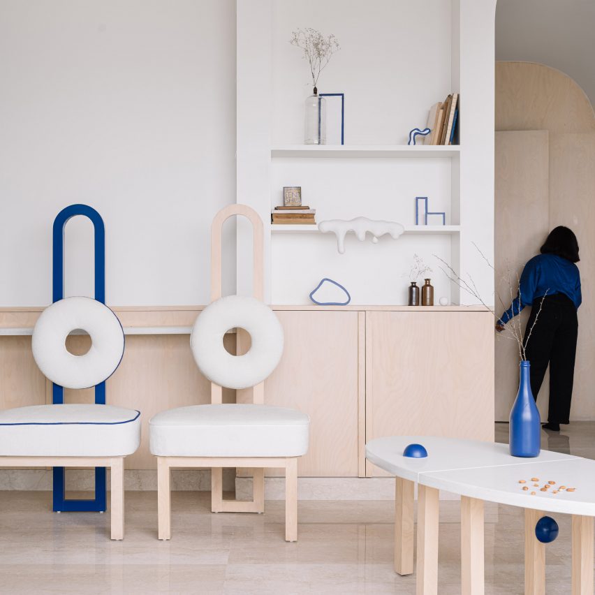
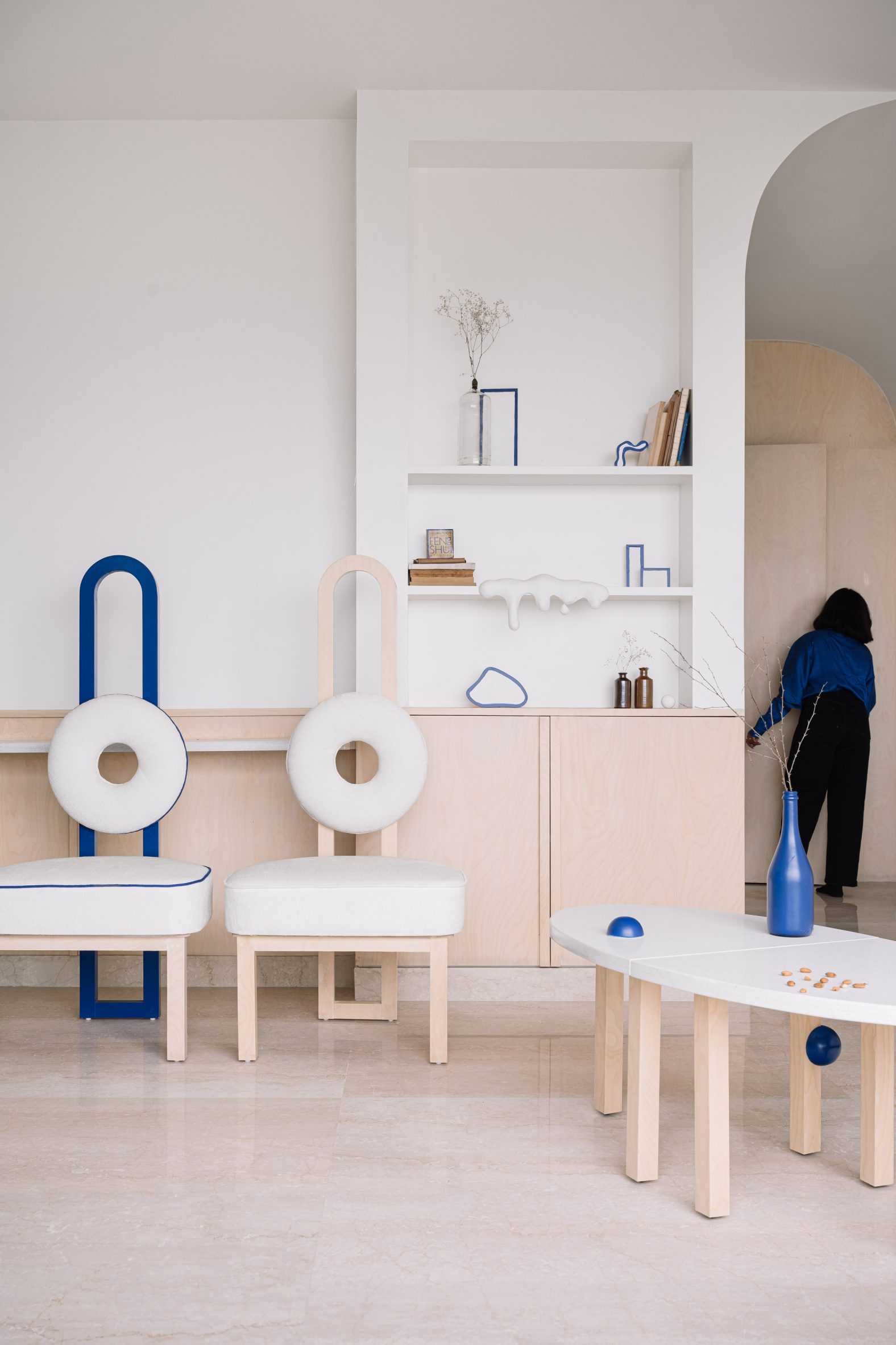
The Act of Quad has introduced a smattering of blue furnishings and fittings to this high-rise apartment, renovated by the design studio in the Indian city of Thane.

The cobalt touches create a vibrant contrast inside the otherwise neutral-toned 101-square-metre home, which is shared by a middle-aged couple, their two daughters and a pet cat.

Matching chairs in cobalt-blue and nattural wood with circular cushions in living room of Out of the Blue apartment
The Act of Quad dotted the apartment with cobalt-blue decor features

Mumbai-based The Act of Quad made a handful of structural changes to the apartment during the renovation, knocking down a wall in the entranceway to make the dining area appear larger and extending the third bedroom with the help of a convex partition.

Several sharp corners near the ceiling were rounded off, which the studio said helps to "soften the severity" of the existing architecture.

Neutral-toned couch and wooden coffee table with black spheres in Thane home interior by The Act of Quad
Ceilings near the entrance were rounded off to soften the existing architecture

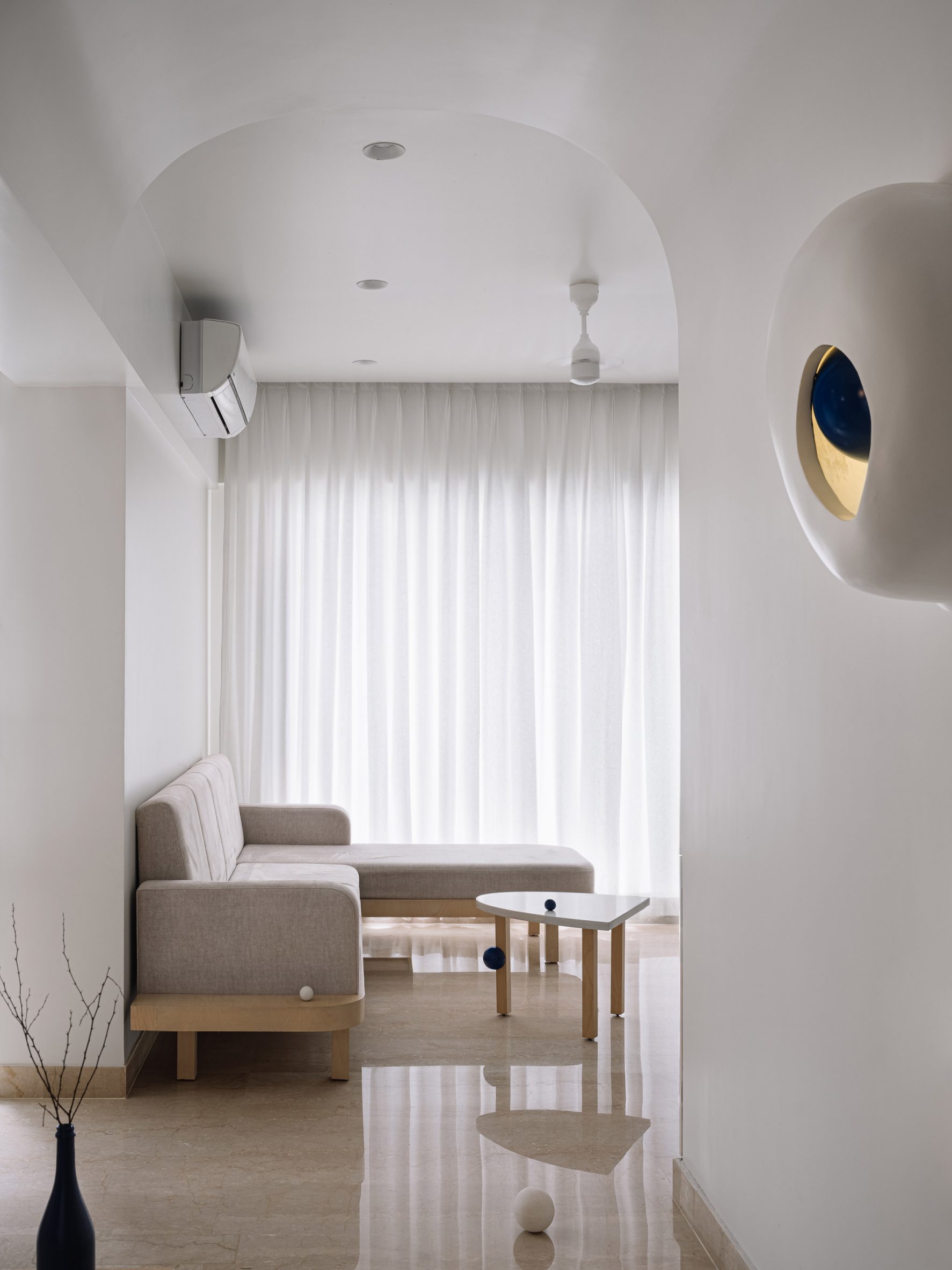
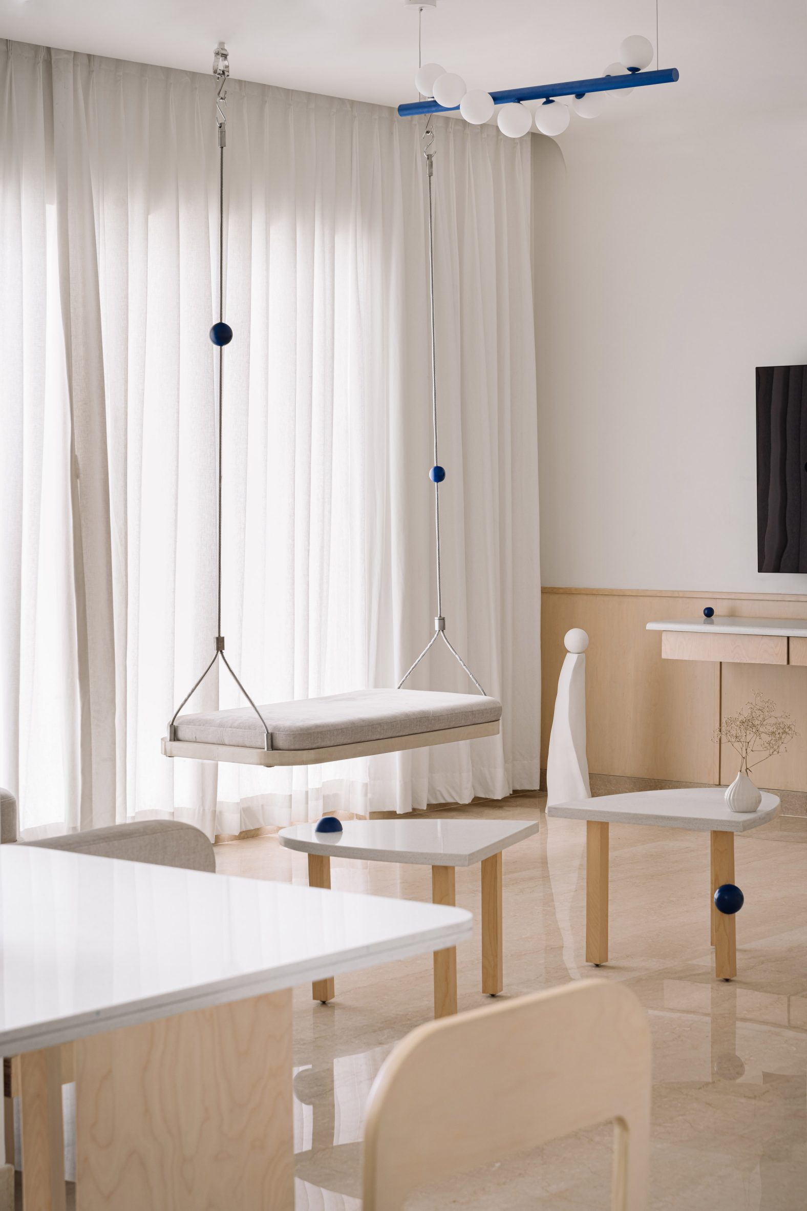
The Act of Quad created a number of bespoke furnishings for the space, including a three-legged quartz-topped dining table, a grey L-shaped sofa and a swing that is suspended in front of the apartment's expansive windows, allowing inhabitants to sit and sway while taking in the city views.

The interior is dotted with cobalt-blue accents, ranging from a tubular pendant light in the living room to the laminate that lines the arched drinks cupboard in the corner.

Nearby, one of the chairs features blue piping around its seat cushion and a matching arched backrest.

Living room swing in interior of Out of the Blue apartment in India
Several furnishings including the swing were made bespoke by the studio

"When we first suggested cobalt to our clients, they thought it was not a colour for a home," explained Priyanka Itadkar and Falguni Bhatia who lead The Act of Quad. "To them, it seemed very out of the blue."

"Now, our clients say that they can't imagine any other colour in their home," the duo added.

Bedroom interior by the Act of Quad with pink desk and bed
The bed in the younger daughter's room can double up as a sofa

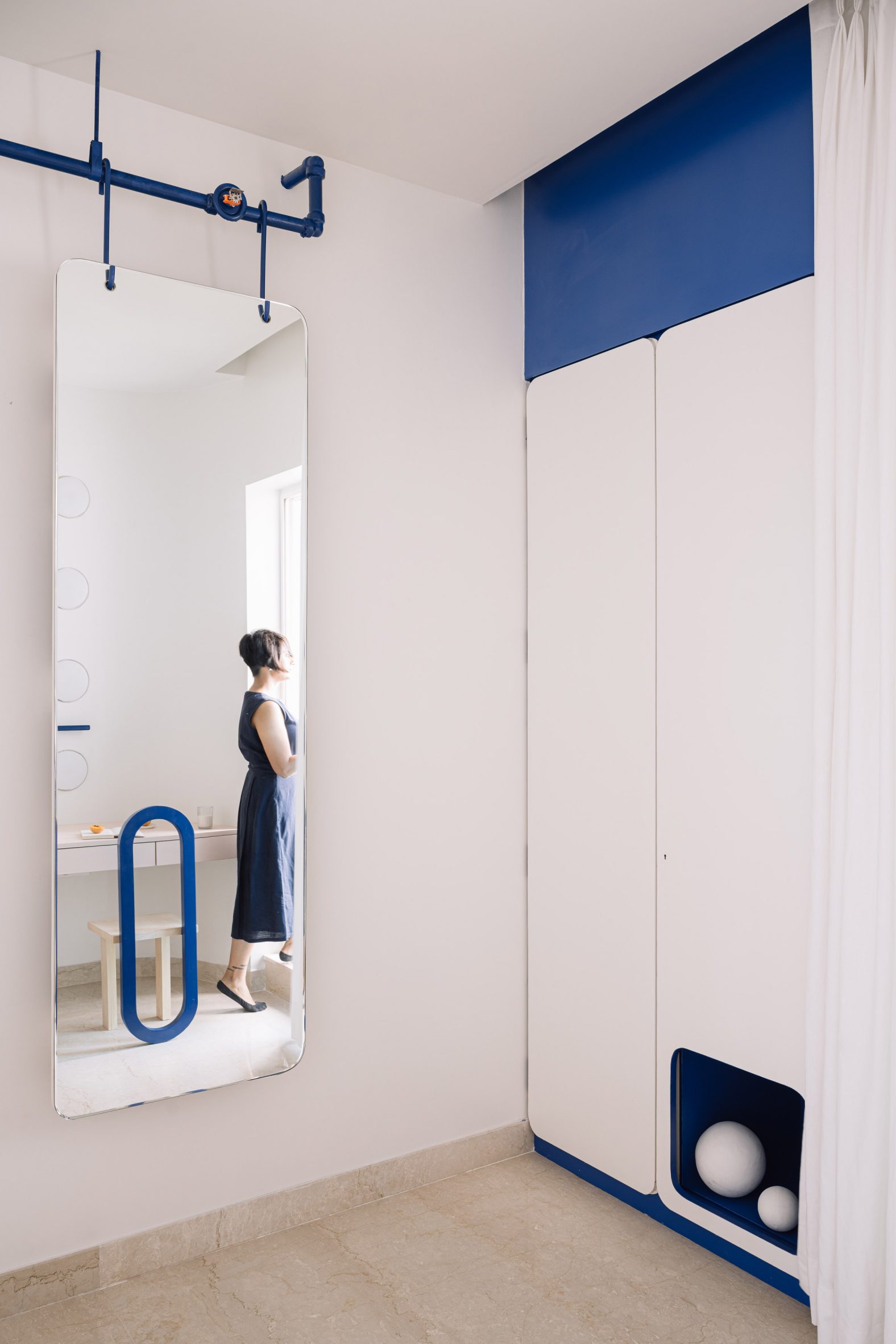
Blue appears again in the younger daughter's bedroom, where cobalt-coloured paint covers a slim wall-mounted rail.

Two back cushions are suspended from the horizontal bar, allowing the adjacent bed to double up as a sofa during the daytime.

A cosy blue cubby for the cat was integrated into the room's wardrobe and a geometric chair made from waste materials found on-site sits tucked under the desk.

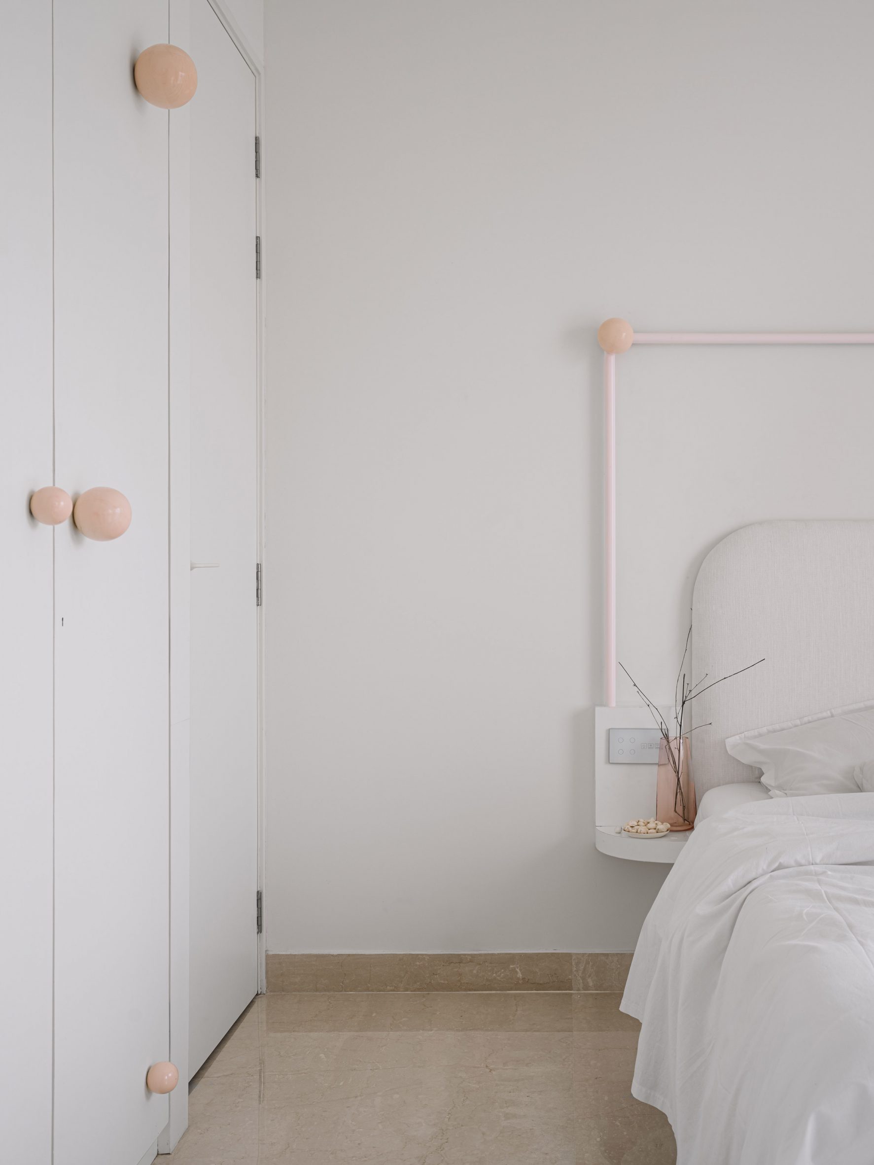
The other bedroom, which belongs to the older sister, is largely dominated by crisp white surfaces.

Built-in wardrobe in bedroom of Out of the Blue apartment with blue cubby hole for cat
A blue cubby for the cat is integrated into the wardrobe

But a niche accommodating a small work table is rendered in peachy pink, together with the orbs fixed to the outside of the wardrobe for holding coats or bags.

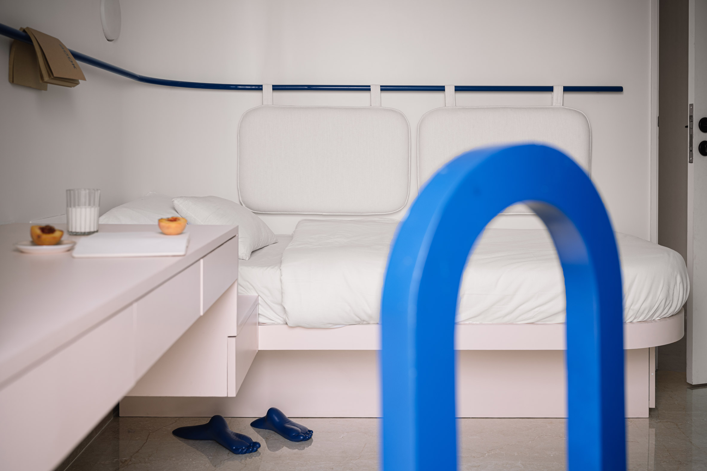
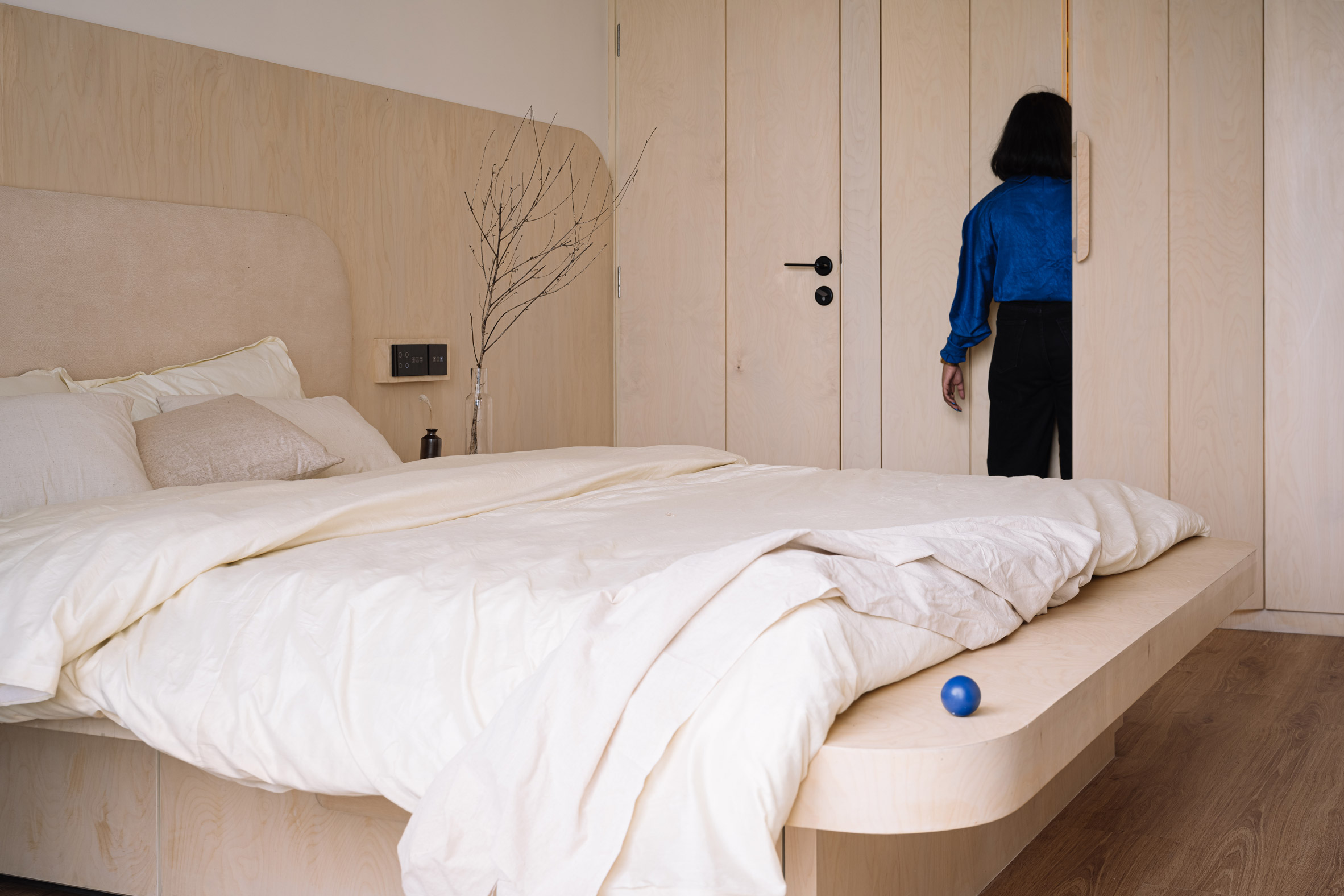
The studio established a slightly warmer feel in the parents' bedroom, which was designed to evoke the wood-lined hotel suites the couple used to frequent during their holidays in northern India.

Bedroom interior by The Act of Quad with white wardrobe and bed with pink and peach-coloured accents
Pink spheres fixed to the wardrobe provide storage for bags and coats

Birch plywood was used to craft the room's floor-to-ceiling storage units as well as the bed frame and headboard, while surfaces in the en-suite are clad in a veiny brown stone.

The primary family bathroom is covered with cobalt-blue tiles and has a large organically shaped mirror mounted above the sink.

Bedroom of Out of the Blue apartment in India clad with birch plywood bed and built-in storage
Birch plywood fittings give the parents' sleeping quarters a warmer feel

The Act of Quad completed another residential project in India just last year, in which the studio merged two Mumbai flats to form a "minimal but playful" home for three generations.

The photography is by The Fishy Project.

The post Cobalt-blue accents brighten interior of family apartment in Thane appeared first on Dezeen.


from Dezeen https://ift.tt/3eYBHzv

Wednesday 5 January 2022

Postmodern architecture celebrated in illustrations by Adam Nathaniel Furman

Isle of Dogs Pumping Station illustration by Adam Nathaniel Furman

Designer Adam Nathaniel Furman has created a vividly coloured illustration series called Postmodern Icons, which celebrates buildings such as London's Isle of Dogs Pumping Station and Chicago's James R Thompson Center.

The series is a personal project that Furman started during the 2020 coronavirus lockdown, when he decided to revisit an old hobby of sketching buildings that he liked and creating 3D models of them.

After adapting one such model into an illustration and enjoying the process, he decided to make an ongoing series, focusing on postmodernism because there was "a gap" in its artistic representation.

No 1 Poultry building illustrated in simple block shapes and colours
Furman's series mainly focuses on postmodern buildings, such as London's No 1 Poultry

"There's a lot of illustrations of modernist buildings and Victorian buildings and the great monuments of our cities from other periods," Furman told Dezeen. "There are not readily available ones much of postmodern architecture, which is something that I really like."

Often colourful and eclectic, postmodern architecture flourished in the 1980s and 1990s as a pushback against the functional ethos of modernism.

Furman tries to illustrate the buildings in a style that is as simple as possible, using just a few lines and blocks of bright colour to convey their essential character.

Shin Takamatsu's Syntax building illustrated in purple, pink and blue against a yellow background
For Shin Takamatsu's Syntax building, Furman created a more detailed illustration

For some of the buildings, such as London's No 1 Poultry by James Stirling and Isle of Dogs Pumping Station by John Outram, the result is a highly simplified illustration that Furman describes as containing "just the right amount of information and no more".

Others, such as Kyoto's now-demolished Syntax building by Shin Takamatsu, are rendered in more detail, which Furman considers necessary to communicate the brilliance in Takamatsu's work.

A couple of the illustrations, including ones of Kengo Kuma's M2 and Philip Johnson and John Burgee's AT&T building, appear as an abstract collections of shapes.

Philip Johnson and John Burgee's AT&T building illustrated in simple blue, yellow and red cut-outs
Philip Johnson and John Burgee's AT&T building is reduced to abstract symbols

Furman chooses buildings that he loves for his illustrations, focusing largely but not exclusively on postmodernism, although not all his favourites have been suitable for the series.

The subjects have to be able to stand on their own, without their urban context.

"They are shown as sort of solitary objects floating – like souvenirs, effectively," said Furman. "And I've always been obsessed with souvenirs, just generally."

"If you look, a lot of my design work kind of revolves around the idea of the souvenir, this sort of encapsulation of something standing on its own representing something bigger."

Helmut Jahn's James R Thompson Centre illustrated with yellow, red and blue lines forming the facade
One of Furman's aims is to bring attention to buildings that are under threat, such as Helmut Jahn's newly saved James R Thompson Center

Furman posts the illustrations on Instagram, and sells them as prints and merchandise, such as mugs and tote bags, on his website. He also tries to use the work to call attention to architectural heritage causes.

The designer has illustrated Helmut Jahn's James R Thompson Center in Chicago, which was recently saved from demolition, as well as Wojciech Jarząbek's Solpol building in Wrocław, which earned Furman some ire from Polish commenters.

"I got loads of angry comments from Polish people like 'this disgusting building should be demolished!' – which is the reaction that very often happens to a style when it's not come back into fashion yet," he said.

Wojciech Jarząbek's Solpol building in Wrocław illustrated by Adam Nathaniel Furman in bright colours and simple shapes
Wojciech Jarząbek's Solpol building is another that is set for demolition

"The same thing happened with brutalism, and now it's everyone's favourite. Postmodernism is just going through the same thing," he continued.

Known for his colourful and playful designs, Furman considers himself part of a movement he has dubbed New London Fabulous.

His recent work has included the Proud Little Pyramid installation at King's Cross in London and pastel-coloured anatomically shaped chairs that explore cuteness and queerness.

The post Postmodern architecture celebrated in illustrations by Adam Nathaniel Furman appeared first on Dezeen.


from Dezeen https://ift.tt/3mZ6UXu

The Center Won't Hold is a geometric pavilion designed to optimise public space

The Center Won't Hold

Multidisciplinary design office The Open Workshop has created an experimental pavilion that proposes how Chicago's vacant public spaces could be used for communal living.

Called The Center Won't Hold, the geometric pavilion comprises a green-painted, timber-framed cuboid with two more rotated cuboid frames within it. The arrangement forms open-air spaces concealed only by thin, gauzy curtains.

Pavilion by The Open Workshop
The Center Won't Hold comprises three timber-framed cuboids rotated inside one another

The project was presented as part of last year's Chicago Architecture Biennial, but remains in place despite the event's conclusion in December.

Titled The Available City, the biennial asked participants to explore the impact of collective urban spaces.

Gauzy curtains on pavilion
Curtains create private spaces within the pavilion

Created by San Fransisco-based studio The Open Workshop, the pavilion was positioned on the site of the former Overton Elementary School in Chicago's Bronzeville neighbourhood, which closed in 2013.

According to its architects, the pavilion attempts to explore how the many vacant lots in areas of the city, such as Bronzeville, might be reclaimed as shared public space in order to promote communal living.

Timber installation
The project was commissioned by the Chicago Architecture Biennial

"The Center Won't Hold is a flexible youth meeting space that serves as a prototype component to a larger network of sharing," The Open Workshop founder Neeraj Bhatia told Dezeen.

Designed to be adaptable, the installation can be reconfigured from one large room to up to nine smaller ones, with a "purposefully straightforward" floor plan that allows communities to determine how they would like to come together.

Each "room" could be filled with various objects – from tables and chairs to potted plants.

Green-painted timber pavilion
It was designed to empower local communities

"The idea behind compartmentalising was to have a framework for the community to curate different ways of gathering, mainly aimed at knowledge production for youth," continued Bhatia.

"Also, the spiral nesting of the squares enables more or less privacy with the surrounding environment."

Informed by the teamwork of traditional communes, The Open Workshop designed the pavilion with what Bhatia called a DIY ethos in mind.

"We wanted the materiality to be very simple so that any carpenter could build the installation with regular tools and dimensional lumber," said Bhatia.

The installation was constructed by five trainee builders from local nonprofit organisation Revolution Workshop, which offers woodworking development to unemployed or underemployed people.

Site of former school
The pavilion is located on the site of a former school

The Center Won't Hold remains at its site as part of Creative Grounds, an initiative by architecture office Borderless Studio that seeks to make use of various disused school grounds in Chicago.

Bhatia explained that members of the local community have expressed their intentions to steward the project forward and make it their own after the biennial.

"The message of the installation is that design can act as a catalyst for the community to take ownership of the spaces and land around them, and by doing so, foster new forms of care," he said.

Slatted timber structure
Shadows are created by slats in the timber structure

"Many of these issues in the Bronzeville neighborhood of Chicago have complex histories tied to policy, racism, capitalism, and resource distribution," Bhatia added.

"Architects and architecture could make those societal issues more legible. Unfortunately, architecture often normalises and naturalises these issues, obscuring them through the design of a city or building."

Founded in 2011, The Open Workshop intends to highlight and tackle societal issues through architecture.

Other pavilions at the 2021 Chicago Architecture Biennial included one by SOM weaved together from small pieces of wood that was designed to explore a low-carbon alternative to conventional timber framing.

The photography is by Neeraj Bhatia unless otherwise stated. 

The post The Center Won't Hold is a geometric pavilion designed to optimise public space appeared first on Dezeen.


from Dezeen https://ift.tt/34dKHyr

OMCM Arquitectos covers Reforma Alas house in Paraguay with ceramic screen

OMCM Arquitectos

A brise-soleil made of orange-hued ceramic pieces is among the additions to an Asunción house that has been renovated by local firm OMCM Arquitectos.

The project, called Reforma Alas, is located in the Los Laureles neighbourhood in Asunción, the capital of Paraguay. Situated on a rectangular, 520-square-metre site, the house faces a recently paved street that has begun to draw more traffic.

House by OMCM Arquitectos
Reforma Alas is located in Paraguay's capital city

OMCM Arquitectos – a local firm led by led by Matías Ortiz and María Paz Chamorro – was initially commissioned to do a quick renovation that entailed fixing bathrooms, installing a couple of walls and general painting.

Upon investigation, however, the team determined that the house was deteriorating due to leaks and moisture issues. Moreover, the home had narrow spaces that did not offer good lighting and natural ventilation.

Orange-hued ceramic screens
OMCM Arquitectos added ceramic screens to the front and rear facades

"Through a deeper diagnosis in consensus with the owner of the house, we determined that it would be appropriate to take advantage of the occasion to rectify such inconveniences," said OMCM Arquitectos.

"This challenge also gave us the opportunity to provide the building a new identity, more adapted to the requirements of contemporary life and to the climatic context of our region."

Interior of Paraguayan house
The screens help to reduce solar heat gain inside

Among the changes was the addition of ceramic screens on the front and rear facades. Beyond granting privacy, the screens help reduce solar heat gain – an important consideration in a subtropical climate.

The screens' ceramic pieces are arranged in a V-shaped formation, and gaps in the assembly enable wind to pass through to the home's interior.

Fluid public zone in Reforma Alas
Walls were removed to create a fluid public zone

According to the architects, wind speed increases as it passes through the screen – a phenomenon known as the Venturi effect, which was discovered by Italian physicist Giovanni Battista Venturi.

"Due to the difference in the inlet and outlet section of the flows, there is an increase of the wind speed and consequently a refreshing sensation, thus obtaining greater thermal comfort and energy savings," the team said.

Within the home, the team made changes to the layout, particularly on the ground level, where walls were removed to create a larger and more fluid public zone.

Upstairs, bathrooms were reconfigured and added, and a front-facing terrace was significantly enlarged. Topping the terrace is a pergola made of salvaged wood.

Bathroom at Reforma Alas
Bathrooms were added upstairs

Beyond the main dwelling, the team rehabilitated a building in the back of the site that holds a barbecue area and service quarters. A channel slab was incorporated to extend and organise the building and make it more functional.

Overall, the home's renovation resulted in spaces that are brighter, larger and better suited for the congregation of family and friends. The revamp also enables the home to better adapt to its evolving context.

Ceramic screens by OMCM
A swimming pool features in the back garden

"The result is a completely rethought house that is incorporated into the urban fabric in a more coherent and lasting way," the team said.

Other homes in Paraguay include a rural house by Bauen that cantilevers of over a steep and lush landscape, and a dwelling by Javier Corvalán that can be lifted open like the lid of a box.

The photography is by Leo Mendez.


Project credits: 

Construction: OMCM Arquitectos (Matías Ortiz and María Paz Chamorro)
Collaborators: Mauricio Paiva, Camila Sosa
Interns: Ivan Rojas, Yeruti Amarilla

The post OMCM Arquitectos covers Reforma Alas house in Paraguay with ceramic screen appeared first on Dezeen.


from Dezeen https://ift.tt/3FYOeih

K Architectures creates trio of permanent circus tents for theatre in Béziers

Domaine de Bayssan Theatre complex in Béziers by K Architectures

Paris studio K Architectures has created a permanent home for the Domaine de Bayssan Theatre near Béziers, France, which was informed by circus tents. 

Built on the Domaine de Bayssan estate near the town of Béziers in southern France, the permanent theatre replaced a circus tent that was erected on the site in 2006.

Domaine de Bayssan Theatre complex
Top: K Architectures designed the theatre complex near Béziers. Above: the theatre (left), restaurant (centre) and ampitheatre (right) were all informed by "circus architecture"

K Architectures aimed to replicate this "circus architecture" with permanent structures for the theatre.

"The recent history of the place guided us," the studio told Dezeen. "A set of canvas tents had occupied the margins of the site for 10 years."

Theatre complex designed to look like circus tents
The theatre is directly connected to a circular restaurant

"We were able to appreciate that this ephemeral and playful architecture integrated perfectly into the history," it continued.

"Its bohemian and whimsical spirit enchanted the estate. We have simply tried to reproduce its appearance and its soul through a permanent architecture."

Timber cladding on theatre
Exterior cladding was designed to look like canvas folds. Photo is by Marc Dunile

The complex consists of three rounded venues that are each wrapped in distinctive timber cladding designed to resemble the canvas forms of circus tents.

"The volume of the envelope was sculpted to evoke the folds of stretched canvases," said the studio.

"The complex geometry borrowed from the world of stretched canvas capitals was very difficult to adapt to our more conventional frames."

Timber interior of circular restaurant
The circular restaurant is clad in timber

At the centre of the site, the smallest structure is a circular building that contains the theatre's main foyer along with a restaurant and bookshop. Directly attached to this is the larger "big top", which contains a 925-seat, flexible theatre space.

The final building in the trio encloses an open-air amphitheatre that can accommodate 1,440 spectators with 965 seated.

According to the studio, the material for each building was chosen to suit their usage.

"The three buildings required very different technical specifications," said the studio. "The central idea of the project was to find the shapes and materials most compatible with the place."

Theatre at Domaine de Bayssan Theatre near Béziers
The theatre has seating for 925

The main theatre was constructed with a steel frame, while the ampitheatre was largely constructed from concrete.

"The theater called for very significant overloads for its framework so metal was used for reasons of economy of material as well as to reduce the influence of the works to facilitate the scenographic installations," said the studio.

Ampitheatre at the Domaine de Bayssan Theatre near Béziers
An open-air ampitheatre can accommodate 1,440

"The same choices were made for the amphitheater, which had even more stringent requirements," the studio continued.

"For vertical walls, acoustic requirements have placed concrete as the best compromise. We would have preferred massive stone, but the timeframe for the operation was too short to allow it."

Ampitheatre in France
It was constructed from concrete

The restaurant building, described by the studio as the cabaret, was constructed with a timber frame.

"As for the cabaret, we were able to give pride of place to wood," said the studio. "Its structure, cladding and interior lining are made of wood."

"Placed in the center of the general figure of the project, its appearance of a 100 per cent wooden tent showcases all the symbolism of this architecture," it added.

Theatre complex in France
The trio of buildings make up the Domaine de Bayssan Theatre

Recent theatres featured on Dezeen include Haworth Tompkins' restoration of London's Theatre Royal Drury Lane and a library and theatre informed by the shape of a "blue whale" in China designed by Open Architecture.

The photography is by Sophie Oddo unless stated otherwise.


Project credits:

Architect: K Architectures
Scenography: Changement A Vue
Landscape architect: Atelier Volga
Structural engineer: Batiserf
Services engineer: Bet Choulet
Building economist: BMF
Acoustical consultant: Altia
Civil engineer: Ateve
Construction manager: AIA Mamangement

The post K Architectures creates trio of permanent circus tents for theatre in Béziers appeared first on Dezeen.


from Dezeen https://ift.tt/3mUpIHu