Saturday 15 January 2022

Bennetts Associates creates cross-laminated timber sports hall in King's Cross

King's Cross Sports Hall by Bennetts Associates

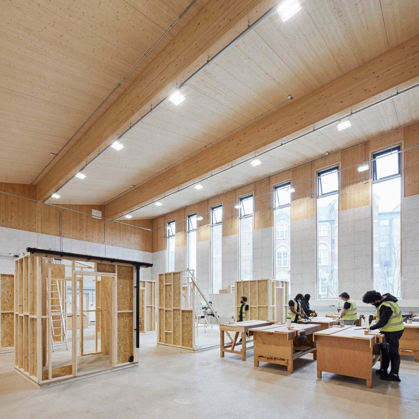
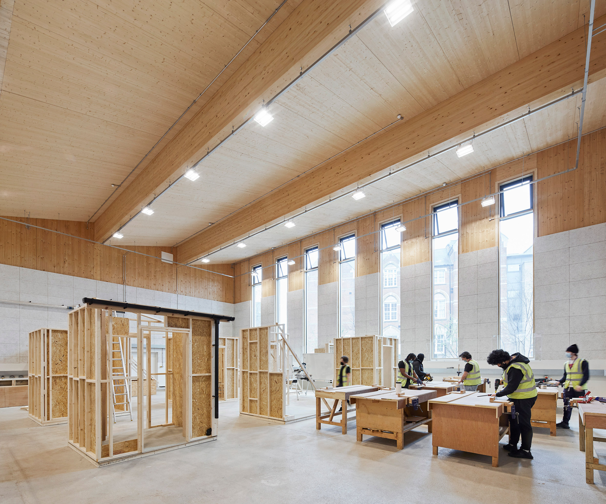
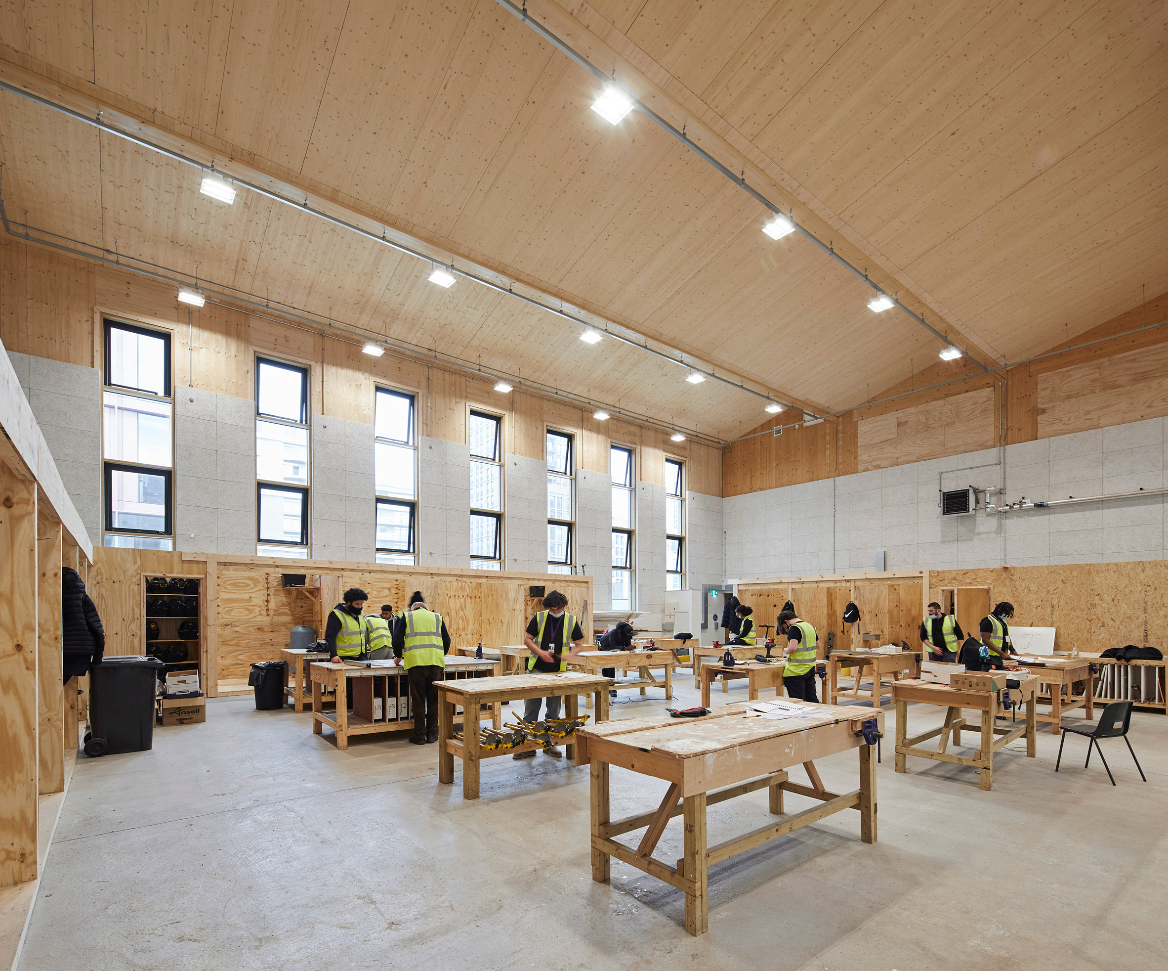
UK studio Bennetts Associates has used cross-laminated timber and glulam to create the lightweight King's Cross Sports Hall, which is currently being used as the Construction Skills Centre.

Set alongside Coffey Architects' 22 Handyside Street office block, to the north of King's Cross station in London, the sports centre was built three metres above a railway tunnel.

King's Cross Sports Hall in King's Cross
The King's Cross Sports Hall was built above three train lines

Named the King's Cross Sports Hall, the building's main space is a double-height hall that can be used as four badminton courts, a basketball court, a volleyball court or a five-a-side football pitch.

Initially, however, this space forms part of the King's Cross Construction Skills Centre, which will use the building to provide construction training and apprenticeships while its permanent home is built in nearby Euston.

A gym and fitness suite, which are open to the public, are located on the upper floor.

Timber sports hall
It was built from glue-laminated timber and cross-laminated timber

Due to the location above three Thameslink railway tunnels, the building needed to be lightweight.

Bennetts Associates therefore designed the structure from glue-laminated timber columns and cross-laminated timber panels. To allow the building to be dismantled at the end of its life, un-boltable connections were used to assemble the structure.

Construction Skills Centre in King's Cross Sports Hal
The main sports hall is currently being used by the Construction Skills Centre

"We designed the building to be a community facility that is welcoming, as well as being flexible, sustainable and lightweight," said Bennetts Associates director Julian Lipscombe.

"The building floats on the Victorian rail tunnels serving King's Cross so it had to be as lightweight as possible," he told Dezeen. "CLT and glulam were the best solutions for this, as well as being very low carbon and allowing longer spans."

Gym and fitness suite in timber building
There is a gym and fitness suite on the upper floor

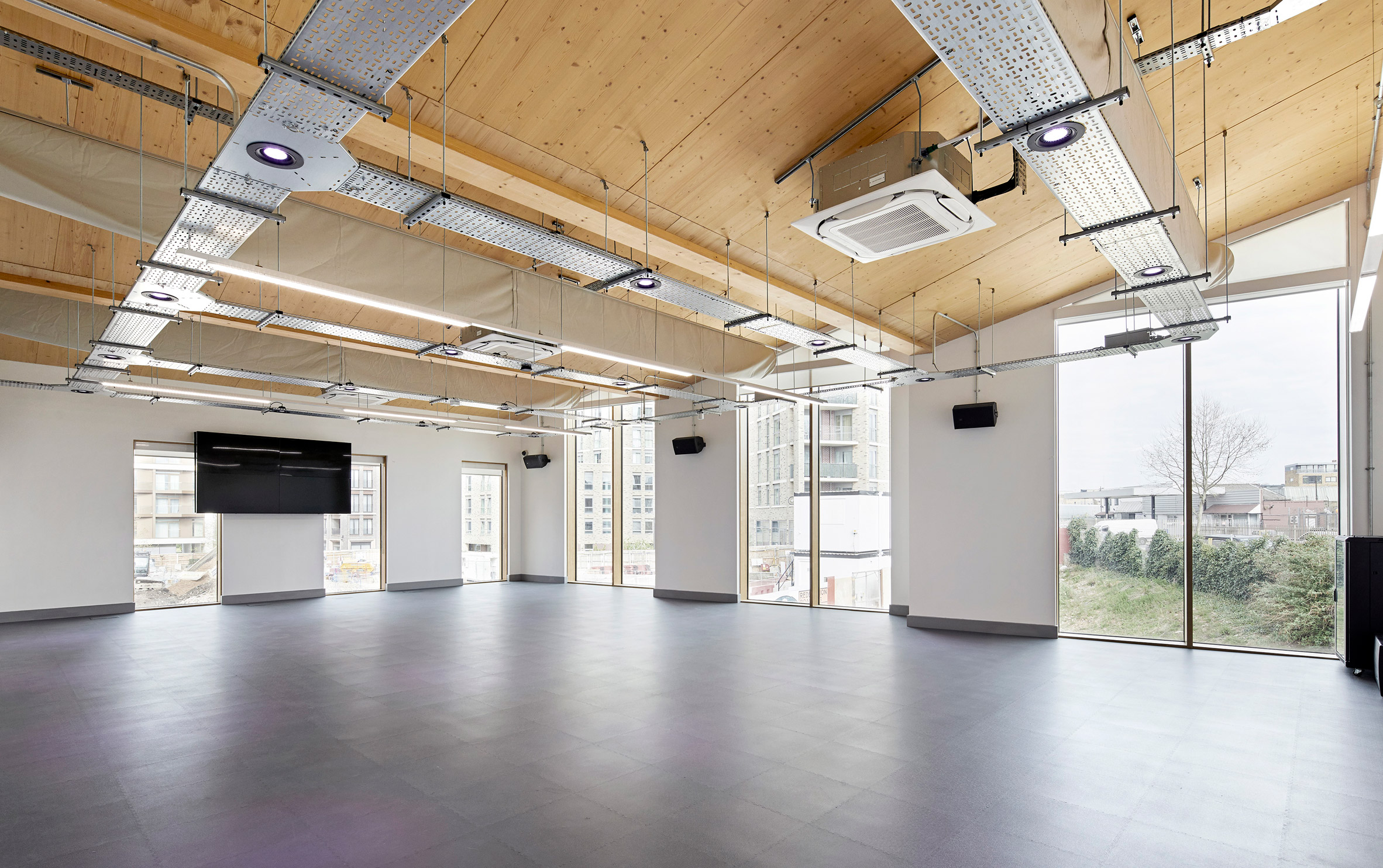
The sports centre's overall form, including the sawtooth profile of its roof, was derived from the underground constraints and the choice of material.

"CLT and glulam offer a simplicity of construction technique that we embraced," said Lipscombe.

"The sawtooth mono pitches of the roof are a direct reflection of the long span beams in the sports hall that sit on cross walls spreading the load evenly onto the tunnels below," he continued.

"The engineering solution had to be incredibly lean and very finely balanced."

Sports hall in King's Cross
The building is located near King's Cross station

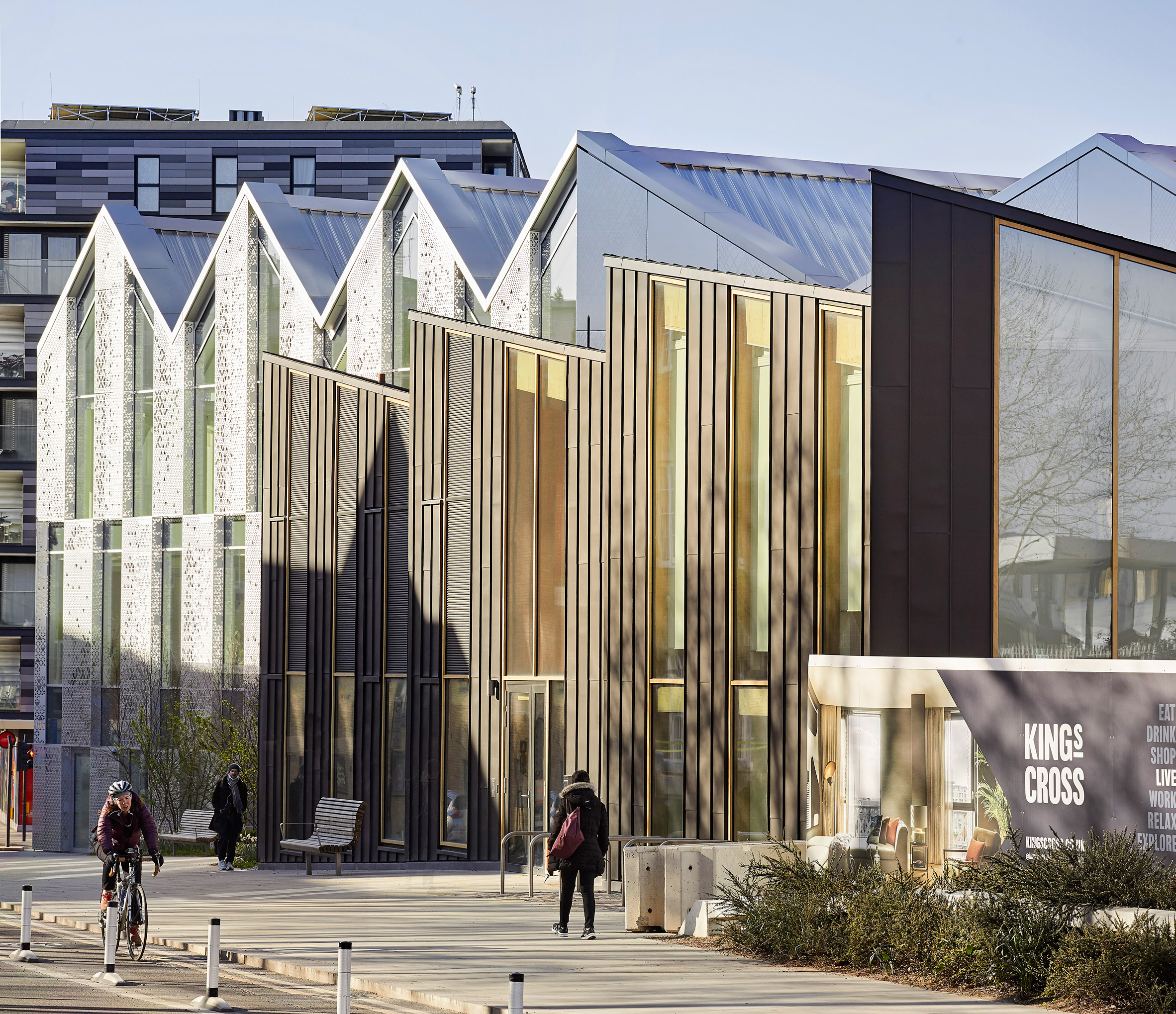
The building is clad in zinc as a nod to the industrial buildings that previously occupied the site.

"The roof form is not only an expression of the structural logic but also a contextual response to the Victorian railway sheds that used to occupy the site, with their intense rhythm of repeated elements," added Lipscombe.

"The dark zinc cladding allows a relatively small building to hold its own against larger neighbouring buildings."

King's Cross Sports Hall by Bennetts Associates
It stands next to Coffey Architects' 22 Handyside Street office

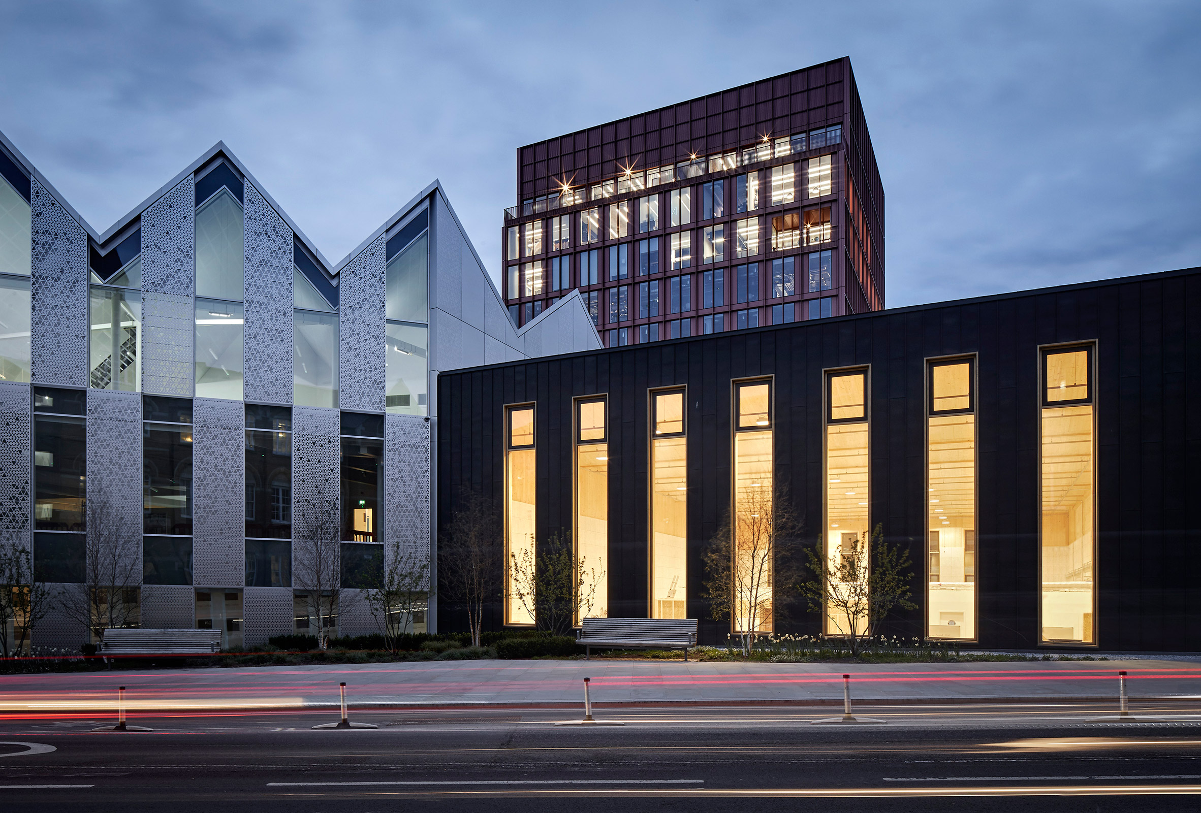
Built as part of the redevelopment of the King's Cross, the sports hall stands next to the Coffey Architects office block that in turn sits beside the pink R7 building designed by Morris + CompanyFumihiko Maki's Aga Khan Centre completes the row of buildings.

The photography is by Hufton + Crow.

The post Bennetts Associates creates cross-laminated timber sports hall in King's Cross appeared first on Dezeen.


from Dezeen https://ift.tt/3ftA0KB

Elton Léniz perches Casa BB on hillside overlooking Chilean lake

Casa BB

A black holiday home by Chilean architecture studio Elton Léniz is lifted off the ground by wooden stilts to help reduce the building's impact on the earth.

Casa BB rises up from a slender, wooded site along Lake Calafquén in southern Chile. Just beyond the lake is Villarrica, one of the country's most active volcanoes.

Elton Léniz house
Elton Léniz designed the house on stilts to overlook a Chilean lake

The building serves as a vacation house for a couple with two children. Santiago-based Elton Léniz aimed to capitalise on the scenery while also providing a sense of privacy.

"The narrow proportion of the site suggested a small, vertical design that would maximise unobstructed views of the impressive geography while freeing up as much space as possible between neighbouring buildings," the team said.

Micro-perforated screen
A micro-perforated screen mitigates sun exposure

To reduce exposure to ground moisture and to minimise disturbance to the hillside, the team propped the house up on wooden supports.

"This compact house sits almost like a container on a wooden structure, with minimal intervention in the terrain and the slope," the team said.

Casa BB in Chile
Cuts and openings connect occupants to the outdoors

Facades are clad in Quadroline aluminium panels from Hunter Douglas – a low-maintenance material with simple, vertical lines.

The panels' black colour helps the home blend with the terrain.

Casa BB by Elton Léniz
The compact house resembles a container

On the north is a micro-perforated screen that mitigates sun exposure while preserving a visual connection with the landscape.

The home's entrance is on the south side, where a wooden walkway leads to the front door. The bottom level holds the kitchen, living room, dining area and a sheltered patio, along with a bedroom.

The social spaces are designed to flow into each other. "Living room, dining room, kitchen and barbecue-terrace are continuously articulated to allow simultaneous activities," the team said.

The main bedrooms are found on the upper level.

Wooden walkway
The house is entered via a wooden walkway

Rooms feature contemporary decor and ample use of earthy materials, including pine wood. Cuts and openings in the building enable occupants to feel connected to the outdoor setting.

"This allows one to silently confront geography and to discover new relations with the landscape from within the space," the team said.

Aluminium facade
Facades are clad in black Quadroline aluminium panels

Led by Mirene Elton and Mauricio Léniz, the firm Elton Léniz has designed a number of residential projects, including Casa El Pangue – a hillside house in Chile that offers panoramic views of the Pacific Ocean.

The photography is by Cristobal Palma.

The post Elton Léniz perches Casa BB on hillside overlooking Chilean lake appeared first on Dezeen.


from Dezeen https://ift.tt/3I7GkUu

Sara Acebes Anta completes Spanish villa with pared-back colour palette

White villa in Spain

A simple palette of white and grey brings an "atmosphere of calm" to this villa in the outskirts of Valladolid, Spain, designed by architecture studio Sara Acebes Anta.

Called Casa Banlusa, the single-storey dwelling is divided into separate wings for day and night, arranged in a U-shape around a central courtyard.

White villa in Spain
Sara Acebes Anta has completed the pared-back Casa Banlusa

It is designed by Madrid studio Sara Acebes Anta to frame views of the nearby Esgueva Valley and the Duero Canal and allow its occupants to follow the sun throughout the day.

"The project embraces the scenery around it," the studio said. "Large windows open up directly to its surroundings and frame the local pine trees."

Aerial view of Casa Banlusa
The dwelling is divided into two wings

In the daytime block, a single open-plan space contains the living, dining and kitchen spaces. A boundary to the kitchen is created by an island unit.

The night wing opposite contains a small office and guest bedrooms, alongside the main bedroom that opens onto a small south-facing terrace.

White exterior of Casa Banlusa
Its exterior is finished with white fluted mortar

"The rooms are distributed in two main zones: night-time and day-time," explained the studio. "The sunrise fills the kitchen, which faces east, and the living room is oriented west to enjoy the sunset," it continued.

"On the other side of the U-shape, there are four bedrooms and two bathrooms facing west absorbing the sun rays of the last hours of the day, warming these rooms for during the night."

White courtyard of Casa Banlusa
A courtyard sits at the centre of the house

The north side of the pared-back home features a garage and plant room containing the aerothermal heat pumps that warm the house through underfloor heating.

On Casa Banlusa's exterior, a finish of white fluted mortar creates a subtle play of light and shadow and contrasts with the greenery and planters that surround the building.

White-walled living room with wooden furniture
The pared-back exterior is echoed internally

"There is a subtle textural verticality counterbalancing the horizontal nature of the single-storey house which is in harmony with the landscape and the environment," said the studio.

The white exterior is broken up by windows placed rhythmically around the home, which extend to almost full height in the living room and reduce in size in the bedrooms for greater privacy.

Casa Banlusa's central courtyard is finished with concrete and connects to a series of thin paved paths that wrap around the edges of the home.

These paths also link up to the terrace alongside the main bedroom and another outside the kitchen.

White-walled living space in Casa Banlusa
White walls are warmed with wooden furnishings

Inside, the muted white and grey tones of Casa Banlusa's exterior are continued, warmed by the addition of wooden furniture and fittings.

Its fluted facades have also been referenced in certain areas, such as on the kitchen counters and portions of the walls.

White-walled living space
The fluted exterior is mirrored internally

Studio Seilern Architects also recently designed a minimal white villa and orientated it to follow the sun. Set on the Greek island of Paros, it comprises a cluster of white cube-shaped forms and is intended as a "simple luxury living environment".

Other projects near Valladolid include a white-painted villa by Escribano Rosique Arquitectos, with living spaces that extend onto a series of external patios.

The post Sara Acebes Anta completes Spanish villa with pared-back colour palette appeared first on Dezeen.


from Dezeen https://ift.tt/3GvBgsE

Ten hotels with refreshingly original bathroom interiors

Hotel bathroom by Plesnser Architects

For our latest lookbook, we have selected ten hotel bathrooms from the Dezeen archive designed to provide an alternative place to refresh.

These vibrant but relaxing hotel bathrooms show how unusual colours, materials and styles can create the ultimate space to scrub.

From an earth-coloured wet room to a cherry-coloured terrazzo shower, they demonstrate why white tiles needn't be the default option when it comes to designing a bathroom.

This is the latest roundup in our Dezeen Lookbooks series that provides visual inspiration for designers and design enthusiasts. Previous lookbooks include interiors with slides at their centres, living rooms with statement rugs and kitchen extensions.


Six Senses Shaharut by Plesner Architects
Photo is by Assaf Pinchuk

Six Senses Hotel, Israel, by Plesner Architects

Tel Aviv-based studio Plesner Architects shows how the finer details such as decor, lighting and material choice can make a bathroom appear cosy and homely.

White linens, plaster walls and regional craft such as this tasselled rug make the space feel personal, even if it is away from home. An alcove just for candles adds the finishing touch.

"We wanted the stones, the patterns, the textures and the colours to be omnipresent, resulting in architecture that is woven in with the natural elements," Plesner Architects said.

Find out more about Six Senses Hotel ›


Bathroom at The Siren Hotel
Photo is by Christian Harder

The Siren, US, by ASH NYC

Bathrooms are as experimental as the guest suites inside The Siren Hotel, which ASH NYC designed as part of an effort to regenerate the city of Detroit.

Flecked, cherry-red terrazzo covers the floor and walls, which contrasts the glass partition and veiny marble shower stools.

Find out more about The Siren ›


Kelly Wearstler's interiors for Santa Monica Proper Hotel
Photo is by The Ingalls

Santa Monica Proper, US, by Kelly Wearstler

Interior designer Kelly Wearstler is known for her laid-back Californian style and this bathroom in the Santa Monica Proper hotel is no exception.

Wearstler opted for materials in colours that match the hotel's beachside setting, such as sandy-coloured tiles and wooden flooring designed to remind guests of beach decking.

Find out more about Santa Monica Proper ›


Tiled bathrooms inside Hotel Les Deux Gares in Paris
Photo is by Benoit Linero

Hotel Les Deux Gares, France, by Luke Edward Hall

British designer Luke Edward Hall didn't hold back when working on this hotel in Paris' 10th arrondissement.

Tasked with making the accommodation feel "anti-modern", Hall chose to pair avocado-coloured sinks and toilets with chequered flooring and mustard yellow tiles, resulting in a maximalist aesthetic.

Find out more about Hotel Les Deux Gares ›


Interiors of The Calile Hotel, designed by Richards and Spence
Photo is by Sean Fennessy

The Calile, Australia, by Richard and Spence

In this hotel's 175 rooms, the bathrooms are either covered in blush or sky-blue-coloured tiles. The colours were chosen to make guests feel as if they are staying at a tropical resort, as opposed to an urban hotel.

Australian architecture studio Richards and Spence used brass faucets, mirrors, and towel railings to add a touch of glamour to the interior.

Find out more about The Calile ›


A white bath in a red bathroom
Photo by Matt Harrington

Hotel Saint Vincent, US, by Lambert McGuire Design

Another example of a maximalist bathroom can be found in the Hotel Saint Vincent, where American studio Lambert McGuire Design used chunky tubs and psychedelic wallpaper to make bathing more of an experience than a chore.

Throughout this 75-room hotel in New Orleans, the studio opted for an eclectic mix of design styles that range from 20th-century Italian to mid-century modern and Art Deco.

Find out more about Hotel Saint Vincent ›


Hoxton Southwark hotel designed by Ennismore
Photo is courtesy of The Hoxton

The Hoxton, Southwark, UK, by Ennismore

Hospitality property developer Ennismore decided to go for an industrial aesthetic for this hotel in London, referencing Southwark's former role as a major trading spot for hops.

The roomy bathrooms which are wrapped in green tiles have walk-in showers, brassy sinks and inbuilt shelves where guests can store toiletries and makeup.

Find out more about The Hoxton, Southwark ›


Nobu Ryokan Malibu by Studio PCH and Montalba Architects
Photo is courtesy of Studio PCH and Montalba Architects

Nobu Ryokan Malibu, US, by Studio PCH and Montalba Architects

All of the rooms in this luxury hotel are fitted with contemporary decor typified by a neutral colour palette and earthy materials that centre Japanese design within a Californian location.

Guests can shower under bright skies or relax in a hand-crafted teak wood soaking tub in the minimalist wet room.

Find out more about Nobu Ryokan Malibu ›


The bathroom inside Goodtime hotel
Photo is by Alice Gao

Goodtime Hotel, US, by Ken Fulk

Pastel hues and wicker furnishing clash playfully with the floral print in this bathroom at the Goodtime Hotel in Miami.

Designed by Ken Fulk for musician Pharrell Williams, the interiors were decorated by Fulk in a "reimagined art deco" aesthetic to "recall the opulence and nostalgia of a time gone by".

Find out more about Goodtime Hotel ›


Dá Licença hotel by Vitor Borges and Franck Laigneau
Photo is by Francisco Nogueira

Dá Licença, Portugal, by Vitor Borges and Franck Laigneau 

Creatives Vitor Borges and Franck Laigneau incorporated vintage furnishings and one-off pieces in the bathroom of this hotel located in the historic city of Estremoz, Portugal.

In a subtle nod to Estremoz's marble-rich terrain, the designers used natural stone to craft the free-standing bath which acts as a centrepiece of the room. The same marble can also be seen on the sink basins and pink-hued shower cubicles.

Find out more about Dá Licença ›


This is the latest in our series of lookbooks providing curated visual inspiration from Dezeen's image archive. For more inspiration see previous lookbooks showcasing rustic interiors, retro bathrooms and domestic gyms.

The post Ten hotels with refreshingly original bathroom interiors appeared first on Dezeen.


from Dezeen https://ift.tt/3nvKZrs

22 Parkside "led to most of the work I do" says Richard Rogers

22 Parkside by Richard Rogers

In the final exclusive interview that Dezeen filmed with Richard Rogers in 2013, the late architect discusses the concept behind his Wimbledon house, 22 Parkside.

The interview forms part of a series Dezeen filmed with Rogers to coincide with a retrospective of his work at the Royal Academy of Arts in London in 2013.

Rogers, who passed away on 18 December aged 88, was one of the world's most famed architects, best known for pioneering the high-tech architecture style that emerged in the 1970s.

He was responsible for designing the Centre Pompidou in Paris with Renzo Piano, as well as the Lloyd's building in central London.

In this interview, Rogers reflects on the influence of the Grade II-listed 22 Parkside, also known as Wimbledon house, that he designed in the late 1960s for his parents in Wimbledon, London.

Rogers hoped that the house would demonstrate the potential of prefabricated homes and revolutionise the housing industry.

"This wasn't gonna be a one-off like our previous buildings," Rogers told Dezeen. "This was going to be a standardised system to solve the British housing problem."

Read on for a transcript of the interview below:


"The Wimbledon house was designed for my parents, I guess we started in 1967 and it has been through a whole series of different clients and users.

"Now we've given the house to Harvard, and they're using it to house graduate students. We've been strongly influenced by people like Soriano, Ellwood, Prouve, Eames and so on.

22 Parkside by Richard Rogers in Wimbledon
22 Parkside was built by Richard Rogers in 1967. Photo is by Tim Crocker

"We were looking at prefabricated systems, process construction. The idea was that we could put up the house fast, it could be all built in a factory, so you didn't have to have all the weather problems, it could be programmed – and really the final idea, you could buy it from your local shop, because you could have the standard components.

"We ended up with this simple rectangular plan, two parts, a courtyard in the middle, the house on the north side, and then we call the lodge.

"We decided to use a very simple steel frame, upside-down C's and you could have as many as you'd like in a line and the house could be as long as you wanted.

"Then you bought bus doors and bus windows and put those on the sides and at the ends of this long tube was just glass, so you looked out to the common or looked out at the gardens as an absolute visual continuity.

Interior image of living space at 22 Parkside by Richard Rogers
The structure was designed to solve the British housing problem

"This wasn't gonna be a one-off like our previous buildings, this was going to be a standardised system to solve the British housing problem.

"It didn't, but it led to most of the work I do some 50 years later and more.

Interior image of study area space at the home
It used standardised components that could be bought locally

"In a sense, it was a prototype also, to the Pompidou Centre. Now Renzo Piano had obviously added his technological knowledge, which is absolutely brilliant.

"So if you put the Wimbledon house and you put Renzo's work together you sort of get the Pompidou Centre.

"Now, it's a much bigger thing. It has escalators across the facade, the open spaces in the floors are the size of two football fields, you can't see that about Wimbledon, and so on, but the concepts were there and the bright colours are there.

"So again, we wanted somewhere which could be fun, which could be enjoyable, which you could participate with, which wasn't just a brick house with windows cut into it."

The post 22 Parkside "led to most of the work I do" says Richard Rogers appeared first on Dezeen.


from Dezeen https://ift.tt/3I92PIs