Dutch branding agency Studio Dumbar has designed a new visual identity for the Netherlands featuring a logo that combines the letters NL with a stylised tulip.
The Dutch government asked the Rotterdam-based studio to develop a new identity that will be used to help enhance the nation's image on the global stage.

The project was initiated because the government agencies responsible for promoting the Netherlands around the world wanted to move away from the previous visual identity, which featured a tulip and the word Holland in a hand-painted style.
The use of Holland in this context was seen by many as inappropriate as it refers to a particular region rather than the whole country. The new identity instead includes a word mark for the Netherlands alongside the NL acronym.
"Dutch people have a direct recognition and an emotional connection with NL; it stands for our country," said Tom Dorresteijn, strategy director at Studio Dumbar.
"Many people abroad know it, especially in Europe. And for those who don't, it is simply an abstract brand-symbol."
The two letters forming the NL symbol are expressed in a bold, sans serif font, and are subtly adapted so the adjacent stems create the shape of an abstracted tulip.
The tulip is commonly used as a symbol for the country, along with the colour orange, which is also retained and applied across the new visual identity.
Dorresteijn told Dezeen that the reference to the tulip is intentionally subtle, as the logo needs to be suitable for use by a wide range of stakeholders, including universities, embassies and cultural organisations in the Netherlands and around the world.
"A traditional tulip symbol is too much connected to tourism and souvenirs," the designer explained. "We designed it in such a way that it is more a reference to a tulip. It makes the acronym more interesting and intriguing, because it is more than a straightforward NL."
The Dutch government's minister for foreign trade and development cooperation, Sigrid Kaag, also claimed that the design's simplicity will enable it to be used successfully in different contexts.
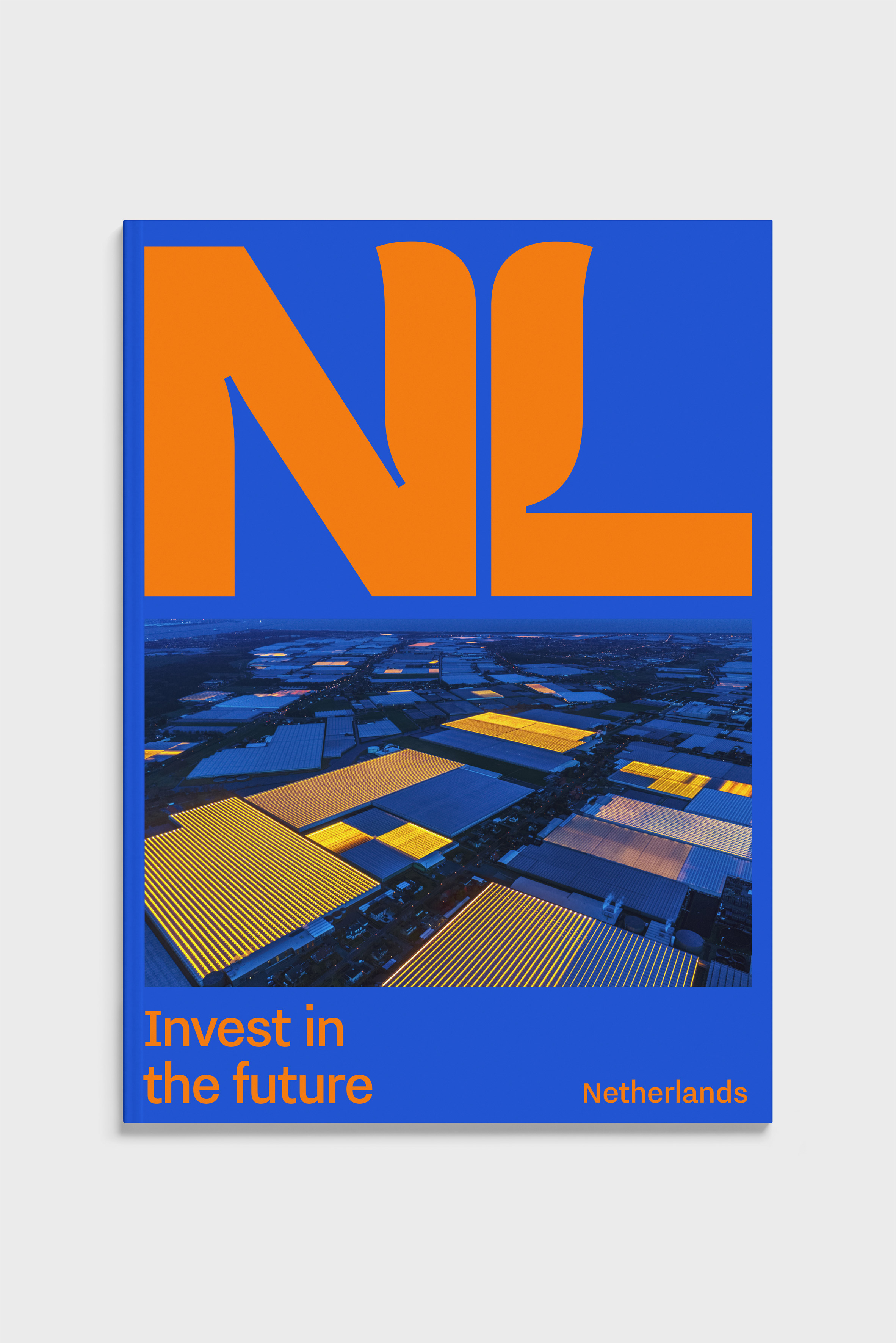
"The new logo can be applied across a range of fields," she pointed out, "from high-tech to agri-food and from sport to culture. A clear-cut international image is positive for our exports and the attraction of investment and talent."
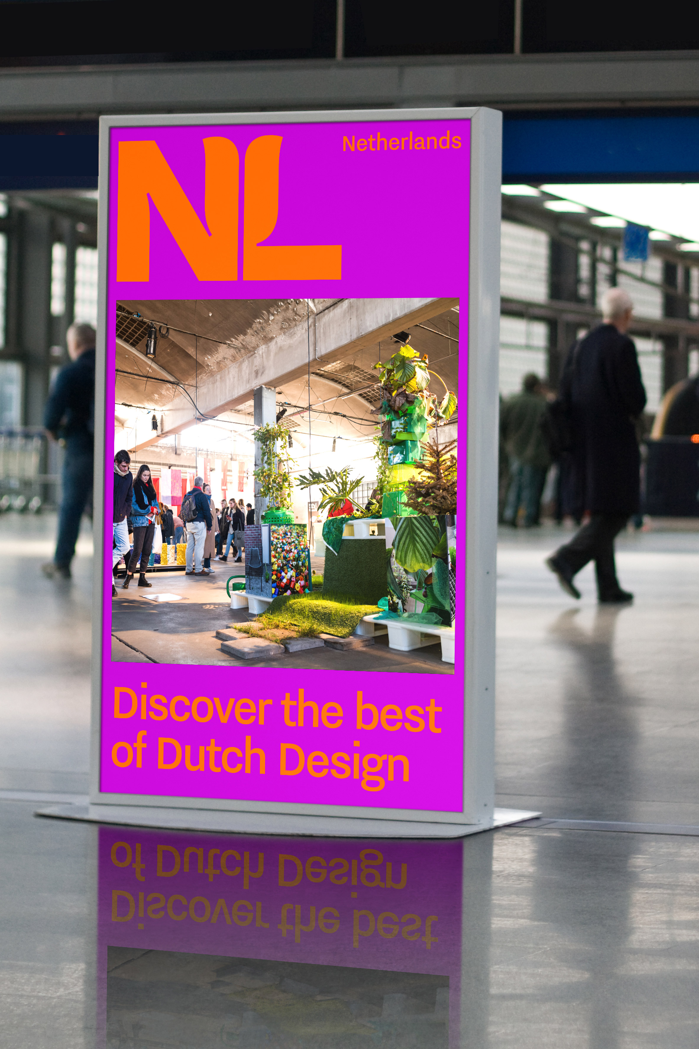
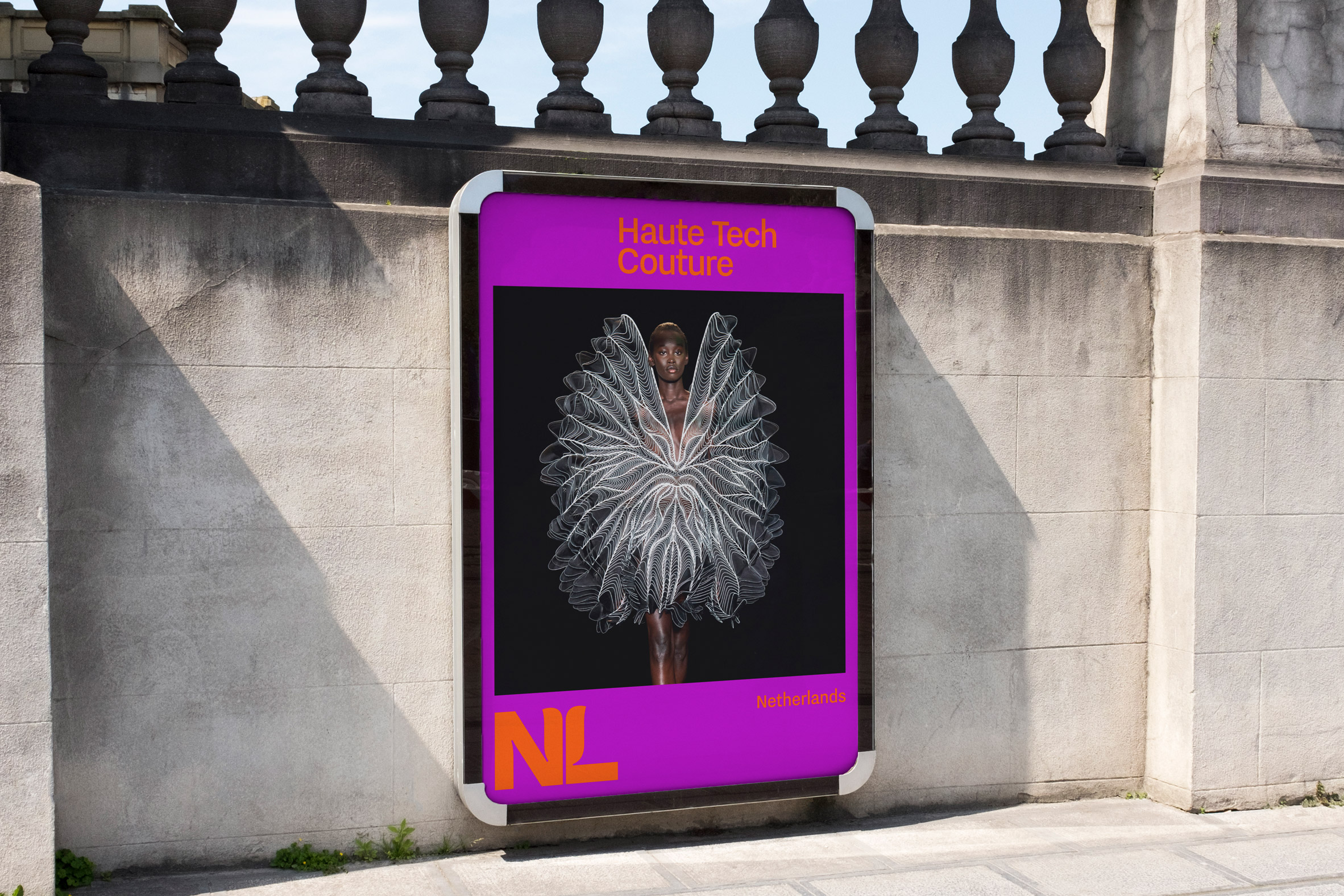
In most scenarios, the NL logo will be accompanied by the Netherlands word mark. Both elements form part of a wider visual-identity system based on a simple grid that is designed to be accessible and easy to use.
The Dutch central government will begin using the NL Brand visual-identity from 1 January 2020, and any partners wishing to apply it in their marketing materials can already download the assets and guidelines from a dedicated website.
The Dutch women's football team also recently updated its visual identity to replace the replace the Royal Dutch Football Association's lion crest with a lioness.
The post Netherlands replaces "tulip Holland" identity with "less touristy" NL logo appeared first on Dezeen.
from Dezeen https://ift.tt/35h8jNT
No comments:
Post a Comment