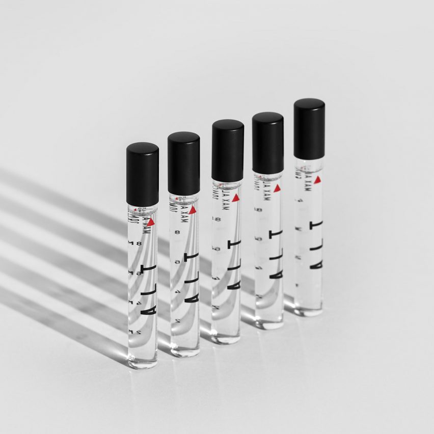
Science, aeronautics and NASA inspired the Very Polite Agency's packaging design for ALT, a liquid cannabis product for people who want a mind-expanding rather than purely medicinal high.
The Canadian creative agency worked on every aspect of the brand identity with the ALT founders, including the name.
"ALT" is a play on the words "altitude" and "altered state" that eventually evolved into an acronym — Advanced Liquid Technologies.
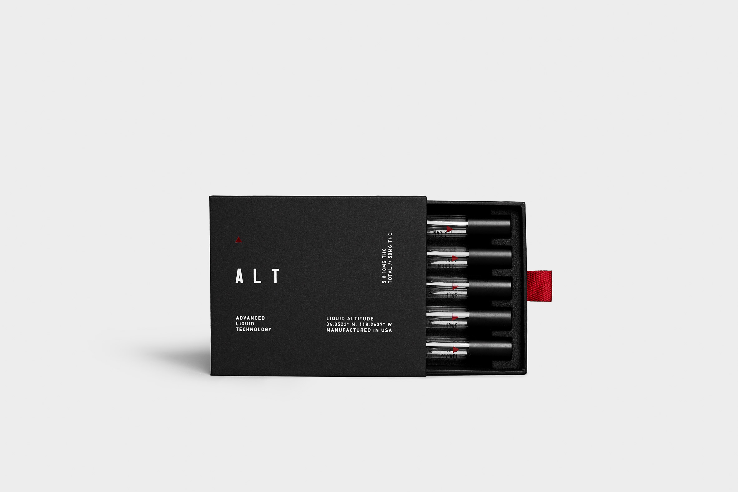
The product has a couple of unique selling points: it is liquid in form, and it promises a controlled but deep high that, according to the brand, opens up neural pathways and gives users a chance to see things differently.
Very Polite saw a potential market among people interested in self-improvement based on scientific approaches, and they designed the packaging accordingly.

"ALT was rooted in scientific development, which we found interesting in a space where cannabis often has an 'organic' or 'granola' association, both in aesthetic and overall tone," Very Polite partner and head of creative Dylan Rekert told Dezeen.
"We wanted to pull from the science element without it feeling pharmaceutical. We had to find a way to make it work, and to us that came in the idea of performance."
This brought Very Polite to the aeronautical and moon-landing theme — not only was it scientific, it conjured associations with human aspiration and achievement that seemed right for ALT.
At the same time, the overall effect had to suit the demographic by being discrete and refined — "something they would have no issue displaying on their coffee table", according to Rekert.
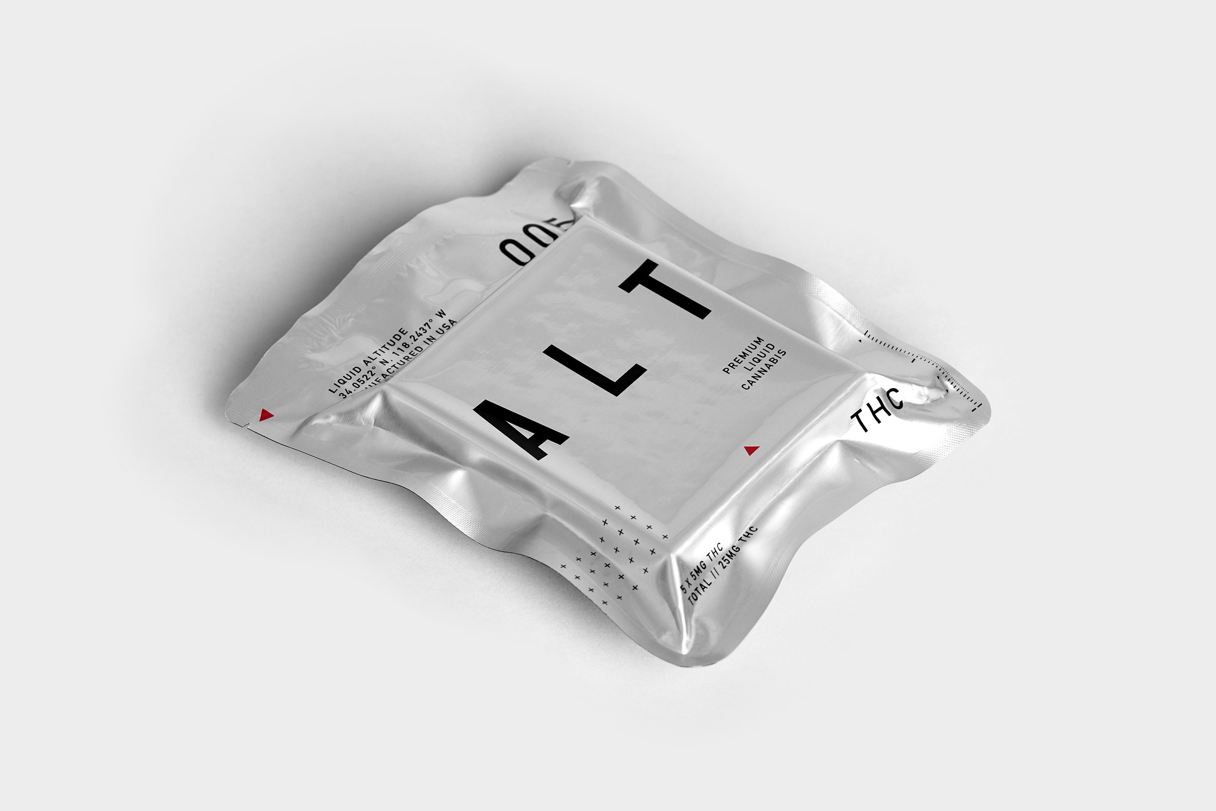
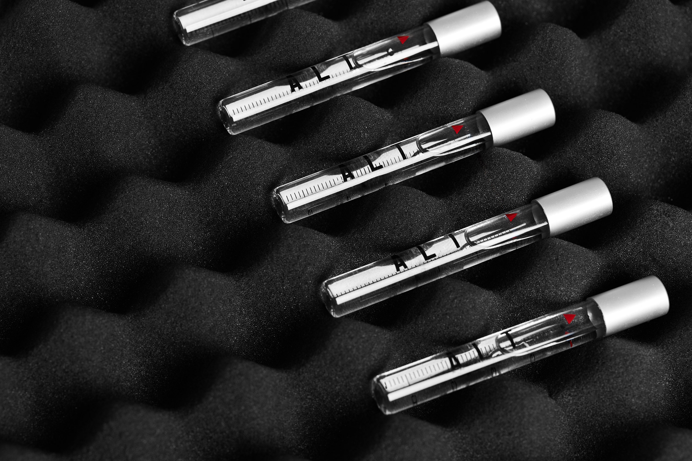
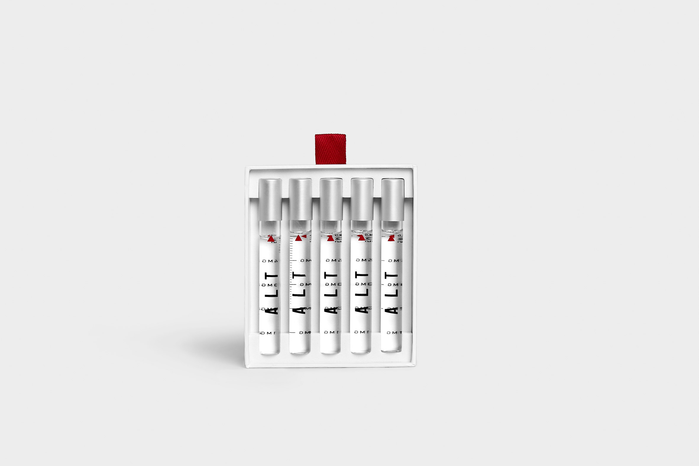
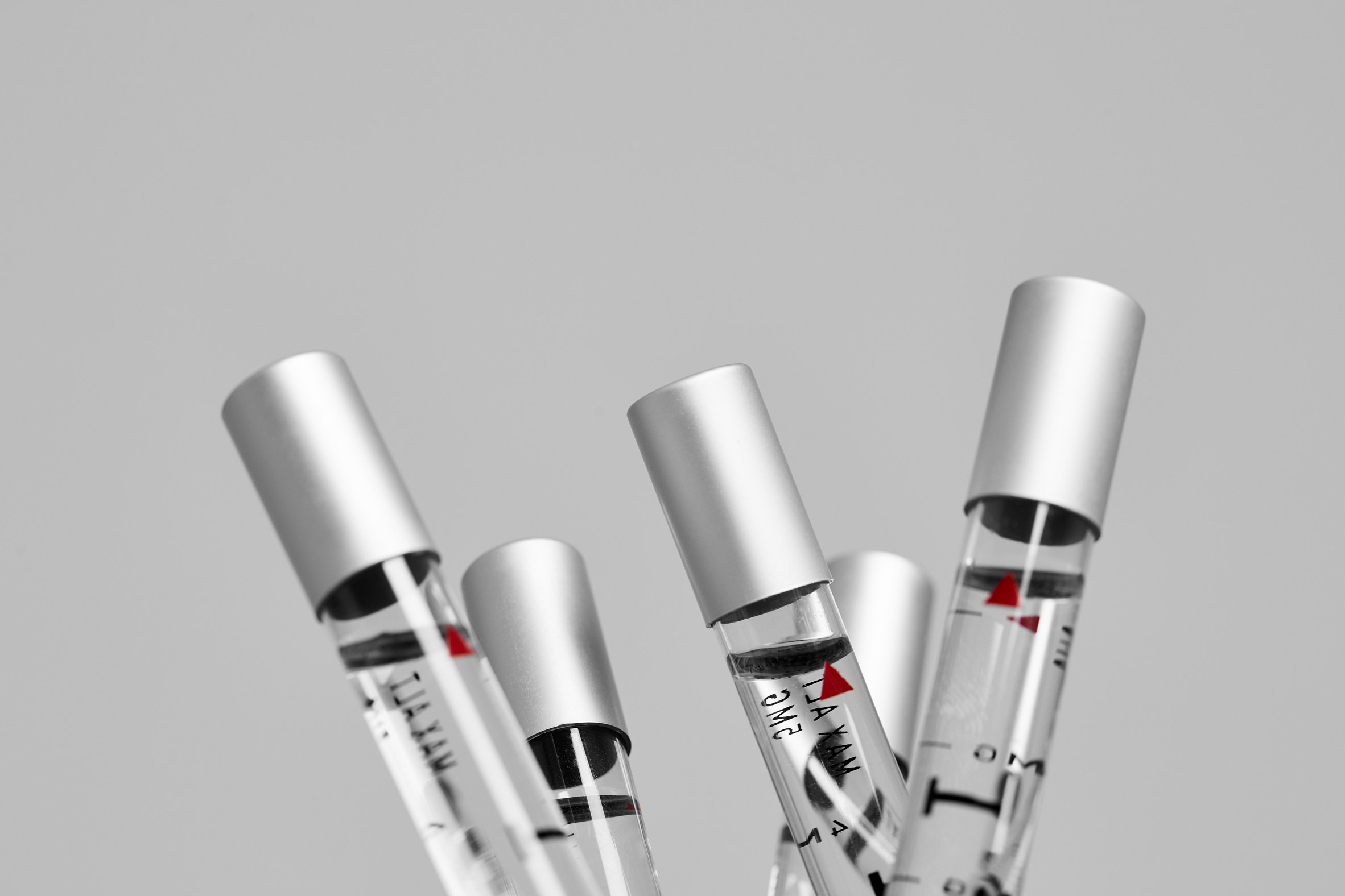
They took their visual cues from NASA, incorporating a minimal black, white and silver colour palette with dashes of red.
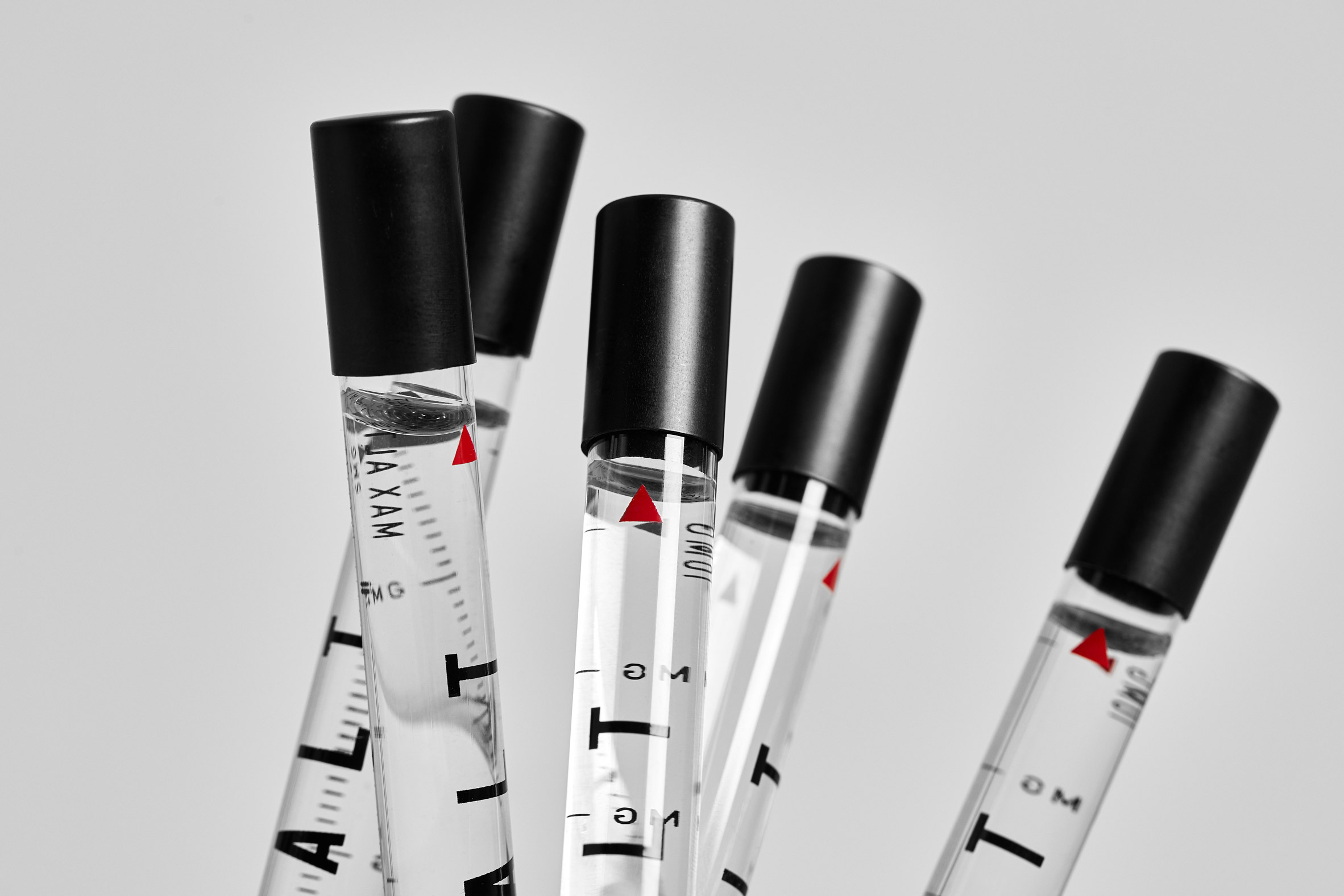
The visual identity pairs navigational elements such as crosshairs and GPS coordinates with lean, sans serif typography.
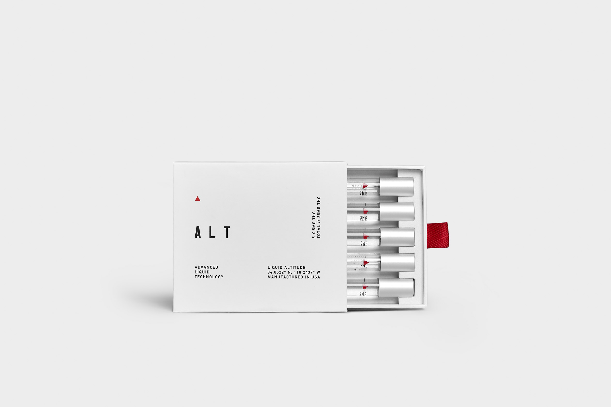
When it came to the packaging design, space food was a major reference; ALT comes vacuum-sealed in silver foil, looking like a luxury version of the meals astronauts get on voyages.
The box within contains five resealable vials of ALT, with dosage levels clearly labelled.
The product comes in either a "functional micro-dose" version with five milligrams of THC per vial or a "deeper expression" with 10 milligrams of THC per vial.
ALT's approach is in contrast to other new premium cannabis companies such as Dosist and Standard Dose, which have tried to associate themselves with wellness.
It is also a departure from the jokey or kitschy branding that still dominates in the sector.
"Ultimately, the cannabis industry is a pun-filled market we didn't want to fall into," said Rekert.
"What we created was a strong, aspirational concept that approached 'getting high' from a different perspective, and the idea of doing something to expand potential for yourself," he continued.
"The same way meditation has gone from a 'hippy' thing to a widely socially accepted and integrated practice, using ALT is a form of modern connectivity, evolved from the perception of simply 'getting high'," he said.
"It can be a cerebral drug, with the right dosage, expanding the mind intentionally."
ALT will be available to buy in North America, which has seen an explosion in cannabis-related products and technologies since US states began legalising recreational marijuana use in 2012.
The post ALT uses aerospace-inspired packaging for its "mind-expanding" liquid cannabis appeared first on Dezeen.
from Dezeen https://ift.tt/2OlMUgr
No comments:
Post a Comment