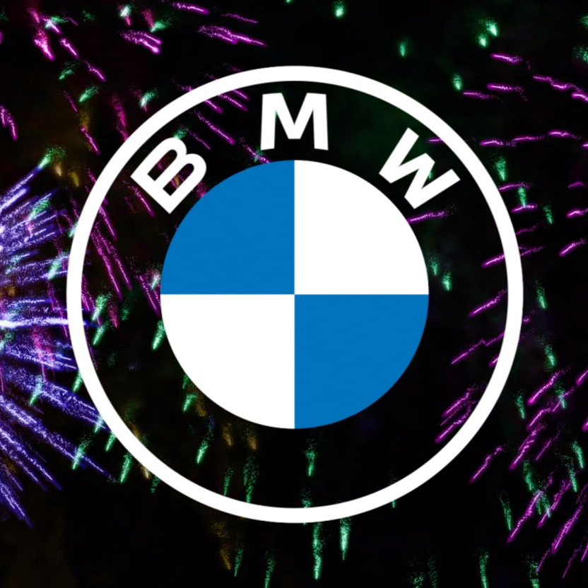
German car manufacturer BMW has revealed a new minimalist, flat logo with a transparent backdrop.
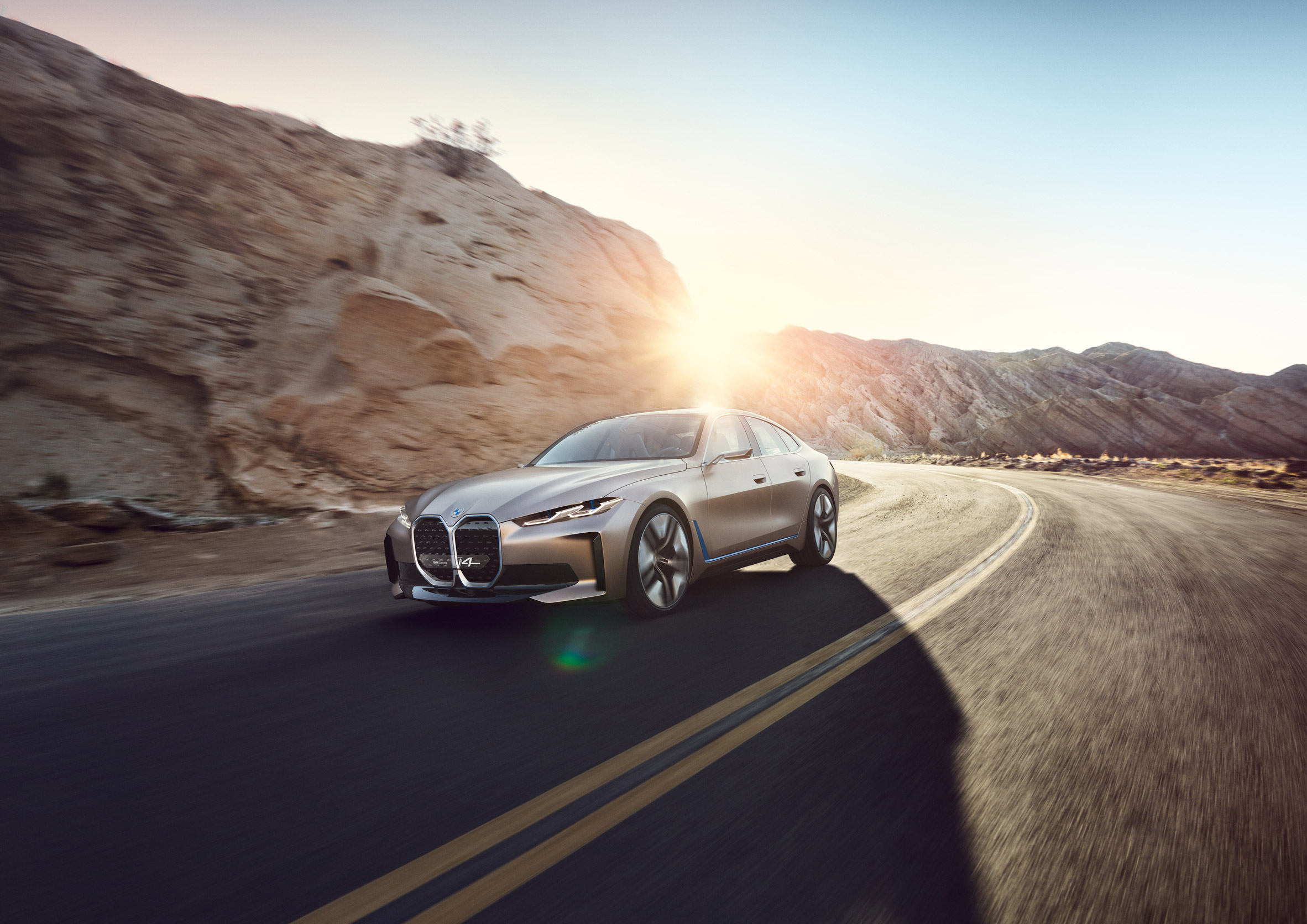
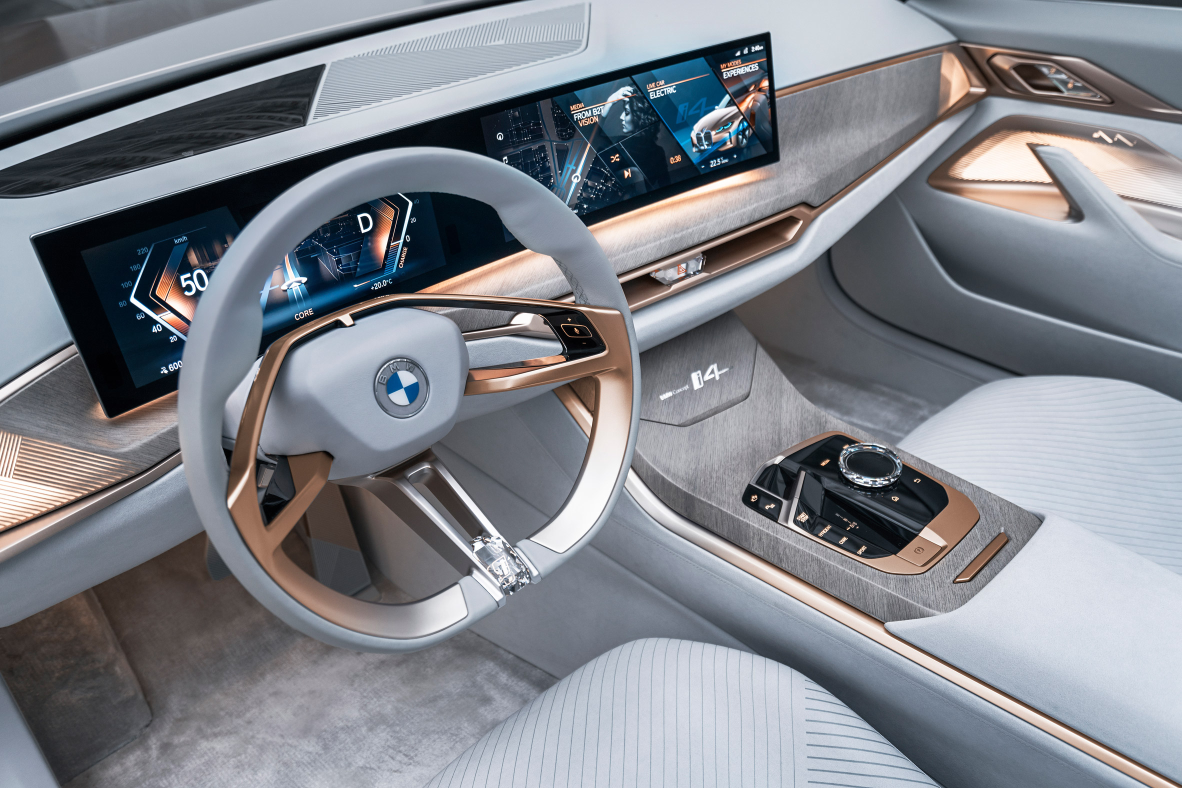
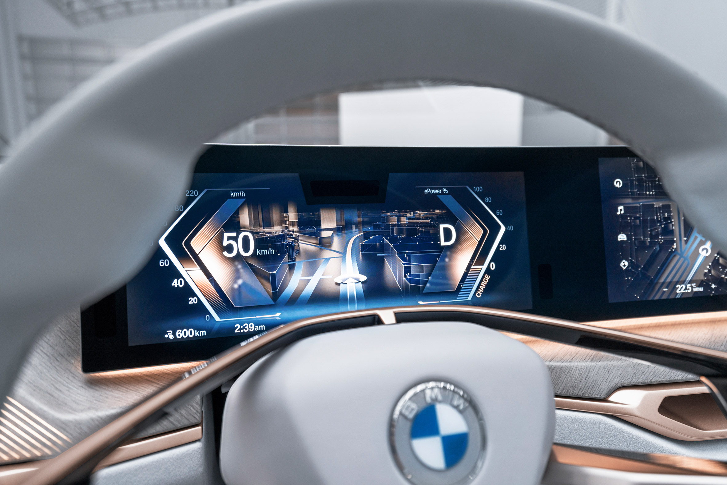
The updated badge was debuted on the brand's electric Concept i4 vehicle, which was set to be presented at the Geneva Motor Show before it was cancelled due to the coronavirus outbreak.
The flat logo replaces BMW's previous logo, which was introduced in 1997.
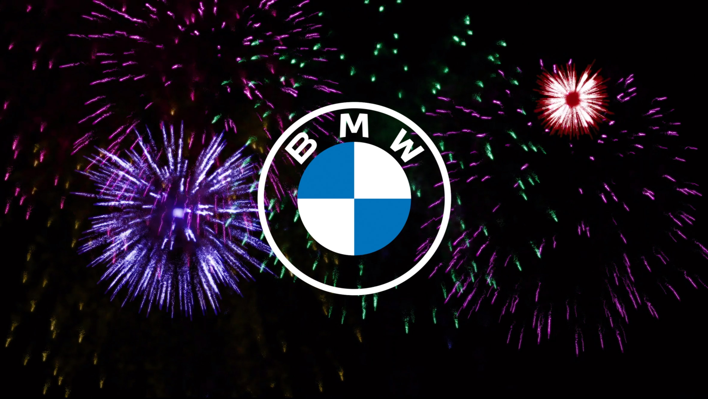
The company has replaced the hallmark black ring that has surrounded its logo since it was first registered in 1917 with a transparent ring, meaning it will take on different colours and patterns depending on what background it is placed.
In the case of the Concept i4 this allows the car's distinctive, metallic bronze shade to shine through.
This transparent ring is meant to radiate "openness and clarity", explained Jens Thiemer, the company's senior vice president of customer and brand.
The company has kept the blue and white interior of the logo, which reference the state colours of Bavaria, where BMW is based. However the 3D shadows that surrounded it have been removed.
This is in keeping with the recent trend towards 2D logos – which recently saw fellow German automotive giant Volkswagen introduce a similarly "flat" badge.
According to the company it is also a nod to BMW's past as no iterations of the company's logo featured any shading or shadows until it was overhauled in 1997.
As of yet, the redesigned badge will not be implemented across BMW's production cars. It is going to be used as a "communication logo" which, as the name suggests, will be featured across BMW's communications including its website and social channels.
"Our new brand design is geared to the challenges and opportunities of digitisation for brands," said Thiemer.
"With visual restraint and graphic flexibility, we are equipping ourselves for the vast variety of touch points in communication at which BMW will be present, online and offline, in the future."
BMW has updated the logos font, too. It is now slightly smaller, with the central stokes of the M and the W shorter than the rest.
BMW also recently made headlines with its "blackest black" car, which that is coated with Anish Kapoo's light absorbent Vantablack.
Other brands that have jumped onto the flat logo bandwagon include Durex and Deliveroo.
The post BMW unveils flat logo in first rebrand for two decades appeared first on Dezeen.
from Dezeen https://ift.tt/3awr5ni
No comments:
Post a Comment