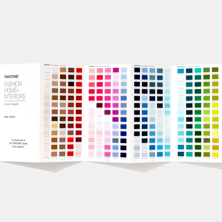
A hot pink called Viva Magenta and an icy blue named Frozen Fjord are among the 315 new hues that American colour company Pantone has added to its roster of shades.
The 315 colours have been chosen by Pantone to reflect present-day and forecasted trends, and have been taken from all bands of the spectrum.
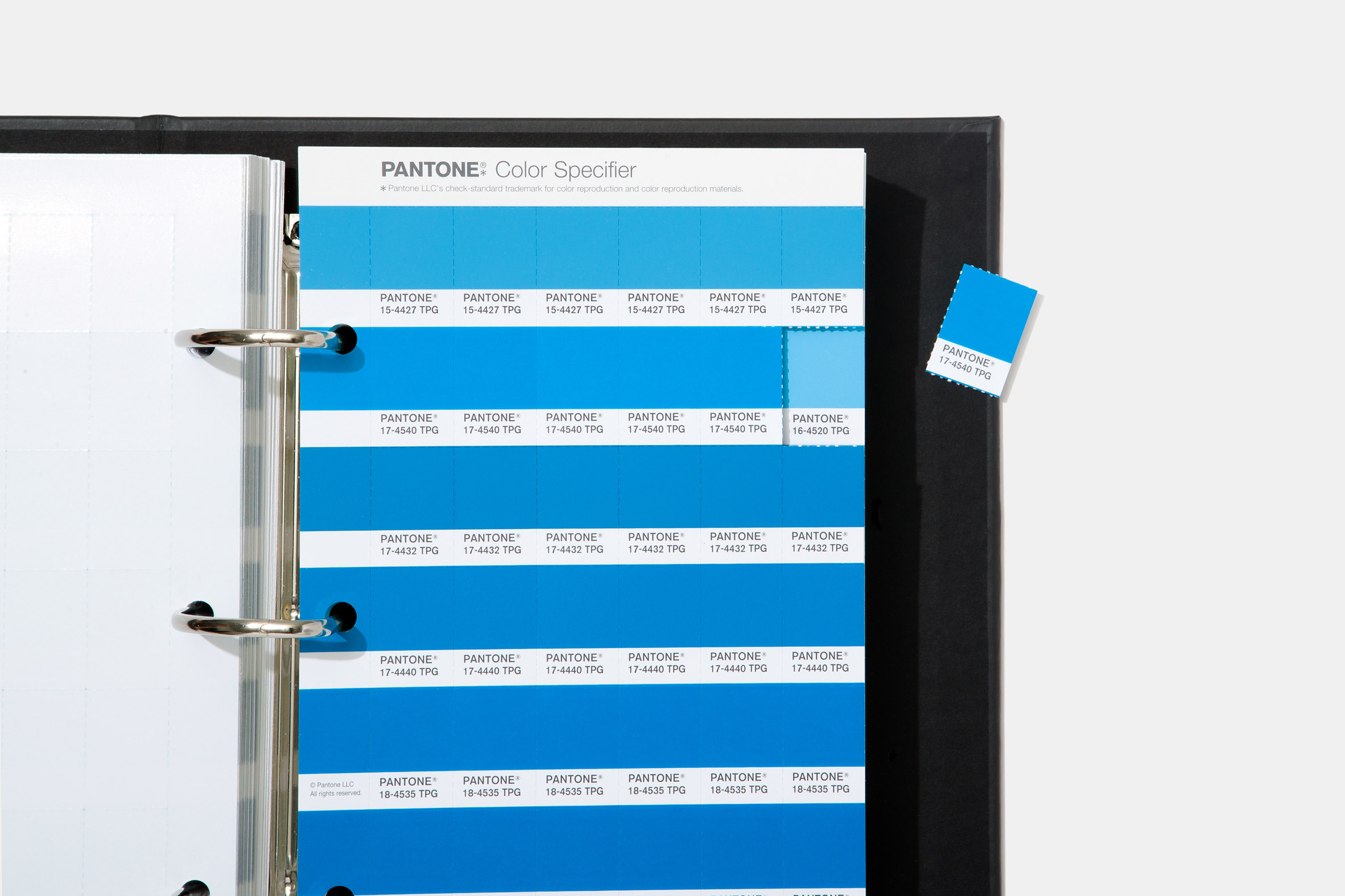
There are over 50 new shades of pink, a colour that the brand believes has "embraced new meanings and relevance beyond it's traditional gendered and child-like status". Among them are First Blush, Viva Magenta and Tender Touch.
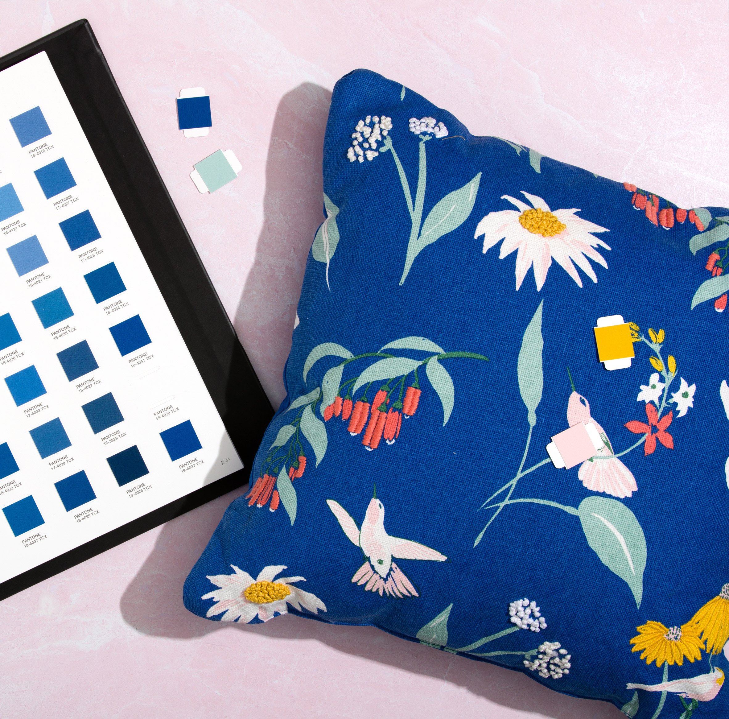
More than 70 new blues will also be available. Some of the cooler hues, like Frozen Fjord, nod to icy natural landscapes, while brighter, green-infused shades like Exotic Plume and Gulf Coast are meant to evoke a more summery, tropical feel.
Some of the added shades – such as Weathered Teak and Island Fossil – are supposed to offer a nuanced take on neutrals and taupes, which Pantone thinks are "too often seen as a single colour" but can offer "endless subtleties".
"The colours that are influencing design today have evolved to reflect shifting societal views, new technological innovations, and a truly global outlook," said executive director of the Pantone Color Institute Leatrice Eiseman.
"Expanding and enhancing our colour palette and introducing new digital solutions ensures our design clients that they can continue to count on Pantone today and into the future, helping them to transform their creative vision into reality," added vice president Laurie Pressman.
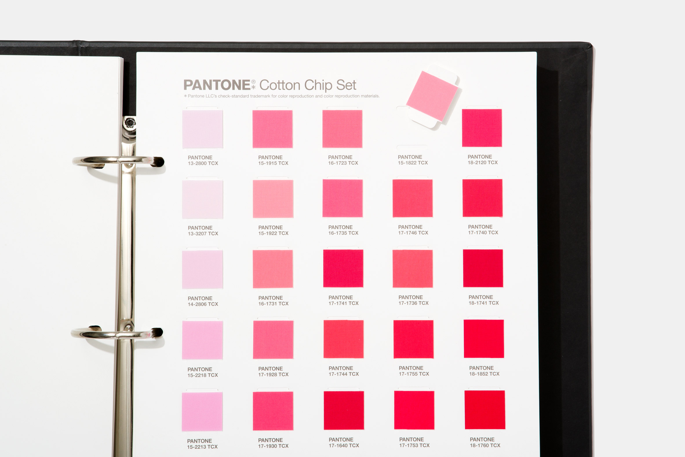
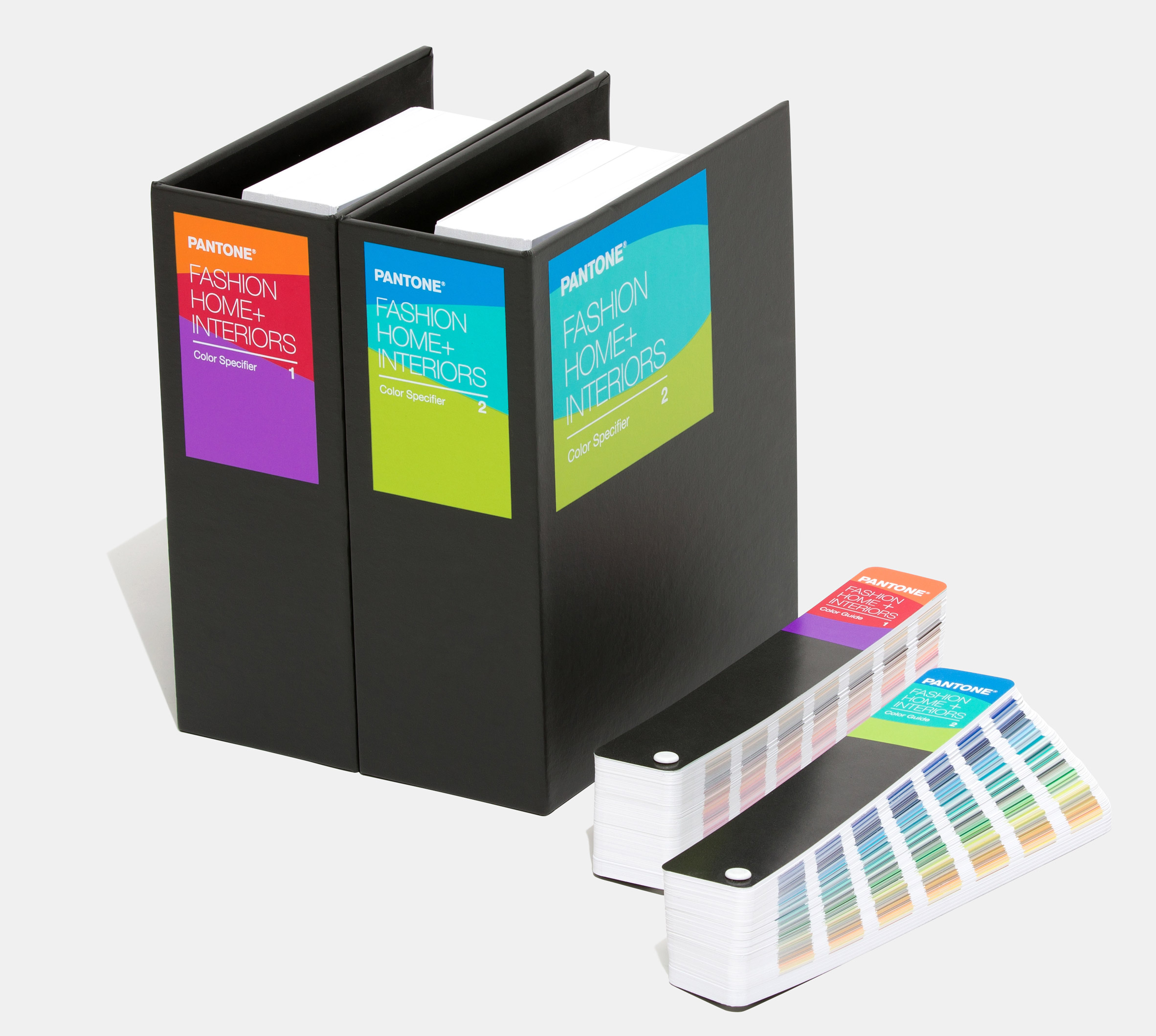
All of the new shades have been added to Pantone's Fashion, Home + Interiors Color Specifier – a pair of ring-bound binders filled with removable coloured slips of paper or cotton that those working in the creative industries can use to develop tonal palettes for projects.
Hues inside each binder have been grouped together to form "colour families" – a move that Pantone hopes will make selecting shades an easier process.
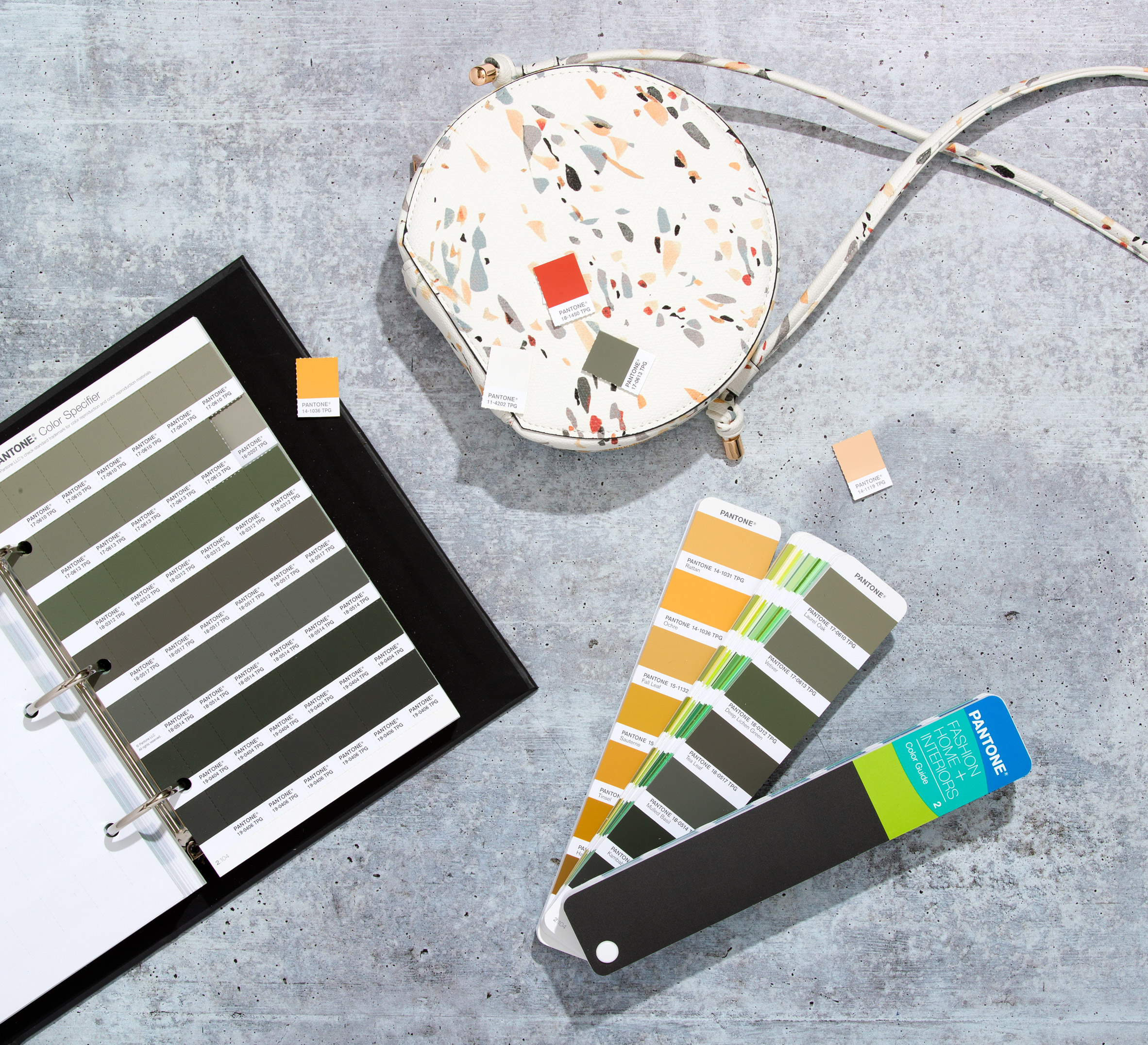
"As you can imagine, with over 2,625 colours included in the palette, there is an enormous level of detail that Pantone has to go into to describe the colour families where a colour would fall," Pressman told Dezeen.
"Even something as simple as a yellow-green versus a green-yellow, all of these have their own place."
The launch of the new shades has also seen the company create Pantone Connect, a management system and extensive colour library that can be merged with digital design tools like Photoshop, Illustrator and InDesign.
Pantone chose it's Classic Blue shade as the colour of the year for 2020. The company described the colour as having a "reassuring presence" that is capable of bringing "a sense of peace and tranquillity to the human spirit".
It came in dramatic contrast to Pantone's colour of the year for 2019, which was a bright shade of peachy-orange called Living Coral.
The post Pantone unveils over 300 new trend-based colours appeared first on Dezeen.
from Dezeen https://ift.tt/2InFhCZ
No comments:
Post a Comment