Cardiff and Amsterdam-based design studio Smörgåsbord has developed Cymru Wales, a "nation-defining" font family that gives an accurate, digital expression to the Cymraeg language for the first time.
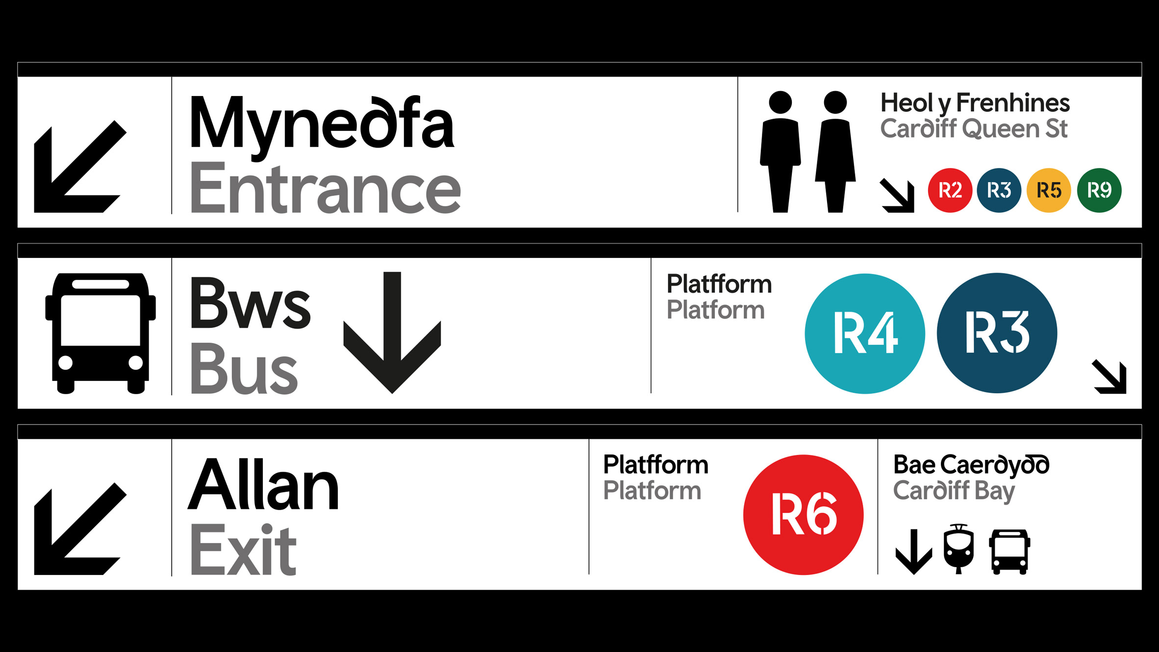
The project was commissioned by the Welsh government as part of a wider rebrand of the country's visual identity, and features the no-frills Cymru Wales Sans which Smörgåsbord originally designed in 2017, alongside a serif font for longer reads and a designated font for the local transport system.

To imbue the typography with a unique sense of identity and place, the studio went back to some of the oldest surviving Welsh manuscripts, including The Black Book of Carmarthen and The Red Book of Hergest, which date back to the 13th and 14th century respectively.
In collaboration with the Colophon Type Foundry, they set about adopting some of the language's unique stylistic traits into a modern font.
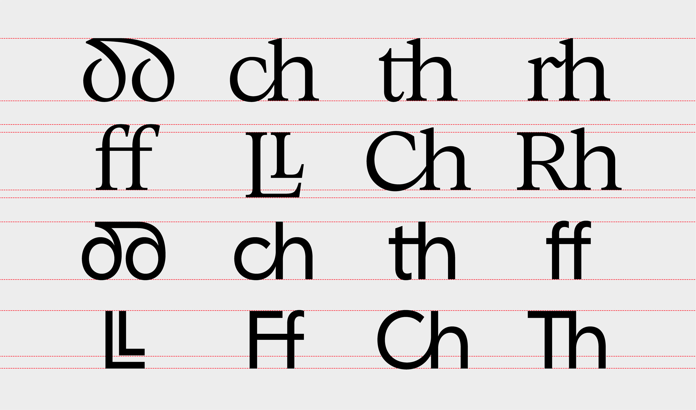
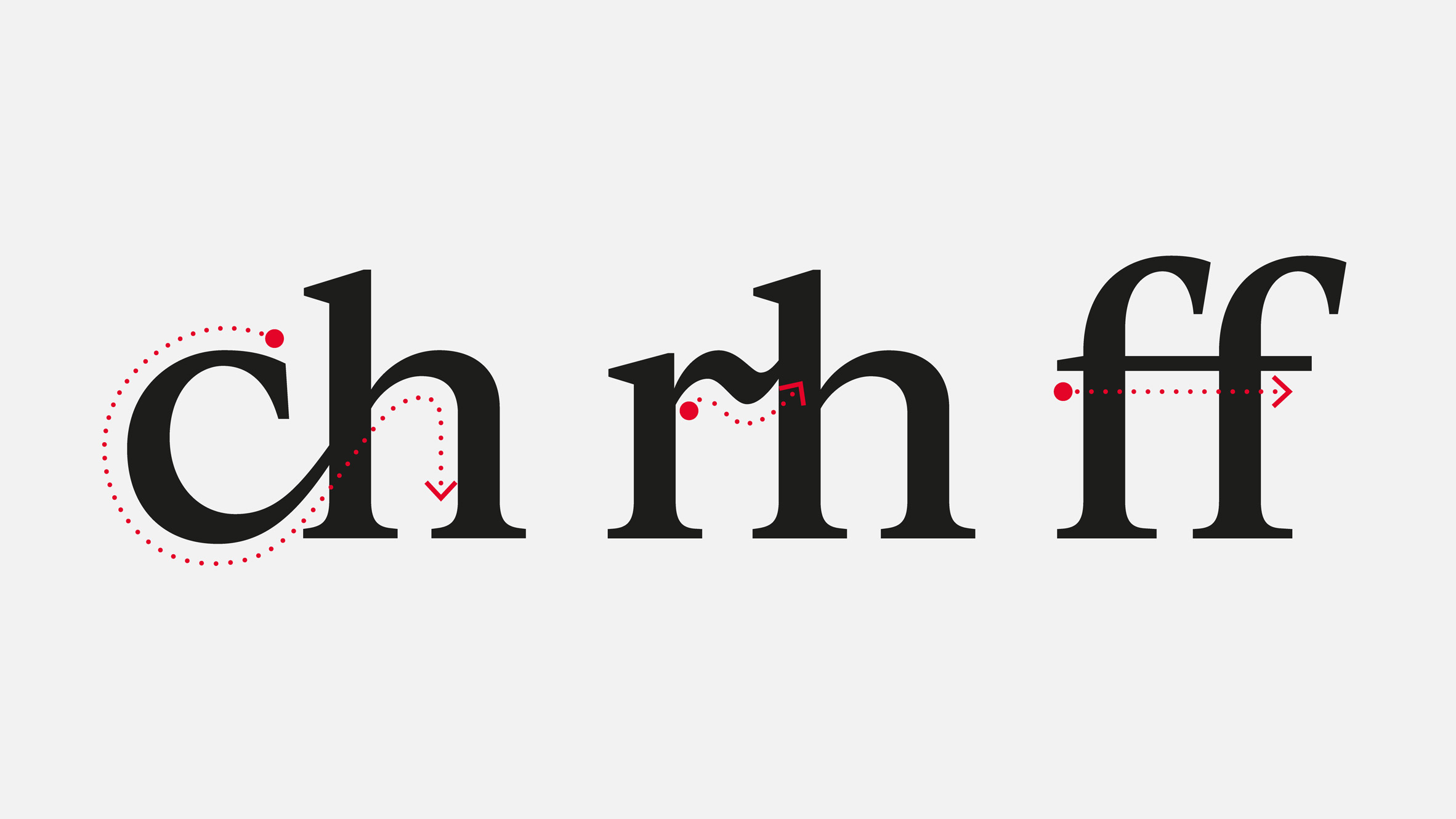
Most notably, the it gives an expression to the digraphs that distinguish the Welsh alphabet from the English one. These feature a combination of two letters such as ph or ll to represent a single sound.
Due to the lack of dedicated digital characters, these are generally spelled using two individual letters, but they actually represent a single letter – much like a German umlaut – and take up a single box in a crossword.
"The Welsh alphabet has a total of 28 letters and is blessed with eight digraphs," said Smörgåsbord's creative director and co-founder Dylan Griffith. "Good enough reason to set about creating a nation-defining bespoke font family."
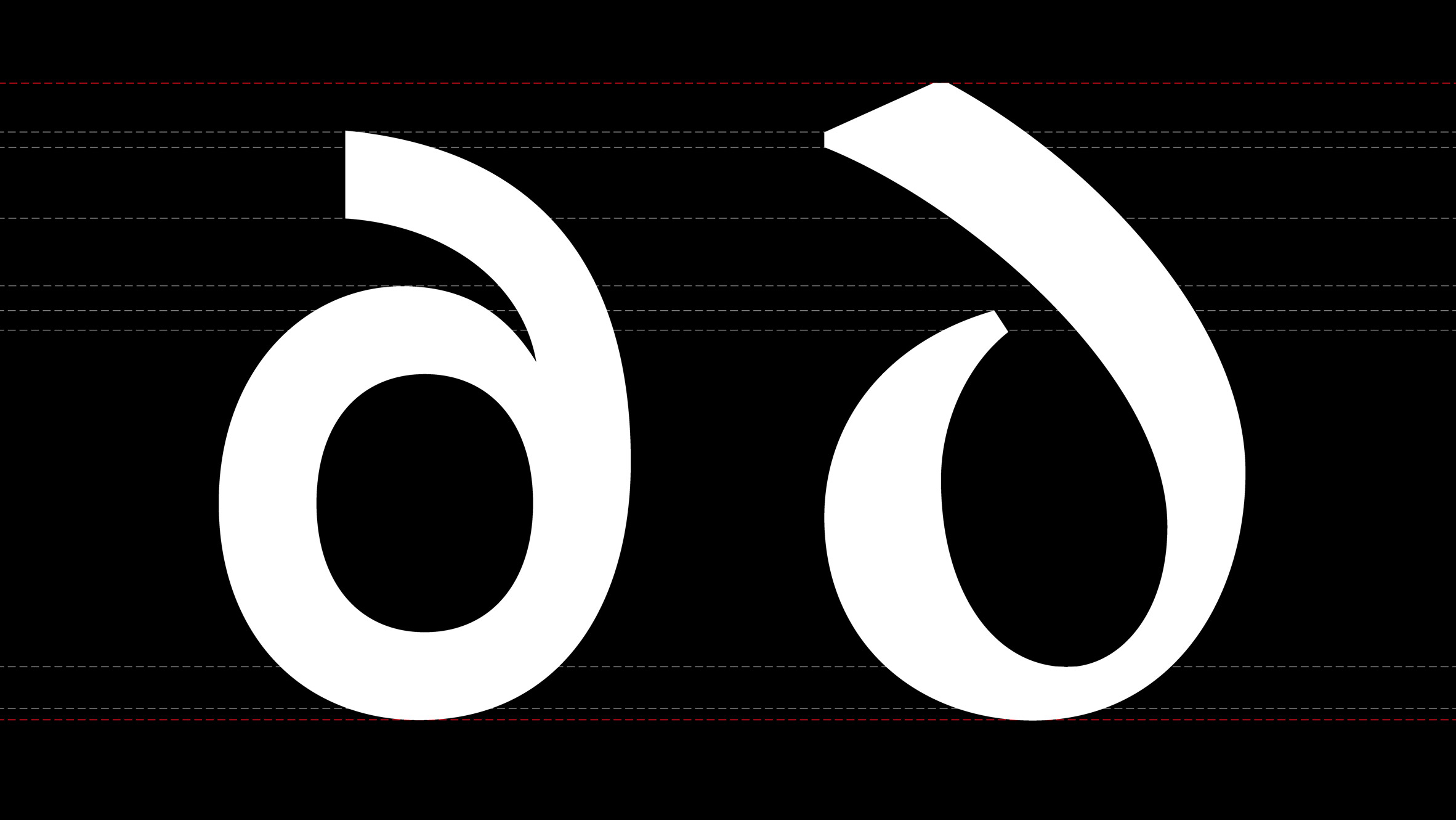
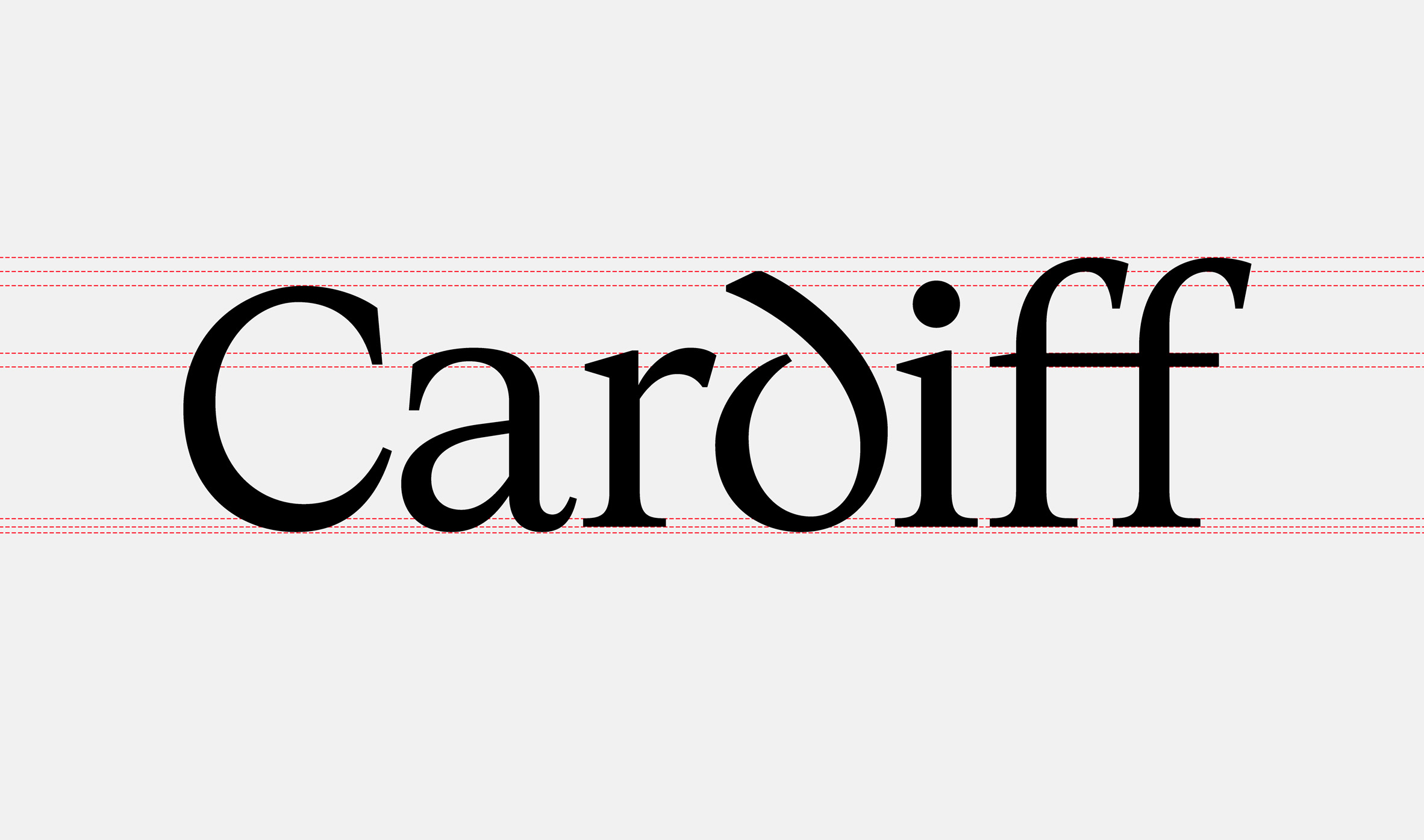
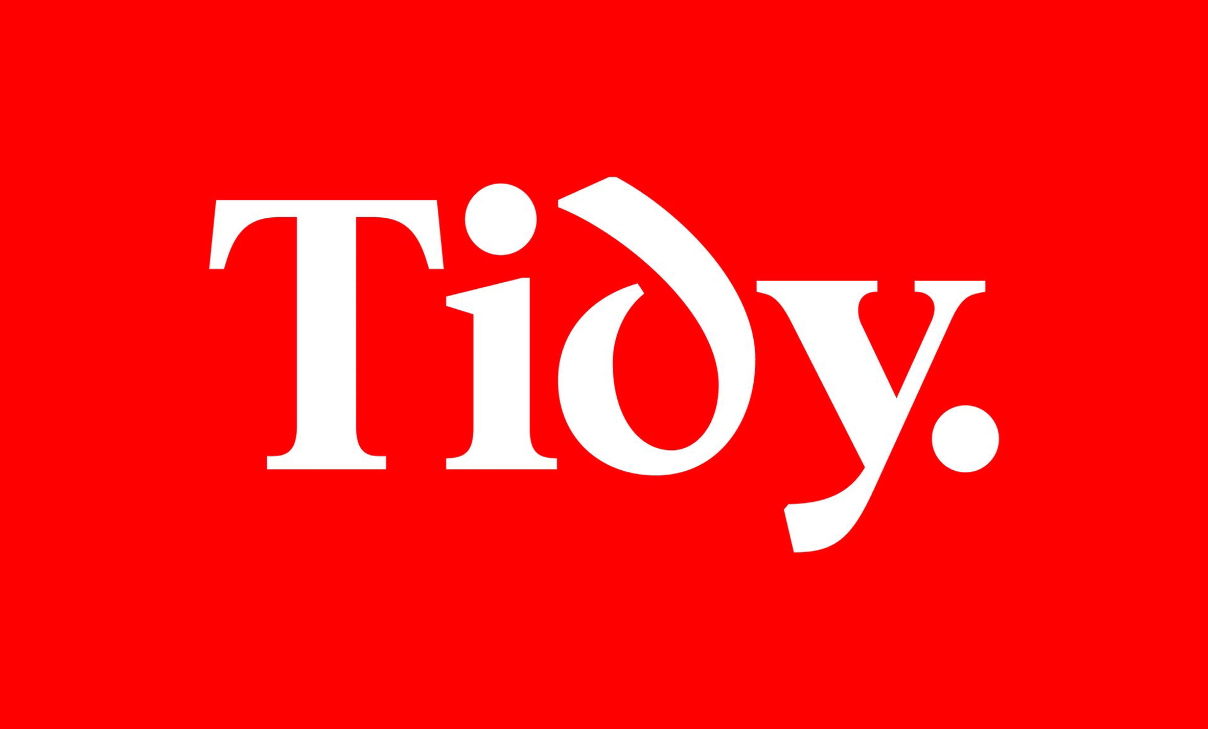
Beyond the digraphs, the most distinctive character is the d, which has an ascender that curves forwards.
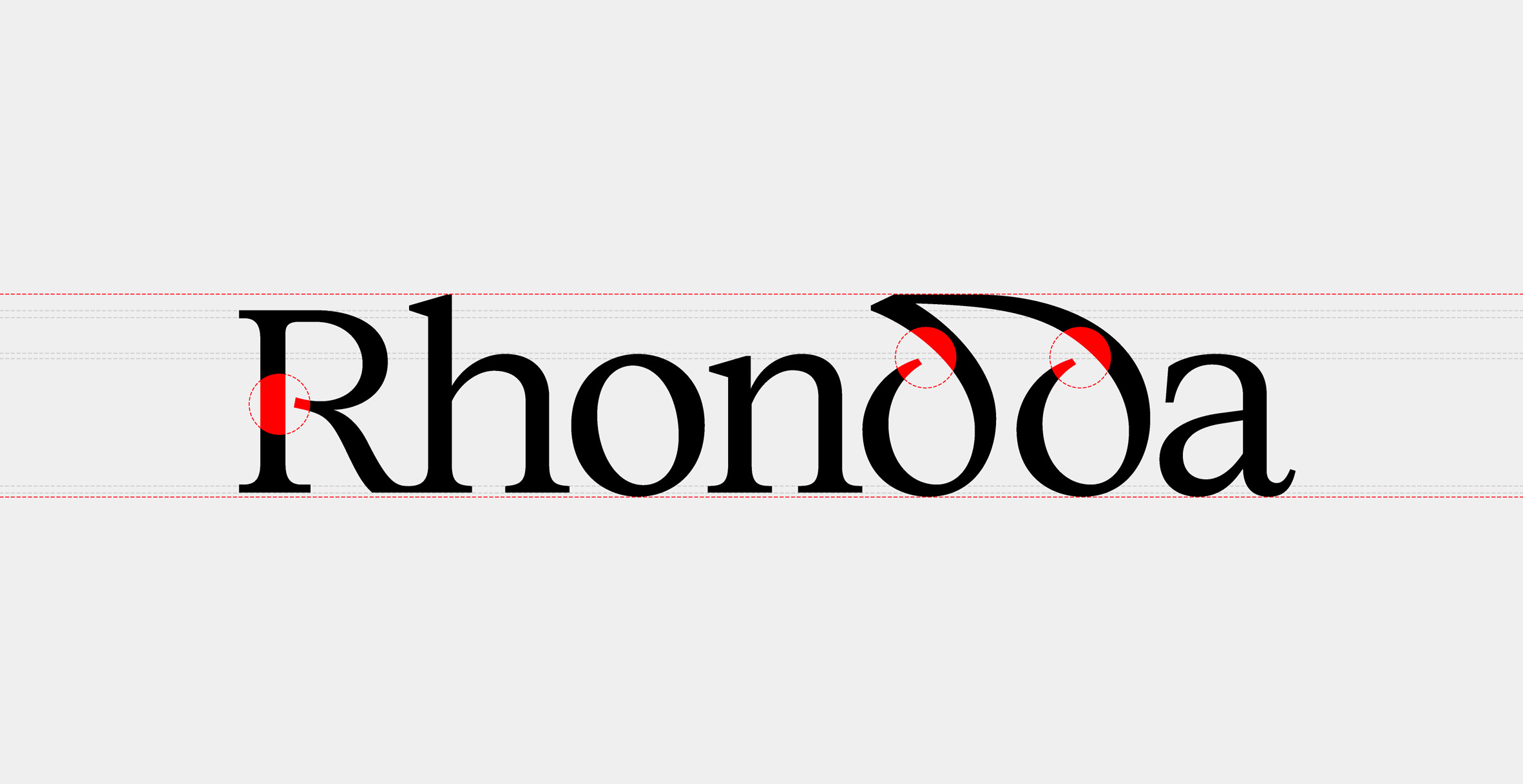
"The curved d featured widely across our two Welsh reference texts, alongside open bowled characters, in which the rounded part of letters such as B, g or R isn't fully closed," Griffith told Dezeen.
"We also felt that the introduction of the open bowls added a contemporary and stylistic element that would further enhance the uniqueness of the font without wandering into the territory of pastiche or parody."
Nods to Welsh cultural heritage be found in subtle details like the chamfered edges of the Cymru Wales Serif font, which invoke the region's traditional craft of stone letter carving.
The studio also looked to the digital expression of other minority languages such as Icelandic, as well as the cursive characters of Arabic for cues on how to infuse a typography with a distinctive personality.
"The Icelandic ð character provided us with some clues as to how to best tackle our curved d," explained Griffith.
"And Arabic typefaces led us to create the folded ribbon-like gestures that feature in Cymru Wales Serif, namely the d, dd, ch, rh, & – plus the stacked element of the l."
Another key concern for the studio was maintaining the accessibility of the language despite the inclusion of little known linguistic elements like the digraphs.
"We could foresee that introducing what could be deemed as 'alien' letterforms into the alphabet could challenge some users, so we worked alongside teams from Burdus Access and Applied Wayfinding from the outset to ensure that the digraphs were deemed valuable legibility tools as opposed to linguistic obstacles," said Griffith.
"All characters share generous, open counters. Descenders were made longer than usual and the dots on the i and j are oversized. We also introduced flicks at the ends of the vertical stems in Cymru Wales Sans to ensures differentiation, for example, between a capital I and lowercase l's."
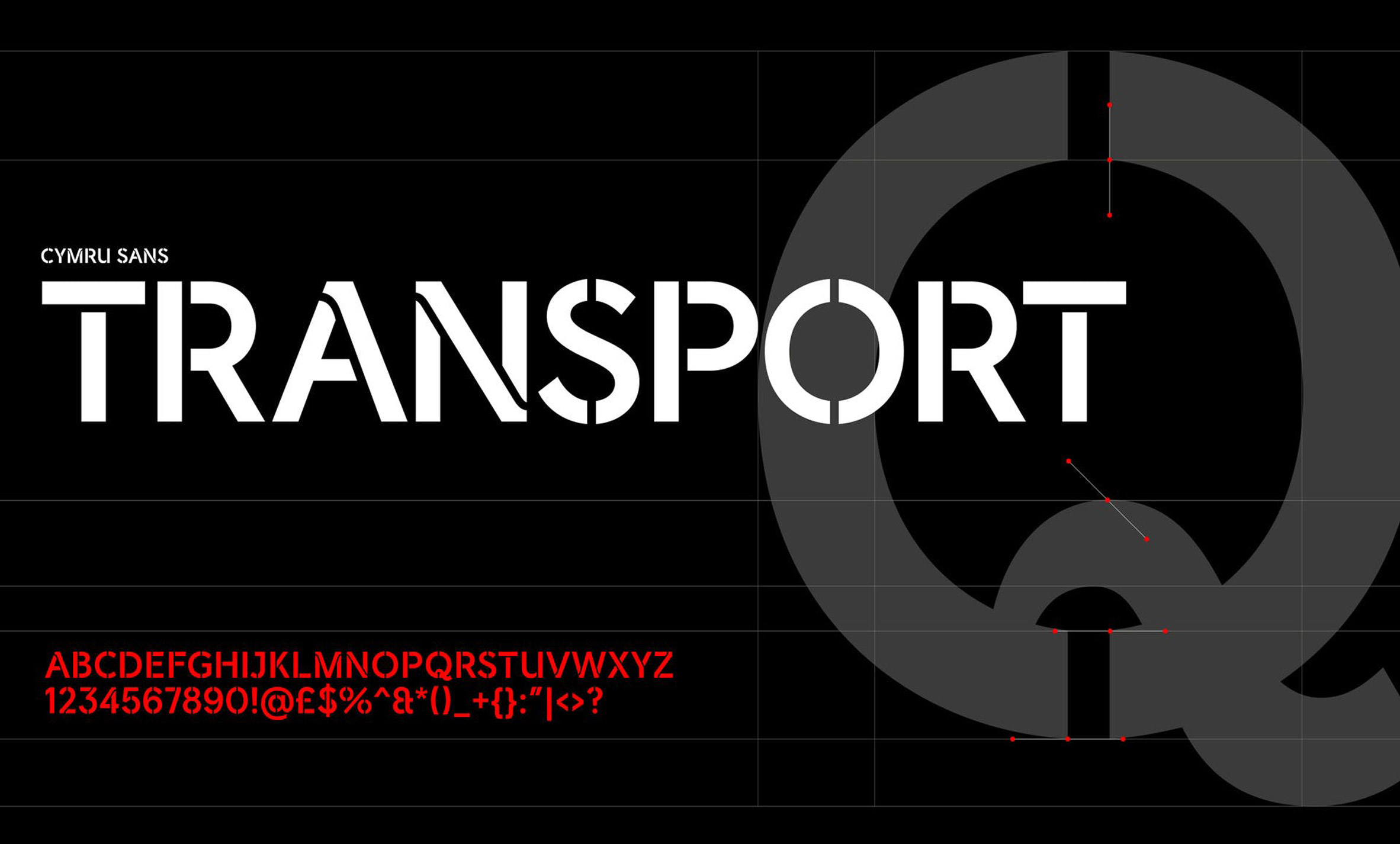
The official Transport for Wales font sees Cymru Wales Sans rendered in all caps, with stencilled utilitarian letters that will be adapted across all the whole transport network.
For now, the new font family is exclusive to government communications, marketing and campaigns associated with promoting Wales. But Griffith hopes that its influence will stretch beyond that.
"Looking ahead we'd like to think the fonts might act as a catalyst for other digital typefaces and could even see people integrate the digraphs into their handwriting," he said.
Although Welsh is one of the oldest living languages in Europe, and was once spoken by around 90 per cent of the population, a 2019 survey found, that this is now only true for around 29 per cent of Welsh people.
Under English sovereignty, Welsh had its official status as a language removed by Henry the VIII in 1567. Later, after a parliamentary review in 1847, it was banned from being taught or even spoken in schools because it was seen by the English to perpetuate the perceived "immortality" of the Welsh people.
However, the language has experienced a renaissance in recent years after it was reinstated as a compulsory subject in schools in 1999, and moved from designated Welsh language radio stations and newspaper into mainstream TV shows such as Hinterland, which was picked up by Netflix.
"The creation of the Cymru Wales font family chimes with the Welsh Government’s vision to have one million Welsh speakers by 2050," explained Griffith. "To quote Irish teacher and poet Pádraig Pearse: 'A country without a language is a country without a soul'."
The importance of language and typography to a sense of national identity has also manifested itself in a series of other recent projects, such as the Oli Grotesk typeface which is capable of expressing nine traditional Indian scripts, and Signato, which was created to celebrate 100 years of Lithuanian independence.
The post Smörgåsbord designs first digital typeface family for the Welsh language appeared first on Dezeen.
from Dezeen https://ift.tt/2UbI5bM
No comments:
Post a Comment