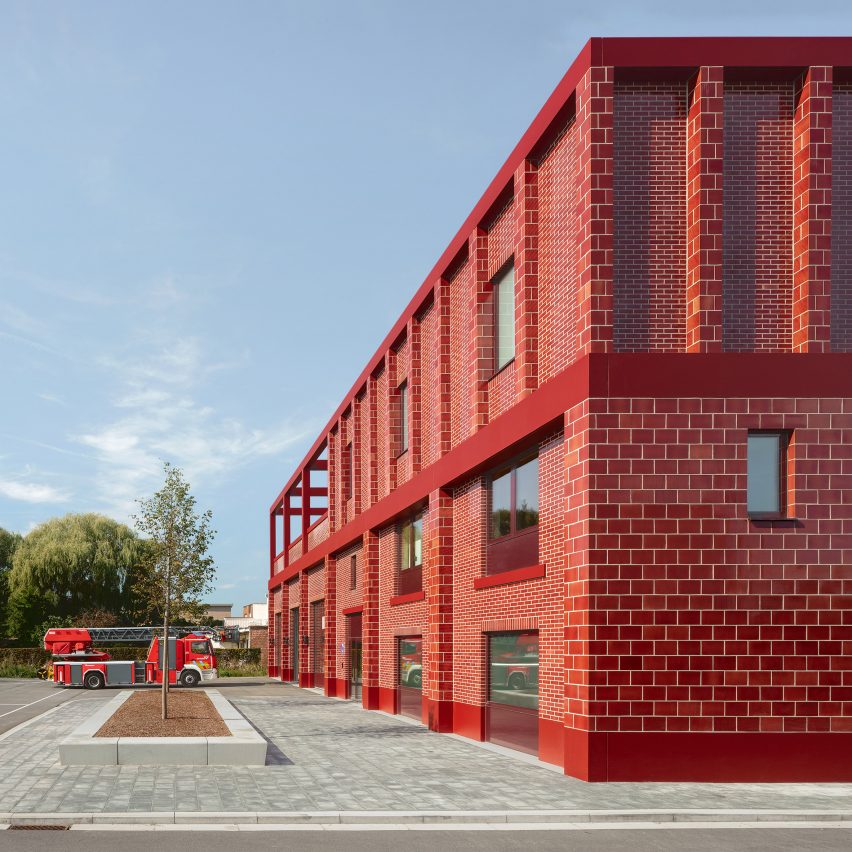
Dutch studio Happel Cornelisse Verhoeven has used red glazed bricks to make a new Antwerp fire station stand out.
Fire Station Wilrijk is located on a main road, in a neighbourhood to the south of the Belgian city.
Happel Cornelisse Verhoeven wanted to make a statement, to help the building quickly develop its own identity, so chose to clad the entire exterior in bright red bricks.
The colour of these bricks is emphasised by the use of vertical piers and bright white grout.
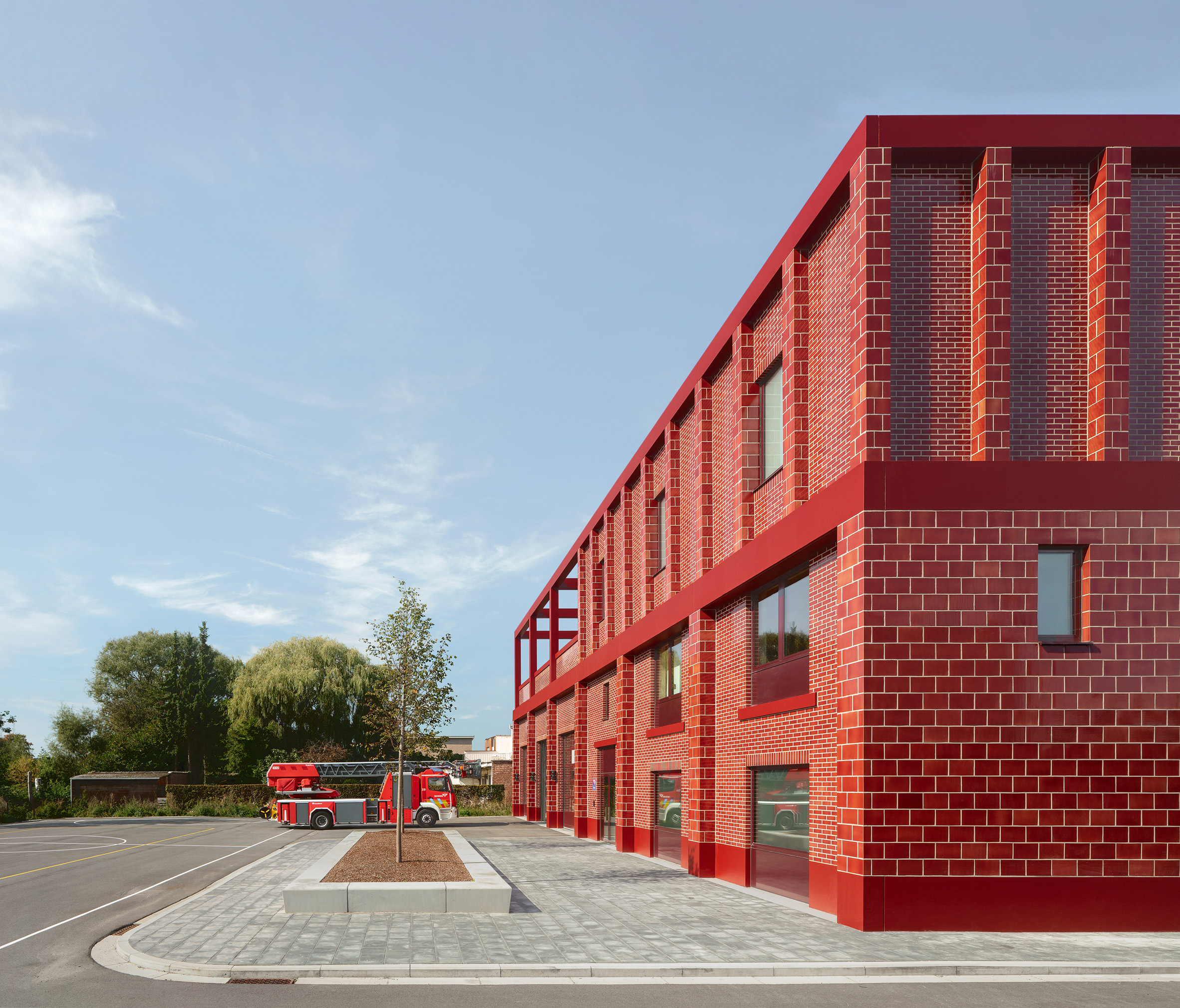
According to Happel Cornelisse Verhoeven, the aim was to make an "architecture parlante" – a type of building where the architectural form explains the structure's function.
"The monochrome character provides a recognisable identity in the neighbourhood, an architecture parlante in which form and appearance irrevocably remind us of the function of the building and the urgency of its users," said the Rotterdam-based studio.
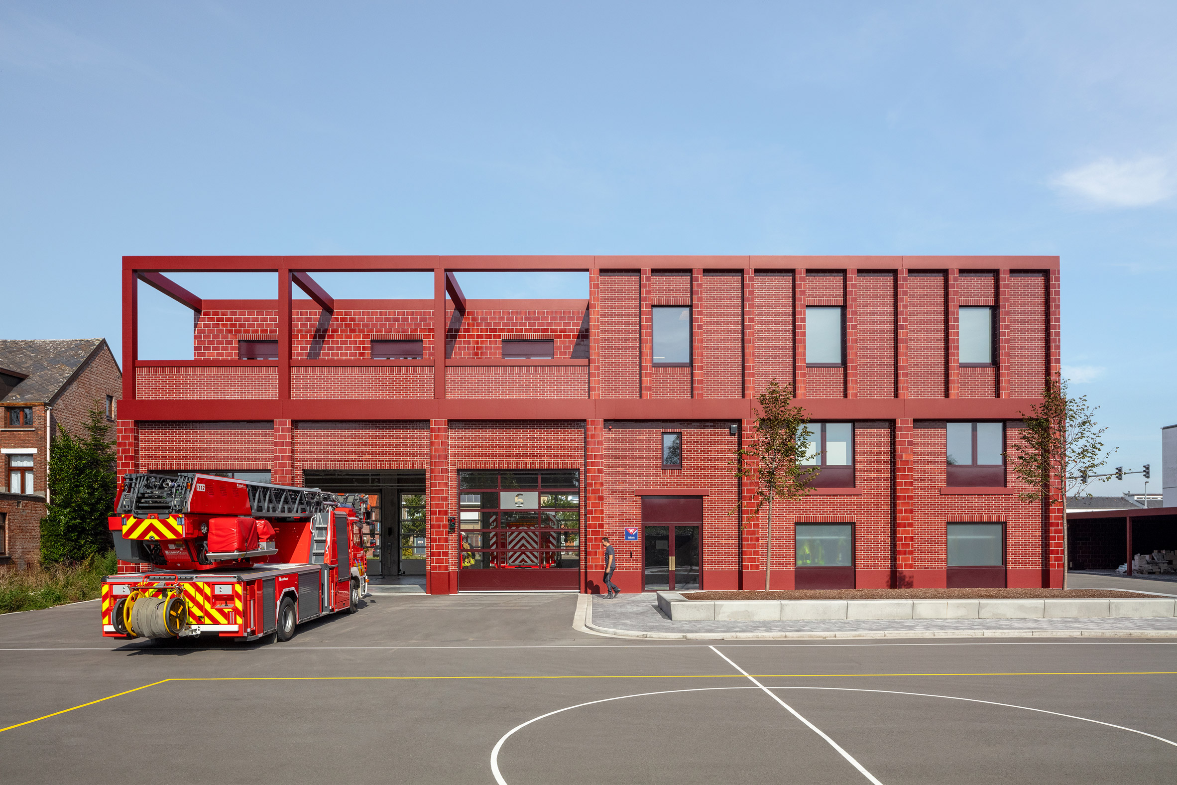
The fire station is a three-storey building, with a double-height station garage on one side and additional rooms wrapping up and over.
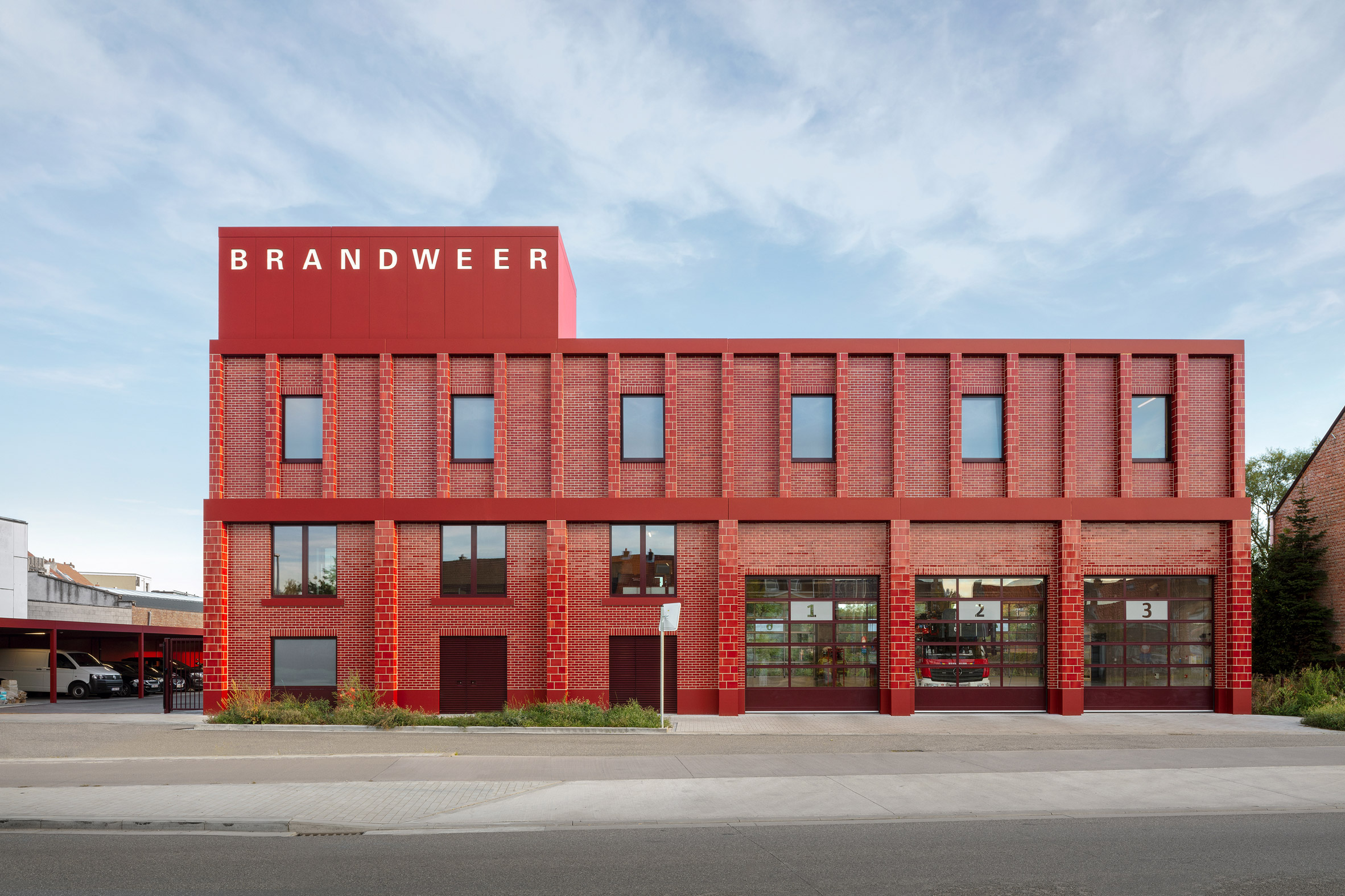
Its volume is made asymmetric by a tower in one corner, with bold white signage spelling out the word Brandweer – meaning fire brigade.
Graphic designer Reynoud Homan designed this signage by adapting the font Univers, designed by Adrian Frutiger in 1957. This sans-serif font helps to reinforce the functional aesthetic to the elevation.
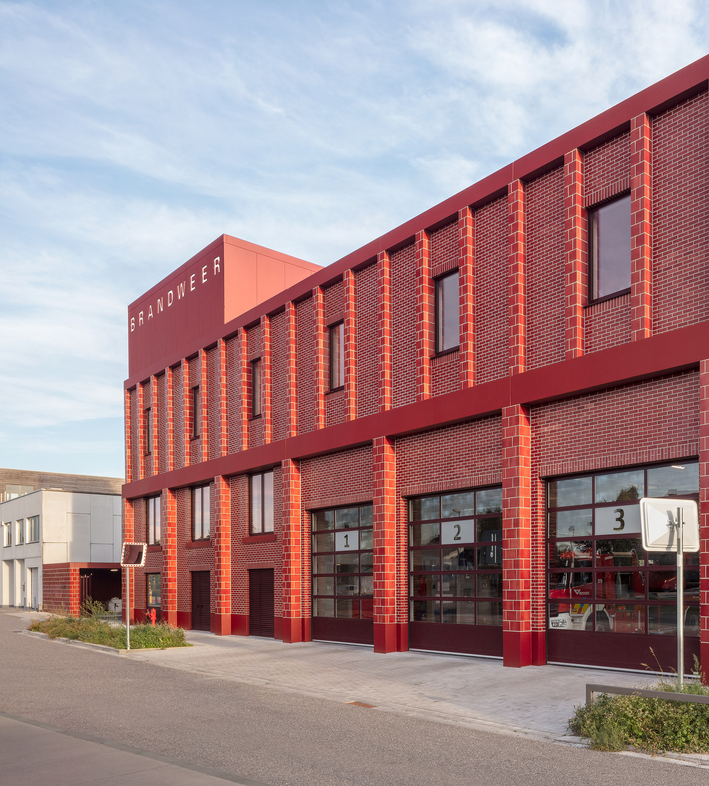
Below this sign, the brick facade is designed in two layers. The outer layer takes the form of a grid, creating a series of thick vertical piers at ground-floor level, and thinner ones on the level above.
Bricks on the outer layer twice as tall as those behind, creating a visual hierarchy.
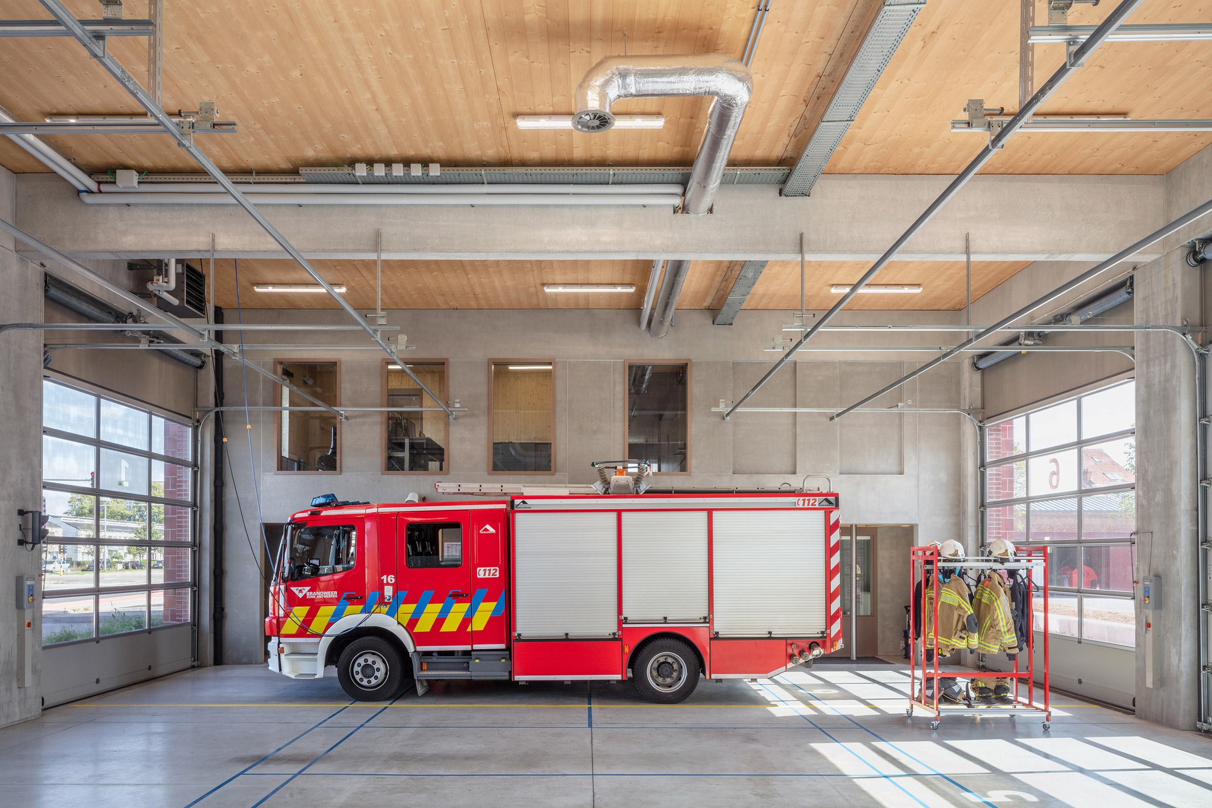
"Particular attention has been paid to the tectonics of the facades, which express the typological stacking of the garage, residence and tower" said Happel Cornelisse Verhoeven.
"This stacking decreases proportionally in height and is emphasized by a mutual setback of 10 centimetres."
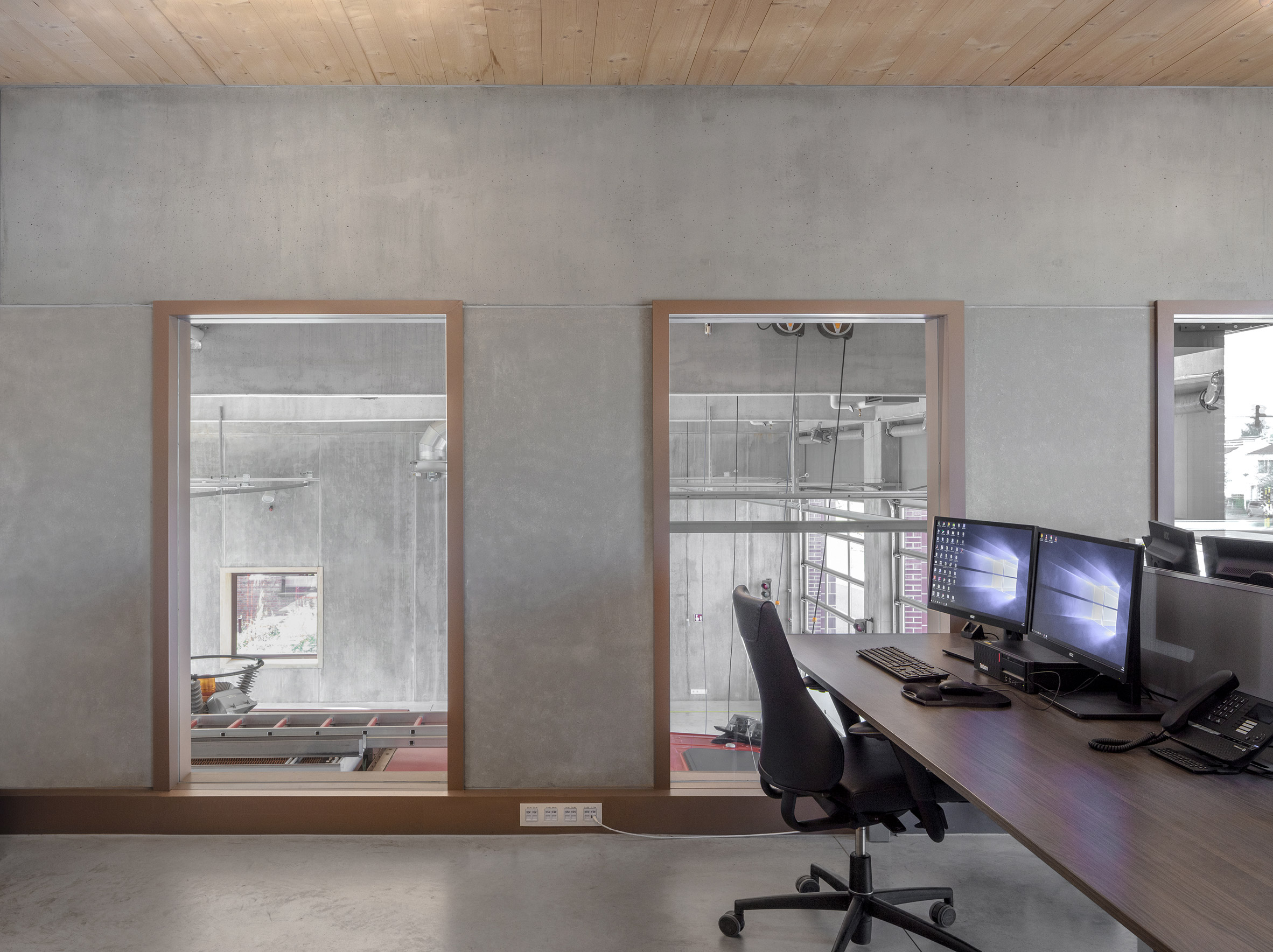
The building is more modest and utilitarian inside, with no traces of red to be found. A hybrid structure of concrete and cross-laminated timber (CLT) is matched by wall partitions on all three floors.
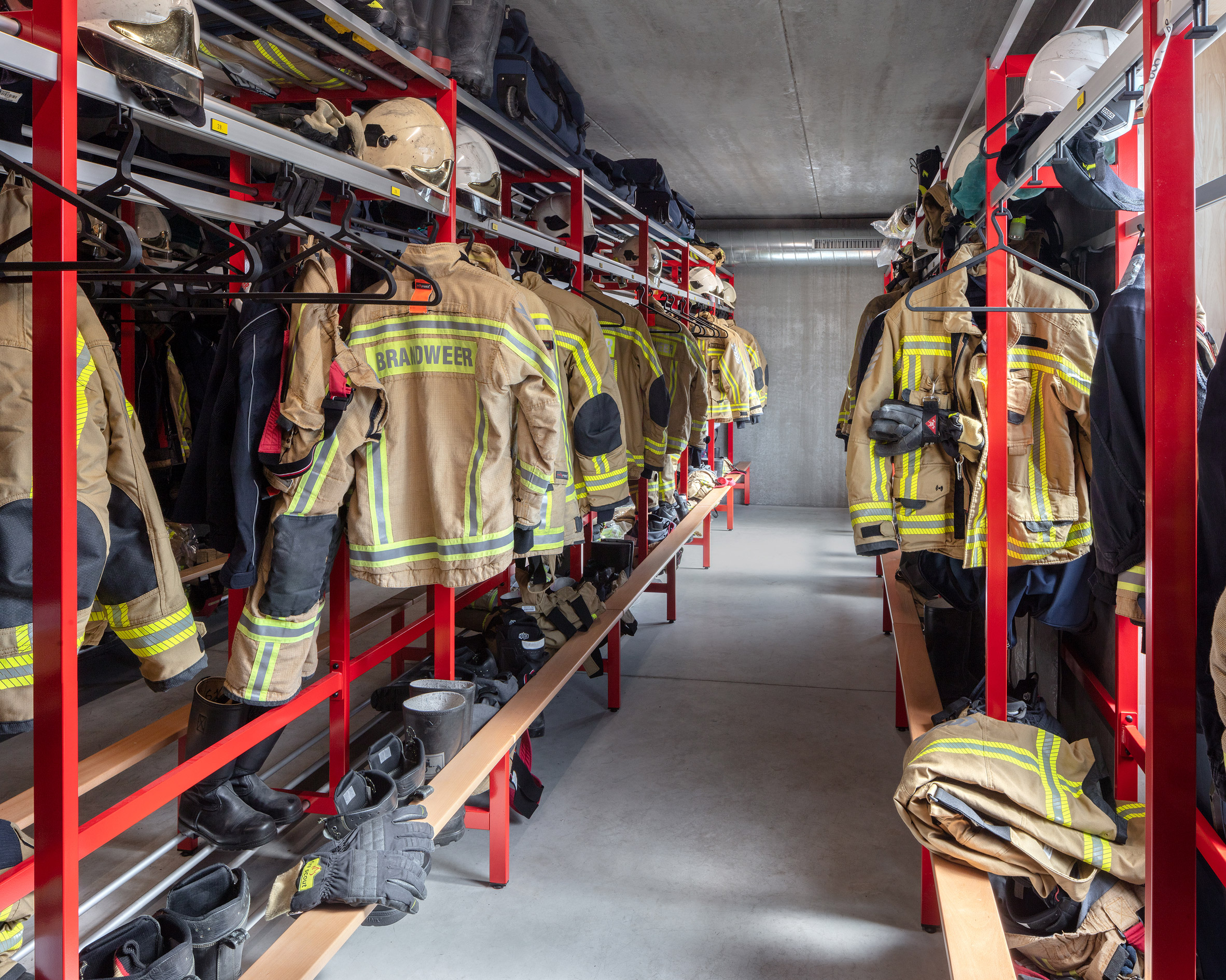
Workshop spaces and office are located on the two lower levels, while the upper floor is designed to feel more domestic. It includes sleeping quarters, dressing rooms and living spaces, so that firefighters can be on call 24/7.
The building generates its own energy, thanks to a solar boiler, a heat pump and rooftop solar panels.
Other examples of architect-designed fire stations include a copper-clad building in Chamonix and a rose-hued building in South Tyrol.
Photography is by Karin Borghouts.
Project credits:
Client: AG Vespa
Architect: Happel Cornelisse Verhoeven
Contractor: dhulst'
Constructional engineer: Vervest Constructief Advies & Ontwerp
Technical engineer: SB Heedfeld NV
EPB Reporting: GHW bvba
The post Happel Cornelisse Verhoeven builds bright red fire station in Antwerp appeared first on Dezeen.
from Dezeen https://ift.tt/358pSRx
No comments:
Post a Comment