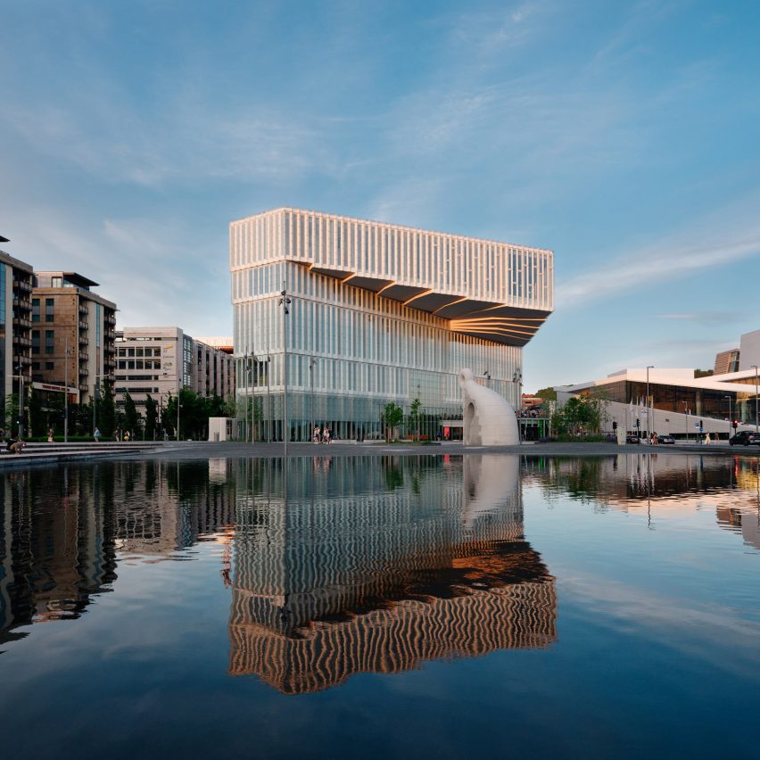
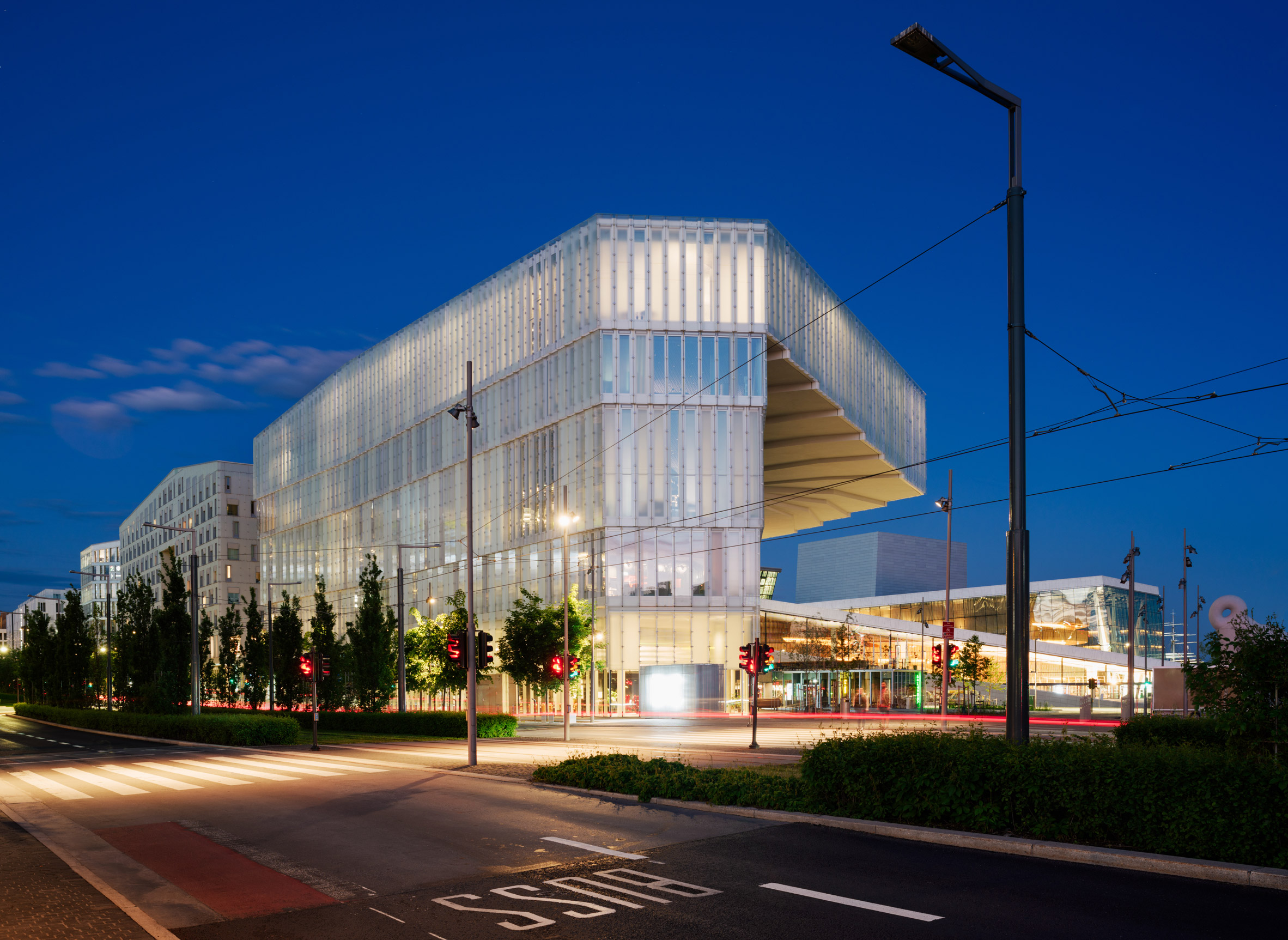
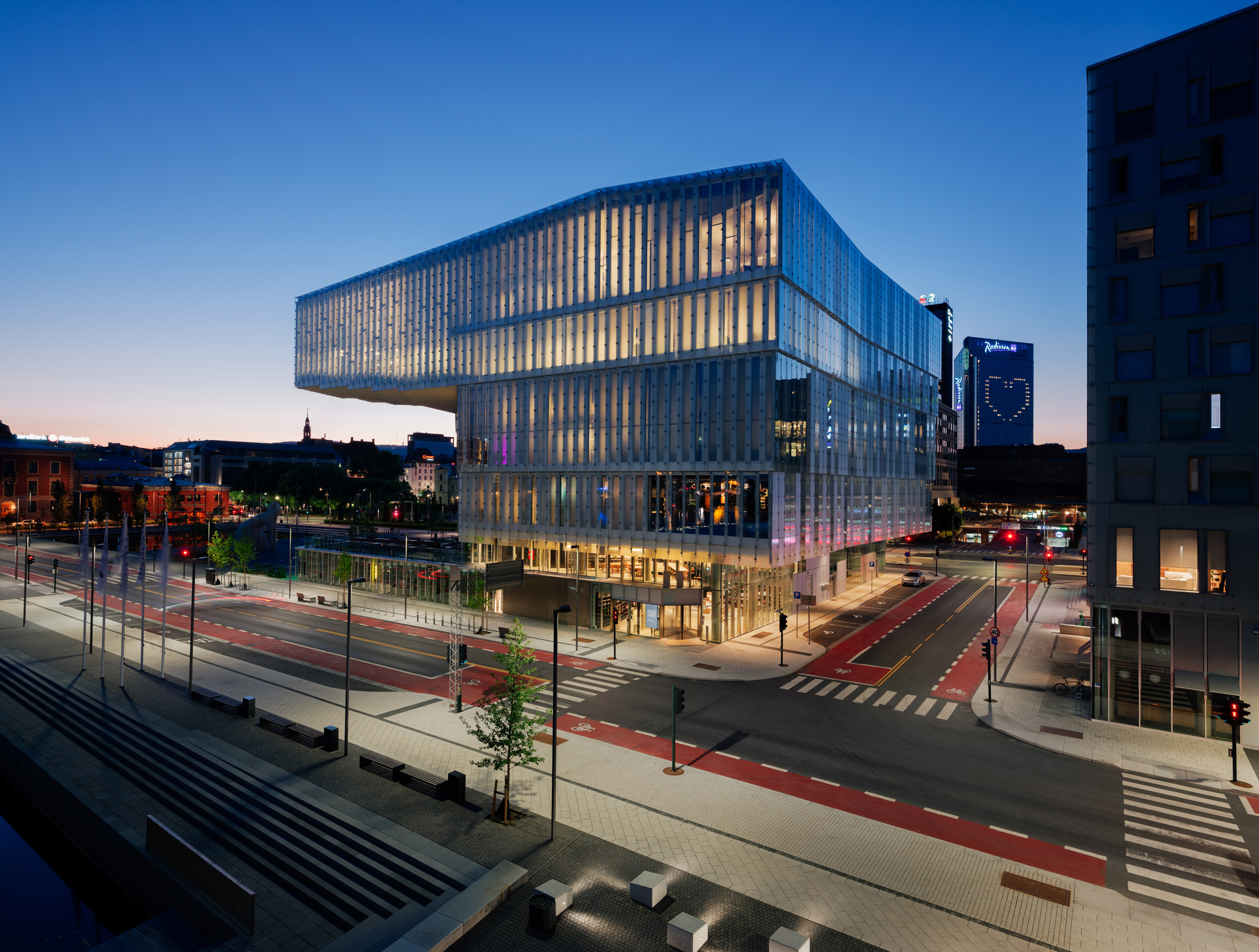
Oslo's long-awaited Deichman Bjørvika central library, which stands alongside the Snøhetta-designed opera house on the city's waterfront, has opened to the public in Norway.
Designed by Atelier Oslo and Lundhagem, the five-storey building contains space for 450,000 books wrapped around a large, top-lit atrium that connects the floors and breaks them into smaller spaces.
"Our aim was to make a library that can offer a variety of different spaces within one large continuous space," explained Atelier Oslo co-founder Nils Ole Brandtzæg.
"We think we have succeeded in making a building that is huge, but at the same time feels intimate so people can feel they belong there."
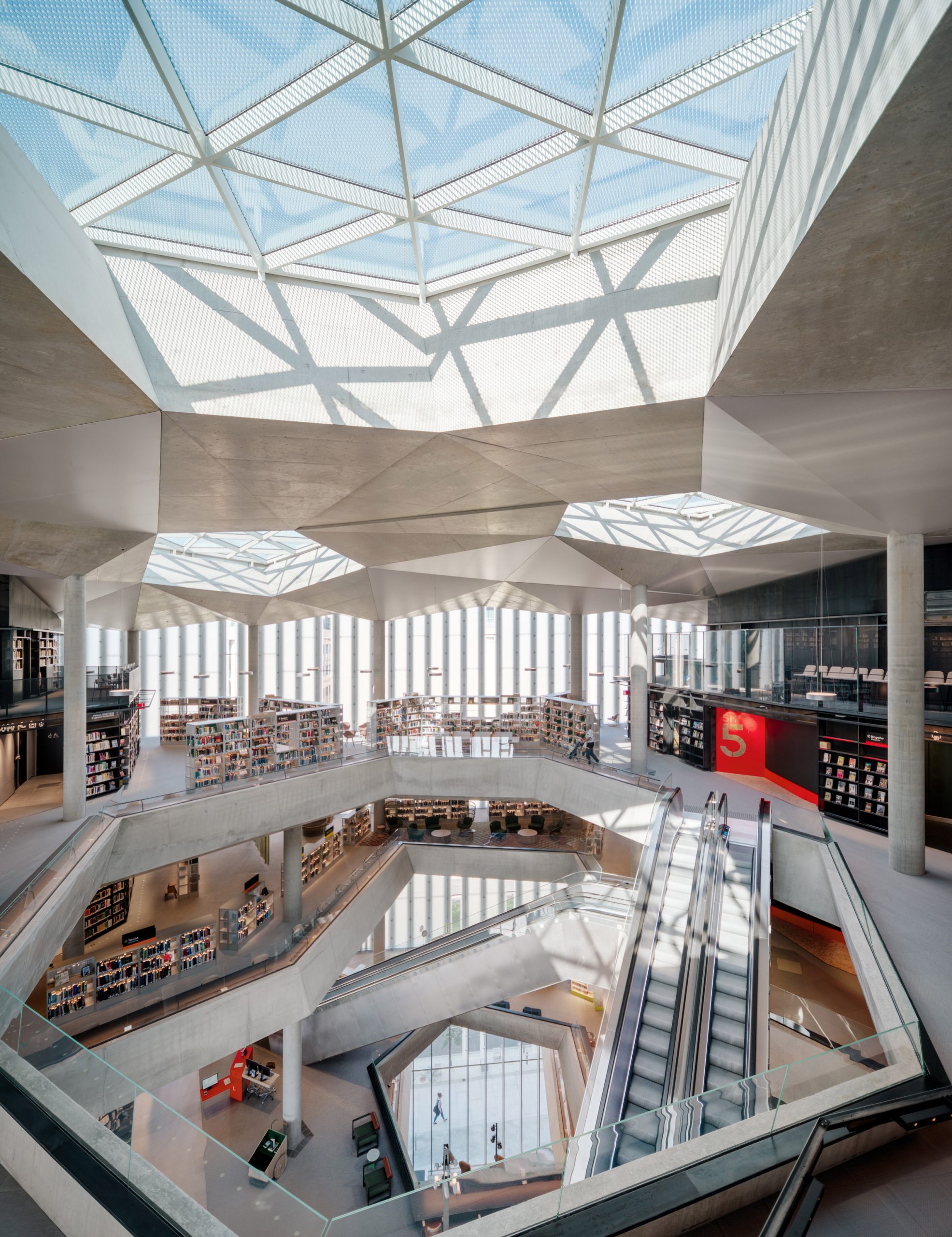
Named after Carl Deichman, whose book collection started the library in 1785, Deichman Bjørvika is located on Oslo's waterfront alongside the opera house. This building, as well as existing roads, determined the library's footprint, distinctive cantilevered top floor and vertical arrangement.
"The competition had options for the library to be placed on two different sites alongside the Opera," Brandtzæg told Dezeen. "We choose to place the library on the site towards the public plaza in the west."
"This site, however, was limited by roads and a regulated sightline towards the front of the Opera," he continued. "The organisation of the building is really built around the restrictions from this regulation."
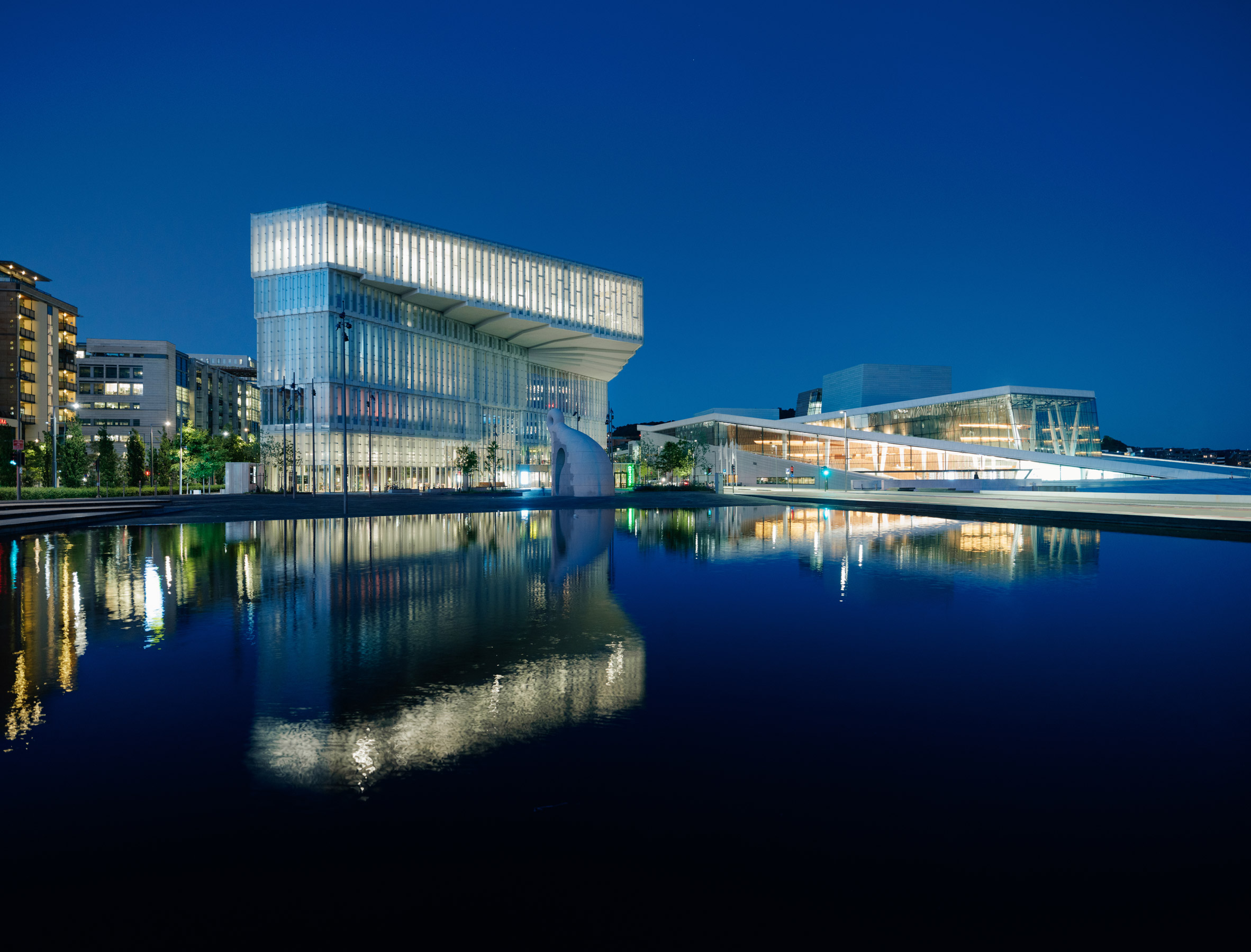
The library is arranged vertically, with a cinema and 200-seat auditorium in the basement, and a cafe, restaurant and newspapers and magazines on the ground floor.
The first floor contains fiction and children's books, while the second and third floor contains more books and several enclosed areas that include recording studios, a mini cinema and gaming rooms.
On the top floor, there are social science books and reading rooms, as well as the Future Library art project.

"The program of the library is organised so that it gets more and more quiet and contemplative towards the top," explained Lundhagem co-founder Einar Hagem.
"The underground floor contains auditorium and cinema for large audiences while the two upper floors are connected through the terraced cantilever that creates a perfect hang-out for contemplation where the library opens towards the Oslo fjord and the surrounding landscape," he continued.
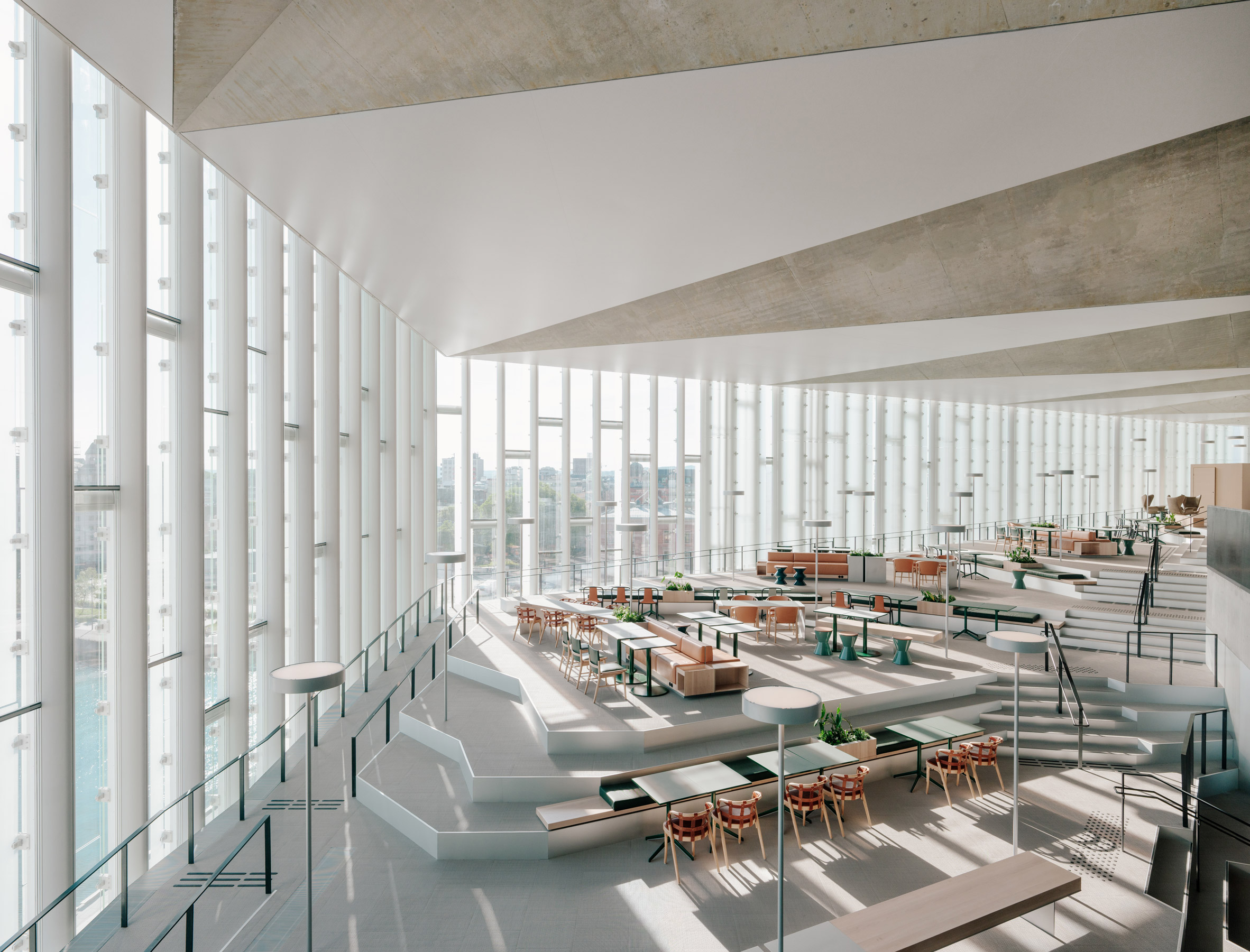
Atelier Oslo and Lundhagem punctuated the upper floors with a series of diagonal voids that combine into a central atrium and create variety within the internal spaces.
"Three diagonal voids, or light shafts, connect the different floors with each other as well as the street below," said Hagem.
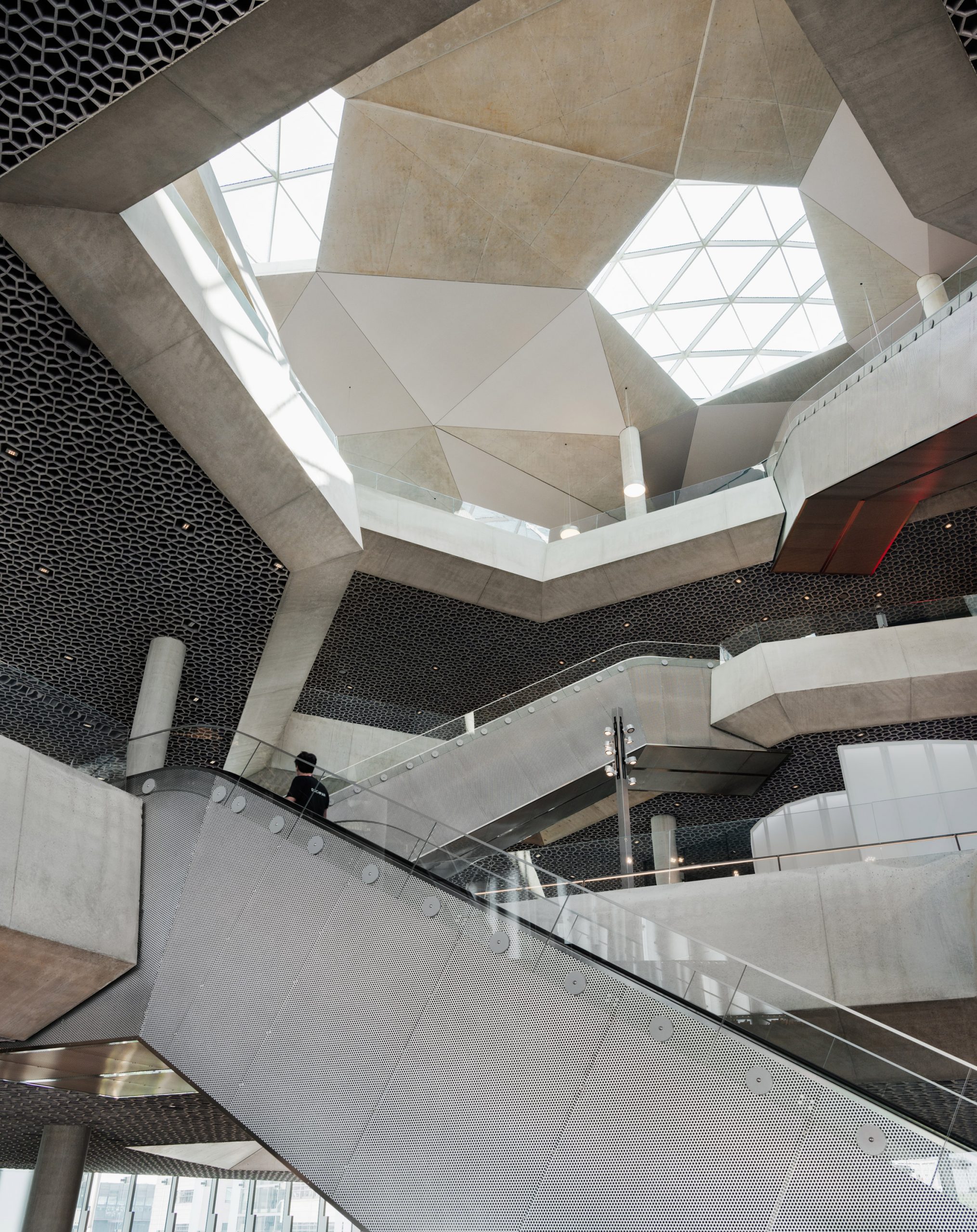
"The light shafts make each floor unique and create a vertical public space that is an open and inviting continuation of the city outside," Hagem continued.
"The interior opens for exploration like in a forest, where you are constantly invited around the next corner to discover new areas of the library."
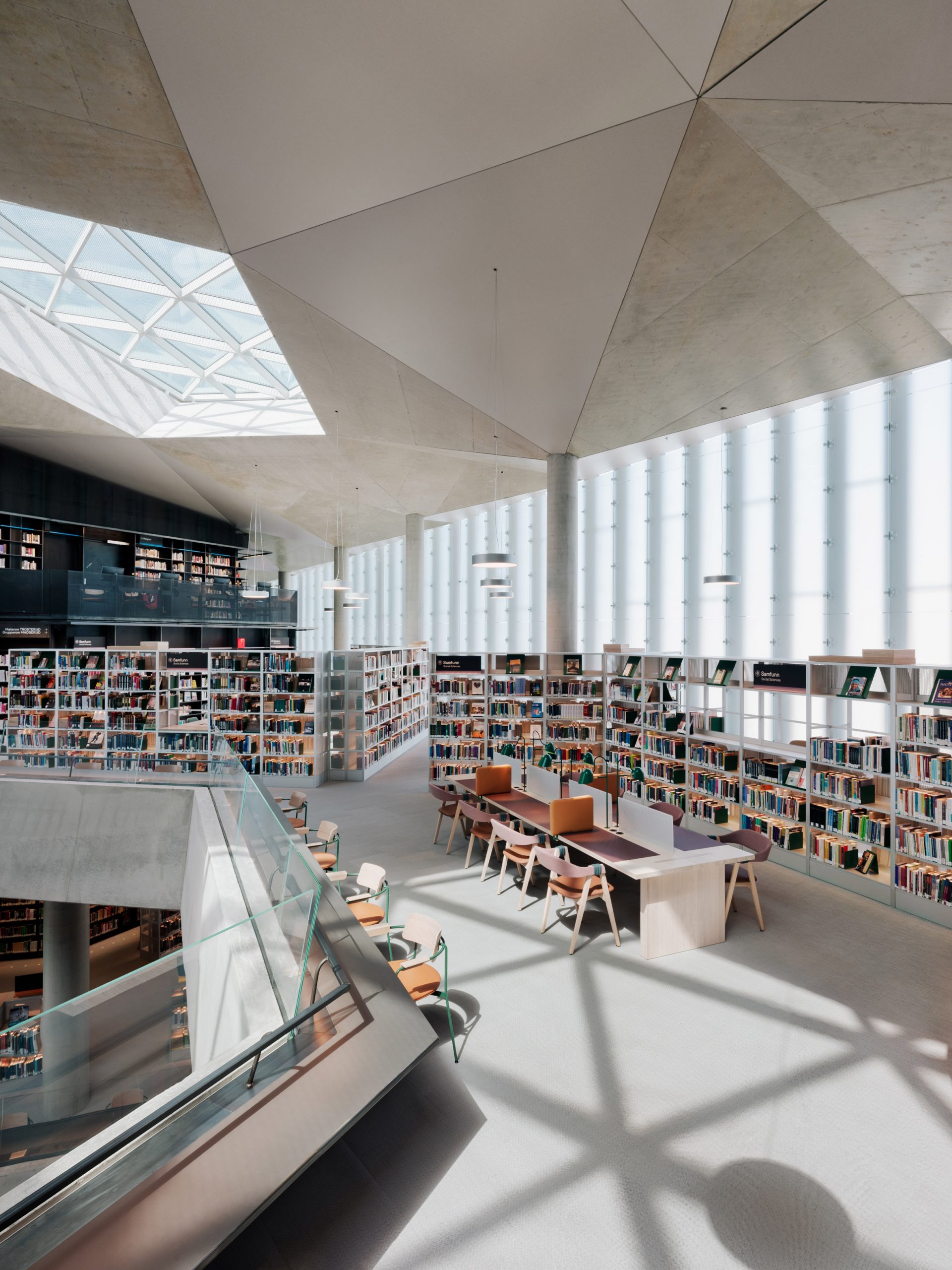
The city hopes that the library will attract more than two million visitors a year after the coronavirus pandemic has passed.
To achieve this, the architecture studios aimed to design a modern library that contains books, but is also a place for people to gather and meet.
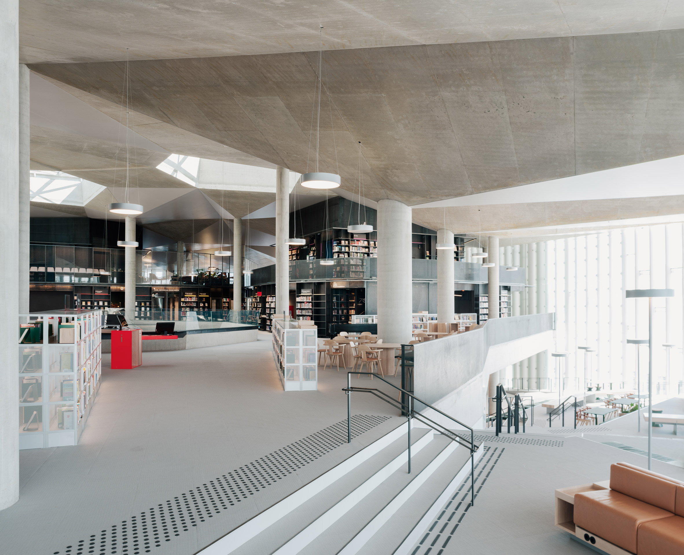
"The library has moved away from being a place to store books to be a place for people to meet and learn," explained Lundhagem co-founder Svein Lund.
"Old libraries were often designed as large floors with rows and rows of bookshelves. Our library space is more divided and creates a huge degree of variation. This breaks down the scale and lets a lot of different activities take place," he continued.
"Here you will find spaces for meeting, rehearsal rooms, gaming rooms, exhibition niches, record studio, silent reading rooms etc. Even though the books still have a strong presence this library is designed first and foremost as a place for people."
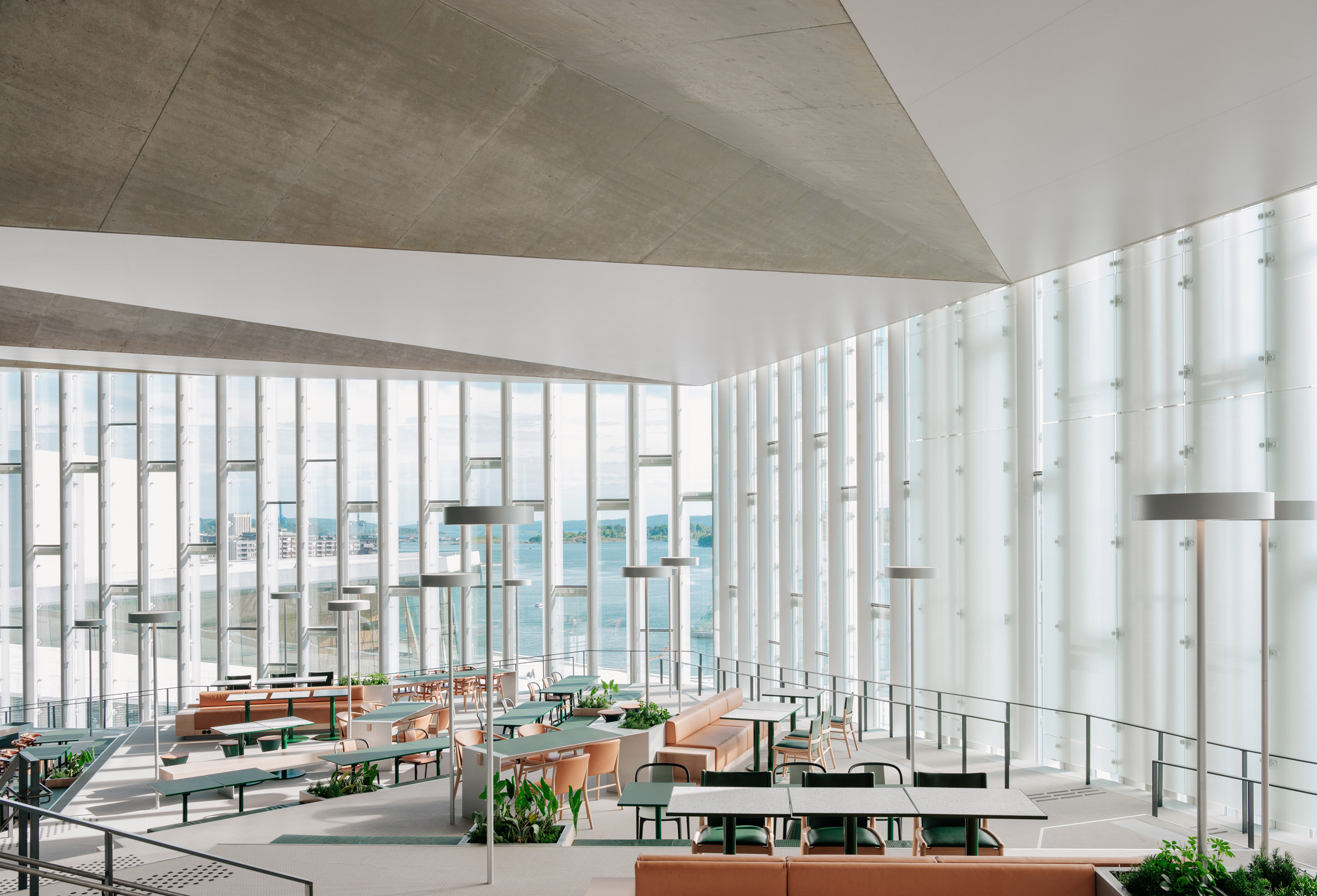
While designing the building, the architecture studios looked at both modern and historic libraries and aimed to create a flexible space that could be adapted as the purpose of the building changes.
This meant that they paid particular attention to elements that will be longlasting, including the building's structure, internal arrangement, ceilings and facades.
"We won the competition 11 years ago and we have had the time to explore many different library projects," said Atelier Oslo co-founder Marius Mowe.
"This has been important to understand the spirit of modern libraries and to try to foresee where we are heading. We also get a lot of inspiration from looking at classical library spaces," he told Dezeen.
"For instance, we got inspired by how the ceilings and the main structure always are treated very carefully. This is something we have pursued in our own project," he continued.
"For us, the ceilings and the main structure will secure some lasting qualities for the library space while the floor is more like a marketplace where activity and use can change and evolve over the years."
Locally based studios Atelier Oslo and Lundhagem won the competition to design the library in 2009.
Lundhagem was established by Hagem and Lund in 1990. The studio's previous projects include a stilted summer house on a Norwegian island and a Y-shaped cabin on a hilltop overlooking a ski resort.
Atelier Oslo was founded in 2006 by Brandtzæg, Mowe, Thomas Liu and Jonas Norsted. It has previously designed a house wrapped in a gridded timber facade on the island of Skåtøy and a basalt-clad cabin overlooking a lake.
Photography is by Einar Aslaksen.
Project credits:
Client: Oslo municipality
Architects: Lundhagem and Atelier Oslo
Interior architects: Scenario
Project management: AFRY Advansia
Structural engineering: Bollinger Grohman and Multiconsult
Consultants: Multiconsult, COWI, Rambøll, Asplan Viak / Kan Energi
Contractor core and shell: SKANSKA
Contractor facade: Roschmann Group
Contractor interior: AF Byggfornyelse
The post Atelier Oslo and Lundhagem unveil Oslo's "huge but intimate" central library appeared first on Dezeen.
from Dezeen https://ift.tt/3ir3okP
No comments:
Post a Comment