In this week's comments update, readers are debating car makers rebranding with flat versions of their logos and sharing their views on other top stories.
Nissan, BMW and numerous other car manufacturers have reverted back to flat designs of their logos having rebranded with three-dimensional, chrome-effect logos in the 80s and 90s.
Thanks to advances in technology, logos are now designed primarily with screens in mind – simplified, two-dimensional logos replicate better on screens and in miniature as app icons.
"Cheap is the only word that can describe how cheap they look"
We rounded up seven examples of logos to demonstrate the change in style and readers are divided.
"Cheap, just cheap," said Raulin Miami. "Cheap is the only word that can describe how cheap they look."
"Less is not always more," added Ken Steffes.
"The old logos were okay," continued Zea Newland. "I fail to see the necessity for flat redesign as today's digital graphics and displays are good enough to display complex graphics."
Steve Layden disagreed though: "I love the flat logos. So much cleaner and more versatile. Just like the hood ornaments of a few decades back look a little ridiculous now, having a stamped piece of chrome is going to look outdated in a few years as well. The options are broad – laser etching, printed logos, glass, not to mention the digital formats. Bring on the change."
What do you think of flat logos? Join the discussion ›

"Handsome interiors with fantastic views" says reader
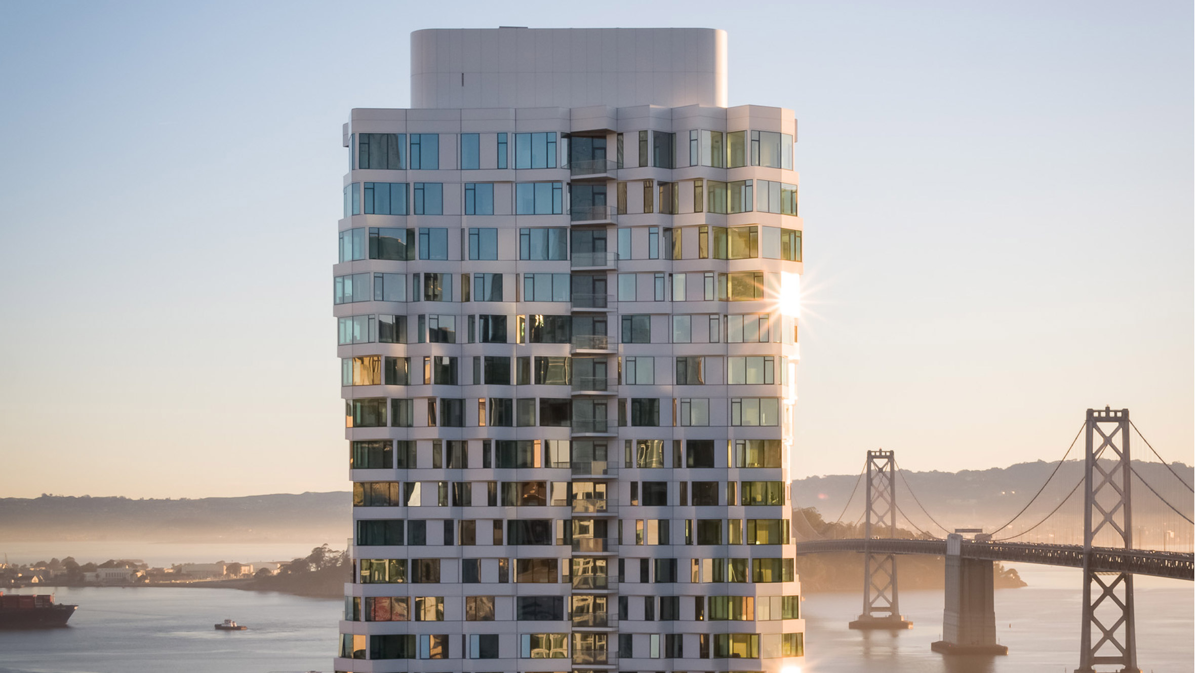
Commenters are discussing Studio Gang's 40-storey apartment complex in San Francisco after photos were revealed of the finished project.
"Handsome interiors with fantastic views," said Felix Amiss. "They'll be happy tenants."
"Looks like early 2000s Frank Gehry got value-engineered by a developer," said Jolene Ski. "That said, I like it."
"It's too short," concluded Jacopo. "The dancing effect the studio was going for needed at least 30 storeys more to get an elegant result. It's still an interesting idea but ultimately a slightly disappointing result. But that's architecture! You win some you lose some."
Is the Mira building to your taste? Join the discussion ›

"We're doing flat logos now" say commenters
Readers have found humour in a new black and silver logo for the United States Space Force. It was designed after an earlier visual identity released by president Donald Trump proved controversial.
"Didn’t they get the memo from the car manufacturers?" joked JZ. "We're doing flat logos now."
Steve Hassler went on: "To dominate strange new worlds, to dominate new life and dominate new civilisations, to boldly go with the military industrial complex where no-one has gone before."
"The logo has nothing to do with an American military branch of service," replied Ken Steffes. "It looks more like it belongs on a 60s-era Pontiac."
Do you think the Space Force logo it out of this world? Join the discussion ›

Reader says they are "enchanted by this house"
Architecture collective Frankie Pappas has hidden a 3.3-metres-wide house within the Bushveld nature reserve in South Africa and commenters can't get enough.
"I'm enchanted by this house!" said Benny. "It's refreshing to see a residence that is built with such specificity and distinctness. Quite lovely."
Zane Gray agreed: "Very inspirational. Shows how nature can be such a beautiful design element."
"Nice project to discover on a quiet summer Sunday morning," added Bras Cubas. "It unveils slowly, partially, photo by photo, space by space. This is great quality."
Are you impressed by House of the Big Arch? Join the discussion ›
Read more Dezeen comments
Dezeen is the world's most commented architecture and design magazine, receiving thousands of comments each month from readers. Keep up to date on the latest discussions on our comments page.
The post "Less is not always more" say commenters appeared first on Dezeen.
from Dezeen https://ift.tt/32Zjop7
No comments:
Post a Comment