Architects and designers have created these seven dental offices with bright and colourful interiors to offer patients a more enjoyable and worry free experience.
Dent Protetyka, Poland, Adam Wiercinski
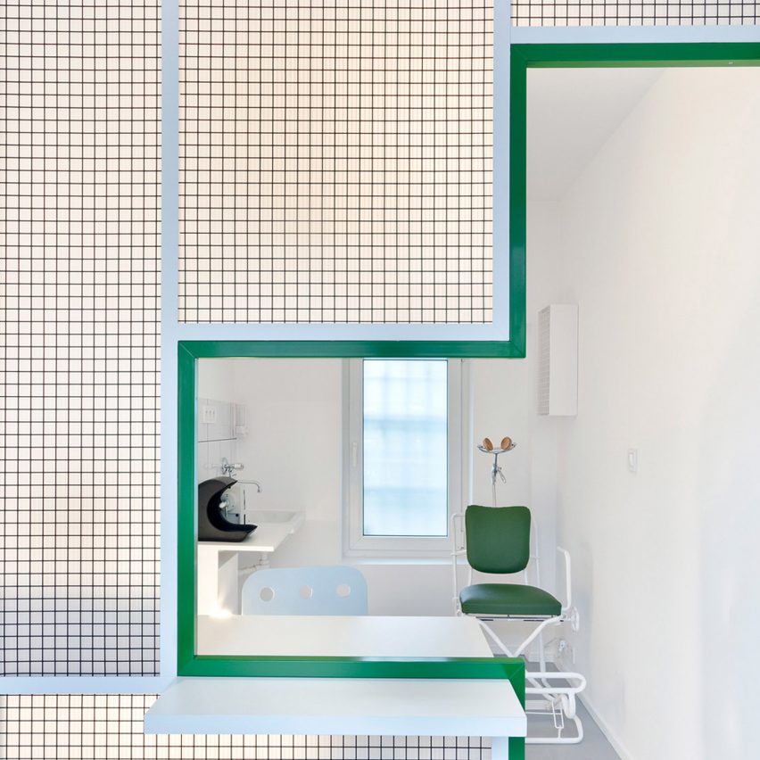
The pick-up window inside this Polish denture clinic designed by Adam Wiercinski is outlined with green lines that form the shape of medical services cross.
Located inside an old tenement building in Poznan, the 10-square-metre space is modelled after the city's small kiosk shops. Steel mesh separates the waiting room and shopfront from the tiny consultation room situated in the rear of the space.
Find out more about Dent Protetyka ›
The Urban Dentist, Germany, Studio Karhard
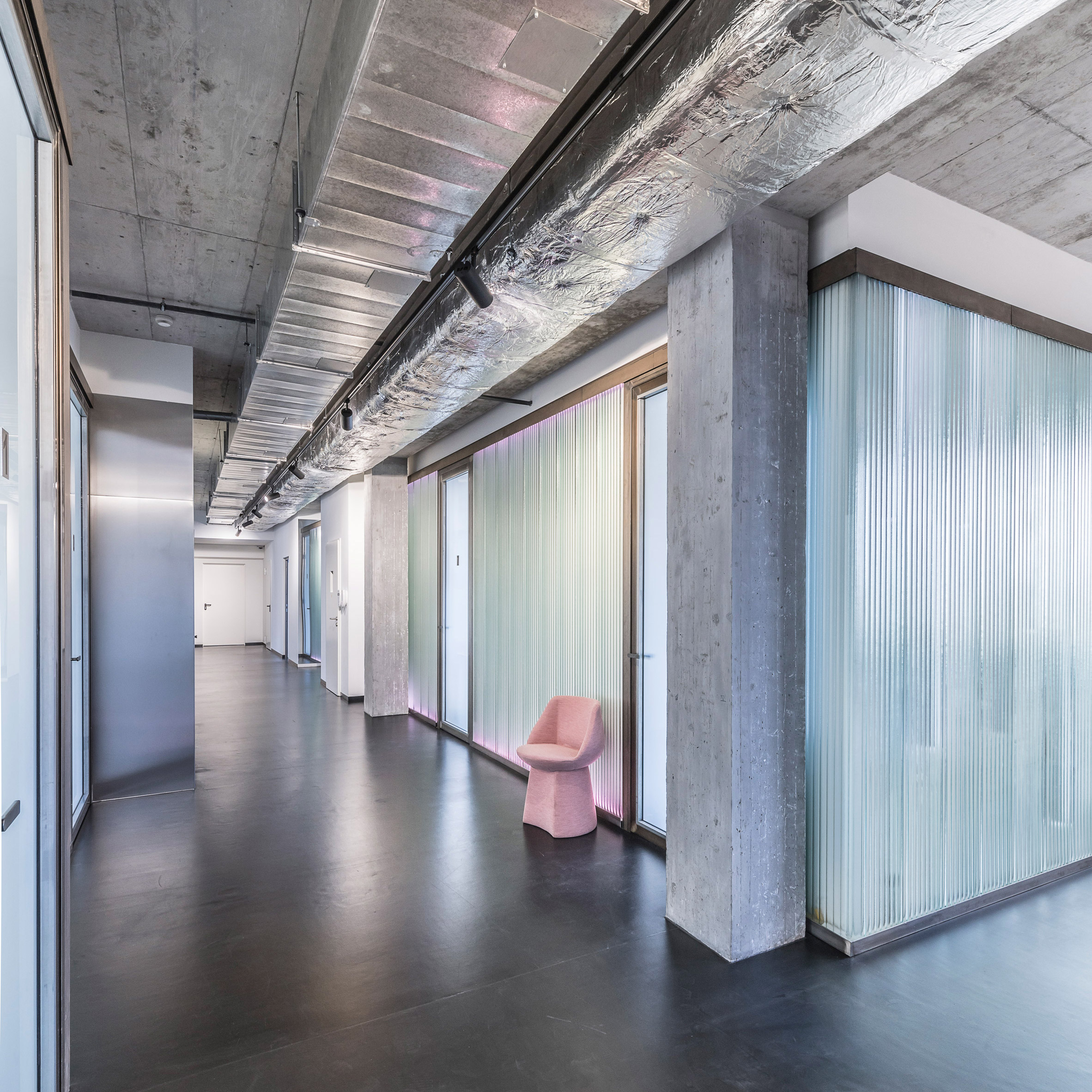
Studio Karhard designed The Urban Dentist in Berlin to mimic the flashy interiors of Berghain, the electronica nightclub in the German city also completed by the firm.
LED lights border the edges of the fluted glass walls, while in the treatment rooms the sink and supplies are stored inside a pink cabinet that is topped with a colourful speckled counter.
Find out more about The Urban Dentist ›
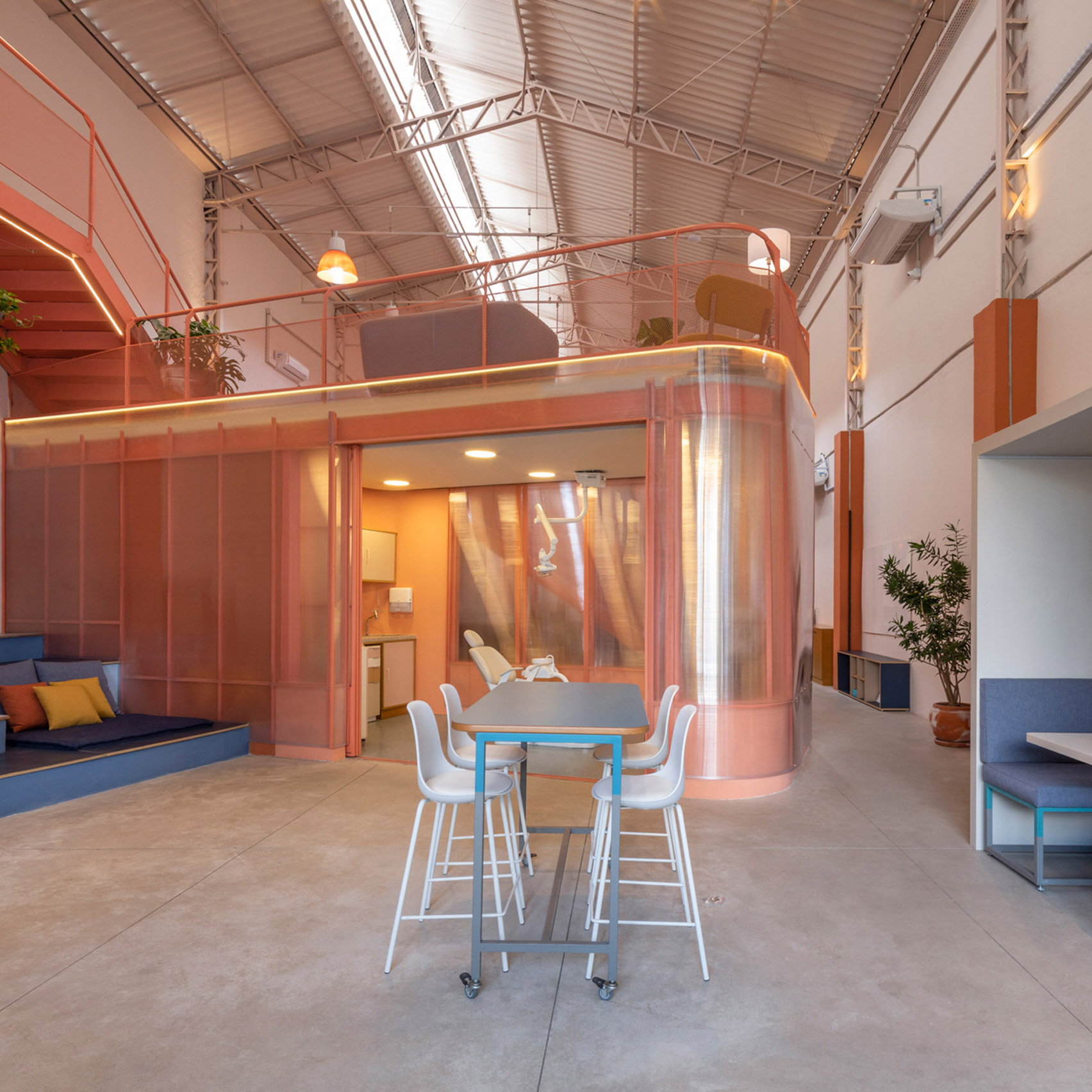
Brazilian studio SuperLimão inserted a pink polycarbonate volume inside Sou Smile, a dental health treatment centre in São Paulo that manufactures dental appliances.
The rounded structure houses a consultation room, while the rest of the converted warehouse building is outfitted with open-plan workstations and a laboratory for manufacturing dental appliances.
Find out more about Sou Smile ›
Waiting room, China, RIGI Design
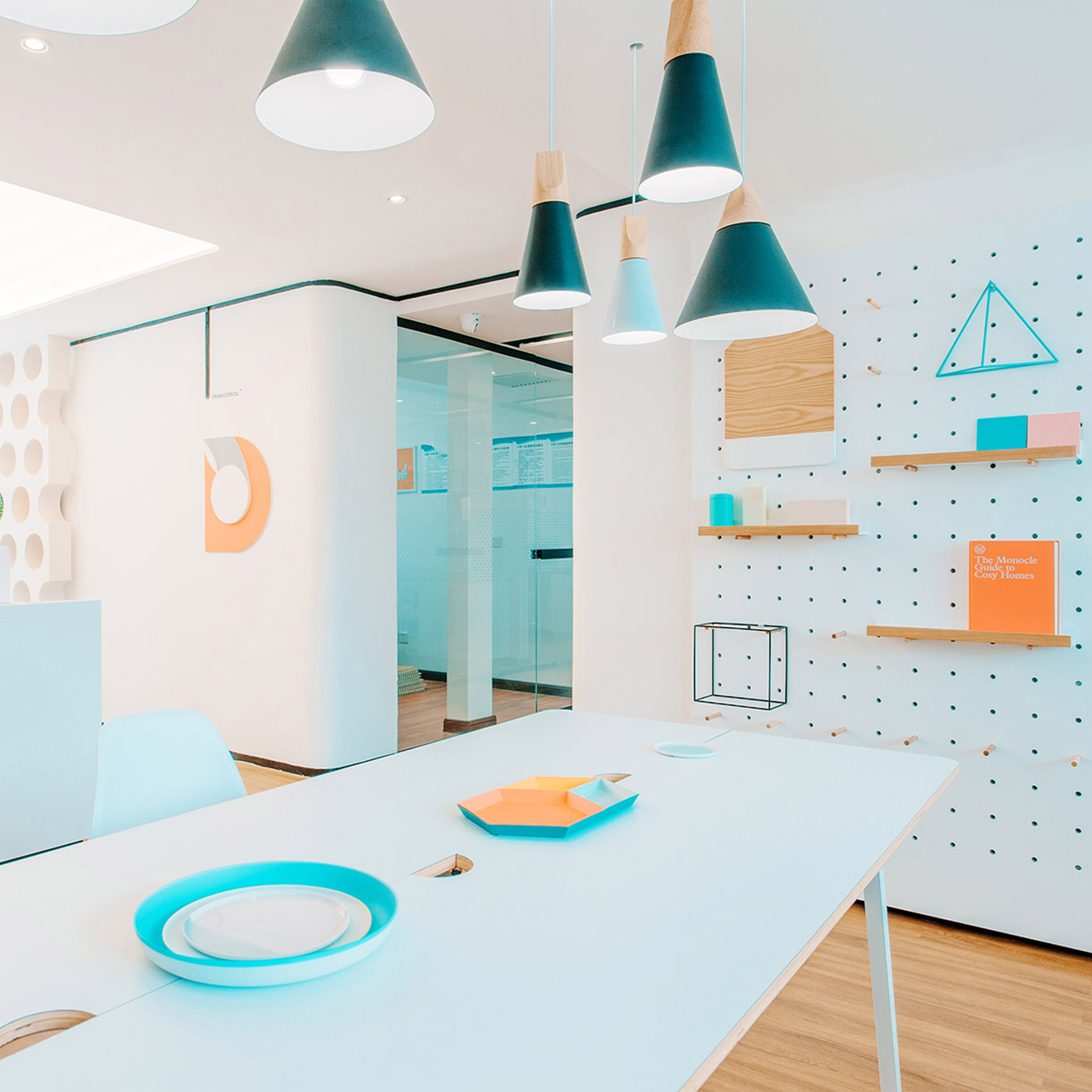
A rectangular "dining" table and play area for children feature in this colourful clinic in Tianjin, China designed by RIGI Design.
The play space is framed in the shape of a house and decorated with animal-shaped furnishings. Treatment rooms are located along a corridor fronted with glass walls. Large black digits painted on the hardwood floor designate the room number.
Find out more about the waiting room ›
Ortho Wijchen, Netherlands, Studio Prototype
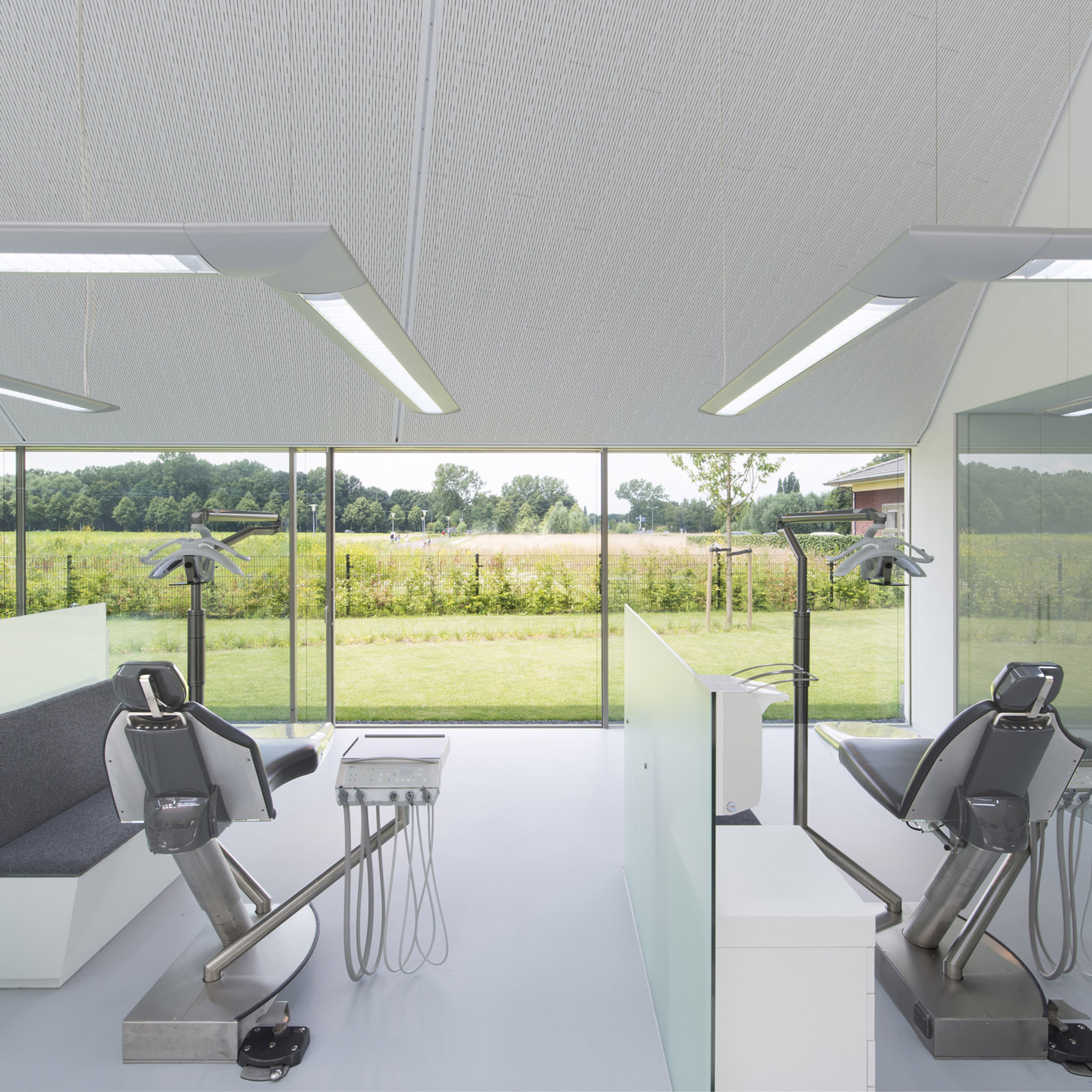
For this office in Wichen, Netherlands has inserted the treatment areas between translucent glass partitions. To ease patient's comfort each the of chairs faces a wall of windows that provide a view of a grassy pastoral landscape.
"The open setup of the plan and the large panoramic view towards the garden create a light and spacious place in which the patient feels comfortable," the studio said.
Find out more about the Ortho Wijchen ›
Go Orthodontistes, Canada, Natasha Thorpe Design
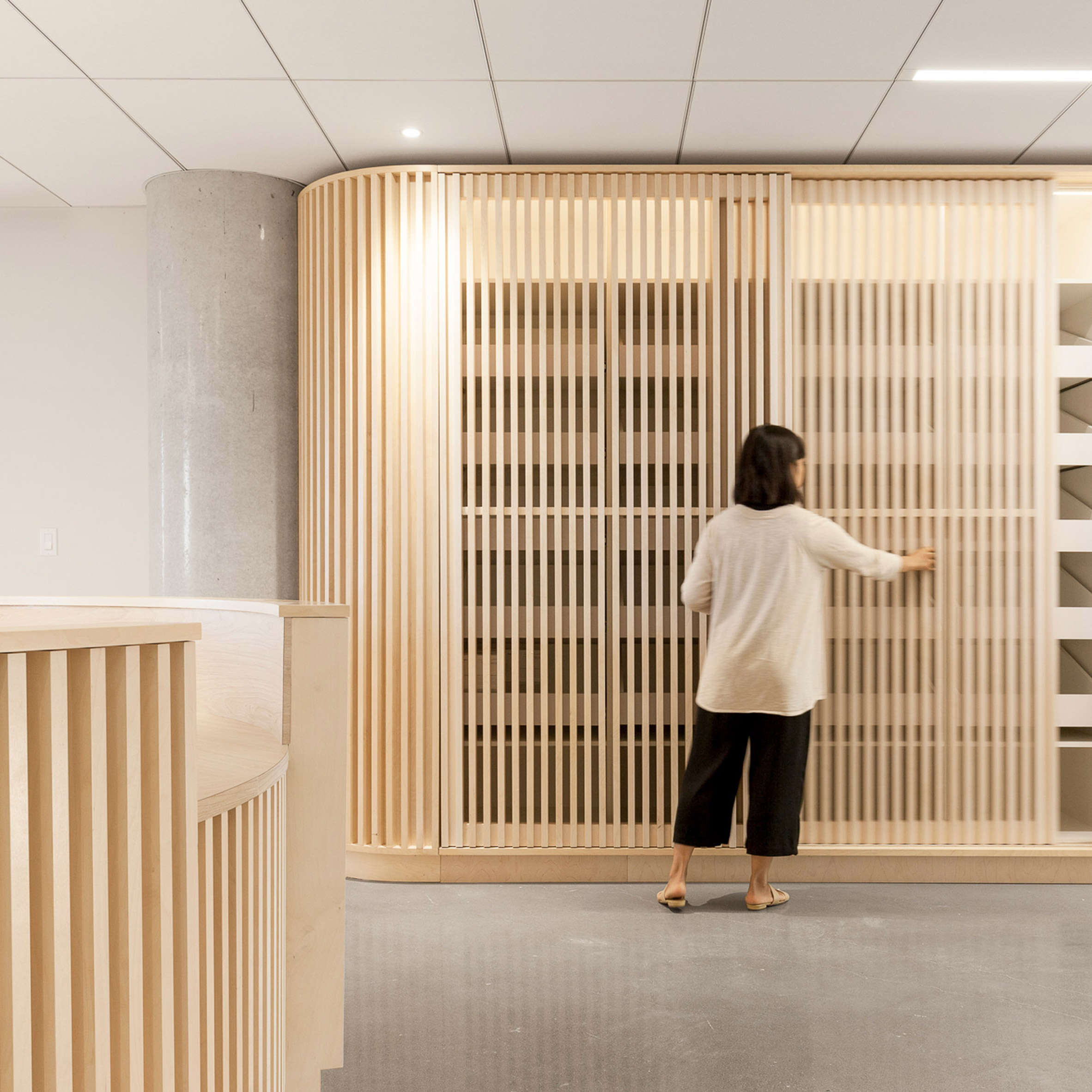
Slatted timber panels clad the walls and reception desk in this orthodontist practice in Quebec, Canada designed by Natasha Thorpe Design.
The boards of Douglas fir wood cover storage cabinets and form shelves in the office. In the consultation room there are several dental chairs and a row of black cabinets. Translucent glass spans across the laboratory and instrument sterilisation room concealing its interiors from the outside.
Find out more about the Go Orthodontistes ›
Impress, Spain, Raúl Sanchez Architects
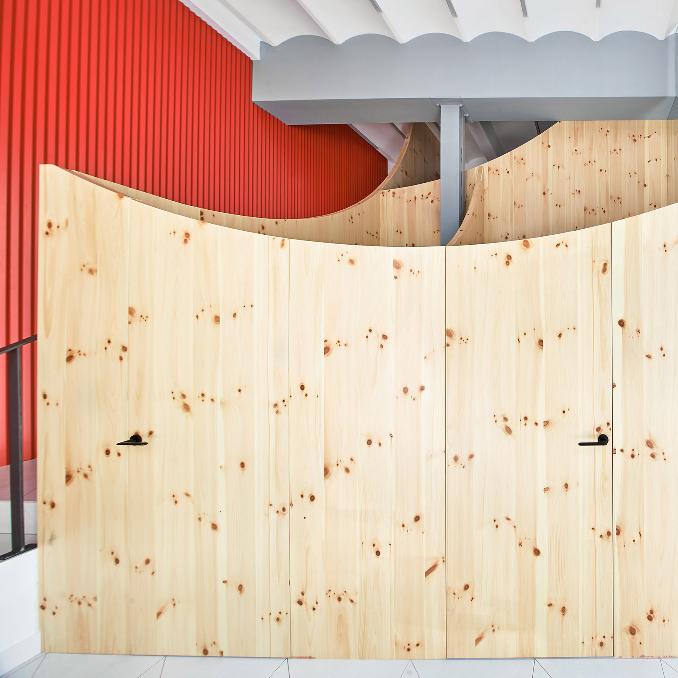
The curve of a smile informed the design for Impress, a dental clinic in Barcelona designed by Raúl Sanchez Architects.
Large rounded boards crafted using pine wood form partitions in the office. The studio chose the material to add warmth to the typically white and sterile environment. Red, blue and grey accents add a playful element to the design and tie in with the company's branding.
Find out more about the Impress ›
The post Seven dental clinics designed to take the pain out of check ups appeared first on Dezeen.
from Dezeen https://ift.tt/3ltdS4O

No comments:
Post a Comment