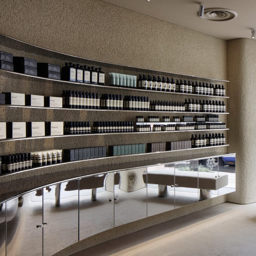
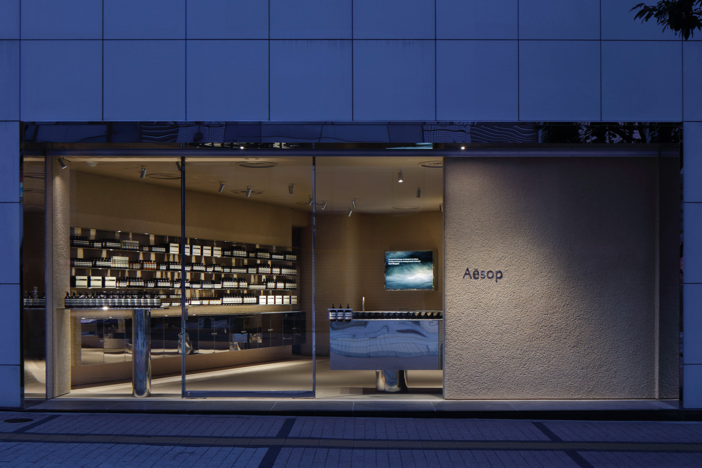
Coarse plaster walls offset glinting stainless-steel display fixtures in this restrained store that architecture studio Case-Real has designed for Aesop in Shinjuku, Tokyo.
The Aesop store occupies a glass-fronted retail unit in Shinjuku, a buzzing, tourist-heavy ward of Tokyo populated with bars, eateries and neon-lit billboards.
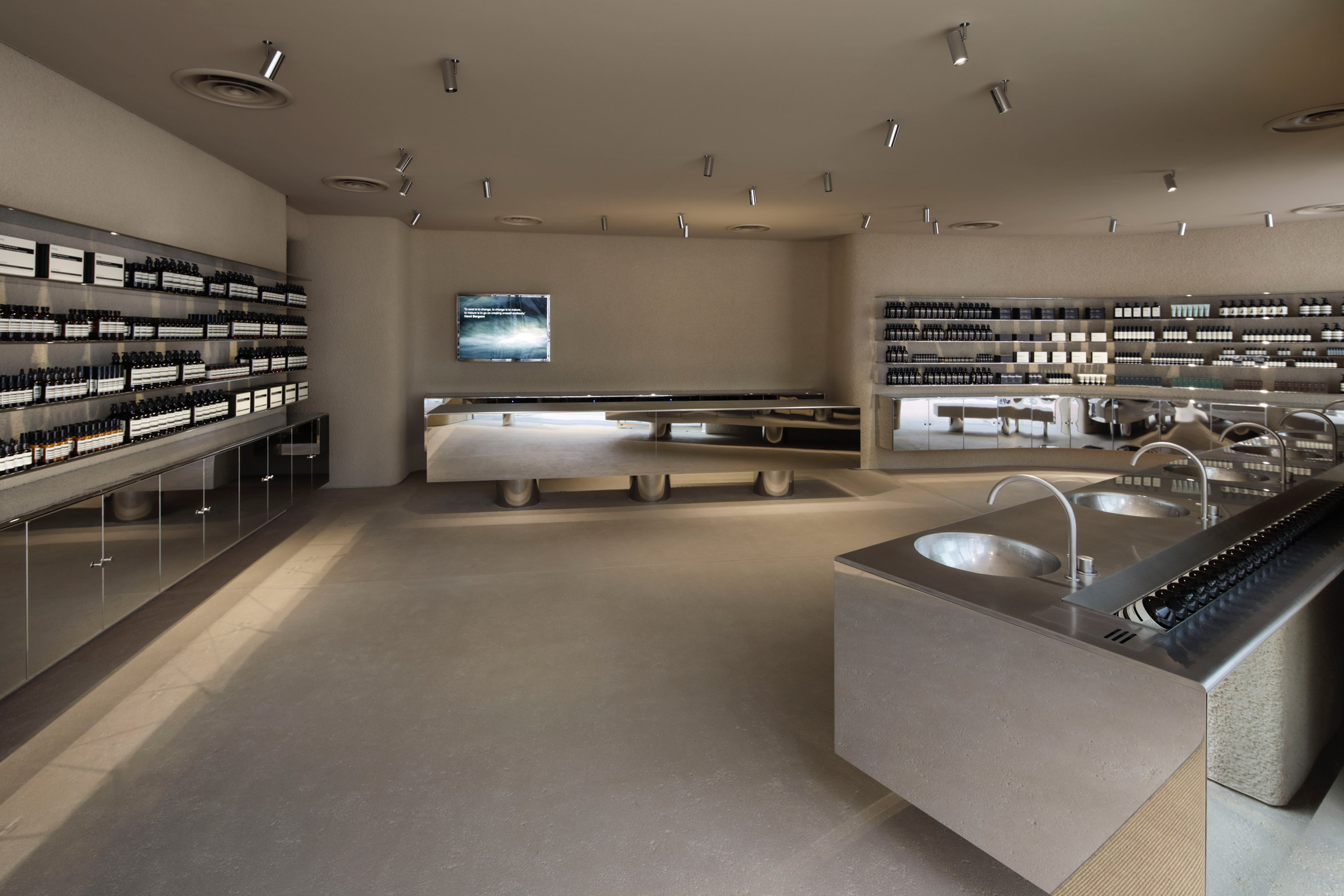
When it came to designing the store's interiors, Case-Real wanted to capture both what it describes as a sense of "artificial chaos" that permeates Shinjuku and the natural quality of Aesop's skincare products.
The locally based studio decided to use two contrasting materials that it felt reflected the dichotomy of natural and artificial – plaster and steel.
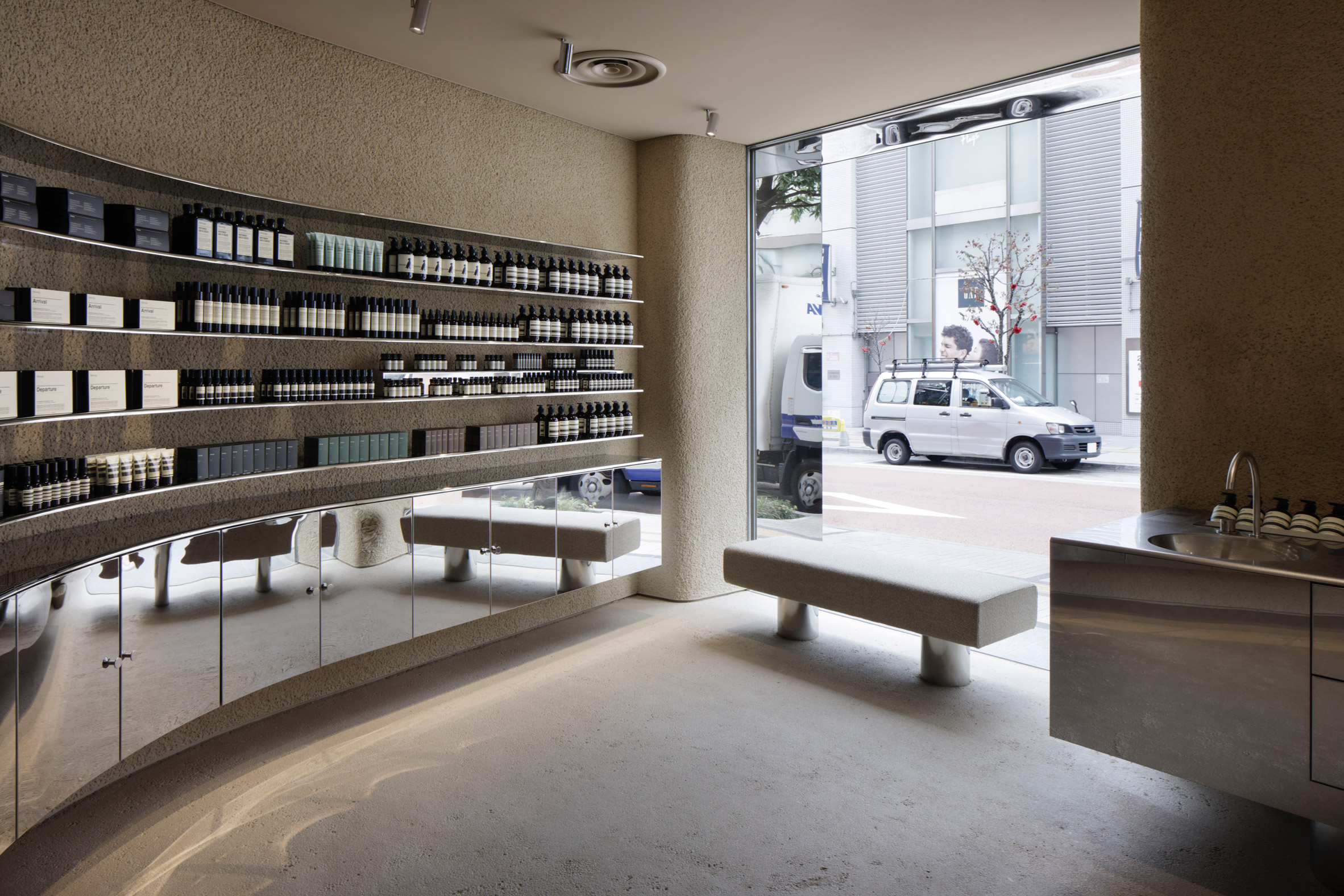
All of the store's gently curving walls are coated with coarse beige plaster, which leaves behind a textured surface finish.
The same plaster has been applied to a section of the store's facade, creating a simple backdrop for Aesop's logo.
Paint in the same beige hue has been washed across the ceiling and floor.
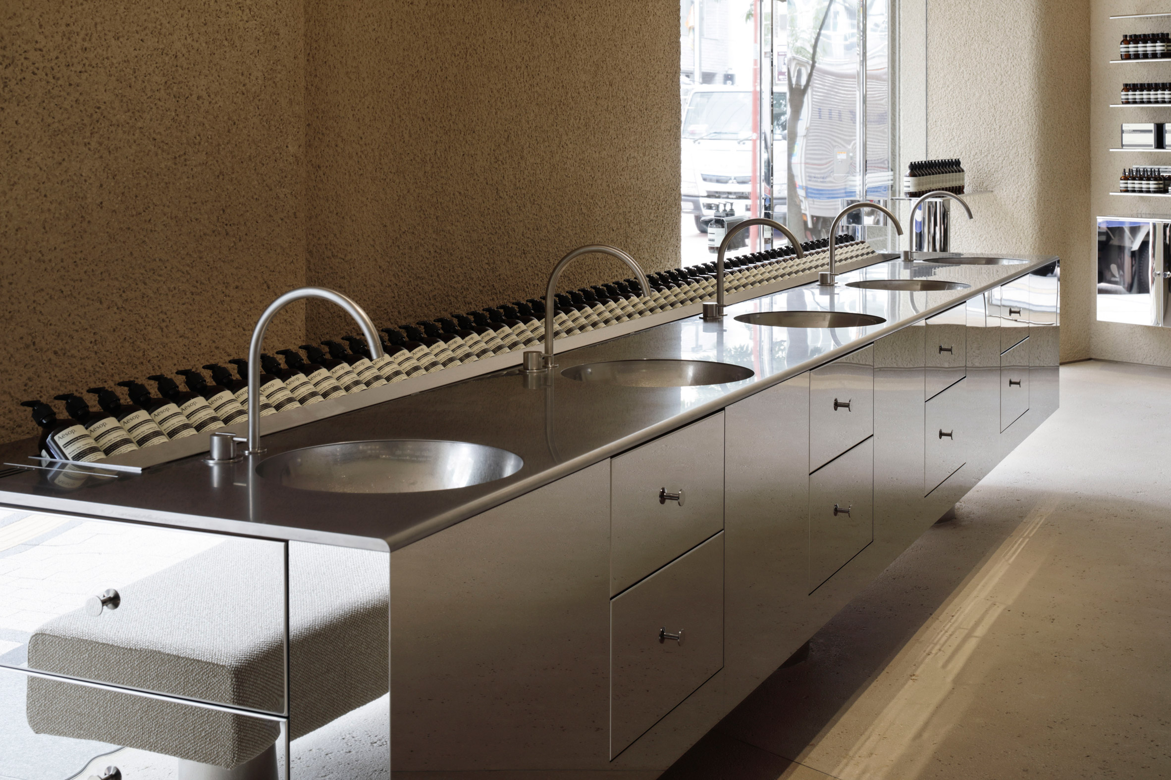
Shiny stainless steel has then been used to craft a series of lengthy display shelves that bend in line with the walls and several low-lying cabinets where extra stock can be hidden away, complete with steel handles.
The metal has additionally been used to make the store's service desk, as well as a long counter inbuilt with round washbasins where customers are invited to test out products or observe demonstrations from staff.
A border of steel has also been created around the entrance doorway.
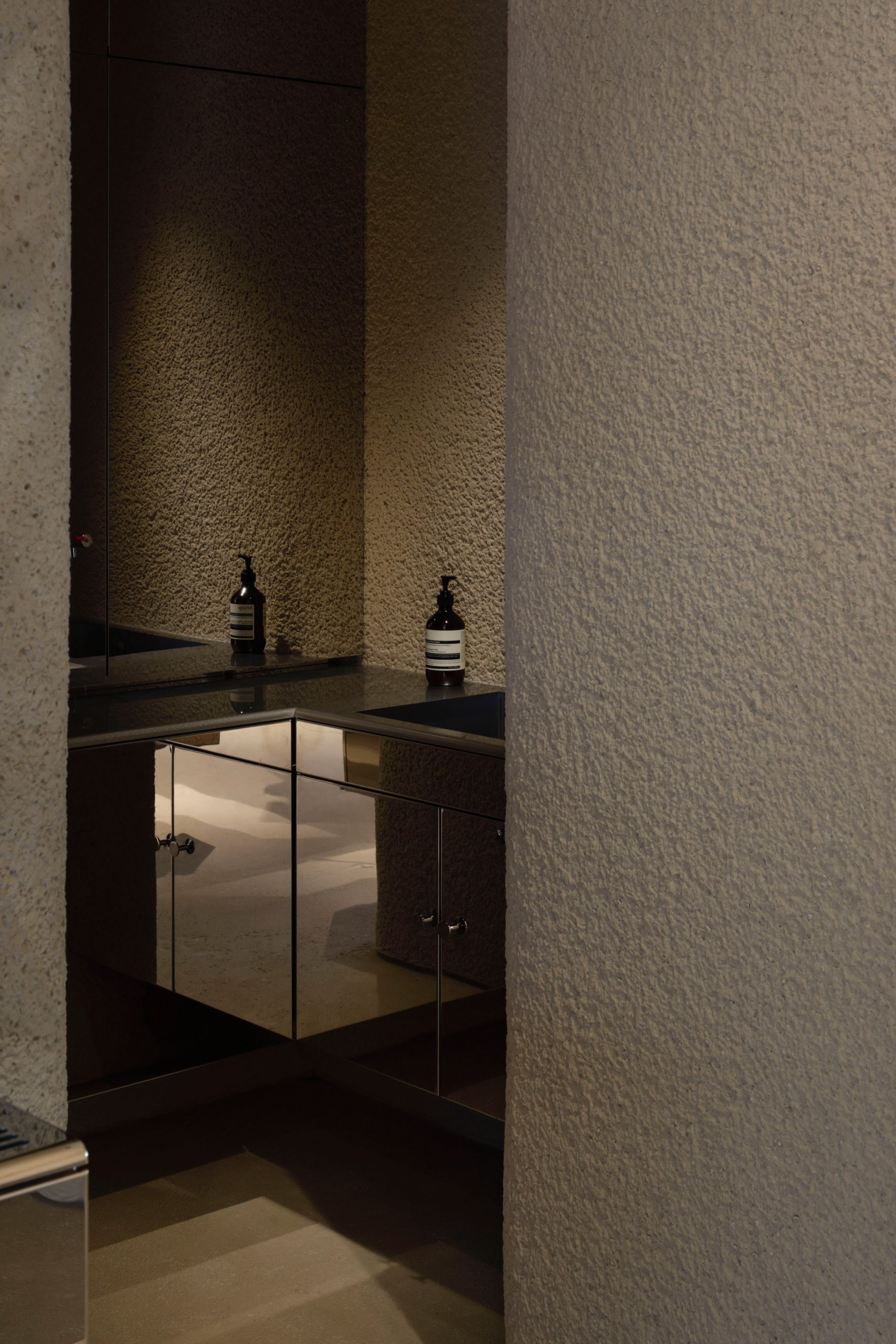
The only other feature that Case-Real has incorporated in the store is a chunky plaster bench seat supported by cylindrical steel legs.
It has been placed directly in front of a window that looks onto the busy streets of Shinjuku, allowing customers to quietly sit and people-watch.
Case-Real was established in the year 2000 and is led by designer Koichi Futatsumata. Four years ago, the studio designed the interiors of another Aesop store in the Japanese city of Sapporo, covering its walls with locally-sourced volcanic stone.
The studio's Aesop Shinjuku store is shortlisted in the small retail interior category of this year's Dezeen Awards. It will compete against projects such as the Pinocchio, a tiny 4.5-metre-wide bakery in Yokohama, and the Glossier pop-up in Seattle, where products are displayed amongst grassy mounds covered in wildflowers.
Photography is by Daisuke Shima.
Project credits:
Design: Koichi Futatusmata, Yuki Onita (Case-Real)
Construction: &S
Lighting plan: BRANCH lighting design (Tatsuki Nakamura)
The post Case-Real contrasts plaster and steel inside Aesop store in Shinjuku appeared first on Dezeen.
from Dezeen https://ift.tt/2Hh2MjI
No comments:
Post a Comment