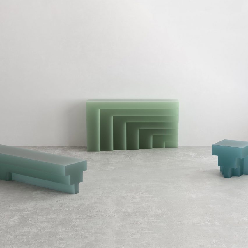
Geometric blocks of resin form this four-piece furniture collection by Niko Koronis, who took design cues from the work of Italian architect Carlo Scarpa.
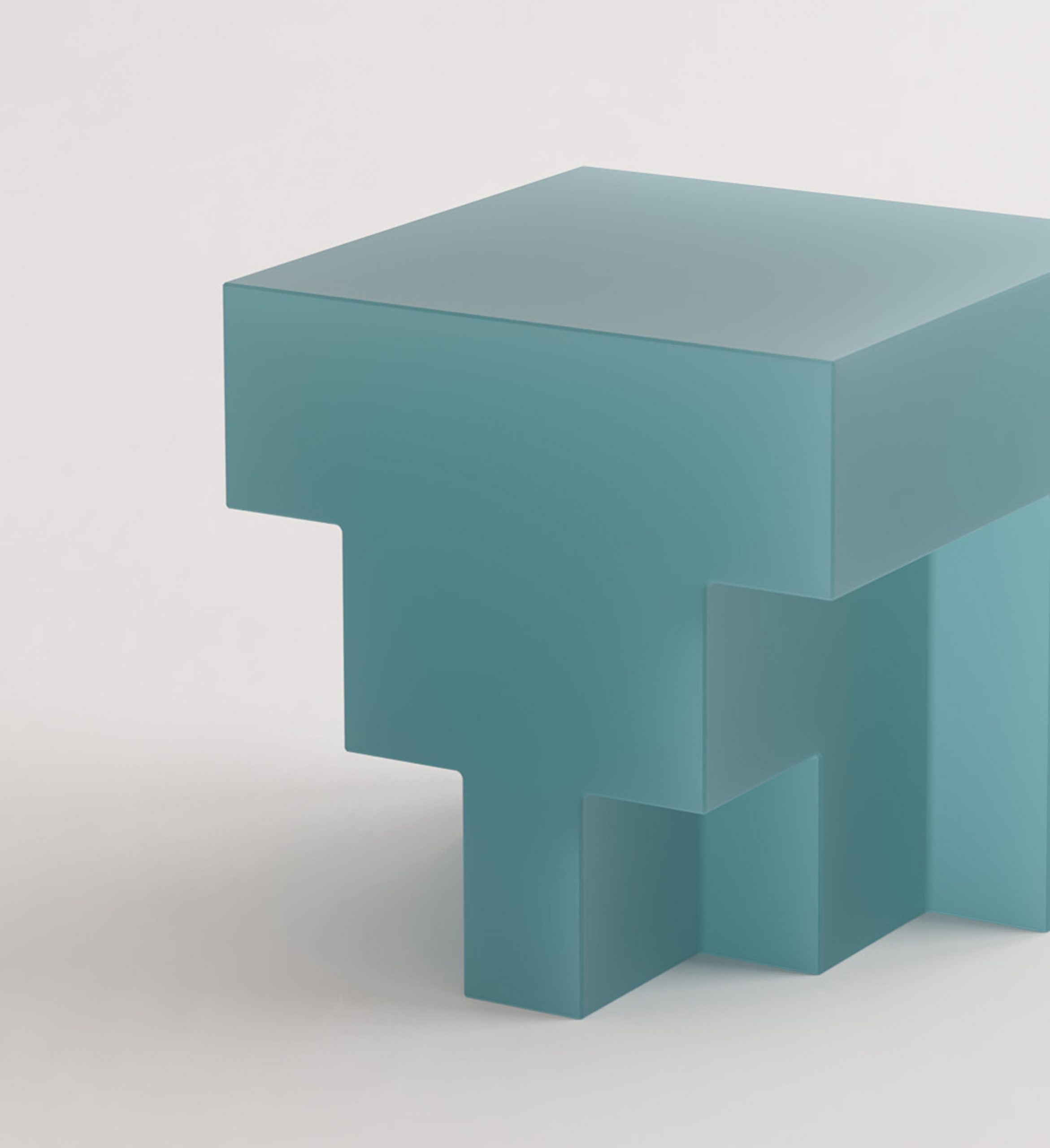
The family of furniture, called the G Collection, comprises the GBC bench, the GRT coffee table, the GSD console table and the GST stool that also acts as a side table.
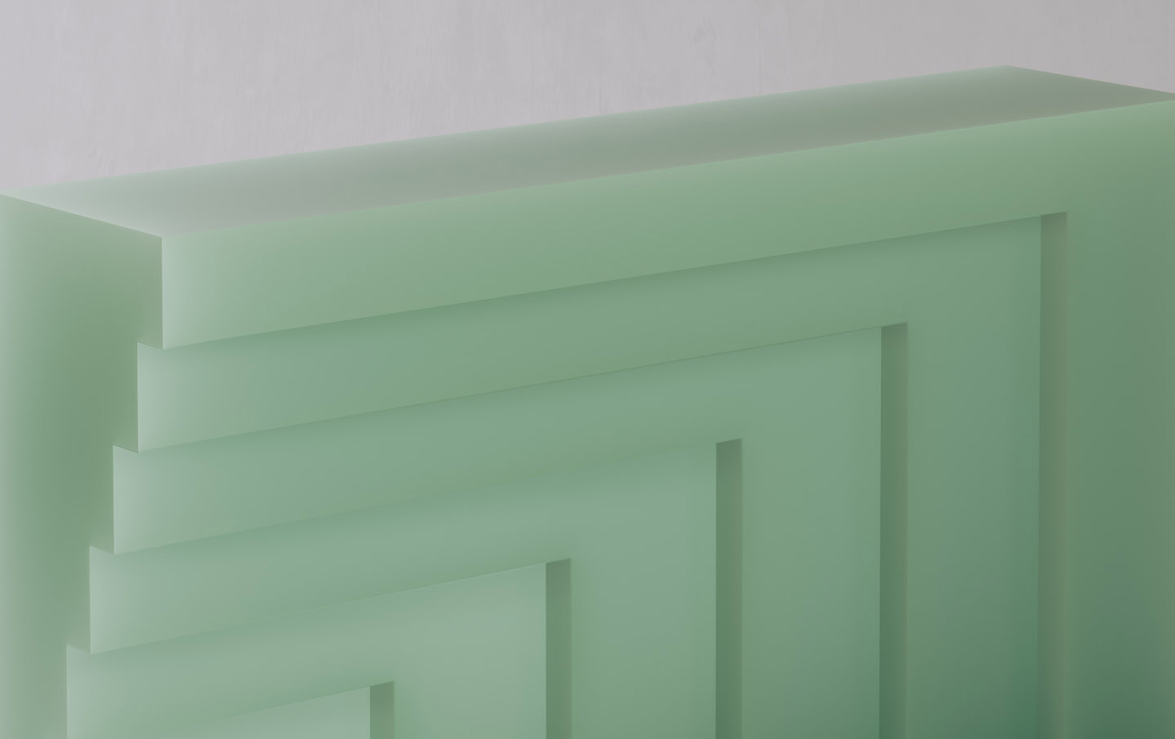
Each custom design was inspired by modernist architect Scarpa, whose work was heavily informed by both Venetian and Japanese landscapes and culture, and often featured sharp lines and graphic shapes.
With this in mind, Koronis designed each stepped furniture item to look like "small scale architectural entities", characterised by an emphasis on linear geometries.
"One has to love Scarpa, for many different reasons," Koronis told Dezeen.
"Apart from his charismatic personality, his unique formal and material aesthetic that stood in contrast to his contemporaries' loud and artificial early postmodernism is something that has been a constant inspiration for many architects and designers alike."
"If one considers his most famous work, the Brion cemetery, it is easy to understand his adoration for the work of Frank Lloyd Wright, Josef Albers, Joseff Hoffmann, and his fascination with elementary and sometimes repetitive geometrical patterns, which resulted in almost meditative experiences," he continued.
"Furthermore, [the G collection was inspired by] his approach to materials, and how these related to the forms he created, as well as the elegant rhythm in his work and the beautifully crafted relationships between negative and positive volumes."
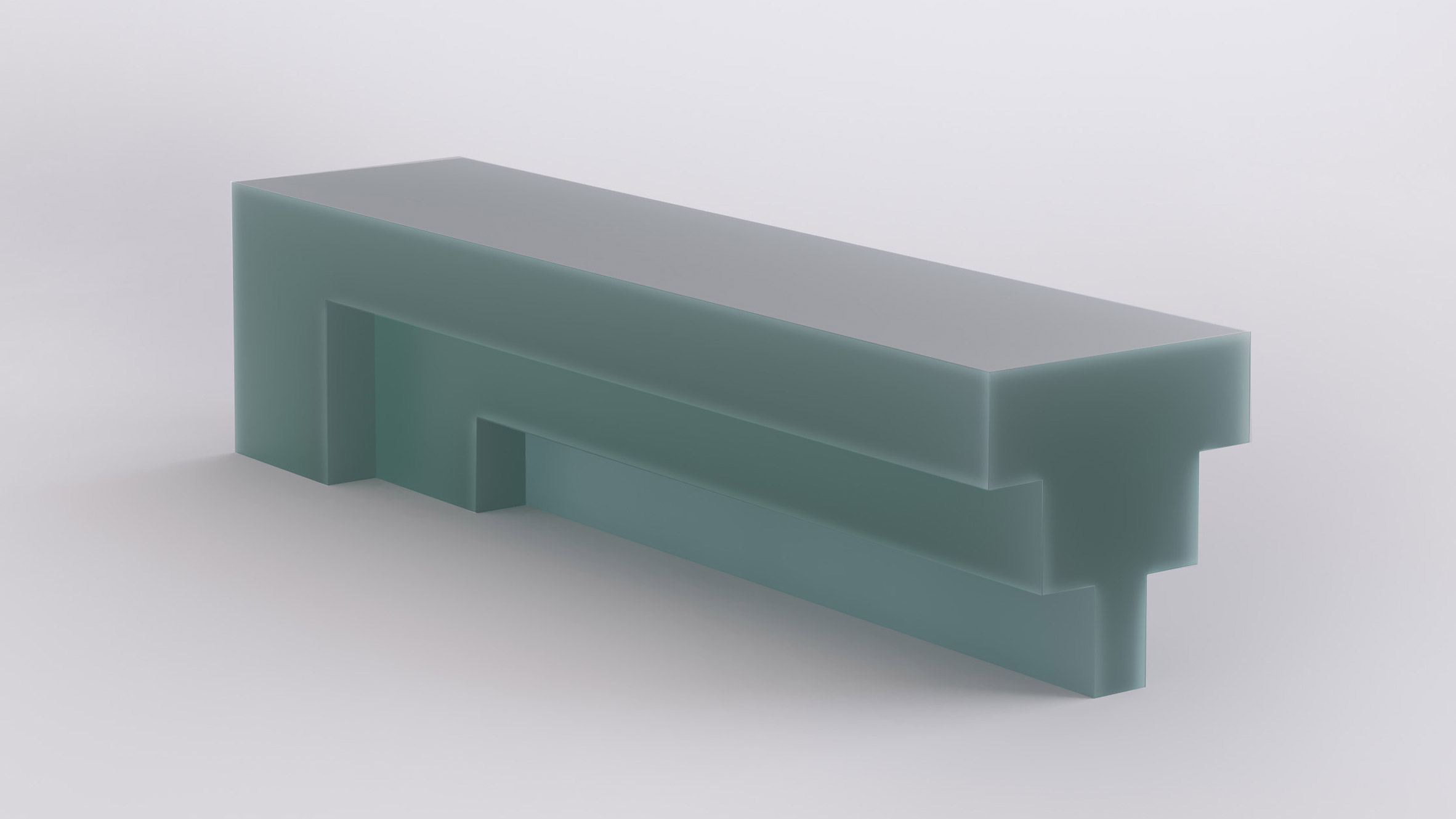
Koronis made each of the translucent furniture pieces from resin in hues of blue and green, granting them a frosty, soap-like appearance.
According to the designer, resin is "a somewhat misunderstood material that is experiencing a revival these days".
The resin used for the collection was industrially produced via a chemical process, as resin usually is, but Koronis wanted to make the material seem as organic as possible.
He carried out multiple tests with the material to test its properties, as well as its limitations and advantages.
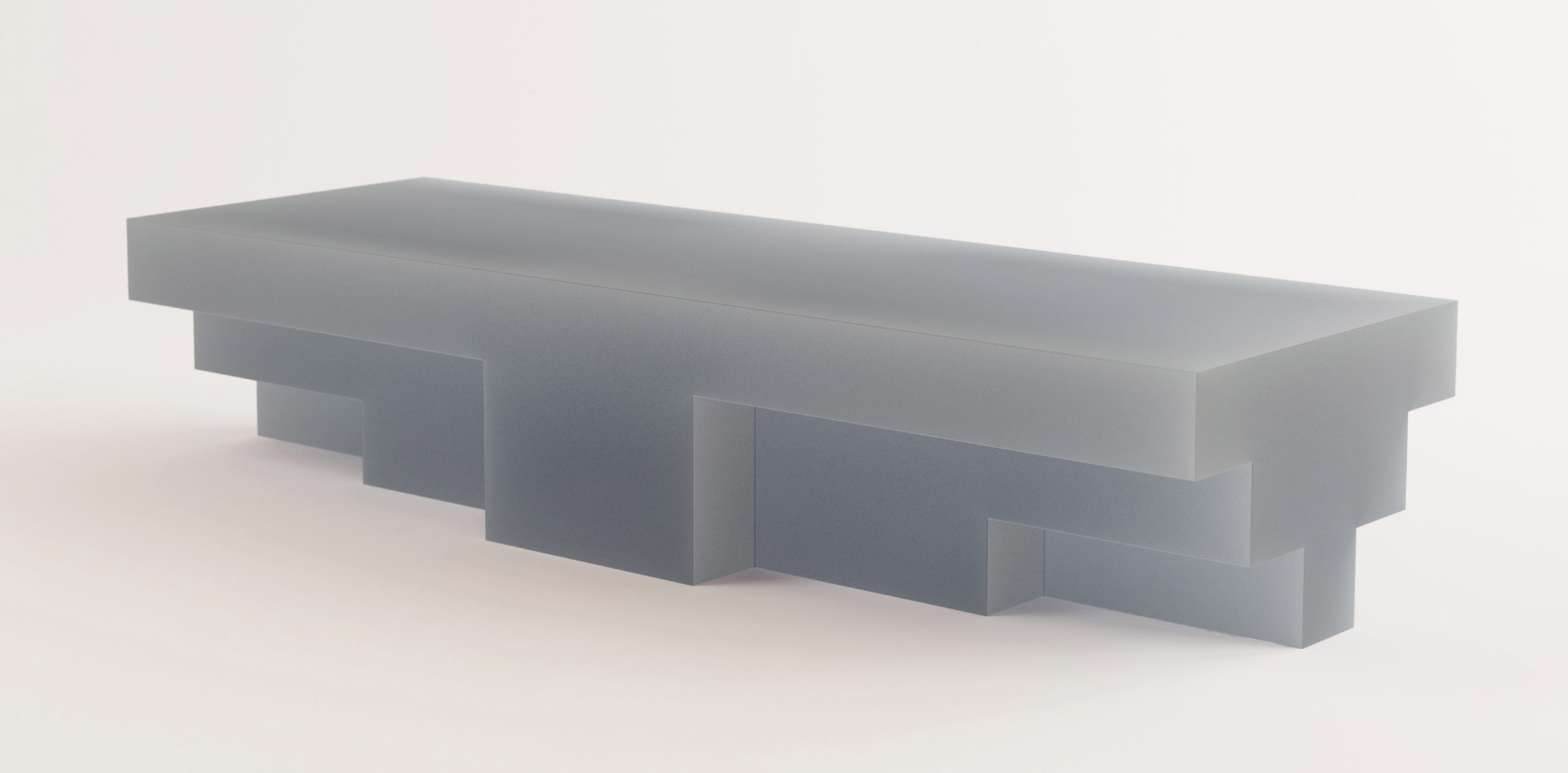
"All boundaries between solidity and fluidity, opacity and translucency, lightness and robustness, seem to be blurred," the designer told Dezeen.
"The crisp and sharp forms combined with varying thicknesses render these objects highly reactive under different lighting conditions, giving this artificial material an almost natural feel."
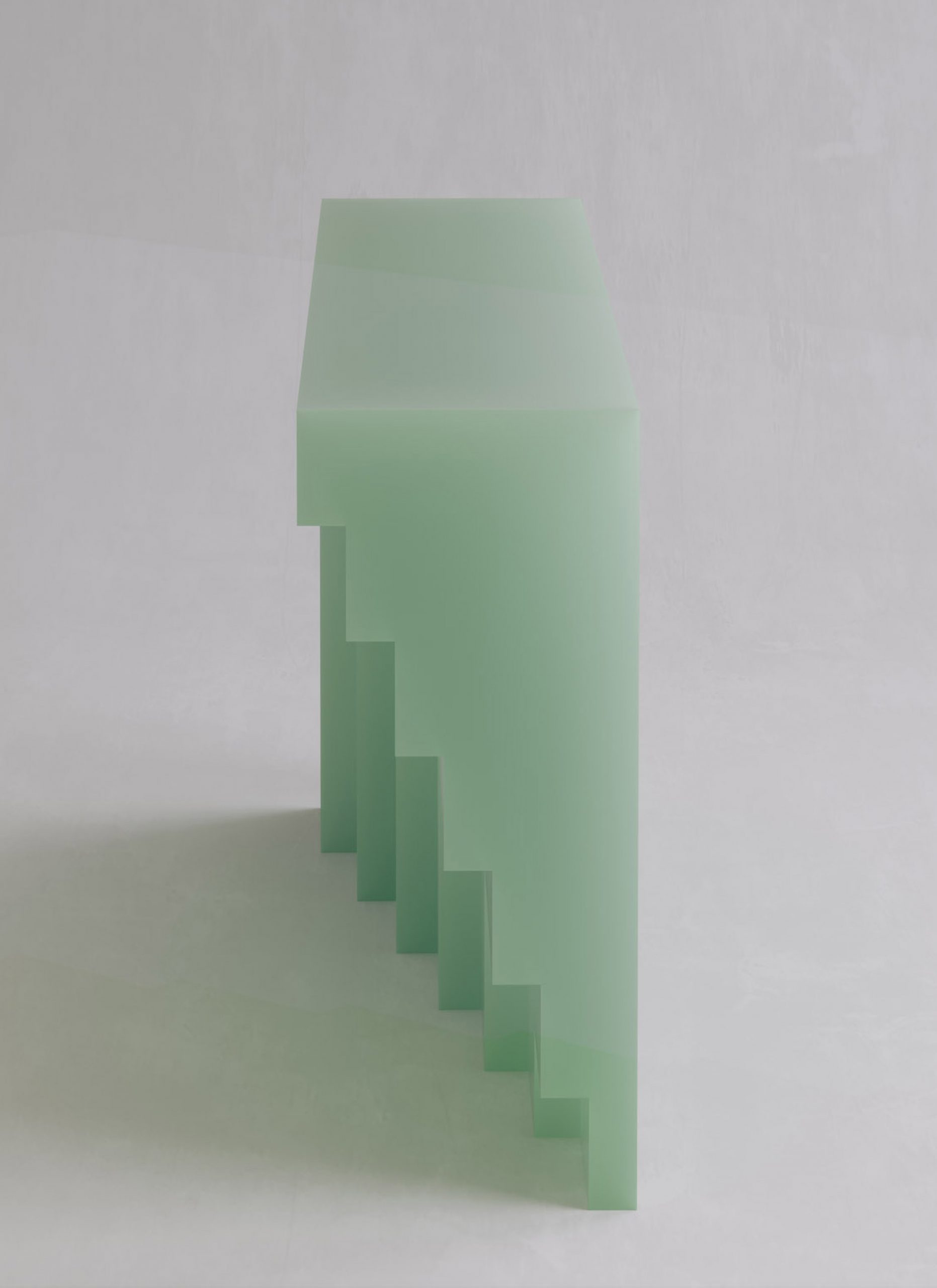
As Koronis told Dezeen, the material choice of resin, which he describes as "very interesting yet technically challenging" to work with, made the hand-made production process long and delicate.
The console, for example, required more than 400 litres of resin, which had to be casted in layers of a certain thickness over a specific period of time.
"Even the smallest mistake can have a negative effect and eventually force us to discard the whole piece and start from scratch," he explained.
"Luckily, we found an amazing artisan in Holland and after several months of trials and numerous prototypes, we managed to perfect our production process."
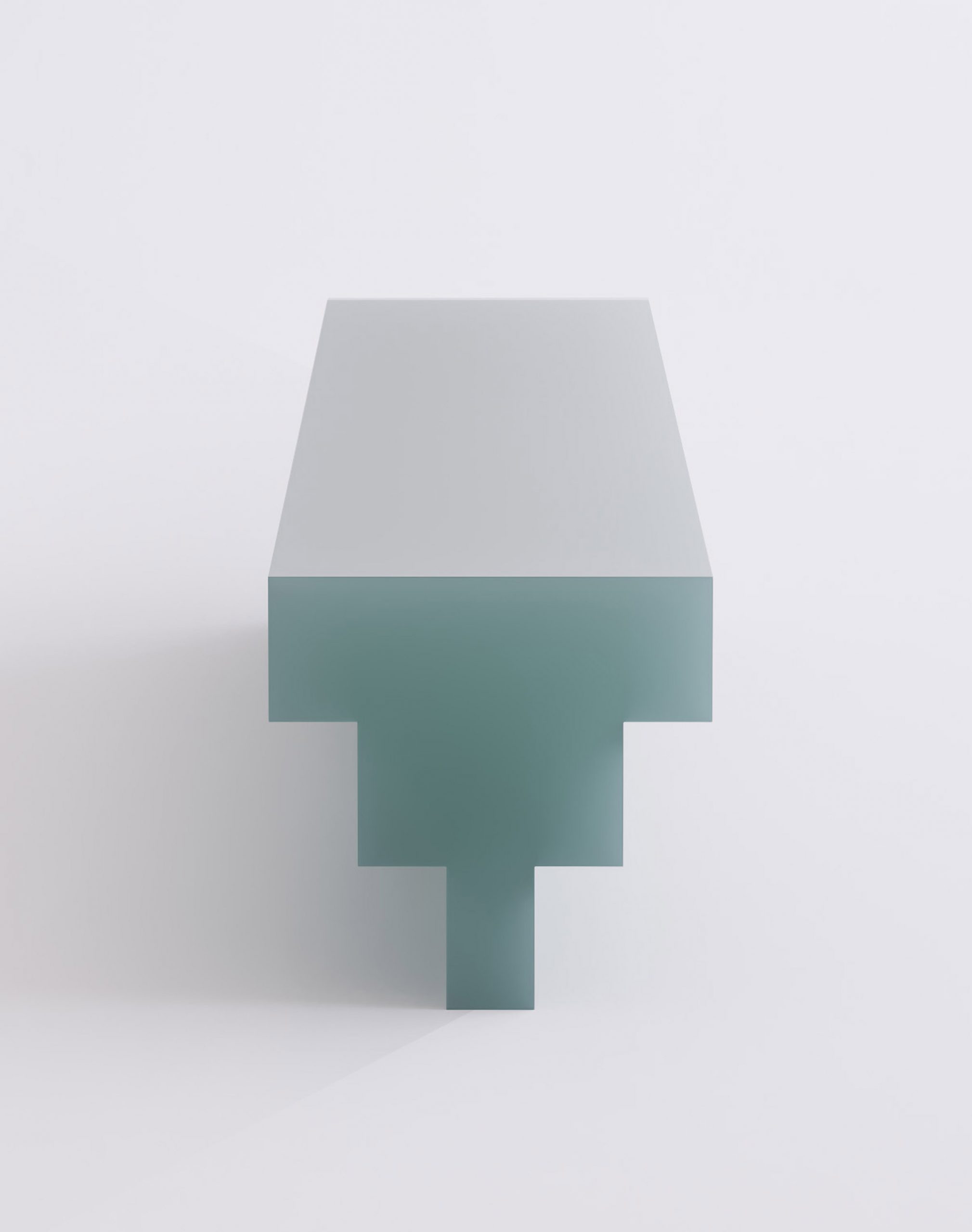
All of the G collection pieces can be made to measure with colours on request. The designs are on show at the Studio Twentyseven gallery in New York.
Other designers experimenting with resin include Marcin Rusak, who created a set of furniture items from a milky white bio-resin with flower buds, stems, petals and leaves inset into the surfaces.
Brussels-based Cobra Studios also made its first furniture collection from resin. The series, called Solids, features a series of geometric tables with chunky legs made from a glossy version of the material.
Like Koronis, Cobra Studios also took cues from architectural structures when creating the Solids collection, basing each piece on a significant building or figure from the Greco-Roman world.
The post Niko Koronis' resin furniture series looks like carved blocks of soap appeared first on Dezeen.
from Dezeen https://ift.tt/3jp3olw
No comments:
Post a Comment