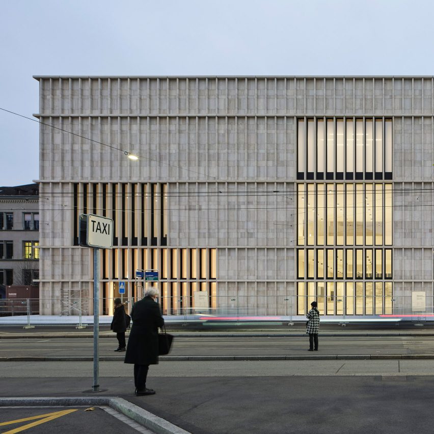
Jura limestone wraps around the concrete interiors of David Chipperfield Architects' long-awaited extension for the Kunsthaus Zurich museum in Switzerland.
Located in Heimplatz square in the old town of Zurich, the extension provides more gallery space for Kunsthaus Zurich – making it the largest art museum in the country.
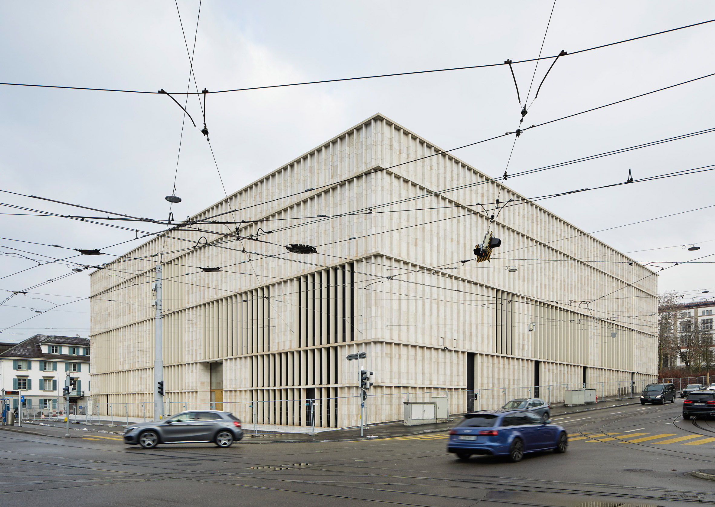
The new building was designed by David Chipperfield Architects' Berlin studio to resemble a freestanding structure, but it is directly connected to the museum's main Moser building via an underground passage.
Its monolithic form takes its cues from the city's 19th-century cantonal school at the north of the site and is intended to provide the square with a "clear urban edge".
"The project for the extension of Kunsthaus Zurich brings together the fundamental concerns of museum design with the responsibilities created by both the urban context and the relationship with the existing museum," explained studio founder David Chipperfield.
"We hope that the quality of the architecture, its spatial, formal and material resolution will guarantee that the extension, like Karl Moser's original building, becomes an integral part of the physical, social and cultural infrastructure of the city of Zurich."
David Chipperfield Architects first revealed the design for the Kunsthaus Zurich extension in 2009, having won a competition to design it in 2008.
It will open to the public in 2021, joining the museum's 1958 Pfister building, the 1976 Müller building and the original Moser building to which it is connected.
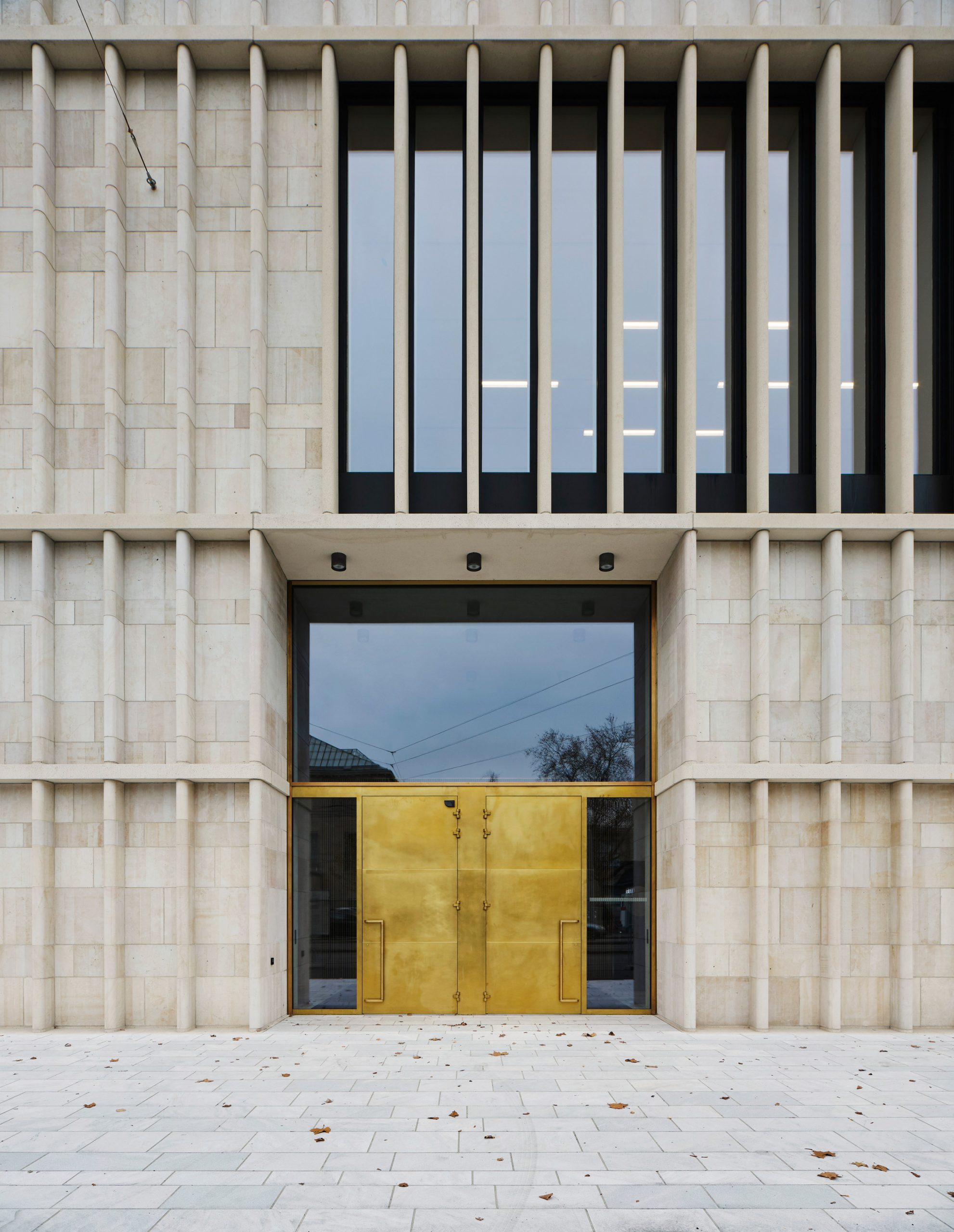
Jura limestone was chosen for the extension's facade to echo traditional stone public buildings in the area – including the Moser building.
The stone is arranged in vertical fins placed in regular intervals around the building, disrupted only around the window areas where the slats are made from cast stone – a type of precast concrete designed to resemble natural-cut stone.
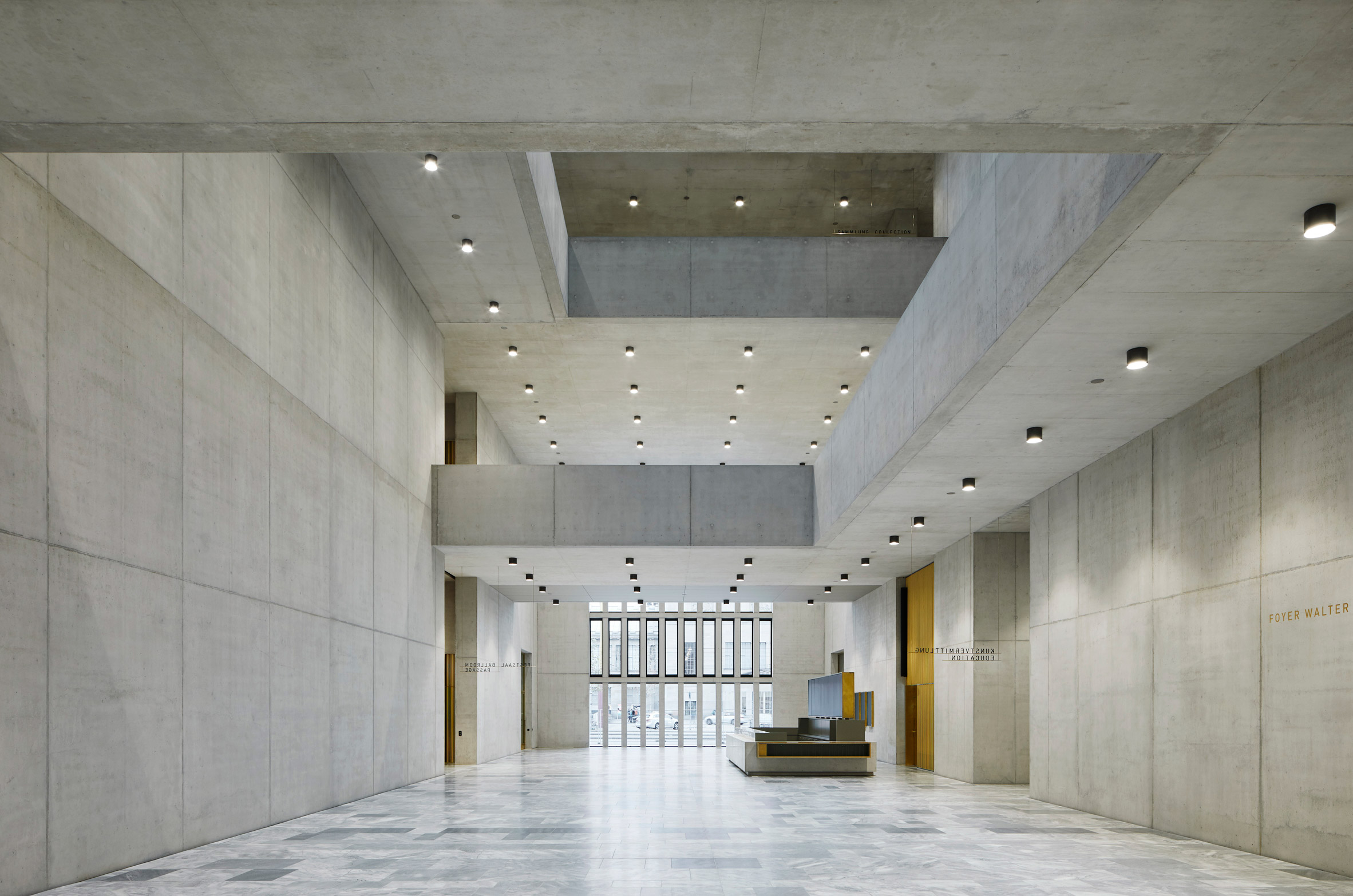
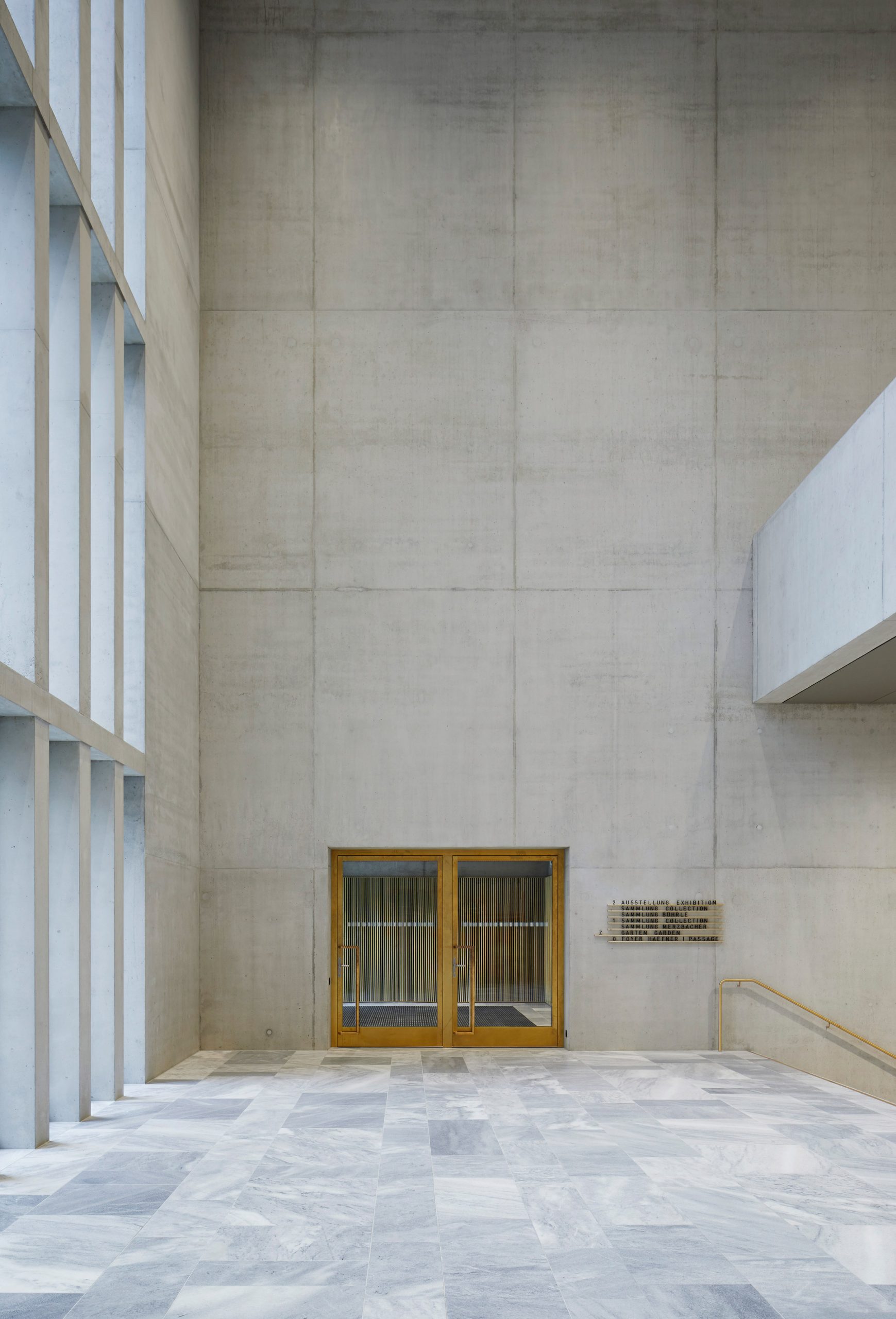
Inside, visitors are welcomed by a large foyer on the ground floor that spans the full length of the building and is accessible from three entrances.
Its length forms a link between the Heimplatz to the south-west of the site with a new park-like area to the north, named the Garden of Art, which doubles as an outdoor exhibition space.
Around the edges of the entrance area are all of the extension's public functions, such as its cafe and bar, an events hall, shop and education services.
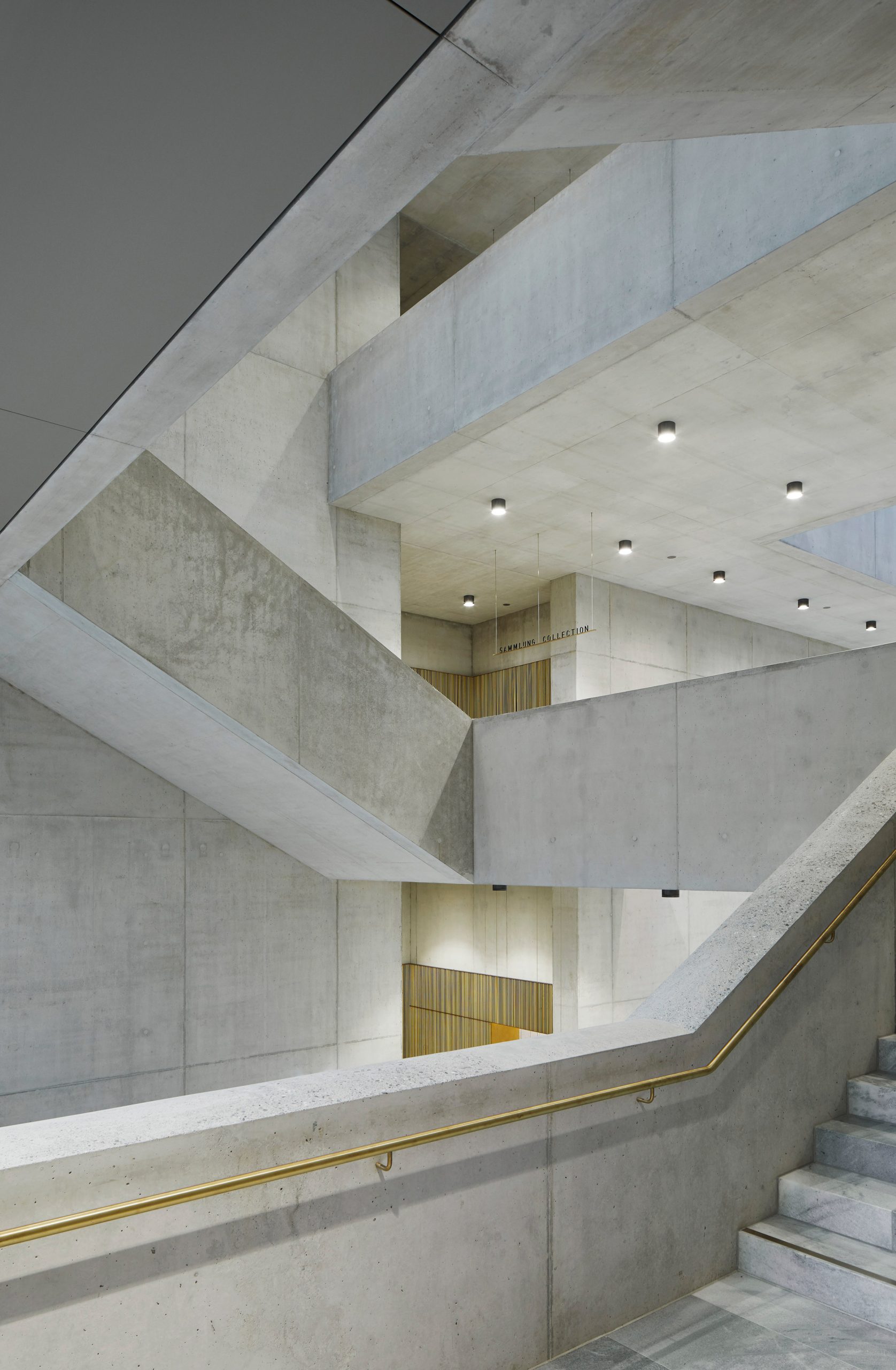
There is also a large open staircase, which David Chipperfield Architects designed as the focal point of the building. This provides access to the galleries on the two upper floors and is hoped to help orientate visitors.
The permeable layout of the ground floor helps to embed the museum within its site and establishes it as an accessible facility within the city.
"Our vision for the new Kunsthaus Zurich was to create an accessible and social place to enjoy art, rather than an exclusive temple for art – a place to go for everyone," said project architect Jan Parth.
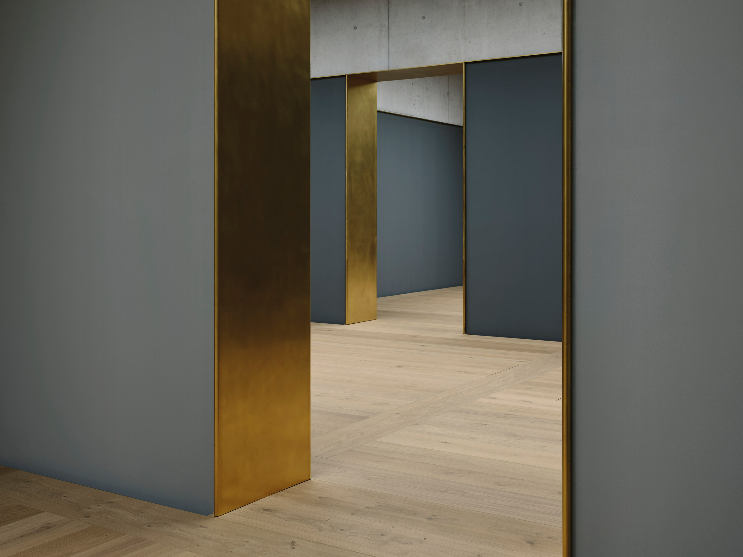
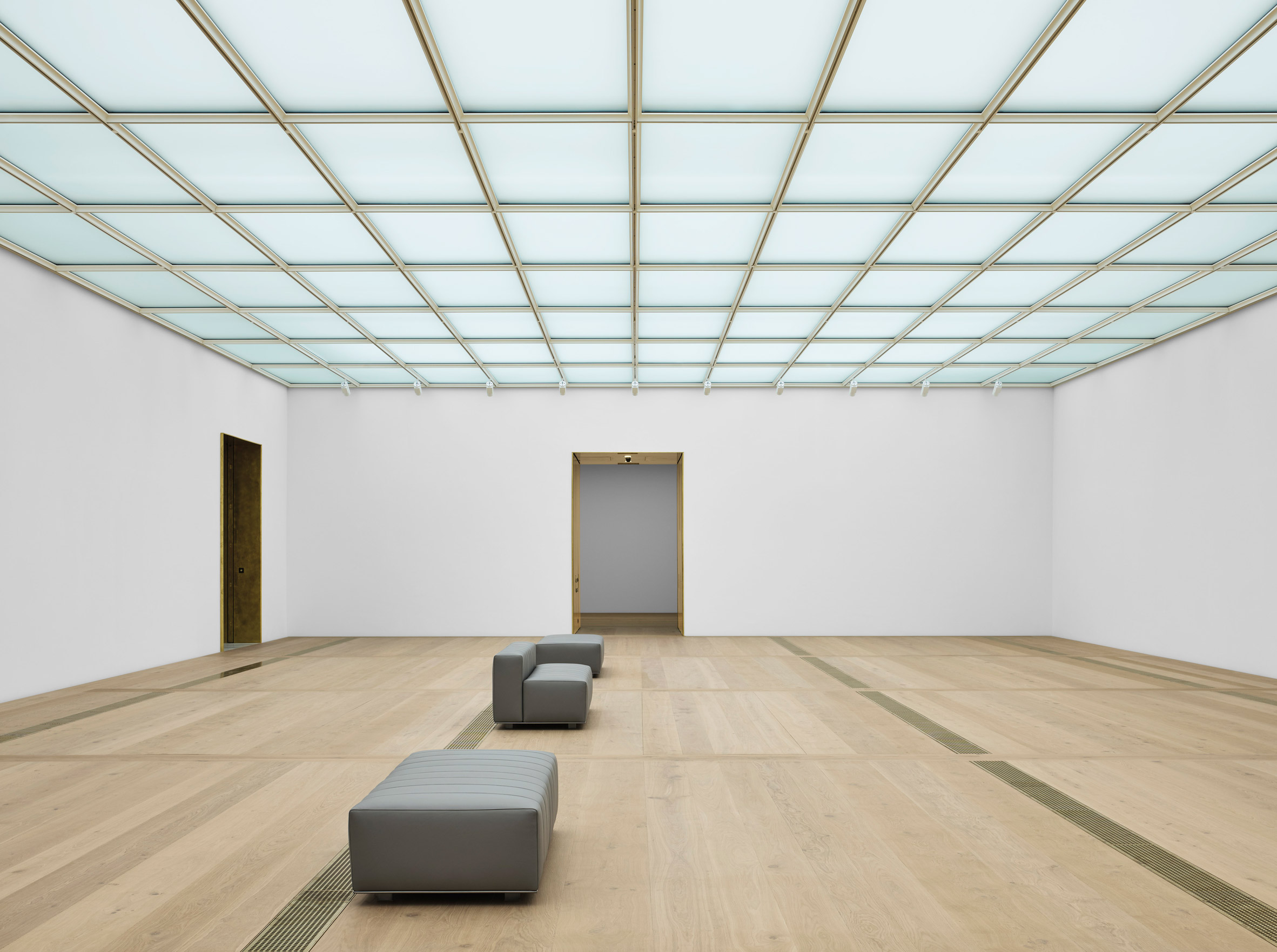
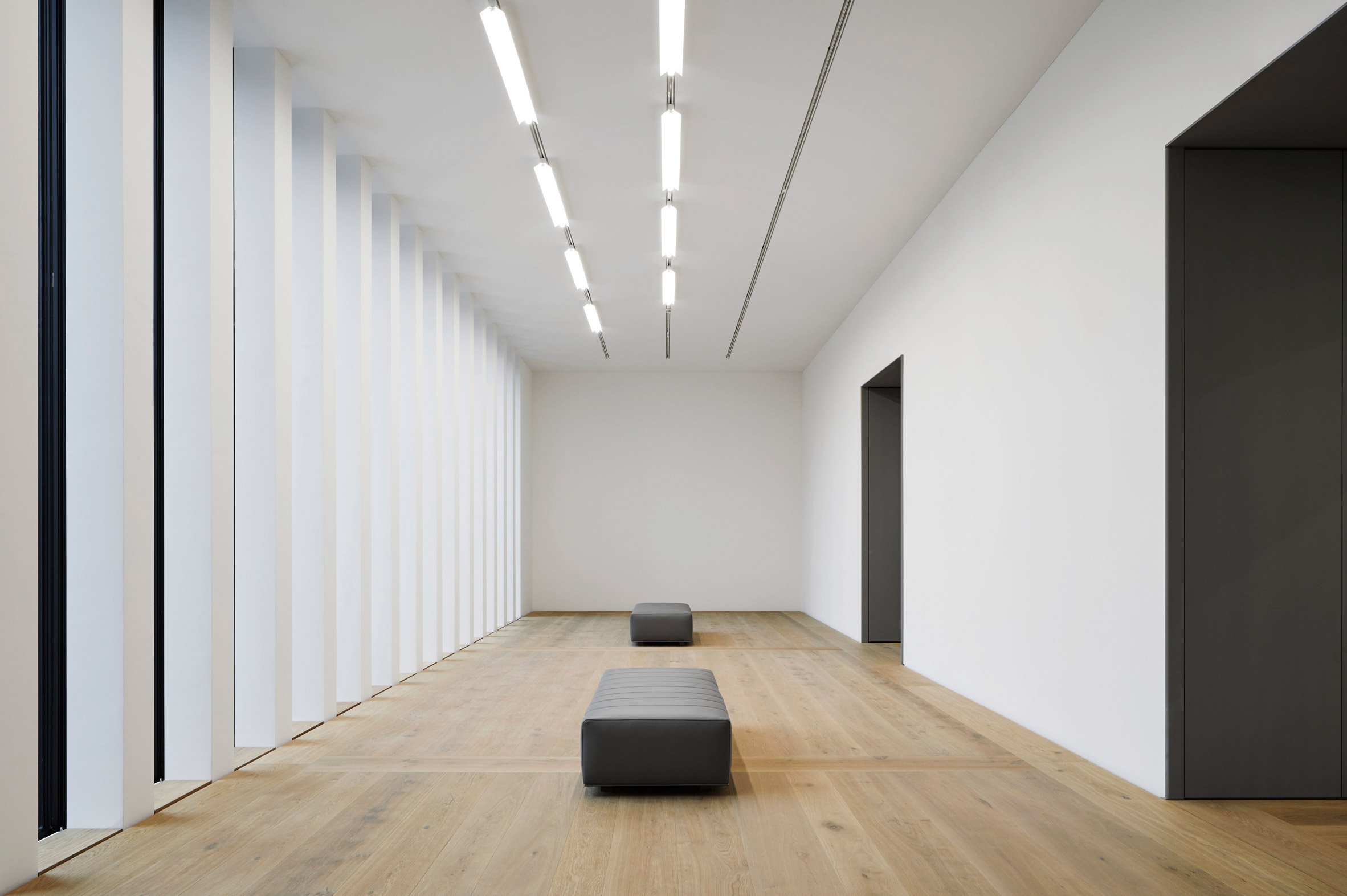
The galleries that occupy the upper floors of the Kunsthaus Zurich extension have all been developed with a unique size, materiality, orientation and lighting conditions to provide them with different atmospheres.
However, they are unified by a backdrop of the reinforced concrete that was used to construct the extension and has been exposed throughout.
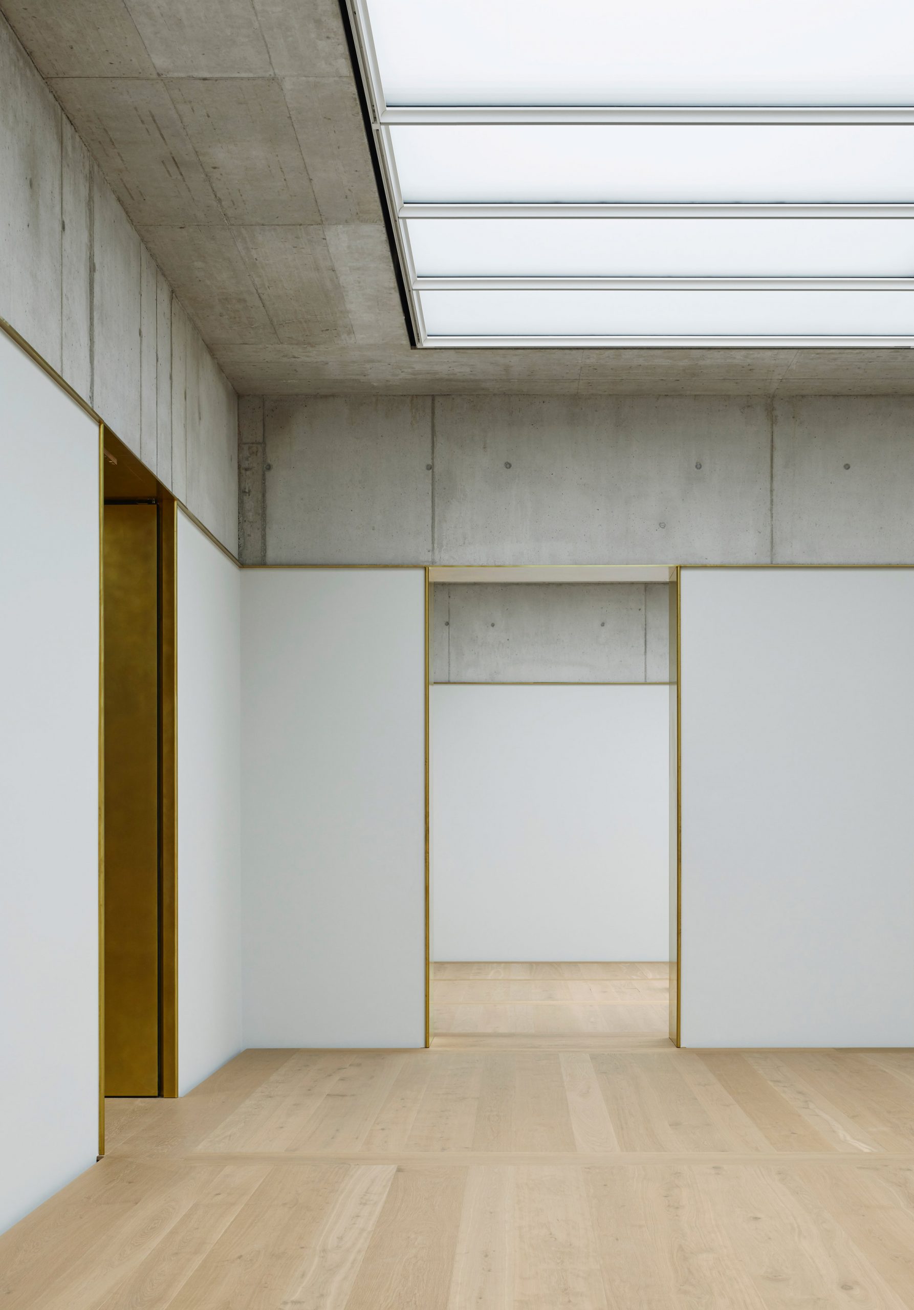
Approximately 90 per cent of the concrete used for the structure was made from a recycled concrete that uses low-carbon cement to help reduce the extension's environmental impact.
An understated material palette of wood, brass and marble detailing has then been used to "dress the exposed concrete rather than cover it up".
"The way we have selected and used materials follows the primary idea of exposing the load-bearing structure of the building, making it both visible and tangible," explained partner and design director Christoph Felger.
Concrete also forms the backdrop to many spaces inside the Würth art gallery, which David Chipperfield Architects recently completed in southern Germany. The museum was built alongside a partially subterranean concert hall that the studio designed in 2017.
Other recent projects by the studio include the West Bund Museum in Shanghai and the Zhejiang Museum of Natural History in China.
The post David Chipperfield adds limestone-clad extension to Kunsthaus Zurich appeared first on Dezeen.
from Dezeen https://ift.tt/34kAzkH
No comments:
Post a Comment