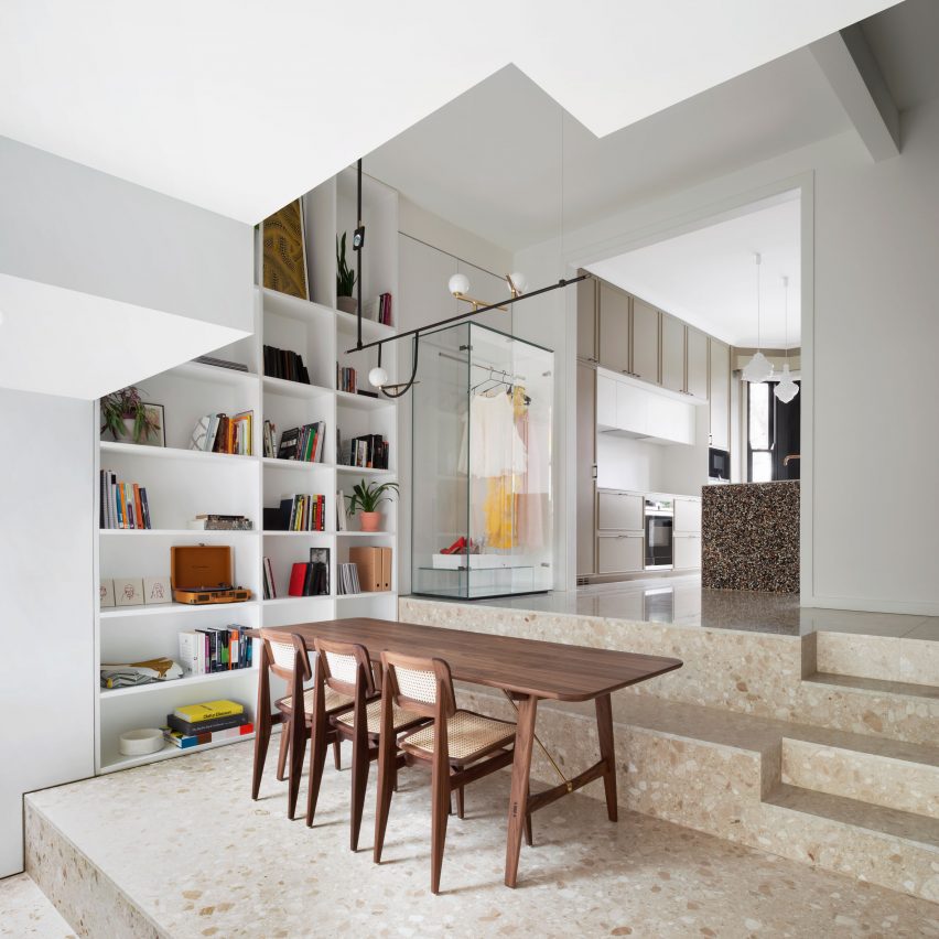
London studio Bureau de Change has used different varieties of terrazzo to create a richly textured interior for a remodelled family home.
Frame House is a Victorian terraced home in south London, renovated and extended by Bureau de Change for a property developer and her family.
The project involved adding a rear extension, converting the loft and completing revamping the interior. But most importantly, the client wanted to give the home a distinct character and coherency throughout.
The architecture studio achieved this with a carefully planned colour and material strategy, and through playful use of geometry.
"The brief was to create a coherent journey through all spaces and floors," explained architect Billy Mavropoulos, who co-founded Bureau de Change with partner Katerina Dionysopoulou.
"We needed a holistic design, looking at everything from the architecture of the extension, to the layouts and the way the spaces are used, down to the joinery handles and details," he told Dezeen.
"The client was after a rich palette of finishes and colours, but one that would feel consistently part of the same narrative."
As is common with Victorian terraces, Frame House has a split-level layout that helps to make the floor plan more efficient.
In the new layout, the ground floor is divided over three levels, comprising the kitchen, dining space and lounge. The two split-level upper storeys contain three en-suite bedrooms, a separate bathroom and a study room.
Terrazzo was the material that Mavropoulos and Dionysopoulou chose to unite the various spaces. It is a material the pair are familiar with, having previously used it in another residential project, Folds House.
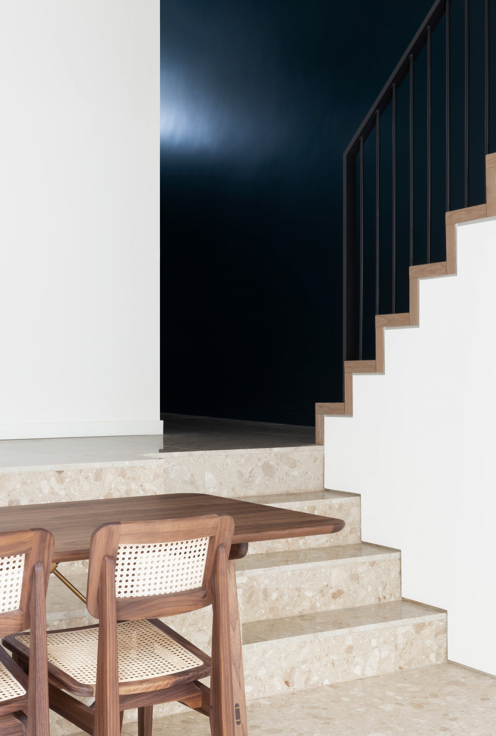
Here, they decided to work with different varieties of terrazzo to give each space its own character, while subtly tying them all together.
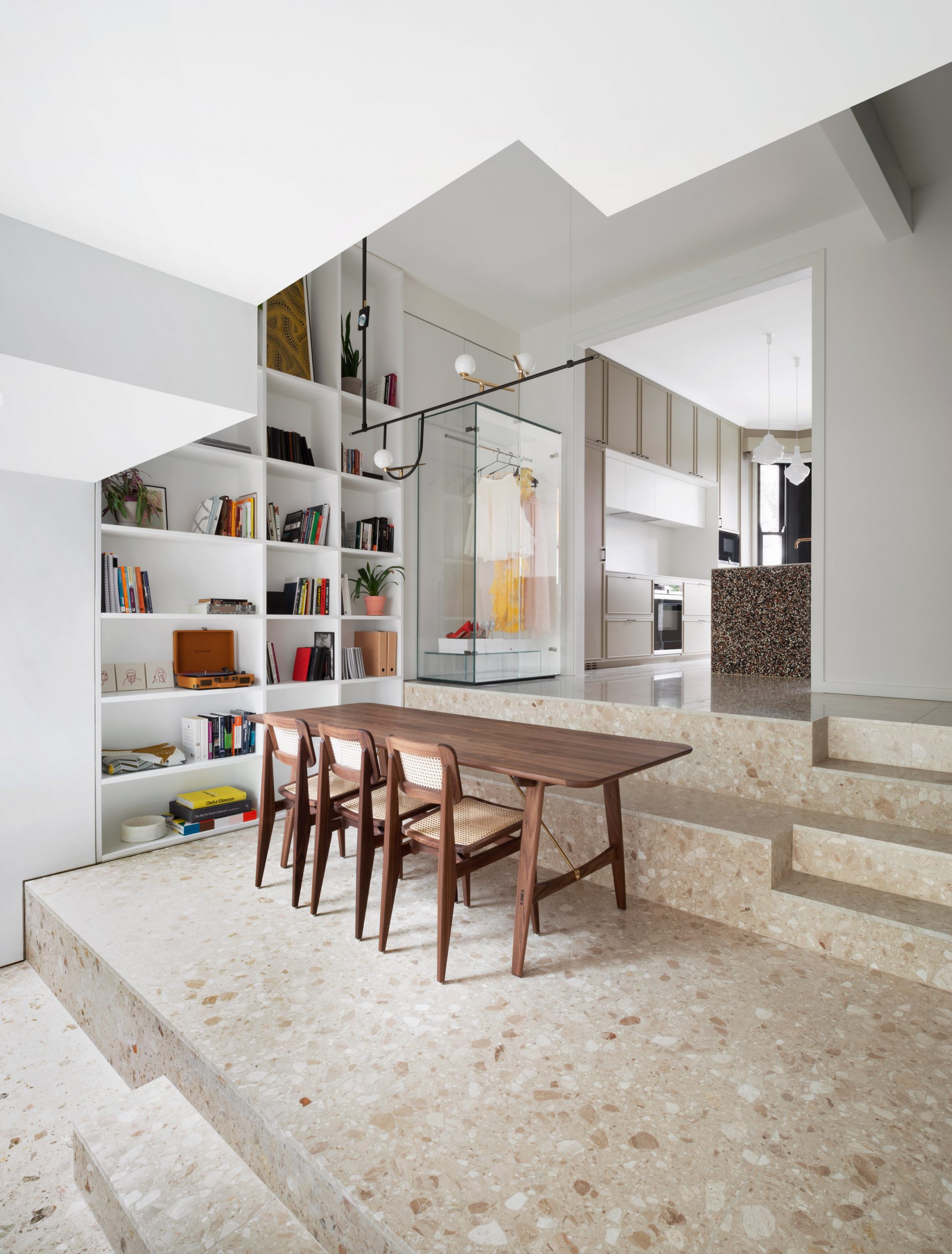
On the ground floor the flooring is a taupe terrazzo in three slightly different shades – one for each level. This creates a gentle transition from light to dark, starting with the kitchen at the front of the house and ending with the lounge at the rear.
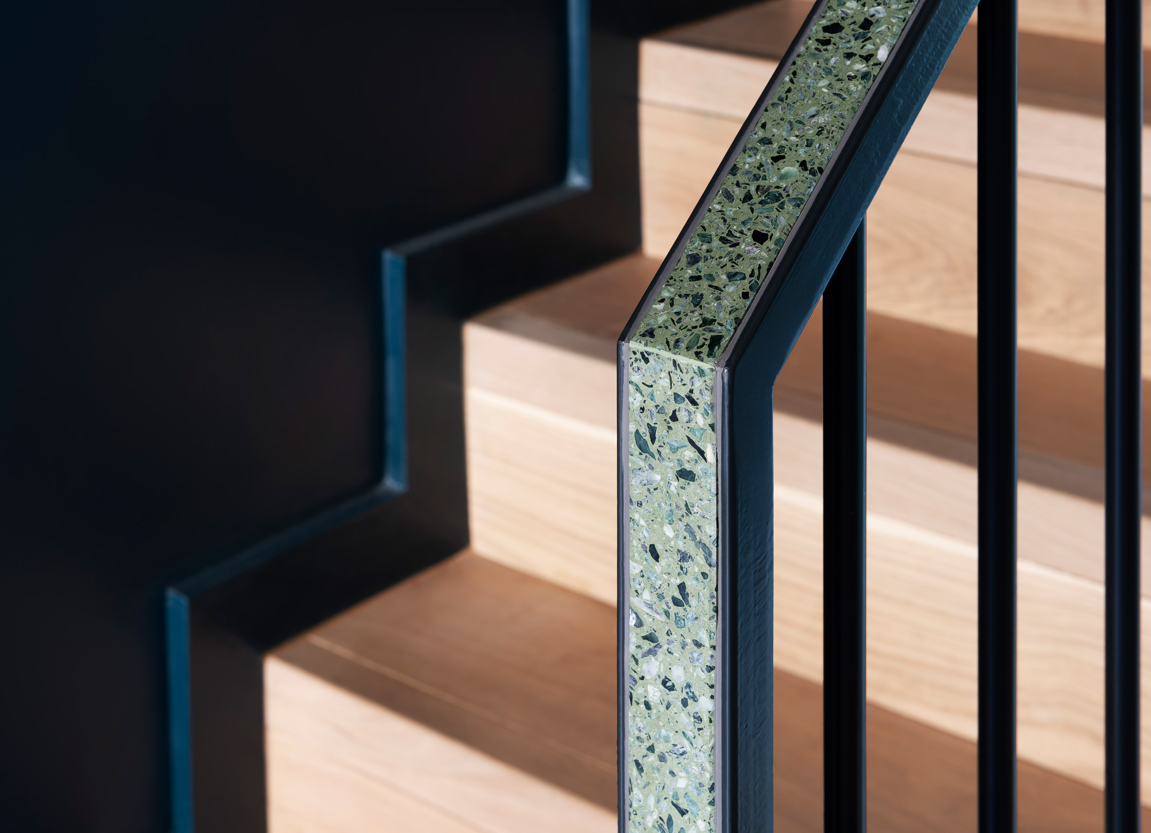
"We chose them very carefully so that they are all of the same family but vary in darkness/density," said Mavropoulos.
"The colour difference is very subtle as we did not want the floor to take over. But when you look closely you notice the difference."
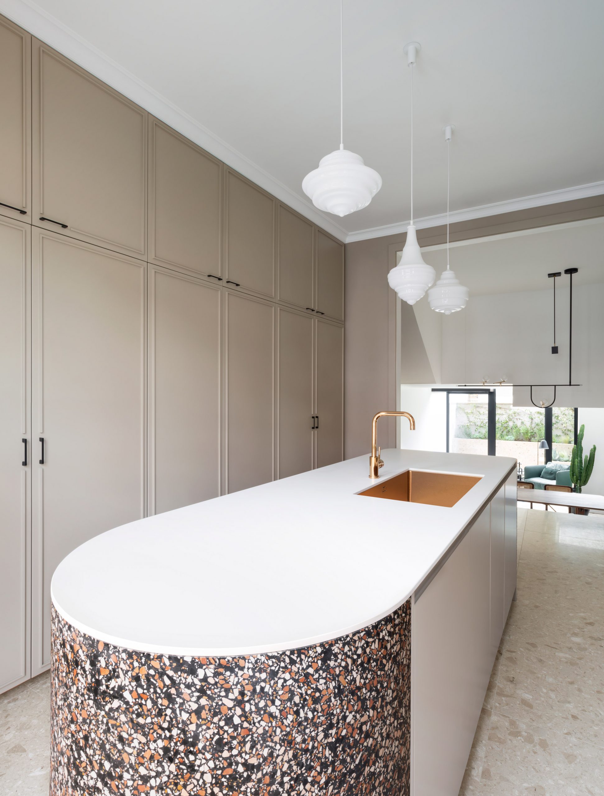
Other details have been picked out contrasting terrazzo varieties: a kitchen island features shades of red and black, the staircase handrails are a green marble terrazzo, and each bathroom has its own different shade.
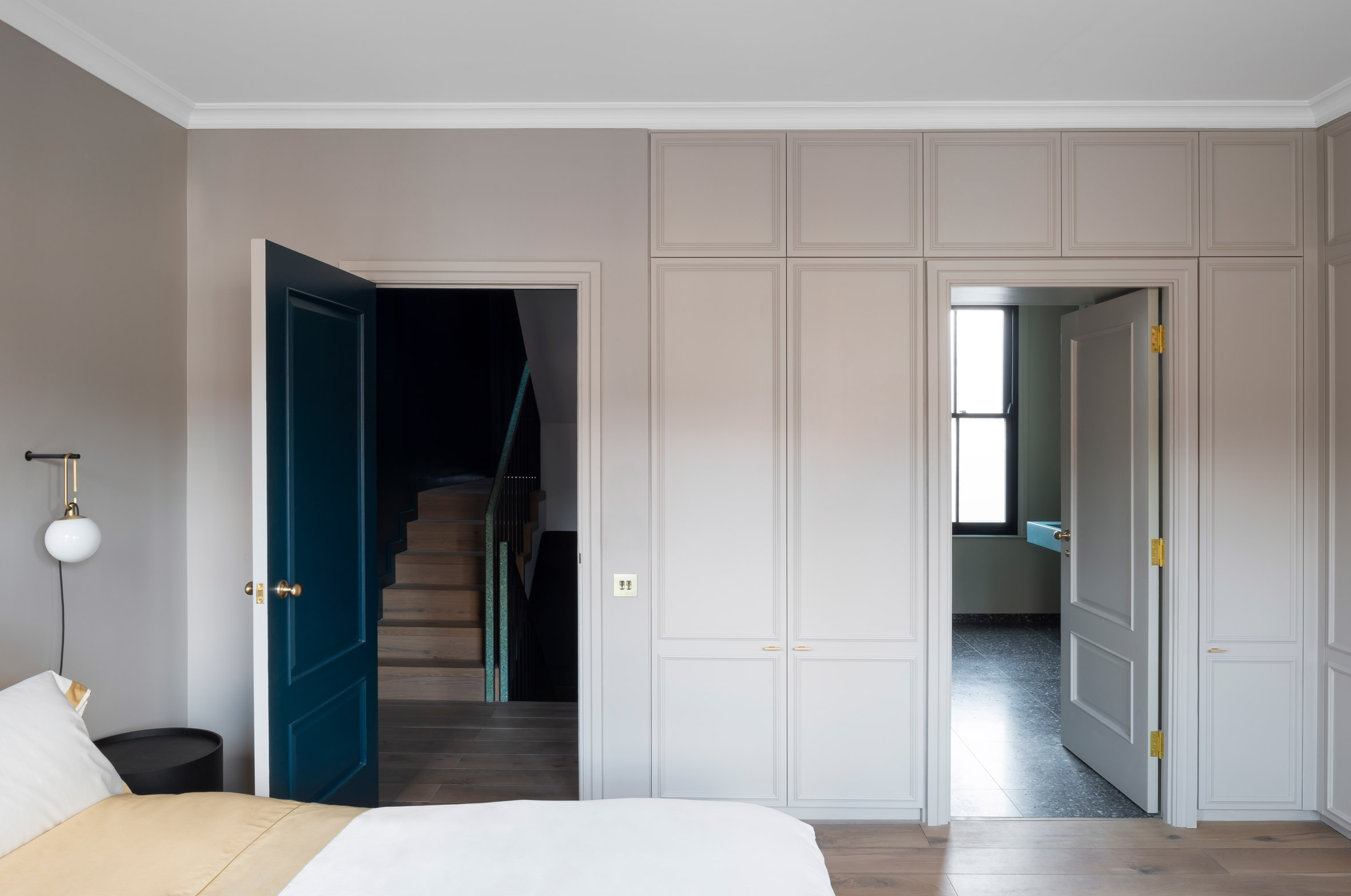
The geometries of the design are based around the rear extension, which gives the occupants a large living space.
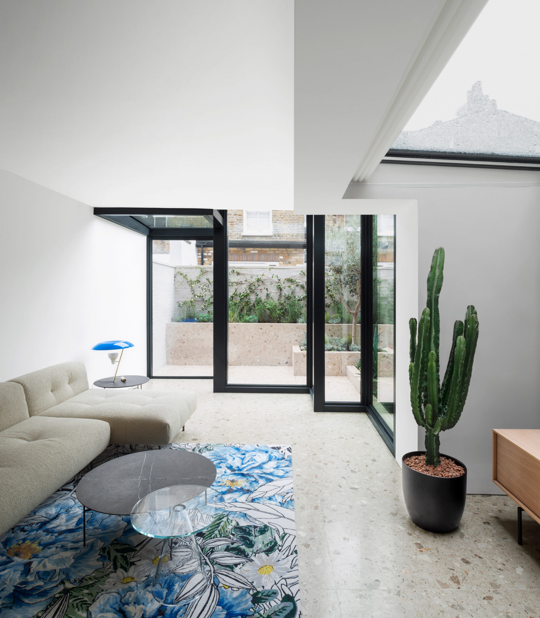
Keen to avoid the 45-degree angled roof and frameless glass typical of infill extensions, the architects opted for a more cuboidal approach. Steel frames create staggered glass boxes, which Mavropoulos and Dionysopoulou liken to museum display cases.
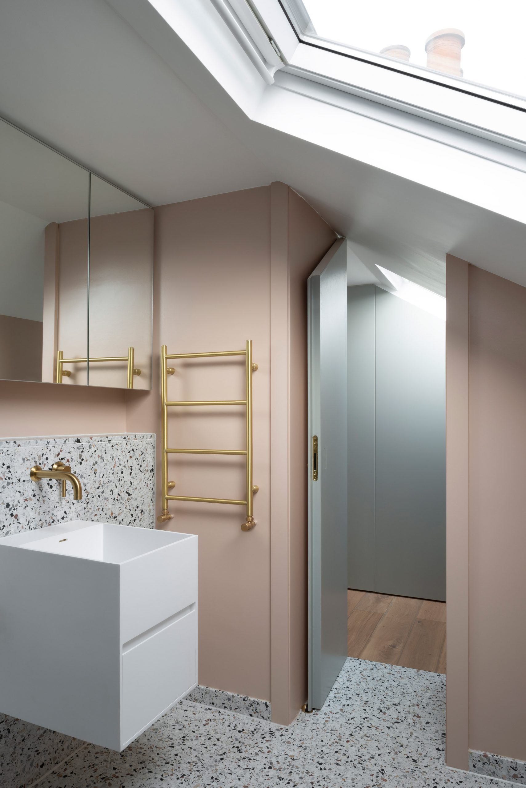
"When we looked at the cascading volumes in plan and section, we felt there was an element of fragility to them, almost like a jewel stone, so we decided to make them out of glass to enhance that feel," said Mavropoulos.
"These distinctly cubist glass volumes are articulated through their bold steel-frame construction, expressing each edge in a manner that creates shifting patterns of light and space, and a paradoxical sense of both levity and solidity," added Dionysopoulou.
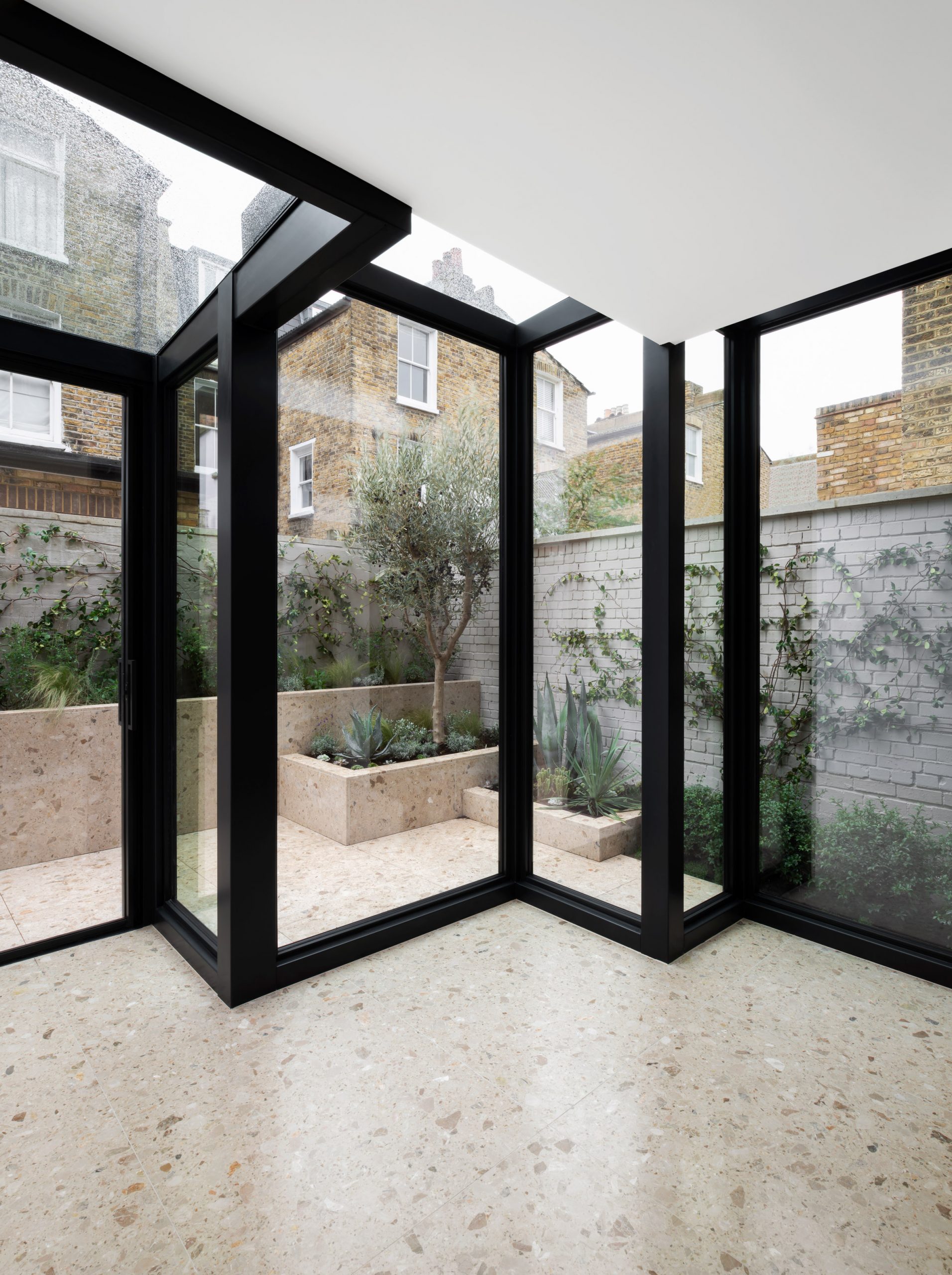
These cascading box forms are referenced in other places, such as the proportions of the split floor levels, or the planting boxes in the garden. There's also a glass display case in the dining area.
Other details contribute to the personality of these spaces. The lounge room brings together a floral-patterned rug and a large cactus plant, while the dining space features a wall of shelving filled with various objects and books.
The architects hope the result is one of "theatre and tactility".
Photography is by Gilbert McCarragher.
Project credits
Architect: Bureau de Change
Interiors: Bureau de Change
Engineer: Symmetrys
M&E: MWL
Contractor: Argyll London
Landscape: Tulip Landscapes
The post Bureau de Change makes creative use of terrazzo in Frame House renovation appeared first on Dezeen.
from Dezeen https://ift.tt/362HgbQ
No comments:
Post a Comment