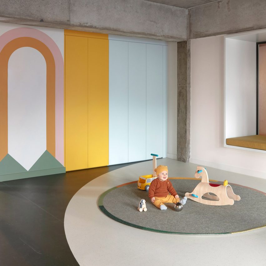
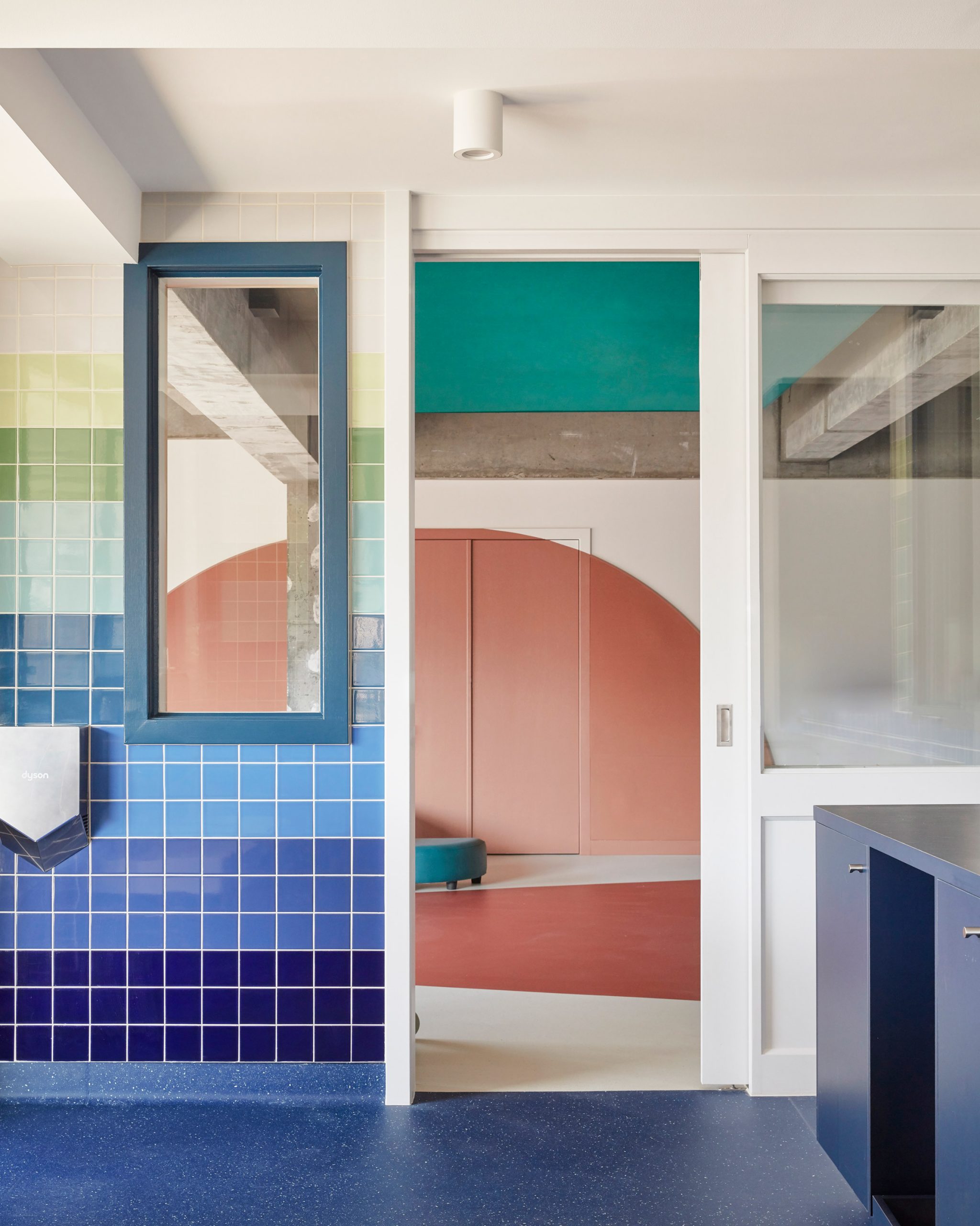
Designer Danielle Brustman used pastel colours, marmoleum flooring and playful hand-painted murals to create the interior of the Brighton Street Early Learning Centre in a brutalist building in Melbourne.
Each playroom in the concrete building, which was converted by Perkins Architects into a childcare centre, was allocated its own motif, which includes a river, meadow, star, sun and cloud. Brustman used these themes to come up with a narrative, treatment and palette for each space.
"The brief and scope for this project was so exciting as the clients were after something bold and unique," Brustman told Dezeen.
"I regularly use colour in my interior design work but it's not often I get the opportunity to be as bold with colours specification."
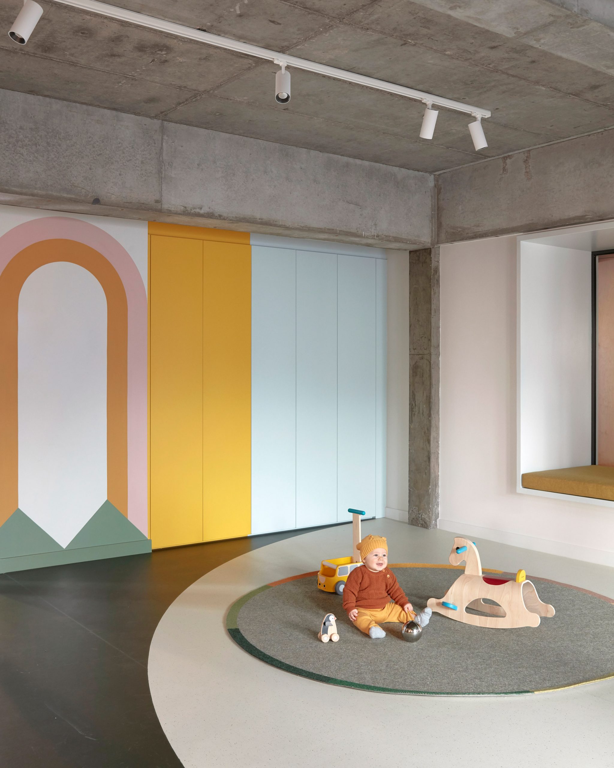
She used 47 colours in total for the early learning centre, which is located in Richmond, Melbourne, adapting them based on the themes of each room and pushing the colour palette to its limits.
"I wanted it to be complex and colourful whilst still adhering to a level of sophistication, gentleness and balance," she said.
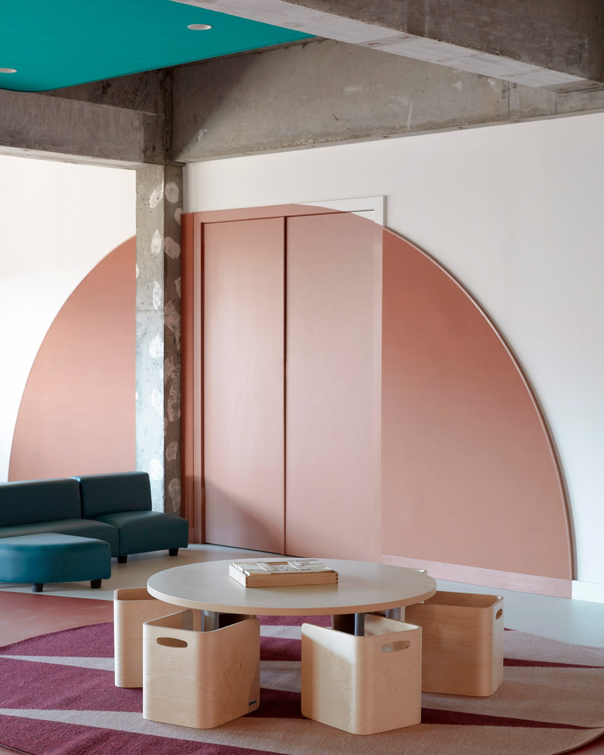
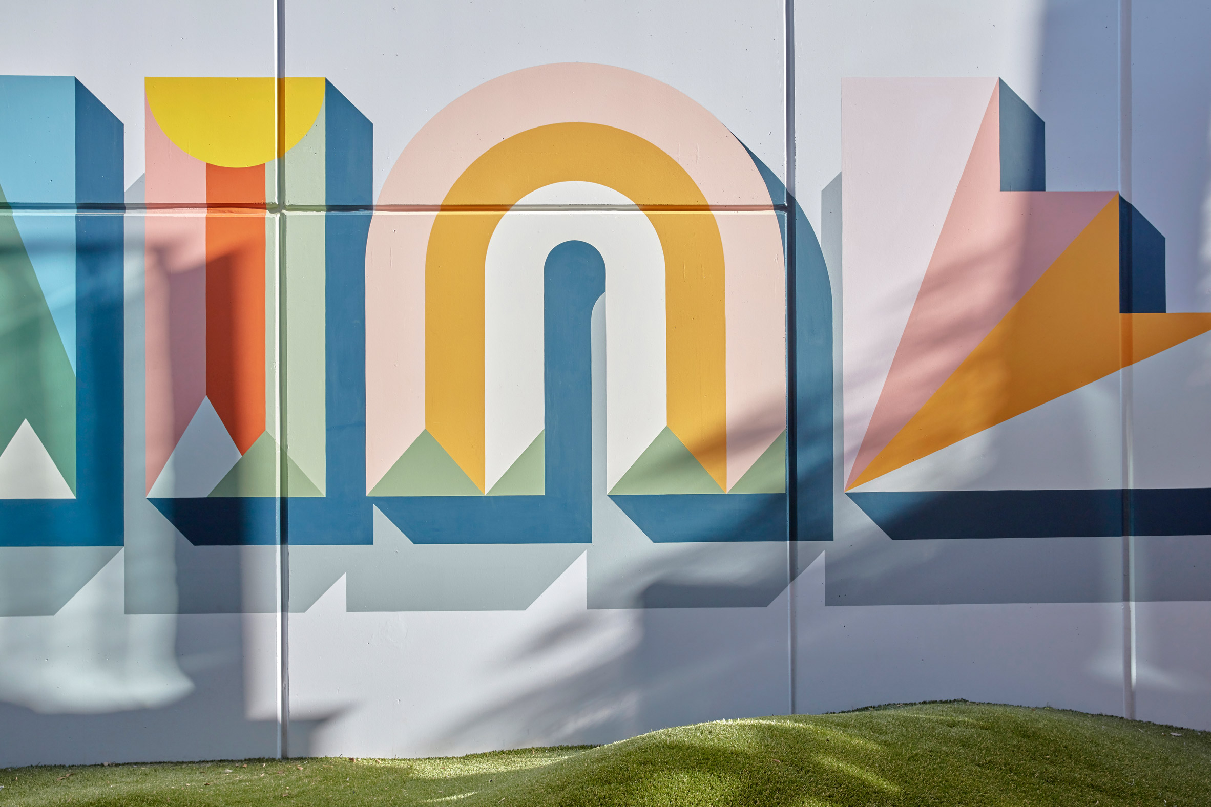
Brustman also added several wall murals, hand-painted by Ben Maitland, to the design, which she hopes will be a source of inspiration and creativity for the children.
The graphic murals feature star bursts, boats made from circles and triangles, rainbows and trees, among other designs.
The rooms also have a seasonal feel. "The forest and river rooms have an autumnal feel to them, while the sun and cloud rooms have a more summery palette and atmosphere," Brustman explained.
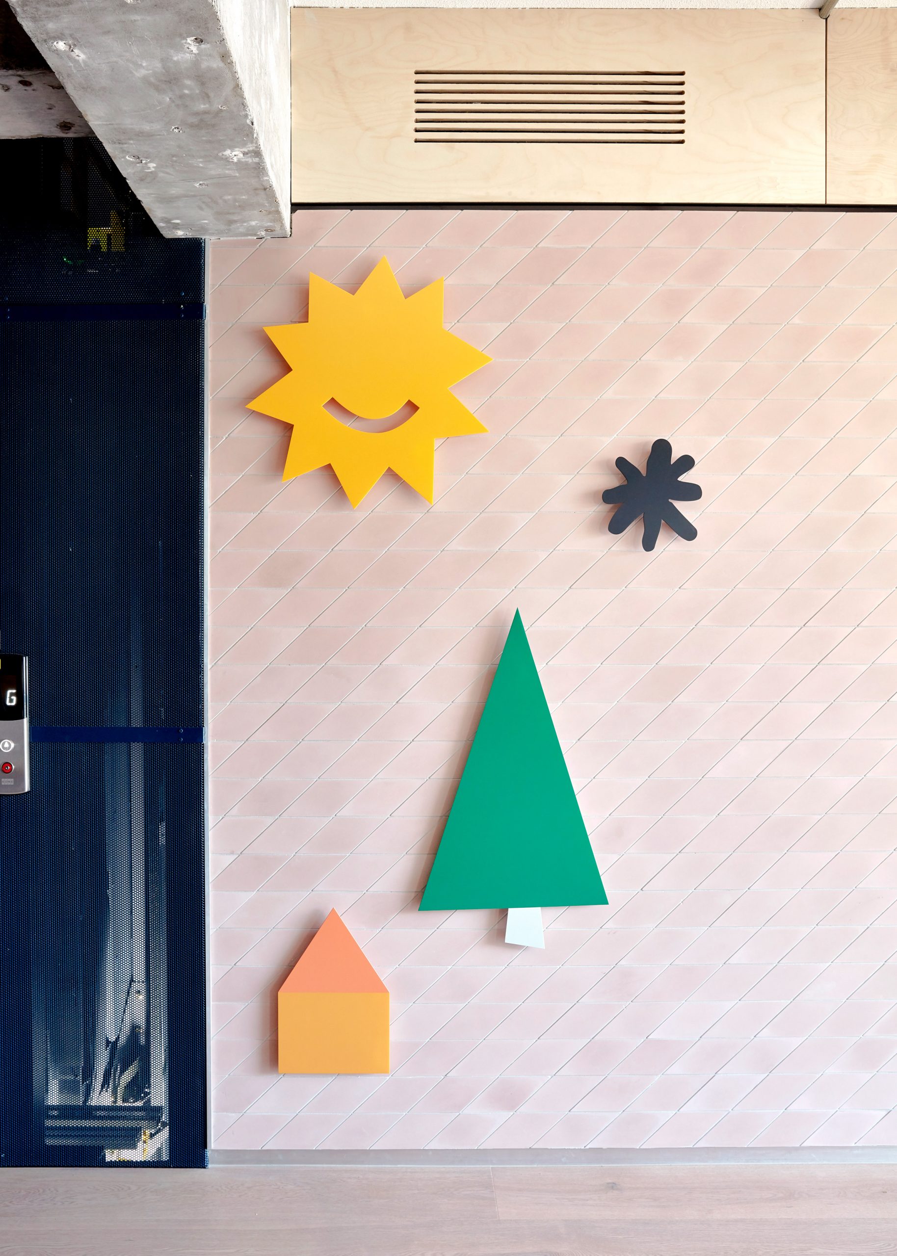
Within the centre, the ground floor rooms relate conceptually to the earth, while the top floor rooms relate to the sky.
Some of the original concrete structure of the building was deliberately left exposed when the space was repurposed to become a children's centre, and has been complemented with natural, durable materials and decorative textiles that soften the space.
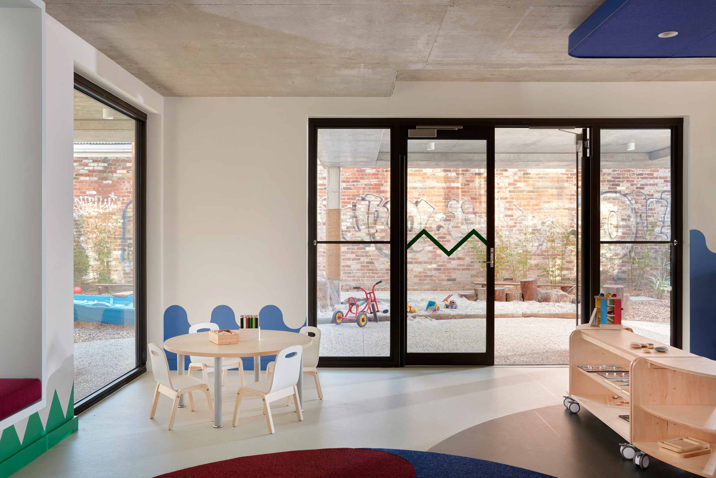
Marmoleum, which is made of 70 per cent natural fibre and 40 per cent recycled materials, is used on floors throughout the centre.
Brustman's studio also designed a number of customised rugs for the rooms, including patterned Tretford rugs made from goat hair.
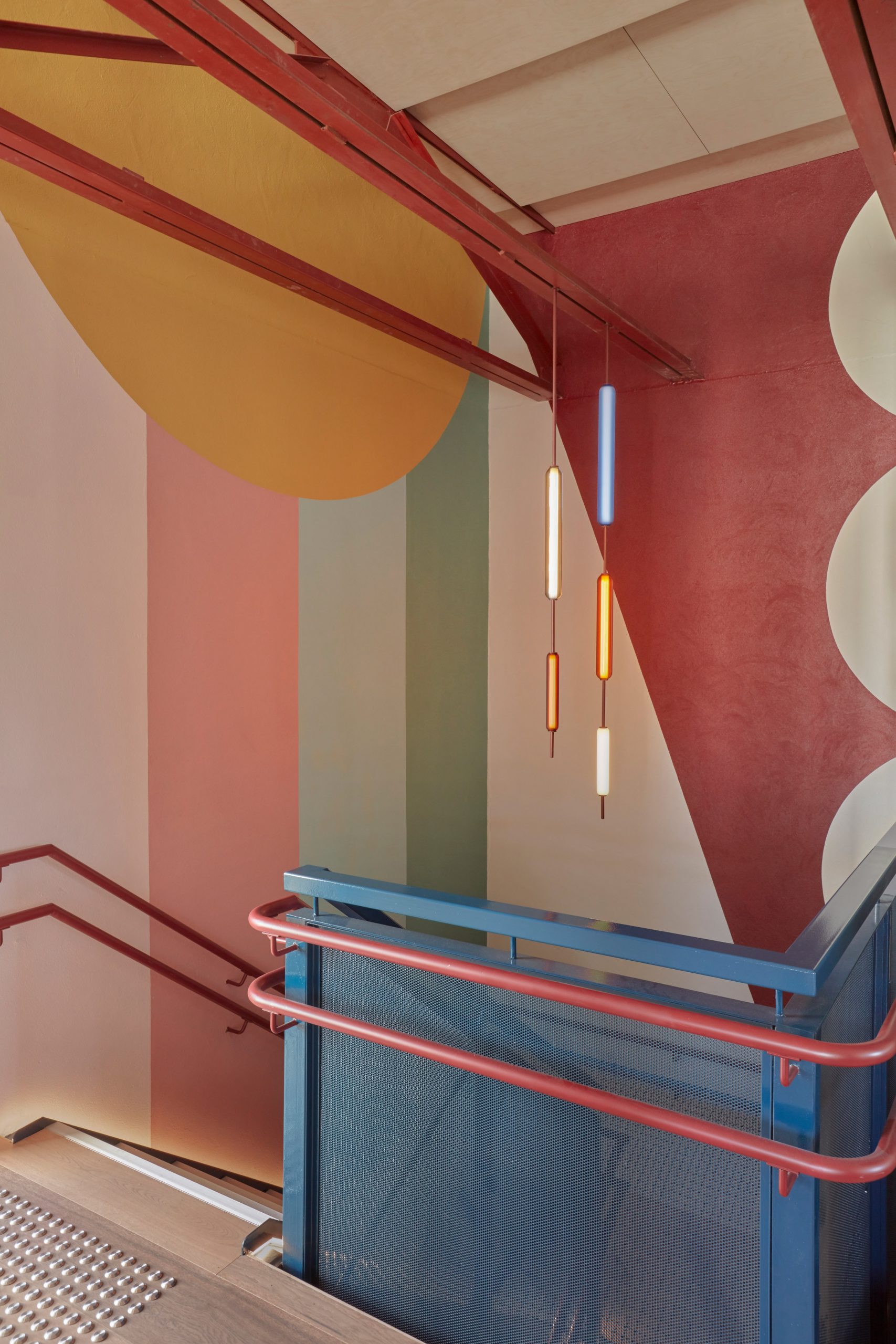
The reception area and stairwell were decorated with coloured pendants made from toughened glass, traditionally used for manufacturing laboratory beakers, by local lighting designer Copper ID.
All playrooms have floating acoustic ceilings to tamper noise, as well as child-friendly soft wool and vinyl furnishings.
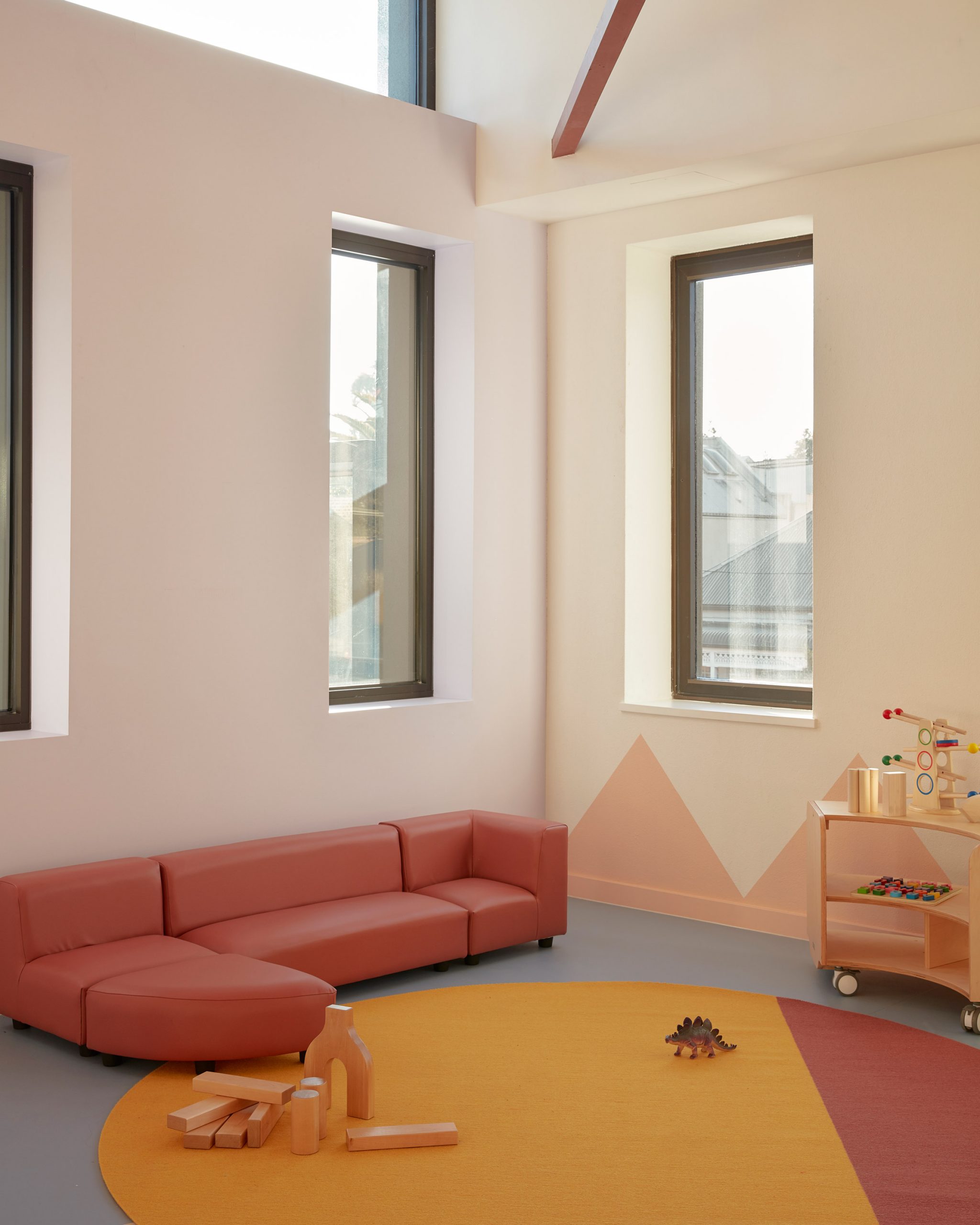
Keeping some of the concrete structure visible has created a contrast to the softer interior details, according to Brustman.
"There's something lovely and unexpected about the intersection between these original raw building materials and the softer, more colourful material surfaces," she said.
Brustman's background is in set design, and the Brighton Street Early Learning Centre design offered an opportunity to create more dramatic designs than some of her regular interior work.
"There is such freedom when you are aiming to please and tend to the imagination of a young child," she said. "I think my design work is compatible with childcare design in that it's playful and a little fantastical."
"My approach to this project has been different in that the same limitations are not placed on the design in terms of what is considered to be a current or tasteful palette," she added.
Other colourful interior designs for children include Integrated Field's design for a hospital in Thailand that features slides and a pool, and Atelier Scale's playground with bright-yellow details in China.
Photography is by Sean Fennessey.
Project credits:
Interior design: Danielle Brustman
Architecture: Perkins Architects
Builder: I BUILD M
Murals: Painted by Ben Maitland
The post Danielle Brustman decorates children's centre in Melbourne with pastel hues and rainbow murals appeared first on Dezeen.
from Dezeen https://ift.tt/3nokwsX
No comments:
Post a Comment